Add Statistical Analytics to Visualizations
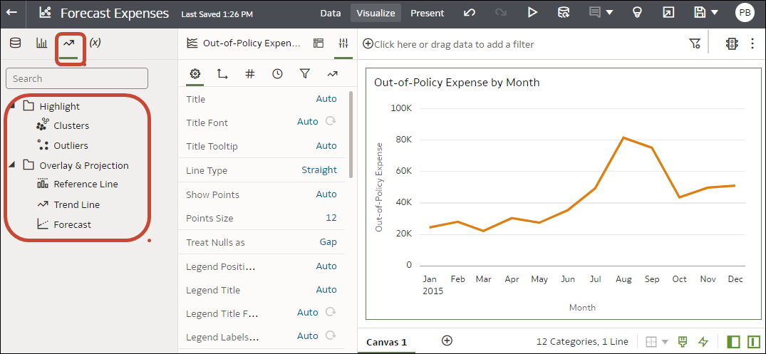
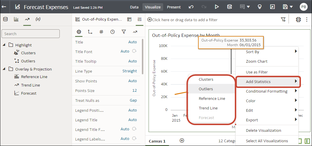
Statistical analytics enable you to highlight clusters or outliers, add forecasts, and show trend and reference lines in your workbooks. Select them on the Analytics tab of the Data pane in the workbook editor.
Alternatively, you can add forecasts, trendlines, and clusters to a workbook using text-only analytics functions. See Analytics Functions.
Before you can use analytic functions in visualizations, you must do the following:
-
Install DVML.
On Windows go to Start, browse to and expand your system's Oracle folder, and click Install DVML.
On Mac, go to Applications and click Oracle Analytics Desktop Configure Python.
-
Create a workbook or visualization that you can apply one or more analytic functions to.
- On your home page, hover over a workbook, click Actions, then select Open.
- In the Data Panel, click the Analytics icon
 .
. - Drag and drop Cluster or Outlier from the Analytics pane to a visualization.
- To configure the analytics function click Properties on the Grammar Panel and use the options in the Analytics pane.

