13 Using List-of-Values Components
inputListOfValues and inputComboboxListOfValues components to a page.This chapter includes the following sections:
About List-of-Values Components
The ADF List-of-Values (LOV) input component is a set of values populated either when the user starts typing the search value in the LOV field or when the user hits the submit button of the LOV field. This is helpful when you want to display the data to the users from one list item to another.
ADF Faces provides two list-of-values (LOV) input components that can display multiple attributes of each list item and can optionally allow the user to search for the needed item. These LOV components are useful when a field used to populate an attribute for one object might actually be contained in a list of other objects, as with a foreign key relationship in a database. For example, suppose you have a form that allows the user to edit employee information. Instead of having a separate page where the user first has to find the employee record to edit, that search and select functionality can be built into the form, as shown in Figure 13-1.
In this form, the employee name field is an LOV that contains a list of employees. When the user clicks the search icon of the inputListOfValues component, a Search and Select popup dialog displays all employees, along with a search field that allows the user to search for the employee, as shown in Figure 13-2. If the results table is empty, you can display a custom message via the resultTable facet.
Figure 13-2 The Search Popup Dialog for a List-of-Values Component
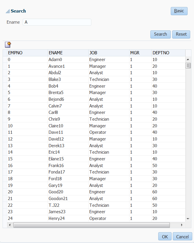
Description of "Figure 13-2 The Search Popup Dialog for a List-of-Values Component"
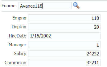
When the user returns to the page, the current information for that employee is displayed in the form, as shown in Figure 13-3. The user can then edit and save the data.
Figure 13-3 Form Populated Using LOV Component
Description of "Figure 13-3 Form Populated Using LOV Component"
As shown in the preceding figures, the inputListOfValues component provides a popup dialog from which the user can search for and select an item. The list is displayed in a table. In contrast, the inputComboboxListOfValues component allows the user two different ways to select an item to input: from a simple dropdown list, or by searching as you can in the inputListOfValues component.
You can also create custom content to be rendered in the Search and Select dialog by using the searchContent facet. You define the returnPopupDataValue attribute and programmatically set it with a value when the user selects an item from the Search and Select dialog and then closes the dialog. This value will be the return value from the ReturnPopupEvent to the returnPopupListener. When you implement the returnPopupListener, you can perform functions such as setting the value of the LOV component and its dependent components, and displaying the custom content. In the searchContent facet you can add components such as tables, trees, and input text to display your custom content.
If you implement both the searchContent facet and the ListOfValues model, the searchContent facet implementation will take precedence in rendering the Search and Select dialog. The following example shows the code to display custom content using a table component.
<af:inputListOfValues model="#{bean.listOfValuesModel}"
...
              returnPopupDataValue="#{bean.returnPopupDataValue}"
              returnPopupListener="#{bean.returnPopupListener}">
   <f:facet name="searchContent">
      <af:table id="t1" value="#{bean.listModel}" var="row"
      selectionListener="#{bean.selected}"
      ...
   </f:facet>
</af:inputListOfValues>
Both components support the auto-complete feature, which allows the user to enter a partial value in the input field, tab out (or click out), and have the dialog populated with one or more rows that match the partial criteria. For auto-complete to work, you must implement logic so that when the user tabs or clicks out after a partial entry, the entered value is posted back to the server. On the server, your model implementation filters the list using the partially entered value and performs a query to retrieve the list of values. ADF Faces provides APIs for this functionality. To configure the LOV input component to auto-complete using only the Search and Select dialog when no unique matching row is available, you need to add the following element to the adf-config.xml file:
You can implement the LOV component to carry forward the value entered in the input field of inputListOfValues and inputComboboxListOfValues to the appropriate search field in the search dialog. You can use the setCriterionValue(Object Value) API method, which sets the search field’s value and also changes the operator of the search field.
public void setCriterionValue(Object value)This method is invoked during the launch of advanced search panel and sets the value of the criterion that matches the LOVs display attribute.
If you want to add the auto-complete feature when the user tabs or clicks out after entering a partial entry, you will need to disable the custom popup. In your LaunchPopupListener() code, add launchPopupEvent.setLaunchPopup(false) to prevent the custom popup from launching when the user tabs or clicks out. Clicking on the Search link will still launch the Search and Select dialog. The following example shows the listener code in a managed bean that is used to disable the custom popup.
public void LaunchPopupListener(LaunchPopupEvent launchPopupEvent) {
    if (launchPopupEvent.getPopupType().equals
       (LaunchPopupEvent.PopupType.SEARCH_DIALOG)
    {
      ...

      launchPopupEvent.setLaunchPopup(false);
    }
}
In the situation where the user tabs out and no unique row match is available to auto-complete a partial input criteria (because duplicate values exist), the Search and Select dialog is displayed. When the user clicks out with a partial value and no unique row match is available, the user gets a validation error notifying them of duplicate values. In this case, you can optionally configure the Search and Select dialog to launch so the behavior for tab out and click out on duplicate values is the same (by default the dialog does not display for the click out action). To configure auto-complete to always use the Search and Select dialog when no unique matching row is available, you can add the following element to the adf-config.xml file
<adf-faces-config xmlns="http://xmlns.oracle.com/adf/faces/config">
    <lov-show-searchdialog-onerror>true</lov-show-searchdialog-onerror>
</adf-faces-config>
If the readOnly attribute is set to true, the input field is disabled. If readOnly is set to false, then the editMode attribute determines which type of input is allowed. If editMode is set to select, the value can be entered only by selecting from the list. If editMode is set to input, then the value can also be entered by typing.
You can also implement the LOV component to automatically display a list of suggested items when the user types in a partial value. For example, when the user enters Ad, then a suggested list which partially matches Ad is displayed as a suggested items list, as shown in Figure 13-4. If there are no matches, a "No results found." message will be displayed.
Figure 13-4 Suggested Items List for an LOV
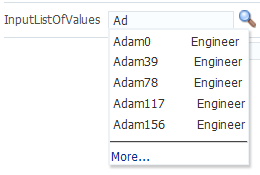
The user can select an item from this list to enter it into the input field, as shown in Figure 13-5.
Figure 13-5 Suggested Items Selected
You add the auto-suggest behavior by adding the af:autoSuggestBehavior tag inside the LOV component with the tag's suggestItems values set to a method that retrieves and displays the list. You can create this method in a managed bean. If you are using ADF Model, the method is implemented by default.
In your LOV model implementation, you can implement a smart list that filters the list further. You can implement a smart list for both LOV components. If you are using ADF Model, the inputComboboxListOfValues allows you declaratively select a smart list filter defined as a view criteria for that LOV. If the smart list is implemented, and auto-suggest behavior is also used, auto-suggest will search from the smart list first. If the user waits for two seconds without a gesture, auto-suggest will also search from the full list and append the results. The maxSuggestedItems attribute specifies the number of items to return (-1 indicates a complete list). If maxSuggestedItems > 0, a More link is rendered for the user to click to launch the LOV's Search and Select dialog. The following example shows the code for an LOV component with both auto-suggest behavior and a smart list.
af:autoSuggestBehavior
    suggestItems="#{bean.suggestItems}"
    smartList="#{bean.smartList}"/>
    maxSuggestedItems="7"/>
Figure 13-6 shows how a list can be displayed by an inputComboboxListOfValues component. If the popup dialog includes a query panel or smart list is not being used a Search link is displayed at the bottom of the dropdown list. If a query panel is not used or if smart list is enable, a More link is displayed.
Figure 13-6 InputComboboxListOfValues Displays a List of Employee Names

Description of "Figure 13-6 InputComboboxListOfValues Displays a List of Employee Names"
You can control when the contents of the dropdown list are sent and rendered to the client using the contentDelivery attribute. When set to immediate delivery, the contents of the list are fetched during the initial request. With lazy delivery, the page initially goes through the standard lifecycle. However, instead of fetching the list content during that initial request, a special separate partial page rendering (PPR) request is run, and the list content is then returned. You can configure the list so that its contents are not rendered to the client until the first request to disclose the content and the contents then remain in the cache (lazy), or so that the contents are rendered each time there is a request to disclose them (lazyUncached), which is the default.
How you set the contentDelivery attribute effects when the LaunchPopupEvent is queued. When contentDelivery is set to lazyUncached, this event is queued while displaying the dropdown panel. When contentDelivery is lazy, the event is queued only the first time the dropdown displays. When set to immediate, the LaunchPopupEvent is not queued at all.
The dropdown list of the inputComboboxListOfValues component can display the following:
-
Full list: As shown in Figure 13-6, a complete list of items returned by the
ListOfValuesModel.getItems()method. -
Favorites list: A list of recently selected items returned by the
ListOfValuesModel.getRecentItems()method. -
Search link: A link that opens a popup Search and Select dialog. The link is not on the scrollable region on the dropdown list.
-
customActionsfacet: A facet for adding additional content. Typically, this contains one or morelinkcomponents. You are responsible for implementing any logic for thelinkto perform its intended action, for example, launching a popup dialog.
The number of columns to be displayed for each row can be retrieved from the model using the getItemDescriptors() method. The default is to show all the columns.
The popup dialog from within an inputListOfValues component or the optional search popup dialog in the inputComboboxListOfValues component also provides the ability to create a new record. For the inputListOfValues component, when the createPopupId attribute is set on the component, a toolbar component with a button is displayed with a create icon. At runtime, a button component appears in the LOV popup dialog, as shown in Figure 13-7.
Figure 13-7 Create Icon in Toolbar of Popup Dialog
Description of "Figure 13-7 Create Icon in Toolbar of Popup Dialog"
When the user clicks the Create button, a popup dialog is displayed that can be used to create a new record. For the inputComboboxListOfValues, instead of a toolbar, a link with the label Create is displayed in the customActions facet, at the bottom of the dialog. This link launches a popup where the user can create a new record. In both cases, you must provide the code to actually create the new record.
Both the inputListOfValues and the inputComboboxListOfValues components support the context facet. This facet allows you to add the af:contextInfo control, which can be used to show contextual information. When the user clicks in this area, it launches a popup window displaying contextual information.
Tip:
Instead of having to build your own create functionality, you can use ADF Business Components and ADF data binding. See Creating an Input Table in Developing Fusion Web Applications with Oracle Application Development Framework.
Like the query components, the LOV components rely on a data model to provide the functionality. This data model is the ListOfValuesModel class. This model uses a table model to display the list of values, and can also access a query model to perform a search against the list. You must implement the provided interfaces for the ListOfValuesModel in order to use the LOV components.
Tip:
Instead of having to build your own ListOfValuesModel class, you can use ADF Business Components to provide the needed functionality. See Creating Databound Selection Lists and Shuttles in Developing Fusion Web Applications with Oracle Application Development Framework.
When the user selects an item in the list, the data is returned as a list of objects for the selected row, where each object is the rowData for a selected row. The list of objects is available on the ReturnPopupEvent event, which is queued after a selection is made.
If you choose to also implement a QueryModel class, then the popup dialog will include a Query component that the user can use to perform a search and to filter the list. Note the following about using the Query component in an LOV popup dialog:
-
The saved search functionality is not supported.
-
The
Querycomponent in the popup dialog and its functionality is based on the correspondingQueryDescriptorclass. -
The only components that can be included in the LOV popup dialog are
query,toolbar, andtable.
When the user clicks the Search button to start a search, the ListOfValuesModel.performQuery() method is invoked and the search is performed. For more information about the query model, see Using Query Components.
You should use the list-of-values components when you have a more complex selection process that cannot be handled by the simpler select components. With list-of-values components, you can filter the selection list using accessors, smart list, auto-suggest, and other features to fine-tune the list criteria. You can create custom content in the popup window. You can add code to the returnPopupListener to perform functions when the popup window closes. A customActions facet can be used to add additional content. A create feature allows the user to create a new record. The list-of-values components offer a rich set of data input features for easier data entry.
Additional Functionality for List-of-Values Components
You may find it helpful to understand other ADF Faces features before you implement your list-of-values components. Additionally, once you have added a list-of-value component to your page, you may find that you need to add functionality such as validation and accessibility. Following are links to other functionality that input components can use.
-
Client components: Components can be client components. To work with the components on the client, see Using ADF Faces Client-Side Architecture .
-
JavaScript APIs: All list-of-value components have JavaScript client APIs that you can use to set or get property values. See the JavaScript API Reference for Oracle ADF Faces.
-
Events: List-of-value components fire both server-side and client-side events that you can have your application react to by executing some logic. See Handling Events.
-
You can add validation and conversion to list-of-values components. See Validating and Converting Input.
-
You can display tips and messages, as well as associate online help with list-of-values components. See Displaying Tips, Messages, and Help.
-
There may be times when you want the certain list-of-values components to be validated before other components on the page. See Using the Immediate Attribute.
-
You may want other components on the page to update based on selections you make from a list-of-values component. See Using the Optimized Lifecycle.
-
You can change the appearance of the components using skins. See Customizing the Appearance Using Styles and Skins.
-
You can make your list-of-values components accessible. See Developing Accessible ADF Faces Pages.
-
Instead of entering values for attributes that take strings as values, you can use property files. These files allow you to manage translation of these strings. See Internationalizing and Localizing Pages.
-
The LOV components use the query component to populate the search list. For information on the query component, see Using Query Components.
-
Other list components, such as
selectOneChoice, also allow users to select from a list, but they do not include a popup dialog and they are intended for smaller lists. For information about select choice components, list box components, and radio buttons, see Using Input Components and Defining Forms . -
If your application uses ADF Model, then you can create automatically bound forms using data controls (whether based on ADF Business Components or other business services). See Creating a Basic Databound Page in Developing Fusion Web Applications with Oracle Application Development Framework.
Creating the ListOfValues Data Model
A ListofValues data model is a collection of interface classes. The ListofValues data model provides you methods to retrieve a QueryModel and a TableModel to display a query component or a table.
Before you can use the LOV components, you must have a data model that uses the ADF Faces API to access the LOV functionality. For information on the LOV data model, see the Java API Reference for Oracle ADF Faces.
How to Create the ListOfValues Data Model
Before you begin:
It may be helpful to have an understanding of the list-of-values data model. See Creating the ListOfValues Data Model.
You may also find it helpful to understand functionality that can be added using other ADF Faces features. See Additional Functionality for List-of-Values Components.
To create a ListOfValues model and associated events:
Using the inputListOfValues Component
Using the inputListOfValues component you can select from list of values to help populate the LOV field on a page. You can use this component when the list of values to display is too large.
The inputListOfValues component uses the ListOfValues model you implemented to access the list of items, as documented in Creating the ListOfValues Data Model.
How to Use the InputListOfValues Component
Before you begin:
It may be helpful to have an understanding of the inputListOfValues component. See Using the inputListOfValues Component.
You may also find it helpful to understand functionality that can be added using other ADF Faces features. See Additional Functionality for List-of-Values Components.
You will need to complete this task:
- Create a page or page fragment. If you also implemented the search API in the model, the component would also allows the user to search through the list for the value.
To add an inputListOfValues component:
What You May Need to Know About Dynamically Creating Auto Suggest Behavior for LOV Components
When you create an LOV dynamically using af:query, you cannot add AutoSuggestBehavior to the dynamically created LOV component. To achieve this, you need to first create the auto suggest behavior dynamically, configure it, and then add the dynamically created auto suggest behavior to the LOV component that is dynamically created. You can use the af:query component to create the behavior and to attach it to the dynamically created LOV component.
To create an auto suggest behavior, use the AutoSuggestBehaviorTag behaviorTag = new AutoSuggestBehaviorTag() in the af:query component.
To configure the properties of the dynamically created auto suggest behavior, use the AutoSuggestBehaviorConfig abstract class, which provides an instance that has all the configurations of AutoSuggestBehavior. The AttributeDescriptor API of af:query has a getAutoSuggestBehaviorConfig method that has the AutoSuggestBehavior properties. The query component invokes the AttributeDescriptor API to read the properties and set it on the AutoSuggestBehaviorTag instance that you created. To get the properties from AutoSuggestBehavior, use the following code:
AutoSuggestBehaviorConfig config = attribeDescriptorInstance.getAutoSuggestBehaviorConfig();
behaviorTag.setMinChars(config.getMinChars());
behaviorTag.setSuggestItems(config.getSuggestItems());
To add the dynamically created behavior to the LOV component, use the following code:
FacesBean bean = component.getFacesBean();
PropertyKey key = bean.getType().findKey("clientListeners");
ClientListenerSet cls = (ClientListenerSet) bean.getProperty(key);
if (cls == null)
  cls = new ClientListenerSet();
behaviorTag.updateClientListenerSet(component, cls);
What You May Need to Know About Skinning the Search and Select Dialogs in the LOV Components
By default, the search and select dialogs that the InputComboboxListOfValues and InputListOfValues components can be resized by end users when they render. You can disable the end user's ability to resize these dialogs by setting the value of the -tr-stretch-search-dialog selector key to false in your application's skin file, as shown in the following example. The default value of the -tr-stretch-search-dialog selector key is true. For more information about skinning, see the skinning chapter.
af|inputComboboxListOfValues{
  -tr-stretch-search-dialog: false;
}
af|inputListOfValues{
  -tr-stretch-search-dialog: false;
}
Using the InputComboboxListOfValues Component
Using the inputComboboxListOfValues component you can select from a list of values to populate the LOV field on a page. The component also allows you to add a search link at the bottom of the populated list dropdown panel to launch the Search and Select dialog.
The inputComboboxListOfValues component allows a user to select a value from a dropdown list and populate the LOV field, and possibly other fields, on a page, similar to the inputListOfValues component. However, it also allows users to view the values in the list either as a complete list, or by most recently viewed. You can also configure the component to perform a search in a popup dialog, as long as you have implemented the query APIs, as documented in Creating the ListOfValues Data Model.
For information about skinning and the Search and Select dialog sizing, see What You May Need to Know About Skinning the Search and Select Dialogs in the LOV Components.
How to Use the InputComboboxListOfValues Component
Before you begin:
It may be helpful to have an understanding of the inputComboboxListOfValues component. See Using the InputComboboxListOfValues Component.
You may also find it helpful to understand functionality that can be added using other ADF Faces features. See Additional Functionality for List-of-Values Components.
To add an inputComboboxListOfValues component:
Using the InputSearch Component
Using the ADF inputSearch component you can filter from a list of values to search and highlight the matched suggestion. You must use the ADF inputSearch component with REST resource and inputSearch supports tag attributes to understand REST data.
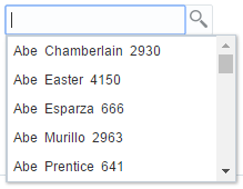
The inputSearch component performs filtering and highlights the matched suggestions on the client. This component fetches the LOV list data from the REST resource call. For better performance, it is recommended to use the inputSearch component with a REST resource that provides around 5000 rows. If the REST response returns more than 5000 rows or beyond the configured limit, the first 5000 rows are displayed. The inputSearch component performs filtering as specified on the component using the filterAttributes and the filter string is case-insensitive. This component performs search across all attributes that supports the search criteria contains and startsWith. By default, the display of suggestions is done using the standard template. You can customize the display of suggestions using clientside templates. Figure 13-8 displays the sample standard template that shows the filtering across all attributes and highlights the matched suggestion.
Figure 13-8 Filters Across All Attributes and Matches Suggestions with Highlighting

Description of "Figure 13-8 Filters Across All Attributes and Matches Suggestions with Highlighting"
The performance of the component is dependent on the appropriate caching strategy that you use while developing a web page. The inputSearch component uses REST services to fetch the suggestions. The caching mechanism that you can use is the default HTTP caching supported by browsers. You can select an appropriate caching strategy for the REST resource. The inputSearch component will be able to parse the response if the REST service adheres to the REST format. The REST response should be in JSON format. A sample REST response is given below, which was used to generate inputSearch list as displayed in Figure 13-8, where the values of specified attributes display in the component.
[{
			"id": 2930,
			"dateOfBirth": "Jan 12, 1991",
			"deptName": "Accounting",
			"tags": "Excel, ",
			"email": "Abe.Chamberlain@acme.com",
			"hireDate": "May 16, 2004",
			"profileKey": "19_M.jpg",
			"lName": "Chamberlain",
			"deptLocation": "Bombay, India",
			"genderCode": "M",
			"fName": "Abe",
			"jobTitle": "Contractor"
  }, {
			"id": 4150,
			"dateOfBirth": "Aug 26, 1982",
			"deptName": "Customer Support",
			"tags": "negotiator, filing, ",
			"email": "Abe.Easter@acme.com",
			"hireDate": "Aug 23, 2000",
			"profileKey": "7_M.jpg",
			"lName": "Easter",
			"deptLocation": "New York, USA",
			"genderCode": "M",
			"fName": "Abe",
			"jobTitle": "Contractor"
  },
  ...
You can customize inputSearch by modifying the source code of the .jspx page. The following customizations are available for the inputSearch component.
-
The
inputSearchcomponent understands the REST data with tag attributes. The data that is to be filtered and displayed should be specified in the tag attributes. You can specify the values from the REST response data for the tag attributes. See What You May Need to Know About InputSearch Component Tags and REST Data. -
The
inputSearchcomponent fetches the LOV list data from the REST resource. Therefore, you must specify the REST resource foraf:inputSearchcomponent, which is the REST endpoint URL. You can use thesearchSectiontag to specify the REST resource path.<af:inputSearch id="iSearch1" ... <af:searchSection dataUrl="/#{request.contextPath}/rest/employees" /> </af:inputSearch>TheinputSearchcomponent does client filtering of the suggestions if the complete suggestions list is sent to the client on a simple request to thedataUrl. If the results set is paginated with the response having hasMore property set to true, then the component delegates the filtering to the REST service. For the server filtering, thesearchSectionsupports an attribute namedfilterParametersthat takes a JS callback name. The JS method is invoked while making the REST calls for server filtering and the callback returns the appropriate query parameters for the REST URL to perform filtering on the REST service. See What You May Need to Know About SearchSection Attributes. -
By default, the
inputSearchcomponent suggestions are displayed in list format. You can customize the display ofinputSearchsuggestions either as a list or table. You can use thecontentModefacet to customize the display.<af:inputSearch contentMode="table/list" ... > ...
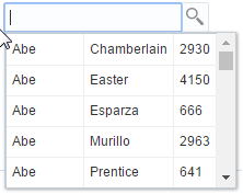
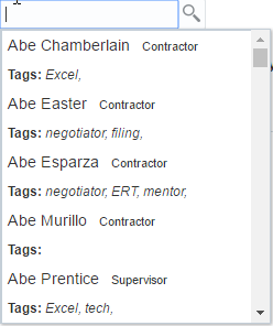
Figure 13-9 and Figure 13-10 display the default List and Table display modes.
-
The
inputSearchcomponent supports clientside template to customize the presentation of suggestions. See How to Customize InputSearch Component Display Modes. -
You can include other attributes to customize the display, such as short descriptions, selection converter, and auto submit for
inputSearch. See What You May Need to Know About InputSearch Attributes. -
You can build and configure a list of preferred suggestions and manage this suggestion list on a client by using the
af:suggestionSectiontag within theaf:inputSearchcomponent. By default,af:suggestionsSectionbased list is shared acrossinputSearchcomponents which are based on same REST URL. You can make them private to theinputSearchcomponent by setting thecacheKeyGeneratorattribute value toprivateList. See How to Set Attributes of Suggestion Section.<af:inputSearch label="Label" valueAttribute="id" ...> <af:searchSection type="default" dataUrl="/rest/employees" /> <af:suggestionsSection /> </af:inputSearch>
When REST calls are made, the
inputSearchcomponent sets theAcceptheader toapplication/json. The JSON document should have a root property labeleditemsand its value should be an array. If anitemsproperty is not available, the first root property for which the value is an array is chosen as the list of suggestions. You can set the attributes in thesuggestionSectionto customize the sharing and display of suggestion list. See How to Set Attributes of Suggestion Section. -
The
inputSearchcomponent supports dependency-based filtering on the clientside. See How to Specify Dependency-Based Filtering on InputSearch Components.
How to Use the InputSearch Component
You customize the inputSearch component by modifying the source code of the .jspx page. You can modify the tag attributes, modify the REST url, customize the display mode, or customize the suggestion section. You can also include clientside template suggestions and dependency-based filtering by modifying the source code. All the customizations are done by modifying the source code.
-
Ensure that the RESTful web service is running when running the
.jspxpage that contains theaf:inputSearchcomponent. -
See Using the InputSearch Component to understand the
inputSearchcomponent.
To customize the inputSearch to display data in tabular format:
-
In the
.jspxpage that contains theaf:inputSearchLOV component, click the Source tab to view the source code. -
Modify the
labelattribute to specify a label for the component.label="Select a person from the list (Filter by name): "
See Figure 13-11 to view the label that is displayed in the output. -
Specify the value for
valueAttribute(id),displayAttributes(fName lName), andfilterAttributes(fName lName jobTitle) to filter by name and job title.valueAttribute="id" displayAttributes="fName lName" filterAttributes="fName lName jobTitle"
See What You May Need to Know About InputSearch Component Tags and REST Data. -
Optionally, customize the display of the
inputSearchcomponent to display as a table by using thecontentModefacet.contentMode="table">
See How to Customize InputSearch Component Display Modes. -
Add a
searchSectioncomponent and specify the REST endpoint URL insearchSection.<af:inputSearch ... <af:searchSection type="default" dataUrl="/rest/employees?cache=etag&limit=5000" /> </af:inputSearch>
-
Optionally, include the
suggestionSectiontag to fetch the suggestion list using the REST data. The following code uses thecacheKeyGeneratorattribute to return theclientIdof theinputSearchcomponent to maintain the suggestion list as private on theinputSearchcomponent.<af:suggestionsSection dontCache="tags1" displayCount="15" cacheKeyGenerator="privateList"/>
See Configuring Suggestion List and How to Set Attributes of Suggestion Section.
<af:inputSearch id="iSearch1"
label="Select a person from the list (Filter by name): "
valueAttribute="id"
displayAttributes="fName lName"
filterAttributes="fName lName jobTitle tags"
selectionConverter="#{inputSearchDemo.selectionConverter}"
autoSubmit="true"
contentMode="table">
<f:validator validatorId="oracle.adfdemo.InputSearchDemoValidator" />
<af:searchSection type="default"
dataUrl="/#{request.contextPath}/rest/employees?cache=etag&limit=5000" />
<af:suggestionsSection dontCache="tags1" displayCount="15" cacheKeyGenerator="privateList"/>
<f:facet name="contentStamp">
<af:sanitized >
<td>{{fName}} {{lName}}</td>
<td>{{jobTitle}}</td>
<td>{{email}}</td>
<td><span style="font-style: italic;">{{tags}}</span></td>
</af:sanitized>
</f:facet>
</af:inputSearch>Figure 13-11 Sample Output of Modified Code

Description of "Figure 13-11 Sample Output of Modified Code"
What You May Need to Know About InputSearch Component Tags and REST Data
inputSearch component supports three tag attributes to understand the REST data. The following example shows the sample tag attributes for the inputSearch component: <af:inputSearch id="iSearch1"
valueAttribute="id"
displayAttributes="fName lName id"
filterAttributes="fName lName jobTitle tags">
</af:inputSearch>-
valueAttribute- specify a value that is unique on which the component is defined. In the REST response data sample shown above, theidattribute uniquely identifies the suggestion object and hence given as the input forvalueAttribute. -
displayAttributes- specify a collection of item properties from the REST response data that is to be displayed in the input field on selection. The value to be displayed in the input field is a combination offName,lName, andid. Therefore, these fields are specified in thedisplayAttributes. If you do not specify a value, this attribute takes the value ofvalueAttribute, by default. -
filterAttributes- specify a collection of item properties from the REST response data, based on which the data is filtered and the values displayed in the suggestions popup. The value to be displayed should be filtered onfName,lName, andjobTitle. Therefore, these fields are specified in thefilterAttributes. If not specified, then it takes the value ofdisplayAttributes. TheinputSearchcomponent performs filtering and highlights the matched suggestions on the client as in Figure 13-8.
What You May Need to Know About InputSearch Attributes
You can customize the filtering and display of suggestions by including attributes in inputSearch source code. Table 13-2 provides the list of attributes that you can use in the inputSearch component.
Table 13-2 Attributes Supported by inputSearch Component
| Name | Type | Supports EL | Description |
|---|---|---|---|
|
|
Char |
Yes |
A character used to gain quick access to the form element specified by the This attribute is sometimes referred to as the mnemonic.
Note: TheaccessKey is triggered by browser-specific and platform-specific modifier keys. It even has browser-specific meaning. For example, Internet Explorer will set focus when you press Alt+accessKey. Firefox sets focus on some operating systems when you press Alt+Shift+accessKey. Firefox on other operating systems sets focus when you press Ctrl+accessKey. Refer your browser documentation for how it treats access keys.
|
|
|
javax.el.MethodExpression |
Only EL |
A method reference to an attribute change listener. Attribute change events are not delivered for any programmatic change to a property. They are only delivered when a renderer changes a property without the application's specific request. An example of an attribute change events might include the width of a column that supported clientside resizing. |
|
|
Boolean |
Yes |
When set to True on a form element, the component will automatically submit when an appropriate action such as, a click, text change takes place. Partial submit like The default value is |
|
|
oracle.adf.view.rich.component.rich.input.RichInputSearch |
Only EL |
An EL reference that will store the component instance on a bean. This can be used to give programmatic access to a component from a backing bean, or to move creation of the component to a backing bean. |
|
|
Boolean |
Yes |
When set to true, the changed indicator icon will be displayed on the component. The default value is |
|
|
String |
Yes |
The text commonly used by user agents to display tool tip text on the changed indicator icon. Default value is |
|
|
Boolean |
Yes |
Specifies if a clientside component is generated or not. A component may be generated whether or not this flag is set, but if client Javascript requires the component object, this must be set to true to guarantee the component's presence. Client component objects that are generated today, by default, may not be present in the future. Setting this flag is the only way to guarantee a component's presence, and clients cannot rely on implicit behavior. However, there may be an impact on performance when you set this flag, therefore, you should avoid turning on client components unless absolutely necessary. For the components The default value is |
|
|
int |
Yes |
The size of the text control specified by the number of characters shown. The number of columns is estimated based on the default font size of the browser. |
|
|
oracle.adf.view.rich.component.rich.input.RichInputSearch.ContentMode |
Yes |
Indicates the rendering mode of The default value is |
|
|
String |
Yes |
The style of the content piece of the component. You can style width by setting this attribute like width: 100px. Because of browser CSS precedence rules, CSS rendered on a DOM element takes precedence over external style sheets like the skin file. Therefore skins will not be able to override what you set on this attribute. |
|
|
javax.faces.convert.Converter |
Yes |
A converter object |
|
|
oracle.adf.view.rich.component.rich.input.RichInputSearch.Criteria |
Yes |
Indicates the search criteria. Valid Values are The default value is |
|
|
String |
Yes |
This attribute is deprecated. The id attribute should be used when applying persistent customization. This attribute will be removed in the next release. |
|
|
Boolean |
Yes |
Specifies whether the element is enabled or disabled. Unlike a If the component has the potential to have a scrollbar, and you want the user to be able to scroll through the component's text or values, use the The default value is |
|
|
java.util.List |
Yes |
The collection item properties from the REST response data whose values represent the selection. This attribute decides the value to be displayed in the input field on selection. If |
|
|
String |
Yes |
The editable look and feel to use for input components. You can use the following values:
|
|
|
String |
Yes |
This attribute holds the name of the JS callback that would perform
Array.filter operation on the collection returned from the REST response. The component instance will be set as context during JS callback invocation. The row object passed to the callback will have the structure below:
|
|
|
String |
Yes |
The collection item properties from the REST response data to be used for filtering suggestions. If
filterAttributes is not specified, it defaults to displayAttributes. Where contentStamp facet is not provided, the values displayed in the suggestions popup is also decided by this attribute.
Note: If you specify an attribute that is not displayed in the suggestions panel as a filterable attribute, it could be confusing for the end user to see the suggestions being filtered based on such an attribute. |
|
|
String |
Yes |
The id used to look up a topic in a helpProvider. Help information should be provided using the It is preferred to use |
|
|
String |
No |
The identifier for the component. Every component may be named by a component identifier that must conform to the following rules:
|
|
|
Boolean |
Yes |
Specifies whether the value is converted and validated immediately in the Apply Request Values phase, or is handled in the Process Validators phase. By default, the values are converted and validated together in the Process Validators phase. However, if you need access to the value of a component during Apply Request Values, for example, if you need to get the value from an The default value is |
|
|
Strin |
Yes |
The CSS styles to use for this component and intended for basic style changes. The If the inlineStyle CSS properties do not affect the DOM element, then create a skin and use the skinning keys like ::label or ::icon-style to target a particular DOM elements. |
|
|
String |
Yes |
The label of the component. If you want the label to appear above the control, use a For all input components and compound components that have an input component part for which a label can be assigned, the component requires a label. This can be accomplished in one of the following ways:
Note: Any one of these approaches is sufficient, thoughlabel or labelAndAccessKey is the most convenient and should be used where possible
All methods may not be available for all the components. |
|
|
String |
Yes |
An attribute that will simultaneously set both the |
|
|
String |
Yes |
The CSS styles to use for the label of this component. The |
|
|
String[] |
Yes |
The IDs of the components that should trigger a partial update. This component listens on the trigger components. If one of the trigger components receives an event that causes it to update in some way, this component will request to be updated too. Identifiers are relative to the source component, and must account for
NamingContainers. If your component is already inside of a naming container, you can use a single colon to start the search from the root of the page, or multiple colons to move up through the NamingContainers:
|
|
|
String |
Yes |
Text to be displayed in the
|
|
|
String |
Yes |
Protection key for this component. |
|
|
Boolean |
Yes |
Specifies whether the control is displayed as an editable field or as an output-style text control. Unlike a The default value is |
|
|
Boolean |
Yes |
Specifies if the component is rendered. When set to false, no output will be delivered for this component. The component is not rendered any way and is not visible on the client. If you want to change a component's rendered attribute from false to true using partial page rendering, set the The default value is |
|
|
Boolean |
Yes |
Specifies if a non-null, non-empty value must be entered. If false, required validation logic is not executed when the value is null or empty. The default value is |
|
|
String |
Yes |
Specifies the message to be displayed, if required validation fails. |
|
|
int |
Yes |
Max number of rows shown in the suggestion panel before scrolling. If The default value is |
|
|
javax.el.MethodExpression |
Only EL |
Specifies a method reference to convert the members of the Map object returned by |
|
|
String |
Yes |
Specifies the short description of the component. The For components with images, the
The behavior for the For form components, the For components that support the |
|
|
Boolean |
Yes |
Specifies if the associated control displays a visual indication of required user input. If a required attribute is also present, both the required attribute and the If you have a field that is initially empty and is required only if some other field on the page is touched, then you can use the The default value is |
|
|
Boolean |
Yes |
Controls if a component provides label support or not. If the value is set to True, the component does not display the You can use this attribute when you use a component repeatedly used as in table, where a label is not required. The default value is |
|
|
String |
Yes |
Specifies a CSS style class to use for this component. The style class can be defined in a jspx page or in a skinning CSS file. For example you can use one of the public style classes, |
|
|
java.util.Set |
Yes |
A whitespace separated list of attributes whose values can be set only on the server, but should be able to set on the client. Currently, this is supported only for the disabled attribute.
Note: To set a property on the client, you must use thesetProperty('attribute', newValue) method, and not the setXXXAttribute(newValue) method.
For example, if you have unsecure=disabled, then on the client you can use the |
|
|
String |
Yes |
The usage attribute will set the type of the input to allow for different html types, such as search. The valid values are The default value is |
|
|
javax.faces.el.MethodBinding |
Only EL |
Specifies a method reference to a validator method. |
|
|
Object |
Yes |
Specifies the value of the component. If the EL binding for the value, points to a bean property with a getter but no setter, and if this is an editable component, then the component is rendered in a read-only mode. |
|
|
String |
Yes |
Specifies the collection item property in REST response data on which the component is defined on. The values of this attribute should be unique. For example, if the component is used for displaying and filtering employee details, Employee Number is a good candidate to be chosen as value attribute. |
|
|
javax.faces.el.MethodBinding |
Only EL |
Specifies a method reference to a value change listener. |
|
|
Boolean |
Yes |
Specifies the visibility of the component. If set to false, the component is hidden on the client. Unlike the The component may have its bindings executed, and the visibility of the component can be toggled on and off on the client, or toggled with PPR. When rendered is false, the component is not any way be rendered, and cannot be made visible on the client. In most cases, use the rendered property instead of the visible property. This attribute is not supported on the following renderkits: The default value is |
What You May Need to Know About SearchSection Attributes
The af:searchSection component is basically used to specify the REST endpoint URL. The af:searchSection supports other attributes that you can use to customize the search section, such as search type, search id and so on. The following example shows the code sample of af:searchSection:
<af:inputSearch label="Label" valueAttribute="id"> <af:searchSection type="default" dataUrl="/rest/employees" /> </af:inputSearch>
Table 13-3 lists the attributes that you can use in the af:searchSection.
Table 13-3 Attributes that You can Use with searchSection
| Attribute Name | Type | Supports EL? | Description |
|---|---|---|---|
|
|
javax.el.MethodExpression |
Only EL |
A method reference to an attribute change listener. Attribute change events are not delivered for any programmatic change to a property. They are only delivered when a renderer changes a property without the application's specific request. An example of an attribute change events might include the width of a column that supported clientside resizing. |
|
|
oracle.adf.view.rich.component. rich.data.RichSearchSectio |
Only EL |
An EL reference that will store the component instance on a bean. This can be used to give programmatic access to a component from a backing bean, or to move creation of the component to a backing bean. |
|
|
String |
Yes |
REST service endpoint URI that provides a list of suggestions for the search section. This attribute supports the following types of URIs: absolute - an absolute path. For example, http://samplerest.com/rest/Emp context relative - a path relatively based on the web application's context root. For example, /rest/Emp server relative - a path relatively based on the web server by application name. For example, //RESTWebService-context-root/rest/Emp The REST response should strictly be in JSON format. The component will set the Accept header to application/json for the REST calls made. The JSON document should have a root property labeled items and its value should be an array. If items property is not available, the first root property whose value is an array is chosen as the list of suggestions.
Note: If the REST endpoint is on a different origin, CORS needs to be setup on the endpoint. |
filterParameters |
String | YES |
Attribute to set the parameters relevant for filtering of the suggestions on the REST service. Server filtering is attempted when the collection size is beyond the configured fetch limit set on the REST service and the REST response has hasMore property set. Otherwise the filtering is completely done on the client and this attribute is not invoked.
Note: When filtering is done on the server side, the dependency based filtering also happens on the server and not on the client. When the master collection size is beyond the configured fetch limit, a converter needs to be attached to the This attribute holds the name of the JS callback and JS callback is invoked when a REST call is being made in response to user action of filtering. The The request object has the following structure:
The context object has the following structure:
|
|
|
String |
No |
The identifier for the component. Every component may be named by a component identifier that must conform to the following rules: They must start with a letter (as defined by the Character.isLetter() method) or underscore (_). Subsequent characters must be letters (as defined by the Character.isLetter() method), digits as defined by the Character.isDigit() method, dashes (-), or underscores (_). To minimize the size of responses generated by Java Server Faces, it is recommended that component identifiers be as short as possible. If a component has been given an identifier, it must be unique in the namespace of the closest ancestor to that component that is a NamingContainer (if any). |
|
|
Boolean |
Yes |
The value is set to True, by default. This attribute specifies if the component is rendered or not. When set to false, no output will be delivered for this component (the component will not in any way be rendered, and cannot be made visible on the client). If you want to change a component's rendered attribute from false to true using partial page rendering, set the partialTrigger attribute of its parent component so the parent refreshes and in turn will render this component. |
|
|
String |
Yes |
The type of the search section. Currently, only default searchSection is supported. |
How to Customize InputSearch Component Display Modes
You can customize the display of suggestions on the client by using the client template feature supported by the inputSearch component. The rendering of the component and submission of value happens through the JSF lifecycle. The template system supported by the component is called Mustache, a web template system that may be embedded into HTML and relies on a template engine to expand the template at runtime. See Mustache Manual. You can include the value from the REST response as Mustache tags within the af:sanitized tag of jspx page. You can use the contentStamp and contentHeader facets in the .jspx page source code to provide the template. Mustache tags are evaluated for each suggestion object and the expanded template is rendered as a suggestion item in the suggestions panel.
Basically, the property names in the JavaScript suggestion object are to be referenced as mustache tags in the template. The component would evaluate the template replacing the mustache tags with the values in the suggestion object. Depending on the contentMode attribute, the component evaluates the mustache expressions and dumps it as is in the HTML either inside a <li> tag or a <tr> tag to display the suggestion items.
The following example shows the sample code for tabular display without any header, followed by the sample template as shown in Figure 13-12.
<af:inputSearch contentMode="table" ... >
...
<f:facet name="contentStamp">
<af:sanitized >
<td>{{fName}} {{lName}}</td>
<td>{{jobTitle}}</td>
<td>{{email}}</td>
<td><span style="font-style: italic;">{{tags}}</span></td>
</af:sanitized>
</f:facet>
</af:inputSearch>
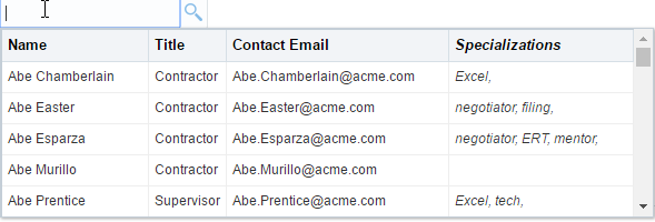
The following example shows the sample code for tabular display with contentHeader, followed by the sample template as shown in Figure 13-13.
<af:inputSearch contentMode="table" ... >
...
<f:facet name="contentHeader">
<af:sanitized >
<th>Name</th>
<th>Title</th>
<th>Contact Email</th>
<th><span style="font-style: italic;">Specializations</span></th>
</af:sanitized>
</f:facet>
<f:facet name="contentStamp">
<af:sanitized >
<td>{{fName}} {{lName}}</td>
<td>{{jobTitle}}</td>
<td>{{email}}</td>
<td><span style="font-style: italic;">{{tags}}</span></td>
</af:sanitized>
</f:facet>
</af:inputSearch>Figure 13-13 Sample Tabular Display with Header Row
Description of "Figure 13-13 Sample Tabular Display with Header Row"
The following example shows the sample code for list display, followed by the sample template as shown in Figure 13-14.
<af:inputSearch ... >
...
<f:facet name="contentStamp">
<af:sanitized >
<span style="font-size:1.2em">{{fName}} {{lName}}</span>
<span style="font-size:0.9em; padding-left: 8px">{{jobTitle}}</span>
<br/>
<b>Tags: </b><span style="font-style: italic;">{{tags}}</span>
</af:sanitized>
</f:facet>
</af:inputSearch>
The following example shows the sample code for advanced list template, followed by the sample template as shown in Figure 13-15.
<af:inputSearch ... >
...
<f:facet name="contentStamp">
<af:sanitized>
<div style="height: 68px; line-height: 18px; white-space: nowrap">
<div style="padding: 0px; margin: 0px; width: 64px; display: inline-block;">
<img src="../../images/people/{{profileKey}}" height="56" width="56"
style="vertical-align: bottom; border: 2px solid #B8AE07; padding: 2px; border-radius: 10px;"/>
</div>
<div style="padding-left: 10px; display: inline-block;">
<div style="color: #4646D0;font-size: medium;">{{fName}} {{lName}}</div>
<div>{{jobTitle}}</div>
<div style="font-size: smaller;font-style: italic;">{{email}}</div>
</div>
</div>
</af:sanitized>
</f:facet>
</af:inputSearch>
How to Add Custom Buttons to Suggestions Popup
The inputSearch component includes a facet toolbar that renders a section in the suggestions panel, which you can use to place custom controls such as tool bar items of your choice. Figure 13-16 displays the suggestion panel.
Figure 13-16 Suggestions Panel Displaying the Toolbar Facet
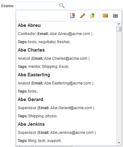
The following example shows the sample code for including the toolbar facet.
<af:searchSection type="default" dataUrl="#{inputSearchDemo.dataUrl}" partialTriggers="ctb3" />
<f:facet name="toolbar">
<af:toolbar id="pgl14">
<af:group id="g1">
<af:commandToolbarButton shortDesc="Create" icon="/images/new_ena.png" id="ctb1">
<af:showPopupBehavior popupId="createpopup"/>
</af:commandToolbarButton>
<af:commandToolbarButton icon="/images/update_ena.png" shortDesc="Update the searchSection URL on client" id="ctb2">
<af:clientListener type="action" method="updateSuggestionCount" />
</af:commandToolbarButton>
<af:commandToolbarButton icon="/images/uplevel.gif" actionListener="#{inputSearchDemo.updateDataUrl}"
shortDesc="Update the searchSection URL on server" id="ctb3"/>
</af:group>
<af:group id="g2">
<af:commandToolbarButton shortDesc="E-mail" icon="/images/email.gif" id="ctb4"/>
<af:commandToolbarButton shortDesc="Snapshot" icon="/images/snapshot.gif" id="ctb5"/>
</af:group>
</af:toolbar>
</f:facet>
What You May Need to Know About SuggestionSection Component
The suggestionSection component creates and manages the most recently used (MRU) suggestion lists based on the frequency and recentness of the suggestions used. The preferred list of suggestion items is stored in the browser’s storage object. The suggestionSection component manages a list of preferred suggestions and gets displayed based on the various factors on the client:
-
The parent
inputSearchcomponent retrieves the list managed by thesuggestionSectionand displays the list in the UI. -
The
inputSearchcomponent might not display the preferred suggestion list managed byaf:suggestionSection, if the master list is small. -
The length of the master list is determined the first time the suggestion popup is launched. Therefore, if you launch the suggestion popup without much suggestions the first time, the
inputSearchwill still display the preferred suggestion list even if the length of the suggestion list is small. -
The list managed by the
suggestionSectioncomponent is a subset of the suggestions retrieved via the REST service.
The following example shows the suggestionSection tag within theinputSearch component:
<af:inputSearch label="Label"
	valueAttribute="id" ...>
  	<af:searchSection type="default" dataUrl="/rest/employees" />
 		<af:suggestionsSection />
</af:inputSearch>
How to Set Attributes of Suggestion Section
By default, af:suggestionsSection based list is shared across inputSearch components which are based on same REST URL. You can use the following attributes in the suggestionSection to customize the sharing and display of suggestion list.
-
cacheKeyGeneratorUse this attribute to keep the suggestion list as private per component or to remove the cache search parameter from the URL to be used as localStorage key. Setting this attribute manages a list of suggestions completely on the client.<af:inputSearch ...> ... <af:suggestionsSection cacheKeyGenerator="ignoreCacheAttr"/"privateList" /> </af:inputSearch>
-
displayCountUse this attribute to customize the number of items that are to be displayed in the preferred list.<af:inputSearch ...> ... <af:suggestionsSection displayCount="15" /> </af:inputSearch>
-
dontCacheUse this attribute to not to store the specified fields in the browser’s localStorage for the REST data.<af:inputSearch ...> ... <af:suggestionsSection dontCache="lName jobTitle" /> </af:inputSearch>
In this code sample, thelNameandjobTitleattributes from the suggestion items retrieved from the REST call will not be stored in the localStorage.
See What You May Need to Know About suggestionSection Attributes for other attributes that you can use with suggestionSection tag.
You can further customize the suggestion list by including a header facet. The suggestionSection supports only header facet that allows the child components within af:sanitized. The following example shows the sample code for the header facet that includes Recent Items as header in the suggestion list.
<af:inputSearch id="iSearch4"
label="Select a person from the list (Filter by name and job title): "
valueAttribute="id"
displayAttributes="fName lName"
filterAttributes="fName lName jobTitle"
selectionConverter="#{inputSearchDemo.selectionConverter}">
<af:searchSection type="default" dataUrl="/rest/employees?cache=etag&limit=5000" />
<af:suggestionsSection>
<f:facet name="header">
<af:sanitized>
<b>Recent Items</b> <!-- The "Recent Items" text in the screenshot below is because of this line -->
</af:sanitized>
</f:facet>
</af:suggestionsSection>
</af:inputSearch>
Figure 13-17 shows the output for the above code.
Figure 13-17 Output of the header Facet in suggestionSection
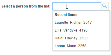
Description of "Figure 13-17 Output of the header Facet in suggestionSection"
What You May Need to Know About suggestionSection Attributes
Table 13-4 lists the attributes that you can use in the af:suggestionSection.
Table 13-4 Attributes Used with suggestionSection
| Attribute Name | Type | Supports EL? | Description |
|---|---|---|---|
|
attributeChangeListener |
javax.el.MethodExpression |
Only EL |
A method reference to an attribute change listener. Attribute change events are not delivered for any programmatic change to a property. They are only delivered when a renderer changes a property without the application's specific request. An example of an attribute change events might include the width of a column that supported client-side resizing. |
|
binding |
oracle.adf.view.rich.component. rich.data.RichSuggestionsSection |
Only EL |
An EL reference that will store the component instance on a bean. This can be used to give programmatic access to a component from a backing bean, or to move creation of the component to a backing bean. |
| cacheKeyGenerator | String | Yes | The attribute holds the name of a JS function. The return value of this function will be used as the key for client storage. The normalized URL of the default searchSection is passed as a parameter to the function, and the function's "this" keyword refers to the parent inputSearch component instance. Sample JS method: function privateList(normalizedUrl)
{ // "this" refers to parent inputSearch component return this.getClientId(); } |
| display count | int | Yes | Maximum number of suggestions to be displayed in the UI. The default value is 5. |
|
dontCache |
java.util.set |
Yes |
A set of attribute names, whose values from the row data should not be cached on the client. |
|
id |
String |
No |
The identifier for the component. Every component may be named by a component identifier that must conform to the following rules: They must start with a letter (as defined by the Character.isLetter() method) or underscore (_). Subsequent characters must be letters (as defined by the Character.isLetter() method), digits as defined by the Character.isDigit() method, dashes (-), or underscores (_). To minimize the size of responses generated by Java Server Faces, it is recommended that component identifiers be as short as possible. If a component has been given an identifier, it must be unique in the namespace of the closest ancestor to that component that is a NamingContainer (if any). |
|
rendered |
Boolean |
Yes |
The value is set to True, by default. This attribute specifies if the component is rendered or not. When set to false, no output will be delivered for this component (the component will not in any way be rendered, and cannot be made visible on the client). If you want to change a component's rendered attribute from false to true using partial page rendering, set the partialTrigger attribute of its parent component so the parent refreshes and in turn will render this component. |
How to Specify Dependency-Based Filtering on InputSearch Components
When you use filterAttributes in the inputSearch component the REST response data is filtered and the values are displayed in the suggestions popup. The inputSearch component further supports dependency-based filtering on clientside. To further filter the suggestion list on the clientside, you can use the filter attribute that holds the name of the JavaScript callback that would perform Array.filter operation on the collection returned from the REST response. The component instance will be set as context during JavaScript callback invocation.
The row object passed to the callback will have the structure below:
-
data: The raw row data -
index: The index for the row -
key: The key value for the row
The following example shows the sample code snippet for dependency based filtering that lists the Employee suggestion list based on the Department value, followed by the sample template as shown in Figure 13-18.
<af:inputSearch label="Employee" filter="filterEmpForDept" ...>
<af:searchSection type="default" dataUrl="/rest/employees" />
</af:inputSearch>
Sample JS:
var filterValue;
var filterKey = "deptName";
function filterEmpForDept(rowObj, collectionIndex)
{
// var component = this;
if (collectionIndex == 0)
{
// get the filterValue once for the zeroth row
// and use the same for subsequent row filtering
var parentComp = AdfPage.PAGE.findComponent
('parent component id whose value will determine the suggestions to be displayed in inputSearch')
var parentCompValue = parentComp.getValue();
filterValue = parentCompValue ? parentComp.getSelectItems()[parentComp.getValue()].getLabel() : null;
}
if (filterValue && rowObj.data[filterKey] == filterValue)
return true;
return false;
}Figure 13-18 shows different Employee suggestion list based on the Department value.
Figure 13-18 Dependency-Based Filtering in inputSearch Component
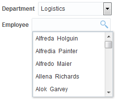
Description of "Figure 13-18 Dependency-Based Filtering in inputSearch Component"
