24 Using Picto Chart Components
This chapter describes how to use the ADF Data Visualization Picto Chart component to display data in picto charts using simple UI-first development. The chapter defines the data requirements, tag structure, and options for customizing the look and behavior of these components.
If your application uses the Fusion technology stack, you can use data controls to create picto charts. For more information, see "Creating Databound Picto Charts" in Developing Fusion Web Applications with Oracle Application Development Framework.
About the Picto Chart Component
The ADF DVT Picto Chart components use icons to visualize an absolute number, or the relative sizes of the different parts of a population. Picto Charts are extensively used in infographics as a more interesting and effective way to present numerical information than traditional tables and lists.
Picto Charts are intended to be used in the default flowing layout. This makes the tool versatile since it can be easily used to visually enhance or support information in text or other ADF Data Visualization components. For example, the different slices of a funnel chart can be represented in absolute numbers as different parts of a population in a picto chart.
Picto Chart Use Cases and Examples
Picto Charts are a versatile tool that can be used along with other components to display data in a visually appealing manner. There are several use cases.
Picto charts can be used to enhance statements about absolute numbers and act as a visual aid. Figure 24-1 shows picto charts reflecting the absolute value mentioned in the accompanying statements.
Figure 24-1 Picto Charts with Absolute Values
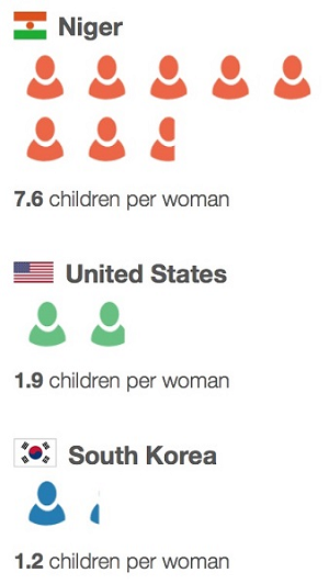
Description of "Figure 24-1 Picto Charts with Absolute Values"
Picto Charts can be used to highlight a portion of a population as a comparison. This works best when the ratio is small. Figure 24-2 shows a single picto chart configured to highlight three out of twenty human figures to illustrate the point made in the accompanying statement.
Figure 24-2 Simple Picto Chart to illustrate a Part of a Population

Description of "Figure 24-2 Simple Picto Chart to illustrate a Part of a Population"
Another use case of picto charts is to create a comparison between parts of a population by highlighting the distribution of parts. For example, Figure 24-3 shows three picto charts together in the default flow layout, each configured to show the number of medals won by the USA at the 2012 Summer Olympics. The three picto charts have been configured to correlate the size of the circle with the rank of the medal.
Figure 24-3 Picto Chart with varying sizes of items
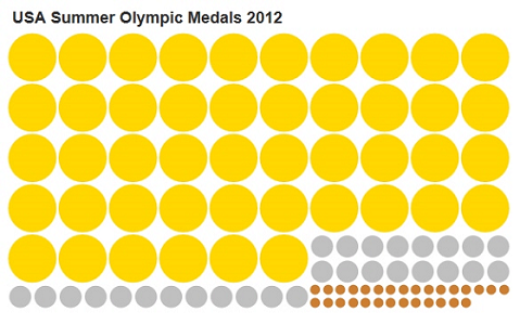
Description of "Figure 24-3 Picto Chart with varying sizes of items"
Picto charts may also be used a set of singletons in order to display unique information for each data point. Figure 24-4 shows a collection of picto charts to represent USA’s medal count in the 2014 Winter Olympics. Thecount attribute for each picto chart is set to 1 and the tooltip for each picto chart is configured to show the name of the athlete who won that medal.
Figure 24-4 A collection of Singleton Picto Charts with Unique Information
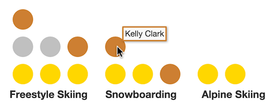
Description of "Figure 24-4 A collection of Singleton Picto Charts with Unique Information"
Multiple picto charts can be arranged within a table to highlight business data. Figure 24-5 shows a table with sales figures of Apple products in the years 2011 and 2012. Each square represents 10 million units.
Figure 24-5 Picto Charts arranged within Table

Description of "Figure 24-5 Picto Charts arranged within Table"
End User and Presentation Features of Picto Charts
Picto Charts have several end user and configurable presentation features.
Picto Charts support custom shapes via the source attribute.Figure 24-6 shows a sample picto chart for a survey on preferred iconic character of choice. Three custom shapes have been provided to indicate the survey options and results.
Figure 24-6 Picto Chart with Custom Shapes
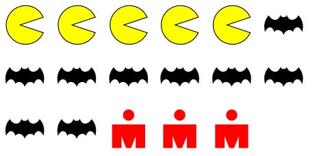
Description of "Figure 24-6 Picto Chart with Custom Shapes"
Picto Charts have flowing layouts, which means that data items are rendered next to each other in the direction provided, given that the container does not have a set width and height.
Picto Chart data items can be rendered in different combinations of directions. Picto charts may be laid out in a horizontal flow or a vertical flow depending on the value of the layout attribute, and the data items can be rendered from any of the four corners of the container. Figure 24-7 shows how data items are laid out in a horizontal layout depending on the value of the layoutOrigin attribute.
Figure 24-7 Layout Origin for Picto Chart Data Items in a Horizontal Layout

Description of "Figure 24-7 Layout Origin for Picto Chart Data Items in a Horizontal Layout"
Figure 24-8 shows how data items are laid out in a vertical layout depending on the value of the layoutOrigin attribute.
Figure 24-8 Layout Origin for Picto Chart Data Items in a Vertical Layout
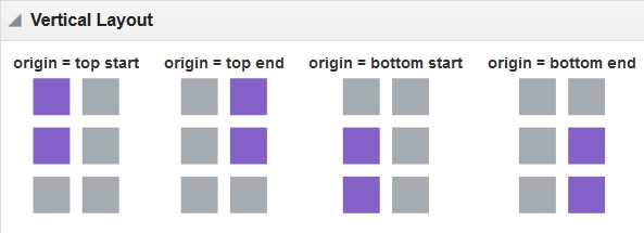
Description of "Figure 24-8 Layout Origin for Picto Chart Data Items in a Vertical Layout"
Additional Functionality for Picto Chart Components
You may find it helpful to understand other ADF Faces features before you implement your picto chart. Additionally, once you have added a picto chart to your page, you may find that you need to add functionality such as validation and accessibility.
Following are links to other functionality that picto chart components can use:
-
Client-side framework: DVT components are rendered on the client when the browser supports it. You can respond to events on the client using the
af:clientListenertag. For more information, see Listening for Client Events. -
Partial page rendering: You may want a picto chart to refresh to show new data based on an action taken on another component on the page. For more information, see Rerendering Partial Page Content.
-
Personalization: When enabled, users can change the way the picto chart displays at runtime, those values will not be retained once the user leaves the page unless you configure your application to allow user customization. For information, see Allowing User Customization on JSF Pages.
-
Accessibility: You can make your picto chart components accessible. For more information, see Developing Accessible ADF Faces Pages.
-
Touch devices: When you know that your ADF Faces application will be run on touch devices, the best practice is to create pages specific for that device. For additional information, see Creating Web Applications for Touch Devices Using ADF Faces.
-
Skins and styles: You can customize the appearance of picto chart components using an ADF skin that you apply to the application or by applying CSS style properties directly using a style-related property (
styleClassorinlineStyle). For more information, see Customizing the Appearance Using Styles and Skins. -
Automatic data binding: If your application uses the Fusion technology stack, then you can create automatically bound picto charts based on how your ADF Business Components are configured. For more information, see Creating Databound Picto Charts in Developing Fusion Web Applications with Oracle Application Development Framework.
Note:
If you know the UI components on your page will eventually use ADF data binding, but you need to develop the pages before the data controls are ready, then you should consider using placeholder data controls, rather than manually binding the components. Using placeholder data controls will provide the same declarative development experience as using developed data controls. For more information, see the "Designing a Page Using Placeholder Data Controls" section in Developing Fusion Web Applications with Oracle Application Development Framework.
Additionally, data visualization components share much of the same functionality, such as how data is delivered, automatic partial page rendering (PPR), and how data can be displayed and edited. For more information, see Common Functionality in Data Visualization Components.
Using the Picto Chart Component
To use the ADF DVT Picto Chart component, add the picto chart to a page using the Component Palette window. Then define the data for the picto chart and complete the additional configuration in JDeveloper using the tag attributes in the Properties window.
Picto Chart Data Requirements
The picto chart in its most basic form only requires a single numeric value.
The picto chart uses the value specified in the count attribute to display an absolute representation of the number. To represent a portion of a population, two pictoChartItem can be used, with two count attributes specified to represent the active portion and inactive portion of the population. Similarly, to represent multiple parts of a population, additional pictoChartItem may be used and styled to show each part in a unique manner.
Data of type int, long or double may be used, since picto charts support fractional values. Data may be provided as an absolute entity or mapped to a data control.
How to Add a Picto Chart to a Page
When you are designing your page using simple UI-first development, you use the Components window to add a picto chart to a JSF page. When you drag and drop a picto chart component onto the page, the picto chart is added to your page, and you can use the Properties window to specify data values and configure additional display attributes.
In the Properties window you can click the icon that appears when you hover over the property field to display a property description or edit options. The figure shows the dropdown menu for a picto chart value attribute.
Figure 24-9 Picto Chart Value Attribute Dropdown Menu
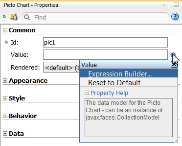
Description of "Figure 24-9 Picto Chart Value Attribute Dropdown Menu"
Note:
If your application uses the Fusion technology stack, then you can use data controls to create a Picto Chart and the binding will be done for you. For more information, see the "Creating Databound Picto Charts" section in Developing Fusion Web Applications with Oracle Application Development Framework.
Before you begin:
It may be helpful to have an understanding of how picto chart attributes and picto chart child tags can affect functionality. For more information, see Configuring Picto Charts.
You may also find it helpful to understand functionality that can be added using other ADF Faces features. For more information, see Additional Functionality for Picto Chart Components.
You must complete the following tasks:
-
Create an application workspace as described in Creating an Application Workspace.
-
Create a view page as described in Creating a View Page.
- In the ADF Data Visualization page of the Components window, drag and drop a Picto Chart from the Common panel to the page.
- In the Properties window, view the attributes for the Picto Chart. Use the Help button or press F1 to display the complete tag documentation for the
pictoChartcomponent. - In the Structure window, expand the dvt:pictoChart element to find the dvt:pictoChartItem element. View and modify the attributes for the dvt:pictoChartItem in the Properties window.
- To create complex picto charts, right-click the dvt:pictoChart element and for each part of the population you wish to add, choose Insert Inside Picto Chart > Picto Chart Item.
What Happens When You Add a Picto Chart to a Page
JDeveloper generates only a minimal set of tags when you drag and drop a picto chart from the Components window onto a JSF page.
The generated code is:
<dvt:pictoChart id="pic1">
	<dvt:pictoChartItem id="pi1"/>
</dvt:pictoChart>
After inserting a picto chart component into the page, you can use the visual editor or Properties window to add data or customize picto chart features. For information about setting component attributes, see How to Set Component Attributes.
If you choose to bind the data to a data control when creating the picto chart, JDeveloper generates code based on the data model. For more information, see the Creating Databound Picto Charts section in Developing Fusion Web Applications with Oracle Application Development Framework.
Configuring Picto Charts
The Picto Chart component has configurable attributes and child components that you can add or modify to customize the display or behavior of the picto chart.
The prefix dvt: occurs at the beginning of the name of each picto chart component, indicating that the component belongs to the ADF Data Visualization Tools (DVT) tag library. You can configure Picto Chart child components, attributes, and supported facets in the following areas:
-
Picto Chart (
dvt:pictoChart): Wraps the picto chart child tags. Configure the following attributes to control the picto chart display:-
layoutRowCount: The number of rows that the picto chart has. -
layoutColumnCount: The number of columns that the picto chart has. -
layout: The layout of the picto chart. May be horizontal or vertical. -
layoutOrigin: The location where the firstpictoChartItemwill be rendered. -
rowHeight: The height of a row in pixels. Only applicable to picto charts using a flowing layout. -
columnWidth: The width of a row in pixels. Only applicable to picto charts using a flowing layout.
-
-
Picto Chart data item (
dvt:pictoChartItem): Use to define the properties for a portion of the represented population. Configure the following attributes to control the picto chart item display:Table 24-1 Picto Chart Child Component Attributes
Child Tag Attribute Description borderColorThe border color of the icon. Does not apply if custom image is specified.
borderWidthThe border width of the icon. Does not apply if custom image is specified.
colorThe color of the icon. Does not apply if custom image is specified.
columnSpanThe number of columns each icon spans. Used for creating a picto chart with mixed icon sizes. Defaults to 1.
countThe item count. Supports fractional values. Defaults to 1.
nameThe name of the item. Used for default tooltip and accessibility.
rowSpanThe number of rows each icon spans. Used for creating a picto chart with mixed icon sizes. Defaults to 1.
shapeThe shape of the icon. Does not apply if custom image is specified. Supported values are
circle,diamond,human,plus,rectangle,square,star,triangleUpandtriangleDown.sourceThe image URI of the custom icon. If specified, it takes precedence over shape.
sourceHoverThe optional URI for the hover state. if not specified, the source image will be used.
sourceHoverSelectedThe optional URI for the hover selected state. if not specified, the source image will be used.
sourceSelectedThe optional URI for the selected state. if not specified, the source image will be used.
-
Picto Chart facets: Picto charts do not support facets.