Create Announcement
Note:
Oracle WebCenter Portal has deprecated the support for Jive features (announcements and discussions). If you have upgraded from a prior release to Release 12c (12.2.1.4.0), Jive features remain available in your upgraded instance but Oracle support is not provided for these features. In the next release, Jive features will not be available even in the upgraded instances
The Create Announcement dialog enables you to create portal-wide announcements.
This dialog provides a Rich Text Editor for content entry and styling as well as controls for specifying when to make an announcement active and inactive (expired).
| Element | Description |
|---|---|
|
Subject |
Enter the subject of the announcement, up to 200 characters. The subject you enter here becomes the announcement headline (in bold). |
|
Announcement Active Date |
Select when the announcement should be published to the portal:
|
|
Announcement Expire Date |
Select when the announcement should be deleted:
You can also remove an announcement manually by clicking its associated Delete icon. |
|
Create |
Click to create the announcement and close the dialog. |
Rich Text Editor Controls
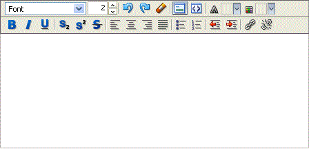
The Rich Text Editor (RTE) provides controls for creating, styling, and editing HTML text.

In addition to the tools that integrate with the Rich Text Editor (RTE), the RTE is available as a standalone HTML editor, which you can add to a page. Look for the Text layout component in the resource catalog.
Within the RTE, if there are tags or styles that are not editable in a particular browser they are transformed into something that the specific browser can edit. Also, the RTE ignores the following types of tags for security reasons or because they are irrelevant or redundant within the RTE context:
-
Script tags
-
Form elements, such as input, select, textarea, and form
-
Frame/frameset
-
Document tags, such as html, head, body, meta, and title
-
Unknown tags, for example, <foo></foo>
The following table illustrates and describes the controls in the RTE.
| Element | Description |
|---|---|
|
|
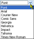
Select a font and begin entering text, or highlight text and select a font. |
|
|
Click the top arrow to select a larger font size. Click the bottom arrow to select a smaller font size. If you prefer, enter a font size manually in the field provided. |
|
|
Click to undo your last editorial action during this session. The key combination Ctrl-z produces the same effect. |
|
|
Click to redo your last undo during this session. The key combination Ctrl-y produces the same effect. |
|
|
Select styled text and click this icon to clear the selection's styling information. This is useful for removing unwanted style effects, such as unwanted bolding, superscripting, underlining, and the like. |
|
|
Click to toggle to Rich Text Editing Mode. In this mode, you can use the style controls at the top of the editor to design your HTML's look and feel. |
|
|
Click to toggle to the Source Code Editing Mode. In this mode, you can enter all of your own HTML manually. This mode assumes you will enter all HTML code manually; therefore, most style controls at the top of the text box are not available in Source Code Editing Mode. |
|
|
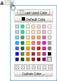
Select a text color from this list and enter text, or highlight text and select a color from the list. |
|
|
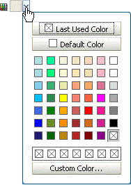
Select text and then select a highlight color, or select a highlight color and begin entering text. Text displays highlighted by a band of the selected color. |
|
|
Click to apply bold font to selected or entered text. |
|
|
Click to apply italic font to selected or entered text. |
|
|
Click to underline selected or entered text. |
|
|
Click to subscript selected or entered text. |
|
|
Click to superscript selected or entered text. |
|
|
Click to strike through selected or entered text. |
|
|
Click to left justify selected or entered text. |
|
|
Click to center selected or entered text. |
|
|
Click to right justify selected or entered text. |
|
|
Click to justify selected or entered text to align at both left and right margins. |
|
|
Click to bullet selected or entered text. |
|
|
Click to number selected or entered text. |
|
|
Click this icon to reduce horizontal margins in selected or entered text. |
|
|
Click this icon to increase horizontal margins in selected or entered text.. |
|
|
Click to create a link on selected text. |
|
|
Click to remove the link on selected text. The selected text remains intact, but the underlying link code is removed. |
|
Text Box |
Enter text content. |
|
Ctrl-x |
Use this key combination to delete highlighted selections. You can also use the keyboard Backspace and Delete keys. |


