Review the Website Pages
The Café Supremo marketing website application has three pages, HOME, MENU, and BLOG.
HOME Page
The home page displays marketing campaigns such as advertisements and promotions.
The items available on the website are advertised with details and links on the home page. At the top, there is a promotion with a more button which, when clicked, opens a page describing the item. Below the promotion, there are three advertisements with shop now buttons. At the end of the home page, the latest blog is displayed and it opens the corresponding blog details page when clicked.
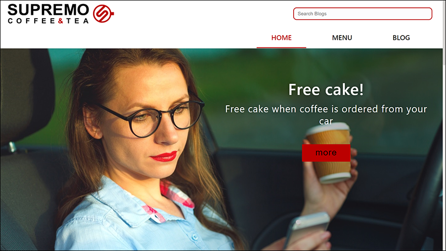
Description of the illustration home_page.png
Let’s walk through the home page to understand how the Oracle Content Management components from the component exchange are used in the Cafe-Supremo application in Oracle Visual Builder.
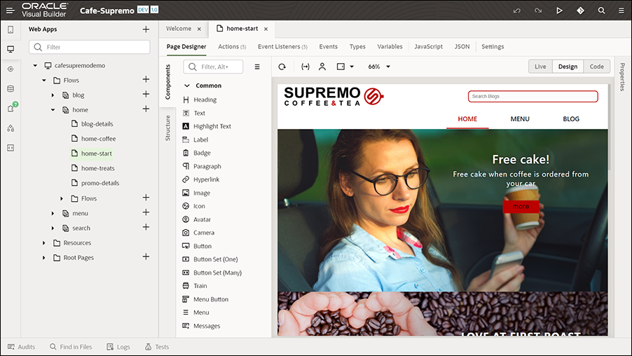
Description of the illustration home-start_page.png
The Content List components with appropriate settings are used to display the content on the home page.
For example, let’s see the configuration of the Content List component used at the top of the page.
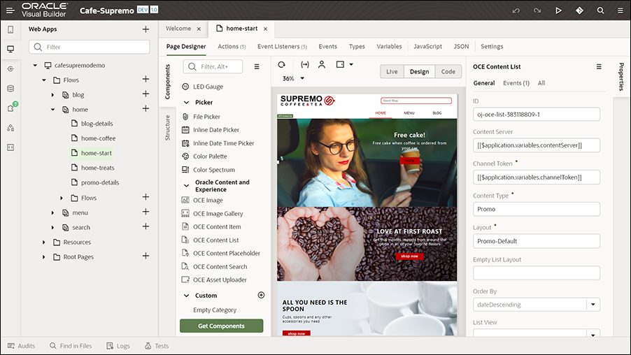
Description of the illustration home_page_component.png
The following key settings are specified in this component’s Properties pane to display the promotion at the top.
- ID - The unique API ID of the asset.
- Content Server - Default value
- Channel Token - Default value
- Content Type - Promo
- Layout - Promo-Default
- Maximum Items - 1
- Start at item - 1
The Promo content type is used in this component. The number of items to display is limited to one. The more button is configured to point to the corresponding details page. An event handler is set up to configure this more button in order to open the corresponding promo-details page. In the component’s properties, on the Events tab, the event settings are configured to define an event and an action chain (a sequence of actions) that specifies what happens when the specified event occurs, that is, what happens when an item is clicked on the page (such as the more button). Event listeners are defined for this page on the Event Listeners tab to listen to events and start the action chains defined on the Actions tab.
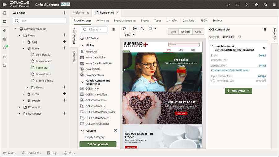
Description of the illustration component_event.png
On the Actions tab, actions associated with the events defined on the Events tab for a content list item are defined, along with action chains. The actions are part of an action chain. For example, on the Actions tab, when you click the first action defined for the first content list, you can view its configuration. In the Diagram section, when you click Navigate promo-details (which is a navigation action), you’ll see that the Target field in the properties pane is set to promo-details, so that it navigates to the details page when a user clicks the more button on the promotion.
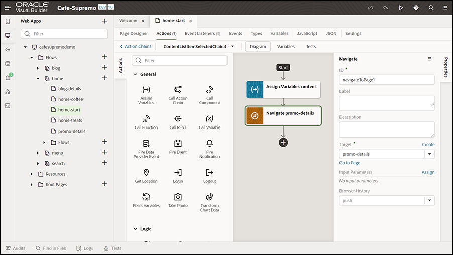
Description of the illustration actions_tab.png
The promo-details page has a Content Placeholder component configured to dynamically display content items. So, when a user clicks the more button, the Content Placeholder component on the promo-details page automatically loads the details of the associated content item.
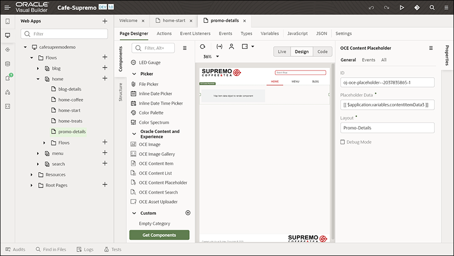
Description of the illustration promo_details.png
Similarly, we have a blog-detail page that is used to display the corresponding blog article when a user clicks the blog displayed at the end of the home page.
These Oracle Content Management components can be dragged from the component exchange and dropped onto the website application pages, and then configured with appropriate settings based on your needs.
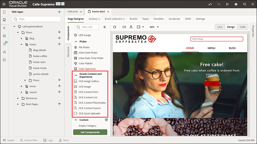
Description of the illustration component_exchange.png
For example, to understand how you could add a content item to the home page, see the Customize section of this solution playbook.
Similarly, two more Content List components are used to display the advertisements and blog below the promotion.
Based on their settings, these components dynamically fetch the content from the repository you created earlier in Oracle Content Management, and then display that content on the home page.
MENU Page
The MENU page lists all the menu items in a catalog.
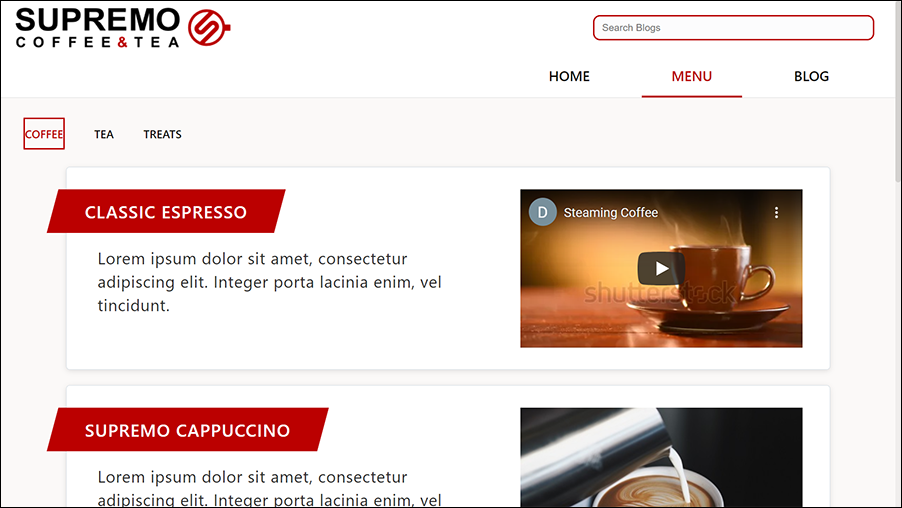
Description of the illustration menu_page.png
This page displays three tabs, COFFEE, TEA, and TREATS. Each of these tabs display different varieties of items available under that category. For example, under the COFFEE tab, varieties such as CLASSIC ESPRESSO, SUPREMO CAPPUCCINO, COLD PRESS COFFEE, and BLACK SUPREMO display with information about each variety. Some of the items also have videos. Below these tabs, the different Café Supremo combos display with details including images describing the items available in each of the combos.
On the menu page, some of the key components used are Tab Bar and Content List. These components have been used with appropriate settings to display the content on the menu page. The Content List component is from the component exchange.
For example, let’s see the configuration of one of the Content List components used at the top of the page.
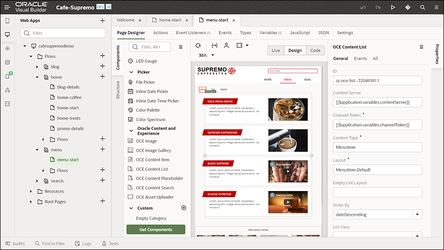
Description of the illustration menu_page_component.png
The following key settings are specified in this component’s Properties pane to display the content items (menu items).
- ID - The unique API ID of the asset.
- Content Server - Default value
- Channel Token - Default value
- Content Type - MenuItem
- Layout - MenuItem-Default
- Maximum Items - 10
- Start at item – 1
- Additional Query String - fields.menuitem_category eq "COFFEE"
The MenuItem content type is used in this component. The number of items to display is limited to ten. For the first tab (COFFEE tab), the Additional Query String field is set to fields.menuitem_category eq "COFFEE". Similarly, it is set for the other tabs too. The Additional Query String field is used to specify additional query parameters to further refine the list of menu items displayed.
Similarly, another Content List component is used with the appropriate settings to display the combo menu items available in Café Supremo.
The components from the component exchange enable these pages to have rich content by dynamically fetching content from the repository in Oracle Content Management and displaying them in the application in Oracle Visual Builder.
BLOG Page
The BLOG page is used to display blog articles of different categories.
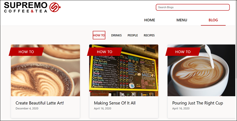
Description of the illustration blog_page.png
This page has four tabs for the different blog categories such as HOW TO, DRINKS, PEOPLE, and RECIPES. Each tab displays the blog items available for that specific category with details such as an image, blog title, and date published. When a user clicks on a blog item, the blog article page opens in the same window.
Components such as Tab Bar and Content List with appropriate settings are used to display the content on the blog page. The Content List component is from the component exchange.
The Tab Bar component is configured with appropriate settings to display the four categories as tabs on the blog page. The following key settings are specified in this component’s Properties pane to display the four blog categories as tabs.
- ID - The unique API ID of the asset.
- Selection - The key of the selected item is specified.
- Tabs - The tab information for the four categories is specified and the first tab is set as the default tab.
- Edge - Top
The properties of the variable needed for these tabs are set on the Variables tab.
Let’s see the configuration of the Content List component. The following key settings are specified in this component’s Properties pane to display the blog items.
- ID - The unique API ID of the asset.
- Content Server - Default value
- Channel Token - Default value
- Content Type - Blog
- Layout - Blog-Default
- List View - threeColumns
- Maximum Items - 10
- Start at item – 1
- Additional Query String - fields.blog_category eq "HOW TO"
The Blog content type is used in this component. The number of items to display is limited to ten. For the first tab (HOW TO tab), the Additional Query String field is set to fields.menuitem_category eq "HOW TO". Similarly, it is set for the other tabs too. An event handler is set up to define the actions and events associated with the content list items to specify what happens when a user clicks a blog item. In the component’s properties, on the Events tab, the event settings are configured to define an event and an action chain that specifies what happens when the specified event occurs, that is, what happens when an item is clicked on the page. Event listeners are defined for this page on the Event Listeners tab to listen to events and start the action chains defined on the Actions tab.
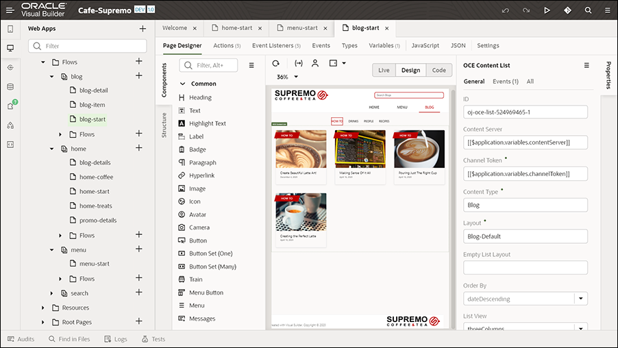
Description of the illustration blog-start_page.png
On the Actions tab, actions associated with the events defined on the Events tab for a content list item are defined, along with action chains. The actions are part of an action chain (a sequence of actions). For example, on the Actions tab, when you click the first action, you can view its configuration. In the Diagram section, when you click Navigate blog-detail (which is a navigation action), you’ll see that the Target field in the properties pane is set to blog-detail, so that it navigates to the corresponding blog article page (blog details) when a user clicks a blog item on the blog page.
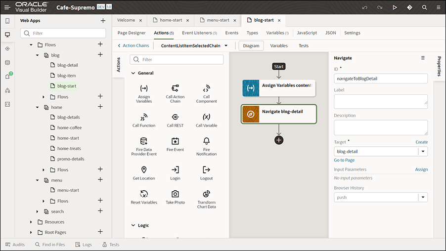
Description of the illustration target_setting.png
The blog-details page has a Content Placeholder component configured to dynamically display content items. So, when a user clicks a blog item, the Content Placeholder component on the blog-details page automatically loads the details of the associated content item.
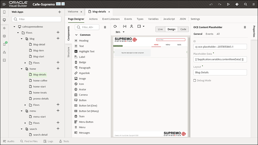
Description of the illustration blog-details_page.png
Once the website application has been published, when new blog articles (Blog content items) are added and published (in the Oracle Content Management web interface), these blog articles are dynamically pulled into the website application's blog page (in Oracle Visual Builder) and made available immediately to the users.