Understand the Website Application Elements
The Café Supremo marketing website has elements such as brand logo, menu bar, and search bar.
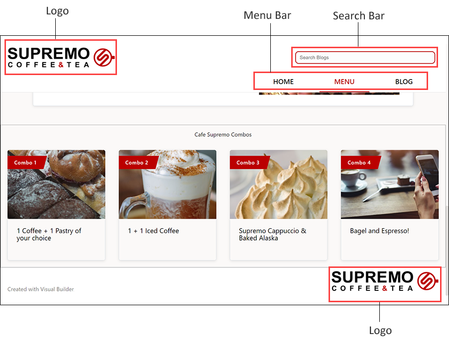
Description of the illustration site_elements.png
Brand Logo in Website Pages
In the Café Supremo marketing website application, the brand logo appears in the upper left and lower right corners of the pages.
Images are used for the brand logo in the Café Supremo marketing website application. The latest version of the image Cafe-Supremo-Header-Logo is used for the logo in the upper left corner of the website. The latest version of the image Cafe-Supremo-Footer-Logo is used for the logo in the lower right corner of the website. You can replace these images with your brand logo.
The API ID of the image is used to surface the image using an image component in Oracle Visual Builder.
- In the Oracle Content Management web interface, navigate to the Assets page and select the CafeSupremo repository.
- Select one of the logo images and open its properties.
- In the Properties pane, the ID value is available on the API tab.
Navigation in Café Supremo Marketing Website Application
In the Café Supremo marketing website application, navigation is achieved using the menu bar that appears in the upper right corner of the website pages.
The menu bar has menu options such as HOME, MENU, and BLOG.
Search Bar
The Café Supremo marketing website application has a search toolbar in the upper right corner that lets customers search the blogs in this website using keywords.
Users need to enter text in the search bar and then press the Enter key to search. The search results display blogs that match the keyword. When the user clicks any of the search results, that specific blog article opens in the same window.
In Oracle Visual Builder, navigate to the search-start page. This is the page that is used to display the list of search results (blog items) when a user performs a search using the search bar. A Content List component from the component exchange is used on this page for this purpose. The following key settings are specified in this component’s Properties pane to display the search results.
General tab:
- ID - The unique API ID of the asset.
- Content Server - Default value
- Channel Token - Default value
- Content Type - Blog
- Layout - Blog-Default
- List View - threeColumns
- Maximum Items - 10
- Start at item - 1
- Search Observable - This property is automatically set to the application-level variable to communicate with a content search component and execute search functionality within the content list.
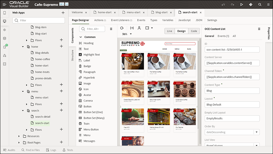
Description of the illustration search-start_page.png
The Blog content type is used in this component. The number of items to display is limited to ten. An event handler is set up to define the actions and events associated with the content list items to specify what happens when a user clicks a blog item. In the component’s properties, on the Events tab, the event settings are configured to define an event and an action chain that specifies what happens when the specified event occurs, that is, what happens when an item is clicked on the page. Event listeners are defined for this page on the Event Listeners tab to listen to events and start the action chains defined on the Actions tab.
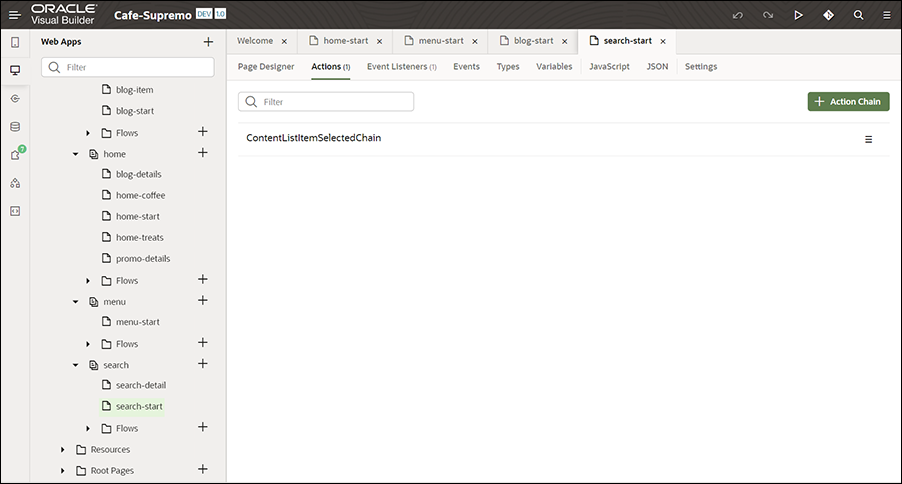
Description of the illustration search-start_actions.png
On the Actions tab of the search-start page, an action associated with the event is defined, along with an action chain (which determines the sequence of actions). The action is part of the action chain. On the Actions tab, when you click the action, you can view its configuration. In the Diagram section, when you click Navigate search-detail (which is a navigation action), you’ll see that the Target field in the properties pane is set to search-detail, so that it navigates to the corresponding blog article page (details) in the application when a user clicks a blog item from the list of search results.
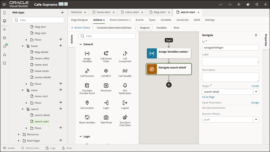
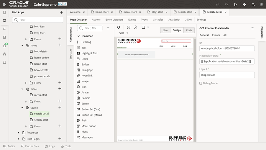
Description of the illustration search_detail_setting.png
The search-detail page has a Content Placeholder component configured to dynamically display content items. So, when a user clicks a blog item from the search results, the Content Placeholder component on the search-detail page automatically loads the details of the associated content item.
