1 OHF Dashboards
The following are the OHF Dashboards and pages. You can customize or extend the dashboards and reports based on your downstream application use cases:
| Dashboard | Pages |
|---|---|
|
Allows you to browse derived measures, such as: HCAHPS, HIQR/HQQR, PQRS, or CQM. |
|
|
Create, save, or retrieve queries for a cohort of patients by: demographics, diagnosis, procedure, drug, DRG, service line, etc. |
|
The reports in these dashboards work for the Hospital enterprise. You can filter some reports by organization.
Value Based Care Dashboard
The Value Based Care Dashboard contains the following pages:
Member Analysis
The Member Analysis page displays analytics based on the Member Month Eligibility and Medical Claim subject areas.
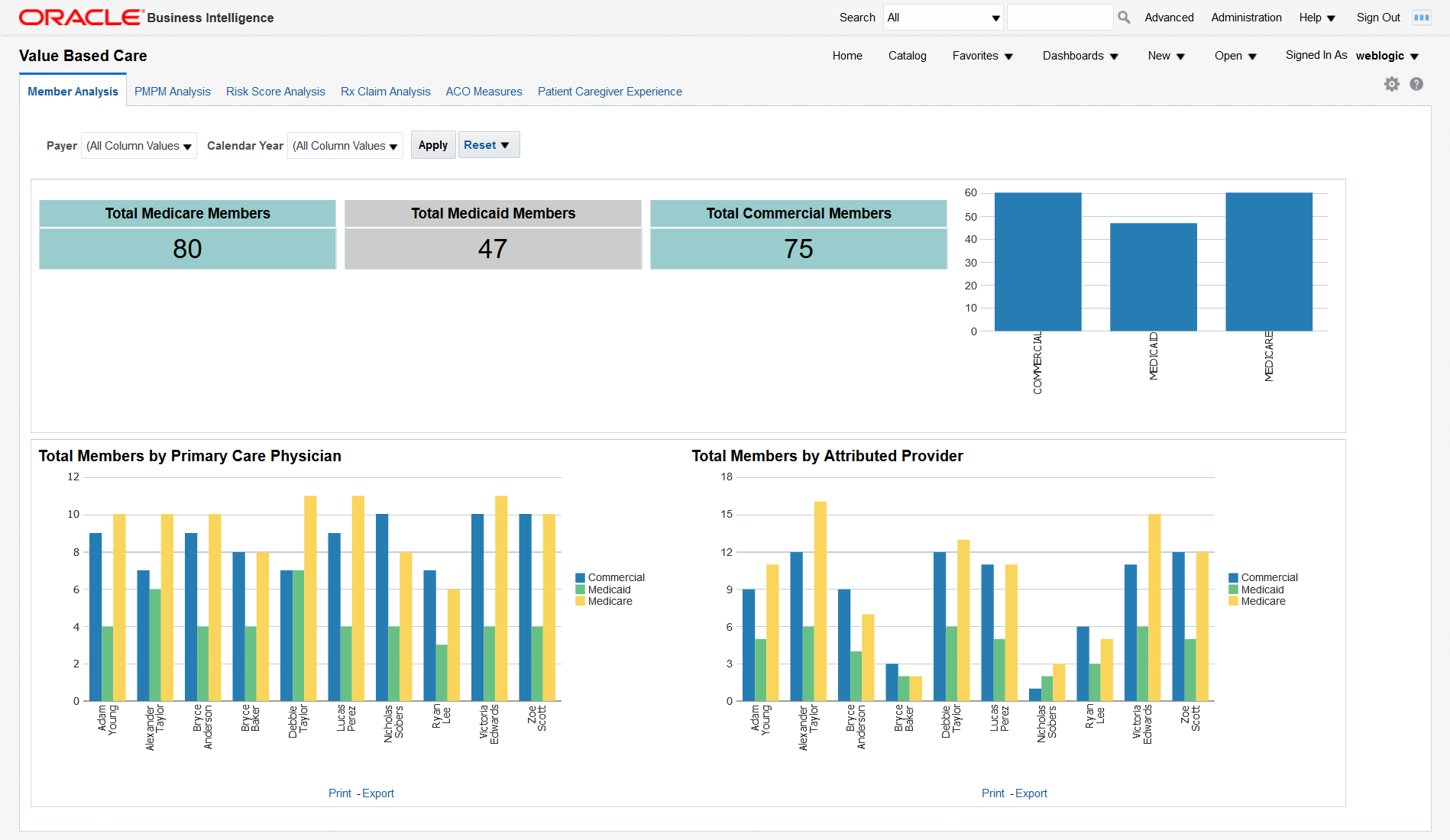
You can use the filters at the top of the page to focus on specific payers and calendar years. This page has the following reports:
-
Total medicare, medicaid, and commercial members. This report shows the organization's exposure to different insurers based on the number of patients they cover. Click on the bars in the graph to display details about all the members covered by each insurer.
-
Total Members by Primary Care Physician. This report shows each primary care physician's exposure to different insurers based on the number of patients they cover. Click on the bars in the graph to display details about all the members covered by each insurer for every primary care physician.
-
Total Members by Attributed Provider. This report shows each attributed provider's exposure to different insurers based on the number of patients they cover. Click on the bars in the graph to display details about all the members covered by each insurer for every attributed provider.
PMPM Analysis
The PMPM Analysis page displays analytics based on the Member Month Eligibility, Medical Claim, and Rx Claim subject areas.
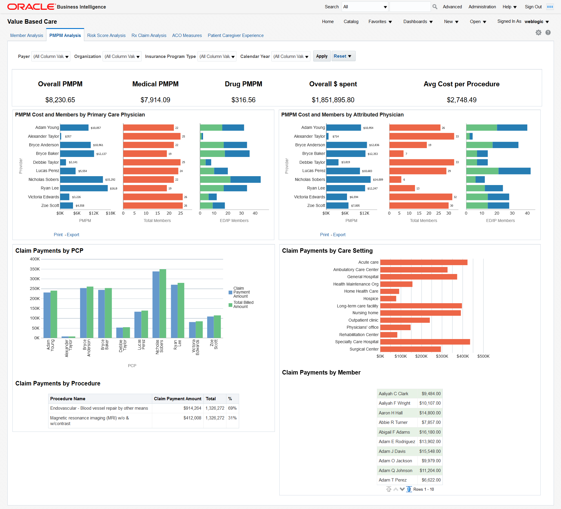
You can use the filters at the top of the page to focus on specific payers, organizations, insurance program types, and calendar years. This page has the following reports:
-
PMPM overall, medical and drug cost in dollars, overall dollars spent, and average cost per procedure. This report allows you to see the average monthly costs per member and their distribution between medical and drug PMPM costs. It also allows you to evaluate your total costs and the cost of a typical procedure.
-
PMPM Cost and Members by Attributed Physician. This report helps you understand the PMPM costs that attributed physicians generate through the average monthly cost per member and the total number of members assigned. The distribution between emergency and inpatient members also helps you understand the associated costs.
Click any bar in the PMPM graph do display a detailed breakdown of all the amounts for each attributed physician.
-
High Cost Members by Primary Care Physician. This report helps you understand the costs that primary care physicians generate through the average monthly cost per member and the total number of members assigned. The distribution between emergency and inpatient members also helps to understand the associated costs.
Click any bar in the PMPM graph do display a detailed breakdown of all the amounts for each primary care physician.
-
Claim Payments by PCP - Graphical representation of the claimed payment amounts and billed amounts by primary care physician. This report allows you to compare the overall payments claimed by primary care physicians and to check how they are covered by the billed amounts.
-
Claim Payments by Procedure - A tabular report of the claim payments for each procedure compared to the total amount. The percentage helps you identify the procedures that generate the largest claims.
-
Claim Payments by Care Setting - Graphical representation of the claim payment amounts for each case setting. This report helps you visualize the care settings that generate the largest claims.
-
Claim Payments by Member - A tabular report that lists all members and their claim payments. This report allows you to drill down to the payments claimed for each member.
Risk Score Analysis
The Risk Score Analysis page displays analytics based on the Member Risk Score subject area.
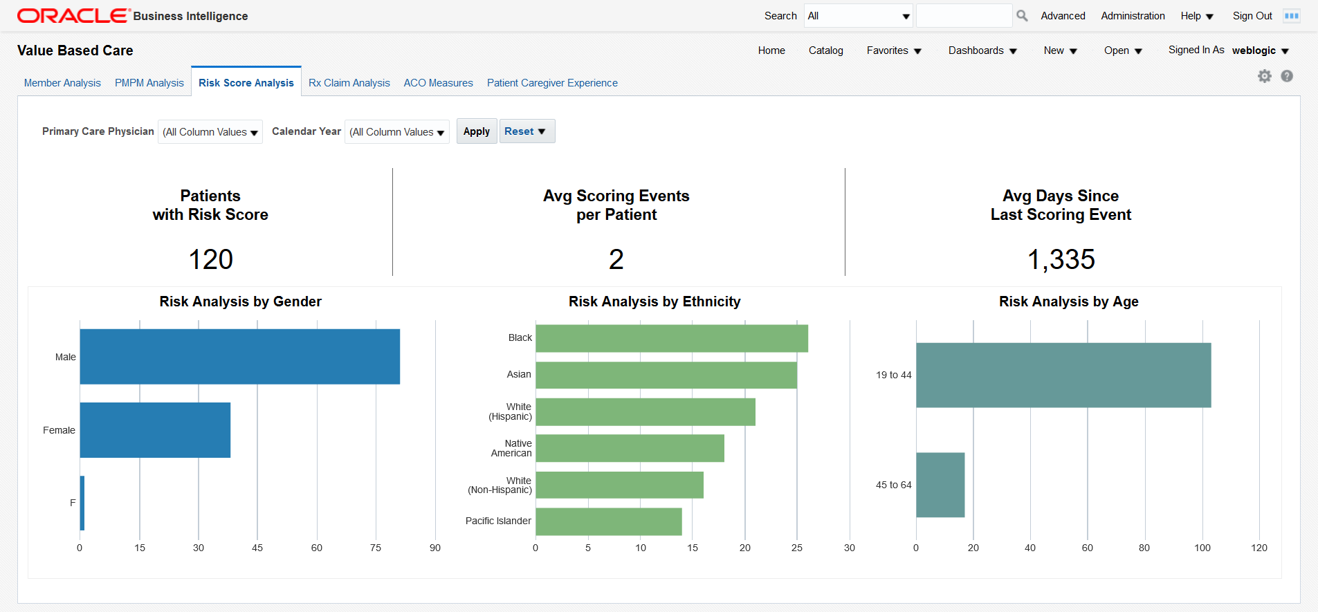
You can use the filters at the top of the page to focus on specific primary care physicians and calendar years. This page has the following reports:
-
Total number of patients with risk score, average scoring events per patient and average days since last scoring event. This report helps you understand the scoring activity volume based on the number of patients it is performed on, the number of scoring events per patient, and their frequency.
-
Risk analysis by gender, ethnicity, and age. Correlate this report with the total numbers of patients in each category to understand which genders, ethnic groups, and age bands are more exposed to risks.
Rx Claim Analysis
The Rx Claim Analysis page displays analytics based on the Prescription Claim subject area.
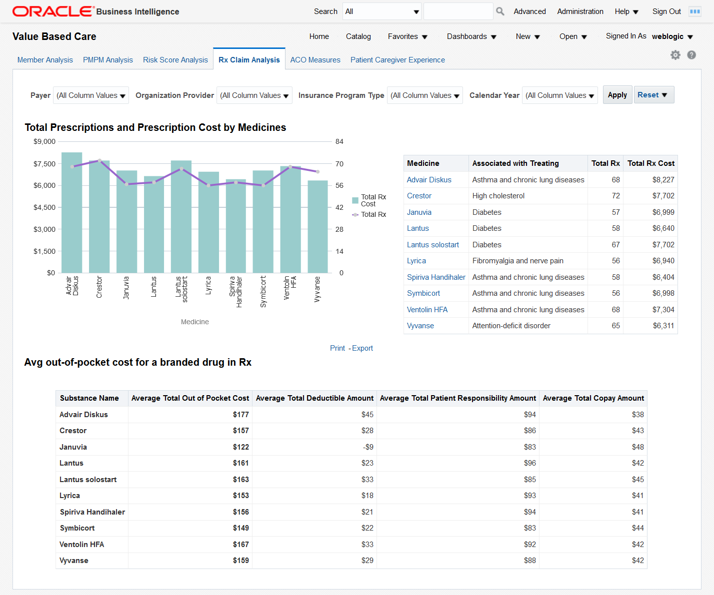
You can use the filters at the top of the page to focus on specific payers, organization providers, insurance program types, and calendar years. This page has the following reports:
-
Total Prescriptions and Prescription Cost by Medicines - This report helps you understand how often different medicines are prescribed and the costs that these prescriptions generate.
Click on a bar or on a medicine name to display detailed prescription information for all the members who have been prescribed the medicine. There are 2 levels of drill down. Clicking further on the member number shows another detailed report for each member with Bill details.
-
Avg out-of-pocket cost for a branded drug in Rx - Shows the average out of pocket cost that patients pay for a given set of medicines along with the breakdown of that cost by deductible, patient responsibility, and copay amounts.
ACO Measures
The ACO Measures page uses quality measurements based on the Accountable Care Organization (ACO) standards. You can customize this page to be used for any quality measure.
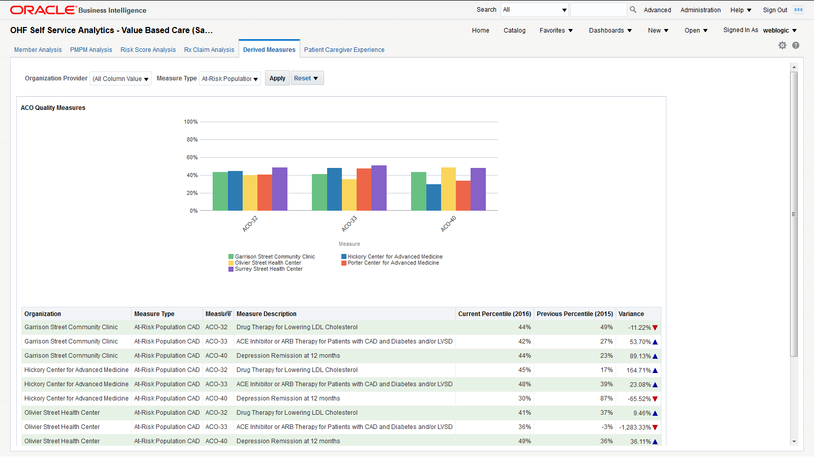
You can use the filters at the top of the page to focus on specific organization providers and measure types. This page has the following report:
-
ACO Quality Measures - Graphical representation of the percentile rating for the selected organization providers for specific measure types. This report allows you to understand how organization providers compare to each other on different measures. The detailed tabular report below the chart also includes the percentile variance from the previous year to the current year, providing insight into the progress of an organization over different ACO quality measures.
Note:
The derived measure model supports drill-down to a patient, member, individual and organization service provider, encounter, internal organization, medical claim, and Rx claim from the quality measure results.Patient Caregiver Experience
The Patient Caregiver Experience page centralizes responses from patient surveys.
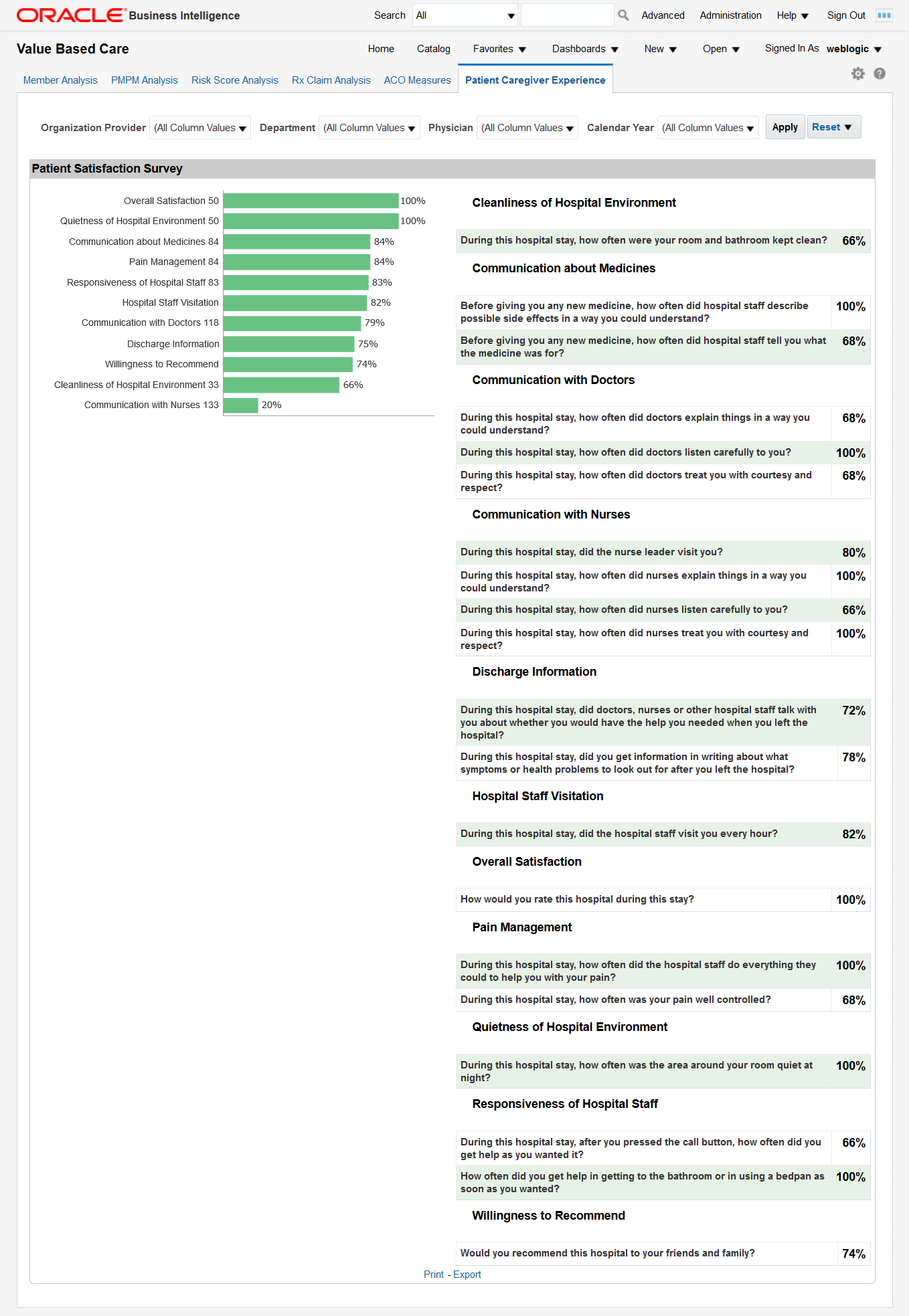
You can use the filters at the top of the page to focus on specific organization providers, departments, physicians, and calendar years. This page has the following report:
-
Patient Satisfaction Survey - Shows the survey response results rolled up to the categories, such as cleanliness of hospital environment, communication about medicines, and communication with doctors and nurses. Click on a graph bar to display the detailed answers for that survey category.
On the right side, the survey displays the performance score for each area. For example, "During the hospital stay, how often doctors explained in a way that the patient could understand?" has a score of 80%, which means 80% of patients agreed that the doctors explained clearly. Click on a percentage number to display the detailed answers for that survey question.
Derived Measures Dashboard
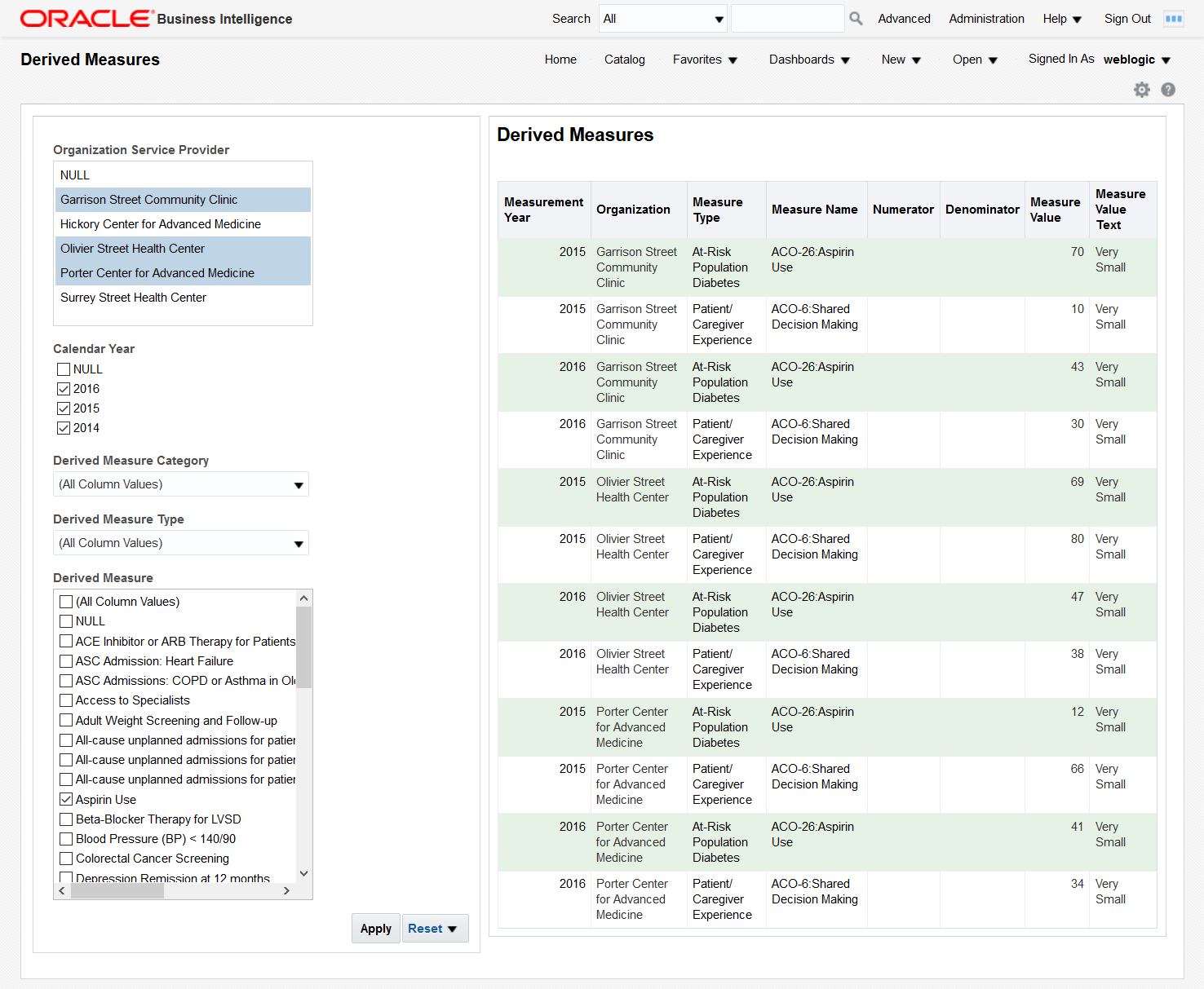
The Derived Measures dashboard allows you to browse derived measures, such as: HCAHPS, HIQR/HQQR, PQRS, or CQM. Use the panel on the left to select your filtering criteria and click Apply to display the results in the table on the right. Also see ACO Measures for measure comparisons between organizations and progress tracking.
Patient Browser Dashboard
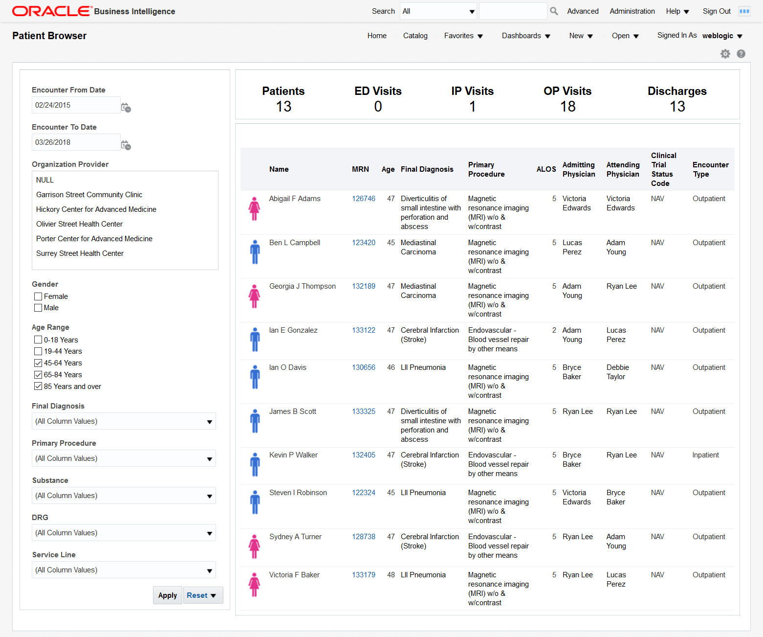
The Patient Browser allows you to create, save, or retrieve queries for a cohort of patients by: demographics, diagnosis, procedure, drug, DRG, service line, etc. Use the panel on the left to select your filtering criteria and click Apply to display the results in the table on the right. A summary count for your results is displayed at the top of the page for the number of patients, visits, and discharges.
Click on an MRN to display that patient's billing information.
Clinical Dashboard
The Clinical dashboard contains the following pages:
Summary
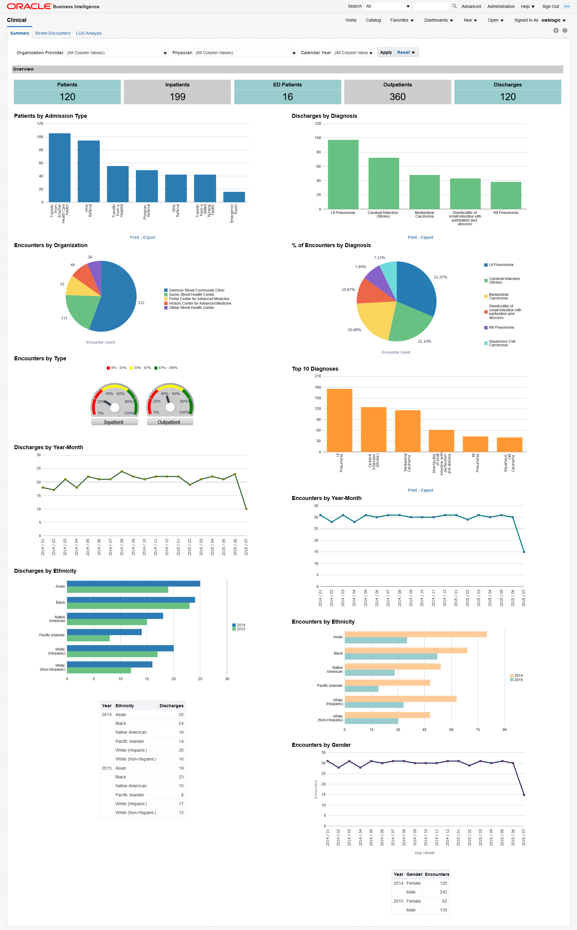
You can use the filters at the top of the page to focus on preferred organization providers, physicians, or calendar years. The page has the following reports:
-
Overview - An overview of counts in a hospital enterprise including the number of patients, discharges, emergency department patients, inpatients, and outpatients. This helps you to compare the inflow and outflow of patients, and to allocate resources based on the distribution of patient care efforts between emergency, ambulatory and inpatient services.
Click on a number to display a detailed list of all the patients in that category. From there, you can click the patients' MRNs to further drill down their billing details.
-
Patients by Admission Type. This report allows you to see the inflow of patients that go through different admission types (referral, transfer, emergency, etc.) and to adjust your admission operations accordingly.
Click on a bar to display a detailed list of all the patients in that category. From there, you can click the patients' MRNs to further drill down their billing details.
-
Discharges by Diagnosis - Modify this report to show the number of discharges for a specific diagnosis of interest. You can correlate this report with the Top 10 Diagnoses report and see if they are proportional. If the number of discharges for a specific diagnosis is trailing, it may indicate a long-term tendency for cases with that specific diagnosis to accumulate in the organization. You may want to investigate such situations and address them.
Click on a bar to display a detailed list of all the patients with that diagnosis. From there, you can click the patients' MRNs to further drill down their billing details.
-
Encounters by Organization. This report allows you to see the workload distribution between your organizations and plan your staffing, budgeting, and resource allocations accordingly.
-
% of Encounters by Diagnosis - Modify this report to show the % of encounters for a specific diagnosis of interest. You can use this report to estimate the mix of specialists that you need, based on the workloads that the various types of treatments require.
-
Encounters by Type - The balance between the inpatient and outpatient services you provide may help your organization adjust its focus either on clinics or hospitals.
-
Top 10 Diagnosis - Modify this report to show the number of encounters for a specific diagnosis of interest. You can use this report to see which treatments that you provide are the most labor intensive.
Click on a bar to display a detailed list of all the patients with that diagnosis. From there, you can click the patients' MRNs to further drill down their billing details.
-
Discharges by Year-Month - You can correlate this report with the number of encounters by year-end and see if there are any seasonal slow-downs in treatment delivery.
-
Encounters by Year-Month - You can use this report to see the long-term trends and seasonal spikes in workload.
-
Discharges by Ethnicity - Shows a comparative analysis of number of discharges over two years by ethnicity. Modify this report to show the number of discharges for specific years of interest. You can correlate this report with the number of encounters by ethnicity to see if there is a systematic tendency to discharge members of certain ethnic groups after fewer investigations than the baseline.
-
Encounters by Ethnicity - Shows a comparative analysis of the number of encounters over two years by ethnicity. Modify this report to show the number of encounters for specific years of interest. You can correlate this report with the number of discharges by ethnicity to see if there is a systematic tendency to discharge members of certain ethnic groups after fewer investigations than the baseline.
-
Encounters by Gender - Shows the workload distribution between male and female patients. You can use this report to plan gender-specific healthcare measures.
Stroke Encounters
The Stroke Encounters page shows a holistic view of the number of encounters in a Healthcare organization for different dimensions such as diagnosis, procedure, and time. It uses the Stroke diagnosis and Endovascular procedure subject areas. You can modify the page to use any diagnosis and procedures based on your use case.
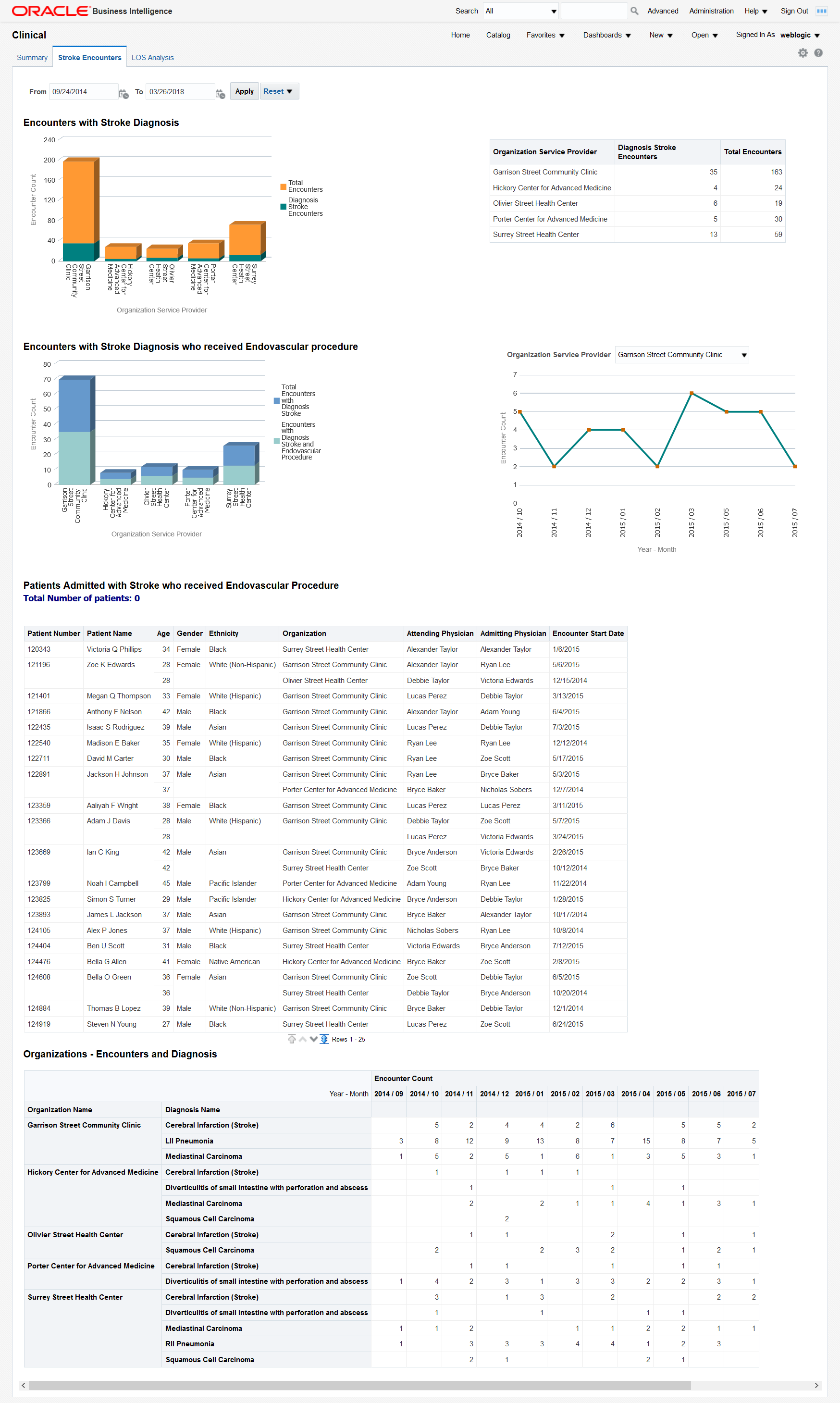
You can use the filters at the top of the page to focus on specific time periods. This page has the following reports:
-
Encounters with Stroke Diagnosis - Shows the total number of encounters with stroke diagnosis in an organization against the total number of encounters. This lets you compare and contrast the volume of encounters in your organizations for a specific diagnosis.
-
Encounters with Stroke Diagnosis who received Endovascular procedure - Shows the number of encounters with stroke diagnosis and the patients who received endovascular procedure treatment. This lets you evaluate the frequency of endovascular procedures performed on patients who suffered a stroke.
The chart on the right displays the evolution of the number of encounters for a selected organization during the analyzed time period. This report lets you see long-term trends and seasonal spikes for endovascular procedures performed on patients who suffered a stroke.
-
Patients Admitted with Stroke who received Endovascular Procedure - Tabular report showing the list of patients with Stroke diagnosis who have received endovascular procedure for the chosen time period. This report allows you to drill down to the specifics of each encounter attended by individual patients.
-
Organizations - Encounters and Diagnosis - Tabular report showing monthly encounters for each diagnosis per organization.
LOS Analysis
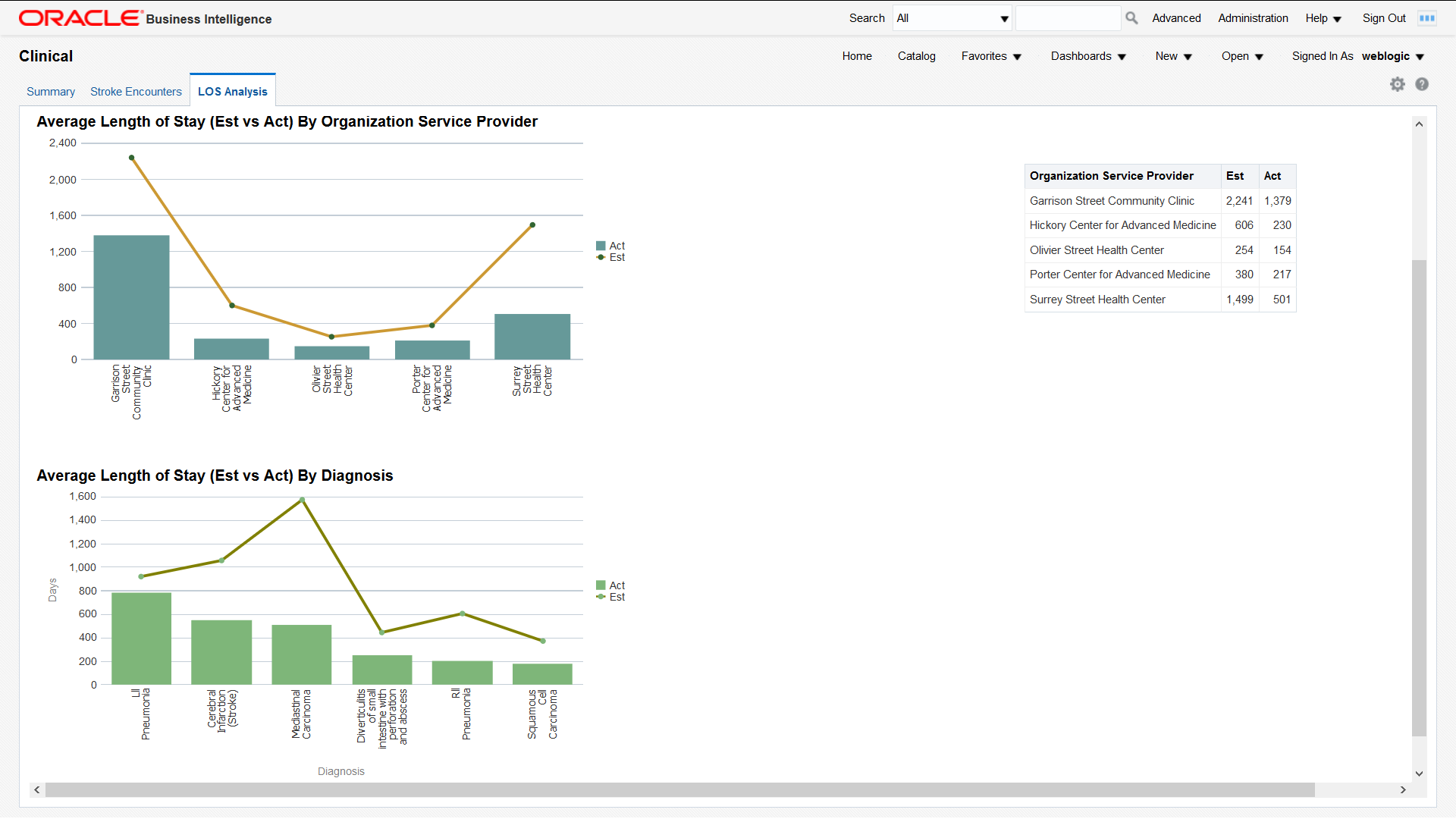
The Length of Stay (LOS) Analysis page has the following reports:
-
Average Length of Stay (Est vs Act) By Time - Comparative analysis report that shows the average estimated LOS and average actual LOS over a period of time filtered by organization service provider. You can use this report to analyze and address issues with your LOS forecasting methodology for an organization service provider.
-
Average Length of Stay (Est vs Act) By Organization Service Provider - Comparative analysis report that shows the estimated LOS and actual LOS by organization service provider. This report provides insight into the LOS forecasting gaps from each organization service provider.
-
Average Length of Stay (Est vs Act) By Diagnosis - Comparative analysis report that shows the average estimated LOS and average actual LOS by diagnosis. You can use this report to analyze and address any issues with your LOS forecasting methodology for individual diagnoses.
Financial Dashboard
The Financial dashboard contains the following pages:
Reimbursement Analysis
The Reimbursement Analysis page covers the reimbursement amounts for the patient accounts.
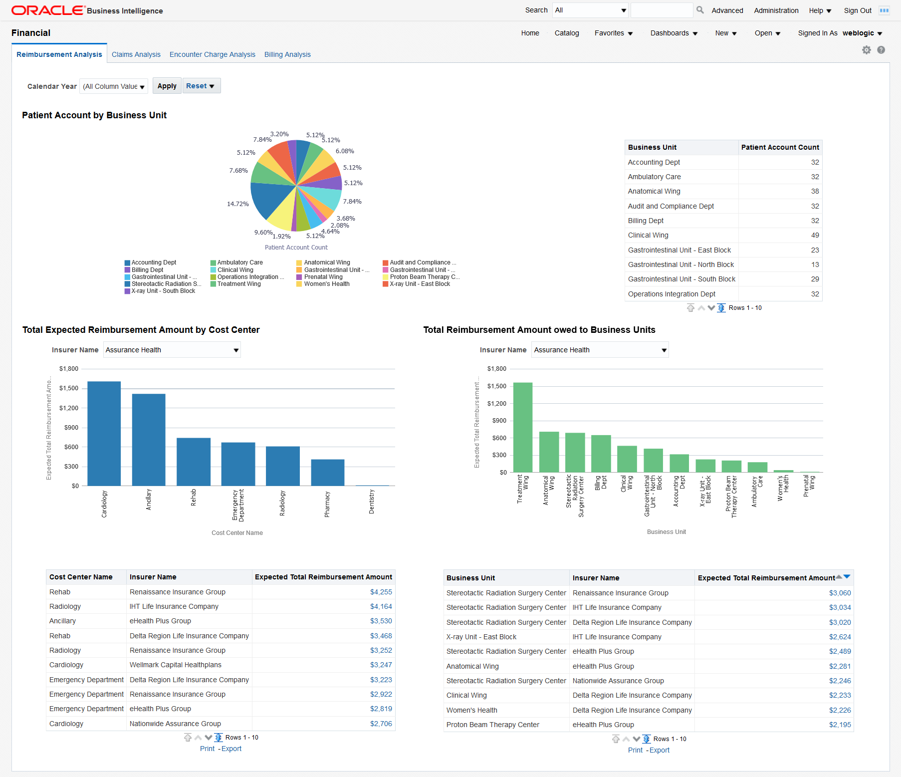
You can use the filter at the top of the page to focus on specific calendar years. This page has the following reports:
-
Patient Account by Business Unit. This report helps you understand the distribution of patient accounts across business units and it helps in resource planning to manage patient accounts effectively.
-
Total Expected Reimbursement Amount by Cost Center, filtered by insurer - This report indicates the degree to which each insurer impacts the income of different cost centers. Click on a bar in the graph to display details about all the patients insured by the selected insurer for that cost center.
A tabular report below the graph lists the expected total reimbursement amounts for all the cost centers and insurers. Click on an amount to display details about all the patients insured by the selected insurer for that cost center.
-
Total Reimbursement Amount owed to Business Units, filtered by insurer - This report indicates the degree to which each insurer impacts the income of different business units. Click on a bar in the graph to display details about all the patients insured by the selected insurer for that business unit.
A tabular report below the graph lists the expected total reimbursement amounts for all the business units and insurers. Click on an amount to display details about all the patients insured by the selected insurer for that business unit.
-
A tabular report with patient, patient account, and reimbursement amount details. This report allows you to track the details of all the reimbursements that apply to each patient.
Claims Analysis
The Claims Analysis page uses the Claim Submission subject area.
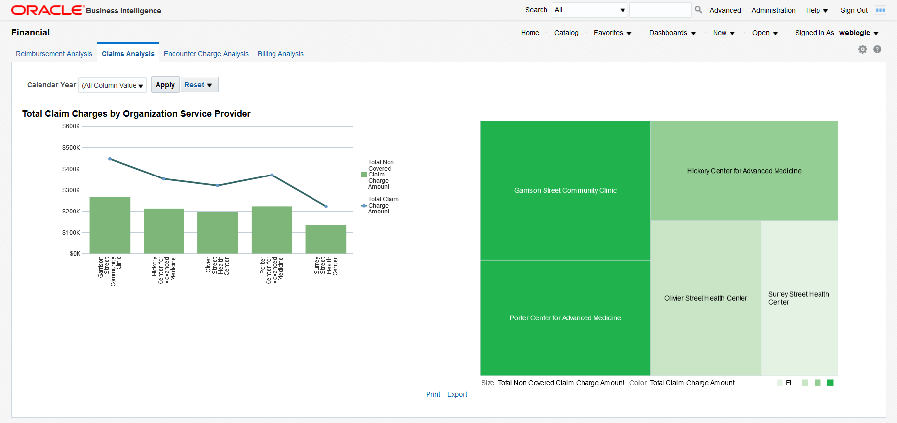
You can use the filter at the top of the page to focus on specific calendar years. This page has the following report:
-
Total Claim Charges by Organization Service Provider - This report allows you to see the extent to which the charges claimed by each organization service provider are covered by insurers and to evaluate the risk of overdue or delinquent payments. The treemap chart on the right allows you to understand the exposure to the various service providers based on their relative sizes.
Click on a bar in the graph to display a detailed list of all the claims for that organization. From there, you can click on an MRN to display all the billing details for a patient or you can click on a claim number to display additional details for that claim.
Encounter Charge Analysis
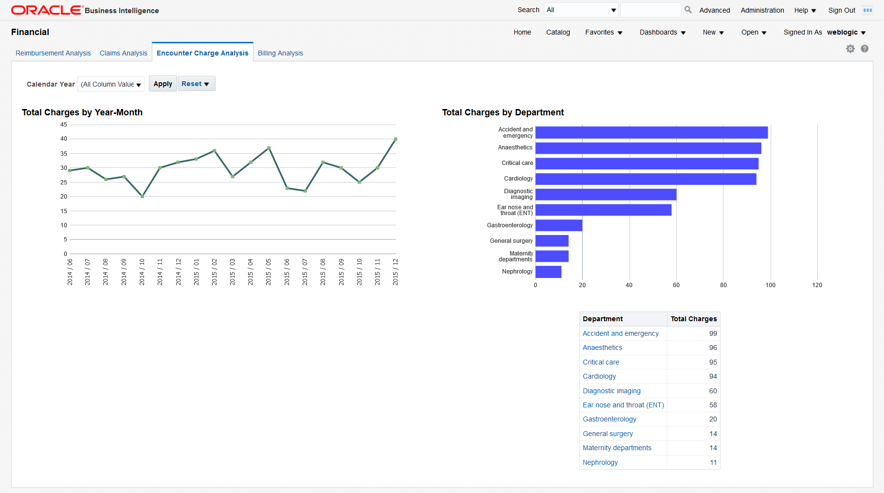
You can use the filter at the top of the page to focus on specific calendar years. This page has the following reports:
-
Total Charges by Year-Month - This report helps you understand the trend in organization spending for patient services over a chosen period of time.
-
Total Charges by Department - This report helps you understand the charging distribution between departments.
Click on a bar in the graph or on a department name in the table to display a detailed list of all the patient charges for that department.
Billing Analysis
The Billing Analysis page displays comparative billing information for your organizations and detailed bills for individual patients.
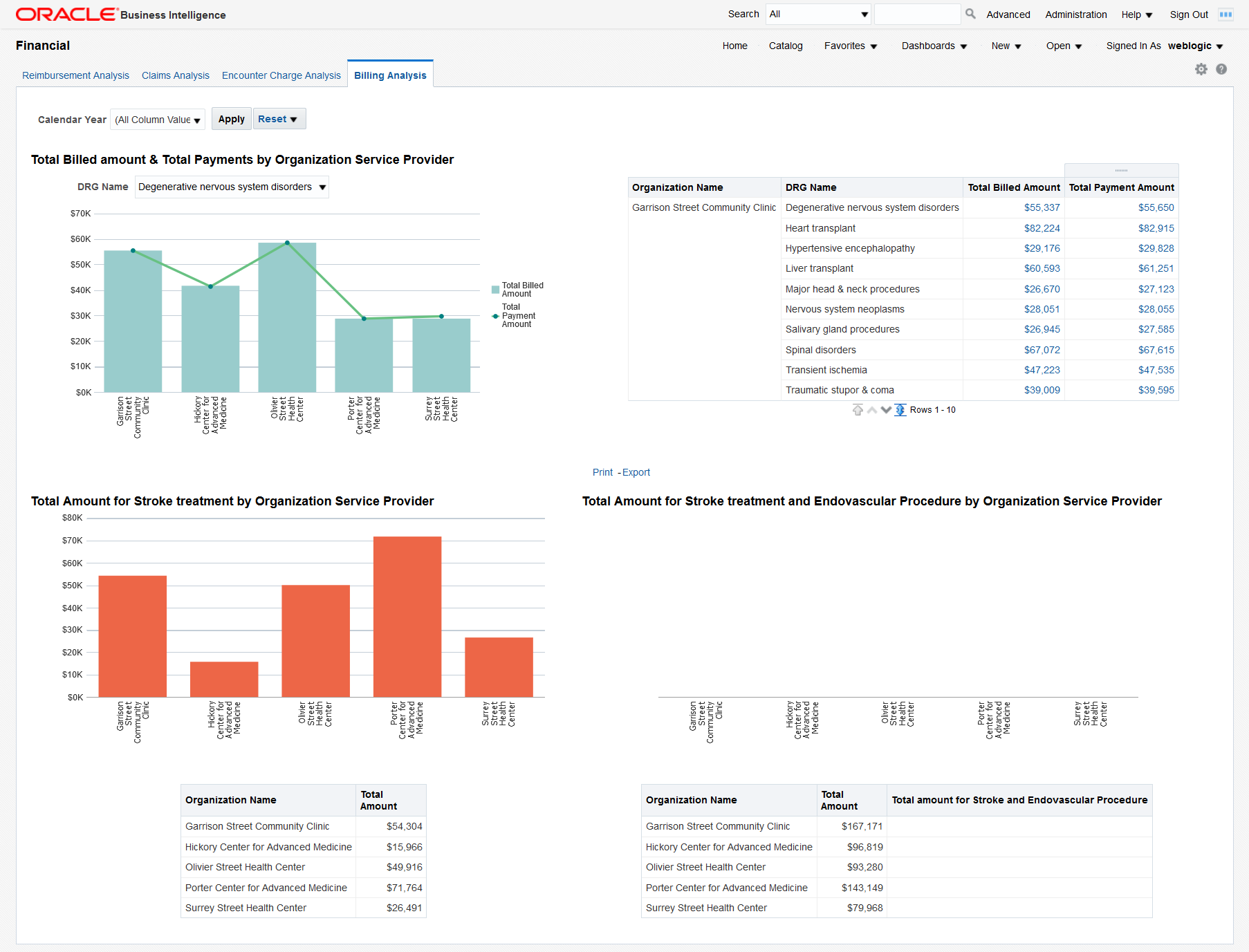
You can use the filter at the top of the page to focus on specific calendar years. This page has the following reports:
-
Total Billed Amount and Total Payments by Organization Service Provider - Graphical report and a tabular report showing the total billed amount and the total payment by organization filtered by DRG. This report helps you identify costs and payments for patient services specific to each organization based on diagnosis-related groups.
Click on a bar in the graph or on a total billed or payment amount to display a detailed list of all the bills for that DRG for the selected organization. From there, you can further drill down the details of a specific bill by clicking on a bill number.
-
Total Amount for Stroke Treatment by Organization Service Provider - You can modify this report to use any diagnosis or procedure. This report helps you compare the costs that organization service providers spend on stroke treatments.
-
Total Amount for Stroke Treatment and Endovascular Procedure by Organization Service Provider - This report helps you compare the costs that organization service providers spend on stroke treatments and endovascular procedures.
Audit Trail and Usage Tracking Dashboard
Note:
To use the Audit Trail and Usage Tracking Dashboard, you must enable usage tracking for OHF. For details, see Enable the OHF SSA Usage Tracking.The Audit Trail and Usage Tracking dashboard contains the following pages:
Usage Summary
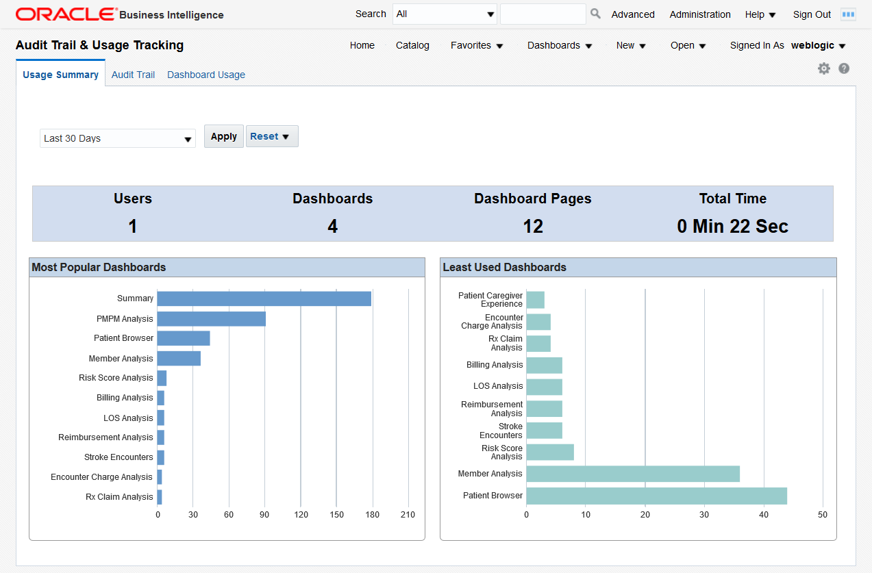
You can use the filter at the top of the page to focus on the preferred time period. The page has the following reports:
-
Overview - This report displays the total number of users, dashboards, pages, and the total display time for all the OHF Dashboards. Based on the overall usage of the dashboards, you can estimate their usefulness and the load on the system.
-
Most Popular Dashboards and Least Used Dashboards - You can use these graphs to evaluate which areas of analysis are the most relevant for future development and which ones have a low impact and might be phased out.
Click on a bar in the graph to display a detailed access log for that dashboard.
Audit Trail
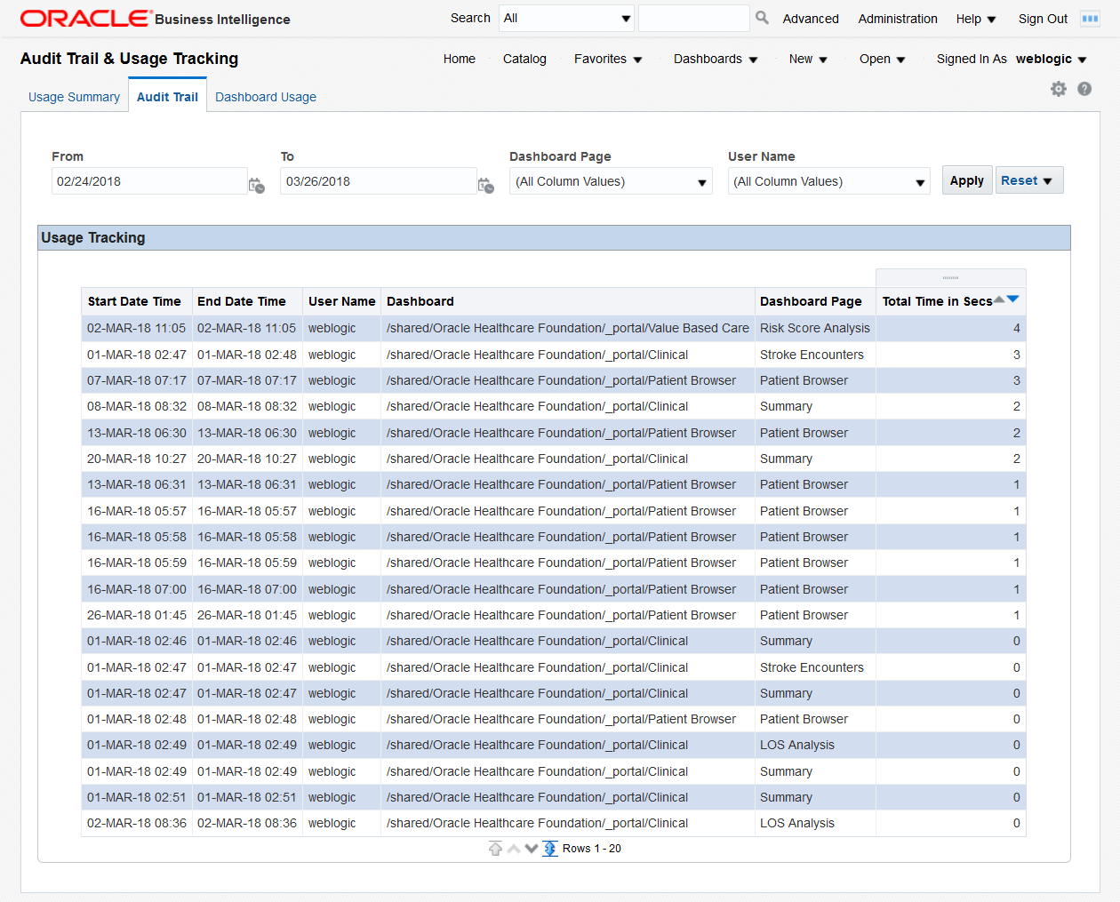
You can use the filters at the top of the page to focus on the preferred time period, dashboard page, and user.
This page displays a detailed access log based on the selected criteria for audit purposes.
Dashboard Usage
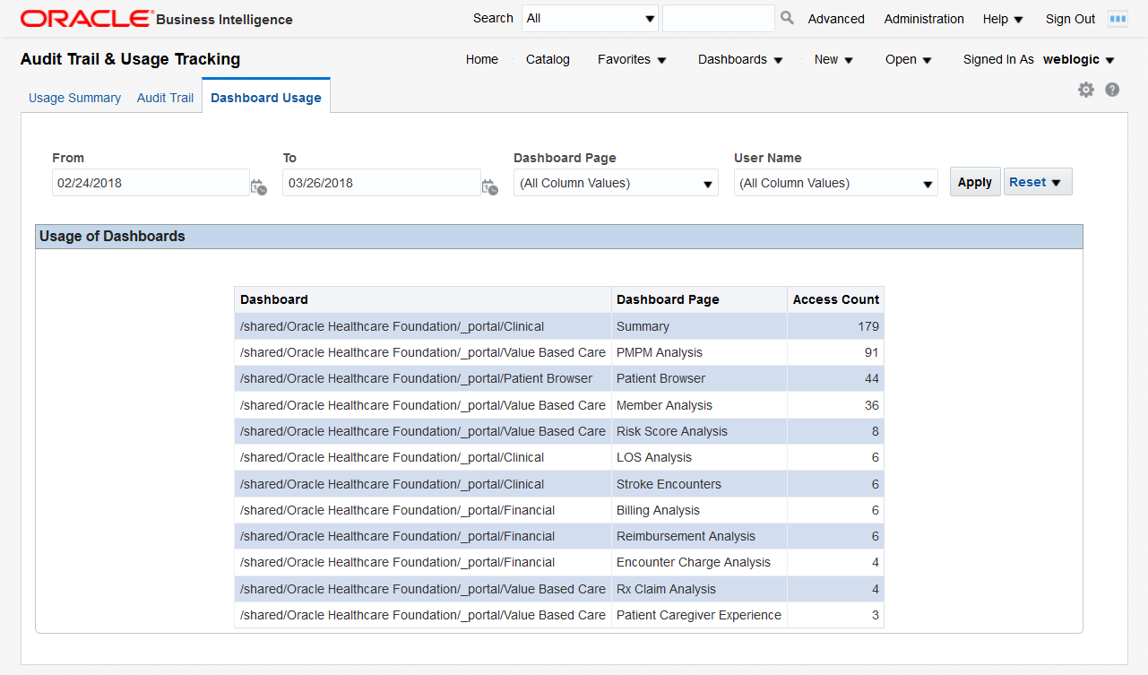
You can use the filters at the top of the page to focus on the preferred time period, dashboard page, and user.
The page displays a tabular report of the total access counts, based on the selected criteria. You can use this information to investigate the pages that are accessed the most by specific users or the users who access the most a specific dashboard page.
Data Lineage Dashboard
Note:
For information on how to enable data lineage for your customized reports and dashboards or for customized RPD files, see Data Lineage Extensibility.The Data Lineage dashboard contains the following pages:
Report Lineage
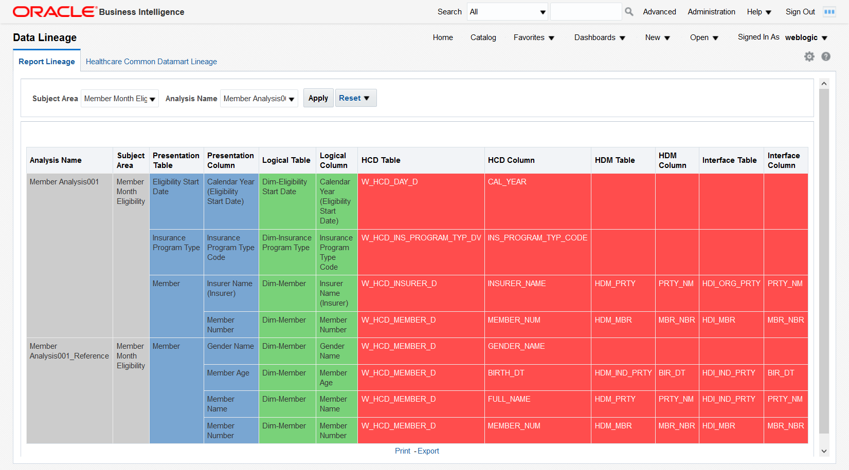
You can use the filters at the top of the page to focus on the preferred subject areas or reports.
The Report Lineage page tracks the data sources for the content displayed in the reports at the following levels: presentation, logical, datamart, data warehouse, and interface tables. This allows you to troubleshoot your reports and identify potential sources of errors in the OHF database or in OBIEE.
Healthcare Common Datamart Lineage
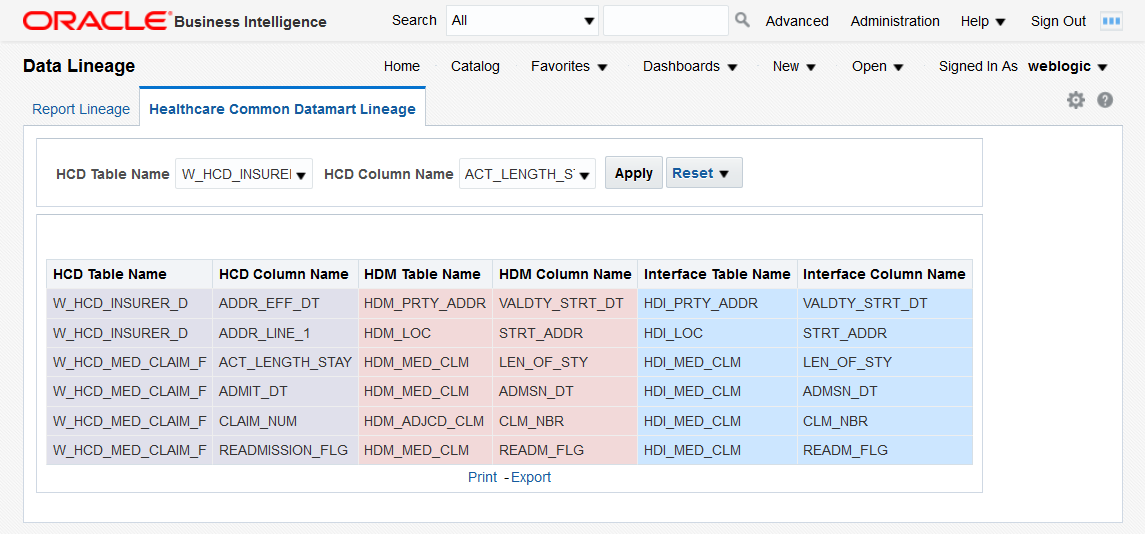
You can use the filters at the top of the page to focus on the preferred HCD tables and columns.
The Healthcare Common Datamart Lineage page displays the data mapping between the datamart, data warehouse, and interface tables. This allows you to better understand the OHF data model and better use the OHF data when building reports and dashboards.