| Oracle® Pulse Getting Started Guide Release 17.1.2 E79199-05 |
|

 Previous |
 Next |
The Customer Level shows key information across all your organization's services and associated environments.
The following topics are covered in this chapter:
The Calendar functionality on the navigation bar provides a real-time report on the open and closed change requests and on the business events related to your organization's services, which are scheduled for the current month and for the previous and the next 12 months, as follows:
Scheduled RFCs start with letter C. Hovering over a scheduled RFC shows the instance affected by the RFC, and the duration required for the RFC to be applied.
Color codes are used to differentiate between open events (highlighted in orange) and closed events (highlighted in green). Click any color-coded event to see detailed information about the corresponding change request.
Business events start with letter B. Hovering over a business event shows the activity type and the instance affected by the business event, if any.
Color codes are used to differentiate between the various types of business events. Click any color-coded event to see detailed information about the corresponding business event.
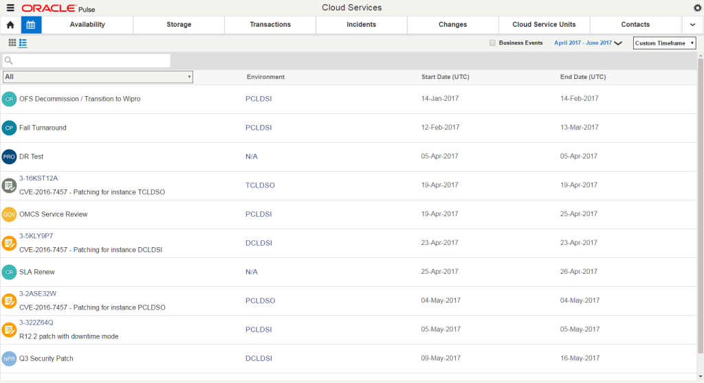
The Calendar Dashboard View, which opens by default when you click the Calendar icon ( ![]() ), provides a real-time report on the open and closed change requests and on the business events related to your organization's services, which are scheduled for the current month or any of the previous and the next 12 months.
), provides a real-time report on the open and closed change requests and on the business events related to your organization's services, which are scheduled for the current month or any of the previous and the next 12 months.
|
Note: If there are numerous calendar entries on the same day, click More to display the full list of entries. |
The Calendar List View shows the list of records for the change requests and business events available for your organization's services in the specified date range. To open the Calendar List View, click the List View icon (  ) in the upper left corner of the Calendar tab.
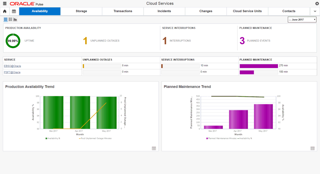
The Availability Dashboard at Customer Level summarizes information about the availability of your organization's production instances for the specified period of time.
The Customer Availability Dashboard View displays information about the following metrics:
the Production Availability widget shows the uptime and the number of unplanned outages for the specified month.
the Service Interruptions widget shows the count of periods when isolated business transactions could not be completed during the specified month, while other service transactions could be performed.
the Planned Maintenance widget shows the count of events where the outage occurs at an agreed date and time due to regular maintenance or a customer change request.
the Availability Metrics Table shows the total duration of unplanned outages, service interruptions and planned maintenance outages for each of your organization's Managed Cloud services during the specified month.
the Production Availability Trend chart shows the production availability (in percentages) and the duration of production unplanned outages (in minutes) for three complete months prior to the specified month.
the Planned Maintenance Trend chart shows the production availability (in percentages) and the duration of planned maintenance outages (in minutes) for three complete months prior to the specified month.
The Customer Availability List View shows the list of records for unplanned outages and service interruptions over a specified period of time.
The Customer Availability Chart View displays information about the following metrics:
the Production Availability Trend chart shows the production availability (in percentages) over a specified period of time.
the Production Unplanned Outage Minutes chart shows the duration of production unplanned outages over a specified period of time.
the All Production Instances Availability chart shows the availability (in percentages) of all your production instances over a specified period of time.
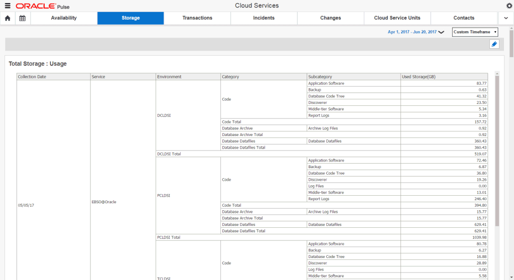
The Storage Dashboard at Customer Level covers storage usage across all your organization's services and associated environments.
This screen displays information about the following metrics:
the Total Storage: Usage table shows the storage used by service, environment, category, and subcategory, as well as the total storage usage across all your organization's Managed Cloud services.
the Total Storage: Growth chart shows the storage usage growth over the specified time interval across all your organization's Managed Cloud services. Use this report to understand if a current overage is likely to be a temporary incident or if there is a trend of continuous growth, as well as to understand how a change in the number of environments has impacted the growth.
the Total Storage : Projection chart shows the overall usage and the projected growth in storage usage over a fixed period of time, based on the data collected during the last month, the last quarter and the last year, across all your organization's Managed Cloud services. This report enables use of the most realistic prediction based on the knowledge of any specific changes in the business, such as new functionalities, an increase in the number of offices rolled out, the addition of new systems or whether they are representing more test/development or more business applications.
the Storage Usage by Service chart shows the distribution of the amount of storage used among your organization's Managed Cloud services. Use this report to identify services that are consuming a disproportionate amount of storage, which can be helpful in organizations where different internal groups are responsible for different services.
the Technology Cloud Total Storage: Usage table shows the storage usage and allocation by service, environment, category, and subcategory, as well as the total storage usage across all your organization's Technology Cloud instances, based on the latest collected data.
the Technology Cloud Total Storage: Growth chart shows the storage usage growth across all your organization's Technology Cloud instances over the specified time interval. Use this report to understand if a current overage is likely to be a temporary incident or if there is a trend of continuous growth, as well as to understand how a change in the number of environments has impacted the growth.
the Technology Cloud Total Storage: Projection chart shows the overall usage and the projected growth in storage usage over a fixed period of time, based on the data collected during the last month, the last quarter and the last year, for all your organization's Technology Cloud instances. This report enables use of the most realistic prediction based on the knowledge of any specific changes in the business, such as new functionalities, an increase in the number of offices rolled out, the addition of new systems or whether they are representing more test/development or more business applications.
the Technology Cloud Storage Usage by Service chart shows the distribution of the amount of storage used across all your organization's Technology Cloud instances. Use this report to identify services that are consuming a disproportionate amount of storage, which can be helpful in organizations where different internal groups are responsible for different services.
the Exadata: Usage table shows the amount of logical space used by the databases associated with the Exadata machine.
the Exadata: Growth chart shows the growth in the logical space used by the databases associated with the Exadata machine over the specified time interval.
the Exadata: Projection chart shows the overall usage and the projected growth in the logical space usage, based on the data collected during the last month, the last quarter and the last year.
the Exalogic: Usage table shows the amount of physical space used from the filer associated with the Exadata machine.
the Exalogic: Growth chart shows the growth in the physical space used from the filer associated with the Exalogic machine over the specified time interval.
the Exalogic: Projection chart shows the overall usage and the projected growth in the physical space usage, based on the data collected during the last month, the last quarter and the last year.
the Device Mapping table shows the relationship between the hosts, instances and the customer-owned storage devices being used across all your organization's services.
the Assets table shows the customer-owned storage devices being used across all your organization's services.
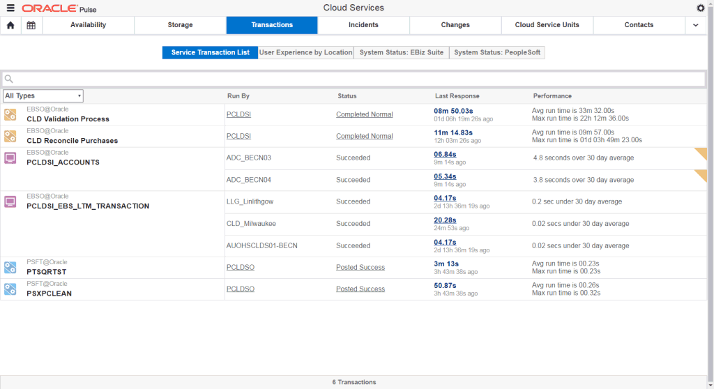
The Transactions Dashboard at Customer Level shows all transactions that are being monitored across your organization's services. Each transaction record shows runtime metrics to help you understand the status and performance of the transaction, historically and in real time.
|
Note: The Transactions Dashboard is displayed on the navigation bar only for services where BTM has been enabled. |
This screen displays information about the following metrics:
the Service Transaction List Dashboard, displayed by default when opening the Transactions Dashboard at Customer Level, provides a complete list of your transactions, allowing you to determine the BTM transactions that are experiencing a degradation in performance. For each batch job or user interaction record, this dashboard shows the transaction and service name, the instance running the job, the status of the latest request for the job, and the performance details. BTM also shows the response time of the last request for a batch job.
the User Experience by Location Dashboard, displayed by default when opening the Transactions Dashboard at Customer Level, shows the stability and performance status for each location available for your organization's services.
the System Status: EBiz Suite Dashboard, which is only available for customers running ESB transactions, shows the stability and performance status for each E-Business Suite concurrent manager and concurrent program (job) that is monitored by Oracle Pulse:
E-Business Suite concurrent managers are background processes designed to manage concurrent requests and batch processing within Oracle Applications. Note that a concurrent manager is itself a concurrent program.
E-Business Suite concurrent programs (jobs) are executable files that run simultaneously with other concurrent programs and with online operations, fully utilizing your hardware capacity. Typically, a concurrent program is a long-running, data-intensive task, such as posting a journal or generating a report.
the System Status: PeopleSoft Dashboard, which is only available for customers running PeopleSoft transactions, enables you to see your organization's PeopleSoft batch processes (also referred to as batch jobs) that are in need of attention, the state of the processes in order to identify if further investigation is necessary, as well as the request and error history in order to set the current state in a historical context and manage capacity. It shows the stability and performance status for each PeopleSoft process scheduler and job that is monitored by Oracle Pulse:
PeopleSoft process schedulers are centralized tools that enable application developers, system administrators, and application users to manage PeopleSoft batch processes. When an application user submits a request to run a process, the request is entered into a database table that lists all of the requests. Process schedulers read requests from the table and start programs running.
PeopleSoft batch jobs are requests to run batch processes.
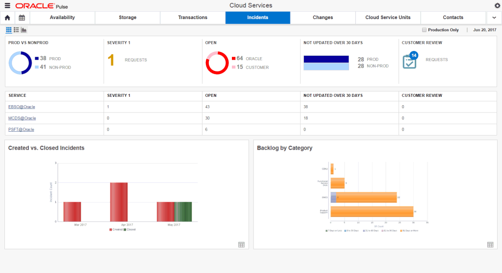
The Incidents functionality at Customer Level shows information about all the service requests created for your organization's production and nonproduction environments.
|
Note: To view the Incidents functionality, your My Oracle Support account must have privileges to view service requests. |
The Customer Incidents Dashboard View displays information about the following metrics:
the Prod vs NonProd widget shows the distribution of the open service requests between your organization's production and nonproduction environments.
the Severity 1 widget shows an overview of the number of open Severity 1 service requests.
the Open widget shows the count of open service requests for both your organization's production and nonproduction environments, requiring action by either Oracle or the customer.
the Not Updated over 30 Days widget shows the count of open service requests for both your organization's production and nonproduction environments, for which no updates have been made in the last 30 days.
the Customer Review widget shows the count of open service requests with the Customer Working substatus that can be performed immediately by the customer.
the Incidents per Service table shows the count of service requests divided by the active and inactive services in your organization.
the Created vs. Closed Incidents chart shows an overview of the number of service requests that have been created or closed in the last 30 days.
the Backlog by Category chart provides an overview of all open service requests, grouped into four product categories (Oracle Managed Cloud Services, CEMLI, Functional Service Desk, Product Support), which have been created over the specified period of time.
The Customer Incidents List View shows the open service requests created for your organization's services in the specified date range.
The Customer Incidents Chart View displays information about the following metrics:
the Created vs. Closed Trend chart shows the trend in the number of service requests created or closed over the specified period of time.
the Prod vs. Non Prod Trend chart shows the trend in the number of service requests that have been created over the specified time interval for both your organization's production and nonproduction environments, over the specified period of time.
the Created vs Closed Product Support Trend chart shows the trend in the number of Product Support service requests, which have been created or closed over the specified period of time.
the Created vs Closed CEMLI Trend chart shows the trend in the number of service requests belonging to the Oracle Managed Cloud product family in My Oracle Support, defined for a component containing CEMLI, which have been created or closed over the specified period of time.
the Created vs Closed Managed Cloud Trend chart shows the trend in the number of Managed Cloud service requests belonging to the Oracle Managed Cloud product family in My Oracle Support, with the exception of service requests created for CEMLI, Functional Service Desk and SaaS Operations components, which have been created or closed over the specified period of time.
the Created vs Closed Functional Service Desk Trend chart shows the trend in the number of service requests created for the Oracle Functional Service Desk product description in My Oracle Support, which have been created or closed over the specified period of time.
the Created: By Requester, Created: By Environment, Created: By Service, Created: By SR Product, and Created: By Severity charts show the number of created service requests divided by requester, by environment, by service, by SR product, and by severity.
the Closed: By Requester, Closed: By Environment, Closed: By Service, Closed: By SR Product, and Closed: By Severity charts show the number of closed service requests divided by requester, by environment, by service, by SR product, and by severity.
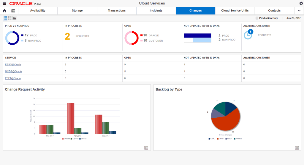
The Changes functionality at Customer Level shows reports of change requests across all services and environments for all your services.
|
Note: To view the Changes Dashboard, your My Oracle Support account must have privileges to view change requests. |
The Customer Changes Dashboard View displays information about the following metrics:
the Prod vs NonProd widget shows the distribution of the open change requests between your organization's production and nonproduction environments.
the In Progress widget shows the count of open change requests for both your organization's production and nonproduction environments, which are scheduled for work at the current time.
the Open widget shows the count of open change requests for both your organization's production and nonproduction environments, requiring action by either Oracle or the customer.
the Not Updated over 30 Days widget shows the count of open change requests for both your organization's production and nonproduction environments, for which no updates have been made in the last 30 days.
the Awaiting Customer widget shows the count of open change requests for both your organization's production and nonproduction environments, which have the Awaiting Customer, Awaiting Customer Approval, Awaiting Customer UAT, or Customer Working substatus and require action from the customer.
the Changes per Service table shows the count of open change requests divided by the active and inactive services in your organization.
the Change Request Activity chart shows the trend in the number of change requests that have been created or closed on a date in the last 30 days or which are scheduled on a date in the last 30 days.
the Backlog by Type chart shows an overview of the open change requests, grouped by the My Oracle Support RFC type.
The Customer Changes List View shows the open change requests created for your organization's services in the specified date range.
The Customer Changes Chart View displays information about the following metrics:
the Created vs. Closed Trend, Prod vs. Non Prod Trend, Refreshes: Created vs. Applied Trend, and Backups: Created vs. Applied Trend charts show the trends in the number of change requests created or closed over the specified period of time, the number of change requests that have been created over the specified period of time for both your organization's production and nonproduction environments, and the number of change requests with the Refresh or Backup type in My Oracle Support, which have been created or scheduled over the specified period of time.
the Created: By Requester, Created: By Environment, Created: By Service, Created: By RFC Type, and Created: By Severity charts show the number of created change requests divided by requester, by environment, by service, by type, and by severity.
the Created: CEMLIs By Environment and Created: PMPs By Environment charts show the number of created CEMLI and PMP change requests divided by environment.
the Created: Refreshes By Service and Created: Backups By Service charts show the number of change requests with the Refresh or Backup type in My Oracle Support, divided by service, which have been created over the specified period of time.
the Applied: By Requester, Applied: By Environment, Applied: By Service, Applied: By RFC Type, and Applied: By Severity charts show the number of applied change requests divided by requester, by environment, by service, by type, and by severity.
the Applied: CEMLIs By Environment and Applied: PMPs By Environment charts show the number of applied CEMLI and PMP change requests divided by environment.
the Applied: Refreshes By Service and Applied: Backups By Service charts show the number of change requests with the Refresh or Backup type in My Oracle Support, divided by service, which have been applied over the specified period of time.
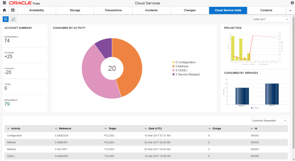
The Cloud Service Units functionality on the navigation bar shows consumption, entitlement and procurement reports for Cloud Service Units (CSU). This dashboard provides information about the consumption and purchase activity, as well as details about the CSUs for the customer. The consumption activity is presented as a monthly statement view. The purchase activity displays CSUs purchased by the customer.
|
Note: To view the Cloud Service Units, you must have at least one active Oracle Public Cloud service, and your My Oracle Support account must have privileges to view service and/or change requests. |
The Statement Dashboard displays the following information:
the Account Summary widget provides a summary of your overall account for the selected statement date.
the Consumed By Activity chart shows the breakdown of CSU charges by activity.
the Projection chart offers a graphical representation of the overall usage and the forecasted consumption of available CSUs.
the Consumed By Services chart provides a clear insight into the number of CSUs used for each of your services.
the Statement Details table provides details about your CSU consumption activity.
The Purchase Dashboard lists the Cloud Service Units purchased by the customer.
The Contacts Dashboard shows all the contacts associated with your organization's services.
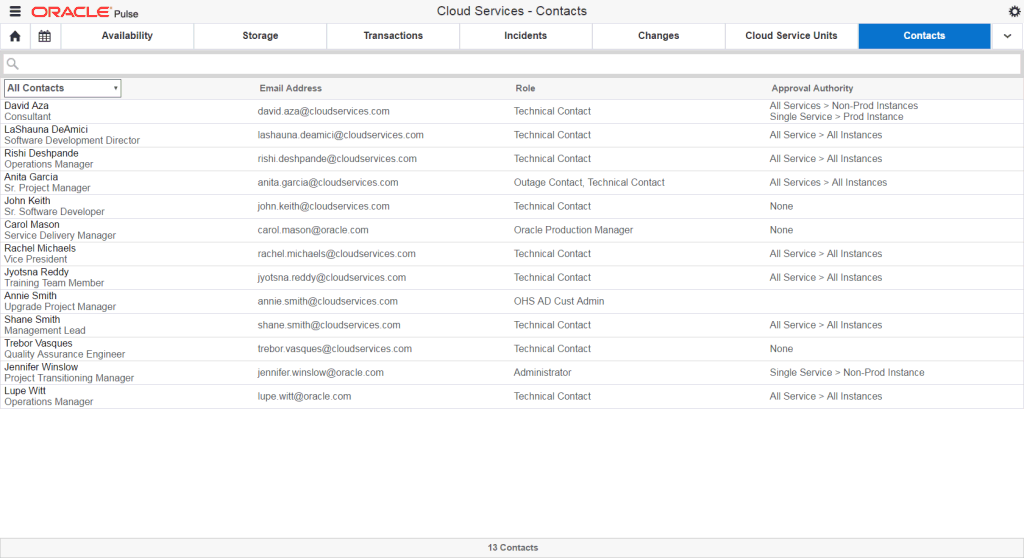
For each contact record, the Contacts Dashboard shows the contact name, phone number, email address, the role granted to the contact person, and the approval authority.
The Notifications list shows all the notifications associated with your organization's services.
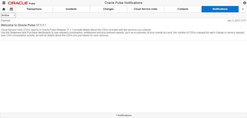
For each notification record, the Notifications list shows whether the outage is planned or unplanned, the event type, the description of the event, and the date when the notification was created.