7 Create the Details Section
This chapter describes how to add the JavaFX GUI components for the Details section of the IssueTrackingLite GUI layout you are building with JavaFX Scene Builder. It also describes how to manage the resizing of the components when the application's window is resized.
Use the following sections to set up the area where the issue's details will be displayed.
Add the GUI Components for the Details Section
Add the GUI components to create the section that will display the details about the issue that you are creating or modifying in the IssueTrackingLite application.
-
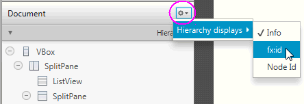
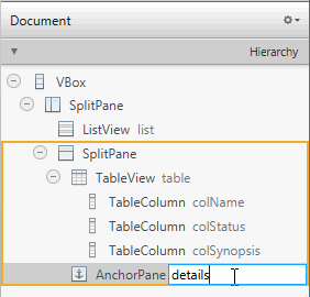
Click the menu button on the top right corner of the Hierarchy panel and select Show fx:id, as shown in Figure 7-1. By default, the Show info mode is selected. Notice that after you change the display mode to Show fx:id, the Hierarchy panel now displays the fx:id values next to the elements that have the fx:id property value assigned to them, as shown in Figure 7-2.
-
Set up the details section.
-
In the Hierarchy panel, select the node for the only AnchorPane element.
-
Double-click the right side of the row for the AnchorPane element to enter the fx:id inline edit mode. Enter
detailsin the inline text editor for the fx:id text property, as shown in Figure 7-2. This editor is available because the current display mode in the Hierarchy panel is set to Show fx:id. Alternatively, click the Code section of the Inspector panel and select details from the drop-down list of instance variables available for the fx:id field.
-
-
Add a label.
-
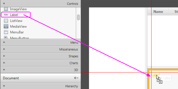
In the Controls section of the Library panel, drag the Label element and drop it on the upper left corner of the details area, as shown in Figure 7-3.
-
In the Content panel, double-click the new Label element to enter into inline edit mode. Enter
PROJECT / IDin the Text property field to replace the default value. -
In the Code section of the Inspector panel, select displayedIssueLabel in the fx:id field's drop-down list of available instance variables.
-
In the Layout section of the Inspector panel, set the value of Min Width to
USE_PREF_SIZE. This setting will keep the labels of the HBox element to be visible when the size of the application window is so reduced that not all of the GUI elements can be displayed.
-
-
Add a Text Field control.
-
From the Library panel, drag a Text Field control and drop it to the right side of the Label you just added.
-
Resize the Text Field element so that it occupies the remaining space to the right, as shown in Figure 7-4.
-
Double-click the Text Field element in the Content panel to enter Edit mode. Enter
SYNOPSISin the editor box. -
In the Code section of the Inspector panel, select synopsis from the drop-down list of instance variables available for the fx:id field.
-
-
Group the Label element with the synopsis Text Field element.
-
In the Content panel, hold the Ctrl key (on Windows and Linux platforms) or Cmd key (on Mac OS platform) to select the PROJECT/ID label and SYNOPSIS textfield components.
-
From the Menu bar, select Arrange, then Wrap in, and then HBox from the submenu.
-
In the Properties section of the Inspector panel, select CENTER for the Alignment property value of the HBox element.
-
Click the Layout section and set the Spacing property value to 10.
-
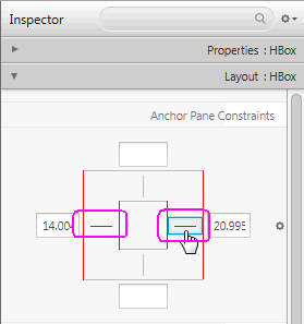
In the AnchorPane Constraints sub-section, click the left and right black anchor lines. After you click the anchor lines, the black lines change into solid red lines, which are circled in Figure 7-5. This action anchors the HBox element's right and left borders to its container and ensures that when the window is resized, the HBox element is also resized.
-
In the Hierarchy panel, select the row for the TextField SYNOPSIS element and locate the HBox Constraints sub-section. Set the Hgrow property to ALWAYS.
This setting indicates that the Text Field: synopsis element will adjust horizontally when its parent container increases.
-
-
Add a Label and a TextArea element in the details area.
-
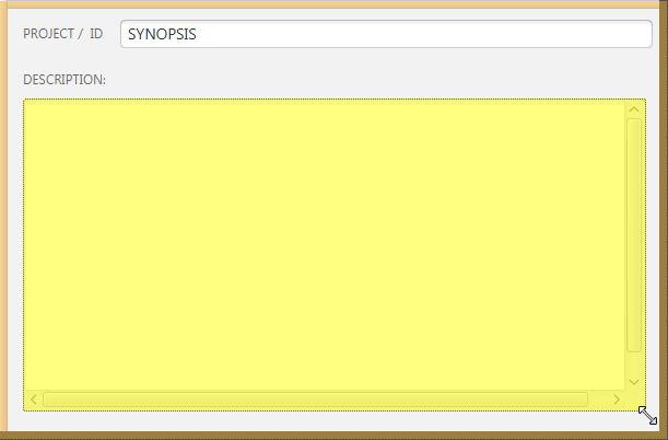
From the Controls section of the Library panel, select Label. Drag and drop it to the Content panel on the left side of the details section and below the row occupied by the HBox you just added. Use the guidelines to position the Label element in line with the HBox element's left side.
-
Double-click Label to enter the edit mode. Enter
DESCRIPTION:to replace the default value. -
Drag and drop a Text Area below the label that you just added.
-
In the Layout section of the Inspector panel, locate the Anchor Pane Constraints sub-section and click the left, top, right, and bottom black anchor lines.
-
In the Code section of the Inspector panel, select descriptionValue from the drop-down list for the fx:id field.
-
In the Content panel, click and drag the lower right handle of the Text Area element to increase its size and fill the remaining space in the details section, as shown in Figure 7-6.
-
