33 Using Diagram Components
This chapter describes how to use the ADF Data Visualization diagram component to display data in diagrams using simple UI-first development. The chapter defines the data requirements, tag structure, and options for customizing the look and behavior of the component.
If your application uses the Fusion technology stack, then you can also use data controls to create diagrams. For more information, see the "Creating Databound Diagrams" section in the Oracle Fusion Middleware Fusion Developer's Guide for Oracle Application Development Framework.
This chapter includes the following sections:
33.1 About the Diagram Component
ADF Data Visualization components provide extensive graphical and tabular capabilities for visually displaying and analyzing business data. Each component needs to be bound to data before it can be rendered since the appearance of the components is dictated by the data that is displayed.
Use diagrams to model, represent, and visualize information using a shape called a node to represent data, and links to represent relationships between nodes. Diagrams are flexible and highly configurable components that can display a wide range of data items using simple shapes or images with a label, or more complex data using zoom levels and stylistic attribute values such as colors for each unique group in the data set.
The layout of diagram links and nodes is configured through a framework using one or more custom JavaScript files. The framework supports rendering in multiple platforms including SVG and Java2D.
For example, diagrams can model a database schema to logically group objects such as tables, views, and stored procedures; represent an employee tree with a complex set of information for each employee at different zoom levels; or visualize the net migration between US states using a sunburst layout.
33.1.1 Diagram Use Cases and Examples
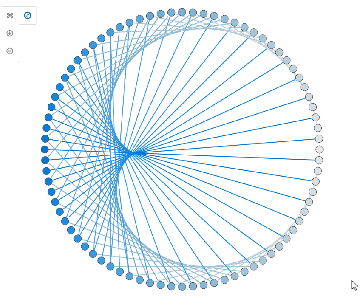
Diagrams use shapes for the node, and lines for links to represent the relationships between the nodes. Figure 33-1 shows a simple diagram configured in a circular layout pattern with circles and lines representing the relationships between them. The example includes the default control panel for diagram zooming.
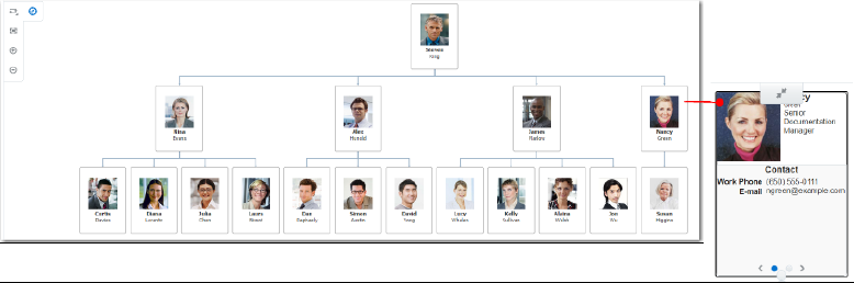
Diagrams can also be configured to visually display hierarchical data with a master-detail relationship. Figure 33-2 shows an employee tree diagram at runtime that includes a control panel, a number of nodes, and links that connect the nodes. Also illustrated is a node panel card that uses af:showDetailItem elements to display multiple sets of data at different zoom levels.
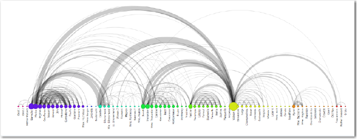
The diagram component can also be configured to display an arc diagram, a graphical display to visualize graphs in a one-dimensional layout. Nodes are displayed along a single axis, while representing the edges or connections between nodes with arcs. Figure 33-3 shows an arc diagram that use characters from Victor Hugo's "Les Miserables" novel to display co-appearances between any pair of characters that appear in the same chapter of the book.
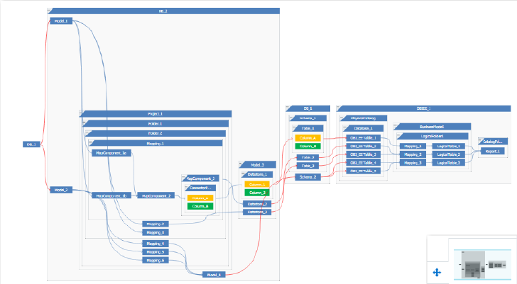
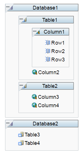
Diagrams can be configured to display a database schema. Figure 33-4 shows a database schema layout diagram with an overview window, a simplified view of the diagram that provides the user with context and navigation options.
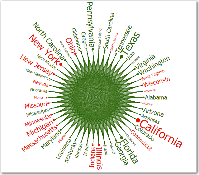
Diagrams can also be configured in a sunburst layout to display quantitative hierarchical data across two dimensions, represented visually by size and color. Figure 33-5 shows a diagram displaying US state to state migration data using attribute groups to display net results.
33.1.2 End User and Presentation Features of Diagrams
The ADF Data Visualization diagram component provides a range of features for end users, such as zooming, grouping, and panning. They also provide a range of presentation features, such as legend display, and customizable colors and label styles.
To use and customize diagram components, it may be helpful to understand these features and components:
-
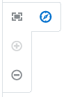
Control Panel: Provides tools for a user to manipulate the position and appearance of a diagram component at runtime. By default, it appears in a hidden state in the upper left-hand corner of the diagram. Users click the Hide or Show Control Panel button to hide or expand the control panel.
Figure 33-6 shows the control panel expanded to display the zoom controls and zoom-to-fit option.
-
Zooming: Enabled by default, users can change the view of the diagram in an expanded or collapsed display. The maximum and minimum scale of the zoom can be configured for the diagram.
-
Panning: Enabled by default, users can select the diagram in any open area and move the entire diagram right, left, up, and down to reposition the view.
-
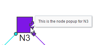
Popup Support: Diagram components can be configured to display popup dialogs, windows, and menus that provide information when the user clicks or hovers the mouse over a node. Figure 33-7 shows a node popup window when the user mouses over the node.
-
Legend Support: Diagrams display legends to provide a visual clue to the type of data represented by the shapes and color. If the component uses attribute groups to specify colors based on conditions, the legend can also display the colors used and indicate what value each color represents.
-
Overview Window: Displays a simplified view of the diagram that provides the user with context and navigation options. The Overview Window viewport can be dragged to pan the diagram. Users click the Hide or Show Overview Window button to hide or expand the window. Figure 33-8 shows the overview window expanded and panned to display a portion of a database schema layout.
-
Context Menus: Diagrams support the ability to display context menus to provide additional information about the selected node.
-
Attribute Groups: Diagram nodes support the use of the
dvt:attributeGroupstag to generate stylistic attribute values such as colors for each unique group in the data set. -
Selection Support: Diagrams support the ability to respond to user clicks on one or more nodes or links to display information about the selected element.
-
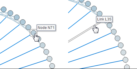
Tooltip Support: Diagrams support the ability to display additional information about a node or link when the user moves the mouse over the element. Figure 33-9 shows node and link tooltips.
-
Drilling Support: Diagram components support drilling to navigate through a hierarchy and display more detailed information about a node.
-
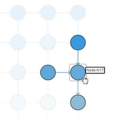
Highlighting Support: Diagrams can be configured to highlight the view of nodes and links when the user hovers the mouse over an element in the diagram. Highlighting can be specified for these values:
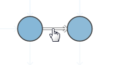
none,node,nodeAndIncomingLinks,nodeAndOutgoingLinks, andnodeAndLinks. Figure 33-10 shows the highlighted view of a node upon hover in a diagram when thenodeAndLinksvalue is specified.Figure 33-11 shows the highlighted view of a link upon hover in a diagram when the
nodeAndLinksvalue is specified. -
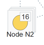
Stacking: You can group nodes and display the nodes in a stacked display. Figure 33-12 shows a stack of nodes. By default, the number of nodes in the stack are displayed.
-
Container Nodes: Nodes can represent a hierarchical relationship using one or more container nodes. Figure 33-13 shows a set of container nodes in a database schema.
-
Node Controls: A tooltip describing the control is displayed by default. Figure 33-13 displays the diagram node controls.
Table 33-1 Diagram Node Controls
Control Name Description 
Isolate
Allows user to detach a single node for isolated display in the diagram.

Preview Stack
Allows user to display all the nodes in a group.

Unstack
Allows user to display a grouped set of nodes so that all nodes are visible.

Restack
Allows user to collapse a set of associated nodes into a grouped display.

Restore
Allows user to return the diagram view from an isolated node.

Close
Allows user to close the view of nodes in a group.

Drill
Allows user to drill from parent to child nodes in a hierarchical arrangement.

Additional Links
Allows user to display the links and nodes associated with a selected node.
-
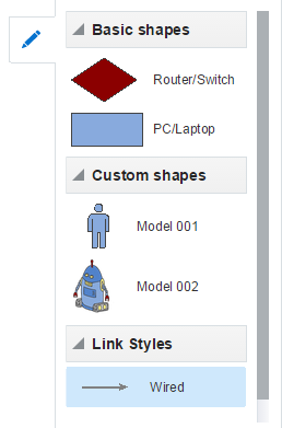
Palette: Diagrams support a panel of node and link items that can be used for drag and drop into a layout configuration. Users click the Hide or Show Palette button to hide or expand the window. Figure 33-14 shows a palette of nodes and links available for creating a diagram.
-
Display in Printable or Emailable Pages: ADF Faces allows you to output your JSF page from an ADF Faces web application in a simplified mode for printing or emailing. For example, you may want users to be able to print a page (or a portion of a page), but instead of printing the page exactly as it is rendered in a web browser, you want to remove items that are not needed on a printed page, such as scrollbars and buttons. If a page is to be emailed, the page must be simplified so that email clients can correctly display it. For information about creating simplified pages for these outputs, see Appendix P, "Using Different Output Modes."
33.2 Using the Diagram Component
To use the diagram component, define the data, specify the JavaScript method to invoke the diagram layout, add the diagram to a page and complete the additional configuration in JDeveloper.
33.2.1 Diagram Data Requirements
A diagram represents two sets of separate, but related data objects; a set of nodes, and a set of links that join those nodes. Data is supplied as two separate collections of data provided either as an implementation of the List interface (java.util.ArryList), or a CollectionModel (org.apache.myfaces.trinidad.model.CollectionModel). The data can be of any type, typically String, int, or long.
Both collections of diagram nodes and links require an attribute that represents the unique Id for each row in the collection. The collections are mapped using a value attribute to stamp out each instance of the node or link using a component to iterate through the collection. Each time a child component is stamped out, the data for the current component is copied into a var property used by the data layer component in an EL Expression. Once the diagram has completed rendering, the var property is removed, or reverted back to its previous value. By convention, var is set to node or link.
The values for the value attribute must be stored in the node's or link's data model or in classes and managed beans if you are using UI-first development.
Note:
The CollectionModel includes data provided by the ADF binding layer in the form of a table or hierarchical binding, which can be used to data bind from the ADF model using data controls.33.2.2 Configuring Diagrams
The diagram component has configurable attributes and child components that you can add or modify to customize the display or behavior of the diagram. The prefix dvt: occurs at the beginning of each diagram component name indicating that the component belongs to the ADF Data Visualization Tools (DVT) tag library.
You can configure diagram child components, attributes, and supported facets in the following areas:
-
Diagram (
dvt:diagram): Wraps the collection of nodes (diagramNodes) and links (diagramLinks), and specifies the layout (clientLayout) reference for the diagram. Configure the following attributes to control the diagram display:-
Animation: Use the
animationOnDisplayattribute to control the initial animation. To change the animation duration from the default duration of 500 milliseconds, modify theanimationDurationattribute. -
Empty text (
emptyText): Use theemptyTextattribute to specify the text to display if there are no nodes to display. -
Zoom (
zooming): By default the diagram can be displayed in an expanded or compressed view. UsemaxZoomandminZoomto specify the size of the scale of the zoom. -
Pan (
panning): By default with a device specific gesture, users can select and move the diagram up, down, right, or left.
-
-
Client layout (
clientLayout): Used to register a JavaScript method invoked to perform layout for a diagram. For detailed information, see Section 33.3, "Using the Diagram Layout Framework." -
Diagram nodes (
diagramNodes): Wraps the collection of diagram nodes. Configure the following attributes to manage the collection of diagram nodes:-
value: Specify the data model for the node collection. Can be an instance ofjavax.faces.CollectionModel. -
var: Name of the EL variable used to reference each element of the node collection. -
varStatus: Use to provide contextual information about the state of the component. -
groupBy: Use to stack nodes by listing the attribute group IDs in a space-separated list. -
highlightBehavior: Use to specify the highlight behavior when the user hovers the mouse over a node in the diagram. Valid values are:none,node,nodeAndIncomingLinks,nodeAndOutgoingLinks, andnodeAndLinks.
-
-
Node (
diagramNode): Used to stamp out each instance of the node in the (diagramNodes) collection. A node is a shape that references the data in a diagram, for example, employees in an organization or computers in a network.The node component supports the use of these
f:facetelements:-
Zoom: Supports the use of one or moref:facetelements that display content at different zoom levels, with more detail content available at the higher zoom levels.-
f:facet name="zoom100" -
f:facet name="zoom75" -
f:facet name="zoom50" -
f:facet name="zoom25"
The
f:facetelement supports the use of many ADF Faces components as child components, such asaf:outputText,af:image, andaf:panelGroupLayout, in addition to the ADF Data VisualizationmarkerandpanelCardcomponents.At runtime, the node contains controls that allow users to navigate between nodes and to show or hide other nodes by default. For information about specifying node content and defining zoom levels, see
-
-
Label: Provides the ability to specify a label that can be independently positioned by the layout. -
Background: Use to specify a background for the zoom facets, automatically scaled to fit the node size. Content is stamped on top of the background. The facet supportsaf:imageanddvt:marker. -
Overlay: Use to position one or more markers overlaid on the zoom facets. The overlay is positioned using advt:pointLocationelement for advt:marker. Use anaf:groupelement when specifying more than one overlay marker. -
Container: Templates provided for stamping out areas of a parent (container) node. Available for specifying top, bottom, right, left, and left-to-right reading direction right and left areas.
-
-
Attribute groups (
attributeGroups): Use this optional child tag of a diagram node child element, typically thedvt:markercomponent, to generate style values for each unique value, or group, in the data set. You can also apply attribute groups to more than one component, for example, in all defined zoom facets to maintain consistency while zooming, or to set the background color of anaf:panelGroupLayout.Attribute groups are necessary to provide information for the display of the diagram legend and are therefore recommended.
-
Links (
diagramLinks): Wraps the collection of diagram links. Configure the following attributes to manage the collection of diagram links:-
value: Specify the data model for the link collection. Can be an instance ofjavax.faces.CollectionModel. -
var: Name of the EL variable used to reference each element of the link collection. -
varStatus: Use to provide contextual information about the state of the component. -
highlightBehavior: Use to specify the highlight behavior when the user hovers the mouse over a link in the diagram. Valid values are:noneandlink.
-
-
Link (
diagramLink): Use to stamp out each instance of the link in the (diagramLinks) collection. Links connect one node with another node. You can configure the display of links using the following attributes:-
linkColor: Use to specify the color of the link using a CSS named color. -
linkStyle: Use to specify the appearance of the link. Valid values aresolid(default),dash,dot,dashDot. -
linkWidth: Use to specify the width in pixels for the link. The default value is1. -
startConnectorType: When required, use to specify one of the available images to use for the starting node link connector. Valid values arenone,arrowOpen,arrow,arrowConcave,circle,rectangle, andrectangleRounded. -
endConnectorType: When required, use to specify one of the available images to use for the terminal node link connector. Valid values arenone,arrowOpen,arrow,arrowConcave,circle,rectangle, andrectangleRounded. -
label: use to specify the label to use for the link.
The link component supports the use of these
f:facetelements:-
startConnector: Supports the use of a custom image for the starting node link connector. -
endConnector: Supports the use of a custom image for the terminal node link connector. -
label: Supports the use of a custom label for the link.
For information about how to customize the appearance of the link and add labels, see
-
-
Legend (
legend): Use to display multiple sections of marker and label pairs. Define the legend as a child of the diagram component. -
Palette (
palette): Use to create a panel for creating nodes and links elements (paletteItem). The palette can display multiple sections of node and label pairs, supporting custom title headers and declarative control over the ordering of such sections. The palette can contain multiple sections (paletteSection) of nodes and a single section of links (paletteLinkDefs).
33.2.3 What You May Need to Know About Using the Default Diagram Layout
When you create a diagram using UI-first development in JDeveloper, a Create Diagram wizard provides the option of using a default client layout that you can use or edit to specify the layout of your diagram. The default layout is based on force-directed graph drawing algorithms. To view the complete code for the default layout, you can view the file in JDeveloper, or see Appendix G, "Code Sample for Default Client Layout."
When you create a diagram using the default client layout, JDeveloper performs the following actions:
-
Registers the layout with the ADF runtime environment as a JavaScript (JS) feature. The creation process automatically adds a JS file in the
ViewController/src/js/layoutdirectory with the following naming convention:ApplicationNameDiagramLayout.jsFor example, if your application is named
DiagramSample, the JS file is namedDiagramSampleDiagramLayout.js. -
Creates the
adf-js-features.xmlfile if it doesn't already exist and adds theApplicationNameDiagramLayoutas the feature-name and the path to the JS file as the feature-class. The file is placed in theViewController/src/META-INFdirectory.The following example shows the
adf-js-features.xmlfile for an application namedDiagramSample.<?xml version="1.0" encoding="UTF-8" ?> <features xmlns="http://xmlns.oracle.com/adf/faces/feature"> <feature> <feature-name>DiagramSampleDiagramLayout</feature-name> <feature-class>js/layout/DiagramSampleDiagramLayout.js</feature-class> </feature> </features> -
References the JavaScript file from the diagram using the
dvt:clientLayoutelement.The following example shows the sample code referencing the JavaScript file:
<dvt:diagram layout="DiagramSampleDiagramLayout" id="d2" <dvt:clientLayout method="DiagramSampleDiagramLayout.forceDirectedLayout" featureName="DiagramSampleDiagramLayout" name="DiagramSampleDiagramLayout"/> ... </diagram> -
Configures the development environment to copy the
.jsfile type from the source path to the output directory when invoking the Make or Build command.
When you design and use a custom client layout for your diagram, you must complete these actions manually. For more information, see Section 33.3.3, "How to Register a Custom Layout."
33.2.4 How to Add a Diagram to a Page
When you are designing your page using simple UI-first development, you use the Component Palette to add a diagram to a JSF page. When you drag and drop a diagram component onto the page, a Create Diagram wizard displays.
If you click Finish, the diagram is added to your page, and you can use the Property Inspector to specify data values and configure additional display attributes. Alternatively, you can choose to bind the data during creation and use the Configure Diagram wizard - Node and Link Data page to configure the associated node and link data.
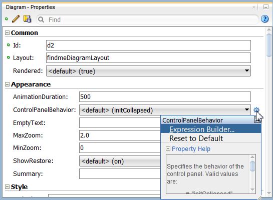
In the Property Inspector you can click the icon that appears when you hover over the property field to display a property description or edit options. Figure 33-15 shows the dropdown menu for a dialog layout attribute.
Note:
If your application uses the Fusion technology stack, then you can use data controls to create a diagram and the binding will be done for you. For more information, see the "Creating Databound Diagram Components" section in Oracle Fusion Middleware Fusion Developer's Guide for Oracle Application Development Framework.It may be helpful to have an understanding of how diagram attributes and child tags can affect functionality. For more information, see Section 33.2.2, "Configuring Diagrams."
You must complete the following tasks:
-
Create an application workspace as described in Section 2.2, "Creating an Application Workspace."
-
Create a view page as described in Section 2.4, "Creating a View Page."
-
In the ADF Data Visualization page of the Component Palette, from the Common panel, drag and drop a Diagram onto the page to open the Create Diagram wizard.
-
In the Client Layout page, choose one of the following options:
-
Default Client Layout: Use the layout available in JDeveloper. The layout is based on force-directed graph drawing algorithms.
-
Custom Client Layout: Use a custom designed client layout.
-
No Layout: Create the diagram without specifying a layout for the nodes and links.
If you select the default layout or specify a custom layout, you can open the file in JDeveloper. You can also click Edit Component Definition in the Property Inspector to display the Edit Diagram - Configure Client Layout dialog and then click Search to display the method in the popup.
-
-
Click Finish to add the diagram to the page.
Note:
If the JSP page is run, only the control panel will be displayed since the diagram is not bound to data at this point.Optionally, click Next to use the wizard to bind the diagram on the Node and Link Data page by navigating to the ADF data control that represents the data you wish to display on the diagram nodes and links. If you choose this option, the data binding fields in the dialog will be available for editing. For help with the dialog, press F1 or click Help.
-
In the Property Inspector, view the attributes for the diagram. Use the help button to display the complete tag documentation for the
diagramcomponent. -
Expand the Appearance section, and enter values for the following attributes:
-
ControlPanelBehavior: Use the attribute's dropdown menu to change the default display of the control panel from
initCollapsedtoinitExpandedorHidden. -
Summary: Enter a summary of the diagram's purpose and structure for screen reader support.
-
33.2.5 What Happens When You Add a Diagram to a Page
Developer generates a set of tags when you drag and drop a diagram from the Component Palette onto a JSF page and choose not to bind the data during creation. The generated code is:
<dvt:diagram layout="DiagramSampleDiagramLayout" id="d2">
  <dvt:clientLayout method="DiagramSampleDiagramLayout.forceDirectedLayout"
                    featureName="DiagramSampleDiagramLayout"
                    name="DiagramSampleDiagramLayout"/>
    <dvt:diagramNodes id="dn1">
      <dvt:diagramNode id="dn2">
        <f:facet name="zoom100">
           <dvt:marker id="m1"/>
        </f:facet>
      </dvt:diagramNode>
    </dvt:diagramNodes>
    <dvt:diagramLinks id="dl1">
      <dvt:diagramLink id="dl2"/>
    </dvt:diagramLinks>
</dvt:diagram>
If you choose to bind the data to a data control when creating the diagram, JDeveloper generates code based on the data model. For more information, see the "Creating Databound Diagram Components" section in Oracle Fusion Middleware Fusion Developer's Guide for Oracle Application Development Framework.
33.3 Using the Diagram Layout Framework
The DVT diagram layout framework supports the display of diagram nodes and links in whatever configuration meets the business needs of the diagram. Written in JavaScript and based on HTML5, the framework supports rendering in multiple platforms, including SVG and Java2D.
Diagrams require a client layout configuration defined in a JavaScript method that you add to the application as a feature. Client layouts specify how to lay out the nodes and links on a page. Diagrams can be configured to work with more than one layout, as in the case of parent and child nodes, but at least one layout must be registered with the application. All node and link display rendering is specified by the diagram component and all layout logic is contained in the layout JavaScript file.
The diagram component includes a default layout based on force-directed graph drawing algorithms that you can use and modify as needed. The default forceDirectedLayout positions the diagram nodes so that all the links are of more or less equal length, and there are as few crossing links as possible
You can also provide your own client layout configuration in a JavaScript object that you add as an application feature using the DVT Diagram APIs.
33.3.1 Layout Requirements and Processing
The basic process of laying out a diagram is to loop though an array of nodes and an array of links and set positioning information on each of them.
Custom diagram layout code uses the DVT diagram base classes defined in Table 33-2.
Table 33-2 DVT Diagram Base Classes
| Base Class | Description/Methods (partial) |
|---|---|
|
|
Defines the context for a layout call. layout: nodes: links: helpers: |
|
|
Defines the link context for a layout call. top level: start/end nodes: labels: |
|
|
Defines the node context for a layout call. top level: state: labels: |
|
|
Point class, used for function parameters and return values ( |
|
|
Rectangle, Dimension class, used for function parameters and return values ( |
You can view the entire JavaScript API for the DVT Diagram here
33.3.2 Configuring Diagram Layouts
The DVT diagram child clientLayout component identifies the JavaScript needed to run the layout of the nodes and links using an alias referenced by the diagram in the layout attribute. Diagrams can use multiple client layouts; for example, when you have a parent container node and a child node, but at least one layout must be registered with the application.
The DVT clientLayout component has three attributes:
-
name: Alias for the layout referenced from the diagram'slayoutproperty. -
method: Identifies the name of a JavaScript function that will perform the layout. -
featureName: Identifies the JavaScript source files required to locate and run the function identified in themethodattribute.
33.3.3 How to Register a Custom Layout
When you create a custom layout for a diagram, you must configure the ADF Faces runtime environment by performing the following actions:
-
Register the layout with the ADF runtime environment as a JavaScript (JS) feature.
-
Create the
adf-js-features.xmlfile if it doesn't already exist and add theApplicationNameDiagramLayoutas the feature-name and the path to the JS file as the feature-class. -
Reference the JavaScript file from the diagram using the
dvt:clientLayoutelement. -
Configure the development environment to copy the
.jsfile type from the source path to the output directory when invoking the Make or Build command
It may be helpful to have an understanding of how diagram attributes and child tags can affect functionality. For more information, see Section 33.2.2, "Configuring Diagrams."
You must complete the following tasks:
-
Create an application workspace as described in Section 2.2, "Creating an Application Workspace."
-
Create a view page as described in Section 2.4, "Creating a View Page."
-
In the application
ViewController/src/js/layoutdirectory, add the custom JavaScript file using the following naming convention:ApplicationNameDiagramLayout.jsFor example, if your application is named
DiagramSample, the JS file is namedDiagramSampleDiagramLayout.js. -
In the Applications Window > Projects Panel, right click the
ViewController/src/META-INFfolder and choose New > XML file. -
In File Name enter
adf-js-features.xmland click OK. -
In the XML Editor define a feature name and associate the name with a JavaScript file. For example:
<?xml version="1.0" encoding="utf-8"?> <features xmlns="http://xmlns.oracle.com/adf/faces/feature"> <feature> <feature-name>DiagramSampleDiagramLayouts</feature-name> <feature-class>js/layouts/DiagramSampleDiagram.js</feature-class> </feature> </features> -
Double-click the project in the Application Navigator to open the Project Properties dialog.
-
In the Compiler settings page > Copy File Types to Output Directory, add a
.jsfile type to the semi-colon separated list. The completed dialog is shown below: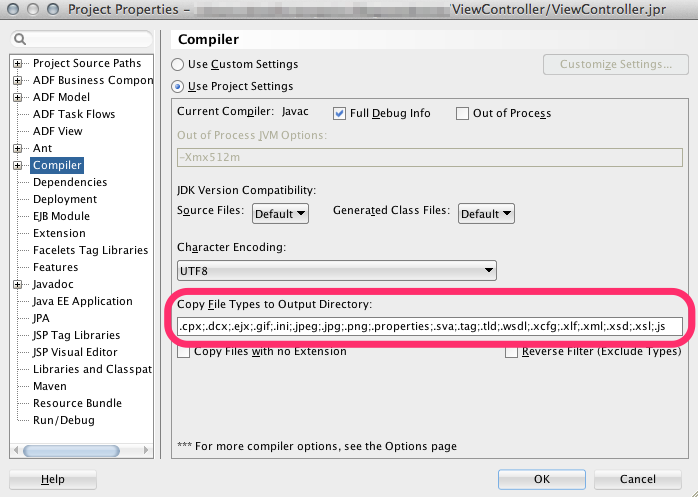
-
Click OK.
33.3.4 Designing Simple Client Layouts
Client layouts specify the layout of nodes and links in a diagram. For example, the layout of diagram nodes in a simple vertical pattern is shown in Figure 33-16.
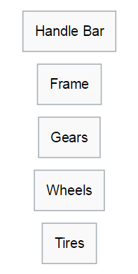
In the layout, the layout context object passed to the layout function contains the information about the number of nodes using the getNodeCount() API, and provides access to each node object using the getNodeByIndex() API. After looping through the nodes to access each node, a call to setPosition() API is used to locate the node on the diagram space. The position is passed in the form of a DvtDiagramPoint() object which defines the simple x and y coordinates.
The JavaScript code for a simple vertical layout of nodes is here:
var DemoVerticalLayout = {
};

/**
 * Main function that does the layout (Layout entry point)
 * @param {DvtDiagramLayoutContext} layoutContext Object that defines a context for layout call
 */
DemoVerticalLayout.layout = function (layoutContext) {
  var padding = 10; //default space between nodes, that can be overwritten by layout attributes
  var currX = 0;  //x coodinate for the node's center
  var currY = 0;  //y coordinate for the node's top edge
  var nodeCount = layoutContext.getNodeCount();
  for (var ni = 0;ni < nodeCount;ni++) {
    var node = layoutContext.getNodeByIndex(ni);
    var bounds = node.getContentBounds();
    //Position the node - in order to do it find a position for the node's top left corner
    //using the node bounds, currX to center the node horizontally and currY for the node's top edge
    node.setPosition(new DvtDiagramPoint(currX - bounds.x - bounds.w * .5, currY));
    currY += bounds.h + padding;
  }
};
A client layout specifying the links connecting the diagram nodes is shown in Figure 33-17.
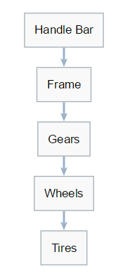
In the layout, the layout context object passed to the layout function contains the information about the number of links using the getLinkCount() API, and provides access to each link object using the getLinkByIndex() API. After looping through the links to access each link, a call to setPosition() API is used to locate the link on the node. The position is passed in the form of a DvtDiagramPoint() object which defines the simple x and y coordinates.
The JavaScript code for a vertical client layout with links is here:
var DemoVerticalLayoutWithLinks = {
};

/**
 * Main function that does the layout (Layout entry point)
 * @param {DvtDiagramLayoutContext} layoutContext Object that defines a context for layout call
 */
DemoVerticalLayoutWithLinks.layout = function (layoutContext) {
  //reading optional attributes that could be defined on the page
  var layoutAttrs = layoutContext.getLayoutAttributes();
  var padding = (layoutAttrs && layoutAttrs["nodePadding"]) ? parseInt(layoutAttrs["nodePadding"]) : 10;

  // layout/position nodes
  var currX = 0;
  var currY = 0;
  var nodeCount = layoutContext.getNodeCount();
  for (var ni = 0;ni < nodeCount;ni++) {
    var node = layoutContext.getNodeByIndex(ni);
    var bounds = node.getContentBounds();
    DemoVerticalLayoutWithLinks.positionNode(node, currX, currY);
    currY += bounds.h + padding;
  }

  //position links
  for (var li = 0;li < layoutContext.getLinkCount();li++) {
    var link = layoutContext.getLinkByIndex(li);
    DemoVerticalLayoutWithLinks.positionLink(layoutContext, link);
  }
};

/**
 * Helper function that positions the node using x,y coordinates
 * @param {DvtDiagramLayoutContextNode} node Node to position
 * @param {number} x Horizontal position for the node center
 * @param {number} y Vertical position for the node top edge
 */
DemoVerticalLayoutWithLinks.positionNode = function (node, x, y) {
  var bounds = node.getContentBounds();
  node.setPosition(new DvtDiagramPoint(x - bounds.x - bounds.w * .5, y));
};
Figure 33-18 shows a client layout of container nodes with parent and child nodes.
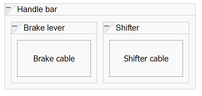
The JavaScript code for a client layout with container nodes is here:
var DemoContainersLayout = {};

/**
 * Main function that does the layout (Layout entry point)
 * @param {DvtDiagramLayoutContext} layoutContext Object that defines a context for layout call
 */
DemoContainersLayout.layout = function(layoutContext) {
  var nodeCount = layoutContext.getNodeCount();
  var currX = 0;
  // iterate through the nodes in the layer and position them horizontally
  for (var ni = 0; ni < nodeCount; ni++) {
    var node = layoutContext.getNodeByIndex(ni);
    node.setPosition(new DvtDiagramPoint(currX, 0));
    currX += node.getBounds().w + 10;
  }
};
You can view and download additional layout examples on the ADF Faces Demo application. For more information, see Section 1.4, "ADF Faces Demonstration Application."