26 Creating Databound ADF Data Visualization Components
This chapter describes how to use the Data Controls panel and ADF data binding to create databound ADF Data Visualization components. These components allow you to display and analyze data through a wide variety of charts, a set of legacy graphs, several kinds of gauges, a pivot table, geographic maps with multiple layers of information, thematic maps, several kinds of Gantt charts, timelines, a hierarchy viewer, treemaps, and sunbursts.
This chapter includes the following sections:
26.1 Introduction to Creating ADF Data Visualization Components
ADF Data Visualization components provide extensive graphical and tabular capabilities for visually displaying and analyzing data.
Chart, gauge, and legacy graph components render graphical representations of data. However, charts and graphs allow you to evaluate multiple data points on multiple axes in a variety of ways. Many chart types assist in the comparison of results from one group with the results from another group. In contrast, gauges focus on a single data point and examine that point relative to minimum, maximum, and threshold indicators to identify problems.
The pivot table component produces a grid that supports multiple layers of data labels on the row edge or the column edge of the grid. An optional pivot filter bar uses a page edge to filter the pivot table data not in view. This component also provides the option of automatically generating subtotals and totals for grid data. Pivot tables let you pivot data layers from one edge to another to obtain different views of your data. For example, a pivot table might initially display total sales data for products within regions on the row edge, broken out by years on the column edge. If you pivot region and year at runtime, then you end up with total sales data for products within years, broken out by region. At runtime, end users can click buttons that appear in the inner column labels to sort rows in ascending or descending order.
The geographic map component represents business data spatially, enabling you to superimpose multiple layers (also referred to as themes) of information on a single map. For example, a map of the United States might use a color theme that provides varying color intensity to indicate the popularity of a product within each state, a pie chart theme that shows sales within product category, and a point theme that identifies the exact location of each warehouse. When all three themes are superimposed on the United States map, you can easily evaluate whether there is sufficient inventory to support the popularity level of a product in specific locations.
Thematic map components represents business data as patterns in stylized areas or associated markers and does not require a connection to an Oracle MapViewer service. Thematic maps focus on data without the geographic details in a geographic map. The thematic map is packaged with prebuilt base maps including a USA base map, a world base map, and base maps for continents and regions of the world including EMEA and APAC. Each base map includes several sets of regions and one fixed set of cities. A set of regions or cities is referred to as a layer. Each layer can be bound to a data collection and stylized to represent the data with color and pattern fills, or a data marker, or both. At runtime, only one map layer and its associated data can be displayed at a time, unless the thematic map has been enabled for drilling.
There are three types of Gantt chart components: the project Gantt chart (which focuses on project management), the scheduling Gantt chart, and the resource utilization Gantt chart (both of which focus on resource management). Each Gantt chart shows the following regions combined with a splitter:
-
List region content: The left side of the splitter provides a list of tasks (for the project Gantt chart) and a list of resources (for the resource utilization and scheduling Gantt charts). This region can display any number of additional columns of related information.
-
Chart region content: The right side of the splitter consists of an area in which task progress, resource utilization, or resource progress is graphed over time. The ability of the Gantt chart to zoom in or out on its time axis lets you view management information across the desired time period.
A timeline component is an interactive data visualization tool that allows users to view date-based events in chronological order and easily navigate forwards and backwards within a defined time range. A dual timeline can be used for a side-by-side comparison of events.
A timeline is composed of the display of events as timeline items along a time axis, a movable overview window that corresponds to the period of viewable time in the timeline, and an overview time axis that displays the total time increment for the timeline. A horizontal zoom control is available to change the viewable time range. Timeline items corresponding to events display associated information or actions and are connected to the date of the event in the time axis. Timelines items are represented by a marker in the overview panel. No more that two series of events are supported by the timeline component.
The hierarchy viewer component produces a graphic that displays hierarchical data as a set of linked shapes. The shapes and links correspond to the elements and relationships in the data. For example, a hierarchy viewer component might be used to generate an organizational chart based on employee data. At runtime, end users can pan and zoom the graphic and expand, select, and navigate the management hierarchy that the graphic displays.
The treemap and sunburst components display quantitative hierarchical data across two dimensions, represented visually by size and color. For example, you can use a treemap or sunburst to display quarterly regional sales and to identify sales trends, using the size of the node to indicate each region's sales volume and the node's color to indicate whether that region's sales increased or decreased over the quarter.
The diagram component produces an interactive component that you can use to model, represent, and visualize information using a shape called a node to represent data and links to represent relationships between the nodes.
Each ADF Data Visualization component needs to be bound to data before it can be rendered because the appearance of the components is dictated by the data that is displayed. This chapter describes how to bind each component to a data source.
26.2 Creating Databound Charts
Charts are based on data collections. To create a databound chart, you drag and drop a collection from the Data Controls panel onto the JSF page and use a dialog to bind the data collection attributes in the chart.
Charts display series and groups of data. Series and groups are analogous to the rows and columns of a grid of data. Typically, the rows in the grid appear as a series in a chart, and the columns in the grid appear as groups.
For most charts, a series appears as a set of markers that are the same color. Typically, the chart legend shows the identification and associated color of each series. For example, in a bar chart, the yellow bars might represent the sales of shoes and the green bars might represent the sales of boots.
Groups appear differently in different chart types. For example, in a stacked bar chart, each stack is a group. A group might represent time periods, such as years. A group might also represent geographical locations such as regions.
Depending on the data requirements for a chart type, a single group might require multiple data values. For example, a scatter chart requires two values for each data marker. The first value determines where the marker appears along the x-axis while the second value determines where the marker appears along the y-axis. For details about chart data requirements, see the "Chart Component Data Requirements" section in the Oracle Fusion Middleware Web User Interface Developer's Guide for Oracle Application Development Framework.
The attributes in a data collection can be data values or categories of data values. Data values are numbers represented by markers, like bar height or points in a scatter chart. Categories of data values are members represented as axis labels or appear as additional properties in a tooltip. The role that an attribute plays in the bindings (either data values or identifiers) is determined by both its data type and where it gets mapped (for example, bars vs. x-axis).
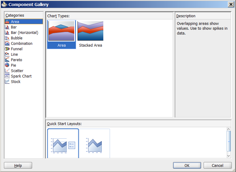
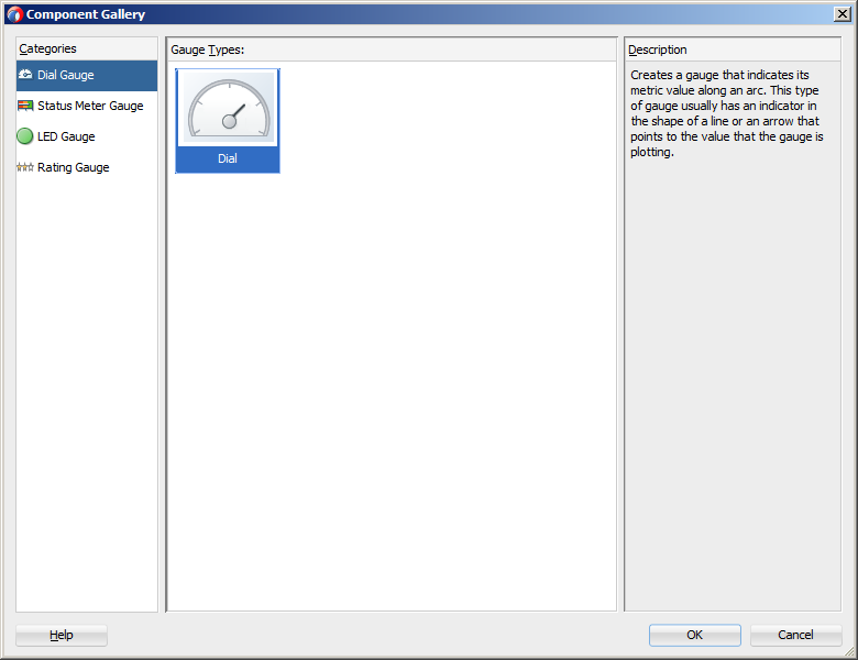
When you create a chart using a data collection inserted from the Data Controls panel, a Component Gallery allows you to choose from a wide number of chart categories, chart types, and layout options. Chart categories group together one or more types of chart. For example, the Area category includes the following types of charts:
-
Area
-
Stacked Area
Explore the Component Gallery that appears when you create a chart to view available chart categories, types, and descriptions for each one. Figure 26-1 shows the Component Gallery that appears for ADF charts when you use the Data Controls panel.
Note:
Thepareto and stock components are legacy server-side graphs whose use is discouraged in favor of the client-side chart components. For information about creating databound legacy graphs, see Section 26.3, "Creating Databound Graphs."Table 26-1 lists the categories that appear in the Component Gallery for charts. Each category has one or more chart types associated with it.
Table 26-1 ADF Chart Categories in the Component Gallery
| Image | Category | Description |
|---|---|---|
 |
Area |
Creates a chart in which data is represented as a filled-in area. Use area charts to show trends over time, such as sales for the last 12 months. Area charts require at least two groups of data along an axis. The axis is often labeled with time periods such as months. |
 |
Bar |
Creates a chart in which data is represented as a series of vertical bars. Use to compare values across products or categories, or to view aggregated data broken out by a time period. |
 |
Bubble |
Creates a chart in which data is represented by the location and size of round data markers (bubbles). Use to show correlations among three types of values, especially when you have a number of data items and you want to see the general relationships. For example, use a bubble chart to plot salaries (x-axis), years of experience (y-axis), and productivity (size of bubble) for your work force. Such a chart allows you to examine productivity relative to salary and experience. |
 |
Combination |
Creates a chart that uses different types of data markers (bars, lines, or areas) to display different kinds of data items. Use to compare bars and lines, bars and areas, lines and areas, or all three. |
 |
Funnel |
Creates a chart in which data is represented by slices across a horizontal or vertical conic section. Use to show disparity between target and actual values against a stage value such as time. For example, use the funnel chart to watch a process where the different sections of the funnel represent different stages in the sales cycle. |
 |
Line |
Creates a chart in which data is represented as a line, as a series of data points, or as data points that are connected by a line. Line charts require data for at least two points for each member in a group. For example, a line chart over months requires at least two months. Typically a line of a specific color is associated with each series of data such as the Americas, Europe, or Asia. Use to compare items over the same time. |
 |
Pie |
Creates a chart that represents a set of data items as proportions of a total. The data items are displayed as sections of a circle causing the circle to look like a sliced pie. Use to show relationship of parts to a whole such as how much revenue comes from each product line. |
 |
Scatter |
Creates a chart in which data is represented by the location of data markers. Use to show correlation between two different kinds of data values such as sales and costs for top products. Scatter charts are especially useful when you want to see general relationships among a number of items. |
 |
Spark |
Creates a simple, condensed chart that displays trends or variations, often in the column of a table, or inline with text. |
You can also create a chart by dragging a chart component from the Component Palette. This approach allows you the option of designing the chart's user interface before binding the component to data. A Create Chart dialog appears to view chart types, descriptions, and quick layout options. For more information about creating charts using UI-first development, see the "Using Chart Components" section in the Oracle Fusion Middleware Web User Interface Developer's Guide for Oracle Application Development Framework.
26.2.1 How to Create an Area, Bar, Combination, or Line Chart Using Data Controls
Area, bar and line charts require at least two groups of data, with one or more series. The groups are displayed along the chart's X Axis for vertical area, bar, and line and along the chart's Y Axis for charts with horizontal orientations. Series are displayed as the areas, bars, or lines on the chart.
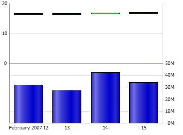
Figure 26-2 shows two bar charts in the customer management sample application for ADF Faces data visualization components. The bar chart on the left is configured to show the customer's order history and order average, and the bar chart on the right shows the ship time for each order. In these examples, the bar charts are configured with groups that represent order and ship dates, and the series are the order totals and ship time averages. The order average is displayed as a red reference line on the Order History chart.
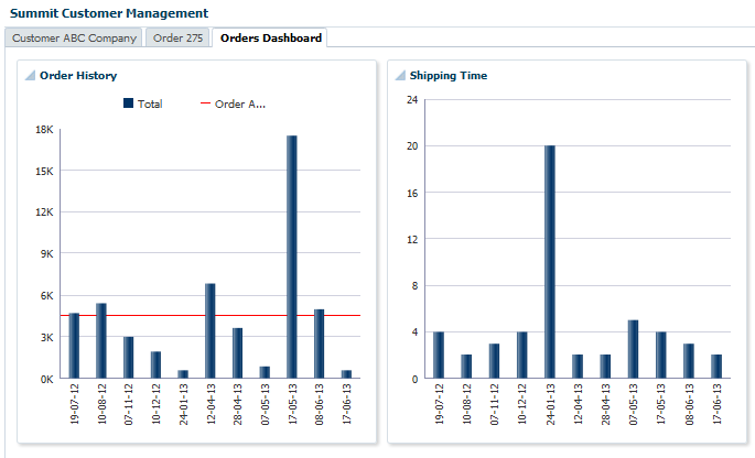
For information about adding reference lines to charts after the chart is created, see the "Adding Reference Objects to a Chart" section in the Oracle Fusion Middleware Web User Interface Developer's Guide for Oracle Application Development Framework.
It may be helpful to have an understanding of databound data visualization charts. For more information, see Section 26.2, "Creating Databound Charts."
You will need to complete these tasks:
-
Create an application module that contains instances of the view objects that you want in your data model, as described in Section 9.2, "Creating and Modifying an Application Module."
For example, the Shipping Time bar chart is based on the
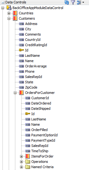
OrdersForCustomerdata collection. Figure 26-3 shows theOrdersForCustomercollection in the Data Controls panel.The
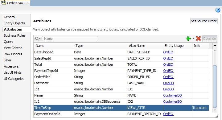
OrdersForCustomerdata control is based on theOrdVOview object. Figure 26-4 shows theOrdVOview object which contains attributes from theOrdEO,EmpEO, andCustomerEOentity objects. TheOrdEO,EmpEO, andCustomerEOentity objects are derived from theSOrd,SEmp, andSCustomertables in the sample application schema.The
OrdVOobject also contains theTimeToShiptransient attribute which is represented by the bars on the ADF Shipping Time bar chart. TheTimeToShipattribute's value is obtained by a call to thecalculateTimeToShip()method:adf.object.calculateTimeToShip(DateOrdered, DateShipped). ThecalculateTimeToShip()method determines the number of days that the order took to ship and is added toOrdVORowImpl.java.OrdVORowImpl.javacontains the implementation methods for theOrdVOview object.Example 26-1 shows the
calculateTimeToShip()method in the ADF sample application. The method returns the number of days as anoracle.jbo.domain.Number, which is the type expected by the chart'svalueattribute.Example 26-1 calculateTimeToShip() Method in ADF Sample Application
public oracle.jbo.domain.Number calculateTimeToShip(Date ordered, Date shipped) {
  if (null != shipped) {
    long days = (shipped.getTime() - ordered.getTime()) / (1000 * 60 * 60 * 24);
    return new Number(days);
  } else
    return new Number(0);
}
For additional information about adding transient attributes to a view object, see Section 5.15, "Adding Calculated and Transient Attributes to a View Object."
-
Create a JSF page as described in the "How to Create JSF JSP Pages" section of the Oracle Fusion Middleware Web User Interface Developer's Guide for Oracle Application Development Framework.
To create a databound area, bar, combination, horizontal bar, or line chart:
-
From the Data Controls panel, select a collection.
For example, to create the bar chart that displays the shipping times for each order on the Orders Dashboard page of the ADF sample application, select the
OrdersForCustomercollection. -
Drag the collection onto a JSF page and, from the context menu, choose Charts.
-
In the Component Gallery, select a chart category and a chart type and click OK.
For information about the chart categories and chart types that appear in the Component Gallery, see Table 26-1.
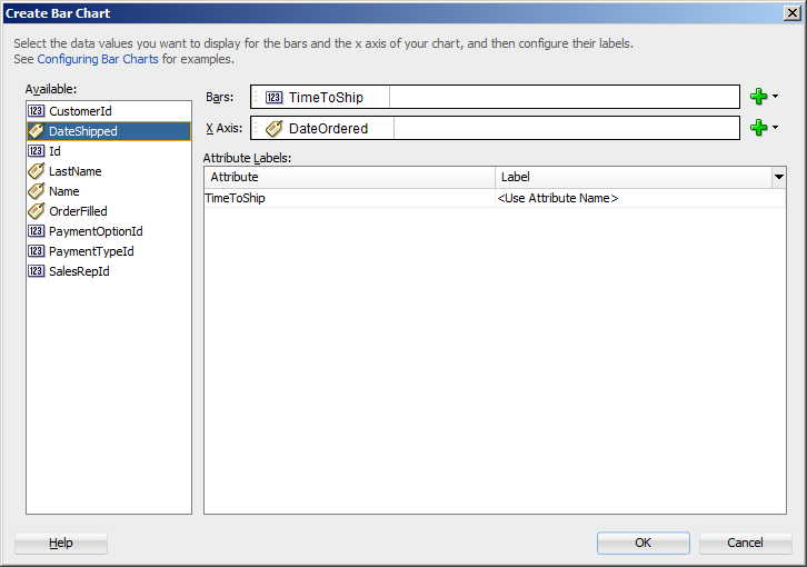
The name of the dialog and the input field labels that appear depend on the category, type of chart, and data collection that you select. For example, if you select Bar as the chart category and Bar as the chart type, then the name of the dialog that appears is Create Bar Chart and the input fields are labeled Bars and X Axis.
-
Do the following in the dialog to configure the chart to display data:
-
Drag attributes from the Available list to the input fields, depending on where you want the values for the attributes to appear at runtime.
For example, to configure the bar chart in the ADF sample application to display the order dates along the X Axis, drag the
DateOrderedattribute from the Available list to the X Axis field in the Create Bar Chart dialog. To configure the chart to display the time to ship as bars, drag theTimeToShipattribute from the Available list to the Bars field in the Create Bar Chart dialog.If you selected a chart type that includes a dual y-axis, the second area, bar, or line that you add will be rendered on the second y-axis. In addition, a
chartSeriesStylecomponent will be added to the chart for the series represented on the second y-axis, and theassignedToY2attribute of thechartSeriesStylecomponent will be set to true.If you selected a combination chart, each attribute that you add to the Data Points input field will be rendered as an area, bar, or line chart. By default, the first attribute will be rendered as a bar chart, the second attribute will be rendered as a line chart, and the third attribute will be rendered as an area chart. To change the chart type, you can add a
chartSeriesStylecomponent to the combination chart'sseriesStampfacet. For additional information, see the "How to Customize a Chart Series" section in the Oracle Fusion Middleware Web User Interface Developer's Guide for Oracle Application Development Framework. -
In the Attribute Labels table, accept the default value or select a value from the dropdown list in the Label field to specify the label that appears at runtime.
The underlying data type determines the choices available in the Label field. The choice you make determines how that attribute's label is rendered in the chart. For more information, see Section 26.2.7, "What You May Need to Know About Using Attribute Labels."
Figure 26-5 shows the Create Bar Chart dialog that generates the ADF sample application Shipping Time bar chart using data from the
DateOrderedandTimeToShipattributes in theOrdersForCustomerdata collection. -
-
Click OK.
After completing the data binding dialog, you can use the Property Inspector to specify settings for the chart attributes and you can also use the child tags associated with the chart tag to customize the chart further. For example, the legend display is turned off for the Shipping Time chart in the ADF sample application. For more information about configuring chart components, see the "Using Chart Components" section in the Oracle Fusion Middleware Web User Interface Developer's Guide for Oracle Application Development Framework.
26.2.2 What Happens When You Use the Data Controls Panel to Create a Chart
Dropping a chart from the Data Controls panel has the following effect:
-
Creates the bindings for the chart and adds the bindings to the page definition file
-
Adds the necessary code for the UI components to the JSF page
The data binding XML that JDeveloper generates represents the physical model of the specific chart type you create. Example 26-2 shows the bindings that JDeveloper generated in the page definition file where a vertical bar chart was created using data from the DateOrdered and TimeToShip attributes in the OrdersForCustomer data collection.
Example 26-2 Binding XML for an ADF Bar Chart
<tree IterBinding="OrdersForCustomerIterator" id="OrdersForCustomer5"
      ChangeEventPolicy="ppr">
  <nodeDefinition DefName="oracle.sample.model.views.OrdVO"
                  Name="OrdersForCustomer5">
    <AttrNames>
      <Item Value="TimeToShip"/>
      <Item Value="DateOrdered"/>
    </AttrNames>
  </nodeDefinition>
</tree>
Charts use a standard tree binding as shown in the example. The node definition shows the name and instance of the data control (OrdersForCustomer5), and the view object (OrdVO) on which the data control is based. Each displayed attribute is listed in the AttrNames definition. For a chart configured for a dual y-axis, the AttrNames definition would include an additional item for the series displayed on the second y-axis.
Example 26-3 shows the code generated for a vertical bar chart when you drag the OrdersForCustomer data collection onto a JSF page and specify DateOrdered for the x-axis and TimeToShip for the bars.
Example 26-3 JSF Code for an ADF Bar Chart
<dvt:barChart id="barChart2" var="row"
              value="#{bindings.OrdersForCustomer5.collectionModel}">  <dvt:chartLegend id="cl2"/>
  <f:facet name="dataStamp">
    <dvt:chartDataItem id="di2" value="#{row.TimeToShip}"
                 group="#{row.DateOrdered}"
                 series="#{bindings.OrdersForCustomer5.hints.TimeToShip.label}"/>
  </f:facet>
</dvt:barChart>
26.2.3 How to Create Databound Funnel Charts
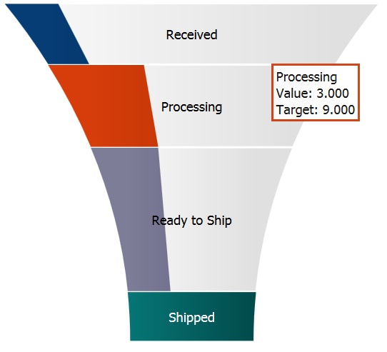
A funnel chart requires at least two series of data, with one group. The series represent the actual and target data values, while the group serves as a stage value.
Figure 26-6 shows a sample funnel chart. The funnel is configured to show the steps in the processing of a customer's order, with the number of orders at any given stage represented with a tooltip.
It may be helpful to have an understanding of databound data visualization charts. For more information, see Section 26.2, "Creating Databound Charts."
You will need to complete these tasks:
-
Create an application module that contains instances of the view objects that you want in your data model, as described in Section 9.2, "Creating and Modifying an Application Module."
-
Create a JSF page as described in the "How to Create JSF JSP Pages" section of the Oracle Fusion Middleware Web User Interface Developer's Guide for Oracle Application Development Framework.
To create a databound funnel chart:
-
From the Data Controls panel, select a collection.
-
Drag the collection onto a JSF page and, from the context menu, choose Charts.
-
In the Component Gallery, select the funnel chart category and a chart type and click OK.
For example, select the Funnel chart category and the Horizontal chart type to create a horizontal funnel chart.
-
Do the following in the dialog to configure the chart to display data:
-
From the drop down menus of the Actual Value and Target Value fields, select an attribute to represent series of data.
-
From the drop down menu of the Funnel Section field, select an attribute to represent a group of data.
-
-
Click OK.
After completing the data binding dialog, you can use the Property Inspector to specify settings for the chart attributes and you can also use the child tags associated with the chart tag to customize the chart further. For more information about configuring chart components, see the "Using Chart Components" section in the Oracle Fusion Middleware Web User Interface Developer's Guide for Oracle Application Development Framework.
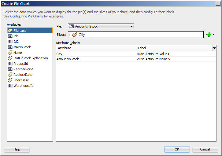
26.2.4 How to Create Databound Pie Charts
A pie chart displays one group of data, each slice representing a different series. This chart type requires one column, with multiple rows, one for each slice.
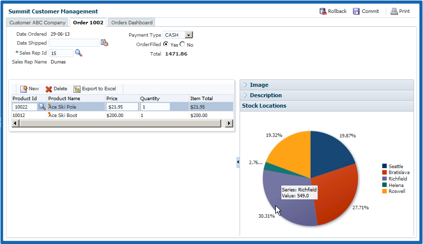
Figure 26-7 shows a pie chart in the ADF sample application that displays the inventory available for the ordered item at each stock location as a percentage of the total available inventory for the item. As the user moves the mouse over each slice, a tooltip shows the actual quantity at the location. The column of data in this example represents the total inventory for the ordered item, and the slices represent the inventory levels at each stocking location.
It may be helpful to have an understanding of databound data visualization charts. For more information, see Section 26.2, "Creating Databound Charts."
You will need to complete these tasks:
-
Create an application module that contains instances of the view objects that you want in your data model, as described in Section 9.2, "Creating and Modifying an Application Module."
-
Create a JSF page as described in the "How to Create JSF JSP Pages" section of the Oracle Fusion Middleware Web User Interface Developer's Guide for Oracle Application Development Framework.
To create a databound pie chart:
-
From the Data Controls panel, select a collection.
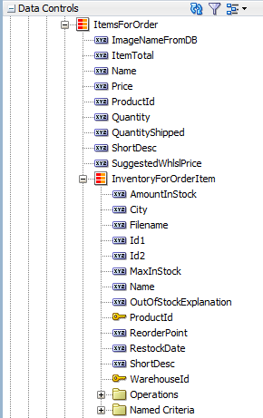
For example, to create the pie chart that displays the inventory levels at each stock location in the Customer Management page of the ADF sample application, select the BackOfficeAppModuleDataControl > Customers > OrdersForCustomer > ItemsForOrder > InventoryForOrderItem collection. Figure 26-8 shows the
InventoryForOrderItemcollection in the Data Controls panel. -
Drag the collection onto a JSF page and, from the context menu, choose Charts.
-
In the Component Gallery, select the Pie chart category and a chart type and click OK.
For example, select the Pie chart category and the Pie chart type to create the pie chart in Figure 26-7.
-
Do the following in the Create Pie Chart dialog to configure the pie chart to display data:
-
From the Pie field's dropdown menu, select an attribute to represent the column of data.
For example, to configure the pie chart in the ADF sample application to display inventory levels, select the
AmountInStockattribute from the Pie field's dropdown menu. -
Drag attributes from the Available list to the Slices field, depending on where you want the values for the attributes to appear at runtime.
For example, to configure the pie chart in the ADF sample application to display the ordered item's inventory levels at each stock location, drag the
Cityattribute from the Available list to the Slices field in the Create Pie Chart dialog. -
In the Attribute Labels table, accept the default value or select a value from the dropdown list in the Label field to specify the label that appears at runtime.
The underlying data type determines the choices available in the Label field. The choice you make determines how that attribute's label is rendered in the chart. For more information, see Section 26.2.7, "What You May Need to Know About Using Attribute Labels."
Figure 26-9 shows the Create Pie Chart dialog that generates a pie chart using the
AmountInStockandCityattributes in theInventoryForOrderItemcollection. -
-
Click OK.
Example 26-4 shows the code generated for the pie chart when you drag the
InventoryForOrderItemdata collection onto a JSF page and specifyAmountInStockfor the Pie value andCityfor the Slices.
After completing the data binding dialog, you can use the Property Inspector to specify settings for the chart attributes and you can also use the child tags associated with the chart tag to customize the chart further. For example, you can configure an exploding pie slice which causes one slice of the pie to appear separated from the other slices. For more information, see the "Using Chart Components" section in the Oracle Fusion Middleware Web User Interface Developer's Guide for Oracle Application Development Framework.
26.2.5 Creating a Databound Spark Chart Using Data Controls
Spark charts are simple, condensed charts that display trends or variations, often in the column of a table, or inline with text.
You can create a sparkchart by inserting a data control from the Data Controls Panel. Figure 26-10 shows the Component Gallery that displays when you drag a spark chart onto your page from the Data Controls panel.
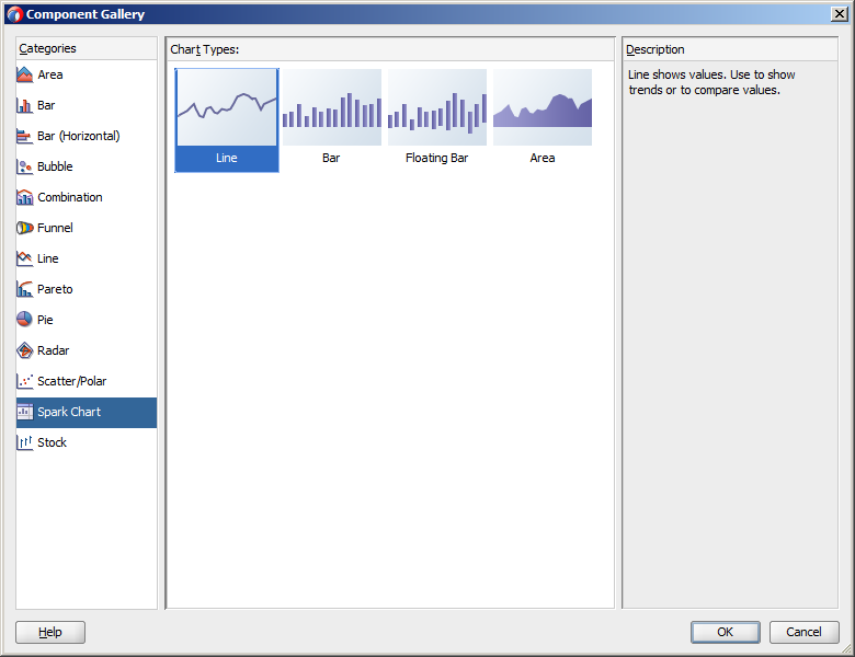
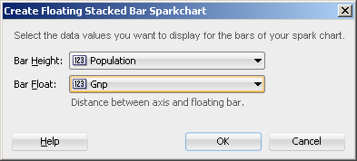
A binding dialog prompts you to specify the value you wish to display for the selected spark chart type. Line, bar, and area spark charts require a single series of data values, for example the changing value of a stock. Floating bar spark charts require two series of data values, one for the float offset, and one for the bar value. For example, in the Create Floating Stacked Bar Sparkchart dialog you specify:
-
Bar Height: Use to select the data value to use for the bar value.
-
Bar Float: Use to select the data value to use for the float offset, the distance between the axis and the floating bar.
Figure 26-11 shows a completed Create Floating Stacked Bar Sparkchart dialog.
In a simple UI-first development scenario you can insert a sparkchart using the Component Palette and bind it to data afterwards. For additional information about providing data to spark charts, see the "How to Add Data to Sparkcharts" section in the Oracle Fusion Middleware Web User Interface Developer's Guide for Oracle Application Development Framework.
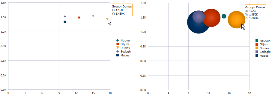
26.2.6 How to Create Databound Bubble and Scatter Charts
Bubble and scatter charts represent data by the location of the data marker. Bubble charts also use the size of the markers to represent an additional aspect of the data.
Scatter charts require at least two data values for each marker. Bubble charts require an additional data value for the marker size. Each data marker represents the following:
-
The x value that determines the marker's location along the x-axis.
-
The y value that determines the marker's location along the y-axis.
-
The z value that determines the size of the marker on bubble charts
For more than one group of data, the data must be in multiples of two for scatter charts and three for bubble charts.
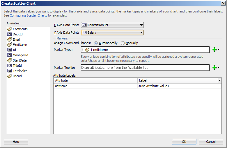
Figure 26-12 shows a scatter and a bubble chart displaying salary and commission for salesmen in the organization. In this example, the x value is determined by the commission, and the y value is determined by the salary. The bubble chart is configured to use the salesmen's total sales for the z value. In this example, Magee has the lowest salary and commission but is the salesman with the highest sales total.
It may be helpful to have an understanding of databound data visualization charts. For more information, see Section 26.2, "Creating Databound Charts."
You will need to complete these tasks:
-
Create an application module that contains instances of the view objects that you want in your data model, as described in Section 9.2, "Creating and Modifying an Application Module."
For example, the bubble and scatter charts in Figure 26-12 in uses a top level view object based on the
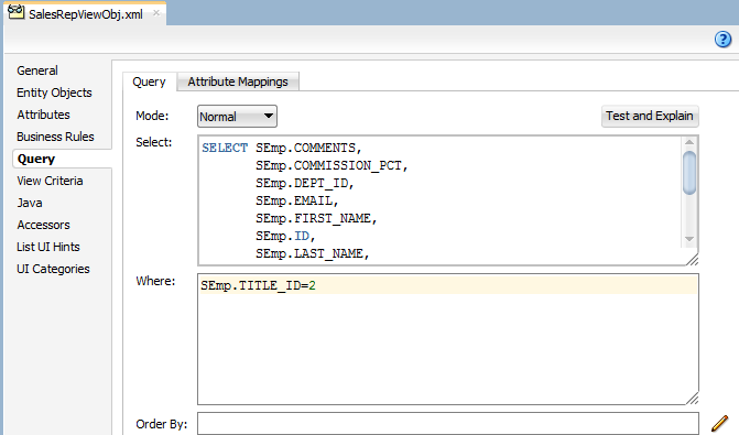
SEmpentity in the sample applications for ADF Faces data visualization components. In this example, the view object retrieves all sales representatives in the ADF employee database by retrieving all employee records with aTITLE_IDof2. Figure 26-13 shows theSalesRepViewObjview object.Figure 26-14 shows the
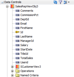
SalesRepViewObj3data control.The
TotalSalesattribute is a transient attribute that calculates the salesman's total sales from theTotalattribute in theSOrdViewview object:SOrdView.sum ('Total'). For information about adding transient attributes to view objects, see Section 5.15, "Adding Calculated and Transient Attributes to a View Object." -
Create a JSF page as described in the "How to Create JSF JSP Pages" section of the Oracle Fusion Middleware Web User Interface Developer's Guide for Oracle Application Development Framework.
To create a databound bubble or scatter chart:
-
From the Data Controls panel, select a collection.
For example, to create the bubble or scatter chart shown in Figure 26-12, select the
SalesRepViewObj3collection. -
Drag the collection onto a JSF page and, from the context menu, choose Charts.
-
In the Component Gallery, select the bubble or scatter chart category and a chart type and click OK.
-
In the Create Bubble Chart or Create Scatter Chart dialog, do the following in the dialog to configure the bubble or scatter chart axis values:
-
In the X Axis Data Point field, use the dropdown list to specify the attribute in the data collection to use for the x-axis data point.
For example, to configure the bubble or scatter chart to display the commission percent along the X Axis, select CommissionPct from the dropdown list.
-
In the Y Axis Data Point field, use the dropdown list to specify the attribute in the data collection to use for the y-axis data point.
-
For bubble charts, in the Z Axis Data Point field, use the dropdown list to specify the attribute in the data collection to use for the z-axis data point.
-
-
If you are configuring a scatter chart, in the Markers section, do the following in the dialog to configure the scatter chart's color, shape, and tooltip:
-
Select Automatically to use system-generated values for color/shape combinations. Select Manually to use distinct attributes to determine color and shape.
If you select Manually, select the attributes in the dropdown list for Marker Color and Marker Shape.
For example, you could select
LastNameandFirstNameto be used for Marker Color and Marker Shape for the scatter chart displayed in Figure 26-12. When the scatter chart is rendered, the legend will contain entries for both the color and shape as shown in Figure 26-15. The scatter chart's tooltip displays the value associated with both the marker and shape attributes. -
From the Marker Type field's dropdown list, specify one or more attributes in the data collection that determine the values that appear in the legend of the scatter chart. Each attribute will be represented by its own color/shape combination in the scatter chart's legend. You can drag and drop attributes from the Available list, or select from the Add dropdown list.
After specifying attributes for the input field, you can right click on any attribute to display a context menu for actions such as Move Right, Move Left, Delete, or Treat as Text.
-
From the Marker Tooltip field's dropdown list, select the attribute to use for the scatter chart's tooltip.
-
-
If you are configuring a bubble chart, in the Markers section, do the following in the dialog to configure the bubble colors and tooltip:
-
Select Automatically to use system-generated values for color. Select Manually to use distinct attributes to determine color and shape.
If you select Manually, select the attribute in the dropdown list for Marker Color and Marker Shape.
-
If you selected Automatically, from the Bubble Color field's dropdown list, specify one or more attributes in the data collection that determine the values that appear in the legend of the bubble chart. Each attribute will be represented by its own color in the bubble chart's legend. You can drag and drop attributes from the Available list, or select from the Add dropdown list.
After specifying attributes for the input field, you can right click on any attribute to display a context menu for actions such as Move Right, Move Left, Delete, or Treat as Text.
-
From the Bubble Tooltip field's dropdown list, select the attribute to use for the bubble chart's tooltip.
By default, the bubble chart's tooltip will display the attribute or attributes associated with the bubble chart's legend. For example, the bubble chart's tooltip in Figure 26-12 shows the last name of the salesman for the Group. You can select a different attribute in the collection to be used for the Group item in the tooltip.
-
-
In the Attribute Labels table, accept the default value or select a value from the dropdown list in the Label field to specify the label that appears at runtime.
The underlying data type determines the choices available in the Label field. The choice you make determines how that attribute's label is rendered in the chart. For more information, see Section 26.2.7, "What You May Need to Know About Using Attribute Labels."
-
Click OK.
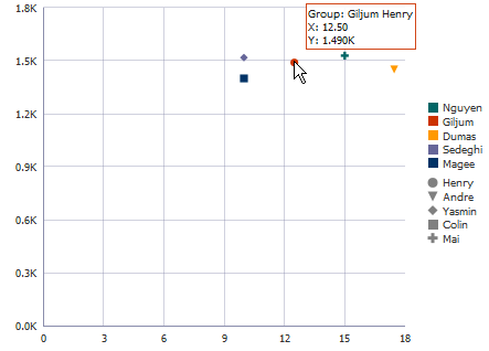
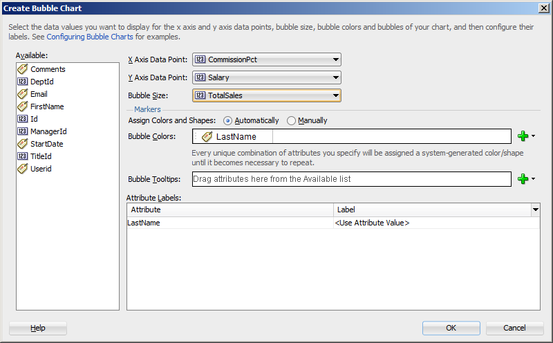
Figure 26-16 shows the Create Bubble Chart dialog that generates a bubble chart using data from the CommissionPct, Salary, and Total Sales attributes in the SalesRepViewObj3 data collection.
The entries for the Create Scatter Chart dialog are similar, but you would not need to select a bubble size. Figure 26-17 shows the Create Scatter Chart dialog that generates a scatter chart using data from the CommissionPct and Salary attributes in the SalesRepViewObj3 data collection.
Example 26-5 shows the code generated for the bubble and scatter charts when you drag the SalesRepViewObj3 data collection onto a JSF page and specify CommissionPct for the X Axis Data Point, Salary for the Y Axis Data Point, and TotalSales for the bubble chart's Z Axis Data Point.
Example 26-5 JSF Code for an ADF Scatter and Bubble Chart
<dvt:scatterChart id="scatterChart1" var="row"
                  value="#{bindings.SalesRepViewObj3.collectionModel}">
  <dvt:chartLegend rendered="true" id="cl1">
    <dvt:legendSection source="ag1" id="ls1"/>
  </dvt:chartLegend>
  <f:facet name="dataStamp">
    <dvt:chartDataItem id="di1" group="#{row.LastName}" x="#{row.CommissionPct}"
                       y="#{row.Salary}">
      <dvt:attributeGroups id="ag1" value="#{row.LastName}" type="color shape"/>
    </dvt:chartDataItem>
  </f:facet>
</dvt:scatterChart>
...
<dvt:bubbleChart id="bubbleChart1" var="row"
                 value="#{bindings.SalesRepViewObj3.collectionModel}">
  <dvt:chartLegend rendered="true" id="cl1">
    <dvt:legendSection source="ag1" id="ls1"/>
  </dvt:chartLegend>
  <f:facet name="dataStamp">
    <dvt:chartDataItem id="di1" group="#{row.LastName}" x="#{row.CommissionPct}"
                       y="#{row.Salary}" z="#{row.TotalSales}">
      <dvt:attributeGroups id="ag1" value="#{row.LastName}" type="color"/>
    </dvt:chartDataItem>
  </f:facet>
</dvt:bubbleChart>
If you chose to configure the scatter chart manually using attributes from the data collection for marker and shape, JDeveloper adds an additional dvt:legendSection and dvt:attributeGroups tag to the JSF page. Example 26-6 shows the revised code, with the modified entries highlighted in bold.
Example 26-6 Code on JSF Page for Scatter Chart Manually Configured for Marker Color and Shape
<dvt:scatterChart id="scatterChart1" var="row"
                  value="#{bindings.SalesRepViewObj3.collectionModel}">
  <dvt:chartLegend rendered="true" id="cl1">
    <dvt:legendSection source="ag1" id="ls1"/>
    <dvt:legendSection source="ag2" id="ls2"/>
  </dvt:chartLegend>
  <f:facet name="dataStamp">
    <dvt:chartDataItem id="di1" group="#{row.LastName} #{row.FirstName}"
                       x="#{row.CommissionPct}"
                       y="#{row.Salary}">
      <dvt:attributeGroups id="ag1" value="#{row.LastName}" type="color"/>
      <dvt:attributeGroups id="ag2" value="#{row.FirstName}" type="shape"/>
    </dvt:chartDataItem>
  </f:facet>
</dvt:scatterChart>
After completing the data binding dialog, you can use the Property Inspector to specify settings for the chart attributes, and you can also use the child tags associated with the chart tag to customize the chart further. For example, you can specify where you want the chart's legend to appear. For more information, see the "Using Chart Components" section in the Oracle Fusion Middleware Web User Interface Developer's Guide for Oracle Application Development Framework.
26.2.7 What You May Need to Know About Using Attribute Labels
When you configure attribute labels in the Create Chart dialog, the underlying data type determines the choices available in the Label field. The choice you make determines how that attribute's label is rendered in the chart.
If an attribute represents data values, then the choices in the Label field are:
-
Use Attribute Name: Select to render the value as a string using the label from the
UIHintsfor that attribute in the underlyingViewObject. This is the default selection. -
No Label: Select to render no label. This choice is useful if there is a single metric and you want to provide your own descriptive text on the page to describe the resulting chart.
-
Select Text Resource: Select to open a Select Text Resource dialog to select or add a text resource to use for the label. The text resource is a translatable string from an application resource bundle. If you need help, press F1 or click Help.
-
Expression Builder: Select to open the Expression Builder dialog to create an expression to be executed at runtime for the label. If you need help, press F1 or click Help.
If the attribute represents a category of data values, then the choices are:
-
Use Attribute Value: Select to render the attribute values as category labels. This is the default selection.
-
From the dropdown list, choose an alternate attribute for the label. For example, use Employee Names for labels instead of Employee IDs.
26.3 Creating Databound Graphs
The Pareto and stock graphs are legacy server-side components whose use is discouraged in favor of the client-side charts.
When you create a chart using a data collection inserted from the Data Controls panel, a Component Gallery allows you to choose from a wide number of chart categories, chart types, and layouts.
Explore the Component Gallery that appears when you create a chart to view available chart categories, types, and descriptions for each one. Figure 26-18 shows the Component Gallery that appears for ADF charts when you use the Data Controls panel.
Note:
The area, bar, bar (horizontal), combination, funnel, line, pie, and scatter charts are client-side components, and their use is favored over the legacy graph components. For additional information about creating databound charts, see Section 26.2, "Creating Databound Charts."You can also create a graph by dragging a graph component from the Component Palette. This approach allows you the option of designing the graph's user interface before binding the component to data. A Create Graph dialog appears to view graph types, descriptions, and quick layout options. For more information about creating graphs using UI-first development, see the "Using Graph Components" section in the Oracle Fusion Middleware Web User Interface Developer's Guide for Oracle Application Development Framework.
Table 26-2 lists the categories that appear in the Component Gallery for graphs.
Table 26-2 ADF Graph Categories in the Component Gallery
| Category | Description |
|---|---|
|
Pareto |
Creates a graph in which data is represented by bars and a percentage line that indicates the cumulative percentage of bars. Each set of bars identifies different sources of defects, such as the cause of a traffic fatality. The bars are arranged by value, from the largest number to the lowest number of incidents. A pareto graph is always a dual-y graph in which the first y-axis corresponds to values that the bars represent and the second y-axis runs from 0 to 100% and corresponds to the cumulative percentage values. Use the pareto graph to identify and compare the sources of defects. |
|
Stock |
Creates a graph in which data shows the high, low, and closing prices of a stock and, optionally, the opening price and trading volume of the stock. |
26.3.1 How to Create a Stock Graph Using Name-Value Pairs
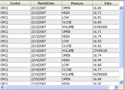
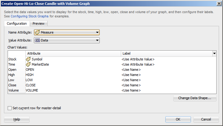
You can create a graph where the data collection is arranged in a series of name-value pairs instead of typed attributes. For example, stock values may be arranged in a single numeric column of data with multiple data points and multiple attributes to designate these points
Figure 26-19 shows an example of a data collection arranged in name-value pairs. For each MarketDate, the Measure attribute contains the names for the values stored in the Data attribute: OPEN, HIGH, LOW, CLOSE, and VOLUME.
It may be helpful to have an understanding of databound data visualization graphs. For more information, see Section 26.3, "Creating Databound Graphs."
It may also be helpful to understand name-value pairs data shapes. For information, see Section 26.3.3, "What You May Need to Know About Using Name-Value Pairs."
You will need to complete these tasks:
-
Create an application module that contains instances of the view objects that you want in your data model, as described in Section 9.2, "Creating and Modifying an Application Module."
-
Create a JSF page as described in the "How to Create JSF JSP Pages" section of Oracle Fusion Middleware Web User Interface Developer's Guide for Oracle Application Development Framework.
To create a graph using a name-value pairs data shape:
-
From the Data Controls panel, select a collection.
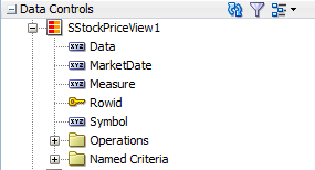
In the example to create a graph that displays the open, high, low, and close stock values over a week's time, select the collection
SStockPriceView1. Figure 26-20 shows theSStockPriceView1collection in the Data Controls panel. -
Drag the collection onto a JSF page and, from the context menu, choose Graphs.
-
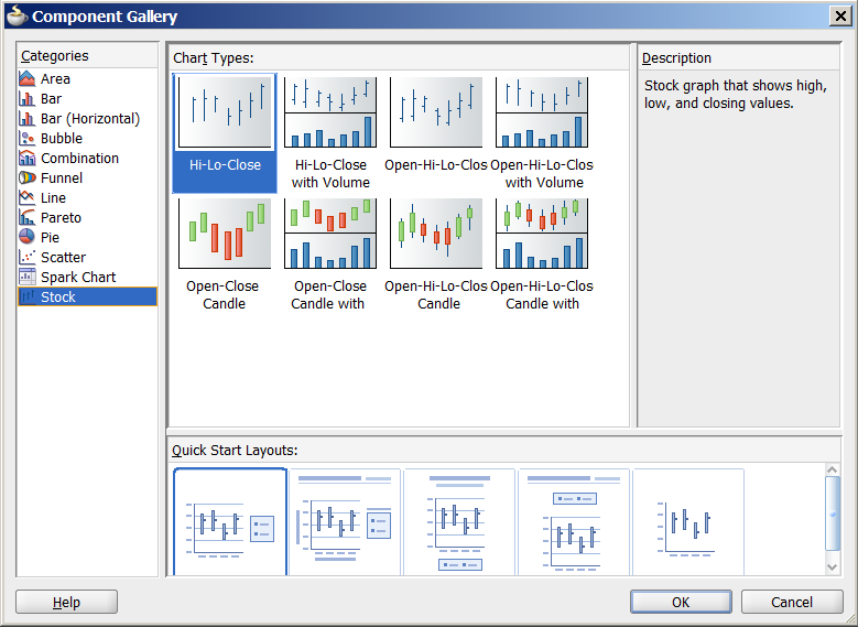
In the Component Gallery, select the Stock graph category, then the Open-Hi-Lo-Close Candle with Volume graph type, and click OK.
-
Do the following to change the dialog to support a name-value pairs data shape:
-
Click Change Data Shape.
-
In the Change Chart Data Shape dialog, select Name-Value Pairs, and click OK.
-
If prompted, confirm your selection.
-
-
Do the following in the modified dialog to configure the graph to display data:
-
For Name Attribute, select the attribute containing the names of the name-value pairs.
For example, choose Measure from the dropdown list to create a stock graph using the data collection in Figure 26-20.
-
For Value Attribute, specify the attribute containing the data for the name-value pairs.
For example, choose Data from the dropdown list to create a stock graph using the data collection in Figure 26-20.
-
In the Chart Values table, accept the default value or select a value from the dropdown list in the Label field to specify the label that appears at runtime.
The underlying data type determines the choices available in the Label field. The choice you make determines how that attribute's label is rendered in the graph. For more information, see Section 26.2.7, "What You May Need to Know About Using Attribute Labels."
-
Set the current row for master-detail: Select to use the graph's row selection listener to enable clicks on a bar, slice, or other graph data element to update the data in another ADF component. For more information see Section 26.3.2, "What You May Need to Know About Using a Graph's Row Selection Listener for Master-Detail Processing."
Note:
If the data collection is the child collection in a master-detail relationship, the dialog includes the option to Include Child Accessors (Hierarchical Graph). This option is included for backwards compatibility with older data models that mapped Tree collections onto the graph's cube model, and you normally would not check this box.
Figure 26-21 shows the Create Stock Graph dialog that generates a graph using the
Measureattribute in theSStockPriceView1collection. -
-
Click OK.
26.3.2 What You May Need to Know About Using a Graph's Row Selection Listener for Master-Detail Processing
You can use the row selection listener of a graph (which serves as a master view) to enable clicks on a bar, slice, or other graph data element to update the data in another ADF component (which serves as a detail view). For example, clicking on a bar that represents sales for a given product in a graph might cause the display of the detailed sales data for that product in a pivot table.
The following requirements must be met to achieve this master-detail processing declaratively:
-
You must use the same data control to provide data for both views as follows:
-
Bind the graph as a row set to the parent collection in the data control, for example,
DepartmentsView. -
Bind the other ADF view (such as a table or pivot table) to the dependent detail collection in the data control, for example
EmployeesView.
-
-
Select Set the current row for master-detail in the Create Graph dialog to set a value automatically for the
clickListenerattribute of the graph tag and use theprocessClickmethod that is already part of the graph binding.For example, if the
valueattribute of the graph tag isvalue="#{bindings.myGraph.graphModel}", then theclickListenerattribute is set toclickListener="#{bindings.myGraph.graphModel.processClick}".
You do not have to write Java code for handling clicks on data elements in the graph. The processClick event on the graph binding recognizes click events on data component in a graph and performs the necessary processing.
26.3.3 What You May Need to Know About Using Name-Value Pairs
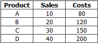
When you configure a graph using data controls, by default the data binding dialog supports typed attributes, where each kind of data point in the collection is represented by a different attribute. For example, if you have data points for the sales and costs of multiple products, use typed attributes only if you have one attribute for the sales data of each product, and a second attribute for the cost of each product in the data collection.
Typed attributes data shape is also valid when there is only a single kind of data point in the graph. Figure 26-22 shows a typed attribute data shape.
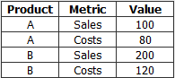
You can select Change Data Shape in the data binding dialog to change the dialog to support name-value pairs, where there are two or more kinds of data points represented by exactly two attributes: a Name attribute that specifies the name of the data point and a Value attribute that specifies the data value. In this case, each dedicated attribute has values that identify each kind of data point. For example, the metrics attribute might have values for dales and costs for each product in a data collection. Figure 26-23 shows a data collection in a name-value pairs data shape.
When using a name-value pairs data shape, specify these values in the graph data binding dialog:
-
Name Attribute: the attribute in the data collection representing the
Nameattribute, when its unique values categorize data points into different metrics. -
Value Attribute: the attribute in the data collection representing the numeric data points plotted on the graph. Each data point is categorized as belonging to a particular metric by the corresponding
Nameattribute value. -
Specify the values for the
Valueattribute in the relevant fields for the graph type as defined in the dialog, for example, Bubble Colors and Bubble Tooltips for a bubble graph. Values can be attributes in the data collection, or data values, representing a unique value of theNameattribute to be used at runtime to categorize data points into specific metrics.You must add one or more data values by selecting Data Value from the field Add dropdown list. Each data value represents a unique value of the
NameAttribute to be used at runtime to categorize data points into specific metrics. You are not required to select all the metrics available in theNameAttribute.After specifying attributes or data values for the input field, you can right-click any attribute to display a context menu for actions such as Move Right, Move Left, Delete, or Edit Data Value.
For example, you can create a stock graph that displays open, high, low, and close stock values bound to a data collection with a single numeric column of data in a name-value pairs shape as displayed in Figure 26-24.
26.4 Creating Databound Gauges
A gauge plots a single data value, such as a sales total, stock level, temperature, or speed. Using thresholds, gauges can show state information such as acceptable or unacceptable ranges using color. For example, a gauge value axis might show ranges colored red, yellow, and green to represent low, medium, and high states. One databound gauge component can create a single gauge or a column of gauges, depending on the number of rows in the data collection used. In a data collection, each row contains the value for a single gauge.
The Component Gallery for gauges allows you to choose from four gauge categories described in Table 26-3.
Table 26-3 ADF Gauge Categories in the Component Gallery
| Image | Category | Description |
|---|---|---|
 |
Dial |
Displays a metric value plotted on a circular axis. The gauge's background attribute determines whether the gauge's background is displayed as a rectangle, circle, or semicircle. An indicator points to the dial gauge's metric value on the axis. |
 |
LED |
Graphically depicts a measurement, such as a key performance indicator (KPI). Several styles of shapes are available for LED gauges, including round or rectangular shapes that use color to indicate status, and triangles or arrows that point up, left, right, or down in addition to the color indicator. |
 |
Rating |
Displays and optionally accepts input for a metric value. This gauge is typically used to show ratings for products or services, such as the star rating for a movie. |
 |
Status Meter |
Displays the metric value on a horizontal or circular axis. An inner rectangle shows the current level of a measurement against the ranges marked on an outer rectangle. Optionally, status meters can display colors to indicate where the metric value falls within predefined thresholds. |
Each category contains one or more gauge types. Explore the Component Gallery that appears when you create a single gauge to view all available gauge and category types, and descriptions for each one. Figure 26-25 shows the Component Gallery that appears for ADF gauges.
The data binding process is essentially the same regardless of which type of gauge you create. Only the metric value (that is, the measurement that the gauge is to indicate) is required. However, if a row in a data collection contains range information such as maximum, minimum, and thresholds, then these values can be bound to the gauge to provide dynamic settings. If information that you want to use in a gauge's upper or lower labels is available in the data collection, then you can bind these values to the gauge as well.
For information about customizing a gauge after the data binding is completed, see the "Using Gauge Components" section in the Oracle Fusion Middleware Web User Interface Developer's Guide for Oracle Application Development Framework.
26.4.1 How to Create a Databound Dial Gauge
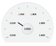
You can use the ADF gauge component to create a dial gauge against a circle, dome, or rectangle background. The gauge's indicator specifies the current value of the metric.
Figure 26-26 shows a single dial gauge that appears if you create a gauge from the AmountInStock data for inventory items in the ADF DVT sample application. The value of the AmountInStock metric, which is 0.650K, appears in a label in the center of the gauge
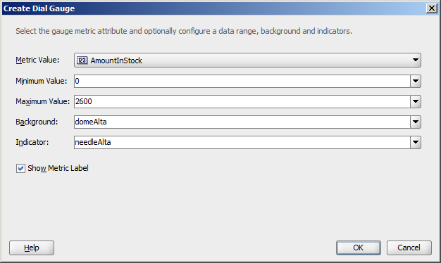
To create a dial gauge using a data control, you bind the gauge component to an attribute in a data collection. JDeveloper allows you to do this declaratively by dragging and dropping an attribute from the Data Controls panel. After you drag and drop the attribute, use the Create Dial Gauge dialog to configure the gauge.
Figure 26-27 shows the Create Dial Gauge dialog configured for the Amount in Stock dial gauge shown in Figure 26-26 and using the gauge type shown in Figure 26-25.
It may be helpful to have an understanding of databound data visualization gauges. For more information, see Section 26.4, "Creating Databound Gauges."
You will need to complete these tasks:
-
Create an application module that contains instances of the view objects that you want in your data model, as described in Section 9.2, "Creating and Modifying an Application Module."
-
Create a JSF page as described in the "How to Create JSF JSP Pages" section of Oracle Fusion Middleware Web User Interface Developer's Guide for Oracle Application Development Framework.
To create a databound dial gauge:
-
From the Data Controls panel, select an attribute from a collection.
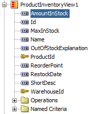
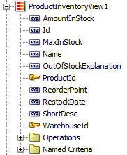
For example, to create a dial gauge in the ADF DVT sample application to display the stock levels for an inventory item, you would select the
AmountInStockattribute in theProductInventoryView1collection. Figure 26-28 shows theProductInventoryView1collection in the Data Controls panel with theAmountInStockattribute selected. -
Drag the attribute onto a JSF page and, from the context menu, choose Gauges.
-
In the Component Gallery, choose the category and type of gauge, and then click OK.
-
In the Create Dial Gauge dialog, do the following:
-
In the Metric field, confirm the column in your data collection that contains the actual value that the gauge is to plot. This is the only required value in the dialog.
-
In the Minimum field, if your data collection stores a minimum value for the gauge range, select the column that contains this value from the dropdown list. Alternatively, specify a minimum number for the range. If you do not specify a value, the minimum defaults to
0. -
In the Maximum field, if your data collection stores a maximum value for the gauge range, select the column that contains this value from the dropdown list. Alternatively, specify a maximum value. If you do not specify a value, the maximum value defaults to
100. -
In the Background field, select a background from the dropdown list.
Available shapes include circle, dome, and rectangle, with alta, light, antique, or dark shading. By default, the gauge's background is set to
autowhich will return the primary design for the current skin. -
In the Indicator field, select an indicator style from the dropdown list.
Available indicators include alta, antique, dark, and light. By default the indicator is set to auto which will select the indicator that matches the gauge's background.
-
In the Show Metric Label check box, select the Show Metric Label check box to show a metric label for the gauge. The metric label contains the actual metric value for the gauge. For example, if the amount in stock for a given item is 63, then the metric label will display 63.
-
-
Click OK.
In the Property Inspector, after you complete the binding of the gauge, you can set values for additional attributes in the gauge tag and its child tags to customize the component. For example, to configure the Amount In Stock gauge to show inventory amounts without scaling, set the scaling attribute of the metric and tick labels to none.
You can also examine and adjust the existing gauge bindings by clicking the Edit icon in the Property Inspector for the gauge component.
For additional information about customizing a gauge after the data binding is completed, see the "Using Gauge Components" section in the Oracle Fusion Middleware Web User Interface Developer's Guide for Oracle Application Development Framework.
26.4.2 What Happens When You Create a Dial Gauge from a Data Control
Dropping a gauge from the Data Controls panel has the following effect:
-
Creates the bindings for the gauge and adds the bindings to the page definition file
-
Adds the necessary code for the UI components to the JSF page
Example 26-7 shows the bindings that JDeveloper generated for the dial gauge that displays the inventory level for a product in a warehouse. This code example shows that the gauge metric receives its value dynamically from the AmountInStock attribute in the ProductInventoryView1 data collection.
Example 26-7 Binding for a Dial Gauge
<bindings>
  <attributeValues IterBinding="ProductInventoryView1Iterator" id="AmountInStock">
    <AttrNames>
      <Item Value="AmountInStock"/>
    </AttrNames>
  </attributeValues>
</bindings>
Example 26-8 shows the code that JDeveloper generated in the JSF page for a dial gauge.
26.4.3 How to Create a Databound Rating Gauge
The rating gauge displays and optionally accepts input for a metric value. This gauge is typically used to show ratings for products or services, such as the star rating for a movie.
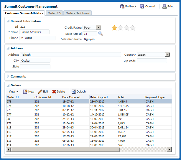
Figure 26-29 shows an example of a rating gauge used to indicate a customer's credit rating in the ADF sample application. In this example, the customer has a poor credit rating and is assigned one star. Other ratings include two stars for fair credit, three stars for good credit, and four stars for excellent.
To create a rating gauge using a data control, you bind the rating gauge to an attribute in a data collection. JDeveloper allows you to do this declaratively by dragging and dropping an attribute from the Data Controls panel. After you drag and drop the attribute, use the Create Rating Gauge dialog to configure the gauge.
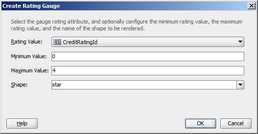
Figure 26-30 shows the Create Rating Gauge dialog completed for the rating gauge in Figure 26-29. In this example, the rating gauge is set to a maximum value of four to reflect the four credit ratings.
It may be helpful to have an understanding of databound data visualization gauges. For more information, see Section 26.4, "Creating Databound Gauges."
You will need to complete these tasks:
-
Create an application module that contains instances of the view objects that you want in your data model, as described in Section 9.2, "Creating and Modifying an Application Module."
-
Create a JSF page as described in the "How to Create JSF JSP Pages" section in the Oracle Fusion Middleware Web User Interface Developer's Guide for Oracle Application Development Framework.
To create a databound rating gauge:
-
From the Data Controls panel, select an attribute from a collection.
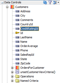
For example, to create the rating gauge in the ADF sample application to display the credit ratings for a customer, you would select the
CreditRatingIdattribute in theCustomercollection. Figure 26-31 shows theCustomercollection in the Data Controls panel with theCreditRatingIdattribute selected. -
Drag the attribute onto a JSF page and, from the context menu, choose Gauges.
-
In the Component Gallery, choose the category and type of gauge, and then click OK.
-
In the Create Rating Gauge dialog, do the following:
-
In the Rating Value field, confirm the column in your data collection that contains the actual value that the gauge is to plot. This is the only required value in the dialog.
-
In the Minimum field, if your data collection stores a minimum value for the gauge range, select the column that contains this value from the dropdown list. Alternatively, specify a minimum number for the range. If you do not specify a value, the minimum defaults to
0. -
In the Maximum field, if your data collection stores a maximum value for the gauge range, select the column that contains this value from the dropdown list. Alternatively, specify a maximum value. If you do not specify a value, the maximum value defaults to
5. -
In the Shape field, select a background from the dropdown list.
Available shapes include circle, diamond, rectangle, and star.
-
-
Click OK.
In the Property Inspector, after you complete the binding of the gauge, you can set values for additional attributes in the gauge tag and its child tags to customize the component. For example, to configure the rating gauge to allow the customer's credit rating to be updated, set the readOnly attribute of the rating gauge to false.
In the ADF example, the rating gauge's value was set to the CreditRatingId during creation. However, the CreditRatingId actually ranges between 1 and 4, with 1 being the highest rating. To convert the rating to stars for the rating gauge, edit the source code in the Code Editor after the gauge is credited and replace the rating gauge's value with: #{5 - bindings.CreditRatingId.inputValue}.
Example 26-9 shows the code on the JSF page for the ADF rating gauge.
Example 26-9 Code on JSF Page for the ADF Rating Gauge
<dvt:ratingGauge id="ratingGauge1" minimum="0" maximum="4"
                 value="#{5 - bindings.CreditRatingId.inputValue}" shape="star"/>
You can also examine and adjust the existing gauge bindings by clicking the Edit icon in the Property Inspector for the gauge component.
For additional information about customizing a gauge after the data binding is completed, see the "Using Gauge Components" section in the Oracle Fusion Middleware Web User Interface Developer's Guide for Oracle Application Development Framework.
26.4.4 Including Gauges in Databound ADF Tables
You can add databound gauges to a databound ADF table by choosing the gauge component when specifying column content during table editing or creation.
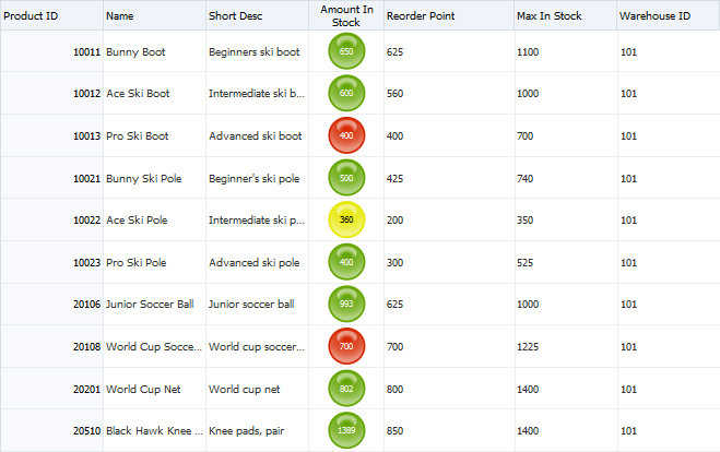
Figure 26-32 shows a portion of a table that displays all the products in a warehouse in the ADF DVT sample application. In this example, the AmountInStock column includes a LED gauge that shows the amount in stock for each product and whether the value falls within an acceptable range.
26.4.4.1 How to Include a Gauge in a Databound ADF Table
To add a gauge to a databound ADF table, drag a data collection that includes the gauge metric from the Data Controls panel to the JSF page and specify the type of gauge to create.
It may be helpful to have an understanding of databound data visualization gauges. For more information, see Section 26.4, "Creating Databound Gauges."
You will need to complete these tasks:
-
Create an application module that contains instances of the view objects that you want in your data model, as described in Section 9.2, "Creating and Modifying an Application Module."
-
Create a JSF page as described in the "How to Create JSF JSP Pages" section of the Oracle Fusion Middleware Web User Interface Developer's Guide for Oracle Application Development Framework.
To include a gauge in a databound ADF table:
-
From the Data Controls panel, select the collection to use for the ADF table.
For example, to create the table that displays the inventory levels for each product in a warehouse in the ADF DVT sample application, select the
ProductInventoryView1collection. Figure 26-33 shows theProductInventoryView1collection in the Data Controls panel. -
Drag the collection onto a JSF page and, from the context menu, choose Table -> ADF Table.
-
In the Edit Table Columns dialog, select the column that represents the gauge metric.
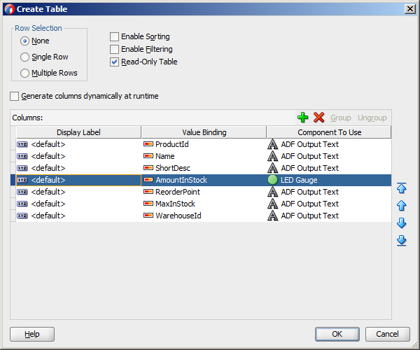
For example, select the
AmountInStockcolumn to use as the gauge metric. -
From the Component to Use dropdown menu, choose the type of gauge to create.
For example, choose Gauge Status Meter to add a status meter to the table.
-
Complete the table configuration.
If you need help, press F1 or click Help.
Figure 26-34 shows the completed dialog for the table displayed in Figure 26-32, with the LED Gauge selected for the
AmountInStockcolumn. -
Click OK to add the table to the JSF page.
In the Property Inspector, after you complete the binding of the table, you can set values for additional attributes in the gauge tag and its child tags to customize the component. For example, the LED gauge in Figure 26-32 is configured to use thresholds to indicate whether the stock level is within an acceptable range. For additional information about configuring gauge thresholds, see the "How to Configure Gauge Thresholds" section in the Oracle Fusion Middleware Web User Interface Developer's Guide for Oracle Application Development Framework.
You can also examine and adjust the existing table bindings by clicking the Edit icon in the Property Inspector for the table component.
For additional information about creating and configuring databound ADF tables, see Chapter 23, "Creating ADF Databound Tables." For additional information about using and customizing gauge components, see the "Using Gauge Components" section in the Oracle Fusion Middleware Web User Interface Developer's Guide for Oracle Application Development Framework.
26.4.4.2 What Happens When You Include a Gauge in an ADF Table
When you include a gauge in a databound ADF table, the gauge's metric attribute is added to the page definition file, and the UI components are updated on the JSF page.
Example 26-10 shows the binding for the ADF table shown in Figure 26-32.
Example 26-10 Binding for ADF Table with LED Gauge
<bindings>
  <tree IterBinding="ProductInventoryView1Iterator" id="ProductInventoryView1">
    <nodeDefinition DefName="model.ProductInventoryView"
                    Name="ProductInventoryView10">
      <AttrNames>
        <Item Value="ProductId"/>
        <Item Value="Name"/>
        <Item Value="ShortDesc"/>
        <Item Value="AmountInStock"/>
        <Item Value="ReorderPoint"/>
        <Item Value="MaxInStock"/>
        <Item Value="WarehouseId"/>
      </AttrNames>
    </nodeDefinition>
  </tree>
</bindings>
Example 26-11 shows the code added to the JSF page for the ADF table. The gauge elements are highlighted in bold. For the sake of brevity, only the first three table columns are displayed.
Example 26-11 Sample Code on JSF Page Showing Gauge in Databound Table
<af:table value="#{bindings.ProductInventoryView1.collectionModel}" var="row"
          rows="#{bindings.ProductInventoryView1.rangeSize}"
          emptyText="#{bindings.ProductInventoryView1.viewable ?
                    'No data to display.' : 'Access Denied.'}"
          rowBandingInterval="0"
          fetchSize="#{bindings.ProductInventoryView1.rangeSize}" id="t1"
          summary="Table Showing Product Inventory">
  <af:column headerText="#{bindings.ProductInventoryView1.hints.ProductId.label}"
             id="c1" width="100"
             rowHeader="true">
    <af:outputText value="#{row.ProductId}"
             shortDesc="#{bindings.ProductInventoryView1.hints.ProductId.tooltip}"
             id="ot1">
      <af:convertNumber groupingUsed="false"
                        pattern="#{bindings.ProductInventoryView1.hints.ProductId.format}"/>
    </af:outputText>
  </af:column>
  <af:column headerText="#{bindings.ProductInventoryView1.hints.Name.label}"
             id="c2" width="100">
    <af:outputText value="#{row.Name}"
                   shortDesc="#{bindings.ProductInventoryView1.hints.Name.tooltip}" id="ot2"/>
  </af:column>
  <af:column headerText="#{bindings.ProductInventoryView1.hints.ShortDesc.label}"
             id="c3" width="100">
    <af:outputText value="#{row.ShortDesc}"
                   shortDesc="#{bindings.ProductInventoryView1.hints.ShortDesc.tooltip}" id="ot3"/>
  </af:column>
  <af:column headerText="#{bindings.ProductInventoryView1.hints.AmountInStock.label}"
             id="c4" width="72" align="center">
    <dvt:ledGauge id="ledGauge1" value="#{row.bindings.AmountInStock.inputValue}"
                  shortDesc="#{bindings.ProductInventoryView1.hints.AmountInStock.tooltip}"
                  maximum="3000">
      <dvt:gaugeMetricLabel rendered="true" scaling="none" id="gml1"/>
      <dvt:gaugeThreshold id="gt1" maximum="#{row.bindings.ReorderPoint.inputValue}"
                          color="#d62800"/>
      <dvt:gaugeThreshold id="gt2" maximum="#{row.bindings.MaxInStock.inputValue}"
                          color="#63a500"/>
      <dvt:gaugeThreshold id="gt3" color="#e7e700"/>
    </dvt:ledGauge>
  </af:column>

... remaining columns omitted
</af:table>
26.5 Creating Databound NBoxes
The ADF nBox component produces an interactive component that you can use to visualize and compare data across a two-dimensional grid, represented visually by rows and columns. The nBox component is comprised of two parts: the node that represents the data and the grid that comprises the cells into which the nodes are placed. If the number of nodes is greater than the space allocated for the cell, the NBox displays an indicator that users can click to access the additional nodes.
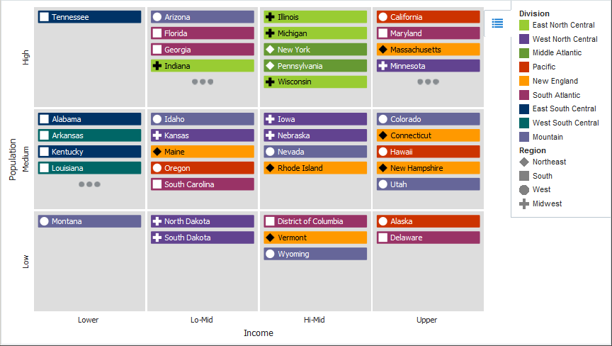
Figure 26-35 shows a sample NBox configured to display a grid with three rows and four columns. Each row represents a range of population data, labeled as Low, Medium, or High. Each column represents a range of income data, labeled as Lower, Lo-Mid, Hi-Mid, or Upper. The nodes represent the states, which are stamped into a cell depending on the value of the state's population and income level. The sample NBox also uses optional attribute groups to color each node depending upon its Division value and to vary the node's icon marker shape depending upon its Region value.
The Create NBox wizard provides declarative support for creating the NBox and binding it to data. In the wizard pages you can:
-
Specify the initial layout of the NBox, including:
-
Number of rows and columns (Required)
-
Values for each NBox row and column (Required)
-
Titles for the NBox rows and columns
-
Labels for each NBox row and column
-
-
Configure the NBox nodes, including:
-
Attributes to use from the data collection to determine the node's row and column placement (Required)
-
Primary and secondary node labels
-
Attribute groups to group nodes by color or shape according to a specified attribute
-
Images to use for the node's icon or indicator
-
After you complete the NBox wizard and the NBox is added to your page, you can further customize the NBox using the Property Inspector. For additional information, see "Using NBox Components" in Oracle Fusion Middleware Web User Interface Developer's Guide for Oracle Application Development Framework.
26.5.1 How to Create an NBox Component Using ADF Data Controls
To create a DVT NBox using a data control, bind the dvt:nBox component to a collection. JDeveloper allows you to do this declaratively by dragging and dropping a collection from the Data Controls panel.
Tip:
You can also create the NBox by dragging the NBox from the Component Palette. This approach allows you the option of designing the NBox user interface before binding the component to data.You will need to complete these tasks:
-
Create an application module that contains instances of the view objects that you want in your data model for the NBox, as described in Section 9.2, "Creating and Modifying an Application Module."
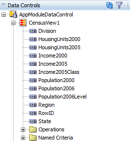
Figure 26-36 shows the data control for the NBox displayed in Figure 26-35. In this example,
CensusView1contains the data collection for the NBox. NBox nodes are represented visually as rectangular boxes identified by their state names. Each node is stamped into one of the NBox cells according to the values in the node'sPopulation2006Leveland Income2005Classattributes.In this example, the rows are defined as ranges, with the lowest range displayed on the bottom row of the NBox. For example, a node whose
Population2006value is less than or equal to 1,000,000 will be assigned aPopulation2006Leveloflow. Columns are also defined as ranges, with the lowest range displayed in the leftmost column for left-to-right locales and in the rightmost column for right-to-left locales.The
Population2006LevelandIncome2005Classattributes are defined as transient attributes whose values are derived from thePopulation2006andIncome2005 attributes in the data collection. The following code sample shows the EL expression used to define the value for thePopulation2006Leveltransient attribute:Population2006 <= 1000000? 'low': (Population2006 <= 5000000 ? 'medium' : 'high')
The EL expression that defines the value for the Income2005Class transient attribute is shown in the following code sample:
Income2005 <= 40000.0 ? 'lower' : (Income2005 <= 45000.0 ? 'lo-mid' : (Income2005 <= 50000.0 ? 'hi-mid' : 'upper'))
For information about adding transient attributes to view objects, see Section 5.15, "Adding Calculated and Transient Attributes to a View Object."
-
Create a JSF page as described in the "How to Create JSF Pages" section of Oracle Fusion Middleware Web User Interface Developer's Guide for Oracle Application Development Framework.
-
From the Data Controls panel, select a collection.
-
Drag the collection onto a JSF page and, from the menu, choose NBox.
-
In the Create NBox - Configure NBox Grid dialog, enter numeric values for the number of rows and number of columns in the NBox.
For example, enter
3for Rows and4for Columns to create the NBox with three rows and four columns. -
Optionally, enter the text label to display for the row and column titles of the NBox. If you wish to associate a text resource from a resource bundle with the text label, select Select Text Resource to launch a dialog available for that purpose. If you wish to access data stored in objects, or reference and invoke methods using an EL Expression, select Expression Builder to launch the Expression Builder dialog. The rows title displays in the dynamic sample NBox.
-
For each cell in the NBox, enter values for the row and column.
For example, to use the data control shown in this section, in Row1 enter
lowfor the row value andlowerfor Column 1's value.Optionally, to display a text label in each cell, select Select Text Resource to associate a text resource for the label. If you wish to access data stored in objects, or reference and invoke methods using an EL Expression, select Expression Builder to launch the Expression Builder dialog.
You can click Next Row or Next Column to move to the next row or column in the NBox. Alternatively, you can click in the desired cell in the NBox dynamic sample to display the row and column fields for that cell. When you have finished entering values, click Next to move to the next dialog.
Figure 26-37 shows the completed dialog for the NBox shown in this section.
-
In the Create NBox - Configure Node dialog, in the Row and Column fields, select the attributes from the data collection that contains the row and column values. If you wish to access data stored in objects, or reference and invoke methods using an EL Expression, select Expression Builder to launch the Expression Builder dialog.
For example, select Population2006Level and Income2005Class to use the transient attributes shown in this section.
-
Optionally, to display a text label in the node, from the Label and Secondary Label dropdown menus, select the attribute to use for the text label. To use a text resource for the label, select Select Text Resource to associate a text resource for the label. If you wish to access data stored in objects, or reference and invoke methods using an EL Expression, select Expression Builder to launch the Expression Builder dialog.
-
Optionally, to configure the NBox node's icon or indicator, in the Create NBox dialog, click Icon or Indicator and enter values for the following:
-
Shape: Click and use the dropdown to select a shape to use for the icon or indicator. Valid values include:
circle,human,diamond,square,triangleDown,triangleUp, andplus.Note:
When you specify the icon or indicator shape explicitly, the same shape will be used for each node in the NBox. If you want to vary the shape according to some measure, configure an attribute group instead. -
Image: Click and use the dropdown to select an image to use for the icon or indicator.
-
-
Optionally, to configure an attribute group for the NBox node, icon, or indicator, click New in the Grouping Rules section under the Node, Icon, or Indicator tab. Use attribute groups if you want the NBox node, icon, or indicator display to vary based on color, shape, or pattern. Attribute groups are also required if you want to display a legend.
To configure an attribute group, enter values for the following:
-
Group by value: From the dropdown list, select the attribute in the data collection to group by in the attribute group. You can select one of the attributes provided or select Expression Builder to enter a JSF EL expression.
The sample application in this section defines attribute groups to group the nodes by Division and the icon by Region. For example, select Division as the Group by value for the
CensusView1collection, and the colors displayed on the NBox nodes will vary according to color. -
Node, Icon, or Indicator: From the dropdown list, select the option that you want to group by for display.
For the NBox node, you can choose Color to group the nodes by color or select Indicator Color if you want the attribute group to vary by color and display the color as an indicator. To vary the attribute group by both color and indicator color, select Select Multiple Attributes and select both Color and Indicator Color. Click OK.
For the NBox icon and indicator, you can choose Color, Shape, or Pattern to group the icon or indicator by color, shape, or pattern. To vary the attribute group by multiple attributes, select Select Multiple Attributes and select Color, Shape, or Pattern from the dialog. Click OK.
-
Legend Label: From the dropdown list, select the attribute in the data collection to display in the NBox legend. You can select one of the attributes provided or select Expression Builder to enter a JSF EL expression.
-
Section Label: To use a text resource for the label, select Select Text Resource to associate a text resource for the label. If you wish to access data stored in objects, or reference and invoke methods using an EL Expression, select Expression Builder to launch the Expression Builder dialog.
Note:
The section label describes the legend content of a sub-section of the legend and is rendered in the legend area. In Figure 26-35, for example, Division and Region are section labels.Figure 26-38 shows the completed Create NBox dialog to configure the nodes.
-
Optionally, click Value-Specific Rules to expand the attribute group dialog to specify a match or exception rule. Use match rules to specify colors or patterns for simple true or false conditions or when you want to match a specific value. Use exception rules when you want to specify a color or pattern when the grouped-by value meets a specific condition.
To specify a match rule, in the Match Rules section, click New and enter values for the following:
-
Group Value: Enter the category value for the match. This can be a string that represents a category or you can set this to
trueorfalse. If you set this to true or false, the Group by value field must contain an EL expression that evaluates to true or false as in the following example:#{row.AmountInStock gt row.ReorderPoint}. -
Property: From the dropdown list, select Color if you want the node to vary by color or select Indicator Color if you want the background of the indicator area on the node to vary by color.
-
Property Value: From the dropdown list, select the color or pattern to display when the node's value matches the Group Value. For color, you can select one of the provided values or select Custom Color to enter a custom color in the Select Custom Color dialog. For pattern, you must select one of the provided values.
To specify an exception rule, in the Exception Rules section, click New and enter values for the following:
-
Condition: Enter a JSF EL expression that evaluates to true or false. You can enter the expression directly in the Condition field or select Expression Builder to enter the JSF EL expression.
-
Property: From the dropdown list, select Color if you want the node to vary by color. Select Indicator Color if you want the node's indicator area to vary by indicator color.
-
Property Value: From the dropdown list, select the color or pattern to display when the node's value meets the condition you specified in the Condition field. For color, you can select one of the provided values or select Custom Color to enter a custom color in the Select Custom Color dialog. For pattern, you must select one of the provided values.
-
Legend Label: From the dropdown list, select Select Text Resource to select a text resource to be used for the legend label. You can also enter text in this field or select Expression Builder to enter a JSF EL expression.
-
-
-
When you have completed the node configuration, click Finish to exit the dialog and add the NBox to the page.
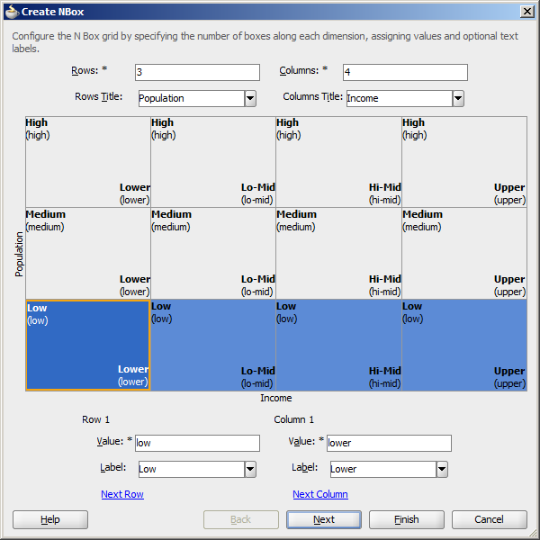
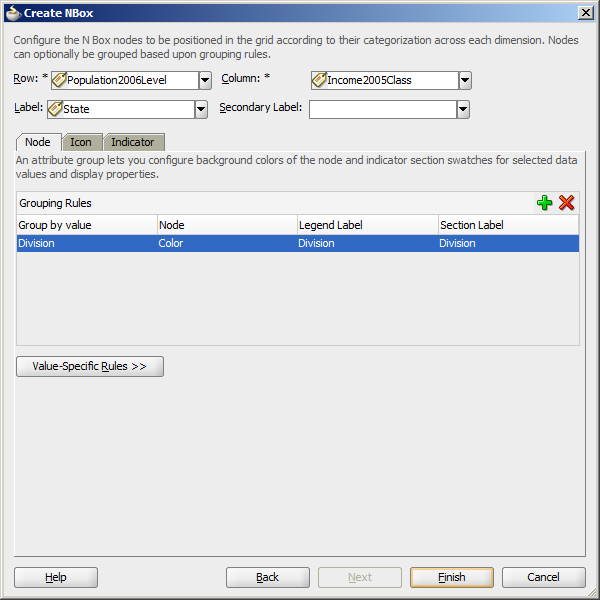
After completing the Create NBox dialog, you can use the Property Inspector to specify settings for the NBox attributes, and you can also use the child tags associated with the NBox tag to customize the NBox further. For detailed information about NBox end user and presentation features, use cases, tag structure, and special features, see "Using NBox Components" in Oracle Fusion Middleware Web User Interface Developer's Guide for Oracle Application Development Framework.
26.5.2 What Happens When You Create a Databound NBox
Creating an NBox from the Data Controls panel has the following effect:
-
Creates the bindings for the NBox in the page definition file of the JSF page
-
Adds the necessary tags to the JSF page for the
dvt:nBoxcomponent
26.5.2.1 Bindings for NBox Components
The following code sample shows the bindings that JDeveloper generated for a dvt:nBox component using the data collection shown in Figure 26-36:
<executables>
  <variableIterator id="variables"/>
  <iterator Binds="CensusView1" RangeSize="-1" DataControl="AppModuleDataControl"
            id="CensusView1Iterator"/>
</executables>
<bindings>
  <tree IterBinding="CensusView1Iterator" id="CensusView1">
    <nodeDefinition DefName="model.CensusView" Name="CensusView10">
      <AttrNames>
        <Item Value="Population2006Level"/>
        <Item Value="Income2005Class"/>
        <Item Value="State"/>
        <Item Value="Division"/>
        <Item Value="Region"/>
      </AttrNames>
    </nodeDefinition>
  </tree>
</bindings>
The rules for populating the NBox node are defined in a node definition. Each node definition references a view object and the attributes specified in the Create NBox dialog.
26.5.2.2 Editing the NBox Binding
Attributes that were not specified in the Create NBox dialog during creation will not be included in the binding. If you need to reference another attribute in the data collection, you must add it manually to the binding. For example, the sample in this section displays a tooltip showing the state's population and income when the user hovers over a node.
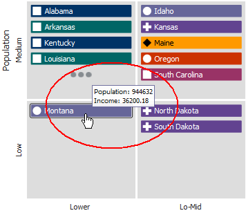
For the tooltip to evaluate properly, you must add the Population2006 and Income2005 attributes to the binding definition for the NBox.
To add the binding, in the Structure window, right-click the dvt:nBox component and choose Go to Binding. Choose Edit in the Binding section to add the Population2006 and Income 2005 attributes.
Figure 26-40 shows the completed Edit Tree Binding with Population2006 and Income2005 added to the display attributes.
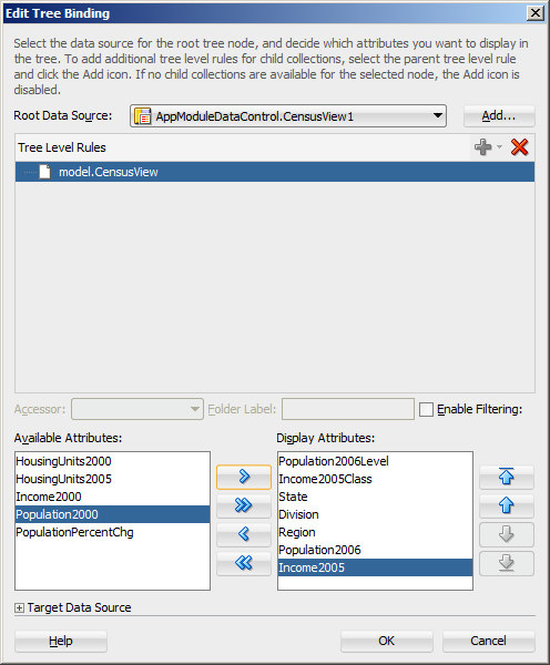
After you click OK, the binding will be updated with the added attributes. The following code sample shows the revised binding for the CensusView10 node definition.
<nodeDefinition DefName="model.CensusView" Name="CensusView10">
  <AttrNames>
    <Item Value="Population2006Level"/>
    <Item Value="Income2005Class"/>
    <Item Value="State"/>
    <Item Value="Division"/>
    <Item Value="Region"/>
    <Item Value="Population2006"/>
    <Item Value="Income2005"/>
  </AttrNames>
</nodeDefinition>
26.5.2.3 Code on the JSF Page for an NBox Component
The following example shows the code that is generated on the JSF page for the NBox:
<dvt:nBox id="nb1" var="ent" rowsTitle="#{viewcontrollerBundle.POPULATION}"
          value="#{bindings.CensusView1.collectionModel}"
          columnsTitle="#{viewcontrollerBundle.INCOME}">
  <f:facet name="rows">
    <af:group id="g1">
      <dvt:nBoxRow label="#{viewcontrollerBundle.LOW}" id="nbr1" value="low"/>
      <dvt:nBoxRow label="#{viewcontrollerBundle.MEDIUM}" id="nbr2" value="medium"/>
      <dvt:nBoxRow label="#{viewcontrollerBundle.HIGH}" id="nbr3" value="high"/>
    </af:group>
  </f:facet>
  <f:facet name="columns">
    <af:group id="g2">
      <dvt:nBoxColumn label="#{viewcontrollerBundle.LOWER}" id="nbc1" value="lower"/>
      <dvt:nBoxColumn label="#{viewcontrollerBundle.LO_MID}" id="nbc2" value="lo-mid"/>
      <dvt:nBoxColumn label="#{viewcontrollerBundle.HI_MID}" id="nbc3" value="hi-mid"/>
      <dvt:nBoxColumn label="#{viewcontrollerBundle.UPPER}" id="nbc4" value="upper"/>
    </af:group>
  </f:facet>
  <dvt:nBoxNode column="#{ent.Income2005Class}" row="#{ent.Population2006Level}"
                label="#{ent.State}" id="nbn1">
    <dvt:attributeGroups value="#{ent.Division}" type="color"
                         label="#{ent.Division}"
                         sectionLabel="#{viewcontrollerBundle.DIVISION}" id="ag1"/>
    <f:facet name="icon">
      <dvt:marker id="m1">
        <dvt:attributeGroups value="#{ent.Region}" type="shape"
                             label="#{ent.Region}"
                             sectionLabel="#{viewcontrollerBundle.REGION}"
                             id="ag2"/>
      </dvt:marker>
    </f:facet>
  </dvt:nBoxNode>
</dvt:nBox>
26.5.2.4 Modifying NBox Properties and Layout
After you create your NBox, you can modify the layout of the component or add additional elements, such as a label, using the Create NBox dialog. To open the dialog, use the Edit icon in the Property Inspector for the nBox component. You can also customize the layout of the Nbox directly in the code, in the visual editor, or by setting values in the Property Inspector.
For example, to add the tooltip shown in Figure 26-39 to your NBox, you can enter a value for the NBox node's shortDesc attribute in the Property Inspector or in the code editor.
<dvt:nBoxNode column="#{ent.Income2005Class}" row="#{ent.Population2006Level}"
label="#{ent.State}" id="nbn1"
shortDesc="Population: #{ent.Population2006}<br/>Income: #{ent.Income2005}">
... contents omitted
</dvt:nBoxNode>
For additional information and examples for customizing your NBox, see "Using NBox Components" in Oracle Fusion Middleware Web User Interface Developer's Guide for Oracle Application Development Framework.
26.6 Creating Databound Pivot Tables
The ADF pivot table displays a grid of data with rows and columns and optionally, a pivot filter bar to filter data not displayed in the rows or columns. The pivot table has the following structure:
-
Column edge: The horizontal axis above the pivot table containing one or more layers of information in the pivot table.
-
Row edge: The vertical axis to the left of the pivot table containing one or more layers of information in the pivot table.
-
Page edge: The optional pivot filter bar containing zero or more layers of information for filtering the display of data in the pivot table.
-
Data body: One or more measures, or data values, displayed in the cells of the pivot table.
Figure 26-41 shows a Sales pivot table that displays data values for sales and units in the data body, a geography data layer on the column edge, and year and product data layers on the row edge. A pivot filter bar displays a channel filter on the page edge.
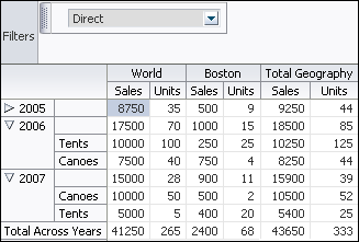
The pivot table aggregates data based on a CSV file of data shown in Figure 26-42.
A Create Pivot Table wizard provides declarative support for data-binding and configuring the pivot table. In the wizard pages you can:
-
Specify the initial layout of the pivot table
-
Associate and configure a pivot filter bar
-
Specify alternative labels for the data layers
-
Configure insert or filter drilling
-
Define aggregation of data values
-
Configure category and data sorting
As you lay out the pivot table in the first page of the wizard, corresponding entries are initialized in the following wizard pages. You can use the Back and Next buttons to adjust the pivot table as you go through the wizard pages. You can also skip configuration options in later wizard pages by clicking Finish.
For information about customizing a pivot table after data binding is completed, see the "Using ADF Pivot Table Components" chapter in the Oracle Fusion Middleware Web User Interface Developer's Guide for Oracle Application Development Framework.
26.6.1 How to Create a Pivot Table
To create a pivot table using a data control, you bind the pivot table component to a collection. JDeveloper allows you to do this declaratively by dragging and dropping a collection from the Data Controls panel.
Tip:
You can also create a pivot table by dragging a pivot table component from the Component Palette. This approach allows you the option of designing the pivot table user interface before binding the component to data.To demonstrate the creation of the sample Sales pivot table shown in Figure 26-41, a placeholder data control was created and data types defined for the CSV file shown in Figure 26-42. For more information, see Section 29.4, "Using Placeholder Data Controls."
To create a databound pivot table:
-
From the Data Controls panel, select a collection.
For example, to create a pivot table that displays sales and units sold by year for each product, you could select the
ptExampleDatadefined for theptExamplePlaceholdercollection in the Data Controls panel, as shown in Figure 26-43. -
Drag the data collection onto a JSF page and, from the context menu, choose Tables > ADF Pivot Table.
-
In the Select Display Attributes page of the Create Pivot Table wizard, specify the initial layout of the pivot table by doing the following:
-
If you want to associate a pivot filter bar with your pivot table, select Create Pivot Filter Bar. Optionally, you can drag attributes from the Available Attributes list to the page edge to configure the initial display of filters; otherwise, an empty pivot filter bar is created. If you add a pivot filter bar to a pivot table after data binding, you must edit the page source directly to bind the data model to the pivot filter bar.
Note:
You can add attributes to the page edge without creating a pivot filter bar. The attributes are then available for access programmatically in the data model. -
For the initial layout, select the attributes for the pivot table's columns, rows, and data body by dragging the attributes from the Available Attributes list to the pivot table layout.
In the pivot table layout, Data Labels refers to a layer of the pivot table that identifies the data in the cells (data values), and that appears as header labels in the row, column, or page edge. Labels for attributes that you drag to the data body of the pivot table appear in the data labels layer.
You can drag data labels to any location on the row, column, or page edge. You can also drag attributes to different locations on the same edge or on another edge.
As an alternative to using a drag operation to place or move attributes in the layout, you can right-click the attribute or use Shift+F10 to display a context menu of options. Figure 26-44 shows the context menu options for the Geography attribute.
Note:
Potential drill paths between attributes are defined as you lay out multiple attributes on the row, column, and page edges. These drill paths can later be enabled to support pivot table drilling at runtime. -
If you want to change from the default selection of Typed Attributes to Name-Value Pairs to configure how data points are stored in a collection, then click the Change Data Shape button. A dialog appears that presents you with the following options:
-
Typed Attributes
Each kind of data point in the collection is represented by a different attribute. This option is also valid when there is only a single kind of data point in the pivot table.
For example, if you have data points for Estimated Value and Actual Value, then select Typed Attributes only if you have one attribute for the estimated value and a second attribute for the actual value.
-
Name-Value Pairs
Indicates that there are multiple kinds of data points, but only a single attribute to designate these types. In this case, the single attribute has -values that identify each kind of data type.
For example, the attribute might have the value
ESTfor a data point that represents an estimated value andACTfor a data point that represents an actual value.
-
For example, to specify the initial layout of the Sales pivot table shown in Figure 26-41, you would drag the Channel attribute to the page edge, Year and Product attributes to the row edge, Sales and Units attributes to the data body (Data Labels), Geography to the column edge, and select Create Pivot Filter Bar, as shown in Figure 26-45.
-
-
If you want to specify alternative labels or values for the attributes laid out in the Select Display Attributes page of the wizard, use the Specify Attribute Labels page to do the following:
-
To specify alternative labels for data values in the Data Values area, change the default
<Use Data Attribute Name>text label stamped in the header cell for the attribute at runtime. You can enter the text directly or select<No Label>to suppress the header cell, for example, in the case of using a single data value for the pivot table. -
To specify alternative labels for attribute categories in the Categories area, change the default
<Use Data Attribute Name>text label stamped in the header cell for the attribute at runtime by entering the text directly in the Attribute Display Name column. The label displays in the pivot handle at runtime.You can also specify an alternative value for an attribute category by selecting a different attribute in the Attribute Display Value column. For example, you might use a
ProductIdattribute in the data collection to lay out the pivot table, but you want theProductNameattribute value to improve human readability in the pivot table.
For example, to specify an alternate label for the Year attribute of the Sales pivot table shown in Figure 26-41, you would enter text (Time) in the Attribute Display Name field, as shown in Figure 26-46.
-
-
If you want to expose drill operations in the pivot table at runtime, use the Configure Drilling page of the Create Pivot Table wizard to enable one of the following options:
-
Select Insert Drilling to provide a collapsed or expanded view of the relationship between two attributes while preserving the aggregate value of the details in the data layer. At runtime, a drill icon is displayed in the parent attribute display label.
Use Insert Parent Row to specify whether the aggregate total for the parent attribute will be displayed before or after the child attributes in the expanded view.
To enable insert drilling you must also:
-
Select the drill paths to enable. Drill paths are configured based upon the layout of the attributes in the Select Display Attributes page of the wizard.
-
Configure aggregation in the Configure Aggregation page of the wizard.
For example, Figure 26-47 shows a pivot table using insert drilling to expand the view for the Year data layer. The aggregated value of Sales (52,500 in 2007, 544,150 in 2006) and Units (410 in 2007, 507 in 2006) for each year is displayed in the row above the products.
-
-
Select Filter Drilling to provide a collapsed or expanded view of the relationships between attributes without preserving the aggregate value of the details in the data layer in the collapsed view. At runtime, a drill icon is enabled in the parent attribute display label.
Filter drilling focuses the view on the details of the data layer attribute. For example, Figure 26-48 shows a pivot table using filter drilling to expand the view of the Year (2007) data layer, displaying the total Sales (52,500) and Units (410).
To enable filter drilling you must select the drill paths to enable. Drill paths are configured based upon the layout of the attributes in the Select Display Attributes page of the wizard.
For example, to enable the insert drilling for the Sales pivot table shown in Figure 26-41, complete the Configure Drilling page of the wizard, as shown in Figure 26-49.
-
-
If you want to define how data is aggregated in totals and subtotals for the pivot table, use one or both of the Configure Aggregation pages of the Create Pivot Table wizard.
By default, if the attributes displayed in the pivot table do not uniquely identify each row in the data collection, the data from duplicate rows is aggregated to collapse that data into a single pivot table cell. You can also override the default aggregate type for a particular data item.
-
If you want to specify how data is aggregated in the pivot table, in the Data Aggregation page, do the following:
-
If you want to change the default aggregation method for handling duplicate rows, use the Default Function dropdown list to specify the value. Valid values are
Sum,Average,Count,Maximum,Minimum,Standard Deviation, andVariance. -
If you want to override the default aggregate type for a specific data value, click the Add icon to insert a row for the available attributes. Then, in the Function column for each attribute, select the mathematical operation that you want to use for the aggregation. Available options are
Sum,Average,Count,Maximum,Minimum,Standard Deviation, andVariance. This attribute is useful only when you have multiple data values (such as Sales and Units) bound to your pivot table.
For example, to override the default aggregation type for the Units data value in the Sales pivot table shown in Figure 26-41, use the Add icon to add the Units attribute and select Average in the Function column in the Data Aggregation page, as shown in Figure 26-50.
-
-
You can also define totals and subtotals for attribute categories added to the column, row, or page edges in the pivot table. In the Categories Totals page, use the Add icon to insert each attribute or select Aggregate All to add all available attributes, and do the following:
-
In the Attribute column, select the attribute that you want to total.
-
In the Function column, select the mathematical operation that you want to use for the aggregation. Available options are
Sum,Average,Count,Maximum,Minimum,Standard Deviation, andVariance. -
In the Insert Total column, select the value that indicates where you want the aggregate display to appear relative to the item referenced in the Attribute column. Valid values are:
Before,After, orReplace. -
In the Total Label column, enter the text that you want to use as a label for the aggregation.
Note:
The read-only Insert Drill Totals table displays the category totals automatically defined as a consequence of enabling insert drilling on the pivot table.For example, to define totals for the Geography and Year data layers in the Sales pivot table shown in Figure 26-41, select
Sumin the Function column andAfterin the Insert Total column, and enter text (Total Geography and Total Year) in the Total Labels column respectively for each attribute in the Categories Totals page, as shown in Figure 26-51.In the resulting pivot table at runtime, expanding a particular Year value will automatically preserve the aggregate total computed from its child value based on the layout and configuration of the insert drill option in the previous wizard page.
-
-
-
If you want to configure sorting in the pivot table, use one or both of the Configure Sorting pages in the Create Pivot Table wizard.
By default, a pivot table initially sorts data based on values in the outer row data layer. You can specify sort order on the data layer of any row, column, or page edge, called a category sort. At runtime, when the data layer is pivoted to a different edge, the specified category sort order is honored.
You cannot specify a category sort of data labels (data values), although you can order the attributes mapped to the data body in the Select Display Attributes page of the wizard. For example, Figure 26-45 shows a pivot table layout with data values for Sales and Units. While you cannot specify a category sort of these measures, you can specify the order in which the values will appear in the data body of the pivot table at runtime, shown in Figure 26-41.
You can also specify an initial sort order of the data values in the data body when the pivot table is rendered, called a data sort.
-
To configure sorting by category, in the Category Sort page, use the Add icon to add the attribute for each row, column, or page edge you wish to configure, and do the following:
-
In the Sort Attribute column, accept the default
<Use Attribute Value>to specify an alphabetical sort based on the actual values in the pivot table header, or customize the sort order by specifying a data label value from the dropdown list. For example, if the underlying query included a rank calculation for ranking products by profitability, you could choose to see products ordered by (ProductRank, Descending). -
In the Initial Sort Order select the initial direction of the sort. Valid values are
ASCENDINGorDESCENDING.
For example, Figure 26-52 shows the Category Sort page of the wizard configured to display the Channel data layer descending on the column edge and the Year data layer ascending on the row edge.
At runtime, the pivot table displays as shown in Figure 26-53.
-
-
To configure data sorting, in the Data Sort page, do the following:
-
Select Sort by Columns to specify an initial sort order of the data when the pivot table is rendered.
-
In the Initial Sort Order dropdown list select the initial direction of the sort. Valid values are
ASCENDINGandDESCENDING. -
In the Sequence Nulls dropdown list, select
Firstif you want the null values to appear at the beginning of a sort and selectLastif you want the null values to appear at the end of the sort. -
In the Initial Sort Column table, specify a data value in the Value column for the data layer displayed in the Layer Attribute column.
For example, Figure 26-54 shows the Data Sort page configured to sort the Channel data layer grouped by Year, based upon Units/World/Canoes data values.
At runtime, the pivot table initially renders as shown in Figure 26-55.
-
-
-
Click Finish to complete the creation of your databound pivot table.
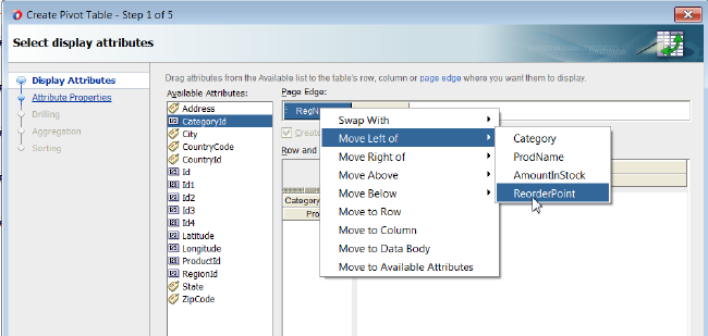
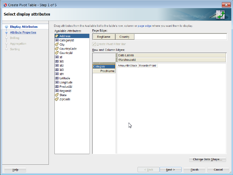
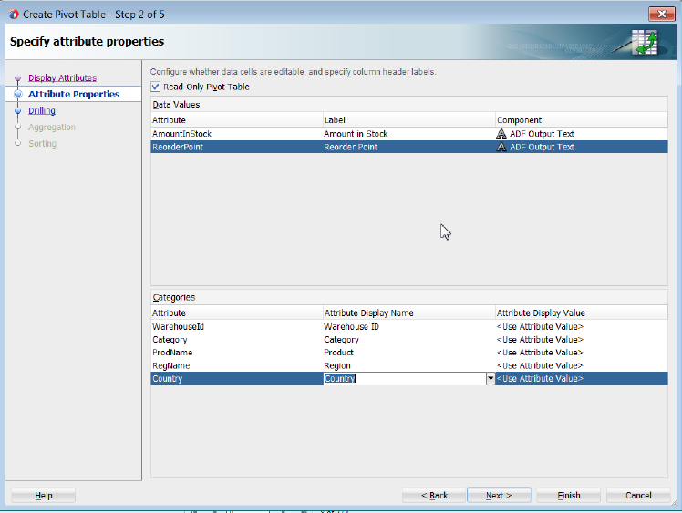
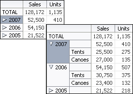
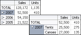
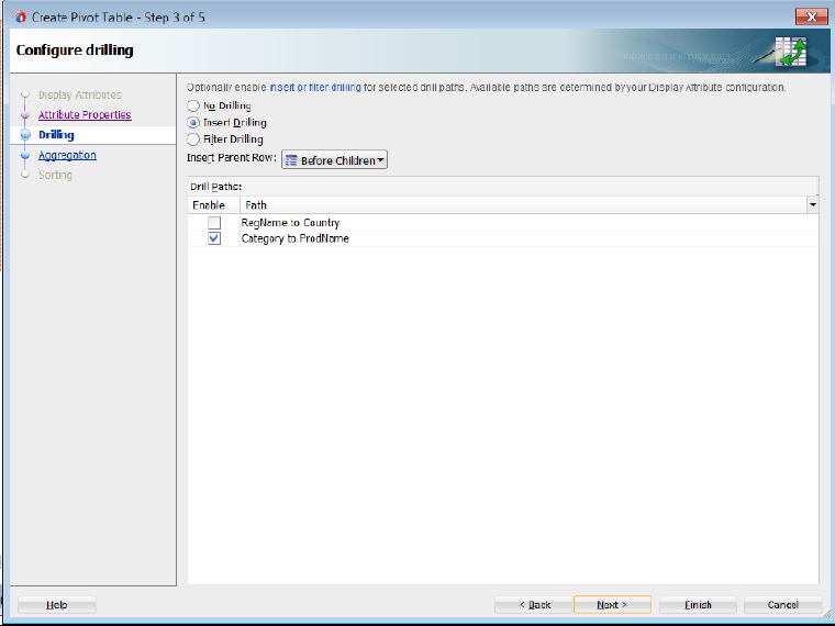
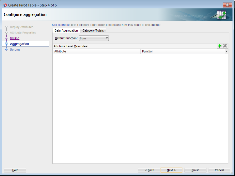
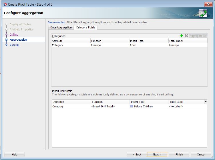
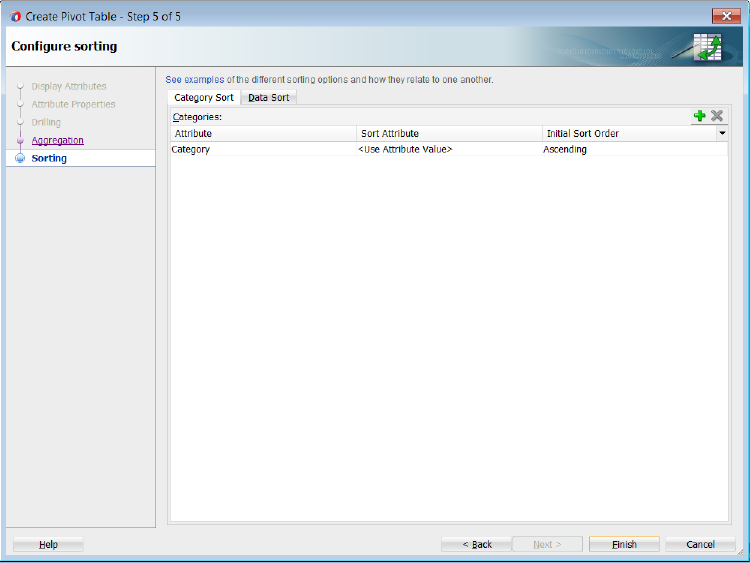
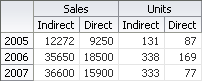
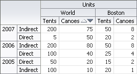
After completing the wizard to create the pivot table, use the tools in JDeveloper to customize the look and feel of the pivot table. For example, you can configure word wrapping for labels that do not fit into the default size of the header cell and add a page control as an alternative to scrollbars for the data set in the pivot table in Figure 26-41.
To customize pivot table display:
-
In the Structure window, right-click the
dvt:pivotTablenode and choose Go to Properties. -
In the Property Inspector, expand the Common section and set the ScrollPolicy property to
pageto configure a page control as an alternative to the default scrollbars. -
In the Structure window, right-click the
dvt:headerCellnode and choose Go to Properties. -
In the Property Inspector, expand the Behavior section and set the WhiteSpace attribute to
normalto configure word wrapping in the pivot table headers.
For additional information about customizing a pivot table after data binding is completed, see the "Using ADF Pivot Table Components" chapter in Oracle Fusion Middleware Web User Interface Developer's Guide for Oracle Application Development Framework.
26.6.2 What Happens When You Use the Data Controls Panel to Create a Pivot Table
Dropping a pivot table from the Data Controls panel has the following effect:
-
Creates the bindings for the pivot table and adds the bindings to the page definition file
-
Adds the necessary code for the UI components to the JSF page
26.6.2.1 Bindings for Pivot Tables
When you create a pivot table from the Data Controls panel, the page definition file is updated with the bindings. Example 26-12 shows the row set bindings that were generated for the pivot table that displays product sales and units sold within geography by year. The pivot table data map contains the following elements:
-
<columns>: Defines each column item -
<rows>: Defines each row item in the appropriate sequence -
<pages>: Defines the items to be included in the pivot filter bar -
<aggregatedItems>: Defines the totals and subtotals of items -
<hierarchies>: Defines the potential drill paths between two items -
<sorts>: Defines category sorts and the initial sort order of pivot table data
The default data aggregation method for duplicate rows is specified in the <data> element. For more information about aggregating duplicates, see Section 26.6.3, "What You May Need to Know About Aggregating Attributes in the Pivot Table."
For more information about sorting operations, see Section 26.6.4, "What You May Need to Know About Specifying an Initial Sort for a Pivot Table."
Example 26-12 Binding XML for the ADF Pivot Table
<pivotTable IterBinding="ptExampleDataIterator" id="ptExampleData"
            xmlns="http://xmlns.oracle.com/adfm/dvt"
            ChangeEventPolicy="ppr">
  <pivotTableDataMap>
    <columns>
      <item value="Geography" itemLabel="Location"/>
        <data aggregateDuplicates="true" defaultAggregateType="SUM">
          <item value="Sales"/>
          <item value="Units" aggregateType="AVERAGE"/>
        </data>
    </columns>
    <rows>
      <item value="Year"/>
    </rows>
    <pages>
      <item value="Channel"/>
    </pages>
    <aggregatedItems>
      <item aggregateLocation="AFTER" aggregateType="SUM" value="Geography"
            aggregateLabel="Total Geography"/>
      <item aggregateLocation="AFTER" aggregateType="SUM" value="Year"
            aggregateLabel="Total Across Years"/>
    </aggregatedItems>
    <drills type="INSERT"/>
    <hierarchies>
      <item value="Year" location="BEFORE">
        <child value="Product" label="Product"/>
      </item>
    </hierarchies>
    <sorts>
      <categorySort item="Channel" direction="DESCENDING"/>
      <categorySort item="Year" direction="ASCENDING"/>
      <qdrSliceSort direction="DESCENDING" edge="rows" grouped="true"
                    nullsFirst="true">
        <item name="Geography" value="World"/>
      </qdrSliceSort>
    </sorts>
  </pivotTableDataMap>
</pivotTable>
26.6.2.2 Code on the JSF Page for a Pivot Table and Pivot Filter Bar
When the pivot table is created using the Data Controls panel, the necessary code is added to the page. Example 26-13 shows the code generated on the JSF page for the sales pivot table and associated pivot filter bar.
Example 26-13 XML Code on a JSF Page for the Pivot Table and Pivot Filter Bar
<dvt:pivotFilterBar id="pivotTable1pivotFilterBar"
                    value="#{bindings.ptExampleData.pivotFilterBarModel}"
                    modelName="pivotTable1Model"/>
<dvt:pivotTable id="pivotTable1"
                value="#{bindings.ptExampleData.pivotTableModel}"
                modelName="pivotTable1Model"/>
26.6.3 What You May Need to Know About Aggregating Attributes in the Pivot Table
If the attributes that you choose to display in your pivot table do not uniquely identify each row in your data collection, then you can aggregate the data from duplicate rows to collapse that data into a single pivot table cell.
For example, if the rows in the data collection shown in Figure 26-41 also contained a store identification, then the data rows from all stores in a given combination of Product, Channel, and Geography would have to be collapsed into a single cell in the pivot table.
The pivot table has the following optional data binding attributes available for controlling the calculation of duplicate data rows:
-
aggregateDuplicates: Boolean property of the<data>element that determines whether special processing is enabled at binding runtime to aggregate data values in duplicate rows. If this attribute is not specified, thenfalseis assumed. -
defaultAggregateType: String property of the<data>element that specifies a default aggregation method for handling duplicates. Valid values areSUM,AVERAGE,COUNT,MIN,MAX,STDDEV,VARIANCE. IfaggregateDuplicatesistrueanddefaultAggregateTypeis unspecified, thenSUMis assumed. -
aggregateType: String property of an<item>element that enables you to override the default aggregate type for a particular data item. This attribute is useful only when you have multiple data values (such as Sales and Units) bound to your pivot table.
26.6.3.1 Default Aggregation of Duplicate Data Rows
By default, the pivot table uses the SUM operation to aggregate the data values of duplicate data rows in a data collection to produce a single cell value in the pivot table. This means that the aggregateDuplicates attribute is set to true and the defaultAggregateType is assumed to be SUM.
The <data> element shown in Example 26-12 is an example of such default aggregation.
26.6.3.2 Custom Aggregation of Duplicate Rows
If you want the pivot table to use a different mathematical operation to aggregate the data values of duplicate rows, then you set the defaultAggregateType to the desired operation.
Example 26-14 shows a data element with the defaultAggregateType set to SUM. This operation would be appropriate if you want to see the total of sales from all stores for each unique combination of Product, Channel, and State.
Example 26-14 Binding XML for Custom Aggregation of Duplicate Rows
<pivotTable IterBinding="SalesPivotTable1Iterator" id="SalesPivotTable11"
            xmlns="http://xmlns.oracle.com/adfm/dvt">
  <pivotTableDataMap>
    <columns>
       <data aggregateDuplicates="true" defaultAggregateType="SUM">
         <item value="Sales"/>
       </data>
       <item value="Geography"/>
    </columns>
    <rows>
       <item value="Channel"/>
       <item value="Product"/>
    </rows>
    <aggregatedItems>
      <item aggregateLocation="After" aggregateType="AVERAGE"
          value="Product" aggregateLabel="Average"/>
    </aggregatedItems>
  </pivotTableDataMap>
</pivotTable>
If you have a pivot table with multiple data values (such as sales and the average size of a store in square feet) and you want to sum the sales data values in duplicate rows, but you want to average the square feet data values, then do the following:
-
On the
<data>element, set thedefaultAggregateTypetoSUM. -
On the
<item>element for the square feet attribute, set theaggregateTypetoAVERAGE.
Example 26-15 shows the <columns> elements wrapped by a PivotTableDataMap element. The <data> element contains the default attributes for aggregation. These apply to all data items that do not have a specific custom aggregateType attribute specified.
26.6.4 What You May Need to Know About Specifying an Initial Sort for a Pivot Table
By default, a pivot table initially sorts data based on values in the outer row data layer. You can specify sort order on the data layer of any row, column, or page item, called a category sort. At runtime, when the data layer is pivoted to a different edge, the specified category sort order is honored. Insert a categorySort element inside the sorts element and set values for the attributes as described in Table 26-4.
Table 26-4 Attribute Values for categorySort Element
| Attribute | Description |
|---|---|
|
|
Specify the column, row, or page item for which you are setting the category sort. A value for this attribute is required. |
|
|
Specify the initial direction of the sort. Valid values are |
You can also specify the initial sort order of the data values in the data body when the pivot table is rendered, called a data sort. You can change the default behavior by inserting a sorts element inside the pivotTableDataMap element of a pivot table binding in the page definition file. Insert a qdrSliceSort element inside the sorts element and set values for the attributes as described in Table 26-5.
Table 26-5 Attribute Values for qdrSliceSort Element
| Attribute | Description |
|---|---|
|
|
Specify the initial direction of the sort. Valid values are |
|
|
Specify |
|
|
Specify |
|
|
Specify |
Insert one or more item tags inside the qdrSliceSort tag. An item tag specifies the slice on the opposite edge from which the values to be sorted should be obtained. Set values for the attributes as described in Table 26-6.
Table 26-6 Attribute Values for item Tag
| Attribute | Description |
|---|---|
|
|
Specify the name of the layer to sort on. Typically, this is the column name in the row set. Specify |
|
|
Specify the value of the specified layer on the desired slice. |
26.7 Creating Databound Geographic Maps
An ADF geographic map is an ADF Data Visualization component that provides the functionality of Oracle Spatial within Oracle ADF. This component allows users to represent business data on a geographic map and to superimpose multiple layers of information (known as themes) on a single map. These layers can be represented as any of the following themes: bar graph, pie graph, color, point, and predefined theme.
Figure 26-56 shows a geographic map component that uses a base map for a region in the United States with the following themes:
-
Color theme: For the selected product, this theme colors states based on product popularity. The colors range from green (which represents the highest popularity for that product) to red (which represents the lowest popularity for that product).
-
Pie graph theme: This theme displays a pie graph in each state to indicate the popular product categories in that state. In this example, the pie graph shows the following product categories as pie slices: Media, Office, and Electronics.
-
Point theme: This theme identifies warehouses as points. For each point, it displays an icon to indicate the inventory level at that warehouse for the selected product. A separate icon is displayed for each of the following ranges of inventory: low inventory, medium inventory, and high inventory.
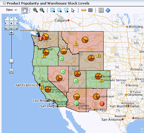
A geographic map component differs from other ADF Data Visualization components as you do not need to put multiple maps on a page to display multiple sets of data. This contrasts to components such as graphs where you can put multiple graphs on a page. Instead, you show how multiple sets of data relate to each other spatially or, for a specific point, you display different attributes layered in separate themes.
The geographic map component itself is not bound to data. However, each map theme has its own data bindings.
A base map forms the background on which the ADF geographic map component layers the themes that developers create.
In Oracle Spatial, administrators create base maps that consist of one or more themes. The administrator controls the visibility of the base map themes. When you zoom in and out on a base map, various base map themes are hidden or displayed. At the ADF geographic map component level, you cannot use zoom factor to control the display of the themes created by the administrator on the base map.
When you overlay themes on the ADF geographic map, you can control the visibility of your themes by setting the maxZoom and minZoom attributes of the tags related to these themes. At runtime, you can also hide or display your custom themes by using the View menu of the Map toolbar or by using other ADF components that you create on the page.
For information about customizing a geographic map after data-binding is completed, see the "Using Map Components" chapter in the Oracle Fusion Middleware Web User Interface Developer's Guide for Oracle Application Development Framework.
26.7.1 How to Create a Geographic Map with a Point Theme
To create a geographic map, you first configure the map (that is, select a base map and provide URLs for processing) and then bind a theme of the map to a data collection. JDeveloper allows you to do this declaratively by dragging and dropping a collection from the Data Controls panel for the theme that you want to create.
When you create a map point theme, you have the option of customizing the style of the points that appear in the map. For each different point style, you can use a mapPointStyleItem tag.
To create a geographic map with a databound point theme:
-
From the Data Controls panel, select a collection.
Figure 26-57 shows an example where you could select the
WarehouseStockLevelsByProduct1collection in the Data Controls panel to create a geographic map with a point theme that displays an image to represent the quantity on hand for each warehouse point. -
Drag the collection onto a JSF page and, from the context menu, choose Geographic Map > Map and Point Theme.
-
If you have not yet configured a map on the page, then in the ensuing Create Geographic Map dialog, click the New icon to display the Create Geographic Map Configuration dialog and do the following:
-
In the Id field enter the unique identifier for the map configuration.
-
In the MapViewer URL field enter the URL for the Oracle Application Server MapViewer Service.
-
In the Geocoder URL field select the URL for the Geocoder Web service that converts street addresses into latitude and longitude coordinates for mapping.
Note:
The Geocoder URL is needed only if you do not already have longitude and latitude information for addresses. -
Click OK to dismiss the dialog and return to the Create Geographic Map dialog.
-
-
In the Maps page, you select the base map for the geographic map component and provide other settings to use with the map by doing the following:
-
From the Data Source list select the collection of maps from which you will choose a base map.
-
From the Base Map list select the map that will serve as the background for the geographic map component.
-
To specify values for the StartingX field and the StartingY field click on the image of the map to center it within the Preview window.
You can use the arrows in the map navigator in the upper left-hand corner to move the map in the appropriate direction.
-
Optionally use the sliding arrow in the Preview window to adjust the zoom factor of the map.
-
Click OK to dismiss the dialog and to display the Create Point Map Theme dialog.
-
-
In the Theme Id field enter the unique identifier for the point map theme.
-
In the Location section, specify whether the point location is to be specified by a pair of x and y coordinates (longitude and latitude) or as an address.
The choice you select for location will determine which controls appear in the Location section.
Tip:
Using x and y coordinates is a more efficient way to present data on the map rather than using the Address controls, which must be converted by a Geocoder to x and y coordinates. If the data collection has more than 100 rows, then to ensure adequate performance, use x and y coordinates. -
For the x and y point location, you select the data that corresponds to the following items:
-
X (Longitude): The horizontal location of the point on the map.
-
Y (Latitude): The vertical location of the point on the map.
-
Label: The labels for the points in the top section of the information window, which is displayed when you click a point.
-
-
In the Point Data section, provide the following information that identifies the data associated with the point, its label, and optionally the style for the point:
-
In the Data field, select the data column that is associated with the point, such as
QuantityOnHand. -
In the Label field, enter the text that will appear in the information window before the data value when you click a point.
-
Optionally, in the Category field, select a data column to use for finding the appropriate style for a point. If you select a value for Category, that value is stored in the binding for this point theme and then matched against the
itemValueattribute of themapPointStyleItemtags that you create for this point theme.Note:
If your data does not have a column that you want to use as a category for finding the style of a point, you can also usemapPointStyleItemtags to define styles related to data ranges (such as high, medium, and low) that are matched to the values in the column that you select in the Data field. For more information, see Section 26.7.2, "How to Create Point Style Items for a Point Theme".
-
-
Select the Enable Row Selection field only if you want to enable the selection of rows in a related component. You select this option when the page contains a component that is linked to a data collection which is related to the geographic map that you are creating.
-
Click OK.
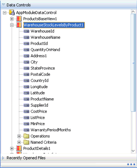
Figure 26-58 shows the Create Point Map Theme dialog for a geographic map with a point theme that displays an image representing quantity on hand for each warehouse point.
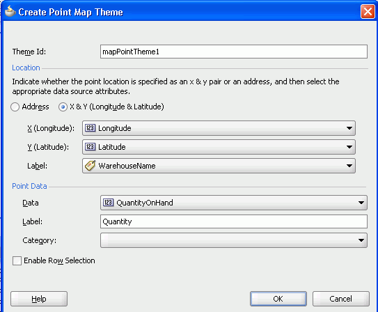
26.7.2 How to Create Point Style Items for a Point Theme
There are a variety of options available for creating point style items for use in a given map point theme. These are:
-
A single image for all data points
-
Separate images for each data point category
-
Images that represent low, medium, and high data value ranges
After you create the data binding for a map point theme, you have the option of selecting a single built-in image that should be used for all points in that map theme. In the Property Inspector, you can make this selection in the builtInImage attribute of the mapPointTheme tag. The default value for this attribute is OrangeBall.
Alternatively, if you specify a value for Category in the Create Point Map Theme dialog, then you should also create a set of point style items to determine a separate image that represents data points in each category. In this case, you do not use the minimum and maximum values in the point style item tags. Instead, you set the itemValue attribute of point style item tags to a value that matches entries in the data column that you specified for Category.
In a point theme for a geographic map, if you do not specify a value for Category, you can still use the mapPointStyleItem child tags of the mapPointTheme tag to specify ranges of values (such as low, medium, and high) and the images that are to represent these ranges. If you do this, then each point will be represented by an image that identifies the range in which the data value for that point falls.
The following procedure assumes that you have already created a geographic map with a point theme.
To add point style items to a map point theme to represent low, medium, and high data value ranges:
-
In the Structure window, right-click the dvt:mapPointTheme tag and choose Insert inside the dvt:mapPointTheme > Point Style Item.
-
In the Point Style Item Property Inspector, set values as described Table 26-7.
Table 26-7 Properties for Point Style Item
For this property Set this value IdSpecify a unique ID for the point style item.
MinValueSpecify the minimum value in a data range that you define.
MaxValueSpecify the maximum value in a data range that you define.
ShortLabelSpecify text to appear when a user hovers over the point item. For example, if you define a point item for low inventory, then enter
Low Inventoryas the value for this property.ImageURLSpecify the URL to the image file or select it from the dropdown list. At runtime, the image you specify appears on the map to represent the data range identified by the MinValue and MaxValue properties.
Alternatively, you can select one of a number of predefined images referenced by the BuiltInImage dropdown list that appears in the Other section.
HoverImageURLSpecify the URL to the image file or select it from the dropdown list. At runtime, the image you specify appears when a user hovers over the point item.
SelectedImageURLSpecify the URL to the image file or select it from the dropdown list. At runtime, the image you specify appears when a user selects the point item.
-
If you defined a data value range for a low data value range in Steps 1 and 2, then repeat Steps 1 and 2 to define medium and high data value ranges with appropriate values.
Note:
The use ofmapPointStyleItem child tags to customize the style of points is a declarative approach that lets you provide custom point images. For information about using a callback to provide not only custom images but also custom HTML, see Section 26.7.4, "What You May Need to Know About Adding Custom Point Style Items to a Map Point Theme".26.7.3 What Happens When You Create a Geographic Map with a Point Theme
Dropping a geographic map and a point theme (which in this case would be the initial theme added to the map) from the Data Controls panel has the following effect:
-
Creates the bindings for the point theme and adds the bindings to the page definition file
-
Adds the necessary tags to the JSF page for the geographic map component
-
Adds the necessary point theme tags to the JSF page within the map XML
26.7.3.1 Binding XML for a Point Theme
Example 26-16 shows the row set bindings that were generated for the point theme of the geographic map.
Example 26-16 Point Theme Binding XML
<mapTheme IterBinding="WarehouseStockLevelsByProduct1Iterator"
     id="WarehouseStockLevelsByProduct1"
     xmlns="http://xmlns.oracle.com/adfm/dvt">
  <mapThemeDataMap mapThemeType="point">
    <item type="data" value="QuantityOnHand" label="Product Quantity"/>
    <item type="lat_long" latitude="Latitude"
      longitude="Longitude" label="WarehouseName"/>
  </mapthemeDataMap>
</mapTheme>
26.7.3.2 XML Code on the JSF Page for a Geographic Map and Point Theme
Example 26-17 shows the XML code generated on the JSF page for the geographic map and its point theme. Notice the code for the three kinds of point style settings based on data value.
The initial point style setting (ps0) applies to values that do not exceed 500. This point style displays an image for very low inventory and provides corresponding tooltip information.
The second point style setting (ps1) applies to values between 500 and 1000. This point style displays an image for low inventory and provides corresponding tooltip information.
The final point style setting (ps2) applies to values between 1000 and 1600. This point style displays an image for high inventory and provides corresponding tooltip information.
Example 26-17 Geographic Map and Point Theme XML Code on the JSF Page
<dvt:map id="map1"
         mapServerConfigId="mapConfig1"
         inlineStyle="width:850px;height:490px"
         startingX="-96.0"
         baseMapName="ELOCATION_MERCATOR.WORLD_MAP"
         startingY="37.0" zoomBarPosition="WEST"
         showScaleBar="false"
         partialTriggers="go pointTheme pieTheme colorTheme" mapZoom="3">
    <dvt:mapPointTheme id="mapPointTheme1"
                       shortLabel="Warehouse Stock Levels"
                       selectionListener="#{MapBean.processSelection}"
                       value="#{bindings.WarehouseStockLevelsByProduct1.geoMapModel}"
                       rendered="#{AppState.showPointTheme}">
      <dvt:mapPointStyleItem id="ps0"
                             minValue="0"
                             maxValue="500"
                             imageURL="/images/low.png"
                             selectedImageURL="/images/lowSelected.png"
                             shortLabel="Very Low Inventory"/>
      <dvt:mapPointStyleItem id="ps1"
                             minValue="500"
                             maxValue="1000"
                             imageURL="/images/medium.png"
                             selectedImageURL="/images/mediumSelected.png"
                             shortLabel="Low Inventory"/>
      <dvt:mapPointStyleItem id="ps2"
                             minValue="1000"
                             maxValue="1600"
                             imageURL="/images/regularGreen.png"
                             selectedImageURL="/images/regularGreenSelected.png"
                             shortLabel="High Inventory"/>
    </dvt:mapPointTheme>
</dvt:map>
26.7.4 What You May Need to Know About Adding Custom Point Style Items to a Map Point Theme
If you want to provide custom HTML as well as custom images for map points, then you can use the customPointCallback attribute of the dvt:mapPointTheme tag to accomplish this customization.
Important:
If you set thecustomPointCallback attribute for a map point theme, the map ignores any dvt:mapPointStyleItem child tags because the callback overrides these tags.To use a callback to customize the style of map points:
-
Write a method in Java to perform the desired point customization.
-
Store this method in a managed bean for the map.
For more information about managed beans, see the "Creating and Using Managed Beans" section in the Oracle Fusion Middleware Web User Interface Developer's Guide for Oracle Application Development Framework.
-
After you finish data-binding the map point theme, use the Property Inspector to specify a reference to the managed bean method in the
customPointCallbackattribute of thedvt:mapPointThemetag.For example, if the managed bean is named
MapSampleBeanand the method is namedsetCustomPointStyle, then the reference becomes#{mapSampleBean.CustomPointStyle}.
26.7.5 How to Add a Databound Color Theme to a Geographic Map
When you create a geographic map, you can choose to create themes (point, color, and graph) in any sequence that you wish.
The following procedure assumes that a geographic map has already been configured and, therefore, the map component does not display the dialog for configuring the map. Instead, only the dialog for creating the color theme appears.
To add a databound color theme to a geographic map:
-
From the Data Controls panel, select a collection.
Figure 26-59 shows an example where you could select the
ProductPopularity1collection in the Data Controls panel to create a color map theme that shows product popularity by the color of regions (for example, states). -
Drag the collection onto a JSF page which already contains a geographic map component and, from the context menu, choose Geographic Map > Color Theme.
-
In the ensuing Create Color Map Theme dialog, enter a unique identifier for the map theme in the Id field.
-
In the Base Map Theme section, identify the base map color theme to use for the geographic map by doing the following:
-
In the Name field, select the name of the base map theme.
-
For Location, select the location column in the data collection that should be matched to the location column in the base map theme that you selected.
-
Optionally, click View Sample Theme Data to display the Sample Theme Data dialog, in which you can examine the first several rows of the actual data so that you can identify the appropriate location column.
For example, if you want to view the data for a region that consists of states in the United States map, you might select MAP_STATES_NAME as shown in Figure 26-60.
Note:
It is possible for an administrator of Oracle Spatial to disable the display of sample data. If this button is not available, then consult the administrator for guidance.
-
-
In the Appearance section, specify the look of the color theme as follows:
-
In Data Bucket Count, enter the number of groups for the data in this geographic map. Each group is coded with a color. After specifying this number, you can provide colors for the minimum value and the maximum value. The colors for the other values are chosen automatically using an RGB algorithm.
-
In Minimum Value Color, select the color for the minimum value.
-
In Maximum Value Color, select the color for the maximum value.
Note:
If you want to specify an exact color for each data bucket, see Section 26.7.7, "What You May Need to Know About Customizing Colors in a Map Color Theme". -
-
In the Data section, provide the following information about the data in the collection:
-
For Location, select the column in the data collection that should match the values in the location column that you selected from the base map theme.
-
For Location Label, select the column in the data collection that contains the labels associated with the values in the location column. These labels are shown in the information window that is displayed when you click or hover over a color.
-
For Data Label, enter the label to use for describing the data in the information window and the tooltip that is displayed when you click or hover over a color. For example, the information window might include a label before the data value, such as Product Popularity.
-
-
Use Enable Row Selection only if you want to enable master-detail relationships. This is useful when the data collection for the map theme is a master in a master-detail relationship with a detail view that is displayed in another UI component on the page.
Figure 26-61 shows the Create Color Map Theme dialog for the product popularity by state color theme.
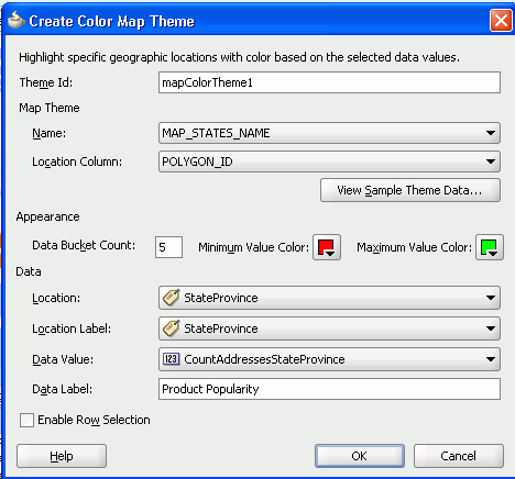
26.7.6 What Happens When You Add a Color Theme to a Geographic Map
Dropping a color theme from the Data Controls panel to an existing geographic map has the following effect:
-
Creates the bindings for the color theme and adds the bindings to the page definition file
-
Adds the necessary color theme tags to the JSF page within the map XML
26.7.6.1 Binding XML for a Color Theme
Example 26-18 shows the row set bindings that were generated for the color theme of the geographic map.
Example 26-18 Color Theme Binding XML
<mapTheme IterBinding="ProductPopularity1Iterator" id="ProductPopularity1"
          xmlns="http://xmlns.oracle.com/adfm/dvt">
   <mapThemeDataMap mapThemeType="color">
      <item type="location" value="StateProvince" label="StateProvince"/>
      <item type="data" value="CountAddressesStateProvince"
            label="Popularity"/>
   </mapThemeDataMap>
</mapTheme>
26.7.6.2 XML Code on the JSF Page for a Color Theme
Example 26-19 shows the XML code generated on the JSF page for a color theme that represents product popularity in different states on the United States map.
26.7.7 What You May Need to Know About Customizing Colors in a Map Color Theme
While you are data-binding a map color theme, you can specify only a minimum color and a maximum color for the data buckets. The map uses an algorithm to determine the colors of the buckets between the minimum and maximum. However, after the data-binding is finished, you have the option of specifying the exact color to be used for each data bucket.
In the Object Inspector, for the dvt:mapColorTheme tag you can use the colorList attribute to specify the color for each bucket. You can either bind a color array to this attribute or you can specify a string of colors using a semicolon separator.
For example, if the value of this attributes is set to: #ff0000;#00ff00;#0000ff, then the color of the first bucket is red, the second bucket is green, and the third bucket is blue.
26.7.8 How to Add a Databound Pie Graph Theme to a Geographic Map
When you create a geographic map, you can choose to create themes (point, color, and graph) in any sequence that you wish. However, only one graph theme (pie or bar) can be visible at a time on the ADF geographic map component.
The following procedure assumes that a geographic map has already been configured and, therefore, the map component does not display the dialog for configuring the map. Instead, only the dialog for creating the pie graph theme appears.
To add a databound pie graph theme to a geographic map:
-
From the Data Controls panel, select a collection.
Figure 26-62 shows an example where you could select the
PopularCategories1collection to create a pie bar theme in an existing geographic map component to represent the popular product categories within a state. -
Drag the collection onto a JSF page and, from the context menu, choose Create > Pie Graph Theme.
-
In the ensuing Create Pie Graph Theme Binding dialog, do the following to identify the new theme and the base map theme elements that you want to work with:
-
For Theme Id, enter a unique identifier for the pie graph theme that you are creating.
-
In the Base Map Theme section, select the name of the base map and the region in which you want to place the pie graphs.
-
-
In the Appearance section, under Data, do the following:
-
For Location, select the location column in the data collection that should be matched to the location column in the base map theme that you selected.
If needed, click View Sample Theme Data to examine the first several rows of the actual data so that you can identify the appropriate location column.
-
For Location Label, select the column in the data collection that contains labels for the locations in the data collection.
-
In the grid for Series Attributes, enter each attribute that contains values that you want represented in the pie graph that you are creating.
-
Beside each series attribute, enter text that should be used as a label for the data values in the series attribute.
-
-
Select Enable Row Selection only if you want to enable the selection of rows in a related component. You select this component when the page contains a component that is linked to a data collection that is related to the geographic map that you are creating.
-
Click OK.
Figure 26-63 shows the completed Create Pie Graph Map Theme dialog for the product popularity by state pie graph theme.
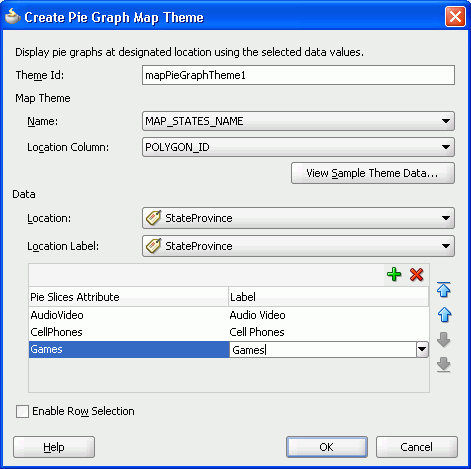
26.7.9 What Happens When You Add a Pie Graph Theme to a Geographic Map
Dropping a pie graph theme from the Data Controls panel to an existing geographic map has the following effect:
-
Creates the bindings for the pie graph theme and adds the bindings to the page definition file
-
Adds the necessary pie graph theme code to the JSF page within the map XML
26.7.9.1 Binding XML for a Pie Graph Theme
Example 26-20 shows the row set bindings that were generated for the pie graph theme of the geographic map.
Example 26-20 Pie Graph Theme Binding XML
<mapTheme IterBinding="PopularCategoriesByState1Iterator"
        id="PopularCategoriesByState1"
        xmlns="http://xmlns.oracle.com/adfm/dvt">
   <mapThemeDataMap mapThemeType="pieChart">
       <item type="location" value="StateProvince" label="StateProvince"/>
       <item type="data" value="AudioVideo" label="Audio Video"/>
       <item type="data" value="CellPhones" label="Cell Phones"/>
       <item type="data" value="Games" label="Games"/>
   </mapThemeDataMap>
</mapTheme>
26.7.9.2 Code on the JSF Page for a Pie Graph Theme
Example 26-21 shows the XML code generated on the JSF page for the pie graph theme of the geographic map.
26.8 Creating Databound Thematic Maps
A thematic map represents business data as patterns in stylized areas or associated markers and does not require a connection to a remote Oracle MapViewer service. Thematic maps focus on data without the geographic details in a geographic map.
The thematic map is packaged with prebuilt base maps including a USA base map, a world base map, and base maps for continents and regions of the world including EMEA and APAC. Each base map includes several sets of regions and one fixed set of cities. A set of regions or cities is referred to as a layer. Each layer can be bound to a data collection and stylized to represent the data with color and pattern fills, or a data marker, or both. At runtime, only one map layer and its associated data can be displayed at a time, unless the thematic map has been enabled for drilling.
The data displayed in a thematic map is based on data collections. Using ADF data controls, JDeveloper makes data binding a declarative task. You drag and drop a collection from the Data Controls panel onto the JSF page and use a Component Gallery to select the base map and map layers on which to display the data. You can then use a Layer Browser and binding dialogs to bind data collection attributes to the data layers in the thematic map.
Stamping is used to associate map layers with a row of data in a data collection. Using stamping, each row of data in the data model can be identified by a style, for example a color or pattern; a marker, for example a circle or square; or an image. When you use stamping, child components are not created for every area, marker, or image in a thematic map. Rather, the content of the component is repeatedly rendered, or stamped, once per data attribute, such as the rows in a data collection.
Figure 26-64 shows a thematic map using a USA base map with a states map layer to display customer and warehouse locations, and the product inventory levels for states with warehouses. The example illustrates thematic map default features including a data bound legend and labels associated with the styled points and areas when you use the Data Controls panel and thematic map binding dialogs.
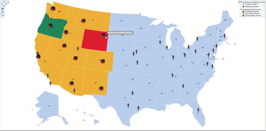
For detailed information about thematic map end user and presentation features, use cases, tag structure, and adding special features to thematic maps, see the "Using Thematic Map Components" section in the Oracle Fusion Middleware Web User Interface Developer's Guide for Oracle Application Development Framework.
26.8.1 How to Create a Thematic Map Using ADF Data Controls
The thematicMap component uses a model to access the data in the underlying list. The specific model class is oracle.adf.view.rich.model.CollectionModel. You can also use other model instances, for example, java.util.List, java.util.Array, and javax.faces.model.DataModel. The data layer will automatically convert the instance into a CollectionModel.
It may be helpful to have an understanding of databound thematic maps. For more information, see Section 26.8, "Creating Databound Thematic Maps."
To create a thematic map using the Data Controls panel:
-
From the Data Controls panel, select a data collection.
Figure 26-65 shows the data collection for warehouse locations and product inventory levels.
-
Drag the collection onto a JSF page and, from the context menu, choose Thematic Map.
-
In the Component Gallery, select the map layer associated with the base map you want to configure for displaying data. In the example, a states map layer in the US base map is selected. Figure 26-66 shows the Component Gallery with the USA states map layer selected.
By default, the Create Data Layer dialog opens for adding an area or point data layer to the selected map layer. In the thematic map displayed in Figure 26-64, an area data layer is configured style USA states by warehouse product levels.
-
In the Create Data Layer dialog, enter the following:
-
Layer Id: Enter a unique name for the data layer you are defining. By default, a unique, consecutively numbered id is entered,
dl1,dl2, and so on. -
Area: Select to add an area data layer to the map layer.
-
AreaLayer: References the map layer to which you are adding a data layer. In the example, a USA States map layer.
-
Location: Select the attribute that represents the column in the data model that determines the location of the data for the areas in the data layer. The locations are Ids of the regions from the base map for which the data is being displayed. For more information, see Section 26.8.5, "What You May Need to Know About Base Map Location Ids."
-
Set current row for master-detail: Select if you want to enable master-detail relationships. This is useful when the data collection for the thematic map is a master in a master-detail relationship with a detail view that is displayed in another UI component on the page. For more information, see Section 26.8.6, "What You May Need to Know About Configuring Master-Detail Relationships."
Figure 26-67 shows the completed Create Data Layer dialog.
An area data layer representing the
areaDataLayercomponent, and an area, representing theareacomponent is added in the Layer Browser hierarchy. Figure 26-68 shows the expanded Layer Browser after adding an area data layer and area to the map layer. -
-
In the Layer Browser, expand the area data layer, select the area to be stylized, and click the Edit icon.
Note:
You configure an area with a default stamp across all areas in the thematic map layer, or you can you can use a childattributeGroupstag to generate the style attribute type automatically based on categorical groups in the data set. If the same style attribute is set in both theareatag, and by anattributeGroupstag, theattributeGroupsstyle type will take precedence. For more information, see Section 26.8.4, "Styling Areas, Markers, and Images to Display Data." -
In the Configure Area dialog, Attribute Groups page, enter the following:
-
Grouping Rules: Use this table to specify the styling of categorical groups of data in a data collection. Use the Add icon to add a row to the table for configuring rules for a categorical group and use the Delete icon to remove any row selected in the table. Each grouping rule is represented as a
attributeGroupscomponent, and assigned a unique, consecutively numbered Id,ag1,ag2, and so on.For each row added to the table, enter the following:
-
Group by Value: Enter or use the dropdown list to select the attribute representing the column in the data set by which you wish to group the data values. For example,
ProductCountrepresents the warehouse product inventory levels by state.Note:
The selected attribute should consist of discrete values that can be categorized. For example, a range of numeric values between 40 and 45, are not automatically grouped. -
Area Properties: Use the dropdown list to select the property to use for styling that area. Areas can be styled using color, pattern, opacity, or any combination of these valid values. Choose Select multiple attributes from the dropdown list for a dialog to specify any combination of values.
The default style values that are generated for each property are defined using CSS style properties in the ADF skin. Each
attributeGroupstype has a default ramp defined in the skin, and these can be customized by setting the index-based properties to the desired values. For more information, see Section 26.8.4.4, "What You May Need to Know About Default Style Values for Attribute Groups." -
Legend Label: Enter text or use the dropdown list to select the attribute representing the text to use for the categorical group in the thematic map legend. You can also select Expression Builder from the dropdown list to create an EL expression to specify the legend text. For more information, see Section 26.8.9, "Creating Databound Legends."
-
-
Value-Specific Rules: Click to open the Match Rules and Exception Rules tables used to specify a finer detail for one or more data values in categorical groups in a data set. For example, use a match rule to style every state with a warehouse with a low product inventory level with a
#DD1E2Fcolor, instead of a predefined range of colors.Note:
Any match or exception rule specified in these tables will override the settings defined in the Grouping Rules table. -
Match Rules: Use to specify the style rule matched to one or more data values in a group of data in a data collection. Use the Add icon to add a row to the table for configuring a match rule for a categorical group and use the Delete icon to remove any row selected in the table. Each match rule is represented as a
attributeMatchRulecomponent, and assigned a unique, consecutively numbered Id,amr1,amr2, and so on. The property and property value is defined in a childf:attributetag. For example:<dvt:attributeMatchRule id="amrl" group="Mountain Dew"> <f:attribute name="color" value="#ffff00"/> </dvt:attributeMatchRule>
For each row added to the table, enter the following:
-
Group Value: Enter the exact value for a Group By Value attribute that will trigger this Match Rule to execute. In the example, warehouse product inventory level data collection attribute, values include
low,med, and high. -
Property: Use the dropdown list to select the property to use for styling that data value. Areas can be styled using color, pattern, or opacity values. The property selected here must match one of the property types listed in the Area Properties for the attribute Grouping Rules.
-
Property Value: Enter or use the dropdown list to assign a value to the property. If the value provided by the match override is also in the prebuilt ramp returned by the Grouping Rules, then that value will only be used by the overrides and will be skipped in the prebuilt ramp.
Valid values for color are RGB hexadecimal colors.
Valid values for pattern include a choice of twelve prebuilt patterns, for example, smallChecker, largeDiamond, smallDiagonalRight, largeCrosshatch. If fill color is specified, the pattern displays in that color on the default white background.
Valid values for opacity range from 0.0 for transparent to 1.0 for opaque.
-
-
Exception Rules: Use to specify one or more exception to the style rules for categorical groups in the data set. Use the Add icon to add a row to the table for configuring an exception rule and use the Delete icon to remove any row selected in the table. Each exception rule is represented as an
attributeExceptionRulecomponent, and assigned a unique, consecutively numbered Id,aer1,aer2, and so on. The property and property value is defined in a childf:attributetag.For each row added to the table, enter the following:
-
Condition: Enter an EL expression, or use the dropdown list to open an Expression Builder dialog to create an EL expression that replaces the style property value with another when certain conditions are met. For example:
#{row.Sales gt 100000} -
Property: Use the dropdown list to select the property to use for styling that data value. Areas can be styled using color, pattern, or opacity values. The property selected here must match one of the property types listed in the Area Properties for the attribute Grouping Rules.
-
Property Value: Enter or use the dropdown list to assign a value to the property. If the value provided by the match override is also in the prebuilt ramp returned by the Grouping Rules, then that value will only be used by the overrides and will be skipped in the prebuilt ramp.
Valid values for color are RGB hexadecimal colors.
Valid values for pattern include a choice of twelve prebuilt patterns, for example, smallChecker, largeDiamond, smallDiagonalRight, largeCrosshatch. If fill color is specified, the pattern displays in that color on the default white background.
Valid values for opacity range from 0.0 for transparent to 1.0 for opaque.
-
Legend Label: Enter a text resource to use for the legend label. The text resource can be a translatable string from a resource bundle or an EL expression executed at runtime. Use the dropdown list to open a Select Text Resource or Expression Builder dialog. If you need help, press F1 or click Help.
Note:
the text resource option is only available for a fixed area. For row-varying areas, use an EL expression to retrieve a row-varying key to look up the text resource in a resource bundle, for example:#{viewController.ResourceBundle[row.label]}
-
-
Messages: Review and clear as necessary any alerts related to the configuration of the area.
Figure 26-69 shows the completed Configure Area dialog. The warning in the message pane alerts the user that the default area color specified in the Default Stamp page of the dialog will be overwritten by the color specified in the Grouping Rules and any value-specific overrides specified in the Attribute Groups page.
-
-
Use the Layer Browser to add a global point data layer representing warehouse locations using the same data collection you used to create the thematic map. For detailed instructions, see Section 26.8.3, "How to Add Data Layers to Thematic Maps."
-
Use the Layer Browser to add a global point data layer representing customer addresses using a different data collection than the one you used to create the thematic map. For detailed instructions, see Section 26.8.3, "How to Add Data Layers to Thematic Maps." Figure 26-70 shows the data collection for customer locations.
-
Use the Layer Browser to add and style a marker representing the customer locations in the global point data layer. For detail instructions, see Section 26.8.4, "Styling Areas, Markers, and Images to Display Data."
Figure 26-71 shows the expanded Layer Browser for the thematic map in Figure 26-64.
-
Add and configure a data bound legend and labels associated with the styled points and areas. For detailed instructions, see Section 26.8.9, "Creating Databound Legends."
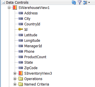
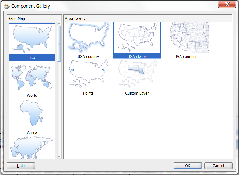
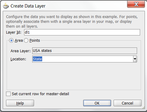
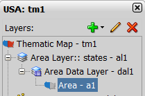
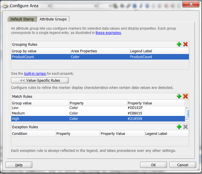
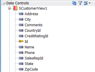
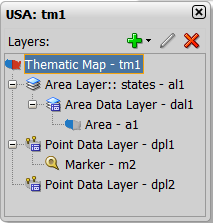
26.8.2 What Happens When You Use Data Controls to Create a Thematic Map
When you use ADF data controls to create a thematic map, JDeveloper:
-
Defines the bindings for the thematic map in the page definition file of the JSF page, and
-
Inserts code in the JSF page for the DVT thematic map components.
Example 26-22 shows the bindings defined in the page definition file of the JSF page for the example thematic map in Figure 26-64.
Example 26-22 XML Bindings for a Thematic Map
<bindings>
<tree IterBinding="WorldProductInventory1Iterator" id="WorldProductInventory1">
<nodeDefinition DefName="model.WorldProductInventory" Name="WorldProductInventory10">
<AttrNames>
<Item Value="Address"/>
<Item Value="AmountInStock"/>
<Item Value="Category"/>
<Item Value="CategoryId"/>
<Item Value="City"/>
<Item Value="Country"/>
<Item Value="CountryCode"/>
<Item Value="CountryId"/>
<Item Value="Id"/>
<Item Value="Id1"/>
<Item Value="Id2"/>
<Item Value="Id3"/>
<Item Value="Id4"/>
<Item Value="Latitude"/>
<Item Value="Longitude"/>
<Item Value="ProdName"/>
<Item Value="ProductId"/>
<Item Value="RegName"/>
<Item Value="RegionId"/>
<Item Value="ReorderPoint"/>
<Item Value="State"/>
<Item Value="WarehouseId"/>
<Item Value="ZipCode"/>
</AttrNames>
</nodeDefinition>
</tree>
<tree IterBinding="SCustomerView1Iterator" id="SCustomerView1">
<nodeDefinition DefName="model.SCustomerView" Name="SCustomerView10">
<AttrNames>
<Item Value="Address"/>
<Item Value="City"/>
<Item Value="CountryId"/>
<Item Value="Id"/>
<Item Value="Name"/>
<Item Value="State"/>
<Item Value="ZipCode"/>
</AttrNames>
</nodeDefinition>
</tree>
<tree IterBinding="SWarehouseView1Iterator" id="SWarehouseView1">
<nodeDefinition DefName="model.SWarehouseView" Name="SWarehouseView10">
<AttrNames>
<Item Value="Address"/>
<Item Value="City"/>
<Item Value="CountryId"/>
<Item Value="Id"/>
<Item Value="Latitude"/>
<Item Value="Longitude"/>
<Item Value="ManagerId"/>
<Item Value="Phone"/>
<Item Value="ProductCount"/>
<Item Value="State"/>
<Item Value="ZipCode"/>
</AttrNames>
</nodeDefinition>
</tree>
</bindings>
Example 26-23 shows the code inserted in the JSF page for the example thematic map in Figure 26-64.
Example 26-23 Code on the JSF Page for a Thematic Map
<dvt:thematicMap id="tm1" basemap="usa" animationOnDisplay="alphaFade"
summary="#{viewcontrollerBundle.THEMATIC_MAP_DISPLAYING_
WAREHOUSE_PRODUCT_INVENTORY_LEVELS}">
<dvt:areaLayer layer="states" id="al1">
<dvt:areaDataLayer id="dal1"
value="#{bindings.SWarehouseView1.collectionModel}"
var="row">
<dvt:areaLocation name="#{row.State}" id="al2">
<dvt:area id="a1" shortDesc="#{row.ProductCount} units">
<dvt:attributeGroups id="ag1" type="color"
value="#{row.ProductCount le 5 ? 'low' :
(row.ProductCount le 8 ? 'med' : 'high')}"
label="#{row.ProductCount le 5 ? 'Low Product
Counts' : (row.ProductCount le 8 ? 'Good
Product Counts' : 'Surplus Product
Counts')}">
<dvt:attributeMatchRule id="amr1" group="low">
<f:attribute name="color" value="#DD1E2F"/>
</dvt:attributeMatchRule>
<dvt:attributeMatchRule id="amr2" group="med">
<f:attribute name="color" value="#EBB035"/>
</dvt:attributeMatchRule>
<dvt:attributeMatchRule id="amr3" group="high">
<f:attribute name="color" value="#218559"/>
</dvt:attributeMatchRule>
</dvt:attributeGroups>
</dvt:area>
</dvt:areaLocation>
</dvt:areaDataLayer>
</dvt:areaLayer>
<dvt:pointDataLayer id="dpl1"
value="#{bindings.SCustomerView1.collectionModel}"
var="row">
<dvt:pointLocation type="pointName" pointName="#{row.State}_
#{fn:toUpperCase(fn:replace(row.City, ' ', '_'))}"
id="pl1">
<dvt:marker id="m2" fillColor="#00000" opacity="1.0" shape="human"
scaleX="4.0" scaleY="4.0"
shortDesc="#{row.Name}">
<f:attribute name="legendLabel" value="Customer Location"/>
</dvt:marker>
</dvt:pointLocation>
</dvt:pointDataLayer>
<dvt:pointDataLayer id="dpl2"
value="#{bindings.SWarehouseView1.collectionModel}"
var="row">
<dvt:pointLocation type="pointXY" pointX="#{row.Longitude}"
pointY="#{row.Latitude}" id="pl2">
<af:image id="img1" source="/images/normalHouse.gif"
shortDesc="#{row.Address}, #{row.City} #{row.ZipCode}">
<f:attribute name="legendLabel" value="Warehouse Location"/>
</af:image>
</dvt:pointLocation>
</dvt:pointDataLayer>
<dvt:legend id="l1">
<dvt:showLegendGroup id="slg1" label="Customer and Warehouse Locations">
<dvt:legendSection source="dpl1:m2" id="ls2"/>
<dvt:legendSection source="dpl2:img1" id="ls1"/>
</dvt:showLegendGroup>
<dvt:showLegendGroup id="slg2" label="Warehouse Product Levels">
<dvt:legendSection source="al1:dal1:ag1" id="ls3"/>
</dvt:showLegendGroup>
</dvt:legend>
</dvt:thematicMap>
Once you have created a data bound thematic map you can add additional map layers representing available regions in the geographical hierarchy of the base map, and associate area or point data layers using the same data collection you used to create the thematic map. The Layer Browser represents the logical structure of the map layers, area and point data layers, and stylized areas and markers. Use the Layer Browser to:
-
Add additional map layers in the base map geographical hierarchy to the thematic map.
-
Define a custom map layer in the geographical hierarchy of the base map, using lower level regions to aggregate the regions in the custom layer. For more information, see Section 26.8.7, "How to Define a Custom Map Layer."
-
Add, edit, or delete area or point (global or map layer specific) data layers. For more information, see Section 26.8.3, "How to Add Data Layers to Thematic Maps."
-
Add, edit, or delete stylized areas or markers. For more information, see Section 26.8.4, "Styling Areas, Markers, and Images to Display Data."
After creating a thematic map using data controls, you can customize the default map labels, legend display, and add interactivity and animation effects. For more information, see the "Using Thematic Map Components" section in the Oracle Fusion Middleware Web User Interface Developer's Guide for Oracle Application Development Framework.
26.8.3 How to Add Data Layers to Thematic Maps
You use data layers to associate map layers with a data collection. Using stamping, each row of data in the data model can be identified by a style, for example a color or pattern; a marker, for example a circle or square; or an image. When a map layer is displayed at runtime, the data appears as stylized areas, markers, or images.
Map layers can display data using an area data layer and/or one or more point data layers. Area data layers can be styled using areas, markers, or images. Point data layers can be styled using markers or images.
When a point data layer is associated with the base map as a direct child of thematicMap instead of as a child of a specific map layer, the data displays at all times and is called a global point layer.
It may be helpful to have an understanding of databound thematic maps. For more information, see Section 26.8, "Creating Databound Thematic Maps."
To add an area data layer to a map layer:
-
Select the thematic map in the Visual Editor.
-
In the Layer Browser, select the map layer to which you wish to bind a row in the data collection. If the Layer Browser is not open in the Visual Editor, right-click inside the map and choose Open Layer Browser.
-
From the Add icon dropdown list, choose Add Data Layer.
-
In the Create Data Layer dialog, enter the following:
-
Layer Id: Enter a unique name for the data layer you are defining. By default, a unique, consecutively numbered id is entered,
dl1,dl2, and so on. -
Bind Data Now: Select and click Browse to open the Picker dialog > Data Controls Definitions page. Select the data collection in the ADF data controls you are using to data bind your data layer.
Note:
Alternatively, you can use the Expression Builder page to select an ADF managed bean you are using to data bind your area data layer and areas. You can also use the Expression Builder dialog in each remaining field. -
Area: Select to add an area data layer to the map layer.
-
AreaLayer: References the map layer to which you are adding a data layer.
-
Location: Select attribute that represents the column in the data model that determines the location of the data for the areas in the data layer. The locations are Ids of the regions from the base map for which the data is being displayed. For more information, see Section 26.8.5, "What You May Need to Know About Base Map Location Ids."
-
Set current row for master-detail: Select if you want to enable master-detail relationships. This is useful when the data collection for the thematic map is a master in a master-detail relationship with a detail view that is displayed in another UI component on the page. For more information, see Section 26.8.6, "What You May Need to Know About Configuring Master-Detail Relationships."
-
Figure 26-72 shows the completed Create Area Data Layer dialog.
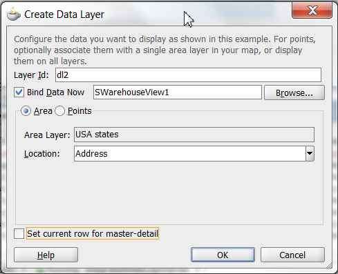
By default, an area data layer representing the areaDataLayer component, and an area, representing the area component is added in the Layer Browser hierarchy. Example 26-24 shows the code added to the JSF page when you add an area data layer to a map layer.
Example 26-24 Area Data Layer Code in JSF Page
<dvt:thematicMap id="tm1" basemap="usa">
<dvt:areaLayer layer="counties" id="al1">
<dvt:areaDataLayer id="dl2"
value="#{bindings.TmapStatesView11.collectionModel}"
var="row">
<dvt:areaLocation name="#{row.Name}" id="al2">
<dvt:area id="a1"/>
</dvt:areaLocation>
</dvt:areaDataLayer>
</dvt:areaLayer>
...
</dvt:thematicMap>
To add a point data layer to a map layer:
-
Select the thematic map in the Visual Editor.
-
In the Layer Browser, select the map layer to which you wish to bind a data layer. If the Layer Browser is not open in the Visual Editor, right-click inside the map and choose Open Layer Browser.
-
From the Add icon dropdown list, choose Add Data Layer.
Note:
If you wish to create a global point layer that displays at all times on the thematic map, choose Create Global Point Layer. -
In the Create Data Layer dialog, enter the following:
-
Layer Id: Enter a unique ID for the data layer you are defining. By default, a unique, consecutively numbered id is entered,
dl1,dl2, and so on. -
Bind Data Now: Select and click Browse to open the Picker dialog > Data Controls Definitions page. Select the data collection in the ADF data controls you are using to data bind your data layer.
Note:
Alternatively, you can use the Expression Builder page to select an ADF managed bean you are using to data bind your point data layer and markers. You can also use the Expression Builder dialog in each remaining field. -
Points: Select to add a point data layer to the map layer.
-
AreaLayer: Use the dropdown list to select the map layer to which you are associating a data layer. If you select All, the point data layer will be configured as a global point layer and display at all times. If you select an available map layer, the point data layer will only display with that map layer is displayed.
-
Data Type: Choose one of the following:
-
City: Select to use a
pointNamedata type representing the named points, such as cities, in the data collection that map to named points in the base map. -
Coordinates: Select to use a
pointXYdata type representing the columns in the data collection that joinpointXandpointYto define the point locations.
-
-
Location: Available if a City Data Type is specified. Use the dropdown list to select the attribute that represents the column in the data model that determines the location of the data for the points in the data layer. The locations are IDs of the points from the base map for which the data is being displayed. For more information, see Section 26.8.5, "What You May Need to Know About Base Map Location Ids."
-
Longitude: Available if a Coordinates Data Type is specified. Use the dropdown list to select the attribute in the data collection that represents the longitude, or
pointXof the marker. -
Latitude: Available if a Coordinates Data Type is specified. Use the dropdown list to select the attribute in the data collection that represents the latitude, or
pointYof the markers. -
Set current row for master-detail: Select if you want to enable master-detail relationships. This is useful when the data collection for the thematic map is a master in a master-detail relationship with a detail view that is displayed in another UI component on the page. For more information, see Section 26.8.6, "What You May Need to Know About Configuring Master-Detail Relationships."
-
Figure 26-73 shows the completed Create Point Data Layer dialog for a pointName data type.
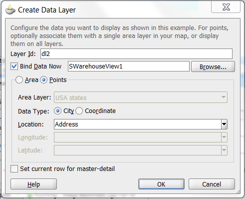
By default, a point data layer representing the pointDataLayer component, and a marker, representing the marker component is added in the Layer Browser hierarchy. Example 26-25 shows the code added to the JSF page when you add a point data layer to a map layer.
Example 26-25 Point Data Layer Code in JSF Page
<dvt:thematicMap id="tm1" basemap="usa">
<dvt:areaLayer layer="states" id="al1">
<dvt:pointDataLayer id="dl1"
value="#{bindings.TmapCitiesView11.collectionModel}"
var="row">
<dvt:pointLocation type="pointName" pointName="#{row.City}" id="pl1">
<dvt:marker id="m2"/>
</dvt:pointLocation>
</dvt:pointDataLayer>
</dvt:areaLayer>
...
</dvt:thematicMap>
Example 26-26 shows the code added to the JSF page when you add a global point data layer to a thematic map.
Example 26-26 Global Point Data Layer Code in JSF Page
<dvt:thematicMap>
<areaLayer layer="states" id="al1"/>
<dvt:pointDataLayer id="dl2"
value="#{bindings.TmapCitiesView12.collectionModel}"
var="row">
<dvt:pointLocation type="pointXY" pointX="#{row.Longitude}"
pointY="#{row.Latitude}" id="pl2">
<dvt:marker id="m3"/>
</dvt:pointLocation>
</dvt:pointDataLayer>
...
</dvt:thematicMap>
After adding the area or point data layer to the thematic map, you style the data using areas, markers, or images. For more information, see Section 26.8.4, "Styling Areas, Markers, and Images to Display Data."
26.8.4 Styling Areas, Markers, and Images to Display Data
An area data layer is used to associate map layers with a data collection. Using stamping, each row of data in the data model can be identified by a style, for example a color or pattern; a marker, for example a circle or square; or an image.
A point data layer is used to associate a set of points on a map with a data collection. The data point can be specified by a named point in a map layer, for example, cities in the US map, or by longitude and latitude. Using stamping, each row of data in the data model can be identified by a marker, for example a circle or square, or an image.
26.8.4.1 How to Style Areas to Display Data
You configure an area with a default stamp across all areas in the thematic map areaLayer, or you can use a child attributeGroups tag to generate the style attribute type automatically based on categorical groups in the data set. If the same style attribute is set in both the area tag, and by an attributeGroups tag, the attributeGroups style type will take precedence.
By default, when you add an area data layer, a configurable area is added to the Layer Browser. You can use the Layer Browser to add additional areas or markers to an area data layer, or markers to a point data layer. The Layer Browser reflects the logical structure of the map layers, area or point data layers, and areas or markers configured in the thematic map.
For example, you can style the states in the states layer of the usa base map with an attribute group to display states with warehouses using the color red as illustrated in Figure 26-74.
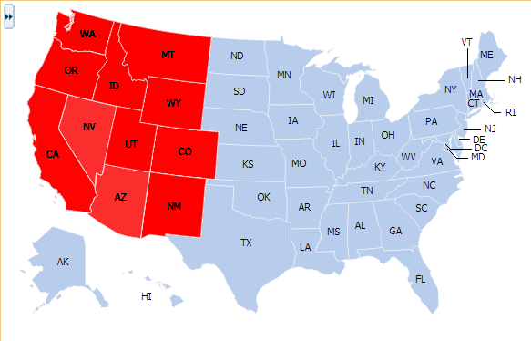
It may be helpful to have an understanding of databound thematic maps. For more information, see Section 26.8, "Creating Databound Thematic Maps."
To style areas using a default stamp:
-
In the Layer Browser, select the area at the area location inside the map layer you are configuring.
-
Click the Edit icon.
-
In the Configure Area dialog, Default Stamp page, enter the following:
-
Location: By default, the attribute that represents the column in the data model that determines the location of the data for the areas in the data layer. The locations are Ids of the regions from the base map for which the data is being displayed. This read-only field displays the EL expression that maps the stamped area to a region in the base map. For more information, see Section 26.8.5, "What You May Need to Know About Base Map Location Ids."
-
Color: Optionally, from the dropdown list select the fill color for the area. Valid values are RGB hexadecimal. Choose Custom Color from the dropdown list to open a Color Picker dialog
-
Pattern: Optionally, from the dropdown list select one of twelve prebuilt patterns to style the area, for example, smallChecker, largeDiamond, smallDiagonalRight, largeCrosshatch. If fill color is specified, the pattern displays in that color on the default white background.
-
Opacity: Optionally, specify the opacity of the fill color of the area. Valid values range from 0.0 for transparent to 1.0 for opaque.
-
Include in Legend: Select and use the search icon to open a Select Text Resource dialog to select or create an application text resource to use for the legend text. The text resource can be a translatable string from a resource bundle or an EL expression executed at runtime. If you need help, press F1 or click Help.
Note:
the text resource option is only available for a fixed area. For row-varying areas, use an EL expression to retrieve a row-varying key to look up the text resource in a resource bundle, for example:#{viewController.ResourceBundle[row.label]} -
Messages: Review and clear as necessary any alerts related to the configuration of the area.
-
Figure 26-75 shows the Configure Area dialog for the Default Stamp page.
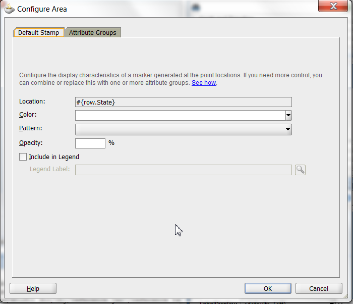
Example 26-27 shows the code inserted in the JSF page for the configured area.
Example 26-27 Sample Code for Area Default Stamp Configuration
<dvt:thematicMap id="tm1" basemap="usa">
<dvt:areaLayer layer="states" id="al1">
<dvt:areaDataLayer id="dl1"
value="#{bindings.TmapStatesView1.collectionModel}"
var="row">
<dvt:areaLocation name="#{row.Name}" id="al2">
<dvt:area id="a1" fillColor="#ff0000">
<f:attribute name="legendLabel"
value="#{Bundle.US_STATES}"/>
</dvt:area>
</dvt:areaLocation>
</dvt:areaDataLayer>
</dvt:areaLayer>
</dvt:thematicMap>
If you wish to style areas using categorical groups of data in the data collection, use the Attribute Groups page of the Configure Area dialog. For details about using the Attribute Groups page including sample code, see the use case described in Section 26.8.1, "How to Create a Thematic Map Using ADF Data Controls."
26.8.4.2 How to Style Markers to Display Data
You configure a marker with a default stamp across all markers in the thematic map layer, or you can use a child attributeGroups tag to generate the style attribute type automatically based on categorical groups in the data set. If the same style attribute is set in both the marker tag, and by an attributeGroups tag, the attributeGroups style type will take precedence.
By default, when you add a point data layer, a configurable marker element is added to the Layer Browser. You can use the Layer Browser to add additional areas or markers to an area data layer, or markers to a point data layer. The Layer Browser reflects the logical structure of the map layers, area or point data layers, and areas or markers configured in the thematic map.
For example, using the default stamp, you can identify all the predefined cities in the states layer of the USA base map with a circle as illustrated in Figure 26-76. In the example, markers are styled on a point data layer. Styling markers on an area data layer is similar.
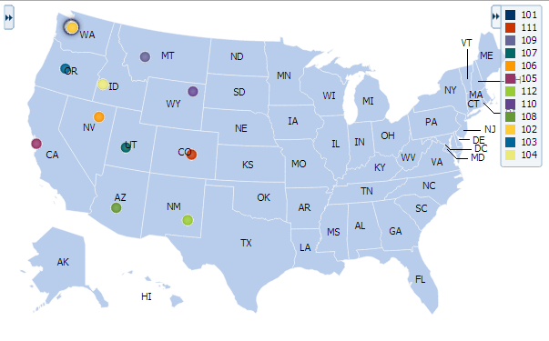
It may be helpful to have an understanding of databound thematic maps. For more information, see Section 26.8, "Creating Databound Thematic Maps."
To style markers using a default stamp:
-
In the Layer Browser, select the marker at the point location inside the map layer you are configuring.
-
Click the Edit icon.
-
In the Configure Marker dialog, Default Stamp page, enter the following:
-
Location: By default, the attribute that represents the column in the data model that determines the location of the data for the markers in the data layer. The locations are Ids of the points from the base map for which the data is being displayed. This read-only field displays the EL expression that maps the stamped marker to a point in the base map. For more information, see Section 26.8.5, "What You May Need to Know About Base Map Location Ids."
-
Color: Optionally, from the dropdown list select the fill color for the marker. Valid values are RGB hexadecimal. Choose Custom Color from the dropdown list to open a Color Picker dialog.
-
Pattern: Optionally, from the dropdown list select one of twelve prebuilt patterns to style the marker, for example, smallChecker, largeDiamond, smallDiagonalRight, largeCrosshatch. If fill color is specified, the pattern displays in that color on the default white background.
-
Opacity: Optionally, specify the opacity of the fill color of the marker. Valid values range from 0.0 for transparent to 1.0 for opaque.
-
Shape: Optionally, select the shape of the marker. Valid values are circle (default), square, plus, diamond, triangleUp, triangleDown, and human.
Optionally, use the Custom Shape field to specify the
shapePathvalue to a Scalable Vector Graphics (SVG) file to use for the marker. Enter the path or use the Search icon to open the Select SVG File dialog and navigate to the file location. This option is only available if the default shape is selected in the Shape field.Shapes can also be specified using CSS style properties. Predefined marker shapes can be overwritten, and the paths to SVG files for custom markers can also be defined without using the
shapePathattribute. For more information, see Section 26.8.4.3, "What You May Need to Know About Styling Markers." -
Size: Optionally, enter a percentage by which to scale the marker from its default size for ScaleX (horizontal), and ScaleY (vertical). The percentages are then scaled to a float. For example, you can double the marker width by setting ScaleX to
200, written to the tag as2.0, and halve the height by setting ScaleY to50, written to the tag as0.5.You can also use an EL expression to evaluate the size of the marker based on the data, for example:
scaleX="#{(5 + row.categories[0]/25)}" scaleY="#{(5 + row.categories[0]/25)}"Note:
To maintain the size of scaled markers relative to the thematic map when it is zoomed in or out, set thedvt:thematicMapcomponentmarkerZoomBehaviorproperty tozoom. -
Include in Legend: Enter a text resource to use for the legend label. The text resource can be a translatable string from a resource bundle or an EL expression executed at runtime. Use the dropdown list to open a Select Text Resource or Expression Builder dialog. If you need help, press F1 or click Help.
Note:
the text resource option is only available for a fixed area. For row-varying areas, use an EL expression to retrieve a row-varying key to look up the text resource in a resource bundle, for example:#{viewController.ResourceBundle[row.label]} -
Messages: Review and clear any messages related to the configuration of the marker.
-
Figure 26-77 shows the Configure Marker dialog, Default Stamp page.
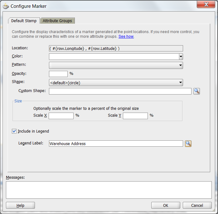
Example 26-28 shows the code inserted in the JSF page for the configured marker.
Example 26-28 Sample Code for Marker Default Stamp Configuration
<dvt:thematicMap id="tm1" basemap="usa">
<dvt:areaLayer layer="states" id="al1">
<dvt:pointDataLayer id="dl2"
value="#{bindings.TmapCitiesView1.collectionModel}"
var="row">
<<dvt:pointLocation type="pointName" pointName="#{row.City}" id="pl1">
<dvt:marker id="m2" fillColor="#ff0000">
<f:attribute name="legendLabel"
value="#{Bundle.US_CITIES}"/>
</dvt:marker>
</dvt:pointLocation>
</dvt:pointDataLayer>
</dvt:areaLayer>
</dvt:thematicMap>
If you wish to style markers using categorical groups of data in the data collection, use the Attribute Groups page of the Configure Marker dialog. You can configure markers for a point data layer or an area data layer.
To style markers using categorical groups of data:
-
In the Layer Browser, select the marker at the marker location inside the map layer you are configuring.
-
Click the Edit icon.
-
In the Configure Marker dialog, Attribute Groups page, enter the following:
-
Grouping Rules: Use this table to specify the styling of categorical groups of data in a data collection. Use the Add icon to add a row to the table for configuring rules for a categorical group and use the Delete icon to remove any row selected in the table. Each grouping rule is represented as a
attributeGroupscomponent, and assigned a unique, consecutively numbered Id,ag1,ag2, and so on.For each row added to the table, enter the following:
-
Group by Value: Enter or use the dropdown list to select the attribute representing the column in the data set by which you wish to group the data values.
Note:
The selected attribute should consist of discrete values that can be categorized. For example, a range of numeric values between 40 and 45, are not automatically grouped. -
Marker Properties: Use the dropdown list to select the property to use for styling that marker. Markers can be styled using color, pattern, opacity, scaleX, scaleY, or any combination of these valid values. Choose Select multiple attributes from the dropdown list for a dialog to specify any combination of values.
The default style values that are generated for each property are defined using CSS style properties in the ADF skin. Each
attributeGroupstype has a default ramp defined in the skin, and these can be customized by setting the index-based properties to the desired values. For more information, see Section 26.8.4.4, "What You May Need to Know About Default Style Values for Attribute Groups." -
Legend Label: Enter text or use the dropdown list to select the attribute representing the text to use for the categorical group in the thematic map legend. You can also select Expression Builder from the dropdown list to create an EL expression to specify the legend text. For more information, see Section 26.8.9, "Creating Databound Legends."
-
-
Value-Specific Rules: Click to open the Match Rules and Exception Rules tables used to specify a finer detail for one or more data values for categorical groups in a data set.
Note:
Any match or exception rule specified in these tables will override the settings defined in the Grouping Rules table. -
Match Rules: Use to specify the style rule matched to one or more data values in a group of data in a data collection. Use the Add icon to add a row to the table for configuring a match rule for a categorical group and use the Delete icon to remove any row selected in the table. Each match rule is represented as a
attributeMatchRulecomponent, and assigned a unique, consecutively numbered Id,amr1,amr2, and so on. The property and property value is defined in a childf:attributetag. For example:<dvt:attributeMatchRule id="amrl" group="Mountain Dew"> <f:attribute name="color" value="#ffff00"/> </dvt:attributeMatchRule>
For each row added to the table, enter the following:
-
Group Value: Enter the exact value for the Group by Value attribute that will trigger the Match Rule to execute.
-
Property: Use the dropdown list to select the property to use for styling that data value. Markers can be styled using color, pattern, opacity, scaleX, scaleY, or any combination of these valid values. The property selected here must match one of the property types listed in the Marker Properties for the attribute Grouping Rules.
-
Property Value: Enter or use the dropdown list to assign a value to the property. If the value provided by the match override is also in the prebuilt ramp returned by the Grouping Rules, then that value will only be used by the overrides and will be skipped in the prebuilt ramp.
Valid values for color are RGB hexadecimal colors.
Valid values for pattern include a choice of twelve prebuilt patterns, for example, smallChecker, largeDiamond, smallDiagonalRight, largeCrosshatch. If fill color is specified, the pattern displays in that color on the default white background.
Valid values for opacity range from 0.0 for transparent to 1.0 for opaque.
Valid values for scaleX and scaleY are percentages that are then scaled to a float.
-
-
Exception Rules: Use to specify one or more exceptions to the style rules for categorical groups in the data set. Use the Add icon to add a row to the table for configuring an exception rule and use the Delete icon to remove any row selected in the table. Each exception rule is represented as an
attributeExceptionRulecomponent, and assigned a unique, consecutively numbered Id,aer1,aer2, and so on. The property and property value is defined in a childf:attributetag. For example:<dvt:attributeExceptionRule id="aer1" condition="#{row.name=='TX'}" label="Texas"> <f:attribute name="color" value="#ff00ff"/> </dvt:attributeExceptionRule>For each row added to the table, enter the following:
-
Condition: Enter an EL expression, or use the dropdown list to open an Expression Builder dialog to create an EL expression that replaces the style property value with another when certain conditions are met. For example:
#{row.Sales gt 100000} -
Property: Use the dropdown list to select the property to use for styling that data value. Markers can be styled using color, pattern, opacity, scaleX, or scaleY. The property selected here must match one of the property types listed in the Marker Properties for the attribute Grouping Rules.
-
Property Value: Enter or use the dropdown list to assign a value to the property. If the value provided by the match override is also in the prebuilt ramp returned by the Grouping Rules, then that value will only be used by the overrides and will be skipped in the prebuilt ramp
Valid values for color are RGB hexadecimal colors.
Valid values for pattern include a choice of twelve prebuilt patterns, for example, smallChecker, largeDiamond, smallDiagonalRight, largeCrosshatch. If fill color is specified, the pattern displays in that color on the default white background.
Valid values for opacity range from 0.0 for transparent to 1.0 for opaque.
Valid values for scaleX and scaleY are percentages that are then scaled to a float.
-
Legend Label: Enter a text resource to use for the legend label. The text resource can be a translatable string from a resource bundle or an EL expression executed at runtime. Use the dropdown list to open a Select Text Resource or Expression Builder dialog. If you need help, press F1 or click Help.
Note:
the text resource option is only available for a fixed area. For row-varying areas, use an EL expression to retrieve a row-varying key to look up the text resource in a resource bundle, for example:#{viewController.ResourceBundle[row.label]}
-
-
Messages: Review and clear as necessary any alerts related to the configuration of the marker.
-
For example, you can use markers in an area data layer to display categorical groups of data using colors as illustrated in Figure 26-78.
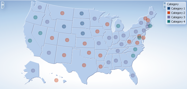
Example 26-29 shows the sample code for marker attribute groups by color.
Example 26-29 Sample Code for Marker Attribute Groups by Color
<dvt:thematicMap basemap="usa" id="tm1"
<dvt:areaLayer layer="states" id="al1" labelDisplay="off">
<dvt:areaDataLayer id="dl1" var="row" value="#{stateData.colorModel}">
<dvt:areaLocation id="al2" name="#{row.name}">
<dvt:marker id="m1"
scaleX="3.0"
scaleY="3.0"
shape="circle">
<dvt:attributeGroups id="ag1" type="color" value="#{row.category}"
label="#{row.category}"/>
</dvt:marker>
</dvt:areaLocation>
</dvt:areaDataLayer>
</dvt:areaLayer>
<dvt:legend id="l1">
<f:facet name="separator"/>
<dvt:legendSection id="ls1" label="Category" source="ag1"/>
</dvt:legend>
</dvt:thematicMap>
You can also use markers to display categorical groups of data using multiple attributes such as color and shape, and display an exception to the grouping rules when certain conditions are met. Figure 26-79 shows a thematic map with categorical groups using color and shape with an exception for the state of Texas.
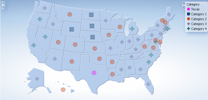
Example 26-30 shows sample code for multiple marker attribute groups with exception rule.
Example 26-30 Sample Code for Multiple Marker Attribute Groups with Exception Rule
<dvt:thematicMap basemap="usa" id="tm2"
<dvt:areaLayer layer="states" id="al1" labelDisplay="off">
<dvt:areaDataLayer id="dl1" var="row" value="#{stateData.colorModel}">
<dvt:areaLocation id="al2" name="#{row.name}">
<dvt:marker id="m1"
scaleX="3.0"
scaleY="3.0"
shape="circle">
<dvt:attributeGroups id="ag1" type="shape color" value="#{row.category}"
label="#{row.category}">
<dvt:attributeExceptionRule id="aer1" condition="#{row.name=='TX'}"
label="Texas">
<f:attribute name="color" value="#ff00ff"/>
</dvt:exceptionRule>
</dvt:attributeGroups>
</dvt:marker>
</dvt:areaLocation>
</dvt:areaDataLayer>
</dvt:areaLayer>
<dvt:legend id="l1">
<f:facet name="separator"/>
<dvt:legendSection id="ls1" label="Category" source="ag1"/>
</dvt:legend>
</dvt:thematicMap>
26.8.4.3 What You May Need to Know About Styling Markers
Thematic maps support a predefined set of seven shapes (circle, square, and so on) that can be specified using the shape attribute in the marker component. For custom markers, the shapePath attribute can be used to specify the path of an SVG file that will get displayed in place of a predefined shape.
Marker shapes can be also specified through CSS style properties in an ADF skin. Using thematic map style properties, predefined marker shapes can be overwritten, and the paths to SVG files for custom markers can be defined without using the shapePath attribute. When using style properties, the shape attribute in the marker component is used for defining both predefined and custom shapes.
A predefined shape will be overwritten if a global or component-specific style property for that shape is specified in the ADF skin. For example, you can overwrite the predefined circle shape by specifying the newCircle.svg file in the thematic map component style property as follows:
af|dvt-thematicMap::shape-circle{
-tr-path: url(/resources/path/newCircle.svg);
}
In the JSF page, the marker component shape attribute is set as follows:
<dvt:marker id="m1" shape="circle"/>
To specify a custom shape in the marker component shape attribute, you must use a prefix of custom in the shape style property name. For example, if the custom shape is named customName, then the ADF skin file should define either a global .AFDVTShapeCustomName:alias style property, or the thematic map specific af|dvt-thematicMap::shape-customName with the -tr-path property pointing to the SVG file as follows:
af|dvt-thematicMap::shape-customName{
-tr-path: url(/resource/path/newCShape.svg);
}
In the JSF page, the marker component shape attribute is set as follows:
<dvt:marker id="m1" shape="customName"/>
For information about using ADF skins and style properties, see the "Customizing the Appearance Using Styles and Skins" chapter in the Oracle Fusion Middleware Web User Interface Developer's Guide for Oracle Application Development Framework.
26.8.4.4 What You May Need to Know About Default Style Values for Attribute Groups
The attributeGroups component is used to generate stylistic property values such as colors or shapes based on categorical grouping of the data in a data collection. Based on the attribute representing the column in the data model to group by, the attributeGroups component can generate style values for each unique value, or group, in the data.
The type of stylistic properties to generate values for is specified by the type attribute of the attributeGroups component. Supported types for area components are color, pattern, and opacity. Supported types for marker components are color, shape, pattern, opacity, scaleX, and scaleY. These types can be combined in a space-delimited list to generate multiple stylistic properties for each unique data value.
The default style values that are generated are defined using CSS style properties in the ADF skin. Each attributeGroups type has a default ramp defined in the ADF skin that can be customized by setting the index-based selectors to the desired values. Example 26-31 show sample code for using CSS style properties to specify attribute groups using CSS style properties.
Example 26-31 Attribute Groups CSS Style Properties
af|dvt-attributeGroups::shape1{
-tr-shape: square;
}
af|dvt-attributeGroups::shape2{
-tr-shape: square;
}
...
af|dvt-attributeGroups::color1{
-tr-fill-color: #003366;
}
The default ramps for each attribute groups type are displayed in Table 26-8.
Table 26-8 Default Ramps for Thematic Map Attribute Groups
| Type | Default Ramps |
|---|---|
|
|
j |
|
|
|
|
|
|
|
|
|
|
|
|
For information about using ADF skins and style properties, see the "Customizing the Appearance Using Styles and Skins" chapter in the Oracle Fusion Middleware Web User Interface Developer's Guide for Oracle Application Development Framework.
26.8.4.5 How to Use Images to Display Data
You can use images to represent data displayed in a thematic map. Using stamping, each row of data in the data model can be identified by an image. Images can be associated with either an area or point data layer. You can associate an image file with the data layer directly or with a marker to represent the data.
For example, you can use a house image to identify prime locations on the states map layer of a US base map as illustrated in Figure 26-80.
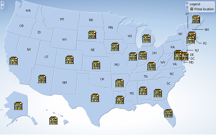
It may be helpful to have an understanding of how thematic map attributes and thematic map child tags can affect functionality. For more information, see the "Configuring Thematic Maps" section in the Oracle Fusion Middleware Web User Interface Developer's Guide for Oracle Application Development Framework.
You should already have a thematic map on your page. If you do not, follow the instructions in this chapter to create a thematic map. For more information, see Section 26.8.1, "How to Create a Thematic Map Using ADF Data Controls."
To use an image to display data:
-
In the Layer Browser, select the area or point data layer where you are configuring an image to display data.
-
In the Structure window, right-click the area or point data layer child
areaLocationorpointLocationcomponent and select insert inside dvt:areaLocation or insert inside dvt:pointLocation > Image. -
In the Insert Image dialog, enter the following:
-
Source: Enter the URI specifying the location of the image source. You can use the dropdown menu to choose Edit and open an Edit Property: Source dialog or the Expression Builder to specify the location of the image source.
-
ShortDesc: Enter the short description of the image used as the
alttext for screen reader users.
-
Example 26-32 shows a code sample for the thematic map using images to display data in Figure 26-80.
Example 26-32 Code Sample for Thematic Map Using Images
<dvt:thematicMap id="thematicMap" imageFormat="flash" basemap="usa"
summary="Thematic map showing the important real estate markets">
<dvt:legend label="Legend">
<dvt:legendSection source="areaLayer:dataLayer:img1"/>
</dvt:legend>
<dvt:areaLayer id="areaLayer" layer="states">
<dvt:areaDataLayer id="dataLayer" contentDelivery="immediate"
value="#{tmapBean.colorModel}"
var="row"varStatus="rowStatus">
<dvt:areaLocation id="dataLoc" name="#{row.name}">
<af:image id="img1" source="/resources/images/geoMap/mansion.gif"
rendered="#{row.category == 'category1'}"
shortDesc="House image">
<f:attribute name="legendLabel" value="Prime location"/>
</af:image>
</dvt:areaLocation>
</dvt:areaDataLayer>
</dvt:areaLayer>
</dvt:thematicMap>
You can also configure a marker to use an image file to display data. Separate images can be specified to display user selected and hover states. Support for the rotation of images is also supported when using the dvt:marker component. For example, the thematic map in Figure 26-81 represents the locations and tracks of airplane flights, rotating the image as it moves along the track.
To use an marker image source to display data:
-
In the Layer Browser, select the area or point data layer where you are configuring an image to display data.
-
In the Structure window, right-click the area or point data layer child
areaLocationorpointLocationcomponent and select insert inside dvt:areaLocation or insert inside dvt:pointLocation > Marker. -
In the Structure window, right-click the dvt:marker component and choose Go to Properties.
-
In the Property Inspector, expand the Appearance section and set the following attributes:
-
Source: Enter the URI specifying the location of the image source. You can use the dropdown menu to choose Edit and open an Edit Property: Source dialog or the Expression Builder to specify the location of the image resource.
-
SourceHover: Optionally enter the URI specifying the location of the image resource on hover.
-
SourceHoverSelected: Optionally enter the URI specifying the location of the selected image resource on hover.
-
SourceSelected: Optionally enter the URI specifying the location of the image resource on selection.
-
ShortDesc: Enter the short description of the image used as the
alttext for screen reader users.
-
-
Optionally, expand the Other section and use the Rotation attribute to specify the marker rotation in clockwise degrees around the center of the image.
Example 26-33 shows the code sample for the thematic map flight tracker in Figure 26-81.
Example 26-33 Code Sample for Flight Tracker Marker Image
<dvt:thematicMap id="thematicMap" basemap="world" animationOnDisplay="none"
tooltipDisplay="auto"
summary="flight tracker demo">
<dvt:areaLayer id="al1" layer="countries">
<dvt:pointDataLayer id="pdl1" contentDelivery="immediate"
value="#{flightTrackerBean.flights}"
selectionListener="#{flightTrackerBean.processSelection}"
var="row"
varStatus="rowStatus"
selectionMode="multiple" partialTriggers="::::sbcb1"
selectedRowKeys="#{flightTrackerBean.selectedKeys}">
<dvt:pointLocation id="pl1" type="pointXY" pointX="#{row.currentLongLat.x}"
pointY="#{row.currentLongLat.y}">
<dvt:marker id="m1" labelPosition="bottom" scaleX="3" scaleY="3"
rotation="#{row.rotation}"
shortDesc="OracleAir#{row.flightNumber}"#{row.flightNumber}"
sourceHover="/resources/images/thematicMap/planeHover.png"
source="/resources/images/thematicMap/plane.png"
sourceSelected="/resources/images/thematicMap/planeSel.png"
sourceHoverSelected="/resources/images/thematicMap/
planeHoverSel.png"
labelDisplay="#{flightTrackerBean.showFlightNo ? 'on' : 'off'}"
value="Flight #{row.flightNumber}"/>
</dvt:pointLocation>
</dvt:pointDataLayer>
</dvt:areaLayer>
</dvt:thematicMap>
26.8.4.6 What You May Need to Know About SVG Files
Scalable Vector Graphics (SVG) is the supported file format for creating custom shapes for thematic map markers.
SVG features that are not supported by custom shapes include:
-
Image tags within the SVG file. Everything must be declared using SVG's vector shapes.
-
Pattern fills
-
Gradients on strokes
26.8.5 What You May Need to Know About Base Map Location Ids
Each base map provided for the thematic map component has two or more prebuilt map layers that represent a set of regions. For example, the world base map includes a map layer for continents and another layer for countries. The regions in the lower level map layers are aggregated to make up the next level in the geographical hierarchy. The map layer is specified in the layer attribute of the areaLayer component.
When you are binding your data collection to a thematic map, you must provide a column in the data model that specifies the location of the area or point data using the map location Ids of the regions from the base map for which the data is being displayed. Area locations are specified in the name attribute of the areaLocation component, and point locations are specified in the pointName attribute for the pointLocation component when its type attribute is set to pointName.
For the United States base map, the locations Ids are determined by the following naming rules:
-
countrylayer:USA -
stateslayer: Use the two-letter postal abbreviation. For example, the location Id for Massachusetts isMA, and the location Id for Texas isTX. -
countieslayer: Use thestateslayer location Id, followed by an underscore, and then the name of the county, all in capital letters with underscores replacing characters that are not letters. For example, the location Id for Middlesex county in Massachusetts isMA_MIDDLESEX, and the location Id for Red River county in Texas isTX_RED_RIVER. -
citieslayer: Use thestateslayer location Id, followed by an underscore, and then the name of the city, all in capital letters with underscores replacing characters that are not letters. For example, the location Id for the id for Boston, Massachusetts isMA_BOSTON, and the location Id for San Antonio, Texas isTX_SAN_ANTONIO.
For all other base maps, location Ids are determined by the following naming rules:
-
continentslayer:AF(Africa),AS(Asia),AU(Australia),EU(Europe),NA(North America), andSA(South America) for theworld,africa,asia,australia,europe,northAmerica, andsouthAmericabase maps. -
worldRegionslayers:APAC(Asia-Pacific),EMEA(Europe and the Middle East),LAT(Latin America),NA(United States and Canada) for theworldRegions,apac,emea,latinAmerica, andusaAndCanadabase maps. -
countrieslayer: Use the ISO 3166-1 alpha-3 country codes. For example, the location Id for Canada isCAN, and the location Id for China isCHN. -
citieslayer: Use the three-lettercountrieslocation ID, followed by an underscore, and then the name of the city, all in capital letters with underscores replacing characters that are not letters. For example, the location Id for Toronto, Canada isCAN_TORONTO, and the location Id for Los Angeles, United States isUSA_LOS_ANGELES.
You can download a comma-separated value (CSV) file for each of the prebuilt map layers with a complete listing of all the thematic map base map location Ids. Find these links in the tag documentation for the areaLocation component, name attribute. To access tag documentation for the data visualization components, select the component in the Structure window and click the help button in the Property Inspector.
26.8.6 What You May Need to Know About Configuring Master-Detail Relationships
You can configure a thematic map to display its associated data in another UI component on the page such as a table. In this configuration the data collection for the thematic map is a master in a master-detail relationship with a detail view in another UI component. Figure 26-82 shows a thematic map displaying unemployment rates by state. Users can select one or multiple states to display the data detail view in the table.
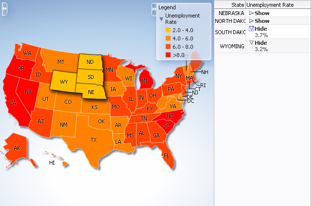
The following requirements must be met to achieve this master-detail processing declaratively:
-
You must use the same data collection to provide data for both views as follows:
-
Bind the thematic map
areaDataLayerorpointDataLayerto the data collection whose attributes represent the data to be styled by areas or markers in the thematic map layer. -
Bind the other ADF component (such as a table) to same data collection.
-
-
Select Set the current row for master-detail in the Create Data Layer dialog to automatically set a value for the
selectionListenerattribute of the thematic mapareaLayercomponent and use theprocessSelectionmethod that is already part of the thematic map binding.For example, if the
valueattribute of the thematic map area data layer component isvalue="#{stateData.employmentData}", then theselectionListenerattribute is set to:selectionListener="#{stateData.employmentData.processSelection}". -
Ensure that the
selectionModeattribute on theareaDataLayerorpointDataLayercomponent is set tosingleormultiple, depending on the requirements for the thematic map.
26.8.7 How to Define a Custom Map Layer
You can define a custom map layer from your own regional data and insert it into the natural geographical hierarchy of a thematic map. The custom layer is created by extending a predefined map layer and aggregating the lower level regions to form the new regions in the custom layer. After defining a custom map layer, it is used in the same way as any other map layer.
For example, you could define geographical regions for the NorthEast, Midwest, West and South in the United States in a US Regions custom map layer as illustrated in Figure 26-83. In the figure, the US Regions custom layer is extended from the states layer in the US base map. The new areas in the layer are aggregated from the states in the states layer. The label for the South US Region lists the states in that region. The MidWest US Region is drilled down to display the sales categories in the lower level counties region. For more information about drilling, see Section 26.8.8, "How to Configure Drilling in Thematic Maps."
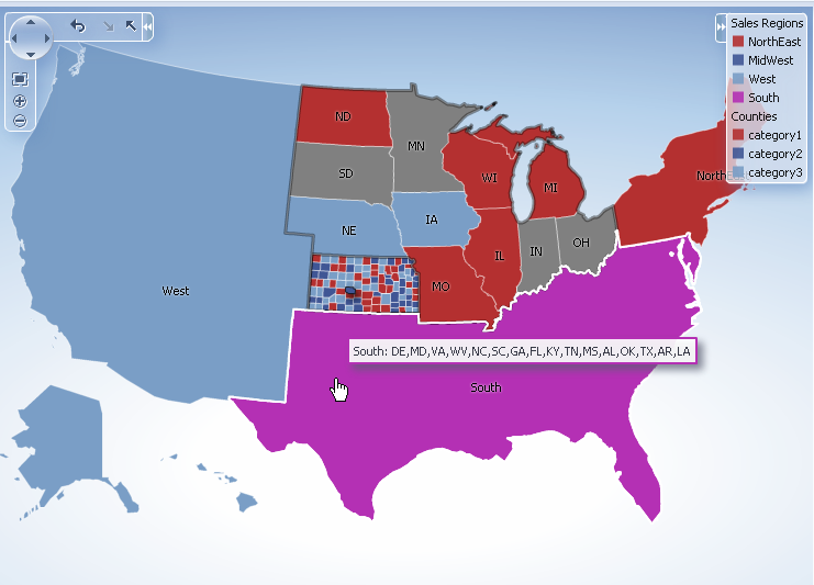
The customAreaLayer component uses a model to access the data in the underlying list. The specific model class is oracle.adf.view.rich.model.CollectionModel. You can also use other model instances, for example, java.util.List, java.util.Array, and javax.faces.model.DataModel. The customAreaLayer will automatically convert the instance into a CollectionModel.
It may be helpful to have an understanding of how thematic map attributes and thematic map child tags can affect functionality. For more information, see the "Configuring Thematic Maps" section in the Oracle Fusion Middleware Web User Interface Developer's Guide for Oracle Application Development Framework.
You should already have an ADF data control or ADF managed bean that defines the aggregated areas in the predefined base map you are extending.
You should already have a thematic map on your page. If you do not, follow the instructions in this chapter to create a thematic map. For more information, see Section 26.8.1, "How to Create a Thematic Map Using ADF Data Controls."
How to add and configure a custom map layer:
-
Select the thematic map in the Visual Editor.
-
In the Layer Browser, from the Add icon dropdown list, choose Add Custom Layer. If the Layer Browser is not open in the Visual Editor, right-click in the map and choose Open Layer Browser.
-
In the Create Custom Layer dialog, enter the following:
-
Bind Data Now: Select and click Browse to open the Picker dialog > Data Controls Definitions page. Select the data collection in the ADF data controls you are using to data bind your custom layer and areas.
Note:
Alternatively, you can use the Expression Builder page to select an ADF managed bean you are using to data bind your custom layer and areas. You can also use the Expression Builder dialog in each remaining field. -
Layer Id: Enter a unique identifier for the
customAreaLayercomponent. For example, if you divide the US into aggregate regions (Northeast, Midwest, West, and South), then you might define them with corresponding Ids (NE, MW, W, and S). -
Extends: Use the search icon to display the built-in map layers that can be used to aggregate areas for the custom layer. Select the map layer that the custom layer will extend.
-
Area List: Use the dropdown list to select the data collection attribute representing the list of lower level map regions that are used to aggregate the areas in the custom map layer. The comma separated list of values aggregate the regions in the may layer defined in the in the Extends attribute.
-
Area Id: Use the dropdown list to select the data collection attribute representing the unique identifier of lower level map regions that are used to aggregate the areas in the custom map layer. By default, a unique identifier,
ca1,ca2, and so on, is used in the for thecustomAreacomponent. -
Area Label: Use the dropdown list to select the data collection attribute representing the names of lower level map regions that are used to aggregate the areas in the custom map layer. At runtime the label will display the comma separated list of the aggregated regions.
-
Figure 26-84 shows the completed Create Custom Layer dialog.
Figure 26-85 shows the Layer Browser after defining a custom layer. In the layer structure, the custom layer cal1 is referenced in the map layer al1, where you add area or point data layers to display data. For more information, see Section 26.8.3, "How to Add Data Layers to Thematic Maps."
Example 26-34 shows the code inserted in the JSF page
Example 26-34 Custom Map Layer Code
<dvt:thematicMap>
...
<dvt:areaLayer layer="states" id="al1"/>
<dvt:areaLayer layer="cal1" id="al3"/>
<dvt:customAreaLayer id="cal1"
value="#{bindings.TmapStatesView.collectionModel}"
var="row"
extendsLayer="states">
<dvt:customArea areaId="#{row.RowID}" areaList="#{row.RowID}"
label="#{row.RowID}" id="ca1"/>
</dvt:customAreaLayer>
...
</dvt:thematicMap>
After configuring and adding a custom layer to the map layer hierarchy, you can then use the map layer in the same way as any other map layer. For example, to create the thematic map illustrated in Figure 26-83, you will need to do the following:
-
Configure the thematic map to support drilling. For more information, see Section 26.8.8, "How to Configure Drilling in Thematic Maps."
Note:
If drilling is enabled for the thematic map, drilling between a custom layer and the map layer used to aggregate the custom layer is available without configuring data display for either layer. -
Add and configure an area data layer for the county data view. For more information, see Section 26.8.3, "How to Add Data Layers to Thematic Maps."
-
Add and style area components to display the related data for each map layer. For more information, see Section 26.8.4, "Styling Areas, Markers, and Images to Display Data."
-
Configure the thematic map legend. For more information, see Section 26.8.9, "Creating Databound Legends."
Example 26-35 shows sample code for using a custom layer in a thematic map.
Example 26-35 Sample Code for Thematic Map with Custom Layer
<dvt:thematicMap id="thematicMap" imageFormat="flash" basemap="usa" drilling="on"
maintainDrill="true"
controlPanelBehavior="initExpanded" summary="US Custom Regions">
<dvt:customAreaLayer id="crl1" value="#{tmapRegions.collectionModel}" var="row"
varStatus="rowStatus"
extendsLayer="states">
<dvt:customArea areaId="#{row.name}" label="#{row.name}"
areaList="#{row.regions}" id="ca1"/>
</dvt:customAreaLayer>
<dvt:areaLayer id="custom" layer="crl1">
<dvt:areaDataLayer contentDelivery="immediate"
value="#{tmapRegions.collectionModel}"
selectionMode="single"
var="row" varStatus="rowStatus" id="adl1">
<dvt:areaLocation name="#{row.name}" id="al1">
<dvt:area fillColor="#{row.color}" shortDesc="#{row.regions}"
id="a1" value="#{row.name}"/>
</dvt:areaLocation>
</dvt:areaDataLayer>
</dvt:areaLayer>
<dvt:areaLayer id="areaLayerS" layer="states"
<dvt:areaDataLayer id="dataLayerS" selectionMode="multiple"
contentDelivery="immediate"
value="#{tmapStates.collectionModel}" var="row"
varStatus="rowStatus">
<dvt:areaLocation id="areaLocS" name="#{row.name}">
<dvt:area id="area1S" fillColor="#{row.color}"></dvt:area>
</dvt:areaLocation>
</dvt:areaDataLayer>
</dvt:areaLayer>
<dvt:areaLayer id="areaLayer" layer="counties">
<dvt:areaDataLayer id="dataLayer" selectionMode="single"
contentDelivery="immediate"
value="#{tmapCounty.collectionModel}" var="row"
varStatus="rowStatus">
<dvt:areaLocation id="areaLoc" name="#{row.name}">
<dvt:area id="area1" fillColor="#{row.color}"
value="#{row.category}"></dvt:area>
</dvt:areaLocation>
</dvt:areaDataLayer>
</dvt:areaLayer>
<dvt:legend label="Sales Regions" id="l1">
<dvt:legendSection source="custom:adl1:a1" id="ls1"/>
<dvt:legendSection label="Counties" source="areaLayer:dataLayer:areaLoc"
id="ls3"/>
</dvt:legend>
</dvt:thematicMap>
26.8.8 How to Configure Drilling in Thematic Maps
A thematic map with related data views in different map layers can be configured for drilling between the higher and lower level data views. For example, a thematic map can display data for sales category by USA state drilled down to USA county data as illustrated in Figure 26-83. When a state or county is selected, drilling up or down is initiated through a context menu choice or the Control Panel.
The following requirements must be met to achieve thematic map area drilling declaratively:
-
For each map layer (
areaLayer) in the drilling hierarchy, you must bind its childareaDataLayerwith a data control that defines the related data for that map layer. -
Each
areaDataLayerin the map layer drill hierarchy must have itsselectionModeattribute set tosingleormultiple. -
You must configure the
areain the lower level map layer drill hierarchy to display data using the same default stamp or categorical attribute style used in the higher level map layerareacomponent. -
The
thematicMapcomponentdrillingattribute must be set toon.
Note:
If drilling is enabled for the thematic map, drilling between a custom layer and the map layer used to aggregate the custom layer is available.It may be helpful to have an understanding of how thematic map attributes and thematic map child tags can affect functionality. For more information, see the "Configuring Thematic Maps" section in the Oracle Fusion Middleware Web User Interface Developer's Guide for Oracle Application Development Framework.
You should already have a thematic map on your page. If you do not, follow the instructions in this chapter to create a thematic map. For more information, see Section 26.8.1, "How to Create a Thematic Map Using ADF Data Controls."
You should already have data controls that define the data model for each of the map layers in the drill hierarchy.
To configure a thematic map area for drilling:
-
In the Structure window, select the dvt:thematicMap component.
-
In the Property Inspector, expand the Behavior section. Use this section to set the following attributes:
-
Drilling: Use to enable drilling the area data view between thematic map layers. From the dropdown list select on to enable drilling. The default value is off.
-
MaintainDrill: Optionally, use to specify an optional true value for maintaining the drilled state of a previously drilled area when a new area is drilled. The default value is false.
-
DrillBehavior: Optionally, use to specify an optional zoomToFit effect on the area being drilled. The default value is none.
-
-
In the Layer Browser, select each Area Layer component in the desired drilling hierarchy and do the following:
-
Click the Add icon and choose Add Data Layer to open the Create Data Layer dialog. Complete the dialog to add an area data layer and bind the data layer to the data control for that map layer. If you need help, press F1 or click Help.
Note:
If the Area Data Layer is already present, click the Edit icon to confirm binding to the data control. -
In the Property Inspector, expand the Behavior section and set the SelectionMode attribute to single or multiple.
-
-
In the Layer Browser, select each Area Data Layer component in the desired drilling hierarchy and do the following:
-
Click the Add icon and choose Add Area to open the Configure Area dialog. Complete the dialog to define a default stamp or use attribute groups to style the area for that map layer. If you need help, press F1 or click Help.
Note:
If the Area is already present, click the Edit icon to confirm the styling of the area.
-
Figure 26-85 shows sample code for drilling enabled for USA states and counties map layers with an area styled to display data about sales categories.
Example 26-36 Sample Code for Configuring Drilling
<dvt:thematicMap id="thematicMap"
basemap="usa"
drilling="on"
maintainDrill="true"
drillBehavior="zoomToFit"
animationOnDisplay="none"
<dvt:areaLayer id="al1" layer="states">
<dvt:areaDataLayer id="adl1"
selectionMode="single"
contentDeliver="immediate"
value="#{row.state}"
var="row"
var="rowStatus">
<dvt:areaLocation id="areaLocS" name="#{row.stname}">
<dvt:area id="a1" fillColor="#{row.state}"/>
</dvt:areaLocation>
</dvt:areaDataLayer>
</dvt:areaLayer>
<dvt:areaLayer id="al2" layer="counties">
<dvt:areaDataLayer id="adl2"
selectionMode="single"
contentDelivery="immediate"
value="#{row.county}"
var="row"
varStatus="rowStatus">
<dvt:areaLocation id="areaLocC" name="#{row.coname}">
<dvt:area id="a2" fillColor="#{row.county}"/>
</dvt:areaLocation>
</dvt:areaDataLayer>
</dvt:areaLayer>
...
</dvt:thematicMap>
26.8.9 Creating Databound Legends
Legends provide an explanatory table of the thematic map's styled data in symbol and label pairs. Thematic map legend components (legend) support symbols for color, shape, custom shape, fill pattern, opacity, images and size. One or more child legend item components (legendSection) are sourced from thematic map area, marker, attributeGroups, or af:image components stamped to style the data displayed in the map. The legend section structure supports control over content ordering and appearance. You can wrap legend items into a disclosable section using a showLegendSection component. Figure 26-86 shows a legend with a disclosable section for map areas and a marker.
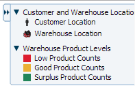
Legend items sourced from the attributeGroups component automatically split area or marker attribute types into different sections. You can specify a separator facet to draw separators between legend sections. Figure 26-87 shows a legend with attribute groups for color, shape, fill pattern, opacity, and size with separators between each section.
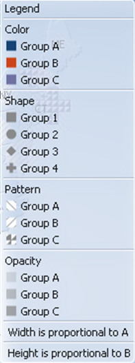
Legends can be displayed in both Flash (default) and PNG image formats and both formats support locales with right-to-left display. When rendered in a PNG format, for example when printing the thematic map, disclosable sections in the legend are not supported, and legend items display as disclosed.
When you create a thematic map using the Data Controls panel and the thematic map binding dialogs, the legend data bindings are created for you. If you configure an area or marker as a default stamp across all areas in the thematic map, you can assign a static text resource to a fixed area or marker for the legend.
For default stamps displaying row-varying data, you can use an EL expression to assign the legend text and optionally, a managed bean to retrieve a row-varying key to look up the text resource in a resource bundle. Example 26-37 shows a code sample to generate legend entries for area and marker stamps. The code illustrates a disclosable section for a row-varying area and a fixed marker with an assigned text resource.
Example 26-37 Code Sample for Legend Area and Marker Stamps
<dvt:thematicMap id="tm1" basemap="usa" ...>
<dvt:legend label=”Legend”>
<dvt:showLegendGroupLabel label="Voting Majority">
<dvt:legendSection id="ls1" source="al1:adl1:areaStamp”/>
</dvt:showLegendGroupLabel>
<dvt:legendSection id="ls2" source="al1:adl1:fixedMarker">
</dvt:legend>
<dvt:areaLayer id="al1" layer="states">
<dvt:areaDataLayer id="adl1"...>
<dvt:areaLocation id="aloc1" ,,,>
<dvt:area id="areaStamp">
fillColor="#{row.value > 50 ? tmapLegendBean,color1 :
tmapLegendBean.color2}"
<f:attribute name="legendLabel" value="#{row.value > 50 ?
'Candidate 2' : 'Candidate 1'}" />
<dvt:marker id=”fixedMarker” shape=”human” fillColor=”"#FF9900"
scaleX="3" scaleY="3">
<f:attribute name="legendLabel”
value="#{Bundle.Office_Locations}"/>
</dvt:marker>
</dvt:areaLocation>
</dvt:areaDataLayer>
</dvt:area>
</dvt:thematicMap>
If you configure an area or marker to use an attributes group to specify the styling of categorical groups of data in a data collection, you can use an EL expression to assign the legend text and optionally, a managed bean to retrieve a row-varying key to look up the text resource in a resource bundle.
If you specify a match rule for the attributes group, the legend text is specified in the group attribute. If you specify an exception rule, you can specify a text resource from the application resource bundle. Example 26-38 shows sample code for a legend with attribute groups, including both a match rule and an exception rule, and specifying a separator between legend sections.
Example 26-38 Sample Code for Legend with Attribute Groups
<dvt:thematicMap id="tm1" basemap="usa" ...>
<dvt:legend id="l1" label="Legend">
<f:facet name="separator"
<af:separator/>
<dvt:legendSection id="ls1" source="al1:adl1:attributeGroupColor" />
<dvt:legendSection id="ls2" source="al1:adl1:attributeGroupShape" />
<dvt:legendSection id="ls3" source="al1:adl1:attributeGroupPattern" />
<dvt:legendSection id="ls4" source="al1:adl1:attributeGroupOpacity" />>
</dvt:legend>
<dvt:areaLayer id="al1" layer="states">
<dvt:areaDataLayer id="adl1" value=" " var=" " ...>
<dvt:areaLocation id="dataLoc" name="#{row.name}">
<dvt:marker id="m1"... >
<dvt:attributeGroups id="attributeGroupColor" type="color"
label="#{row.category1}" value="#{row.category1}" />
<dvt:attributeMatchRule id="amrl" group="Mountain Dew">
  <f:attribute name="color" value="#ffff00"/>
</dvt:attributeMatchRule>
<dvt:attributeGroups id="attributeGroupShape" type="shape"
label="#{row.category2}" value="#{row.category2}" />
<dvt:attributeExceptionRule id="aer1" condition="#{row.name=='TX'}"
label="#{viewcontroller.Texas}">
<f:attribute name="shape" value="human"/>
</dvt:exceptionRule>
<dvt:attributeGroups id="attributeGroupShape" type="pattern"
label="#{row.category3}" ... />
<dvt:attributeGroups id="attributeGroupShape" type="opacity"
label="#{row.category4}" ... />
</dvt:marker>
</dvt:areaLocation>
</dvt:areaDataLayer>
</dvt:areaLayer>
</dvt:thematicMap>
You configure thematic map legend areas or markers in a custom region in the same way as any other map layer. Example 26-39 shows sample code for a custom map layer legend.
Example 26-39 Sample Code for Legend for Custom Map Layer
<dvt:thematicMap>
  <dvt:legend>
    <dvt:legendSection label=”Sales Regions” source="customAreaStamp"/>
      </dvt:legend>
      ...
  <dvt:customAreaLayer id="crl1”>
  ...
  </dvt:customAreaLayer>
  <dvt:areaLayer layer="crl1">
    <dvt:areaDataLayer var="row”>
      <dvt:areaLocation name="#{row.name}" id="al1">
        <dvt:area id=”customAreaStamp" fillColor="#{row.color}”>
          <f:attribute name="legendLabel” value=”#{row.name}"/>
        </dvt:area>
      </dvt:areaLocation>
    </dvt:areaDataLayer>
  </dvt:areaLayer>
</dvt:thematicMap
You can customize the appearance of thematic map legends using ADF skins. For more information, see the "Customizing the Appearance Using Styles and Skins" chapter in the Oracle Fusion Middleware Web User Interface Developer's Guide for Oracle Application Development Framework
26.9 Creating Databound Gantt Charts
A Gantt chart is a type of bar graph (with time on the horizontal axis). It is used in planning and tracking projects to show tasks or resources in a time frame with a distinct beginning and end.
When you create a Gantt chart, you can choose from the following types:
-
Project
A project Gantt chart lists tasks vertically and shows the duration of each task as a bar on a horizontal time line.
-
Resource Utilization
A resource utilization Gantt chart shows graphically whether resources are over or under allocated. It shows resources vertically while showing their allocation and, optionally, capacity on the horizontal time axis.
-
Scheduling
A scheduling Gantt chart is based on manual scheduling boards and shows resources vertically with corresponding activities on the horizontal time axis. Examples of resources include people, machines, or rooms.
For information about customizing Gantt chart charts after data-binding is completed, see the "Using Gantt Chart Components" chapter in the Oracle Fusion Middleware Web User Interface Developer's Guide for Oracle Application Development Framework.
26.9.1 How to Create a Databound Project Gantt Chart
For a project Gantt chart, you must specify values for tasks. Optionally, you can specify values for split tasks, subtasks, recurring tasks, and dependencies between tasks, if your data collection has accessors for this additional information.
The project Gantt chart is displayed with default values for overall start time and end time and for the major and minor time axis values. In a project Gantt chart, the setting for the major time axis defaults to weeks and the setting for the minor time axis defaults to days.
Figure 26-88 shows a project Gantt chart in which each task is an order to be filled. The list region on the left side of the splitter shows columns with the name of the person who is responsible for the order and columns for the order date and shipped date. In the chart region on the right side of the splitter, the Gantt chart displays a horizontal bar from the order date to the ship date for each order.
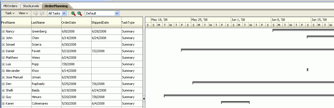
To create a project Gantt chart using a data control, you bind the project Gantt chart component to a data collection. JDeveloper allows you to do this declaratively by dragging and dropping a collection from the Data Controls panel.
Tip:
You can also create a project Gantt chart by dragging a project Gantt chart component from the Component Palette and completing the Create Project Gantt dialog. This approach allows you to design the Gantt chart user interface before binding the component to data.To create a databound project Gantt chart:
-
From the Data Controls panel, select a data collection. For a Gantt chart, you can select a row set collection (which produces a flat list of tasks) or a basic tree collection (which produces a hierarchical list of tasks).
Figure 26-89 shows an example where you could select the
OrderShippingSummary1collection in the Data Controls panel to create a project Gantt chart that displays the progress of order shipping. -
Drag the collection onto a JSF page and, from the context menu, choose Gantt > Project.
-
In the ensuing Create Project Gantt dialog, you do the following to connect task-related controls in the pages at the top of the dialog with corresponding columns in the data collection:
-
In the Tasks page at the top of the dialog, you select the columns in the data collection that correspond to each of the following controls: Task Id, Start Time, and End Time. By clicking Show More in the dialog, you can select additional columns in the data collection that correspond to the following controls: Actual Start, Actual End, % Complete, Completed Through, Critical, and Is Container.
Optionally, you can select a column in the data collection to map to the task type. If you do not bind Task Type to a column in your data collection, then all tasks default to Normal. The task type controls the appearance of the task bar when it is rendered in the Gantt chart.
A project Gantt chart component supports the following task types that you configure the data collection to return: Summary, Normal, and Milestone.
-
If the data collection has an accessor for subtasks, you have the option of using the Subtasks page in the dialog to select the subtasks accessor and to select the columns in the data collection that correspond to each of the following controls: SubTask Id, Start Time, and End Time. Optionally, you can select a column in the data collection to map to the subtask type. If you do not bind SubTask Type to data, then all subtasks default to Normal.
A project Gantt chart component supports the following task types that you configure the data collection to return: Summary, Normal, and Milestone.
If you do not bind subtasks, then the Gantt chart cannot render a hierarchy view of tasks. If you bind subtasks, then you can drill from tasks to subtasks in the hierarchy view of the Gantt chart.
-
If the data collection has an accessor for dependent tasks, you have the option of using the Dependent Tasks page in the dialog to select the dependent task accessor and to select the columns in the data collection that correspond to the following controls: Dependency Type, From Task Id, and To Task Id.
Dependent tasks are linked by their dependency between their finish and start times.
A project Gantt chart component supports the following dependency types that you configure the data collection to return:
fs(for finish to start),ss(for start to start),ff(for finish to finish), andsf(for start to finish). -
If the data collection has an accessor for split tasks, you have the option of using the Split Tasks page in the dialog to select Split Tasks accessor and to select the columns in that data collection that correspond to each of the following controls: SplitTask Id, Start Time, and End Time.
-
If the data collection has an accessor for recurring tasks, you have the option of using the Recurring Tasks page in the dialog to select the recurring tasks accessor and to select the columns in that data collection that correspond to each of the following controls: Recurring Task Id, Type, Start Time, and End Time.
-
You can use the Appearance page in the dialog to specify the attributes that correspond to the Label of the task bar, and up to three icons to associate with the task bar.
-
-
In the Table Columns section, you specify the columns to appear in the list region of the Gantt chart. Specify one row of information for each column that is to appear. Use the New icon to add new rows. Use the arrow icons to arrange the rows in the exact sequence that you want the columns to appear in the Gantt chart list.
Note:
The first row that you specify in the Table Columns section designates the nodestamp column for the list region. The nodestamp column is the one that you can expand or collapse when you have a subtask collection.For each row, you provide the following specifications:
-
Display Label: Select the values for the headers of the columns in the Gantt chart list. If you select <default>, then the text for the header is automatically retrieved from the data binding.
-
Value Binding: Select the columns in the data collection to use for the columns in the Gantt chart list. The available values are the same as those for the tasks group.
-
Component to Use: Select the type of component to display in the cell of the Gantt chart list. The default is the ADF Output Text component.
-
-
Click OK.
-
If you want to include a legend in the Gantt chart, right-click the project Gantt chart node in the Structure window and choose Insert inside dvt:projectGantt > Legend.
The legend shows information about each symbol and color coded bar that is used to represent different task types. It also shows detailed information about the task that is selected in the Gantt chart.
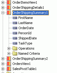
Figure 26-90 shows the dialog used to create the project Gantt dialog from the data collection for shipping orders.
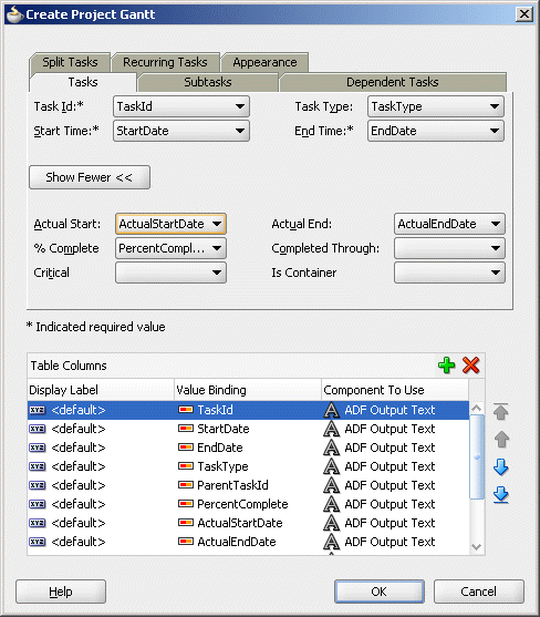
After completing the data binding dialog, you can use the Property Inspector to specify values for additional attributes for the project Gantt chart.
26.9.2 What Happens When You Create a Project Gantt Chart from a Data Control
Dropping a project Gantt chart from the Data Controls panel has the following effect:
-
Creates the bindings for the Gantt chart and adds the bindings to the page definition file
-
Adds the necessary code for the UI components to the JSF page
Example 26-40 displays the row set bindings that were generated for the project Gantt chart that displays orders shipped. This code example shows that there are nodes defined for tasks and subtasks, along with attributes. There are also nodes defined for dependent tasks, split tasks, and recurring tasks but no attributes.
Example 26-40 Bindings for a Project Gantt Chart
<gantt IterBinding="OrderShippingSummary2Iterator"
       id="OrderShippingSummary2" xmlns="http://xmlns.oracle.com/adfm/dvt">
  <ganttDataMap>
    <nodeDefinition DefName="oracle.fod.model.OrderShippingSummary"
                                type="Tasks">
      <AttrNames>
        <Item Value="PersonId" type="taskId"/>
        <Item Value="OrderDate" type="startTime"/>
        <Item Value="TaskType" type="taskType"/>
        <Item Value="ShippedDate" type="endTime"/>
      </AttrNames>
      <Accessors>
        <Item Value="OrderShippingDetails" type="subTasks"/>
      </Accessors>
    </nodeDefinition>
    <nodeDefinition type="SubTasks"
                    DefName="oracle.fod.model.OrderShippingDetails">
      <AttrNames>
        <Item Value="OrderId" type="taskId"/>
        <Item Value="OrderDate" type="startTime"/>
        <Item Value="TaskType" type="subTaskType"/>
        <Item Value="ShippedDate" type="endTime"/>
      </AttrNames>
    </nodeDefinition>
    <nodeDefinition type="Dependents">
      <AttrNames/>
    </nodeDefinition>
    <nodeDefinition type="SplitTasks">
      <AttrNames/>
    </nodeDefinition>
    <nodeDefinition type="RecurringTasks">
      <AttrNames/>
    </nodeDefinition>
  </ganttDataMap>
</gantt>
Example 26-41 shows the code generated on the JSF page for the ADF project Gantt chart. This tag code contains settings for the overall start and end time for the project Gantt chart. It also shows the default time axis settings for the major axis (in weeks) and the minor axis (in days). Finally, it lists the specifications for each column that appears in the list region of the Gantt chart. For brevity, the code in the af:column elements for OrderStatusCode and ShippedDate has been omitted.
Example 26-41 Code on the JSF Page for a Project Gantt Chart
<projectGantt id="projectGantt1"
              value="#{bindings.OrderShippingSummary2.projectGanttModel}"
              var="row" startTime="2008-05-17" endTime="2008-07-07"
              inlineStyle="width:100%; height:100%;">
  <f:facet name="major">
    <timeAxis scale="weeks"/>
  </f:facet>
  <f:facet name="minor">
    <timeAxis scale="days"/>
  </f:facet>
  <f:facet name="nodeStamp">
    <af:column sortProperty="FirstName" sortable="false"
             headerText="#{bindings.OrderShippingSummary2.hints.FirstName.label}">
      <af:outputText value="#{row.FirstName}"/>
    </af:column>
  </f:facet>
    <af:column sortProperty="LastName" sortable="false"
             headerText="#{bindings.OrderShippingSummary2.hints.LastName.label}">
      <af:outputText value="#{row.LastName}"/>
    </af:column>
    <af:column sortProperty="OrderDate" sortable="false"
             headerText="#{bindings.OrderShippingSummary2.hints.OrderDate.label}">
       <af:outputText value="#{row.OrderDate}">
         <af:convertDateTime
             pattern="#{bindings.OrderShippingSummary2.hints.OrderDate.format}"/>
       </af:outputText>
     </af:column>
     <af:column sortProperty="ShippedDate" sortable="false"
         headerText="#{bindings.OrderShippingSummary2.hints.ShippedDate.label}">
       <af:outputText value="#{row.ShippedDate}">
       <af:convertDateTime
         pattern="#{bindings.OrderShippingSummary2.hints.ShippedDate.format}"/>
       </af:outputText>
     </af:column>
     <af:column sortProperty="TaskType" sortable="false"
         headerText="#{bindings.OrderShippingSummary2.hints.TaskType.label}">
       <af:outputText value="#{row.TaskType}"/>
     </af:column>
 </projectGantt>
26.9.3 What You May Need to Know About Summary Tasks in a Project Gantt Chart
A summary task shows start time and end time for a group of tasks (which are usually subtasks). A summary task cannot be moved or extended. However, your application should recalculate the summary task times when the dates of any subtask changes.
To detect a change in task duration, register an event handler by specifying a method binding expression on the DataChangeListener attribute of the Gantt chart component. When an action occurs that potentially changes data in the Gantt chart, the event fired is of type oracle.adf.view.faces.bi.event.DataChangeEvent. This event contains information about the data changes and is fired to the registered event listener. The listener is responsible for validating the new values and updating the underlying data model.
When the update is completed, the Gantt chart is refreshed with either the old data (if the update failed) or with the new data. The Gantt chart uses partial page rendering so that only the Gantt chart and not the entire page is refreshed.
26.9.4 What You May Need to Know About Percent Complete in a Project Gantt Chart
Percent complete can be represented as an inner bar that indicates what percentage of a task is complete. The length of the inner bar is calculated based on percent complete returned by the data object.
The data binding dialog for the project Gantt chart does not provide a control in which you can enter the percentage complete value, but this value is required to render a percent complete. However, the Gantt chart data object does contain a percentComplete attribute.
To provide the percent complete integer, you must add a new attribute mapping in the nodeDefinition for type Tasks. For example, if your data collection has a column named PercentDone, then the attribute mapping would appear as follows: <Item Value="PercentDone" type="percentComplete"/>.
Example 26-42 shows the percent complete attribute mapping added to the data binding code for the nodeDefinition of type Tasks in the project Gantt chart binding displayed in Example 26-40.
Example 26-42 Bindings for Project Gantt Chart with Percent Complete
<nodeDefinition DefName="oracle.fod.model.OrderShippingSummary"
                type="Tasks">
  <AttrNames>
    <Item Value="PersonId" type="taskId"/>
    <Item Value="OrderDate" type="startTime"/>
    <Item Value="TaskType" type="taskType"/>
    <Item Value="ShippedDate" type="endTime"/>
    <Item Value="PercentDone" type="percentComplete"/>
  </AttrNames>
</nodeDefinition>
Another attribute (completedThrough) exists that allows you to specify a date rather than a percentage. The Gantt chart data object calculates the percentage complete based on the date that the completedThrough attribute references. For example, if your data collection has a column named PercentDone, then the attribute mapping would appear as follows: <Item Value="PercentDone" type="completedThrough"/>.
26.9.5 What You May Need to Know About Variance in a Project Gantt Chart
Variance can be rendered within two horizontal bars. One bar represents the base (or original) start and end time for the task. The second bar represents the actual start and end time for the task. You enter the binding information for the base start time and end time in the data binding dialog for a project Gantt chart.
The data binding dialog for Gantt chart does not provide controls in which you can enter the actual start time and actual end time for the Gantt chart, but these values are required to render variance. However, the Gantt chart data object does contain the following attributes: actualStart and actualEnd.
To provide the actual start and actual end time, you must add two new attribute mappings in the nodeDefinition for type Tasks. For example, if your data collection has columns named ActualStartDate and ActualEndDate, then the attribute mappings would appear as shown in Example 26-43.
Example 26-43 Attribute Mappings for Actual Start and Actual End
<Item Value="ActualStartDate" type="actualStart"/>
<Item Value="ActualEndDate" type="actualEnd"/>
Example 26-44 shows the actual start and actual end attribute mappings added to the data binding code for the nodeDefinition of type Tasks for a project Gantt chart.
Example 26-44 Bindings for Project Gantt Chart with Actual Start and Actual End
<nodeDefinition DefName="oracle.fod.model.OrderShippingSummary"
                type="Tasks">
  <AttrNames>
    <Item Value="PersonId" type="taskId"/>
    <Item Value="OrderDate" type="startTime"/>
    <Item Value="TaskType" type="taskType"/>
    <Item Value="ShippedDate" type="endTime"/>
    <Item Value="ActualStartDate" type="actualStart"/>
    <Item Value="ActualEndDate" type="actualEnd"/>
  </AttrNames>
</nodeDefinition>
26.9.6 How to Create a Databound Resource Utilization Gantt Chart
For a resource utilization Gantt chart, you must supply identification for resources, identification for time, and start and end times for resource usage. Optionally, you can provide data values for subresources.
The resource utilization Gantt chart is displayed with default values for the major and minor time axis values. In a resource utilization Gantt chart, the setting for the major time axis defaults to weeks and the setting for the minor time axis defaults to days.
Figure 26-91 shows a resource utilization Gantt chart that lists each resource and an associated calendar that can display when the resource is in use.
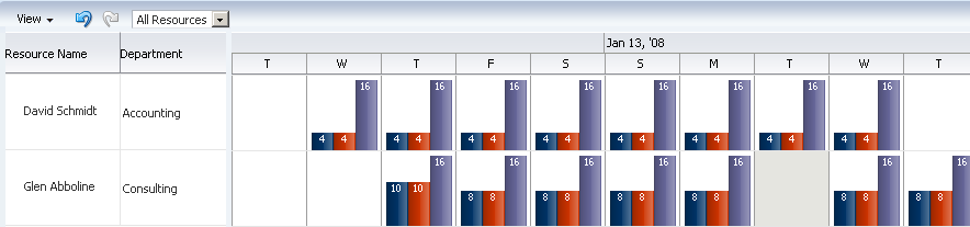
To create a resource utilization Gantt chart using a data control, you bind the resource utilization component to a data collection. JDeveloper allows you to do this declaratively by dragging a collection from the Data Controls panel and dropping it on a JSF page.
Tip:
You can also create a resource utilization Gantt chart by dragging a resource utilization Gantt chart component from the Component Palette and completing the Create Resource Utilization Gantt dialog. This approach gives you the option of designing the Gantt chart user interface before binding the component to data.To create a resource utilization Gantt chart:
-
From the Data Controls panel, select a data collection. For a Gantt chart, you can select a row set collection or a basic tree collection.
Figure 26-92 shows an example where you could select the
GanttRugResourcesView1collection in the Data Controls panel to create a resource utilization Gantt chart to display the usage of a resource. -
Drag the collection onto a JSF page and, from the context menu, choose Gantt > Resource Utilization.
-
In the Create Resource Utilization Gantt dialog, connect resource- and time-related controls with corresponding columns in the data collection.
-
For Resource Id, select the column in the data collection that corresponds to the unique identifier of the resource.
-
In the Time Buckets page, select a value from the Bucket Accessor dropdown list that contains the time buckets assigned to the resource and select a value from the Bucket Date dropdown list that corresponds to a unit of time.
-
In the Bucket Metrics list, you can optionally specify attributes that appear as bars within the time bucket. Each attribute that you specify in the Bucket Metrics list must be of type Number as the value of the attribute is used to calculate the height of the bar.
-
In the Table Columns list, specify the column(s) to appear in the list region of the Gantt chart resource utilization on the left side of the splitter. Specify one row of information for each column that is to appear. Use the New icon to add new rows. Use the arrow icon to arrange the rows in the exact sequence that you want the columns to appear in the resource utilization list. For each row, provide values for Display Label, Value Binding, and Component to Use.
-
If the data collection has an accessor for subresources, you can use the Subresources page to select a subresources accessor and a resource ID.
-
-
Click OK.
Figure 26-93 shows the dialog used to create a resource utilization Gantt chart from the data collection for resources available for a project.
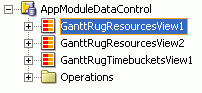
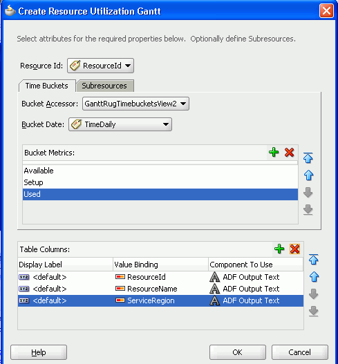
26.9.7 What Happens When You Create a Resource Utilization Gantt Chart
Dropping a resource utilization Gantt chart from the Data Controls panel onto a JSF page has the following effects:
-
Creates bindings for the resource utilization Gantt chart and adds the bindings to the page definition file
-
Adds the necessary code for the UI components to the JSF page
Example 26-45 shows the row set bindings that were generated for the resource utilization Gantt chart illustrated in Figure 26-93.
Example 26-45 Binding XML for a Resource Utilization Gantt Chart
<gantt IterBinding="GanttRugResourcesView2Iterator"
       id="GanttRugResourcesView2"
       xmlns="http://xmlns.oracle.com/adfm/dvt">
  <ganttDataMap>
    <nodeDefinition DefName="model.GanttRugResourcesView" type="Resources">
      <AttrNames>
        <Item Value="ResourceId" type="resourceId"/>
      </AttrNames>
      <Accessors>
        <Item Value="GanttRugTimebucketsView2" type="timeBuckets"/>
      </Accessors>
    </nodeDefinition>
    <nodeDefinition type="TimeBuckets"
                    DefName="model.GanttRugTimebucketsView">
      <AttrNames>
        <Item Value="TimeDaily" type="time"/>
        <Item type="metric" Value="Available"/>
        <Item type="metric" Value="Setup"/>
        <Item type="metric" Value="Used"/>
      </AttrNames>
    </nodeDefinition>
    <nodeDefinition type="Subresources">
      <AttrNames/>
    </nodeDefinition>
  </ganttDataMap>
</gantt>
Example 26-46 shows the code generated on the JSF page for the resource utilization Gantt chart. This tag code contains settings for the overall start and end time for the resource utilization Gantt chart. These settings have to be edited manually. The code also shows the time axis settings for the major time axis (in weeks) and the minor time axis (in days). Finally, it lists the specifications for each column to appear in the list region of the resource utilization Gantt chart.
Example 26-46 Code on the JSF Page for a Resource Utilization Gantt Chart
<dvt:resourceUtilizationGantt id="resourceUtilizationGantt1"
    value="#{bindings.GanttRugResourcesView2.resourceUtilizationGanttModel}"
    var="row"
    metrics="#{bindings.GanttRugResourcesView2.metrics}"
    taskbarFormatManager="#{bindings.GanttRugResourcesView2.
                            resourceUtilizationGanttTaskbarFormatManager}"
    startTime="2008-07-03"
    endTime="2008-07-29">
  <f:facet name="major">
    <dvt:timeAxis scale="weeks"/>
  </f:facet>
  <f:facet name="minor">
    <dvt:timeAxis scale="days"/>
  </f:facet>
  <f:facet name="nodeStamp">
    <af:column sortProperty="ResourceId" sortable="false"
           headerText="#{bindings.GanttRugResourcesView2.hints.ResourceId.label}">
      <af:outputText value="#{row.ResourceId}"/>
    </af:column>
  </f:facet>
  <af:column sortProperty="ResourceName" sortable="false"
         headerText="#{bindings.GanttRugResourcesView2.hints.ResourceName.label}">
    <af:outputText value="#{row.ResourceName}"/>
  </af:column>
  <af:column sortProperty="ServiceRegion" sortable="false"
        headerText="#{bindings.GanttRugResourcesView2.hints.ServiceRegion.label}">
    <af:outputText value="#{row.ServiceRegion}"/>
  </af:column>
</dvt:resourceUtilizationGantt>
26.9.8 How to Create a Databound Scheduling Gantt Chart
For a scheduling Gantt chart, you must supply identification for resources, identification for tasks, and start and end times for tasks. Optionally, you can provide data values for subresources, recurring tasks, split tasks, and dependencies between tasks.
The scheduling Gantt chart is displayed with default values for overall start and end time and for the major and minor time axis values. In a scheduling Gantt chart, the setting for the major time axis defaults to weeks and the setting for the minor time axis defaults to days.
Figure 26-94 shows a scheduling Gantt chart that lists each resource and all the orders for which that resource is responsible. In contrast to a project Gantt chart, the scheduling Gantt chart shows all the tasks for a given resource on the same line, while the project Gantt chart lists each task on a separate line.
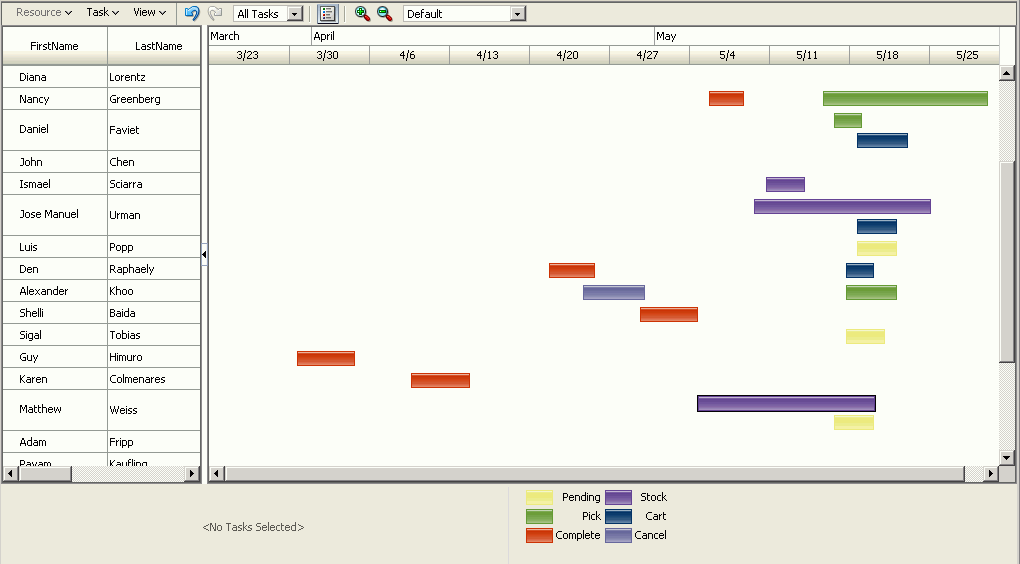
To create a scheduling Gantt chart using a data control, you bind the schedulingGantt tag to a data collection. JDeveloper allows you to do this declaratively by dragging and dropping a collection from the Data Controls panel.
To create a databound scheduling Gantt chart:
-
From the Data Controls panel, select a data collection. For a Gantt chart, you can select a row set collection or a basic tree collection.
Figure 26-95 shows an example where you could select the
Personsdata collection to create a scheduling Gantt chart that displays the orders that each resource is responsible for. -
Drag the collection onto a JSF page and, from the context menu, choose Gantt, then Scheduling.
-
In the ensuing Create Scheduling Gantt dialog, you do the following to connect resource- and task-related controls at the top of the dialog with corresponding columns in the data collection:
-
For Resource Id, select the column in the data collection that corresponds to the unique identifier of the resource.
-
In the Tasks page select a value from the Task Accessor dropdown list that contains the tasks assigned to the resource. Select the columns in the data collection that correspond to each of the following controls: Task Id, Start Time, and End Time. You can optionally specify a data column to map to task type. If you do not bind task type to data, then all task types default to Normal.
-
If the data collection has an accessor that holds dependent tasks, you have the option of using the Dependent Tasks page in the dialog to select the dependent tasks accessor and to select the columns in that data collection that correspond to each of the following controls: Dependency Type, From Task Id, and To Task Id.
-
If the data collection has an accessor for split tasks, you have the option of using the Split Tasks page in the dialog to select the split tasks accessor and to select the columns in that data collection that correspond to each of the following controls: Split Task Id, Start Time, and End Time.
-
If the data collection has an accessor for recurring tasks, you have the option of using the Recurring Tasks page in the dialog to select the Recurring Tasks accessor and to select the columns in that data collection that correspond to each of the following controls: Recurring Task Id, Type, Start Time, and End Time.
-
If the data collection has an accessor for subresources (lower-level resources), you have the option of using the Subresouces page to specify the appropriate accessor and to select the data column that contains the unique identifier of the subresource.
For example, a manager might be a resource and his direct reports might be subresources. If data contains subresources, then you can drill in a resource to locate subresources.
-
-
In the Table Columns section, you specify the columns that will appear in the list region of the Gantt chart on the left side of the splitter. Specify one row of information for each column that is to appear. Use the New icon to add new rows. Use the arrow icon to arrange the rows in the exact sequence that you want the columns to appear in the Gantt chart list. For each row, you provide the following specifications:
-
Display Label: Select the values for the headers of the columns in the Gantt chart list. If you select
<default>, then the text for the header is automatically retrieved from the data binding. -
Value Binding: Select the columns in the data collection to use for the column in the Gantt chart list. The available values are the same as those for the tasks group.
-
Component to Use: Select the type of component to display in the cell of the Gantt chart list. The default is the ADF Output Text component.
-
-
Click OK to dismiss the Create Scheduling Gantt dialog.
-
Select the
dvt:schedulingGanttelement in the Structure window of the JSF page and set dates for the following attributes of thedvt:schedulingGanttelement in the Property Inspector:-
StartTime -
EndTime
The dates that you specify determine the initial view that appears in the scheduling Gantt chart at runtime.
-
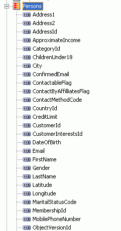
Figure 26-96 shows the dialog used to create the scheduling Gantt chart from the data collection for resources responsible for shipping orders.
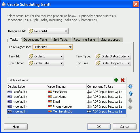
26.9.9 What Happens When You Create a Scheduling Gantt Chart
Dropping a scheduling Gantt chart from the Data Controls panel has the following effect:
-
Creates the bindings for the Gantt chart and adds the bindings to the page definition file
-
Adds the necessary code for the UI components to the JSF page
Example 26-47 shows the row set bindings that were generated for the scheduling Gantt chart that displays resources and orders shipped.
Example 26-47 Binding XML for a Scheduling Gantt Chart
<gantt IterBinding="PersonsIterator" id="Persons"
       xmlns="http://xmlns.oracle.com/adfm/dvt">
  <ganttDataMap>
    <nodeDefinition DefName="oracle.fodemo.storefront.store.queries.PersonsVO"
                    type="Resources">
      <AttrNames>
        <Item Value="PersonId" type="resourceId"/>
      </AttrNames>
      <Accessors>
          <Item Value="OrdersVO" type="tasks"/>
      </Accessors>
    </nodeDefinition>
    <nodeDefinition type="Tasks"
                    DefName="oracle.fodemo.storefront.store.queries.OrdersVO">
      <AttrNames>
        <Item Value="OrderId" type="taskId"/>
        <Item Value="OrderDate" type="startTime"/>
        <Item Value="OrderStatusCode" type="taskType"/>
        <Item Value="OrderShippedDate" type="endTime"/>
       </AttrNames>
     </nodeDefinition>
     <nodeDefinition type="Dependents">
       <AttrNames/>
     </nodeDefinition>
     <nodeDefinition type="SplitTasks">
       <AttrNames/>
     </nodeDefinition>
     <nodeDefinition type="RecurringTasks">
       <AttrNames/>
     </nodeDefinition>
     <nodeDefinition type="Subresources">
        <AttrNames/>
     </nodeDefinition>
  </ganttDataMap>
</gantt>
Example 26-48 shows the code generated on the JSF page for the scheduling Gantt chart. This tag code contains settings for the overall start and end time for the scheduling Gantt chart. It also shows the time axis settings for the major time axis (in months) and the minor time axis (in weeks). Finally, it lists the specifications for each column that appears in the list region of the Gantt chart. For brevity, the code in the af:column elements for MembershipId, Email, and PhoneNumber has been omitted.
Example 26-48 Code on the JSF Page for a Scheduling Gantt Chart
<dvt:schedulingGantt id="schedulingGantt1"
     value="#{bindings.Persons.schedulingGanttModel}"
     var="row" startTime="2008-03-29"
     endTime="2008-05-30"
     taskbarFormatManager="#{GanttBean.taskbarFormatManager}">
  <f:facet name="major">
    <dvt:timeAxis scale="months"/>
  </f:facet>
  <f:facet name="minor">
    <dvt:timeAxis scale="weeks"/>
  </f:facet>
  <f:facet name="nodeStamp">
   <af:column sortProperty="FirstName" sortable="false"
              headerText="#{bindings.Persons.hints.FirstName.label}">
     <af:outputText value="#{row.FirstName}"/>
   </af:column>
  </f:facet>
  <af:column sortProperty="LastName" sortable="false"
             headerText="#{bindings.Persons.hints.LastName.label}">
  <af:outputText value="#{row.LastName}"/>
  </af:column>
          ...
  <dvt:ganttLegend>
</dvt:schedulingGantt>
26.10 Creating Databound Timelines
A timeline is an interactive data visualization tool that allows users to view date-based events in chronological order and easily navigate forwards and backwards within a defined time range. A dual timeline can be used for a side-by-side comparison of events. For example, you can use a timeline to display the hire dates of employees, or use a dual timeline to compare multiple human resource events between two employees.
A timeline is composed of the display of events as timeline items along a time axis, a movable overview window that corresponds to the period of viewable time in the timeline, and an overview time axis that displays the total time increment for the timeline. A horizontal zoom control is available to change the viewable time range. Timeline items corresponding to events display associated information or actions and are connected to the date of the event in the time axis. Timelines items are represented by a marker in the overview panel. No more that two series of events are supported by the timeline component.
Figure 26-97 shows a timeline displaying the chronological order of the hire dates of employees. In this example, timeline items representing each event display information about the employee using an image and text with labels. When selection is configured, the timeline item, line feeler, and the event marker in the overview panel are highlighted.
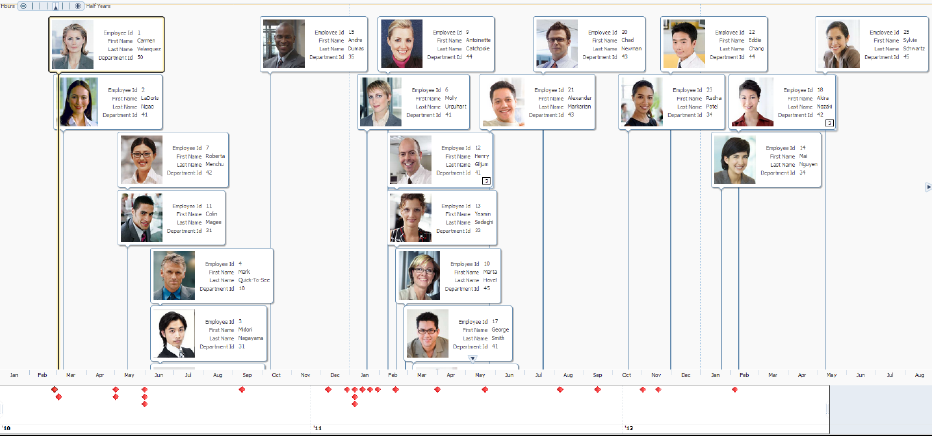
Figure 26-98 shows a dual timeline comparing multiple human resource events between two employees. The time axis is positioned between the two series of events and the overview panel displays at the bottom of the timeline.
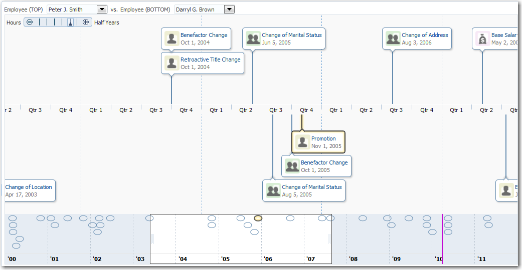
The content of timeline items, marker display, and time axis are configurable. For detailed information about timeline use cases, end user and presentation features, tag structure, and adding special features to timelines, see the "Using Timeline Components" chapter in the Oracle Fusion Middleware Web User Interface Developer's Guide for Oracle Application Development Framework.
26.10.1 How to Create a Timeline Using ADF Data Controls
The data displayed in a timeline is based on data collections. The timeline component uses a model to access the data in the underlying list. The specific model class is oracle.adf.view.rich.model.CollectionModel. You can also use other model instances, for example, java.util.List, java.util.Array, and javax.faces.model.DataModel. The data layer will automatically convert the instance into a CollectionModel.
Stamping is used to associate information about a timeline event with a row of data in a data collection. Using stamping, each row of data in the data model can be displayed for an event. When you use stamping, child components are not created for every item in the timeline. Rather, the content of the component is repeatedly rendered, or stamped, once per data attribute.
Using data controls in Oracle ADF, JDeveloper makes this a declarative task. You drag and drop a data collection from the Data Controls panel that generates one (up to two) series of events onto the JSF page.
It may be helpful to have an understanding of databound timelines. For more information, see Section 26.10, "Creating Databound Timelines."
You will need to complete these tasks:
-
Create an application module that contains instances of the view objects that you want in your data model, as described in Section 9.2, "Creating and Modifying an Application Module."
-
Create a JSF page as described in the "How to Create JSF JSP Pages" section of the Oracle Fusion Middleware Web User Interface Developer's Guide for Oracle Application Development Framework.
To create a timeline using the Data Controls panel:
-
From the Data Controls panel, select a collection.
Figure 26-99 shows the data collection for the timeline in Figure 26-99. In this example the application uses the
SEmpView1data collection to create the timeline. -
Drag the collection onto the JSF page, and from the context menu choose Timeline.
-
In the Configure Timeline Series Data page of the Create Timeline wizard, configure the timeline data model for at least one (at most two for a dual timeline), by setting the following values:
-
Series Value: Use the dropdown list to select the data collection to use in the timeline. By default, the data collection you inserted from the Data Controls panel is displayed. JDeveloper automatically lists any data collection from the application module that includes at least one qualifying date-based attribute from which to choose.
-
Item Date Value: Use the dropdown list to select the date-based attribute to use for the timeline items stamped in the timeline. JDeveloper automatically lists all qualifying attributes in the data collection referenced in the Series Value from which to choose.
-
Group: Optionally use the dropdown list to select the attribute to use to group timeline items when the item date values are identical. JDeveloper automatically lists all data collection attributes from which to choose.
You can also choose Expression Builder and create an EL Expression to specify grouping of attributes at runtime. If you need help press F1 or click Help.
-
-
For each timeline series that you configured as a data model, select the series, and set the following values for the timeline item display attributes:
-
Image: Optionally, enter the relative path to the image file to stamp in the timeline item, or use the Search icon to open the Select Image File dialog to navigate to the image source.
You can also choose Expression Builder to configure an EL Expression that evaluates at runtime to locate the image file.
Note:
if you need to change the size of the image in the timeline item, specify the InlineStyle attribute of theaf:imagecomponent in source code or declaratively in the Property Inspector. For example, in the sample, specifyinlineStyle="width:85px;height:100px;". -
Component: From the dropdown list, select the ADF Faces component to use to display the attribute text in the timeline item. You can choose from
outputText, which displays unformatted text, andoutputFormatted, which displays text and can include a limited range of formatting options. You can also choose to associate a label with either output text option in the Label value. -
Value: From the dropdown list select the attribute value to display in the timeline item. JDeveloper automatically lists all attributes in the data collection for the selected timeline series.
-
Label: This option is available if you specify an ADF Faces component with a label in the Component value for the display attribute. You can use the default
Use Attribute Nametext, specify a text resource from a resource bundle, or use the EL Expression builder to evaluate the label text at runtime. The label displays in the timeline item at runtime.
For example, to specify the timeline series and display attributes for the timeline in Figure 26-97, complete the Configure Timeline Series Data page of the Create Timeline wizard as shown in Figure 26-100.
-
-
Select Next to advance to the next page of the wizard, Finish to complete the definition of the data binding, or Cancel to end the creation of the timeline.
-
In the Configure Event Marker page of the Create Timeline Wizard, for each timeline series that you configured as a data model, select the series, and set the following optional values for the event marker:
-
Color: Specify the fill color for the event marker. You can use the dropdown list to select available colors, or click the icon to display a color picker dialog. By default, no color is specified.
-
Opacity: Specify the opacity of the fill color of the marker. Valid values range from
0percent for transparent, to100percent for opaque. -
Standard Shape: Specify the shape of the overview marker for each selected timeline series value. From the dropdown list, select one of seven prebuilt shapes to style the overview marker shape. Valid values are
circle(default),diamond,human,plus,square,triangleDown, andtriangleUp. -
ScaleX/ScaleY: Enter the horizontal (
scaleX) and vertical (scaleY) scale factor to modify the overview marker from its default size. Valid values are numerical percentages from0to100percent. JDeveloper will automatically resize a marker to fit within the timeline overview area if the marker is too large.
For example, to specify the timeline overview series markers for the timeline in Figure 26-97, complete the Configure Event Marker page of the Create Timeline wizard as shown in Figure 26-101.
-
-
Select Back to return to the last page of the wizard, Next to advance to the next page of the wizard, Finish to complete the definition of the data binding, or Cancel to end the creation of the timeline.
-
In the Configure Time Range and Scale of the Create Timeline Wizard, configure the time axis and overview axis by setting the following values:
-
Start Time: Enter the starting date to use for the time range of the timeline using the format
yyyy-mm-dd. Select a start date that will include events in the data collection you wish to display on the timeline. From the dropdown list you can selectCurrent Date. You can also click the Calendar icon to display a date picker dialog. The current date is the default value. -
End Time: Enter the ending date to use for the timeline time range using the format
yyyy-mm-dd. Select an end date that will include events in the data collection you wish to display on the timeline. From the dropdown list you can selectCurrent Date. You can also click the Calendar icon to display a date picker dialog. The current date is the default value. -
Axis Scale: Use the dropdown list to select the time scale to use for the timeline time axis. The time axis shows the user the current time increment for the timeline.
You must use a smaller time scale than the Overview Scale. For example, you cannot set the axis scale to
yearsif the overview scale is set tomonths. You can also specify a custom axis scale.Valid values are
twoyears,years,halfyears,quarters(default),twomonths,months,twoweeks,weeks,days,sixhours,threehours,hours,halfhours, andquarterhours. You can also specify a custom axis scale. For more information, see the "Customizing Timeline Display Elements" section in the Oracle Fusion Middleware Web User Interface Developer's Guide for Oracle Application Development Framework. -
Overview Scale: Use the dropdown list to select the time scale to use for the timeline overview axis. The overview axis shows the user the total time increment covered by the timeline.
Valid values are
twoyears,years(default),halfyears,quarters,twomonths,months,twoweeks,weeks,days,sixhours,threehours,hours,halfhours, andquarterhours. You can also specify a custom axis scale. For more information, see the "Customizing Timeline Display Elements" section in the Oracle Fusion Middleware Web User Interface Developer's Guide for Oracle Application Development Framework.
For example, to specify the timeline axis and overview time range for the timeline in Figure 26-97, complete the Configure Time Range and Scale page in the Create Timeline wizard as shown in Figure 26-102.
-
-
Select Back to return to the last page of the wizard, Finish to complete the definition of the data binding, or Cancel to end the creation of the timeline.
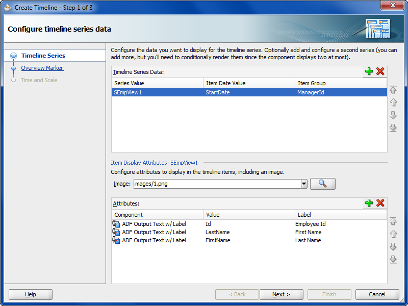
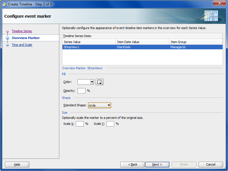
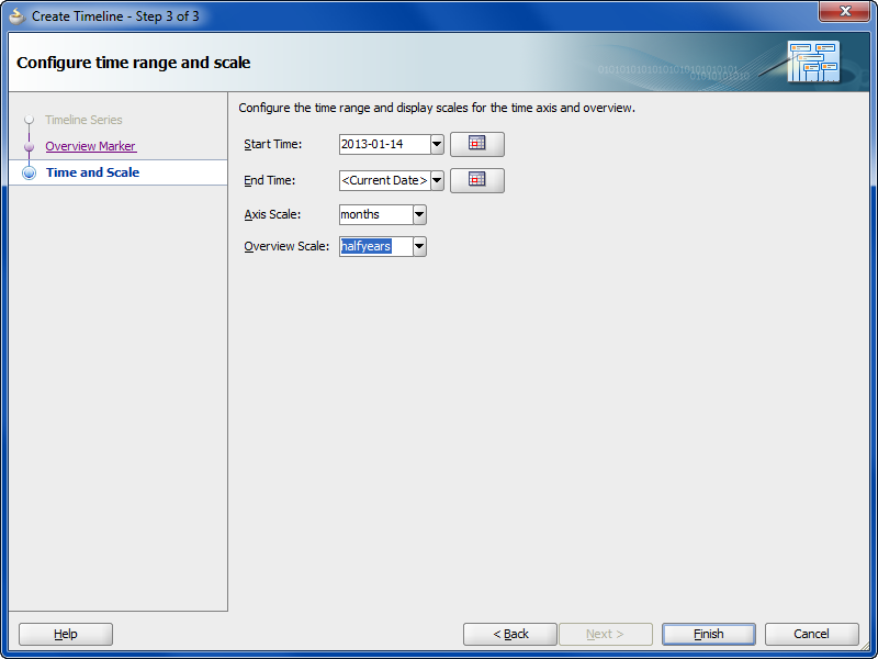
26.10.2 What Happens When You Use Data Controls to Create a Timeline
When you use ADF data controls to create a timeline, JDeveloper:
-
Defines the bindings for the timeline in the page definition file of the JSF page, and
-
Inserts code in the JSF page for the DVT timeline components.
Example 26-49 shows the bindings defined in the page definition file of the JSF page for the timeline in Figure 26-97.
Example 26-49 XML Bindings in Page Definition File
<bindings>
  <tree IterBinding="SEmpView1Iterator" id="SEmpView1" ChangeEventPolicy="ppr">
    <nodeDefinition DefName="model.SEmpView" Name="SEmpView1">
      <AttrNames>
        <Item Value="DeptId"/>
        <Item Value="FirstName"/>
        <Item Value="Id"/>
        <Item Value="LastName"/>
        <Item Value="StartDate"/>
      </AttrNames>
    </nodeDefinition>
  </tree>
</bindings>
Example 26-50 shows the code inserted in the JSF page for the example timeline in Figure 26-97.
Example 26-50 Sample Code for Timeline Component
<dvt:timeline id="tl1" startTime="2010-01-01" endTime="2012-12-31"
      itemSelection="multiple">
  <dvt:timelineSeries id="ts1" var="evt"
        value="#{bindings.SEmpView1.collectionModel}">
    <dvt:timelineItem value="#{evt.StartDate}" id="ti1" group="#{evt.DeptId}">
      <af:panelGroupLayout id="pg1" layout="horizontal">
        <af:image id="img1" source="images/#{evt.Id}.png"
            inlineStyle="width:85px;height:100px;"/>
        <af:spacer width="3" id="s1"/>
        <af:panelGroupLayout id="pg2" layout="vertical">
          <af:panelLabelAndMessage id="plam1"
                                   label="#{viewcontrollerBundle.EMPLOYEE_ID}">
            <af:outputText id="ot1" value="#{evt.Id}" noWrap="true">
              <af:convertNumber groupingUsed="false" pattern=
                                "#{bindings.SEmpView1.hints.Id.format}"/>
              </af:outputText>
          </af:panelLabelAndMessage>
          <af:panelLabelAndMessage id="plam2"
                                   label="#{viewcontrollerBundle.FIRST_NAME}">
            <af:outputText id="ot2" value="#{evt.FirstName}" noWrap="true"/>
          </af:panelLabelAndMessage>
          <af:panelLabelAndMessage id="plam3"
                                   label="#{viewcontrollerBundle.LAST_NAME}">
            <af:outputText id="ot3" value="#{evt.LastName}" noWrap="true"/>
          </af:panelLabelAndMessage>
          <af:panelLabelAndMessage id="plam4"
                                   label="#{viewcontrollerBundle.DEPARTMENT_ID}">
            <af:outputText id="ot4" value="#{evt.DeptId}" noWrap="true">
              <af:convertNumber groupingUsed="false" pattern=
                                "#{bindings.SEmpView1.hints.DeptId.format}"/>
            </af:outputText>
          </af:panelLabelAndMessage>
        </af:panelGroupLayout>
      </af:panelGroupLayout>
      <f:facet name="overviewItem">
        <dvt:marker id="m1" fillColor="#ff0000"/>
      </f:facet>
    </dvt:timelineItem>
  </dvt:timelineSeries>
  <dvt:timeAxis id="ta1" scale="months"/>
  <dvt:timelineOverview id="ov1">
    <dvt:timeAxis id="ta2" scale="halfyears"/>
  </dvt:timelineOverview>
</dvt:timeline>
26.10.3 What You May Need to Know About Using Data Controls to Create a Dual Timeline
When you use the Data Controls panel to create a dual timeline, you can configure the same or different data collections to configure the two timeline series and specify the timeline item display attributes and overview marker for each one. JDeveloper automatically lists any data collection from the application module that includes at least one qualifying date-based attribute from which to choose in the Create Timeline wizard.
Example 26-51 show the sample code for the dual timeline displayed in Figure 26-98.
Example 26-51 Sample Code for a Dual Timeline
<dvt:timeline id="tl1" startTime="2000-01-01" endTime="2011-12-31"
      inlineStyle="width:1024px;height:500px" itemSelection="single"
      currentTime="2010-04-01">
  <dvt:timelineSeries id="ts1" var="evt" value="#{timeline.firstModel}"
        contentDelivery="lazy">
    <dvt:timelineItem id="ti1" value="#{evt.date}" group="#{evt.group}">
      <af:panelGroupLayout id="pg1" layout="horizontal">
        <af:image id="img1" inlineStyle="width:30px;height:30px"
               source="/resources/images/timeline/#{evt.type}.png"/>
        <af:spacer width="3"/>
          <af:panelGroupLayout id="pg2" layout="vertical">
            <af:outputText id="ot1" inlineStyle="color:#084B8A"
                  value="#{evt.description}" noWrap="true"/>
            <af:outputText id="ot2" value="#{evt.date}"
                  inlineStyle="color:#6e6e6e" noWrap="true">
            <af:convertDateTime dateStyle="medium"/>
            </af:outputText>
          </af:panelGroupLayout>
      </af:panelGroupLayout>
        <f:facet name="overviewItem">
          <dvt:marker id="m1" shape="circle" fillColor="#ff0000"/>
        </f:facet>
    </dvt:timelineItem>
  </dvt:timelineSeries>
  <dvt:timelineSeries id="ts2" var="evt" value="#{timeline.secondModel}"
        contentDelivery="lazy">
    <dvt:timelineItem id="ti2" value="#{evt.date}">
      <af:panelGroupLayout id="pg2" layout="horizontal">
        <af:image id="img2" inlineStyle="width:30px;height:30px"
              source="/resources/images/timeline/#{evt.type}.png"/>
        <af:spacer width="3"/>
          <af:panelGroupLayout id="pg3" layout="vertical">
            <af:outputText id="ot3" inlineStyle="color:#084B8A"
                  value="#{evt.description}" noWrap="true"/>
            <af:outputText id="ot4" value="#{evt.date}"
                  inlineStyle="color:#6e6e6e" noWrap="true">
            <af:convertDateTime dateStyle="medium"/>
            </af:outputText>
          </af:panelGroupLayout>
        </af:panelGroupLayout>
        <f:facet name="overviewItem">
          <dvt:marker id="m2" shape="circle" fillColor="#0000ff"/>
        </f:facet>
      </dvt:timelineItem>
    </dvt:timelineSeries>
    <dvt:timeAxis id="ta1" scale="quarters"/>
      <dvt:timelineOverview id="ov1">
        <dvt:timeAxis id="ta2" scale="years"/>
      </dvt:timelineOverview>
</dvt:timeline>
For information about the data requirements, tag structure, and options for customizing the look and behavior of the component, see the "Using Timeline Components" chapter in the Oracle Fusion Middleware Web User Interface Developer's Guide for Oracle Application Development Framework.
26.11 Creating Databound Hierarchy Viewers
A hierarchy viewer is an ADF Data Visualization component that visually displays data where parent-child relationships exist within the data. This component is useful where you want to display organization charts, network diagrams, or social networks, for example.
Hierarchy viewers use a shape called a node to reference the data in a hierarchy. The shape and content of the nodes are configurable, as well as the visual layout of the nodes. Nodes can display multiple views in a panel card.
Figure 26-103 shows a runtime view of a hierarchy viewer component that renders an organization chart.
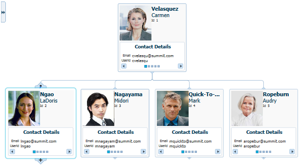
Figure 26-104 shows the Component Gallery displaying the types of hierarchy viewers that you can use to create a hierarchy viewer.
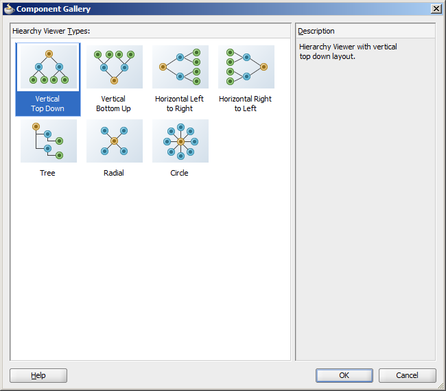
Each hierarchy viewer component (dvt:hierarchyViewer) that you create can include:
-
One or more node elements (
dvt:node) -
One or more link elements (
dvt:link)
The optional panel card element (dvt:panelCard) can be used in conjunction with the hierarchy viewer component. The panel card provides a method to switch dynamically between multiple sets of content referenced by a node element using animation by, for example, horizontally sliding the content or flipping a node over.
For information about customizing a hierarchy viewer after the databinding is complete, see the "Using Hierarchy Viewer Components" chapter in the Oracle Fusion Middleware Web User Interface Developer's Guide for Oracle Application Development Framework.
26.11.1 How to Create a Databound Hierarchy Viewer
Hierarchy viewers are based on data collections where a master-detail relationship exists between one or more detail collections and a master data collection. Using data controls in Oracle ADF, JDeveloper makes this a declarative task. You drag and drop a data collection from the Data Controls panel that generates one or more root nodes onto a JSF page.
You will need to complete these tasks:
-
Create an application module that contains instances of the view objects that you want in your data model, as described in Section 9.2, "Creating and Modifying an Application Module."
For example, the data for the hierarchy viewer in Figure 26-103 comes from a single table containing employee data in a fictitious organization. Figure 26-105 shows the
SEmptable structure in the Database Navigator. In this example, each employee's manager is identified by the value in theMANAGER_IDcolumn.To set up a hierarchical relationship between the managers and employees using the
SEmptable and to establish the highest level employee as the root of the hierarchy, do the following:-
Create an entity object based on the
SEmptable.Figure 26-106 shows the
SEmpentity object based on theSEmptable. The attributes in the entity object correspond to the columns in theSEmptable. For help with creating entity objects, see Chapter 4, "Creating a Business Domain Layer Using Entity Objects." -
Create an association between
SEmp.IdandSEmp.ManagerIDto establish the relationship between the employee and manager.Figure 26-107 shows the
SEmpManagerIdFkAssoc. For additional information about associations, see Section 4.2, "Creating Entity Objects and Associations." -
To establish the hierarchy between the managers and employees, create a view link between the managers and employees based on the
SEmpManagerIdFkAssocassociation.Figure 26-108 shows the
SEmpManagerIDFKLinkview link. For additional information about establishing the master-detail relationship using view links, see Section 5.7, "Working with a Single Table in a Recursive Master-Detail Hierarchy." -
Create a view object that retrieves the root value from the data collection.
For example, in the hierarchy viewer displayed in Figure 26-103, Carmen Velasquez is the highest level manager and has a employee ID of
1. To duplicate this example, create a view object that retrieves the employee whose ID is1.Figure 26-109 shows the
RootEmployeeViewObjectfor a view object based on theSEmptable example. The query retrieves the employee whose ID is1and stores it in therootEmpNobind variable. For more information about working with view objects and bind variables, see Section 5.10, "Working with Bind Variables." -
To establish the hierarchy between the root employee and the lower-level managers and employees, add a view link between the
RootEmployeeViewObjand the managers-employees view object created in Step 3. -
In the Data Controls panel, click Refresh to update the data controls.
For additional information about master-detail relationships, see Chapter 24, "Displaying Master-Detail Data."
-
-
Create a JSF page as described in the "Creating a View Page" section of the Oracle Fusion Middleware Web User Interface Developer's Guide for Oracle Application Development Framework.
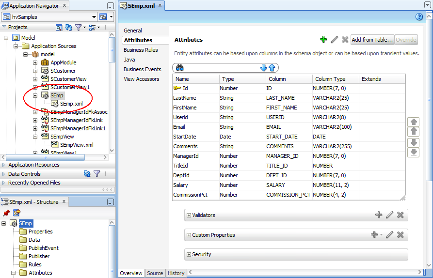
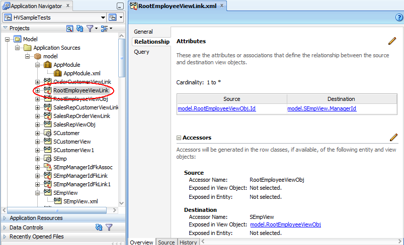
To create a databound hierarchy viewer:
-
From the Data Controls panel, select a collection.
Figure 26-111 shows an example where you could select the
RootEmployeeViewObject2collection in the Data Controls panel to create a hierarchy viewer representing the personnel data in an organizational chart. -
Drag the collection onto a JSF page and, from the context menu, choose Hierarchy Viewer.
-
From the Component Gallery, select the layout of the hierarchy viewer you want to create. Figure 26-104 shows the Component Gallery with the vertical top down layout selected.
-
In the Create Hierarchy Viewer dialog, enter the following:
-
Hierarchy: Select the collections you want to include as nodes in the runtime diagram. By default, the root collection is selected. You can also choose to configure ancestors or descendants in the hierarchy.
-
Node: For each collection that you select in the Hierarchy list, configure the attributes in the Title Area, and the title and attributes in each panel card, using one or more of the zoom levels available to you. By default, the node for the 100% zoom level follows an algorithm that:
-
Assigns the first three attributes in the data collection to the Title Area.
-
Assigns the next two attributes to the first panel card.
-
Assigns the following two attributes to the second panel card, and so on until all attributes are assigned to a panel card.
Select the panel card title or node attributes to configure one or more of the following for that element:
-
Text: Available for panel card titles. Not available for the Title Area element. Enter text for the panel card title in the hierarchy, or choose Select Text Resource from the dropdown list to open a dialog to select or add a text resource to use for the title. The text resource is a translatable string from an application resource bundle. If you need help, press F1 or click Help.
-
Panel Card Data Source: Available for panel cards. The data source indicates which data collection will be used for the panel card attributes. By default, the collection associated with the current hierarchy level will be used for attribute selection.
Figure 26-112 shows a Create Hierarchy Viewer dialog for a hierarchy viewer using the
RootEmployeeViewObj2data control. In this example, the Panel Card Data Source is the defaultSEmpViewcollection.To use an alternative child accessor for the panel card attributes, select an alternative child accessor from the dropdown list as shown in Figure 26-113. For additional information, see Section 26.11.3, "How to Configure an Alternate View Object for a Databound Panel Card.".
-
Attribute: Available for attribute and image elements. From the dropdown list, select the attribute in the data collection that represents the value you wish to display in the hierarchy viewer node.
-
Label: Available for attributes. From the dropdown list, select the attribute in the data collection that represents the label you wish to display for that element in the hierarchy viewer node. You can use the default Use Attribute Name to render the value as a string using the label from the UIHints for that attribute in the underlying
ViewObject, select No Label to render no label for the attribute, or choose Select Text Resource to open a Select Text Resource dialog to select or add a text resource to use for the label. The text resource is a translatable string from an application resource bundle. -
Component: Available for attributes. Select the type of component to use to display the data in the node. Valid values are: ADF Output Text w/ Label, ADF Output Text, ADF Output Formatted Text w/ Label, and ADF Output Formatted Text. For more information about using these components, see the "Using Output Components" chapter in the Oracle Fusion Middleware Web User Interface Developer's Guide for Oracle Application Development Framework.
Click the New icon to add a new panel card, attribute, or image to the node, relative to your selection in the node. After selecting an existing element, use the arrow icons (Up, Down, Top, Bottom) to reorder the element, or use the Delete icon to delete the selected element.
Use the 75%, 50%, and 25% pages to specify the expanded display of the hierarchy at each page level. Select Add Zoom Level to enable the zoom level for a page level. By default, the algorithms to assign node attributes and panel cards in the node are similar to the 100% zoom level.
Note:
The hierarchy viewer component defines four zoom levels. You cannot modify these zoom levels or create new zoom levels. The default zoom level is 100%. -
-
Sample: A nonconfigurable display of the sample outline of the hierarchy viewer node. Areas such as Title Area and attributes are highlighted in the sample when selected in the node area.
-
-
Click OK.
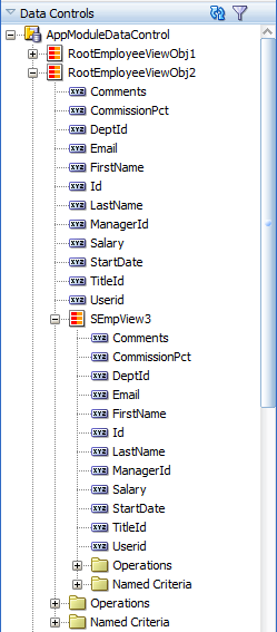
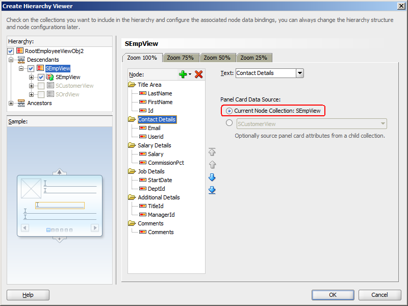
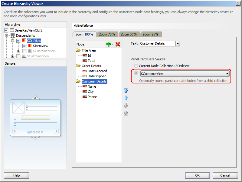
Figure 26-114 shows the Create Hierarchy Viewer dialog that appears if you create a hierarchy viewer using data from a data collection named RootEmployeeViewObject2. In this example, the hierarchy viewer is configured to display the title area and a panel card with five sets of employee information.
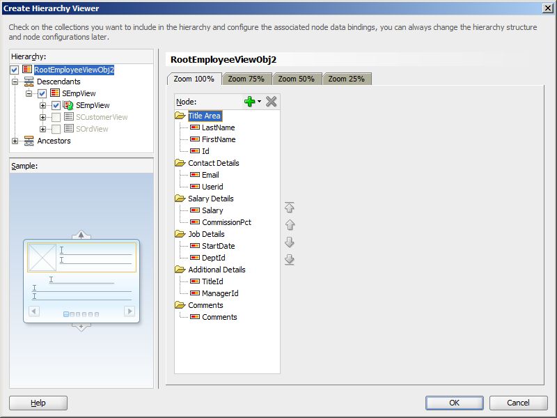
After completing the Create Hierarchy Viewer dialog, you can use the Property Inspector to specify settings for the hierarchy viewer attributes, and you can also use the child tags associated with the hierarchy viewer tag to customize the hierarchy viewer further. For detailed information about hierarchy viewer end user and presentation features, use cases, tag structure, and adding special features to hierarchy viewers, see the "Using Hierarchy Viewer Components" chapter in the Oracle Fusion Middleware Web User Interface Developer's Guide for Oracle Application Development Framework.
When editing the hierarchy viewer in the visual editor, the display approximates the runtime display and functionality. You can move between the panel cards and work with stamped elements within the panel cards and title area to rearrange attributes or bind new attributes imported from the Data Controls panel.
26.11.2 What Happens When You Create a Databound Hierarchy Viewer
Creating a hierarchy viewer from Data Controls panel has the following effect:
-
Creates the bindings for the hierarchy viewer in the page definition file of the JSF page
-
Adds the necessary tags to the JSF page for the hierarchy viewer component
Example 26-52 displays bindings that JDeveloper generated for a hierarchy viewer component. The rules for populating the nodes of the master-detail tree are defined as a node definition. The example shows that two node definitions were generated. Each of these node definitions references a view object and associated attributes. The code example also references an accessor SEmpView.
Example 26-52 Bindings for a Hierarchy Viewer
<bindings>
  <tree IterBinding="RootEmployeeViewObj2Iterator" id="RootEmployeeViewObj2">
    <nodeDefinition DefName="model.RootEmployeeViewObj"
                    Name="RootEmployeeViewObj20">
      <AttrNames>
        <Item Value="ManagerId"/>
        <Item Value="TitleId"/>
        <Item Value="Userid"/>
        <Item Value="Comments"/>
        <Item Value="DeptId"/>
        <Item Value="StartDate"/>
        <Item Value="Email"/>
        <Item Value="Salary"/>
        <Item Value="FirstName"/>
        <Item Value="Id"/>
        <Item Value="CommissionPct"/>
        <Item Value="LastName"/>
      </AttrNames>
      <Accessors>
        <Item Value="SEmpView">
          <Properties>
            <CustomProperties>
              <Property Name="hierarchyType" Value="children"/>
            </CustomProperties>
          </Properties>
        </Item>
      </Accessors>
    </nodeDefinition>
    <nodeDefinition DefName="model.SEmpView" Name="RootEmployeeViewObj21">
      <AttrNames>
        <Item Value="ManagerId"/>
        <Item Value="TitleId"/>
        <Item Value="Userid"/>
        <Item Value="Comments"/>
        <Item Value="DeptId"/>
        <Item Value="StartDate"/>
        <Item Value="Email"/>
        <Item Value="Salary"/>
        <Item Value="FirstName"/>
        <Item Value="Id"/>
        <Item Value="CommissionPct"/>
        <Item Value="LastName"/>
      </AttrNames>
      <Accessors>
        <Item Value="SEmpView">
          <Properties>
            <CustomProperties>
              <Property Name="hierarchyType" Value="children"/>
            </CustomProperties>
          </Properties>
        </Item>
      </Accessors>
    </nodeDefinition>
  </tree>
</bindings>
Example 26-53 shows the code generated on the JSF page that is associated with the page definition file in Example 26-52. For brevity, the details in the facet elements named zoom75, zoom50, and zoom25 and panel card showDetailItem components have been omitted. In addition, the details for the second node in the hierarchy viewer have also been omitted.
The example shows a hierarchy viewer component that references the RootEmployeeViewObj2 tree binding. It includes two node (dvt:node) components that in turn include a panel card component (dvt:panelCard). The panel card component defines slide_horz as the effect to use when changing the display of content referenced by the node.
Once you create your hierarchy viewer, you can modify the layout of the component or add additional components using the Create Hierarchy dialog illustrated in Figure 26-114. To open the dialog, use the Edit icon in the Property Inspector for the hierarchyViewer component. You can also customize the layout of a hierarchy viewer component directly in the code, in the visual editor, or by setting values in the Property Inspector. You can add additional components, such as panel card attributes, using the Component Palette.
Example 26-53 Code on the JSF Page for a Hierarchy Viewer
<dvt:hierarchyViewer id="hv1" var="node"
        value="#{bindings.RootEmployeeViewObj2.treeModel}"
        selectionListener="#{bindings.RootEmployeeViewObj2.treeModel.makeCurrent}"
        detailWindow="none" layout="hier_vert_top"
        levelFetchSize="#{bindings.RootEmployeeViewObj2.rangeSize}"
        styleClass="AFStretchWidth">
  <dvt:link linkType="orthogonalRounded" id="l1"/>
  <dvt:node type="model.RootEmployeeViewObj" width="233" height="233" id="n1">
    <f:facet name="zoom100">
      <af:panelGroupLayout styleClass="AFStretchWidth AFHVNodeStretchHeight
                                       AFHVNodePadding"
                           layout="vertical" id="pgl1">
        <af:panelGroupLayout layout="horizontal" id="pgl2">
          <af:panelGroupLayout layout="vertical" id="pgl6">
            <af:outputText value="#{node.LastName}"
                           styleClass="AFHVNodeTitleTextStyle"
                           id="ot2"/>
            <af:outputText value="#{node.FirstName}"
                           styleClass="AFHVNodeSubtitleTextStyle"
                           id="ot13"/>
            <af:panelLabelAndMessage label="#{node.hints.Id.label}"
                                     id="plam5">
              <af:outputText value="#{node.Id}"
                             styleClass="AFHVNodeTextStyle" id="ot16">
                <af:convertNumber groupingUsed="false"
                                  pattern="#{node.hints.Id.format}"/>
              </af:outputText>
            </af:panelLabelAndMessage>
          </af:panelGroupLayout>
        </af:panelGroupLayout>
      <af:spacer height="5" id="s7"/>
      <dvt:panelCard effect="slide_horz" styleClass="AFHVNodePadding" id="pc2">
        <af:showDetailItem text="Contact Details" id="sdi1">
          <af:spacer height="2" id="s6"/>
          <af:panelFormLayout styleClass="AFStretchWidth AFHVNodeStretchHeight
                                          AFHVNodePadding"
                              id="pfl2">
            <af:panelLabelAndMessage label="#{node.hints.Email.label}"
                                     id="plam3">
              <af:outputText value="#{node.Email}"
                             styleClass="AFHVPanelCardTextStyle"
                             id="ot12"/>
            </af:panelLabelAndMessage>
            <af:panelLabelAndMessage label="#{node.hints.Userid.label}"
                                     id="plam15">
              <af:outputText value="#{node.Userid}"
                             styleClass="AFHVPanelCardTextStyle"
                             id="ot1"/>
            </af:panelLabelAndMessage>
          </af:panelFormLayout>
        </af:showDetailItem>
           ... Remaining showDetailItems omitted
      </dvt:panelCard>
    </af:panelGroupLayout>
   </f:facet>
           ... Remaining zoom levels omitted
 </dvt:node>
 <dvt:node type="model.SEmpView" width="233" height="233" id="n2">
   ... Second node details omitted
 </dvt:node>
</dvt:hierarchyViewer>
26.11.3 How to Configure an Alternate View Object for a Databound Panel Card
You can specify an alternate view object as the data source for a panel card when you create or edit a databound hierarchy viewer. For example, you may have a data collection that has a master-detail relationship between sales representatives and orders, but you want your panel card to display details about the customer who placed the order.
Figure 26-115 shows a portion of the runtime view of a hierarchy viewer configured to display the orders and order details for sales representatives. In this example, the hierarchy viewer is configured to use an alternate view object for the Customer Details panel card.
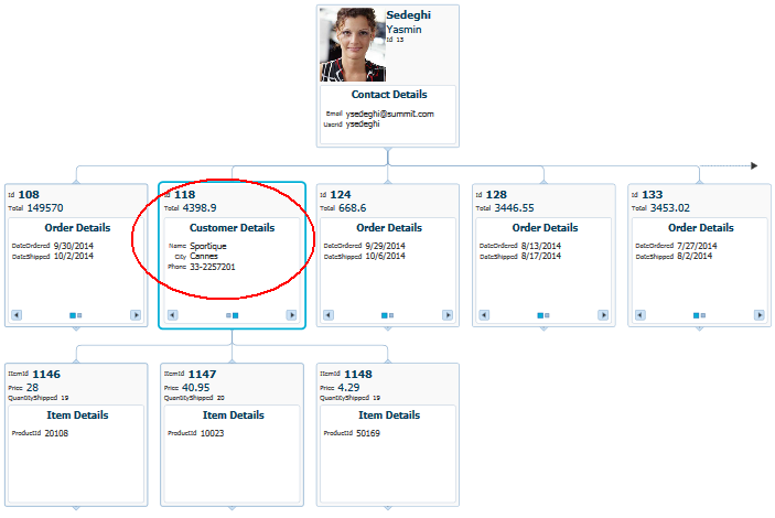
The alternate view object must be a child of the parent collection. You can establish this parent-child relationship by creating a view link between the parent and child collection.
Create an application module that contains instances of the entity and view objects that you want in your application, as described in Section 9.2, "Creating and Modifying an Application Module."
Create the data model for the hierarchy viewer. For example, the hierarchy viewer in Figure 26-115 uses a top level view object based on the SEmp entity shown in Figure 26-106. In this example, the view object retrieves all sales representatives in the employee database by retrieving all employee records with a TITLE_ID of 2. Figure 26-116 shows the SalesRepViewObj view object.
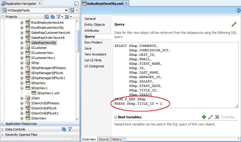
For information about creating a view object, see Section 5.2.1, "How to Create an Entity-Based View Object."
The order view object is based on an order entity object that contains details about an order, including the employee ID of the order's sales representative. Figure 26-117 shows the SOrdView object and SQL query used to retrieve the columns from the SOrd table.
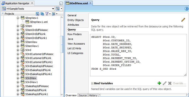
The master-detail relationship between the sales representatives and orders is established with a view link between SalesRepViewObj and OrdersViewObj. Figure 26-118 shows the relationship between the view objects.
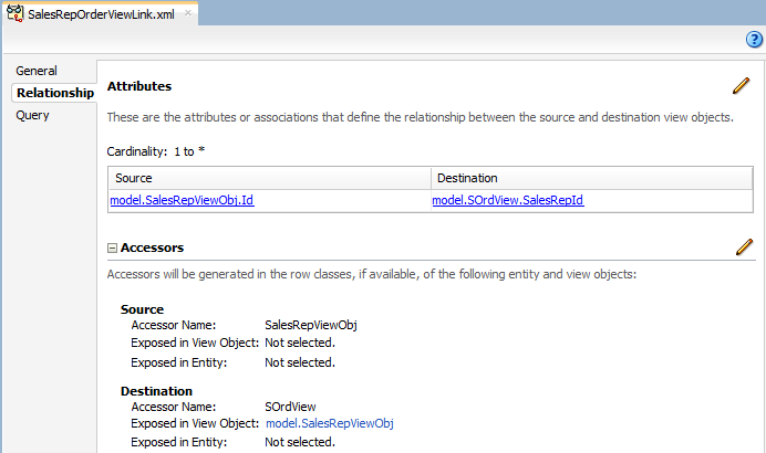
For additional information about establishing the master-detail relationship using view links, see Section 5.6.2, "How to Create a Master-Detail Hierarchy Based on View Objects Alone."
To configure an alternate view object for a databound panel card:
-
If you have not already done so, create the view object that will be the alternate data source for the panel card.
For example, the hierarchy viewer in Figure 26-115 uses a view object based on a
SCustomerentity object. Figure 26-119 shows theSCustomerViewObjectand SQL query used to retrieve the values from theSCustomertable. -
Create a view link between the parent collection and the alternate view object.
Figure 26-120 shows the view link between the sales representatives and customers in the hierarchy viewer example. For help with creating view links, see Section 5.6.2, "How to Create a Master-Detail Hierarchy Based on View Objects Alone."
-
If needed, create a view link to establish the hierarchy between the parent collection and the alternate child collection.
For example, to establish the hierarchy between orders and customers in the hierarchy viewer example, create a view link between the
SOrdViewandSCustomerViewcollections. Figure 26-121 shows the sample view link.
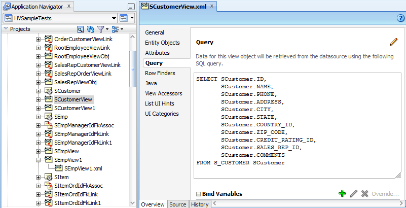
26.11.3.1 What Happens When You Use an Alternate View Object for a Hierarchy Viewer Panel Card
When you configure your hierarchy viewer to use an alternate view object for the panel card data source, JDeveloper adds the bindings for the hierarchy viewer and alternate source in the page definition file of the JSF page.
Example 26-54 shows the sample bindings for the hierarchy viewer displayed in Figure 26-115. The entries for the alternate source are highlighted. Note that the alternate data source is defined as one of the hierarchy viewer's node definitions.
Example 26-54 Bindings For a Hierarchy Viewer Using an Alternate Panel Card Data Source
<bindings>
  <tree IterBinding="SalesRepViewObj1Iterator" id="SalesRepViewObj1">
    <nodeDefinition DefName="model.SalesRepViewObj" Name="SalesRepViewObj10">
      <AttrNames>
        <Item Value="Userid"/>
        <Item Value="Email"/>
        <Item Value="FirstName"/>
        <Item Value="Id"/>
        <Item Value="LastName"/>
      </AttrNames>
      <Accessors>
        <Item Value="SOrdView">
          <Properties>
            <CustomProperties>
              <Property Name="hierarchyType" Value="children"/>
            </CustomProperties>
          </Properties>
        </Item>
      </Accessors>
    </nodeDefinition>
    <nodeDefinition DefName="model.SOrdView" Name="SalesRepViewObj11">
      <AttrNames>
        <Item Value="DateShipped"/>
        <Item Value="DateOrdered"/>
        <Item Value="Id"/>
        <Item Value="Total"/>
      </AttrNames>
      <Accessors>
        <Item Value="SItemView">
          <Properties>
            <CustomProperties>
              <Property Name="hierarchyType" Value="children"/>
            </CustomProperties>
          </Properties>
        </Item>
        <Item Value="SCustomerView"/>
      </Accessors>
    </nodeDefinition>
    <nodeDefinition DefName="model.SCustomerView" Name="SalesRepViewObj12">
      <AttrNames>
        <Item Value="Name"/>
        <Item Value="Phone"/>
        <Item Value="City"/>
      </AttrNames>
    </nodeDefinition>
    <nodeDefinition DefName="model.SItemView" Name="SalesRepViewObj13">
      <AttrNames>
        <Item Value="QuantityShipped"/>
        <Item Value="ItemId"/>
        <Item Value="Price"/>
        <Item Value="ProductId"/>
      </AttrNames>
    </nodeDefinition>
  </tree>
</bindings>
26.11.4 How to Create a Databound Search in a Hierarchy Viewer
The search function in a hierarchy viewer is based on the searchable attributes or columns of the data collection that is the basis of the hierarchy viewer data model. Using a query results collection defined in data controls in Oracle ADF, JDeveloper makes this a declarative task. You drag and drop an ExecuteWithParams operation into an existing hierarchy viewer component on the page.
Figure 26-122 shows the example employee hierarchy viewer configured to search for employees by last name. In this example, the user can enter an employee's last name in the Search panel or specify a pattern match using % or _.
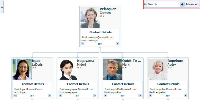
-
Create a databound hierarchy viewer component present on your page.
-
Verify the query that retrieves the root node in the hierarchy viewer.
For example, Figure 26-109 shows retrieving the root node by the
EMPNOcolumn. -
Create a view object that performs the search.
For example, Figure 26-123 shows the
EmployeesSearchResultsview object that performs the search based on theLastNamecolumn in the data collection with a default value of%for matching any value, and a comparison value ofliketo enable pattern matching.For information about creating a view object, see Section 5.2.1, "How to Create an Entity-Based View Object."
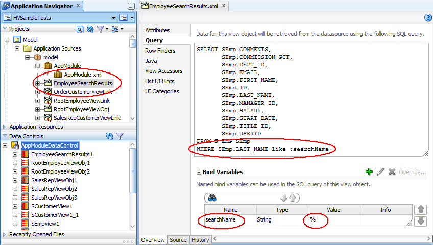
To create a databound search with a hierarchy viewer:
-
From the Data Controls panel, select the collection that corresponds to the query results and expand the Operations node to display the ExecuteWithParams operation.
Figure 26-124 shows the expanded
EmployeeSearchResults1data control that is generated if you create the employee search view object shown in Figure 26-123. -
Drag the ExecuteWithParams operation and drop it onto the hierarchy viewer in the visual editor or onto the component in the Structure window. Alternatively, you can drag the parameter onto the hierarchy viewer.
-
In the Create Hierarchy Viewer Search dialog that displays, use the Add icon to specify the list of results to display in the Search Results panel, and specify the following for each result:
-
Display Label: Select the values for the headers of the nodes in the hierarchy. If you select
<default>, then the text for the header is automatically retrieved from the data binding. -
Value Binding: Select the columns in the data collection to use for nodes in the tree for the hierarchy viewer.
-
Component to Use: Select the type of component to display in the node. The default is the ADF Output Text component.
After selecting an existing field, use the arrow icons (Up, Down, Top, Bottom) to reorder the results or use the Delete icon to delete that result.
-
-
In the Operation dropdown list select the hierarchy root data collection to use when a search result is selected. Valid values include:
-
removeRowWithKey: Uses the row key as aStringconverted from the value specified by the input field to remove the data object in the bound data collection. -
setCurrentRowWithKey: Sets the row key as aStringconverted from the value specified by the input field. The row key is used to set the currency of the data object in the bound data collection. -
setCurrentRowWithKeyValue: Sets the current object on the iterator, given a key's value. -
ExecuteWithParams: Sets the values to the named bind variables passed as parameters.
-
-
In the Parameter Mapping table, use the dropdown list in the Results Attribute column to select the results collection attribute to map to the parameter displayed in the Hierarchy Parameter column.
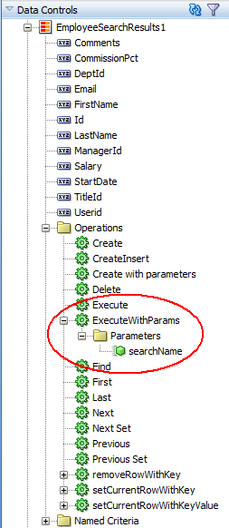
Figure 26-125 shows the Create Hierarchy Viewer Search dialog that appears if you create a hierarchy viewer using data from a data collection named EmployeesSearchResults1.
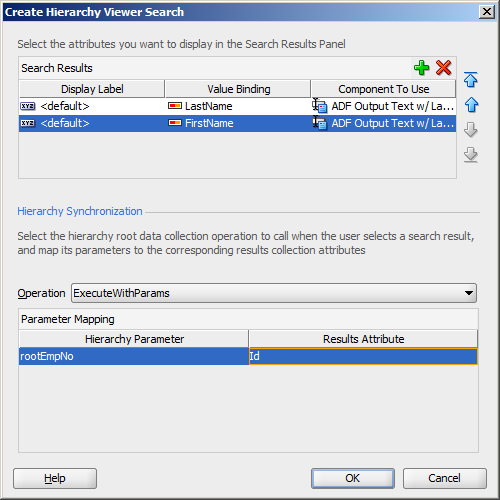
At runtime, the search results are displayed in a table by LastName and FirstName. Figure 26-126 shows the search results panel if a user enters C% in the search box to search for all employees whose last names begin with C.
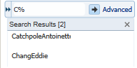
The user can choose one of the search results to display the associated hierarchy viewer node and any children if they exist. Figure 26-127 shows the hierarchy viewer node if the user chooses Catchpole from the search results list.
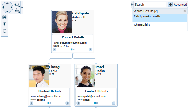
26.12 Creating Databound Treemaps and Sunbursts
Treemaps and sunbursts are ADF Data Visualization components that display quantitative hierarchical data across two dimensions, represented visually by size and color. For example, you can use a treemap or sunburst to display quarterly regional sales and to identify sales trends, using the size of the node to indicate each region's sales volume and the node's color to indicate whether that region's sales increased or decreased over the quarter.
Treemaps and sunbursts use a shape called a node to reference the data in the hierarchy. Treemaps display nodes as a set of nested rectangles. Each branch of the tree is given a rectangle, which is then tiled with smaller rectangles representing sub-branches.
Figure 26-128 shows a treemap displaying products available at a company's warehouses in different regions around the world. In this example, the node size represents the amount in stock for each product, and node color represents inventory status.
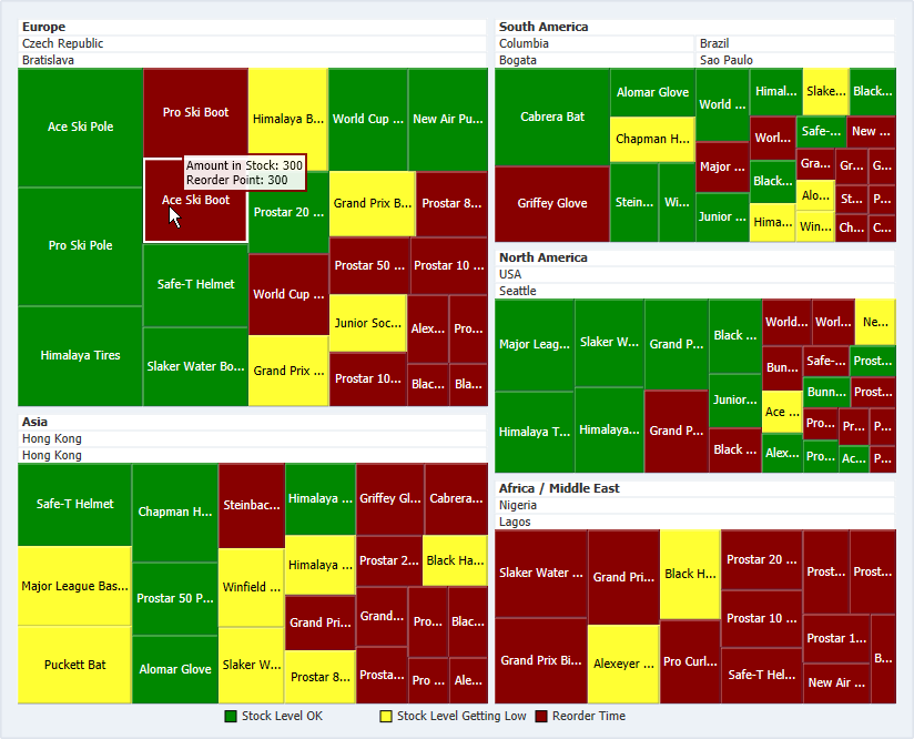
Sunbursts display the nodes in a radial rather than a rectangular layout, with the top of the hierarchy at the center and deeper levels farther away from the center. Figure 26-129 shows the same inventory data displayed in a sunburst.
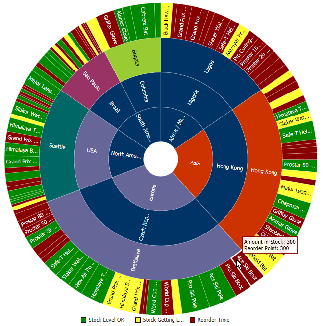
The shape and content of the nodes are configurable, as well as the visual layout of the nodes. For detailed information about treemap and sunburst end user and presentation features, use cases, tag structure, and adding special features, see the "Using Treemap and Sunburst Components" chapter in the Oracle Fusion Middleware Web User Interface Developer's Guide for Oracle Application Development Framework.
26.12.1 How to Create Treemaps and Sunbursts Using ADF Data Controls
Treemaps and sunbursts are based on data collections where a master-detail relationship exists between one or more detail collections and a master data collection. Treemaps and sunbursts also require that the following attributes be set in JDeveloper:
-
value: the size of the node -
fillColor: the color of the node -
label: a text identifier for the node
The values for the value and label attributes must be stored in the treemap's or sunburst's data model or in classes and managed beans if you are using UI-first development. You can specify the fillColor values in the data model, classes, and managed beans, or declaratively in the Property Inspector.
In order to configure a treemap or sunburst successfully, ensure that the data adheres to the following rules:
-
Each child node can have only one parent node.
-
There can be no skipped levels.
Using data controls in Oracle ADF, JDeveloper makes treemap and sunburst creation a declarative task. You drag and drop a data collection from the Data Controls panel that generates one or more nodes onto a JSF page.
You will need to complete these tasks:
-
Create an application module that contains instances of the view objects that you want in your data model, as described in Section 9.2, "Creating and Modifying an Application Module."
If you need help working with master-detail relationships, see Chapter 24, "Displaying Master-Detail Data."
-
Create a JSF page as described in the "Creating a View Page" section of the Oracle Fusion Middleware Web User Interface Developer's Guide for Oracle Application Development Framework.
To create a treemap or sunburst using the Data Controls panel:
-
From the Data Controls panel, select a collection.
Figure 26-130 shows the data collection for the treemap in Figure 26-128 and the sunburst in Figure 26-129. In this example, the application uses a view link between the
SCountriesView2collection and theSWarehouseView2collection to create a hierarchy consisting of theSRegionView1andSWarehouseView2data collections.Table 26-9 shows the value, size, and color attributes used to create the treemap or sunburst.
Table 26-9 Sample Values for Treemap and Sunburst Inventory Example
Collection Size Value Label Value Color Value SRegionView1CountryCountNameDefault
SCountriesView2WarehouseCountCountryDefault
SWarehouseView2ProductCountCityDefault
ProductInventoryView2AmountInStockNameVaries by stock level
-
Drag the collection onto a JSF page and, from the context menu, choose Treemap or Sunburst.
-
In the Create Treemap dialog or Create Sunburst dialog, in the Hierarchy section, select the collections you want to include as nodes in the runtime treemap or sunburst. By default, the root collection is selected.
-
For each collection that you select in the Hierarchy list, enter a value for the following.
-
Value: From the dropdown list, select the attribute in the data collection that represents the size value for the sunburst. You can select one of the attributes provided or select Expression Builder to enter a JSF EL expression. For help with the Expression Builder dialog, press F1 or click Help.
For example, to create a treemap or sunburst using the data collection in Figure 26-130, select CountryCount for the SRegionView1 value to represent the size value for the first node.
-
Label: From the dropdown list, select the attribute in the data collection that represents the label you wish to display for the sunburst node label. You can select one of the attributes provided or select Expression Builder to enter a JSF EL expression.
For example, select Name for the SRegionView1 node label.
-
Optionally, in the View Area section, click New to configure an attribute group for the node. Use attribute groups if you want the node's display to vary based on color or pattern. You can also specify the node's fill color or pattern in the node's
fillColorandfillPatternproperties after you create the treemap or sunburst.If you do not configure an attribute group to vary by color or specify a
fillColorattribute on the node, the node will display in black. By default, no pattern will be displayed on the node.In the treemap and sunburst product inventory example, attribute groups are configured for each level in the hierarchy.
To configure an attribute group, enter values for the following:
-
Group by value: From the dropdown list, select the attribute in the data collection to group by in the attribute group. You can select one of the attributes provided or select Expression Builder to enter a JSF EL expression.
In the treemap and sunburst example, the size value is used as the Group by value. For the
SRegionView1collection, select CountryCount as the Group by value. -
Area: From the dropdown list, select Color if you want the attribute group to vary by color or select Pattern if you want the attribute group to vary by pattern. To vary the attribute group by both color and pattern, select Select Multiple Attributes and select both Color and Pattern. Click OK.
In the treemap and sunburst product inventory example, color is used for each level of the hierarchy.
-
Legend Label: From the dropdown list, select the attribute in the data collection to display in the treemap's legend. You can select one of the attributes provided or select Expression Builder to enter a JSF EL expression.
In the treemap and sunburst product inventory example, this value is left blank.
Figure 26-131 shows the Create Treemap dialog completed for the first node in the product inventory example. The entries for the Create Sunburst dialog are identical.
-
-
Optionally, click Value-Specific Rules to expand the attribute group dialog to specify a match or exception rule. Use match rules to specify colors or patterns for simple true or false conditions or when you want to match a specific value. Use exception rules when you want to specify a color or pattern when the node's grouped-by value meets a specific condition.
To specify a match rule, in the Match Rules section, click New and enter values for the following:
-
Group Value: Enter the category value for the match. This can be a string that represents a category or you can set this to
trueorfalse. If you set this to true or false, the Group by value field must contain an EL expression that evaluates to true or false as in the following example:#{row.AmountInStock gt row.ReorderPoint}. -
Property: From the dropdown list, select Color if you want the node to vary by color or select Pattern if you want the attribute node to vary by pattern.
-
Property Value: From the dropdown list, select the color or pattern to display when the node's value matches the Group Value. For color, you can select one of the provided values or select Custom Color to enter a custom color in the Select Custom Color dialog. For pattern, you must select one of the provided values.
Figure 26-132 shows the Create Treemap dialog for a data collection using match rules for the bottom level of the hierarchy. The Create Sunburst dialog entries are identical.
In this example, the treemap nodes will display in green (RGB hexadecimal
#008000) when the inventory levels are acceptable and in red (RBG hexadecimal#ff0000) when the inventory level is at or below the product's reorder level. The attribute group's Label field contains the details for the legend display. In this case, the field contains an expression that determines the legend label based on an item's amount in stock:#{(row.AmountInStock gt row.ReorderPoint) ? 'Stock Level OK' : 'Reorder Time'}.Figure 26-133 shows the runtime treemap.
To specify an exception rule, in the Exception Rules section, click New and enter values for the following:
-
Condition: Enter a JSF EL expression that evaluates to true or false. You can enter the expression directly in the Condition field or select Expression Builder to enter the JSF EL expression.
In the treemap and sunburst product inventory example, three exception rules are defined for the bottom level of the hierarchy. When the product's inventory level is well above the reorder level, the treemap node in Figure 26-128 and the sunburst node in Figure 26-129 display in green. The treemap and sunburst node display in yellow when the inventory level is close to the reorder point and display in red when the inventory level is at or very near the reorder point.
Figure 26-134 shows the Create Sunburst dialog for the sample data collection in Figure 26-130 using exception rules for the bottom level of the hierarchy. The Create Treemap dialog entries are identical.
-
Property: From the dropdown list, select Color if you want the node to vary by color. Select Pattern if you want the node to vary by pattern.
-
Property Value: From the dropdown list, select the color or pattern to display when the node's value meets the condition you specified in the Condition field. For color, you can select one of the provided values or select Custom Color to enter a custom color in the Select Custom Color dialog. For pattern, you must select one of the provided values.
-
Legend Label: From the dropdown list, select Select Text Resource to select a text resource to be used for the legend label. You can also enter text in this field or select Expression Builder to enter a JSF EL expression.
-
-
-
Click OK.
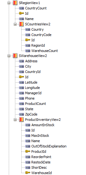
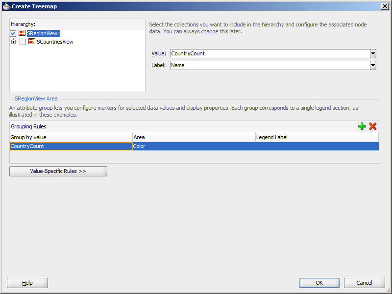
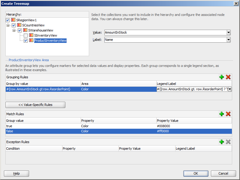
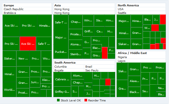
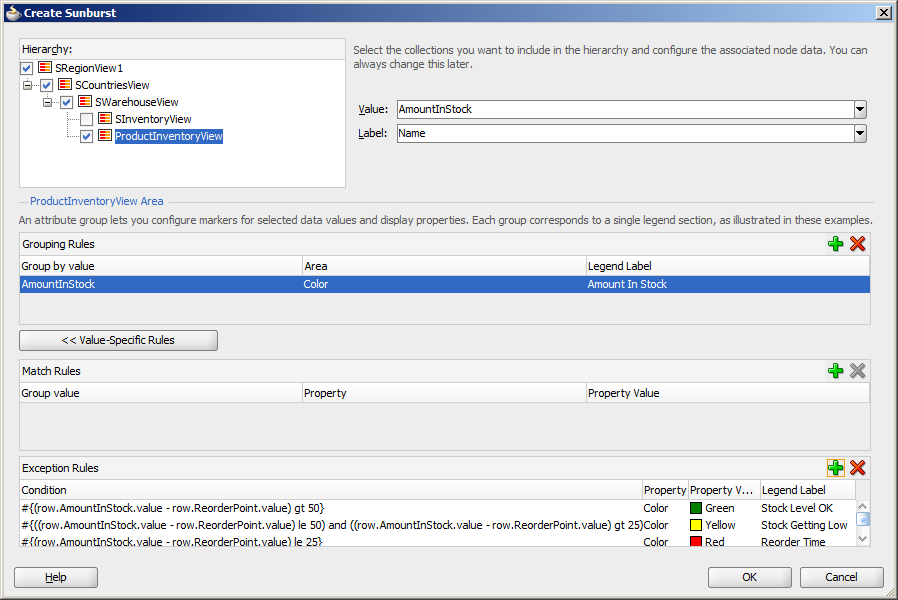
26.12.2 What Happens When You Create a Databound Treemap or Sunburst
Creating a treemap or sunburst from Data Controls panel has the following effect:
-
Creates the bindings for the sunburst or treemap in the page definition file of the JSF page
-
Adds the necessary tags to the JSF page for the
treemaporsunburstcomponent
Example 26-55 displays bindings that JDeveloper generated for a treemap or sunburst component using the data collection in Figure 26-130. Since both components use the same data model, the bindings in the page definition file are identical.
Example 26-55 Sample Bindings for a Treemap or Sunburst
<executables>
  <variableIterator id="variables"/>
  <iterator Binds="SRegionView1" RangeSize="-1" DataControl="AppModuleDataControl"
            id="SRegionView1Iterator"/>
</executables>
<bindings>
  <tree IterBinding="SRegionView1Iterator" id="SRegionView1">
    <nodeDefinition DefName="model.SRegionView" Name="SRegionView10">
      <AttrNames>
        <Item Value="Id"/>
        <Item Value="Name"/>
        <Item Value="CountryCount"/>
      </AttrNames>
      <Accessors>
          <Item Value="SCountriesView"/>
      </Accessors>
    </nodeDefinition>
    <nodeDefinition DefName="model.SCountriesView" Name="SRegionView11">
      <AttrNames>
        <Item Value="Id"/>
        <Item Value="Country"/>
        <Item Value="RegionId"/>
         Item Value="WarehouseCount"/>
      </AttrNames>
      <Accessors>
        <Item Value="SWarehouseView"/>
      </Accessors>
    </nodeDefinition>
    <nodeDefinition DefName="model.SWarehouseView" Name="SRegionView12">
      <AttrNames>
        <Item Value="Id"/>
        <Item Value="Address"/>
        <Item Value="City"/>
        <Item Value="State"/>
        <Item Value="CountryId"/>
        <Item Value="ZipCode"/>
        <Item Value="Phone"/>
        <Item Value="ManagerId"/>
        <Item Value="ProductCount"/>
      </AttrNames>
      <Accessors>
        <Item Value="ProductInventoryView"/>
      </Accessors>
    </nodeDefinition>
    <nodeDefinition DefName="model.ProductInventoryView" Name="SRegionView13">
      <AttrNames>
        <Item Value="ProductId"/>
        <Item Value="WarehouseId"/>
        <Item Value="AmountInStock"/>
        <Item Value="ReorderPoint"/>
        <Item Value="MaxInStock"/>
        <Item Value="OutOfStockExplanation"/>
        <Item Value="RestockDate"/>
        <Item Value="Id"/>
        <Item Value="Name"/>
        <Item Value="ShortDesc"/>
      </AttrNames>
    </nodeDefinition>
  </tree>
</bindings>
The rules for populating the nodes of the treemap or sunburst are defined in node definitions. The example shows that four node definitions were generated, one for each level of the hierarchy. Each of these node definitions references a view object and associated attributes. Each node definition also references an accessor for the next level of the hierarchy if the next level exists.
Once you create your treemap or sunburst, you can modify the value, label, and attribute group for each node using the Create Treemap or Create Sunburst dialog. To open the dialog, use the Edit icon in the Property Inspector for the treemap or sunburst component. You can also customize the values directly in the code or by setting values in the Property Inspector.
26.12.3 What Happens at Runtime: How Databound Sunbursts or Treemaps Are Initially Displayed
By default, a sunburst or treemap displays only the first two levels of the hierarchy and will not display a legend until you configure the legendSource attribute on the sunburst or treemap. Figure 26-135 shows the sunburst that is displayed at runtime if you create the sunburst using the data collection in Figure 26-130.
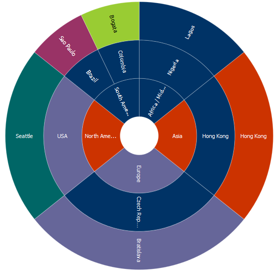
After completing the Create Treemap or Create Sunburst dialog, you can use the Property Inspector to configure the treemap or sunburst level display and legendSource attribute. You can also specify settings for other treemap or sunburst attributes and use the child tags associated with the sunburst and treemap tags to customize the components further.
Example 26-56 shows the code on the JSF page code for the treemap in Figure 26-128. In this example, the databound treemap is configured to display all levels in the hierarchy, a legend, and a tooltip when the user hovers the mouse over a node.
Example 26-56 Sample Code on a JSF Page for a Treemap
<dvt:treemap id="t1" value="#{bindings.SRegionView1.treeModel}"
var="row" displayLevelsChildren="3"
legendSource="ag1" summary="Sample Treemap">
<af:switcher facetName="#{row.hierTypeBinding.name}" id="s1">
<f:facet name="SRegionView11">
<dvt:treemapNode value="#{row.WarehouseCount}" label="#{row.Country}"
id="tn1">
<dvt:attributeGroups id="ag2" value="#{row.WarehouseCount}" type="color"/>
</dvt:treemapNode>
</f:facet>
<f:facet name="SRegionView10">
<dvt:treemapNode value="#{row.CountryCount}" label="#{row.Name}" id="tn2">
<dvt:attributeGroups id="ag3" value="#{row.CountryCount}" type="color"/>
</dvt:treemapNode>
</f:facet>
<f:facet name="SRegionView13">
<dvt:treemapNode value="#{row.AmountInStock}" label="#{row.Name}" id="tn3"
shortDesc="Amount in Stock: #{row.AmountInStock}<br/>Reorder Point: #{row.ReorderPoint}">
<dvt:attributeGroups value="#{row.AmountInStock}" type="color" id="ag1">
<dvt:attributeExceptionRule id="aer1"
condition="#{(row.AmountInStock.value - row.ReorderPoint.value) gt 50}"
label="Stock OK">
<f:attribute name="color" value="#008800"/>
</dvt:attributeExceptionRule>
<dvt:attributeExceptionRule id="aer2"
condition="#{((row.AmountInStock.value - row.ReorderPoint.value) le 50) and ((row.AmountInStock.value - row.ReorderPoint.value) gt 25)}"
label="Stock Level Getting Low">
<f:attribute name="color" value="#FFFF33"/>
</dvt:attributeExceptionRule>
<dvt:attributeExceptionRule id="aer3"
condition="#{(row.AmountInStock.value - row.ReorderPoint.value) le 25}"
label="Reorder Time">
<f:attribute name="color" value="#880000"/>
</dvt:attributeExceptionRule>
</dvt:attributeGroups>
</dvt:treemapNode>
</f:facet>
<f:facet name="SRegionView12">
<dvt:treemapNode value="#{row.ProductCount}" label="#{row.City}" id="tn4">
<dvt:attributeGroups id="ag4" value="#{row.ProductCount}" type="color"/>
</dvt:treemapNode>
</f:facet>
</af:switcher>
</dvt:treemap>
Example 26-57 shows the code on the JSF page code for the sunburst in Figure 26-129. In this example, the databound sunburst is also configured to display all levels in the hierarchy, a legend, and a tooltip when the user hovers the mouse over a node. Note the similarities between the sunburst code in this example and the treemap code in the previous example.
Example 26-57 Sample Code on a JSF Page for a Sunburst
<dvt:sunburst id="t1" value="#{bindings.SRegionView1.treeModel}" var="row"
displayLevelsChildren="3"
summary="Sample Sunburst" legendSource="ag3">
<af:switcher facetName="#{row.hierTypeBinding.name}" id="s1">
<f:facet name="SRegionView10">
<dvt:sunburstNode value="#{row.CountryCount}" label="#{row.Name}" id="sn1" >
<dvt:attributeGroups value="#{row.CountryCount}" type="color"
label="Country Count" id="ag1"/>
</dvt:sunburstNode>
</f:facet>
<f:facet name="SRegionView11">
<dvt:sunburstNode value="#{row.WarehouseCount}" label="#{row.Country}"
id="sn4">
<dvt:attributeGroups value="#{row.WarehouseCount}" type="color" id="ag4"/>
</dvt:sunburstNode>
</f:facet>
<f:facet name="SRegionView12">
<dvt:sunburstNode value="#{row.ProductCount}" label="#{row.City}" id="sn3">
<dvt:attributeGroups value="#{row.ProductCount}" type="color" id="ag2"/>
</dvt:sunburstNode>
</f:facet>
<f:facet name="SRegionView13">
<dvt:sunburstNode value="#{row.AmountInStock}" label="#{row.Name}" id="sn2"
shortDesc="Amount in Stock: #{row.AmountInStock}<br/>Reorder Point: #{row.ReorderPoint}">
<dvt:attributeGroups value="#{row.AmountInStock}" type="color"
label="Amount in Stock" id="ag3">
<dvt:attributeExceptionRule id="aer1" condition="#{(row.AmountInStock.value - row.ReorderPoint.value) gt 50}"
label="Stock Level OK">
<f:attribute name="color" value="#008800"/>
</dvt:attributeExceptionRule>
<dvt:attributeExceptionRule id="aer2"
condition="#{((row.AmountInStock.value - row.ReorderPoint.value) le 50) and ((row.AmountInStock.value - row.ReorderPoint.value) gt 25)}"
label="Stock Getting Low">
<f:attribute name="color" value="#FFFF33"/>
</dvt:attributeExceptionRule>
<dvt:attributeExceptionRule id="aer3" condition="#{(row.AmountInStock.value - row.ReorderPoint.value) le 25}"
label="Reorder Time">
<f:attribute name="color" value="#880000"/>
</dvt:attributeExceptionRule>
</dvt:attributeGroups>
</dvt:sunburstNode>
</f:facet>
</af:switcher>
</dvt:sunburst>
For information about configuring the sunburst or treemap level display, legendSource attribute, tooltips, additional attributes, or child tags, see the "Using Treemap and Sunburst Components" chapter in the Oracle Fusion Middleware Web User Interface Developer's Guide for Oracle Application Development Framework.
26.13 Creating Databound Diagrams
Databound diagrams require a collection of node objects to represent the data and, optionally, a collection of link objects to represent the relationships between the nodes. You can use objects that implement a List interface, such as a java.util.ArrayList object, or a collection model, such as a org.apache.myfaces.trinidad.model.CollectionModel.
Databound diagrams also require a client layout configuration defined in a JavaScript method that you add to the application as a feature. Client layouts specify how to lay out the nodes and links on a page. The diagram component includes a default layout that you can use and modify as needed. The default forceDirectedLayout positions the diagram nodes so that all the links are of more or less equal length, and there are as few crossing links as possible.
Note:
You can also provide your own client layout configuration in a JavaScript object that you add as an application feature. For additional information, see "Using the Diagram Layout Framework" in Oracle Fusion Middleware Web User Interface Developer's Guide for Oracle Application Development Framework.The Create Diagram wizard provides declarative support for creating the diagram and binding it to data. In the five wizard pages you can:
-
Configure the diagram's client layout.
You can choose the default client
forceDirectedLayoutfeature, specify your own layout, or choose no layout. -
Specify the node and link data, including:
-
The collections to use for the node and link data
-
The attribute that specifies the node's unique identifier (id)
-
Optionally, the attribute in the node collection that contains the container id to identify child nodes that are contained by the parent node
-
The attributes in the link collection that specify the starting and ending node ids for a link
-
-
Optionally, configure the display characteristics of the node's label and marker.
Diagram nodes use the
dvt:markercomponent to configure many of the node's display characteristics, including color, pattern, shape, border style, and color. -
Optionally, configure attribute groups to group nodes by color, shape, pattern, opacity, scale X, or scale Y according to a specified attribute.
-
Optionally, configure the display characteristics of the link's label, style, color, width, beginning connector, and end connector.
Figure 26-136 shows a diagram configured to use the default client layout. In this example, the diagram is configured to use attribute groups to group the nodes by the values in the node's NodeGroup and NodeType attributes.
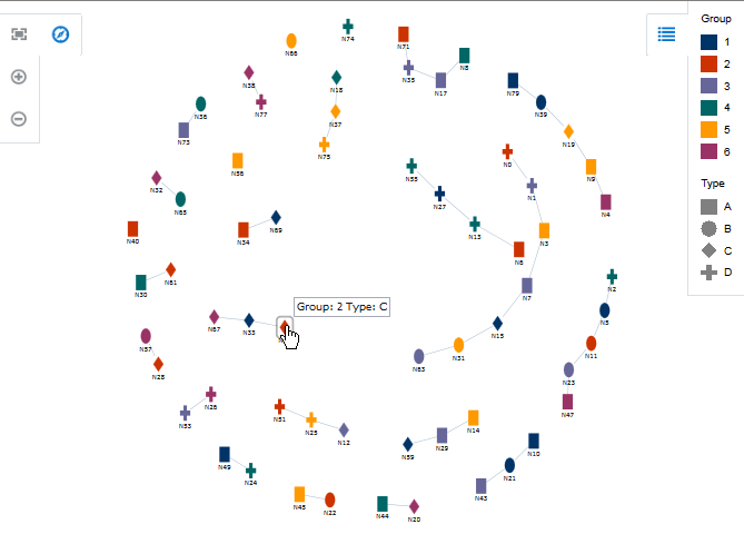
After you complete the Create Diagram wizard and the diagram is added to your page, you can further customize the diagram using the Property Inspector. For additional information, see "Using Diagram Components" in Oracle Fusion Middleware Web User Interface Developer's Guide for Oracle Application Development Framework.
Note:
The ADF Data Visualization Tools (DVT) component collection includes other components that you can also use to model organization charts, time lines, etc.For example, you can also use the DVT hierarchy viewer component to display an organization chart bound to employee data. Hierarchy viewers also use nodes and links to display data, but the component automatically creates the links based on the values in the node's data collection, and you do not need to supply a separate data collection for the links.
For additional information about other DVT components and typical use cases, see "Introduction to Data Visualization Components" in Oracle Fusion Middleware Web User Interface Developer's Guide for Oracle Application Development Framework
26.13.1 How to Create a Diagram Using ADF Data Controls
To create a DVT diagram using data controls, bind the dvt:diagram component to a collection that contains the node data and a collection that contains the links that represent the relationships between the nodes. JDeveloper allows you to do this declaratively by dragging and dropping a collection from the Data Controls panel.
Tip:
You can also create the diagram by dragging the diagram from the Component Gallery.You will need to complete these tasks:
-
Create an application module that contains instances of the view objects that you want in your data model for the diagram, as described in Section 9.2, "Creating and Modifying an Application Module."
Figure 26-137 shows the data control for the diagram displayed in Figure 26-136. In this example,
NodesView1contains the data collection for the diagram nodes, andLinksView1contains the data collection for the diagram links.The
StartnodeandEndnodeattributes in theLinksView1data collection contain references to theNodeidattribute in theNodesView1data collection. Figure 26-138 shows a portion of the link collection's data in the Object Viewer. -
Create a JSF page as described in the "How to Create JSF Pages" section of Oracle Fusion Middleware Web User Interface Developer's Guide for Oracle Application Development Framework.
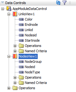
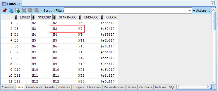
To create a databound diagram:
-
From the Data Controls panel, select the data collection that represents the nodes to use for your diagram.
For example, to use the data collection shown in this section, select
NodesView1. -
Drag the collection onto a JSF page and, from the menu, choose Diagram.
-
In the Create Diagram - Configure Client Layout dialog, select your client layout.
You can choose the default client layout, provide your own layout, or choose no layout. To choose the default layout, click Default Client Layout as shown in Figure 26-139.
To specify a different layout, click Choose Client Layout and select the feature and method that you want to use from the Features and Methods dropdown menus. After you choose the layout, the layout's optional attributes appear in the dialog, and you can enter values for the attributes as desired.
Figure 26-140 shows the completed Create Diagram - Configure client layout dialog for a custom circle layout. In this example, the selected feature name is
DemoCircleLayout, and the selected method iscircleLayout. Optional layout attributes includeanchor,center,curvedLinks,radialLabels,radius, andsortAttr.If you want to look at the code source for the method you selected, click Search to display a popup containing the source code. Figure 26-141 shows the popup that displays the
DemoCircleLayout.circleLayoutmethod. -
In the Create Diagram - Specify Node and Link Data dialog, enter values for the following to identify the data sources and link connections:
-
Collection: Verify that the correct data collection is displayed for the node collection.
To change the data collection, click Add Data Source and choose another data collection from the list.
-
Node Id: Enter a value or use the dropdown menu to select the attribute in the node's data collection that represents the unique identifier of the node in the diagram.
Alternatively, you can enter an EL expression that returns the value or select Expression Builder from the dropdown menu to launch the Expression Builder dialog. For help with the Expression Builder dialog, press F1 or click Help.
-
Container Id: Enter or use the dropdown list to select the attribute in the node's data collection that represents the parent node for child nodes in the diagram.
Alternatively, you can enter an EL expression that returns the value or select Expression Builder from the dropdown menu to launch the Expression Builder dialog.
-
Collection (Link): Enter the data collection that represents the links, or click Add Data Source to choose the data collection from the list.
-
Start Node Id: Enter or use the dropdown list to select the attribute in the link's data collection that represents the source node in diagram.
Alternatively, you can enter an EL expression that returns the value or select Expression Builder from the dropdown menu to launch the Expression Builder dialog.
-
End Node Id: Enter or use the dropdown list to select the attribute in the link's data collection that represents the target node in diagram.
Alternatively, you can enter an EL expression that returns the value or select Expression Builder from the dropdown menu to launch the Expression Builder dialog.
Figure 26-142 shows the completed dialog for a diagram using the
NodesView1andLinksView1data collections. In this example, the Node Id value isNodeid, and the link's Start Node Id and End Node Id values are set to theStartnodeandEndnodeattributes in theLinksView1data collection. In this example, the parent container has no children, and the Container ID field is not used. -
-
In the Create Diagram - Configure Diagram Nodes dialog, optionally enter values for the following to configure the display characteristics of the node's label and marker:
-
Node Label: From the dropdown list, select the attribute in the data collection to use for the node's label. You can select one of the attributes provided or select Expression Builder to enter a JSF EL expression.
Optionally, you can enter values for the label's width, height, and opacity. For help with the dialog, press F1 or click Help.
Tip:
If you're not sure yet which values make sense for your diagram, you can create the diagram and modify the values after creation. -
Color: From the dropdown list, select a node color from the provided colors or select Custom Color to enter the Color Picker dialog. The default node color is
black. -
Pattern: From the dropdown list, select a node pattern. Valid values for pattern include a choice of twelve prebuilt patterns, such as small and large checkers, diamonds, and triangles. If you specified a node color, the pattern will display in the color you chose. The default node pattern is
none. -
Shape: From the dropdown list, select a shape to use for the node. Valid values include:
circle,human,diamond,square,triangleDown,triangleUp, andplus. The default node shape iscircle.Note:
When you specify the node's shape, color, or pattern explicitly, the same value will be used for each node in the diagram. If you want to vary the color, pattern, or shape according to some measure, configure an attribute group in the next page of the Create Diagram wizard instead. -
Source: To use a custom node shape, enter the relative path to the SVG file to use for the node image, or use the Search icon to open the Select SVG File dialog to navigate to the image source.
-
Border Style: From the dropdown list, select a border style for all nodes in the diagram. Valid values include
solid,dash, anddot. The default style is a solid line. -
Border Color: From the dropdown list, select a border color for all nodes in the diagram or select Custom Color to enter the Color Picker dialog. The default border color is
black.Figure 26-143 shows a completed Create Diagram - Configure Diagram Nodes dialog. In this example, the node label is configured with a relative width of 20 and relative height of 30. The node's shape is a triangle pointing up with an aqua-colored small crosshatch pattern.
Figure 26-144 shows the runtime view of three diagram nodes after creation.
-
-
(Optional) In the Create Diagram - Configure Attribute Groups, to configure one or more attribute groups for the diagram nodes, click New in the Grouping Rules section and enter values for the following:
-
Group by value: From the dropdown list, select the attribute in the data collection to group by in the attribute group. You can select one of the attributes provided or select Expression Builder to enter a JSF EL expression.
-
Property: From the dropdown list, select the property that you want to group by for display. Available options include
Color,Opacity,Pattern,Scale X,Scale Y, andShape.To vary the attribute group by more than one property, select Select Multiple Attributes. In the Select Multiple Attributes, select the desired properties, and click OK.
-
Legend Label: From the dropdown list, select the attribute in the data collection to display in the diagram legend. You can select one of the attributes provided or select Expression Builder to enter a JSF EL expression.
-
Section Label: To use a text resource for the label, select Select Text Resource to associate a text resource for the label. If you wish to access data stored in objects, or reference and invoke methods using an EL Expression, select Expression Builder to launch the Expression Builder dialog.
Note:
The section label describes the legend content of a sub-section of the legend and is rendered in the legend area. In Figure 26-136, for example, Group and Type are section labels. -
Optionally, click Value-Specific Rules to expand the attribute group dialog to specify a match or exception rule. Use match rules to specify colors or patterns for simple true or false conditions or when you want to match a specific value. Use exception rules when you want to specify a color or pattern when the grouped-by value meets a specific condition.
To specify a match rule, in the Match Rules section, click New and enter values for the following:
-
Group Value: Enter the category value for the match. This can be a string that represents a category or you can set this to
trueorfalse. If you set this to true or false, the Group by value field must contain an EL expression that evaluates to true or false as in the following example:#{row.AmountInStock gt row.ReorderPoint}. -
Property: From the dropdown list, select the property that you want to group by for display. Available options include
Color,Opacity,Pattern,Scale X,Scale Y, andShape. -
Property Value: From the dropdown list, select the color or pattern to display when the node's value matches the Group Value. For color, you can select one of the provided values or select Custom Color to enter a custom color in the Select Custom Color dialog. For pattern, you must select one of the provided values.
To specify an exception rule, in the Exception Rules section, click New and enter values for the following:
-
Condition: Enter a JSF EL expression that evaluates to true or false. You can enter the expression directly in the Condition field or select Expression Builder to enter the JSF EL expression.
-
Property: From the dropdown list, select the property that you want to group by for display. Available options include
Color,Opacity,Pattern,Scale X,Scale Y, andShape. -
Property Value: From the dropdown list, select the color or pattern to display when the node's value meets the condition you specified in the Condition field. For color, you can select one of the provided values or select Custom Color to enter a custom color in the Select Custom Color dialog. For pattern, you must select one of the provided values.
-
Legend Label: From the dropdown list, select Select Text Resource to select a text resource to be used for the legend label. You can also enter text in this field or select Expression Builder to enter a JSF EL expression.
-
Figure 26-145 shows the completed Create Diagram - Configure Attribute Groups dialog for the diagram in Figure 26-136. In this example, the diagram is configured for two attributes groups. The first attribute group varies the node's color depending upon the value in the
NodeGroupattribute, and the second attribute group varies the node's shape depending upon the value in theNodeTypeattribute. The legend will display section labels for both groups. -
-
In the Create Diagram - Configure Diagram Links dialog, enter values for the following to configure the display characteristics of the link label, style, and connector:
-
Link Style: From the dropdown list, select a border style for all nodes in the diagram. Valid values include
solid,dash,dot, anddashDot. The default style is a solid line. -
Link Width: Enter the width of the link in pixels. The default value is
1. -
Link Color: From the dropdown list, select a link color from the provided colors or select Custom Color to enter the Color Picker dialog. The default link color is
black. -
Connector Start: Enter a value for the link's start connector. Valid values include
none,arrowOpen,arrow,arrowConcave,circle,rectangle, andrectangleRounded. The default value isnone. -
Connector End: Enter a value for the link's end connector. Valid values include
none,arrowOpen,arrow,arrowConcave,circle,rectangle, andrectangleRounded. The default value isnone. -
Label: From the dropdown list, select the attribute in the data collection to use for the links's label. You can select one of the attributes provided or select Expression Builder to enter a JSF EL expression.
Figure 26-146 shows a completed Create Diagram - Configure Diagram Links dialog. In this example, the link is configured with a label and the default width and style. The link's color is maroon and will display a circle at the connector's start and an arrow at the connector's end.
Figure 26-147 shows the runtime view of three diagram nodes after creation.
-
-
When you have completed the Create Diagram wizard, click Finish to exit the wizard and add the diagram to the page.
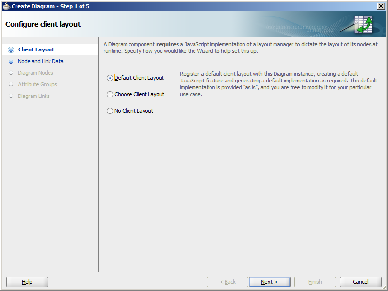
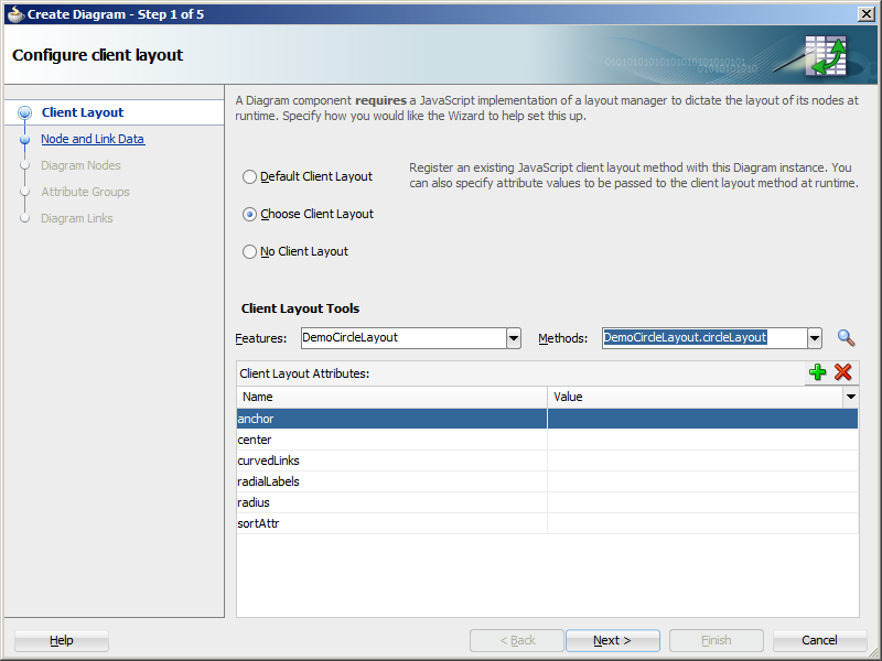
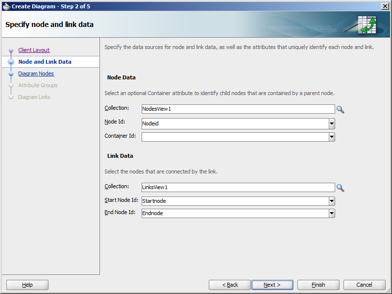
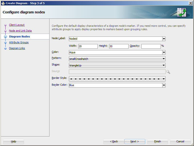
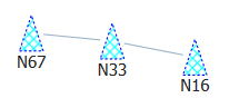
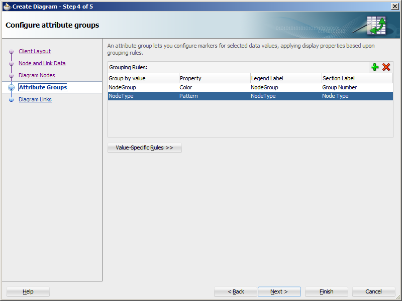
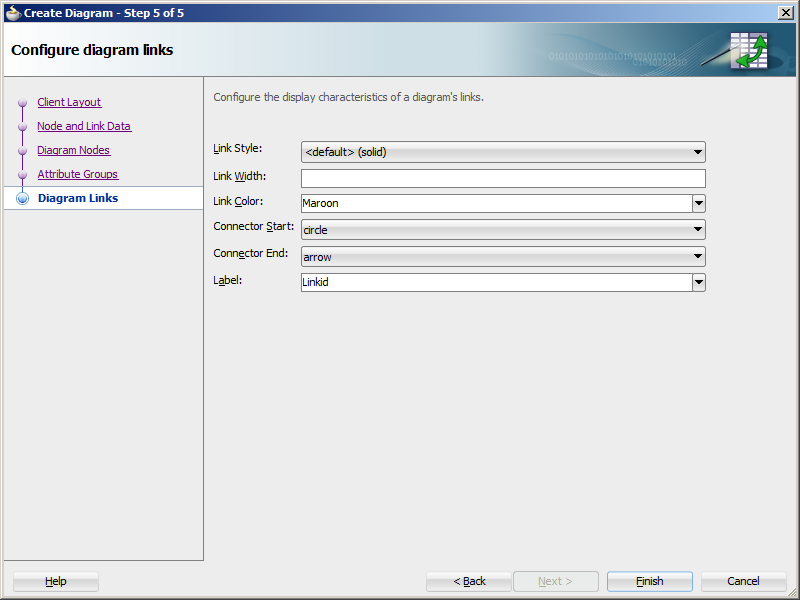
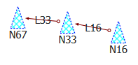
26.13.2 What Happens When You Create a Databound Diagram
Creating a diagram from the Data Controls panel has the following effect:
-
Creates the bindings for the diagram in the page definition file (pageName
PageDef.xml) of the JSF page -
Adds the necessary tags to the JSF page for the
dvt:diagramcomponent -
If you chose the default client layout during creation, registers the layout with the ADF Faces runtime environment
26.13.2.1 Bindings for Diagram Components
The following code sample shows the bindings that JDeveloper generated for a dvt:diagram component using the data collection shown in Figure 26-137.
<executables>
  <variableIterator id="variables"/>
    <iterator Binds="NodesView1" RangeSize="-1" DataControl="AppModuleDataControl" id="NodesView1Iterator"/>
    <iterator Binds="LinksView1" RangeSize="-1" DataControl="AppModuleDataControl" id="LinksView1Iterator"/>
</executables>
<bindings>
  <tree IterBinding="NodesView1Iterator" id="NodesView1">
    <nodeDefinition DefName="model.NodesView" Name="NodesView10">
      <AttrNames>
        <Item Value="NodeGroup"/>
        <Item Value="NodeType"/>
        <Item Value="Nodeid"/>
      </AttrNames>
    </nodeDefinition>
  </tree>
  <tree IterBinding="LinksView1Iterator" id="LinksView1">
    <nodeDefinition DefName="model.LinksView" Name="LinksView10">
      <AttrNames>
        <Item Value="Endnode"/>
        <Item Value="Startnode"/>
      </AttrNames>
    </nodeDefinition>
  </tree>
</bindings>
The rules for populating the diagram are defined in a node definition. Each node definition references the node and links view objects and the attributes specified in the Create Diagram dialog. For additional information about the pageNamePageDef.xml file, see Appendix A, "pageNamePageDef.xml."
26.13.2.2 Code on the JSF Page for a Diagram Component
The following example shows the code that is generated on the JSF page for the diagram shown in Figure 26-136.
<dvt:diagram id="dg1" layout="DiagramSampleDiagramLayout">
  <dvt:diagramNodes var="node" id="dnodes1"
                    value="#{bindings.NodesView1.collectionModel}">
    <dvt:diagramNode label="#{node.Nodeid}" id="dn1" nodeId="#{node.Nodeid}">
      <f:facet name="zoom100">
        <dvt:marker width="20" id="m1" height="30">
          <dvt:attributeGroups id="ag1" label="#{node.NodeGroup}" type="color"
                               value="#{node.NodeGroup}"/>
          <dvt:attributeGroups id="ag2" label="#{node.NodeType}" type="shape"
                               value="#{node.NodeType}"/>
        </dvt:marker>
      </f:facet>
    </dvt:diagramNode>
  </dvt:diagramNodes>
  <dvt:diagramLinks var="link" value="#{bindings.LinksView1.collectionModel}"
                    id="dl1">
    <dvt:diagramLink startNode="#{link.Startnode}" id="dl2"
                     endNode="#{link.Endnode}"/>
  </dvt:diagramLinks>
  <dvt:clientLayout method="DiagramSampleDiagramLayout.forceDirectedLayout"
                    featureName="DiagramSampleDiagramLayout"
                    name="DiagramSampleDiagramLayout">
    <f:attribute name="optimalLinkLength" value="75"/>
  </dvt:clientLayout>
  <dvt:legend id="l1">
    <dvt:legendSection label="#{viewcontrollerBundle.GROUP}" source="dnodes1:ag1"
                       id="ls1"/>
    <dvt:legendSection label="#{viewcontrollerBundle.TYPE}" source="dnodes1:ag2"
                       id="ls2"/>
  </dvt:legend>
</dvt:diagram>
26.13.2.3 Default Client Layout Files and Location
When you create a diagram using the default client layout, JDeveloper registers the force directed layout with the ADF runtime environment as a JavaScript (JS) feature. The creation process automatically adds a JS file in the ViewController/src/js/layout directory with the following naming convention:
ApplicationNameDiagramLayout.js
For example, if your application is named DiagramSample, the JS file is named DiagramSampleDiagramLayout.js. The content of the file contains the forceDirectedLayout method, and you can open the file in JDeveloper. You can also click Edit Component Definition in the Property Inspector to display the Edit Diagram - Configure Client Layout dialog and then click Search to display the method popup.
JDeveloper also creates the adf-js-features.xml file if it doesn't already exist and adds the ApplicationNameDiagramLayout as the feature-name and the path to the JS file as the feature-class. The following example shows the adf-js-features.xml file for an application named DiagramSample.
<?xml version="1.0" encoding="UTF-8" ?>
<features xmlns="http://xmlns.oracle.com/adf/faces/feature">
  <feature>
    <feature-name>DiagramSampleDiagramLayout</feature-name>
    <feature-class>js/layout/DiagramSampleDiagramLayout.js</feature-class>
  </feature>
</features>
26.13.2.4 Modifying Diagram Properties and Layout
After you create your diagram, you can specify a different client layout or add additional elements, such as a label, using the Edit Diagram dialog. To open the dialog, use the Edit icon in the Property Inspector for the dvt:diagram component. You can also customize the diagram properties directly in the visual editor or by setting values in the Property Inspector.
For example, to add the tooltip shown in Figure 26-136 to your diagram, you can enter a value for the diagram node's shortDesc attribute in the Property Inspector or in the code editor.
<dvt:diagramNode label="#{node.Nodeid}" id="dn1" nodeId="#{node.Nodeid}"
                 shortDesc="Group: #{node.NodeGroup} Type: #{node.NodeType}">
  <f:facet name="zoom100">
    ... contents omitted
  </f:facet>
</dvt:diagramNode>
For additional information and examples for customizing your diagram, see "Using Diagram Components" in Oracle Fusion Middleware Web User Interface Developer's Guide for Oracle Application Development Framework.