H Using Graph Components
This appendix describes how to use ADF Data Visualization Tool (DVT) paretoGraph and stockGraph server-side components to display data in graphs using simple UI-first development. The chapter defines the data requirements, tag structure, and options for customizing the look and behavior of the components.
If your application uses the Fusion technology stack, you can also use data controls to create graphs. For more information, see the "Creating Databound Graphs" section in Oracle Fusion Middleware Fusion Developer's Guide for Oracle Application Development Framework.
This chapter includes the following sections:
-
Section H.4, "Formatting Graph Text, Colors, and Data Values"
-
Section H.5, "Customizing the Appearance of Series and Groups of Data"
The DVT chart components are client-side components used for displaying data in charts. Chart components include area, bar, bubble, combination, funnel, line, pie, polar, radar, scatter, and spark charts. For information about the DVT chart components, see Chapter 24, "Using Chart Components."
H.1 Introduction to the Graph Component
The graph component gives you the capability of a variety of Pareto and stock graphs. This component lets you evaluate multiple data points on multiple axes in many ways. For example, a number of graphs assist you in the comparison of results from one group with the results from another group.
A graph displays series and groups of data. Series and groups are analogous to the rows and columns of a grid of data. Typically, the rows in the grid appear as a series in a graph and the columns in the grid appear as groups in the graph.
For most graphs, a series appears as a set of markers that are the same color. Typically, the graph legend shows the identification and associated color of each series. For example, in a radar graph, the red line might represent the sales of a product, and the blue line might represent the sales of boots.
Groups appear differently in different graph types. For example, in a Pareto graph, each bar is a group. A group might represent time periods, such as years. A group might also represent categorical data such as regions.
H.1.1 Graph Component Use Cases and Examples
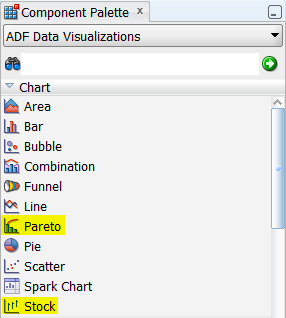
Graph components include two types of graphs that you can use to display data. JDeveloper provides a Component Palette that displays available graph categories. Figure H-1 shows the Component Palette for charts, with the graph components highlighted.
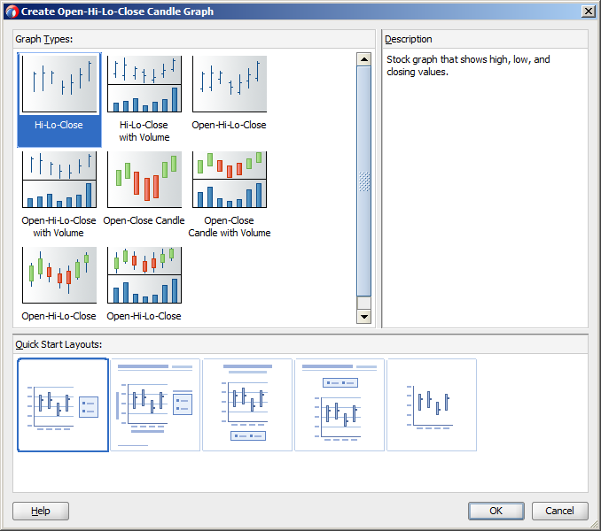
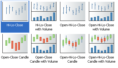
When you select a graph category in the Component Palette, JDeveloper displays a dialog with descriptions about the available graph types to provide visual assistance when you are creating graphs. Figure H-2 shows the different stock graph types and layouts available when you select the Stock component in the Component Palette.
Graph types include:
-
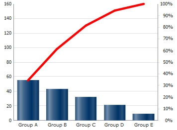
Pareto: Represents data by bars and a percentage line that indicates the cumulative percentage of bars. Each set of bars identifies different sources of defects, such as the cause of a traffic accident. The bars are arranged by value, from the largest number to the lowest number of incidents. A Pareto graph is always a dual-Y graph in which the first y-axis corresponds to values that the bars represent and the second y-axis runs from 0% to 100% and corresponds to the cumulative percentage values. Use Pareto graphs to identify and compare the sources of defects. The Pareto graph has no variations.
Figure H-3 shows an example Pareto graph.
-
Stock: Shows data as the high, low, and closing prices of a stock. Each stock marker displays two to four separate values (not counting the optional volume marker) depending on the specific type of stock graph chosen. Stock graphs display stock prices and, optionally, the volume of trading for one or more stocks in a graph. When any stock or candle stock graph includes the volume of trading, the volume appears as bars in the lower part of the graph.
Candle stock graphs display stock prices and, optionally, the volume of trading for only a single stock. When a candle stock graph includes the volume of trading, the volume appears as bars in the lower part of the graph.
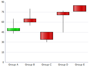
Candle stock graphs also show the lesser of the open and close values at the bottom of the candle. The greater value appears at the top of the candle. If the closing value is greater than the opening value, then the candle is green. If the opening value is higher than the closing value, then the candle is red.
Figure H-4 shows variations of the stock graph type as displayed in the Create Stock Graph dialog with the default graph selected.
Figure H-5 shows an example candle stock graph.
H.1.2 End User and Presentation Features
Graph end user and configurable presentation features include a rich variety of options.
H.1.2.1 Graph Layout
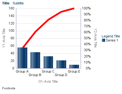
The optional graph title, subtitle, footnote, legend, and axis title components can be customized for placement and appearance. The plot area, present for all graphs, can be customized for appearance. Figure H-6 shows the default display of those graph components for a Pareto graph.
H.1.2.2 Sizing
Graphs are displayed in a default size of 400 X 300 pixels. You can customize the size of a graph or specify dynamic resizing to fit an area across different browser window sizes. When graphs are displayed in a horizontally or vertically restricted area, for example in a web page sidebar, the graph is displayed in a fully featured, although simplified display.
H.1.2.3 Image Formats
Graphs support the following image formats: HTML5, Flash, and PNG. By default, new applications default to HTML5, but you can change the default image format. You can also disable Flash across your application or customize the Flash Player's behavior on client platforms.
H.1.2.4 Data Marker Selection
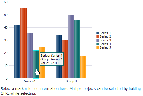
Graphs can be enabled for single or multiple selection of data markers such as bubbles in a bubble graph or shapes in a scatter graph. Enabling selection is required for context menus and for responding programmatically to user clicks on the data markers.
Figure H-7 shows a bar graph enabled for selection. Each data marker is highlighted as the user moves over it to provide a visual clue that the marker is selectable.
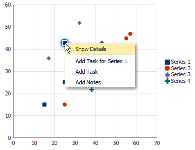
H.1.2.5 Context Menus
Graphs support right-click context menus using facets for any of three types:
-
Context menus displayed on any non selectable area within the component, for example, the plot area
-
Context menus displayed on any selectable element, for example, the marker in a scatter graph
-
Context menus displayed on multiple selectable elements
Figure H-8 shows a context menu displayed on a marker selected in a scatter graph.
H.1.2.6 Reference Areas/Line and Alerts
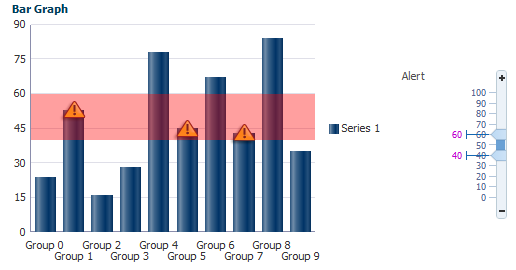
Graphs can be configured to associate a data reference area or line with a graph series or axis. Separately, graphs can be configured to define an additional data point that needs to be highlighted with a separate symbol, such as for an error or warning. Figure H-9 shows a bar graph with a warning alert icon for each bar inside the alert range of the graph. The figure also illustrates an ADF input range slider that can be associated with the graph to change the reference area.
H.1.2.7 Hide and Show Series
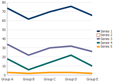
Graphs can be configured to hide and show one or more series displayed in the graph data. This is useful for comparison and analysis, particularly when multiple series are displayed. Figure H-10 shows hide and show in a line graph. The default icon for the hidden series is an empty box.
H.1.2.8 Annotations
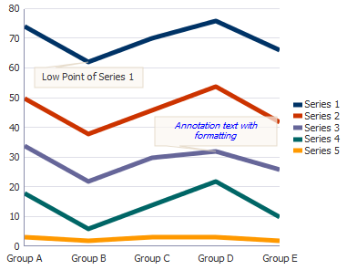
Annotations can be used to call out significant values in the graph data. Figure H-11 shows sample annotations in a line graph.
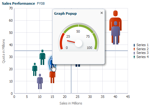
H.1.2.9 Popup Support
Graph components can be configured to display popup dialogs, windows, and menus that provide information or request input from end users. Figure H-12 shows a popup with a gauge component in a graph.
H.1.2.10 Time Selector
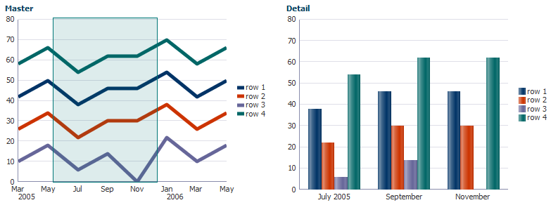
Graphs that include a time axis can be configured to include a time selector which allows the user to select a time range on the time axis. Figure H-13 shows a user-enabled time selector to display the master-detail data in graphs. When the user moves the time selector on the line graph, the bar graph changes to display the data for the selected time period.
H.1.2.11 Bi-directional Support
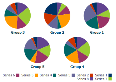
All image formats for graphs support bi-directional locales. Figure H-14 shows bi-directional support in multiple pie graphs.
H.1.2.12 Drag and Drop
Pareto and stock graphs can be configured as drop targets to supports drops from other ADF components.
H.1.2.13 Screen Reader Support
To support visually impaired users who read web pages with a screen reader, graphs are automatically replaced with pivot tables when screen reader mode is enabled for the application. Screen readers can more easily navigate and read the data in a pivot table than in a graph. For information about enabling screen reader mode, see Chapter 22, "Developing Accessible ADF Faces Pages." For information about ADF pivot tables, see Section 27.1, "Introduction to Pivot Tables."
H.2 Using the Graph Component
Data requirements for graphs differ with graph type. Data requirements can be any of the following kinds:
-
Geometric: Some graph types need a certain number of data points in order to display data. For example, a line graph requires at least two groups of data because a line requires at least two points.
-
Complex: Some graph types require more than one data point for each marker (which is the component that actually represents the data in a graph). A scatter graph, for example, needs two values for each group so that it can position the marker along the x-axis and along the y-axis. If the data that you provide to a graph does not have enough data points for each group, the graph component does its best to display a graph.
-
Logical: Some graph types cannot accept certain kinds of data. The following examples apply:
-
Negative data issues: Do not pass negative data to a pie graph or to a percentage bar, line, or area graph. Markers will not display for negative data in percentage graphs.
-
Null or zero data: You cannot see markers for null data because markers will not be produced for null data. Also, if a graph receives zero data and the axis line is at zero, the marker is not visible. However, if the axis line is at nonzero, the zero marker is visible.
-
Insufficient sets (or series) of data: Dual-Y graphs require a set of data for each y-axis. Usually, each set represents different information. For example, the y1-axis might represent sales for specific countries and time periods, while the y2-axis might represent total sales for all countries. If you pass only one set of y-axis data, then the graph cannot display data on two different Y-axes. It displays the data on a single y-axis.
-
Similar graphs share similar data requirements. For example, you can group the following graphs under the category of area graphs:
-
Absolute area graph.
-
Stacked area graph.
-
Percentage area graph.
H.2.1 Graph Type Data Requirements
Specific data requirements for each graph type are defined as follows:
-
Funnel graphs:
-
At least two series (or sets of data) are required for funnel graphs. These two sets of data serve as the target and actual data values. Threshold values appear in the graph legend.
Another variation of the funnel graph requires only one set of data, where the data values shown are percentages of the total values. To produce this type of funnel graph, you must set the
funnelPercentMeasureproperty on the graph to beTrue. This setting should be done in the XML for the graph. -
At least one group of data is required to be used as a stage for funnel graphs.
-
-
Pareto graphs:
-
At least two groups of data are required for Pareto graphs.
-
Pareto graphs cannot have negative numbers.
-
If you pass more than one set of data to a Pareto graph, the graph uses only the first set of data.
-
Do not pass percentage values as part of the data for a Pareto graph. The graph calculates the percentages based on the data that you pass.
-
-
Radar graphs:
At least three groups of data are required for a radar graph. The data structure is as follows:
-
The number of sides on the polygon is equal to the number of groups of data. Each corner of the polygon represents a group.
-
A series or set of data is represented by a line, all the markers of the same color, or both. It is labeled by legend text.
-
-
Stock graphs:
-
Stock: High-Low-Close
-
Each stock marker requires a group of three data values in the following sequence: High, Low, Close. To display stock data for more than one day, data must be in multiples of three, such as three data values for Monday, three data values for Tuesday, and so on for each additional day.
-
A series (or set) of data is represented by markers of the same color that represent one stock. A series is labeled by legend text such as Stock A. The legend appears even if you have only one stock, with the exception of candle stock graphs. Most high-low-close stock graphs have only one series. If you show more than one series and the prices of the different stocks overlap, then some stock markers obscure other stock markers.
-
-
Stock: High-Low-Close with Volume:
-
Each stock marker requires a group of four data values in the following sequence: High, Low, Close, Volume. To display stock data for more than one day, data must be in multiples of four and sequenced as follows: Monday High, Monday Low, Monday Close, Monday Volume, and so on for each additional day.
-
High-low-close stock graphs that also show volume can display the data for only one stock. The label for this stock appears in the legend of the graph.
-
-
Stock: Open-High-Low-Close
-
Each stock marker requires a group of four data values in the following sequence: Open, High, Low, Close. To display stock data for more than one day, data must be in multiples of four, such as four data values for Monday, four data values for Tuesday, and so on.
-
A series (or set) of data is represented by markers that have the same color and represent one stock. A series is labeled by legend text such as Stock A. The legend appears even if you have only one stock. Most open-high-low-close stock graphs have only one series. If you show more than one series and the prices of the different stocks overlap, then some stock markers obscure other stock markers.
-
-
Stock: Open-High-Low-Close with Volume
-
Each stock marker requires a group of five data values in the following sequence: Open, High, Low, Close, Volume. To display stock data for more than one day, data must be in multiples of five and sequenced as follows: Monday Open, Monday High, Monday Low, Monday Close, Monday Volume, and so on for each additional day.
-
Open-high-low-close stock graphs that also show volume can display the data for only one stock. The label for this stock appears in the legend of the graph.
-
-
Candle: Open-Close
-
Each stock marker requires a group of two data values in the following sequence: Open, Close. To display stock data for more than one day, data must be in multiples of two, such as two data values for Monday, two data values for Tuesday, and so on.
-
A series (or set of data) is represented by markers for one stock. Candle stock graphs allow the display of values for only one stock. For this reason, no legend appears in these graphs and you should show the series label (which is the name of the stock) in the title of the graph.
-
-
Candle: Open-Close with Volume
-
Each stock marker requires a group of three data values in the following sequence: Open, Close, Volume. To display stock data for more than one day, data must be in multiples of three, such as three data values for Monday, three data values for Tuesday, and so on.
-
A series (or set of data) is represented by markers for one stock. Candle stock graphs allow the display of values for only one stock. For this reason, no legend appears in these graphs and you should show the series label (which is the name of the stock) in the title of the graph.
-
-
Candle: Open-High-Low-Close
-
Each stock marker requires a group of four data values in the following sequence: Open, High, Low, Close. To display stock data for more than one day, data must be in multiples of four, such as four data values for Monday, four data values for Tuesday, and so on.
-
A series (or set) of data is represented by markers for one stock. Candle stock graphs allow the display of values for only one stock. For this reason, no legend appears in these graphs and you should show the series label (which is the name of the stock) in the title of the graph.
-
-
Candle: Open-High-Low-Close with Volume
-
Each stock marker requires a group of five data values in the following sequence: Open, High, Low, Close, Volume. To display stock data for more than one day, data must be in multiples of five, such as five data values for Monday, five data values for Tuesday, and so on.
-
A series (or set) of data is represented by markers for one stock. Candle stock graphs allow the display of values for only one stock. For this reason, no legend appears in these graphs and you should show the series label (which is the name of the stock) in the title of the graph.
-
-
H.2.2 Configuring Graphs
Because of the many graph types and the significant flexibility of the graph components, graphs have a large number of DVT tags. The prefix dvt: occurs at the beginning of each graph tag name indicating that the tag belongs to the ADF Data Visualization Tools (DVT) tag library. The following list identifies groups of tags related to the graph component:
-
Graph component tags: The four graph component tags provide a convenient and quick way to create a commonly used graph type. They are represented in the Component Palette as categories of graphs with one or more type variations.
Table H-1 provides a description of the graph component tags, and their variations as specified in the
subTypeattribute of the graph component.Table H-1 Graph Component Tags and Sub Types
Graph Tag Description Sub Types funnelGraphVisually represents data related to steps in a process. The steps appear as vertical slices across a horizontal cone-shaped section.
FUNNELparetoGraphRepresents data by bars and a percentage line that indicates the cumulative percentage of bars.
PARETOradarGraphAppears as a circular line graph.
RADAR_LINEscatterGraphRepresents data by the location of data markers. A scatter graph can display data in a directional manner as a polar graph.
SCATTER
SCATTER_2Y
POLARstockGraphDisplays stock prices and, optionally, the volume of trading for one or more stocks in a graph. When any stock or candle stock graph includes the volume of trading, the volume appears as bars in the lower part of the graph.
STOCK_CANDLE
STOCK_CANDLE_VOLUME
STOCK_HILO_CLOSE
STOCK_HILO_CLOSE_VOLUME
STOCK_OHLC_CANDLE
STOCK_OHLC_CANDLE_VOLUME
STOCK_OPEN_HILO_CLOSE
STOCK_VOLUME -
Common graph child tags: These tags are supported by most graph component tag to provide a variety of customization options.
Table H-2 provides a list and description of these tags.
Table H-2 Common Graph Child Tags
Child Tag Description
animationOnDisplay
animationOnDataChangeConfiguring animation effects for graphs.
background
graphFont
graphFootnote
graphPlotArea
graphSubTitle
graphTitleCustomizing the appearance of graph elements including titles.
attributeFormatFormatting categorical attributes in the ordinal axis and marker tooltips.
legendArea
legendText
legendTitleCustomizing of the graph legend.
markerText
x1Format
y1Format
y2Format
zFormatMarker customization related to each axis.
o1Axis
o1MajorTick
o1TickLabel
o1TitleCustomizing the ordinal axis (also known as the category axis) used with bar, area, combination, line, radar, and stock graphs with group labels.
x1Axis
x1MajorTick
x1TickLabel
x1MinorTick
x1TitleCustomizing the x-axis used with scatter and bubble graphs with numerical labels.
y1Axis
y1MajorTick
y1TickLabel
y1MinorTick
y1TitleCustomizing the y1-axis.
-
Child set tags: These tags wrap a set of an unlimited number of related tags.
Table H-3 provides a list and description of these tags.
Table H-3 Graph Child Set Tags
Child Set Tag Description
alertSetWraps
dvt:alerttags that define an additional data point that needs to be highlighted with a separate symbol, such as an error or warning.
annotationSetWraps
dvt:annotationtags that define an annotation on a graph. An annotation is associated with a specific data point on a graph
referenceObjectSetWraps
dvt:referenceObjecttags that define a reference line or a reference area for a graph. You can define an unlimited number of reference objects for a given graph.
seriesSetWraps
dvt:seriestags that define a set of data markers or series on a graph.
shapeAttributesSetWraps
dvt:shapeAttributestags that specify interactivity properties on a subcomponent of a graph.In each case, during design, you must create the wrapper tag first, followed by a related tag for each item in the set. Example H-1 shows the sequence of the tags when you create a set of alert tags to define two alert points for an area graph.
Example H-1 Code Sample for a Set of Alert Tags
<dvt:areaGraph id="areaGraph1" subType="AREA_VERT_ABS"> <dvt:background> <dvt:specialEffects/> </dvt:background> <dvt:graphPlotArea/> <dvt:alertSet> <dvt:alert xValue="Boston" yValue="3.50" yValueAssignment="Y1AXIS" imageSource="myWarning.gif"/> <dvt:alert xValue="Boston" yValue="5.50" yValueAssignment="Y1AXIS" imageSource="myError.gif"/> </dvt:alertSet> <dvt:o1Axis/> <dvt:y1Axis/> <dvt:legendArea automaticPlacement="AP_NEVER"/> </dvt:areaGraph> -
Graph-specific child tags: These tags apply either to specific graph types or to specific parts of a graph.
Table H-4 provides a list and description of these tags.
Table H-4 Graph-Specific Child Tags
Child Tag Description
specialEffects
gradientStopStyleGradients that are used for a graph only in conjunction with
dvt:background,dvt:legendArea,dvt:graphPlotArea,dvt:graphPieFrame,dvt:series,dvt:referenceObject, ordvt:timeSelectorchild components.
sliceLabel
x1TickLabel
y2TickLabel
y1TickLabel
x1Format
y1Format
y2Format
zFormat
stockVolumeFormatFormatting numerical data values for graph.
paretoLine
paretoMarkerPareto graph customizations.
stockMarker
stockVolumeformat
volumeMarkerStock graph customizations.
For complete descriptions of all the tags, their attributes, and a list of valid values, consult the DVT tag documentation. To access this documentation for a specific graph tag in JDeveloper, select the tag in the Structure window and press F1 or click Help.
H.2.3 How to Add a Graph to a Page
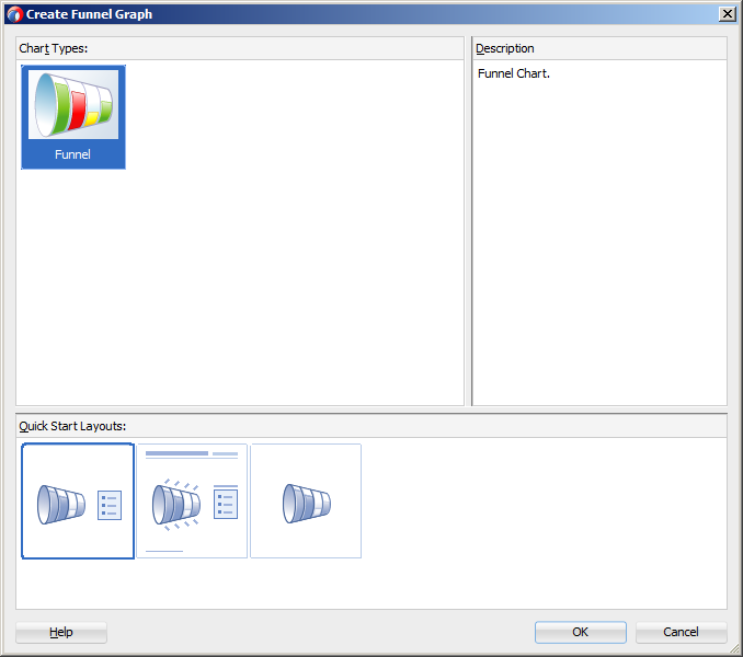
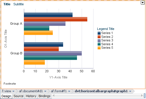
When you are designing your page using simple UI-first development, you use the Component Palette to add a graph to a JSF page. When you drag and drop a graph component onto the page, a Create Graph dialog displays available categories of graph types, with descriptions, to provide visual assistance when creating graphs. You can also specify a quick start layout of the graph's title and legend. Figure H-15 shows the Create Funnel Graph dialog for funnel graphs with the default funnel graph type selected.
Once you complete the dialog, and the graph is added to your page, you can use the Property Inspector to specify data values and configure additional display attributes for the graph.
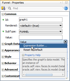
In the Property Inspector you can click the icon that appears when you hover over the property field to display a property description or edit options. Figure H-16 shows the dropdown menu for a bar graph component value attribute.
Note:
If your application uses the Fusion technology stack, then you can use data controls to create a graph and the binding will be done for you. For more information, see the "Creating Databound Graphs" chapter of Oracle Fusion Middleware Fusion Developer's Guide for Oracle Application Development FrameworkIt may be helpful to have an understanding of how graph attributes and graph child tags can affect functionality. For more information, see Section H.2.2, "Configuring Graphs."
You must complete the following tasks:
-
Create an application workspace as described in Section 2.2, "Creating an Application Workspace."
-
Create a view page as described in Section 2.4, "Creating a View Page."
-
In the ADF Data Visualizations page of the Component Palette, from the Graph and Gauge panel, drag and drop the desired graph category onto the page to open the Create Graph dialog.
-
Use the dialog to select the graph type and the quick start layout for display of graph title, legend, and labels. For help with the dialog, press F1 or click Help.
-
Click OK to add the graph to your page.
-
In the Property Inspector, view the attributes for the graph. Use the help button to display the complete tag documentation for the graph type component.
-
Expand the Common section. Use this section to set the following attribute:
-
SubType: If you wish to change the variation of the graph type, select the desired type from the attribute dropdown menu. The valid values will vary depending on the graph.
For example, the valid values for a bar graph are:
-
BAR_VERT_CLUST: Clustered bar graph that has a vertical orientation. -
BAR_VERT_CLUST_SPLIT2Y: Clustered, vertical, split dual-y bar graph. -
BAR_VERT_CLUST2Y: Clustered, vertical, dual-y bar graph. -
BAR_VERT_FLOAT_STACK: Floating, vertical, stacked bar graph. -
BAR_VERT_PERCENT: Percent, vertical bar graph. -
BAR_VERT_STACK: Stacked, vertical bar graph. -
BAR_VERT_STACK_SPLIT2Y: Stacked, vertical, split dual-y bar graph. -
BAR_VERT_STACK2Y: Stacked, vertical, dual-y bar graph.
-
-
-
Expand the Graph Data section. Specify data values for the graph by setting the value in these fields:
-
Value: Specify the data model, which must be an instance of
DataModel, using an EL Expression. Alternatively, set a metric value as either aJava.lang.Numberobject or aString. -
TabularValue: Alternatively, specify a tabular data set as a
Java.util.Listobject. For more information, see Section H.2.5, "How to Create a Graph Using Tabular Data."
-
-
Expand the Appearance section. Specify display attributes by setting the value in these fields:
-
ShortDesc: Enter a statement of the graph's purpose and structure for use by screen readers
-
EmptyText: Specify the error text to display if the graph has no data.
-
The graph will display on the client in the HTML5 image format if the client supports it. For more information about graph image formats, see Section H.2.6, "What You May Need to Know About Graph Image Formats."
H.2.4 What Happens When You Add a Graph to a Page
When a graph component is inserted into a JSF page using the Create Graph dialog, a set of child tags that support customization of the graph is automatically inserted. Example H-2 shows the code inserted in the JSF page for a bar graph with the quick-start layout selected in Figure H-15.
<dvt:barGraph id="graph1" subType="BAR_VERT_CLUST">
  <dvt:background>
    <dvt:specialEffects/>
  </dvt:background>
  <dvt:graphPlotArea/>
  <dvt:seriesSet>
    <dvt:series/>
  </dvt:seriesSet>
  <dvt:o1Axis/>
  <dvt:y1Axis/>
  <dvt:legendArea automaticPlacement="AP_NEVER"/>
</dvt:barGraph>
After inserting a graph component into the page, specialized context menus in the visual editor and Property Inspector buttons are available to support the customization of graph features. For more information, see Section H.2.7, "Editing Graphs in the Visual Editor and Property Inspector."
H.2.5 How to Create a Graph Using Tabular Data
A graph is created when a grid of data is used for the graph component. The tabularData attribute of a graph component lets you specify a list of values that the graph uses to create a grid and to populate itself. To create a graph using tabular data you must store the data in a method in the graph's managed bean, and then use the graph component's tabularData attribute to reference the data.
For example, the table in Figure H-17 has three columns: 2006, 2007, and 2008, and two rows: Shoes and Boots. This data produces a graph that compares annual sales for boots and shoes over a three-year period.
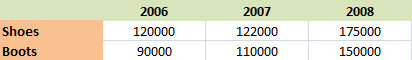
In a managed bean, the list that contains the tabular data consists of a three-member Object array for each data value to be passed to the graph. The members of each array must be organized as follows:
-
The first member (index 0) is the column label, in the grid, of the data value. This is generally a
String. If the graph has a time axis, then this should be aJava Date. Column labels typically identify groups in the graph. -
The second member (index 1) is the row label, in the grid, of the data value. This is generally a
String. Row labels appear as series labels in the graph, usually in the legend. -
The third member (index 2) is the data value, which is usually
Double.
Example H-3 shows code that creates the list of data required for a graph to compare annual sales of shoes and boots for a three-year period.
Example H-3 Code to Create a List of Data for a Graph
public List getTabularData()
{
    ArrayList list = new ArrayList();
    String[] rowLabels  = new String[] {"Boots", "Shoes"};
    String[] colLabels  = new String[] {"2006", "2007", "2008"};
    Double [] [] values = new Double[][]{
        {120000.0, 122000.0, 175000.0},
        {90000.0, 110000.0, 150000.0}
        };
    for (int c = 0; c < colLabels.length; c++)
    {
     for (int r = 0; r < rowLabels.length; r++)
       {
        list.add (new Object [] {colLabels[c], rowLabels[r],
            new Double (values[r][c])});
       }
    }
    return list;
}
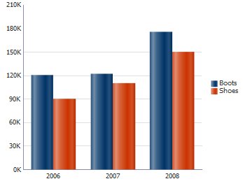
Figure H-18 shows the graph that is rendered on the page if you add the method in Example H-3 to a vertical clustered bar graph's tabularData attribute.
It may be helpful to have an understanding of how graph attributes and graph child tags can affect functionality. For more information, see Section H.2.2, "Configuring Graphs."
You should already have a graph on your page. If you do not, follow the instructions in this chapter to create a graph. For information, see Section H.2.3, "How to Add a Graph to a Page."
You will also need to create the method to supply data and add it to the graph's managed bean. If you need additional help, see Section 2.6, "Creating and Using Managed Beans."
To create a graph that uses data from a managed bean:
-
In the Structure window, right-click the dvt:typeGraph node and choose Go to Properties.
-
In the Property Inspector, expand the Graph Data section.
-
From the TabularData attribute dropdown menu, choose Expression Builder.
-
In the Expression Builder dialog, use the search box to locate the graph's managed bean.
-
Expand the managed bean node and select the method that contains the list of tabular data.
-
Click OK.
The Expression is created.
For example, for a managed bean named
sampleGraphand a method namedgetTabularData, the Expression Builder generates the code#{sampleGraph.tabularData}as the value for thetabularDataattribute of the graph.
H.2.6 What You May Need to Know About Graph Image Formats
Graphs support the following image formats: HTML5, Flash, and PNG. The image format used depends upon the application's settings and the client's environment.
You can configure your application to use a specific image format by setting or changing the following parameters:
-
oracle.adf.view.rich.dvt.DEFAULT_IMAGE_FORMATThis context initialization parameter is automatically added to
web.xmlfor all new applications and defaults to HTML5. For more information, see Appendix A, "Graph and Gauge Image Format." -
Skin style
Graphs will be displayed in the HTML5 image format when using the Skyros skin. New applications default to this skin. For more information about skinning and styles, see Chapter 20, "Customizing the Appearance Using Styles and Skins."
-
flash-player-usageYou can disable the use of Flash content across the entire application by setting a
flash-player-usagecontext parameter inadf-config.xml. For more information, see Appendix A, "Configuring Flash as Component Output Format."
If the specified image format is not available on the client, the application will default to an available format. For example, if the client does not support HTML5, the application will use:
-
Flash, if the Flash Player is available.
-
Portable Network Graphics (PNG) output format. A PNG output format is also used when printing graphs. Although static rendering is fully supported when using a PNG output format, certain interactive features are not available including:
-
Animation
-
Context menus
-
Drag and drop gestures
-
Interactive pie slice behavior
-
Reference object hover behavior
-
Popup support
-
Selection
-
Series rollover behavior
-
H.2.7 Editing Graphs in the Visual Editor and Property Inspector
When you edit graph components in the visual editor and Property Inspector, specialized context menus and buttons are available to support the customization of graph features. Graph child components such as the title, legend area, plot area, background, axis labels, and display of graph series such as bars can be selected to display a context menu with editing choices. Figure H-19 shows the display of a horizontal bar graph in the visual editor.
Popups in the visual editor provide confirmation of selection of the graph feature to be customized. For example, Figure H-20 shows the popup displayed in the plot area of a line graph.
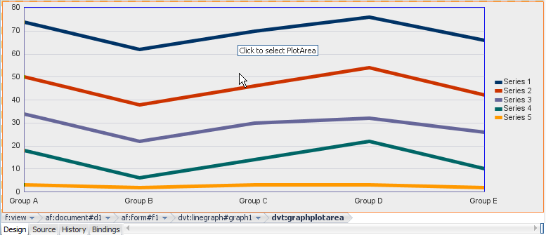
When the graph feature is selected in the visual editor, a specialized editing context menu is made available. Figure H-21 shows the line graph plot area context menu from which you can choose a variety of options including removing the default display of the horizontal grid marks. You can also use the context menu or the Property Inspector buttons to configure special fill effects in the plot area. The selection of the graph tags is synchronized in the visual editor, Structure window, Property Inspector, and source editor.
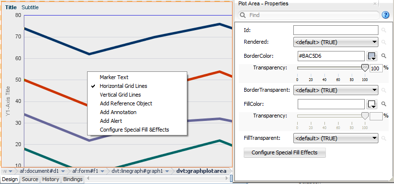
For additional information about configuring line graphs, see. Section H.5.2, "Changing the Appearance of Lines in Graphs." For additional information about configuring special fill effects, see Section H.4.3, "Using Gradient Special Effects in Graphs."
H.3 Customizing Graph Display Elements
You can configure graph display elements including sizing, background and plot area appearance, title, axes, labels, legends, and tooltips.
H.3.1 Changing Graph Size and Style
You can customize the width and height of a graph and you can allow for dynamic resizing of a graph based on changes to the size of its container. You can also control the style sheet used by a graph. These two aspects of a graph are interrelated in that they share the use of the graph inlineStyle attribute.
H.3.1.1 How to Specify the Size of a Graph at Initial Display
You can specify the initial size of a graph by setting values for attributes of the dvt:typeGraph tag. If you do not also provide for dynamic resizing of the graph, then the initial size becomes the only display size for the graph.
It may be helpful to have an understanding of how graph attributes and graph child tags can affect functionality. For more information, see Section H.2.2, "Configuring Graphs."
You should already have a graph on your page. If you do not, follow the instructions in this chapter to create a graph. For information, see Section H.2.3, "How to Add a Graph to a Page."
To specify the size of a graph at its initial display:
-
In the Structure window, right-click the dvt:typeGraph node and choose Go to Properties.
-
In the Property Inspector, in the Style section, enter a value for the InlineStyle attribute of the graph tag.
For example, to create a graph that is 200 pixels in width and has a height of 200 pixels, use the following setting for the InlineStyle attribute:
width:200px;height:200px.
H.3.1.2 How to Provide for Dynamic Resizing of a Graph
You must enter values in each of two attributes of the dvt:typeGraph tag to allow for a graph to resize when its container in a JSF page changes in size. The values that you specify for this capability also are useful for creating a graph component that fills an area across different browser window sizes.
It may be helpful to have an understanding of how graph attributes and graph child tags can affect functionality. For more information, see Section H.2.2, "Configuring Graphs."
You should already have a graph on your page. If you do not, follow the instructions in this chapter to create a graph. For information, see Section H.2.3, "How to Add a Graph to a Page."
To allow dynamic resizing of a graph:
-
In the Structure window, right-click the dvt:typeGraph node and choose Go to Properties.
-
In the Property Inspector, in the Behavior section, from the DynamicResize attribute's dropdown list, select the value
DYNAMIC_SIZE. -
In the Style section, for the InlineStyle attribute, enter a fixed number of pixels or a relative percent for both width and height.
For example, to create a graph that fills 50% of its container's width and has a height of 200 pixels, use the following setting for the InlineStyle attribute:
width:50%;height:200px.Best Practice Tip:
To specify a width of 100%, set the StyleClass toAFStretchWidth.
H.3.1.3 How to Use a Specific Style Sheet for a Graph
You have the option of selecting any of the standard styles available for the dvt:typeGraph tag. You can also specify a custom style sheet for use with a graph.
It may be helpful to have an understanding of how graph attributes and graph child tags can affect functionality. For more information, see Section H.2.2, "Configuring Graphs."
You should already have a graph on your page. If you do not, follow the instructions in this chapter to create a graph. For information, see Section H.2.3, "How to Add a Graph to a Page."
To select a style sheet for a graph:
-
In the Structure window, right-click the dvt:typeGraph node and choose Go to Properties.
-
In the Property Inspector, expand the Style section.
-
For the StyleClass attribute, enter the name of the CSS style class to use for the graph.
-
In the Property Editor, select the CSS style class to use for the graph.
For example, select the
OraBGGrayLightclass to set a light gray background for the graph.For additional help with style sheets and CSS style classes, see Chapter 20, "Customizing the Appearance Using Styles and Skins."
H.3.2 Changing Graph Background, Plot Area, and Title
The graph automatically provides default settings for its background and plot area based on the style it is using. You can customize these settings using child tags of the graph.
The graph also provides title, subtitle, and footnote options that you can specify. By default, no text is provided for titles and footnotes. When you enter this information, you can also specify the font and font characteristics that you want to use for the text.
H.3.2.1 How to Customize the Background and Plot Area of a Graph
You can customize the following parts of graphs related to background and plot area:
-
Background: The area on which the graph is plotted.
-
Plot area: A frame in which data is plotted for all graphs other than pie graphs. Axes are displayed on at least two borders of the plot area.
-
Pie frame: A frame in which pie graphs are plotted without the use of axes.
It may be helpful to have an understanding of how graph attributes and graph child tags can affect functionality. For more information, see Section H.2.2, "Configuring Graphs."
You should already have a graph on your page. If you do not, follow the instructions in this chapter to create a graph. For information, see Section H.2.3, "How to Add a Graph to a Page."
To customize the background and plot area of a graph:
-
If you want to customize the background of a graph, do the following:
-
In the Structure window, right-click the dvt:background node and choose Go to Properties.
-
To change the background fill color, choose Edit from the FillColor attribute's dropdown and select the color to use in the Property Editor.
-
-
If you want to customize the plot area of any graph other than a pie graph, do the following:
-
In the Structure window, right-click the dvt:graphPlotArea node and choose Go to Properties.
-
In the Property Inspector, use the attribute dropdown menus to select colors that you want to customize for the plot area's BorderColor and FillColor attributes.
-
-
If you want to customize the plot area of a pie graph, do the following:
-
In the Structure window, right-click the dvt:graphPieFrame node and choose Go to Properties.
-
In the Property Inspector, use the attribute dropdown menus to select colors that you want to customize for the plot area's BorderColor and FillColor attributes.
-
Note:
You can also customize the colors of the background and plot area in a graph by adding gradient special effects. For more information, see Section H.4.3, "Using Gradient Special Effects in Graphs."H.3.2.2 How to Specify Titles and Footnotes in a Graph
You have the option of specifying a title, subtitle, and footnote for a graph. You use a separate child tag of the graph for each of these text entries. The attributes of each of these child tags let you define the horizontal alignment of the text field, the text content, and whether or not the text should be rendered.
The tags for title, subtitle, and footnote support the use of a child graph font tag to let you identify the exact font characteristics to be used for each text field.
It may be helpful to have an understanding of how graph attributes and graph child tags can affect functionality. For more information, see Section H.2.2, "Configuring Graphs."
You should already have a graph on your page. If you do not, follow the instructions in this chapter to create a graph. For information, see Section H.2.3, "How to Add a Graph to a Page."
To specify titles and a footnote for a graph:
-
If you want to enter a graph title, do the following:
-
In the Structure window, right-click the dvt:typeGraph node and choose Insert inside GraphType > ADF Data Visualizations > dvt:graphTitle.
-
Use the Property Inspector to specify values in the attributes of the
dvt:graphTitletag. -
If you want to provide specific font characteristics for the text, then in the Structure window, right-click the dvt:graphTitle node and choose Insert inside dvt:graphTitle > dvt:graphFont.
-
Use the Property Inspector to specify values for the attributes of the
dvt:graphFonttag.
-
-
If you want to enter a graph subtitle, do the following:
-
In the Structure window, right-click the dvt:typeGraph node and choose Insert inside GraphType > ADF Data Visualizations > dvt:graphSubtitle.
-
Use the Property Inspector to specify values in the attributes of the
dvt:graphSubtitletag. -
If you want to provide specific font characteristics for the text, in the Structure window, right-click the dvt:graphSubtitle node and choose Insert inside dvt:graphSubtitle > dvt:graphFont.
-
Use the Property Inspector to specify values for the attributes of the
dvt:graphFonttag.
-
-
If you want to enter a graph footnote, do the following:
-
In the Structure window, right-click the dvt:typeGraph node and choose Insert inside GraphType > ADF Data Visualizations > dvt:graphFootnote.
-
Use the Property Inspector to specify values in the attributes of the
dvt:graphFootnotetag. -
If you want to provide specific font characteristics for the text, then in the Structure window, right-click the dvt:graphFootnote node and choose Insert inside dvt:graphFootnote > dvt:graphFont.
-
Use the Property Inspector to specify values for the attributes of the
dvt:graphFonttag.
-
H.3.3 How to Customize Graph Axes and Labels
Graphs can have the following axes:
-
Ordinal axis (also known as the o1-axis): The ordinal (or category) axis of a graph shows ordered data, such as ratings or stages, or shows nominal data, such as different cities or different products. The ordinal axis appears on bar, line, area, combination, or radar graphs. When the ordinal axis is horizontal and contains time data, it is called a time axis.
An example of an ordinal axis is the horizontal line across the bottom of the plot area of a vertical bar graph. The values along this axis do not identify the extent of the data shown. Instead, they identify the different groups to which the data belongs.
-
x1-axis: The x1-axis shows the values that appear along the horizontal axis in a graph. This axis has regular intervals of numbers instead of group labels. It is referred to as the x-axis. The x1-axis appears on bubble and scatter graphs.
-
y1-axis: The y1-axis is the primary y-axis. It is usually the vertical value axis along the left side of the plot area. It has regular intervals of numbers.
-
y2-axis: The y2-axis is the secondary y-axis. It is usually the vertical axis along the right side of the plot area. It has regular intervals of numbers.
For each axis, there are several graph child tags that support customization. The following sections discuss the options available for various kinds of customization of an axis.
H.3.3.1 How to Specify the Title, Appearance, and Scaling of an Axis
The following graph child tags support customization of the title and appearance of an axis:
-
Title: Specifies the text and alignment for an axis title. Includes the following tags:
dvt:o1Title,dvt:x1Title,dvt:y1Title, anddvt:y2Title. An axis does not show a title unless you use the appropriate title tag. -
Axis: Controls the color, line width, scaling, increment between tick marks, visibility of the axis, and scrolling in specific graph types. Includes the following tags:
dvt:o1Axis,dvt:x1Axis,dvt:y1Axis,dvt:y2Axis.Note:
Scaling attributes are not present on thedvt:o1Axistag because the ordinal axis does not display numeric values.
It may be helpful to have an understanding of how graph attributes and graph child tags can affect functionality. For more information, see Section H.2.2, "Configuring Graphs."
You should already have a graph on your page. If you do not, follow the instructions in this chapter to create a graph. For information, see Section H.2.3, "How to Add a Graph to a Page."
To specify the title and appearance of an axis:
-
In the Structure window, right-click the dvt:typeGraph node and choose Insert inside GraphType > ADF Data Visualizations > dvt:AxisTypeTitle.
For example, to set the title for a bar graph's o1-axis, choose Insert inside Bar > ADF Data Visualizations > dvt:O1Title.
-
In the Property Inspector, enter the text for the axis title and optionally specify values for other attributes of this tag.
-
If you want to specify font characteristics for the title, do the following:
-
In the Structure window, right-click the dvt:typeTitle node and choose Insert inside Title > dvt:graphFont.
-
In the Property Inspector, enter the desired values for the characteristics of the font.
-
H.3.3.2 Specifying Scrolling on an Axis
Scrolling on a graph axis can be specified for the following graph types:
-
Area, bar, and line graphs for the
dvt:o1Axis,dvt:y1Axis, anddvt:y2Axistags. -
Bubble and scatter graphs for the
dvt:x1Axis,dvt:y1Axis, anddvt:y2Axistags.
By default, a graph axis scrolling attribute is set to off. You can specify these values for the scrolling attribute:
-
off: Scrolling is disabled (default). -
on: Scrolling is enabled, and the scroll bar is always present. -
asNeeded: Scrolling is enabled, but the scrollbar is not initially present. After zooming on the graph, the scrollbar displays and remains visible for the session. -
hidden: Scrolling is enabled but the scroll bar is always hidden. User may use pan scrolling.
H.3.3.3 How to Control the Appearance of Tick Marks and Labels on an Axis
Tick marks are used to indicate specific values along a scale on a graph. The following graph child tags support customization of the tick marks and their labels on an axis:
-
Major tick: Controls the color, width, and style of tick marks on the axis. Includes the following tags:
dvt:o1MajorTick,dvt:x1MajorTick,dvt:y1MajorTick, anddvt:y2MajorTick. Major tick increments are calculated automatically by default, or you can specify the tick steps with themajorIncrementattribute. -
Minor tick: Controls the color, width, and style of minor tick marks on the axis. Includes the following tags:
dvt:x1MinorTick,dvt:y1MinorTick, anddvt:y2MinorTick. Minor tick increments are one-half of the major tick increment by default, or you can specify the tick steps with theminorIncrementattribute. Minor ticks do not support labels. -
Tick label: Controls the rotation of major tick label text and lets you specify font characteristics for the label. Includes the following tags:
dvt:o1TickLabel,dvt:x1TickLabel,dvt:y1TickLabel, anddvt:y2TickLabel. These tags can also have advt:graphFontchild tag to change font characteristics of the label.
It may be helpful to have an understanding of how graph attributes and graph child tags can affect functionality. For more information, see Section H.2.2, "Configuring Graphs."
You should already have a graph on your page. If you do not, follow the instructions in this chapter to create a graph. For information, see Section H.2.3, "How to Add a Graph to a Page."
To control the appearance of the ordinal axis tick labels:
-
In the visual editor, select the o1 Tick Label element on the graph.
Alternatively, you can select the dvt:o1Axis node in the Structure window, then in the Property Inspector click Configure O1 Axis and choose Value Labels.
-
In the Property Inspector, enter values as needed for the following properties:
-
TextRotation: Use to specify the degree of text rotation to improve readability of the tick labels.
Tip:
Use rotation angles that are multiples of 90 degrees to achieve best results. Other angles are not well supported across rendering technologies and are not recommended. -
TickLabelSkipMode: Use to specify if and how tick labels will be displayed on the ordinal axis. When you set the value at
TLS_MANUAL, you can optionally use the tickLabelSkipCount attribute to set the number of tick labels to display between tick labels and the tickLabelSkipFirst attribute to set the index of the first tick label to be skipped.
-
-
Optionally, in the Property Inspector, click the Configure Font button to set properties for the child
dvt:graphFonttag.
To control the appearance of tick marks and labels on an x-axis:
-
In the Structure window, right-click the dvt:typeGraph node and choose Insert inside GraphType > ADF Data Visualizations > dvt:x1MajorTick.
-
In the Property Inspector, enter desired values for the attributes of this tag and click the Configure Tick Label button to add an dvt:x1TickLabel tag to the graph.
-
In the Property Inspector, enter desired values for the dvt:x1TickLabel and if desired, click the Configure Font button to specify font characteristics for the tick label.
-
If you want to specify minor ticks in the graph, do the following:
-
In the Structure window, right-click the graph node and choose Insert inside GraphType > ADF Data Visualizations > dvt:x1MinorTick.
-
In the Property Inspector, enter desired values for the characteristics of the font.
Note:
For thetickStyleattribute you must specify a value other thanGS_NONEorGS_AUTOMATIC.
-
The procedure for controlling the appearance of tick marks on any graph axis is similar to the procedure for the x-axis. However, you customize the major tick and label tags and insert the minor ticks related to the specific axis that you want to customize.
H.3.3.4 Formatting Numbers on an Axis
The dvt:markerText tag lets you to control the format of numbers on an axis. The following dvt:markerText child tags wrap the number format for specific axes: dvt:x1Format, dvt:y1Format, and dvt:y2Format.
Note:
There is no format for the ordinal axis because that axis does not contain numeric values.To format numbers on these axes, insert child tags for the appropriate axis as shown in Section H.4.4, "Formatting Data Values in Graphs."
H.3.3.5 How to Set Minimum and Maximum Values on a Data Axis
The Y-axes have the following graph child tags to support the starting value of the axis: dvt:y1Axis, and dvt:y2Axis. You have the option of specifying different scaling on each y-axis in a dual y-axis graph. For example, the y1-axis might represent units in hundreds while the y2-axis might represent sales in thousands of dollars.
Some graphs, such as scatter and bubble graphs, contain a dvt:x1Axis child tag for which the minimum and maximum values can also be set.
It may be helpful to have an understanding of how graph attributes and graph child tags can affect functionality. For more information, see Section H.2.2, "Configuring Graphs."
You should already have a graph on your page. If you do not, follow the instructions in this chapter to create a graph. For information, see Section H.2.3, "How to Add a Graph to a Page."
To specify the starting value on a y1-axis:
-
In the Structure window, right-click the dvt:y1Axis node and choose Go To Properties.
-
In the Property Inspector, for the AxisMinValue field, enter the starting value for the y1-axis.
-
In the AxisMinAutoScaled field, select
falsefrom the attribute dropdown list.You must set this attribute in order for the minimum value to be honored.
To establish the starting value on a y2-axis, use a similar procedure, but first insert the dvt:y2Axis tag as a child of the graph.
H.3.4 How to Customize Graph Legends
Graph components provide child tags for the following kinds of customization for the legend:
-
Specifying the color, border, visibility, positioning, and scrollability of the legend area relative to the graph,
dvt:legendAreatag -
Specifying the font characteristics and positioning of the text that is related to each colored entry in the legend,
dvt:legendTexttag -
Specifying an optional title and font characteristics for the legend area,
dvt:legendTitletag
It may be helpful to have an understanding of how graph attributes and graph child tags can affect functionality. For more information, see Section H.2.2, "Configuring Graphs."
You should already have a graph on your page. If you do not, follow the instructions in this chapter to create a graph. For information, see Section H.2.3, "How to Add a Graph to a Page."
To customize the legend area, legend text, and title:
-
In the Structure window, right-click the dvt:legendArea node and choose Go to Properties.
-
Use the Property Inspector to specify values for the attributes of this tag. For example, you can specify the following attributes for the legend area:
-
AutomaticPlacement and Position: Specify automatic positioning of the legend area on the right or the bottom of the graph with the default value of
AP_ALWAYS. Setting the value atAP_NEVERrequires the value of thepositionattribute to be used for positioning of the legend area. -
Scrolling: Specify scrolling in the legend area when required space exceeds available space using the value
asNeeded. By default the value is set tooff. -
PositionHint: For pie, radar, and polar graphs, specify the alignment of the legend toward the center of the plot area using the value
alignToCenter. By default the value is set toalignToEdgewhich aligns the legend toward the edge of the graph frame. -
MaxWidth: Specify the maximum width of the legend area as a percentage of the graph's area. By default the value is set to an empty string which automatically sets the width based on the graph's settings.
For example, to set the maximum width of the legend to 50% of the graph's area, enter
50%.
-
-
If you want to customize the legend text, do the following:
-
In the Structure window, right-click the dvt:typeGraph node and choose Insert inside GraphType > ADF Data Visualizations > dvt:legendText.
-
Use the Property Inspector to enter values for the attributes of this tag.
-
Right-click the dvt:legendText node and choose Insert inside dvt:legendText > dvt:graphFont.
-
Use the Property Inspector to specify values for the attributes of the font tag.
-
-
If you want to enter a title for the legend, do the following:
-
In the Structure window, right-click the dvt:typeGraph node and choose Insert inside GraphType > ADF Data Visualizations > dvt:graphLegendTitle.
-
Use the Property Inspector to enter values for the attributes of this tag.
-
Right-click the dvt:legendTitle node and choose Insert inside dvt:legendTitle > dvt:graphFont.
-
Use the Property Inspector to specify values for the attributes of the font tag.
-
H.3.5 Customizing Tooltips in Graphs
Tooltips are useful to display identification or detail information for data markers. They can be very useful in smaller graphs without enough space to display markerText. Graphs automatically display tooltips for components like title, subtitle, footnote, legend text, and annotations when their text is truncated.
In most graphs, if you move the cursor over a data marker, then a tooltip is displayed. In a line or area graph, you must move the cursor over a data marker or at the corners of the line or area and not merely over the line or area.
You can specify that each graph marker (such as bars) displays a tooltip with information. The following graph attributes are used together to customize a graph tooltip:
-
markerTooltipType: Specifies whether tooltips are displayed for markers (such as bars) and identifies the kind of information that appears in the tooltips. You have the option to display the following information: text only, values only, or text and values. For specific graph types, options include displaying cumulative data value for each stacked graph marker or displaying percentage data value for each pie slice marker. -
seriesTooltipLabelType: Specifies whether tooltips are displayed for each set of values that appear in a legend. This attribute also controls the kind of information that appears in a series tooltip. For example, you could choose to display text that identifies a general term for the entire series (such as Product) or a specific term for a given member of the series (such as a specific Product name).Note:
The graph displays series tooltip labels only if the graph'smarkerTooltipTypeattribute has a setting that includes text. -
groupTooltipLabelType: Specifies whether tooltip labels are displayed for data groups along an axis. For example, sales for specific products might be grouped by years or quarters. You can choose to display text that identifies a general term for the entire group (such as Time) or specific terms for each member of the group (such as Q1, Q2, Q3, or Q4 for quarters).
You can quickly format all the marker tooltips in a graph by setting the graph's markerTooltipTemplate attribute to a tokenized String. The attribute accepts a String that may contain any number of a set of predefined tokens. For example:
<dvt:lineGraph markerTooltipTemplate="Template Based Tooltip NEW_LINE SERIES_LABEL GROUP_LABEL NEW_LINE Value: Y_VALUE"/>
The list of supported tokens is described in Table H-5.
Table H-5 markerTooltipTemplate String Tokens
| Token | Description |
|---|---|
|
|
Inserts a new line. |
|
|
The series label for the series of this marker. |
|
|
The group label for the group of this marker. |
|
|
The X value of a scatter or bubble marker or continuous time axis marker. |
|
|
The Y value of this marker (if this marker has a Y value). |
|
|
The actual value for a funnel slice. |
|
|
The target value for a funnel slice. |
|
|
The high value for a stock marker. |
|
|
The low value for a stock marker. |
|
|
The close value for a stock marker. |
|
|
The open value for a stock marker. |
|
|
The volume value for a stock volume marker. |
|
|
The cumulative stacked value for a stacked graph. |
|
|
The cumulative percentage value for a stacked percent graph or Pareto graph. |
H.4 Formatting Graph Text, Colors, and Data Values
You can format the text, colors, and data values for all graph types.
H.4.1 Formatting Text in Graphs
You can format text in any of the following subcomponents of a graph:
-
Annotation: Includes only the
dvt:annotationtag. -
Axis title: Includes the
dvt:o1Title,dvt:x1Title,dvt:y1Title, anddvt:y2Titletags. -
Axis tick label: Includes the
dvt:o1TickLabel,dvt:x1TickLabel,dvt:y1TickLabel, anddvt:y2TickLabeltags. -
Graph title: Includes the
dvt:graphFootnote,dvt:graphSubtitle, anddvt:graphTitletags. -
Legend: Includes only the
dvt:legendTexttag. -
Marker: Includes only the
dvt:markerTexttag.
Use the dvt:graphFont tag as a child of the specific subcomponent for which you want to format text. For an example of formatting text in a graph, see Section H.3.2.2, "How to Specify Titles and Footnotes in a Graph.".
H.4.1.1 What You May Need to Know About Skinning and Formatting Text in Graphs
You can set the font attributes of graph components globally across all pages in your application by using a cascading style sheet (CSS) to build a skin, and configuring your application to use the skin. By applying a skin to define the fonts used in graph components, the pages in an application will be smaller and more organized, with a consistent style easily modified by changing the CSS file.
You can use the ADF Data Visualization Tools Skin Selectors to define the font styles for graph components. Graph component skin selectors include the following:
-
af|dvt-graphFootnote -
af|dvt-graphSubtitle -
af|dvt-graphTitle -
af|dvt-o1Title -
af|dvt-x1Title -
af|dvt-y1Title -
af|dvt-y2Title -
af|dvt-pieLabel -
af|dvt-ringTotalLabel -
af|dvt-legendTitle -
af|dvt-legendText -
af|dvt-markerText -
af|dvt-o1TickLabel -
af|dvt-x1TickLabel -
af|dvt-y1TickLabel -
af|dvt-y2TickLabel -
af|dvt-annotation -
af|dvt-sliceLabel -
af|dvt-tooltips
You can also use ADF Data Visualization Tools global skin selectors to define the font attributes across multiple graph components. Global skin selector names end in the :alias pseudo-class, and affect the skin for more than one component. Global graph skin selectors include the following:
-
.AFDvtGraphFont:alias: Specifies thefontattributes for all graph components. -
.AFDvtGraphTitlesFont:alias: Specifies thefontattributes for all graph title components. -
.AFDvtGraphLabelsFont:alias: Specifies thefontattributes for all graph label components.
It may be helpful to have an understanding of how graph attributes and graph child tags can affect functionality. For more information, see Section H.2.2, "Configuring Graphs."
You should already have a graph on your page. If you do not, follow the instructions in this chapter to create a graph. For information, see Section H.2.3, "How to Add a Graph to a Page."
To use a custom skin to set graph fonts:
-
Add a custom skin to your application containing the defined skin style selectors for the graph subcomponents. You can specify values for the following attributes:
-
-tr-font-family: Specifies the font family (name). It may not contain more than one font. If multiple fonts are specified, the first font will be used. -
-tr-font-size: Specifies the size of the font. Units of absolute size are defined as:-
pt: Points - the standard font size used by CSS2, where 1 point equals 1/72nd of an inch. -
in: Inches, where 1 inch equals 72 points. -
cm: Centimeters, where 1 centimeter equals approximately 28 points. -
mm: Millimeters, where 1 millimeter equals approximately 2.8 points. -
pc: Picas, where 1 pica equals 12 points.
You can also use font size names for this attribute, including the following:
-
xx-small: 8 points -
x-small: 9 points -
small: 10 points -
medium: 12 points -
large: 14 points -
x-large: 16 points -
xx-large: 18 points
-
-
-tr-font-style: Specifies the style of the font. Valid values arenormaloritalic. -
-tr-font-weight: Specifies the weight of the font. Valid values arenormalorbold. -
-tr-text-decoration: Specifies whether or not the underline emphasis is rendered. Valid values arenoneorunderline. -
-tr-color:Specifies the color of the font. Valid values are color names for HTML and CSS. The World Wide Consortium lists 17 valid color names includingaqua,black,blue,fuchsia,gray,green,lime,maroon,navy,olive,orange(CSS 2.1),purple,red,silver,teal,white, andyellow.You can also use 3, 6, or 8 digits HEX (alpha channel is first 2 digit in 8 digit HEX), RGB, or RGBA.
For example, specify the font family for all graph titles in a
mySkin.cssfile as follows:af|dvt-graphTitle { -tr-font-family: Comic Sans MS; }For help with creating a custom skin, see Section 20.2, "Applying Custom Skins to Applications".
-
-
Configure the application to use the custom skin in the
trinidad-config.xmlfile.For help with configuring the application, see Section 20.2.4, "How to Configure an Application to Use a Custom Skin".
For additional information about using styles and skins, see Chapter 20, "Customizing the Appearance Using Styles and Skins."
H.4.2 Specifying Transparent Colors for Parts of a Graph
You can specify that various parts of a graph show transparent colors by setting the borderTransparent and fillTransparent attributes on the graph child tags related to these parts of the graph. By default, these attributes are set to true. The following list identifies the parts of the graph that support transparency:
-
Graph background: Use the
dvt:backgroundtag. This element does not contain a border, and theborderTransparentattribute does not apply. -
Graph legend area: Use the
dvt:legendAreatag. -
Graph pie frame: Use the
dvt:graphPieFrametag. -
Graph plot area: Use the
dvt:graphPlotAreatag.
H.4.3 Using Gradient Special Effects in Graphs
A gradient is a special effect in which an object changes color gradually. Each color in a gradient is represented by a stop. The first stop is stop 0, the second is stop 1, and so on. You can specify any number of stops in the special effects for a subcomponent of a graph that supports special effects.
You can define gradient special effects for the following subcomponents of a graph:
-
Graph background: Use the
dvt:backgroundtag. -
Graph plot area: Use the
dvt:graphPlotAreatag. -
Graph pie frame: Use the
dvt:graphPieFrametag. -
Legend area: Use the
dvt:legendAreatag. -
Series: Use the
dvt:seriestag.Note:
By default, a graph's series gradient is set in theseriesEffectattribute with a value ofSE_AUTO_GRADIENTto make the data markers appear smoother and apply graphic antialiasing. You must set the attribute toSE_NONEin order to specify a custom series gradient. -
Time selector: Use the
dvt:timeSelectortag. -
Reference area: Use the
dvt:referenceObjecttag.
The approach that you use to define gradient special effects is identical for each part of the graph that supports these effects.
H.4.3.1 How to Add Gradient Special Effects to a Graph
For each subcomponent of a graph to which you want to add special effects, you must insert a dvt:specialEffects tag as a child tag of the subcomponent if it doesn't already exist. For example, if you want to add a gradient to the plot area of a graph, then you would create one dvt:specialEffects tag that is a child of the dvt:graphPlotArea tag.
Then, optionally if you want to control the rate of change for the fill color of the subcomponent, you would insert as many dvt:gradientStopStyle tags as you need to control the color and rate of change for the fill color of the component. These dvt:gradientStopStyle tags then must be inserted as child tags of the single dvt:specialEffects tag.
It may be helpful to have an understanding of how graph attributes and graph child tags can affect functionality. For more information, see Section H.2.2, "Configuring Graphs."
You should already have a graph on your page. If you do not, follow the instructions in this chapter to create a graph. For information, see Section H.2.3, "How to Add a Graph to a Page."
To add a gradient special effect to a graph:
-
In the Structure window, locate the graph's child node for the component that will contain the gradient special effect and expand if needed.
For example, to set a gradient special effect on the graph's plot area, locate the dvt:graphPlotArea node and expand if needed.
-
If the selected child node does not contain a dvt:specialEffects child node, right-click the node and choose Insert inside ChildNode > dvt:specialEffects.
For example, to set a gradient special effect on the graph's plot area, right-click dvt:graphPlotArea and choose Insert inside dvt:graphPlotArea > dvt:specialEffects.
-
Use the Property Inspector to enter values for the attributes of the
dvt:specialEffectstag:-
FillType: Choose
FT_GRADIENT.For GradientDirection, select the direction of change that you want to use for the gradient fill.
-
NumStops: Enter the number of stops to use for the gradient.
-
-
Optionally, in the Structure window, right-click the dvt:specialEffects node and choose Insert inside dvt:specialEffects > dvt:gradientStopStyle if you want to control the color and rate of change for each gradient stop.
-
Use the Property Inspector to enter values for the attributes of the
dvt:gradientStopStyletag:-
StopIndex: Enter a zero-based integer as an index within the
dvt:gradientStopStyletags that are included within thespecialEffectstag. -
GradientStopColor: Enter the color that you want to use at this specific point along the gradient.
-
GradientStopPosition: Enter the proportional distance along a gradient for the identified stop color. The gradient is scaled from 0 to 100. If 0 or 100 is not specified, default positions are used for those points.
-
-
Repeat Step 4 and Step 5 for each gradient stop that you want to specify.
H.4.3.2 What Happens When You Add a Gradient Special Effect to a Graph
Example H-4 shows the XML code that is generated when you add a gradient fill to the background of a graph and specify two stops.
Example H-4 XML Code Generated for Adding a Gradient to the Background of a Graph
<dvt:graph>
  <dvt:background borderColor="#848284">
    <dvt:specialEffects fillType="FT_GRADIENT" gradientDirection="GD_RADIAL"
                        gradientNumStops="2">
      <dvt:gradientStopStyle stopIndex="0" gradientStopPosition="60"
                             gradientStopColor="FFFFCC"/>
      <dvt:gradientStopStyle stopIndex="1" gradientStopPosition="90"
                             gradientStopColor="FFFF99"/>
    </dvt:specialEffects>
  </dvt:background>
</dvt:graph>
H.4.4 Formatting Data Values in Graphs
The attributes in a data collection can be data values or categories of data values. Data values are numbers represented by markers, like bar height, or points in a scatter graph. Categories of data values are members represented as an ordinal axis label or appear as additional properties in a tooltip. You can format both numerical and categorical attributes by using ADF Faces converter tags, including af:convertNumber for numerical data values, and af:convertNumber, af:convertDateTime, and af:convertColor for categorical data values.
Converter tag attributes let you format percents, scale numbers, control the number of decimal places, placement of signs, and so on. For more information about ADF Faces converters, see Chapter 6, "Validating and Converting Input."
H.4.4.1 How to Format Categorical Data Values
Categorical data values in graphs are represented by the name in the page definition file (<pagename>PageDef.xml) that defines the graph's data model. Example H-5 shows the XML code in a page definition file for a page with a graph displaying categorical data values for the hire date and the bonus cost for employees.
Example H-5 Categorical Data Value Names in Page Definition File
<graph IterBinding="EmpView1Iterator" id="EmpView1"
       xmlns="http://xmlns.oracle.com/adfm/dvt" type="BAR_VERT_CLUST">
  <graphDataMap leafOnly="true">
    <series>
      <data>
        <item value="Bonus"/>
      </data>
    </series>
    <groups>
        <item value="Hiredate"/>
    </groups>
  </graphDataMap>
</graph>
For each categorical attribute to be formatted, use the dvt:attributeFormat tag to specify the name of the categorical data value, and specify the child converter tag to be used when formatting the attribute. You can use af:convertNumber, af:convertDateTime, and af:convertColor to specify formatting for a categorical attribute.
For example, you can format the Hiredate and Bonus categorical data values defined in the page definition file in (<pagename>PageDef.xml).
It may be helpful to have an understanding of how graph attributes and graph child tags can affect functionality. For more information, see Section H.2.2, "Configuring Graphs."
You should already have a graph on your page. If you do not, follow the instructions in this chapter to create a graph. For information, see Section H.2.3, "How to Add a Graph to a Page."
To format categorical data values defined in the page definition file:
-
In the Structure window, right-click the dvt:typeGraph node and choose Insert inside GraphType > ADF Data Visualizations > dvt:attributeFormat.
-
In the Property Inspector, enter the information for the Name attribute.
For example, to specify a value for the hire date in Example H-5, enter
Hiredatefor the Name attribute. -
In the Structure window, right-click the attribute format tag you named and choose Insert inside dvt:attributeFormat > dvt:convertType.
For example, to continue formatting
Hiredate, right-click the dvt:attributeFormat node and choose Insert inside dvt:attributeFormat > dvt:convertDateTime. -
In the Structure window, right-click the af:convertType node and choose Go to Properties.
-
Use the Property Inspector to enter values for the converter. For additional help, see Chapter 6, "Validating and Converting Input."
-
Repeat Step 1 through Step 5 for each additional attribute.
For example, to complete the formatting for categorical data values in Example H-5, repeat Step 1 through Step 5, setting
Bonusas the name of the attribute, adding anaf:convertNumberconverter, and formatting the attribute for currency.
Example H-6 shows the XML code that is generated if you format the categorical data values in a bar graph.
Example H-6 Formatting Categorical Data Values in a Bar Graph
<dvt:barGraph id="barGraph1" value="#{bindings.EmpView1.graphModel}"
              subType="BAR_VERT_CLUST">
  <dvt:attributeFormat id="af1" name="Hiredate">
    <af:convertDateTime pattern = "yyyy-MM-dd hh:mm:ss a"  timeZone="US/Pacific"/>
  </dvt:attributeFormat>
  <dvt:attributeFormat id="af2" name="Bonus">
    <af:convertNumber type = "currency" currencySymbol = "$"
  </dvt:attributeFormat>
</dvt:barGraph
Note:
If there is a single categorical date attribute being displayed on the ordinal (o1) axis, then the graph displays a time axis. The time axis will show dates in a hierarchical format as opposed to a single label on the axis, for example, June 27, 2001. To display a single label on the ordinal axis, the time axis should be turned off, for exampletimeAxisType="TAT_OFF", and a dvt:attributeFormat tag should be used to specify the date format.H.4.4.2 How to Format Numerical Data Values
Use the ADF Faces af:convertNumber tag to specify formatting for numeric data values related to any of the following graph tags:
-
dvt:sliceLabel -
dvt:stockVolumeFormat -
dvt:x1TickLabel -
dvt:x1Format -
dvt:y1TickLabel -
dvt:y1Format -
dvt:y2TickLabel -
dvt:y2Format -
dvt:zFormat
For example, by default a pie graph shows the relationship of parts to a whole, represented as slices in a pie, and each slice label displays the percentage that each slice represents. You can configure a pie graph to represent each slice as a value such as the cost of materials, labor, and profit that make up the list price. You specify the textType attribute of the dvt:sliceLabel tag to display the value represented in the slice, and format the number accordingly.
It may be helpful to have an understanding of how graph attributes and graph child tags can affect functionality. For more information, see Section H.2.2, "Configuring Graphs."
You should already have a pie graph on your page. If you do not, follow the instructions in this chapter to create a graph. For information, see Section H.2.3, "How to Add a Graph to a Page."
To format numbers in the slice label of a pie graph:
-
In the Structure window, right-click the dvt:sliceLabel node and choose Go to Properties.
-
In the Property Inspector, choose
LD_VALUEfrom the TextType attribute dropdown list to specify that the pie slice in the graph represents a value. -
In the Property Inspector, click Configure Slice Label and choose Number Format from the dropdown menu.
-
In the Property Inspector, choose
currencyfrom the Type attribute's dropdown list to specify the values as currency, and enter a dollar sign ($) in the CurrencySymbol attribute to use a dollar sign as the currency symbol.
Example H-7 shows the XML code that is generated if you format the numbers in the slice label of a graph to appear as currency, and use the dollar sign symbol.
Example H-7 Formatting the Numbers in the Slice Label of a Pie Graph
<pieGraph>
...
  <dvt:sliceLabel textType="LD_VALUE">
    <af:convertNumber type="currency" currencySymbol="$"/>
  </dvt:sliceLabel>
...
</pieGraph>
You can also use the ADF Faces af:convertNumber tag to format numbers in the marker text of a graph.
For example, you can provide different formatting for the marker text of each axis in the graph. In this procedure, the af:convertNumber tag is used to format the marker text on dvt:y1axis.
It may be helpful to have an understanding of how graph attributes and graph child tags can affect functionality. For more information, see Section H.2.2, "Configuring Graphs."
You should already have a graph on your page. If you do not, follow the instructions in this chapter to create a graph. For information, see Section H.2.3, "How to Add a Graph to a Page."
To format numerical data values for the marker text associated with the y1-axis of a graph:
-
In the Structure window, right-click the dvt:typeGraph node and choose Insert inside GraphType > ADF Data Visualizations > dvt:markerText.
-
In the Property Inspector, optionally enter values for attributes of
dvt:markerText. For example, selecttruefor the Rendered attribute to display the text in the graph. -
In the Property Inspector, click Configure Marker and choose Y1 Format.
-
In the Property Inspector, optionally enter values as needed for the
dvt:y1Formatattributes. -
In the Property Inspector, click Configure Number Format and specify values as needed for the attributes of the
af:convertNumbertag. For example, select apercentvalue for the Type attribute to place a percentage sign after the marker text.
Example H-8 shows the XML code that is generated when you format the numbers in the marker text for the y1-axis of a graph. This example specifies that numbers are followed by a percentage sign and that the text appears above the markers. For example, in a bar graph, the text will appear above the bars.
Example H-8 Formatting Numbers in Graph Marker Text
<dvt:barGraph>
  <dvt:markerText rendered="true" markerTextPlace="MTP_OUTSIDE_MAX">
    <dvt:y1Format>
      <af:convertNumber type="percent"/>
    </dvt:y1Format>
  </dvt:markerText>
</dvt:barGraph>
Note:
When the textType attribute of a pie slice label is set to percent (LD_PERCENT), or the markerTooltipType attribute of a graph tooltip is set to percent (MTT_PERCENT_XXX), a childaf:convertNumber tag, if used, will be automatically set to percent for its type attribute. When af:convertNumber is forced to percent, graph clears the pattern attribute. This means that patterns are ignored when a graph forces percent formatting. This is applicable for pie, Pareto, funnel and any bar, line, or area percent graph.H.4.4.3 What You May Need to Know About Automatic Scaling and Precision
In order to achieve a compact and clean display, graphs automatically determine the scale and precision of the values being displayed in axis labels, marker text, and tooltips. For example, a value of 40,000 will be formatted as 40K, and 0.230546 will be displayed with 2 decimal points as 0.23.
Automatic formatting still occurs when af:convertNumber is specified. Graph tags that support af:convertNumber child tags have scaling and autoPrecision attributes that can be used to control the graph's automatic number formatting. By default, these attribute values are set to scaling="auto" and autoPrecision="on". Fraction digit settings specified in af:convertNumber, such as minFractionDigits, maxFractionDigits, or pattern, are ignored unless autoPrecision is set to off.
H.5 Customizing the Appearance of Series and Groups of Data
You can customize the appearance of series and groups of data for color, style, display. You can also customize the appearance of lines in a radar graph or add reference lines to a graph.
H.5.1 Changing the Color, Style, and Display of Graph Data Values
For most graph types, an entry appears in the legend for each set of data values represented as graph bars, lines, areas, and points. This entry identifies a set of related data values and displays the color that represents the set in the graph. For example, a radar graph might use yellow lines to represent the sales of shoes and green lines to represent the sales of boots. The graph component refers to each set of related data values as a series.
The graph automatically assigns a different color to each set of data values. You can customize the colors assigned to each series, including the fill color and the border color. For some graph types, you can enable filtering the display of data values in a graph by hiding or showing the series from the graph legend.
You can specify additional characteristics for specific graph types such as the width and style of lines in a radar graph with choices including solid lines, dotted lines, lines with dashes, and so on. For more information, see Section H.5.2, "Changing the Appearance of Lines in Graphs."
You can also customize the colors of each series in a graph by adding gradient special effects. For more information, see Section H.4.3, "Using Gradient Special Effects in Graphs."
H.5.1.1 How to Specify the Color and Style for Individual Series Items
Use one dvt:seriesSet tag to wrap all the individual dvt:series tags for a graph and set attributes for color and style of graph data markers.
It may be helpful to have an understanding of how graph attributes and graph child tags can affect functionality. For more information, see Section H.2.2, "Configuring Graphs."
You should already have a graph on your page. If you do not, follow the instructions in this chapter to create a graph. For information, see Section H.2.3, "How to Add a Graph to a Page."
To specify the color and style for series items in a graph:
-
In the Structure window, right-click the dvt:seriesSet child tag in the graph node, and choose Go to Properties.
-
Optionally, use the Property Inspector to specify values for attributes of the
dvt:seriesSettag.The attributes of this tag determine default settings for all series tags in the set. However, you can override these settings for a given series by entering values in the corresponding attributes of a
dvt:seriestag. -
In the Structure window, expand the dvt:seriesSet node.
-
In the Structure window, right-click the dvt:series node and choose Go to Properties.
The first
dvt:seriestag represents the first series item that appears in the Create Graph Binding dialog. -
Use the Property Inspector to specify colors and other characteristics as needed for the
dvt:seriestag. -
To configure additional series items, in the Structure window, right-click the seriesSet node and choose Insert inside dvt:seriesSet > dvt:series.
-
Use the Property Inspector to specify colors and other characteristics as needed for the
dvt:seriestag. -
Repeat Step 6 and Step 7 for each series item.
H.5.1.2 How to Enable Hiding and Showing Series Items
You can enable the hiding or showing of the series in a radar graph at runtime. Although at least one series must be displayed in the graph, users can filter the display of data values by clicking on the corresponding legend item.
It may be helpful to have an understanding of how graph attributes and graph child tags can affect functionality. For more information, see Section H.2.2, "Configuring Graphs."
You should already have a graph on your page. If you do not, follow the instructions in this chapter to create a graph. For information, see Section H.2.3, "How to Add a Graph to a Page."
To enable hiding and show series items:
-
In the Structure window, right-click the dvt:radarGraph node and choose Go to Properties.
-
In the Property Inspector, in the Series section of the Appearance attributes category, set the HideAndShowBehavior attribute of the graph. Valid values include:
-
none: Default value, no hide and show series behavior is enabled. -
withRescale: Rescales the graph to show only the visible series. -
withoutRescale: Hides the series, but does not rescale the graph.
-
H.5.2 Changing the Appearance of Lines in Graphs
You can use attributes of the dvt:seriesSet child of a graph tag to change the appearance of lines in radar graphs.
H.5.2.1 Displaying Either Data Lines or Markers in Graphs
You have the option of displaying data lines or data markers in a radar graph. If you display markers rather than data lines, then the markers appear in the legend automatically.
In the Property Inspector, set the following attributes of the dvt:seriesSet tag to display data lines or data markers:
-
LineDisplayed: Specifies whether data lines appear in the graph. You can set these values:
-
trueindicates that data lines are displayed in the graph. -
falseindicates that markers are displayed in the graph rather than data lines.
-
-
MarkerDisplayed: Specifies whether markers or data lines appear in graph. You can set these values:
-
trueindicates that markers are displayed in a graph. -
falseindicates that data lines are displayed in a graph.
-
Note:
Do not set both thelineDisplayed attribute and the markerDisplayed attribute to false.H.5.2.2 Changing the Appearance of Lines in a Graph Series
You can customize the appearance of lines by using the dvt:seriesSet tag and the dvt:series tag as described in the following list:
-
On the
dvt:seriesSettag, you can affect all thedvt:seriestags within that set by specifying values for the following attributes:-
defaultMarkerShape: Used only for line, scatter, polar, bubble, and combination graphs. Identifies a default marker shape for all the series in the series set. -
defaultMarkerType: Used only for combination and line graphs. Valid values includeMT_AREA,MT_BAR,MT_MARKER, andMT_DEFAULT.
-
-
On the
dvt:seriestag, you can specify settings for each individual series using the following line attributes:-
lineWidth: Specifies the width of a line in pixels -
lineStyle: Specifies whether you want the graph to use solid lines, dotted lines, dashed lines, or dash-dot combination lines.
-
See the procedures in Section H.5.1.1, "How to Specify the Color and Style for Individual Series Items" for more information about using the dvt:seriesSet tag and the dvt:series tag.
H.5.3 How to Customize Pareto Graphs
A Pareto graph identifies the sources of defects using a series of bars. The bars are arranged by value, from the greatest to the lowest number. The Pareto line shows the percentage of cumulative values of the bars, to the total values of all the bars in the graph. The line always ends at 100 percent.
You can customize the Pareto line and the Pareto marker by using the following graph child tags:
-
dvt:paretoLinetag: Lets you specify the color, line width, and line style (such as solid, dashed, dotted, or a combination of dash-dot). -
dvt:paretoMarkertag: Lets you specify the shape of the Pareto markers.
It may be helpful to have an understanding of how graph attributes and graph child tags can affect functionality. For more information, see Section H.2.2, "Configuring Graphs."
You should already have a Pareto graph on your page. If you do not, follow the instructions in this chapter to create a graph. For information, see Section H.2.3, "How to Add a Graph to a Page."
-
In the Structure window, right-click the dvt:paretoLine node and choose Go to Properties.
-
In the Property Inspector, specify values in the Color, Width, or LineStyle attributes.
-
In the Structure window, right-click the dvt:paretoMarker node and choose Go to Properties.
-
In the Property Inspector, select a value for the MarkerShape attribute.
H.5.4 Adding Reference Lines or Areas to Graphs
Reference lines and areas can be set to display always, on rollover only, or never, regardless of how many there are and whether they are associated with a series or an axis.
You can create reference lines that are associated with a series (that is a set of data values that appears as a single color in the graph legend). If there are multiple series with reference lines, then the reference lines show only when you move the cursor over a series marker or the corresponding series legend item. This is because multiple reference lines can be confusing to users.
You can also create reference areas that are associated with an axis. Typically, these areas are associated with a y-axis. If there are multiple reference areas, then these areas are also displayed when you move the cursor over the related axis.
If your application does not know how many reference lines or areas it will need until it is running, then you can create reference lines or areas dynamically at runtime.
For example, you could add areas to a bar graph to provide a reference for the values displayed in the graph. Figure H-22 shows a bar graph with two reference areas for the high and low values of the graph.
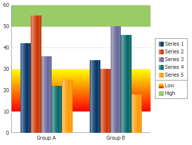
H.5.4.1 How to Create Reference Lines or Areas During Design
Both reference lines and reference areas are created by the use of the following tags:
-
referenceObjectSet: Wraps all the reference object tags for reference lines or reference areas for this graph. -
referenceObject: Identifies whether the tag represents a reference line or a reference area and specifies characteristics for the tag.
It may be helpful to have an understanding of how graph attributes and graph child tags can affect functionality. For more information, see Section H.2.2, "Configuring Graphs."
You should already have a graph on your page. If you do not, follow the instructions in this chapter to create a graph. For information, see Section H.2.3, "How to Add a Graph to a Page."
To add reference lines or areas to a graph during design:
-
In the Structure window, right-click the dvt:typeGraph node and choose Insert inside GraphType > ADF Data Visualizations > dvt:referenceObjectSet.
-
Right-click the dvt:referenceObjectSet node and choose Go to Properties.
-
In the Property Inspector, if you are defining reference areas related to specific axes, then specify a value for displaying the appropriate axis or axes attributes: displayX1, displayY1, or displayY2.
The value
RO_DISPLAY_AUTOMATICenables the display of a reference area only when the mouse moves over the related axis. This choice prevents the confusion that might occur if multiple reference areas were displayed all at the same time.Optionally, you can apply a gradient special effect to the reference area. For more information see Section H.4.3, "Using Gradient Special Effects in Graphs."
-
If you are defining a reference line, specify a value for displaying the line.
The value
RO_DISPLAY_AUTOMATICenables the display of a reference line only when the cursor moves over a series item (such as a bar) or over the corresponding series entry in the graph legend. This choice prevents the confusion that might occur if multiple series reference lines were displayed all the time. -
In the Structure window, right-click the dvt:referenceObjectSet node and choose Insert inside dvt:referenceObjectSet > dvt:referenceObject.
-
Right-click the dvt:referenceObject node and choose Go to Properties.
-
In the Property Inspector, do the following:
-
In the Common section, specify values for the Index attribute of the reference object, the Type attribute of the reference object (
RO_LINEorRO_AREA), and the associated object in the Association attribute (a series for a reference line or a specific axis for a reference area). Also specify if the object should be displayed in the legend using the DisplayedInLegend attribute, and specify the text, if any, to display in the legend. -
If you are creating a reference line, then specify values for the attributes related to the line in the Reference Line section. This includes specifying the value of the line and series number of the series to which the line is related. The series number refers to the sequence in which the series appear in the Graph data binding dialog.
-
If you are creating a reference area, then specify the low value and the high value in the Reference Area section that represent the reference area on the specified axis.
-
Configure any additional attributes as needed.
For example, use the Color attribute's dropdown menu to enter a color for the reference line or area. For additional help, press F1 or click Help.
-
H.5.4.2 What Happens When You Create Reference Lines or Areas During Design
When you create reference lines or areas during design, XML code is generated within the graph XML on the JSF page. The reference objects (both lines and areas) are wrapped by the dvt:referenceObjectSet tags. Example H-9 shows the code for the two reference areas associated with the bar graph in Figure H-22.
Example H-9 XML Code for Reference Lines and Areas in a Graph
<dvt:barGraph shortDesc="Graph" id="bg1">
  <dvt:referenceObjectSet>
    <dvt:referenceObject type="RO_AREA" association="Y1AXIS"
                         location="RO_BACK" color="#55FFFF00"
                         lowValue="10" highValue="30"
                         displayedInLegend="true" text="Low">
      <dvt:specialEffects fillType="FT_GRADIENT"
                          gradientDirection="GD_DOWN"
                          gradientNumStops="2">
        <dvt:gradientStopStyle stopIndex="0" gradientStopPosition="0"
                               gradientStopColor="#FFFF00"/>
        <dvt:gradientStopStyle stopIndex="1"
                               gradientStopPosition="100"
                               gradientStopColor="#FF0000"/>
      </dvt:specialEffects>
    </dvt:referenceObject>
    <dvt:referenceObject type="RO_LINE" association="Y1AXIS"
                         location="RO_BACK" color="#99cc66"
                         lineValue="50"
                         displayedInLegend="true" text="High"/>
  </dvt:referenceObjectSet>
</dvt:barGraph>
H.5.4.3 How to Create Reference Lines or Areas Dynamically
If you want to create reference objects dynamically at runtime, then you use only the referenceObjectSet tag. You set the referenceObjectMap attribute on this tag with a method reference to the code that creates a map of the child component reference objects. The method that creates this map must be stored in a managed bean.
Example H-10 shows sample code for creating a method to create a reference line dynamically.
It may be helpful to have an understanding of how graph attributes and graph child tags can affect functionality. For more information, see Section H.2.2, "Configuring Graphs."
You should already have a graph on your page. If you do not, follow the instructions in this chapter to create a graph. For information, see Section H.2.3, "How to Add a Graph to a Page."
To create reference lines or areas dynamically:
-
Create the managed bean to create the map of child component reference objects that you want to create dynamically during runtime. For additional help, see Section 2.6, "Creating and Using Managed Beans."
-
In the Structure window, right-click the graph node, then choose Insert inside GraphType > ADF Data Visualizations > dvt:referenceObjectSet.
-
Right-click the dvt:referenceObjectSet node and choose Go to Properties.
-
In the Property Inspector, specify in the ReferenceObjectMap attribute a method reference to the code that creates the map of child component reference objects.
For example, for the managed bean
(sampleGraph)and the methodgetReferenceObjectMapListshown in Example H-10, the attribute should be set to the following value:referenceObjectMap="#{sampleGraph.referenceObjectMapList}".
Example H-10 Code for a Map of Child Reference Objects
Managed bean sampleGraph.java :
   public Map getReferenceObjectMapList() {
     HashMap map = new HashMap();
     ReferenceObject referenceObject = new ReferenceObject();
     referenceObject.setIndex(1);
     referenceObject.setColor(Color.red);
     referenceObject.setLineValue(30);
     referenceObject.setLineWidth(3);
     map.put(new Integer(1), referenceObject);
     return map;
    }
H.6 Animating Graphs
Graph components support animation effects such as slideshow transition for initial display of the graph component and for partial page refresh (PPR) events. Animation effects are specified in the graph's animationOnDisplay and animationOnDataChange properties with these values:
-
none(default) -
alphaFade -
conveyorFromLeft -
conveyorFromRight -
cubeToLeft -
cubeToRight -
flipLeft -
flipRight -
slideToLeft -
slideToRight -
transitionToLeft -
transitionToRight -
zoom
H.6.1 Specifying Animation Effects for Graphs
In the Property Inspector for the graph you wish to animate, set the following attributes:
-
animationOnDisplay: Optional. Use to specify the type of initial rendering effect to apply. Valid values are:-
none(default): Do not show any initial rendering effect. -
auto: Apply an initial rendering effect automatically chosen based on graph type. -
alphaFade -
conveyorFromLeftorconveyorFromRight -
cubeToLeftorcubeToRight -
flipLeftorflipRight -
slideToLeftorslideToRight -
transitionToLeftortransitionToRight -
zoom
-
-
animationOnDataChange: Optional. Use to specify the type of data change animation to apply. Valid values vary, depending upon the graph type, and include:-
none(default): Apply no data change animation effects. -
auto: Apply data change animation effects based on graph type.
-
alphaFade -
conveyorFromLeftorconveyorFromRight -
cubeToLeftorcubeToRight -
flipLeftorflipRight -
slideToLeftorslideToRight -
transitionToLeftortransitionToRight -
zoom
-
-
animationDuration: Use to specify the animation duration in milliseconds. -
animationIndicators: Use to specify the type of data change indicators to show. Valid values are:-
none: Show no data change indicators. -
all(default): Show all data change indicators.
-
-
animationUpColor: Use to specify the RGB hexadecimal color used to indicate that a data value has increased. -
animationDownColor: Use to specify the RGB hexadecimal color used to indicate that a data value has decreased.
H.7 Adding Special Effects to Graphs
You can add special effects to graphs including marker and legend dimming, zooming and scrolling, adding an interactive time axis, annotations, alerts, drag and drop, popups, selection support, and context menus.
H.7.1 How to Provide Marker and Legend Dimming
You can force all the data markers for a given set of data to be highlighted when you move the cursor over one data marker in the set or over the corresponding entry in the graph legend. The highlighting effect is visually achieved by dimming the other data markers in the set. For example, if a bar graph displays sales by month for four products (P1, P2, P3, P4), when you move the cursor over product P2 in January, all the P2 bars are highlighted, and the P1, P3, and P4 bars are dimmed.
Because the graph refers to all the data markers in a given set of data (such as all the P2 bars) as a series, the ability to highlight the data markers in a series is part of the graph's series rollover behavior feature.
Series rollover behavior is available only in the radar graph type.
It may be helpful to have an understanding of how graph attributes and graph child tags can affect functionality. For more information, see Section H.2.2, "Configuring Graphs."
You should already have a graph on your page. If you do not, follow the instructions in this chapter to create a graph. For information, see Section H.2.3, "How to Add a Graph to a Page."
To dim all the data markers in a series:
-
In the Structure window, right-click the dvt:radarGraph node and choose Go to Properties.
-
In the Appearance section, in the SeriesRolloverBehavior field, use the attribute dropdown list to select
RB_DIM.
H.7.2 How to React to Changes in the Zoom and Scroll Levels
Zooming is enabled when you configure scrolling on one or more of the graph axes as described in Section H.3.3.2, "Specifying Scrolling on an Axis."
You can provide custom code that will be executed when the zoom and scroll levels change on a graph. For example, you could write a method to determine which axis is zoomed, as well as the current extent of the zoomed axes.
You store the methods in a managed bean that takes as input a ZoomEvent or ScrollEvent. Example H-11 shows sample code for creating methods to handle a graph's zoom and scroll events.
It may be helpful to have an understanding of how graph attributes and graph child tags can affect functionality. For more information, see Section H.2.2, "Configuring Graphs."
You should already have a graph on your page. If you do not, follow the instructions in this chapter to create a graph. For information, see Section H.2.3, "How to Add a Graph to a Page."
To provide custom behavior in response to zooming and scrolling in a graph:
-
Create a managed bean and add the methods that respond to zoom and scroll events. For additional help, see Section 2.6, "Creating and Using Managed Beans."
For example, to use the code sample in Example H-11, create a managed bean named
sampleGraphand add the example methods to it. -
In the Property Inspector, if not already enabled, configure scrolling on the axes that the methods will manage.
For example, to use the sample code in Example H-11, configure scrolling on the dvt:o1Axis node. For additional help with configuring scrolling, see Section H.3.3.2, "Specifying Scrolling on an Axis."
-
In the Structure window, right-click the dvt:typeGraph node and choose Go to Properties.
-
In the Property Inspector, expand the Behavior section and do one or both of the following:
-
In the ZoomListener field, specify a reference to the method that you stored in the managed bean.
For example, if the method
setZoomis stored in the managed beansampleGraph, then the setting becomes:"#{sampleGraph.setZoom}". -
In the ScrollListener field, specify a reference to the method that you stored in the managed bean.
For example, if the method
setScrollis stored in the managed beansampleGraph, then the setting becomes:"#{sampleGraph.setScroll}".
-
Example H-11 Sample Code to Set Zoom and Scroll
Managed bean sampleGraph.java:
public void setZoom(ZoomEvent event) {
        System.out.println("Start Group: " + event.getAxisStartGroup(ZoomEvent.O1AXIS));
        System.out.println("Group Count: " + event.getAxisGroupCount(ZoomEvent.O1AXIS));
        System.out.println("Start Group Label: " + event.getAxisStartGroupLabel(ZoomEvent.O1AXIS));
}
public void setScroll(ScrollEvent event) {
        System.out.println("End Group Label: " + event.getAxisEndGroupLabel(ScrollEvent.O1AXIS));
        System.out.println("Axis Min: " + event.getAxisMin(ScrollEvent.O1AXIS));
        System.out.println("Axis Max: " + event.getAxisMax(ScrollEvent.O1AXIS));
}
H.7.3 Providing an Interactive Time Axis for Graphs
You can define relative ranges and explicit ranges for the display of time data. You can also add a time selector to allow users to select a time range on the time axis.
H.7.3.1 How to Define a Relative Range of Time Data for Display
You can define a simple relative range of time data to be displayed, such as the last seven days. This will force old data to scroll off the left edge of the graph as new data points are added to the display of an active data graph. Relative time range specifications are not limited to use in active data graphs.
It may be helpful to have an understanding of how graph attributes and graph child tags can affect functionality. For more information, see Section H.2.2, "Configuring Graphs."
You should already have a graph that displays an axis based on time values on your page. If you do not, follow the instructions in this chapter to create a graph. For information, see Section H.2.3, "How to Add a Graph to a Page."
To specify a relative range of time data for display:
-
In the Structure window, right click the dvt:typeGraph node and choose Go to Properties.
-
In the Property Inspector, expand the Appearance section and specify values for the following attributes:
-
TimeRangeMode: Specify the value
TRM_RELATIVE_LASTorTRM_RELATIVE_FIRSTdepending on whether the relative range applies to the end of the time range (such as the last seven days) or to the beginning of the time range (such as the first seven days). -
TimeRelativeRange: Specify the relative range in milliseconds.
For example, if you wish to specify a seven day range, enter the number of days (
7) multiplied by the number of milliseconds in a day (86400000):604800000.
-
H.7.3.2 How to Define an Explicit Range of Time Data for Display
You can define an explicit range of time data to be displayed, such as the period between March 15 and March 25. In this example, the year, hour, minute, and second use default values because they were not stated in the start and end values.
You store the methods for specifying the start and end dates of the explicit range in the graph's managed bean.
It may be helpful to have an understanding of how graph attributes and graph child tags can affect functionality. For more information, see Section H.2.2, "Configuring Graphs."
You will need to complete these tasks:
-
Create methods in a managed bean to return the start and end dates for the time range. For help with managed beans, see Section 2.6, "Creating and Using Managed Beans."
Example H-12 shows two sample methods that return the start and end dates for the time range.
Example H-12 Sample Code to Set Start and End Dates for Explicit Time Range
// Add the following imports to your bean import java.util.Date; import java.util.Calendar; import java.util.GregorianCalendar; // Add the following variables to your bean private static Calendar cal1 = new GregorianCalendar (2011,0,2); private static Calendar cal2 = new GregorianCalendar (2011,0,4); private static Date m_startDate = cal1.getTime(); private static Date m_endDate = cal2.getTime(); // Add the following methods to your bean public Date getStartDate(){ return m_startDate; } public Date getEndDate(){ return m_endDate; } -
Create a graph that displays an axis based on time values on your page. For additional information, see Section H.2.3, "How to Add a Graph to a Page."
To specify an explicit range of time data for display:
-
In the Structure window, right click the dvt:typeGraph node and choose Go to Properties.
-
In the Property Inspector, expand the Appearance section and specify the values for the following attributes:
-
TimeRangeMode: Choose
TRM_EXPLICITfrom the attribute's dropdown menu. -
TimeRangeStart: Specify a reference to a method that returns the initial date for the time range.
For example, for a managed bean named
timeAxisSampleand thegetStartDate()method referenced in Example H-12, enter the following for the initial date:#{timeAxisSample.startDate}. -
TimeRangeEnd: Specify a reference to a method that returns the ending date for the time range.
-
H.7.3.3 How to Add a Time Selector to a Graph
You can add a time selector to any graph that is configured to display a time axis. The time selector permits the user to select a range of data on the time axis. Typically, the time selector is used in master-detail graphs where the detail is based on the time selector's date range.
To add a time selector to a graph, add the dvt:timeSelector component to your graph and add methods to a managed or backing bean to return the start and end dates for the range. If you are configuring master-detail graphs, add a listener to the time selector to update the detail graph when the user moves the time selector.
Figure H-23 shows a simple example of a master-detail graph configured to use a time selector. The bar graph display updates automatically when the user moves the time selector to another date range on the master graph.
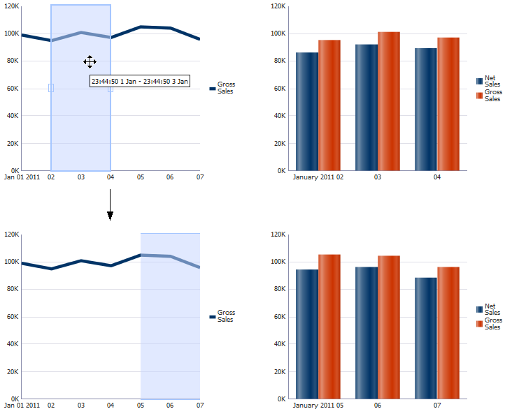
It may be helpful to have an understanding of how graph attributes and graph child tags can affect functionality. For more information, see Section H.2.2, "Configuring Graphs."
You will need to complete these tasks:
-
Create a graph that displays an axis based on time values on your page. For additional information, see Section H.2.3, "How to Add a Graph to a Page."
Area, bar, line, combination, and stock graphs display a time axis when dates of object type
java.util.Dateare specified for the column labels. To use the time selector, ensure that the dates are sorted in ascending order and use regular intervals such as days, weeks, or months.For example, the line graph in Figure H-23 uses sales dates for the o1-axis and gross sales for the series. Figure H-24 shows the sample data.
-
If you are configuring master-detail graphs, create the graph that will display the detail based on the start and end dates of the time selector.
For example, the bar graph in Figure H-23 also uses sales dates for the o1-axis but includes the net sales data in addition to the gross sales.
-
Create methods in a managed or backing bean to return the start and end dates for the time range. For help with managed beans, see Section 2.6, "Creating and Using Managed Beans."
Example H-13 shows two sample methods that return the start and end dates for the time selector's time range.
Example H-13 Sample Methods to Return Start and End Dates for Time Selector
// Include these imports in your bean import java.util.Calendar; import java.util.Date; import java.util.GregorianCalendar; // Add these variables to your bean private static Calendar cal1 = new GregorianCalendar (2011,0,2); private static Calendar cal2 = new GregorianCalendar (2011,0,4); private static Date m_startDate = cal1.getTime(); private static Date m_endDate = cal2.getTime(); // Add these methods to your bean public Date getTimeAxisStartDate() { return m_startDate; } public Date getTimeAxisEndDate() { return m_endDate; } -
Optionally, add a method to the managed bean for the time selector's listener.
Example H-14 shows a sample listener for the time selector displayed in Figure H-23.
Example H-14 Sample Code for Time Selector Listener
// Include these imports in your bean
import java.util.Date;
import java.util.Calendar;
import java.util.GregorianCalendar;
import oracle.adf.view.faces.bi.event.TimeSelectorEvent;
import javax.faces.event.AbortProcessingException;

// Add this method to your bean
public void processTimeSelectorEvent(TimeSelectorEvent event) throws AbortProcessingException
{
  Date startDate = new Date(event.getStartDate().getTime());
  Date endDate = new Date(event.getEndDate().getTime());
  if (graph2 != null)
  {
    graph2.setTimeRangeStart(startDate);
    graph2.setTimeRangeEnd(endDate);
  }
}
In this example, the
graph2variable is declared as aUIGraphin the page's backing bean. When the user changes the time selector range on the master graph, the listener code sets the new time range on the detail graph.
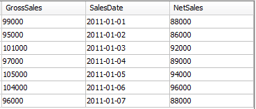
To add a time selector to a graph:
-
In the Structure window, right-click the dvt:typeGraph node and choose Insert inside GraphType > ADF Data Visualizations > dvt:timeSelector.
-
Right-click the dvt:timeSelector node and choose Go to Properties.
-
In the Property Inspector, enter values for the following attributes:
-
ExplicitStart: Specify a reference to a method that returns the initial starting date for the time range.
For example, for a bean named
timeSelectorDemoand thegetTimeAxisStartDate()method referenced in Example H-13, enter the following for the initial date:#{timeSelectorDemo.timeAxisStartDate}. -
ExplicitEnd: Specify a reference to a method that returns the initial ending date for the time range.
-
Mode: From the attribute's dropdown list, select
EXPLICITto enable the time selector display. By default, this attribute is set toOFF. -
FillColor: From the attribute's dropdown list, select the color for the fill of the time selector.
-
To display the data points behind the time selector, use the Transparency slider to select a value below 100%.
For example, set the Transparency slider to 53% to duplicate the time selector in Figure H-23. This has the effect of changing the fill color value from a 6 digit hexadecimal value to an 8 digit value. The first two digits represent the transparency for the fill color. By default, the fill color is set to
#000000, and the time selector's fill color is opaque. -
Optionally, to enable transparency, from the FillTransparent dropdown list, select
true.If you set FillTransparent and BorderTransparent to
true, the time selector will not be displayed, but the user can still select it. -
BorderColor: From the attribute's dropdown list, select the color for the border of the time selector.
-
Optionally, to enable transparency, from the BorderTransparent dropdown list, select
true. -
Optionally, in the TimeSelectorListener field, specify a reference to a method that returns the listener for the time selector.
For example, for a managed bean named
timeSelectorDemoand theprocessTimeSelectorEventmethod referenced in Example H-14, enter the following for the time selector listener:#{timeSelectorDemo.processTimeSelectorEvent}.
Example H-15 shows the code on the JSF page for the example time selector.
-
-
If you created a detail graph, update the detail graph to use an explicit time range and configure it to update when the time selector changes.
-
In the Structure window, right-click the detail graph node and choose Go to Properties.
-
In the Property Inspector, expand the Appearance section.
-
From the TimeRangeMode attribute's dropdown list, select
TRM_EXPLICIT. -
In the TimeRangeStart field, specify a reference to a method that returns the starting time for the time range.
For example, for a bean named
timeSelectorDemoand thegetTimeAxisStartDate()method referenced in Example H-13, enter the following for the initial date:#{timeSelectorDemo.timeAxisStartDate}. -
In the TimeRangeEnd field, specify a reference to a method that returns the ending time for the time range.
-
In the Property Inspector, expand the Behavior section.
-
In the PartialTriggers field, enter the ID of the master graph to enable the detail graph to update when the user changes the time selector range.
For example, enter
::graph1to reference the ID of the line graph in Figure H-23. You can also choose Edit from the PartialTriggers dropdown menu to select the partial trigger.
-
H.7.4 Adding Alerts and Annotations to Graphs
Alerts define a data value on a graph that must be highlighted with a separate symbol, such as an error or warning. An icon marks the location of the alert. When the cursor moves over the alert icon, the text of that alert is displayed.
Annotations are associated with a data value on a graph to provide information when the cursor moves over the data value.
H.7.4.1 How to Add Alerts to Graphs
An unlimited number of alerts can be defined for a graph using dvt:alert tags. The alerts are wrapped in a dvt:alertSet tag which is a child of the graph tag. For each alert, you must specify the image source (imageSource) and location that you want the alert to display on the x-axis or ordinal axis (xValue) and on the y-axis (yValue). If your graph uses a y2-axis, you can use the YValueAssignment attribute to associate the yValue with the y2-axis. You can also specify the text to display when the user hovers the mouse over the alert.
Example H-16 shows the code for an alert displayed on a line graph. In this example, the xValue and yValue attributes are defined in the alertBean managed bean. At runtime, the user can modify the alert's location on both axes by changing the spin box or date selector.
Example H-16 Sample Code for Graph Alerts
<af:panelGroupLayout>
  <af:outputText value="Use spin box and date selector to change alert location."
                 id="ot2"/>
  <af:panelGroupLayout id="pgl2" layout="horizontal">
    <dvt:lineGraph id="graph1"
                   subType="LINE_VERT_ABS"
                   tabularData="#{alertBean.lineList}"
                   timeAxisType="TAT_MIXED_FREQUENCY_STRICT"
                   partialTriggers="::al1 ::yValue"
                   shortDesc="Line Graph">
      <dvt:graphTitle text="Line Graph"/>
      <dvt:alertSet>
        <dvt:alert xValue="#{alertBean.alertDate}"
                   yValue="#{alertBean.alertYValue}"
                   imageSource="#{resource['images:alert_icon.png']}"
                   text="Alert Example"/>
      </dvt:alertSet>
      <dvt:graphFootnote text="Alerts assigned to location and date"/>
    </dvt:lineGraph>
    <af:panelGroupLayout layout="vertical" id="pgl8">
      <af:inputDate label="Date" id="al1" value="#{alertBean.alertDate}"
                    autoSubmit="true"/>
      <af:inputNumberSpinbox label="Y Value" id="yValue"
                             value="#{alertBean.alertYValue}"
                             autoSubmit="true" stepSize="10"/>
    </af:panelGroupLayout>
</af:panelGroupLayout>
You specify values for the alert's location attributes through the Property Inspector. The xValue attribute can be a string, double, or date. The yValue must be defined as a double.
If your xValue is a date, you must define a method that sets the alert's xValue in the graph's managed bean. Example H-17 shows code that will create a sample array of tabular data and define the alert's methods to change the alert date and value to match the user's selection. For additional information about tabular data, see Section H.2.5, "How to Create a Graph Using Tabular Data." For help with managed beans, see Section 2.6, "Creating and Using Managed Beans."
Example H-17 Sample Managed Bean for Graph Alerts
import java.util.Date;
import java.util.ArrayList;
import java.util.Random;
import java.util.List;
import java.util.Calendar;
import java.util.GregorianCalendar;

public class alertBean {
  private List m_lineList;
  private Double m_alertYValue;
  private static Calendar cal1 = new GregorianCalendar (2010,0,1);
  private static Calendar cal2 = new GregorianCalendar (2010,0,1);
  private Date m_date;
  public alertBean(){
     m_alertYValue = new Double(100);
     m_date = cal1.getTime();
     Random random = new Random();
       m_lineList = new ArrayList();
       Date newDate = cal2.getTime();
       for (int i = 0; i < 100; i ++){
          double number = random.nextDouble() * 20+90;
          m_lineList.add(new Object[]{"Group "+i,"Series 1", newDate});
          m_lineList.add(new Object[]{"Group' "+i,"Series 1",
                        new Double(number)});
          newDate = new Date(newDate.getTime() + 86400000);
       }
   }
     public List getLineList(){
         return m_lineList;
     }
     public Date getAlertDate(){
         return m_date;
     }
     public void setAlertDate(Date date){
         m_date = date;
     }
     public Double getAlertYValue(){
         return m_alertYValue;
     }
     public void setAlertYValue(Double value){
         m_alertYValue = value;
     }
}
Figure H-25 shows the initial page that is rendered when the application starts. If you change the date or enter a different value for the y-axis, the alert icon will move to the new location.
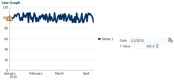
It may be helpful to have an understanding of how graph attributes and graph child tags can affect functionality. For more information, see Section H.2.2, "Configuring Graphs."
You should already have a graph on your page. If you do not, follow the instructions in this chapter to create a graph. For information, see Section H.2.3, "How to Add a Graph to a Page."
-
Optionally, create a managed bean and add the code that will set and get the alert values. For additional help, see Section 2.6, "Creating and Using Managed Beans."
For example, to duplicate the alert displayed in Figure H-25, create a managed bean named
popupSample.javausing the code in Example H-17. -
In the Structure window, right-click the dvt:typeGraph node and choose Insert inside GraphType > ADF Data Visualizations > dvt:alertSet.
-
Right-click the dvt:alert node and choose Go to Properties.
-
In the Property Inspector, set the following attributes:
-
ImageSource: Specify the path to the alert's icon using the attribute's dropdown menus to select an existing image or choose Edit to add a new one to the application.
-
Text: Specify optional text that appears in a tooltip when a mouse pointer hovers over the icon.
-
XValue: Specify a value for the x-axis or ordinal axis. Optionally, use the attribute's dropdown menu to access the EL Expression Builder and select the method that sets the alert's
xValue.For example, for the
alertBeanmanaged bean in Example H-17 and the methodsetAlertDate, set thexValueto the following value:#{alertBean.alertDate}. -
YValue: Specify a value for the y-axis. Optionally, use the attribute's dropdown menu to access the EL Expression Builder and select the method that sets the alert's
yValue.For example, for the
alertBeanmanaged bean in Example H-17 and the methodsetAlertYValue, set theyValueto the following value:#{alertBean.alertDate}. -
YValueAssignment: Identify which axis to associate with the
yValueattribute. Valid values are:Y1AXIS(default) orY2AXIS(if configured).In the managed bean example in Example H-17, the
yValueis associated with theY1AXISso there is no need to change the default.
-
-
To add additional alerts, in the Structure window, right-click the dvt:alertSet and choose Insert inside dvt:alertSet > dvt:alert for each new alert.
-
Repeat Step 3 and Step 4 to configure the new alert.
H.7.4.2 Adding Annotations to Graphs
An unlimited number of annotations can be defined for a graph using dvt:annotation tags, and multiple annotations can be associated with a single data value. The annotations are wrapped in a dvt:annotationSet tag that is a child of the graph tag.
The data marker associated with the annotation is defined using these attributes of the dvt:annotation tag:
-
series: Specifies the zero-based index of a series in a graph. In most graphs, each series appears as a set of markers that are the same color. For example, in a multiple pie graph, each yellow slice might represent sales of shoes, while each green slice represents the sales of boots. In a bar graph, all of the yellow bars might represent the sales of shoes, and the green bars might represent the sales of boots. -
group: Specifies the zero-based index of a group in a graph. Groups appear differently in different graph types. In a clustered bar graph, each cluster of bars is a group. In a stacked bar graph, each stack is a group. In a multiple pie graph, each pie is a group.
Example H-18 shows a set of annotations for an area graph.
Example H-18 Sample Code for a Set of Annotations
<dvt:areaGraph>
  <dvt:annotationSet>
    <dvt:annotation series="0" group="0" text="annotation #1"/>
    <dvt:annotation series="0" group="7" fillColor="#55FFFF00"
                    borderColor="#55FF0000" text="second annotation"/>
  </dvt:annotationSet>
</dvt:areaGraph>
You can control the position of the annotation in the plot area of a graph using these attributes:
-
position: Specifies the type of positioning to use for the annotation. Valid values are:-
dataValue(default): Positions the annotation by the data value defined in theseriesandgroupattributes. Overlap with other annotations is avoided. -
absolute: Positions the annotation at the exact point defined by thexValueand theyValuein graphs with both those axes. Overlap with other annotations is not avoided. -
percentage: Positions the annotation at the exact point defined by using thexValueandyValueas a percentage between 0 and 100 of the plot area of graphs with both those axes. Overlap with other annotations is not avoided.
-
-
xValue: Specifies the X value at which to position the annotation. This setting only applies when the annotation position isabsoluteorpercentage. -
yValue: Specifies the Y value at which to position the annotation. This setting only applies when the annotation position isabsoluteorpercentage. -
horizontalAlignment: Specifies the horizontal positioning of the annotation. This setting only applies when the annotationpositionattribute isabsoluteorpercentage. Valid values areLEFT(default),CENTER,LEADING, orRIGHT. -
verticalAlignment: Specifies the vertical positioning of the annotation. This setting only applies when the annotationpositionattribute isabsoluteorpercentage. Valid values areCENTER(default),TOP, orBOTTOM.
H.7.5 How to Add Drop Functionality to Pareto and Stock Graphs
The ADF Faces framework provides the ability to drag and drop items from one place to another on a page. Pareto and stock graphs can be configured as a drop target to allow drops from other ADF components. For example, you can configure a stock graph to allow drops from an ADF table cell.
To configure a Pareto or stock graph as a drop target, add the af:dropTarget tag as a child of the Pareto or stock Graph, and add a method in a managed bean to respond to the drop event. Example H-19 shows a sample drop listener for a graph configured to accept drops from an ADF table.
Example H-19 Managed Bean Sample for Handling Drag and Drop Targets
public class dragAndDrop {
  public DnDAction fromTableDropListener(DropEvent event) {
    Transferable transferable = event.getTransferable();
    DataFlavor<RowKeySet> dataFlavor = DataFlavor.getDataFlavor(RowKeySet.class, "fromTable");
    RowKeySet set = transferable.getData(dataFlavor);
    Employee emp = null;
    if(set != null && !set.isEmpty()) {
      int index = (Integer) set.iterator().next();
      emp = m_tableModel.get(index);
    }
    if(emp == null)
        return DnDAction.NONE;
    DnDAction proposedAction = event.getProposedAction();
    if(proposedAction == DnDAction.COPY) {
      m_graphList.add(emp);
    }
    else if(proposedAction == DnDAction.LINK) {
      m_graphList.add(emp);
    }
    else if(proposedAction == DnDAction.MOVE) {
      m_graphList.add(emp);
      m_tableModel.remove(emp);
    }
    else
        return DnDAction.NONE;
  RequestContext.getCurrentInstance().addPartialTarget(event.getDragComponent());
    return event.getProposedAction();
  }
You must also configure the ADF Faces component, object, or collection as a drag source and define the method that will respond to the drag. For additional information about configuring drag and drop, see Chapter 35, "Adding Drag and Drop Functionality."
It may be helpful to have an understanding of how graph attributes and graph child components can affect functionality. For more information, see Section H.2.2, "Configuring Graphs."
You must complete the following tasks:
-
Add a Pareto or stock graph to your page. For more information, see Section H.2.3, "How to Add a Graph to a Page."
-
Create the method that will listen for drops on the graph. For information about using managed beans, see Section 2.6, "Creating and Using Managed Beans."
To configure a Pareto or stock graph as a drop target:
-
In the Structure window, right-click dvt:paretoGraph or dvt:stockGraph and choose Insert inside (Pareto or Stock) > af:dropTarget.
-
In the Insert Drop Target dialog, specify the DropListener as an EL Expression that evaluates the reference to the
oracle.adf.view.rich.event.DropEventmethod called when a drop occurs on the component.To specify the DropListener used in Example H-19, enter:
#{dragAndDrop.fromTableDropListener}. -
In the Insert Data Flavors dialog, specify the flavorClass, the fully qualified Java class name for this
dataFlavor. If the drop contains thisdataFlavor, the drop target is guaranteed to be able to retrieve an Object from the drop with this Java type using thisdataFlavor.For example, to specify the flavorClass for a drop target configured to allow drops from an ADF table, enter:
org.apache.myfaces.trinidad.model.RowKeySet.
H.7.6 How to Add Popups to Graphs
Graph child component seriesSet can be configured to display popup dialogs, windows, and menus that provide information or request input from end users. Using the af:popup component with other ADF Faces components, you can configure functionality to allow your end users to show and hide information in secondary windows, input additional data, or invoke functionality such as a context menu.
With ADF Faces components, JavaScript is not needed to show or hide popups. The af:showPopupBehavior tag provides a declarative solution, so that you do not have to write JavaScript to open a popup component or register a script with the popup component. For more information about these components, see Chapter 13, "Using Popup Dialogs, Menus, and Windows."
For example, you may want to associate a popup displaying information in a note window with the data markers in a scatter graph series. Figure H-26 shows a scatter graph with a data marker clicked to display a gauge in a note window with data about a specific marker.
It may be helpful to have an understanding of how graph attributes and graph child components can affect functionality. For more information, see Section H.2.2, "Configuring Graphs."
You will need to complete these tasks:
-
Add a graph to your page. For more information, see Section H.2.3, "How to Add a Graph to a Page."
To duplicate the gauge popup example in Figure H-26, create a scatter graph.
-
Create the popup components for data points in a graph series to reference. Figure H-26 shows a code sample for the popup to be referenced when the user clicks on a data point in the graph series displayed in Figure H-26.
Example H-20 Code Sample for the Graph Data Marker Popup Window
<af:popup id="graphPopup" launcherVar="source" eventContext="launcher" clientComponent="true" contentDelivery="lazyUncached"> <af:setPropertyListener from="#{source.seriesKey}" to="#{popupSample.seriesKey}" type="popupFetch"/> <af:setPropertyListener from="#{source.groupKeys}" to="#{popupSample.groupKeys}" type="popupFetch"/> <af:panelWindow title="Graph Popup" id="pw1"> <dvt:gauge shortDesc="Gauge" value="#{popupSample.gaugeValue}" gaugeType="DIAL" animationOnDisplay="auto" inlineStyle="width:150px;height:120px;" minValue="0" maxValue="100" contentDelivery="immediate" id="g3"> <dvt:bottomLabel text="Sales" position="LP_NONE"/> <dvt:metricLabel position="LP_NONE"/> <dvt:thresholdSet> <dvt:threshold thresholdMaxValue="#{popupSample.quotaValue}" text="Under Quota"/> <dvt:threshold fillColor="#84AE31" text="Above Quota"/> </dvt:thresholdSet> <dvt:indicator useThresholdFillColor="true"/> <dvt:tickLabel content="TC_MIN_MAX TC_INCREMENTS"/> <dvt:tickMark content="TC_NONE" majorTickCount="5"/> </dvt:gauge> </af:panelWindow> </af:popup> -
Add methods to a managed bean to define the listener methods that will respond to the popup request. For help with managed beans, see Section 2.6, "Creating and Using Managed Beans."
Example H-21 shows the sample code used to respond to the popup request in the gauge popup example. In this example, the scatter graph is using default data values.
Example H-21 Managed Bean Sample Code for the Graph Data Marker Popup
import java.util.List;
import java.util.Set;
import oracle.adf.view.faces.bi.component.gauge.UIGauge;
import oracle.adf.view.faces.bi.component.graph.UIGraph;
import oracle.adf.view.faces.bi.model.KeyMap;
import oracle.dss.graph.DataType;
public class popupSample {
  private UIGraph m_graph;
  private UIGauge m_gauge;
  private KeyMap m_seriesKey;
  private List<KeyMap> m_groupKeys;
  public UIGraph getGraph() {
      if(m_graph == null)
         m_graph = new UIGraph();
      return m_graph;
  }
  public void setGraph(UIGraph graph) { m_graph = graph; }
  public UIGauge getGauge() {
      if(m_gauge == null)
         m_gauge = new UIGauge();
      return m_gauge;
  }
  public void setGauge(UIGauge gauge) { m_gauge = gauge;}
  public KeyMap getSeriesKey() { return m_seriesKey; }

  public void setSeriesKey(KeyMap key) { m_seriesKey = key; }
  public List<KeyMap> getGroupKeys() { return m_groupKeys; }
  public void setGroupKeys(List<KeyMap> keys) { m_groupKeys = keys; }
  private int m_gaugeValue = 0;
  public int getGaugeValue() {
    // Reestablish context
    m_graph.setDataKey(m_seriesKey, m_groupKeys);
    // Fetch the x value
    Object val = m_graph.getDataValue(DataType.X_VALUE);
    if(val instanceof Number) {
      Number number = (Number) val;
      m_gaugeValue = (int) number.doubleValue();
    }
    return m_gaugeValue;
  }
  private int m_quotaValue = 0;
  public int getQuotaValue() {
    // Reestablish context
    m_graph.setDataKey(m_seriesKey, m_groupKeys);
    // Fetch the y value
    Object val = m_graph.getDataValue(DataType.Y_VALUE);
    if(val instanceof Number) {
      Number number = (Number) val;
      m_quotaValue = (int) number.doubleValue();
    }
    return m_quotaValue;
  }
}
To add a popup to a graph series set:
-
In the Structure window, right-click the graph child dvt:seriesSet component and choose Insert inside dvt:seriesSet > af:showPopupBehavior.
-
Right-click the af:showPopupBehavior node and choose Go to Properties.
-
In the Property Inspector, set the following attributes:
-
PopupId: Enter the ID of the popup, relative to the containing component. An ID beginning with a colon will be treated as absolute after trimming off the colon.
For example, to reference the gauge popup in Example H-20, enter:
::graphPopup. -
TriggerType: Enter the event type that will trigger the popup being displayed. Valid values for graph
seriesSetcomponents areaction,click, andmouseHover.For example, to continue with the gauge popup example, enter:
click. -
Align: From the dropdown list, choose how the popup should be aligned with the
seriesSetcomponent.This attribute does not have a default setting and is normally required. However, the attribute does not require setting if the popup type is
af:panelWindoworaf:dialog. These types of popups can be manually repositioned using drag-and-drop and will open by default at the center of the browser window.To continue with the gauge popup example, leave this field blank since the gauge popup example is using an
af:panelWindowtype. -
AlignID: Enter the ID of the component relative to which the popup will be aligned. An ID beginning with a colon will be treated as absolute after trimming off the colon.
This attribute is also normally required unless the popup type is
af:panelWindoworaf:dialog. To continue with the gauge popup example, leave this field blank.
-
Example H-22 shows the code sample for associating a popup component with a graph series set component.
Example H-22 Code Sample for Popup Associated With Series Set Component
<dvt:scatterGraph dataSelection="single"
                  shortDesc="Scatter Graph with Click Popup"
                  binding="#{popupSample.graph}"
                  inlineStyle="width:500px;height:350px;" id="g2">
  <dvt:seriesSet defaultMarkerShape="MS_HUMAN">
    <af:showPopupBehavior triggerType="click" popupId="::graphPopup"/>
  </dvt:seriesSet>
  <dvt:x1Title text="Sales in Millions"/>
  <dvt:y1Title text="Quota in Millions"/>
  <dvt:graphTitle text="Sales Performance"/>
  <dvt:graphSubtitle text="FY08"/>
</dvt:scatterGraph>
H.7.7 Adding Data Marker Selection Support for Graphs
Add selection support to respond programmatically when a user selects one or more of the graph's data markers.
For example, Figure H-27 displays a bar graph supporting single and multiple selection to output information about each selected series. To make multiple selections, users press Control on the keyboard while selecting the data markers.
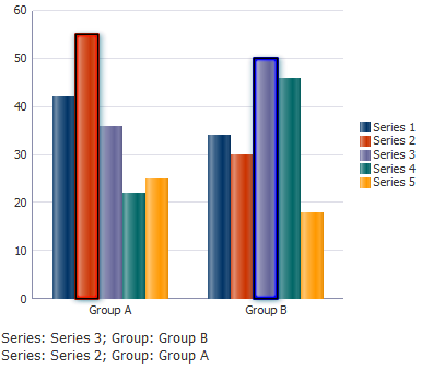
H.7.7.1 How to Add Selection Support to Graphs
To add selection support, create a listener in a managed bean that will handle the SelectionEvent and perform the needed logic. You then enable selection support in the graph's dataSelection attribute and bind the selectionListener attribute of the graph to that listener.
Example H-23 shows sample code to create a managed bean that returns the selection state as the formatted string displayed below the bar graph in Figure H-27.
Example H-23 Managed Bean Example for Graph Selection Support
import java.util.List;
import java.util.Set;
import oracle.adf.view.faces.bi.component.graph.DataSelection;
import oracle.adf.view.faces.bi.component.graph.GraphSelection;
import oracle.adf.view.faces.bi.event.graph.SelectionEvent;
import oracle.adf.view.faces.bi.model.KeyMap;

public class graphSelection {
  public void selectionListener(SelectionEvent selectionEvent) {
    StringBuilder eventInfo = new StringBuilder();
    Set<? extends GraphSelection> selectionSet = selectionEvent.getGraphSelection();
    eventInfo.append(convertSelectionStateToString(selectionSet));

    // Store on the selection string
    m_selectionInfo = eventInfo.toString();
  }

  /**
   * Returns the selection state as a formatted String with one selected data point per line.
   * @param selectionSet
   * @return
   */
  public static String convertSelectionStateToString(Set<? extends GraphSelection> selectionSet) {
    StringBuilder selectionState = new StringBuilder();
    for(GraphSelection selection: selectionSet) {
      if(selection instanceof DataSelection) {
        DataSelection ds = (DataSelection) selection;
        Set seriesKeySet = ds.getSeriesKey().keySet();
        for(Object key : seriesKeySet) {
          selectionState.append(key).append(": ").append(ds.getSeriesKey().get((String)key));
        }

        List<KeyMap> groupKeys = ds.getGroupKeys();
        for(KeyMap groupKey : groupKeys) {
          Set groupKeySet = groupKey.keySet();
          for(Object key : groupKeySet) {
            selectionState.append("; ").append(key).append(": ").append(groupKey.get((String)key));
          }
        }

        selectionState.append("<br>");
      }
    }

    return selectionState.toString();
  }

  private String m_selectionInfo = "Select a marker to see information here.  Multiple objects can be selected by holding CTRL while selecting.";
  public String getSelectionInfo() {
    return m_selectionInfo;
  }
}
Example H-24 shows the code sample for configuring the JDeveloper page for multiple selection support and to bind the selectionListener attribute of the graph to the selection listener. The sample uses the af:outputFormatted component to display the selected information on the page.
Example H-24 Code Sample for Configuring Graph Selection Support on a Page
<af:panelGroupLayout id="pgl1">
  <dvt:barGraph id="graph1" subType="BAR_VERT_CLUST" shortDesc="BarGraph"
                selectionListener="#{graphSelection.selectionListener}"
                dataSelection="multiple">
    <dvt:background>
      <dvt:specialEffects/>
    </dvt:background>
    <dvt:graphPlotArea/>
    <dvt:seriesSet>
      <dvt:series/>
    </dvt:seriesSet>
    <dvt:o1Axis/>
    <dvt:y1Axis/>
    <dvt:legendArea automaticPlacement="AP_NEVER"/>
  </dvt:barGraph>
  <af:outputFormatted id="selectionText"
                      inlineStyle="font-size:120.0%;"
                      partialTriggers="graph1"
                      value="#{graphSelection.selectionInfo}"/>
</af:panelGroupLayout>
It may be helpful to have an understanding of how graph attributes and graph child components can affect functionality. For more information, see Section H.2.2, "Configuring Graphs."
You will need to complete these tasks:
-
Add a graph to your page. For more information, see Section H.2.3, "How to Add a Graph to a Page."
To duplicate the multiple selection support example in this section, create a bar graph.
-
Add methods to a managed bean to define the listener methods that will respond to the selection events. For help with managed beans, see Section 2.6, "Creating and Using Managed Beans."
To add selection support to graphs:
-
In the Structure window, right-click the dvt:typeGraph node and choose Go to Properties.
-
In the Property Inspector, expand the Behavior section and specify the values for the following attributes:
-
DataSelection: Specify
singleormultipleto enable selection support for single or multiple data markers. The default is none which means that selection is not enabled by default. -
SelectionListener: Specify a reference to the selection listener.
For example, to specify the
selectionListenermethod in a managed bean namedgraphSelection.java, enter the following in the SelectionListener field:#{graphSelection.selectionListener}.
-
-
Complete any additional configuration as needed.
For example, to duplicate the multiple selection example in this section, add the following code to your page:
<af:outputFormatted id="selectionText"
    inlineStyle="font-size:120.0%;"
    partialTriggers="graph1" value="#{graphSelection.selectionInfo}"/>
H.7.7.2 What You May Need to Know About Graph Data Marker Selection
The selection listener responds to click events on graph data markers only.
JDeveloper also provides a clickListener listener that can respond to click events on other graph components. The click listener, however, provides only single selection support and does not provide the same hover and click feedback that the selectionListener listener can provide. The clickListener attribute is also not available on newer components, and its use is generally discouraged in favor of the selection listener.
H.7.8 Configuring Graph Context Menus
Context menus can be defined for graph components using these context menu facets:
-
bodyContextMenu: Specifies a context menu that is displayed on non selectable elements in the graph component. -
contextMenu: Specifies a context menu that is displayed on any selectable element in the graph component. -
multiSelectContextMenu: Specifies a content menu that is displayed when multiple elements are selected in the graph component.
Each facet on a JSP or JSPX page supports a single child component. Facelets support multiple child components. For all of these facets to work, selection must be enabled and supported for the specific graph type. Context menus are currently only supported in Flash.
For example, Figure H-28 shows a scatter graph context menu with custom menu items.
Example H-25 shows a code sample for configuring a scatter graph context menu.
Example H-25 Code Sample for Scatter Graph Context Menu
<dvt:scatterGraph binding="#{contextMenu.graph}" subType="SCATTER"
                  dataSelection="multiple" id="graph" shortDesc="ScatterGraph">
  <f:facet name="contextMenu">
    <af:popup contentDelivery="lazyUncached" id="p1">
      <af:menu id="m1">
        <af:commandMenuItem text="Show Details"
                            actionListener="#{contextMenu.menuItemListener}"
                            id="cmi1"/>
        <af:group id="g1">
          <af:commandMenuItem text="Add Task for #{contextMenu.currentSeriesId}"
                              actionListener="#{contextMenu.menuItemListener}"
                              id="cmi2"/>
          <af:commandMenuItem text="Add Task"
                              actionListener="#{contextMenu.menuItemListener}"
                              id="cmi3"/>
          <af:commandMenuItem text="Add Notes"
                              actionListener="#{contextMenu.menuItemListener}"
                              id="cmi4"/>
        </af:group>
      </af:menu>
    </af:popup>
  </f:facet>
  <f:facet name="bodyContextMenu">
    <af:popup contentDelivery="immediate" id="p2">
      <af:menu id="m2">
        <af:goMenuItem text="www.oracle.com"
                       destination="http://www.oracle.com"
                       id="gmi1"/>
      </af:menu>
    </af:popup>
  </f:facet>
  <f:facet name="multiSelectContextMenu">
    <af:popup contentDelivery="lazyUncached" id="p3">
      <af:menu id="m3">
        <af:commandMenuItem text="Compare Selected Objects"
                            actionListener="#{contextMenu.menuItemListener}"
                            id="cmi5"/>
      </af:menu>
    </af:popup>
  </f:facet>
</dvt:scatterGraph>
Example H-26 shows a code sample for a managed bean to create a custom context menu. For help with managed beans, see Section 2.6, "Creating and Using Managed Beans."
Example H-26 Managed Bean to Create Custom Context Menu
import java.util.Set;
import javax.faces.component.UIComponent;
import javax.faces.event.ActionEvent;
import oracle.adf.view.faces.bi.component.graph.DataSelection;
import oracle.adf.view.faces.bi.component.graph.GraphSelection;
import oracle.adf.view.faces.bi.component.graph.UIGraph;
import oracle.adf.view.faces.bi.model.KeyMap;
import oracle.adf.view.rich.component.rich.nav.RichCommandMenuItem;
import oracle.adf.view.rich.component.rich.output.RichOutputFormatted;
import org.apache.myfaces.trinidad.context.RequestContext;

public class ContextMenu {
  private RichOutputFormatted m_outputFormatted;
  public RichOutputFormatted getOutputFormatted() {
    if(m_outputFormatted == null)
      m_outputFormatted = new RichOutputFormatted();
    return m_outputFormatted;
  }
  public void setOutputFormatted(RichOutputFormatted text) {
    m_outputFormatted = text;
  }
  private String m_status = "Click Menu Item for Status";
  public String getStatus() {
    return m_status;
  }
  private UIGraph m_graph;
  public UIGraph getGraph() {
    if(m_graph == null)
      m_graph = new UIGraph();
    return m_graph;
  }
  public void setGraph(UIGraph graph) {
    m_graph = graph;
  }
  public String getCurrentSeriesId() {
    if(m_graph != null) {
      Set<? extends GraphSelection> set = m_graph.getSelection();
      if(set != null && !set.isEmpty()) {
        GraphSelection selection = set.iterator().next();
        if(selection instanceof DataSelection) {
          DataSelection dataSelection = (DataSelection) selection;
          KeyMap seriesKey = dataSelection.getSeriesKey();
          Set seriesKeySet = seriesKey.keySet();
          for(Object key : seriesKeySet) {
            return seriesKey.get((String)key);
          }
        }
      }
    }
    return null;
  }
  /**
   * Called when a commandMenuItem is clicked.  Updates the outputText with information about the menu item clicked.
   * @param actionEvent
   */
  public void menuItemListener(ActionEvent actionEvent) {
    UIComponent component = actionEvent.getComponent();
    if(component instanceof RichCommandMenuItem) {
      RichCommandMenuItem cmi = (RichCommandMenuItem) component;
      // Add the text of the item into the status message
      StringBuilder s = new StringBuilder();
      s.append("You clicked on \"").append(cmi.getText()).append("\".  <br><br>");
      // If graph data is selected, add that too
      Set<? extends GraphSelection> selectionSet = m_graph.getSelection();
      if(!selectionSet.isEmpty()) {
        // Write out the selection state
        s.append("The current graph selection is: <br>");
        s.append(SelectionSample.convertSelectionStateToString(selectionSet));
      }
      m_status = s.toString();
      RequestContext.getCurrentInstance().addPartialTarget(m_outputFormatted);
    }
  }
}
The managed bean in the preceding example calls the SelectionSample class which is displayed in Example H-27.
Example H-27 Managed Bean for Custom Context Menu SelectionSample Class
import java.util.ArrayList;
import java.util.List;
import java.util.Set;
import javax.faces.model.SelectItem;
import oracle.adf.view.faces.bi.component.graph.DataSelection;
import oracle.adf.view.faces.bi.component.graph.GraphSelection;
import oracle.adf.view.faces.bi.event.graph.SelectionEvent;
import oracle.adf.view.faces.bi.model.KeyMap;
public class SelectionSample {
  public void selectionListener(SelectionEvent selectionEvent) {
    StringBuilder eventInfo = new StringBuilder();
    Set<? extends GraphSelection> selectionSet =
                           selectionEvent.getGraphSelection();
    eventInfo.append(convertSelectionStateToString(selectionSet));
    // Store on the selection string
    m_selectionInfo = eventInfo.toString();
  }
  /**
   * Returns selection state formatted with one selected data point per line.
   * @param selectionSet
   * @return
   */
  public static String convertSelectionStateToString
                       (Set<? extends GraphSelection> selectionSet) {
    StringBuilder selectionState = new StringBuilder();
    for(GraphSelection selection: selectionSet) {
      if(selection instanceof DataSelection) {
        DataSelection ds = (DataSelection) selection;
        Set seriesKeySet = ds.getSeriesKey().keySet();
        for(Object key : seriesKeySet) {
          selectionState.append(key).append(": ").
                                 append(ds.getSeriesKey().get((String)key));
        }
        List<KeyMap> groupKeys = ds.getGroupKeys();
        for(KeyMap groupKey : groupKeys) {
          Set groupKeySet = groupKey.keySet();
          for(Object key : groupKeySet) {
            selectionState.append("; ").append(key).append(": ").
                                        append(groupKey.get((String)key));
          }
        }
        selectionState.append("<br>");
      }
    }
    return selectionState.toString();
  }
  private String m_selectionInfo = "Select a marker to see information here.";
  public String getSelectionInfo() {
    return m_selectionInfo;
  }
  private String graphType = "bubbleGraph";
  public String getGraphType() {
      return graphType;
  }
  public void setGraphType(String type) {
      graphType = type;
  }
  private List graphList;
  public List getGraphList() {
      graphList = new ArrayList();
      SelectItem graph = new SelectItem("bubbleGraph", "Bubble Graph");
      graphList.add(graph);
      graph = new SelectItem("scatterGraph", "Scatter Graph");
      graphList.add(graph);
      return graphList;
  }
}
H.7.8.1 What You Many Need to Know About Configuring Graph Context Menus
Due to technical limitations when using the Flash rendering format, context menu contents are currently displayed using the Flash Player's context menu. This imposes several limitations defined by the Flash Player:
-
Flash does not allow for submenus it its context menu.
-
Flash limits custom menu items to 15. Any built-in menu items for the component, for example, a pie graph
interactiveSliceBehaviormenu item, will count towards the limit, -
Flash limits menu items to text-only. Icons or other controls possible in ADF Faces menus are not possible in Flash menus.
-
Each menu caption must contain at least one visible character. Control characters, new lines, and other white space characters are ignored. No caption can be more than 100 characters long.
-
Menu captions that are identical to another custom item are ignored, whether the matching item is visible or not. Menu captions are compared to built-in captions or existing custom captions without regard to case, punctuation, or white space.
-
The following captions are not allowed, although the words may be used in conjunction with other words to form a custom caption: Save, Zoom In, Zoom Out, 100%, Show All, Quality, Play, Loop, Rewind, Forward, Back, Movie not loaded, About, Print, Show Redraw Regions, Debugger, Undo, Cut, Copy, Paste, Delete, Select All, Open, Open in new window, and Copy link.
-
None of the following words can appear in a custom caption on their own or in conjunction with other words: Adobe, Macromedia, Flash Player, or Settings.
Additionally, since the request from Flash for context menu items is a synchronous call, a server request to evaluate EL is not possible when the context menu is invoked. To provide context menus that vary by selected object, the menus will be pre-fetched if the context menu popup uses the setting contentDelivery="lazyUncached". For context menus that may vary by state, this means that any EL expressions within the menu definition will be called repeatedly at render time, with different selection and currency states. When using these context menus that are pre-fetched, the application must be aware of the following:
-
Long running or slow code should not be executed in any EL expression that may be used to determine how the context menu is displayed. This does not apply to
af:commandMenuItemattributes that are called after a menu item is selected, such asactionListener. -
In the future, if the Flash limitations are solved, the ADF context menu may be displayed in place of the Flash context menu. To ensure upgrade compatibility, you should code such that an EL expression will function both in cases where the menu is pre-fetched, and also where the EL expression is evaluated when the menu is invoked. The only component state that applications should rely on are
selectionandcurrency.