24 Using Chart Components
This chapter describes how to use the ADF Data Visualization chart components to display data in charts using simple UI-first development. The chart components include area, bar, bubble, combination, funnel, line, pie, polar, radar, scatter, and spark charts. The chapter defines the data requirements, tag structure, and options for customizing the look and behavior of these components.
If your application uses the Fusion technology stack, you can use data controls to create charts. For more information, see "Creating Databound Charts" in Oracle Fusion Middleware Fusion Developer's Guide for Oracle Application Development Framework.
This chapter includes the following sections:
The DVT graph components are legacy server-side components used for displaying data in graphs. However, the use of these components is discouraged in favor of the client-side charts. Graph components include Pareto and stock graphs. For information about the DVT graph components, see Appendix H, "Using Graph Components."
24.1 Introduction to the Chart Component
The DVT chart components give you the capability of producing a variety of data visualizations that let you evaluate multiple data points on multiple axes in many ways. For example, a number of charts assist you in the comparison of results from one group with the results from another group.
Charts display series and groups of data. Series and groups are analogous to the rows and columns of a grid of data. Typically, the rows in the grid appear as a series in a chart, and the columns in the grid appear as groups.
For most charts, a series appears as a set of markers that are the same color. Typically, the chart legend shows the identification and associated color of each series. For example, in a bar chart, the yellow bars might represent the sales of shoes and the green bars might represent the sales of boots.
Groups appear differently in different chart types. For example, in a stacked bar chart, each stack is a group. A group might represent time periods, such as years. A group might also represent geographical locations such as regions.
Depending on the data requirements for a chart type, a single data item might require one or more data values. For example, a scatter chart requires two values for each data marker. The first value determines where the marker appears along the x-axis while the second value determines where the marker appears along the y-axis.
24.1.1 Chart Component Use Cases and Examples
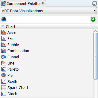
The chart components include nine types of charts with one or more variations for a total of over 13 different charts that you can use to display data. JDeveloper provides a Component Palette that displays available chart categories. Figure 24-1 shows the Component Palette for area, bar, bubble, combination, funnel, line, pie, scatter, and spark charts.
The pareto and stock graphs are legacy server-side components used for displaying data in graphs, and their use is discouraged in favor of the client-side chart components. For information about the DVT graph components, see Appendix H, "Using Graph Components."
When you select a chart category in the Component Palette, JDeveloper displays a dialog with descriptions about the available chart types to provide visual assistance when you are creating charts. Figure 24-2 shows the different area chart types and layouts available when you select the Area chart in the Component Palette.
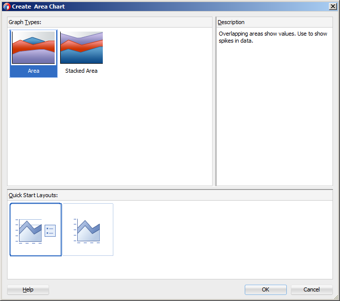
Chart categories include:
-
Area: Represents data as a filled-in area. Use area charts to show trends over time, such as sales for the last 12 months. Area charts require at least two groups of data along an axis. The axis is often labeled with increments of time such as months.
Area charts represent these kinds of data values:
-
Absolute: Each area marker connects a series of two or more data values.
-
Stacked: Area markers are stacked. The values of each set of data are added to the values for previous sets. The size of the stack represents a cumulative total.
Tip:
Stacked charts are generally preferred over absolute charts. Areas in absolute charts can be visually obscured by other areas, depending on the area's data value.
All variations of area charts can be configured with a single y-axis or dual y-axis.
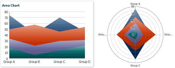
Figure 24-3 shows example area charts with cartesian and polar coordinate systems.
-
-
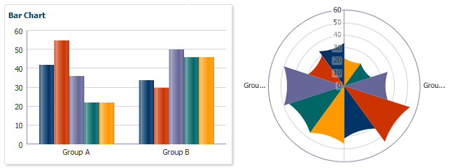
Bar: Represents data as a series of vertical bars. Use bar charts to examine trends over time or to compare items at the same time, such as sales for different product divisions in several regions.
Bar charts represent these kinds of data values:
-
Clustered: Each cluster of bars represents a group of data. For example, if data is grouped by employee, one cluster might consist of a Salary bar and a Commission bar for a given employee. This kind of chart includes the following variations: vertical clustered bar charts and horizontal clustered bar charts.
-
Stacked: Bars for each set of data are appended to previous sets of data. The size of the stack represents a cumulative data total.
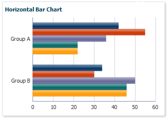
All variations of bar charts can be configured with a single y-axis or dual y-axis. Bar charts may also be displayed horizontally using the
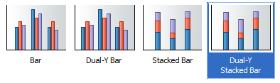
orientationattribute.Figure 24-4 shows variations of the bar chart type as displayed in the Create Bar Chart dialog with the Dual-Y Stacked Bar chart selected.
Figure 24-5 shows example bar charts with cartesian and polar coordinate systems.
Figure 24-6 shows an example bar chart with horizontal orientation.
-
-
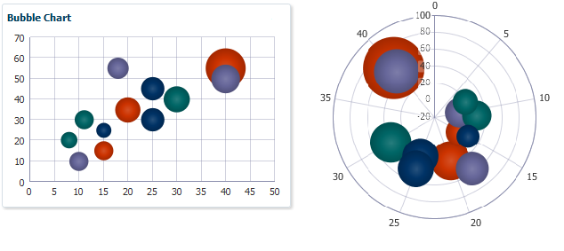
Bubble: Represents data by the location and size of round data markers (bubbles). Use bubble charts to show correlations among three types of values, especially when you have a number of data items and you want to see the general relationships. For example, use a bubble chart to plot salaries (x-axis), years of experience (y-axis), and productivity (size of bubble) for your work force. Such a chart allows you to examine productivity relative to salary and experience.
Figure 24-7 shows example bubble charts with cartesian and polar coordinate systems.
-
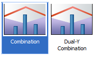
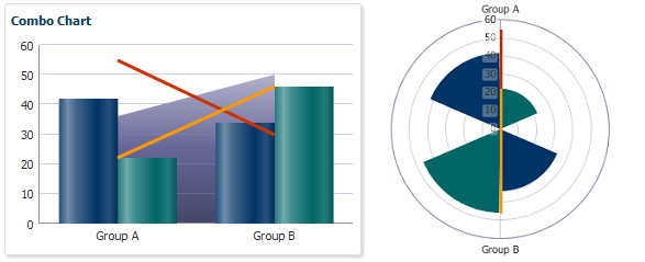
Combination: Chart that uses different types of data markers (bars, lines, or areas) to display different kinds of data items. Use combination charts to compare bars and lines, bars and areas, lines and areas, or all three combinations.
Figure 24-8 shows variations of the combination chart type as displayed in the Create Combination Chart dialog with the default combination chart selected. Combination charts can be configured with a single y-axis or dual y-axis.
Figure 24-9 shows example combination charts with cartesian and polar coordinate systems.
-
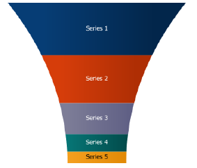
Funnel: Visually represents data related to steps in a process. The steps appear as vertical slices across a vertical or horizontal cone-shaped section. As the actual value for a given step or slice approaches the quota for that slice, the slice fills. Typically, a funnel chart requires actual values and target values against a stage value, which might be time. For example, use the funnel chart to watch a process where the different sections of the funnel represent different stages in the sales cycle.
Figure 24-10 shows an example funnel chart.
-
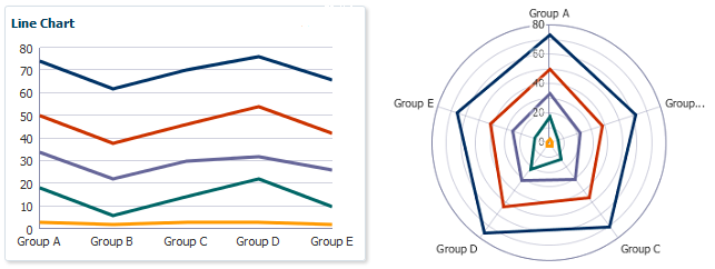
Line: Represents data as a line, as a series of data points, or as data points that are connected by a line. Line charts require data for at least two points for each member in a group. For example, a line chart over months requires at least two months. Typically a line of a specific color is associated with each group of data such as the Americas, Europe, and Asia. Use line charts to compare items over the same time.
Figure 24-11 shows example line charts with cartesian and polar coordinate systems. Line charts can be configured with a single y-axis or dual y-axis
-
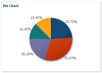
Pie: Represents a set of data items as proportions of a total. The data items are displayed as sections of a circle causing the circle to look like a sliced pie. Use pie charts to show the relationship of parts to a whole such as how much revenue comes from each product line.
Figure 24-12 shows an example pie chart.
-
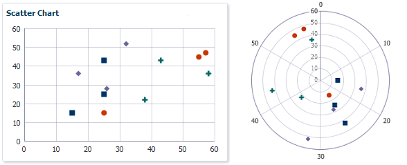
Scatter: Represents data by the location of data markers. Use scatter charts to show correlation between two different kinds of data values such as sales and costs for top products. Use scatter charts in particular to see general relationships among a number of items.
Figure 24-13 shows example scatter charts with cartesian and polar coordinate systems.
-
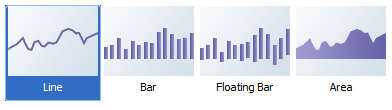
Spark: A simple, condensed chart that displays trends or variations in a single data value, typically stamped in the column of a table or in line with related text. Spark charts have basic conditional formatting. Since spark charts contain no labels, the adjacent columns of a table or surrounding text provide context for spark chart content
Figure 24-14 shows variations of the spark chart type as displayed in the Create Spark Chart dialog with the default chart selected.
Figure 24-15 shows examples of bar, line, area, and floating bar spark charts.
Note:
The pareto and stock components shown in the Component Palette are legacy server-side graphs, and their use is discouraged in favor of the client-side chart components. For information about using legacy graphs, see Appendix H, "Using Graph Components."24.1.2 End User and Presentation Features of Charts
Chart end user and configurable presentation features include a rich variety of options.
24.1.2.1 Chart Data Labels
Use data labels to display information about the data points. You can customize the text, position, and style.
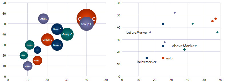
Figure 24-16 shows a bubble chart and a scatter chart, each configured to show data labels. In the bubble chart, the group's value is displayed in the center of the bubble. In the scatter chart, the label position varies by series. In the first series, the label is positioned below the series marker, and the second series is set to auto which displays the label after the marker. The third series label is configured to display the label before the series marker, and the fourth series label displays the label above the marker.
24.1.2.2 Chart Element Labels
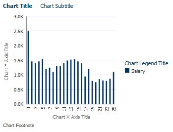
You can add descriptive labels to most chart components and subcomponents, including titles, subtitles, axis labels, footnotes, and legends.
Figure 24-17 shows a bar chart configured to show a title and subtitle. The chart is also configured to show titles for the x-axis, y-axis, legend, and footnote.
24.1.2.3 Chart Sizing
Charts use client-side layout management for controlling the size of the chart. A chart can automatically adjust to the size of the chart's container, and the user can resize the chart by resizing its container. You can also specify the size of a chart using its inlineStyle or styleClass attributes.
Figure 24-18 shows a portion of a page configured with the af:panelSplitter and dvt:barChart components. The user can drag the splitter to change the bar chart's size.
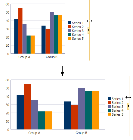
When charts are displayed in a horizontally or vertically restricted area, as in a web page sidebar, the chart is displayed in a fully featured, although simplified display.
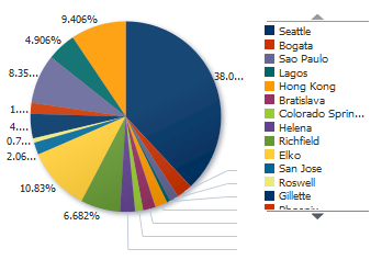
24.1.2.4 Chart Legends
Chart legends identify the chart's series and associated colors. Figure 24-19 shows a pie chart configured with a legend. In this example, the number of series is greater than the legend area, and the user can scroll through the legend items to see all series on the chart.
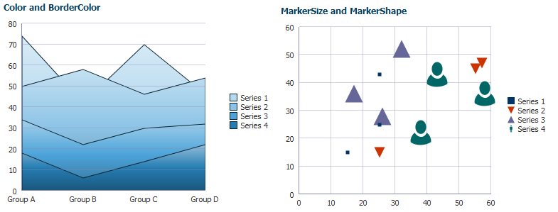
24.1.2.5 Chart Styling
Charts support styling of colors, sizes, and text to customize series, markers, lines, and data items. Figure 24-20 shows an area chart configured with custom colors for the series items and borders and a scatter chart configured with custom markers.
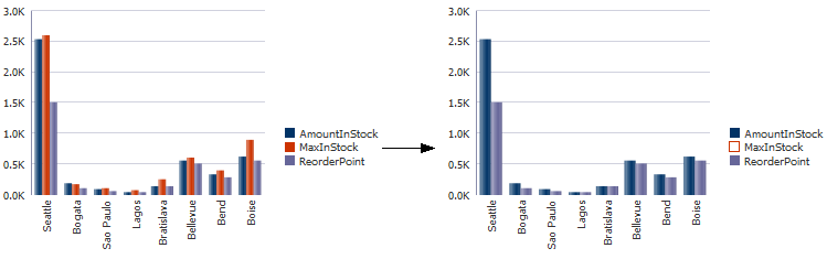
24.1.2.6 Chart Series Hiding
You can configure charts to allow the user to click on a legend series item to hide a series item from view. The resulting chart can be rescaled or rendered without rescaling.
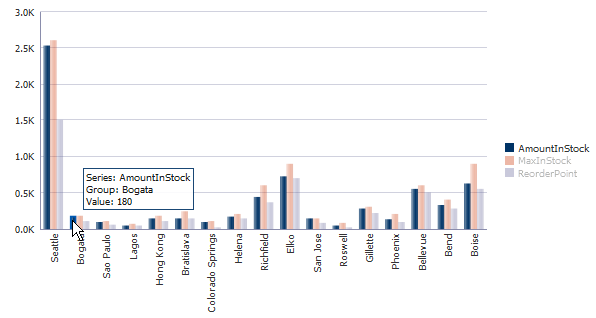
Figure 24-21 shows a bar chart configured for series show and hide. When the user clicks the MaxInStock series item in the chart legend, the series no longer renders, and the legend changes to show which series item is hidden from view. The user can click the series item again to restore the series view.
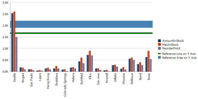
24.1.2.7 Chart Reference Objects
You can add reference lines or areas to a specified location or area on a chart's axis.
Figure 24-22 shows an example of a bar chart configured to show a reference line and reference area along its y-axis. In this example, the chart is configured to display a green reference line at 1665 on the y-axis. The reference area is configured to display in blue all values between a minimum of 1900 and a maximum of 2200.
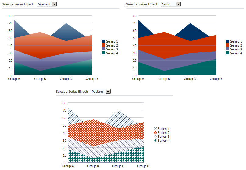
24.1.2.8 Chart Series Effects
By default, charts apply gradients to chart series. You can remove the gradients to achieve a flatter design or display the series with patterns. Figure 24-23 shows three area charts configured for series effects.
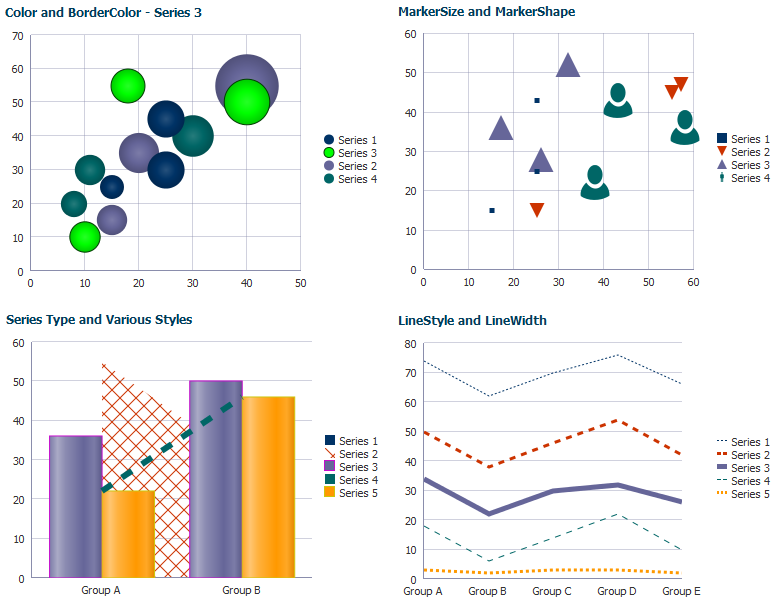
24.1.2.9 Chart Series Customization
You can customize the appearance of individual series in a chart. Depending upon the chart type, you can customize colors, markers, lines, and fill effects. For combination charts, the series is a chart, and you can also specify which chart to display.
Figure 24-24 shows a bubble, scatter, line, and combination chart configured with customized series. The charts illustrate how you might customize series colors, lines, and markers. The combination chart also shows how you might configure the series type to display an area, bar, and line chart.
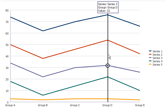
24.1.2.10 Chart Data Cursor
You can add a data cursor to a chart that the user can move to display detail about a data point.
Figure 24-25 shows a line chart configured with a data cursor. In this example, the user chose to display the detail for the chart's third series in the fourth group.
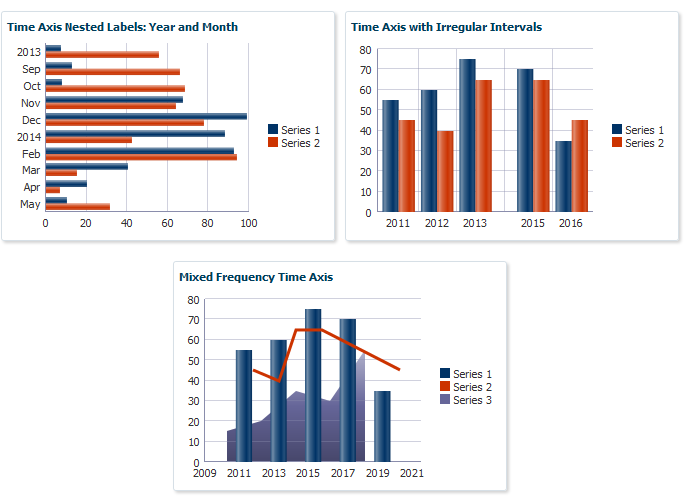
24.1.2.11 Chart Time Axis
Charts support the use of a time axis when the chart's data is based on dates. For example, you can use a time axis to display daily sales. The time data can cover regular or irregular time intervals. Time axes also support mixed frequency time data, where the time stamps vary by series.
Figure 24-26 shows three charts configured with a time axis. The horizontal bar chart's time axis contains regular monthly data and is configured to show the year and month with nested labels. The bar chart shows the time axis configured for irregular yearly intervals. The combination chart shows a mixed frequency time axis with time data that varies by series.
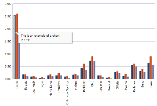
24.1.2.12 Chart Popups and Context Menus
You can configure charts to display popups or context menus using the af:showPopupBehavior tag.
Figure 24-27 shows a bar chart configured to show a popup when the user clicks the chart. The popup displays an output message in a note window.
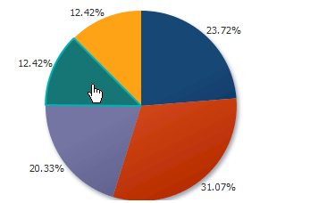
24.1.2.13 Chart Selection Support
Charts can be enabled for single or multiple selection of data markers such as bubbles in a bubble chart or shapes in a scatter chart. Enabling selection is required for popups and context menus and for responding programmatically to user clicks on the data markers.
Figure 24-28 shows a pie chart enabled for multiple selection. Each data marker is highlighted as the user moves over it to provide a visual clue that the marker is selectable. The user can press Ctrl while selecting to add or delete slices from the selection.
24.1.2.14 Chart Zoom and Scroll
Charts provide the ability to scroll through the data via a view port or simple scrollbar. This feature can be useful for charts containing large amounts of data.
Figure 24-29 shows a line chart configured for scrolling with a view port. As the user moves the view port on the master line chart, the detail chart changes to reflect the selected range.
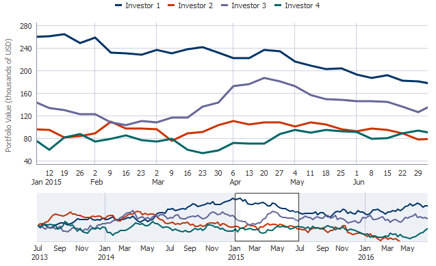
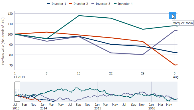
The user can also choose to zoom in on a specific period by clicking the Marquee Zoom icon that appears when the user hovers over the chart. Figure 24-30 shows the same line chart configured for marquee zoom. In this example, the user chose to zoom the chart on the October 2013 time period.
24.1.2.15 Legend and Marker Dimming
Charts provide the ability to highlight a series when the user hovers over a legend item or marker. Figure 24-31 shows a bar chart configured with three series. As the user hovers over each series, the remaining series dim from view.
24.1.2.16 Pie Chart Other Slice Support
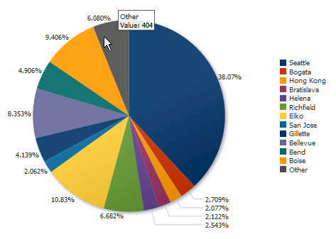
Pie charts provide the ability to aggregate data if your data model includes a large number of smaller contributors in relation to the larger contributors.
Figure 24-32 shows a pie chart configured to aggregate all values less than two percent of the total. In this example, the tooltip shows the total value of the aggregated slices.
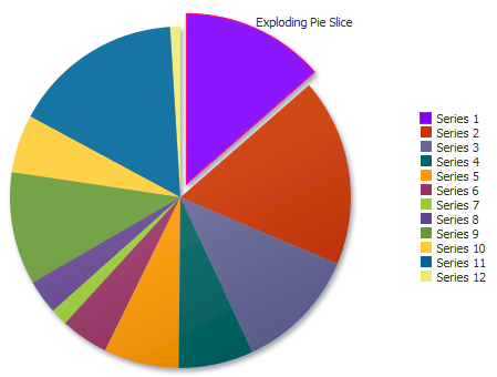
24.1.2.17 Exploding Slices in Pie Charts
When one slice is separated from the other slices in a pie, this display is referred to as an exploding pie slice. You can explode a slice to make it stand out from the other slices.
Figure 24-33 shows an example of an exploded pie slice.
24.2 Using the Chart Component
To use the chart component, define the data, add the chart to a page, and complete the additional configuration in JDeveloper.
24.2.1 Chart Component Data Requirements
The chart component use a standard CollectionModel for its data structure. This class extends the JSF DataModel class and adds on support for row keys and sorting. In the DataModel class, rows are identified entirely by index. This can cause problems when the underlying data changes from one request to the next, for example a user request to delete one row may delete a different row when another user adds a row. To work around this, the CollectionModel class is based on row keys instead of indexes. For more information about collection-based components, see Chapter 10, "Using Tables, Trees, and Other Collection-Based Components."
Data requirements for charts differ with chart type. Data requirements can be any of the following kinds:
-
Geometric: Some chart types need a certain number of data points in order to display data. For example, a line chart requires at least two groups of data because a line requires at least two points.
-
Complex: Some chart types require more than one data point for each marker (which is the component that actually represents the data in a chart). A scatter chart, for example, needs two values for each group so that it can position the marker along the x-axis and along the y-axis. If the data that you provide to a chart does not have enough data points for each group, the chart component does its best to display a chart.
-
Logical: Some chart types cannot accept certain kinds of data. The following examples apply:
-
Negative data: Do not pass negative data to a pie or funnel chart.
-
Null or zero data: A bar or marker will not be visible if its value is zero, but an invisible region will be drawn to provide tooltip information.
-
Insufficient sets (or series) of data: Dual-Y charts require a set of data for each y-axis. Usually, each set represents different information. For example, the y-axis might represent sales for specific countries and time periods, while the y2-axis might represent total sales for all countries. If you pass only one set of y-axis data, then the chart cannot display data on two different y-axes. It displays the data on a single y-axis.
-
24.2.1.1 Area, Bar, and Line Chart Data Requirements
Data requirements for area, bar, and line charts include:
-
At least two groups of data are required for area, bar and line charts. A group is represented by a position along the horizontal axis of area, bar, and line charts. In a chart that shows data for a three-month period, the groups might be labeled January, February, and March.
-
One or more series of data is required. In a chart that shows data for a three-month period, the series might be sales and quota.
-
Dual-Y charts require two sets of data.
24.2.1.2 Bubble Chart Data Requirements
Bubble charts require at least three data values for a data marker. Each data marker in a bubble chart represents three group values:
-
The x value that determines the marker's location along the x-axis.
-
The y value that determines the marker's location along the y-axis.
-
The z value that determines the size of the marker.
For more than one group of data, bubble charts require that data be in multiples of three. For example, in a specific bubble chart, you might need three values for Paris, three for Tokyo, and so on. An example of these three values might be: x value is average life expectancy, y value is average income, and z value is population.
Note:
When you look at a bubble chart, you can identify groups of data by examining tooltips on the markers. However, identifying groups is not as important as looking at the overall pattern of the data markers.24.2.1.3 Combination Chart Data Requirements
Combination charts require one set of data for each chart included in the combination chart. Each chart in the combination chart must meet the data requirements for the area, bar, or line chart components on which it is based. For a list of the data requirements for area, bar, or line chart components, see Section 24.2.1.1, "Area, Bar, and Line Chart Data Requirements."
24.2.1.4 Funnel Chart Data Requirements
Funnel charts require at least two data values and an optional third value for each funnel section. The data structure is as follows:
-
One data value represents the different steps in a process. Each value is the label of a step, and it appears in the legend text.
-
One data value is required to show the actual value of a funnel section. In a chart that shows the process of dealing with customers, the actual value is the number of customers at each stage in the process.
-
One data value is optional and shows the target value of a funnel section. The actual value is compared against the target at each stage. In a chart that shows the process of dealing with customers, the target value is the desired number of customers at each stage in the process.
-
Data values cannot be negative. Target values should be greater than or equal to actual values.
24.2.1.5 Pie Chart Data Requirements
One collection of data with one or more sets of data items is required for a pie chart. The data structure is as follows:
-
A series or set of data is represented by the pie slice. You see legend text for each set of this data. For example, if there is a separate set of data for each country, then the name of each country appears in the legend text.
-
Data values cannot be negative.
24.2.1.6 Scatter Chart Data Requirements
Scatter charts require at least two data values for each marker. Each data marker represents the following:
-
The x value that determines the marker's location along the x-axis.
-
The y value that determines the marker's location along the y-axis.
For more than one group of data, the data must be in multiples of two.
24.2.2 Configuring Charts
Because of the many chart types and the significant flexibility of the chart components, charts have a large number of DVT tags. The prefix dvt: occurs at the beginning of each chart tag name indicating that the tag belongs to the ADF Data Visualization Tools (DVT) tag library. The following list identifies groups of tags related to the chart component:
-
Chart component tags: The nine chart component tags provide a convenient and quick way to create a chart type. They are represented in the Component Palette as categories of charts with one or more type variations.
Table 24-1 provides a description of the chart component tags and their variations.
Table 24-1 Chart Component Tags
Chart Tag Description Variations areaChartRepresents data as a filled in area.
dual y-axis
stacked
barChartRepresents data as a series of vertical bars.
dual y-axis
stacked
bubbleChartRepresents data by the location and size of the round (bubble) data marker.
comboChartRepresents data as a combination of area, bar, or line markers.
dual y-axis
stacked
funnelChartRepresents data as a stepped cone.
lineChartRepresents data as a series of lines.
dual y-axis
stacked
pieChartDisplays values that are parts of a whole, where each value is shown as a sector of a circle.
scatterChartRepresents data by the location of data markers on a two-dimensional plane.
sparkChartSimple, condensed chart that displays trends or variations in a single data value, typically stamped in the column of a table or in line with related text.
area
bar
floating bar
line
-
Chart child component tags: These child tags are supported by most chart components to provide a variety of customization options.
Table 24-2 provides a list and description of these child tags.
Table 24-2 Common Chart Child Tags
Child Tag Description chartDataItemDefines properties for the data item of an area, bar, bubble, combination, line, or scatter chart.
chartLegendDefines properties for the chart legend.
chartSeriesStyleDefines properties for the series of an area, bar, bubble, combination, line, or scatter chart.
chartValueFormatDefines formatting properties for the values of a chart.
chartXAxisDefines properties for the x-axis of a chart.
chartYAxisDefines properties for the y-axis of a chart.
chartY2AxisDefines properties for the y2-axis of a chart.
chartAxisLinechartTickLabelmajorTickminorTickreferenceAreareferenceLineChild tags of the
chartXAxis,chartYAxis, andchartY2Axiscomponents. Provides additional customization for the chart axes.pieDataItemDefines properties for the data item of a pie chart.
funnelDataItemDefines properties for the data item of a funnel chart.
-
Chart attributes: Properties of chart components. Attributes may be applicable to all charts or specific to a chart type.
Table 24-3 provides a list and description of commonly used attributes.
Table 24-3 Common Chart Attributes
Child Tag Description animationIndicatorsSpecifies the type of data change animation indicator.
barGapRatioSpecifies the amount of space between bars in a bar chart and the thickness of the bars, expressed as a ratio or percentage.
coordinateSystemSpecifies if the chart uses Cartesian or Polar coordinates.
dataCursorSpecifies whether or not the data cursor is enabled.
dataLabelPositionSpecifies the position of the data labels.
dataSelectionSpecifies the selection mode for the chart.
footnotefootnoteHAlignDefines the footnote and its horizontal alignment.
hideAndShowBehaviorSpecifies the hide and show behavior when clicking on legend items.
hoverBehaviorSpecifies whether or not to dim other markers when the user hovers over a marker.
maximumBarWidthSpecifies the maximum width of bars in a bar chart, expressed in pixels.
orientationSpecifies whether the chart is displayed vertically or horizontally.
otherColorotherThresholdDefines the color and percentage for the
Otherslice in a pie chart.seriesEffectDefines the fill properties for data items.
sliceLabelPositionSpecifies the position of the pie chart's data labels.
stackSpecifies whether or not the data should be stacked.
subtitleSpecifies the subtitle for the chart.
timeAxisTypeDefines a time axis type for the chart.
titletitleHAlignDefines the title and its horizontal alignment.
varEL variable that iterates through each element in the collection.
zoomAndScrollSpecifies the chart's zoom and scroll behavior.
-
Chart facets: All charts with the exception of spark charts and pie charts support facets, which are named sections within a component.
Table 24-4 provides a list and description of supported chart facets.
Child Tag Description dataStampWraps the data item component or components to stamp for each row of the model. To stamp multiple data items, wrap them in the
af:grouptag.overviewSpecifies the rendering of the optional overview window.
seriesStampSpecifies the series style component to stamp for each row of the model. The properties of the stamp will be processed once for each unique series. To declaratively define multiple series, wrap them in the
af:grouptag. -
Spark chart tags: Properties of the spark chart component. Spark charts contain a minimal set of formatting attributes.
Table 24-5 provides a list and description of commonly used spark chart tags.
Table 24-5 Common Spark Chart Attributes
Child Tag Description axisScaledFromBaselineSpecifies whether or not the axis is scaled to include the baseline value of zero.
borderColorSpecifies the border color of the data item.
colorSpecifies the color of the bars, line, or area in the spark chart.
lineWidthlineStylelineTypeSpecifies line width in pixels, whether the line is solid, dashed or dotted, and the type of line connector, such as straight, curved, stepped or segmented.
firstMarkerColorhighMarkerColorlastMarkerColorl
owMarkerColormarkersSpecifies the colors for the first, last, high, and low markers and whether or not the markers are displayed.
markerShapemarkerSizeSpecifies the shape of the marker, such as square, circle, diamond etc. and the size of the marker in pixels.
sparkItemSpecifies the data value for the spark chart
subTypeSpecifies whether the spark chart is displayed as an area, bar, floating bar, or line.
dataSelectionSpecifies the selection mode for the chart.
thresholdthresholdSetDefines thresholds for the spark chart.
tooltipSpecifies text to display when the user hovers over the spark chart.
timeAxisTypeDefines a time axis type for the chart.
For complete descriptions of all the tags, their attributes, and a list of valid values, consult the DVT tag documentation. To access this documentation for a specific chart tag in JDeveloper, select the tag in the Structure window and press F1 or click Component Help.in the Property Inspector.
24.2.3 How to Add a Chart to a Page
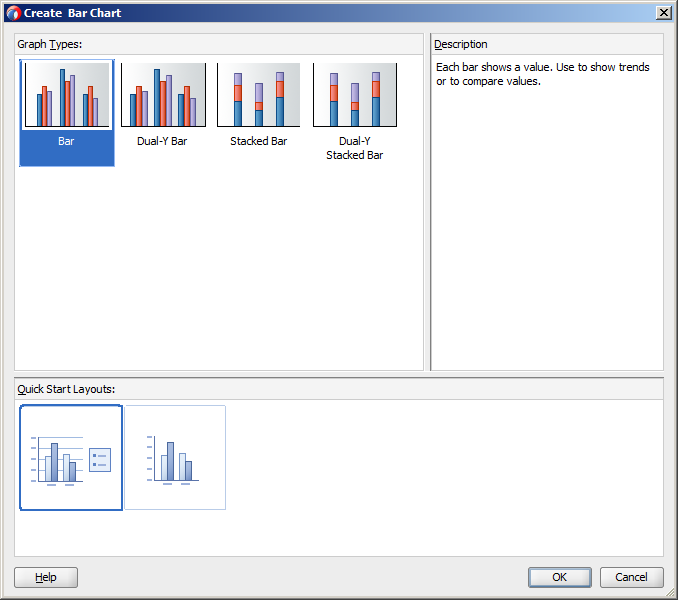
When you are designing your page using simple UI-first development, you use the Component Palette to add a chart to a JSF page. When you drag and drop a chart component onto the page, a Create Chart dialog displays available categories of chart types, with descriptions, to provide visual assistance when creating charts. You can also specify a quick start layout of the chart's legend.
Figure 24-34 shows the Create Bar Chart dialog for bar charts with the default bar chart type and quick start layout selected.
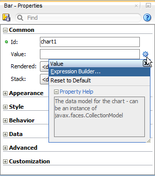
Once you complete the dialog, and the chart is added to your page, you can use the Property Inspector to specify data values and configure additional display attributes for the chart.
In the Property Inspector you can use the dropdown menu for each attribute field to display a property description and options. Figure 24-35 shows the dropdown menu for a bar chart component value attribute.
Note:
If your application uses the Fusion technology stack, then you can use data controls to create a chart and the binding will be done for you. For more information, see "Creating Databound Charts" in Oracle Fusion Middleware Fusion Developer's Guide for Oracle Application Development FrameworkIt may be helpful to have an understanding of how chart attributes and chart child tags can affect functionality. For more information, see Section 24.2.2, "Configuring Charts."
You must complete the following tasks:
-
Create an application workspace as described in Section 2.2, "Creating an Application Workspace."
-
Create a view page as described in Section 2.4, "Creating a View Page."
-
In the ADF Data Visualizations page of the Component Palette, from the Charts panel, drag and drop the desired chart category onto the page to open the Create Graph dialog.
-
Use the dialog to select the chart type and the quick start layout for display of chart title, legend, and labels. For help with the dialog, press F1 or click Help.
-
Click OK to add the chart to the page.
-
In the Property Inspector, view the attributes for the chart. Use the Component Help button to display the complete tag documentation for the chart.
24.2.4 What Happens When You Add a Chart to a Page
JDeveloper generates only a minimal set of tags when you drag and drop a gauge from the Component Palette onto a JSF page.
Example 24-1 shows the code inserted in the JSF page for a bar chart with the quick start layout selected in Figure 24-34.
Example 24-1 Bar Chart Sample Code
<dvt:barChart id="chart1">
  <dvt:chartLegend id="leg1" rendered="true"/>
</dvt:barChart>
After inserting a chart component into the page, you can use the visual editor or Property Inspector to add data or customize chart features. For information about setting component attributes, see Section 2.4.8, "How to Set Component Attributes."
24.3 Adding Data to Charts
The process to add data to charts depends upon the chart's type. In most cases, you specify the data model in the chart's value attribute and configure the chart's data items in the chartDataItem, pieDataItem, or funnelDataItem attributes. For spark charts, you specify the spark chart's value in the sparkItem child component.
You can specify the chart's value and chart data items in a managed bean that returns the chart's data or by binding a data control to the chart.
24.3.1 How to Add Data to Area, Bar, Combination, and Line Charts
To add data to area, bar, combination, and line charts, specify the data model in the chart's value attribute and configure a chartDataItem for each unique group. For details about data requirements, see Section 24.2.1, "Chart Component Data Requirements."
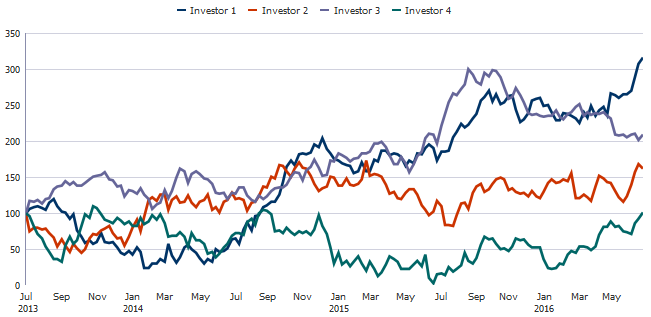
Example 24-2 shows an example of a managed bean that defines the data for a line chart that shows weekly portfolio values for four investors. In this example, the ChartDataSource class defines the chart's CollectionModel in the getWeeklyStockData() method which calls the getPortfolioData() method to define the chart's data items.
Example 24-2 Managed Bean Example Defining Data for a Line Chart
package view;

import java.util.ArrayList;
import java.util.Calendar;
import java.util.GregorianCalendar;
import java.util.HashMap;
import java.util.Random;

import java.util.List;

import org.apache.myfaces.trinidad.model.CollectionModel;
import org.apache.myfaces.trinidad.model.ModelUtils;

public class ChartDataSource {
/**
* Object representing the data for a single row of the model.
*/
  public static class ChartDataItem extends HashMap<String, Object> {
  @SuppressWarnings("compatibility")
  private static final long serialVersionUID = 1L;

  public ChartDataItem(String series, Object group, Number value) {
    put("series", series);
    put("group", group);
    put("value", value);
  }

  public ChartDataItem(String series, Object group, Object x, Number y) {
    put("series", series);
    put("group", group);
    put("x", x);
    put("y", y);
  }

  public ChartDataItem(String series, Object group, Number x, Number y, Number z) {
    put("series", series);
    put("group", group);
    put("x", x);
    put("y", y);
    put("z", z);
  }

  public ChartDataItem(String series, Number value, Number targetValue) {
    put("series", series);
    put("value", value);
    put("targetValue", targetValue);
  }
}
  public CollectionModel getWeeklyStockData() {
    return getPortfolioData(4, 157, 2013, 6, 1, Calendar.DATE, 7);
  }

  private Random random = new Random(23);

  private double getNextValue(double curValue, double std) {
    if (curValue == 0)
      return 0;
    else
      return Math.max(curValue + random.nextGaussian() * std, 0);
  }

  public CollectionModel getPortfolioData(int numSeries, int numGroups,
                                          int startYear, int startMonth,
                                          int startDate, int dateField,
                                          int addCount)
  {
    List<ChartDataItem> dataItems = new ArrayList<ChartDataItem>();
    GregorianCalendar cal;
    double curValue;
    for(int series=0; series<numSeries; series++) {
      cal = new GregorianCalendar(startYear, startMonth, startDate);
      curValue = 100;
      for(int group=0; group<numGroups; group++) {
        dataItems.add(new ChartDataItem("Investor " + (series+1), cal.getTime(),
                                         curValue));
        cal.add(dateField, addCount);
        curValue = getNextValue(curValue, 10);
      }
    }
    return ModelUtils.toCollectionModel(dataItems);
  }
}
Example 24-3 shows the code on the JSF page that defines the line chart and references the ChartDataSource class. In this example, the managed bean is named chartDataSource.
Example 24-3 Sample Code on JSF Page for Line Chart Using Managed Bean for Data
<dvt:lineChart id="chart1" value="#{chartDataSource.weeklyStockData}"
               timeAxisType="enabled" var="row">
  <dvt:chartLegend id="leg1" rendered="true" position="top"/>
  <f:facet name="dataStamp">
    <dvt:chartDataItem id="cdi1" series="#{row.series}" group="#{row.group}"
                    value="#{row.value}"/>
  </f:facet>
</dvt:lineChart>
Figure 24-36 shows the line chart that is displayed if you configure the line chart using the ChartDataSource class.
It may be helpful to have an understanding of how chart attributes and child tags can affect functionality. For more information about configuring charts, see Section 24.2.2, "Configuring Charts."
Add an area, bar, combination, or line chart to your page. For help with adding a chart to a page, see Section 24.2.3, "How to Add a Chart to a Page."
To add data to an area, bar, combination, or line chart:
-
Optionally, create the managed bean that will return the chart's data model.
If you need help creating classes, see the "Working with Java Code" section of the JDeveloper online help. For help with managed beans, see Section 2.6, "Creating and Using Managed Beans."
-
In the Structure window, right-click dvt:typeChart and choose Go To Properties.
-
In the Property Inspector, expand the Data section, and enter a value for the Var field.
The
varproperty is the name of an EL variable that references each element in the data collection. In Example 24-3, thevarattribute is defined asrow. -
In the Property Inspector, do one of the following:
-
To reference a managed bean that returns the chart's data model, expand the Common section and specify the EL expression that references the data model in the Value field.
You can enter a static numeric value or specify an EL expression that references the managed bean and metric value.
For example, to specify an EL expression for a managed bean named chartDataSource that includes the class referenced in Example 24-2, enter the following in the Value field:
#{chartDataSource.weeklyStockData}.For help with creating EL expressions, see Section 2.5.1, "How to Create an EL Expression."
-
To bind the chart to a data control, click Bind to ADF Control to select a data collection.
For more information about using data controls to supply data to your chart, see "Creating Databound Charts" in Oracle Fusion Middleware Fusion Developer's Guide for Oracle Application Development Framework.
-
-
If you specified a managed bean for the chart's data model, do the following to add a
chartDataItemto the chart:-
In the Structure window, right-click dvt:typeChart and choose Insert inside Chart > f:facet - dataStamp.
-
To add multiple chart data items, right-click f:facet - dataStamp and choose Insert inside Facet data Stamp > af:group.
-
Right-click f:facet - dataStamp or af:group and choose Insert inside (Facet data Stamp or Group) > dvt:chartDataItem.
-
To add additional data items, right-click af:group and choose Insert inside Group > dvt:chartDataItem for each additional data item.
-
Right-click dvt:chartDataItem and choose Go to Properties.
-
In the Property Inspector, in the Common section, enter a value for the Value field.
For example, to reference the value defined in the
chartDataSourcemanaged bean, enter the following in the Value field:#{row.value}.In this example,
rowis the variable that you defined in the previous step, andvalueis defined in thechartDataSourcebean'sgetPortfolioData()method shown in Example 24-2. -
Expand the Data section, and enter a value in the Group field.
To use the same
chartDataSourcemanaged bean, enter the following in the Group field:#{row.group}. -
Enter a value in the Series field.
To use the same
chartDataSourcemanaged bean, enter the following in the Series field:#{row.series}. -
To customize the tooltip that is displayed when the user moves the focus to a data point, enter a value in the
shortDescfield. -
Configure any additional properties as needed to customize the data item.
For example, you can add a label or configure a series marker. For additional information, see Section 24.4, "Customizing Chart Display Elements."
If your chart includes time data on the x-axis, you can enable a time axis. For additional information, see Section 24.4.4.1, "How to Configure a Time Axis."
-
To configure additional chart data items, repeat Step f through Step i for each additional data item.
-
24.3.2 How to Add Data to Pie Charts
To add data to a pie chart, specify the data model in the pie chart's value attribute and configure a pieDataItem for each unique series. For information about pie chart data requirements, see Section 24.2.1.5, "Pie Chart Data Requirements."
The process to add data to pie charts is similar to the process for adding data to area, bar, bubble, combination, line, and scatter charts. The primary difference is that you add a pieDataItem instead of a chartDataItem to the chart.
Example 24-4 shows a simple example for configuring a pie chart from a managed bean. In this example, the getDefaultPieData() method is added to the chartDataSource bean referenced in Example 24-2.
Example 24-4 Sample Method to Supply Data to a Pie Chart
public CollectionModel getDefaultPieData() {
  List<ChartDataItem> dataItems = new ArrayList<ChartDataItem>();
    dataItems.add(new ChartDataItem("Series 1", "Group A", 42));
    dataItems.add(new ChartDataItem("Series 2", "Group A", 55));
    dataItems.add(new ChartDataItem("Series 3", "Group A", 36));
    dataItems.add(new ChartDataItem("Series 4", "Group A", 22));
    dataItems.add(new ChartDataItem("Series 5", "Group A", 22));
    return ModelUtils.toCollectionModel(dataItems);
}
Example 24-5 shows the code on the JSF page that defines a pie chart and references the ChartDataSource class. In this example, the managed bean is named chartDataSource.
Example 24-5 Sample Code on JSF Page for Pie Chart Using Managed Bean for Data
<dvt:pieChart id="chart1" value="#{chartDataSource.defaultPieData}" var="row">
  <dvt:chartLegend id="leg1" rendered="true"/>
    <dvt:pieDataItem label="#{row.series}" value="#{row.value}" id="pdi1"/>
  </dvt:pieChart>
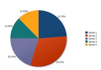
Figure 24-37 shows the pie chart at run time. In this example, the pie chart is rendered with a legend, and the data labels show the percentage of each slice as a portion of the total.
It may be helpful to have an understanding of how chart attributes and child tags can affect functionality. For more information about configuring charts, see Section 24.2.2, "Configuring Charts."
Add a pie chart to your page. For help with adding a chart to a page, see Section 24.2.3, "How to Add a Chart to a Page."
-
Optionally, create the managed bean that will return the chart's data model.
If you need help creating classes, see the "Working with Java Code" section of the JDeveloper online help. For help with managed beans, see Section 2.6, "Creating and Using Managed Beans."
-
In the Structure window, right-click dvt:pieChart and choose Go To Properties.
-
In the Property Inspector, do one of the following:
-
To reference a managed bean that returns the chart's data model, expand the Common section and specify the EL expression that references the data model in the Value field.
You can enter a static numeric value or specify an EL expression that references the managed bean and metric value.
For example, to specify an EL expression for a managed bean named
chartDataSourcethat includes the method shown in Example 24-4, enter the following in the Value field:#{chartDataSource.defaultPieData}.For help with creating EL expressions, see Section 2.5.1, "How to Create an EL Expression."
-
To bind the chart to a data control, click Bind to ADF Control to select a data collection.
For more information about using data controls to supply data to your chart, see "Creating Databound Charts" in Oracle Fusion Middleware Fusion Developer's Guide for Oracle Application Development Framework.
-
-
If you specified a managed bean for the chart's data model, do the following to add a
pieDataItemto the pie chart:-
Right-click dvt:pieChart and choose Insert inside Pie > dvt:pieDataItem.
-
In the Insert Pie Data Item dialog, enter a label and value for the data item.
For example, to use the
chartDataSourcemanaged bean, enter the following for the label and value, respectively:#{row.series} #{row.value} -
In the Structure window, right-click dvt:pieChart and choose Go to Properties.
-
In the Property Inspector, expand the Data section, and enter a value for the Var field.
The
varproperty is the name of an EL variable that references each element in the data collection. In Example 24-3, thevarattribute is defined asrow. -
To customize the tooltip that is displayed when the user moves the focus to a data point, enter a value in the
shortDescfield. -
Configure any additional properties as needed to customize the data item.
For example, you can customize the label or explode the pie slice. For additional information, see Section 24.4, "Customizing Chart Display Elements."
-
To add additional pie data items, repeat Step a through Step e for each additional data item.
-
24.3.3 How to Add Data to Bubble or Scatter Charts
To add data to a bubble or scatter chart, specify the data model in the chart's value attribute and configure a chartDataItem for each unique group. For details about data requirements, see Section 24.2.1, "Chart Component Data Requirements."
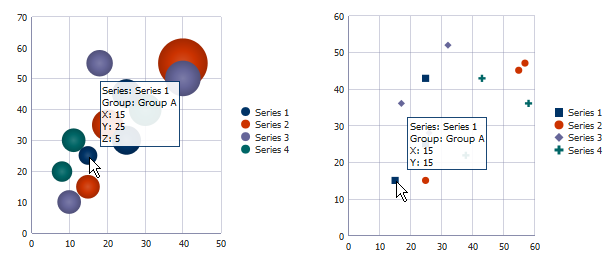
The process to add data to bubble or scatter charts is similar to the process for adding data to area, bar, combination, and line charts. The primary difference is that you must also specify values for the x-axis and y-axis. For bubble charts, you must also specify values for the z-axis, which represents the size of the bubbles.
Example 24-6 shows a simple example for configuring a bubble chart from a managed bean. In this example, the getDefaultBubbleData() method is added to the chartDataSource bean referenced in Example 24-2.
Example 24-6 Sample Method to Supply Data to a Bubble Chart
public CollectionModel getDefaultBubbleData() {
  List<ChartDataItem> dataItems = new ArrayList<ChartDataItem>();
  // Each data item below defines a series, group, x, y, and z value
  dataItems.add(new ChartDataItem("Series 1", "Group A", 15, 25, 5));
  dataItems.add(new ChartDataItem("Series 1", "Group B", 25, 30, 12));
  dataItems.add(new ChartDataItem("Series 1", "Group C", 25, 45, 12));

  dataItems.add(new ChartDataItem("Series 2", "Group A", 15, 15, 8));
  dataItems.add(new ChartDataItem("Series 2", "Group B", 20, 35, 14));
  dataItems.add(new ChartDataItem("Series 2", "Group C", 40, 55, 35));

  dataItems.add(new ChartDataItem("Series 3", "Group A", 10, 10, 8));
  dataItems.add(new ChartDataItem("Series 3", "Group B", 18, 55, 10));
  dataItems.add(new ChartDataItem("Series 3", "Group C", 40, 50, 18));

  dataItems.add(new ChartDataItem("Series 4", "Group A", 8, 20, 6));
  dataItems.add(new ChartDataItem("Series 4", "Group B", 11, 30, 8));
  dataItems.add(new ChartDataItem("Series 4", "Group C", 30, 40, 15));
  return ModelUtils.toCollectionModel(dataItems);
}
For scatter charts, only the x-axis and y-axis positions are required. Example 24-7 shows a simple example for configuring a scatter chart from a managed bean. In this example, the getDefaultScatterData() method is added to the chartDataSource bean referenced in Example 24-2
Example 24-7 Sample Method to Supply Data to a Scatter Chart
public CollectionModel getDefaultScatterData() {
  List<ChartDataItem> dataItems = new ArrayList<ChartDataItem>();
  dataItems.add(new ChartDataItem("Series 1", "Group A", 15, 15));
  dataItems.add(new ChartDataItem("Series 1", "Group B", 25, 43));
  dataItems.add(new ChartDataItem("Series 1", "Group C", 25, 25));

  dataItems.add(new ChartDataItem("Series 2", "Group A", 25, 15));
  dataItems.add(new ChartDataItem("Series 2", "Group B", 55, 45));
  dataItems.add(new ChartDataItem("Series 2", "Group C", 57, 47));

  dataItems.add(new ChartDataItem("Series 3", "Group A", 17, 36));
  dataItems.add(new ChartDataItem("Series 3", "Group B", 32, 52));
  dataItems.add(new ChartDataItem("Series 3", "Group C", 26, 28));

  dataItems.add(new ChartDataItem("Series 4", "Group A", 38, 22));
  dataItems.add(new ChartDataItem("Series 4", "Group B", 43, 43));
  dataItems.add(new ChartDataItem("Series 4", "Group C", 58, 36));
  return ModelUtils.toCollectionModel(dataItems);
}
Figure 24-38 shows the bubble chart and scatter chart displayed at runtime. The tooltips show the data from the first ChartDataItem defined in Example 24-6 and Example 24-7.
It may be helpful to have an understanding of how chart attributes and child tags can affect functionality. For more information about configuring charts, see Section 24.2.2, "Configuring Charts."
Add a bubble or scatter chart to your page. For help with adding a chart to a page, see Section 24.2.3, "How to Add a Chart to a Page."
To add data to a bubble or scatter chart:
-
Optionally, create the managed bean that will return the chart's data model.
If you need help creating classes, see the "Working with Java Code" section of the JDeveloper online help. For help with managed beans, see Section 2.6, "Creating and Using Managed Beans."
-
In the Structure window, right-click dvt:typeChart and choose Go To Properties.
-
In the Property Inspector, expand the Data section, and enter a value for the Var field.
The
varproperty is the name of an EL variable that references each element in the data collection. For the bubble and scatter charts shown in Figure 24-38, thevarattribute is defined asrow. -
In the Property Inspector, do one of the following:
-
To reference a managed bean that returns the chart's data model, expand the Common section and specify the EL expression that references the data model in the Value field.
You can enter a static numeric value or specify an EL expression that references the managed bean and metric value.
For example, to specify an EL expression for a managed bean named
chartDataSourcethat includes the method referenced in Example 24-6, enter the following in the Value field:#{chartDataSource.defaultBubbleData}.For help with creating EL expressions, see Section 2.5.1, "How to Create an EL Expression."
-
To bind the chart to a data control, click Bind to ADF Control to select a data collection.
For more information about using data controls to supply data to your chart, see "Creating Databound Charts" in Oracle Fusion Middleware Fusion Developer's Guide for Oracle Application Development Framework.
-
-
If you specified a managed bean for the chart's data model, do the following to add a
chartDataItemto the chart:-
In the Structure window, right-click dvt:typeChart and choose Insert inside Chart > f:facet - dataStamp.
-
To add multiple chart data items, right-click f:facet - dataStamp and choose Insert inside Facet data Stamp > af:group.
-
Right-click f:facet - dataStamp or af:group and choose Insert inside (Facet data Stamp or Group) > dvt:chartDataItem.
-
To add additional data items, right-click af:group and choose Insert inside Group > dvt:chartDataItem for each additional data item.
-
Right-click dvt:chartDataItem and choose Go to Properties.
-
Expand the Data section, and enter a value in the X field.
To use the managed beans shown in Example 24-6 and Example 24-7, enter the following in the X field:
#{row.x}. -
Enter a value in the Y field.
For example, enter the following in the Y field:
#{row.y}. -
For bubble charts, enter a value in the Z field.
For example, enter the following in the Z field:
#{row.z}. -
Enter a value in the Group field.
For example, enter the following in the Group field:
#{row.group}. -
Enter a value in the Series field.
For example, enter the following in the Series field:
#{row.series}. -
To customize the tooltip that is displayed when the user moves the focus to a data point, enter a value in the
shortDescfield. -
Configure any additional properties as needed to customize the data item.
For example, you can add a label or configure a series marker. For additional information, see Section 24.4, "Customizing Chart Display Elements."
-
To configure additional chart data items, repeat Step 5 through Step 12 for each additional data item.
-
24.3.4 How to Add Data to Funnel Charts
To add data to a funnel chart, specify the data model in the chart's value attribute and configure a funnelDataItem for each unique group. For details about data requirements, see Section 24.2.1, "Chart Component Data Requirements."
The process to add data to funnel charts is similar to the process for adding data to area, bar, bubble, combination, line, and scatter charts. The primary difference is that you add a funnelDataItem instead of a chartDataItem to the chart.
Example 24-8 shows a simple example for configuring a funnel chart from a managed bean. In this example, the getDefaultFunnelData() method is added to the chartDataSource bean referenced in Example 24-2.
Example 24-8 Sample Method to Supply Data to a Funnel Chart
public CollectionModel getDefaultFunnelData() {
  List<ChartDataItem> dataItems = new ArrayList<ChartDataItem>();
    dataItems.add(new ChartDataItem("Series 1", 46, 60));
    dataItems.add(new ChartDataItem("Series 2", 42, 50));
    dataItems.add(new ChartDataItem("Series 3", 33, 33));
    dataItems.add(new ChartDataItem("Series 4", 21, 25));
    return ModelUtils.toCollectionModel(dataItems);
}
Example 24-9 shows the code on the JSF page that defines a funnel chart and references the ChartDataSource class. In this example, the managed bean is named chartDataSource.
Example 24-9 Sample Code on JSF Page for Funnel Chart Using Managed Bean for Data
<dvt:funnelChart id="chart1" value="#{chartDataSource.defaultFunnelData}" var="row">
  <dvt:funnelDataItem label="#{row.series}" value="#{row.value1}" id="pdi1"/>
</dvt:funnelChart>
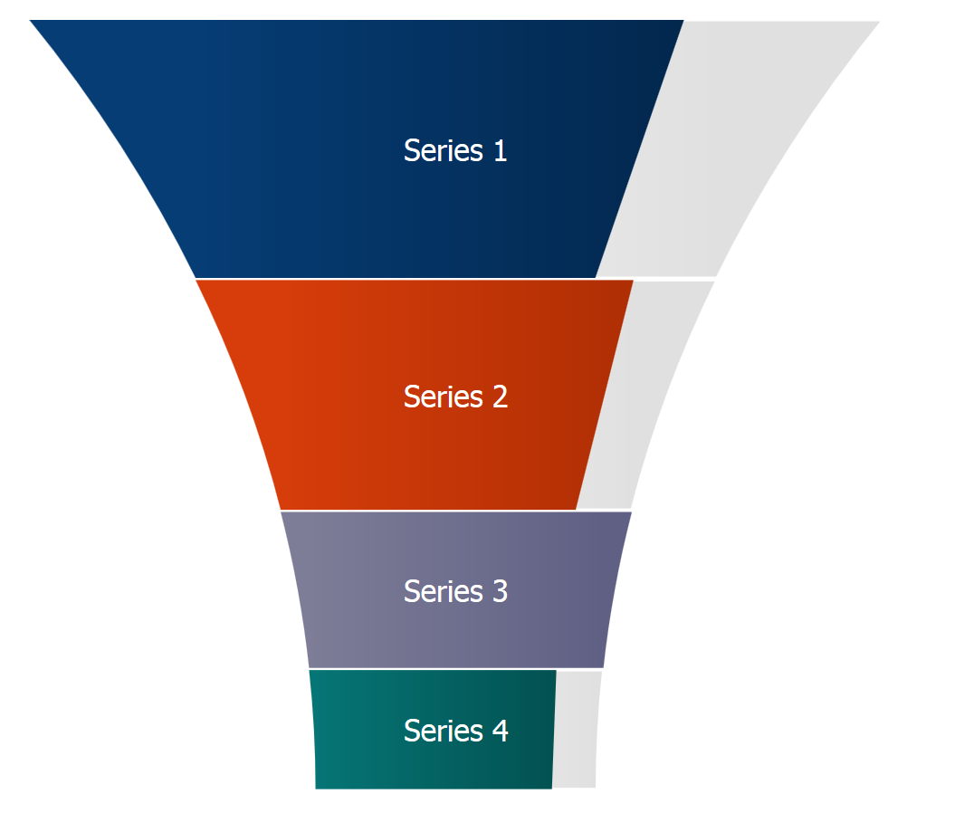
Figure 24-39 shows the funnel chart at run time.
It may be helpful to have an understanding of how chart attributes and child tags can affect functionality. For more information about configuring charts, see Section 24.2.2, "Configuring Charts."
Add a funnel chart to your page. For help with adding a chart to a page, see Section 24.2.3, "How to Add a Chart to a Page."
To add data to a funnel chart:
-
Optionally, create the managed bean that will return the chart's data model.
If you need help creating classes, see the "Working with Java Code" section of the JDeveloper online help. For help with managed beans, see Section 2.6, "Creating and Using Managed Beans."
-
In the Structure window, right-click dvt:funnelChart and choose Go To Properties.
-
In the Property Inspector, do one of the following:
-
To reference a managed bean that returns the chart's data model, expand the Common section and specify the EL expression that references the data model in the Value field.
You can enter a static numeric value or specify an EL expression that references the managed bean and metric value.
For example, to specify an EL expression for a managed bean named
chartDataSourcethat includes the method shown in Example 24-8, enter the following in the Value field:#{chartDataSource.defaultFunnelData}.For help with creating EL expressions, see Section 2.5.1, "How to Create an EL Expression."
-
To bind the chart to a data control, click Bind to ADF Control to select a data collection.
For more information about using data controls to supply data to your chart, see "Creating Databound Charts" in Oracle Fusion Middleware Fusion Developer's Guide for Oracle Application Development Framework.
-
-
If you specified a managed bean for the chart's data model, do the following to add a
funnelDataItemto the pie chart:-
Right-click dvt:funnelChart and choose Insert inside dvt:funnelChart > Funnel Data Item.
-
In the Insert Funnel Data Item dialog, enter a label and value for the data item.
For example, to use the
chartDataSourcemanaged bean, enter the following for the label and value, respectively:#{row.series} #{row.value} -
In the Structure window, right-click dvt:funnelChart and choose Go to Properties.
-
In the Property Inspector, expand the Data section, and enter a value for the Var field.
The
varproperty is the name of an EL variable that references each element in the data collection. In Example 24-9, thevarattribute is defined asrow. -
Optionally, enter a value in the TargetValue field.
For example, enter the following in the TargetValue field:
#{row.targetValue}. -
To customize the tooltip that is displayed when the user moves the focus to a data point, enter a value in the
shortDescfield. -
Configure any additional properties as needed to customize the data item.
For example, you can customize the label. For additional information, see Section 24.4, "Customizing Chart Display Elements."
-
To add additional funnel data items, repeat Step 1 through Step 6 for each additional data item.
-
24.3.5 How to Add Data to Spark Charts
Spark charts are simple, charts that display trends or variations, often in the column of a table, or inline with text. Line, bar, and area spark charts require a single series of data values. Example 24-9 shows an example of a line spark chart in a table column.
Floating bar spark charts require two series of data values, one for the float offset, and one for the bar value. Figure 24-41 shows an example of a floating bar spark chart.
In a simple UI-first development scenario you can insert a spark chart using the Component Palette and bind it to data afterwards.
You can provide data to spark charts in any of the following ways:
-
Specify data statically in child
dvt:sparkItemtags. Example 24-10 shows an example of providing static data to a spark chart. -
Specify data using EL Expression in child
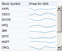
dvt:sparkItemtags.Example 24-11 shows an example of providing data to spark charts using EL Expressions to produce the table shown in Figure 24-40.
Example 24-11 EL Expression Data in Spark Chart
<af:table summary="Table" value="#{sparkChart.tableData}" var="row"
          columnStretching="last"
          rowBandingInterval="1" id="t1" width="230"
          disableColumnReordering="true"
          contentDelivery="immediate" autoHeightRows="8">
  <af:column sortable="false" headerText="Stock Symbol" align="start" id="c1"
             rowHeader="true">
    <af:outputText value="#{row[0]}" id="ot4"/>
  </af:column>
  <af:column sortable="false" headerText="Prices for 2014" id="c2">
    <dvt:sparkChart id="sparkchart1" subType="line" axisScaledFromBaseline="off"
                    shortDesc="Sparkchart in Table">
      <dvt:sparkItem value="#{row[1]}" id="si6"/>
      <dvt:sparkItem value="#{row[2]}" id="si5"/>
      <dvt:sparkItem value="#{row[3]}" id="si4"/>
      <dvt:sparkItem value="#{row[4]}" id="si3"/>
      <dvt:sparkItem value="#{row[5]}" id="si2"/>
      <dvt:sparkItem value="#{row[6]}" id="si1"/>
    </dvt:sparkChart>
  </af:column>
</af:table>
In this example, the spark chart's data is defined in a managed bean named
sparkChart. Example 24-12 shows the managed bean. The class is defined asSparkchartSample, and thegetTableData()method defines the columns for the table.Example 24-12 Sample Method to Define Data for a Table Containing a Spark Chart
import java.util.ArrayList; import java.util.Arrays; import java.util.List; import java.util.Random; public class SparkchartSample { public List <List <Object>> getTableData() { List <List <Object>> list = new ArrayList <List <Object>>(); // Create a random number generator with a constant seed Random rand = new Random(5); String stocks[] = {"ORCL", "AAPL", "MSFT", "YHOO", "CSCO", "PALM", "GOOG", "SAP", "HPQ", "IBM", "INTC", "RIMM"}; Arrays.sort(stocks); // sort to look nice for(int i=0; i<stocks.length; i++) { List <Object> row = new ArrayList <Object>(); row.add(stocks[i]); for(int j=0; j<6; j++) { // Let the value vary between 40 and 70 (for simplicity) row.add((rand.nextDouble()*30) + 40); } list.add(row); } return list; } } -
Use
af:iteratorto stamp spark items.Example 24-13 shows an example of using
af:iteratorto provide data to a bar spark chart.Example 24-13 Using af:iterator to Stamp Spark Chart Data Items
<dvt:sparkChart subType="bar" id="sc5">
  <af:iterator value="#{sparkChart.collection}" var="row" id="i3">
    <dvt:sparkItem value="#{row.close}" id="si9"/>
  </af:iterator>
</dvt:sparkChart>
In this example, the iteration is defined in the
sparkChartmanaged bean. Example 24-14 shows thecollection()method that creates the spark items.Example 24-14 Sample Method to Define Spark Chart Items Used by af:iterator
import java.util.ArrayList;
import java.util.Arrays;
import java.util.HashMap;
import java.util.List;
import java.util.Map;
public List <Map <String,Object>> getCollection() {
  List <Map <String,Object>> list = new ArrayList <Map <String,Object>>();

  // Generate some sort of stock data
  double open[] =  {5,   6,   4.5, 6.3, 4.1, 7.6, 8.4, 11.5, 10.5, 11.3};
  double close[] = {6.8, 4.2, 6.7, 4.5, 7.1, 8.6, 10.4, 10.0, 12.5, 14.5};
  for(int i=0; i<open.length; i++)
    {
      Map <String,Object> row = new HashMap <String,Object>();
      row.put("open", open[i]);
      row.put("close", close[i]);
      list.add(row);
    }
  return list;
}
Figure 24-42 shows the runtime view of the spark chart that displays if you create the spark chart defined in Example 24-13.
It may be helpful to have an understanding of how chart attributes and child tags can affect functionality. For more information about configuring charts, see Section 24.2.2, "Configuring Charts."
If you plan on displaying your spark chart in a table, create the ADF table. If you need help creating the table, see Section 10.2.4, "How to Display a Table on a Page."
Add a spark chart to your page. For help with adding a chart to a page, see Section 24.2.3, "How to Add a Chart to a Page."
-
Create the managed bean that will return the chart's data model.
If you need help creating classes, see the "Working with Java Code" section of the JDeveloper online help. For help with managed beans, see Section 2.6, "Creating and Using Managed Beans."
-
To use an
af:iteratorto stamp the spark chart data items, do the following:-
Right-click dvt:sparkChart and choose Insert inside Spark Chart > af:iterator.
-
In the Structure window, right-click af:iterator and choose Go to Properties.
-
In the Property Inspector, expand the Common section, and enter a value for the Value field.
Reference the EL expression that returns the value for the spark chart data item. To reference the method used in Example 24-14, specify the following for the value:
#{sparkChart.collection}. -
Enter a value for the Var field.
The
varproperty is the name of an EL variable that references each element in the data collection. In Example 24-14, thevarattribute is defined asrow. -
Configure any additional properties as needed to customize the iterator.
For example, you can specify a maximum number of rows. For more information about working with af:iterator, click Component Help.
-
-
To add the spark chart data items, do the following:
-
Right-click dvt:sparkChart or af:iterator and choose Insert inside (Spark Chart or Iterator > ADF Data Visualizations) > dvt:sparkItem.
-
In the Structure window, right-click dvt:sparkItem and choose Go to Properties.
-
In the Property Inspector, expand the Common section, and enter a value for the Value field.
You can enter a static numeric value or reference an EL expression that returns the value for the spark chart data item. To reference the method used in Example 24-14, specify the following for the Value:
#{row.close}. -
Configure any additional properties as needed to customize the data item.
For example, you must specify a FloatValue for floating bar spark charts. For additional information about the available attributes, click Component Help.
-
To add additional spark chart data items, repeat Step a through Step d for each additional data item.
-
Note:
You can also bind the spark chart to a data control if your application uses the Fusion technology stack. To do so, click Bind to ADF Control in the Property Inspector to select a data collection. For more information about using data controls to supply data to your chart, see "Creating Databound Charts" in Oracle Fusion Middleware Fusion Developer's Guide for Oracle Application Development Framework.24.4 Customizing Chart Display Elements
You can customize most aspects of the chart's display, including its labels, legend, axes, series, and animation effects.
Depending upon the chart type, you can also add reference objects to charts, specify the stacking behavior, or add a dual Y-Axis to charts that support it. Pie charts also support the ability to aggregate smaller values or explode a pie slice.
24.4.1 How to Configure Chart Labels
You can customize the style and position of chart data labels on all charts other than spark charts. Depending on the chart type, you can also add a title, subtitle, footnote, legend title, or axis title.
Tip:
Use data labels sparingly because they cause clutter and decrease readability. Use data labels primarily to highlight outliers or important values and not to show values for all data points.24.4.1.1 How to Configure Chart Data Labels
To configure chart data labels, configure the attributes of the dvt:chartDataItem, dvt:pieDataItem, or dvt:funnelDataItem chart child component.
If you want the style and position of all chart or pie data items to be the same, you can configure attributes directly on the chart component.
It may be helpful to have an understanding of how chart attributes and child tags can affect functionality. For more information about configuring charts, see Section 24.2.2, "Configuring Charts."
Add a chart to your page. For help with adding a chart to a page, see Section 24.2.3, "How to Add a Chart to a Page."
Add data to your chart. For additional information, see Section 24.3, "Adding Data to Charts."
To configure data labels for charts:
-
In the Structure window, right-click dvt:chartDataItem, dvt:pieDataItem, or dvt:funnelDataItem and choose Go to Properties.
-
In the Property Inspector, expand the Appearance section.
-
To customize the data label colors, enter a value for the following:
-
Color: Specify the RGB value in hexadecimal notation or choose Expression Builder from the attribute's dropdown menu to enter an expression that evaluates to the RGB value.
For example, enter
#008000to render the data label in green. -
BorderColor: For all charts except spark charts, specify the RGB value in hexadecimal notation or choose Expression Builder from the attribute's dropdown menu to enter an expression that evaluates to the RGB value.
For example, enter
#FF0000to render the data label in red. -
BorderWidth: For all charts except spark charts, specify a numeric value or choose Expression Builder from the attribute's dropdown menu to enter an expression that evaluates to the numeric width value.
For example, enter
4to render the data label border width at 4 units.
-
-
To customize the position and style of the data label on area, bar, bubble, combination, line, and scatter charts:
-
In the Property Inspector, expand the Data section.
-
From the DataLabelPosition attribute's dropdown list, choose a location for the data label.
By default, the DataLabelPosition attribute is set to
autowhich will center the label on bubble and stacked bar charts, render the label inside the bar edge for non-stacked bar charts, and render the label after the marker on line, area, and scatter charts.You can select
Centerto position the label on the center of the data point. For bubble charts, if the label is too long, the content will be truncated.You can also select
aboveMarker,belowMarker,beforeMarker, andafterMarkerto position the label above, below, before, or after the marker for area, bubble, line, and scatter charts. For bar charts, you can also selectinsideBarEdgewhich renders the label inside the bar edge oroutsideBarEdgeto render the data label on top of the bar for positive data values and below the bar for negative data values. -
To customize the text style of the data label, in the Style section, enter a value for the StyleClass or InlineStyle attributes.
For example, if you want to specify a bold font for the data label, enter the following for the InlineStyle attribute:
font-weight:bold;
-
To customize the position or text style of a specific chart data item, in the Property Inspector, configure the LabelPosition, Style, or InlineStyle attributes of the dvt:chartItem child component.
Note:
If you configure label positions on both the chart and its child data item, the values you set for the chart's data item will override any settings on the chart.
-
-
To customize the position and style of the data label on pie charts:
-
In the Structure window, right-click dvt:pieChart and choose Go to Properties.
-
In the Property Inspector, from the SliceLabelPosition attribute's dropdown list, choose a location for the data label.
By default, the SliceLabelPosition is set to
autowhich will position the label outside the slide. You can select inside to position the label inside the slice or none to remove the label entirely. -
To customize the text style of the data label, in the Style section, enter a value for the StyleClass or InlineStyle attributes.
For example, if you want to specify a bold font for the data label, enter the following for the InlineStyle attribute:
font-weight:bold;
-
24.4.1.2 How to Configure Chart Element Labels
To configure a chart label, add the chart child component as needed, and configure the style and position of the label. Depending upon the chart type, you can specify labels for the chart's title, subtitle, footnote, legend title, or axis title and tick labels.
Note:
Spark charts are condensed charts that contain minimal formatting and have little support for labels. Use the spark chart's container to provide descriptive text for the spark chart.It may be helpful to have an understanding of how chart attributes and child tags can affect functionality. For more information about configuring charts, see Section 24.2.2, "Configuring Charts."
Add a chart to your page. For help with adding a chart to a page, see Section 24.2.3, "How to Add a Chart to a Page."
To add a title, subtitle or footnote to a chart:
-
In the Structure window, right-click dvt:typeChart and choose Go to Properties.
-
In the Property Inspector, expand the Appearance section.
-
To add a title to the chart:
-
In the Property Inspector, enter a value for the title in the Title field.
You can enter text for the title or choose Expression Builder from the attribute's dropdown menu to enter an expression that evaluates to the chart's title.
-
From the TitleHAlign attribute's dropdown list, select the alignment to use for the title.
By default, the title's alignment is set to
startwhich aligns the title to the left in left-to-right mode and aligns the title to the right in to right-to-left mode.You can set the alignment to
centerwhich positions the title in the center. You can also set the alignment toendwhich aligns the title to the right in left-to-right mode and aligns the title to the left in right-to-left mode.
-
-
To add a subtitle to the chart, enter a value in the Subtitle field.
You can enter text for the subtitle or choose Expression Builder from the attribute's dropdown menu to enter an expression that evaluates to the chart's subtitle.
-
To add a footnote to the chart:
-
In the Property Inspector, enter a value for the footnote in the Footnote field.
You can enter text for the footnote or choose Expression Builder from the attribute's dropdown menu to enter an expression that evaluates to the chart's footnote.
-
From the FootnoteHAlign attribute's dropdown list, select the alignment to use for the title.
By default, the footnote's alignment is set to
startwhich aligns the footnote to the left in left-to-right mode and aligns the footnote to the right in to right-to-left mode.You can set the alignment to
centerwhich positions the footnote in the center. You can also set the alignment toendwhich aligns the footnote to the right in left-to-right mode and aligns the footnote to the left in right-to-left mode.
-
To configure chart axis labels:
-
In the structure window, right-click dvt:typeChart and choose Insert inside Chart > (dvt:chartXAxis or dvt:chartYAxis or dvt:chartY2Axis).
-
Right-click the axis you added in the previous step and choose Go to Properties.
For example, right-click dvt:chartXAxis and choose Go to Properties.
-
To add a title to the axis, in the Property Inspector, expand the Common section and enter a value in the Title field.
You can enter text for the axis title or choose Expression Builder from the attribute's dropdown menu to enter an expression that evaluates to the axis title.
-
To configure axis tick labels, in the Structure window, right-click the dvt:chartXAxis, dvt:chartYAxis, or dvt:ChartY2Axis node and choose Insert inside Axis > dvt:chartTickLabel.
-
Right-click dvt:chartTickLabel and choose Go to Properties.
-
In the Property Inspector, enter values for the following:
-
LabelStyle: Enter the CSS attribute to use for the axis label.
For example, if you want to specify a bold font for the axis label, enter the following for the InlineStyle attribute:
font-weight:bold;
-
Rotation: From the Rotation attribute's dropdown list, select
offto turn off rotation.By default, the chart will automatically rotate the labels by 90 degrees if needed to fit more labels on the axis. The rotation will only be applied to categorical labels for a horizontal axis.
-
Scaling: From the attribute's dropdown list, select the scale factor for the numeric value.
Scaling options range from
nonetoquadrillion.
-
For information about customizing chart legend titles, see Section 24.4.2, "How to Configure Chart Legends."
24.4.2 How to Configure Chart Legends
You can add a legend to all charts except the spark chart to identify the chart's series and associated colors. If you chose a quick start layout that included a legend when you created your chart, you should already have a legend on the page.
After you have added the legend, you can customize its position, configure a legend title, or disable scrolling.
It may be helpful to have an understanding of how chart attributes and child tags can affect functionality. For more information about configuring charts, see Section 24.2.2, "Configuring Charts."
Add a chart to your page. For help with adding a chart to a page, see Section 24.2.3, "How to Add a Chart to a Page."
-
In the Structure window, expand the dvt:typeChart node.
-
If the dvt:chartLegend node is missing in the expanded display, right-click dvt:typeChart and choose Insert inside Chart > dvt:chartLegend.
-
Right-click dvt:chartLegend and choose Go to Properties.
-
In the Property Inspector, enter values in the following fields as needed.
-
Position: From the Position attribute's dropdown list, select a position for the legend.
By default, the legend's position is set to
autowhich will position the legend on the side or bottom of the chart, depending upon the size and content of the chart.You can set the position to
start, which aligns the legend to the left in left-to-right mode and aligns the legend to the right in to right-to-left mode, orendwhich aligns the legend to the right in left-to-right mode and aligns the legend to the left in right-to-left modeYou can also set the alignment to
topwhich positions the legend at the top of the chart orbottomto position the legend at the bottom of the chart. -
Title: Enter a title for the legend.
You can enter text for the legend title or choose Expression Builder from the attribute's dropdown menu to enter an expression that evaluates to the legend title.
-
TitleHAlign: From the TitleHAlign attribute's dropdown list, select an alignment for the legend's title.
By default, the legend's alignment is set to
startwhich aligns the legend's title to the left in left-to-right mode and aligns the legend to the right in to right-to-left mode.You can set the alignment to
centerwhich positions the legend's title in the center. You can also set the alignment toendwhich aligns the legend's title to the right in left-to-right mode and aligns the title to the left in right-to-left mode. -
ReferenceObjectTitle: Enter a title for the reference object area, if one exists.
You can enter text for the title or choose Expression Builder from the attribute's dropdown menu to enter an expression that evaluates to the title.
For information about adding reference objects to your chart, see Section 24.4.5, "Adding Reference Objects to a Chart."
-
Scrolling: From the Scrolling attribute's dropdown list, select the legend's scrolling behavior.
By default, the chart's scrolling behavior is set to
asNeededwhich will add a scrollbar to the legend if needed. You can selectoffto disable legend scrolling.
-
24.4.3 How to Format Chart Numerical Values
You can customize the appearance of numeric values on charts using the dvt:chartValueFormat or dvt:chartTickLabel tags.
Use the dvt:chartValueFormat tag to format numeric values for the chart's value, value label, or axis values. Use the dvt:chartTickLabel tag to format the values on the axis labels.
The dvt:chartValueFormat and dvt:chartTickLabel tags both allow you to specify the scaling for numeric display. The dvt:chartTickLabel tag also has a rotation property to specify whether the chart will automatically rotate the labels by 90 degrees in order to fit more labels on the axis. The rotation will only be applied to categorical labels for a horizontal axis.
You can also specify specific patterns for the numeric values or change the numeric display to currency or percent by adding the af:convertNumber tag to the dvt:chartValueFormat or dvt:chartTickLabel tags. For additional information about using the af:convertNumber tag, see Chapter 6, "Validating and Converting Input."
Figure 24-43 shows the effect of adding dvt:chartValueFormat and dvt:chartTickLabel tags to a bar chart configured to display monthly salaries for a fictitious department. In this example, the top bar chart is using default numeric formatting. The bar chart at the bottom of the figure is configured to display the series value and axis label as currency values.
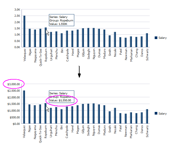
It may be helpful to have an understanding of how chart attributes and child tags can affect functionality. For more information about configuring charts, see Section 24.2.2, "Configuring Charts."
Add a chart to your page. For help with adding a chart to a page, see Section 24.2.3, "How to Add a Chart to a Page."
To format numeric values on a chart's value, value label, or axis values:
-
In the Structure window, right-click dvt:typeChart and choose Insert inside Chart > dvt:chartValueFormat.
-
Right-click the dvt:chartValueFormat node and choose Go to Properties.
-
In the Property Inspector, enter values for the following:
-
Type: From the attribute's dropdown list, select the tag that identifies the chart element that you wish to format. Valid values include
x,y,y2,z,value, orlabel.For example, to format the numeric value for the bar chart's series shown in Figure 24-43, select
yfrom the Type attribute's dropdown list. -
Scaling: From the attribute's dropdown list, select the scale factor for the numeric value.
Scaling options range from
nonetoquadrillion.
-
To format numeric values on a chart's axis label:
-
In the Structure window, expand the dvt:typeChart node.
-
If the expanded node does not contain the axis that you wish to format, right-click dvt:typeChart and choose Insert inside Chart > (dvt:chartXAxis or dvt:chartYAxis or dvt:ChartY2Axis).
-
Right-click the dvt:chartXAxis, dvt:chartYAxis, or dvt:ChartY2Axis node and choose Insert inside Axis > dvt:chartTickLabel.
-
Right-click dvt:chartTickLabel and choose Go to Properties.
-
In the Property Inspector, enter values for the following:
-
Rotation: From the Rotation attribute's dropdown list, select
offto turn off rotation.By default, the chart will automatically rotate the labels by 90 degrees in order to fit more labels on the axis. The rotation will only be applied to categorical labels for a horizontal axis.
-
Scaling: From the attribute's dropdown list, select the scale factor for the numeric value.
Scaling options range from
nonetoquadrillion.
-
To specify numeric patterns, currency, or percent using af:convertNumber:
-
In the Structure window, right-click dvt:chartTickLabel or dvt:chartValueFormat and choose Insert inside (Chart Tick Label or Chart Value Format) > dvt:convertNumber.
-
Right-click af:convertNumber and choose Go to Properties.
-
In the Property Inspector, from the Type attribute's dropdown list, select the desired numeric type.
By default, Type is set to
number, but you can also selectcurrencyorpercent. -
Configure additional attributes as needed.
For example, you can specify which currency symbol to use in the CurrencySymbol field. For help with an individual field or to look at the complete tag documentation for the af:convertNumber tag, click Component Help.
24.4.4 Customizing a Chart Axis
Depending upon the chart type, you can configure a time axis on the x-axis or customize the properties of a chart's x-axis, y-axis, y2-axis, or z-axis.
24.4.4.1 How to Configure a Time Axis
If your x-axis includes time data, then you can enable the time axis display. Charts include support for time data that is based on regular or irregular intervals. Charts also support mixed frequency time data, where the individual series contain differing dates.
Figure 24-44 shows three charts configured for a time axis. In the horizontal bar chart, the time data is spaced equally. The vertical bar chart shows an example of irregularly spaced data, and the chart provides a visual clue that there is no data for 2014. The combination chart shows mixed frequency time data. In this example, the time data is different for each series (chart) in the combination chart.
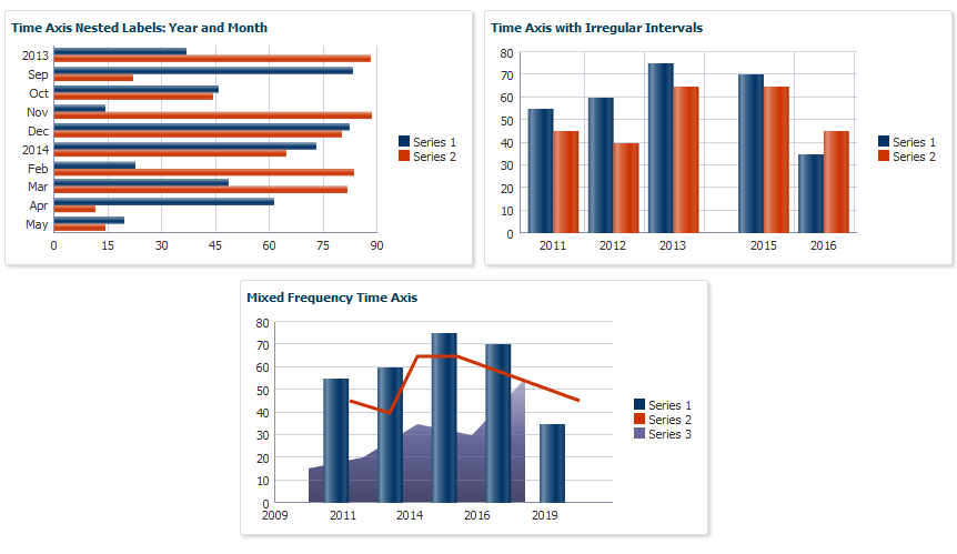
To configure a time axis, set the timeAxisType attribute's value to enabled for regular or irregular data, and set it to mixedFrequency for time data that varies by series.
Example 24-15 shows the code snippet on the JSF page that defines the horizontal bar chart, bar chart, and combination chart, with the timeAxisType definition highlighted in bold font.
Example 24-15 Code on JSF page Defining timeAxisType
<af:panelBox text="Time Axis Nested Labels: Year and Month"
             showDisclosure="false">
  <dvt:barChart orientation="horizontal" value="#{chartDataSource.monthlyTimeData}"
             var="row" hoverBehavior="dim" timeAxisType="enabled">
    <f:facet name="dataStamp">
      <dvt:chartDataItem series="#{row.series}" group="#{row.group}"
                         value="#{row.value}"/>
    </f:facet>
  </dvt:barChart>
</af:panelBox>
<af:panelBox text="Time Axis with Irregular Intervals" showDisclosure="false">
  <dvt:barChart value="#{chartDataSource.yearlyIrregularTimeData}"
                var="row" hoverBehavior="dim" timeAxisType="enabled">
    <f:facet name="dataStamp">
      <dvt:chartDataItem series="#{row.series}" group="#{row.group}"
                         value="#{row.value}"/>
    </f:facet>
    <dvt:chartXAxis>
      <dvt:majorTick rendered="true"/>
    </dvt:chartXAxis>
  </dvt:barChart>
</af:panelBox>
<af:panelBox text="Mixed Frequency Time Axis" showDisclosure="false">
  <dvt:comboChart value="#{chartDataSource.yearlyMixedFrequencyTimeData}"
                  var="row" hoverBehavior="dim" timeAxisType="mixedFrequency">
    <f:facet name="dataStamp">
      <dvt:chartDataItem series="#{row.series}" group="#{row.group}" x="#{row.x}"
                         y="#{row.y}"/>
    </f:facet>
  </dvt:comboChart>
The code that defines the charts' collection models and populate them with data is stored in the chartDataSource managed bean shown in Example 24-2.
Example 24-16 shows the getMonthlyTimeData(), getYearlyIrregularTimeData(), and getYearlyMixedFrequencyTimeData() methods. In this example, the getMonthlyTimeData() method calls the getTimeData() method which is a reusable method that takes the series, group, and time data as its arguments.
Example 24-16 Sample Methods Defining Chart Collection Models With Time Data
public CollectionModel getYearlyIrregularTimeData() {
  List<ChartDataItem> dataItems = new ArrayList<ChartDataItem>();
  dataItems.add(new ChartDataItem("Series 1", new GregorianCalendar(2011, 7, 27).getTime(), 55));
  dataItems.add(new ChartDataItem("Series 1", new GregorianCalendar(2012, 7, 27).getTime(), 60));
  dataItems.add(new ChartDataItem("Series 1", new GregorianCalendar(2013, 7, 27).getTime(), 75));
  dataItems.add(new ChartDataItem("Series 1", new GregorianCalendar(2015, 1, 27).getTime(), 70));
  dataItems.add(new ChartDataItem("Series 1", new GregorianCalendar(2016, 1, 27).getTime(), 35));

  dataItems.add(new ChartDataItem("Series 2", new GregorianCalendar(2011, 7, 27).getTime(), 45));
  dataItems.add(new ChartDataItem("Series 2", new GregorianCalendar(2012, 7, 27).getTime(), 40));
  dataItems.add(new ChartDataItem("Series 2", new GregorianCalendar(2013, 7, 27).getTime(), 65));
  dataItems.add(new ChartDataItem("Series 2", new GregorianCalendar(2015, 1, 27).getTime(), 65));
  dataItems.add(new ChartDataItem("Series 2", new GregorianCalendar(2016, 1, 27).getTime(), 45));

  return ModelUtils.toCollectionModel(dataItems);
}
public CollectionModel getYearlyMixedFrequencyTimeData() {
  List<ChartDataItem> dataItems = new ArrayList<ChartDataItem>();
  dataItems.add(new ChartDataItem("Series 1", "Group 1", new GregorianCalendar(2011, 7, 27).getTime(), 55));
  dataItems.add(new ChartDataItem("Series 1", "Group 2", new GregorianCalendar(2013, 7, 27).getTime(), 60));
  dataItems.add(new ChartDataItem("Series 1", "Group 3", new GregorianCalendar(2015, 7, 27).getTime(), 75));
  dataItems.add(new ChartDataItem("Series 1", "Group 4", new GregorianCalendar(2017, 7, 27).getTime(), 70));
  dataItems.add(new ChartDataItem("Series 1", "Group 5", new GregorianCalendar(2019, 7, 27).getTime(), 35));

  dataItems.add(new ChartDataItem("Series 2", "Group 1", new GregorianCalendar(2012, 1, 27).getTime(), 45));
  dataItems.add(new ChartDataItem("Series 2", "Group 2", new GregorianCalendar(2013, 7, 27).getTime(), 40));
  dataItems.add(new ChartDataItem("Series 2", "Group 3", new GregorianCalendar(2014, 7, 27).getTime(), 65));
  dataItems.add(new ChartDataItem("Series 2", "Group 4", new GregorianCalendar(2016, 1, 27).getTime(), 65));
  dataItems.add(new ChartDataItem("Series 2", "Group 5", new GregorianCalendar(2020, 7, 27).getTime(), 45));
  dataItems.add(new ChartDataItem("Series 3", "Group 1", new GregorianCalendar(2010, 7, 27).getTime(), 15));
  dataItems.add(new ChartDataItem("Series 3", "Group 2", new GregorianCalendar(2012, 7, 27).getTime(), 20));
  dataItems.add(new ChartDataItem("Series 3", "Group 3", new GregorianCalendar(2014, 7, 27).getTime(), 35));
  dataItems.add(new ChartDataItem("Series 3", "Group 4", new GregorianCalendar(2016, 7, 27).getTime(), 30));
  dataItems.add(new ChartDataItem("Series 3", "Group 5", new GregorianCalendar(2018, 7, 27).getTime(), 55));
  return ModelUtils.toCollectionModel(dataItems);
}
public CollectionModel getMonthlyTimeData() {
  return getTimeData(2, 10, 2013, 7, 1, Calendar.MONTH, 1);
}
private double getValue() {return Math.random() * 100;}
public CollectionModel getTimeData(int numSeries, int numGroups,
                       int startYear, int startMonth, int startDate,
                       int dateField, int addCount){
  List<ChartDataItem> dataItems = new ArrayList<ChartDataItem>();
  GregorianCalendar cal = new GregorianCalendar(startYear, startMonth, startDate);
  for(int group=0; group<numGroups; group++) {
    for(int series=0; series<numSeries; series++) {
      dataItems.add(new ChartDataItem("Series " + (series+1), cal.getTime(), getValue()));
    }
    cal.add(dateField, addCount);
  }
  return ModelUtils.toCollectionModel(dataItems);
}
It may be helpful to have an understanding of how chart attributes and child tags can affect functionality. For more information about configuring charts, see Section 24.2.2, "Configuring Charts."
Add a chart to your page. For help with adding a chart to a page, see Section 24.2.3, "How to Add a Chart to a Page."
To configure a chart time axis:
-
In the Structure window, right-click dvt:typeChart and choose Go To Properties.
-
In the Property Inspector, expand the Appearance section.
-
From the TimeAxisType attribute's dropdown list, select
enabledif your chart includes regular or irregular time data. SelectmixedFrequencyif your chart contains mixed frequency time data.
24.4.4.2 How to Customize the Chart Axis
Charts include support for customizing the x-axis, y-axis, and y2-axis. Depending upon the axis type, you can customize the minimum and maximum values of the data and axis, add a title, specify tick mark increments, configure viewport boundaries, and specify whether the axis baseline starts at the minimum value of the data or at zero.
To customize a chart axis, add the dvt:chartXAxis, dvt:chartYAxis, or dvt:chartY2Axis component to the chart and configure the properties for the axis in the Property Inspector.
Table 24-6 lists the chart axis attributes and the axis on which they apply. Most attributes have default settings which are based upon the data, and you only need to change these if you want to modify the defaults. However, you must specify values for the title, attributeChangeListener, and binding attributes if you want to use them.
Table 24-6 Chart Axis Attributes
| Name | Description | X-Axis Support? | Y-Axis Support? | Y2-Axis Support? |
|---|---|---|---|---|
|
|
Specifies whether the tick marks of the y1 and y2 axes are aligned. |
No |
No |
Yes |
|
|
Method reference to a listener for renderer changes to a property without the application's specific request. |
Yes |
Yes |
Yes |
|
|
Specifies whether the axis baseline starts at the minimum value of the data or at zero. |
Yes |
Yes |
Yes |
|
|
Specifies a binding reference to store a specific instance of the axis from a backing bean. Set this attribute only to access code in a backing bean. |
Yes |
Yes |
Yes |
|
|
Specifies the maximum data value on a numerical axis. If not set, attribute defaults to the maximum value of the data set. |
Yes |
Yes |
Yes |
|
|
Specifies the minimum data value on a numerical axis. If not set, attribute defaults to the maximum value of the data set. |
Yes |
Yes |
Yes |
|
|
Specifies the component's identifier. |
Yes |
Yes |
Yes |
|
|
Specifies the increment for the major ticks of a numerical axis. |
Yes |
Yes |
Yes |
|
|
Specifies the maximum value of the axis. |
Yes |
Yes |
Yes |
|
|
Specifies the minimum value of the axis. |
Yes |
Yes |
Yes |
|
|
Specifies the minimum increment between tick marks on a numerical axis. |
Yes |
Yes |
Yes |
|
|
Specifies the increment for the minor ticks of the axis. |
Yes |
Yes |
Yes |
|
|
Specifies whether the axis is rendered. |
Yes |
Yes |
Yes |
|
|
Specifies the title of the axis. |
Yes |
Yes |
Yes |
|
|
Specifies the end group of the current viewport on group or time axes. |
Yes |
No |
No |
|
|
Specifies the start group of the current viewport on group or time axes. |
Yes |
No |
No |
|
|
Specifies the maximum x-coordinate or y-coordinate of the current viewport on bubble and scatter charts. |
Yes |
Yes |
No |
|
|
Specifies the minimum x-coordinate of the current viewport |
Yes |
Yes |
No |
Chart axes also support optional child components which allow you to customize the major and minor tick marks, axis tick labels, and axis lines.
-
dvt:majorTickanddvt:minorTick: Specifies the line color, style, and width of the chart's tick marks. -
dvt:chartAxisLine:Specifies the line color and width of the axis line. -
dvt:chartTickLabel: Specifies the scaling, styling, and rotation of the chart's tick labels.For details about configuring
dvt:chartTickLabel, see Section 24.4.3, "How to Format Chart Numerical Values" and Section 24.4.1.2, "How to Configure Chart Element Labels." -
dvt:referenceAreaanddvt:referenceLine: Specifies a reference area or line on the axis.For information about adding a reference area or line to your chart, see Section 24.4.5, "Adding Reference Objects to a Chart."
It may be helpful to have an understanding of how chart attributes and child tags can affect functionality. For more information about configuring charts, see Section 24.2.2, "Configuring Charts."
Add a chart to your page. For help with adding a chart to a page, see Section 24.2.3, "How to Add a Chart to a Page."
-
In the Structure window, expand the dvt:typeChart node.
-
If the expanded node does not contain the axis that you wish to customize, right-click dvt:typeChart and choose Insert inside Chart > (dvt:chartXAxis or dvt:chartYAxis or dvt:ChartY2Axis).
-
Right-click the dvt:chartXAxis, dvt:chartYAxis, or dvt:ChartY2Axis node and choose Go to Properties.
-
To customize a numerical axis, in the Property Inspector, enter values for the following:
-
BaselineScaling: From the BaselineScaling's attribute's dropdown list, select
minto set the axis baseline to the minimum value of the data. By default, this attribute is set tozero. -
DataMaximum and DataMinimum: Enter the minimum and maximum values for which data will be displayed.
By default, the chart will display the entire data set.
-
MajorTickIncrement and MinorTickIncrement: Specify the increments for the major and minor ticks.
By default, the tick increments are calculated from the data.
-
Scaling: From the attribute's dropdown list, select the scale factor for the numeric value.
Scaling options range from
nonetoquadrillion.
-
-
For all axis types, in the Property Inspector, enter values for the following attributes.
-
Minimum and Maximum: Enter the minimum and maximum axis values.
By default, the minimum and maximum values are calculated from the data.
-
Title: Specify the axis title. By default, the axis does not include a title.
-
-
To configure a viewport, in the Property Inspector, enter values for the viewportEndGroup, viewportStartGroup, viewportMaximum, and viewportMinimum attributes as needed.
For information about adding a viewport to your chart, see Section 24.5.6, "How to Configure Chart Zoom and Scroll."
-
Configure additional attributes as needed.
For example, you can turn off alignment of the tick marks on the y1 and y2 axes of a dual-Y chart using the AlignTickMarks attribute. For help with an individual field or to look at the complete tag documentation for the axis, click Component Help.
-
Right-click the dvt:chartXAxis, dvt:chartYAxis, or dvt:ChartY2Axis node and choose Insert inside Axis > dvt:chartTickLabel.
-
Right-click dvt:chartTickLabel and choose Go to Properties.
-
In the Property Inspector, enter values for the following attributes.
-
Rotation: From the Rotation attribute's dropdown list, select
offto turn off rotation.By default, the chart will automatically rotate the labels by 90 degrees in order to fit more labels on the axis. The rotation will only be applied to categorical labels for a horizontal axis.
-
Scaling: From the attribute's dropdown list, select the scale factor for the numeric value.
Scaling options range from
nonetoquadrillion.
-
-
To further customize the numeric value, in the Structure window, right-click dvt:chartTickLabel and choose Insert inside Chart Tick Label > af:convertNumber.
-
Right-click af:convertNumber and choose Go to Properties.
-
In the Property Inspector, from the Type attribute's dropdown list, select the desired numeric type.
By default, Type is set to
number, but you can also selectcurrencyorpercent. -
Configure additional attributes as needed.
For example, you can specify which currency symbol to use in the CurrencySymbol field. For help with an individual field or to look at the complete tag documentation for the af:convertNumber tag, click Component Help.
To customize the chart's axis line:
-
In the Structure window, right-click the dvt:chartXAxis, dvt:chartYAxis, or dvt:ChartY2Axis node and choose Insert inside Axis > dvt:chartAxisLine.
-
Right-click dvt:chartAxisLine and choose Go to Properties.
-
In the Property Inspector, enter values for the following attributes.
-
LineColor: Specify the RGB value in hexadecimal notation or choose Expression Builder from the attribute's dropdown menu to enter an expression that evaluates to the RGB value.
For example, enter
#008000to render the axis line's color in green. -
LineWidth: Enter the axis line's width in pixels. By default, LineWidth is set to
1.
-
To customize the axis major or minor ticks:
-
In the Structure window, right-click the dvt:chartXAxis, dvt:chartYAxis, or dvt:ChartY2Axis node and choose Insert inside Axis > (dvt:majorTick or dvt:minorTick).
-
Right-click dvt:majorTick or dvt:minorTick and choose Go to Properties.
-
In the Property Inspector, enter values for the following attributes.
-
LineColor: Specify the RGB value in hexadecimal notation or choose Expression Builder from the attribute's dropdown menu to enter an expression that evaluates to the RGB value.
For example, enter
#008000to render the tick mark's color in green. -
LineStyle: From the LineStyle attribute's dropdown list, select the tick mark's line style.
By default, LineStyle is set to
solid, but you can selectdashedordottedto change the default line style. -
LineWidth: Enter the tick mark's width in pixels. By default, LineWidth is set to
1.
-
24.4.4.3 Configuring Dual Y-Axis
You can add a second y-axis to area, bar, combination, and line charts. This feature is useful if you have two series with different ranges of data. For example, you could have a bar chart that shows salary on one y-axis and commission percent on the second.
To configure a dual y-axis, add the dvt:chartSeriesStyle component to your chart, and set the assignedToY2 attribute to true. For instructions to configure the dvt:chartSeriesStyle component, see Section 24.4.7.1, "How to Customize a Chart Series."
24.4.5 Adding Reference Objects to a Chart
You can add reference areas or lines to all charts except pie charts using the dvt:referenceLine or dvt:referenceArea components. Reference areas are associated with the chart's axis and typically are associated with the y-axis. Use reference areas or lines to show target values or ranges.
Figure 24-45 shows the line chart displayed in Figure 24-36 with a reference area and reference line. In this example, the reference area is configured with a light blue color and a range between 200 and 250. The reference line is configured with a green color and a value of 25.
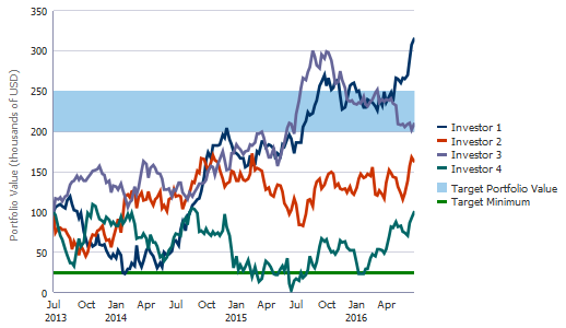
Example 24-17 shows the code snippet on the JSF page that defines the reference area and line. In this example, the reference area and line are configured as children of the chart's y-axis.
Example 24-17 Sample Code on JSF Page Defining Reference Area and Reference Line
<dvt:chartYAxis title="Portfolio Value (thousands of USD)">
  <dvt:referenceArea id="ra1" color="#A0CEEC" maximum="250" minimum="200"
                     displayInLegend="on" text="Target Portfolio Value"/>
  <dvt:referenceLine id="rl1" color="#008000" value="25" displayInLegend="on"
                     text="Target Minimum" rendered="true" lineWidth="3"/>
</dvt:chartYAxis>
You can also specify multi-segment reference lines or areas as shown in Figure 24-46. In this example, the bar chart is configured with a multi-segment reference line, and the line chart is configured with a multi-segment reference area. In these examples, the target values vary by year.
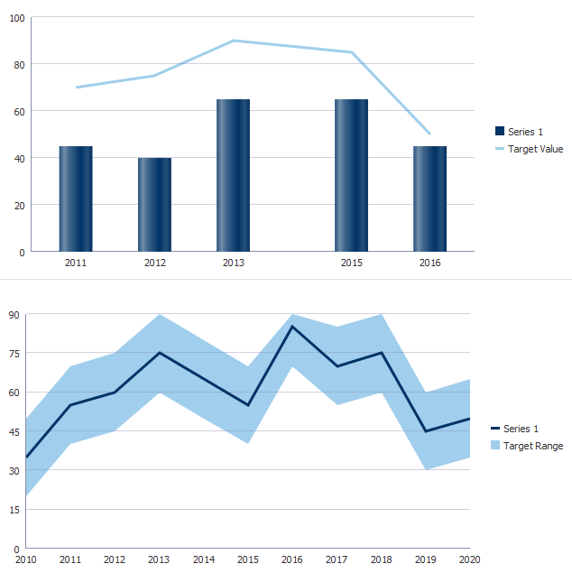
Multi-segment reference lines or reference areas are defined by adding the dvt:referenceAreaItem or dvt:referenceLineItem elements as children of the dvt:referenceArea and dvt:referenceLine components. You can explicitly define a reference area or line item for each segment in the reference line or area, or use the af:iterator tag to loop through the segments.
Example 24-18 shows the code snippets on the JSF page that define the bar and line charts. The code related to the reference area and reference line is highlighted in bold.
Example 24-18 Code on JSF Page Defining Segmented Reference Area and Line
<dvt:barChart value="#{chartDataSource.yearlyIrregularTimeData}"
              var="row" timeAxisType="enabled" inlineStyle="width:650px">
  <f:facet name="dataStamp">
    <dvt:chartDataItem series="Series 1" group="#{row.group}"
                       value="#{row.value}"/>
  </f:facet>
  <dvt:chartYAxis maximum="100">
    <dvt:referenceLine color="#A0CEEC" displayInLegend="on" text="Target Value"
                       lineWidth="3" shortDesc="Target Value">
      <af:iterator id="it1" value="#{chartDataSource.yearlyIrregularTimeData}"
                   var="row">
        <dvt:referenceLineItem x="#{row.series == 'Series 1' ? row.group:0}"
                          value="#{row.series == 'Series 1' ? row.value + 15:0}"/>
      </af:iterator>
    </dvt:referenceLine>
  </dvt:chartYAxis>
  <dvt:chartLegend rendered="true"/>
</dvt:barChart>
    ...
<dvt:lineChart value="#{chartDataSource.yearlySingleTimeData}" var="row"
               timeAxisType="enabled" inlineStyle="width:650px" id="chart1">
  <f:facet name="dataStamp">
    <dvt:chartDataItem series="#{row.series}" group="#{row.group}"
                       value="#{row.value}"/>
  </f:facet>
  <dvt:chartYAxis>
    <dvt:referenceArea color="#A0CEEC" displayInLegend="on" text="Target Range"
                       shortDesc="Target Range">
      <af:iterator id="it3" value="#{chartDataSource.yearlySingleTimeData}"
                   var="row">
        <dvt:referenceAreaItem x="#{row.group}" minimum="#{row.value - 15}"
                               maximum="#{row.value + 15}"/>
      </af:iterator>
    </dvt:referenceArea>
  </dvt:chartYAxis>
  <dvt:chartLegend rendered="true"/>
</dvt:lineChart>
The data for the bar chart is defined in the getYearlyIrregularTimeData() method and is shown in Example 24-16, and the line chart's data is defined in the getYearlySingleTimeData() method. Both methods are contained in the chartDataSource managed bean.
Example 24-19 shows the getYearlySingleTimeData() method that defines the line chart's collection model and populates it with sample data.
Example 24-19 Sample Method to Define a Chart With Single Series
public CollectionModel getYearlySingleTimeData() {
  List<ChartDataItem> dataItems = new ArrayList<ChartDataItem>();
  dataItems.add(new ChartDataItem("Series 1",
                new GregorianCalendar(2010, 1, 27).getTime(), 35));
  dataItems.add(new ChartDataItem("Series 1",
                new GregorianCalendar(2011, 1, 27).getTime(), 55));
  dataItems.add(new ChartDataItem("Series 1",
                new GregorianCalendar(2012, 1, 27).getTime(), 60));
  dataItems.add(new ChartDataItem("Series 1",
                new GregorianCalendar(2013, 1, 27).getTime(), 75));
  dataItems.add(new ChartDataItem("Series 1",
                new GregorianCalendar(2014, 1, 27).getTime(), 65));
  dataItems.add(new ChartDataItem("Series 1",
                new GregorianCalendar(2015, 1, 27).getTime(), 55));
  dataItems.add(new ChartDataItem("Series 1",
                new GregorianCalendar(2016, 1, 27).getTime(), 85));
  dataItems.add(new ChartDataItem("Series 1",
                new GregorianCalendar(2017, 1, 27).getTime(), 70));
  dataItems.add(new ChartDataItem("Series 1",
                new GregorianCalendar(2018, 1, 27).getTime(), 75));
  dataItems.add(new ChartDataItem("Series 1",
                new GregorianCalendar(2019, 1, 27).getTime(), 45));
  dataItems.add(new ChartDataItem("Series 1",
                new GregorianCalendar(2020, 1, 27).getTime(), 50));
  return ModelUtils.toCollectionModel(dataItems);
}
24.4.5.1 How to Add a Reference Object to a Chart
To add a reference object to a chart, add the dvt:referenceArea or dvt:referenceLine component as a child of the chart's associated axis. The process is the same for all charts except the spark charts which use reference objects wrapped inside a reference object set for reference areas and lines.
To specify segmented reference lines or areas, add the dvt:referenceAreaItem or dvt:referenceLineItem as a child of the dvt:referenceArea or dvt:referenceLine. To use af:iterator to loop through the reference items, add the af:iterator as a child of the chart's axis and then add the reference item.
Note:
To add a reference line or object to a spark chart, add thedvt:referenceObjectSet component to the spark chart and configure a dvt:referenceObject for each reference line or area. Consult the tag documentation for additional information.It may be helpful to have an understanding of how chart attributes and child tags can affect functionality. For more information about configuring charts, see Section 24.2.2, "Configuring Charts."
Add a chart to your page. For help with adding a chart to a page, see Section 24.2.3, "How to Add a Chart to a Page."
To add a reference line to a chart:
-
In the Structure window, expand the dvt:typeChart node.
-
If the expanded node does not contain the axis that will contain the reference line, right-click dvt:typeChart and choose Insert inside Chart > (dvt:chartXAxis or dvt:chartYAxis or dvt:chartY2Axis).
-
Right click the dvt:axis node and choose Insert inside Axis > dvt:referenceLine.
-
Right-click dvt:referenceLine and choose Go to Properties.
-
In the Property Inspector, enter values for the following:
-
Value: Specify the value on the axis where the line is to appear.
For example, enter 25 to position the line where the axis equals 25.
-
Color: Specify the RGB value in hexadecimal notation or choose Expression Builder from the attribute's dropdown menu to enter an expression that evaluates to the RGB value.
For example, enter
#008000to display the reference line in green. -
LineStyle: From the attribute's dropdown list, select
dashedordottedto change the default display from solid. -
LineType: From the attribute's dropdown list, select a line type. By default, this attribute is set to
auto. You can also set this tostraight,curved,stepped,centeredStepped,segmented, orcenteredSegmented. -
LineWidth: Enter the width in pixels for the line.
-
Text: Enter a description for the reference line.
-
DisplayedInLegend: From the attribute's dropdown list, select
onto have the reference line included in the chart's legend.
-
-
In the Structure window, to specify a segmented reference line and define the reference line items using
af:iterator,right-clickdvt:referenceLineand choose Insert inside Reference Line Item > af:iterator. -
Right-click the af:iterator or dvt:referenceLine node and choose Insert inside (Iterator or Reference Line) > dvt:referenceLineItem.
-
Right-click dvt:referenceLineItem and choose Go to Properties.
-
In the Property Inspector, enter values for the following:
-
Value: Specify the value of the reference line item.
You can enter a static value or use an EL Expression that evaluates to the reference line item's value. For example, to specify the value for the reference line item for the line chart shown in Figure 24-46, enter #{row.series == 'Series 1' ? row.value + 15:0}.
-
X: Specify the location on the x-axis where the reference line item is to be rendered.
For charts with time data, this is the time stamp. For charts with a categorical axis, this is the index of the group, which starts at 0.
To specify the x-axis position for the line chart shown in Figure 24-46, enter #{row.series == 'Series 1' ? row.group:0}.
-
-
To add additional reference line items, repeat Step 7 through Step 9 for each additional item.
To add a reference area to a chart:
-
In the Structure window, expand the dvt:typeChart node.
-
If the expanded node does not contain the axis that will contain the reference area, right-click dvt:typeChart and choose Insert inside Chart > (dvt:chartXAxis or dvt:chartYAxis or dvt:chartY2Axis).
-
Right click the dvt:axis node and choose Insert inside Axis > dvt:referenceArea.
-
Right-click dvt:referenceArea and choose Go to Properties.
-
In the Property Inspector, enter values for the following:
-
LineType: From the attribute's dropdown list, select a line type. By default, this attribute is set to
auto. You can also set this tostraight,curved,stepped, orcenteredStepped. -
Maximum: Specify the upper bound of the reference area.
For example, enter
300to set the upper bound of the reference area to 300 along the chart's associated axis. -
Minimum: Specify the lower bound of the reference area.
For example, enter
250to set the lower bound of the reference area to 250 along the chart's associated axis. -
Color: Specify the RGB value in hexadecimal notation or choose Expression Builder from the attribute's dropdown menu to enter an expression that evaluates to the RGB value.
For example, enter
#A0CEECto display the reference line in light blue. -
Text: Enter a description for the reference line.
-
DisplayedInLegend: From the attribute's dropdown list, select
onto have the reference area included in the chart's legend.
-
-
In the Structure window, to specify a segmented reference area and define the reference area items using
af:iterator,right-clickdvt:referenceAreaand choose Insert inside Reference Area Item > af:iterator. -
Right-click the af:iterator or dvt:referenceArea node and choose Insert inside (Iterator or Reference Area) > dvt:referenceAreaItem.
-
Right-click dvt:referenceAreaItem and choose Go to Properties.
-
In the Property Inspector, enter values for the following:
-
Maximum: Specify the maximum value of the reference area item.
You can enter a static value or use an EL Expression that evaluates to the reference area item's value. For example, to specify the maximum value for the reference area item for the line chart shown in Figure 24-46, enter
#{row.value + 15}. -
Minimum: Specify the minimum value of the reference area item.
You can enter a static value or use an EL Expression that evaluates to the reference area item's value. For example, to specify the minimum value for the reference area item for the line chart shown in Figure 24-46, enter
#{row.value + 15}. -
X: Specify the location on the x-axis where the reference line item is to be rendered.
For charts with time data, this is the time stamp. To specify the x-axis position for the line chart shown in Figure 24-46, enter
#{row.group}.
-
-
To add additional reference area items, repeat Step 7 through Step 9 for each additional item.
24.4.6 How to Configure a Stacked Chart
Stacked charts show cumulative values across groups. Stacked charts typically contain two or more series which are aggregated into one bar, area, or line. For example, you might want to show the total sales of three products, grouped by city. In a clustered bar chart, the bar chart would display three bars, one for each product. In a stacked bar chart, the three bars would be aggregated into one bar for each city.
Figure 24-47 shows the effect of stacking series in a bar chart. In this example, the five series in the clustered bar chart at the top of the figure are configured as a stacked bar chart at the bottom of the figure.
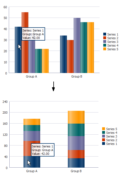
If you chose a quick start layout that included a stacked display, then JDeveloper automatically stacked the series by group. Otherwise, you can enable stacking by setting the stack attribute to on.
It may be helpful to have an understanding of how chart attributes and child tags can affect functionality. For more information about configuring charts, see Section 24.2.2, "Configuring Charts."
Add a chart to your page. For help with adding a chart to a page, see Section 24.2.3, "How to Add a Chart to a Page."
-
In the Structure window, right-click dvt:typeChart and choose Go To Properties.
-
In the Property Inspector, from the Stack attribute's dropdown list, select
on.
24.4.7 Customizing Chart Series
You can customize the fill of all series in a chart by setting the seriesEffect attribute on the chart component.
You can customize the appearance of individual series in a chart by adding the dvt:chartSeriesStyle component to your chart. Depending upon the chart type, you can customize colors, markers, lines, and fill effects. For combination charts, you can also specify which chart to display.
Note:
Spark charts contain only a single series and do not supportseriesEffect or chartSeriesStyle. To customize the spark chart, enter values for the dvt:sparkChart component in the Property Inspector. You can customize the series color and specify which markers are displayed. For more information, click Component Help in the Property Inspector.24.4.7.1 How to Customize a Chart Series
To customize an individual series in a chart, add the dvt:chartSeriesStyle component and configure its properties in the Property Inspector.
Table 24-7 lists the attributes available on the chartSeriesStyle component and the chart types for which they apply.
Table 24-7 dvt:chartSeriesStyle Tags
| Chart Tag | Description | Supported Chart Types |
|---|---|---|
|
|
Method reference to an action. |
area, bar, bubble, combination, line |
|
|
Method reference to an action listener. |
area, bar, bubble, combination, line |
|
|
Specifies the color of an area series. |
area, combination (with area) |
|
|
Specifies whether the series should be assigned to the Y2 axis. |
area, bar, combination, line |
|
|
Method reference to an attribute change listener. |
all |
|
|
Specifies the border color of the series. |
all |
|
|
Specifies the color of the series. |
all |
|
|
Specifies whether the series is displayed in the chart legend |
all |
|
|
Specifies the id of the component. |
all |
|
|
Specifies the appearance of the line. |
combination (with line), line |
|
|
Specifies the appearance of line connectors |
area, scatter, combination (with line), line |
|
|
Specifies the width of the line in pixels. |
combination (with line), line |
|
|
Specifies the color of the data item markers, if different than the series color. |
area, bubble, combination (with area or line), line, scatter |
|
|
Specifies whether the data item markers are displayed. |
area, bubble, combination (with area or line), line, scatter |
|
|
Specifies the shape of the data item markers. |
area, bubble, combination (with area or line), line, scatter |
|
|
Specifies the size of the data item markers if displayed. |
area, bubble, combination (with area or line), line, scatter |
|
|
Specifies the pattern of the series. |
all |
|
|
Specifies whether the component is rendered. |
all |
|
|
Identifies the series for which the series style applies. |
all |
|
|
Specifies whether the series is displayed as an area, bar, line, or lineWithArea chart. |
combination |
It may be helpful to have an understanding of how chart attributes and child tags can affect functionality. For more information about configuring charts, see Section 24.2.2, "Configuring Charts."
Add a chart to your page. For help with adding a chart to a page, see Section 24.2.3, "How to Add a Chart to a Page."
-
In the Structure window, right-click dvt:typeChart and choose Insert inside Chart > f:facet seriesStamp.
-
If you plan on customizing more than one series in your chart, right-click f:facet - dataStamp and choose Insert inside Facet series Stamp > af:group.
-
Right-click af:group or f:facet seriesStamp and choose Insert inside (Group or Facet seriesStamp) > dvt:chartSeriesStyle.
-
To add additional series style elements, right-click af:group and choose Insert inside Group > dvt:chartSeriesStyle for each additional element.
-
Right-click dvt:chartSeriesStyle and choose Go to Properties.
-
In the Property Inspector, enter values for the desired customization.
-
Action: Specify the method reference to use for the action attribute, or choose Expression Builder from the attribute's dropdown menu to enter an expression that evaluates to the method reference.
-
ActionListener: Specify the method reference to use for the action listener, or choose Expression Builder from the attribute's dropdown menu to enter an expression that evaluates to the method reference.
-
AreaColor: Specify the RGB value in hexadecimal notation to use for the area fill color, or choose Expression Builder from the attribute's dropdown menu to enter an expression that evaluates to the RGB value.
For example, enter
#000080to display the area fill color in blue. -
Assigned2Y2: From the attribute's dropdown list, select
trueto customize the y2-axis. -
BorderColor: Specify the RGB value in hexadecimal notation to use for the border color, or choose Expression Builder from the attribute's dropdown menu to enter an expression that evaluates to the RGB value.
For example, enter
#008000to display the series border color in green. -
Color: Specify the RGB value in hexadecimal notation to use for the series color, or choose Expression Builder from the attribute's dropdown menu to enter an expression that evaluates to the RGB value.
-
DisplayInLegend: From the attribute's dropdown list, select
falseif you do not want to display the series in the legend. By default, this attribute is set totrue. -
LineStyle: From the attribute's dropdown list, select a line style. By default, this attribute is set to
solidwhich will display a solid line. You can also set this todashedordotted. -
LineType: From the attribute's dropdown list, select a line type. By default, this attribute is set to
auto. You can also set this tostraight,curved,stepped,centeredStepped,segmented,centeredSegmentedornone. -
LineWidth: Specify the width in pixels for the line.
-
MarkerColor: Specify the RGB value in hexadecimal notation to use for the series color, or choose Expression Builder from the attribute's dropdown menu to enter an expression that evaluates to the RGB value.
-
MarkerDisplayed: From the attribute's dropdown list, select
trueto display the line or area series marker. By default, this attribute is set tofalse. -
MarkerSize: Enter a value in pixels for the marker size.
-
Pattern: From the attribute's dropdown list, select a series pattern.
Available patterns include
smallChecker,smallCrosshatch,smallDiagonalLeft,smallDiagonalRight,smallDiamond,smallTriangle,largeChecker,largeCrosshatch,largeDiagonalLeft,largeDiagonalRight,largeDiamond, andlargeTriangle. -
Series: Enter the name of the series.
For example, to customize the first series in your chart, enter:
Series 1.If your application uses the Fusion technology stack and you are configuring a databound chart, the Series field will display the available bindings in the attribute's dropdown list. For more information about databound charts, see "Creating Databound Charts" in Oracle Fusion Middleware Fusion Developer's Guide for Oracle Application Development Framework
-
Type: From the attribute's dropdown list, select the chart type to use for the combination chart series.
Available choices include
area,bar,lineorlineWithArea.
-
24.4.7.2 How to Configure Series Fill Effects on All Series in a Chart
To customize the series fill effects for all series in the chart, specify a value for the seriesEffect attribute.
It may be helpful to have an understanding of how chart attributes and child tags can affect functionality. For more information about configuring charts, see Section 24.2.2, "Configuring Charts."
Add a chart to your page. For help with adding a chart to a page, see Section 24.2.3, "How to Add a Chart to a Page."
To configure series fill effects for all series in a chart:
-
In the Structure window, right-click dvt:typeChart and choose Go To Properties.
-
In the Property Inspector, from the SeriesEffect attribute's dropdown list, select the desired fill effect.
By default, the SeriesEffect attribute is set to gradient. You can select color to render the chart without gradients or pattern to display each series in a different pattern.
If you want to specify specific patterns for a series, see Section 24.4.7.1, "How to Customize a Chart Series."
24.4.8 How to Configure the Pie Chart Other Slice
Use the Other slice to aggregate smaller data sets visually into one larger set for easier comparison, as shown in Figure 24-32. To configure the Other slice, set a value for the otherThreshold attribute which specifies the percentage under which the slice would be aggregated into the Other slice. Optionally, you can set a value for the Other slice color.
It may be helpful to have an understanding of how chart attributes and child tags can affect functionality. For more information about configuring charts, see Section 24.2.2, "Configuring Charts."
Add a chart to your page. For help with adding a chart to a page, see Section 24.2.3, "How to Add a Chart to a Page."
To configure the pie chart Other slice:
-
In the Structure window, right-click dvt:typeChart and choose Go To Properties.
-
In the Property Inspector, expand the Appearance section.
By default, the SeriesEffect attribute is set to gradient. You can select color to render the chart without gradients or pattern to display each series in a different pattern.
If you want to specify specific patterns for a series, see Section 24.4.7.1, "How to Customize a Chart Series."
-
In the OtherThreshold field, enter a value between 0 and 1 to set the percentage under which the slide will be aggregated.
For example, if you want to aggregate all slices whose values are less than two percent of the pie chart's total, enter
0.02. -
Optionally, in the OtherColor field, specify the RGB value in hexadecimal notation to use for the border color, or choose Expression Builder from the attribute's dropdown menu to enter an expression that evaluates to the RGB value.
For example, enter
#008000to display the Other slice in green.
24.4.9 How to Explode Pie Chart Slices
You can configure the slices of a pie chart so that each slice is separated from the other using the explode attribute of the dvt:pieDataItem. You can specify a value between 1 and 10 for the distance between the slices.
Figure 24-48 shows the pie chart displayed inFigure 24-37 configured for exploding slices. In this example, the explode attribute for the pie chart's data item is defined as 0.25.
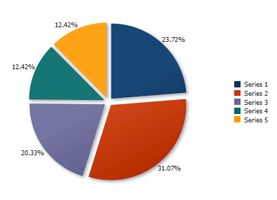
You can also configure an individual slice to explode using the explode attribute. Figure 24-49 shows the same pie chart configured to explode the Series 1 slice.
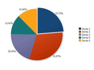
To configure an individual slice, you can use an EL expression to identify the slice and the value for the explode attribute. The individual slices in a pie chart are its series, and you can reference the series number in the EL expression.
For example, to set the explode attribute for the first series (slice) in the pie chart to 0.5, enter the following for the EL expression: #{row.series == 'Series 1' ? 0.5 : 0}. If you wanted to set the explode attribute for the third series to 0.25, you could enter the following for the EL expression: #{row.series == 'Series 3' ? 0.25 : 0}.
It may be helpful to have an understanding of how chart attributes and child tags can affect functionality. For more information about configuring charts, see Section 24.2.2, "Configuring Charts."
Add a chart to your page. For help with adding a chart to a page, see Section 24.2.3, "How to Add a Chart to a Page."
-
In the Structure window, right-click dvt:pieDataItem and choose Go To Properties.
-
In the Property Inspector, expand the Appearance section.
-
To explode all slices in the pie chart, in the Explode field, enter a value between 0 and 1.
-
To explode a single slice in the pie chart, in the Explode field, enter an EL Expression that evaluates to the series name and explode value.
For example, to explode the first series in the pie chart shown in Example 24-19, enter the following in the Explode field:
#{row.series == 'Series 1' ? 0.5 : 0}.
24.4.10 How to Configure Animation
To configure chart animation, add the af:transition tag as a child of the chart component and configure the trigger type and transition effect.
It may be helpful to have an understanding of how chart attributes and child tags can affect functionality. For more information about configuring charts, see Section 24.2.2, "Configuring Charts."
Add a chart to your page. For help with adding a chart to a page, see Section 24.2.3, "How to Add a Chart to a Page."
-
In the Structure window, click the chart component.
-
In the Source editor, add the
af:transitiontag as a child of the highlighted chart component as shown in the following example.<af:transition triggerType="display" transition="auto"/>
24.4.11 What You May Need to Know About Skinning and Customizing Chart Display Elements
Charts also support skinning to customize the color and font styles for the top level components as well as the axes, legend, series, marquee icon, labels, and plot area. You can also use skinning to define the animation duration and chart series effect.
Example 24-20 shows the skinning key for a chart configured to show patterns for its series fill effect.
Example 24-20 Using a Skinning Key to Define Chart Series Fill Effect
af|dvt-chart
  {
    -tr-series-effect: pattern;
  }
For the complete list of chart skinning keys, see the Oracle Fusion Middleware Data Visualization Tools Tag Reference for Oracle ADF Faces Skin Selectors. For additional information about customizing your application using skinning and styles, see Chapter 20, "Customizing the Appearance Using Styles and Skins."
24.5 Adding Interactive Features to Charts
You can add a variety of interactive features to your charts, including data cursors, hide and show behavior, hover behavior, selection support, popups, context menus, and zoom and scroll.
24.5.1 How to Add a Data Cursor
Add a data cursor to your chart to allow the user to focus more easily on data points. For charts where selection and other click interactivity is not enabled, the data cursor can be used to provide feedback for the closest data item to the mouse or touch gesture.
The data cursor is enabled by default for area and line charts on touch devices. To add the data cursor explicitly, set the dataCursor attribute to on and define the data cursor's behavior.
Figure 24-50 shows the line chart displayed in Figure 24-36 configured with a data cursor. In this example, the data cursor displays the series name, group value and series value. The box surrounding the data detail is displayed in the same color as the series fill color.
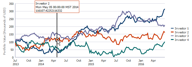
It may be helpful to have an understanding of how chart attributes and child tags can affect functionality. For more information about configuring charts, see Section 24.2.2, "Configuring Charts."
Add a chart to your page. For help with adding a chart to a page, see Section 24.2.3, "How to Add a Chart to a Page."
To configure a chart data cursor:
-
In the Structure window, right-click dvt:typeChart and choose Go To Properties.
-
In the Property Inspector, expand the Data section.
-
From the DataCursor attribute's dropdown list, select
onto enable the data cursor. -
From the DataCursorBehavior attribute's dropdown list, select
smoothorsnapto specify the data cursor behavior.By default, the data cursor's behavior is set to
auto, and the data cursor moves smoothly for line and area charts, and it snaps for other chart types. You can set this tosmoothorsnapto set the behavior explicitly.
Note:
The content displayed in the data cursor's tooltip is determined by thedvt:chartDataItem, dvt:pieDataItem, or dvt:funnelDataItem component's shortDesc attribute. You can edit this value in the Property Inspector for dvt:chartDataItem, or dvt:pieDataItem, or dvt:funnelDataItem.24.5.2 How to Configure Hide and Show Behavior
To configure hide and show behavior, which permits the user to click on a legend series item to hide or show a series item, configure the chart's hideAndShowBehavior attribute.
It may be helpful to have an understanding of how chart attributes and child tags can affect functionality. For more information about configuring charts, see Section 24.2.2, "Configuring Charts."
Add a chart to your page. For help with adding a chart to a page, see Section 24.2.3, "How to Add a Chart to a Page."
To configure hide and show behavior:
-
In the Structure window, right-click dvt:typeChart and choose Go To Properties.
-
In the Property Inspector, expand the Behavior section.
-
From the HideAndShowBehavior attribute's dropdown list, select
withRescaleorwithoutRescaleto specify the data cursor behavior.If you select
withoutRescale, the chart will not rescale the axes to fit the data. SelectwithRescaleif you want the chart to rescale the axes.
24.5.3 How to Configure Legend and Marker Dimming
To configure legend and marker dimming, set the chart's hoverBehavior attribute to dim. As the user hovers over each series, the remaining series dim from view.
It may be helpful to have an understanding of how chart attributes and child tags can affect functionality. For more information about configuring charts, see Section 24.2.2, "Configuring Charts."
Add a chart to your page. For help with adding a chart to a page, see Section 24.2.3, "How to Add a Chart to a Page."
To configure legend and marker dimming:
-
In the Structure window, right-click dvt:typeChart and choose Go To Properties.
-
In the Property Inspector, expand the Behavior section.
-
From the HoverBehavior attribute's dropdown list, select
dim.
24.5.4 How to Configure Selection Support
Charts can be enabled for single or multiple selection of data markers. Enabling selection is required for popups and context menus and for responding programmatically to user clicks on the data markers. To enable selection support, set the chart's dataSelection attribute to single or multiple.
After you have enabled selection support, you can specify a selection listener that will respond to user clicks on the chart.
Figure 24-51 shows a bar chart configured for multiple selection support. The user can click to select a single bar or use Ctrl-Click to select multiple bars. The bars highlight to show which bars are selected, and a message is displayed at the top of the page indicating which row key was selected.
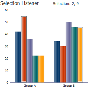
Example 24-21 shows the code on the JSF page that defines the bar chart and selection listener, with the selection code highlighted.
Example 24-21 Sample Code on JSF Page for Bar Chart Configured for Multiple Selection
<af:group id="g1">
  <af:outputText inlineStyle="font-size:large;" value="Selection Listener" id="ot1"/>
  <af:spacer width="50px"/>
  <af:outputText partialTriggers="chartSelect"
                 value="#{chartDataSource.selectionState}"
                 inlineStyle="font-size:larger;" id="ot2"/>
  <af:panelGroupLayout id="pgl1" layout="horizontal">
    <dvt:barChart id="chartSelect" value="#{chartDataSource.defaultBarData}"
                  var="row" dataSelection="multiple"
                  selectionListener="#{chartDataSource.selectionListener}">
      <dvt:chartLegend id="leg1" rendered="false"/>
      <f:facet name="dataStamp">
        <dvt:chartDataItem id="cdi1" value="#{row.value}" group="#{row.group}"
                           series="#{row.series}"/>
      </f:facet>
    </dvt:barChart>
  </af:panelGroupLayout>
</af:group>
In this example, the code that defines the bar chart is included in a method named defaultBarData(), and the selection listener is defined in a method named selectionListener().
Example 24-22 shows the defaultBarData() and selectionListener() methods. The methods and imports were added to the chartDataSource class created in Example 24-2.
Example 24-22 Sample Methods to Create Bar Chart With a Selection Listener
// Additional imports needed by selection listener
import oracle.adf.view.faces.bi.component.chart.UIChartBase;import org.apache.myfaces.trinidad.event.SelectionEvent;
import org.apache.myfaces.trinidad.model.RowKeySet;

// Bar Chart data
public CollectionModel getDefaultBarData() {  List<ChartDataItem> dataItems = new ArrayList<ChartDataItem>();  dataItems.add(new ChartDataItem("Series 1", "Group A", 42));  dataItems.add(new ChartDataItem("Series 1", "Group B", 34));  dataItems.add(new ChartDataItem("Series 2", "Group A", 55));  dataItems.add(new ChartDataItem("Series 2", "Group B", 30));  dataItems.add(new ChartDataItem("Series 3", "Group A", 36));  dataItems.add(new ChartDataItem("Series 3", "Group B", 50));  dataItems.add(new ChartDataItem("Series 4", "Group A", 22));  dataItems.add(new ChartDataItem("Series 4", "Group B", 46));  dataItems.add(new ChartDataItem("Series 5", "Group A", 22));  dataItems.add(new ChartDataItem("Series 5", "Group B", 46));  return ModelUtils.toCollectionModel(dataItems);
}

// Selection state
private String m_selection = "No Nodes Selected";
public String getSelectionState() {
  return m_selection;
}

// Selection Listener
public void selectionListener(SelectionEvent event) {
  UIChartBase chart = (UIChartBase) event.getComponent();
  RowKeySet rowKeySet = chart.getSelectedRowKeys();
  if(rowKeySet != null && rowKeySet.size() > 0) {
    StringBuilder sb = new StringBuilder("Selection: ");
    for(Object rowKey : rowKeySet) {
      sb.append(rowKey).append(", ");
    }
  // Remove the trailing comma and set the selection string
    sb.setLength(sb.length()-2);
    m_selection = sb.toString();
  }
  else
    m_selection = "No Nodes Selected";
}
It may be helpful to have an understanding of how chart attributes and child tags can affect functionality. For more information about configuring charts, see Section 24.2.2, "Configuring Charts."
Add a chart to your page. For help with adding a chart to a page, see Section 24.2.3, "How to Add a Chart to a Page."
To configure chart selection support:
-
In the Structure window, right-click dvt:typeChart and choose Go to Properties.
-
In the Property Inspector, expand the Data section.
-
From the DataSelection dropdown list, select
singleormultipleto enable selection support. -
Optionally, to enable a selection listener, do the following.
-
Create the method or methods that define the selection listener, and add it to the chart's managed bean.
If you need help creating classes, see the "Working with Java Code" section of the JDeveloper online help. For help with managed beans, see Section 2.6, "Creating and Using Managed Beans."
-
In the Property Inspector, in the SelectionListener field, enter the name of the selection listener.
For example, for a managed bean named chartDataSource and a method named selectionListener(), enter the following in the SelectionListener field:
#{chartDataSource.selectionListener}.You can also choose Edit from the SelectionListener attribute's dropdown menu to select a managed bean and method in the Edit Property: Selection Listener dialog, or choose Expression Builder to enter an expression that returns the selection listener.
-
-
Configure any additional elements as needed.
For example, to duplicate the multiple selection example in this section, add the
af:outputTextcomponents shown in Example 24-21.
24.5.5 How to Configure Popups and Context Menus
The process to add a popup or context menu is essentially the same. Add the af:showPopupBehavior tag as a child of one of the chart's data items, define the trigger type as click for popup menus or contextMenu for context menus, and add an af:popup containing the desired behavior to the page.
Figure 24-52 shows the pie chart displayed in Figure 24-37 configured for popup support. If the user clicks one of the pie slices, a note window pops up with a message.
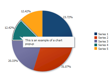
Example 24-23 shows the code on the page for the popup menu shown in Figure 24-52. In this example, the af:showPopupBehavior component uses the popupId to reference the af:popup component. The af:popup component is configured with the af:noteWindow component which is configured to display a simple message in the af:outputFormatted component. The triggerType of the af:showPopupBehavior tag is set to click, and the note window will launch when the user clicks one of the pie chart's slices.
Example 24-23 Code Example for Pie Chart Popup
<af:group id="g1">
  <dvt:pieChart id="chart1" value="#{chartDataSource.defaultPieData}"
                var="row" dataSelection="single">
    <dvt:chartLegend id="leg1" rendered="true"/>
    <dvt:pieDataItem label="#{row.series}" value="#{row.value}" id="pdi1">
      <af:showPopupBehavior popupId="::noteWindowPopup" triggerType="click"
                            align="afterStart"/>
    </dvt:pieDataItem>
  </dvt:pieChart>
  <af:popup childCreation="deferred" autoCancel="disabled"
            id="noteWindowPopup" clientComponent="true"
            launcherVar="source" eventContext="launcher">
    <af:noteWindow id="nw1">
      <af:outputFormatted value="This is an example of a chart popup" id="of1"/>
    </af:noteWindow>
  </af:popup>
</af:group>
You can change the popup to a context menu by simply changing the trigger type for the af:showPopupBehavior component to contextMenu as shown in the following code snippet:
<af:showPopupBehavior popupId="::noteWindowPopup" triggerType="contextMenu"/>
It may be helpful to have an understanding of how chart attributes and child tags can affect functionality. For more information about configuring charts, see Section 24.2.2, "Configuring Charts."
Add a chart to your page. For help with adding a chart to a page, see Section 24.2.3, "How to Add a Chart to a Page."
Add a popup component to your page. For help with configuring the af:popup component, see Chapter 13, "Using Popup Dialogs, Menus, and Windows."
To add a popup or context menu to a chart:
-
In the Structure window, right-click dvt:typeChart and choose Insert inside Chart > af:showPopupBehavior.
-
Right-click af:showPopupBehavior and choose Go to Properties.
-
In the Property Inspector, enter values for the following:
-
PopupId: Specify the ID of the
af:popupcomponent. -
TriggerType: For popup menus, enter
click. For context menus, entercontextMenu.
Optionally, set values for Align, AlignId, and Disabled. Click Component Help for more information about the
af:showPopupBehaviorcomponent. -
-
In the Structure window, right-click dvt:typeChart and choose Go to Properties.
-
In the Property Inspector, expand the Data section.
-
From the DataSelection dropdown list, select
singleormultipleto enable selection support.
24.5.6 How to Configure Chart Zoom and Scroll
You can configure your chart to include marquee zoom and scroll which permits the user to focus on an area of the chart or scroll through the data using the mouse. This feature can be useful for large data sets.
Figure 24-53 shows the line chart shown in Figure 24-36 configured for marque zoom and scroll. The user can select an area on the chart and then release the mouse button to zoom in on the selected area. The user can also scroll the mouse wheel upward to zoom in on chart data. To restore the chart to its original display, the user can scroll the mouse wheel downward.
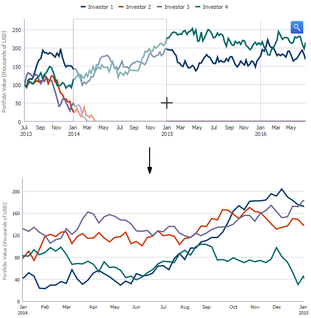
You can also add a viewport to the chart which uses a small form factor to display the entire data set, and then configure the original line chart to display a subset of the data.
Figure 24-54 shows the same line chart configured with an overview port. When the user zooms in on a chart area, the viewport changes to match the user's selection. The user can stretch or shrink the viewport dragging the handles on each side of the viewport.
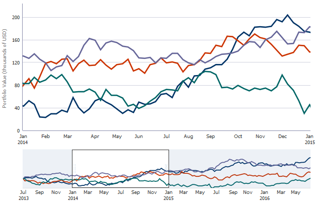
To configure marque zoom and scroll, set a value for the chart's zoomAndScroll attribute. To configure an overview window, add the overview facet and overview window to the chart, and configure the chart's axis for the overview range.
It may be helpful to have an understanding of how chart attributes and child tags can affect functionality. For more information about configuring charts, see Section 24.2.2, "Configuring Charts."
Add a chart to your page. For help with adding a chart to a page, see Section 24.2.3, "How to Add a Chart to a Page."
To configure marquee zoom and scroll:
-
In the Structure window, right-click dvt:typeChart and choose Go to Properties.
-
In the Property Inspector, expand the Behavior section.
-
From the ZoomAndScroll dropdown list, select the desired zoom and scroll behavior. By default, this attribute is set to
off. Available options include:-
delayed: Specifies that the chart update will wait until the zoom or scroll action is done. Both zoom and scroll will be enabled.Specify a delay if the chart display is slow to render.
-
delayedScrollOnly: Specifies that the chart update will wait until the scroll action is done. The marquee zoom icon will not be displayed. -
live: Specifies that the chart will be updated continuously as it is being manipulated. Both zoom and scroll will be enabled. -
liveScrollOnly: Specifies that the chart will be updated continuously as it is being manipulated. The marquee zoom icon will not be displayed.
You can also choose Expression Builder from the ZoomAndScroll attribute's dropdown menu to enter an expression that returns the zoom and scroll behavior.
-
-
Optionally, to enable a selection listener, do the following.
-
Create the method or methods that define the selection listener, and add it to the chart's managed bean.
If you need help creating classes, see the "Working with Java Code" section of the JDeveloper online help. For help with managed beans, see Section 2.6, "Creating and Using Managed Beans."
-
In the Property Inspector, in the SelectionListener field, enter the name of the selection listener.
For example, for a managed bean named chartDataSource and a method named selectionListener(), enter the following in the SelectionListener field:
#{chartDataSource.selectionListener}.You can also choose Edit from the SelectionListener attribute's dropdown menu to select a managed bean and method in the Edit Property: Selection Listener dialog, or choose Expression Builder to enter an expression that returns the selection listener.
-
-
Configure any additional elements as needed.
For example, to duplicate the multiple selection example in this section, add the
af:outputTextcomponents shown in Example 24-21.
To add an overview window to your chart:
-
In the Structure window, right-click dvt:typeChart and choose Insert inside Chart > f:facet - overview.
-
Right-click f:facet - overview and choose Insert inside Facet overview > dvt:overview.
-
Right-click dvt:overview and choose Go to Properties.
-
In the Property Inspector, enter values to style the overview window as desired.
For example, you can specify an inline style or style class to use for the overview window. For help with the overview window properties, click Component Help.
-
If your chart does not include an x-axis, in the Structure window, right-click dvt:typeChart and choose Insert inside Chart > dvt:chartXAxis.
-
Right-click dvt:chartXAxis and choose Go to Properties.
-
In the Property Inspector, expand the Viewport section.
-
From the Viewport attribute's dropdown list, enter values for the following as needed to set the viewport's range.
-
ViewportStartGroup: Specifies the start group of the current viewport. This attribute only applies to charts with a group or time x axis. If not specified, the default start group is the first group in the data set.
For example, if your chart's groups consist of city data, you could enter the city name for the ViewportStartGroup:
London.You can also choose Expression Builder from the attribute's dropdown menu to enter an expression that returns the viewport's start group.
-
ViewportEndGroup: Specifies the end group of the current viewport. This attribute only applies to charts with a group or time x axis. If not specified, the default end group is the last group in the data set.
-
ViewportMinimum: Specifies the minimum x-axis coordinate of the current viewport for zoom and scroll.
For a group axis, the group index will be treated as the x-axis coordinate. For a time axis, the time stamp of the group will be treated as the x-axis coordinate.If both viewportStartGroup and viewportMinimum are specified, then viewportStartGroup takes precedence. If not specified, this value will be the axis minimum.
You can also choose Expression Builder from the attribute's dropdown menu to enter an expression that returns the viewport minimum. For the line chart displayed in Figure 24-54, a method is added to the chartDataSource managed bean to return the viewport minimum.
Example 24-24 shows a sample method that returns the viewport minimum. In this example, the chart is configured with a viewport minimum of January 1, 2016.
Example 24-24 Sample Code to Return a Viewport Start Group on a Time Axis
// Add these imports to your bean
import java.util.Date;
import java.util.GregorianCalendar;

public Date getStockViewportMinimum() {
  return new GregorianCalendar(2016, 0, 1).getTime();
}
To use this method for your chart, enter the following for the ViewportMinimum:
#{chartDataSource.stockViewportMinimum}. -
ViewportMaximum: Specifies the maximum x-axis coordinate of the current viewport for zoom and scroll.
You can also choose Expression Builder from the ViewportMaximum attribute's dropdown menu to enter an expression that returns the zoom and scroll behavior.
-