23 Introduction to ADF Data Visualization Components
This chapter highlights the common characteristics and focus of the ADF Data Visualization components, which are an expressive set of interactive ADF Faces components. The remaining chapters in this part of the guide provide detailed information about how to create and customize each component.
This chapter includes the following sections:
-
Section 23.1, "Introduction to the ADF Data Visualization Components"
-
Section 23.2, "Defining the ADF Data Visualization Components"
-
Section 23.3, "Common Functionality in Data Visualization Components"
-
Section 23.4, "Providing Data for ADF Data Visualization Components"
23.1 Introduction to the ADF Data Visualization Components
The ADF Data Visualization components provide significant graphical and tabular capabilities for displaying and analyzing data. These components provide the following common features:
-
They are full ADF Faces components that support the use of ADF data controls.
-
They provide for declarative design time creation using the Data Controls Panel, the JSF Visual Editor, Property Inspector, and Component Palette.
For information about the data binding of ADF Data Visualization Components, see the "Creating Databound ADF Data Visualization Components" chapter in the Oracle Fusion Middleware Fusion Developer's Guide for Oracle Application Development Framework.
23.2 Defining the ADF Data Visualization Components
The ADF Data Visualization components include the following: chart, graph, gauge, NBox, pivot table, geographic map, thematic map, Gantt chart, hierarchy viewer, treemap, sunburst, and diagram. The prefix dvt: occurs at the beginning of each component name indicating that the component belongs to the ADF Data Visualization Tools (DVT) tag library.
23.2.1 Chart Component Use Cases and Examples
The chart components include nine types of charts with one or more variations for a total of over 13 different charts that you can use to display data. Chart components give you the capability of producing a variety of data visualizations that let you evaluate multiple data points on multiple axes in many ways. For example, a number of charts assist you in the comparison of results from one group with the results from another group.
Chart categories include:
-
Area (
areaChart): Represents data as a filled-in area. Use area charts to show trends over time, such as sales for the last 12 months. Area charts require at least two groups of data along an axis. The axis is often labeled with increments of time such as months. -
Bar (
barChart): Represents data as a series of vertical bars. Use bar charts to examine trends over time or to compare items at the same time, such as sales for different product divisions in several regions. -
Horizontal bar (
horizontalBarChart): Displays bars horizontally along the y-axis. Use horizontal bar charts to provide an orientation that allows you to show trends or compare values. -
Bubble (
bubbleChart): Represents data by the location and size of round data markers (bubbles). Use bubble charts to show correlations among three types of values, especially when you have a number of data items and you want to see the general relationships. For example, use a bubble chart to plot salaries (x-axis), years of experience (y-axis), and productivity (size of bubble) for your work force. Such a chart allows you to examine productivity relative to salary and experience. -
Combination (
comboChart): Chart that uses different types of data markers (bars, lines, or areas) to display different kinds of data items. Use combination charts to compare bars and lines, bars and areas, lines and areas, or all three combinations. -
Line (
lineChart): Represents data as a line, as a series of data points, or as data points that are connected by a line. Line charts require data for at least two points for each member in a group. For example, a line chart over months requires at least two months. Typically a line of a specific color is associated with each group of data such as the Americas, Europe, and Asia. Use line charts to compare items over the same time. -
Pie (
pieChart): Represents a set of data items as proportions of a total. The data items are displayed as sections of a circle causing the circle to look like a sliced pie. Use pie charts to show the relationship of parts to a whole such as how much revenue comes from each product line. -
Scatter (
scatterChart): Represents data by the location of data markers. Use scatter charts to show correlation between two different kinds of data values such as sales and costs for top products. Use scatter charts in particular to see general relationships among a number of items. -
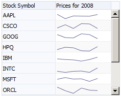
Spark (
sparkChart): A simple, condensed chart that displays trends or variations in a single data value, typically stamped in the column of a table or in line with related text. Spark charts have basic conditional formatting. Since spark charts contain no labels, the adjacent columns of a table or surrounding text provide context for spark chart content
Figure 23-1 shows examples of area, bar, horizontal bar, bubble, combination, line, pie, and scatter charts.
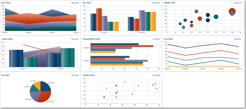
Figure 23-2 shows a line sparkchart displaying sales trends in a table column.
Note:
The funnel, pareto, radar, and stock graphs are legacy server-side components, and their use is discouraged in favor of the client-side chart components. For information about using legacy graphs, see Appendix H, "Using Graph Components."For more information including how to use charts in your application, see Chapter 24, "Using Chart Components."
23.2.2 Gauge Component Use Cases and Examples
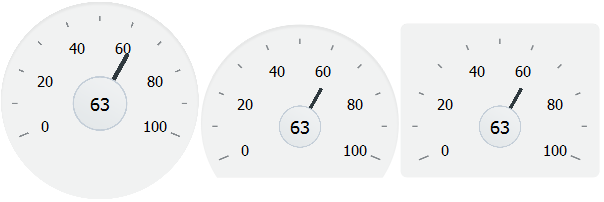
The gauge (gauge) component is a measuring instrument for indicating a quantity such as sales, stock levels, temperature, or speed. Gauges typically display a single data value, often more effectively than a charts. Using thresholds, gauges can show state information such as acceptable or unacceptable ranges using color.
The following kinds of gauges can be produced by this component:
-
Dial: Displays a metric value plotted on a circular axis. The gauge's background attribute determines whether the gauge's background is displayed as a rectangle, circle, or semicircle. An indicator points to the dial gauge's metric value on the axis.
Example 23-0 shows three dial gauges with backgrounds set to full circle, partial circle, and rectangle. In all three examples, the gauge's metric value is
63. -
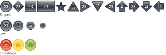
LED (lighted electronic display): Graphically depicts a measurement, such as a key performance indicator (KPI). Several styles of shapes are available for LED gauges, including round or rectangular shapes that use color to indicate status, and triangles or arrows that point up, left, right, or down in addition to a color indicator.
Example 23-0 shows LED gauges configured with a variety of shapes, sizes, and thresholds.
-
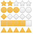
Rating: Displays and optionally accepts input for a metric value. This gauge is typically used to show ratings for products or services, such as the star rating for a movie.
Example 23-0 shows four rating gauges configured with star, diamond, circle, and rectangle shapes.
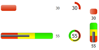
-
Status meter: Displays the metric value on a horizontal or circular axis. An inner rectangle shows the current level of a measurement against the ranges marked on an outer rectangle. Optionally, status meters can display colors to indicate where the metric value falls within predefined thresholds.
Example 23-0 shows examples of status meter gauges configured as both horizontal and circular status meters. The gauges are configured to use thresholds that display color to indicate whether the gauge's value falls within an acceptable range.
For more information including how to use gauges in your application, see Chapter 25, "Using Gauge Components."
23.2.3 NBox Use Cases and Examples
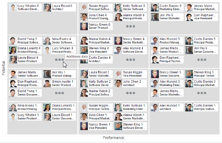
The ADF NBox is an interactive data visualization tool that allows users to view data displayed in a grid across two dimensions, each dimension representing a range of data. Customizable nodes representing data items are displayed in the cells formed by the intersection of the two dimensions.
The nBox component is comprised of two parts: the node that represents the data and the grid that comprises the cells into which the nodes are placed. If the number of nodes is greater than the space allocated for the cell, the NBox displays an indicator that users can click to access the additional nodes.
For example, as illustrated in Figure 23-7 you can use the nBox component to compare employee potential and performance data, where the row represents employee potential and the column represents employee performance. The node that represents the employee is stamped into the appropriate cell.
For more information including how to use NBoxes in your application, see Chapter 26, "Using NBox Components."
23.2.4 Pivot Table Use Cases and Examples
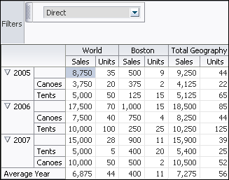
The pivot table produces a grid that supports multiple layers of data labels on rows or columns. An optional pivot filter bar can be associated with the pivot table to filter data not displayed in the row or column edge. When bound to an appropriate data control such as a row set, the component also supports the option of generating subtotals and totals for grid data, and drill operations at runtime. In JDeveloper, a Create Pivot Table wizard provides declarative support for databinding and configuring the pivot table. For more information, see the "Creating Databound Pivot Tables" section in the Oracle Fusion Middleware Fusion Developer's Guide for Oracle Application Development Framework.
Pivot tables let you swap data labels from one edge (row or column) or pivot filter bar (page edge) to another edge to obtain different views of your data. For example, a pivot table might initially display total sales data for products within regions on the row edge, broken out by years on the column edge. If you swap region and year at runtime, then you end up with total sales data for products within years, broken out by region.
Pivot tables support horizontal and vertical scrolling, header and cell formatting, and drag-and-drop pivoting. Pivot tables also support ascending and descending group sorting of rows at runtime. Figure 23-8 shows an example pivot table with a pivot filter bar.
For more information including how to use pivot tables in your application, see Chapter 27, "Using ADF Pivot Table Components."
23.2.5 Geographic Map Use Cases and Examples
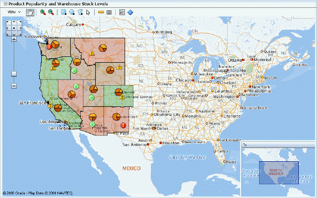
The geographic map provides the functionality of Oracle Spatial within the ADF framework. This component represents business data on a map and lets you superimpose multiple layers of information on a single map. This component supports the simultaneous display of a color theme, a graph theme (bar or pie graph), and point themes. You can create any number of each type of theme and you can use the map toolbar to select the desired themes at runtime.
As an example of a geographic map, consider a base map of the United States with a color theme that provides varying color intensity to indicate the popularity of a product within each state, a pie chart theme that shows the stock levels of warehouses, and a point theme that identifies the exact location of each warehouse. When all three themes are superimposed on the United States map, you can easily evaluate whether there is sufficient inventory to support the popularity level of a product in specific locations. Figure 23-9 shows a geographic map with color theme, pie graph theme, and point theme.
For more information including how to use geographic maps in your application, see Chapter 30, "Using Map Components."
23.2.6 Thematic Map Use Cases and Examples
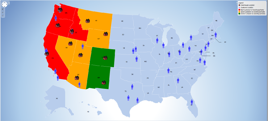
A thematic map represents business data as patterns in stylized areas or associated markers and does not require a connection to a remote Oracle MapViewer service. Thematic maps focus on data without the geographic details in a geographic map.
The thematic map is packaged with prebuilt base maps including a USA base map, a world base map, and base maps for continents and regions of the world including EMEA and APAC. Each base map includes several sets of regions and one fixed set of cities. A set of regions or cities is referred to as a layer. Each layer can be bound to a data collection and stylized to represent the data with color and pattern fills, or a data marker, or both. At runtime, only one map layer and its associated data can be displayed at a time, unless the thematic map has been enabled for drilling.
Figure 23-10 shows a thematic map using a USA base map with a states map layer to display customer and warehouse locations, and the product inventory levels for states with warehouses. The example illustrates thematic map default features including a data bound legend and labels associated with the styled points and areas when you use the Data Controls panel and thematic map binding dialogs.
For more information including how to use thematic maps in your application, see Chapter 30, "Using Map Components."
23.2.7 Gantt Chart Use Cases and Examples
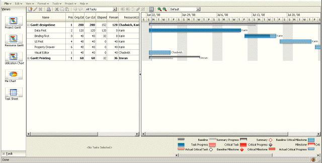
The Gantt chart is a type of horizontal bar graph (with time on the horizontal axis) that is used in planning and tracking projects to show resources or tasks in a time frame with a distinct beginning and end.
A Gantt chart consists of two ADF Faces tree tables combined with a splitter. The left-hand table contains a list of tasks or resources while the right-hand table consists of a single column in which progress is graphed over time.
There are three types of gantt components:
-
Project Gantt: Creates a Gantt chart that shows tasks vertically, and the duration of the task is represented as a bar on a horizontal timeline.
-
Resource utilization Gantt: Creates a Gantt chart that shows graphically whether resources are over or under allocated. It shows resources vertically while showing their allocation and, optionally, capacity on the horizontal time axis.
-
Scheduling Gantt: Creates a Gantt chart that shows resource management and is based on manual scheduling boards. It shows resources vertically with corresponding activities on the horizontal time axis.
Figure 23-11 shows a project Gantt view of staff resources and schedules.
For more information including how to use Gantt charts in your application, see Chapter 28, "Using Gantt Chart Components."
23.2.8 Timeline Use Cases and Examples
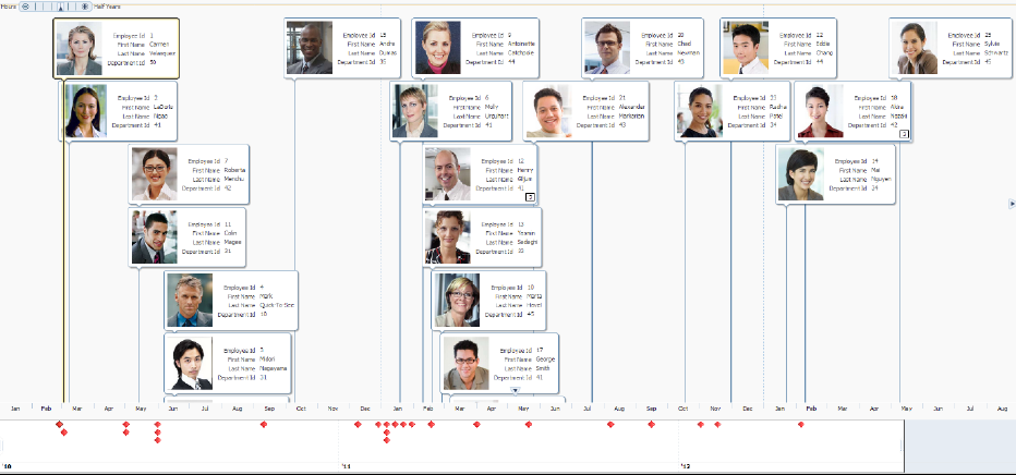
The timeline component is an interactive data visualization tool that allows users to view events in chronological order and easily navigate forwards and backwards within a defined time range. Events are represented as timeline items using simple ADF components to display information such as text and images, or supply actions such a links. A dual timeline can be configured to display two series of events to allow a side-by-side comparison of related information.
A timeline is composed of the display of events as timeline items along a time axis, a movable overview window that corresponds to the period of viewable time in the timeline, and an overview time axis that displays the total time increment for the timeline. A horizontal zoom control is available to change the viewable time range. Timeline items corresponding to events display associated information or actions and are connected to the date of the event in the time axis. Timelines items are represented by a marker in the overview panel. No more that two series of events are supported by the timeline component.
Figure 23-12 shows a timeline displaying the chronological order of the hire dates of employees. In this example, timeline items representing each event display information about the employee using an image and text with labels. When selection is configured, the timeline item, line feeler, and the event marker in the overview panel are highlighted.
For more information including how to use timelines in your application, see Chapter 29, "Using Timeline Components."
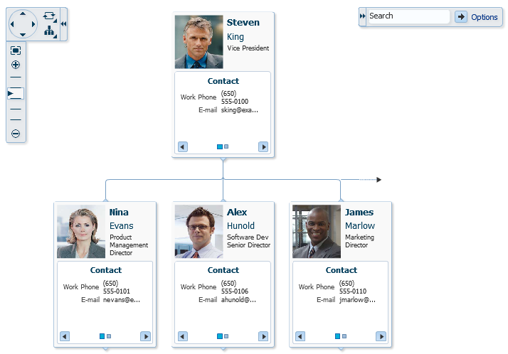
23.2.9 Hierarchy Viewer Use Cases and Examples
The hierarchy viewer component displays hierarchical data as a set of linked nodes in a diagram. The nodes and links correspond to the elements and relationships to the data. The component supports pan and zoom operations, expanding and collapsing of the nodes, rendering of simple ADF Faces components within the nodes, and search of the hierarchy viewer data. A common use of the hierarchy viewer is to display an organization chart, as shown in Figure 23-13.
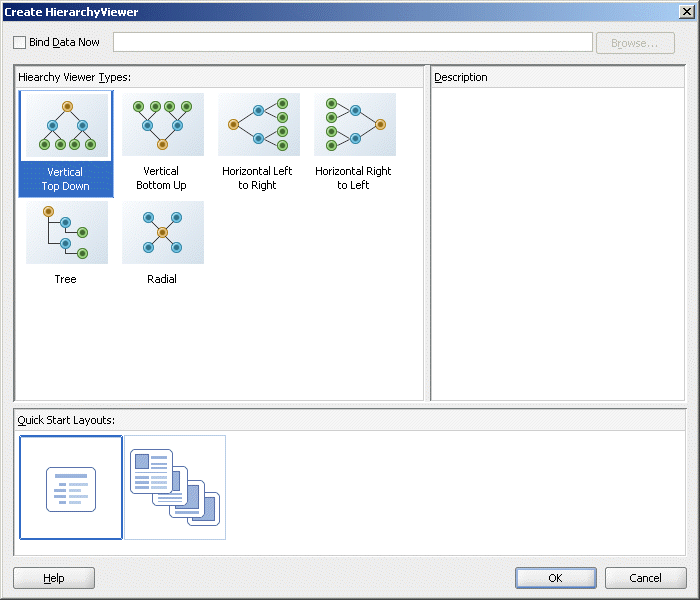
In JDeveloper, a Component Gallery displays available hierarchy viewer types and descriptions to provide visual assistance when designing the component and defining a quick layout. Figure 23-14 shows the Component Gallery for the hierarchy viewer.
For more information including how to use hierarchy viewers in your application, see Chapter 31, "Using Hierarchy Viewer Components."
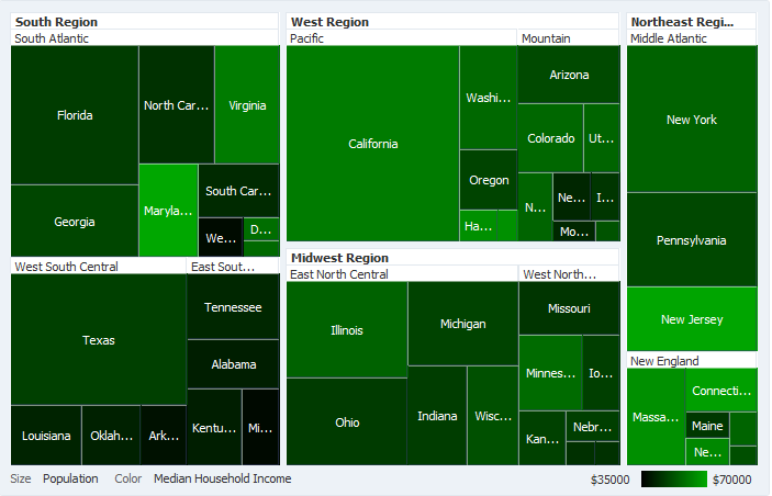
23.2.10 Treemap and Sunburst Use Cases and Examples
The treemap and sunburst components display quantitative hierarchical data across two dimensions, represented visually by size and color. For example, you can use a treemap or sunburst to display quarterly regional sales and to identify sales trends, using the size of the node to indicate each region's sales volume and the node's color to indicate whether that region's sales increased or decreased over the quarter.
Treemaps and sunbursts use a shape called a node to reference the data in the hierarchy. Treemaps display nodes as a set of nested rectangles. Each branch of the tree is given a rectangle, which is then tiled with smaller rectangles representing sub-branches.
Figure 23-15 shows a treemap displaying United States census data grouped by regions, with the color attribute used to indicate median income levels. States with larger populations display in larger-sized nodes than states with smaller populations.
Sunbursts display the nodes in a radial rather than a rectangular layout, with the top of the hierarchy at the center and deeper levels farther away from the center. Figure 23-16 shows the same census data displayed in a sunburst.
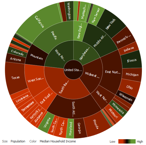
Treemaps and sunbursts can display thousands of data points in a relatively small spatial area. These components are a good choice for identifying trends for large hierarchical data sets, where the proportional size of the nodes represents their importance compared to the whole. Color can also be used to represent an additional dimension of information
Use treemaps if you are primarily interested in displaying two metrics of data using size and color at a single layer of the hierarchy. Use sunbursts instead if you want to display the metrics for all levels in the hierarchy. Drilling can be enabled to allow the end user to traverse the hierarchy and focus in on key parts of the data.
For additional information about treemaps and sunbursts and how to use them in your application, see Chapter 32, "Using Treemap and Sunburst Components."
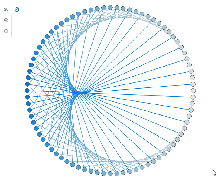
23.2.11 Diagram Use Cases and Examples
Use diagrams to model, represent, and visualize information using a shape called a node to represent data, and links to represent relationships between nodes. Diagrams are flexible and highly configurable components that can display a wide range of data items using simple shapes or images with a label, or more complex data using zoom levels and stylistic attribute values such as colors for each unique group in the data set.
The layout of diagram links and nodes is configured through a framework using one or more custom JavaScript files. The framework supports rendering in multiple platforms including SVG and Java2D.
For example, diagrams can model a database schema to logically group objects such as tables, views, and stored procedures; represent an employee tree with a complex set of information for each employee at different zoom levels; or visualize the net migration between US states using a sunburst layout.
Diagrams use shapes for the node, and lines for links to represent the relationships between the nodes. Figure 23-17 shows a simple diagram configured in a circular layout pattern with circles and lines representing the relationships between them. The example includes the default control panel for diagram zooming.
For additional information about diagrams and how to use them in your application, see Chapter 33, "Using Diagram Components."
23.3 Common Functionality in Data Visualization Components
Data visualization components share much of the same functionality, such as how data is delivered, automatic partial page rendering (PPR), the image format used to display the component, and how data can be displayed and edited. It is important that you understand this shared functionality and how it is configured before you use these components.
23.3.1 Content Delivery
Data visualization components including chart, gauge, diagram, Gantt chart, hierarchy viewer, pivot table, sunburst, thematic map, timeline, and treemap can be configured for how data is delivered from the data source. The data can be delivered to the components either immediately upon rendering, as soon as the data is available, or lazily fetched after the shell of the component has been rendered. By default all data visualization components, with the exception of the geographic map, support the delivery of content from the data source when it is available. The contentDelivery attribute of these components is set to whenAvailable by default.
Data visualization components based on a tree or tree table model including Gantt charts, hierarchy viewers, pivot tables, sunbursts, timelines, and treemaps are virtualized, meaning not all the rows, columns, or levels that are there for the component on the server are delivered to and displayed on the client. You configure these components to fetch a certain number of rows, columns, or levels at a time from your data source. Use these attributes to configure fetch size:
-
Gantt charts:
-
fetchSize: Specifies the number of rows in the data fetch block. The default value is25. -
horizontalFetchSize: Specifies the size of the horizontal data window in number of pixels in which the data are fetched. Only task bars within this data window would be rendered. In contrast withfetchSize, which provides vertical virtualization,horizontalFetchSizeprovides horizontal virtualization.
-
-
Hierarchy Viewer:
-
levelFetchSize: Specifies the number of child nodes that will be fetched and displayed at a single time for each expanded parent node. Additional child nodes may be fetched and displayed by using the lateral navigation controls shown in the hierarchy viewer. The default value is25.
-
-
Pivot table:
-
rowFetchSize: Specifies the number of rows in a data fetch block. The default value is25. -
columnFetchSize: Specifies the number of columns in a data fetch block. The default value is10.
-
-
Sunburst:
-
displayLevelsChildren: Specifies the number of child levels to display during initial render. This property is 0-based. A value of 0 means that no child levels below the root will be shown; the root itself will be shown. The default value is 2, which means that the root and the first two levels of children will be shown.
-
-
Timeline:
-
fetchStartTime: Specifies the start of the time range where data is currently being fetched -
fetchEndTime: Specifies the end of the time range where data is currently being fetched.
-
-
Treemap:
-
displayLevelsChildren: Specifies the number of child levels to display during initial render. This property is 0-based. A value of 0 means that no child levels below the root will be shown; the root itself will be shown. The default value is 2, which means that the root and the first two levels of children will be shown.
-
For lazy delivery, when a page contains one or more of these components, the page initially goes through the standard life cycle. However, instead of fetching the data during that initial request, a special separate partial page rendering (PPR) request is run, and the value of the fetch size for the component is then returned. Because the page has just been rendered, only the Render Response phase executes for the components, allowing the corresponding data to be fetched and displayed. When a user's actions cause a subsequent data fetch (for example scrolling in a pivot table grid for another set of rows), another PPR request is executed.
When content delivery is configured to be delivered when it is available, the framework checks for data availability during the initial request, and if it is available, it sends the data to the component. If it is not available, the data is loaded during the separate PPR request, as it is with lazy delivery.
Performance Tip:
Lazy delivery should be used when a data fetch is expected to be an expensive (slow) operation, for example, slow, high-latency database connection, or fetching data from slow data sources like web services. Lazy delivery should also be used when the page contains a number of components other than a data visualization component. Doing so allows the initial page layout and other components to be rendered first before the data is available.Immediate delivery should be used if the data visualization component is the only context on the page, or if the component is not expected to return a large set of data. In this case, response time will be faster than using lazy delivery (or in some cases, simply perceived as faster), as the second request will not go to the server, providing a faster user response time and better server CPU utilizations. Note that for components based on a tree or tree table model, only the value configured to be the fetch block will be initially returned. As with lazy delivery, when a user's actions cause a subsequent data fetch, the next set of rows are delivered.
The whenAvailable delivery provides the additional flexibility of using immediate when data is available during initial rendering or falling back on lazy when data is not initially available.
For more information about setting the fetch size for components based on the tree or tree table model, see Section 10.1.1, "Content Delivery."
23.3.2 Automatic Partial Page Rendering (PPR)
ADF Faces supports Partial Page Rendering (PPR), which allows certain components on a page to be rerendered without the need to rerender the entire page. In addition to built-in PPR functionality, you can configure components to use cross-component rendering, which allows you to set up dependencies so that one component acts as a trigger and another as the listener. For more information, see Section 7.1, "Introduction to Partial Page Rendering."
By default, ADF Data Visualization components support automatic PPR, where any component whose values change as a result of backend business logic is automatically rerendered. If your application uses the Fusion technology stack, you can enable the automatic partial page rendering feature on any page. For more information, see the "What You May Need to Know About Automatic Partial Page Rendering" section in Oracle Fusion Middleware Fusion Developer's Guide for Oracle Application Development Framework.
23.3.3 Active Data Support
The Fusion technology stack includes the Active Data Service (ADS), which is a server-side push framework that allows you to provide real-time data updates for ADF Faces components and ADF Data Visualization components. You bind ADF Faces components to a data source and ADS pushes the data updates to the browser client without requiring the browser client to explicitly request it.
Table 23-1 lists the DVT components that support active data and where you can find additional detail.
Table 23-1 DVT Components Supporting Active Data
| DVT Component | Link to Component Detail |
|---|---|
|
geographic map |
Section 30.2.4, "What You May Need to Know About Active Data Support for Map Point Themes" |
|
pivot table and pivot filter bar |
Section 27.2.1, "Active Data Support (ADS)" Supports ADS only when the |
|
sunburst |
|
|
treemap |
For additional information about using the Active Data Service, see Chapter 37, "Using the Active Data Service with an Asynchronous Backend."
23.3.4 Text Resources from Application Resource Bundles
JDeveloper supports easy localization of ADF Faces and data visualization components using the abstract class java.util.ResourceBundle to provide locale-specific resources.
Data visualization components may include text that is part of the component, for example the af:table component uses the resource string af_table.LABEL_FETCHING for the message text that displays in the browser while the af:table component fetches data during the initial load of data or while the user scrolls the table. JDeveloper provides automatic translation of these text resources into 28 languages. These text resources are referenced in a resource bundle. If you set the browser to use the language in Italy, any text contained within the components will automatically be displayed in Italian
For any text you add to a component, for example if you define the title of a pieGraph component by setting the text attribute on its child graphTitle component, you must provide a resource bundle that holds the actual text, create a version of the resource bundle for each locale, and add a <locale-config> element to define default and support locales in the application's faces-config.xml file. You must also add a <resource-bundle> element to your application's faces-config.xml file in order to make the resource bundles available to all the pages in your application. Once you have configured and registered a resource bundle, the Expression Language (EL) editor will display the key from the bundle, making it easier to reference the bundle in application pages.
To simplify the process of creating text resources for text you add to ADF components, JDeveloper supports automatic resource bundle synchronization for any translatable string in the visual editor. When you edit components directly in the visual editor or in the Property Inspector, text resources are automatically created in the base resource bundle. For more information, see Section 21.2, "Using Automatic Resource Bundle Integration in JDeveloper."
Note:
Any text retrieved from the database is not translated.For data visualization components with title and label child components, you can also create and add text resources to a resource bundle by using the attribute dropdown list to open a Select Text Resource dialog to select or add a translatable string from an application resource bundle. Alternatively, you can select Expression Builder to open the Expression Language (EL) editor to create an expression to be executed at runtime for the title or label.
23.4 Providing Data for ADF Data Visualization Components
In JDeveloper you can add any Data Visualization component to your JSF page using UI-first development, and then later manually bind the data you wish to display using ADF data controls or managed beans. In this case you drag the component from the Component Palette to the page and manually bind the data in the Property Inspector.
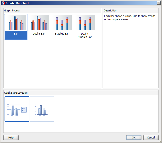
For example, when you are designing your page using simple UI-first development, you use the Component Palette to add a bar chart to a JSF page. When you drag and drop a chart component onto the page, a Create Chart dialog displays available categories of chart types, with descriptions, to provide visual assistance when creating charts. You can also specify a quick start layout of the chart's legend. Figure 23-18 shows the Create Bar Chart dialog for bar charts with the default bar chart type and quick start layout selected.
For information about creating Data Visualization components using UI-first development, understanding component data requirements, configuring DVT parent and child components, customizing the appearance of components, and adding special effects and interactivity to components, see the following chapters in this part of the guide:
-
Chapter 24, "Using Chart Components"
Note:
The funnel, pareto, radar, and stock graphs are legacy server-side components, and their use is discouraged in favor of the client-side chart components. For information about using legacy graphs, see Appendix H, "Using Graph Components."
Alternatively, you can use data-first development and create the component using an ADF data control that will handle the data binding for you. In this case you drag a data collection from the Data Controls panel and complete the data binding dialogs to configure the display of data.
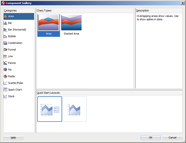
For example, you can create and data bind a DVT chart by dragging a data control from the Data Controls Panel. A Component Gallery displays available chart categories, types, and descriptions to provide visual assistance when designing charts and defining a quick layout. Figure 23-19 shows the Component Gallery that displays when creating a chart from a data control.
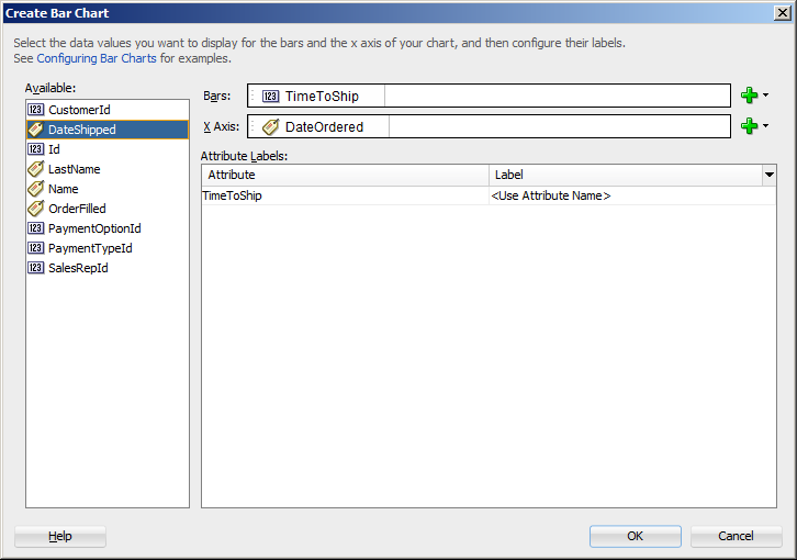
After selecting the category and type of chart you wish to create, a data binding dialog is displayed to bind the data collection attributes to the chart component. Figure 23-20 shows the Create Bar Chart dialog used to create and data bind a bar chart.
All data visualization components can be bound to data collections in an ADF data control. For information and examples of data binding these components to data controls, see the following:
-
"Creating Databound Charts" section in Oracle Fusion Middleware Fusion Developer's Guide for Oracle Application Development Framework.
-
"Creating Databound Graphs" section in Oracle Fusion Middleware Fusion Developer's Guide for Oracle Application Development Framework.
Note:
The funnel, pareto, radar, and stock graphs are legacy server-side components whose use is discouraged in favor of the client-side charts. -
"Creating Databound Gauges" section in Oracle Fusion Middleware Fusion Developer's Guide for Oracle Application Development Framework.
-
"Creating Databound NBoxes" section in Oracle Fusion Middleware Fusion Developer's Guide for Oracle Application Development Framework
-
"Creating Databound Pivot Tables" section in Oracle Fusion Middleware Fusion Developer's Guide for Oracle Application Development Framework.
Note:
In JDeveloper, a Create Pivot Table wizard provides declarative support for data-binding and configuring the pivot table. -
"Creating Databound Geographic Maps" section in Oracle Fusion Middleware Fusion Developer's Guide for Oracle Application Development Framework.
-
"Creating Databound Thematic Maps" section in Oracle Fusion Middleware Fusion Developer's Guide for Oracle Application Development Framework.
-
"Creating Databound Gantt Charts" section in Oracle Fusion Middleware Fusion Developer's Guide for Oracle Application Development Framework.
-
"Creating Databound Timelines" section in Oracle Fusion Middleware Fusion Developer's Guide for Oracle Application Development Framework.
-
"Creating Databound Hierarchy Viewers" section in Oracle Fusion Middleware Fusion Developer's Guide for Oracle Application Development Framework.
-
"Creating Databound Treemaps and Sunbursts" section in Oracle Fusion Middleware Fusion Developer's Guide for Oracle Application Development Framework.
-
"Creating Databound Diagrams" section in Oracle Fusion Middleware Fusion Developer's Guide for Oracle Application Development Framework.