26 Using NBox Components
This chapter describes how to use the ADF Data Visualization NBox component to display data in NBoxes using simple UI-first development. The chapter defines the data requirements, tag structure, and options for customizing the look and behavior of these components.
If your application uses the Fusion technology stack, you can use data controls to create NBoxes. For more information, see "Creating Databound NBox Components" in Oracle Fusion Middleware Fusion Developer's Guide for Oracle Application Development Framework.
This chapter includes the following sections:
26.1 Introduction to ADF Data Visualization NBox Components
ADF Data Visualization components provide extensive graphical and tabular capabilities for visually displaying and analyzing business data. Each component needs to be bound to data before it can be rendered since the appearance of the components is dictated by the data that is displayed.
The ADF NBox is an interactive data visualization tool that allows users to view data displayed in a grid across two dimensions, each dimension representing a range of data. Customizable nodes representing data items are displayed in the cells formed by the intersection of the two dimensions.
26.1.1 NBox Use Cases and Examples
The nBox component is comprised of two parts: the node that represents the data and the grid that comprises the cells into which the nodes are placed. If the number of nodes is greater than the space allocated for the cell, the NBox displays an indicator that users can click to access the additional nodes.
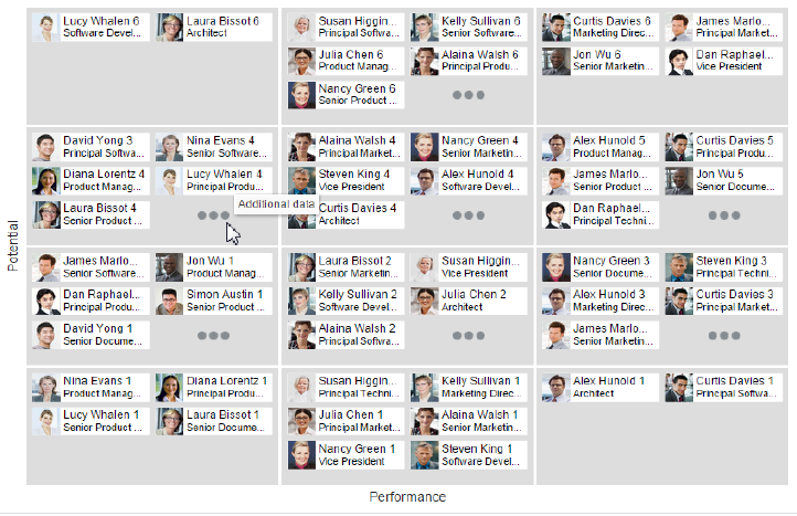
For example, as illustrated in Figure 26-1 you can use the nBox component to compare employee potential and performance data, where the row represents employee potential and the column represents employee performance. The node that represents the employee is stamped into the appropriate cell.
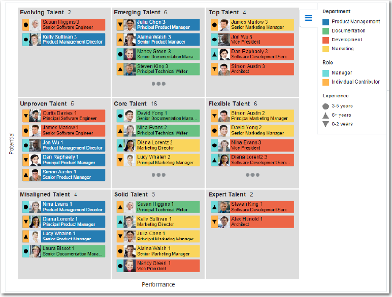
NBox nodes can also be styled with colors, markers, and indicators to represent each unique value, or group, in the data set using attribute groups. Figure 26-2 shows an NBox with employee nodes styled by department, role, and experience.
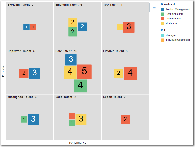
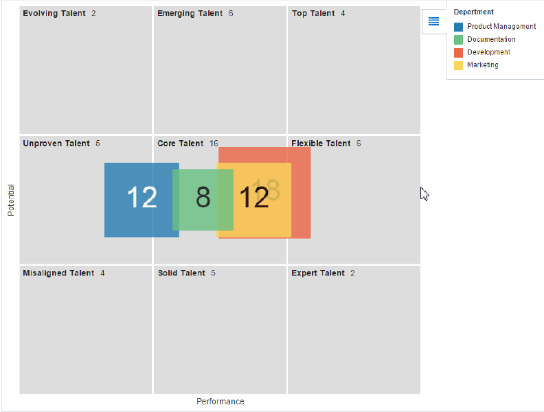
NBox nodes representing attribute groups can also be configured to display by size and number within each grid cell as illustrated in Figure 26-3, or across all cells are illustrated in Figure 26-4.
26.1.2 End User and Presentation Features of NBoxes
The ADF Data Visualization nBox component provides a range of features for end users, such as selection and tooltips. They also provide a range of presentation features, such as legend display, and customizable node shapes and colors.
To use and customize NBox components, it may be helpful to understand these features and components:
-
Popup Support: NBox components can be configured to display popup dialogs, windows, and menus that provide information or request input when the user clicks or hovers the mouse over a node.
-
Context Menus: NBoxes support the ability to display context menus to provide additional information about the selected node.
-
Attribute Groups: NBox nodes support the use of the
dvt:attributeGroupstag to generate stylistic attribute values such as colors, markers, images, or indicators for each unique group in the data set. -
Legend Support: NBoxes display legends to provide a visual clue to the type of data controlling the image and color. If the component uses attribute groups to specify colors based on conditions such as level of performance, the legend can also display the colors used and indicate what value each color represents.
-
Node Selection Support: NBoxes support the ability to respond to user clicks on one or more nodes to display information about the selected node(s).
-
Tooltip Support: NBoxes support the ability to display additional information about a node when the user moves the mouse over a node.
-
Grouping: You can configure NBoxes to group nodes together based on attribute groups and then display the group within each cell or across cells.
-
Other Node Support: NBox components provide the ability to aggregate data if your data model includes a large number of smaller contributors in relation to the larger contributors.
-
Maximize Row or Column: NBox rows or columns can be configured to magnify a specify row or column in the NBox, or a cell at the intersection of a specified row and column.
26.2 Using the NBox Component
To use the nBox component, define the data, add the NBox to a page and complete the additional configuration in JDeveloper.
26.2.1 NBox Data Requirements
The ADF NBox component displays data in a grid layout, with a configurable number of rows and columns used to represent two dimensions or measures of data. Nodes represent the actual data and are stamped inside the grid's cells according to where the node's value falls within the ranges or measures specified for the cells.
Data is supplied as a collections of data provided either as an implementation of the List interface (java.util.ArryList), or a CollectionModel (org.apache.myfaces.trinidad.model.CollectionModel). The data can be of any type, typically String, int, or long.
The collection of NBox nodes requires an attribute that represents the unique Id for each row in the collection. The collection is mapped using a value attribute to stamp out each instance of the node using a component to iterate through the collection. Each time a child component is stamped out, the data for the current component is copied into a var property used by the data layer component in an EL Expression. Once the NBox has completed rendering, the var property is removed, or reverted back to its previous value. By convention, var is set to node or link.
The values for the value attribute must be stored in the node's or link's data model or in classes and managed beans if you are using UI-first development.
26.2.2 Configuring NBoxes
The nBox component has configurable attributes and child components that you can add or modify to customize the display or behavior of the NBox. The prefix dvt: occurs at the beginning of each NBox component name indicating that the component belongs to the ADF Data Visualization Tools (DVT) tag library.
You can configure NBox child components, attributes, and supported facets in the following areas:
-
NBox (
dvt:nBox): Wraps the NBox nodes. Configure the following attributes to control the NBox display:-
colunmsTitle: Optional label for the ordered list of columns from bottom to top along the horizontal axis of the NBox grid. -
rowsTitle: Optional label for the ordered list of rows from start to end along the vertical axis of the NBox grid. -
Empty text (
emptyText): Use theemptyTextattribute to specify the text to display if an NBox node contains no data. -
groupBy: Use to group nodes together by listing the attribute group IDs in a space-separated list. -
groupBehavior: Use to specify the display of a group of nodes within the cells or across the cells of the NBox. -
Animation: Use a child
af:transitiontag to enable animation by setting atriggerTypeattribute todisplaywhen the NBox initially displays, and todataChangewhen the values of the NBox nodes change. -
Maximize: Use the
maximizedColumnormaximizedRowattributes to magnify a specific column or row in the NBox. Specifying both attributes will magnify the cell at the intersection of the specified row and column. -
Other group: Use the
otherThreshold, andotherColorattributes to aggregate child data into an Other node.
The NBox component supports the use of these
f:facetelements:-
Columns: Use to specify the number and optional label of columns for the NBox grid. Anaf:groupelement wraps thedvt:nBoxColumnelements representing the ordered list of columns from bottom to top along the horizontal axis of the grid. -
Rows: Use to specify the number and optional label of rows for the NBox grid. Anaf:groupelement wraps thedvt:nBoxRowelements representing the ordered list of rows from start to end along the vertical axis of the grid. -
cells: Use to configure the attributes of individual cells, for example, background colors and labels.
-
-
NBox nodes (
nBoxNode): Use to define the properties for an NBox node. The component supports the use of thesef:facetelements:-
icon: Specifies advt:markerto be used as the primary graphical element of this node, such as an employee photo or human shape. -
indicator: Specifies advt:markerto be used as the secondary graphical element of this node, such as a color bar.
-
-
Attribute groups (
attributeGroups): Use this optional child tag of an NBox node child element, typically thedvt:markercomponent, to generate style values for each unique value, or group, in the data set.Attribute groups are necessary to provide information for the display of the NBox and are therefore recommended.
-
Legend (
legend): Use to display multiple sections of marker and label pairs. Define the legend as a child of the NBox component.
26.2.3 How to Add an NBox to a Page
When you are designing your page using simple UI-first development, you use the Components Palette to add an NBox to a JSF page. When you drag and drop an nBox component onto the page, the NBox is added to your page, and you can use the Property Inspector to specify data values and configure additional display attributes.
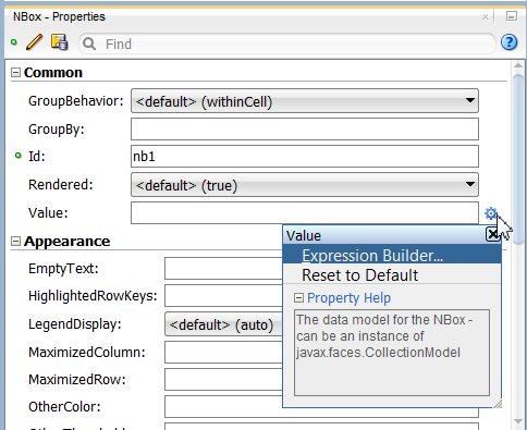
In the Property Inspector you can click the icon that appears when you hover over the property field to display a property description or edit options. Figure 26-5 shows the dropdown menu for an NBox value attribute.
Note:
If your application uses the Fusion technology stack, then you can use data controls to create an NBox and the binding will be done for you. For more information, see the "Creating Databound NBox Components" section in Oracle Fusion Middleware Fusion Developer's Guide for Oracle Application Development Framework.It may be helpful to have an understanding of how NBox attributes and child tags can affect functionality. For more information, see Section 26.2.2, "Configuring NBoxes."
You must complete the following tasks:
-
Create an application workspace as described in Section 2.2, "Creating an Application Workspace."
-
Create a view page as described in Section 2.4, "Creating a View Page."
-
In the ADF Data Visualization page of the Components Palette, from the Common panel, drag and drop an NBox onto the page.
-
In the Property Inspector, view the attributes for the NBox. Use the help button to display the complete tag documentation for the
nBoxcomponent. -
Expand the Appearance section, and enter values for the following attributes:
-
ColumnsTitle: Enter text to label the ordered list of columns from bottom to top along the horizontal axis of the NBox grid. Alternatively, choose Select Text Resource or Expression Builder from the attribute's dropdown menu to select a text resource or EL expression.
-
RowsTitle: Enter text to label the ordered list of rows from start to end along the vertical axis of the NBox grid. Alternatively, choose Select Text Resource or Expression Builder from the attribute's dropdown menu to select a text resource or EL expression.
-
Summary: Enter a summary of the NBox purpose and structure for screen reader support.
-
-
In the Structure window, expand the dvt:nBox element, then expand the NBox Facets element and choose Insert Inside NBox > Facet Columns.
-
In the Structure window, right-click the f:facet - columns element and choose Insert inside Facet columns > Group.
-
In the Structure window, right-click the Group element and for each column you wish to add to the NBox, choose Insert inside Group > ADF Data Visualizations > NBox Column.
-
In the Insert NBox Column dialog enter the value representing a defined range of data within the column dimension of the NBox. For example, for an NBox displaying a range of US population size across 3 columns, you might enter
low,medium, andhigh. -
In the Structure window, right-click the dvt:nBox element and choose Insert Inside NBox > Facet Rows.
-
In the Structure window, right-click the f:facet - row element and choose Insert inside Facet Rows > Group.
-
In the Structure window, right-click the Group elements and for each row you wish to add to the NBox, choose Insert inside Group > ADF Data Visualizations > NBox Row.
-
In the Insert NBox Row dialog enter the value representing a defined range of data within the row dimension of the NBox. For example, for an NBox displaying a range of income levels across 3 rows, you might enter
lower,medium, andupper.
26.2.4 What Happens When You Add an NBox to a Page
Developer generates only a minimal set of tags when you drag and drop an NBox from the Components Palette onto a JSF page and choose not to bind the data during creation. The generated code is:
<dvt:nBox id="exampleNBox"/>
If you choose to bind the data to a data control when creating the NBox, JDeveloper generates code based on the data model. For more information, see the "Creating Databound NBox Components" section in Oracle Fusion Middleware Fusion Developer's Guide for Oracle Application Development Framework.