25 Using Gauge Components
This chapter describes how to use the ADF Data Visualization dial, LED, rating, and status meter gauge components using simple UI-first development. The chapter defines the data requirements, tag structure, and options for customizing the look and behavior of the components.
If your application uses the Fusion technology stack, you can use data controls to create gauges. For more information, see "Creating Databound Gauges" in Oracle Fusion Middleware Fusion Developer's Guide for Oracle Application Development Framework.
This chapter includes the following sections:
25.1 Introduction to the Gauge Component
Gauges are measuring instruments for indicating a quantity such as sales, stock levels, temperature, or speed. Gauges typically display a single data value, often more effectively than a charts. Using thresholds, gauges can show state information such as acceptable or unacceptable ranges using color. For example, a gauge value axis might show ranges colored red, yellow, and green to represent low, medium, and high states. When you need to compare many data values at a glance, multiple gauges can be shown inside table cells.
Best Practice Tip:
When multiple data values, such as the text values of thresholds and the current value are required, a list or table component may be a better choice than a gauge.The gauge component supports four categories of gauge types: dial, LED, rating, and status meter.
25.1.1 Gauge Component Use Cases and Examples
Gauges are typically used to display a single data point. The following types of gauges are supported by the gauge component:
-
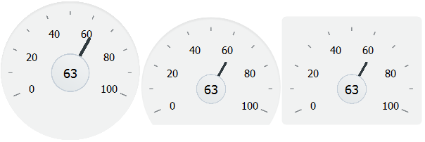
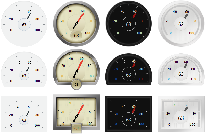
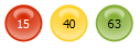
Dial: Displays a metric value plotted on a circular axis. The gauge's background attribute determines whether the gauge's background is displayed as a rectangle, circle, or semicircle. An indicator points to the dial gauge's metric value on the axis.
Figure 25-1 shows three dial gauges with backgrounds set to full circle, partial circle, and rectangle. In all three examples, the gauge's metric value is
63. -
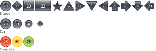
LED: Graphically depicts a measurement, such as a key performance indicator (KPI). Several styles of shapes are available for LED gauges, including round or rectangular shapes that use color to indicate status, and triangles or arrows that point up, left, right, or down indicate good (up), fair (left- or right-pointing), or poor (down) states in addition to the color indicator.
Figure 25-2 shows LED gauges configured with a variety of shapes, sizes, and thresholds.
-
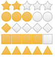
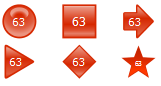
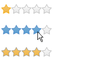
Rating: Displays and optionally accepts input for a metric value. This gauge is typically used to show ratings for products or services, such as the star rating for a movie.
Figure 25-3 shows five rating gauges configured with star, diamond, circle, rectangle and triangle shapes.
-
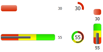
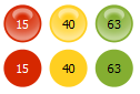
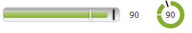
Status Meter: Displays the metric value on a horizontal, circular or vertical axis. An inner rectangle shows the current level of a measurement against the ranges marked on an outer rectangle. Optionally, status meters can display colors to indicate where the metric value falls within predefined thresholds.
Figure 25-4 shows examples of status meter gauges configured as horizontal, circular and vertical status meters. The gauges are configured to use thresholds that display color to indicate whether the gauge's value falls within an acceptable range.
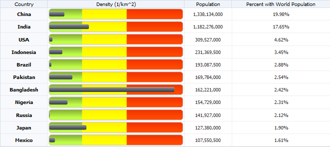
You can also display gauges in table cells where users can see and compare them alongside related information. Figure 25-5 shows an example of a status meter gauge comparing population density of the countries with the highest population in 2010. In this example, the status meter is configured with thresholds that show red for the most densely populated countries and green for the least densely populated countries.
25.1.2 End User and Presentation Features of Gauge Components
ADF Data Visualization gauge components provide a range of presentation features, such as shape variations, threshold display, visual effects, animation, and customizable color and label styles.
The gauge components also support interactivity features such as popup and context menus. All gauges also include value change support, which allows the user to change the gauge's metric value.
25.1.2.1 Gauge Shape Variations
Gauge shapes are configurable and vary by gauge type.
-
Dial gauges: The
backgroundattribute sets shape and shading. Example 25-0 shows the backgrounds available for dial gauges, which include the circle, dome, and rectangular shapes with alta, antique, dark, or light shading. -
LED gauge: The
typeattribute sets the LED gauge's shape. Figure 25-7 shows the types available for the LED gauge, which include circle, rectangle, arrow, triangle, diamond, and star. -
Status meter gauge: The
orientationattribute determines whether the status meter is displayed along a horizontal or circular axis. Figure 25-4 shows status meter gauges configured as rectangles and circles. -
Rating gauge: The rating gauge's
shapeattribute determines the rating gauge's shape. Figure 25-3 shows the shapes available for the rating gauge, which include the star, diamond, circle, and rectangle shapes.
25.1.2.2 Gauge Thresholds
Gauge thresholds contain values that represent the upper bound of a range on the status meter or LED gauge. Typically, thresholds are defined to indicate whether a gauge's metric value falls within an acceptable range.
Figure 25-8 shows three horizontal and three circular status meter gauges, each configured to show a red indicator when the gauge's metric value is at or below 25, a yellow indicator when the metric value is at or below 50, and a green indicator when the metric value is great than 50.
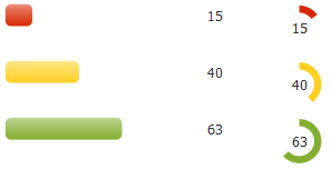
Figure 25-9 shows three LED gauge, each configured to display its shape in red when the gauge's metric value is at or below 25, in yellow when the metric value is at or below 50, and in green when the metric value is greater than 50.
25.1.2.3 Gauge Visual Effects
By default, gauges apply gradients and overlays to color display. You can disable visual effects to achieve a flatter design. The second row in Figure 25-10 shows the result of disabling visual effects on the three LED gauges in Figure 25-9.
25.1.2.4 Gauge Animation
For browsers that support HTML5 technologies, gauges support animation on initial display or data change using the af:transition child tag.
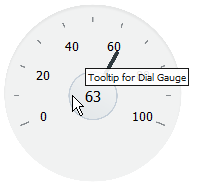
25.1.2.5 Gauge Tooltips
You can configure a tooltip of contextual information to display when a user moves a cursor over the gauge using the shortDesc attribute. Figure 25-11 shows the tooltip for a dial gauge.
25.1.2.6 Gauge Popups and Context Menus
You can configure gauges to display popups or context menus using the af:showPopupBehavior tag.
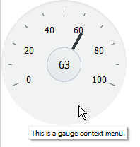
Figure 25-12 shows a dial gauge configured to show a popup when the user clicks the gauge. The popup displays an output message in a note window.
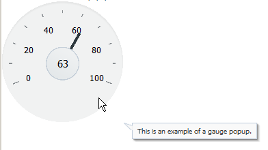
Figure 25-13 shows a dial gauge configured to show a context menu when the user right-clicks the gauge. The context menu displays an output message in a note window.
25.1.2.7 Gauge Value Change Support
You can configure gauges to accept input from the user to change the metric value. For example, you could configure a rating gauge that allows the user to assign the number of stars to a movie rating.
Figure 25-14 shows an example of a rating gauge configured to accept user input. The gauge's initial metric value is 1. As the user glides the mouse over the stars, the color changes to indicate the number of selected stars. To effect the change, the user clicks the highlighted star with the largest desired value.
25.1.2.8 Gauge Reference Lines (Status Meter Gauges)
You can configure status meter gauges to display a reference line. Reference lines can be used in conjunction with thresholds to display trend information, such as the previous value, and target information at the same time.
Figure 25-15 shows a horizontal and circular status meter gauge configured to show reference lines. Each gauge is configured to show one white and one black reference line. The white reference line's value is set to 45, and the black reference line's value is set to 95.
25.2 Using the Gauge Component
To use the gauge component, define the data, add the gauge to a page, and complete the additional configuration in JDeveloper.
25.2.1 Gauge Component Data Requirements
Gauges display the following kinds of data values:
-
Metric: The value that the gauge is to plot. This value can be specified as static data in the
Valueattribute in the Property Inspector. It can also be specified through data controls. This is the only required data for a gauge. -
Minimum and maximum: Optional values that identify the lowest and highest points on the gauge value axis. These values can be provided as dynamic data from a data collection. They can also be specified as static data in the
MinimumandMaximumfields in the Property Inspector for the gauge.The default minimum value for all gauges is 0. The default maximum value for dial, LED, and status meters gauges is 100, and the default maximum value for rating gauges is 5. You must change this value if your gauge's metric exceeds the maximum value for your gauge to display properly.
-
Thresholds: Optional values that can be provided as dynamic data from a data collection to identify ranges of acceptability on the value axis of the gauge. You can also specify these values as static data using gauge threshold tags in the Property Inspector. For more information, see Section 25.3.1, "How to Configure Gauge Thresholds."
25.2.2 How to Add a Gauge to a Page
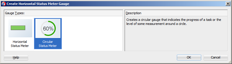
When you are designing your page using simple UI-first development, you use the Component Palette to add a gauge to a JSF page. When you drag and drop a gauge component onto the page, a Create Gauge dialog displays available categories of gauge types, with descriptions, to provide visual assistance when creating gauges. Figure 25-16 shows the Create Horizontal Status Meter Gauge dialog.
Once you complete the dialog, and the gauge is added to your page, you can use the Property Inspector to specify data values and configure additional display attributes for the gauge.
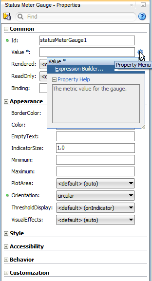
In the Property Inspector you can use the dropdown menu for each attribute field to display a property description and options. Figure 25-17 shows the Property menu for a gauge component value attribute.
Note:
If your application uses the Fusion technology stack, then you can use data controls to create a gauge and the binding will be done for you. For more information, see "Creating Databound Gauges" in Oracle Fusion Middleware Fusion Developer's Guide for Oracle Application Development Framework.It may be helpful to have an understanding of how gauge attributes and gauge child components can affect functionality. For more information, see Section 25.2.5, "Configuring Gauges."
You must complete the following tasks:
-
Create an application workspace as described in Section 2.2, "Creating an Application Workspace."
-
Create a view page as described in Section 2.4, "Creating a View Page."
-
In the ADF Data Visualizations page of the Component Palette, from the Gauge panel, drag and drop the desired gauge onto the page to open the Create Gauge dialog.
-
In the Create Gauge dialog, click OK to add the gauge to the page.
-
In the Property Inspector, view the attributes for the gauge. Use the Component Help button to display the complete tag documentation for the
gaugecomponent.
25.2.3 What Happens When You Add a Gauge to a Page
JDeveloper generates only a minimal set of tags when you drag and drop a gauge from the Component Palette onto a JSF page.
For all gauges but the rating gauge, JDeveloper adds the dvt:gaugeMetricLabel tag to the page. For the status meter and LED gauges which support thresholds, JDeveloper adds one dvt:gaugeThreshold tag representing the maximum bound of the gauge.
Example 25-1 shows the default code that JDeveloper adds to the page for a dial, LED, status meter, and rating gauge. In this example, each gauge is contained in a grid cell of the af:panelGridLayout component. The gauge-related tags are highlighted in bold.
Example 25-1 Gauge Sample Code in UI-First Development
<af:panelGridLayout id="pgl1">
  <af:gridRow marginTop="5px" height="auto" id="gr1">
    <af:gridCell marginStart="5px" width="50%" id="gc1">
      <dvt:dialGauge id="dialGauge1" value="10">
        <dvt:gaugeMetricLabel rendered="true" id="gml1"/>
      </dvt:dialGauge>
    </af:gridCell>
    <af:gridCell marginStart="5px" width="50%" id="gc2">
      <dvt:ledGauge id="ledGauge1" value="10">
        <dvt:gaugeThreshold id="thr1" color="#d62800"/>
        <dvt:gaugeMetricLabel rendered="true" id="gml2"/>
      </dvt:ledGauge>
    </af:gridCell>
  </af:gridRow>
  <af:gridRow marginTop="5px" height="auto" marginBottom="5px" id="gr2">
    <af:gridCell marginStart="5px" width="50%" id="gc4">
      <dvt:statusMeterGauge id="statusMeterGauge1" value="10">
        <dvt:gaugeThreshold id="thr3" color="#d62800"/>
          <dvt:gaugeMetricLabel rendered="true" id="gml3"/>
        </dvt:statusMeterGauge>
    </af:gridCell>
    <af:gridCell marginStart="5px" width="50%" marginEnd="5px" id="gc6">
      <dvt:ratingGauge id="ratingGauge1" value="10" />
    </af:gridCell>
  </af:gridRow>
</af:panelGridLayout>
For information about the panel grid layout component, see Section 8.5.1, "How to Use the panelGridLayout, gridRow, and gridCell Components to Create a Grid-Based Layout."
25.2.4 How to Add Data to Gauges
A gauge's metric value is the only required value for a gauge, and you specify this value in the gauge's value attribute. You can specify the value for the value attribute as a static numeric value in the Property Inspector, in a managed bean that returns the gauge's numeric value, or by binding a data control to a gauge.
It may be helpful to have an understanding of how gauge attributes and child tags can affect functionality. For more information about configuring gauges, see Section 25.2.5, "Configuring Gauges."
Add a gauge to your page. For help with adding a gauge to a page, see Section 25.2.2, "How to Add a Gauge to a Page."
-
Optionally, create the managed bean that will return the gauge's metric value.
If you need help creating classes, see the "Working with Java Code" section of the JDeveloper online help. For help with managed beans, see Section 2.6, "Creating and Using Managed Beans."
-
In the Structure window, right-click the dvt:typeGauge node and choose Go To Properties.
-
In the Property Inspector, do one of the following:
-
To add data to the gauge statically or to reference a managed bean that returns the gauge's metric value, expand the Common section and specify the metric value in the Value field.
You can enter a static numeric value or specify an EL expression that references the managed bean and metric value.
For example, to specify an EL expression for a managed bean named
gaugethat returns the gauge's metric value in a method namedgetGaugeMetric(), enter the following in the Value field:#{gauge.gaugeMetric}.For help with creating EL expressions, see Section 2.5.1, "How to Create an EL Expression."
-
To bind the gauge to a data control, click Bind to ADF Control to select a data collection.
For more information about using data controls to supply data to your gauge, see "Creating Databound Gauges" in Oracle Fusion Middleware Fusion Developer's Guide for Oracle Application Development Framework.
-
-
If needed, in the Property Inspector, expand the Appearance section and enter values for the Minimum and Maximum fields.
You can enter a static numeric value or specify an EL expression that references a managed bean and minimum or maximum value.
Note:
If your gauge's metric value exceeds the default maximum value for the gauge, you must change the maximum value or your gauge will not display properly.
If you want your LED or status meter gauge to display thresholds for predefined ranges, add a dvt:gaugeThreshold tag for each threshold. For additional information, see Section 25.3.1, "How to Configure Gauge Thresholds."
25.2.5 Configuring Gauges
The properties for the gauge component are sufficient to produce a gauge, but you can modify the gauge properties to customize the display and behavior of the gauge. You can also add and configure child components or supported facets to customize the display and behavior of the gauge. The prefix dvt: occurs at the beginning of each gauge component name indicating that the component belongs to the Oracle Fusion Middleware Data Visualization Tools Tag Reference for Oracle ADF Faces tag library.
Configurable elements vary by gauge type. Some elements are available to all or more than one gauge type and include:
-
minimumandmaximum: Attributes that specify the minimum and maximum values for the gauge. -
inlineStyle: Attribute that specifies the style of the outer element (enclosing div) of the component. -
shortDesc: Attribute that specifies the short description of this component. This is used to customize the tooltip text that appears when the user hovers the mouse over the gauge. -
visualEffects: Attribute that specifies whether gradients and overlays are displayed. By default, this is set toauto, but you can also set this tononeto turn off visual effects. -
styleClass: Attribute that sets a CSS style class to use for this component. -
gaugeMetricLabel: Child component that determines the metric label's style, visibility, scaling, and text type. This attribute is not available on the rating gauge which uses the number of shapes as its metric value. -
readOnly: Attribute on dial, rating, and status meter gauges that determines whether the user can change the gauge's metric value. -
gaugeThreshold: Child component that specifies a threshold for LED or status meter gauges. -
borderColor: Attribute that specifies the border color of the LED or status meter gauge's indicator. -
color: Attribute that specifies the fill color of the LED or status meter gauge's indicator.
You can view a complete list of gauge tags and supported child components by clicking Component Help in the Property Inspector for the gauge.
25.2.5.1 Configuring Dial Gauges
Configurable elements specific to dial gauges include:
-
background: Attribute that determines the shape and background style of the dial gauge. -
indicator: Attribute that specifies the indicator style for the dial gauge. -
gaugeTickLabel: Child component that determines the tick label's style, visibility, scaling, and text type.
25.2.5.2 Configuring LED Gauges
Configurable elements specific to LED gauges include:
-
type:Attribute that specifies the shape of the LED gauge. -
size: Attribute that determines the relative size of the LED gauge. -
rotation: Attribute that specifies the rotation of LED gauges configured to use arrow or triangle shapes.
25.2.5.3 Configuring Rating Gauges
Configurable elements specific to rating gauges include:
-
shape: Attribute that determines the shape of the rating gauge increments. -
inputIncrement: Attribute that specifies the change increment when users edit the metric value. -
unselectedShape: Attribute that determines the shape of gauge increments that are not selected. -
changedStyle: Attribute that determines the color and border color of selected gauge increments after a change in value has been made. -
selectedStyle: Attribute that determines the color and border color of gauge increments that have been selected. -
unselectedStyle: Attribute that determines the color and border color of gauge increments that are not selected. -
hoverStyle: Attribute that controls the color and border color of gauge increments that are hovered on but not yet selected.
25.2.5.4 Configuring Status Meter Gauges
Configurable elements specific to status meter gauges include:
-
orientation: Attribute that determines whether the gauge is displayed as a horizontal, circular or vertical status meter gauge. -
indicatorSize: Attribute that determines the relative size of the indicator. -
plotArea: Attribute that determines whether or not the plot area is displayed. -
thresholdDisplay: Attribute that determines how thresholds are displayed.
25.2.6 How to Add Gauges to Tables
You can display gauges in table cells where users can see and compare them alongside related information. The immediate children of an ADF table component must be column components. Each visible column component is displayed as a separate column in the table. Column components contain components used to display content, images, or provide further functionality.
The child components of each column display the data for each row in that column. The column does not create child components per row; instead, the table uses stamping to render each row. Each child is stamped once per row, repeatedly for all the rows. As each row is stamped, the data for the current row is copied into a property that can be addressed using an EL expression. You specify the name to use for this property using the var property on the table. Once the table has completed rendering, this property is removed or reverted back to its previous value.
Example 25-2 shows sample code for displaying gauges in the Oracle ADF table component shown in Figure 25-5. In this example, the table's var property is row, and the table's value is stored in a managed bean named gaugeData. The gauge's metric is set in the value field to #{row.density}. The code related to the gauge is highlighted.
Example 25-2 Gauge Component Stamped in Table Column
<af:table var="row" rowBandingInterval="0" id="t1"
          value="#{gaugeData.gaugeTableData}"
          summary="Status Meter Gauges in Table"
          inlineStyle="height:400px;" styleClass="AFStretchWidth"
          columnStretching="last">
  <af:column sortable="false" headerText="Country" id="c1" rowHeader="true"
             align="center" inlineStyle="font-weight:bold">
    <af:outputText value="#{row.name}" id="ot1"/>
  </af:column>
  <af:column sortable="false" headerText="Density (1/km^2)" id="c2"
             align="center" width="300">
    <dvt:statusMeterGauge id="statusMeterGauge1" value="#{row.density}"
                          inlineStyle="height:22px"
                          styleClass="AFStretchWidth"
                          maximum="1200.0" thresholdDisplay="all"
                          indicatorSize="0.5">
      <dvt:gaugeThreshold id="gt1" maximum="300" color="#86B132"/>
      <dvt:gaugeThreshold id="gt2" maximum="700" color="#FFF200"/>
      <dvt:gaugeThreshold id="thr1" color="#F23300"/>
      <dvt:gaugeMetricLabel rendered="false" id="gml1"/>
    </dvt:statusMeterGauge>
  </af:column>
  <af:column sortable="false" headerText="Population" id="c3" align="center">
    <af:outputText value="#{row.population}" id="ot3">
      <af:convertNumber pattern="#,##0"/>
    </af:outputText>
  </af:column>
  <af:column sortable="false" headerText="Percent with World Population"
             id="c4" align="center">
    <af:outputText value="#{row.percent}" id="ot4">
      <af:convertNumber type="percent" pattern="#.00%"/>
    </af:outputText>
  </af:column>
</af:table>
Example 25-3 shows the sample code for the gaugeData managed bean. In this example, the class is named GaugeTableData.
Example 25-3 Managed Bean Code for Gauge in Table Example
import java.util.ArrayList;
import java.util.List;
public class GaugeTableData {
  private List<CountryData> _gaugeTableData;
  public GaugeTableData() {
    ArrayList<CountryData> list = new ArrayList<CountryData>(11);
    list.add(new CountryData("China", 1338134000,139.434));
    list.add(new CountryData("India", 1182276000, 359.654));
    list.add(new CountryData("USA", 309527000,32.145));
    list.add(new CountryData("Indonesia", 231369500,121.481));
    list.add(new CountryData("Brazil", 193087500, 22.676));
    list.add(new CountryData("Pakistan", 169784000, 211.19));
    list.add(new CountryData("Bangladesh", 162221000,1126.55));
    list.add(new CountryData("Nigeria", 154729000, 167.498));
    list.add(new CountryData("Russia", 141927000,8.301));
    list.add(new CountryData("Japan", 127380000,337.097));
    list.add(new CountryData("Mexico", 107550500,54.923));
    _gaugeTableData = list;
  }
  public List<CountryData> getGaugeTableData(){
      return _gaugeTableData;
  }
  public static class CountryData {
    private String _name;
    private long _population;
    private double _percent;
    private double _density;
    private static long worldPopulation = 6697254000L;
    public CountryData(String name, int population, double density) {
      _name = name;
      _population = population;
      _density = density;
      _percent = (double)population / (double)worldPopulation;
    }
    public String getName() {
      return _name;
    }
    public double getPercent() {
      return _percent;
    }
    public long getPopulation() {
      return _population;
    }
    public double getDensity() {
      return _density;
    }
  }
}
When configuring gauges in table cells, use these guidelines to improve usability:
-
Make gauges as small as possible while maintaining legibility.
-
Use only one type of gauge per column and use the same axis values and thresholds.
-
Avoid displaying so many gauges that users must scroll to see them all.
If your application uses the Fusion technology stack, then you can use data controls to create a databound ADF table and add the gauge during table creation. For more information, see "Creating Databound Gauges" in Oracle Fusion Middleware Fusion Developer's Guide for Oracle Application Development Framework.
It may be helpful to have an understanding of how gauge attributes and gauge child tags can affect functionality. For more information, see Section 25.2.5, "Configuring Gauges."
You must complete the following tasks:
-
Create the managed bean that contains the data for the table and gauge.
To duplicate the table displayed in Figure 25-5, create a managed bean named
gaugeDataand add the code in Example 25-3. For help with managed beans, see Section 2.6, "Creating and Using Managed Beans." -
Create the ADF table.
Example 25-2 shows the code used to display the table in Figure 25-5. By default, the gauge component is not listed as an option during table creation. Configure the column that will contain the gauge as any valid component. You will delete the component when you add the gauge to the table.
If you need help creating the table, see Section 10.2.4, "How to Display a Table on a Page."
-
In the Structure window, expand af:table.
-
Right-click the component that the gauge will replace and choose Delete.
For example, if you configured the table column to use
af:outputText, right-click it and choose Delete. -
Right-click the column that will contain the gauge and choose Insert inside Column > ADF Data Visualizations > dvt:gaugeType.
For example, to add a horizontal status meter gauge to the table, choose Insert inside Column > ADF Data Visualizations > dvt:statusMeterGauge.
-
In the Create Gauge dialog, choose the gauge type and click OK to add the gauge to the table.
-
In the Structure window, right-click the dvt:gaugeType node and choose Go to Properties.
-
In the Property Inspector, in the Value field, enter the metric value that the gauge is to display.
For example, to set the gauge to the value used by the gauge in Figure 25-5, enter:
#{row.density}. -
Optionally, in the Property Inspector, in the Minimum and Maximum fields, enter the maximum value for the gauge.
-
Optionally, if you created a gauge that supports thresholds, add the desired number of thresholds to the gauge.
For example, the status meter gauge in Figure 25-5 is configured with thresholds that show red for the most densely populated countries and green for the least densely populated countries. For help with configuring thresholds, see Section 25.3.1, "How to Configure Gauge Thresholds."
-
Format the gauge elements as needed.
For example, the code example in Example 25-2 sets values for height and size to the following:
inlineStyle="height:22px" styleClass="AFStretchWidth"
For help with configuring gauge style elements, see Section 25.3.2, "Formatting Gauge Style Elements."
25.3 Customizing Gauge Display Elements
You can customize a number of gauge display elements, including thresholds, styles, numeric data values, visual effects, animation, and reference lines.
25.3.1 How to Configure Gauge Thresholds
Thresholds are numerical data values in status meter or LED gauges that highlight a particular range of values. Thresholds must be values between the minimum and the maximum value for a gauge.
On status meter gauges, the range identified by a threshold is filled with a color that is different than the color of other ranges. The threshold can be displayed on the indicator or the plot area.
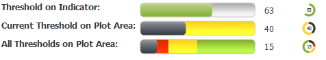
Figure 25-18 shows horizontal and circular status meters configured for thresholds. The gauges in the first row are configured to show the threshold on the indicator. In the second row, the gauges are configured to display the current threshold on the plot area. In the third row, the gauges are configured to display all thresholds on the plot area.
On LED gauges, the background is filled with the color defined for the threshold range containing the metric value. Figure 25-19 shows three LED gauges configured with thresholds using the same maximum bound and color values as the status meters shown in Figure 25-18.
When you create a status meter or LED gauge by dragging the gauge to the page from the Component Palette, JDeveloper adds one dvt:gaugeThreshold tag as a child of the gauge. You can add additional thresholds by inserting additional dvt:gaugeThreshold tags and defining the threshold's value and color attributes.
The data collection for a gauge can provide dynamic values for thresholds when the gauge is databound. For information about using dynamic values for thresholds, see "Creating Databound Gauges" in Oracle Fusion Middleware Fusion Developer's Guide for Oracle Application Development Framework.
It may be helpful to have an understanding of how gauge attributes and child tags can affect functionality. For more information about configuring gauges, see Section 25.2.5, "Configuring Gauges."
Add a gauge to your page. For help with adding a gauge to a page, see Section 25.2.2, "How to Add a Gauge to a Page."
To configure status meter or LED gauge thresholds:
-
In the Structure window, right-click the dvt:statusMeterGauge or dvt:LEDGauge component and choose Insert inside (Status Meter or LED) Gauge > dvt:gaugeThreshold.
Depending upon how you created the gauge, you may already have one
dvt:gaugeThresholdcomponent defined and can proceed to the next step for that threshold. -
Right-click the dvt:gaugeThreshold node and choose Go to Properties.
-
In the Property Inspector, set values for the following:
-
Maximum: Specify the maximum bound for the threshold. You can enter an integer value or use the dropdown menu to choose Expression Builder to enter an EL Expression that represents the maximum bound.
You do not need to enter a value for the threshold representing the maximum bound for the gauge. This value is automatically derived from the value in the gauge's
maximumattribute. -
Color: Specify the RGB value in hexadecimal notation or choose Expression Builder from the attribute's dropdown menu to enter an expression that evaluates to the RGB value.
For example, enter
#0000FFto render the threshold in blue. -
BorderColor: Specify the RGB value in hexadecimal notation or choose Expression Builder from the attribute's dropdown menu to enter an expression that evaluates to the RGB value.
For example, enter
#000000to render the threshold's border color in black. -
ShortDesc: Specify the custom hover text for the threshold in plain text or choose Expression Builder from the attribute's dropdown menu to enter an EL expression that contains the text value.
-
-
Repeat Step 1 through Step 3 for each threshold that you want to configure.
-
For status meter gauges, set the following attributes to customize the threshold display.
-
In the Structure window, right-click the dvt:statusMeterGauge and choose Go to Properties.
-
In the Property Inspector, in the ThresholdDisplay field, use the dropdown menu to customize the placement and appearance of the threshold.
By default, the threshold is displayed on the indicator. If you want the current threshold displayed on the plot area, choose
currentOnly. To display all thresholds on the plot area, chooseall. -
In the PlotArea field, use the dropdown menu to turn the plot area display on or off.
By default, PlotArea is set to
autowhich will show the plot area when thresholds are configure and ThresholdDisplay is set tocurrentOnlyorall. You can also set this toonoroff. -
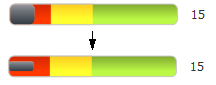
In the Indicator field, enter a value between 0 and 1 to change the relative size of the indicator.
For example, to set the indicator to consume 50% of the plot area, enter
0.5. Figure 25-20 shows the effect of changing the indicator size to 0.5.
-
25.3.2 Formatting Gauge Style Elements
You can customize the styling of gauges to change the initial size of a gauge and apply style elements to labels and other presentation features.
25.3.2.1 How to Change Gauge Size and Apply CSS Styles
You can customize the width and height of a gauge by applying a CSS style or specifying a value in the gauge's inlineStyle attribute.
It may be helpful to have an understanding of how gauge attributes and child tags can affect functionality. For more information about configuring gauges, see Section 25.2.5, "Configuring Gauges."
Add a gauge to your page. For help with adding a gauge to a page, see Section 25.2.2, "How to Add a Gauge to a Page."
To specify the size of a gauge:
-
In the Structure window, right-click the gauge component and choose Go to Properties.
-
In the Property Inspector, expand the Style section. Specify the initial size of the gauge in the InlineStyle attribute. You can specify a fixed size or specify a relative percent for both width and height.
For example, to create a gauge that fills 50% of its container's width and has a height of 200 pixels, use the following setting for the InlineStyle attribute:
width:50%;height:200px
Best Practice Tip:
Instead of specifying width at 100% in theinlineStyleattribute, set thestyleClassattribute toAFStretchWidth.
To apply CSS styles to a gauge:
-
In the Structure window, right-click the gauge component and choose Go to Properties.
-
In the Property Inspector, expand the Style section and enter the name of the style class in the StyleClass field.
For example, to set the width of the gauge to fill 100% of its container's width, use the following setting for the StyleClass attribute:
AFStretchWidth
For information about applying CSS styles, see Chapter 20, "Customizing the Appearance Using Styles and Skins."
25.3.2.2 How to Format Gauge Text
You can format the text in the following gauge child components:
-
gaugeMetricLabel -
gaugeTickLabel
It may be helpful to have an understanding of how gauge attributes and child tags can affect functionality. For more information about configuring gauges, see Section 25.2.5, "Configuring Gauges."
Add a gauge to your page. For help with adding a gauge to a page, see Section 25.2.2, "How to Add a Gauge to a Page."
-
In the Structure window, right-click dvt:gaugeMetricLabel or dvt:gaugeTickLabel and choose Go to Properties.
-
In the Property Inspector, enter a value for LabelStyle.
This property accepts font-related CSS attributes such as
font-weightandfont-size. For example, to set the label to bold, enter the following for LabelStyle:font-weight:bold;
You can also set the style attributes of gauge components globally across all pages in your application by using a cascading style sheet (CSS) to build a skin, and configuring your application to use the skin. By applying a skin to define the styles used in gauge components, the pages in an application will be smaller and more organized, with a consistent style easily modified by changing the CSS file. For more information, see Section 25.3.2.3, "What You May Need to Know About Skinning and Formatting Gauge Style Elements."
25.3.2.3 What You May Need to Know About Skinning and Formatting Gauge Style Elements
You can set the font and other style attributes of gauge components globally across all pages in your application by using a cascading style sheet (CSS) to build a skin and configuring your application to use the skin. By applying a skin to define the styles used in gauge components, the pages in an application will be smaller and more organized, with a consistent style easily modified by changing the CSS file.
You can use the ADF Data Visualization Tools Skin Selectors to define the styles for gauge components. Gauge component skin selectors that support styling include the following:
-
af|dvt-dialGauge -
af|dvt-ledGauge -
af|dvt-ratingGauge -
af|dvt-ratingGauge::selected-shape -
af|dvt-ratingGauge::unselected-shape -
af|dvt-ratingGauge::hover-shape -
af|dvt-ratingGauge::changed-shape -
af|dvt-statusMeterGauge -
af|dvt-gaugeMetricLabel -
af|dvt-gaugeTickLabel -
af|dvt-gaugeThreshold -
af|dvt-gaugeThreshold::index$
It may be helpful to have an understanding of how gauge attributes and child tags can affect functionality. For more information about configuring gauges, see Section 25.2.5, "Configuring Gauges."
Add a gauge to your page. For help with adding a gauge to a page, see Section 25.2.2, "How to Add a Gauge to a Page."
To use a custom skin to set gauge styles:
-
Add a custom skin to your application containing the defined skin style selectors for the gauge subcomponents.
For example, specify the font family for all gauge metric labels in a
mySkin.cssfile as follows:af|dvt-gaugeMetricLabel { -tr-font-weight:bold; } -
Configure the application to use the custom skin in the
trinidad-config.xmlfile.
For additional information about using styles and skins, see Chapter 20, "Customizing the Appearance Using Styles and Skins."
25.3.3 How to Format Numeric Data Values in Gauges
You can use the gauge's gaugeMetricLabel child component to format the appearance of the gauge's metric value in dial, LED, and status meter gauges. You can also format the appearance of dial gauge tick labels using the gaugeTickLabel child tag. Each component has a textType attribute that lets you specify whether you want to display the metric value itself or a percentage that the value represents.
In some cases, this might be sufficient numeric formatting, but you can use properties on the component to change scaling.
If you wish to further format the gauge metric or tick label value, you can use an ADF Faces standard converter, af:convertNumber. For example, you may wish to display the value as currency or display specific decimal settings.
It may be helpful to have an understanding of how gauge attributes and child tags can affect functionality. For more information about configuring gauges, see Section 25.2.5, "Configuring Gauges."
Add a dial, LED, or status meter gauge to your page. For help with adding a gauge to a page, see Section 25.2.2, "How to Add a Gauge to a Page."
To format numeric values in a gauge:
-
If you are formatting a dial gauge's tick label, in the Structure window, right-click the dvt:dialGauge component and choose Insert inside Dial Gauge > dvt:gaugeMetricLabel or dvt:gaugeTickLabel.
-
In the Structure window, right-click the dvt:gaugeMetricLabel or dvt:gaugeTickLabel node and choose Go to Properties.
-
In the Property Inspector, set values for the following:
-
Scaling: Use the attribute's dropdown list to change the default scaling from auto. You can select one of the available scaling options or
noneto turn off scaling. -
TextType: Use the attribute's dropdown list to change the default text type from
numbertopercent.
-
-
If you want to specify additional formatting for the data values displayed in the gauge metric or tick label, do the following:
-
In the Structure window, right-click the dvt:gaugeMetricLabel or dvt:gaugeTickLabel node and choose Insert inside (Gauge Metric Label or Gauge Tick Label) > af:convertNumber.
-
Right-click the af:convertNumber node and choose Go to Properties.
-
In the Property Inspector, specify values for the attributes of the af:convertNumber component to produce additional formatting. Click Help or press F1 to display the complete tag documentation for the
af:convertNumbercomponent.
-
25.3.4 How to Disable Gauge Visual Effects
By default, gauges are displayed with gradient coloring and overlays as shown in Figure 25-10. To disable these visual effects, set the gauge's visualEffects attribute to none.
It may be helpful to have an understanding of how gauge attributes and child tags can affect functionality. For more information about configuring gauges, see Section 25.2.5, "Configuring Gauges."
Add a gauge to your page. For help with adding a gauge to a page, see Section 25.2.2, "How to Add a Gauge to a Page."
To disable visual effects on a gauge:
-
In the Structure window, right-click the dvt:typeGauge component and choose Go to Properties.
-
In the Property Inspector, expand the Appearance section, and from the VisualEffects attribute's dropdown list, select
none.
25.3.5 How to Configure Gauge Animation
To configure gauge animation, add the af:transition tag as a child of the gauge component and configure the trigger type and transition effect.
It may be helpful to have an understanding of how gauge attributes and child tags can affect functionality. For more information about configuring gauges, see Section 25.2.5, "Configuring Gauges."
Add a gauge to your page. For help with adding a gauge to a page, see Section 25.2.2, "How to Add a Gauge to a Page."
-
In the Structure window, click the gauge component.
-
In the Source editor, add the
af:transitiontag as a child of the highlighted gauge component as shown in the following example.<af:transition triggerType="display" transition="auto"/>
25.3.6 How to Configure Status Meter Gauge Reference Lines
You can add reference lines to status meter gauges at specified values on the gauge's axis. To configure reference lines, add the dvt:referenceLine component to the status meter gauge and configure as needed.
Example 25-4 shows the code on the JSF page that creates the gauge and reference lines in Figure 25-15.
Example 25-4 Code Example for Status Meter Gauge Reference Lines
<af:panelGroupLayout id="pgl1" layout="horizontal">
  <af:spacer width="5" id="s1"/>
  <dvt:statusMeterGauge value="90" indicatorSize="0.5" plotArea="on" id="smg1">
    <dvt:referenceLine color="#FFFFFF" value="75" id="rl1"/>
    <dvt:referenceLine color="#000000" value="95" id="rl2"/>
    <dvt:gaugeThreshold maximum="33" id="gt1"/>
    <dvt:gaugeThreshold maximum="67" id="gt2"/>
    <dvt:gaugeThreshold id="gt3"/>
  </dvt:statusMeterGauge>
  <af:spacer width="25" id="s2"/>
  <dvt:statusMeterGauge inlineStyle="width:50px;height:50px;"
                        orientation="circular" value="90" id="smg2">
    <dvt:referenceLine color="#FFFFFF" value="75" id="rl3"/>
    <dvt:referenceLine color="#000000" value="95" id="rl4"/>
    <dvt:gaugeThreshold maximum="33" id="gt4"/>
    <dvt:gaugeThreshold maximum="67" id="gt5"/>
    <dvt:gaugeThreshold id="gt6"/>
  </dvt:statusMeterGauge>
</af:panelGroupLayout>
It may be helpful to have an understanding of how gauge attributes and child tags can affect functionality. For more information about configuring gauges, see Section 25.2.5, "Configuring Gauges."
Add a gauge to your page. For help with adding a gauge to a page, see Section 25.2.2, "How to Add a Gauge to a Page."
To add a reference line to a status meter gauge:
-
In the Structure window, right-click the dvt:statusMeterGauge and choose Insert inside Status Meter Gauge > dvt:referenceLine.
-
Right-click the dvt:referenceLine node and choose Go to Properties.
-
In the Property Inspector, enter values for the following:
-
Value: Specify the value for the reference line or choose Expression Builder from the attribute's dropdown menu to enter an expression that evaluates to the value.
-
Color: Specify the RGB value in hexadecimal notation or choose Expression Builder from the attribute's dropdown menu to enter an expression that evaluates to the RGB value.
For example, to render the reference line in white, enter
#000000. -
LineStyle: Use the attribute's dropdown list to change the line from
solidtodashedordotted. -
LineWidth: Specify the width of the line.
-
25.4 Adding Interactivity to Gauges
You can make your gauges more interactive by adding tooltips, popups and context menus, and value change support.
25.4.1 How to Configure Gauge Tooltips
You configure a gauge tooltip by setting a value for the gauge's shortDesc attribute.
It may be helpful to have an understanding of how gauge attributes and child tags can affect functionality. For more information about configuring gauges, see Section 25.2.5, "Configuring Gauges."
Add a gauge to your page. For help with adding a gauge to a page, see Section 25.2.2, "How to Add a Gauge to a Page."
-
In the Structure window, right-click the dvt:typeGauge component and choose Go to Properties.
-
In the Property Inspector, expand the Accessibility section.
-
In the ShortDesc field, enter a description for the gauge. You can also use the attribute's dropdown menu to open the Select Text Resource or Expression Builder dialogs to select a text resource or EL expression that contains the gauge's description.
25.4.2 How to Add a Popup or Context Menu to a Gauge
The process to add a popup or context menu is essentially the same. Add the af:showPopupBehavior tag as a child of the gauge component, define the trigger type as click for popup menus or contextMenu for context menus, and add an af:popup containing the desired behavior to the page.
Example 25-5 shows the code on the page for the popup menu shown in Figure 25-12. In this example, the af:showPopupBehavior component uses the popupId to reference the af:popup component. The af:popup component is configured with the af:noteWindow component which is configured to display a simple message in the af:outputFormatted component. The triggerType of the af:showPopupBehavior tag is set to click, and the note window will launch when the user clicks anywhere in the gauge.
Example 25-5 Code Example for Gauge Popup Menu
<af:group id="g1">
  <dvt:dialGauge id="dialGauge1" value="63" shortDesc="Dial Gauge with Popup">
    <af:showPopupBehavior popupId="::noteWindowPopup" triggerType="click"/>
    <dvt:gaugeMetricLabel rendered="true" id="gml1"/>
  </dvt:dialGauge>
  <af:popup childCreation="deferred" autoCancel="disabled"
            id="noteWindowPopup" launcherVar="source"
            clientComponent="true" eventContext="launcher">
    <af:noteWindow id="nw1">
      <af:outputFormatted value="This is an example of a gauge popup." id="of1"
                          shortDesc="Gauge Popup Example"/>
    </af:noteWindow>
  </af:popup>
</af:group>
You can change the popup to the context menu displayed in Figure 25-13 by simply changing the trigger type for the af:showPopupBehavior component to contextMenu as shown in the following code snippet:
<af:showPopupBehavior popupId="::noteWindowPopup" triggerType="contextMenu"/>
It may be helpful to have an understanding of how gauge attributes and child tags can affect functionality. For more information about configuring gauges, see Section 25.2.5, "Configuring Gauges."
Add a gauge to your page. For help with adding a gauge to a page, see Section 25.2.2, "How to Add a Gauge to a Page."
Add a popup component to your page. For help with configuring the af:popup component, see Chapter 13, "Using Popup Dialogs, Menus, and Windows."
To add a popup or context menu to a gauge:
-
In the Structure window, right-click the gauge component and choose Insert inside Type Gauge > af:showPopupBehavior.
-
Right-click af:showPopupBehavior and choose Go to Properties.
-
In the Property Inspector, enter values for the following:
-
PopupId: Specify the ID of the
af:popupcomponent. -
TriggerType: For popup menus, enter
click. For context menus, entercontextMenu.
Optionally, set values for Align, AlignId, and Disabled. Click Component Help for more information about the
af:showPopupBehaviorcomponent. -
25.4.3 How to Configure Value Change Support for a Gauge
You can allow users to change the metric value for a dial or rating gauge by setting the gauge's readOnly attribute to false.
To process the change on the server, specify a listener in the gauge's valueChangeListener attribute.
Example 25-6 shows an example of a value change listener for a rating gauge configured to process a value change on the server. In this example, the rating gauge and listener are contained in a managed bean named gaugeData. The listener is named ratingChangedListener and simply outputs the new value to the console.
Example 25-6 Server-Side Value Change Listener for a Gauge
import javax.faces.event.ValueChangeEvent;

public class GaugeData {
  private Double gaugeValue = 3.0;
  public void ratingChangedListener (ValueChangeEvent e){
    if (e != null){
      gaugeValue = (Double) e.getNewValue();
      System.out.println("You clicked on " + gaugeValue + " stars");
    }
  }
  public Double getGaugeValue(){
    return gaugeValue;
  }
}
Example 25-7 shows the code on the JSF page for a rating gauge configured to use the gaugeData managed bean.
Example 25-7 Code on JSF Page for Rating Gauge Configured With a Value Change Listener
<dvt:ratingGauge id="ratingGauge1" readOnly="false" value="#{gaugeData.gaugeValue}"
                valueChangeListener="#{gaugeData.ratingChangedListener}">
</dvt:ratingGauge>
You can also process the change on the client using af:clientListener components configured for valueChange and input event types. To use this method, you must create JavaScript functions that perform change event handling.
Example 25-8 shows an example of a rating gauge configured with two af:clientListener components, one to handle the valueChange event and one to handle the input event. In this example, the valueChangeListener function sends an alert to the browser, and the inputListener function sends a message to the browser's console log.
Example 25-8 Code on JSF Page for Rating Gauge Configured for Client-Side Event Handling
<script type="text/javascript" xmlns="http://www.w3.org/1999/xhtml">
  function valueChangeListener(event) {
  alert("valueChange for " + event.getSource().getId() + ": " +
         event.getOldValue() + " --> " + event.getNewValue());
  }
  function inputListener(event) {
    console.log("input for " + event.getSource().getId() + ": " +
                 event.getValue());
  }
</script>
<dvt:ratingGauge id="ratingGauge1" readOnly="false" value="#{gauge.gaugeValue}">
  <af:clientListener method="valueChangeListener" type="valueChange"/>
  <af:clientListener method="inputListener" type="input"/>
</dvt:ratingGauge>
Note:
This example uses inline JavaScript for the purposes of illustration only. Inline JavaScript can increase response payload size, will never be cached in the browser, and can block browser rendering. Instead of using inline JavaScript, consider putting all scripts in JavaScript libraries. For additional information about adding JavaScript to a page, see Section 3.3, "Adding JavaScript to a Page." For additional information about client-side event handling, see Section 3.2, "Listening for Client Events."It may be helpful to have an understanding of how gauge attributes and child tags can affect functionality. For more information about configuring gauges, see Section 25.2.5, "Configuring Gauges."
Add a gauge to your page. For help with adding a gauge to a page, see Section 25.2.2, "How to Add a Gauge to a Page."
If you are configuring server-side event handling, add the value change listener to the gauge's managed bean. If you need help with managed beans, see Section 2.6, "Creating and Using Managed Beans."
If you are configuring client-side event handling, create the JavaScript functions that will handle the valueChange and input events. For additional information about client-side event handling, see Section 3.2, "Listening for Client Events."
To configure value change support for a gauge:
-
If you are configuring server-side change support, do the following:
-
In the Structure window, right-click the gauge component and choose Go to Properties.
-
In the Property Inspector, expand the Common section if needed.
-
From the ReadOnly attribute's dropdown list, select
False. -
Expand the Behavior section.
-
From the ValueChangeListener attribute's dropdown menu, choose Edit to select the gauge's managed bean and listener.
For example, to reference the
gaugeDatasample bean, selectgaugeDatafrom the Managed Bean field's dropdown list, and selectratingChangedListenerfor the method. You can also choose Expression Builder from the ValueChangeListener attribute's dropdown menu to enter an EL expression that evaluates to the gauge's listener.
-
-
If you are configuring client-side event support, do the following:
-
In the Structure window, right-click the gauge component and choose Insert inside Type Gauge > af:clientListener.
-
In the Insert Client Listener dialog, enter the name of the JavaScript function that will handle the event and the event type.
For example, to use the example
valueChangeListener() function shown in Example 25-8, entervalueChangeListenerfor the method andvalueChangefor the event type. -
Repeat Step 1 and Step 2 to insert additional client listeners as needed.
-
In the Structure window, right-click the gauge component and choose Go to Properties.
-
In the Property Inspector, expand the Common section if needed.
-
From the ReadOnly attribute's dropdown list, select
False.
-