Graphing Data in Analyses
Editing Graph Views
You can use graphs of various types for analyzing and displaying data. For example, in the Brand Revenue analysis, you can edit a bar graph to compare the product revenue for three different regions. The following figure shows a bar graph view on a dashboard page:
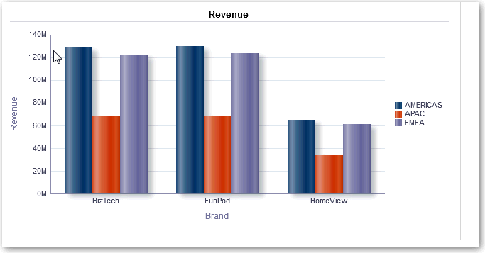
Description of the illustration views58.gif
To edit a graph view:
-
Open the analysis for editing.
-
Click the Analysis Editor: Results tab.
-
Click View Properties to edit properties. You can set the following kinds of properties:
-
Related to the graph canvas, such as legend location.
-
That control the appearance of the graph, such as the style.
-
For axis limits and tick marks.
-
That control the display of titles and labels for the graph.
-
-
On the Scale tab of the properties dialog, select Click to edit Scale Markers to display the Scale Markers dialog. Define scale markers, which are accenting lines or shaded background ranges that mark key points, thresholds, ranges, and so on in a graph. The following table describes the two types of scale markers:
Type Description Line A line that is drawn across the graph at a specified position on the scale Range A shaded background area that is displayed behind the graph. You can apply line or range scale markers on one or more axes depending on the type of graph.
-
Click OK to dismiss the dialog.
-
Click Edit View to display the Graph editor.
-
Use various toolbar buttons to affect the display of the graph, as described in the following table:
Button Description Type Includes bar, line, and pie. Subtype Includes vertical or horizontal, depending on the graph type. Style Available choices for style depend on the graph type. Effect Either a 2D or 3D effect. -
Define thresholds for a funnel graph, as described in Setting Thresholds.
-
To drill in data in the view, see Drilling in Results.
-
Click Done.
Zooming and Scrolling in Graphs
If zooming and scrolling has been enabled for a graph, then the graph includes a Zoom icon. The Zoom icon enables you to zoom in and out of a graph's plot area using its axes. After you zoom in on an axis, you can scroll the axis. Enable zooming and scrolling with the General tab of the Graph Properties dialog.
For example, while viewing a graph in results of a Brand Revenue analysis, you can zoom in on the Product Type axis. Doing so enables you to scroll the axis and view more data by product type.
To zoom and scroll in a graph, hover the mouse cursor over the graph to reveal the Zoom button and click Zoom. If only one axis is enabled, select Zoom In or Zoom Out.
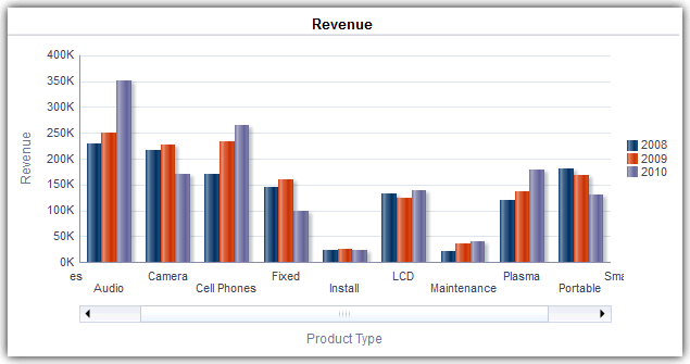
Description of the illustration views35.gif
If both axes of the graph are enabled for zooming and scrolling:
-
Select Horizontal Axis, then either Zoom In or Zoom Out.
A zoom and scroll slider is displayed on the X axis.
To unzoom the X axis, select Actual Size.
-
Select Vertical Axis, then either Zoom In or Zoom Out.
A zoom and scroll slider is displayed on the Y axis.
To unzoom the Y axis, select Actual Size.
-
To unzoom both the X and Y axes, select Actual Size.
(Optional) To use other zoom features:
-
Use Zoom to zoom in and out incrementally.
-
Drag the scroll thumb on an axis to dynamically scroll the graph, revealing portions of the graph that are out of view.
-
Click the scroll buttons on an axis to scroll left and right (on the X axis), or up and down (on the Y axis).
-
Use the resize handles to zoom in and out on an axis.
Formatting the Visual Appearance of Graphs
You can format the visual appearance of graphs based on two settings:
-
The position of the graph elements (such as lines or bars in a line-bar graph or slices in a pie graph).
-
Conditions applied to columns.
Formatting Graphs Based on Position
Positional formatting enables you to customize the appearance of a graph based on the position of graph elements; that is, the numeric sequence in which graph elements (for example, bars) are displayed in a group. A group is determined by the attribute columns that are displayed in the Group By drop target area. (For information on drop target areas, see About Drop Targets in the Layout Pane.
You can format the visual appearance of a graph based on position in terms of its color, line width, and line symbols. You cannot use positional formatting with waterfall graphs.
Formatting Graphs Based on Columns
Conditional formatting enables you to customize the appearance of a graph based on conditions applied to columns. The formatting is applied to the column values that meet the condition.
You can specify a color in which to display graph data based upon a specific column value, or range of column values that meet the condition specified for the column. For example:
-
Conditionally changing the color of a graph based on specific column values.
You want to create a bar graph to compare sales between two beverages, Lemonade and Cola. When creating a bar graph, you specify two conditions, one where the bar representing Lemonade sales is yellow and another where the bar representing Cola sales is blue.
-
Conditionally changing the color of a graph based on a range of column values.
A sales manager wants to create a bar graph to compare sales for all representatives across two sales bands.When creating a bar graph the sales manager specifies two conditions, one where the bar is red for all sales representatives with sales less than $250,000, and another where the bar is green for all sales representatives with sales greater than $250,000.
To format the appearance of a graph:
-
Click Edit Graph Properties on the toolbar of the graph editor.
-
Click the Style tab of the Graph Properties dialog.
-
Click Style and Conditional Formatting.
-
Click the Style Formatting tab to format the appearance of a graph based on the position of the graph elements. To add a custom formatted position:
-
Select the tab for the graph element (for example, bar) to which you want to add a custom formatted position.
-
Click Add new position. A new position entry is displayed in the Custom Formatted Positions table.
-
Specify the formatting. For example, to select the color to be applied to the position, click the down arrow next to the Color box to access the Color Selector dialog. (Note that the formatting options depend on the element.)
Note:
If you specify 0 for the width of a line, then the legend marker changes from the default line marker to symbol markers for the line and for other lines in the graph. For example, the symbol markers are shown as the legend markers for all the lines in the graph. -
-
Click the Conditional Formatting tab to format the appearance of a graph based on a condition that is applied to columns. To add a condition to a column:
-
Click Add Condition Format and select the column to which you want to apply a condition.
-
Select the operator and enter a column value, or a range of column values for this condition.
-
Click OK.
-
To select the color to be applied to column values when the condition is met, click the down arrow next to the Color box to display the Color Selector dialog.
-
-
Click OK.
Rules for Applying Conditional Formats in Graphs
The following rules apply for building and using conditions in graphs:
-
You can create conditions only from columns that are being used by the graph.
-
When format conditions conflict with each other, conflicting conditions are prioritized in the following order:
-
Conditional formatting on attributes.
-
Conditional formatting on measures
-
Style formatting based on the positions of graph elements.
-
-
When a user drills on a graph that has conditional formatting applied, the following rules apply:
-
A conditional format based on measures is not carried to the next level. (It does not make sense to carry the conditional format to a different level; for example if, in a geographic hierarchy, from Region to City.)
-
A conditional format based on attributes is carried to the next graph if it has not been drilled on.
For example, if you had the conditional format "Lemonade = Blue" and only drill on years, then "Lemonade = Blue" stays in place.
-
-
Conditional formatting is not supported on subtotals and totals for waterfall graphs.
Graph Exceptions for Conditional Formatting on Columns
The following table lists the graph exceptions that apply to conditional formatting based on columns.
| Graph Type | Exception |
|---|---|
| Line
Line-Bar Radar Time Series Line |
Only symbol formatting is allowed for the line. |
| Pareto | Formatting is applied only to the bars, not to the Pareto line. |
Limiting Data Displayed in Graphs and Gauges
You can limit the data that is shown in graphs or gauges using section sliders. A section slider displays members of one or more attribute or hierarchical columns as values on a rectangular bar. The slider also provides mechanisms to select a value for that column such as increase and decrease buttons. The play button sequentially moves through the slider values.

Description of the illustration views33.gif
Defining Section Sliders in Graphs and Gauges
You can define a section slider to limit the data that is shown in a graph or gauge. For example, you can limit the data that is shown in a graph to the a specific quarter in the year 2013.
To define a section slider:
-
Open the analysis for editing.
-
Click the Analysis Editor: Results tab.
-
Create the graph or gauge.
-
Click Edit View on the graph or gauge view.
-
In the Layout pane, drag columns to the Sections drop target.
-
Select Display as Slider.
-
Click Section properties.
-
Specify the maximum number of values to display in the section slider, then click OK.
-
To close the editor, click Done.
-
To save the changes, click Save Analysis.
Using Section Sliders in Graphs and Gauges
To use a section slider in a graph or gauge:
-
Move the slider thumb to the desired value.
-
Click the decrease button to move the slider thumb to the left.
-
Click the increase button to move the slider thumb to the right.
-
To sequentially move the slider through all the values, click the play button.
The play button changes to a pause button that enables you to stop on a particular value.
The data in the graph or gauge is limited by the current value indicated by the slider thumb.