Editing Various Types of Views
Editing Table and Pivot Table Views
Two common views for analyzing and displaying data are the table and pivot table. For example, you can edit a pivot table in the analysis and place Brand on the row edge to display its corresponding Revenue data for each Quarter and Region. You can include a table and a pivot table side-by-side in a compound layout.
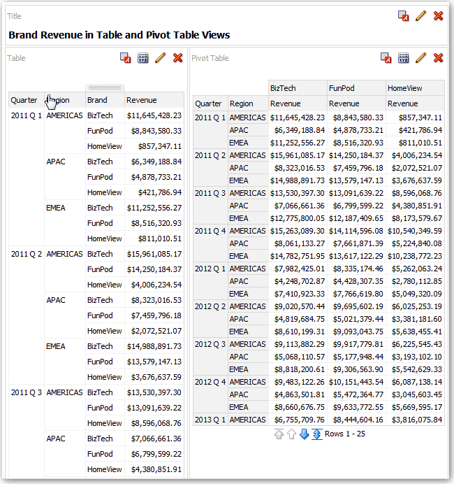
Description of the illustration views14.gif
To edit a table or pivot table view:
-
Open the analysis for editing.
-
Click the Analysis Editor: Results tab.
-
Click View Properties to edit properties. You can set properties such as the following ones:
-
The method to be used to browse data — either scrolling or paging controls.
-
The display of headings for the columns and the view.
-
Formatting preferences such as size and colors.
-
Green bar styling. Setting this property shows alternating rows or columns in a light green color, which is the default color that you can change.
-
-
Click OK to dismiss the dialog.
-
Click Edit View to display the Table View editor.
-
For a pivot table view, click the Graph Pivoted Results button on the toolbar to display the results of the pivot table in a graph view, which is displayed alongside the pivot table. The two views are fully linked, which means that changes made to one view are automatically reflected in the other.
-
Click Done.
-
To specify sorting in the view, see Sorting Values in Views.
-
To drill in the data in the view, see Drilling in Results.
Editing Gauge Views
You can use gauge views to graphically compare performance to goals. Due to their compact size, gauges can be more effective than graphs for showing a single data value. Results show as dial, bar, or bulb gauges. For example, you can use a gauge to see whether Actual Revenue falls within predefined limits for a brand.
The following figure shows a dial gauge:
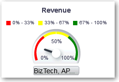
Description of the illustration analysis40.gif
The following figure shows a bar gauge:
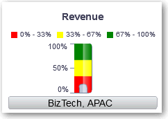
Description of the illustration analysis41.gif
The following figure shows a bulb gauge:
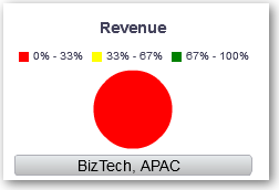
Description of the illustration analysis42.gif
To edit a gauge view:
-
Open the analysis for editing.
-
Click the Analysis Editor: Results tab.
-
Click View Properties to perform tasks such as the following:
-
Specify the number of rows of gauges to display and placement of labels in Gauges per Row.
-
Change the width and height of gauges and the appearance of titles and labels.
-
Specify the scale of gauge limits and tick marks. For example, you can specify a custom gauge limit. You can specify a static value such as 1000 as either an actual value or as a percentage. The value that you specify depends on the range of data points. You must ensure that the maximum gauge limit is more than the maximum data point. Do so to ensure that all data points are displayed on the gauge.
-
Specify the marker type for a dial gauge, such as Needle, Line or Fill.
-
-
Click OK to dismiss the dialog.
-
Click Edit View to display the Gauge View editor.
-
Click the Gauge Type button on the toolbar to select the type of gauge, such as bulb or dial.
-
Define thresholds for the gauge, as described in Setting Thresholds.
-
Click Done.
Setting Thresholds
You can set thresholds for display in gauges and funnel graphs. Each threshold has a high and a low and is associated with a color in which the range identified by the threshold is displayed in the gauge, such as green for acceptable, yellow for warning, and red for critical.
To set thresholds:
-
Click Edit View to display the view editor
-
In the Settings pane, select either High values are desirable or Low values are desirable. For example selecting High values are desirable lists the statuses in order from the most desirable indicator (such as Excellent) at the top to the least desirable indicator (such as Warning) at the bottom. Generally with columns such as Revenue, high values are desirable. With columns such as Expenses, low values are desirable.
-
In the Threshold list, specify the data values that highlight a particular range of values. The values must be between the minimum and maximum values set for the view's limits. The range that a threshold identifies is filled with a color that differs from the color of other ranges.
To specify a data value, you can enter a static value directory in a Threshold filed. or you can click Threshold Options to set the value based on a measure column, a variable expression, or the results of a SQL query. Select Dynamic to enable the system to determine the threshold value.
-
Enter the labels for the ranges in the Status area. Select Threshold Values to use the current threshold values as the label for the range. Select Specify Label to use text that you specify as the label for the range, such as Excellent.
Editing Performance Tile Views
Performance tile views focus on a single piece of aggregate of data. By default, the first measure in the analysis on the Criteria tab is selected as the performance tile measure. You must set up aggregation and filters on the Criteria tab to ensure that the correct measure value is displayed in the tile. To change this measure, edit the performance tile view. To include additional performance tile views for each measure in an analysis, add a separate view for each measure.
For example, you might want to edit a performance tile view to use Revenue as the measure. You can specify that the values and labels utilize the available space. The following figure shows performance tiles on a dashboard page:
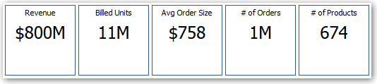
Description of the illustration views51.gif
To edit a performance tile view:
-
Open the analysis for editing.
-
Click the Analysis Editor: Results tab.
-
Click View Properties to edit properties. You can set the following kinds of properties:
-
Related to the size of the tile.
-
That control the appearance of the tile, such as the background and border colors. You can apply conditional formatting to the tile.
-
That abbreviate the value on the tile.
A performance tile can show a value using its measure's default formatting or the value can be abbreviated to the nearest thousand, million, and so on.
Examples of formatting are shown in the following table:
Default Formatting Abbreviated Value 123,456.50 123K 123,456,789.50 123M 123,456,789,123.50 123B -
-
Click one of the following buttons to align the performance tile label:
Button Description Fixed positions Sets (or "fixes") the positions of the labels. The label text is displayed in fixed positions. This option is recommended for layouts with multiple performance tiles (of the same size) in a row, where you want to ensure visual consistency by rendering text anchored at the same height despite variations in content. Utilize available space Evenly spaces the label text on the performance tile vertically. The label text utilizes all available space on the performance tile. Note that when you have multiple tiles placed beside each other, the labels might be displayed at different heights and look uneven based on the varying label content. -
Click OK to dismiss the dialog.
-
Click Edit View to display the Performance Tile editor.
-
In the Styles pane, change the tile size to Small, Medium, or Large.
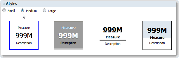
Description of the illustration views52.gif
-
Select a themed (or stylized) tile located below the Tile Size option buttons to change the theme for the performance tile.
-
Click Done.
Editing Trellis Views
A trellis view is a type of graph view that displays a grid of multiple graphs, one in each data cell. A trellis view can be simple or advanced. A simple trellis displays a core inner graph multiplied across row sets and column sets, rendering many small multiples that are ideal for comparing and contrasting. An advanced trellis displays a grid of small spark graphs that are ideal for monitoring trends and spotting patterns in a data set. For more information, see About Simple Trellis Versus Advanced Trellis.
The following figure shows a simple trellis view:
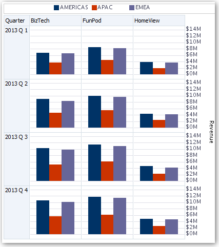
Description of the illustration views56.gif
The trellis view, also referred to as a trellis graph, is the same as a pivot table—with one major exception: the data cells within the trellis contain graphs. Whereas a stand-alone graph type such as a single bar graph or a single scatter graph works on its own, the trellis graph works only by displaying a grid of nested graphs, known as inner graphs. So a bar-graph trellis view is actually comprised of multiple bar graphs.
To edit a trellis view:
-
Open the analysis for editing.
-
Click the Analysis Editor: Results tab.
-
Click View Properties to edit properties. You can set the following kinds of properties:
-
Related to the grid canvas, such as legend location (simple trellis views only).
-
Related to graph size for the visualizations that are included in the trellis.
-
That specify the method to be used to browse data — either scrolling or paging controls.
-
That control the appearance of the trellis's grid and its visualizations, such as various style choices and the way that legends are displayed.
-
That control the type of scale and the appearance of scale markers for each of the trellis's visualizations (simple trellis views only).
-
That control the display of titles and labels (simple trellis views only).
-
-
Click OK to dismiss the dialog.
-
Click Edit View to display the Trellis editor.
-
In the Layout pane:
-
Drag and drop columns into the Columns and Rows fields to specify how data is arranged in the trellis.
-
Select the type of graph you want to display for each of the cells in the trellis.
-
Drag and drop columns to indicate how to color the graphs.
-
-
To specify sorting in the view, see Sorting Values in Views.
-
Click Done.
About the Functions of Trellis Views
For the most part, a trellis view behaves like a pivot table. The main difference between a trellis and a pivot table is the way the data cells are displayed. In the row and column label cells of a trellis, you can:
-
Right-click to hide or move measure labels.
-
Right-click to sort data.
-
Drag to reposition rows and columns.
In the data cells of a trellis, you can hover the mouse pointer to display related contextual information. Numeric data cells in a trellis behave the same as numeric data cells in a pivot table. The ways in which the behavior of a trellis view differs from the behavior of a pivot table are the following:
-
Graph data cells — There is no right-click functionality for the data cells in simple trellises, nor drilling in trellis graph data cells (left-click functionality).
-
Microchart data cells — When you hover the cursor over the data cells in spark graphs, you are shown contextual information (such as first, last, minimum, and maximum values) that otherwise is not displayed as it is in a pivot table view.
About Simple Trellis Versus Advanced Trellis
A trellis view has one of two types: Simple Trellis and Advanced Trellis. The Simple Trellis displays a single type of inner visualization, for example, all bar graphs. The inner visualization always uses a common axis, so that all inner graphs are viewed on the same scale. Having a common axis makes all graph markers easy to compare across rows and columns.
The following figure shows a simple trellis view:
Description of the illustration views56.gif
The Advanced Trellis accommodates the display of multiple visualization types within its grid. An advanced trellis that illustrates sales trends might show a grid that contains numbers in the cells of one column (revenue, for example). Another column alongside the numbers column displays Spark Line graphs in its cells. Next to that column, a different microchart might be displayed, such as a column of Spark Bar graphs that visualize a different measure, such as unit totals.
The following figure shows an advanced trellis view:
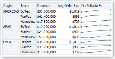
Description of the illustration views63.gif
Each measure that is visualized is assigned a different inner graph type. Each cell of the grid is scaled independently.
Think of an advanced trellis as a pivot table with spark graphs inside its data cells. But, for each measure that you add, you can optionally associate a dimension and render it as a microchart visualization. This makes an advanced trellis very different from a simple trellis. In a simple trellis, all of the measures are rendered in the same visualization, along with additional dimensions.
Design Considerations for Trellis Views and Microcharts
Consider the following ideas when designing content displayed in trellis views:
-
For comparisons, select the Simple Trellis.
-
For trend analysis, select the Advanced Trellis.
-
Make the inner graphs that comprise a trellis readable and not too dense. A trellis view is not especially useful for displaying multiple series or multiple groups. If you cannot easily target a data point with the mouse (to display a tooltip), then the inner graph is likely too dense to be readable.
-
For the Simple Trellis:
-
Designing a simple trellis is like designing a pivot table, except that the total number of cells that can be rendered is much less for a trellis.
-
The main difference between designing a simple trellis and designing a pivot table is that for a trellis, one or two of the dimensions can be associated with the visualization. You add many fewer dimensions to the outer edge.
-
Design the trellis with a small number of outer-edge dimensions. The entire graph series should be visible at once (for easy comparison of like to like) with no need to scroll. If you must show additional dimensionality, then consider adding the dimensions to the graph prompt.
-
When determining which data to show in column headers and which to show in row headers, ensure that the column headers show one or two dimensions (each dimension with a small number of members).
-
-
For the Advanced Trellis:
-
A common use case for an advanced trellis is to show trend graphs alongside numeric values, in a compressed form. So a typical advanced trellis contains a combination of spark graphs alongside number representations of the same measure.
-
Ideally, include no dimensions in the column headers. Include the measure in the column headers.
-
The dimensionality typically associated with a spark graph is time. Because a spark graph includes no visible labels, it is important that the data visualized is intrinsically ordered. For example, a spark graph that visualizes regions is meaningless, because the ordering of the regions (which would be the specific bars, in a Spark Bar graph) is not intuitive.
-
Just as when designing pivot tables, you generally display time on the horizontal axis, with the other dimensions displayed on the vertical axis. The eye then scans from left to right to see how the dimensionality changes over time.
-
-
Hierarchical columns do not work well with the Simple Trellis. When a hierarchical column is displayed on the outer edge, parents and children (such as Year and Quarter) are shown by default using a common axis scale. However, because Year and Quarter have different magnitudes, the markers in child graphs might be extremely small and hard to read against the parent scale. (Hierarchical columns do work well with the Advanced Trellis, because each data cell is a different scale.)
Editing Treemap Views
Treemaps organize hierarchical data by grouping the data into rectangles (known as tiles). Treemaps display tiles based on the size of one measure and the color of the second measure. The following figure shows an example of a treemap view. The country names are grouped by region and area. This treemap shows the correlation of revenue for a country (based on average order size) across different regions for an area.
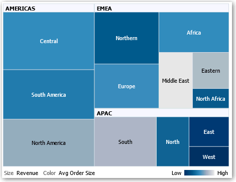
Description of the illustration views55.gif
By default, the first measure of the analysis in the Criteria tab is selected as the Size By measure, and the second measure is selected as the Color By measure. If there is only one measure in the analysis, this measure is the default for both Size By and Color By options. Additionally, the Style element defaults to Percentile Binning with "quartile" as the value for the number of bins.
Treemaps have the following characteristics:
-
Tiles are colored by percentile bins or continuously.
-
First Group By dimension is displayed as the group (header) label.
-
The order of the Group By dimensions implies the nesting order within the treemap. The last dimension in the Group By is the lowest level and this dimension name is displayed as the tile label. If the label is too long to fit on the tile, then it is truncated. Full values for the labels display in the tooltip.
To edit a treemap view:
-
Open the analysis for editing.
-
Click the Analysis Editor: Results tab.
-
Click View Properties. You can set properties such as the following ones:
-
The size of the treemap.
-
Whether a legend is to be displayed to show the continuous color variations or binning for the treemap tiles.
-
The background color and fill of the legend.
-
The border colors of the groups and tiles.
-
-
Click OK to dismiss the dialog.
-
Click Edit View to display the treemap view editor.
-
In the Layout pane, select the Percentile Binning or Continuous Color Fill options to change the color palette of the view.
Style Description Percentile Binning Specify that the color of the tiles within the treemap is displayed as a percentile bin. In the Bins list, select the number of bins to display in the treemap. You can select an integer, Quartile (4), or Decile (10). Values range from 2 to 12. The number of bins selected corresponds to the number of colors in the treemap. For example: You create a treemap for Region and Area. You specify Revenue as the Size By measure and Avg Order Size as the Color By measure. Then, you select Percentile Binning as the Style with 4 (Quartile) bins. The First Quartile represents those areas within the region that are under performing for the average order size by revenue.
The Binning Properties area displays the percentage for the bin based on a total of 100% and is calculated based on the number of bins selected. Each percentage is color-coded and corresponds to the Color selection.
Continuous Color Fill Specify that the tiles within the treemap are displayed as a gradient color scheme. The low value gradient color is the minimum value for the selected Color By measure. The high value gradient color is the maximum value for the selected Color By measure. -
Change the measures and attribute and hierarchal (excluding skip-level) columns to visualize the new data in more meaningful ways by using Group By, Size By, and Color By options.
-
Click Done.
Editing Narrative Views
A narrative view displays data results as one or more paragraphs of text. You use a narrative view to provide information such as context, explanatory text, or extended descriptions along with column values. You can perform various tasks in the narrative view editor:
-
Type a sentence with placeholders for each column in the results.
-
Specify how rows are separated.
-
Apply cosmetic formatting to the fonts used in the narrative view, or import the font formatting from a previously saved view.
-
Add references to variables.
To edit a narrative view:
-
Open the analysis for editing.
-
Click the Analysis Editor: Results tab.
-
Click Edit View to display the narrative view editor.
-
In the Prefix field, enter the header for the narrative. This text is displayed at the beginning of the narrative.
-
In the Narrative box, enter the narrative text that is displayed for each row in the results. You can include both text and column values. Include a line break code at the end of this field to force each line of text and values onto its own line.
To include column values, use an at sign (@), optionally followed by a number. Use an at sign by itself to indicate the first column. If you include multiple at signs, then the first occurrence of the sign corresponds to the first column, the second occurrence corresponds to the second column, and so on.
Use @n to include the results from the designated column in the narrative. For example, @1 inserts the results from the first column in the analysis, and @3 inserts the results of the third column.
For example, for an analysis that returns the region name in the second column, specify
@2to include the following values in the view: East Region and West Region. -
n the Row separator field, enter a row separator for each line from the Narrative field that contains values. For example you might enter a string of plus signs (+) between each line.
-
In the Rows to display field, enter the number of rows from the column to return. For example, enter 5 to display values from the first 5 rows of the column. For a hierarchical column, you can use selection steps to display hierarchy levels with the hierarchical column. For example, create a step to select members based on hierarchy and add members of the specified level. A hierarchy level is considered a row.
-
In the Postfix field, enter the footer for the narrative. Ensure that the narrative ends in a line break, or that the footer begins with a line break.
-
Click Done.
About Editing Non-Data Views
You often edit views that display data, such as tables, graphs, and gauges. You can also include the following types of views in analyses and dashboards:
About Column Selector Views
A column selector view is a set of drop-down lists that contain pre-selected columns. Users can dynamically select columns and change the data that is displayed in the views of the analysis.
One drop-down list can be attached to each column in the analysis, and multiple columns can be attached to each drop-down list. Updates that you make in the column selector view affect all the data views in the analysis.
You add columns to drop-down lists from the Subject Areas pane. When you add columns in this way, they are not added to the Criteria tab for the analysis. Instead, when you display the Criteria tab, you see that the column is now referred to as a "Column Group" with the default column for the list specified also. The default column is the one on which you created the drop-down list.
About Filters Views
A filters view displays the filters in effect for an analysis. Filters, like selection steps, allow you to constrain an analysis to obtain results that answer a particular question. Filters are applied before the query is aggregated. For information, see Creating Filters for Columns.
About Selection Steps Views
A selection steps view displays the selection steps in effect for the analysis. Selection steps, like filters, enable you to obtain results that answer particular questions. Selection steps are applied after the query is aggregated.
You cannot modify selection steps from this view editor. To modify the selection steps, exit the Selection Steps editor and use the Selection Steps pane. For information, see Refining Selections of Data.
About Static Text Views
A static text view adds static text to be displayed with the analysis results. You can include variables in a static text view, as shown in the following example. For information, see Advanced Techniques: Referencing Stored Values in Variables.
[u] Static Text View [/u][br/]
Region: @{variables.myFavoriteRegion} - Year:
@{variables.myFavoriteYear}[br/]
System Time: @{system.currentTime}[dddd,MMMM dd,yyyy][br/]
Product Version: @{system.productVersion}[br/]
[br/]
About Title Views
A title view displays a title, a subtitle, a logo, and timestamps to the results. If you do not specify a title, then the name of the saved analysis is used as the title. For unsaved analyses, the Title text box is blank. You can reference variables in the text fields of the Title editor.
About View Selector Views
A view selector view enables users to select a specific view of the results from among the saved views for an analysis. When placed on a dashboard, the view selector is displayed as a list from which users can choose the view that they want to display below the selector.
Generally, you include views in the view selector that are not being displayed in the Compound Layout view. For example, you might create a table, graph, gauge, and view selector view for an analysis, but include only the table and view selector view on the Compound Layout view. When the analysis is displayed on a dashboard page, users can select the graph or gauge view from the view selector view.