30 Using Treemap and Sunburst Components
This chapter describes how to use the ADF Data Visualization treemap and sunburst components to display hierarchical data in treemaps and sunbursts using simple UI-first development. The chapter defines the data requirements, tag structure, and options for customizing the look and behavior of the components.
If your application uses the Fusion technology stack, then you can also use data controls to create treemaps and sunbursts. For more information, see the "Creating Databound Hierarchy Viewer, Treemap, and Sunburst Components" chapter of Developing Fusion Web Applications with Oracle Application Development Framework.
This chapter includes the following sections:
-
Section 30.3, "Adding Data to Treemap and Sunburst Components"
-
Section 30.4, "Customizing Treemap and Sunburst Display Elements"
-
Section 30.5, "Adding Interactive Features to Treemaps and Sunbursts"
30.1 About the Treemap and Sunburst Components
Use treemaps and sunbursts to display quantitative hierarchical data across two dimensions, represented visually by size and color. Treemaps and sunbursts use a shape called a node to reference the data in the hierarchy.
For example, you can use a treemap or sunburst to display quarterly regional sales and to identify sales trends, using the size of the node to indicate each region's sales volume and the node's color to indicate whether that region's sales increased or decreased over the quarter. The appearance and content of the nodes are configurable at each level of the hierarchy.
30.1.1 Treemap and Sunburst Use Cases and Examples
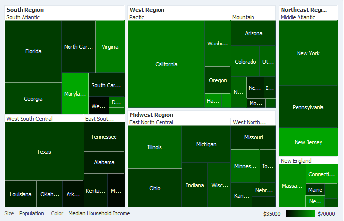
Treemaps display nodes as a set of nested rectangles. Each branch of the tree is given a rectangle, which is then tiled with smaller rectangles representing sub-branches. Figure 30-1 shows a treemap displaying United States census data grouped by regions, with the color attribute used to indicate median income levels. States with larger populations display in larger-sized nodes than states with smaller populations.
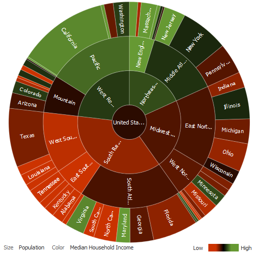
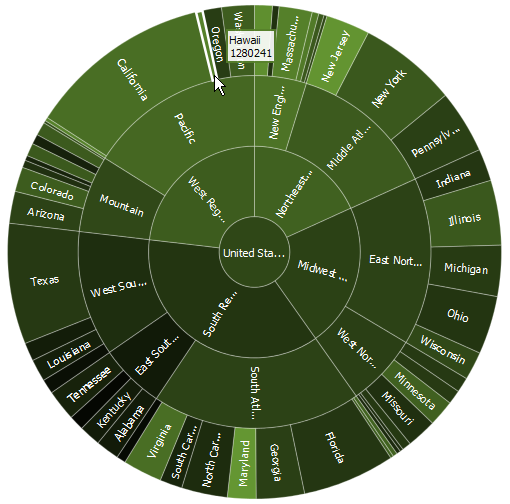
Sunbursts display the nodes in a radial rather than a rectangular layout, with the top of the hierarchy at the center and deeper levels farther away from the center. Figure 30-2 shows the same census data displayed in a sunburst.
Both treemaps and sunbursts can display thousands of data points in a relatively small spatial area. These components are a good choice for identifying trends for large hierarchical data sets, where the proportional size of the nodes represents their importance compared to the whole. Color can also be used to represent an additional dimension of information.
Use treemaps if you are primarily interested in displaying two metrics of data using size and color at a single layer of the hierarchy. Use sunbursts instead if you want to display the metrics for all levels in the hierarchy. Drilling can be enabled to allow the end user to traverse the hierarchy and focus in on key parts of the data.
If your application uses a smaller data set or you wish to emphasize the parent/child relationship between the nodes, then consider using the tree, treeTable, or hierarchyViewer component. For information about using trees and tree tables, see Chapter 12, "Using Tables, Trees, and Other Collection-Based Components." For information about using hierarchy viewers, see Chapter 29, "Using Hierarchy Viewer Components."
30.1.2 End User and Presentation Features of Treemaps and Sunbursts
The ADF Data Visualization treemap and sunburst components provide a range of features for end users, such as drilling, grouping, and filtering. They also provide a range of presentation features, such as layout variations, legend display, and customizable colors and label styles.
To use and customize treemap and sunburst components, it may be helpful to understand these features and components:
30.1.2.1 Treemap and Sunburst Layouts
You define the initial layout of the treemap or sunburst when you insert the component on the page from either the Data Controls panel to bind a data collection to the treemap or sunburst component or from the Components window to insert the component.
The sunburst component has only one layout, as shown in Figure 30-2.
The layout of nodes in a treemap component is configurable and includes the following types of layouts:
-
Squarified, nodes are laid out to be as square as possible.
The squarified layout is optimized so that the user can most easily compare the relative sizes of the nodes and is the layout displayed in Figure 30-1.
-
Slice and dice horizontal, nodes are first laid out horizontally across the width of the treemap and then vertically across the height of the treemap.
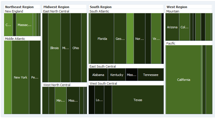
This layout is optimized for animation because the relative ordering of the nodes remains constant. Figure 30-3 displays the sample United States census data in the slice and dice horizontal layout.
-
Slice and dice vertical, nodes are first laid out vertically across the height of the treemap and then horizontally across the width of the treemap.
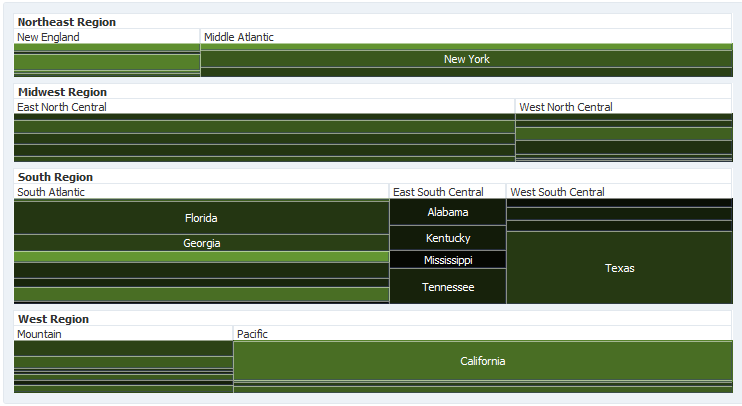
This layout is also optimized for animation because the relative ordering of the nodes remains constant. Figure 30-4 displays the sample United States census data in the slice and dice vertical layout.
30.1.2.2 Attribute Groups
Treemaps and sunbursts support the use of the dvt:attributeGroups tag to generate stylistic attribute values such as colors for each unique group in the data set.
In treemaps and sunbursts, the data values determine which color to display. Both components display continuous data by selecting a color across a gradient, in which the nodes change color gradually based on the data values. The treemap in Figure 30-1 uses gradients to display the median income as a range of data.
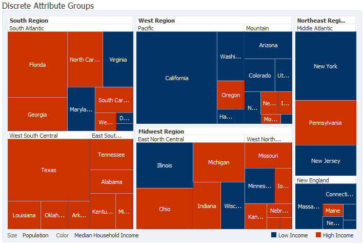
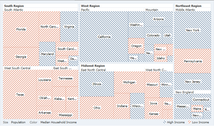
For discrete data, treemaps and sunbursts display a specific color, also based on the data value. Figure 30-5 shows the same United States census population using two colors to distinguish between high and low median incomes.
Attribute groups are required for legend support and make it easier to customize the color and pattern of the nodes.
30.1.2.3 Legend Support
Treemaps and sunbursts display legends below the components to provide a visual clue to the type of data controlling the size and color. If the component uses attribute groups to specify colors based on conditions such as income levels, the legend can also display the colors used and indicate what value each color represents.
The treemap in Figure 30-5 displays a legend for a treemap using discrete attribute groups. The legend makes it easy to determine which colors are used to indicate low or high median incomes.
If your treemap uses continuous attribute groups, the legend displays the colors used as a gradient. The treemap in Figure 30-1 shows a legend for a treemap using continuous attribute groups to indicate median income levels.
30.1.2.4 Pattern Support
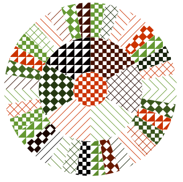
Treemaps and sunbursts display patterns when values are specified for the fillPattern attribute on the child nodes. The pattern is drawn with a white background, and the fillColor value determines the foreground color.
Figure 30-6 shows a sunburst configured with an assortment of fill patterns.
30.1.2.5 Node Selection Support
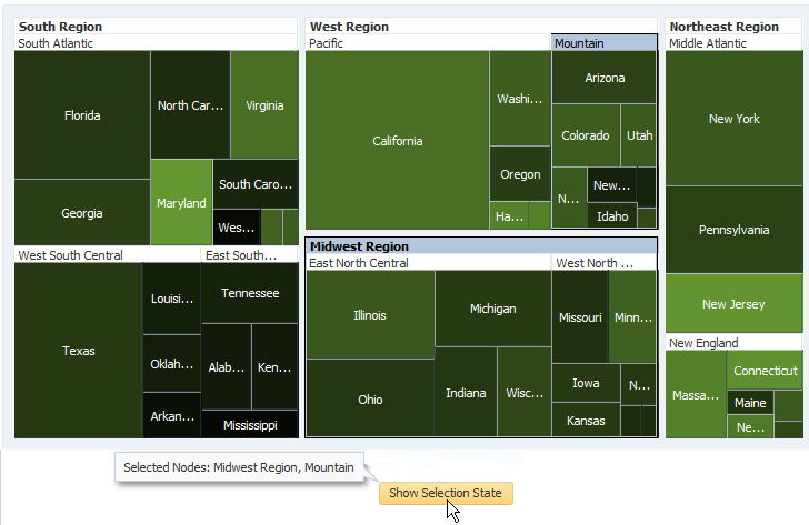
Treemaps and sunbursts support the ability to respond to user clicks on one or more nodes to display information about the selected node(s).
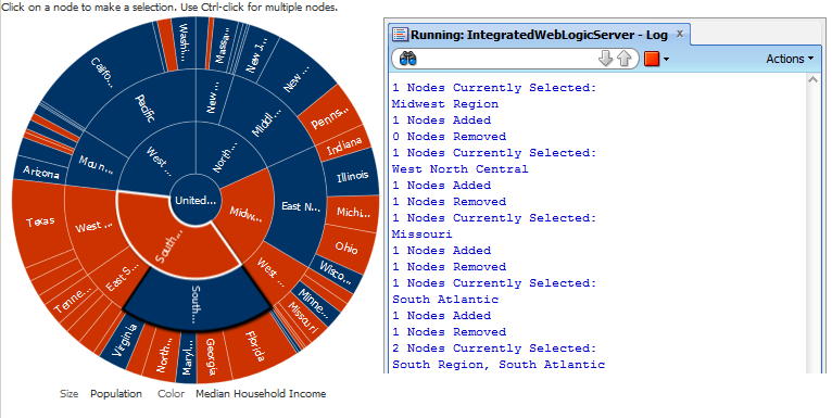
Figure 30-7 shows a treemap configured for multiple selection support.
30.1.2.6 Tooltip Support
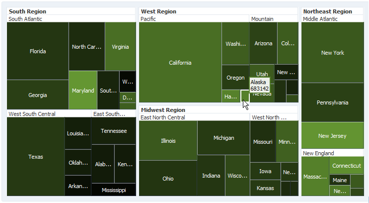
Treemaps and sunbursts support the ability to display additional information about a node when the user moves the mouse over a node.
Figure 30-8 shows the tooltip that is displayed when the user moves the mouse over the Alaska node.
The tooltip permits the user to see information about the data that may not be obvious from the visual display. Configuring tooltips on treemaps and sunbursts is recommended due to the space-constrained nature of the components.
30.1.2.7 Popup Support
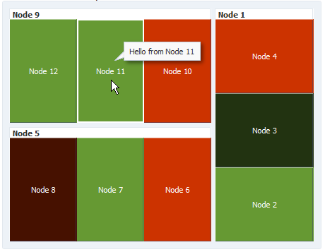
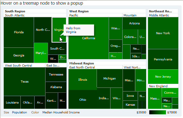
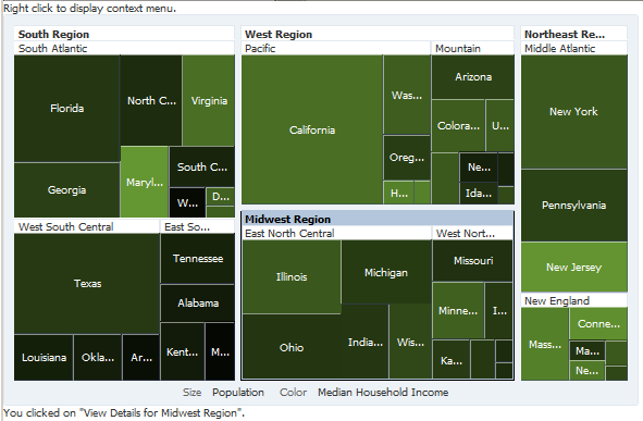
Treemap and sunburst components can be configured to display popup dialogs, windows, and menus that provide information or request input when the user clicks or hovers the mouse over a node. Figure 30-9 shows a sample popup displayed when a user hovers the mouse over one of the treemap nodes.
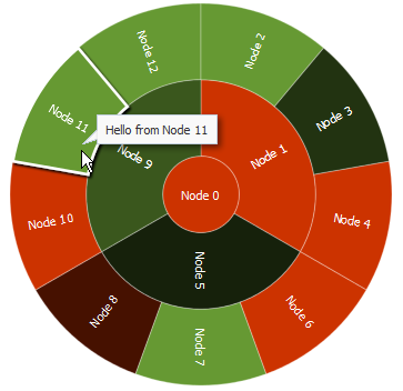
Figure 30-10 shows a similar popup window that is displayed when the user clicks on one of the sunburst nodes.
30.1.2.8 Context Menus
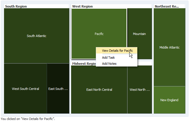
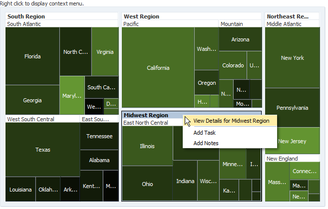
Treemaps and sunbursts support the ability to display context menus to provide additional information about the selected node. Figure 30-11 shows a context menu displayed when the user right-clicks on one of the sunburst nodes.
30.1.2.9 Drilling Support
Treemap and sunburst components support drilling to navigate through the hierarchy and display more detailed information about a node.
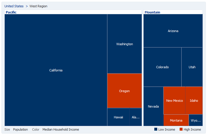
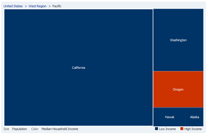
Figure 30-12 shows the treemap that is displayed when a user clicks on the West Region header text in Figure 30-5. The user can navigate back up the hierarchy by clicking on the United States > West Region breadcrumb.
The user can also double-click on a node to set the node as the root of the hierarchy as shown in Figure 30-13.
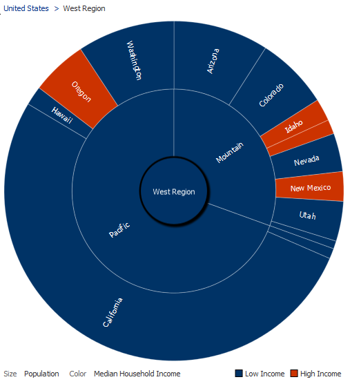
To drill on a sunburst component, the user double-clicks a sunburst node to set it as the root of the hierarchy as shown in Figure 30-14. The user can navigate back up the hierarchy by clicking the United States > West Region breadcrumb or by pressing the shift key and double-clicking the West Region node.
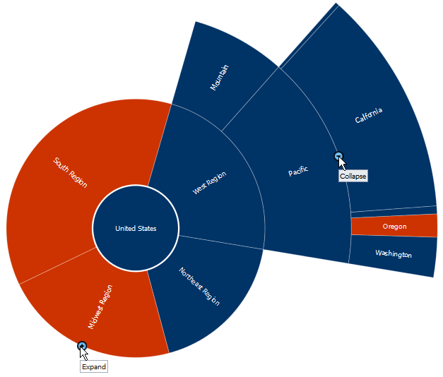
Sunbursts also provide the ability to expand or collapse the children of a selected node. Users click the Expand icon that appears when the user moves the mouse over the node to expand it. To collapse the children, users click the Collapse icon.
Figure 30-15 shows a sunburst configured for asymmetric drilling.
30.1.2.10 Other Node Support
Treemap and sunburst components provide the ability to aggregate data if your data model includes a large number of smaller contributors in relation to the larger contributors.
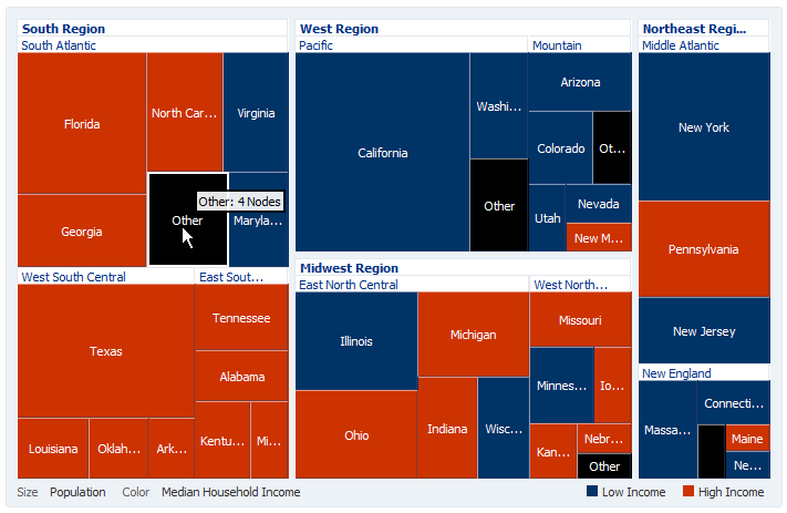
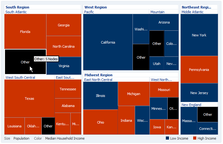
Figure 30-16 shows the census treemap displayed in Figure 30-5 with the Other node configured. In this example, the South Carolina, Delaware, West Virginia, and District of Columbia nodes in the South Atlantic region are represented by the Other node.
30.1.2.11 Drag and Drop Support
Treemap and sunburst components support drag and drop both as a drop source and a drop target.
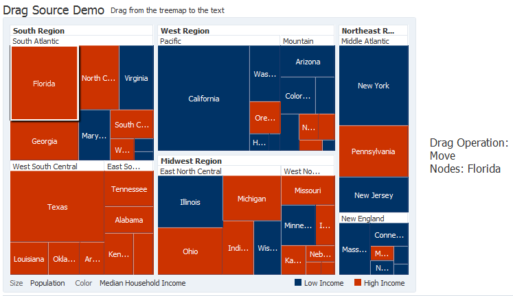
Figure 30-17 shows a treemap configured as a drag source. When the user drags one of the nodes to the text on the right, the text changes to reflect which node was dragged.
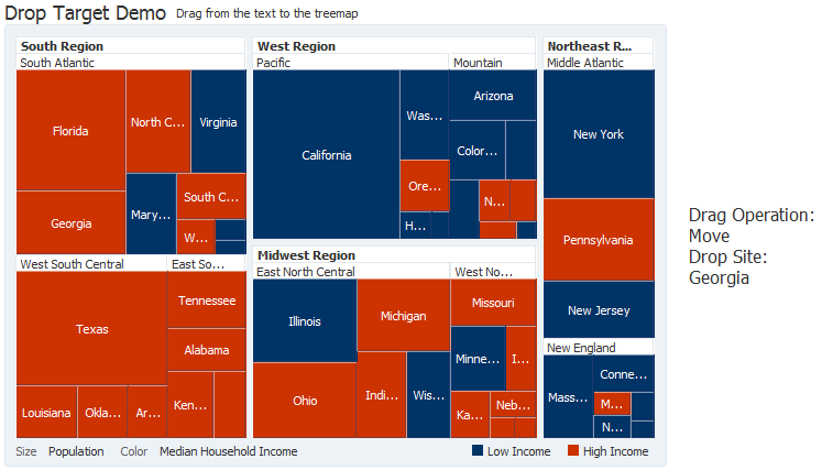
Figure 30-18 shows a treemap configured as a drop target. When the user drags the text on the right to one of the nodes, the text changes to reflect which node received the text.
30.1.2.12 Sorting Support
Treemap and sunburst components support sorting to display nodes with the same parent by size. This feature is useful if your data model is not already sorted because it makes comparison of the nodes easier.
Figure 30-19 shows a sorted treemap. The nodes are arranged in decreasing size, making it easy to see which regions have the largest population.
Note:
Treemaps support sorting in the slice and dice layouts only.
30.1.2.13 Treemap and Sunburst Image Formats
Treemaps and sunbursts support the following image formats: HTML5, Flash, and Portable Network Graphics (PNG).
By default, treemaps and sunbursts will display in the best output format supported by the client browser. If the best output format is not available on the client, the application will default to an available format. For example, if the client does not support HTML5, the application will use:
-
Flash, if the Flash Player is available.
You can control the use of Flash content across the entire application by setting a
flash-player-usagecontext parameter inadf-config.xml. For more information, see Section A.4.3, "Configuring Flash as Component Output Format." -
PNG output format. Although static rendering is fully supported when using a PNG output format, certain interactive features are not available including:
-
Animation
-
Context menus
-
Drag and drop gestures
-
Popup support
-
Selection
-
30.1.2.14 Advanced Node Content
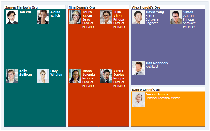
Treemaps and sunbursts provide a content facet on the nodes to add content that would not normally fit into a text label. For sunbursts, the advanced content is displayed on the root node. For treemaps, the advanced content is displayed on the leaf nodes.
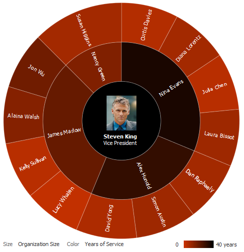
Figure 30-20 shows an example of a sunburst using advanced node content on the root node. In this example, the root node displays an image and title in addition to the node text.
Figure 30-21 shows an example of a treemap using advanced node content.
Note:
Advanced node content is limited to af:outputText, af:panelGroupLayout, af:spacer, and af:image components. For details about configuring advanced node content, see Section 30.4.7, "Configuring Treemap and Sunburst Advanced Node Content."
30.1.2.15 Printing and Email Support
ADF Faces allows you to output your JSF page from an ADF Faces web application in a simplified mode for printing or for emailing. For example, you may want users to be able to print a page (or a portion of a page), but instead of printing the page exactly as it is rendered in a web browser, you want to remove items that are not needed on a printed page, such as scroll bars and buttons. If a page is to be emailed, the page must be simplified so that email clients can correctly display it. For information about creating simplified pages for these outputs, see Chapter 37, "Using Different Output Modes."
30.1.2.16 Active Data Support (ADS)
Treemaps and sunbursts support ADS by sending a Partial Page Refresh (PPR) request when an active data event is received. The PPR response updates the components, animating the changes as needed. Supported ADS events include:
-
Node size updates
-
Node color updates
-
Node label updates
-
Node insertion
-
Node deletion
-
Enhanced node content changes
For additional information about using the Active Data Service, see Chapter 38, "Using the Active Data Service with an Asynchronous Backend."
30.1.2.17 Isolation Support (Treemap Only)
Treemaps provide isolation support to focus on comparisons within groups of displayed data. Users click the Isolate icon that appears when the user moves the mouse over the group header to maximize the group.
Figure 30-22 shows the Isolate icon that appears when the user moves the mouse over the South Atlantic group header.
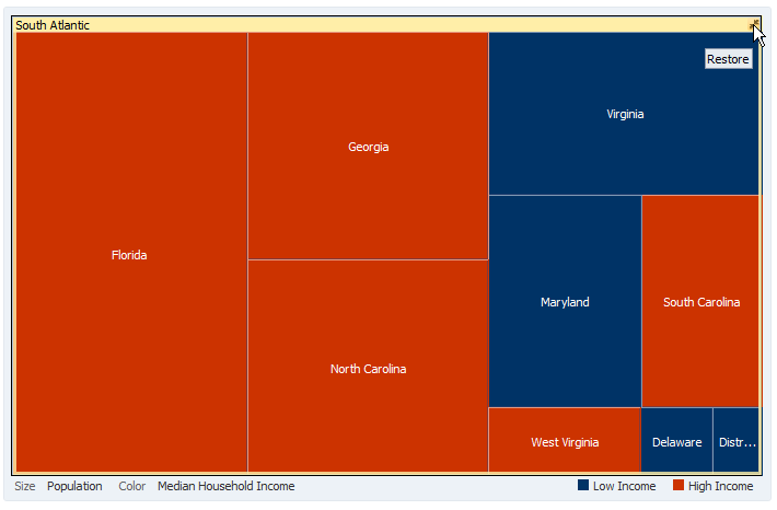
Figure 30-23 shows the treemap that is displayed when the users click the Isolate icon for the South Atlantic region in Figure 30-22.
To restore the treemap to the original view, users click the Restore icon.
30.1.2.18 Treemap Group Node Header Customization (Treemap Only)
When the treemap displays multiple levels, the parent level is displayed in a group header. By default, the group header is displayed with a white background, and the group's title is aligned to the left in left-to-right mode and displayed with black text.
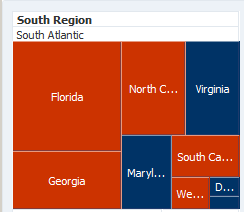
Figure 30-24 shows a portion of a treemap with node headers. In this example, the South Region and South Atlantic headers are formatted with the default formatting.
You can customize the headers to use the node's color, change the text alignment or customize the font.
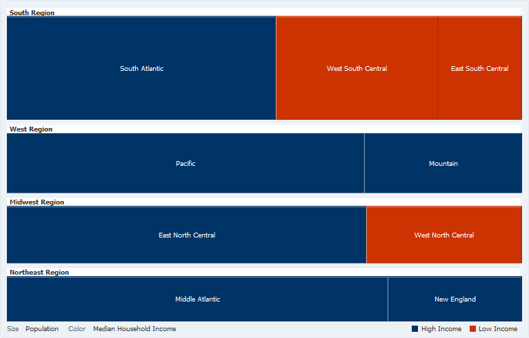
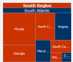
Figure 30-25 shows the same treemap with the node header formatted to use the node's color, align the title to the center and change the font size and color.
In this example, the treemap nodes are displayed in red when the income levels are lower than $50,000, and the treemap nodes are displayed in blue when the income levels are higher than $50,000. The South Atlantic node header is displayed in blue because the color is calculated from the same rules that were used to calculate the color of the individual nodes. In this case, the income levels of all nodes contained within the South Atlantic division are higher than $50,000. However, the South Region node header is displayed in red because it also includes the West South Central and East South Central divisions. In this case, the income levels of all nodes contained within the South Region is less than $50,000.
30.1.3 Additional Functionality for Treemap and Sunburst Components
You may find it helpful to understand other ADF Faces features before you implement your treemap or sunburst component. Additionally, once you have added a treemap or sunburst to your page, you may find that you need to add functionality such as validation and accessibility. Following are links to other functionality that treemap and sunburst components can use:
-
Partial page rendering: You may want a treemap or sunburst to refresh to show new data based on an action taken on another component on the page. For more information, see Chapter 8, "Rerendering Partial Page Content."
-
Personalization: When enabled, users can change the way the treemap or sunburst displays at runtime. Those values will not be retained once the user leaves the page unless you configure your application to allow user customization. For information, see Chapter 35, "Allowing User Customization on JSF Pages."
-
Skins and styles: You can customize the appearance of pivot table and pivot filter bar components using an ADF skin that you apply to the application or by applying CSS style properties directly using a style-related property (
styleClassorinlineStyle). For more information, see Chapter 31, "Customizing the Appearance Using Styles and Skins." -
Accessibility: You can make your treemap and sunburst components accessible. For more information, see Chapter 33, "Developing Accessible ADF Faces Pages."
-
Touch devices: When you know that your ADF Faces application will be run on touch devices, the best practice is to create pages specific for that device. For additional information, see Appendix D, "Creating Web Applications for Touch Devices Using ADF Faces."
-
Automatic data binding: If your application uses the Fusion technology stack, then you can create automatically bound treemaps and sunbursts based on how your ADF Business Components are configured. For more information, see the "Creating Databound Hierarchy Viewer, Treemap, and Sunburst Components" chapter of Developing Fusion Web Applications with Oracle Application Development Framework.
Note:
If you know the UI components on your page will eventually use ADF data binding, but you need to develop the pages before the data controls are ready, then you should consider using placeholder data controls, rather than manually binding the components. Using placeholder data controls will provide the same declarative development experience as using developed data controls. For more information, see the "Designing a Page Using Placeholder Data Controls" section in Developing Fusion Web Applications with Oracle Application Development Framework.
Additionally, data visualization components share much of the same functionality, such as how data is delivered, automatic partial page rendering (PPR), and how data can be displayed and edited. For more information, see Section 22.2, "Common Functionality in Data Visualization Components."
30.2 Using the Treemap and Sunburst Components
To use the treemap and sunburst components, define the data, add the treemap or sunburst to a page and complete the additional configuration in JDeveloper.
30.2.1 Treemap and Sunburst Data Requirements
Treemap and sunburst components require data collections where a master-detail relationship exists between one or more detail collections and a master detail collection. Both components use the same data model as the ADF Faces tree component. For more information about the tree component, see Section 12.6, "Displaying Data in Trees."
Treemaps and sunbursts require that the following attributes be set in JDeveloper:
-
value: the size of the node -
fillColor: the color of the node -
label: a text identifier for the node
The values for the value and label attributes must be stored in the treemap's or sunburst's data model or in classes and managed beans if you are using UI-first development. You can specify the fillColor values in the data model, classes, and managed beans, or declaratively in the Properties window.
Figure 30-26 shows a subset of the data used to generate the treemap in Figure 30-1. This is the same data used to generate the sunburst in Figure 30-2.
In this example, United States is the root node with three child levels: region, division, and state.
In order to configure a treemap or sunburst successfully, ensure that the data adheres to the following rules:
-
Each child node can have only one parent node.
-
There can be no skipped levels.
To create a treemap or sunburst model in UI-first development, use classes and managed beans to define the tree node and tree model, populate the tree with data and add additional methods as needed to configure the treemap or sunburst.
See Section F.3.1, "Sample Code for Treemap and Sunburst Census Data Example" for sample code that defines the classes and managed beans used in both the treemap and sunburst census data examples.
30.2.2 Using the Treemap Component
To use the treemap component, add the treemap to a page and complete the additional configuration in JDeveloper.
30.2.2.1 Configuring Treemaps
The treemap component has configurable attributes and child components that you can add or modify to customize the display or behavior of the treemap. The prefix dvt: occurs at the beginning of each treemap component name indicating that the component belongs to the ADF Data Visualization Tools (DVT) tag library.
You can configure treemap child components, attributes, and supported facets in the following areas:
-
Treemap (
dvt:treemap): Wraps the treemap nodes. Configure the following attributes to control the treemap display.-
Labels: Use the
colorLabelandsizeLabelattributes to identify the color and size metrics for the treemap. Treemaps require these labels for legend display. -
Legend source (
legendSource): Use this attribute to display a legend for treemaps configured with attribute groups. Specify the id of the attribute group. -
Display child levels (
displayLevelsChildren): Specify the number of child levels to display. By default, treemaps display the root and the first two child levels. -
Animation: Use the
animationOnDisplayattribute to control the initial animation and theanimationOnDataChangeattribute to control subsequent animations. To change the animation duration from the default duration of 500 milliseconds, modify theanimationDurationattribute. -
Empty text (
emptyText): Use theemptyTextattribute to specify the text to display if a treemap node contains no data. -
Group gaps (
groupGaps): Specify the gaps to display between groups. By default, this attribute is set toouter, and the treemap displays gaps between the outer nodes only. You can remove all gaps by setting this attribute tononeor add gaps between all groups by setting this attribute toall. -
Sorting (
sorting): If your treemap uses a slice and dice layout, use this attribute to sort all nodes having the same parent in descending size. -
Other group: Use the
otherThreshold,otherColor, andotherPatternattributes to aggregate child data into an Other node.
-
-
Treemap node (
dvt:treemapNode): child of thetreemapcomponent. This tag defines the size and color for each node in the treemap and is stamped for each row in the data model. If you want to vary the stamp by row, use the ADF Facesaf:switchercomponent, and insert a treemap node for each row. Configure the following attributes to control the node display:-
value(required): Specify the value of the treemap node. The value determines the relative size of the node within the treemap. -
fillColor(required): Specify the fill color for the node in RGB hexadecimal. This value is also required for the treemap to display properly. -
fillPattern: Specify an optional fill pattern to use. The pattern is drawn with a white background and the foreground color uses the color specified in thefillColorattribute. -
groupLabelDisplay: Specify where you want the group label to appear. By default this value is set toheaderwhich will display the label on the group header. You can also set it tooffto turn off the label display ornodeto display the label inside the node. -
label: Specify the label for the node. -
labelDisplay: Specify where you want the node label to appear. By default, this attribute is set tonodewhich will display the label inside the node, but you can also set it tooffto turn off the label display.You can further customize the label display by setting the
labelHalign,labelStyle, andlabelValignattributes.
-
-
Treemap node header (
dvt:treemapNodeHeader): optional child of the treemap node. Add this attribute to configure the following node header attributes:-
isolate: By default, this attribute is set toon, but you can set it tooffto disable isolation support. -
labelStyle: Specify the font style. -
useNodeColor: By default, this attribute is set tooff. Set this toonto display the node's color in the header. -
titleHalign: Specify where you want the title to appear in the header. By default, this attribute is set tostartwhich aligns the title to the left in left-to-right mode and aligns it to the right in to right-to-left mode.
-
-
Attribute group (
dvt:attributeGroup): optional child of the treemap node. Add this attribute to generatefillColorandfillPatternvalues automatically based on categorical bucketing or continuous classification of the data set. -
Supported facets: optional children of the treemap or treemap node. The
treemapcomponent supports facets for displaying popup components, and the treemap'snodecomponent supports a content facet for providing additional detail when the treemap node's label is not sufficient.
Treemaps also share much of the same functionality and tags as other DVT components. For a complete list of treemap tags, consult the Tag Reference for Oracle ADF Faces Data Visualization Tools. For information about additional functionality for treemap components, see Section 30.1.3, "Additional Functionality for Treemap and Sunburst Components."
30.2.2.2 How to Add a Treemap to a Page
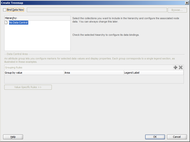
When you are designing your page using simple UI-first development, you use the Components window to add a treemap to a JSF page. When you drag and drop a treemap component onto the page, a Create Treemap dialog displays. Figure 30-27 shows the Create Treemap dialog.
If you click OK, the treemap is added to your page, and you can use the Properties window to specify data values and configure additional display attributes. Alternatively, you can choose to bind the data during creation and use the dialog to configure the associated node data.
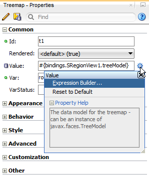
In the Properties window you can click the icon that appears when you hover over the property field to display a property description or edit options. Figure 30-28 shows the dropdown menu for a treemap value attribute.
Note:
If your application uses the Fusion technology stack, then you can use data controls to create a treemap and the binding will be done for you. For more information, see the "Creating Databound Hierarchy Viewer, Treemap, and Sunburst Components" section in Developing Fusion Web Applications with Oracle Application Development Framework.
It may be helpful to have an understanding of how treemap attributes and treemap child tags can affect functionality. For more information, see Section 30.2.2.1, "Configuring Treemaps."
You may also find it helpful to understand functionality that can be added using other ADF Faces features. For more information, see Section 30.1.3, "Additional Functionality for Treemap and Sunburst Components."
-
In the ADF Data Visualization page of the Components window, from the Common panel, drag and drop a Treemap onto the page to open the Create Treemap dialog.
-
In the Create Treemap dialog, click OK to add the treemap to the page.
Optionally, use the dialog to bind the treemap by selecting Bind Data Now and navigating to the ADF data control that represents the data you wish to display on the treemap. If you choose this option, the data binding fields in the dialog will be available for editing. For help with the dialog, press F1 or click Help.
-
In the Properties window, view the attributes for the treemap. Use the help button to display the complete tag documentation for the
treemapcomponent. -
Expand the Appearance section, and enter values for the following attributes:
-
Layout: Use the attribute's dropdown menu to change the default layout from
squarifiedtosliceAndDiceHorizontalorsliceAndDiceVertical.See Section 30.1.2.1, "Treemap and Sunburst Layouts" for sample images of treemap layouts.
-
Summary: Enter a summary of the treemap's purpose and structure for screen reader support.
-
30.2.2.3 What Happens When You Add a Treemap to a Page
JDeveloper generates only a minimal set of tags when you drag and drop a treemap from the Components window onto a JSF page and choose not to bind the data during creation. Example 30-1 shows the generated code.
Example 30-1 Treemap Sample Code in UI-First Development
<dvt:treemap id="t1">
  <dvt:treemapNode id="tn1"/>
</dvt:treemap>
If you choose to bind the data to a data control when creating the treemap, JDeveloper generates code based on the data model. For more information, see the "Creating Databound Hierarchy Viewer, Treemap, and Sunburst Components" section in Developing Fusion Web Applications with Oracle Application Development Framework.
30.2.3 Using the Sunburst Component
To use the sunburst component, add the sunburst to a page and complete the additional configuration in JDeveloper.
30.2.3.1 Configuring Sunbursts
The sunburst component has configurable attributes and child components that you can add or modify to customize the display or behavior of the treemap. The prefix dvt: occurs at the beginning of each treemap component name indicating that the component belongs to the ADF Data Visualization Tools (DVT) tag library.
You can configure sunburst child components, attributes, and supported facets in the following areas:
-
Sunburst (
dvt:sunburst): Wraps the sunburst nodes. Configure the following attributes to control the sunburst display.-
Labels: Use the
colorLabelandsizeLabelattributes to identify the color and size metrics for the sunburst. Sunbursts require these labels for legend display. -
Legend source (
legendSource): Use this attribute to display a legend for sunbursts configured with attribute groups. Specify the id of the attribute group. -
Display child levels (
displayLevelsChildren): Specify the number of child levels to display. By default, sunbursts display the root and the first two child levels. -
Animation: Use the
animationOnDisplayattribute to control the initial animation and theanimationOnDataChangeattribute to control subsequent animations. To change the animation duration from the default duration of 500 milliseconds, modify theanimationDurationattribute. -
Rotation (
rotation): Use this attribute to enable client-side sunburst rotation. -
Start angle (
startAngle): Specify the starting angle of the sunburst. -
Empty text (
emptyText): Use theemptyTextattribute to specify the text to display if a sunburst node contains no data. -
Sorting (
sorting): If your treemap uses a slice and dice layout, use this attribute to sort all nodes having the same parent in descending size. -
Other group: Use the
otherThreshold,otherColor, andotherPatternattributes to aggregate child data into an Other node.
-
-
Sunburst node (
dvt:sunburstNode): child of thesunburstcomponent. This tag defines the size and color for each node in the sunburst and is stamped for each row in the data model. If you want to vary the stamp by row, use the ADF Facesaf:switchercomponent, and insert a sunburst node for each row. Configure the following attributes to control the node display:-
value(required): Specify the value of the sunburst node. The value determines the relative size of the node within the sunburst. -
fillColor(required): Specify the fill color for the node in RGB hexadecimal. This value is also required for the sunburst to display properly. -
fillPattern: Specify an optional fill pattern to use. The pattern is drawn with a white background and the foreground color uses the color specified in thefillColorattribute. -
label: Specify the label for the node. -
labelDisplay: Specify how you want the node label to appear. By default, this attribute is set torotatedwhich will display the rotated labels inside the node, but you can also set it tooffto turn off the label display oronto display horizontal labels within the nodes.Note:
Rotated text is not supported on all client technologies. In particular, rotated text is not supported on clients using the Flash image format.
-
-
Attribute group (
dvt:attributeGroup): optional child of the sunburst node. Add this attribute to generatefillColorandfillPatternvalues automatically based on categorical bucketing or continuous classification of the data set. -
Supported facets: optional children of the sunburst or sunburst node. The
sunburstcomponent supports facets for displaying popup components, and the sunburst'snodecomponent supports a content facet for providing additional detail when the sunburst node's label is not sufficient.
Sunbursts also share much of the same functionality and tags as other DVT components. For a complete list of sunburst tags, consult the Tag Reference for Oracle ADF Faces Data Visualization Tools. For information about additional functionality for sunburst components, see Section 30.1.3, "Additional Functionality for Treemap and Sunburst Components."
30.2.3.2 How to Add a Sunburst to a Page
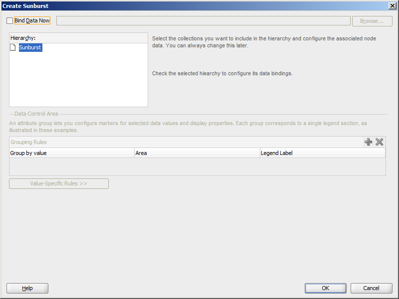
When you are designing your page using simple UI-first development, you use the Components window to add a sunburst to a JSF page. When you drag and drop a sunburst component onto the page, a Create Sunburst dialog displays. Figure 30-29 shows the Create Sunburst dialog.
If you click OK, the sunburst is added to your page, and you can use the Properties window to specify data values and configure additional display attributes. Alternatively, you can choose to bind the data during creation and use the dialog to configure the associated node data.
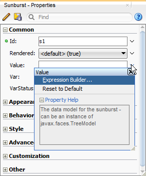
In the Properties window you can use the dropdown menu for each attribute field to display a property description and options such as displaying an EL Expression Builder or other specialized dialogs. Figure 30-30 shows the dropdown menu for a sunburst value attribute.
Note:
If your application uses the Fusion technology stack, then you can use data controls to create a sunburst and the binding will be done for you. For more information, see the "Creating Databound Hierarchy Viewer, Treemap, and Sunburst Components" section in Developing Fusion Web Applications with Oracle Application Development Framework.
It may be helpful to have an understanding of how sunburst attributes and sunburst child tags can affect functionality. For more information, see Section 30.2.2.1, "Configuring Treemaps."
You may also find it helpful to understand functionality that can be added using other ADF Faces features. For more information, see Section 30.1.3, "Additional Functionality for Treemap and Sunburst Components."
-
In the ADF Data Visualization page of the Components window, from the Common panel, drag and drop a Sunburst onto the page to open the Create Sunburst dialog.
-
In the Create Sunburst dialog, click OK to add the sunburst to the page.
Optionally, use the dialog to bind the sunburst by selecting Bind Data Now and navigating to the ADF data control that represents the data you wish to display on the sunburst. If you choose this option, the data binding fields in the dialog will be available for editing. For help with the dialog, press F1 or click Help.
-
In the Properties window, view the attributes for the sunburst. Use the help button to display the complete tag documentation for the
sunburstcomponent. -
Expand the Other section, and set a value for the following attributes:
-
Summary: Enter text to describe the sunburst's purpose and structure for screen reader support. Alternatively, choose Select Text Resource or Expression Builder from the attribute's dropdown menu to select a text resource or EL expression.
-
Rotation: Use the dropdown menu to specify whether or not rotation is enabled on the sunburst. By default, this rotation is set to
on, but you can also set it tooffto disable rotation. Alternatively, choose Expression Builder from the attribute's dropdown menu to create an EL expression that sets the rotation. -
StartAngle: Enter a value for the start angle of the sunburst. By default, the angle is set to
90, but you can enter any value between 0 and 360. Alternatively, choose Expression Builder from the attribute's dropdown menu to create an EL expression that sets the start angle.
-
30.2.3.3 What Happens When You Add a Sunburst to a Page
JDeveloper generates only a minimal set of tags when you drag and drop a sunburst from the Components window onto a JSF page and choose not to bind the data during creation. Example 30-2 shows the generated code.
Example 30-2 Sunburst Sample Code in UI-First Development
<dvt:sunburst id="s1">
  <dvt:sunburstNode id="sn1"/>
</dvt:sunburst>
If you choose to bind the data to a data control when creating the sunburst, JDeveloper generates code based on the data model. For more information, see the "Creating Databound Hierarchy Viewer, Treemap, and Sunburst Components" section in Developing Fusion Web Applications with Oracle Application Development Framework.
30.3 Adding Data to Treemap and Sunburst Components
To add data to the treemap or sunburst using UI-first development, create the classes, managed beans, and methods that will create the tree model and reference the classes, beans, or methods in JDeveloper.
You may also find it helpful to understand functionality that can be added using other ADF Faces features. For more information, see Section 30.1.3, "Additional Functionality for Treemap and Sunburst Components."
30.3.1 How to Add Data to Treemap or Sunburst Components
Because treemaps and sunbursts use the same data model, the process for adding data to the treemap or sunburst is similar.
It may be helpful to have an understanding of how treemap and sunburst attributes and child tags can affect functionality. For more information about configuring treemap attributes and child tags, see Section 30.2.2.1, "Configuring Treemaps." For information about configuring sunburst attributes and child tags, see Section 30.2.3.1, "Configuring Sunbursts."
You may also find it helpful to understand functionality that can be added using other ADF Faces features. For more information, see Section 30.1.3, "Additional Functionality for Treemap and Sunburst Components."
Add a treemap or sunburst to your page. For help with adding a treemap to a page, see Section 30.2.2.2, "How to Add a Treemap to a Page." For help with sunbursts, see Section 30.2.3.2, "How to Add a Sunburst to a Page."
To add data to the treemap or sunburst in UI-first development:
-
Create the classes and managed beans that will define the treemap's tree model and supply the data to the treemap. See Section 30.2.1, "Treemap and Sunburst Data Requirements" for additional information and examples. If you need help creating classes, see the "Working with Java Code" chapter of Developing Applications with Oracle JDeveloper. For help with managed beans, see Section 3.6, "Creating and Using Managed Beans."
-
In the Structure window, right-click the dvt:treemap or dvt:sunburst node and choose Go To Properties.
-
In the Properties window, in the Appearance section, enter a value for the DisplayLevelsChildren attribute to change the number of child levels displayed on the treemap. By default, this value is set to
2.For example, the treemap and sunburst in the census data example have three child levels to represent regions, divisions, and states, and you would set this value to
3to duplicate the example. -
In the Common section, set the following attributes:
-
Value: Specify an EL expression for the object to which you want the treemap or sunburst to be bound. This must be an instance of
org.apache.myfaces.trinidad.model.TreeModel.For example, reference the managed bean you created to instantiate the treemap or sunburst. In the census data example, the treemap managed bean is named
treemap, and the census data is instantiated when the treemap is referenced. To use the census data example with a treemap, enter the following in the Value field for the EL expression:#{treemap.censusData}.For help with creating EL expressions, see Section 3.5.1, "How to Create an EL Expression."
-
Var: Enter the name of a variable to be used during the rendering phase to reference each element in the treemap collection. This variable is removed or reverted back to its initial value once rendering is complete.
For example, enter
rowin the Var field to reference each element in the census data example.
-
VarStatus: Optionally, enter the name of a variable during the rendering phase to access contextual information about the state of the component, such as the collection model or loop counter information. This variable is removed or reverted back to its initial value once rendering is complete.
-
-
In the Structure window, right-click the dvt:treemapNode node or dvt:sunburstNode and choose Go To Properties.
-
In the Common section, use the Value attribute's dropdown menu to choose Expression Builder.
-
In the Expression Builder dialog, create the EL expression that will reference the size data for the treemap or sunburst node, using the variable you specified for the
Varattribute when creating your component and the method you created to return the size of the node.For example, in the census data example, the
Varattribute is namedrowand the size is stored in them_sizevariable which is returned by thegetSize()method in theTreeNodeclass shown in Example F-3, "Code Sample to Create a Treemap or Sunburst Tree Node". To reference the size data in the census data example, create the following expression:#{row.size}. -
In the Properties window, expand the Appearance section and enter values for the following attributes:
-
FillColor: Specify the fill color of the node. You can enter the color in RGB hexadecimal or use the attribute's dropdown menu to choose Expression Builder and create an EL expression.
For example, you could enter
#FF0000to set the node's fill color to red. However, you might want your treemap or sunburst node to change color based on the color metric. In the census data example in Figure 30-1, "Treemap Displaying United States Population and Median Income by Regions", the fill color is calculated from income data.Example 30-3 shows the sample method used by the census data example. To reference this example in the Expression Builder, create the following expression:
#{row.color}.Example 30-3 Sample Method to Set Treemap or Sunburst Node Fill Color
import java.awt.Color; private static Color getColor(double value, double min, double max) { double percent = Math.max((value - min) / max, 0); if(percent > 0.5) { double modifier = (percent - 0.5) * 2; return new Color((int)(modifier*102), (int)(modifier*153), (int)(modifier*51)); } else { double modifier = percent *2; return new Color((int)(modifier*204), (int)(modifier*51), 0); } } -
Label: Specify the node's label. You can enter text or use the attribute's dropdown menu to choose Expression Builder and create an EL expression.
For example, the census data example uses a method that converts the node data into strings for label display. See Example F-5, "Managed Bean Example to Set Census Data Treemap" for the
convertToString() method. TheTreeNodeclass uses the output from theconvertToString()method to set thetextvariable which is used for the label display. To reference this example in the Expression Builder dialog, create the following expression:#{row.text}.
-
Note:
You can also use attribute groups to set the fillColor and label attribute. Attribute groups are optional, but you must use them if you want your treemap or sunburst to change color or pattern based on a given condition, such as high versus low income. For information about configuring attribute groups, see Section 30.4.3.1, "How to Configure Treemap and Sunburst Discrete Attribute Groups."
30.3.2 What You May Need to Know about Adding Data to Treemaps and Sunbursts
The examples in this chapter use classes and managed beans to provide the data to the treemap and sunburst. If your application uses the Fusion technology stack, then you can use data controls to create a sunburst and the binding will be done for you. For more information, see the "Creating Databound Hierarchy Viewer, Treemap, and Sunburst Components" section in Developing Fusion Web Applications with Oracle Application Development Framework.
Alternatively, if you know the UI components on your page will eventually use ADF data binding, but you need to develop the pages before the data controls are ready, then you should consider using placeholder data controls, rather than manually binding the components. Using placeholder data controls will provide the same declarative development experience as using developed data controls. For more information, see the "Designing a Page Using Placeholder Data Controls" section in Developing Fusion Web Applications with Oracle Application Development Framework.
30.4 Customizing Treemap and Sunburst Display Elements
You can configure treemap and sunburst display elements, including patterns, attribute groups, legends, labels, animation, aggregation of smaller data contributors, skinning, sizing, and ordering of the nodes by size.
30.4.1 Configuring Treemap and Sunburst Display Size and Style
You can configure the treemap or sunburst's size and style using the inlineStyle or styleClass attributes. Both attributes are available in the Style section in the Properties window for the dvt:treemap or dvt:sunburst component. Using these attributes, you can customize stylistic features such as fonts, borders, and background elements.
Treemaps and sunbursts also support skinning to customize the color and font styles for the top level components as well as the nodes, node headers, and icons used for treemap isolation and sunburst expansion and collapse. You can also use skinning to define the styles for a treemap or sunburst node or a treemap node header when the user hovers the mouse over or selects a node or node header. If the node or node header is drillable, you can use skinning to define the styles when the user hovers the mouse over or selects it.
Example 30-4 shows the skinning key for a sunburst configured to show the node's text in bold when the user selects it.
Example 30-4 Using a Skinning Key to Change Font Weight When Node is Selected
af|dvt-sunburstNode::selected
  {
    -tr-font-weight: bold;
  }
For the complete list of treemap and sunburst skinning keys, see the Oracle Fusion Middleware Data Visualization Tools Tag Reference for Oracle ADF Faces Skin Selectors. For additional information about customizing your application using skinning and styles, see Chapter 31, "Customizing the Appearance Using Styles and Skins."
The page containing the treemap or sunburst may also impose limitations on the ability to change the size or style. For more information about page layouts, see Chapter 9, "Organizing Content on Web Pages."
30.4.2 Configuring Pattern Display
You can configure the treemap or sunburst node to display patterns. The available patterns are:
-
none(default) -
smallChecker -
smallCrosshatch -
smallDiagonalLeft -
smallDiagonalRight -
smallDiamond -
smallTriangle -
largeChecker -
largeCrosshatch -
largeDiagonalLeft -
largeDiagonalRight -
largeDiamond -
largeTriangle
To configure the treemap or sunburst node to display patterns, specify the fillPattern attribute on the dvt:treemapNode or dvt:sunburstNode node. You can also use discrete attribute groups to specify the fill pattern. For more information about discrete attribute groups, see Section 30.4.3.1, "How to Configure Treemap and Sunburst Discrete Attribute Groups."
30.4.3 Configuring Treemap and Sunburst Attribute Groups
Use attribute groups to generate stylistic attribute values such as colors or shapes based on categorical bucketing of a data set. Treemaps and sunbursts support both discrete and continuous attribute groups for setting the color and pattern of the child nodes.
Use a discrete attribute group if you want the color or pattern to depend upon a given condition, such as high or low income levels. Use the continuous attribute group if you want the color to change gradually between low and high values.
30.4.3.1 How to Configure Treemap and Sunburst Discrete Attribute Groups
Configure discrete attribute groups by adding the dvt:attributeGroups tag to your treemap or sunburst and defining the conditions under which the color or pattern will be displayed.
It may be helpful to have an understanding of how treemap and sunburst attributes and child tags can affect functionality. For more information about configuring treemap attributes and child tags, see Section 30.2.2.1, "Configuring Treemaps." For information about configuring sunburst attributes and child tags, see Section 30.2.3.1, "Configuring Sunbursts."
You may also find it helpful to understand functionality that can be added using other ADF Faces features. For more information, see Section 30.1.3, "Additional Functionality for Treemap and Sunburst Components."
You will need to complete these tasks:
-
Add a treemap or sunburst to your page. For more information, see Section 30.2.2.2, "How to Add a Treemap to a Page" or Section 30.2.3.2, "How to Add a Sunburst to a Page."
-
If you did not bind the treemap or sunburst to a data control when you added the component to the page, add data to the treemap or sunburst. For information about adding data to treemaps or sunbursts using UI-first development, see Section 30.3, "Adding Data to Treemap and Sunburst Components."
To configure a treemap or sunburst discrete attribute group:
-
In the Structure window, right-click the dvt:treemapNode or dvt:sunburstNode node and choose Insert Inside Component Node > Attribute Groups.
For example, to configure a treemap discrete attribute group, right-click the dvt:treemapNode node and choose Insert Inside Treemap Node > Attribute Groups.
Right-click the dvt:attributeGroups element and choose Go to Properties.
-
In the Properties window, expand the Appearance section.
-
From the Value attribute's dropdown menu, choose Expression Builder and create an expression that references the color metric and the condition that will control the color display.
For example, if you want your treemap to display different colors for median income levels higher or lower than $50,000 as shown in Figure 30-5, create an expression similar to the following expression for the Value field:
#{row.income > 50000}For help with creating EL expressions, see Section 3.5.1, "How to Create an EL Expression."
-
From the Label attribute's dropdown menu, choose Expression Builder and create an expression for the legend that describes what the discrete colors or patterns represent.
For example, to let the user know that the colors represent high and low median income levels, create an expression similar to the following expression for the Label field:
#{row.income > 50000 ? 'High Income' : 'Low Income'} -
From the Type attribute's dropdown menu, choose Edit.
-
From the Edit Property dialog, choose color, pattern, or both, and click OK.
If you choose both color and pattern and build the page now, the treemap or sunburst will use default colors and patterns for the discrete attribute group.
Figure 30-31 shows the treemap that displays if you accept the default colors and patterns in the census data example.
-
Optionally, to change the attribute group's default colors, do the following:
In the Structure window, right-click the dvt:attributeGroups element and choose Insert Inside Attribute Groups > Attribute Match Rule.
The
dvt:attributeMatchRuletag is used to replace an attribute when the data matches a given condition. In the census data example, the condition is median income higher than $50,000.-
Right-click the dvt:attributeMatchRule element and choose Go to Properties.
-
In the Group field, enter
trueif you want the color to display when the condition is true, or enterfalseif you want the color to display when the condition is false.For example, enter
trueto choose the color to display in the census data example when the median income level is higher than 50000. -
In the Structure window, right-click the dvt:attributeMatchRule element and choose Insert Inside Match Rule > Attribute.
In the Insert Attribute dialog, enter
colorfor the name field and a color in the value field, and click OK.The value field accepts a six-digit RGB hexadecimal value. For example, to set the value to green, enter the following in the value field:
#00AA00.-
Repeat step 1 through step 5 if you want to change the default color for the other half of the condition.
For example, add another match rule to define the color that displays when the income is under 50000, and set the Group field to
false.
-
Optionally, to change the attribute group's default patterns, do the following:
In the Structure window, right-click the dvt:attributeGroups element and choose Insert Inside Attribute Groups > Attribute Match Rule.
-
Right-click the dvt:attributeMatchRule element and choose Go to Properties.
-
In the Group field, enter
trueif you want the pattern to display when the condition is true, or enterfalseif you want the pattern to display when the condition is false. -
In the Structure window, right-click the dvt:attributeMatchRule element and choose Insert Inside Attribute Match Rule > Attribute.
In the Insert Attribute dialog, enter
patternfor the Name field and a supported pattern in the Value field, and click OK.For example, enter
smallDiamondin the Value field to change the pattern to small diamonds. For the list of available patterns, see Section 30.4.2, "Configuring Pattern Display."-
Repeat step 1 through step 5 if you want to change the default color for the other half of the condition.
For example, add another match rule to define the color that displays when the income is under 50000, and set the Group field to
false.
Example 30-5 shows the code on the JSF page if you configure a discrete attribute group for the treemap shown in Figure 30-5, "Treemap Displaying Discrete Attribute Groups".
Example 30-5 Sample Code on JSF Page for Discrete Attribute Group
<dvt:treemap id="t1" summary="SampleTreemap" value="#{treemap.censusData}"
             var="row" colorLabel="Median Household Income" sizeLabel="Population"
             displayLevelsChildren="3" emptyText="No Data to Display"
             legendSource="ag1">
  <dvt:treemapNode id="tn1" value="#{row.size}" label="#{row.text}">
    <dvt:attributeGroups id="ag1" value="#{row.income > 50000}"
                         label="#{row.income > 50000 ? 'High Income' : 'Low Income'}"
                         type="color">
      <dvt:attributeMatchRule id="amr1" group="true">
        <f:attribute name="color" value="#00AA00"/>
      </dvt:attributeMatchRule>
      <dvt:attributeMatchRule id="amr2" group="false">
        <f:attribute name="color" value="#AA0000"/>
      </dvt:attributeMatchRule>
    </dvt:attributeGroups>
    <f:facet name="content"/>
  </dvt:treemapNode>
</dvt:treemap>
30.4.3.2 How to Configure Treemap or Sunburst Continuous Attribute Groups
Configure continuous attribute groups by adding the dvt:attributeGroups tag to your treemap or sunburst and defining the colors to be displayed at the minimum and maximum levels of the data range. The attribute group will use the data to determine the data range and display labels in the legend with corresponding values, but you can also configure the attribute group to use different ranges or labels.
It may be helpful to have an understanding of how treemap and sunburst attributes and child tags can affect functionality. For more information about configuring treemap attributes and child tags, see Section 30.2.2.1, "Configuring Treemaps." For information about configuring sunburst attributes and child tags, see Section 30.2.3.1, "Configuring Sunbursts."
You may also find it helpful to understand functionality that can be added using other ADF Faces features. For more information, see Section 30.1.3, "Additional Functionality for Treemap and Sunburst Components."
You will need to complete these tasks:
-
Add a treemap or sunburst to your page. For more information, see Section 30.2.2.2, "How to Add a Treemap to a Page" or Section 30.2.3.2, "How to Add a Sunburst to a Page."
-
If you did not bind the treemap or sunburst to a data control when you added the component to the page, add data to the treemap or sunburst. For information about adding data to treemaps or sunbursts using UI-first development, see Section 30.3, "Adding Data to Treemap and Sunburst Components."
To configure a treemap or sunburst continuous attribute group:
-
In the Structure window, right-click the dvt:treemapNode or dvt:sunburstNode node and choose Insert Inside Component Node > Attribute Groups.
For example, to configure a treemap continuous attribute group, right-click the dvt:treemapNode node and choose Insert Inside Treemap Node > Attribute Groups.
-
Right-click the dvt:attributeGroups element and choose Go to Properties.
-
In the Properties window, expand the Appearance section.
-
From the Value attribute's dropdown menu, choose Expression Builder and enter an expression that references the color metric.
For example, to specify an EL expression that returns the income data from the census example, choose Expression Builder and enter the following value in the Value field:
#{row.income}. For help with creating EL expressions, see Section 3.5.1, "How to Create an EL Expression." -
In the Type field, enter
color. -
In the AttributeType field, use the attribute's dropdown menu to choose
continuous. -
Optionally, set values for the following minimum or maximum range and labels:
-
MinValue: Enter the minimum boundary for the range. Alternatively, choose Expression Builder from the attribute's dropdown menu and enter the expression that returns the minimum boundary.
For example, enter 35000 in the MinValue field to set the lower boundary of the range to 35,000.
-
MaxValue: Enter the maximum boundary for the range. Alternatively, choose Expression Builder from the attribute's dropdown menu and enter the expression that returns the maximum bound.
-
MinLabel: Enter the label for the minimum value to be displayed in the legend. Alternatively, choose Select Text Resource or Expression Builder from the attribute's dropdown menu to select a text resource or EL expression.
For example, enter
$35000in the MinLabel field to set the label displayed in the legend to $35000. -
MaxLabel: Enter the label for the maximum value to be displayed in the legend. Alternatively, choose Select Text Resource or Expression Builder from the attribute's dropdown menu to select a text resource or EL expression.
-
-
To define the colors used for the minimum and maximum bounds of the range, do the following:
-
In the Structure window, right-click the dvt:attributeGroups element and choose Insert Inside Attribute Groups > Attribute.
-
In the Insert Attribute dialog, enter
color1for the name and a value for the minimum boundary, and click OK.The value field accepts a six-digit RGB hexadecimal value. For example, to set the value of the minimum bound to black, which is the color used in the attribute group in Figure 30-1, enter the following in the value field:
#000000. -
In the Structure window, right-click the dvt:attributeGroups element and choose Insert Inside Attribute Groups > Attribute.
-
In the Insert Attribute dialog, enter
color2for the name and a value for the maximum boundary, and click OK.The value field accepts a six-digit RGB hexadecimal value. For example, to set the value of the maximum bound to a light green, which is the color used in the attribute group in Figure 30-1, enter the following in the value field:
#00AA00.
-
Example 30-0 shows the code on the JSF page if you configure the continuous attribute group shown in Figure 30-1.
Example 30-6 Sample Code on JSF Page for Continuous Attribute Group
<dvt:treemap id="t1" summary="SampleTreemap" value="#{treemap.censusData}"
             var="row" colorLabel="Median Household Income" sizeLabel="Population"
             displayLevelsChildren="3" emptyText="No Data to Display"
             legendSource="ag1">
  <dvt:treemapNode id="tn1" value="#{row.size}" label="#{row.text}">
    <dvt:attributeGroups id="ag1" value="#{row.income}" type="color"
                         attributeType="continuous" minValue="35000"
                         maxValue="70000" minLabel="$35000" maxLabel="$70000">
      <f:attribute name="color1" value="#000000"/>
      <f:attribute name="color2" value="#00AA00"/>
    </dvt:attributeGroups>
    <f:facet name="content"/>
  </dvt:treemapNode>
</dvt:treemap>
30.4.3.3 What You May Need to Know About Configuring Attribute Groups
If you use the Other node to aggregate nodes for display, the Other node will not use the color or pattern of the configured attribute group. For more information, see Section 30.4.5.2, "What You May Need to Know About Configuring the Treemap and Sunburst Other Node."
30.4.4 How to Configure Treemap and Sunburst Legends
Legends display automatically when you specify values for the following attributes:
-
sizeLabel: Specify the text that describes the size metric of the component. Alternatively, choose Select Text Resource or Expression Builder from the attribute's dropdown menu to select a text resource or EL expression. -
colorLabel: Specify the text that describes the color metric of the component. Alternatively, choose Select Text Resource or Expression Builder from the attribute's dropdown menu to select a text resource or EL expression. -
legendSource: Optionally, specify the id of the attribute group used in the treemap or sunburst display.If your treemap or sunburst does not use attribute groups, the legend display will be limited to the text descriptions that you specified for the size and color labels.
It may be helpful to have an understanding of how treemap and sunburst attributes and child tags can affect functionality. For more information about configuring treemap attributes and child tags, see Section 30.2.2.1, "Configuring Treemaps." For information about configuring sunburst attributes and child tags, see Section 30.2.3.1, "Configuring Sunbursts."
You may also find it helpful to understand functionality that can be added using other ADF Faces features. For more information, see Section 30.1.3, "Additional Functionality for Treemap and Sunburst Components."
You will need to complete these tasks:
-
Add a treemap or sunburst to your page. For more information, see Section 30.2.2.2, "How to Add a Treemap to a Page" or Section 30.2.3.2, "How to Add a Sunburst to a Page."
-
If you did not bind the treemap or sunburst to a data control when you added the component to the page, add data to the treemap or sunburst. For information about adding data to treemaps or sunbursts using UI-first development, see Section 30.3, "Adding Data to Treemap and Sunburst Components."
To configure a treemap or sunburst legend:
-
In the Structure window, right-click the dvt:treemap or dvt:sunburst node and choose Go to Properties.
-
In the Properties window, expand the Appearance section.
-
In the SizeLabel field, enter the text that the legend will display to describe the size metric.
For example, enter
Populationin the SizeLabel field to indicate that the size of the nodes in the treemap or sunburst is based on population.You can also use the dropdown menu to choose a text resource or EL expression from the Expression Builder dialog. For example, to specify an EL expression that returns the size from the census data example, choose Expression Builder and enter the following value in the SizeLabel field:
#{row.size}. For help with creating EL expressions, see Section 3.5.1, "How to Create an EL Expression." -
In the ColorLabel field, enter the text that the legend will display to describe the color metric.
For example, enter
Median Household Incomein the ColorLabel field to indicate that the size of the nodes in the treemap or sunburst is based on population.Alternatively, use the dropdown menu to enter a text resource or select an expression from the Expression Builder. For example, to specify an EL expression that returns the color from the census data example, choose Expression Builder and enter the following value in the ColorLabel field:
#{color.size}. -
If your treemap or sunburst uses attribute groups, reference the id of the
attributeGroupscomponent as follows:-
From the LegendSource property's dropdown menu, choose Edit.
-
In the Edit Property: LegendSource dialog, expand each component and locate the
attributeGroupscomponent. -
Select the
attributeGroupscomponent and click OK.
-
30.4.5 Configuring the Treemap and Sunburst Other Node
Use the Other node to aggregate smaller data sets visually into one larger set for easier comparison.
30.4.5.1 How to Configure the Treemap and Sunburst Other Node
Configure the treemap Other node by setting values for the following attributes:
-
OtherThreshold: Specify the percentage of the parent under which a node would be aggregated into the Other node. Valid values range from 0 (default) to 1.
For example, a value of
0.1would cause all nodes which are less than 10% of their parent to be aggregated into the Other node. In Figure 30-16, the otherThreshold is set to.08or eight percent which aggregated the South Carolina, Delaware, West Virginia, and District of Columbia nodes in the South Atlantic region.If you increase the value to
.1or 10%, the Maryland node is added to the aggregation. Figure 30-32 shows the same treemap with the otherThreshold attribute set to.1. -
OtherColor: Specify a reference to a method that takes the
RowKeySetof all nodes contained within the current Other node and returns aStringfor the color of the Other node.For example, the census data example uses a method to calculate the mean income of all the nodes contained within the Other node. If the mean household income is less than 50,000, the method returns the same color value used to display low income as the non-aggregated nodes in the treemap. Notice how the color changed on the Other node in Figure 30-32 to reflect the higher mean income when the Maryland node is included in the Other node.
Example 30-7 shows the sample method to specify the
otherColorvalue based on the mean income in the census data example.Example 30-7 Sample Method to Set Treemap otherColor Value
import org.apache.myfaces.trinidad.model.RowKeySet; import org.apache.myfaces.trinidad.model.TreeModel; public String otherColor(RowKeySet set) { // The color should be the mean income of the contained regions. Note that it should actually // be the median, but we can't calculate that with the available information. TreeModel tree = getCensusRootData(); // Loop through and get the population + average income double population = 0; double average = 0; for(Object rowKey : set) { CensusData.CensusTreeNode item = (CensusData.CensusTreeNode) tree.getRowData(rowKey); population += item.getSize().doubleValue(); average += item.getSize().doubleValue() * item.getIncome(); } // Calculate the average average = average / population; // Match the attr groups used by the demos return average > 50000 ? "#CC3300" : "#003366"; } -
OtherPattern: Optionally, specify a reference to a method that takes the
RowKeySetof all nodes contained within the current Other node and returns aStringfor the pattern of the Other node.Example 30-8 shows the sample code for a method that sets the pattern fill to
smallDiamondon the Other node.
It may be helpful to have an understanding of how treemap and sunburst attributes and child tags can affect functionality. For more information about configuring treemap attributes and child tags, see Section 30.2.2.1, "Configuring Treemaps." For information about configuring sunburst attributes and child tags, see Section 30.2.3.1, "Configuring Sunbursts."
You may also find it helpful to understand functionality that can be added using other ADF Faces features. For more information, see Section 30.1.3, "Additional Functionality for Treemap and Sunburst Components."
You will need to complete these tasks:
-
Add a treemap or sunburst to your page. For more information, see Section 30.2.2.2, "How to Add a Treemap to a Page" or Section 30.2.3.2, "How to Add a Sunburst to a Page."
-
If you did not bind the treemap or sunburst to a data control when you added the component to the page, add data to the treemap or sunburst. For information about adding data to treemaps or sunbursts using UI-first development, see Section 30.3, "Adding Data to Treemap and Sunburst Components."
-
Create the method that takes the
RowKeySetof all nodes contained within the current Other node and returns aStringfor the color of the Other node.To use the United States census data example, add the sample method in Example 30-7 to a managed bean.
If you need help with managed beans, see Section 3.6, "Creating and Using Managed Beans."
-
Optionally, create the method that takes the
RowKeySetof all nodes contained within the current Other node and returns aStringfor the pattern of the Other node.To use the United States census data example, add the sample method in Example 30-8 to a managed bean.
To add the otherColor node to a treemap or sunburst:
-
In the Structure window, right-click the dvt:treemap or dvt:sunburst node and choose Go to Properties.
-
In the Properties window, expand the Other section and enter a value for the following attributes:
-
OtherThreshold: Enter the percentage of nodes to be aggregated as a value between 0 and 1.
-
OtherColor: Choose Edit from the dropdown menu and select the managed bean and method that sets the
otherColorattribute.For example, for a managed bean named
treemapand a method namedotherColor, enter the following in the OtherColor field:#{treemap.otherColor}. -
OtherPattern: Choose Edit from the dropdown and select the managed bean and method that sets the
otherPatternattribute.For example, for a managed bean named
treemapand a method namedotherPattern, enter the following in the OtherPattern field:#{treemap.otherPattern}.
-
30.4.5.2 What You May Need to Know About Configuring the Treemap and Sunburst Other Node
Because the Other node is an aggregation of individual nodes, its behavior will be different than other treemap and sunburst child nodes when managing children, attribute groups, selection, tooltips, and popup support. Specifically, you should be aware of the following differences:
-
Child nodes: Children of the aggregated nodes are not displayed.
-
Othernode display with attribute groups: If you use attribute groups to specify a color or pattern, that color or pattern will not be displayed on the Other node. If you want the Other node to display the same color or pattern as the attribute group, you must create methods in a managed bean to return a color or pattern that makes sense. -
Selection behavior: Other nodes are not selectable if you change node selection support from the default value of multiple selection to single node selection.
-
Tooltips: Tooltips display the number of nodes within the Other node and are not customizable.
-
Popups: By default, popups will not display on the Other node.
When a user invokes a popup on a node, that node is made current on the component (and its model), allowing the application to determine context. Treemaps and sunbursts use the
af:showPopupBehaviortag to determine context, but this tag does not support making multiple nodes current. If you want your treemap or sunburst to display a popup on the Other node, you must create a method in a managed bean that calls thegetPopupContext()method on theUITreemaporUISunburstcomponent to determine the context of the aggregated nodes.
30.4.6 Configuring Treemap and Sunburst Sorting
Sorting is enabled by default if your treemap or sunburst uses the Other node. Otherwise you must enable it by setting the dvt:treemap or dvt:sunburst sorting attribute to on in the Properties window.
Treemaps support sorting in the slice and dice layouts only.
30.4.7 Configuring Treemap and Sunburst Advanced Node Content
Configure advanced node content by defining a content facet on the treemap or sunburst node.
Both treemaps and sunbursts support the following Oracle Application Development Framework tags:
-
af:image -
af:outputText -
af:panelGroupLayout -
af:spacer
Only a single child is supported for layout reasons, and you must use af:panelGroupLayout to wrap multiple child components. Interactive behaviors are also not supported for components within this facet.
30.4.7.1 How to Add Advanced Node Content to a Treemap
Configure advanced node content on a treemap by defining the content facet on the dvt:treemapNode node.
It may be helpful to have an understanding of how treemap attributes and child tags can affect functionality. For more information about configuring treemap attributes and child tags, see Section 30.2.2.1, "Configuring Treemaps."
You may also find it helpful to understand functionality that can be added using other ADF Faces features. For more information, see Section 30.1.3, "Additional Functionality for Treemap and Sunburst Components."
Add a treemap to your page. For more information, see Section 30.2.2.2, "How to Add a Treemap to a Page."
To add advanced node content to a treemap:
-
In the Structure window, expand the dvt:treemapNode.
-
To configure the facet, in the Structure window, right-click the f:facet - content node and choose to Insert Inside f:facet - content one of the following:
-
Image
-
Output Text
-
Panel Group Layout
-
Spacer
To insert more than one component, choose the Panel Group Layout and add the image, output text, or spacers as required by your application. For help with configuring panel group layouts, see Section 9.13.1, "How to Use the panelGroupLayout Component."
For help with configuring images and output text, see Chapter 18, "Using Output Components."
-
30.4.7.2 How to Add Advanced Root Node Content to a Sunburst:
Configure advanced node content on a treemap by defining the rootContent facet on the dvt:sunburstNode node.
It may be helpful to have an understanding of sunburst attributes and child tags can affect functionality. For information about configuring sunburst attributes and child tags, see Section 30.2.3.1, "Configuring Sunbursts."
You may also find it helpful to understand functionality that can be added using other ADF Faces features. For more information, see Section 30.1.3, "Additional Functionality for Treemap and Sunburst Components."
Add a sunburst to your page. For more information, see Section 30.2.3.2, "How to Add a Sunburst to a Page."
To add advanced root node content to a sunburst:
-
In the Structure window, expand the dvt:sunburst node.
-
To configure the facet, in the Structure window, right-click the f:facet - content node and choose to Insert Inside f:facet - rootContent one of the following:
-
Image
-
Output Text
-
Panel Group Layout
-
Spacer
To insert more than one component, choose the Panel Group Layout and add the image, output text, or spacers as required by your application. For help with configuring panel group layouts, see Section 9.13.1, "How to Use the panelGroupLayout Component."
For help with configuring images and output text, see Chapter 18, "Using Output Components."
-
30.4.7.3 What You May Need to Know About Configuring Advanced Node Content on Treemaps
Treemaps are meant to display two dimensions of data using size and color. Node content should be used to identify the treemap node, such as with labels or images, and should not be relied upon to display many additional dimensions of data. Applications should consider using popups for additional content since they will not have aspect ratio or small size issues like treemap nodes.
30.4.8 How to Configure Animation in Treemaps and Sunbursts
Treemaps and sunbursts support multiple types of animations. By default, no animation is displayed, but you can add animation to the treemap or sunburst when it initially displays. You can also customize the animation effects when a data change occurs on the component.
It may be helpful to have an understanding of how treemap and sunburst attributes and child tags can affect functionality. For more information about configuring treemap attributes and child tags, see Section 30.2.2.1, "Configuring Treemaps." For information about configuring sunburst attributes and child tags, see Section 30.2.3.1, "Configuring Sunbursts."
You may also find it helpful to understand functionality that can be added using other ADF Faces features. For more information, see Section 30.1.3, "Additional Functionality for Treemap and Sunburst Components."
Add a treemap or sunburst to your page. For more information, see Section 30.2.2.2, "How to Add a Treemap to a Page" or Section 30.2.3.2, "How to Add a Sunburst to a Page."
To add animation effects to a treemap or sunburst:
-
In the Structure window, right-click the dvt:treemap or dvt:sunburst node and choose Go to Properties.
-
In the Properties window, expand the Appearance section and set a value for the following attributes:
-
AnimationDuration: Specify the duration of the animation in milliseconds. The default value is
500. For data changes, the animation occurs in stages, and the default value is500for each stage of the animation. -
AnimationDisplay: Use the dropdown menu to specify the type of animation to apply when the component is initially rendered. By default, this is set to
none. -
AnimationOnDataChange: Use the dropdown menu to specify the type of animation to apply when data is changed in the treemap or sunburst. By default, this is set to
activeDatafor Active Data Service data change events.For treemap and sunburst, the
autotype is recommended because it will apply animation for both Partial Page Refresh and Active Data Service Events.
-
Table 30-1 shows the list of supported animation effects.
Table 30-1 Treemap and Sunburst Animation Effects
| Animation Effect | AnimationOnDisplay | AnimationOnDataChange |
|---|---|---|
|
|
x |
x |
|
|
x |
|
|
|
x |
x |
|
|
x |
|
|
|
x (treemap only) |
|
|
|
x (treemap only) |
|
|
|
x (sunburst only) |
|
|
|
x (sunburst only) |
|
|
|
x (sunburst only) |
|
|
|
x |
|
|
|
x |
|
|
|
x |
|
|
|
x |
|
|
|
x |
x |
30.4.9 Configuring Labels in Treemaps and Sunbursts
Treemaps and sunbursts support customization of label display for the following elements:
-
colorLabelandsizeLabel: These labels are used in the legend display. For additional information about configuring these labels, see Section 30.4.4, "How to Configure Treemap and Sunburst Legends." -
treemapNodeHeader: The title displayed in treemap node headers is configurable. For additional information about customizing the treemap node header title, see Section 30.4.10, "Configuring Treemap Node Headers and Group Gap Display." -
node labels: You can configure the size, style, and display of node labels on both treemaps and sunbursts. The options for configuration are slightly different between the components, due to the differences in layouts.
30.4.9.1 How to Configure Treemap Leaf Node Labels
Configure treemap node labels by setting label attributes on the treemap node.
It may be helpful to have an understanding of how treemap attributes and child tags can affect functionality. For more information about configuring treemap attributes and child tags, see Section 30.2.2.1, "Configuring Treemaps."
You may also find it helpful to understand functionality that can be added using other ADF Faces features. For more information, see Section 30.1.3, "Additional Functionality for Treemap and Sunburst Components."
Add a treemap to your page. For more information, see Section 30.2.2.2, "How to Add a Treemap to a Page."
To configure treemap leaf node labels:
-
In the Structure window, right-click the dvt:treemapNode node and choose Go to Properties.
-
In the Properties window, expand the Appearance section and set a value for the following attributes:
-
LabelDisplay: Use the dropdown menu to specify whether or not labels are displayed on the leaf nodes. The default is
nodewhich displays the label inside the leaf node. To turn off the label display, chooseoff. -
LabelHalign: Use the dropdown menu to specify the horizontal alignment for labels displayed within the node. The default value is
center. To align the title to the left in left-to-right mode and to the right in right-to-left more, set this value tostart.You can also set this toendwhich aligns the title to the right in left-to-right mode and to the left in right-to-left mode. -
LabelValign: Use the dropdown menu to specify the vertical alignment for labels displayed within the node. The default value is
center. You can change this totoporbottom. -
LabelStyle: Specify the font style for the label displayed in the header. This attribute accepts CSS style attributes such as
font-sizeorcolor.For example, to change the size of the title to 14 pixels and the color to white, enter the following value for LabelStyle:
font-size:14px;color: #FFFFFF
For the complete list of CSS attributes, visit the World Wide Web Consortium's web site at:
-
GroupLabelDisplay: Use the dropdown menu to specify the label display behavior for group nodes. The default value is
headerwhich will display the group node label in the node header. You can also set this tooffor tonodewhich will display the label inside the node.
-
30.4.9.2 How to Configure Sunburst Node Labels
Configure sunburst node labels by setting label attributes on the sunburst node.
It may be helpful to have an understanding of how treemap and sunburst attributes and child tags can affect functionality. For more information about configuring treemap attributes and child tags, see Section 30.2.2.1, "Configuring Treemaps." For information about configuring sunburst attributes and child tags, see Section 30.2.3.1, "Configuring Sunbursts."
You may also find it helpful to understand functionality that can be added using other ADF Faces features. For more information, see Section 30.1.3, "Additional Functionality for Treemap and Sunburst Components."
Add a sunburst to your page. For more information, see Section 30.2.3.2, "How to Add a Sunburst to a Page."
To configure sunburst node labels:
-
In the Structure window, right-click the dvt:sunburstNode node and choose Go to Properties.
-
In the Properties window, expand the Appearance section and set a value for the following attributes:
-
LabelStyle: Specify the font style for the label displayed in the header. This attribute accepts CSS style attributes such as
font-sizeorcolor.For example, to change the size of the title to 14 pixels and the color to white, enter the following value for LabelStyle:
font-size:14px;color: #FFFFFF
For the complete list of CSS attributes, visit the World Wide Web Consortium's web site at:
-
LabelDisplay: Use the dropdown menu to specify the label display for the nodes. The default value is rotated which displays rotated labels within the nodes if the client's environment supports rotated text. You can also set this to
offto turn off the label display or toonwhich will display horizontal labels within the nodes.Note:
If the
labelDisplayattribute is set torotatedand the client's environment does not support rotated text, the sunburst will display horizontal labels within the nodes.
-
30.4.10 Configuring Treemap Node Headers and Group Gap Display
Treemap node headers are displayed by default whenever there are two or more child levels in the treemap. Configure the node header if you wish to change the default display.
Group gaps are displayed between the outer group nodes by default. Configure group gaps if you wish to change the way group gaps are displayed between the nodes.
30.4.10.1 How to Configure Treemap Node Headers
Configure treemap node headers by adding the dvt:treemapNodeHeader element to your treemap node and setting values for the following attributes:
-
labelStyle: Specify the font style for the label displayed in the header. This attribute accepts CSS style attributes such asfont-sizeorcolor.For the complete list of CSS attributes, visit the World Wide Web Consortium's web site at:
-
titleHalign: Specify the horizontal alignment of the header's title. By default, this attribute is set tostartwhich aligns the title to the left in left-to-right mode and to the right in right-to-left mode. You can set this tocenterwhich aligns the title to the center or toendwhich aligns the title to the right in left-to-right mode and to the left in right-to-left mode. -
useNodeColor: Set this toonto have the header use the node color of the parent node.
It may be helpful to have an understanding of how treemap attributes and child tags can affect functionality. For more information about configuring treemap attributes and child tags, see Section 30.2.2.1, "Configuring Treemaps."
You may also find it helpful to understand functionality that can be added using other ADF Faces features. For more information, see Section 30.1.3, "Additional Functionality for Treemap and Sunburst Components."
You will need to complete these tasks:
-
Add a treemap to your page. For more information, see Section 30.2.2.2, "How to Add a Treemap to a Page."
-
If you did not bind the treemap to a data control when you added the component to the page, add data to the treemap. For information about adding data to treemaps or sunbursts using UI-first development, see Section 30.3, "Adding Data to Treemap and Sunburst Components."
To configure a treemap node header:
-
In the Structure window, right-click the dvt:treemapNode node and choose Insert Inside Treemap Node > Treemap Node Header.
-
Right-click the dvt:treemapNodeHeader node and choose Go to Properties.
-
In the Properties window, enter a value for the following attributes:
-
LabelStyle: Enter the style for the node header title.
For example, to change the size of the title to 14 pixels and the color to white, enter the following value for LabelStyle:
font-size:14px;color: #FFFFFF
-
TitleHalign: Use the attribute's dropdown menu to change the default alignment to
centerorend. By default, this attribute is set tostartwhich aligns the title to the left in left-to-right mode or to the right in right-to-left mode. -
UseNodeColor: Use the attribute's dropdown menu to change the default to
on.
-
30.4.10.2 What You May Need to Know About Treemap Node Headers
When you choose to use the node color in the header, the node color used is the color that would have been displayed in the treemap if that node was the bottom level of the treemap.
If your treemap is using the same color scheme across all hierarchical levels, then using the node color in the header can provide useful information. However, if you have specified a different color scheme for different levels of the hierarchy, using the node color may not make sense.
30.4.10.3 How to Customize Treemap Group Gaps
Customize the group gaps displayed between nodes by setting a value for the groupGaps attribute.
It may be helpful to have an understanding of how treemap attributes and child tags can affect functionality. For more information about configuring treemap attributes and child tags, see Section 30.2.2.1, "Configuring Treemaps."
You may also find it helpful to understand functionality that can be added using other ADF Faces features. For more information, see Section 30.1.3, "Additional Functionality for Treemap and Sunburst Components."
Add a treemap to your page. For more information, see Section 30.2.2.2, "How to Add a Treemap to a Page."
To customize treemap group gap display:
-
In the Structure window, right-click the dvt:treemap node and choose Go to Properties.
-
In the Properties window, expand the Appearance section.
-
Use the GroupGaps dropdown menu to select a value for the group gap display. Valid values are:
-
outer(default): Gaps are displayed between the outer group nodes. -
all: Gaps are displayed between all group nodes. -
none: No gaps are displayed between group nodes.
-
30.5 Adding Interactive Features to Treemaps and Sunbursts
You can add interactive features to treemaps and sunbursts, including tooltips, popups, selection support, context menus, and drilling. Treemaps also provide support for isolation of group nodes.
30.5.1 Configuring Treemap and Sunburst Tooltips
Define tooltips by specifying a value for the dvt:treemapNode or dvt:sunburstNode shortDesc attribute. You can specify simple text in this attribute, or you can specify an EL expression that pulls data from the treemap or sunburst and displays the additional detail about the node.
Figure 30-33 shows a sunburst displaying the name and size of one of the sunburst nodes.
To configure the tooltip to display detail about the node's label and size data, reference the label and size attributes in an EL expression. The EL expression pulls data from the managed bean that references the methods for setting the label and size attributes.
For example, to specify the values for the label and size attributes in the United States census example, enter the following for the shortDesc attribute in JDeveloper:
#{row.text}<br/>#{row.size}
30.5.2 Configuring Treemap and Sunburst Popups
Define popups in treemaps or sunbursts using the af:popup and af:showPopupBehavior tags.
Using the af:popup component with treemap and sunburst components, you can configure functionality to allow your end users to show and hide information in secondary windows, input additional data, or invoke functionality such as a context menu. See Section 30.5.4, "Configuring Treemap and Sunburst Context Menus" to see how to display a context menu using the af:popup component.
30.5.2.1 How to Add Popups to Treemap and Sunburst Components
With ADF Faces components, JavaScript is not needed to show or hide popups. The af:showPopupBehavior tag provides a declarative solution, so that you do not have to write JavaScript to open a popup component or register a script with the popup component. This section provides an example for configuring a sunburst or treemap component to display popups using the af:showPopupBehavior tag.
To configure a popup using the af:showPopupBehavior and af:popup tags, define the af:popup component and associated methods, insert the af:showPopupBehavior tag as a child of the dvt:treemapNode or dvt:sunburstNode component and configure the af:showPopupBehavior component's tags for the trigger type and reference to the af:popup component's id attribute.
Figure 30-34 shows a treemap configured to display a brief message and the name of the treemap node as the user hovers the mouse over the treemap.
Example 30-9 shows the code on the page to declare the popup.
Example 30-9 Sample Code for Treemap Popup on Mouse Hover
<af:group id="g1">
  <af:outputText value="Hover on a node to show a popup."
                 inlineStyle="font-size:medium;" id="ot1"/>
  <af:panelGroupLayout layout="horizontal" id="pgl1">
    <dvt:treemap id="treemap" value="#{treemap.censusData}" var="row"
                 inlineStyle="width:450px; height:350px;"
                 summary="Treemap Popup"
                 displayLevelsChildren="3">
       <dvt:treemapNode id="tn1" value="#{row.size}" fillColor="#{row.color}
                 label="#{row.text}">
          <af:showPopupBehavior popupId="::noteWindowPopup"
                                triggerType="mouseHover"/>
       </dvt:treemapNode>
    </dvt:treemap>
  </af:panelGroupLayout>
  <af:popup childCreation="deferred" autoCancel="disabled"
          id="noteWindowPopup" launcherVar="source" eventContext="launcher"
          clientComponent="true" contentDelivery="lazyUncached">
    <af:setListener from="#{source.currentRowData.text}"
                    to="#{treemap.noteWindowMessage}" type="popupFetch"/>
    <af:noteWindow id="nw1">
      <af:outputFormatted value="Hello from #{treemap.noteWindowMessage}" id="of8"/>
    </af:noteWindow>
  </af:popup>
</af:group>
It may be helpful to have an understanding of how treemap and sunburst attributes and child tags can affect functionality. For more information about configuring treemap attributes and child tags, see Section 30.2.2.1, "Configuring Treemaps." For information about configuring sunburst attributes and child tags, see Section 30.2.3.1, "Configuring Sunbursts."
You may also find it helpful to understand functionality that can be added using other ADF Faces features. For more information, see Section 30.1.3, "Additional Functionality for Treemap and Sunburst Components."
You will need to complete these tasks:
-
Add a treemap or sunburst to your page. For more information, see Section 30.2.2.2, "How to Add a Treemap to a Page" or Section 30.2.3.2, "How to Add a Sunburst to a Page."
-
If you did not bind the treemap or sunburst to a data control when you added the component to the page, add data to the treemap or sunburst. For information about adding data to treemaps or sunbursts using UI-first development, see Section 30.3, "Adding Data to Treemap and Sunburst Components."
-
Add the ADF Faces
popupcomponent to your page and insert the menu, dialog, or window that you want the popup to display.For example, the popup in Figure 30-34 uses a note window to display the "Hello from Texas" message. To use this example, insert the ADF Faces
noteWindowcomponent inside thepopupcomponent, and insert the ADF FacesoutputFormattedcomponent inside the note window. The sample code is displayed in Example 30-9.The example popup also includes the ADF Faces
setListenercomponent that retrieves the data from the treemap for use by the note window. In this example, the data is retrieved from the text attribute of the current node (source.currentRowData.text) and then stored in thenoteWindowMessagestring variable in the treemap managed bean. To use this example, add the code shown in Example 30-10 to the treemap bean:Example 30-10 Code Fragment to Add noteWindowMessage Variable to Treemap Managed Bean
private String noteWindowMessage = null;

public void setNoteWindowMessage(String noteWindowMessage) {
  this.noteWindowMessage = noteWindowMessage;
}
public String getNoteWindowMessage() {
  return noteWindowMessage;
}
If you need help with managed beans, see Section 3.6, "Creating and Using Managed Beans." For additional details about using popup windows to display dialogs, menus, and windows, see Chapter 15, "Using Popup Dialogs, Menus, and Windows."
-
Create any additional components needed to display the selection.
For example, the page in Figure 30-34 uses an
af:outputTextcomponent to prompt the user to hover on a node to show a popup. For additional information about configuringaf:outputTextcomponents, see Section 18.2, "Displaying Output Text and Formatted Output Text."
To add a popup to a treemap or sunburst:
-
In the Structure window, right-click the dvt:treemapNode or dvt:sunburstNode node and choose Insert Inside Component Node > Show Popup Behavior.
For example, to add the popup to a treemap, right-click the dvt:treemapNode node and choose Insert Inside Treemap Node > Show Popup Behavior.
-
Right-click the af:showPopupBehavior node and choose Go to Properties.
-
In the Properties window, enter a value for the following attributes:
-
TriggerType: Enter a value for the actions that will trigger the popup. Valid values are
clickandmouseHover. -
PopupId: Reference the id of the popup component. You can enter the id directly or use the attribute's dropdown menu to choose Edit and select the id in the Edit Property: PopupId dialog.
For example, to reference the popup in the census data example, enter the following value for the PopupId:
::noteWindowPopup.
-
30.5.2.2 What You May Need to Know About Adding Popups to Treemaps and Sunburst Components
Treemaps and sunbursts currently support only the click and mouseHover trigger types.
Popups do not display on the Other node. For additional information, see Section 30.4.5.2, "What You May Need to Know About Configuring the Treemap and Sunburst Other Node."
30.5.3 Configuring Treemap and Sunburst Selection Support
The treemap and sunburst components support single or multiple node selection. If the component allows multiple selections, users can select multiple nodes using a Control+click operation.
30.5.3.1 How to Add Selection Support to Treemap and Sunburst Components
When a user selects or deselects a node, the treemap or sunburst component invokes a selectionEvent event. You can register a custom selectionListener instance that can do post-processing on the treemap or sunburst component based on the selected node or nodes.
Figure 30-35 shows a simple example of a sunburst configured to use a custom selection listener. As the user makes single or multiple selections, the console displays the name of the node or nodes selected and the number of nodes added or removed from the selection.
Example 30-11 shows the selectionListener method used to respond to the user clicks and generate the output to the console. Store this method in the sunburst's managed or backing bean.
Example 30-11 Code Sample for Sunburst selectionListener Method
import javax.faces.component.UIComponent;
import oracle.adf.view.faces.bi.component.sunburst.UISunburst;
import org.apache.myfaces.trinidad.event.SelectionEvent;
import org.apache.myfaces.trinidad.model.RowKeySet;

public void selectionListener(SelectionEvent event) {
  UIComponent component = event.getComponent();
  if(component instanceof UISunburst) {
     UISunburst sunburst = (UISunburst) component;
     StringBuilder s = new StringBuilder();
       // Get the selected row keys and print
     RowKeySet selectedRowKeys = sunburst.getSelectedRowKeys();
     System.out.println(selectedRowKeys.size() + " Nodes Currently Selected:");
     if (selectedRowKeys != null) {
       for (Object rowKey : selectedRowKeys) {
          TreeNode rowData = (TreeNode)sunburst.getRowData (rowKey);
          s.append (rowData.getText()).append(", ");
       }
       if (s.length() > 0)
         s.setLength (s.length() - 2);
       System.out.println(s);
     }
       // Get the row keys that were just added to the selection
     RowKeySet addedRowKeys = event.getAddedSet();
     System.out.println(addedRowKeys.size() + " Nodes Added");
       // Get the row keys that were just removed from the selection
     RowKeySet removedRowKeys = event.getRemovedSet();
     System.out.println(removedRowKeys.size() + " Nodes Removed");
   }
 }
You declare the selection listener method in the treemap or sunburst component's selectionListener attribute and add any additional components to display the selection to the JSF page. In the example in this section, the listener is simply displaying the output to the console, and only the prompt to the user to make the selection is added to the page. Example 30-12 shows the portion of the page used to set up the sunburst. The selectionListener attribute is highlighted in bold font.
Example 30-12 Sunburst Sample Page Declaring Selection Listener
<af:panelGroupLayout id="pgl12">
<af:group id="g5">
<af:outputText value="Click on a node to make a selection. Use Ctrl-click for multiple nodes."
inlineStyle="font-size:large;" id="ot3"/>
<dvt:sunburst id="s1" summary="SampleSunburst"
value="#{sunburst.censusData}"
var="row"
colorLabel="Income"
sizeLabel="Population" displayLevelsChildren="3"
selectionListener="#{sunburst.selectionListener}">
<dvt:sunburstNode id="sn1" value="#{row.size}" fillColor="#{row.color}"
label="#{row.text}"
shortDesc="#{row.text}<br/>#{row.size}"/>
</dvt:sunburst>
</af:group>
</af:panelGroupLayout>
It may be helpful to have an understanding of how treemap and sunburst attributes and child tags can affect functionality. For more information about configuring treemap attributes and child tags, see Section 30.2.2.1, "Configuring Treemaps." For information about configuring sunburst attributes and child tags, see Section 30.2.3.1, "Configuring Sunbursts."
You may also find it helpful to understand functionality that can be added using other ADF Faces features. For more information, see Section 30.1.3, "Additional Functionality for Treemap and Sunburst Components."
You will need to complete these tasks:
-
Add a treemap or sunburst to your page. For more information, see Section 30.2.2.2, "How to Add a Treemap to a Page" or Section 30.2.3.2, "How to Add a Sunburst to a Page."
-
If you did not bind the treemap or sunburst to a data control when you added the component to the page, add data to the treemap or sunburst. For information about adding data to treemaps or sunbursts using UI-first development, see Section 30.3, "Adding Data to Treemap and Sunburst Components."
-
Create the method that will define the
selectionListenerand return the selection state and store it in the treemap or sunburst component's managed or backing bean.To use the same census data example, copy the example code into a managed bean named
sunburst. If you need help with managed beans, see Section 3.6, "Creating and Using Managed Beans." -
Create any additional components needed to display the selection.
For example, the page in Figure 30-35 uses an
af:outputTextcomponent to prompt the user to click on a node to make a selection. For additional information about configuringaf:outputTextcomponents, see Section 18.2, "Displaying Output Text and Formatted Output Text."
To add selection support to a treemap or sunburst:
-
In the Structure window, right-click the dvt:treemap or dvt:sunburst node and choose Go to Properties.
-
In the Properties window, expand the Behavior section and set the following properties:
-
NodeSelection: Set to
singleto enable selection support for single nodes only. Multiple selection is enabled by default. -
SelectionListener: Enter the name of the method to be called when the user clicks on the nodes.
For example, for a managed bean named
sunburstand a method namedselectionListener, enter the following in the SelectionListener field:#{sunburst.selectionListener}.
-
30.5.3.2 What You May Need to Know About Adding Selection Support to Treemaps and Sunbursts
Because treemaps and sunbursts use the same data model as the Tree component, selection events are defined in the org.apache.myfaces.trinidad.event.SelectionEvent library. For additional information about selection support in a tree model, see Section 12.6.3, "What Happens at Runtime: Tree Component Events."
For additional information about event handling in JDeveloper, see Chapter 6, "Handling Events."
30.5.4 Configuring Treemap and Sunburst Context Menus
You can configure both treemaps and sunbursts to display context menus when a user right-clicks a node.
30.5.4.1 How to Configure Treemap and Sunburst Context Menus
Define treemap and sunburst context menus using these context menu facets:
-
bodyContextMenu: Specifies a context menu that is displayed on non-selectable elements in the treemap or sunburst component. -
contextMenu: Specifies a context menu that is displayed on any selectable element in the treemap or sunburst component. -
multiSelectContextMenu: Specifies a content menu that is displayed when multiple elements are selected in the treemap or sunburst component.
Each facet on a JSP or JSPX page supports a single child component. Facelets support multiple child components. For all of these facets to work, selection must be enabled in the treemap or sunburst's properties. Context menus are currently only supported in Flash.
You create a context menu by using af:menu components within an af:popup component. You can then invoke the context menu popup from another component, based on a specified trigger. For more information about configuring context menus, see Chapter 15, "Using Popup Dialogs, Menus, and Windows."
Figure 30-36 shows a sample treemap configured to display a context menu using the contextMenu facet when the user right-clicks on one of the treemap's regions, divisions, or nodes.
If the user selects View Details for Midwest Region, the application can provide additional information about the Midwest Region node.
Figure 30-37 shows the text output that is displayed below the treemap after the user chooses to view the details for the Midwest Region. In this example, the output simply verifies what the user clicked on, but this context menu could also be used to present additional details about the Midwest Region.
Example 30-13 shows the sample code used to configure the example treemap and the context menu.
Example 30-13 Code Sample for Treemap Context Menu
<af:group id="g1">
  <af:outputFormatted value="Right click to display context menu." id="of1"/>
  <dvt:treemap id="t1" displayLevelsChildren="3" summary="Sample Treemap"
               var="row" value="#{treemap.censusData}"
               binding="#{treemapContextMenu.treemap}">
    <dvt:treemapNode id="tn1" value="#{row.size}" fillColor="#{row.color}"
                     label="#{row.text}"/>
    <f:facet name="contextMenu">
      <af:popup id="p1" contentDelivery="lazyUncached">
        <af:menu text="menu 1" id="m1">
          <af:commandMenuItem text="View Details for #{treemapContextMenu.selectionState}"
                       id="cmi1"
                       actionListener="#{treemapContextMenu.menuItemListener}"/>
          <af:group id="g2">
            <af:commandMenuItem text="Add Task" id="cmi2"
                         actionListener="#{treemapContextMenu.menuItemListener}"/>
            <af:commandMenuItem text="Add Notes" id="cmi3"
                         actionListener="#{treemapContextMenu.menuItemListener}"/>
          </af:group>
        </af:menu>
      </af:popup>
    </f:facet>
  </dvt:treemap>
  <af:outputFormatted value="#{treemapContextMenu.status}" id="of2"
                      clientComponent="true"
                      binding="#{treemapContextMenu.outputFormatted}"/>
</af:group>
The example uses a backing bean named treemapContextMenu for the methods to set the treemap, return the selection state and respond to user clicks on the context menu. This example also uses the same classes and methods to set up the data for the treemap as described in Section 30.3, "Adding Data to Treemap and Sunburst Components." Example 30-14 shows the code for the ContextMenuSample class.
Example 30-14 ContextMenuSample Class Code
import javax.faces.component.UIComponent;
import javax.faces.event.ActionEvent;
import oracle.adf.view.faces.bi.component.treemap.UITreemap;
import oracle.adf.view.rich.component.rich.nav.RichCommandMenuItem;
import oracle.adf.view.rich.component.rich.output.RichOutputFormatted;
import org.apache.myfaces.trinidad.context.RequestContext;

public class ContextMenuSample {
    private UITreemap treemap;
    private String status;
    private RichOutputFormatted outputFormatted;
public ContextMenuSample() {
}
public void setTreemap(UITreemap treemap) {
    this.treemap = treemap;
}
public UITreemap getTreemap() {
    return treemap;
}
public String getSelectionState() {
    if (treemap != null) {
      return TreemapSample.convertToString(treemap.getSelectedRowKeys(), treemap);
    } else
      return null;
  }
public String getStatus() {
    return status;
  }
public void setOutputFormatted(RichOutputFormatted outputFormatted) {
    this.outputFormatted = outputFormatted;
  }
public RichOutputFormatted getOutputFormatted() {
    return outputFormatted;
  }
/**
   * Called when a commandMenuItem is clicked.  Updates the outputText with information about the menu item clicked.
   * @param actionEvent
 */
public void menuItemListener(ActionEvent actionEvent) {
    UIComponent component = actionEvent.getComponent();
    if (component instanceof RichCommandMenuItem) {
      RichCommandMenuItem cmi = (RichCommandMenuItem)component;
      // Add the text of the item into the status message
      StringBuilder s = new StringBuilder();
      s.append("You clicked on \"").append(cmi.getText()).append("\".  <br><br>");
      this.status = s.toString();
      // Update the status text component
      RequestContext.getCurrentInstance().addPartialTarget(this.outputFormatted);
    }
  }
}
It may be helpful to have an understanding of how treemap and sunburst attributes and child tags can affect functionality. For more information about configuring treemap attributes and child tags, see Section 30.2.2.1, "Configuring Treemaps." For information about configuring sunburst attributes and child tags, see Section 30.2.3.1, "Configuring Sunbursts."
You may also find it helpful to understand functionality that can be added using other ADF Faces features. For more information, see Section 30.1.3, "Additional Functionality for Treemap and Sunburst Components."
You will need to complete these tasks:
-
Add a treemap or sunburst to your page. For more information, see Section 30.2.2.2, "How to Add a Treemap to a Page" or Section 30.2.3.2, "How to Add a Sunburst to a Page."
-
If you did not bind the treemap or sunburst to a data control when you added the component to the page, add data to the treemap or sunburst. For information about adding data to treemaps or sunbursts using UI-first development, see Section 30.3, "Adding Data to Treemap and Sunburst Components."
-
Create the managed bean that will define the
actionListenerand return the selection state.To use the same census data example, copy the example code in Example 30-14, "ContextMenuSample Class Code" into a backing bean named
treemapContextMenu. If you need help with managed beans, see Section 3.6, "Creating and Using Managed Beans." -
Create any additional components needed to support the context menu.
For example, the page in Figure 30-36 uses an
af:outputTextcomponent to prompt the user to right-click to display a context menu. When the user selects the custom context menu item, the page uses anaf:outputFormattedcomponent to display a message confirming which node the user selected.See the code sample in Example 30-14 for the details needed to configure the additional components. For additional information about
af:outputTextandaf:outputFormattedcomponents, see Section 18.2, "Displaying Output Text and Formatted Output Text."
To add a context menu to a treemap or sunburst:
-
If your application is using a backing bean, do the following:
-
In the Structure window, right-click the dvt:treemap or dvt:sunburst node and choose Go to Properties.
Expand the Advanced section and enter a value for the Binding attribute to associate the treemap with the managed bean that contains the methods for the context menu. Alternatively, choose Edit from the attribute's dropdown menu to create or select an existing bean and method.
The binding attribute is needed for the census data example because it includes the code to set up the treemap, but it also uses the data and methods from the same classes and methods that were described in Section 30.3.1, "How to Add Data to Treemap or Sunburst Components." For example, for a backing bean named
treemapContextMenu, enter the following in the Binding field:#{treemapContextMenu.treemap}. -
In the Structure window, right-click the dvt:treemap or dvt:sunburst node and choose Insert Inside Treemap or Insert Inside Sunburst > Facet.
-
In the Insert Facet dialog, enter the name of the facet that corresponds to the type of context menu that you wish to create.
For example, to define a
contextMenufacet, enter the following in the Name field:contextMenu. -
Click OK.
The facet is created as a child of the dvt:treemap or dvt:sunburst node.
-
In the Structure window, right-click the f:facet - context menu node and choose Insert Inside Facet > ADF Faces > Popup.
-
Right-click the af:popup node and choose Go to Properties.
-
In the Properties window, set the following properties:
-
ContentDelivery: Set this to
LazyUncached. -
AutoCancel: Set this to
<default> enabled. -
ChildCreation: Set this to
<default> immediate.
-
-
In the Structure window, right-click the af:popup node and choose Insert Inside Popup > Menu.
In the Structure window, right-click the af:menu node and choose Insert Inside Menu > Menu Item to create a menu item.
-
Right-click the af:commandMenuItem and choose Go to Properties.
In the Properties window, expand the Common section and set the following properties:
-
Text: Enter the text to display in the menu.
For example, to duplicate the treemap census data example, enter the following in the Text field:
View Details for #{treemapContextMenu.selectionState}. -
ActionListener: Enter the name of the method to be called when the user selects the menu item.
For example, for a managed bean named
treemapContextMenuand a method namedmenuItemListener, enter the following in the ActionListener field:#{treemapContextMenu.menuItemListener}.
-
Repeat Step 9 through Step 11 for each menu item that you want the context menu to display.
Tip:
To group related menu items, wrap the ADF Faces
af:groupcomponent around theaf:commandMenuItemas shown in Example 30-13. For information about theaf:groupcomponent, see Section 9.13, "Grouping Related Items."-
To configure additional context menu facets, repeat Step 2 through Step 12.
30.5.4.2 What You May Need to Know About Configuring Treemap and Sunburst Context Menus
Context menus are supported in HTML5 and Flash image formats only. When context menus are rendered in Flash, the context menus use the Flash Player's context menu. This imposes several limitations on the context menus. For additional detail about Flash and context menus, see Section 22.2.4, "Context Menus for Graphs, Gauges, Treemaps, and Sunbursts."
30.5.5 Configuring Treemap and Sunburst Drilling Support
Drilling support enables the user to navigate through the treemap or sunburst hierarchy by clicking the component's group headers or by double-clicking the individual nodes.
30.5.5.1 How to Configure Treemap and Sunburst Drilling Support
Enable drilling support through the treemap or sunburst node's drilling attribute.
JDeveloper includes the necessary code to support drilling. However, you may want the application to perform some other task when the node is drilled. You can define a method to perform the additional task and add it as a drill listener to the treemap's or sunburst's managed or backing bean.
It may be helpful to have an understanding of how treemap and sunburst attributes and child tags can affect functionality. For more information about configuring treemap attributes and child tags, see Section 30.2.2.1, "Configuring Treemaps." For information about configuring sunburst attributes and child tags, see Section 30.2.3.1, "Configuring Sunbursts."
You may also find it helpful to understand functionality that can be added using other ADF Faces features. For more information, see Section 30.1.3, "Additional Functionality for Treemap and Sunburst Components."
You will need to complete these tasks:
-
Add a treemap or sunburst to your page. For more information, see Section 30.2.2.2, "How to Add a Treemap to a Page" or Section 30.2.3.2, "How to Add a Sunburst to a Page."
-
If you did not bind the treemap or sunburst to a data control when you added the component to the page, add data to the treemap or sunburst. For information about adding data to treemaps or sunbursts using UI-first development, see Section 30.3, "Adding Data to Treemap and Sunburst Components."
-
If you wish to add a drill listener, create the method that will define the listener and add it to the treemap's managed or backing bean.
For more information about handling events, see Chapter 6, "Handling Events." If you need help with beans, see Section 3.6, "Creating and Using Managed Beans."
To add drilling support to a treemap or sunburst
-
In the Structure window, right-click the dvt:treemapNode or dvt:sunburstNode node and choose Go to Properties.
-
In the Properties window, expand the Advanced section, and use the Drilling attribute's dropdown list to set the Drilling attribute to one of the following values:
-
replace: allows the user to double-click a node to set it as the new root of the treemap or sunburst -
insert(sunburst only): allows the user to expand or collapse the children of a node -
insertAndReplace(sunburst only): allows the user to double-click a node to set it as the root of the hierarchy and allows the user to expand or collapse the children of a node
-
-
If your application includes a drill listener, do the following:
-
In the Structure window, right-click the dvt:treemap node and choose Go to Properties.
-
In the Properties window, expand the Behavior section.
-
From the DrillListener attribute's dropdown menu, choose Edit.
-
In the Edit Property dialog, use the search box to locate the treemap's managed bean.
-
Expand the managed bean node and select the method that contains the drill listener.
-
Click OK.
The expression is created.
For example, for a managed bean named
sampleTreemapand a method namedsampleDrillListener, the Expression Builder generates the code#{sampleTreemap.sampleDrillListener}as the value for the drill listener.
-
30.5.5.2 What You May Need to Know About Treemaps and Drilling Support
Drilling is recommended when there are additional layers of data that can be displayed. Unlike isolation, it is a server side operation that will fetch additional data from the tree model. To focus on group data that is already displayed, use the treemap isolate feature. For more information, see Section 30.5.7, "Configuring Isolation Support (Treemap Only)."
30.5.6 How to Add Drag and Drop to Treemaps and Sunbursts
You can configure treemaps and sunbursts as drag sources and drop targets for drag and drop operations between supported components on a page.
To add drag support to a treemap or sunburst, add the af:dragSource tag to the treemap and add the af:dropTarget tag to the component receiving the drag. The component receiving the drag must include the org.apache.myfaces.trinidad.model.RowKeySet data flavor as a child of the af:dropTarget and also define a dropListener method to respond to the drop event.
To add drop support to a treemap or sunburst, add the af:dropTarget tag to the treemap or sunburst and include the data flavors that the treemap or sunburst will support. Add a dropListener method to a treemap or sunburst managed bean that will respond to the drop event.
The following procedure shows how to set up a treemap or sunburst as a simple drag source or drop target. For more detailed information about configuring drag and drop on ADF Faces or ADF Data Visualization components, see Chapter 36, "Adding Drag and Drop Functionality."
It may be helpful to have an understanding of how treemap and sunburst attributes and child tags can affect functionality. For more information about configuring treemap attributes and child tags, see Section 30.2.2.1, "Configuring Treemaps." For information about configuring sunburst attributes and child tags, see Section 30.2.3.1, "Configuring Sunbursts."
You may also find it helpful to understand functionality that can be added using other ADF Faces features. For more information, see Section 30.1.3, "Additional Functionality for Treemap and Sunburst Components."
You will need to complete these tasks:
-
Add a treemap or sunburst to your page. For more information, see Section 30.2.2.2, "How to Add a Treemap to a Page" or Section 30.2.3.2, "How to Add a Sunburst to a Page."
-
If you did not bind the treemap or sunburst to a data control when you added the component to the page, add data to the treemap or sunburst. For information about adding data to treemaps or sunbursts using UI-first development, see Section 30.3, "Adding Data to Treemap and Sunburst Components."
-
Create any additional components needed to support the drag and drop.
For example, the page in Figure 30-17 uses an
af:outputTextcomponent to prompt the user to drag a treemap node to the indicated text. When the user drags a node to the text, the page uses anaf:outputFormattedcomponent to display a message confirming which node the user dragged.Example 30-15 shows the sample code for the completed page. For additional information about
af:outputTextandaf:outputFormattedcomponents, see Section 18.2, "Displaying Output Text and Formatted Output Text."Example 30-15 Sample Code for Treemap Drag Source Example
<af:group id="g1"> <af:panelGroupLayout id="pgl2" layout="horizontal"> <af:outputText value="Drag Source Demo" inlineStyle="font-size:large;" id="ot2"/> <af:spacer width="10" height="10" id="s1"/> <af:outputText value="Drag a Treemap Node to the Text" id="ot1"/> </af:panelGroupLayout> <af:panelGroupLayout id="pgl3" layout="horizontal"> <dvt:treemap id="t1" value="#{treemap.censusData}" var="row" displayLevelsChildren="3" colorLabel="Median Household Income" sizeLabel="Population" summary="Discrete Treemap" legendSource="ag1"> <dvt:treemapNode id="tn1" value="#{row.size}" label="#{row.text}" shortDesc="#{row.text}<br/>Population: #{row.size}<br/>Income: #{row.income}"> <dvt:attributeGroups id="ag1" value="#{row.income > 50000}" label="#{row.income > 50000 ? 'High Income' : 'Low Income'}" type="color"/> </dvt:treemapNode> <af:dragSource defaultAction="MOVE" actions="COPY MOVE LINK"/> </dvt:treemap> <af:spacer width="20" id="s2"/> <af:outputFormatted value="#{treemap.dropText}" id="of1"> <af:dropTarget dropListener="#{treemap.fromDropListener}"> <af:dataFlavor flavorClass="org.apache.myfaces.trinidad.model.RowKeySet"/> </af:dropTarget> </af:outputFormatted> </af:panelGroupLayout> </af:group>Example 30-16 shows the sample code for the page in Figure 30-18. In this example, the treemap is configured as the drop target.
Example 30-16 Sample Code for Treemap Drop Target Example
<af:group id="g1"> <af:panelGroupLayout id="pgl4" layout="horizontal"> <af:outputText value="Drop Target Demo" inlineStyle="font-size:large;"/> <af:spacer width="10" id="s2"/> <af:outputText value="Drag From the Text to the Treemap" id="ot1"/> </af:panelGroupLayout> <af:panelGroupLayout id="pgl3" layout="horizontal"> <dvt:treemap id="t1" value="#{treemap.censusData}" var="row" displayLevelsChildren="3" colorLabel="Median Household Income" sizeLabel="Population" summary="Discrete Treemap" legendSource="ag1"> <dvt:treemapNode id="tn1" value="#{row.size}" label="#{row.text}" shortDesc="#{row.text}<br/>Population: #{row.size}<br/>Income: #{row.income}"> <dvt:attributeGroups id="ag1" value="#{row.income > 50000}" label="#{row.income > 50000 ? 'High Income' : 'Low Income'}" type="color"/> </dvt:treemapNode> <af:dropTarget dropListener="#{treemap.toDropListener}" actions="MOVE COPY LINK"> <af:dataFlavor flavorClass="java.lang.Object"/> </af:dropTarget> </dvt:treemap> <af:spacer width="20" id="s1"/> <af:outputFormatted value="#{treemap.dragText}" id="of1" clientComponent="true"> <af:componentDragSource/> </af:outputFormatted> </af:panelGroupLayout> </af:group>
To add drag and drop support to a treemap or sunburst:
-
To configure a treemap or sunburst as a drop target, in the Components window, from the Operations panel, drag a Drop Target and drop it as a child to the treemap or sunburst component.
-
In the Insert Drop Target dialog, enter the name of the drop listener or use the dropdown menu to choose Edit to add a drop listener method to the treemap's or sunburst's managed bean. Alternatively, use the dropdown menu to choose Expression Builder and enter an EL Expression for the drop listener.
For example, to add a method named
toDropListener()on a managed bean namedtreemap, choose Edit, select treemap from the dropdown menu, and click New on the right of the Method field to create thetoDropListener()method.Example 30-17 shows the sample drop listener and supporting methods for the treemap displayed in Figure 30-18.
Example 30-17 Sample Drop Listener for a Treemap
// imports needed by methods import java.util.Map; import oracle.adf.view.rich.dnd.DnDAction; import oracle.adf.view.rich.event.DropEvent; import oracle.adf.view.rich.datatransfer.DataFlavor; import oracle.adf.view.rich.datatransfer.Transferable; import org.apache.myfaces.trinidad.context.RequestContext; import org.apache.myfaces.trinidad.render.ClientRowKeyManager; import javax.faces.context.FacesContext; import oracle.adf.view.faces.bi.component.treemap.UITreemap; import javax.faces.component.UIComponent; // variables need by methods private String dragText = "Drag this text onto a node"; // drop listener public DnDAction toDropListener(DropEvent event) { Transferable transferable = event.getTransferable(); DataFlavor<Object> dataFlavor = DataFlavor.getDataFlavor(Object.class); Object transferableObj = transferable.getData(dataFlavor); if(transferableObj == null) return DnDAction.NONE; // Build up the string that reports the drop information StringBuilder sb = new StringBuilder(); // Start with the proposed action sb.append("Drag Operation: "); DnDAction proposedAction = event.getProposedAction(); if(proposedAction == DnDAction.COPY) { sb.append("Copy<br>"); } else if(proposedAction == DnDAction.LINK) { sb.append("Link<br>"); } else if(proposedAction == DnDAction.MOVE) { sb.append("Move<br>"); } // Then add the rowKeys of the nodes that were dragged UIComponent dropComponent = event.getDropComponent(); Object dropSite = event.getDropSite(); if(dropSite instanceof Map) { String clientRowKey = (String) ((Map) dropSite).get("clientRowKey"); Object rowKey = getRowKey(dropComponent, clientRowKey); if(rowKey != null) { sb.append("Drop Site: "); sb.append(getLabel(dropComponent, rowKey)); } } // Update the output text this.dragText = sb.toString(); RequestContext.getCurrentInstance().addPartialTarget(event.getDragComponent()); return event.getProposedAction(); } public String getDragText() { return dragText; } private String getLabel(UIComponent component, Object rowKey) { if(component instanceof UITreemap) { UITreemap treemap = (UITreemap) component; TreeNode rowData = (TreeNode) treemap.getRowData(rowKey); return rowData.getText(); } return null; } private Object getRowKey(UIComponent component, String clientRowKey) { if(component instanceof UITreemap) { UITreemap treemap = (UITreemap) component; ClientRowKeyManager crkm = treemap.getClientRowKeyManager(); return crkm.getRowKey(FacesContext.getCurrentInstance(), component, clientRowKey); } return null; } -
Click OK to enter the Insert Data Flavor dialog.
-
In the Insert Data Flavor dialog, enter the object that the drop target will accept. Alternatively, use the dropdown menu to navigate through the object hierarchies and choose the desired object.
For example, to allow the
af:outputFormattedcomponent to drag text to the treemap, enterjava.lang.Objectin the Insert Data Flavor dialog. -
In the Structure window, right-click the af:dropTarget node and choose Go to Properties.
-
In the Properties window, in the Actions field, enter a list of the operations that the drop target will accept, separated by spaces. Allowable values are:
COPY,MOVE, orLINK. If you do not specify a value, the drop target will useCOPY.For example, enter the following in the Actions field to allow all operations:
COPY MOVE LINK
-
To use the treemap or sunburst as the drop target, do the following:
-
In the Components window, from the Operations panel, drag and drop a Drag Source as a child to the component that will be the source of the drag.
For example, drag and drop a Drag Source as a child to an
af:outputFormattedcomponent. -
In the Properties window, in the component's Value field, reference the public variable that you created in the drop listener for the treemap or sunburst in Step 2.
For example, for a drop listener named
toDropListener()and a variable nameddropText, enter the following in the component's Value field:#{treemap.dropText}
-
-
To configure the treemap or sunburst as a drag source, in the Components window, from the Operations panel, drag and drop a Drag Source as a child to the treemap or sunburst.
-
In the Properties window, in the Actions field, enter a list of the operations that the drop target will accept, separated by spaces. Allowable values are:
COPY,MOVE, orLINK.For example, enter the following in the Actions field to allow all operations:
COPY MOVE LINK
-
To specify the default action that the drag source will support, use the DefaultAction attribute's dropdown menu to choose
COPY,MOVE, orLINK.The treemap in the drag and drop example in Figure 30-17, "Treemap Configured as a Drag Source" uses
MOVEas the default action. -
To make another component the drop target for drags from the treemap or sunburst, do the following:
-
In the Components window, from the Operations panel, drag and drop a Drop Target onto the component that will receive the drop.
For example, the page in the drag and drop example in Figure 30-18, "Treemap Configured as a Drop Target" contains an
af:outputFormattedcomponent that displays the results of the drop. -
In the Insert Drop Target dialog, enter the name of the drop listener or use the dropdown menu to choose Edit to add a drop listener method to the appropriate managed bean. Alternatively, use the dropdown menu to choose Expression Builder and enter an EL Expression for the drop listener.
For example, to add a method named
fromDropListener()on a managed bean namedtreemap, choose Edit, select treemap from the dropdown menu, and click New on the right of the Method field to create thefromDropListener()method.Example 30-18 shows the sample drop listener for the treemap displayed in Figure 30-17. This example uses the same imports and helper methods used in Example 30-17, and they are not included here.
Example 30-18 Sample Drop Listener for a Component Using a Treemap as a Drag Source
// Additional import needed for listener import org.apache.myfaces.trinidad.model.RowKeySet; // Variables needed by method private String dropText = "Drop a node here"; // Drop listener public DnDAction fromDropListener(DropEvent event) { Transferable transferable = event.getTransferable(); DataFlavor<RowKeySet> dataFlavor = DataFlavor.getDataFlavor(RowKeySet.class); RowKeySet rowKeySet = transferable.getData(dataFlavor); if(rowKeySet == null || rowKeySet.getSize() <= 0) return DnDAction.NONE; // Build up the string that reports the drop information StringBuilder sb = new StringBuilder(); // Start with the proposed action sb.append("Drag Operation: "); DnDAction proposedAction = event.getProposedAction(); if(proposedAction == DnDAction.COPY) { sb.append("Copy<br>"); } else if(proposedAction == DnDAction.LINK) { sb.append("Link<br>"); } else if(proposedAction == DnDAction.MOVE) { sb.append("Move<br>"); } // Then add the rowKeys of the nodes that were dragged sb.append("Nodes: "); UIComponent dragComponent = event.getDragComponent(); for(Object rowKey : rowKeySet) { sb.append(getLabel(dragComponent, rowKey)); sb.append(", "); } // Remove the trailing , sb.setLength(sb.length()-2); // Update the output text this.dropText = sb.toString(); RequestContext.getCurrentInstance().addPartialTarget(event.getDropComponent()); return event.getProposedAction(); } -
Click OK to enter the Insert Data Flavor dialog.
-
In the Insert Data Flavor dialog, enter
org.apache.myfaces.trinidad.model.RowKeySet.For example, to allow the
af:outputFormattedcomponent to drag text to the treemap, enterorg.apache.myfaces.trinidad.model.RowKeySetin the Insert Data Flavor dialog. -
In the Structure window, right-click the af:dropTarget node and choose Go to Properties.
-
In the Properties window, in the Actions field, enter a list of the operations that the drop target will accept, separated by spaces. Allowable values are:
COPY,MOVE, orLINK. If you do not specify a value, the drop target will useCOPY.For example, enter the following in the Actions field to allow all operations:
COPY MOVE LINK
-
In the component's Value field, reference the public variable that you created in the drop listener for the treemap or sunburst in Step 2.
For example, for a drop listener named
fromDropListener()and a variable nameddragText, enter the following in the component's Value field:#{treemap.dragText}
-
30.5.7 Configuring Isolation Support (Treemap Only)
Isolation allows the user to click a group header to maximize the display of the group's data. The isolation feature is enabled by default when the group header is displayed.
30.5.7.1 How to Disable Isolation Support
If you wish to disable isolation, set the Isolate attribute of the dvt:treemapNodeHeader node to off.
It may be helpful to have an understanding of how treemap attributes and treemap child tags can affect functionality. For more information, see Section 30.2.2.1, "Configuring Treemaps."
You may also find it helpful to understand functionality that can be added using other ADF Faces features. For more information, see Section 30.1.3, "Additional Functionality for Treemap and Sunburst Components."
Add a treemap to your page. For more information, see Section 30.2.2.2, "How to Add a Treemap to a Page."
Add treemap node headers to your treemap. For more information, see Section 30.4.10.1, "How to Configure Treemap Node Headers."
30.5.7.2 What You May Need to Know About Treemaps and Isolation Support
Isolation is a client-side operation that allows the user to focus on data that is already displayed. If your treemap has multiple child levels and you want the user to access levels that are not already displayed, use drilling instead. To add drilling support, see Section 30.5.5.1, "How to Configure Treemap and Sunburst Drilling Support."
