20 Working with Navigation Components
This chapter describes how to use ADF Faces navigation components to provide navigation in web user interfaces. This includes descriptions of how to use buttons and links to navigate and invoke functionality in addition to how to create page hierarchies. The chapter also describes how to use train components to navigate a multistep process.
This chapter includes the following sections:
-
Section 20.2, "Common Functionality in Navigation Components"
-
Section 20.4, "Configuring a Browser's Context Menu for Links"
-
Section 20.5, "Using Buttons or Links to Invoke Functionality"
-
Section 20.7, "Using a Menu Model to Create a Page Hierarchy"
-
Section 20.9, "Using Train Components to Create Navigation Items for a Multistep Process"
20.1 About Navigation Components
Navigation components allow users to drill down for more information, to navigate to related pages or windows, and to perform specific actions on data and navigate at the same time. The common forms of navigation components are buttons and links, most of which can be used on their own and a few that can only be used in conjunction with other components.
Some components render navigable items such as tabs and breadcrumbs for navigating hierarchical pages and keeping track of the user's current location in the page hierarchy. Two components render links and buttons that you use specifically to guide users through a multistep task. You can also use the button or link components to fire partial page requests, and to implement popup dialogs and secondary windows (in conjunction with other ADF Faces tags and components). Navigation components can provide navigation with or without server-side actions.
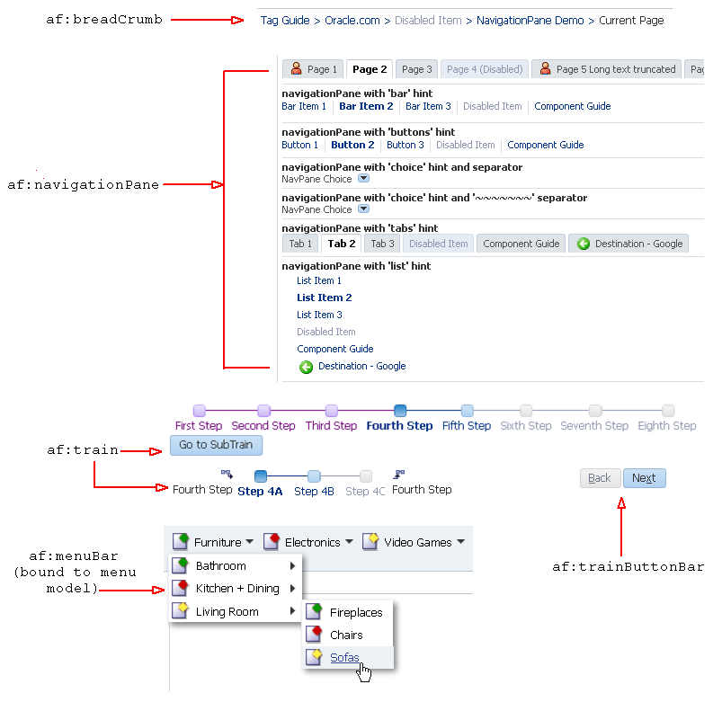
Figure 20-1 shows the different ADF Faces components that are used to provide navigation.
20.1.1 Navigation Components Use Cases and Examples
Typical uses of navigation components are to create buttons and links to allow users to navigate to another page or window, to perform actions on data, or to perform actions and navigate at the same time. For example, as shown in Figure 20-2, the main page of the File Explorer application contains a button component that you click to refresh the page after making a skin selection and a link component that opens a popup window when clicked.
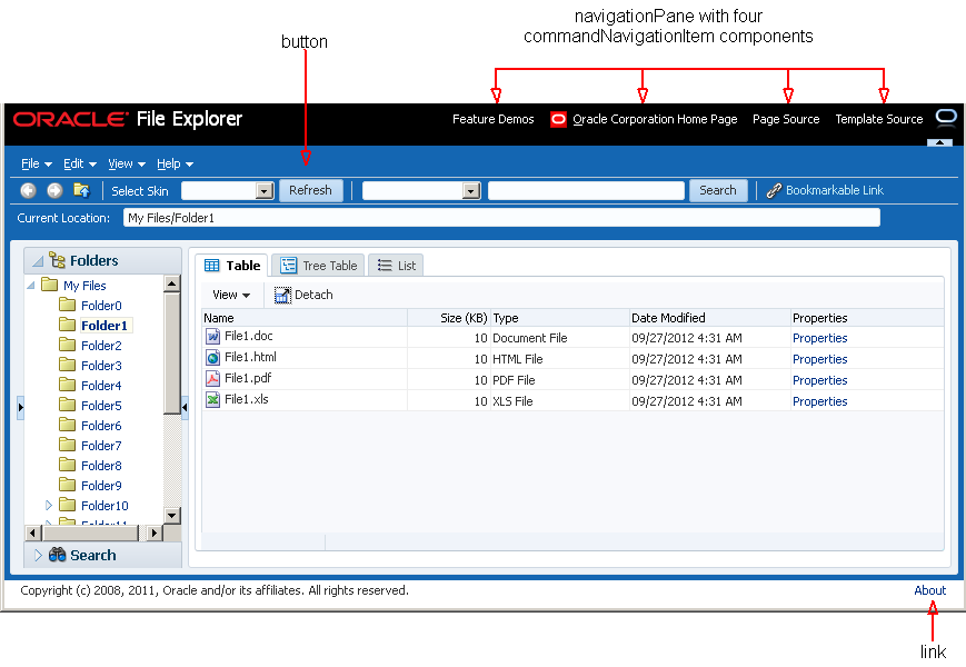
At the top right corner of the File Explorer application, there are four global application links. While you can use link components to provide the destinations for navigation, the File Explorer application uses the navigationPane and child commandNavigationItem components to provide links that either navigate directly to another location or deliver an action that results in navigation.
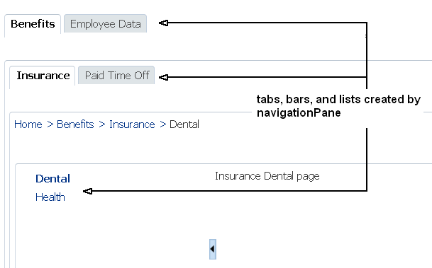
The navigationPane component also lets you organize application content in a meaningful structure and provides a navigation method for users to move through different content areas in the application to perform various functions. For example, a simple HR application might have pages that let employees check on company benefits, and pages for administration to view and create employee data, as shown in Figure 20-3. The navigationPane component provides the structure with tabs, bars, or lists for example, and the child commandNavigationItem components provide the navigation links.
The navigationPane component can also be used with a menu model, where the component is bound to the menu model managed bean. For complex page hierarchies, using a menu model is more efficient as the framework generates the correct number of navigation items in the structure on each page and also keeps track of which items are to be displayed as "selected".
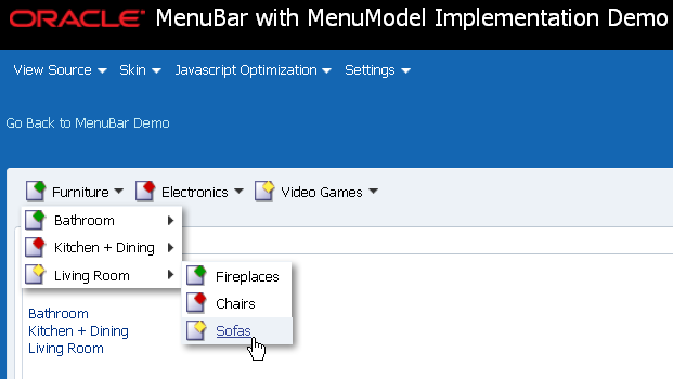
The menuBar component can also be bound to a menu model to implement menus and submenus for navigating different levels in a page hierarchy. Most shopping websites use a system of menus to categorize shopping areas and provide a one-click action to a specific subcategory or item in the hierarchy. As shown in Figure 20-4, the menu bar shows the first level of menu items at a glance. As the mouse cursor hovers over a menu, a submenu of more items display for the user to browse and choose. Typically you would not implement more than three levels of menu items.
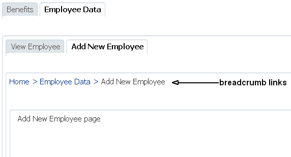
Whether you use navigationPane or menuBar (bound to a menu model) to create your page hierarchy, you can use the breadCrumbs component and a series of child commandNavigationItem components to provide users with a visual indication to their current location in the page hierarchy. As shown in Figure 20-5, the breadCrumbs component displays a line of text links starting from the root page down to the current page, which is always the last link. If you create your page hierarchy using a menu model, you can also bind the breadCrumbs component to the same menu model managed bean and let the framework dynamically generate the links for you.
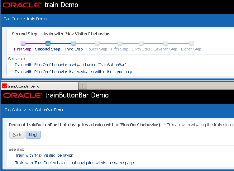
The train component allows users to quickly see where they are in a multistep process and also navigate through that process. The trainButtonBar component provides additional navigation for a train process in the form of Back and Next buttons, as shown in Figure 20-6.
20.1.2 Additional Functionality for Navigation Components
You may find it helpful to understand other ADF Faces features before you implement your navigation components. Additionally, once you have added these components to your page, you may find that you need to add functionality such as accessibility and localization. Following are links to other functionality that navigation components can use.
-
Using parameters in text: You can use the ADF Faces EL format tags if you want the text displayed in a component to contain parameters that will resolve at runtime. For more information, see Section 3.5.2, "How to Use the EL Format Tags."
-
Events: Components fire both server-side and client-side events that you can have your application react to by executing some logic. For more information, see Chapter 6, "Handling Events."
-
Partial page rendering: ADF Faces navigation components can be used to trigger partial rerendering of components on a page. For more information, see Chapter 8, "Rerendering Partial Page Content."
-
Accessibility: You can make your navigation components accessible. For more information, see Chapter 33, "Developing Accessible ADF Faces Pages."
-
Localization: Instead of directly entering text for labels, you can use property files. These files allow you to manage translation of the text strings. For more information, see Chapter 32, "Internationalizing and Localizing Pages."
-
Skins: You can change the look and feel of navigation components by changing the skin. For more information, see Chapter 31, "Customizing the Appearance Using Styles and Skins."
-
Touch Devices: ADF Faces components may behave and display differently on touch devices. For more information, see Appendix D, "Creating Web Applications for Touch Devices Using ADF Faces."
-
Drag and Drop: You can configure your components so that the user can drag and drop them to another area on the page. For more information, see Chapter 35, "Adding Drag and Drop Functionality."
20.2 Common Functionality in Navigation Components
Like any JSF application, an application that uses ADF Faces components contains a set of rules for choosing the next page to display when a button or link (used on its own or within another navigation component) is clicked. You define the rules by adding JSF navigation rules and cases in the application's configuration resource file (faces-config.xml).
JSF uses an outcome string to select the navigation rule to use to perform a page navigation. ADF Faces navigation components that implement javax.faces.component.ActionSource interface generate an ActionEvent event when users activate the component. The JSF NavigationHandler and default ActionListener mechanisms use the outcome string on the activated component to find a match in the set of navigation rules. When JSF locates a match, the corresponding page is selected, and the Render Response phase renders the selected page. For more information about the JSF lifecycle, see Chapter 5, "Using the JSF Lifecycle with ADF Faces." Also note that navigation in an ADF Faces application may use partial page rendering. For more information, see Chapter 8, "Rerendering Partial Page Content."
20.3 Using Buttons and Links for Navigation
ADF Faces provides button and link components that can be used for navigation. Depending on your use case, you can configure these components to navigate directly to another location, to submit requests, and fire ActionEvent events.
Apart from the button and link components, ADF Faces also provides specialized components (goMenuItem and commandMenuItem) for use inside menus. For more information, see Chapter 15, "Using Menus, Toolbars, and Toolboxes."
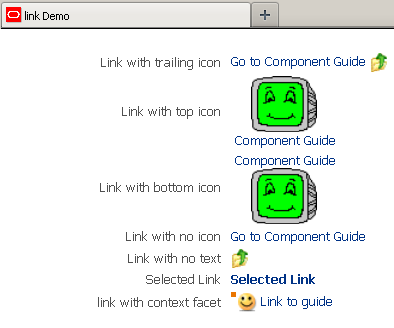
The button and link components can render images, along with optional text, as shown in Figure 20-7 and Figure 20-8. You can determine the position of the image relative to the optional text by setting a value for the iconPosition attribute. In addition, you can set different icons for when the user hovers over an icon, or the icon is depressed or disabled. You specify the image to use by setting a value for the icon attribute. The button and link components expand to the number of pixels required to accommodate the image that you specify to render within the component. If you do not specify an image, the component renders using the minimum dimensions specified for the component in the web application's skin.
Figure 20-7 shows a number of the options that you can configure for the button component.
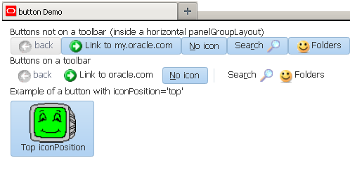
Figure 20-8 shows a number of the options that you can configure for the link component.
Using the ADF Faces toolbar component, you can provide additional functionality, such as a popup facet that opens popup menus from a button component. For more information, see Section 15.3, "Using Toolbars."
The behavior of button and link components differ when you output your page in simplified mode for printing or email. The link component appears in print and email modes although it cannot be invoked while the button component does not render when you output a page in simplified mode for printing or email. For more information about email and print output modes, see Chapter 36, "Using Different Output Modes."
You can configure your application to allow end users to invoke a browser's context menu when they right-click an action component that renders a link. End users who right-click the link rendered by an action component may use a browser's context menu to invoke an action that you do not want them to invoke (for example, open the link in a new window). For more information, see Section 20.4, "Configuring a Browser's Context Menu for Links."
You can show a warning message to end users if the page that they attempt to navigate away from contains uncommitted data. Add the checkUncommittedDataBehavior component as a child to action components that have their immediate attribute set to true. If the user chooses not to navigate, the client event will be cancelled. You can add the checkUncommittedDataBehavior component as a child to the af:button and af:link components. For the warning message to appear to end users, the page must contain uncommitted data and you must have also set the document tag's uncommittedDataWarning attribute to on, as described in Section 9.2.5, "How to Configure the document Tag."
Note:
A warning message may also appear for uncommitted data if you set thedocument tag's uncommittedDataWarning tag to on and your page renders an ADF Controller bounded task flow that is configured as critical, as described in the "How to Enable Implicit Save Points" section in Developing Fusion Web Applications with Oracle Application Development Framework.20.3.1 How to Use Buttons and Links for Navigation and Deliver ActionEvents
Typically, you use action components like button and link to perform page navigation and to execute any server-side processing.
It may help to understand how action component's attributes affect functionality. For more information, see Section 20.3, "Using Buttons and Links for Navigation."
You may also find it helpful to understand functionality that can be added using other ADF Faces features. For more information, see Section 20.1.2, "Additional Functionality for Navigation Components."
To create and use action components:
-
In the Components window, from the General Controls panel, drag and drop the action component that you want to use onto the JSF page. More specifically, drag and drop a:
-
Button to create a
buttoncomponent. -
Link to create a
linkcomponent.
-
-
In the Properties window, expand the Common section and set the following:
-
Text: Specify the text to display.
Tip:
Alternatively, you can use thetextAndAccessKeyattribute to provide a single value that defines the label along with the access key to use for the button or link. For information about how to define access keys, see Section 33.3.4, "How to Define Access Keys for an ADF Faces Component." -
Icon: Set to the URI of the image file if you want to render an icon inside the component. If you render an icon, you can also set values for
hoverIcon,disabledIcon,depressedIcon, andiconPositionin the Appearance section.Tip:
You can use either thetextattribute (ortextAndAccessKeyattribute) or theiconattribute, or both. -
IconPosition: If you specified an icon, you can determine the position of the icon relative to the text by selecting a value from the dropdown list:
-
<default> (leading): Renders the icon before the text.
-
trailing: Renders the icon after the text.
-
top: Renders the icon above the text.
-
bottom: Renders the icon below the text.
-
-
Selected: Set to
trueso that the component appears as selected when the page renders. -
Action: Set to an outcome string or to a method expression that refers to a backing bean action method that returns a logical outcome
String. For more information about configuring the navigation between pages, see Section 3.3, "Defining Page Flows."The default JSF
ActionListenermechanism uses the outcome string to select the appropriate JSF navigation rule, and tells the JSFNavigationHandlerwhat page to use for the Render Response phase. For more information about using managed bean methods to open dialogs, see Chapter 16, "Using Popup Dialogs, Menus, and Windows." For more information about outcome strings and navigation in JSF applications, see the Java EE tutorial athttp://docs.oracle.com/javaee/index.html.Tip:
TheactionListenerattribute can also be used for navigation when bound to a handler that returns an outcome. Usually, you should use this attribute only to handle user interface logic and not navigation.For example, in the File Explorer application, the Search button in Search panel does not navigate anywhere. Instead, it performs a search. It has the following value for its
actionListenerattribute:actionListener="#{explorer.navigatorManager.searchNavigator. searchForFileItem}"This expression evaluates to a method that actually performs the search.
-
-
Expand the Behavior section and set the following:
-
Disabled: Select
truefrom the dropdown list if you want to show the component as a noninteractive button or link. -
PartialSubmit: Select
truefrom the dropdown list to fire a partial page request each time the component is activated. For more information, see Section 8.2, "Using Partial Triggers." -
Immediate: Select
truefrom the dropdown list if you want to skip the Process Validations and Update Model phases. The component's action listeners (if any), and the default JSFActionListenerhandler are executed at the end of the Apply Request Values phase of the JSF lifecycle. For more information, see Section 5.2, "Using the Immediate Attribute."
-
-
Optionally, if you set the
immediateattribute totrueas described in Step 3, you can add theaf:checkUncommittedDataBehaviorcomponent as a child to the action component to display a warning message to the user if the page contains uncommitted data. Drag Check Uncommitted Data Behavior from the Behavior group in the Operations panel of the Components window and drop it as a child of the action component you added in Step 1.Note:
You must have also set thedocumenttag'suncommittedDataWarningattribute toon, as described in Section 9.2.5, "How to Configure the document Tag."
Buttons and links can also be used to open secondary windows through these attributes: useWindow, windowHeight, windowWidth, launchListener, and returnListener. For information about opening secondary windows, see the "Using the ADF Faces Dialog Framework Instead of Bounded Task Flows" section in Developing Fusion Web Applications with Oracle Application Development Framework.
To use buttons and links to invoke popups without writing any JavaScript code, see Section 16.3, "Declaratively Invoking a Popup."
20.3.2 How to Use Buttons and Links for Navigation Without Delivering ActionEvents
You can use the button and link components to perform direct page navigation, without delivering an ActionEvent event.
It may help to understand how the button and link components' attributes affect functionality. For more information, see Section 20.3, "Using Buttons and Links for Navigation."
You may also find it helpful to understand functionality that can be added using other ADF Faces features. For more information, see Section 20.1.2, "Additional Functionality for Navigation Components."
To create buttons and links that navigate without delivering an ActionEvent:
-
In the Components window, from the General Controls panel, drag and drop the component that you want to use onto the JSF page. More specifically, drag and drop a:
-
Button to create a
buttoncomponent. -
Link to create a
linkcomponent.
-
-
In the Properties window, expand the Common section and set the following:
-
Text: Specify the text to display.
Tip:
Instead, you can use thetextAndAccessKeyattribute to provide a single value that defines the label and the access key to use for the button or link. For information about how to define access keys, see Section 33.3.4, "How to Define Access Keys for an ADF Faces Component." -
Icon: Set to the URI of the image file if you want to render an icon inside the component. If you render an icon, you can also set values for
hoverIcon,disabledIcon,depressedIcon, andiconPositionin the Appearance section.Tip:
You can use either thetextattribute (ortextAndAccessKeyattribute) or theiconattribute, or both. -
IconPosition: If you specified an icon, you can determine the position of the icon relative to the text by selecting a value from the dropdown list:
-
<default> (leading): Renders the icon before the text.
-
trailing: Renders the icon after the text.
-
top: Renders the icon above the text.
-
bottom: Renders the icon below the text.
-
-
Selected: Set to
trueso that the component appears as selected when the page renders. -
Destination: Set to the URI of the page to navigate to.
For example, set to the following to navigate to Oracle's web site:
destination="http://www.oracle.com"
-
TargetFrame: Specify where the new page should display by selecting a value from the dropdown list:
-
_blank: The link opens the document in a new window.
-
_parent: The link opens the document in the window of the parent. For example, if the link appeared in a dialog, the resulting page would render in the parent window.
-
_self: The link opens the document in the same page or region.
-
_top: The link opens the document in a full window, replacing the entire page.
-
-
-
Expand the Behavior section and select
truefrom the Disabled dropdown list if you want to show the component as a noninteractive button or link.
20.3.3 What You May Need to Know About Using Partial Page Navigation
As described in Section 8.5, "Using Partial Page Navigation," you can configure an ADF Faces application to have navigation triggered through a partial page rendering request. When partial page navigation is turned on, partial page navigation for GET requests is automatically supported on the following components:
-
af:button -
af:link -
af:goMenuItem(used withinaf:menuandaf:menuBar) -
af:commandNavigationItem(used withinaf:navigationPane)
The only requirement is that the destination attribute on a supported component contain a relative URL of the application context root and begin with "/", such as "/faces/myPage.jsf", where faces is the URL mapping to the application's servlet defined in web.xml and myPage.jsf is the page to navigate. Because partial page navigation makes use of the hash ('#') portion of the URL, you cannot use the hash portion for navigation to anchors within a page.
If the targetFrame attribute on a supported component is set to open the link in a new window, the framework automatically reverts to full page navigation.
20.4 Configuring a Browser's Context Menu for Links
The action components that render links at runtime allow your end users to invoke actions. In addition you can configure your application so that the ADF Faces framework allows the end user's browser to render a context menu for these action components. By default, the ADF Faces framework disables this context menu. The ADF Faces framework disables this context menu when no value is set for the destination attribute because the context menu may present menu options that invoke a different action (for example, open a link in a new window) to that specified by the action component. The components for which you can configure this behavior include the following:
-
af:link -
af:commandMenuItem(used within anaf:menuBarcomponent) -
af:commandNavigationItemif no value is specified for thedestinationattribute, the ADF Faces framework enables the browser context menu in the following scenarios:-
For the two anchors that
af:commandNavigationItemrenders when inside anaf:traincomponent -
When an
af:commandNavigationItemrenders inside anaf:breadCrumbscomponent -
When an
af:commandNavigationItemrenders inside anaf:navigationPanecomponent (any hint--tabs, bar, buttons, choice, list)
-
-
af:panelTabbed: the tabs and overflow indicators -
af:panelAccordion: the disclosure link and overflow indicators
You cannot configure this behavior for components that specify a destination and do not invoke an action. For example, an af:commandNavigationItem component where you specify a value for the destination attribute and no value for the action attribute.
20.4.1 How to Configure a Browser's Context Menu for Command Links
Set the value of the oracle.adf.view.rich.ACTION_LINK_BROWSER_CONTEXT_SUPPRESSION context parameter in your application's web.xml file to no.
It may help to understand what action components you can configure this functionality for. For more information, see Section 20.4, "Configuring a Browser's Context Menu for Links."
You may also find it helpful to understand functionality that can be added using other ADF Faces features. For more information, see Section 20.1.2, "Additional Functionality for Navigation Components."
To configure a browser's context menu for a command link:
-
In the Applications window, expand the WEB-INF node and double-click web.xml.
-
In the overview editor, click the Application navigation tab and then click the Add icon next to the Context Initialization Parameters table to add an entry for the
oracle.adf.view.rich.ACTION_LINK_BROWSER_CONTEXT_SUPPRESSIONparameter and set it tono. -
Save and close the
web.xmlfile.
20.4.2 What Happens When You Configure a Browser's Context Menu for Command Links
If you followed the procedure outlined in Section 20.4.1, "How to Configure a Browser's Context Menu for Command Links," JDeveloper writes a value to the web.xml file, as shown in Example 20-1.
Example 20-1 Context Parameter to Configure a Browser's Context Menu
<context-param>
    <param-name>oracle.adf.view.rich.ACTION_LINK_BROWSER_CONTEXT_SUPPRESSION</param-name>
    <param-value>no</param-value>
  </context-param>
For more information about ADF Faces configuration options in your application's web.xml file, see Section A.2, "Configuration in web.xml."
At runtime, end users can invoke a browser's context menu by right-clicking on the links rendered by certain components, as described in Section 20.4, "Configuring a Browser's Context Menu for Links."
20.5 Using Buttons or Links to Invoke Functionality
In addition to using action components for navigation, ADF Faces also includes listener tags that you can use with action components to have specific functionality execute when the action event fires. Listener tags included with ADF Faces include:
-
exportCollectionActionListener: Use to export data from thetable,treeandtreeTablecomponents to an Excel spreadsheet. For more information, see Section 12.12, "Exporting Data from Table, Tree, or Tree Table." -
fileDownloadActionListener: Use to initiate a file download from the server to the local hard drive. For more information, see Section 20.5.1, "How to Use an Action Component to Download Files." -
resetListener: Use to reset submitted values. However, no data model states will be altered. For more information, see Section 20.5.2, "How to Use an Action Component to Reset Input Fields." If the input components render in a popup, see Section 16.7, "Resetting Input Fields in a Popup."If you want to reset the input components to their previous state, which was partially or fully submitted successfully to the server, then you can use a reset button. For more information, see Section 11.2.3, "How to Add a Button to Reset the Form."
20.5.1 How to Use an Action Component to Download Files
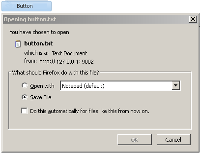
You can create a way for users to download files by creating an action component such as a button and associating it with a fileDownloadActionListener tag. When the user selects or clicks the component, a popup dialog displays that allows the user to select different download options, as shown in Figure 20-9.
Use the fileDownloadActionListener tag to allow an action component (for example, a button, link, or menu item) to send the contents of a file to an end user. You can also specify the content type or file name when you use this tag. Any value that you set for the action component's partialSubmit attribute is ignored at render time if you use the fileDownloadActionListener tag. The fileDownloadActionListener tag determines what type of submit the action component invokes based on the context. If you use the fileDownloadActionListener tag within a JSF portlet in your application, the action component invokes a partial submit (partialSubmit="true"). If you use the fileDownloadActionListener tag within an application that uses the ADF Faces servlet, the action component invokes a full submit (partialSubmit="false").
Tip:
For information about uploading a file to the server, see Section 11.9, "Using File Upload."After the content has been sent to the browser, how that content is displayed or saved depends on the option that the end user selects in the dialog. If the end user selects the Open with option, the application associated with that file type will be invoked to display the content. For example, a text file may result in the Notepad application being started. If the end user selects the Save to Disk option, depending on the browser, a popup dialog may appear to select a file name and a location in which to store the content.
Example 20-2 shows the tags of a button with the fileDownloadActionListener tag to download the file named hello.txt to the user.
Example 20-2 File Download Using Button and fileDownloadActionListener Tag
<af:button value="Say Hello">
  <af:fileDownloadActionListener filename="hello.txt"
      contentType="text/plain; charset=utf-8"
      method="#{bean.sayHello}"/>
</af:button>
Example 20-3 shows a managed bean method used to process the file download.
Example 20-3 Managed Bean Method Used to Process File Download
public void sayHello(FacesContext context, OutputStream out) throws IOException{
  OutputStreamWriter w = new OutputStreamWriter(out, "UTF-8");
  w.write("Hi there!");
   . . .
}
If you use the fileDownloadActionListener tag from within a JSF portlet in your application, you can optionally add the parameters described in Table 20-1 to the web.xml file of your application to configure the size and temporary location options for the file during download.
Table 20-1 Parameters to Add to web.xml File to Use fileDownloadActionListener in a Portlet
| Parameter name | Data type | Description |
|---|---|---|
|
|
Integer |
Specify the maximum size in kilobytes of the file that the If you do not specify a value for this parameter in the |
|
|
Integer |
Specify the maximum size in kilobytes of the file that the If you do not specify a value for this parameter in the |
|
|
String |
Specify the temporary location where you store files during download. If you do not specify a value, it defaults to the directory specified by |
For more information about configuring your web.xml file, see Section A.2, "Configuration in web.xml."
It may help to understand how a component's attributes affect functionality. For more information, see Section 20.5, "Using Buttons or Links to Invoke Functionality."
You may also find it helpful to understand functionality that can be added using other ADF Faces features. For more information, see Section 20.1.2, "Additional Functionality for Navigation Components."
You will need to complete this task:
- Create an action component, as described in Section 20.3, "Using Buttons and Links for Navigation."
To create a file download mechanism:
-
In the Components window, from the Operations panel, in the Listeners group, drag and drop the File Download Action Listener tag as a child to the action component.
-
In the Properties window set the following attributes:
-
ContentType: Specify the MIME type of the file, for example
text/plain,text/csv,application/pdf, and so on. -
Filename: Specify the proposed file name for the object. When the file name is specified, a Save File dialog will typically be displayed, though this is ultimately up to the browser. If the name is not specified, the content will typically be displayed inline in the browser, if possible.
-
Method: Specify the method that will download the file contents. The method takes two arguments, a
FacesContextobject and anOutputStreamobject. TheOutputStreamobject will be automatically closed, so the sole responsibility of this method is to write all bytes to theOutputStreamobject.
For example, entries in the JSF page for a
buttoncomponent that uses thefileDownloadActionListenertag would be similar to the following:<af:button text="Load File"> <af:fileDownloadActionListener contentType="text/plain" filename="MyFile.txt" method="#(mybean.LoadMyFile"/> </af:button> -
20.5.2 How to Use an Action Component to Reset Input Fields
You can use the resetListener tag in conjunction with an action component to reset input values. When the end user invokes the action component, it resets all input values to null or empty. If you want to reset the input components to their previous state, which was partially or fully submitted successfully to the server, then you should use a reset button. For more information, see Section 11.2.3, "How to Add a Button to Reset the Form."
If you use the resetListener tag to reset input components that render in a popup, you also need to set a value for the popup component's resetEditableValues property. For more information about this use case, see Section 16.7, "Resetting Input Fields in a Popup."
It may help to understand how an action component's attributes affect functionality. For more information, see Section 20.5, "Using Buttons or Links to Invoke Functionality."
You may also find it helpful to understand functionality that can be added using other ADF Faces features. For more information, see Section 20.1.2, "Additional Functionality for Navigation Components."
You will need to complete this task:
- Create an action component, as described in Section 20.3, "Using Buttons and Links for Navigation."
To use the reset listener tag:
-
In the Components window, from the Operations panel, in the Listeners group, drag a Reset Listener and drop it inside the action component that you created.
-
In the Insert Reset Listener dialog, specify the type of event that the
resetListenertag activates in response to. For example, enteractionso that theresetListenertag responds to anactionEventreturned by the action component'sactionListenerattribute.Click Help in the Insert Reset Listener dialog to view a complete list of supported values.
20.6 Using Navigation Items for a Page Hierarchy
Note:
If your application uses the Fusion technology stack with ADF Controller, then you should use ADF task flows and anXMLMenuModel implementation to create the navigation system for your application page hierarchy. For details, see the "Creating a Page Hierarchy Using Task Flows" section in Developing Fusion Web Applications with Oracle Application Development Framework.An application may consist of pages that are related and organized in a tree-like hierarchy, where users gain access to specific information on a page by drilling down a path of links. For example, Figure 20-10 shows a simple page hierarchy with three levels of nodes under the top-level node, Home. The top-level node represents the root parent page; the first-level nodes, Benefits and Employee Data, represent parent pages that contain general information for second-level child nodes (such as Insurance and View Employee) that contain more specific information; the Insurance node is also a parent node, which contains general information for third-level child nodes, Health and Dental. Each node in a page hierarchy (except the root Home node) can be a parent and a child node at the same time, and each node in a page hierarchy corresponds to a page.
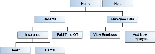
Navigation in a page hierarchy follows the parent-child links. For example, to view Health information, the user would start drilling from the Benefits page, then move to the Insurance page where two choices are presented, one of which is Health. The path of selected links starting from Home and ending at Health is known as the focus path in the tree.
In addition to direct parent-child navigation, some cross-level or cross-parent navigation is also possible. For example, from the Dental page, users can jump to the Paid Time Off page on the second level, and to the Benefits page or the Employee Data page on the first level.
As shown in Figure 20-10, the Help node, which is not linked to any other node in the hierarchy but is on the same level as the top-level Home node, is a global node. Global nodes represent global pages (such as a Help page) that can be accessed from any page in the hierarchy.
Typical widgets used in a web user interface for navigating a page hierarchy are tabs, bars, lists, and global links, all of which can be created by using the navigationPane component. Figure 20-11 shows an example of how the hierarchy as illustrated in Figure 20-10 could be rendered using the navigationPane and other components.
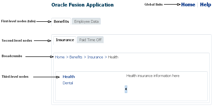
In general, tabs are used as first-level nodes, as shown in Figure 20-11, where there are tabs for the Benefits and Employee Data pages. Second-level nodes, such as Insurance and Paid Time Off are usually rendered as bars, and third-level nodes, such as Health and Dental are usually rendered as lists. However, you may also use tabs for both first- and second-level nodes. Global links (which represent global nodes) are rendered as text links. In Figure 20-11, the Home and Help global links are rendered as text links.
One navigationPane component corresponds to one level of nodes, whether they are first-, second-, or third-level nodes, or global nodes. Regardless of the type of items the navigationPane component is configured to render for a level, you always use the commandNavigationItem component to represent the items within the level.
The navigationPane component simply renders tabs, bars, lists, and global links for navigation. To achieve the positioning and visual styling of the page background, as shown in Figure 20-16 and Figure 20-17, you use the decorativeBox component as the parent to the first level navigationPane component. The decorativeBox component uses themes and skinning keys to control the borders and colors of its different facets. For example, if you use the default theme, the decorativeBox component body is white and the border is blue, and the top-left corner is rounded. If you use the medium theme, the body is a medium blue. For information about using themes and skins, see Chapter 31, "Customizing the Appearance Using Styles and Skins".
Tip:
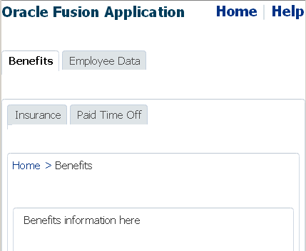
Because creating a page hierarchy requires that each page in the hierarchy use the same layout and look and feel, consider using a template to determine where the navigation components should be placed and how they should be styled. For more information, see Section 10.3, "Using Page Templates"On each page in simple hierarchies, you first use a series of navigationPane components to represent each level of the hierarchy. Then you add commandNavigationItem components as direct children of the navigationPane components for each of the links at each level. For example, to create the Health insurance page as shown in Figure 20-11, you would first use a navigationPane component for each level displayed on the page, in this case it would be four: one for the global links, one for the first-level nodes, one for the second-level nodes, and one for the third-level nodes. You would then need to add commandNavigationItem components as children to each of the navigationPane components to represent the individual links (for example, you would add two commandNavigationItem child components to the third-level navigationPane component to represent the two third-level list items). If instead you were creating the Benefits page, as shown in Figure 20-12, you would add only three navigationPane components (one each for the global, first, and second levels), and then add just the commandNavigationItem components for the links seen from this page.
As you can see, with large page hierarchies, this process can be very time consuming and error prone. Instead of creating each of the separate commandNavigationItem components on each page, for larger hierarchies you can use an XMLMenuModel implementation and managed beans to dynamically generate the navigation items on the pages. The XMLMenuModel class, in conjunction with a metadata file, contains all the information for generating the appropriate number of hierarchical levels on each page, and the navigation items that belong to each level.
Then instead of using multiple commandNavigationItem components within each navigationPane component and marking the current items as selected on each page, you declaratively bind each navigationPane component to the same XMLMenuModel implementation, and use one commandNavigationItem component in the nodeStamp facet to provide the navigation items. The commandNavigationItem component acts as a stamp for navigationPane component, stamping out navigation items for nodes (at every level) held in the XMLMenuModel object.
The menuBar component can also be used with the XMLMenuModel implementation to stamp out menu items for navigating a page hierarchy.
Note:
If you want to create menus that can be used to cause some sort of change in an application (for example, a File menu that contains the commands Open and Delete), then see Chapter 15, "Using Menus, Toolbars, and Toolboxes."On any page, to show the user's current position in relation to the entire page hierarchy, you use the breadCrumbs component with a series of commandNavigationItem components or one commandNavigationItem component as a nodeStamp, to provide a path of links from the current page back to the root page (that is, the current nodes in the focus path).
For more information about creating a navigational hierarchy using the XMLMenuModel, see Section 20.7, "Using a Menu Model to Create a Page Hierarchy". For more information about manually creating a navigational hierarchy, see Section 20.8, "Creating a Simple Navigational Hierarchy".
20.6.1 How to Create Navigation Cases for a Page Hierarchy
Whether you use a menu model to create the navigation items for a page hierarchy or manually create the navigation items yourself, the JSF navigation model, through the default ActionListener mechanism, is used to choose the page to navigate to when users select a navigation item.
It may help to understand how the attributes of navigation components affect functionality. For more information, see Section 20.6, "Using Navigation Items for a Page Hierarchy."
You may also find it helpful to understand functionality that can be added using other ADF Faces features. For more information, see Section 20.1.2, "Additional Functionality for Navigation Components."
To create navigation cases for a page hierarchy:
-
In the Applications window, expand the WEB-INF node and double-click faces-config.xml.
-
Create one global JSF navigation rule that has the navigation cases for all the nodes in the page hierarchy.
For example, the page hierarchy shown in Figure 20-10 has 10 nodes, including the global Help node. Thus, you would create 10 navigation cases within one global navigation rule in the
faces-config.xmlfile, as shown in Example 20-4.For each navigation case, specify a unique outcome string, and the path to the JSF page that should be displayed when the navigation system returns an outcome value that matches the specified string.
Example 20-4 Global Navigation Rule for a Page Hierarchy in faces-config.xml
<navigation-rule>
  <navigation-case>
    <from-outcome>goHome</from-outcome>
    <to-view-id>/home.jsf</to-view-id>
  </navigation-case>
  <navigation-case>
    <from-outcome>goHelp</from-outcome>
    <to-view-id>/globalhelp.jsf</to-view-id>
  </navigation-case>
  <navigation-case>
    <from-outcome>goEmp</from-outcome>
    <to-view-id>/empdata.jsf</to-view-id>
  </navigation-case>
  <navigation-case>
    <from-outcome>goBene</from-outcome>
    <to-view-id>/benefits.jsf</to-view-id>
  </navigation-case>
  <navigation-case>
    <from-outcome>goIns</from-outcome>
    <to-view-id>/insurance.jsf</to-view-id>
  </navigation-case>
  <navigation-case>
    <from-outcome>goPto</from-outcome>
    <to-view-id>/pto.jsf</to-view-id>
  </navigation-case>
  <navigation-case>
    <from-outcome>goView</from-outcome>
    <to-view-id>/viewdata.jsf</to-view-id>
  </navigation-case>
  <navigation-case>
    <from-outcome>goCreate</from-outcome>
    <to-view-id>/createemp.jsf</to-view-id>
  </navigation-case>
  <navigation-case>
    <from-outcome>goHealth</from-outcome>
    <to-view-id>/health.jsf</to-view-id>
  </navigation-case>
  <navigation-case>
    <from-outcome>goDental</from-outcome>
    <to-view-id>/dental.jsf</to-view-id>
  </navigation-case>
</navigation-rule>
For more information about creating navigation cases in JDeveloper, see Section 3.3, "Defining Page Flows."
20.7 Using a Menu Model to Create a Page Hierarchy
Note:
If your application uses the Fusion technology stack or ADF Controller, then you should use ADF task flows and anXMLMenuModel implementation to create the navigation system for your application page hierarchy. For details, see the "Creating a Page Hierarchy Using Task Flows" section in Developing Fusion Web Applications with Oracle Application Development Framework.Section 20.6, "Using Navigation Items for a Page Hierarchy" describes how you can create navigation items for a very simple page hierarchy using navigationPane components with multiple commandNavigationItem children components. Using the same method for more complex page hierarchies would be time consuming and error prone. It is inefficient and tedious to manually insert and configure individual commandNavigationItem components within navigationPane and breadCrumbs components on several JSF pages to create all the available items for enabling navigation. It is also difficult to maintain the proper selected status of each item, and to deduce and keep track of the breadcrumb links from the current page back to the root page.
For more complex page hierarchies (and even for simple page hierarchies), a more efficient method of creating a navigation system is to use a menu model. A menu model is a special kind of tree model. A tree model is a collection of rows indexed by row keys. In a tree, the current row can contain child rows (for more information about a tree model, see Section 12.6, "Displaying Data in Trees"). A menu model is a tree model that knows how to retrieve the rowKey of the node that has the current focus (the focus node). The menu model has no special knowledge of page navigation and places no requirements on the nodes that go into the tree.
The XMLMenuModel class creates a menu model from a navigation tree model. But XMLMenuModel class has additional methods that enable you to define the hierarchical tree of navigation in XML metadata. Instead of needing to create Java classes and configuring many managed beans to define and create the menu model (as you would if you used one of the other ADF Faces menu model classes), you create one or more XMLMenuModel metadata files that contain all the node information needed for the XMLMenuModel class to create the menu model.
Tip:
Do not confuse thenavigationPane component with the panelTabbed component. You use the panelTabbed component to display multiple tabbed content areas that can be hidden and displayed (see Section 9.10, "Displaying or Hiding Contents in Panels"). However, the panelTabbed component cannot bind to any navigational model and the whole content must be available from within the page, so it has limited applicability.To create a page hierarchy using a menu model, you do the following:
-
Create the JSF navigation rule and navigation cases for the page hierarchy. See Section 20.6.1, "How to Create Navigation Cases for a Page Hierarchy."
-
Create the
XMLMenuModelmetadata. See Section 20.7.1, "How to Create the Menu Model Metadata." -
Configure the managed bean for the
XMLMenuModelclass. The application uses the managed bean to build the hierarchy. This configuration is automatically done for you when you use the Create ADF Menu Model dialog in JDeveloper to create theXMLMenuModelmetadata file. See Section 20.7.2, "What Happens When You Use the Create ADF Menu Model Wizard." -
Create a JSF page for each of the hierarchical nodes (including any global nodes).
Tip:
Typically, you would use a page template that contains a facet for each level of items (including global items and breadcrumbs) to create each JSF page. For example, thenavigationPanecomponent representing global items might be wrapped in a facet namednavigationGlobal, and thenavigationPanecomponent representing first level tabs might be wrapped in anavigation1facet. For information about creating page templates, see Chapter 10, "Creating and Reusing Fragments, Page Templates, and Components." -
On each page, bind the
navigationPaneandbreadCrumbscomponents to theXMLMenuModelclass. See Section 20.7.3, "How to Bind the navigationPane Component to the Menu Model" and Section 20.7.4, "How to Use the breadCrumbs Component with a Menu Model." To bind themenuBarcomponent, see Section 20.7.5, "How to Use the menuBar Component with a Menu Model."
20.7.1 How to Create the Menu Model Metadata
The XMLMenuModel metadata file is a representation of a navigation menu for a page hierarchy in XML format. You can use one or more XMLMenuModel metadata files to represent an entire page hierarchy. In an XMLMenuModel metadata file, the page hierarchy is described within the menu element, which is the root element of the file. Every XMLMenuModel metadata file is required to have a menu element and only one menu element is allowed in each file.
The other elements in the XMLMenuModel metadata file or hierarchy can be made up of item nodes, group nodes, and shared nodes. Item nodes represent navigable nodes (or pages) in the hierarchy. For example, say you wanted to build the hierarchy depicted in Figure 20-13.
If you wanted each node in the hierarchy to have its own page to which a user can navigate, then in the metadata file you would create an item node for each page. You nest children nodes inside a parent node to create the hierarchy. However, say you did not need a page for the Employee Data node, but instead wanted the user to navigate directly to the View Employee page. You would then use a group node to represent the Employee Data page and use the group node's idref attribute to reference the page that opens (the View Employee page) when an end user clicks the Employee Data tab. The group node allows you to retain the hierarchy without needing to create pages for nodes that are simply aggregates for their children nodes.
Example 20-5 shows an XMLMenuModel metadata file that uses mostly item nodes and one group node to define the entire page hierarchy illustrated in Figure 20-13.
Example 20-5 XMLMenuModel Metadata File Sample 1
<?xml version="1.0" encoding="windows-1252" ?>
<menu xmlns="http://myfaces.apache.org/trinidad/menu">
  <itemNode id="in01" focusViewId="/home.jsf" label="Home" action="goHome">
    <itemNode id="in1" focusViewId="/benefits.jsf" action="goBene"
              label="Benefits">
      <itemNode id="in11" focusViewId="/insurance.jsf" action="goIns"
                label="Insurance">
        <itemNode id="in111" focusViewId="/health.jsf" action="goHealth"
                  label="Health"/>
        <itemNode id="in112" focusViewId="/dental.jsf" action="goDental"
                  label="Dental"/>
      </itemNode>
      <itemNode id="in12" focusViewId="/pto.jsf" action="goPto"
                label="Paid Time Off">
        <itemNode id="in121" focusViewId="/vacation.jsf"
                  action="goVacation" label="Vacation"/>
        <itemNode id="in122" focusViewId="/sick.jsf" action="goSick"
                  label="Sick Pay"/>
      </itemNode>
    </itemNode>
    <groupNode id="gn2" idref="newEmp" label="Employee Data">
      <itemNode id="in21" focusViewId="/createemp.jsf" action="goCreate"
                label="Create New Employee"/>
      <itemNode id="in22" focusViewId="/viewdata.jsf" action="goView"
                label="View Data"/>
    </groupNode>
  </itemNode>
  <itemNode id="in02" focusViewId="/globalhelp.jsf" action="goHelp"
            label="Help"/>
  <itemNode id="in03" focusViewId="/preferences.jsf" action="goPref"
            label="Preferences"/>
</menu>
Within the root menu element, global nodes are any nodes that are direct children of the menu element. For example, the code in Example 20-5 shows three global nodes, namely, Home, Help, and Preferences.
You can also nest menu models using shared nodes. Use this approach where you have sub trees in the hierarchy (for example, the Benefits tree) as it makes the page hierarchy easier to maintain. For example, you might create the entire Benefits tree as its own menu model metadata file (as shown in Example 20-6) so that the menu model could be reused across an application.
Example 20-6 Benefits XMLMenuModel Metadata File
<?xml version="1.0" encoding="windows-1252" ?>
<menu xmlns="http://myfaces.apache.org/trinidad/menu">
  <itemNode id="in1" focusViewId="/benefits.jsf" action="goBene"
            label="Benefits">
    <itemNode id="in11" focusViewId="/insurance.jsf" action="goIns"
              label="Insurance">
      <itemNode id="in111" focusViewId="/health.jsf" action="goHealth"
                label="Health"/>
      <itemNode id="in112" focusViewId="/dental.jsf" action="goDental"
                label="Dental"/>
    </itemNode>
    <itemNode id="in12" focusViewId="/pto.jsf" action="goPto"
              label="Paid Time Off">
      <itemNode id="in121" focusViewId="/vacation.jsf"
                action="goVacation" label="Vacation"/>
      <itemNode id="in122" focusViewId="/sick.jsf" action="goSick"
                label="Sick Pay"/>
    </itemNode>
  </itemNode>
</menu>
Once you have created the nodes as a separate menu model, then within the different hierarchies that need to use those nodes, you use a shared node to reference the Benefits menu model.
Example 20-7 shows an XMLMenuModel metadata file that uses item nodes, a shared node and a group node to define the same page hierarchy depicted in Figure 20-13.
Example 20-7 XMLMenuModel Metadata File Sample 2
<?xml version="1.0" encoding="windows-1252" ?>
<menu xmlns="http://myfaces.apache.org/trinidad/menu">
  <itemNode id="in01" focusViewId="/home.jsf" label="Home" action="goHome">
    <sharedNode ref="#{benefits_menu}/>
    <groupNode id="gn2" idref="newEmp" label="Employee Data">
      <itemNode id="in21" focusViewId="/createemp.jsf" action="goCreate"
                label="Create New Employee"/>
      <itemNode id="in22" focusViewId="/viewdata.jsf" action="goView"
                label="View Data"/>
    </groupNode>
  </itemNode>
  <itemNode id="in02" focusViewId="/globalhelp.jsf" action="goHelp"
            label="Help"/>
  <itemNode id="in03" focusViewId="/preferences.jsf" action="goPref"
            label="Preferences"/>
</menu>
The sharedNode element references the managed bean that is configured for the Benefits XMLMenuModel metadata file. Whenever you use the Create ADF Menu Model wizard to create a metadata file, JDeveloper automatically adds the managed bean configuration for you.
It may help to understand how the attributes of navigation components affect functionality. For more information, see Section 20.7, "Using a Menu Model to Create a Page Hierarchy."
You may also find it helpful to understand functionality that can be added using other ADF Faces features. For more information, see Section 20.1.2, "Additional Functionality for Navigation Components."
To create the XMLMenuModel metadata:
-
In the Applications window, locate the project where you want to create the
XMLMenuModelmetadata file. Expand the WEB-INF node, right-click faces-config.xml and choose Create ADF Menu Model.Note:
If your application uses ADF Controller, then this menu option will not be available to you. You need to instead use a bounded task flow to create the hierarchy. See the "Creating a Page Hierarchy Using Task Flows" section in Developing Fusion Web Applications with Oracle Application Development Framework. -
In the Create ADF Menu Model dialog, enter a file name for the
XMLMenuModelmetadata file, for example,root_menu.Tip:
If you are using more than oneXMLMenuModelmetadata file to define the page hierarchy, use the nameroot_menuonly for the topmost (root) metadata file that contains references to the other submenu metadata files. -
Enter a directory for the metadata file. By default, JDeveloper saves the
XMLMenuModelmetadata file in the WEB-INF node of the application.When you click OK, JDeveloper displays a blank
XMLMenuModelmetadata file in the source editor, as shown in Example 20-8.Example 20-8 Blank XMLMenuModel Metadata File
<?xml version="1.0" encoding="windows-1252" ?>
<menu xmlns="http://myfaces.apache.org/trinidad/menu"></menu>
For information about the managed bean configuration that JDeveloper automatically adds for you in
faces-config.xml, see Section 20.7.2, "What Happens When You Use the Create ADF Menu Model Wizard." -
Select the menu node in the Structure window and enter the appropriate information in the Properties window.
Table 20-2 shows the attributes you can specify for the
menuelement.Table 20-2 Menu Element Attributes
Attribute Description resourceBundleOptional. This is the resource bundle to use for the labels (visible text) of the navigation items at runtime. For example,
org.apache.myfaces.demo.xmlmenuDemo.resource.MenuBundle.varIf using a resource bundle, specify an ID to use to reference the bundle in EL expressions for navigation item labels. For example,
#{bundle.somelabel}. See Example 20-9 for a sampleXMLMenuModelmetadata file that uses a resource bundle.xmlnsRequired. Set to
http://myfaces.apache.org/trinidad/menuExample 20-9 shows sample
XMLMenuModelmetadata code that uses EL expressions to access a resource bundle for the navigation item labels.Example 20-9 XMLMenuModel Using Resource Bundle
<?xml version="1.0" encoding="windows-1252" ?>
<menu xmlns="http://myfaces.apache.org/trinidad/menu"
      resourceBundle="org.apache.myfaces.demo.xmlmenuDemo.resource.MenuBundle"
      var="bundle">
  <itemNode id="in1" label="#{bundle.somelabel1}" ../>
  <itemNode id="in2" label="#{bundle.somelabel2}" ../>
</menu>
Note:
When you use asharedNodeelement to create a submenu and you use resource bundles for the navigation item labels, it is possible that the shared menu model will use the same value for thevarattribute on the rootmenuelement. TheXMLMenuModelclass handles this possibility during parsing by ensuring that each resource bundle is assigned a unique hash key.For more information about using resource bundles, see Chapter 32, "Internationalizing and Localizing Pages."
-
In the Structure window, right-click menu and choose Insert inside menu, and then choose the desired element (
itemNode,groupNode, orsharedNode) from the subsequent context menu, as shown in Figure 20-14, to add to the nodes in your hierarchy.The elements can be one of the following:
-
itemNode: Specifies a node that performs navigation upon user selection.
-
groupNode: Groups child components; the
groupNodeitself does no navigation. Child nodes node can beitemNodeor anothergroupNode.For example, say you did not need a page for the Employee Data node, but instead, wanted the user to navigate directly to the View Employee page. You would then use a group node to represent the Employee Data page by specifying the
idattribute of the desired child node as a value for the group node'sidrefattribute. The group node allows you to retain the hierarchy without needing to create pages for nodes that are simply aggregates for their children nodes. -
sharedNode: References another
XMLMenuModelinstance. AsharedNodeelement is not a true node; it does not perform navigation nor does it render anything on its own.You can insert a
sharedNodeelement anywhere within the hierarchy. For example, in the code shown in Example 20-10, thesharedNodeelement adds a submenu on the same level as the first-level Employee Data node.Example 20-10 SharedNode Sample Code
<?xml version="1.0" encoding="windows-1252" ?>
<menu xmlns="http://myfaces.apache.org/trinidad/menu"
  <itemNode id="in0" label="Home" ..>
    <sharedNode ref="#{shared_menu}"/>
    <itemNode id="in1" label="Employee Data" ../>
  </itemNode>
  <itemNode id="in01" label="Help" ../>
</menu>
As you build the
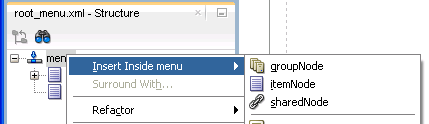
XMLMenuModelmetadata file, the tree structure you see in the Structure window exactly mirrors the indentation levels of the menu metadata, as shown in Figure 20-15. -
-
For each element used to create a node, set the properties in the Properties window, as described in Table 20-3 for
itemNodeelements, Table 20-4 forgroupNodeelements, and Table 20-5 forsharedNodeelements.Table 20-3 itemNode Element Attributes
Attribute Description actionSpecify either an outcome string or an EL method binding expression that returns an outcome string. In either case, the outcome string must match the
from-outcomevalue to the navigation case for that node as configured in thefaces-config.xmlfile.destinationSpecify the URI of the page to navigate to when the node is selected, for example,
http://www.oracle.com. If the destination is a JSF page, the URI must begin with "/faces".Alternatively, specify an EL method expression that evaluates to the URI.
If both
actionanddestinationare specified,destinationtakes precedence overaction.focusViewIdRequired. The URI of the page that matches the node's navigational result, that is, the
to-view-idvalue of the navigation case for that node as specified in thefaces-config.xmlfile.For example, if the action outcome of the node navigates to
/page_one.jsf(as configured in thefaces-config.xmlfile), thenfocusViewIdmust also be/page_one.jsf.The
focusViewIddoes not perform navigation. Page navigation is the job of theactionordestinationattributes. ThefocusViewId, however, is required for theXMLMenuModelto determine the correct focus path.idRequired. Specify a unique identifier for the node.
As shown in Example 20-5, it is good practice to use "inX" for the ID of each
itemNode, where for example, "inX" could be in1, in11, in111, in2, in21, in 211, and so on.labelSpecify the label text to display for the node. Can be an EL expression to a string in a resource bundle, for example,
#{bundle.somelabel}, wherebundlemust match the rootmenuelement'svarattribute value.A
groupNodeelement does not have theactionordestinationattribute that performs navigation directly, but it points to a child node that has the action outcome or destination URI, either directly by pointing to anitemNodechild (which has theactionordestinationattribute), or indirectly by pointing to agroupNodechild that will then point to one of its child nodes, and so on until anitemNodeelement is reached. Navigation will then be determined from the action outcome or destination URI of thatitemNodeelement.Consider the
groupNodecode shown in Example 20-11. At runtime, when users clickgroupNode id="gn1", orgroupNode id="gn11", oritemNode id="in1", the navigation outcome is "goToSubTabOne", as specified by the firstitemNodereached (that isitemNode id="id1"). Table 20-4 shows the attributes you must specify when you use agroupNodeelement.Example 20-11 groupNode Elements
<?xml version="1.0" encoding="windows-1252" ?>
<menu xmlns:"http://myfaces.apache.org/trinidad/menu">
  <groupNode id="gn1" idref="gn11" label="GLOBAL_TAB_0">
    <groupNode id="gn11" idref="in1" label="PRIMARY_TAB_0">
      <itemNode id="in1" label="LEVEL2_TAB_0" action="goToSubTabOne"
                focusViewId="/menuDemo/subtab1.jsf"/>
      <itemNode id="in2" label="LEVEL2_TAB_1" action="goToSubTabTwo"
                focusViewId="/menuDemo/subtab2.jsf"/>
    </groupNode>
    <itemNode id="in3" label="PRIMARY_TAB_1" focusViewId="/menuDemo/tab2.jsf"
              destination="/faces/menuDemo/tab2.jsf"/>
  </groupNode>
  <itemNode id="gin1" label="GLOBAL_TAB_1" action="goToGlobalOne"
            focusViewId="/menuDemo/global1.jsf"/>
  <itemNode id="gin2" label="GLOBAL_TAB_2"
            destination="/faces/menuDemo/global2.jsf"
            focusViewId="/menuDemo/global2.jsf"/>
</menu>
Table 20-4 GroupNode Element Attribute
Attribute Description idA unique identifier for the group node.
As shown in Example 20-11, it is good practice to use
gnXfor the ID of eachgroupNode, where for example,gnXcould begn1,gn2, and so on.idrefSpecify the ID of a child node, which can be an
itemNode, or anothergroupNode. When adding agroupNodeas a child node, that child in turn can reference anothergroupNodeand so on, but eventually anitemNodechild must be referenced as the last child.The
idrefattribute can contain more than one child ID, separated by spaces; the IDs are processed in the order they are listed.labelSpecify the label text to display for the group node. Can be an EL expression to a string in a resource bundle, for example,
#{bundle.somelabel}.Table 20-5 sharedNode Element Attribute
Attribute Description refSpecify the managed bean name of another
XMLMenuModelclass, as configured in thefaces-config.xmlfile, for example,#{shared_menu}.At runtime, the referenced navigation menu is created, inserted as a submenu into the main (root) menu, and rendered.
20.7.2 What Happens When You Use the Create ADF Menu Model Wizard
When you use the Create ADF Menu Model wizard to create an XMLMenuModel metadata file, JDeveloper automatically configures for you a managed bean for the menu metadata file in the faces-config.xml file, using the metadata file name you provide as the managed bean name.
Example 20-12 shows part of the faces-config.xml file that contains the configuration of one XMLMenuModel metadata file. By default, JDeveloper uses the oracle.adf.view.rich.model.MDSMenuModel class as the managed bean class, and request as the managed bean scope, which is required and cannot be changed.
Example 20-12 Managed Bean Configuration for XMLMenuModel in faces-config.xml
<managed-bean>
  <managed-bean-name>root_menu</managed-bean-name>
  <managed-bean-class>oracle.adf.view.
                      rich.model.MDSMenuModel</managed-bean-class>
  <managed-bean-scope>request</managed-bean-scope>
  <managed-property>
    <property-name>createHiddenNodes</property-name>
    <value>false</value>
  </managed-property>
  <managed-property>
    <property-name>source</property-name>
    <property-class>java.lang.String</property-class>
    <value>/WEB-INF/root_menu.xml</value>
  </managed-property>
</managed-bean>
In addition, the following managed properties are added by JDeveloper for the XMLMenuModel managed bean:
-
createHiddenNodes: Whentrue, specifies that the hierarchical nodes must be created even if the component'srenderedattribute isfalse. ThecreateHiddenNodesvalue is obtained and made available when the menu metadata source file is opened and parsed. This allows the entire hierarchy to be created, even when you do not want the actual component to be rendered. -
source: Specifies the menu metadata source file to use (for example,/WEB-INF/root_menu.xml).
Note:
ThecreateHiddenNodes property must be placed before the source property, which JDeveloper does for you when the managed bean is automatically configured. The XMLMenuModel managed bean must have the createHiddenNodes value already set to properly parse and create the menu's XML metadata from the source managed property.For each XMLMenuModel metadata file that you create in a project using the wizard, JDeveloper configures a managed bean for it in the faces-config.xml file. For example, if you use a sharedNode element in an XMLMenuModel to reference another XMLMenuModel metadata file (as shown in Example 20-10), you would have created two metadata files. And JDeveloper would have added two managed bean configurations in the faces-config.xml file, one for the main (root) menu model, and a second managed bean for the shared (referenced) menu model, as shown in Example 20-13.
Example 20-13 Managed Bean for Shared Menu Model in faces-config.xml
<!-- managed bean for referenced, shared menu model -->
<managed-bean>
  <managed-bean-name>shared_menu</managed-bean-name>
  <managed-bean-class>
  <managed-bean-class>oracle.adf.view.
                      rich.model.MDSMenuModel</managed-bean-class>
  </managed-bean-class>
  <managed-bean-scope>request</managed-bean-scope>
  <managed-property>
    <property-name>createHiddenNodes</property-name>
    <value>false</value>
  </managed-property>
  <managed-property>
    <property-name>source</property-name>
    <property-class>java.lang.String</property-class>
    <value>/WEB-INF/shared_menu.xml</value>
  </managed-property>
</managed-bean>
This means, if you use shared nodes in your XMLMenuModel metadata files, the faces-config.xml file will have a root menu model managed bean, plus menu model managed beans for any menu models referenced through shared nodes.
20.7.3 How to Bind the navigationPane Component to the Menu Model
Each node in the page hierarchy corresponds to one JSF page. On each page, you use one navigationPane component for each level of navigation items that you have defined in your XMLMenuModel metadata file, including global items. Levels are defined by a zero-based index number: Starting with global nodes in the metadata file (that is, direct children nodes under the menu element as shown in Example 20-5), the level attribute value is 0 (zero), followed by 1 for the next level (typically tabs), 2 for the next level after that (typically bars), and so on. For example, if you had a page hierarchy like the one shown in Figure 20-13 and Example 20-5, you would use three navigationPane components on a page such as Home (for the three levels of navigation under the Home node), plus one more navigationPane component for the global nodes.
Tip:
Because the menu model dynamically determines the hierarchy (that is, the links that appear in eachnavigationPane component) and also sets the current nodes in the focus path as selected, you can practically reuse the same code for each page. You need to change only the page's document title, and add the specific page contents to display on that page.
Because of this similar code, you can create a single page fragment that has just the facets containing the navigationPane components, and include that fragment in each page, where you change the page's document title and add the page contents.
As described in Section 20.8.1, "How to Create a Simple Page Hierarchy," you use the hint attribute to specify the type of navigation item you want to use for each hierarchical level (for example, buttons, tabs, or bar). But instead of manually adding multiple commandNavigationItem components yourself to provide the navigation items, you bind each navigationPane component to the root XMLMenuModel managed bean, and insert only one commandNavigationItem component into the nodeStamp facet of each navigationPane component, as shown in Example 20-14.
Example 20-14 navigationPane Component Bound to XMLMenuModel Managed Bean
<af:navigationPane var="menuNode" value="#{root_menu}" level="0"
                   hint="buttons">
  <f:facet name="nodeStamp">
    <af:commandNavigationItem text="#{menuNode.label}"
                              action="#{menuNode.doAction}"
                              icon="#{menuNode.icon}"
                              destination="#{menuNode.destination}"
                              visible="#{menuNode.visible}"
                              rendered="#{menuNode.rendered}"/>
  </f:facet>
</af:navigationPane>
The nodeStamp facet and its single commandNavigationItem component, in conjunction with the XMLMenuModel managed bean, are responsible for:
-
Stamping out the correct number of navigation items in a level.
-
Displaying the correct label text and other properties as defined in the metadata. For example, the EL expression
#{menuNode.label}retrieves the correct label text to use for a navigation item, and#{menuNode.doAction}evaluates to the action outcome defined for the same item. -
Marking the current items in the focus path as selected. You should not specify the
selectedattribute at all for thecommandNavigationItemcomponents.
Note:
If there is no node information in theXMLMenuModel object for a particular hierarchical level (for example, level 3 lists), ADF Faces does not display those items on the page even though the page contains the navigationPane component code for that level.If you want the navigation items to be styled, create a decorativeBox component by dragging and dropping a Decorative Box from the Layout panel of the Components window to the JSF page. Set the theme to determine how you want the tabs to appear. Valid values are:
-
default -
light -
medium -
dark
Each value describes the look and feel applied to the application by its ADF skin when you specify the theme value for the component. You can change how the themes display. For more information, see Chapter 31, "Customizing the Appearance Using Styles and Skins."
It may help to understand how the attributes of navigation components affect functionality. For more information, see Section 20.7, "Using a Menu Model to Create a Page Hierarchy."
You may also find it helpful to understand functionality that can be added using other ADF Faces features. For more information, see Section 20.1.2, "Additional Functionality for Navigation Components."
To bind a navigationPane component to the menu model:
-
In the Components window, from the Layout panel, in the Interactive Containers and Headers group, drag and drop a Navigation Pane onto the JSF page for each level of the hierarchy.
For example, to create any of the pages as shown in the hierarchy in Figure 20-13, you drag and drop four
navigationPanecomponents onto the JSF page. -
For each
navigationPanecomponent, in the Properties window, expand the Common section and select one of the following types of navigation items from the Hint dropdown list to determine how thenavigationPanedisplays:-
bar: Displays the navigation items separated by a bar, for example the Insurance and Paid Time Off links in Figure 20-17.
-
buttons: Displays the navigation items separated by a bar in a global area, for example the Home and Help links in Figure 20-17.
-
choice: Displays the navigation items in a popup list when the associated dropdown icon is clicked. You must include a value for the
navigationPanecomponent'siconattribute and you can associate a label to the dropdown list using thetitleattribute. -
list: Displays the navigation items in a bulleted list, for example the Health and Dental links in Figure 20-17.
-
tabs: Displays the navigation items as tabs, for example the Benefits and Employee Data tabs in Figure 20-17.
-
-
In the Level field, enter a number for the appropriate level of metadata in the
XMLMenuModelmetadata file. Thelevelattribute is a zero-based index number: Starting with global nodes in the metadata file (that is, direct children nodes under themenuelement as shown in Example 20-5), thelevelattribute value is0(zero), followed by1for the next level (typically tabs),2for the next level after that (typically bars), and so on.The
commandNavigationItemcomponent is able to get its metadata from the metadata file through thelevelattribute on the parentnavigationPanecomponent. By default, if you do not specify alevelattribute value,0(zero) is used, that means thenavigationPanecomponent will take the metadata from the first level under themenuelement for rendering by thecommandNavigationItemcomponent. -
In the Properties window, expand the Data section and set the following:
-
Value: Set to the menu model managed bean that is configured for the root
XMLMenuModelclass in thefaces-config.xmlfile.Note:
Thevalueattribute can reference root menu models and menu models referenced by shared nodes. If you reference a shared node in thevalueattribute, thefaces-config.xmlfile needs to have a new managed bean entry with a different managed bean name than the one which is used in a root menu model definition in the menu model metadata file. This promotes the menu model of a shared node to a root menu model which can then be referred to in the value attribute. -
Var: Set to text that you will use in the
commandNavigationItemcomponents to get the needed data from the menu model.As the hierarchy is created at runtime, and each node is stamped, the data for the current node is copied into the
varattribute, which can then be addressed using an EL expression. You specify the name to use for this property in the EL expression using thevarproperty.Tip:
You use the same value for thevarattribute for everynavigationPanecomponent on the page or in the application.
-
-
In the Components window, from the Layout panel, in the Interactive Containers and Headers group, drag and drop a Navigation Item to the
nodeStampfacet of thenavigationPanecomponent. -
Set the values for the remaining attributes that have corresponding values in the metadata using EL expressions that refer to the menu model (whose metadata contains that information). You access these values using the value of the
varattribute you set for the parentnavigationPanecomponent in Step 4 along with the name of the correspondingitemNodeelement that holds the value in the metadata. Table 20-6 shows the attributes on the navigation item that has corresponding values in the metadata.Table 20-6 Navigation Item Attributes and the Associated Menu Model Attributes
Navigation Item Attribute Associated Menu Model Element Attribute text
label
action
doAction
icon
icon
destination
destination
visible
visible
rendered
rendered
For example, if you had set the
varattribute on the parentnavigationPanecomponent tomenuNode, you would use#{menuNode.doAction}as the EL expression for the value of theactionattribute. This would resolve to the action property set in the metadata for each node. Example 20-15 shows the JSF code for binding to a menu model that has four levels of hierarchical nodes.Example 20-15 Binding to the XMLMenuModel
<af:form>
  <af:navigationPane hint="buttons" level="0" value="#{root_menu}"
                     var="menuNode">
    <f:facet name="nodeStamp">
      <af:commandNavigationItem text="#{menuNode.label}"
                                action="#{menuNode.doAction}"
                                icon="#{menuNode.icon}"
                                destination="#{menuNode.destination}"/>
    </f:facet>
  </af:navigationPane>
  <af:navigationPane hint="tabs" level="1" value="#{root_menu}"
                     var="menuNode">
    <f:facet name="nodeStamp">
      <af:commandNavigationItem text="#{menuNode.label}"
                                action="#{menuNode.doAction}"
                                icon="#{menuNode.icon}"
                                destination="#{menuNode.destination}"/>
    </f:facet>
  </af:navigationPane>
  <af:navigationPane hint="bar" level="2" value="#{root_menu}"
                     var="menuNode">
    <f:facet name="nodeStamp">
      <af:commandNavigationItem text="#{menuNode.label}"
                                action="#{menuNode.doAction}"
                                icon="#{menuNode.icon}"
                                destination="#{menuNode.destination}"/>
    </f:facet>
  </af:navigationPane>
  <af:navigationPane hint="list" level="3" value="#{root_menu}"
                     var="menuNode">
    <f:facet name="nodeStamp">
      <af:commandNavigationItem text="#{menuNode.label}"
                                action="#{menuNode.doAction}"
                                icon="#{menuNode.icon}"
                                destination="#{menuNode.destination}"/>
    </f:facet>
  </af:navigationPane>
</af:form>
Note:
For information about how to let users close navigation tabs, see Section 20.8.3, "What You May Need to Know About Removing Navigation Tabs."20.7.4 How to Use the breadCrumbs Component with a Menu Model
Creating a breadcrumb using the menu model is similar to creating the page hierarchy; you use the breadCrumbs component with a nodeStamp facet that stamps a commandNavigationItem component with data from the model.
It may help to understand how the attributes of navigation components affect functionality. For more information, see Section 20.7, "Using a Menu Model to Create a Page Hierarchy."
You may also find it helpful to understand functionality that can be added using other ADF Faces features. For more information, see Section 20.1.2, "Additional Functionality for Navigation Components."
To create a breadcrumb using a menu model:
-
In the Components window, from the General Controls panel, in the Location group, drag and drop a BreadCrumbs onto the JSF page.
-
By default, breadcrumb links display in a horizontal line. To change the layout to be vertical, in the Properties window, expand the Common section and select
verticalfrom the Orientation dropdown list. -
In the Properties window, expand the Data section and the set the following:
-
Value: Set to the root
XMLMenuModelmanaged bean as configured in thefaces-config.xmlfile. This is the same bean to which thenavigationPanecomponent is bound.Note:
Thevalueattribute should reference only a root menu model and not any menu models referenced through shared nodes. For example, if you use a shared node in your mainXMLMenuModelelement (as shown in Example 20-10), JDeveloper would have created managed bean configurations for the shared node and the rootXMLMenuModelbean that consumes the shared model. The shared model managed bean is automatically incorporated into the root menu model managed bean as the menu tree is parsed at startup. -
Var: Set to text that you will use in the
commandNavigationItemcomponents to get the needed data from the menu model.As the hierarchy is created at runtime, and each node is stamped, the data for the current node is copied into the
varattribute, which can then be addressed using an EL expression. You specify the name to use for this property in the EL expression using thevarproperty.Tip:
You can use the same value for thevarattribute for thebreadCrumbscomponent as you did for thenavigationPanecomponents on the page or in the application.
-
-
In the Components window, from the Layout panel, in the Interactive Containers and Headers group, drag a Navigation Item and drop it inside the
nodeStampfacet of thebreadCrumbscomponent.Note:
ThenodeStampfacet of thebreadCrumbscomponent determines what links appear according to the menu model that you specify for thevalueattribute of thebreadCrumbscomponent. If you do not specify the menu model you want to render for thevalueattribute of thebreadCrumbscomponent, no links appear at runtime. Do not use anodeStampfacet for thebreadCrumbscomponent if you do not use a menu model because no stamps will be required. -
Set the values for the remaining attributes that have corresponding values in the metadata using EL expressions that refer to the menu model (whose metadata contains that information). You access these values using the value of the
varattribute you set for the parentbreadCrumbscomponent in Step 3 along with the name of the correspondingitemNodeelement that holds the value in the metadata. Table 20-6 shows the attributes on the navigation item that has corresponding values in the metadata.For example, if you had set the
varattribute on thebreadCrumbscomponent tomenuNode, you would use#{menuNode.doAction}as the EL expression for the value of theactionattribute. This would resolve to the action property set in the metadata for each node.
20.7.5 How to Use the menuBar Component with a Menu Model
As described in Chapter 15, "Using Menus, Toolbars, and Toolboxes," the menuBar and menu components are usually used to organize and create menus that users click to cause some change or action in the application. Where applicable, the menuBar component can be used with an XMLMenuModel implementation and managed beans to create a page hierarchy. Like the breadCrumbs or navigationPane component, when menuBar is bound to the root XMLMenuModel managed bean, you use one commandNavigationItem component in the nodeStamp facet to dynamically provide the menu items for navigating the page hierarchy.
When the page hierarchy of a website cannot be sufficiently represented by a tabbed navigation system (through a navigationPane or panelTabbed component), use the menuBar component to provide a navigation bar of menus and submenus. For example, a web store application with many shopping categories for users to browse might benefit from a horizontal arrangement of top-level menus in a bar instead of rendering all the categories and subcategories within tabs, subtabs or bars, and lists. With a menuBar bound to a menu model, submenus appear only when the user places the mouse cursor over a top-level menu or a submenu item. Not only does this arrangement reduce screen real estate, but the user can also quickly navigate from the top of the hierarchy to a page at the lowest level with just one click.
Unlike a menuBar component that is not bound to a menu model, a menuBar that is bound to a menu model is not detachable, and should not be used with a toolbar. Also, do not use navigation tabs with a menuBar bound to a menu model on the same page. If you must use both, always place the menuBar component above the navigation tabs. You can, however, use a menuBar bound to a menu model with a breadCrumbs component bound to the same model on those pages where you want to show breadcrumb links.
If you want the menu bar to be styled, create a decorativeBox component by dragging and dropping a Decorative Box from the Layout panel of the Components window to the JSF page. Set the theme to determine how you want the tabs to appear. Valid values are:
-
default -
light -
medium -
dark
Each value describes the look and feel applied to the application by its ADF skin when you specify the theme value for the component. You can change how the themes display. For more information, see Chapter 31, "Customizing the Appearance Using Styles and Skins."
It may help to understand how the attributes of navigation components affect functionality. For more information, see Section 20.7, "Using a Menu Model to Create a Page Hierarchy."
You may also find it helpful to understand functionality that can be added using other ADF Faces features. For more information, see Section 20.1.2, "Additional Functionality for Navigation Components."
To create a horizontal menu bar using a menu model:
-
In the Components window, from the Menus and Toolbars panel, drag and drop a Menu Bar onto the JSF page.
-
In the Properties window, expand the Menu Model section and set the following values:
-
Value: Set to the root
XMLMenuModelmanaged bean as configured in thefaces-config.xmlfile. This is the same bean to which thebreadCrumbscomponent is bound.Note:
Thevalueattribute should reference only a root menu model and not any menu models referenced through shared nodes. For example, if you use a shared node in your mainXMLMenuModelelement (as shown in Example 20-10), JDeveloper would have created managed bean configurations for the shared node and the rootXMLMenuModelbean that consumes the shared model. The shared model managed bean is automatically incorporated into the root menu model managed bean as the menu tree is parsed at startup. -
Var: Set to the text that you will use in the
commandNavigationItemcomponents to get the needed data from the menu model.As the hierarchy is created at runtime, and each node is stamped, the data for the current node is copied into the
varattribute, which can then be addressed using an EL expression. You specify the name to use for this property in the EL expression using thevarproperty.Tip:
You can use the same value for thevarattribute for themenuBarcomponent as you did for thebreadCrumbscomponent on the page or in the application.
-
-
In the Components window, from the Layout panel, in the Interactive Containers and Headers group, drag and drop a Navigation Item to the
nodeStampfacet of themenuBarcomponent.Note:
ThenodeStampfacet of themenuBarcomponent determines what links appear according to the menu model that you specify for thevalueattribute of themenuBarcomponent. If you do not specify the menu model you want to render for thevalueattribute of themenuBarcomponent, no menu items will appear at runtime. -
Set the values for the remaining attributes that have corresponding values in the metadata using EL expressions that refer to the menu model (whose metadata contains that information). You access these values using the value of the
varattribute you set for the parentmenuBarcomponent in Step 2 along with the name of the correspondingitemNodeelement that holds the value in the metadata. Table 20-6 shows the attributes on the navigation item that has corresponding values in the metadata.For example, if you had set the
varattribute on themenuBarcomponent tomenuNode, you would use#{menuNode.doAction}as the EL expression for the value of theactionattribute. This would resolve to the action property set in the metadata for each node.
20.7.6 What Happens at Runtime: How the Menu Model Creates a Page Hierarchy
The value attribute of the menu model bound component (navigationPane, breadCrumbs, or menuBar) references the managed bean for the XMLMenuModel element. When that managed bean is requested, the following takes place:
-
The
setSource()method of theXMLMenuModelclass is called with the location of the model's metadata, as specified in themanaged-propertyelement in thefaces-config.xmlfile. -
An
InputStreamobject to the metadata is made available to the parser (SAXParser); the metadata for the navigation items is parsed, and a call toMenuContentHandlermethod is made. -
The
MenuContentHandlerbuilds the navigation menu tree structure as aListobject in the following manner:-
The
startElement()method is called at the start of processing a node in the metadata. -
The
endElement()method is called at the end of processing the node. -
As each node is processed, a
Listof navigation menu nodes that make up the page hierarchy of the menu model is created.
-
-
A
TreeModelobject is created from the list of navigation menu nodes. -
The
XMLMenuModelobject is created from theTreeModelobject.
If a groupNode element has more than one child id in its idref attribute, the following occurs:
-
The IDs are processed in the order they are listed. If no child node is found with the current ID, the next ID is used, and so on.
-
Once a child node is found that matches the current ID in the
idreflist, then that node is checked to see if itsrenderedattribute is set totrue, itsdisabledattribute is set tofalse, itsreadOnlyattribute is set tofalse, and itsvisibleattribute is set totrue. If any of the criteria is not met, the next ID in theidreflist is used, and so on. -
The first child node that matches the criteria is used to obtain the action outcome or destination URI. If no child nodes are found that match the criteria, an error is logged. However, no error will be shown in the UI.
-
If the first child node that matches the criteria is another
groupNodeelement, the processing continues into its children. The processing stops when anitemNodeelement that has either anactionordestinationattribute is encountered. -
When the
itemNodeelement has anactionattribute, the user selection initiates aPOSTaction and the navigation is performed through the action outcome. When theitemNodeelement has adestinationattribute, the user selection initiates aGETaction and navigation is performed directly using thedestinationvalue.
The XMLMenuModel class provides the model that correctly highlights and enables the items on the navigation menus (such as tabs and bars) as you navigate through the navigation menu system. The model is also instantiated with values for label, doAction, and other properties that are used to dynamically generate the navigation items.
The XMLMenuModel class does no rendering; the model bound component uses the return value from the call to the getFocusRowKey() method to render the navigation menu items for a level on a page.
The commandNavigationItem component housed within the nodeStamp facet of the menu model bound component provides the label text and action outcome for each navigation item. Each time the nodeStamp facet is stamped, the data for the current navigation item is copied into an EL-reachable property, the name of which is defined by the var attribute on the navigationPane component that houses the nodeStamp facet. The nodeStamp displays the data for each item by getting further properties from the EL-reachable property. Once the navigation menu has completed rendering, this property is removed (or reverted back to its previous value). When users select a navigation item, the default JSF actionListener mechanism uses the action outcome string or destination URI to handle the page navigation.
The XMLMenuModel class, in conjunction with nodeStamp facet also controls whether or not a navigation item is rendered as selected. As described earlier, the XMLMenuModel object is created from a tree model, which contains viewId attribute information for each node. The XMLMenuModel class has a method getFocusRowKey() that determines which page has focus, and automatically renders a node as selected if the node is on the focus path. The getFocusRowKey() method in its most simplistic fashion does the following:
-
Gets the current
viewIdattribute. -
Compares the
viewIdattribute value with the IDs in internal maps used to resolve duplicateviewIdvalues and in theviewIdFocusPathMapobject that was built by traversing the tree when the menu model was created. -
Returns the focus path to the node with the current
viewIdattribute or returnsnullif the currentviewIdattribute value cannot be found.
The viewId attribute of a node is used to determine the focus rowKey object. Each item in the model is stamped based on the current rowKey object. As the user navigates and the current viewId attribute changes, the focus path of the model also changes and a new set of navigation items is accessed.
20.7.7 What You May Need to Know About Using Custom Attributes
Custom attributes that you have created can be displayed, but only for itemNode elements. To add an itemNode element to access the value of a custom attribute, you need to get the tree from the menu model by:
-
Calling the menu models
getWrappedData()method -
Calling the
getFocusRowKey()method to get the current focus path -
Using this focus path to traverse the tree and return a list of nodes in the focus path
-
Testing one or more of these nodes for custom attribute(s) by calling the
getCustomProperty()API
Example 20-18 shows an example of the required code.
Example 20-18 Accessing Custom Attributes from the XMLMenuModel
  /**
    * Returns the nodes corresponding to a focus path
    *
    * @param tree
    * @param focusPath
    */
    public List getNodesFromFocusPath(TreeModel tree, ArrayList focusPath)
    {
      if (focusPath == null || focusPath.size() == 0)
        return null;

      // Clone the focusPath cause we remove elements
      ArrayList fp = (ArrayList) focusPath.clone();

      // List of nodes to return
      List nodeList = new ArrayList<Object>(fp.size());

      // Convert String rowkey to int and point to the
      // node (row) corresponding to this index
      int targetNodeIdx = Integer.parseInt((String)fp.get(0));
      tree.setRowIndex(targetNodeIdx);

      // Get the node
      Object node = tree.getRowData()

      // put the Node in the List
      nodeList.add(node);

      // Remove the 0th rowkey from the focus path
      // leaving the remaining focus path
      fp.remove(0);

      // traverse into children
      if (   fp.size() > 0
          && tree.isContainer()
          && !tree.isContainerEmpty()
         )
      {
        tree.enterContainer();

        // get list of nodes in remaining focusPath
        List childList = getNodesFromFocusPath(tree, fp);

        // Add this list to the nodeList
        nodeList.addAll(childList);

        tree.exitContainer();
      }

      return nodeList;
    }

  public String getElementLabel(XMLMenuModel model, Object myVal, String myProp)
  {
     TreeModel tree = model.getWrappedData();

     Object node = findNodeByPropertyValue(tree, myVal, myProp);

     FacesContext context = FacesContext.getCurrentInstance();
     PropertyResolver resolver = context.getApplication().getPropertyResolver();

     String label = (String) resolver.getValue(node, _LABEL_ATTR);

     return label;
  }

  public Object findNodeByPropertyValue(TreeModel tree, Object myVal, String myProp)
  {
    FacesContext context = FacesContext.getCurrentInstance();
    PropertyResolver resolver = context.getApplication().getPropertyResolver();

    for ( int i = 0; i < tree.getRowCount(); i++)
    {
      tree.setRowIndex(i);

      // Get a node
      Object node = tree.getRowData();

      // Get the value of the attribute of the node
      Obect propVal = resolver.getValue(node, myProp);

      if (propVal == myVal)
      {
        return node;
      }

      if (tree.isContainer() && !tree.isContainerEmpty())
      {
        tree.enterContainer();
        node = findNodeByPropertyValue(tree, myVal, myProp);

        if (node != null)
          return node;

        tree.exitContainer();
      }guap
    }
    return null;
  }
20.8 Creating a Simple Navigational Hierarchy
Note:
If the application hierarchy is complex and consists of deeply nested pages, it is more efficient to use a menu model to create your navigation system. For details, see Section 20.7, "Using a Menu Model to Create a Page Hierarchy".Section 20.6, "Using Navigation Items for a Page Hierarchy" describes a simple page hierarchy with three levels of links under a top-level root node, Home. Figure 20-16 and Figure 20-17 show an example of what the user interface could look like when the navigationPane component and individual commandNavigationItem components are used to create a view for the page hierarchy shown in Figure 20-10.
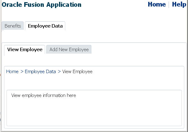
When you create the hierarchy manually, first determine the focus path of each page (that is, where exactly in the hierarchy the page resides) in order to determine the exact number of navigationPane and commandNavigationItem components needed for each page, as well as to determine the components that should be configured as selected when the user visits the page. For example, in Figure 20-16, which shows the View Employee page, you would need three navigationPane components. In addition to the first-level tabs, only the second-level child bars of Employee Data are needed, and only the Employee Data tab and View Employee bar render as selected.
Similarly in Figure 20-17, which shows the Health page, only the child bars of Benefits are needed, and the Benefits tab and Insurance bar must be configured as selected. Additionally for this page, you would create the child nodes under Insurance, which can be presented as a vertical list on the side of the page. The Health item in the vertical list is configured as selected, and the contents of the Health page are displayed in the middle, to the right of the vertical list.
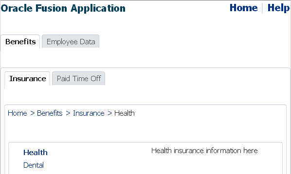
Regardless of the type of navigation items you use (such as tabs, bars or lists), you use a navigationPane component to represent one level of hierarchical links, and a series of commandNavigationItem child components within each navigationPane component to provide the actual navigation items. For example, in Figure 20-17 the actual links for the first-level tabs (Benefits and Employee Data), the second-level bars (Insurance and Paid Time Off), and the Health and Dental links in the list are each provided by a commandNavigationItem component. Underneath the bars, to provide the breadcrumb links that show the focus path of the current page, you use a breadCrumbs component with the required number of child commandNavigationItem components.
20.8.1 How to Create a Simple Page Hierarchy
When your navigational hierarchy contains only a few pages and is not very deep, you can choose to manually create the hierarchy. Doing so involves creating the navigation rule and navigation cases, using the navigationPane component to create the hierarchy, and using the commandNavigationItem component to create the links.
It may help to understand how the attributes of navigation components affect functionality. For more information, see Section 20.8, "Creating a Simple Navigational Hierarchy."
You may also find it helpful to understand functionality that can be added using other ADF Faces features. For more information, see Section 20.1.2, "Additional Functionality for Navigation Components."
To manually create a navigation hierarchy:
-
In the Applications window, expand the WEB-INF node and double-click faces-config.xml.
-
In the source editor, create one global JSF navigation rule that has the navigation cases for all the nodes (that is, pages) in the page hierarchy.
For example, the page hierarchy shown in Figure 20-10 has 10 nodes, including the global Help node. Thus, you would create 10 navigation cases within one global navigation rule in the
faces-config.xmlfile, as shown in Example 20-19.For each navigation case, specify a unique outcome string, and the path to the JSF page that should be displayed when the navigation system returns an outcome value that matches the specified string.
Example 20-19 Global Navigation Rule for a Page Hierarchy in faces-config.xml
<navigation-rule>
  <navigation-case>
    <from-outcome>goHome</from-outcome>
    <to-view-id>/home.jsf</to-view-id>
  </navigation-case>
  <navigation-case>
    <from-outcome>goHelp</from-outcome>
    <to-view-id>/globalhelp.jsf</to-view-id>
  </navigation-case>
  <navigation-case>
    <from-outcome>goEmp</from-outcome>
    <to-view-id>/empdata.jsf</to-view-id>
  </navigation-case>
  <navigation-case>
    <from-outcome>goBene</from-outcome>
    <to-view-id>/benefits.jsf</to-view-id>
  </navigation-case>
  <navigation-case>
    <from-outcome>goIns</from-outcome>
    <to-view-id>/insurance.jsf</to-view-id>
  </navigation-case>
  <navigation-case>
    <from-outcome>goPto</from-outcome>
    <to-view-id>/pto.jsf</to-view-id>
  </navigation-case>
  <navigation-case>
    <from-outcome>goView</from-outcome>
    <to-view-id>/viewdata.jsf</to-view-id>
  </navigation-case>
  <navigation-case>
    <from-outcome>goCreate</from-outcome>
    <to-view-id>/createemp.jsf</to-view-id>
  </navigation-case>
  <navigation-case>
    <from-outcome>goHealth</from-outcome>
    <to-view-id>/health.jsf</to-view-id>
  </navigation-case>
  <navigation-case>
    <from-outcome>goDental</from-outcome>
    <to-view-id>/dental.jsf</to-view-id>
  </navigation-case>
</navigation-rule>
For more information about creating navigation cases in JDeveloper, see Section 3.3, "Defining Page Flows."
-
Create the JSF pages for all the hierarchical nodes. If you want the navigation tabs to be styled, create a
decorativeBoxcomponent by dragging and dropping a Decorative Box from the Layout panel of the Components window to each page. Set the theme to determine how you want the tabs to appear. Valid values are:-
default -
light -
medium -
dark
Each value describes the look and feel applied to the application by its ADF skin when you specify the theme value for the component. You can change how the themes display. For more information, see Chapter 31, "Customizing the Appearance Using Styles and Skins." To consider using a page template to achieve the positioning and visual styling of your JSF pages, see Section 10.3, "Using Page Templates."
-
-
In the Components window, from the Layout panel, in the Interactive Containers and Headers group, drag and drop a Navigation Pane to each page. Drag and drop a
navigationPanecomponent for each level of the hierarchy on the page.For example, to create the Health page, as shown in Figure 20-17, drag and drop four
navigationPanecomponents. In the Health page, the components are dropped into specific areas of a template that already contains layout components to create the look and feel of the page. -
For each
navigationPanecomponent, in the Properties window, expand the Common section and select one of the following types of navigation items from the Hint dropdown list to determine how thenavigationPanecomponent displays:-
bar: Displays the navigation items separated by a bar, for example the Insurance and Paid Time Off links in Figure 20-17.
-
buttons: Displays the navigation items separated by a bar in a global area, for example the Home and Help links in Figure 20-17.
-
choice: Displays the navigation items in a popup list when the associated dropdown icon is clicked. You must include a value for the
navigationPanecomponent'siconattribute and you can associate a label to the dropdown list usingtitleattribute. -
list: Displays the navigation items in a bulleted list, for example the Health and Dental links in Figure 20-17.
-
tabs: Displays the navigation items as tabs, for example the Benefits and Employee Data tabs in Figure 20-17.
-
-
For each
navigationPanecomponent, add the neededcommandNavigationItemcomponents to represent the different links by dragging and dropping a Navigation Item from the Interactive Containers and Headers group in the Layout panel of the Components window. Drop a Navigation Item as a child to thenavigationPanecomponent for each link needed.For example, to create the Health page as shown in Figure 20-17, you would use a total of eight
commandNavigationItemcomponents, two for eachnavigationPanecomponent.Performance Tip:
At runtime, when available browser space is less than the space needed to display the contents in a tab or bar of a navigation pane, or the contents of the breadcrumb, ADF Faces automatically displays overflow icons that enable users to select and navigate to those items that are out of view. The number of child components within anavigationPaneorbreadCrumbscomponent, and the complexity of the children, will affect the performance of the items within the overflow. You should set the size of thenavigationPaneorbreadCrumbscomponent to avoid overflow when possible. -
For each
commandNavigationItemcomponent, set the navigation to the desired page. In the Properties window, expand the Common section and provide a static string outcome of an action or use an EL expression to reference an action method in the Action field. If you use a string, it must match the navigation metadata set up in the navigation rules for the page created in Step 2. If referencing a method, that method must return the required string. -
In the Properties window, expand the Behavior section and select
truefrom the Selected dropdown list if thecommandNavigationItemcomponent should be displayed as selected when the page is first rendered, andfalseif it should not.At runtime, when a navigation item is selected by the user, that component's
selectedattribute changes toselected="true"and the appearance changes to indicate to the user that the item has been selected. For example, in Figure 20-17 the Benefits tab, Insurance bar, and Health list item are shown as selected by a change in either background color or font style. You do not have to write any code to show the selected status; theselectedattribute on thecommandNavigationItemcomponent for that item takes care of turning on the selected status when the attribute value istrue.
Example 20-20 shows code used to generate the navigation items that are available when the current page is Health. Because the Health page is accessed from the Insurance page from the Benefits page, the commandNavigationItem components for those three links have selected="true".
Example 20-20 Sample Code Using Individual Navigation Items on One Page
<af:navigationPane hint="buttons">
  <af:commandNavigationItem text="Home" action="goHome"/>
  <af:commandNavigationItem text="Help" action="goHelp"/>
</af:navigationPane>
...
<af:navigationPane hint="tabs">
  <af:commandNavigationItem text="Benefits" action="goBene"
                            selected="true"/>
  <af:commandNavigationItem text="Employee Data" action="goEmp"/>
</af:navigationPane>
...
<af:navigationPane hint="bar">
  <af:commandNavigationItem text="Insurance" action="goIns"
                            selected="true"/>
  <af:commandNavigationItem text="Paid Time Off" action="goPto"/>
</af:navigationPane>
...
<af:navigationPane hint="list">
  <af:commandNavigationItem text="Health" action="goHealth"
                            selected="true"/>
  <af:commandNavigationItem text="Dental" action="goDental"/>
</af:navigationPane>
To change the selected state programmatically, you have to write a backing bean method to handle an action event. Then reference the method on the actionListener attribute of the commandNavigationItem components, as shown in Example 20-21.
Example 20-21 Using actionListener to Change Selected State
<!--  JSF Page Code ----->
<af:navigationPane hint="tabs">
  <af:commandNavigationItem text="Benefits"
                            actionListener="#{myBean.navigationItemAction}"
                            partialSubmit="true"../>
  .
</af:navigationPane>

<!-- Managed Bean Code ----->
public void navigationItemAction(ActionEvent event)
{
  UIComponent actionItem = event.getComponent();
  UIComponent parent = actionItem.getParent();
  while (! (parent instanceof UIXNavigationHierarchy) )
  {
    parent = parent.getParent();
    if (parent == null)
    {
      System.err.println(
       "Unexpected component hierarchy, no UIXNavigationHierarchy found.");
      return;
    }
  }

  List<UIComponent> children = parent.getChildren();
  for (UIComponent child : children)
  {
    FacesBean childFacesBean = ((UIXComponent) child).getFacesBean();
    FacesBean.Type type = childFacesBean.getType();
    PropertyKey selectedKey = type.findKey("selected");
    if (selectedKey != null)
    {
      childFacesBean.setProperty(selectedKey, child==actionItem);
    }
  }
  RequestContext adfContext = RequestContext.getCurrentInstance();
  adfContext.addPartialTarget(parent);
}
20.8.2 How to Use the breadCrumbs Component
In both Figure 20-16 and Figure 20-17, the user's current position in the page hierarchy is indicated by a path of links from the current page back to the root page. The path of links, also known as breadcrumbs, is displayed beneath the secondary bars, above the vertical lists (if any). To manually create such a path of links, you use the breadCrumbs component with a series of commandNavigationItem components as children.
It may help to understand how the attributes of navigation components affect functionality. For more information, see Section 20.8, "Creating a Simple Navigational Hierarchy."
You may also find it helpful to understand functionality that can be added using other ADF Faces features. For more information, see Section 20.1.2, "Additional Functionality for Navigation Components."
To manually create a breadcrumb:
-
In the Components window, from the General Controls panel, in the Location group, drag and drop a BreadCrumbs onto the JSF page.
-
By default, breadcrumb links are displayed in a horizontal line. To change the layout to be vertical, in the Properties window, expand the Common section and select
verticalfrom the Orientation dropdown list. -
For each link in the breadcrumb, create a
commandNavigationItemcomponent by dragging and dropping a Navigation Item from the Interactive Containers and Headers group in the Layout panel of the Components window as a child to thebreadCrumbscomponent. The last item should represent the current page.Tip:
Depending on the renderer or client device type, the last link in the breadcrumb may not be displayed, but you still must add thecommandNavigationItemcomponent for it. On clients that do display the last breadcrumb link, the link is always disabled automatically because it corresponds to the current page. -
For each
commandNavigationItemcomponent (except the last), set the navigation to the desired page. In the Properties window, expand the Common section and provide a static string outcome of an action or use an EL expression to reference an action method in the Action field. If you use a string, it must match the navigation metadata set up in the navigation rule for the page created in Step 2 as described in Section 20.8.1, "How to Create a Simple Page Hierarchy." If referencing a method, that method must return the required string.
For example, to create the breadcrumb as shown on the Health page in Figure 20-17, drag and drop four commandNavigationItem components, as shown in Example 20-22.
Example 20-22 BreadCrumbs Component With Individual CommandNavigationItem Children
<af:breadCrumbs>
  <af:commandNavigationItem text="Home" action="goHome"/>
  <af:commandNavigationItem text="Benefits" action="goBene"/>
  <af:commandNavigationItem text="Insurance" action="goIns"/>
  <af:commandNavigationItem text="Health"/>
</af:breadCrumbs>
20.8.3 What You May Need to Know About Removing Navigation Tabs
You can configure a navigationPane component whose hint attribute value is tabs so that the individual tabs can be closed. You can set it such that all tabs can be closed, all but the last tab can be closed, or no tabs can be closed. When navigation tabs are configured to be removed, a close icon (for example, an X) displays at the end of each tab as the mouse cursor hovers over the tab.
To enable tabs removal in a navigationPane component when hint="tabs", you need to do the following:
-
Set the
itemRemovalattribute onnavigationPane hint="tabs"toallorallExceptLast. When set toallExceptLast, all but one tab can be closed. This means as a user closes tabs, when there is only one tab left, that single last tab cannot be closed. -
Implement a handler to do the tab removal. When a user closes a tab, an
ItemEventof typeremoveis launched. Your code must handle this event and the actual removal of the tab, and any other desired functionality (for example, show a warning dialog on how to handle child components). For more information about events, see Chapter 6, "Handling Events." For information about using popup dialogs and windows, see Chapter 16, "Using Popup Dialogs, Menus, and Windows." -
Set the
itemListenerattribute on thecommandNavigationItemcomponent to an EL expression that resolves to the handler method that handles the actual tab removal, as shown in Example 20-23.
Example 20-23 Using itemListener to Remove a Tab Item
<!---- JSF Page Code ----->
<af:navigationPane hint="tabs" itemRemoval="all">
  <af:commandNavigationItem text="Benefits" partialSubmit="true"
                            itemListener="#{closebean.handleCloseTabItem}"/>
  ...
</af:navigationPane>

// Managed Bean Code
import oracle.adf.view.rich.event.ItemEvent;
...
public void handleCloseTabItem(ItemEvent itemEvent)
{
  if (itemEvent.getType().equals(ItemEvent.Type.remove))
  {
    Object item = itemEvent.getSource();
    if (item instanceof RichCommandNavigationItem)
    {
      RichCommandNavigationItem tabItem = (RichCommandNavigationItem) item;
      tabItem.setVisible(false);
      // do other desired functionality here ...
    }
  }
}
20.8.4 What You May Need to Know About the Size of Navigation Tabs
By default, the size of the tabs rendered by a navigationPane component that has its hint attribute value set to tabs is determined by the length of the text used as the label. You can configure the size of these tabs by configuring the following attributes for the navigationPane component:
-
maxTabSize: Set to a size in pixels. The tabs will never be larger than this size. -
minTabSize: Set to a size in pixels. The tabs will never be smaller than this size. -
truncationStyle: Set toellipsisif you want an ellipses to display after truncated text that cannot fit, based on themaxTabSize. If set tonone, then if the text does not fit on the tab, it will simply be truncated.
20.8.5 What You May Need to Know About Skinning and Navigation Tabs
You can use the -tr-layout-type skinning key to configure the type of indicator that the navigationPane component renders in an application window that is in a compressed layout. That is, the application window is not wide enough to display all the navigation tabs.
Figure 20-18 shows an overflow indicator that renders a dropdown list where the user can choose the navigation tab to navigate to.
Example 20-24 shows how you configure the -tr-layout-type skinning key so that the navigationPane component displays an overflow indicator.
Example 20-24 Using a Skinning Key to Set the Compressed Layout to Overflow
af|navigationPane {
  -tr-layout-type: overflow;
}
Rather than display overflow indicators, as shown in Figure 20-18, you can configure the -tr-layout-type skinning key for the navigationPane component so that the component renders a conveyor belt where users can scroll left or right to tabs that are not currently visible. Configuring the -tr-layout-type skinning key also renders all navigation tabs in one dropdown list, as shown in Figure 20-19. This configuration only takes effect if the navigationPane component's hint attribute is set to tabs. If the navigationPane component's hint attribute is set to another value, set the -tr-layout-type skinning key to overflow.
Example 20-25 shows how you configure the -tr-layout-type skinning key so that the navigationPane component renders a conveyor belt.
Example 20-25 Using a Skinning Key to Set the Compressed Layout to Conveyor Belt
af|navigationPane {
  -tr-layout-type: conveyor;
}
Figure 20-19 shows the navigationPane component rendering a conveyor belt in a compressed layout.
For more information about skinning, see Chapter 31, "Customizing the Appearance Using Styles and Skins."
20.9 Using Train Components to Create Navigation Items for a Multistep Process
Note:
If your application uses the Fusion technology stack or ADF Controller, then you should use ADF task flows to create the navigation system for your application page hierarchy. For details, see the "Using Train Components in Bounded Task Flows" section in Developing Fusion Web Applications with Oracle Application Development Framework.If you have a set of pages that users should visit in a particular order, consider using the train component on each page to display a series of navigation items that guide users through the multistep process. Figure 20-20 shows an example of what a rendered train component looks like on a page. Not only does a train component display the number of steps in a multistep process, it also indicates the location of the current step in relation to the entire process.
The train component renders each configured step represented as a train stop, and with all the stops connected by lines. Each train stop has an image (for example, a square block) with a label underneath the image.
Each train stop corresponds to one step or one page in your multistep process. Users navigate the train stops by clicking an image or label, which causes a new page to display. Typically, train stops must be visited in sequence, that is, a user must start at Step 1, move to Step 2, then Step 3, and so on; a user cannot jump to Step 3 if the user has not visited Step 2. Train stops can also be configured so that end users do not have to visit the stops in sequence. When you configure train stops in this way, all train stops that can be directly visited are enabled.
As shown in Figure 20-20, the train component provides at least four styles for train stops. The current stop where the user is visiting is indicated by a bold font style in the train stop's label, and a different image for the stop; visited stops before the current stop are indicated by a different label font color and image color; the next stop immediately after the current stop appears enabled; any other stops that have not been visited are grayed-out.
A train stop can include a subtrain, that is, you configure an action component (for example, a button component) to start a child multistep process from a parent stop, and then return to the correct parent stop after completing the subprocess. Suppose stop number 3 has a subprocess train containing two stops, when the user navigates into the first stop in the subprocess train, ADF Faces displays an icon representation of the parent train before and after the subprocess train, as shown in Figure 20-21.
You can use the trainButtonBar component in conjunction with the train component to provide additional navigation items for the train, in the form of Back and Next buttons, as shown in Figure 20-22. These Back and Next buttons allow users to navigate only to the next or previous train stop from the current stop. You can also use the trainButtonBar component without a train component. For example, you may want to display just the Back and Next buttons without displaying the stops when not all of the stops will be visited based on some conditional logic.
Both train components work by having the value attribute bound to a train model of type org.apache.myfaces.trinidad.model.MenuModel. The train menu model contains the information needed to:
-
Control a specific train behavior (that is, how the train advances users through the train stops to complete the multistep process).
-
Dynamically generate the train stops, including the train stop labels, and the status of each stop (that is, whether a stop is currently selected, visited, unvisited, or disabled).
Note:
In an application that uses the ADF Model layer and ADF Controller, this navigation and display is set up and handled in a different manner. For more information, see the "Using Train Components in Bounded Task Flows" section in Developing Fusion Web Applications with Oracle Application Development Framework.Briefly, a menu model for the train is implemented by extending the MenuModel abstract class, which in turn extends the TreeModel class (For more information, see Chapter 12, "Using Tables, Trees, and Other Collection-Based Components"). A MenuModel object represents the menu structure of a page or application or could represent the hierarchy of pages and stops involved in a flow.
Because an instance of a MenuModel class is a special kind of a TreeModel object, the nodes in the TreeModel object can represent the stops of a train. The node instance that represents a train stop within the train component can be of type TrainStopModel, or it can be any object as long as it provides the same EL structure as a TrainStopModel object. However, the TrainStopModel class is a convenient interface that exposes all the relevant methods to retrieve the outcome, as well as the label of a stop and its immediate, disabled, and visited attribute states.
The MenuModel class can also indicate where in the tree the current train stop (page) is focused. The getFocusRowKey() method in the MenuModel class returns the rowKey object of the focus page for the current viewId. The menu model implementation for the train must also have a specific train behavior. You can implement this behavior by extending the MenuModel abstract class or the ProcessMenuModel convenience class. Both these classes come from the following package:
org.apache.myfaces.trinidad.model
The train behavior controls what other stops along the train users can visit while visiting the current train stop.
To create a train stop model, you can either extend the TrainStopModel abstract class and implement the abstract methods, or you can create your own class with the same method signatures. Your class must return a rowData object. An instance of this class represents a rowData object in the underlying collection (for the MenuModel implementation).
Binding a train component to a menu model is similar to binding a navigationPane component to an XMLMenuModel class using the value attribute (described in Section 20.7.3, "How to Bind the navigationPane Component to the Menu Model"). However, as long as your TrainStopModel implementation represents a rowData object, you do not need to use the nodeStamp facet and its commandNavigationItem component to provide the train stops. At runtime ADF Faces dynamically creates the nodeStamp facet and commandNavigationItem component, and automatically binds the methods in the train stop model to the appropriate properties on the commandNavigationItem component. Example 20-26 shows the simplified binding for a train.
Tip:
If you need to collate information for the train stops from various places, then you will need to manually create thenodeStamp facet and the individual commandNavigationItem components that represent the train stops. For more information, see Section 20.9.3, "How to Bind to the Train Model in JSF Pages."The MenuModel implementation of your train model must provide specific train behavior. Train behavior defines how you want to control the pages users can access based on the page they are currently visiting. ADF Faces supports two train behaviors: Plus One and Max Visited.
Suppose there are 5 pages or stops in a train, and the user has navigated from page 1 to page 4 sequentially. Currently the user is at page 4. Where the user can go next depends on which train behavior the train model implements:
-
Plus One behavior: the user can go to page 3 or page 5
-
Max Visited behavior: the user can visit pages 1 to 3 (previously visited) and page 5 because it is the next page in the sequence. If the user goes to page 2, the next page that the user can visit is page 1, 3 or 4. The user cannot visit page 5 because page 4 was the maximum visited train stop in the sequence.
To define and use a train for all pages in a multistep process:
-
Create a JSF navigation rule and the navigation cases for the train. Creating a navigation rule and its navigation cases for a train is similar to Section 20.8.1, "How to Create a Simple Page Hierarchy," where you create one global navigation rule that has the navigation cases for all the train stops in the train.
Note:
You may want to set the value of theredirectelement totruefor each navigation case that you define within the JSF navigation rule if each train stop is an individual page and you want the client browser's URL to reference each new page. If you enable partial page rendering, the displayed URL may be different. For more information about theredirectelement, see the JavaServer Faces specification. For more information about partial page rendering, see Chapter 8, "Rerendering Partial Page Content." -
Create a train model that implements a specific train behavior and provides the train stop items for stamping. This includes creating a train stop model class and a menu model class. See Section 20.9.1, "How to Create the Train Model."
-
Configure managed beans for the train model. See Section 20.9.2, "How to Configure Managed Beans for the Train Model."
-
Create a JSF page for each train stop.
-
On each page, bind the
traincomponent to the train model. See Section 20.9.3, "How to Bind to the Train Model in JSF Pages." Optionally, bind thetrainButtonBarcomponent to the same train model if you want to provide additional navigation buttons for the train.
20.9.1 How to Create the Train Model
To define a train menu model, you create:
-
A train stop model that provides data for rendering a train stop.
-
A
MenuModelimplementation with a specific train behavior (like Max Visited or Plus One) that controls what stops along the train users can visit while visiting at a current train stop, which stops should be disabled or whether the train needs to be navigated sequentially or not, among other things.
ADF Faces makes it easier for you to define a train menu model by providing additional public classes, such as:
-
The abstract class
TrainStopModelfor implementing a train stop model. -
The classes
ProcessMenuModelandProcessUtilsthat implement the Max Visited and Plus One behaviors.
Users can either implement their own custom train behavior by overriding MenuModel or extend the existing ProcessMenuModel to provide specialized behavior.
For examples of train model classes, see the oracle.adfdemo.view.nav.rich package of the ADF Faces Demonstration application.
It may help to understand how a train component's attributes affect functionality. For more information, see Section 20.9, "Using Train Components to Create Navigation Items for a Multistep Process."
You may also find it helpful to understand functionality that can be added using other ADF Faces features. For more information, see Section 20.1.2, "Additional Functionality for Navigation Components."
-
Create a train stop model class. A train stop model object holds the row data for stamping each train stop. The train stop model implementation you create should set and get the properties for each stop in the train, and define the methods required to render a train stop. The properties of a train stop correspond to the properties of the
commandNavigationItemcomponent. This will allow you to use the simplified binding, as shown in Example 20-26.Alternatively, you can extend the abstract class
TrainStopModel, and implement the abstract methods in the subclass.The properties on the
commandNavigationItemcomponent that will be automatically EL bound are:-
action: A static action outcome or a reference to an action method that returns an action outcome. The outcome is used for page navigation through the defaultActionListenermechanism in JSF. -
disabled: A boolean value that indicates whether or not the train stop should be noninteractive. Note that the train behavior you elect to use affects the value of this property. For more information, see Step 2. -
immediate: A boolean value that determines whether or not data validations should be performed. Note that the train behavior you elect to use affects the value of this property. For more information, see Step 2. -
messageType: A value that specifies a message alert icon over the train stop image. Possible values arenone,error,warning, andinfo, andcomplete. For more information about messages, see Chapter 19, "Displaying Tips, Messages, and Help." -
shortDesc: A value that is commonly used by client user agents to display as tooltip help text for the train stop. -
showRequired: A boolean value that determines whether or not to display an asterisk next to the train stop to indicate that required values are contained in that train stop page. -
textAndAccessKey: A single value that sets both the label text to display for the train stop, as well as the access key to use. -
visited: A boolean value that indicates whether or not the train stop has already been visited. Note that the train behavior you elect to use affects the value of this property. For more information, see Step 2.
-
-
Create a class based on the
MenuModelclass to facilitate the construction of a train model.The
MenuModelimplementation of your train model must have a specific train behavior. TheProcessMenuModelclass in theorg.apache.myfaces.trinidad.modelpackage is a reference implementation of theMenuModelclass that supports the two train behaviors: Plus One and Max Visited. To implement a train behavior for a train model, you can either extend theProcessMenuModelclass, or create your own.In your train model class, you override the
getFocusRowKey()method (see theMenuModelclass) and implement a train behavior (see theProcessMenuModelandProcessUtilsclasses).The train behaviors provided in the
ProcessMenuModelclass have an effect on thevisited,immediate, anddisabledproperties of thecommandNavigationItemcomponent.The
visitedattribute is set totrueonly if that page in the train has been visited. TheProcessMenuModelclass uses the following logic to determine the value of thevisitedattribute:-
Max Visited: A max visited stop is the farthest stop the user has visited in the current session. The
visitedattribute is set totruefor any stop if it is before a max visited stop, or if it is the max visited stop itself. -
Plus One: A plus one stop does not keep track of the farthest stop that was visited. The
visitedattribute is set totruefor the current stop, or a stop that is before the current stop.
When the data on the current page does not have to be validated, the
immediateattribute should be set totrue. Suppose page 4 in the Plus One behavior described earlier has data that must be validated. If the user has advanced to page 4 and then goes back to page 2, the user has to come back to page 4 again later to proceed on to page 5. This means the data on page 4 does not have to be validated when going back to page 1, 2, or 3 from page 4, but the data should be validated when going ahead to page 5. For more information about how theimmediateattribute works, see Section 5.2, "Using the Immediate Attribute."The
ProcessMenuModelclass uses the following logic to determine the value of theimmediateattribute:-
Plus One: The
immediateattribute is set totruefor any previous step, andfalseotherwise. -
Max Visited: When the current page and the maximum page visited are the same, the behavior is the same as the Plus One scenario. If the current page is before the maximum page visited, then the
immediateattribute is set tofalse.Note:
In an application that uses the ADF Model layer, thepageDefinitionelement in a page definition file supports an attribute (SkipValidation) that, when set totrue, skips data validation for the page. SetSkipValidationtotrueif you want users to navigate from the page without invoking data validation. For more information, see the "pageNamePageDef.xml" section in Developing Fusion Web Applications with Oracle Application Development Framework.
The
disabledattribute is set totrueonly if that page in the train cannot be reached from the current page. TheProcessMenuModelclass uses the following logic to determine the value of thedisabledattribute:-
Plus One: The
disabledattribute will betruefor any page beyond the next available page. -
Max Visited: When the current stop and the maximum page visited are the same, the behavior is the same as the Plus One behavior. If the current page is before the maximum page visited, then
disabledis set totruefor any page beyond the maximum page visited.
-
By default, ADF Faces uses the Max Visited behavior when a non-null maxPathKey value is passed into the train model, as determined by the managed bean you will create to support the behavior (For more information, see Section 20.9.2, "How to Configure Managed Beans for the Train Model"). If the maxPathKey value is null, then ADF Faces uses the Plus One behavior.
20.9.2 How to Configure Managed Beans for the Train Model
You use managed beans in a train model to gather the individual train stops into an Arraylist object, which is turned into the tree model that is then injected into a menu model to bind to the value attribute of the train component. You must instantiate the beans with the proper values for injection into the models, and you also have to configure a managed bean for each train stop or page in the train.
It may help to understand how a train component's attributes affect functionality. For more information, see Section 20.9, "Using Train Components to Create Navigation Items for a Multistep Process."
You may also find it helpful to understand functionality that can be added using other ADF Faces features. For more information, see Section 20.1.2, "Additional Functionality for Navigation Components."
To configure managed beans for the train model:
-
Configure a managed bean for each stop in the train, with values for the properties that require setting at instantiation, to create the train stops to pass into an
ArrayList.If a train stop has subprocess train children, there should be a managed bean for each subprocess train stop as well.
Each bean should be an instance of the train stop model class created in Section 20.9.1, "How to Create the Train Model." Example 20-27 shows sample managed bean code for train stops in the
faces-config.xmlfile.Example 20-27 Managed Beans for All Train Stops
<!-- First train stop -->
<managed-bean>
  <managed-bean-name>train1</managed-bean-name>
  <managed-bean-class>project1.DemoTrainStopModel</managed-bean-class>
  <managed-bean-scope>none</managed-bean-scope>
  <managed-property>
    <property-name>viewId</property-name>
    <value>/train.jsf</value>
  </managed-property>
  <managed-property>
    <property-name>outcome</property-name>
    <value>guide.train</value>
  </managed-property>
  <managed-property>
    <property-name>label</property-name>
    <value>First Step</value>
  </managed-property>
  <managed-property>
    <property-name>model</property-name>
    <value>trainMenuModel</value>
  </managed-property>
</managed-bean>
...
<!-- Second train stop -->
<managed-bean>
  <managed-bean-name>train2</managed-bean-name>
  <managed-bean-class>project1.DemoTrainStopModel</managed-bean-class>
  <managed-bean-scope>none</managed-bean-scope>
  <managed-property>
    <property-name>viewId</property-name>
    <value>/train2.jsf</value>
  </managed-property>
  <managed-property>
    <property-name>outcome</property-name>
    <value>guide.train2</value>
  </managed-property>
  <managed-property>
    <property-name>label</property-name>
    <value>Second Step</value>
  </managed-property>
  <managed-property>
    <property-name>model</property-name>
    <value>trainMenuModel</value>
  </managed-property>
</managed-bean>
...
<!-- And so on -->
...
The managed properties set the values to the train stop model object (the class created in Step 1 in Section 20.9.1, "How to Create the Train Model").
The
viewIdvalue is the path and file name to the page that is navigated to when the user clicks a train stop.The
outcomeproperty value is the action outcome string that matches a JSF navigation case. The default JSFActionListenermechanism is used to choose the page associated with the train stop as the view to navigate to when the train stop is selected.The
labelproperty value is the train stop label text that displays beneath the train stop image. The value can be static or an EL expression that evaluates to a string in a resource bundle.The
modelproperty value is the managed bean name of the train model (see Example 20-31).If a train stop has subprocess train children, the managed bean configuration should also include the property (for example,
children) that lists the managed bean names of the subprocess train stops in value expressions (for example,#{train4a}), as shown in Example 20-28.Example 20-28 Managed Bean for a Train Stop with Subprocess train Children
<managed-bean> <managed-bean-name>train4</managed-bean-name> <managed-bean-class>project1.DemoTrainStopModel</managed-bean-class> <managed-bean-scope>none</managed-bean-scope> <managed-property> <property-name>viewId</property-name> <value>/train4.jsf</value> </managed-property> <managed-property> <property-name>outcome</property-name> <value>guide.train4</value> </managed-property> <managed-property> <property-name>label</property-name> <value>Fourth Step</value> </managed-property> <managed-property> <property-name>children</property-name> <list-entries> <value-class>project1.DemoTrainStopModel</value-class> <value>#{train4a}</value> <value>#{train4b}</value> <value>#{train4c}</value> </list-entries> </managed-property> <managed-property> <property-name>model</property-name> <value>trainMenuModel</value> </managed-property> </managed-bean> -
Configure a managed bean that is an instance of an
ArrayListobject to create the list of train stops to pass into the train tree model.Example 20-29 shows sample managed bean code for creating the train stop list.
Example 20-29 Managed Bean for Train List
<managed-bean>
  <managed-bean-name>trainList</managed-bean-name>
  <managed-bean-class>
    java.util.ArrayList
  </managed-bean-class>
  <managed-bean-scope>
    none
  </managed-bean-scope>
  <list-entries>
    <value-class>project1.DemoTrainStopModel</value-class>
    <value>#{train1}</value>
    <value>#{train2}</value>
    <value>#{train3}</value>
    <value>#{train4}</value>
    <value>#{train5}</value>
  </list-entries>
</managed-bean>
The
list-entrieselement contains the managed bean names for the train stops (excluding subprocess train stops) in value expressions (for example,#{train1}), listed in the order that the stops should appear on the train. -
Configure a managed bean to create the train tree model from the train list.
The train tree model wraps the entire train list, including any subprocess train lists. The train model managed bean should be instantiated with a
childPropertyvalue that is the same as the property name that represents the list of subprocess train children (see Example 20-28).Example 20-30 Managed Bean for Train Tree Model
<managed-bean>
  <managed-bean-name>trainTree</managed-bean-name>
    <managed-bean-class>
     org.apache.myfaces.trinidad.model.ChildPropertyTreeModel
    </managed-bean-class>
  <managed-bean-scope>none</managed-bean-scope>
  <managed-property>
    <property-name>childProperty</property-name>
    <value>children</value>
  </managed-property>
  <managed-property>
    <property-name>wrappedData</property-name>
    <value>#{trainList}</value>
  </managed-property>
</managed-bean>
The
childPropertyproperty defines the property name to use to get the child list entries of each train stop that has a subprocess train.The
wrappedDataproperty value is the train list instance to wrap, created by the managed bean in Step 2. -
Configure a managed bean to create the train model from the train tree model.
This is the bean to which the
traincomponent on each page is bound. The train model wraps the train tree model. The train model managed bean should be instantiated with aviewIdPropertyvalue that is the same as the property name that represents the pages associated with the train stops.Example 20-31 shows sample managed bean code for a train model.
Example 20-31 Managed Bean for Train Model
<managed-bean>
  <managed-bean-name>trainMenuModel</managed-bean-name>
    <managed-bean-class>
     org.apache.myfaces.trinidad.model.ProcessMenuModel
    </managed-bean-class>
  <managed-bean-scope>session</managed-bean-scope>
  <managed-property>
    <property-name>viewIdProperty</property-name>
    <value>viewId</value>
  </managed-property>
  <managed-property>
    <property-name>wrappedData</property-name>
    <value>#{trainTree}</value>
  </managed-property>
  <!-- to enable plusOne behavior instead, comment out the maxPathKey property -->
  <managed-property>
    <property-name>maxPathKey</property-name>
    <value>TRAIN_DEMO_MAX_PATH_KEY</value>
  </managed-property>
</managed-bean>
The
viewIdPropertyproperty value is set to the property that is used to specify the page to navigate to when the user clicks the train stop.The
wrappedDataproperty value is the train tree instance to wrap, created by the managed bean in Step 3.The
maxPathKeyproperty value is the value to pass into the train model for using the Max Visited train behavior. ADF Faces uses the Max Visited behavior when a non-nullmaxPathKeyvalue is passed into the train model. If themaxPathKeyvalue isnull, then ADF Faces uses the Plus One behavior.
20.9.3 How to Bind to the Train Model in JSF Pages
Each stop in the train corresponds to one JSF page. On each page, you use one train component and optionally a trainButtonBar component to provide buttons that allow the user to navigate through the train.
It may help to understand how a train component's attributes affect functionality. For more information, see Section 20.9, "Using Train Components to Create Navigation Items for a Multistep Process."
You may also find it helpful to understand functionality that can be added using other ADF Faces features. For more information, see Section 20.1.2, "Additional Functionality for Navigation Components."
To bind the train component to the train model:
-
In the Components window, from the General Controls panel, in the Location group, drag and drop a Train onto the JSF page. Optionally drag and drop a Train Button Bar.
-
Bind the component. If your
MenuModelimplementation for a train model returns arowDataobject similar to the public abstract classoracle.adf.view.rich.model.TrainStopModel, you can use the simplified form of train binding in the train components, as shown in Example 20-32.
Example 20-32 Simple Implementation of a Train Component Bound to a Menu Model
<af:train value="#{trainMenuModel}"/>
<af:trainButtonBar value="#{trainMenuModel}"/>
The trainMenuModel EL expression is the managed bean name for the train model (see Example 20-31).
If you cannot use the simplified binding, you must bind the train value to the train model bean, manually add the nodeStamp facet to the train, and to that, add a commandNavigationItem component, as shown in Example 20-33.