29 Creating ADF Databound Tables
This chapter describes how to create tables with data modeled from ADF Business Components, using ADF data controls and ADF Faces components, including editable tables, input tables, and dynamic tables.
This chapter includes the following sections:
29.1 About Creating ADF Databound Tables
Unlike forms, tables allow you to display more than one data object from a collection at a time.
You can create tables that simply display data, or you can create tables that allow you to edit or create data. Once you drop a collection as a table, you can add command buttons bound to actions that execute some logic on a selected row. You can also modify the default components to suit your needs.
You can also display a collection of objects in a list that uses a grid to display each object's attributes, similar to a simple table.
29.1.1 ADF Databound Tables Use Cases and Examples
Figure 29-1 shows the Products table on the Inventory Control tab of the Summit sample application for Oracle ADF. This table is used to display all of the products in the inventory and enables the user to select a product to see its inventory status in an adjoining graph.
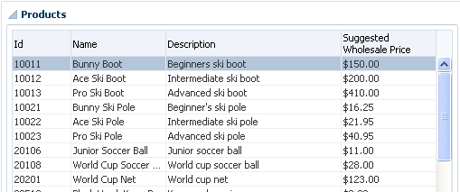
You can create a table that simply displays information, as shown in Figure 29-1, or you can allow the user to edit the information and create new records, as shown in Figure 29-2.
29.1.2 Additional Functionality for Databound Tables
You may find it helpful to understand other ADF Faces features before you implement your table and tree components. Additionally, once you have added a tree or table component to your page, you may find that you need to add functionality such as validation and accessibility. Following are links to other functionality that table and tree components can use.
-
ADF view objects: Much of how the components display and function in the table is controlled by the corresponding view objects. For more information, see Chapter 5, "Defining SQL Queries Using View Objects."
-
ADF application modules: The Data Controls panel, from which you drag databound components to your pages, is populated with representations of view objects that you have added to application modules. For more information, see Chapter 13, "Implementing Business Services with Application Modules."
-
Adapter-based data controls: If you are using other types of business services, such as EJB components or web services, you can create data control for those business service as described in Developing Applications with Oracle ADF Data Controls.
-
ADF Model and data binding: When you create databound tables in an ADF web application, you use ADF Model and data binding. For more information, see Chapter 17, "Using ADF Model in a Fusion Web Application."
-
ADF Faces: For detailed information about developing with ADF Faces, see Developing Web User Interfaces with Oracle ADF Faces.
-
Command buttons: You may want to add command button or links that invoke some functionality against the data set. For more advanced functionality than what is covered in this chapter, see Chapter 30, "Using Command Components to Invoke Functionality in the View Layer."
-
Filtered tables: You can create tables that provide filtering, in effect executing a query-by-example search against the data in the table. For more information, see Section 33.5, "Creating Standalone Filtered Search Tables from Named View Criteria."
-
Task flows: If your table takes part in a transaction, for example an input table, then you may need to use an ADF task flow to invoke certain operations before or after the table is rendered. For more information, see Part V, "Creating ADF Task Flows".
-
Validation: You may want certain fields to be validated before they are submitted to the data store. For more information, see Chapter 11, "Defining Validation and Business Rules Declaratively" and Chapter 18, "Using Validation in the ADF Model Layer."
-
Active data: If your application uses active data, then you can have the data in your tables and trees update automatically, whenever the data in the data source changes. For more information, see Chapter 47, "Using the Active Data Service."
Note:
If you wish to use active data, and your application uses ADF Business Components, then your tables must conform to the following:-
The binding represents homogeneous data (that is, only one rule), although an accessor can still access a like accessor.
-
The binding rule contains a single attribute.
-
The table does not use filtering.
-
The tree component's
nodeStampfacet contains a singleoutputTexttag and contains no other tags.
-
29.2 Creating a Basic Table
Unlike with forms where you bind the individual UI components that make up a form to the individual attributes on the collection, with a table you bind the ADF Faces table component to the complete collection or to a range of n data objects at a time from the collection. The individual components used to display the data in the columns are then bound to the attributes. The iterator binding handles displaying the correct data for each object, while the table component handles displaying each object in a row. JDeveloper allows you to do this declaratively, so that you don't need to write any code.
29.2.1 How to Create a Basic Table
To create a table using a data control, you bind the table component to a collection. JDeveloper allows you to do this declaratively by dragging and dropping a collection from the Data Controls panel.
It may be helpful to have an understanding of ADF Faces databound tables. For more information, see Section 29.2, "Creating a Basic Table."
You may also find it helpful to understand other ADF functionality and features. For more information, see Section 29.1.2, "Additional Functionality for Databound Tables."
You will need to complete these tasks:
-
Create an application module that contains instances of the view objects that you want in your data model, as described in Section 13.2, "Creating and Modifying an Application Module." Alternatively, if you are using another type of business service, create a data control for that business service as described in "Exposing Business Services with Data Controls" in Developing Applications with Oracle ADF Data Controls.
-
Create a JSF page as described in Section 26.3, "Creating a Web Page."
-
From the Data Controls panel, select a collection.
For example, to create a simple table in the Summit ADF sample application that displays all of the customers, you would select the
Customerscollection. -
Drag the collection onto a JSF page, and from the context menu, choose Table/List View > ADF Table.
-
The Create Table dialog shows each attribute in the collection, and allows you to determine how these attributes will behave and appear as columns in your table.
Using this dialog, you can do the following:
-
Make the table read-only.
-
Allow the ADF Model layer to handle selection by selecting the Single Row or Multiple Rows radio button. Selecting either of these options means that the iterator binding will access the iterator to determine the selected row or rows. Select one of these options unless you do not want the table to allow selection.
-
Allow the ADF Model layer to handle column sorting by selecting the Enabling Sorting checkbox. Selecting this option means that the iterator binding will access the iterator, which will perform an order-by query to determine the order. Select this option unless you do not want to allow column sorting.
-
Allow the columns in the table to be filtered using entered criteria by selecting the Enabling Filtering checkbox. Selecting this option allows the user to enter criteria in text fields above each column. That criteria is then used to build a Query-by-Example (QBE) search on the collection, so that the table will display only the results returned by the query. For more information, see Section 33.5, "Creating Standalone Filtered Search Tables from Named View Criteria."
Note:
For JPA-based data controls, filtering does not work on tables that are created from nested collections in the data control. If you drop such a collection on a page, you should leave this checkbox unselected to avoid runtime errors. For more information on JPA-based data controls, see "About EJB Data Controls" in Developing Applications with Oracle ADF Data Controls. -
Group columns for selected attributes together under a parent column, by selecting the desired attributes (shown as rows in the dialog), and clicking the Group button. Figure 29-3 shows how five grouped columns appear in the visual editor after the table is created.
-
Change the display label for a column. By default, the label is bound to the
labelsproperty for any control hint defined for the attribute on the table binding. This binding allows you to change the value of a label text once on the view object, and have the change appear the same on all pages that display the label.Instead of using this default, you can enter text or an EL expression to bind the label value to something else, for example, a key in a resource file.
-
Change the value binding for a column. You can change the column to be bound to a different attribute. If you simply want to rearrange the columns, you should use the order buttons. If you do change the attribute binding for a column, the label for the column also changes.
-
Change the UI component used to display an attribute. The UI components are set based on the table you selected when you dropped the collection onto the page, on the type of the corresponding attribute (for example,
inputDatecomponents are used for attributes that are dates), and on whether or not default components were set as control hints on the corresponding view object. You can change to another component using the dropdown list.Tip:
If one of the attributes for your table is also a primary key, you may want to choose a UI component that will not allow a user to change the value.Tip:
If you want to use a component that is not listed in the dropdown menu, use this dialog to select theoutputTextcomponent, and then manually add the other tag to the page. -
Change the order of the columns using the order buttons.
-
Add a column using the Add icon. There's no limit to the number of columns you can add. When you first click the icon, JDeveloper adds a new column line at the bottom of the dialog and populates it with the values from the first attribute in the bound collection; subsequent new columns are populated with values from the next attribute in the sequence, and so on.
-
Delete a column using the Delete icon.
-
Make the table dynamic by selecting the Generate columns dynamically at runtime checkbox. For more information on dynamic tables, see Section 29.6, "Creating a Table with Dynamic Components."
-
-
Once the table is dropped on the page, you can use the Properties window to set other display properties of the table. For example, you may want to set the width of the table to a certain percentage or size. For more information about display properties, see the "Using Tables, Trees, and Other Collection-Based Components" chapter of Developing Web User Interfaces with Oracle ADF Faces.
Tip:
When you set the table width to 100%, the table will not include borders, so the actual width of the table will be larger. To have the table set to 100% of the container width, expand the Style section of the Properties window, select the Box tab, and set theBorder Widthattribute to 0 pixels. -
If you want the user to be able to edit information in the table and save any changes, you need to provide a way to submit and persist those changes. For more information, see Section 29.3, "Creating an Editable Table." For procedures on creating tables that allow users to input data, see Section 29.4, "Creating an Input Table."
29.2.2 What Happens When You Create a Table
Dropping a table from the Data Controls panel has the same effect as dropping a text field or form. Briefly, JDeveloper does the following:
-
Creates the bindings for the table and adds the bindings to the page definition file
-
Adds the necessary code for the UI components to the JSF page
For more information, see Section 28.2.2, "What Happens When You Create a Text Field."
29.2.2.1 Iterator and Value Bindings for Tables
When you drop a table from the Data Controls panel, a tree value binding is created. A tree consists of a hierarchy of nodes, where each subnode is a branch off a higher level node. In the case of a table, it is a flattened hierarchy, where each attribute (column) is a subnode off the table. Like an attribute binding used in forms, the tree value binding references the iterator binding, while the iterator binding references an iterator for the data collection, which facilitates iterating over the data objects in the collection. Instead of creating a separate binding for each attribute, only the tree binding to the table node is created. In the tree binding, the AttrNames element within the nodeDefinition element contains a child element for each attribute that you want to be available for display or reference in each row of the table.
The tree value binding is an instance of the FacesCtrlHierBinding class that extends the core JUCtrlHierBinding class to add two JSF specific properties:
-
collectionModel: Returns the data wrapped by an object that extends thejavax.faces.model.DataModelobject that JSF and ADF Faces use for collection-valued components like tables. -
treeModel: ExtendscollectionModelto return data that is hierarchical in nature. For more information, see Chapter 31, "Displaying Master-Detail Data."
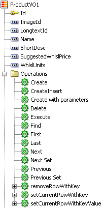
Example 29-1 shows the value binding for the table created when you drop the Summit sample application for ADF task flows's ProductVO1 collection.
Example 29-1 Value Binding Entries for a Table in the Page Definition File
<bindings>
  <tree IterBinding="ProductVO1Iterator" id="ProductVO1">
    <nodeDefinition
            DefName="oracle.summit.model.views.ProductVO"
            Name="ProductVO10">
      <AttrNames>
        <Item Value="Id"/>
        <Item Value="Name"/>
        <Item Value="ShortDesc"/>
        <Item Value="LongtextId"/>
        <Item Value="ImageId"/>
        <Item Value="SuggestedWhlslPrice"/>
        <Item Value="WhlslUnits"/>
      </AttrNames>
    </nodeDefinition>
  </tree>
</bindings>
Only the table component needs to be bound to the model (as opposed to the columns or the text components within the individual cells), because only the table needs access to the data. The tree binding for the table drills down to the individual structure attributes in the table, and the table columns can then derive their information from the table component.
29.2.2.2 Code on the JSF Page for an ADF Faces Table
When you use the Data Controls panel to drop a table onto a JSF page, JDeveloper inserts an ADF Faces table component, which contains an ADF Faces column component for each attribute named in the table binding. Each column then contains another component (such as an inputText or outputText component) bound to the attribute's value. Each column's heading is bound to the labels property for the control hint of the attribute.
Tip:
If an attribute is marked as hidden on the associated view or entity object, no corresponding UI is created for it.Example 29-2 shows a code excerpt from a table created by dropping the ProductsVO1 collection as a read- only table.
Example 29-2 JSF Code for an ADF Faces Table
<af:table value="#{bindings.ProductVO1.collectionModel}" var="row"
          rows="#{bindings.ProductVO1.rangeSize}"
          emptyText="#{bindings.ProductVO1.viewable ? 'No data to display.' : 'Access Denied.'}"
          fetchSize="#{bindings.ProductVO1.rangeSize}" rowBandingInterval="0"
          selectedRowKeys="#{bindings.ProductVO1.collectionModel.selectedRow}"
          selectionListener="#{bindings.ProductVO1.collectionModel.makeCurrent}"
          rowSelection="single" id="t1">
    <af:column headerText="#{bindings.ProductVO1.hints.Id.label}" id="c1">
        <af:outputText value="#{row.Id}"
                  shortDesc="#{bindings.ProductVO1.hints.Id.tooltip}"
                  id="ot1">
            <af:convertNumber groupingUsed="false"
                               pattern="#{bindings.ProductVO1.hints.Id.format}"/>
        </af:outputText>
    </af:column>
    <af:column headerText="#{bindings.ProductVO1.hints.Name.label}" id="c2">
        <af:outputText value="#{row.Name}"
                       shortDesc="#{bindings.ProductVO1.hints.Name.tooltip}"
                       id="ot2"/>
    </af:column>
    <af:column headerText="#{bindings.ProductVO1.hints.ShortDesc.label}" id="c3">
        <af:outputText value="#{row.ShortDesc}"
                  shortDesc="#{bindings.ProductVO1.hints.ShortDesc.tooltip}"
                  id="ot3"/>
    </af:column>
.
.
.
</af:table>
The tree binding iterates over the data exposed by the iterator binding. Note that the table's value is bound to the collectionModel property, which accesses the collectionModel object. The table wraps the result set from the iterator binding in a collectionModel object. The collectionModel allows each item in the collection to be available within the table component using the var attribute.
In the example, the table iterates over the rows in the current range of the ProductVO1 iterator binding. The iterator binding binds to a row set iterator that keeps track of the current row. When you set the var attribute on the table to row, each column then accesses the current data object for the current row presented to the table tag using the row variable, as shown for the value of the af:outputText tag:
<af:outputText value="#{row.Id}"/>
When you drop an ADF Table and do not specify it as a read-only table, input components are generated instead of output components, as shown in Example 29-3. The value of the input component is implicitly bound to a specific row in the binding container through the bindings property, instead of being bound to the row variable. Additionally, JDeveloper adds validator components for each input component. By using the bindings property, any raised exception can be linked to the corresponding binding object or objects. The controller iterates through all exceptions in the binding container and retrieves the binding object to get the client ID when creating FacesMessage objects. This retrieval allows the table to display errors for specific cells. This strategy is used for all input components, including selection components such as lists.
Example 29-3 Input Components Within a Table
<af:table value="#{bindings.ProductVO1.collectionModel}" var="row"
          rows="#{bindings.ProductVO1.rangeSize}"
          emptyText="#{bindings.ProductVO1.viewable ? 'No data to display.' :
          'Access Denied.'}"
          fetchSize="#{bindings.ProductVO1.rangeSize}" rowBandingInterval="0"
          id="t1">
    <af:column headerText="#{bindings.ProductVO1.hints.Id.label}" id="c1">
        <af:inputText value="#{row.bindings.Id.inputValue}"
                      label="#{bindings.ProductVO1.hints.Id.label}"
                      required="#{bindings.ProductVO1.hints.Id.mandatory}"
                      columns="#{bindings.ProductVO1.hints.Id.displayWidth}"
                      maximumLength="#{bindings.ProductVO1.hints.Id.precision}"
                      shortDesc="#{bindings.ProductVO1.hints.Id.tooltip}"
                      id="it1">
            <f:validator binding="#{row.bindings.Id.validator}"/>
            <af:convertNumber groupingUsed="false"
                              pattern="#{bindings.ProductVO1.hints.Id.format}"/>
        </af:inputText>
    </af:column>
For more information about using ADF Faces validators and converters, see the "Validating and Converting Input" chapter of Developing Web User Interfaces with Oracle ADF Faces.
Table 29-1 shows the other attributes defined by default for ADF Faces tables created using the Data Controls panel.
Table 29-1 ADF Faces Table Attributes and Populated Values
| Attribute | Description | Default Value |
|---|---|---|
|
|
Determines how many rows to display at one time. |
An EL expression that, by default, evaluates to the |
|
|
Index of the first row in a range (based on 0). |
An EL expression that evaluates to the |
|
|
Text to display when there are no rows to return. |
An EL expression that evaluates to the viewable property on the iterator. If the table is viewable, the attribute displays No data to display when no objects are returned. If the table is not viewable (for example, if there are authorization restrictions set against the table), it displays Access Denied. |
|
|
Number of rows of data fetched from the data source. |
An EL expression that, by default, evaluates to the Note that to improve scrolling behavior in a table, when the table's iterator binding is expected to manage a data set consisting of over 200 items, and the view object is configured to use range paging, the iterator actually returns a set of ranges instead of just one range. For more information about using range paging for view objects, see Section 9.1.5, "Efficiently Scrolling Through Large Result Sets Using Range Paging." For more information on range paging for JPA-based data controls, see "Paginated Fetching of Data in EJB Data Controls" in Developing Applications with Oracle ADF Data Controls. |
|
|
The selection state for the table. |
An EL expression that by default, evaluates to the selected row on the collection model. |
|
|
Reference to a method that listens for a selection event. |
An EL expression that by default, evaluates to the |
|
|
Determines whether rows are selectable. |
Set to |
|
Column Attributes |
||
|
|
Determines the property on which to sort the column. |
Set to the columns corresponding attribute binding value. |
|
|
Determines whether a column can be sorted. |
Set to |
|
|
Determines the text displayed at the top of the column. |
An EL expression that, by default, evaluates to the label control hint set on the corresponding attribute. |
29.2.3 What You May Need to Know About Setting the Current Row in a Table
When you use tables in an application and you allow the ADF Model layer to manage row selection, the current row is determined by the iterator. When a user selects a row in an ADF Faces table, the row in the table is shaded, and the component notifies the iterator of the selected row. To do this, the selectedRowKeys attribute of the table is bound to the collection model's selected row, as shown in Example 29-4.
Example 29-4 Selection Attributes on a Table
<af:table value="#{bindings.ProductVO1.collectionModel}" var="row"
.
.
.
          selectedRowKeys="#{bindings.ProductVO1.collectionModel.selectedRow}"
          selectionListener="#{bindings.ProductVO1.collectionModel.makeCurrent}"
          rowSelection="single">
This binding binds the selected keys in the table to the selected row of the collection model. The selectionListener attribute is then bound to the collection model's makeCurrent property. This binding makes the selected row of the collection the current row of the iterator.
Note:
If you create a custom selection listener, you must create a method binding to themakeCurrent property on the collection model (for example #{binding.Products.collectionModel.makeCurrent}) and invoke this method binding in the custom selection listener before any custom logic.Although a table can handle selection automatically, there may be cases where you need to programmatically set the current row for an object on an iterator.
You can call the getKey() method on any view row to get a Key object that encapsulates the one or more key attributes that identify the row. You can also use a Key object to find a view row in a row set using the findByKey() method. At runtime, when either the setCurrentRowWithKey or the setCurrentRowWithKeyValue built-in operation is invoked by name by the data binding layer, the findByKey() method is used to find the row based on the value passed in as a parameter before the found row is set as the current row.
The setCurrentRowWithKey and setCurrentRowWithKeyValue operations both expect a parameter named rowKey, but they differ precisely by what each expects that rowKey parameter value to be at runtime:
- setCurrentRowWithKey Operation
-
setCurrentRowWithKeyexpects therowKeyparameter value to be the serialized string representation of a view row key. This is a hexadecimal-encoded string that looks similar to this:000200000002C20200000002C102000000010000010A5AB7DAD9
The serialized string representation of a key encodes all of the key attributes that might comprise a view row's key in a way that can be conveniently passed as a single value in a browser URL string or form parameter. At runtime, if you inadvertently pass a parameter value that is not a legal serialized string key, you may receive exceptions like
oracle.jbo.InvalidParamExceptionorjava.io.EOFExceptionas a result. In your web page, you can access the value of the serialized string key of a row by referencing therowKeyStrproperty of an ADF control binding (for example.#{bindings.SomeAttrName.rowKeyStr}) or the row variable of an ADF Faces table (e.g.#{row.rowKeyStr}). - setCurrentRowWithKeyValue Operation
-
The
setCurrentRowWithKeyValueoperation expects therowKeyparameter value to be the literal value representing the key of the view row. For example, its value would be simply "201" to find product number201.
Note:
If you write custom code in an application module class and need to find a row based on a serialized string key passed from the client, you can use thegetRowFromKey() method in the JboUtil class in the oracle.jbo.client package:
static public Row getRowFromKey(RowSetIterator rsi, String sKey)
The first parameter is the view object instance in which you'd like to find the row. The second parameter is the serialized string format of the key.
29.2.4 What You May Need to Know About Getting Row Data Programmatically
CollectionModel supports a version of the getRowData method that takes a row key parameter and thus allows you to get row data without changing currency.
For example, you can replace this code:
CollectionModelInstance.setRowKey(RowKeyInstance);
JUCtrlHierNodeBinding rowData = (JUCtrlHierNodeBinding)
   CollectionModelInstance.getRowData();
with this code:
JUCtrlHierNodeBinding rowData = (JUCtrlHierNodeBinding)
   CollectionModelInstance.getRowData(RowKeyInstance);
This is particularly useful when your view object uses range paging, since it enables you to avoid having to use the setRowKey method. (If you use setRowKey, you might also need to provide custom code to ensure that the row that you specify with that method is within the current range of rows.)
29.3 Creating an Editable Table
You can create a table that allows the user to edit information within the table, and then commit those changes to the data source. You can use built-in data control operations to create command buttons for changing the data, and place those buttons in a toolbar in the table. For example, you might use the Delete operation to create a button that allows a user to delete a record from the current range.
It is important to note that the collection-specific operations are executed only against objects in the ADF cache. You need to use the Commit operation on the root data control to actually commit any changes to the data source. You use the data control's Rollback operation to roll back any changes made to the cached object. If the page is part of a transaction within a bounded task flow, you would most likely use these operations to resolve the transaction in a task flow return activity. For more information, see Section 24.3, "Managing Transactions in Task Flows."
Note:
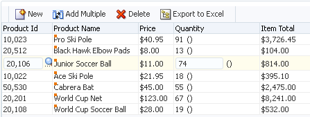
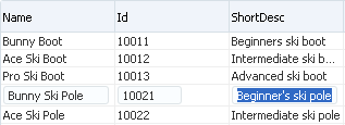
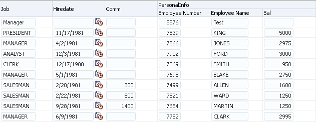
For data controls which do not have theCommit and Rollback operations available, such as data controls based on web services or stateless EJB session beans, you need to provide custom methods to save the data to the data source. For JPA-based data controls, you can use the mergeEntity or persistEntity methods to save changes, but these methods only work on a single row. For more information on working with JPA-based data controls, see "About Commit Models for EJB Session Beans" in Developing Applications with Oracle ADF Data Controls.When you decide to use editable components to display your data, you have the option of the table displaying all rows as editable immediately, or displaying all rows as read-only until the user double-clicks within the row. Figure 29-4 shows a table whose rows all have editable fields. The page renders using the components that were added to the page (for example, inputText and inputDate, components).
Figure 29-5 shows the same table, but configured so that the user must double-click (or single-click if the row is already selected) a row in order to edit or enter data. Note that outputText components are used to display the data in the nonselected rows, even though the same input components as in Figure 29-4 were used to build the page. The only row that actually renders those components is the row selected for editing.
For more information about how ADF Faces table components handle editing, see the "Editing Data in Tables, Trees, and Tree Tables" section of Developing Web User Interfaces with Oracle ADF Faces.
29.3.1 How to Create an Editable Table
To create an editable table, you follow similar procedures to creating a basic table, then you add command buttons bound to operations. However, in order for the table to contain a toolbar, you need to add an ADF Faces component that associates the toolbar with the items in the collection used to build the table.
It may be helpful to have an understanding of editable databound tables. For more information, see Section 29.3, "Creating an Editable Table."
You may also find it helpful to understand other ADF functionality and features. For more information, see Section 29.1.2, "Additional Functionality for Databound Tables."
You will need to complete these tasks:
-
Create an application module that contains instances of the view objects that you want in your data model, as described in Section 13.2, "Creating and Modifying an Application Module." Alternatively, if you are using another type of business service, create a data control for that business service as described in "Exposing Business Services with Data Controls" in Developing Applications with Oracle ADF Data Controls.
-
Create a JSF page as described in Section 26.3, "Creating a Web Page."
-
From the Data Controls panel, select a collection.
For example, to create a simple table in the Summit ADF task flow sample application that will allow you to edit products in the system, you would select the
ProductVO1collection. -
Drag the collection onto a JSF page, and from the context menu, choose Table /List View > ADF Table.
This creates an editable table using input components.
-
Use the ensuing Create Table dialog to determine how the attributes should behave and appear as columns in your table. Be sure to select the Single Row or Multiple Rows radio button in order to allow the user to select a row to edit.
For more information about using this dialog to configure the table, see Section 29.2.1, "How to Create a Basic Table."
-
With the table selected in the Structure window, expand the Behavior section of the Properties window and set the EditingMode attribute. If you want all the rows to be editable select editAll. If you want the user to click into a row to make it editable, select clickToEdit.
-
From the Structure window, right-click the table component and choose Surround With.
-
In the Surround With dialog, ensure that ADF Faces is selected in the dropdown list, select the Panel Collection component, and click OK.
The
panelCollectioncomponent's toolbar facet will hold the toolbar which, in turn, will hold the command components used to update the data. -
In the Structure window, right-click the
panelCollection's f:facet - toolbar facet node and choose Insert inside f:facet - toolbar > Toolbar.This creates a toolbar that already contains a default menu that allows users to change how the table is displayed and a Detach link that detaches the entire table and displays it such that it occupies the majority of the space in the browser window. For more information about the
panelCollectioncomponent, see the "Displaying Table Menus, Toolbars, and Status Bars" section of Developing Web User Interfaces with Oracle ADF Faces. -
From the Data Controls panel, select the operation associated with the collection of objects on which you wish the operation to execute, drag it onto the
toolbarcomponent in the Structure window, and choose Create > ADF Button from the context menu. This will place the databound command component inside the toolbar.For example, if you want to be able to delete a product record, you would drag the
Deleteoperation associated with theProductVO1collection. Figure 29-6 shows the operations associated with heProductVO1collection. -
If you need a button for submitting changes to the cache, right-click the af:toolbar component in the Structure window and choose Insert Inside Toolbar > Button.
Note:
You can use other means to submit changes to the cache, such as setting theautoSubmitproperty totruefor the input components in the table. For more information, see "Using Partial Triggers" in Developing Web User Interfaces with Oracle ADF Faces. -
If the page is not part of a transaction within a bounded task flow, then you need to create buttons that allow the user to either commit or rollback the changes. From the Data Controls panel, drag the
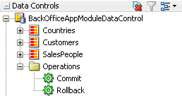
CommitandRollbackoperations associated with the root-level data control, and drop them as either a button or link into the toolbar.Figure 29-7 shows the commit and roll back operations for the
BackOfficeAppModuleDataControldata control.If the page is part of a transaction within a bounded task flow, then you can simply enter
CommitandRollbackas the values for the transaction resolution when creating the task flow return activity. For more information, see Section 24.3, "Managing Transactions in Task Flows."
Tip:
To create a table that allows you to insert a new record into the data store, see Section 29.4, "Creating an Input Table."29.3.2 What Happens When You Create an Editable Table
Creating an editable table is similar to creating a form used to edit records. Action bindings are created for the operations dropped from the Data Controls panel. For details, see Section 28.4.2, "What Happens When You Create Command Components Using Operations."
29.4 Creating an Input Table
You can create a table that allows users to insert a new blank row into a table and then add values for each column (any default values set on the corresponding entity or view object will be automatically populated).
29.4.1 How to Create an Input Table
When you create an input table, you want the user to see the new blank row in the context of the other rows within the current row set. To allow this insertion, you use the CreateInsert operation. As opposed to the Create operation, the CreateInsert operation actually creates the new row within the row set instead of only in the cache. In addition, you need to configure the table to respond to that user action. ADF Faces components can be set so that one component refreshes based on an interaction with another component, without the whole page needing to be refreshed. This is known as partial page rendering.
Note:
TheCreateInsert operation is not available for adapter-based data controls, such as those based web services or Java classes. However, for JPA-based data controls, the Create operation adds the new row to the row set like CreateInsert does for data controls based on application modules. For more information, see "Data Control Built-in Operations" in Developing Applications with Oracle ADF Data Controls.It may be helpful to have an understanding of ADF Faces input tables. For more information, see Section 29.4, "Creating an Input Table."
You may also find it helpful to understand other ADF functionality and features. For more information, see Section 29.1.2, "Additional Functionality for Databound Tables."
You will need to complete these tasks:
-
Create an editable table, as described in Section 29.3, "Creating an Editable Table."
-
If your table is not part of a bounded task flow, include buttons bound to the
CommitandRollbackoperations.
-
From the Data Controls panel, drag the CreateInsert operation associated with the dropped collection and drop it as a toolbar button into the toolbar. You may want to change the ID to something more recognizable, such as
CreateNewRow. This will make it easier to identify when you need to select it as the partial trigger.Note:
If the collection is a child to another collection (for example, in the Summit ADF sample application theOrdersForCustomercollection is a child to theCustomerscollection), then instead of using theCreateInsertoperation, you need to use theCreate with Parametersoperation so that the record to create for the child collection is associated with the parent collection. -
In the Structure window, select the table component. In the Properties window, expand the Behavior section.
-
In the Properties window, mouse over the PartialTriggers attribute, click the dropdown menu, and choose Edit.
-
In the Edit Property dialog, expand the toolbar facet for the
panelCollectioncomponent and then expand the toolbar that contains the CreateInsert command component. Select that component and shuttle it to the Selected panel. Click OK. This sets that component to be the trigger that will cause the table to refresh.
29.4.2 What Happens When You Create an Input Table
When you use the CreateInsert operation to create an input table, JDeveloper:
-
Creates an iterator binding for the collection, an action binding for the
CreateInsertoperation, and attribute bindings for the table. TheCreateInsertoperation is responsible for creating the new row in the row set. If you created command buttons or links using theCommitandRollbackoperations, JDeveloper also creates an action bindings for those operations. -
Inserts code in the JSF page for the table using ADF Faces
table,column, andinputTextcomponents, and in the case of the operations,buttoncomponents.
Example 29-5 shows the page definition file for an input table created from the ProductVO1 collection (some attributes were deleted in the Create Table dialog when the collection was dropped).
Example 29-5 Page Definition Code for an Input Table
<executables>
  <iterator Binds="ProductVO1" RangeSize="25"
            DataControl="BackOfficeAppModuleDataControl" id="ProductVO1Iterator"/>
</executables>
  <tree IterBinding="ProductVO1Iterator" id="ProductVO1">
    <nodeDefinition
            DefName="oracle.summit.model.views.ProductVO"
            Name="ProductVO10">
      <AttrNames>
        <Item Value="Id"/>
        <Item Value="Name"/>
        <Item Value="ShortDesc"/>
        <Item Value="LongtextId"/>
        <Item Value="ImageId"/>
        <Item Value="SuggestedWhlslPrice"/>
        <Item Value="WhlslUnits"/>
      </AttrNames>
    </nodeDefinition>
  </tree>
  <action IterBinding="ProductVOIterator" id="CreateInsert"
          RequiresUpdateModel="true" Action="createInsertRow"/>
  <action id="Commit" RequiresUpdateModel="true" Action="commitTransaction"
          DataControl="BackOfficeAppModuleDataControl"/>
  <action id="Rollback" RequiresUpdateModel="false"
          Action="rollbackTransaction"
          DataControl="BackOfficeAppModuleDataControl"/>
</bindings>
Example 29-6 shows the code added to the JSF page that provides partial page rendering, using the CreateInsert command toolbar button as the trigger to refresh the table.
Example 29-6 Partial Page Trigger Set on a Command Button for a Table
<af:form>
  <af:panelCollection id="pc1">
    <f:facet name="menus"/>
    <f:facet name="toolbar">
      <af:toolbar id="tb1">
        <af:button actionListener="#{bindings.CreateInsert.execute}"
                                 text="CreateInsert"
                                 disabled="#{!bindings.CreateInsert.enabled}"
                                 id="CreateInsert"/>
        <af:button actionListener="#{bindings.Commit.execute}"
                                 text="Commit"
                                 disabled="false" id="b2"/>
        <af:button actionListener="#{bindings.Rollback.execute}"
                                 text="Rollback"
                                 disabled="#{!bindings.Rollback.enabled}"
                                 immediate="true" id="b3">
          <af:resetActionListener/>
        </af:button>
      </af:toolbar>
    </f:facet>
    <f:facet name="statusbar"/>
    <af:table value="#{bindings.ProductVO1.collectionModel}" var="row"
              rows="#{bindings.ProductVO1.rangeSize}"
              emptyText="#{bindings.ProductVO1.viewable ? \'No data to display.\' :
                                                      \'Access Denied.\'}"
              fetchSize="#{bindings.ProductVO1.rangeSize}"
              rowSelection="single" partialTriggers="CreateInsert" id="t1">
      <af:column sortProperty="Id" sortable="false"
                 headerText="#{bindings.ProductVO1.hints.Id.label}"
                 id="c1">
        <af:inputText value="#{row.ProductId}" simple="true"
                      required="#{bindings.ProductVO1.hints.Id.mandatory}"
                      columns="#{bindings.ProductVO1.hints.Id.displayWidth}"
                      maximuumLength="#{bindings.ProductVO1.hints.Id.precision}"
                     id="it1"/>
      </af:column>
.
.
.
    </af:table>
  </af:panelCollection>
</af:form>
29.4.3 What Happens at Runtime: How CreateInsert and Partial Page Refresh Work
When the button bound to the CreateInsert operation is invoked, the action executes, and a new instance for the collection is created and inserted as the page is rerendered. Because the button was configured to be a trigger that causes the table to refresh, the table redraws with the new empty row shown at the top. When the user clicks the button bound to the Commit action, the newly created rows in the row set are inserted into the database. For more information about partial page refresh, see the "Rerendering Partial Page Content" chapter in Developing Web User Interfaces with Oracle ADF Faces.
29.4.4 What You May Need to Know About Creating a Row and Sorting Columns
If your table columns allow sorting, and the user has sorted on a column before inserting a new row, then that new row will not be sorted. To have the column sort with the new row, the user must first sort the column opposite to the desired sort, and then resort. This is because the table assumes the column is already sorted, so clicking on the desired sort order first will have no effect on the column.
For example, say a user had sorted a column in ascending order, and then added a new row. Initially, that row appears at the top. If the user first clicks to sort the column again in ascending order, the table will not resort, as it assumes the column is already in ascending order. The user must first sort on descending order and then ascending order.
If you want the data to automatically sort on a specific column in a specific order after inserting a row, then programmatically queue a SortEvent after the commit, and implement a handler to execute the sort.
If you want to allow sorting on a column for which the view object attribute is defined by a custom domain data type, you must implement the compareTo() method for the table's sort button click event:
public int compareTo(Object theObject)
The method will return 0 for values that are equal, less then 0 if the current object is less than theObject, and greater than 0 if the current object is greater. The object comparison for attributes behaves just like String comparisons.
29.4.5 What You May Need to Know About Create and CreateInsert
When you use the Create or CreateInsert operation to declaratively create a new row, it performs the following lines of code:
// create a new row for the view object
Row newRow = yourViewObject.createRow();
// mark the row as being "initialized", but not yet new
newRow.setNewRowState(Row.STATUS_INITIALIZED);
However, if you are using the CreateInsert operation, it performs the additional line of code to insert the row into the row set:
// insert the new row into the view object's default rowset
yourViewObject.insertRow(newRow);
When you create a row in an entity-based view object, the Transaction object associated with the current application module immediately takes note of the fact. The new entity row that gets created behind the view row is already part of the Transaction's list of pending changes. When a newly created row is marked as having the initialized state, it is removed from the Transaction's pending changes list and is considered a blank row in which the end user has not yet entered any data values. The term initialized is appropriate since the end user will see the new row initialized with any default values that the underlying entity object has defined. If the user never enters any data into any attribute of that initialized row, then it is as if the row never existed. At transaction commit time, since that row is not part of the Transaction's pending changes list, no INSERT statement will be attempted for it.
As soon as at least one attribute in an initialized row is set, it automatically transitions from the initialized status to the new status (Row.STATUS_NEW). At that time, the underlying entity row is enrolled in the Transaction's list of pending changes, and the new row will be permanently saved the next time you commit the transaction.
Note:
If the end user performs steps that result in creating many initialized rows but never populating them, it might seem likely to cause a slow memory leak. However, the memory used by an initialized row that never transitions to the new state will eventually be reclaimed by the Java virtual machine's garbage collector.29.4.6 What You May Need to Know About Saving Multiple Rows in a JPA-Based Data Control
EJB data controls and JPA-based bean data controls do not have the built-in CreateInsert operation available. However, it is possible to replicate the behavior of CreateInsert with the Create operation in these data controls by setting the data control's EagerPersist property to true. This property is set to true by default for data controls based on stateful session beans that use container-managed transactions and an explicit commit model. For more information, see "About Commit Models for EJB Session Beans" in Developing Applications with Oracle ADF Data Controls
29.5 Creating a List View of a Collection
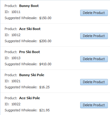
You can use the listView component when you need to display a collection of objects in a list. The attributes of each object are displayed in a group or grid within a single row and single column. Figure 29-8 shows a collection of products displayed using a listView component.
In this listView, a child listItem component contains a panelGridLayout component that, in turn, contains outputFormatted components that display the data and a button component that allows users to delete the item. The listView component is bound to the collection, in the same way that a table is bound to a collection, using the value attribute. The listItem component is a direct child to the listView component, and is the container for the components that display the data, in the same way that the column component holds the data components for a table.
If your collection has a master-detail relationship with another collection, you can group the child collection under the parent collection using grouping functionality in the listView component. For more information, see Section 31.6, "Using List Views to Display Master-Detail Objects."
For complete information about the listView and listItem components, see the "Displaying a Collection in a List" section of the Developing Web User Interfaces with Oracle ADF Faces. For complete information about using the panelGridLayout component to group items in grid within the list (as shown in Figure 29-8), see the "Arranging Content in a Grid" section of the Developing Web User Interfaces with Oracle ADF Faces. You can also use a panelGroupLayout component to group components when you don't need a grid layout. For more information, see the "Grouping Related Items" section of the Developing Web User Interfaces with Oracle ADF Faces.
29.5.1 How to Create a Databound List View
You use the Create List View wizard to create your list. This wizard allows you to choose between a panelGroupLayout or a panelGridLayout component to arrange the components for your list item. If you are creating the list for a child of a master-detail relationship, you can also use the wizard to configure the headers for the list.
It may be helpful to have an understanding of ADF Faces list views. For more information, see Section 29.5, "Creating a List View of a Collection."
You may also find it helpful to understand other ADF functionality and features. For more information, see Section 29.1.2, "Additional Functionality for Databound Tables."
You will need to complete these tasks:
-
Create an application module that contains instances of the view objects that you want in your data model, as described in Section 13.2, "Creating and Modifying an Application Module." Alternatively, if you are using another type of business service, create a data control for that business service as described in "Exposing Business Services with Data Controls" in Developing Applications with Oracle ADF Data Controls.
-
Create a JSF page as described in Section 26.3, "Creating a Web Page."
-
From the Data Controls panel, drag a collection onto the page and choose Table/List View > ADF List View. If you want to create a list with headers from a parent collection, drag a collection that is a child to another collection.
-
Use the Create List View wizard to select your layout component to organize your display of the data, and to select the attributes and components to display. If you are creating a group, on the first page of the wizard, select Include header using parent collection.
For more information about using the wizard, press the F1 key or click Help.
-
Use the Properties window to further configure the layout components.
For complete information about using the
panelGridLayoutcomponent, see the "Arranging Content in a Grid" section of the Developing Web User Interfaces with Oracle ADF Faces. For more information about thepanelGroupLayoutcomponent, see the "Grouping Related Items" section of the Developing Web User Interfaces with Oracle ADF Faces.
29.5.2 What Happens When You Create a Databound List View
When you use the wizard to create a listView component, JDeveloper creates and configures the listView, listItem, and layout components. The bindings are the same as for a table—the listView component is bound to the collection dropped from the Data Controls panel. The value of the var attribute on this component is used by the outputFormatted components to access the data, in the same way as a table. For more information about the page definition code and the JSP code for collections, see Section 29.2.2, "What Happens When You Create a Table."
Example 29-7 shows the page code for the simple table shown in Figure 29-8.
Example 29-7 Page Code for a List View Component
<af:listView value="#{bindings.SProductView1.collectionModel}" var="item"
             emptyText="#{bindings.SProductView1.viewable ? 'No data to display.'
                                                          : 'Access Denied.'}"
             fetchSize="#{bindings.SProductView1.rangeSize}" id="lv1">
    <af:listItem id="li1">
        <af:panelGridLayout id="pgl2" dimensionsFrom="parent">
            <af:gridRow marginTop="5px" height="15px" id="gr2">
                <af:gridCell marginStart="5px" width="50%" id="gc2">
                    <af:panelLabelAndMessage label="Product:" id="plam1"
                                                  inlineStyle="font-weight:bold;">
                        <af:outputFormatted
                               value="#{item.bindings.Name.inputValue}" id="of1"/>
                    </af:panelLabelAndMessage>
                </af:gridCell>
                <af:gridCell marginStart="5px" width="50%" marginEnd="5px"
                             id="gc3"/>
            </af:gridRow>
            <af:gridRow marginTop="5px" height="15px" id="gr3">
                <af:gridCell marginStart="5px" width="50%" id="gc4">
                    <af:panelLabelAndMessage label="ID:" id="plam2">
                        <af:outputFormatted value="#{item.bindings.Id.inputValue}"
                                            id="of2">
                            <af:convertNumber groupingUsed="false"
                             pattern="#{bindings.SProductView1.hints.Id.format}"/>
                        </af:outputFormatted>
                    </af:panelLabelAndMessage>
                </af:gridCell>
                <af:gridCell marginStart="5px" width="50%" marginEnd="5px"
                             id="gc5">
                    <af:button actionListener="#{bindings.Delete.execute}"
                               text="Delete Product"
                               disabled="#{!bindings.Delete.enabled}" id="b1"/>
                </af:gridCell>
            </af:gridRow>
            <af:gridRow marginTop="5px" height="15px" marginBottom="5px" id="gr4">
                <af:gridCell marginStart="5px" width="50%" id="gc6">
                    <af:panelLabelAndMessage label="Suggested Wholesale:"
                                             id="plam3">
                        <af:outputFormatted
                           value="#{item.bindings.SuggestedWhlslPrice.inputValue}"
                           id="of3">
                            <af:convertNumber groupingUsed="false"
           pattern="#{bindings.SProductView1.hints.SuggestedWhlslPrice.format}"/>
                        </af:outputFormatted>
                    </af:panelLabelAndMessage>
                </af:gridCell>
                <af:gridCell marginStart="5px" width="50%" marginEnd="5px"
                             id="gc7"/>
            </af:gridRow>
        </af:panelGridLayout>
    </af:listItem>
</af:listView>
29.6 Creating a Table with Dynamic Components
Instead of creating static databound tables where you provide tags for each component directly in the page, you can use a dynamic component to create tables where the binding metadata, columns, and the components used to display the bound content are determined at runtime.
Figure 29-9 shows a dynamic table at runtime that was created by setting UI hints for attributes on the CustomerVO view object and then dropping the Customers data control collection as a dynamic table. Among the UI hints set were LABEL and DISPLAYHINT (the latter of which can be set to Hide in order to not include the given attribute in the dynamic form).
For more general information on dynamic components, see Section 28.9.1, "About Dynamic Components."
29.6.1 How to Create a Dynamic Table
To create a dynamic table, you drop a collection from the data controls panel as an ADF Table and specify that the fields be generated dynamically.
It may be helpful to have an understanding of the dynamic component feature and dynamic databound tables. For more information, see Section 28.9.1, "About Dynamic Components" and Section 29.6, "Creating a Table with Dynamic Components."
You may also find it helpful to understand other ADF functionality and features. For more information, see Section 29.1.2, "Additional Functionality for Databound Tables."
You will need to complete these tasks:
-
Create an application module that contains instances of the view objects that you want in your data model, as described in Section 13.2, "Creating and Modifying an Application Module." Alternatively, if you are using another type of business service, create a data control for that business service as described in "Exposing Business Services with Data Controls" in Developing Applications with Oracle ADF Data Controls.
-
Create a JSF page as described in Section 26.3, "Creating a Web Page."
-
Set UI hints on the view object or data control structure definition file that corresponds to the collection for which you are creating the dynamic form.
UI hints determine things such as the type of UI component to use to display the attribute, the label, the tooltip, whether the field should be automatically submitted, etc. You can also determine whether a given attribute is displayed or hidden. For procedures on creating UI hints, see Section 5.13, "Defining UI Hints for View Objects."
-
Optionally, for the
Categoryhint on each view object attribute, specify a category or click the New Category icon to create a new category.Any attributes that have the same category can be grouped together in dynamic tables that you create based on that view object.
-
Optionally, for any categories that you have created in step 2, set the UI hints for the category's label and tooltip. These can be set in the UI Categories tab of the view object's overview editor.
-
From the Data Controls panel, select the collection that represents the view object.
-
Drag the collection onto the page, and from the context menu, choose Table/List View > ADF Table.
-
In the Create Table dialog, select the Generate columns dynamically at runtime checkbox.
-
If you have specified any categories for attributes in step 2, select the Include Column Groups checkbox in order for the form to organize the display of columns into any checkbox in order for the table to group the columns according to those categories.
29.6.2 What Happens When You Use Dynamic Components
When you drop a collection as a dynamic table on a page, the following things happen:
-
The page definition is populated with a
variableIteratorbinding, aniteratorbinding to the iterator, and atreevalue binding. For more information, see Section 28.9.3.1, "Bindings Created for the Dynamic Form." -
The JSF page is populated with a
tabletag and one or moreiterator,columnanddynamicComponenttags. In addition, if the Include Column Groups option is selected,switcherandgrouptags are added.
29.6.2.1 Tags Created for a Dynamic Table without Grouping
In the JSF page, JDeveloper inserts a table tag, within which it nests an iterator tag that iterates over the attributes of the collection. Within that iterator tag is nested a column tag, which contains a dynamicComponent tag. The dynamicComponent in turn displays the appropriate component for each column as determined at runtime.
Example 29-8 shows the code that is generated when you drop the Countries data control object as a dynamic table (but do not select the Include Column Groups option).
Example 29-8 JSF Page Code for a Dynamic Table
<af:table value="#{bindings.Countries.collectionModel}" var="row"
          rows="#{bindings.Countries.rangeSize}"
          emptyText="#{bindings.Countries.viewable ? 'No data to display.' :
                                                     'Access Denied.'}"
          rowBandingInterval="0" fetchSize="#{bindings.Countries.rangeSize}"
          id="t1">
    <af:iterator id="i1"
                 value="#{bindings.Countries.attributesModel.attributes}"
                 var="column">
        <af:column headerText="#{column.label}" id="c1">
            <af:dynamicComponent id="d2" attributeModel="#{column}"
                                 value="#{row.bindings[column.name].inputValue}"/>
        </af:column>
    </af:iterator>
</af:table>
The value attribute of the iterator tag uses an EL expression that evaluates to the attributesModel.attributes property of the collection's tree binding. The attributesModel property is used to retrieve the data object's attributes and their metadata, such as component type, label, tooltip, and other properties of the real component to be rendered. The attributes property of attributesModel signifies that a flat (unhierarchical) list of displayable attributes and their metadata is provided.
The attributeModel attribute of the dynamicComponent tag is bound to the EL expression #{column}, which references the variable that is defined in the iterator's var attribute and that serves as a pointer to the current attribute of the data control collection and its corresponding metadata. The EL expression for the dynamicComponent's value attribute also references the variable column.
29.6.2.2 Tags Created for a Dynamic Table with Grouping
If you have selected the Include Column Groups checkbox in the Create Table dialog, the generated JSF page includes the switcher and group tags in addition to the tags described in Section 29.6.2.1, "Tags Created for a Dynamic Table without Grouping."
The switcher tag is nested directly within a column tag. Within the switcher tag are nested facet tags named GROUP and ATTRIBUTE. The GROUP facet contains a group tag, within which is an outputText tag to display the group name and an iterator tag, which contains a column tag that in turn contains a dynamicComponent tag. The ATTRIBUTE facet only contains a dynamicComponent tag.
For each attribute that the high-level iterator iterates over, the switcher dynamically determines whether to render a group or a column. If it renders a group, the iterator within the group then is used to render the columns within that group.
Example 29-9 shows the code that is generated if you create a dynamic form based on the Countries collection and choose to include column groups.
Example 29-9 JSF Page Code for a Dynamic Table with Groups
<af:table value="#{bindings.Countries.collectionModel}" var="row"
          rows="#{bindings.Countries.rangeSize}"
          emptyText="#{bindings.Countries.viewable ? 'No data to display.' : 'Access Denied.'}"
          rowBandingInterval="0" fetchSize="#{bindings.Countries.rangeSize}"
          id="t1">
    <af:iterator id="i1"
              value="#{bindings.Countries.attributesModel.hierarchicalAttributes}"
                 var="column">
        <af:column headerText="#{column.label}" id="c1">
            <af:switcher id="sw1" facetName="#{column.descriptorType}"
                         defaultFacet="ATTRIBUTE">
                <f:facet name="GROUP">
                    <af:iterator id="gi1" value="#{column.descriptors}"
                                 var="nestedCol">
                        <af:column headerText="#{nestedCol.label}" id="c2">
                            <af:dynamicComponent id="gd1"
                                                 attributeModel="#{nestedCol}"
                              value="#{row.bindings[nestedCol.name].inputValue}"/>
                        </af:column>
                    </af:iterator>
                </f:facet>
                <f:facet name="ATTRIBUTE">
                    <af:dynamicComponent id="ad1" attributeModel="#{column}"
                                value="#{row.bindings[column.name].inputValue}"/>
                </f:facet>
            </af:switcher>
        </af:column>
    </af:iterator>
</af:table>
The value attribute of the iterator tag uses an EL expression that evaluates to the attributesModel.hierarchicalAttributes property of the collection's tree binding. The attributesModel property is used to retrieve the data object's attributes and their metadata, such as component type, label, tooltip, and other properties of the real component to be rendered. The hierarchicalAttributes property signifies that a hierarchical list of displayable attributes and their metadata is provided, including any categories that have been set for any attributes in the UI hints.
The attributeModel attribute of the dynamicComponent tag is set to the EL expression #{column}, which references the variable that is defined in the iterator's var attribute and that serves as a pointer to the current column (or category) of the data control collection and its corresponding metadata.
29.6.3 What Happens at Runtime: How Attribute Values Are Dynamically Determined
When a page with dynamic components is rendered, the bindings are created just as they are when items are dropped from the Data Controls panel at design time, except that they are created at runtime. For more information, see Section 28.9.4, "What Happens at Runtime: How Attribute Values Are Dynamically Determined."
29.6.4 How to Create a Dynamic Table with a detailStamp Facet
You can create a dynamic table that displays master content and includes detailStamp facet that enables a user to display detail for a given record. The detail content is obtained through the dynamic component's bindings to a view link accessor on the master view object. Figure 29-10 shows a part of a dynamic table that contains such a detail facet. For more information on using detailStamp facets in tables, see "Adding Hidden Capabilities to a Table" in Developing Web User Interfaces with Oracle ADF Faces.
It may be helpful to have an understanding of dynamic tables. For more information, see Section 29.6, "Creating a Table with Dynamic Components."
You may also find it helpful to understand other ADF functionality and features. For more information, see Section 29.1.2, "Additional Functionality for Databound Tables."
You will need to complete these tasks:
-
Create an application module that contains instances of the view objects and view links that establish the desired master-detail hierarchy, as described in Section 6.2.2, "How to Create a Master-Detail Hierarchy Based on View Objects Alone."
-
Create a dynamic table as shown in Section 29.6.1, "How to Create a Dynamic Table."
To create a dynamic table with a detailStamp facet:
-
In the source editor for the JSF page, insert a
facettag within the dynamic table'stabletag. -
Within the
facettag, insert apanelFormLayouttag. -
Within the
panelFormLayouttag, insert aniteratortag. -
Bind the iterator's
valueattribute to theattributesModel.getLinkedViewAttributes(LinkedViewName)property of your data object, whereLinkedViewNameis the name of a view link accessor that accesses the detail content. -
Within the
iteratortag, insert adynamicComponenttag. -
Bind the
dynamicComponenttag'sattributeModelattribute to the value of theiteratortag'svarattribute. -
Bind the
dynamicComponenttag'svalueattribute to an expression that returns the detail data for the selected row.
Example 29-10 shows the JSF page code for a dynamic table that uses a detailStamp facet to display data retrieved through a view link accessor.
Example 29-10 Tags for Dynamic Table With Context-Sensitive Content
<af:table value="#{bindings.EmpVO3.collectionModel}" var="row" id="t1" ...>
  <f:facet name="detailStamp">
    <af:panelForm id="pgl1" layout="vertical">
      <af:iterator id="iter3" var="detail"
           value="#{bindings.EmpVO3.attributesModel.getLinkedViewAttributes('DeptView')}">
        <af:dynamicComponent value="#{row['DeptView'].bindings[detail.name].inputValue}"/> attributeModel="#{detail}" id="dc1"/>
      </af:iterator>
    </af:panelForm>
  </f:facet>
  <af:iterator id="itr1" var="column"
      value="#{bindings.EmpVO3.attributesModel.attributes}">
    <af:column headerText="#{column.label}" id="dcc1">
      <af:dynamicComponent value="#{row.bindings[column.name].inputValue}" attributeModel="#{column}" id="dc1"/>
    </af:column>
  </af:iterator>
</af:table>
29.7 Modifying the Attributes Displayed in the Table
Once you use the Data Controls panel to create a table, you can then delete attributes, change the order in which they are displayed, change the component used to display them, and change the attribute binding for the component. You can also add new attributes, or rebind the table to a new data control.
29.7.1 How to Modify the Displayed Attributes
You can modify the following aspects of a table that was created using the Data Controls panel:
-
Change the binding for the label of a column
-
Change the UI component bound to an attribute
-
Add or delete columns that represent the attributes
-
Reorder the columns in the table
-
Enable selection and sorting
It may be helpful to have an understanding of modifying databound tables. For more information, see Section 29.7, "Modifying the Attributes Displayed in the Table."
You may also find it helpful to understand other ADF functionality and features. For more information, see Section 29.1.2, "Additional Functionality for Databound Tables."
You will need to complete this task:
Create a databound table as described in Section 29.2, "Creating a Basic Table."
To change the attributes for a table:
-
In the Structure window, select the table component.
-
In the Properties window, expand the Columns section to change, add, or delete the attributes that are displayed as columns. You can also change the UI component used within the column to display the data.
-
Expand other sections of the Properties window to change the display and behavior of the table, such as filtering and sorting.
29.7.2 How to Change the Binding for a Table
Instead of modifying a binding, you can completely change the object to which the table is bound.
It may be helpful to have an understanding of modifying databound tables. For more information, see Section 29.7, "Modifying the Attributes Displayed in the Table."
You may also find it helpful to understand other ADF functionality and features. For more information, see Section 29.1.2, "Additional Functionality for Databound Tables."
You will need to complete this task:
-
Create a databound table as described in Section 29.2, "Creating a Basic Table."
-
Right-click the table in the Structure window and choose Rebind to Another ADF Control.
-
In the Bind to ADF Control dialog, select the new collection to which you want to bind the table.
Note that changing the binding for the table will also change the binding for all the columns. You can then use the procedures in Section 29.7.1, "How to Modify the Displayed Attributes" to modify those bindings.
Tip:
You can also rebind a table by dragging a different view object on top of the existing table.29.7.3 What Happens When You Modify Bindings or Displayed Attributes
When you simply modify how an attribute is displayed by moving the UI component or changing the UI component, JDeveloper changes the corresponding code on the JSF page. When you use the binding editors to add or change a binding, JDeveloper adds the code to the JSF page, and also adds the appropriate elements to the page definition file.