28 Using Gantt Chart Components
projectGantt, resourceUtilizationGantt, and schedulingGantt components to display data in Gantt charts using simple UI-first development. The chapter defines the data requirements, tag structure, and options for customizing the look and behavior of the components.If your application uses the technology stack, then you can also use data controls to create Gantt charts. For more information, see the "Creating Databound Gantt Chart and Timeline Components" chapter of Developing Fusion Web Applications with Oracle Application Development Framework.
This chapter includes the following sections:
28.1 About the Gantt Chart Components
A Gantt Chart is a visualization tool used to plan and track projects. It comprises two regions, containing a bar chart and a table, and shows resources or tasks in a defined and limited time frame. Gantt charts are useful for project management, both at an overview and a transactional level.
A Gantt chart shows resources or tasks in a time frame with a distinct beginning and end. Both regions of a Gantt chart present data differently, one displaying the Gantt chart data in a table, and the other displaying the Gantt chart data graphically with a resizable splitter between the two regions. The table and chart regions share the same data and selection model, supporting and synchronizing scrolling, and expanding and collapsing of rows between the two regions.
At runtime, Gantt charts provide interaction capabilities in the table region to the user such as entering data, expanding and collapsing rows, showing and hiding columns, navigating to a row, and sorting and totaling columns. In the chart region, users can drag a task to a new date, select multiple tasks to create dependencies, and extend or shorten the task date. A Gantt chart toolbar is available to support user operations such as changing or filtering the view of the data, and creating, deleting, cutting, copying, and pasting tasks.
Both Gantt chart regions are based on an ADF Faces tree table component. For more information about ADF tree tables, including virtualization of rows, see Using Tables, Trees, and Other Collection-Based Components.
ADF Gantt chart components include a project Gantt chart (projectGantt), a resource utilization Gantt chart (resourceUtlizationGantt), and a scheduling Gantt chart (schedulingGantt).
28.1.1 Gantt Chart Component Use Cases and Examples
The Gantt chart provides the following types:
-
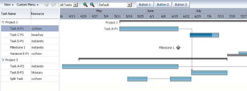
Project Gantt chart: A project Gantt chart is used for project management. The chart lists tasks vertically and shows the duration of each task as a bar on a horizontal time line. It graphs each task on a separate line as shown in Figure 28-1.
Figure 28-1 Project Gantt Chart for a Software Application
-
Resource Utilization Gantt chart: A resource utilization Gantt chart graphically shows the metrics for a resource, for example, whether resources are over or under allocated. It shows resources vertically while showing their metrics, such as allocation and capacity on the horizontal time axis. Figure 28-2 shows a resource utilization Gantt chart illustrating how many hours are allocated and utilized for a particular resource in a given time period.
Figure 28-2 Resource Utilization Gantt Chart for a Software Application

The metrics for a resource utilization Gantt chart can also be configured to display as stacked bars, or as a horizontal line. Figure 28-3 shows a resource utilization Gantt chart illustrating a stacked bar representing hours utilized for two metrics, a vertical bar representing hours allocated, and a horizontal line representing a threshold metric that steps through the chart.
Figure 28-3 Resource Metrics Displayed as Stacked Bars and Stepped Line

-
Scheduling Gantt chart: A scheduling Gantt chart is used for resource scheduling. The chart is based on manual scheduling boards and shows resources vertically, with corresponding activities on the horizontal time axis. Examples of resources include people, machines, or rooms. The scheduling Gantt chart uses a single line to graph all the tasks that are assigned to a resource as shown in Figure 28-4.
Figure 28-4 Scheduling Gantt Chart for a Software Application

28.1.2 End User and Presentation Features
To understand how Gantt charts are used and can be customized, it is helpful to understand these elements and features.
28.1.2.1 Gantt Chart Regions
A Gantt chart is composed of two regions:
-
A table region that displays Gantt chart data attributes in a table with columns. The table region requires a minimum of one column, but you can define attributes for as many columns as desired. By default, all the columns that you define when you create a databound Gantt chart are visible in the table region although you can selectively cause one or more of these columns to be hidden.
-
A chart region displays a bar graph of the Gantt chart data along a horizontal time axis. The time axis provides for major and minor settings to allow for zooming. The major setting is for larger time increments and the minor setting is for smaller time increments.
For example, in Figure 28-4, the scheduling Gantt chart table region contains columns for Task Name and Resources, and the chart region graphs tasks on a time axis that shows weeks within months.
Figure 28-5 Project Gantt Chart Regions

28.1.2.2 Information Panel
The optional information panel displays both the information region that displays text about a selected task, or metric about a selected resource, and the optional legend that displays task types in the area beneath the Gantt chart. You must configure a Gantt chart legend to enable the information panel.
Figure 28-6 shows an information panel for the scheduling Gantt chart in Figure 28-4 with information about a task selected in the chart region and the Gantt chart legend.
Figure 28-6 Scheduling Gantt Chart Information Panel

28.1.2.3 Toolbar
The Gantt chart toolbar allows users to perform operations on the Gantt chart. The toolbar is visible in the Gantt chart by default.
The toolbar is composed of two sections:
-
Menu bar: The left section of the toolbar contains a set of menus for the Gantt chart. Each Gantt chart type has a set of default options. Figure 28-7 displays the menu bar, which is visible in the Gantt chart by default. You can change the visibility of the menu bar and customize menu items.
Note:
The default View menu is available by right-clicking header cells in the Gantt table region, even when the menu bar items are hidden or disabled.
Figure 28-7 Sample Menu Bar for a Gantt Chart

By default, Gantt chart View menu items support one or more of the following operations:
-
Configuring the visibility of columns in the table region.
-
Expanding and collapsing the display of hierarchical data in the table region.
-
Hiding and showing dependency lines between tasks in the chart region.
-
Hiding and showing the Gantt chart legend.
-
Specify a specific date in the Gantt chart. Figure 28-8 shows the View menu Go to Date dialog.
Figure 28-8 Go to Date Dialog

-
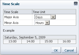
Changing the time scale of the Gantt chart. Figure 28-9 shows the View menu Time Scale dialog.
Figure 28-9 Time Scale Dialog
Note:
The menu bar View menu items do not require that you write application code to make them functional. However, you must provide application code for any items that you want to use on the other menus.
-
-
Toolbar buttons: The right section of the toolbar displays a set of action buttons for working with the Gantt chart. Each Gantt chart type has a set of default options. Figure 28-10 shows a sample toolbar for a project Gantt chart.
Figure 28-10 Sample Toolbar for a Project Gantt Chart

Note:
In locales using right-to-left display, directional icons are displayed in reverse order.
You can use the toolbar to change the time display on the Gantt chart. You can zoom in and out on a time axis to display the chart region in different time units.
You can also use a specialized zoom-to-fit feature in which you select the amount of time that you want to display in the chart region without a need to scroll the chart. The Gantt chart time scale in the View menu automatically adjusts for the selected dates. Figure 28-11 shows the zoom-to-fit toolbar option expanded for a project Gantt chart.
Figure 28-11 Zoom-to-Fit Toolbar Option

28.1.2.4 Scrolling, Zooming, and Panning
The Gantt chart design lets you perform horizontal scrolling of the table and the chart regions independently. This is especially helpful when you want to hold specific task or resource information constant in the table region while scrolling through multiple time periods of information in the chart region.
As an alternative to scrollbars, you can also display a horizontal page control that allows the user to select and navigate through a multiple page Gantt chart. Figure 28-12 shows a resource utilization Gantt chart configured with a horizontal page control.
Figure 28-12 Resource Utilization Gantt Chart Page Control

In addition to the toolbar zoom controls, users can also zoom in and out on the time scale of a Gantt chart by holding the Ctrl key and using the mouse scroll wheel. A tooltip displays to allow the user to keep track of the current level when zooming through multiple levels at a time. This is especially useful for users with a scroll wheel without a click function.
In project and scheduling Gantt charts, users can pan the chart area by dragging it vertically and horizontally using the cursor. A move cursor displays when the user clicks inside the chart area, other than on a task.
The Gantt chart also provides a user option to collapse and expand the display of the table region using an icon available in the vertical space between the two regions.
28.1.2.5 Showing Dependencies
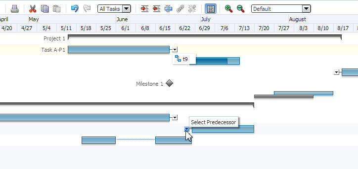
When dependencies between tasks are specified, project and scheduling Gantt charts can optionally show dependency lines in the chart region. The option to display dependency lines is available as a View menu item. Additionally for project Gantt charts, you can show dependencies as a menu option for the predecessor or successor task using a dropdown menu at the beginning or end of the task with a dependency.
Figure 28-13 shows a project Gantt chart View menu with options for showing dependencies as lines, menu items, or not displayed.
Figure 28-13 Project Gantt Chart Show Dependencies Options
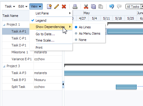
Figure 28-14 shows a project Gantt chart with dependency task menu items for a successor and predecessor task.
Figure 28-14 Project Gantt Chart Dependency Task Menu Items
28.1.2.6 Context Menus
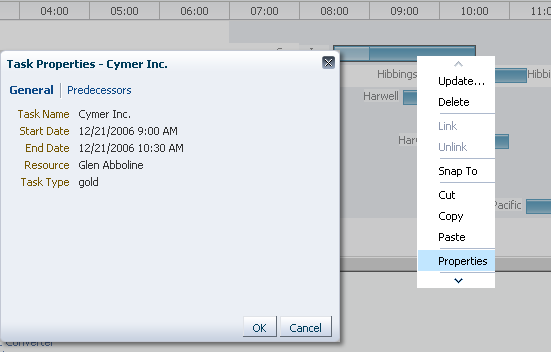
Right-clicking in the Gantt chart table or chart regions provides a context menu with a standard set of menu items. You can provide your own set of menu items by using the tablePopupMenu or chartPopupMenu facet.
For more information, see Customizing Gantt Chart Context Menus.
Figure 28-15 shows a custom context menu item displayed for a scheduling Gantt chart task properties.
Figure 28-15 Custom Context Menu for Task
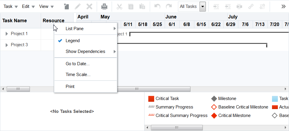
Right-clicking on the column headers in the table region of the Gantt chart displays the default View menu, even if the menu bar is hidden or disabled.
Figure 28-16 shows the default view menu in the context menu for column headers in the table region of a Project Gantt chart.
Figure 28-16 View Context Menu in Table Region
28.1.2.7 Row Selection
You can configure selection for no rows, for a single row, or for multiple rows in the chart region of a Gantt chart using the rowSelection attribute. You can select tasks for a project Gantt chart or resources for a scheduling or resource utilization Gantt chart. This setting allows you to execute logic against the selected tasks or resources. For example, you may want users to be able to select a resource and display a calendar based on that resource.
When the selected row in the table region changes, the component triggers a selection event. This event reports which rows were just selected or deselected. While the components handle selection declaratively, if you want to perform some logic on the selected rows, you need to implement code that can access those rows and then perform the logic. You can do this in a selection listener method on a managed bean. For more information, see Performing an Action on Selected Tasks or Resources.
Note:
If you configure your component to allow multiple selection, users can select one row and then press the shift key to select another row, and all the rows in between will be selected. This selection will be retained even if the selection is across multiple data fetch blocks. Similarly, you can use the Ctrl key to select rows that are not next to each other.
For example, if you configure your Gantt chart table region to fetch only 25 rows at a time, but the user selects 100 rows, the framework is able to keep track of the selection.
28.1.2.8 Editing Tasks
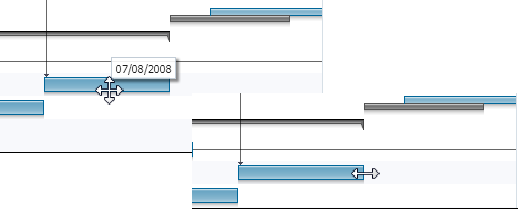
In project and scheduling Gantt charts, users can move or resize the task bar of an editable task in the chart region. Move the cursor over an editable task to display a move cursor with an informational popup about the location of the curser. Click and drag the task bar with its associated beginning and end dates to reposition the task in the chart. If the beginning or ending date of a task is editable, a double-sided arrow is displayed at the start or end of the task bar. Click and drag the date to the desired location.
Figure 28-17 shows the move and resize cursors for an editable task in a project Gantt chart.
Figure 28-17 Move and Resize Cursors for an Editable Task Bar
28.1.2.9 Server-Side Events
When a user interaction involves a change in data, the Gantt chart processes the change by performing event handling and update of the data model. When configured for a Gantt chart, validation ensures that the data submitted meets basic requirements, for example, that a date is valid and does not fall into a nonworking time period. When validation fails, the update of the data model is omitted, and an error message is returned.
When a Gantt chart server-side event is fired, an event with validated information about the change is sent to the registered listener. The listener is then responsible for updating the underlying data model. A customized event handler can be registered by specifying a method binding expression on the dataChangeListener attribute of the Gantt chart component.
Server-side events supported by the Gantt chart include:
-
Update of data in the table cells of the Gantt chart table region
-
Create, update, delete, move, cut, copy, paste, indent, outdent of tasks
-
Reassignment of resource by dragging the task bar from one row to another
-
Drag the task bar to another date
-
Extend the duration of a task
-
Link or unlink tasks
-
Select a row or multiple rows in the Gantt chart table region
-
Undo or redo of user actions
-
Double-click on a task bar
Users can filter the data in a Gantt chart using a dropdown list from the toolbar. You can create a custom filter.
28.1.2.10 Printing
The Gantt chart provides printing capability in conjunction with Apache or XML Publisher by generating PDF files. For more information, see Printing a Gantt Chart.
28.1.2.11 Content Delivery
Gantt charts can be configured for how data is delivered from the data source. The data can be delivered to the Gantt chart task bars either immediately upon rendering, as soon as the data is available, or lazily fetch after the shell of the component has been rendered.
By default, Gantt charts support the delivery of content from the data source when it is available. The contentDelivery attribute is set to whenAvailable by default.
Gantt charts are virtualized, meaning not all data on the server is delivered to and displayed on the client. You can configure Gantt charts to fetch a certain number of rows or columns at a time from your data source based on date related values. Use fetchSize and horizontalFetchSize to configure fetch size.
28.1.3 Additional Functionality for Gantt Chart Components
You may find it helpful to understand other ADF Faces features before you implement your Gantt chart component. Additionally, once you have added a Gantt chart component to your page, you may find that you need to add functionality such as validation and accessibility.
Following are links to other functionality that Gantt chart components can use:
-
Partial page rendering: You may want a Gantt chart to refresh to show new data based on an action taken on another component on the page. For more information, see Rerendering Partial Page Content.
-
Personalization: Users can change the way the Gantt chart displays at runtime, those values will not be retained once the user leaves the page unless you configure your application to allow user customization. For information, see Allowing User Customization on JSF Pages.
-
Accessibility: By default, Gantt chart components are accessible. You can make your application pages accessible for screen reader users. For more information, see Developing Accessible ADF Faces Pages.
-
Export to Excel: You can export the table region of the project Gantt chart using
af:exportCollectionActionListener. For more information, see Exporting Data from Table, Tree, or Tree Table. -
Content Delivery: You configure your Gantt chart table region to fetch a certain number of rows at a time from your data source using the
contentDeliveryattribute. For more information, see Content Delivery. -
Automatic data binding: If your application uses the technology stack, then you can create automatically bound Gantt charts based on how your ADF Business Components are configured. For more information, see the "Creating Databound Gantt Chart and Timeline Components" chapter of Developing Fusion Web Applications with Oracle Application Development Framework.
Note:
If you know the UI components on your page will eventually use ADF data binding, but you need to develop the pages before the data controls are ready, then you should consider using placeholder data controls, rather than manually binding the components. Using placeholder data controls will provide the same declarative development experience as using developed data controls. For more information, see the "Designing a Page Using Placeholder Data Controls" chapter of Developing Fusion Web Applications with Oracle Application Development Framework.
Additionally, data visualization components share much of the same functionality, such as how data is delivered, automatic partial page rendering (PPR), image formats, and how data can be displayed and edited. For more information, see Common Functionality in Data Visualization Components.
28.2 Using the Gantt Chart Components
To use the Gantt chart component, add the Gantt chart component to a page using the Component Palette window. Then define the data collection for the Gantt chart and complete the additional configuration in JDeveloper using the tag attributes in the Properties window.
The data model for a Gantt chart can be either a tree (hierarchical) model or a collection model that contains a row set or flat list of objects. When you bind a Gantt chart to a data control, you specify how the collection in the data control maps to the node definitions of the Gantt chart.
For more information, see the "Creating Databound Gantt Chart and Timeline Components" chapter of Developing Fusion Web Applications with Oracle Application Development Framework.
28.2.1 Data for a Project Gantt Chart
The data model for a project Gantt chart supports hierarchical data and uses TreeModel to access the data in the underlying list. The specific model class is org.apache.myfaces.trinidad.model.TreeModel.
The collection of objects returned by the TreeModel must have, at a minimum, the following properties:
-
taskId: The ID of the task. -
startTime: The start time of the task. -
endTime: The end time of the task.
Optionally, the object could implement the oracle.adf.view.faces.bi.model.Task interface to ensure it provides the correct properties to the Gantt chart.
When binding the data to an ADF data control, the following node definitions are available in a project Gantt chart:
-
Task node: Represents a collection of tasks. The task node definition has the following types of optional accessors:
-
subTask(available only for project Gantt chart) -
splitTask
-
-
Split task node: Represents a collection of split tasks. A split task node definition does not have accessors.
-
Dependency node: Represents a collection of dependencies for a task. A dependency node definition does not have accessors.
-
Recurring task node: Represents a collection of recurring tasks. A recurring task node definition does not have accessors.
Table 28-1 shows a complete list of data object keys for the project Gantt chart.
Table 28-1 Data Object Keys for Project Gantt
| Data Object Key | Date Type and Description |
|---|---|
|
|
Date. The actual end time for normal and milestone tasks. |
|
|
Date. The actual start time for normal and milestone tasks. |
|
|
Date. Completed through for normal and summary tasks. |
|
|
Boolean. Specifies whether or not the task is critical for all tasks. |
|
Dependency (node) |
A list of dependencies for a task. Data object keys for dependencies include:
|
|
|
Boolean. Specifies whether or not a task bar can be edited in the chart region. |
|
|
Date. The end time for all tasks. |
|
|
String. The first icon associated with the task bar for all tasks. The icon might change depending on other attributes |
|
|
String. The second icon associated with the tasks bar for all tasks. |
|
|
String. The third icon associated with the tasks bar for all tasks. |
|
|
String. The alignment of the icon in the task bar for all tasks. Valid values are |
|
|
Boolean. Specifies whether or not a node definition is a container. |
|
|
String. The label associated with the task bar for all tasks. |
|
|
String. The alignment of the label in the task bar for all tasks. Valid values are |
|
|
Integer. Percentage completed for normal and summary tasks. |
|
Recurring tasks (node) |
The list of recurring tasks for all tasks. |
|
Split tasks (node) |
The list of tasks without a continuous time line for all tasks. |
|
|
Date. The starting time for all tasks. |
|
Subtasks (node) |
An optional list of subtasks for all tasks. |
|
|
String. The unique identifier for all tasks. |
|
|
Sting. The type of the tasks for all tasks. |
28.2.2 Data for a Resource Utilization Gantt Chart
The data model for a resource utilization Gantt chart supports hierarchical data and uses TreeModel to access the data in the underlying list. The specific model class is org.apache.myfaces.trinidad.model.TreeModel.
The collection of objects returned by TreeModel must have, at a minimum, the following properties:
-
resourceId: The ID of the task. -
timeBuckets: A collection of time bucket objects for this resource.
Optionally, the object could implement the oracle.adf.view.faces.bi.model.Resource interface to ensure it provides the correct properties to the Gantt chart.
The collection of objects returned by the timeBuckets property must also have the following properties:
-
time: The date represented by the time bucket. -
values: A list of metrics for this resource.
When binding the data to an ADF data control, the following node definitions are available in a Resource Utilization Gantt chart:
-
Resource node: Represents a collection of resources. The resource node definition has an optional
subResourcesaccessor that returns a collection of subresources for the current resource. -
Time bucket node: Represents a collection of time slots with metrics defined.
-
Time bucket details node: Optional child accessor to the time bucket node that represents a collection of rows that would be rendered along with other metric values in the time bucket.
Table 28-2 shows a complete list of data object keys for the resource utilization Gantt chart.
Table 28-2 Data Object Keys for Resource Utilization Gantt
| Data Object Key | Data Type and Description |
|---|---|
|
|
String. The label associated with the task bar. |
|
|
String. The alignment of the label in the task bar. Valid values are |
|
|
String. The unique identifier of a resource. |
|
|
List. The list of tasks associated with a resource. |
|
|
List. The list of attributes associated with a resource. |
|
|
Date. The start time of the time bucket. |
|
|
Double. The values of the metrics. |
28.2.3 Data for a Scheduling Gantt Chart
The data model for a scheduling Gantt chart supports hierarchical data and uses TreeModel to access the data in the underlying list. The specific model class is org.apache.myfaces.trinidad.model.TreeModel.
The collection of objects returned by TreeModel must have, at a minimum, the following properties:
-
resourceId: The ID of the resource. -
tasks: A collection of task objects for this resource.
Optionally, the object could implement the oracle.adf.view.faces.bi.model.ResourceTask interface to ensure it provides the correct properties to the Gantt chart.
The collection of objects returned by the tasks property must also have the following properties:
-
taskId: The ID of the task. -
startTime: The start time of the task. -
endTime: The end time of the task.
Optionally, a backgroundBars property can be set for each task object to customize the appearance of individual background bars for a given resource over a daily time interval, as in the case of a change in shift on a monthly, weekly, or even daily schedule. The collection of objects returned by the backgroundBars property must have the following properties:
-
startTime: The start time of the task. -
endTime: The end time of the task. -
type: Linked to an instance of abackgroundBarFormatobject that can be registered with the Gantt chart through theTaskbarFormatManager.
When binding the data to an ADF data control, the scheduling Gantt chart has a Resource node definition. The Resource node has the following types of accessors:
-
subResources: Returns a collection of subresources for the current resource. This accessor is optional. -
tasks: Returns a collection of tasks for the current resource. This accessor is required. Tasks can also include asplitTaskaccessor.
Table 28-3 shows a complete list of data object keys for a scheduling Gantt chart.
Table 28-3 Data Object Keys for Scheduling Gantt Chart
| Data Object Key | Data Type and Description |
|---|---|
|
Dependency (node) |
A list of dependencies for a task. Data object keys for dependencies include:
|
|
|
Date. The end time for all the tasks. |
|
|
String. The first icon associated with the task bar for all tasks. The icon might change depending on other attributes. |
|
|
String. The second icon associated with the task bar for all tasks. |
|
|
String. The third icon associated with the task bar for all tasks. |
|
|
String. The alignment of the icon in the task bar for all tasks. Valid values are |
|
|
Boolean. Specifies whether or not a node definition is a container. |
|
|
String. The label associated with the task bar for all tasks. |
|
|
String. The alignment of the label in the task bar for all tasks. Valid values are |
|
Recurring tasks (node) |
A list of recurring tasks for all tasks. |
|
|
String. The unique identifier of a resource. |
|
Split tasks (node) |
A collection of tasks without a continuous time line for all tasks. |
|
|
Date. The start time for all tasks. |
|
|
Date. The startup time before a task begins. |
|
Tasks (node) (required) |
A list of tasks associated with a resource. |
|
|
String. The unique identifier of the task for all tasks. |
|
|
String. The type of the task for all tasks. |
|
|
Object. A list of the working days of the week. |
|
|
String. The work end time for the resource. |
|
|
String. The work start time for the resource. |
28.2.4 Gantt Chart Tasks and Resources
Project and scheduling Gantt charts use predefined tasks with a set of formatting properties that describe how the tasks will be rendered in the chart area. All supported tasks must have a unique identifier.
The following describes the supported tasks and how they appear in a Gantt chart:
-
Normal: The basic task type. It is a plain horizontal bar that shows the start time, end time, and duration of the task.
-
Summary: The start and end date for a group of subtasks. A summary task cannot be moved or extended. Instead, it is the responsibility of the application to execute code to recalculate the start and end date for a summary task when the date of a subtask changes. Summary tasks are available only for the project Gantt chart.
-
Milestone: A specific date in the Gantt chart. There is only one date associated with a milestone task. A milestone task cannot be extended but it can be moved. A milestone task is available only for the project Gantt chart.
-
Recurring: A task that is repeated in a Gantt chart, each instance with its own start and end date. Individual recurring tasks can optionally contain a subtype. All other properties of the individual recurring tasks come from the task which they are part of. However, if an individual recurring task has a subtype, this subtype overrides the task type.
-
Split: A task that is split into two horizontal bars, usually linked by a line. The time between the bars represents idle time due to traveling or down time.
-
Scheduled: The basic task type for a scheduling Gantt chart. This task type shows the starting time, ending time, and duration of a task, as well as startup time if one is specified.
For normal, summary, and milestone tasks, additional attributes are supported that would change the appearance and activity of a task. These style attributes include:
-
percentComplete,completedThrough: An extra bar would be drawn to indicate how far the task is completed. This is applicable to normal and summary task types. -
critical: The color of the bar would be changed to red to mark it as critical. This is applicable to normal, summary, and milestone task types. -
actualStartandactualEnd: When these attributes are specified, instead of drawing one bar, two bars are drawn. One bar indicates the base start and end date, the other bar indicates the actual start and end date. This is applicable to normal and milestone task types.
Figure 28-18 displays a legend that shows common task types in a project Gantt chart.
Figure 28-18 Project Gantt Chart Legend for Task Types

Resource utilization Gantt charts graphically show resources vertically while displaying their metrics, such as allocation and capacity on the horizontal time axis. The metrics displayed for the tasks in a time bucket are rendered as specified by the TaskbarFormat class and can be one of three types:
-
BAR(default): Render the task as a vertical bar. -
STACKED: Render the task as a bar stacked on the previous bar. -
STEPPED_LINE: Render the task as a horizontal line.
28.2.5 Configuring Gantt Charts
The three Gantt chart components beginning with the prefix dvt: for each Gantt chart tag name indicates that the tag belongs to the ADF Data Visualization Tools (DVT) tag library:
-
projectGantt -
resourceUtilizationGantt -
schedulingGantt
All Gantt chart components support the child tag ganttLegend to provide an optional legend in the information panel of a Gantt chart. Some menu bar and toolbar functions may or may not be available depending on whether the Gantt legend is specified.
In the Gantt chart table region, the ADF Faces af:column tag is used to specify the header text, icons and alignment for the data, the width of the column, and the data bound to the column. To display data in hierarchical form, a nodeStamp facet specifies the primary identifier of an element in the hierarchy. For example, the "Task Name" column might be used as the nodeStamp facet for a project Gantt chart. The example below shows sample code for a project Gantt chart with "Task Name" as the nodeStamp facet, with columns for Resource, Start Date, and End Date.
<dvt:projectGantt id="projectChart1" startTime="2008-04-12"
           endTime="2009-04-12"
           value="#{project.model}"
           var="task">
  <f:facet name="major">
    <dvt:timeAxis scale="months"/>
  </f:facet>
  <f:facet name="minor">
    <dvt:timeAxis scale="weeks"/>
  </f:facet>
  <f:facet name="nodeStamp">
    <af:column headerText="Task Name">
      <af:outputText value="#{task.taskName}"/>
    </af:column>
  </f:facet>
    <af:column headerText="Resource">
      <af:outputText value="#{task.resourceName}"/>
    </af:column>
    <af:column headerText="Start Date">
      <af:outputText value="#{task.startTime}"/>
    </af:column>
    <af:column headerText="End Date">
      <af:outputText value="#{task.endTime}"/>
    </af:column>
</dvt:projectGantt>
In addition to the nodeStamp facet, other facets are used for customizations by the Gantt chart components. Table 28-4 shows the facets supported by Gantt chart components.
Table 28-4 Facets Supported by Gantt Chart Components
| Facet | Description |
|---|---|
|
|
Specifies the component to use to identify additional controls to appear in the context menu of the chart region. Must be an |
|
|
Specifies the component to use to identify controls to appear in the custom tab of the task properties dialog. |
|
|
Specifies the component to use to identify the major time axis. Must be a |
|
|
Specifies the component to use to identify additional controls to appear in the Gantt menu bar. Must be an |
|
|
Specifies the component to use to identify the minor time axis. Must be a |
|
|
Specifies the component to use to stamp each element in the Gantt chart. Only certain types of components are supported, including all components with no activity and most components that implement the |
|
|
Specifies the component to use to identify additional controls to appear in the context menu of the table region. Must be an |
|
|
Specifies the component to use to identify additional controls to appear in the Gantt toolbar. Must be an |
28.2.6 How to Add a Gantt Chart to a Page
When you are designing your page using simple UI-first development, you use the Components window to drag and drop a project, resource utilization, or scheduling Gantt chart component onto a JSF page. Once the Gantt chart is added to your page, you can use the Properties window to specify data values and configure additional display attributes for the Gantt chart.
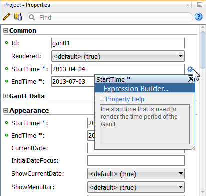
In the Properties window you can use the dropdown menu for each attribute field to display a property description and options such as displaying an EL Expression Builder or other specialized dialogs. Figure 28-19 shows the dropdown menu for a project Gantt chart component startTime attribute.
Figure 28-19 Project Gantt Chart startTime Attribute Dropdown Menu
Note:
If your application uses the Fusion technology stack, then you can use data controls to create a Gantt chart and the binding will be done for you. For more information, see the "Creating Databound Gantt Chart and Timeline Components" chapter of Developing Fusion Web Applications with Oracle Application Development Framework
Before you begin:
It may be helpful to have an understanding of how Gantt chart attributes and Gantt chart child components can affect functionality. For more information, see Configuring Gantt Charts.
You may also find it helpful to understand functionality that can be added using other ADF Faces features. For more information, see Additional Functionality for Gantt Chart Components.
To add a Gantt chart to a page:
28.2.7 What Happens When You Add a Gantt Chart to a Page
When you use the Components window to create a Gantt chart, JDeveloper inserts code in the JSF page.
The example below shows the code inserted in the JSF page for a project Gantt chart.
<dvt:projectGantt startTime="2011-03-20" endTime="2011-06-19" var="row" id="pg1">
  <f:facet name="major">
    <dvt:timeAxis scale="weeks" id="ta5"/>
  </f:facet>
  <f:facet name="minor">
    <dvt:timeAxis scale="days" id="ta6"/>
  </f:facet>
  <f:facet name="nodeStamp">
    <af:column sortable="false" headerText="col1" id="c11">
      <af:outputText value="#{row.col1}" id="ot11"/>
    </af:column>
  </f:facet>
    <af:column sortable="false" headerText="col2" id="c12">
      <af:outputText value="#{row.col2}" id="ot12"/>
    </af:column>
    <af:column sortable="false" headerText="col3" id="c13">
      <af:outputText value="#{row.col3}" id="ot13"/>
    </af:column>
    <af:column sortable="false" headerText="col4" id="c14">
      <af:outputText value="#{row.col4}" id="ot14"/>
    </af:column>
    <af:column sortable="false" headerText="col5" id="c15">
      <af:outputText value="#{row.col5}" id="ot15"/>
    </af:column>
</dvt:projectGantt>
28.3 Customizing Gantt Chart Tasks and Resources
Once you have added a Gantt chart to your JSF page, you can create a new task type, configure tasks to display as a stacked bar or horizontal line, and display the attribute details for a task.
28.3.1 Creating a New Task Type
A task type is represented visually as a bar in the chart region of a Gantt chart. Task types can be created in one of three ways.
You can create a new task type by:
-
Defining the task type style properties in the JSF page or in a separate CSS file.
-
Defining a
TaskbarFormatobject and registering the object with thetaskbarFormatManager. -
Modifying the properties of a predefined task type by retrieving the associated
TaskbarFormatobject and updating its properties through asetmethod.
The TaskBarFormat object exposes the following properties:
-
Fill color
-
Fill image pattern
-
Border color
-
Images used for a milestone task
-
Images used for the beginning and end of a summary task
For tasks that have more than one bar, such as a split or recurring task, properties are defined for each individual bar.
The example below shows sample code to define the properties for a custom task type in the JSF page.
<af:document>
  <f:facet name="metaContainer">
    <f:verbatim>
      <![CDATA[
      <style type="text/css">
         .onhold
{
         background-image:url('images/Bar_Image.png');
         background-repeat:repeat-x;
         height:13px;
         border:solid 1px #000000;
}
      </style>
        ]]>
    </f:verbatim>
  </f:facet>
The example below shows sample code to define a TaskbarFormat object fill and border color and register the object with the taskbarFormatManager.
TaskbarFormat _custom = new TaskbarFormat("Task on hold", null, "onhold", null);
//        _gantt.getTaskbarFormatManager().registerTaskbarFormat("FormatId", _custom);
TaskbarFormat _custom = new TaskbarFormat("Task on hold", "#FF00FF", null, "#00FFDD", 13);
//    _gantt.getTaskbarFormatManager().registerTaskbarFormat("FormatId", _custom);
28.3.2 Configuring Stacked Bars in Resource Utilization Gantt Charts
In a resource utilization Gantt chart, a time bucket displays the unit allocated and used for a resource for a specified time period. By default, these units are rendered as vertical bars in the chart region. You can also configure the graphical display to stack two or more of the bars together.
For example, the resource utilization Gantt chart in Figure 28-3 stacks the RUN and SETUP resource metrics into a vertical bar next to the AVAILABLE resource metric bar.
To configure stacked bars in a resource utilization Gantt chart, use the setDisplayAs() method to update the TaskbarFormat object. Specifying a STACK display renders the task as a metric stacked on the previous metric. The example below shows a managed bean that configures the RUN metric to stack on the previous metric, SETUP.
public class ResourceUtilizationGantt
{
    private TreeModel m_model;
    public String[] getMetrics()
    {
        return new String[]{"SETUP", "RUN", "AVAILABLE"};
    }

    public TaskbarFormatManager getTaskbarFormatManager()
    {
        TaskbarFormatManager _manager = new TaskbarFormatManager();
        TaskbarFormat _format = TaskbarFormat.getInstance("Run Hours",
            UIResourceUtilizationGantt.MIDNIGHT_BLUE_FORMAT);
        _format.setStacked(true);

        _manager.registerTaskbarFormat("SETUP", TaskbarFormat.getInstance("Setup
            Hours", UIResourceUtilizationGantt.BRICK_RED_FORMAT));
        _manager.registerTaskbarFormat("RUN", _format);
        _manager.registerTaskbarFormat("AVAILABLE",
            TaskbarFormat.getInstance("Available Hours",
            UIResourceUtilizationGantt.TEAL_FORMAT));
        return _manager;
    }
28.3.3 Configuring a Resource Capacity Line
In addition to displaying the resource metrics as vertical bars in the chart region of a resource utilization Gantt chart, you can configure a metric to display as a horizontal line in the chart region. This is useful for displaying capacity metrics, such as a resource threshold level.
For example, Figure 28-3 shows a resource utilization Gantt chart with a capacity line displaying a threshold metric across the stacked RUN and SETUP metrics, and the ALLOCATED metric bars.
To configure a resource capacity line in a resource utilization Gantt chart, use the setDisplayAs() method to update the TaskbarFormat object. Specifying a STEPPED_LINE display renders the task as a horizontal line over the vertical bars, stepping through each metric. The example below shows the managed bean that configures the resource metric THRESHOLD to step through the vertical bar metrics.
public class ResourceUtilizationGanttSteppedLine
{
    private TreeModel m_model;
    public String[] getMetrics()
    {
        return new String[]{"SETUP", "RUN", "AVAILABLE", "THRESHOLD"};
    }
    public TaskbarFormatManager getTaskbarFormatManager()
    {
        TaskbarFormatManager _manager = new TaskbarFormatManager();
        TaskbarFormat _format = TaskbarFormat.getInstance("Run Hours",
            UIResourceUtilizationGantt.MIDNIGHT_BLUE_FORMAT);
        _format.setStacked(true);

        _manager.registerTaskbarFormat("SETUP", TaskbarFormat.getInstance("Setup
            Hours", UIResourceUtilizationGantt.BRICK_RED_FORMAT));
        _manager.registerTaskbarFormat("RUN", _format);
        _manager.registerTaskbarFormat("AVAILABLE",
            TaskbarFormat.getInstance("Available Hours",
            UIResourceUtilizationGantt.TEAL_FORMAT));

        MetricFormat _threshold = new MetricFormat("threshold", "#FF0000", null,
            "#FF0000", MetricFormat.Display.STEPPED_LINE);
        _manager.registerTaskbarFormat("THRESHOLD", _threshold);
        return _manager;
    }
28.3.4 Displaying Resource Attribute Details
By default, the time buckets in resource utilization Gantt charts display a fixed size metric.
For example, the Gantt chart in Figure 28-20 displays stacked RUN and SETUP metrics, and ALLOCATED metric bars for a table of company resources.
You may wish to break out the detail for a time bucket metric by attributes associated with the resource. For example, the resource utilization Gantt chart in Figure 28-20 illustrates the detail values for a BUDGET metric by actual values for time spent on each product.
Figure 28-20 Resource Utilization Gantt Chart Metric Attribute Details
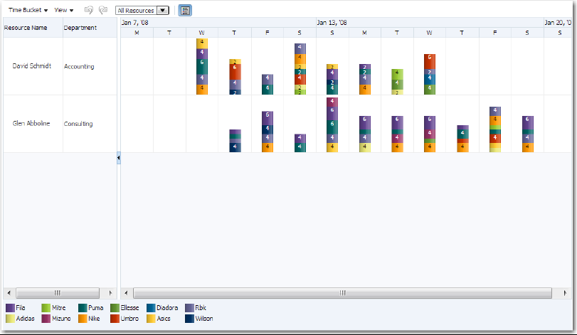
To configure the display of the attribute details for a resource, you will need add a child timeBucketDetails accessor to the page definition file. The example below shows the sample code for adding the accessor to the page definition file.
<nodeDefinition DefName="model.GanttRugResourceAppView" type="Resources">
  <AttrNames>
    <Item Value="ResourceId" type="resourceId"/>
  </AttrNames>
  <Accessors>
    <Item Value="GanttRugTimebucketAppView" type="timeBuckets"/>
  </Accessors>
</nodeDefinition>
<nodeDefinition type="TimeBuckets" DefName="model.GanttRugTimebucketAppView">
  <AttrNames>
    <Item type="time" Value="StartDate"/>
    <Item type="metric" Value="Budget"/>
  </AttrNames>
  <Accessors>
    <Item Value="GanttRugProductAppView" type="timeBucketDetails"/>
  </Accessors>
</nodeDefinition>
<nodeDefinition type="TimeBucketDetails">
  <AttrNames>
    <Item type="metric" Value="Actual"/>
    <Item type="format" Value="Product"/>
  </AttrNames>
</nodeDefinition>
To configure the attribute details for a resource in a resource utilization Gantt chart, use the setDisplayAs() method to update the TaskbarFormat object. The example below shows the managed bean that configures the attribute detail metrics for the BUDGET resource bar.
public class ResourceUtilizationGanttAttributeDetail
{
    private TreeModel m_model;

    public String[] getMetrics()
    {
        return new String[] {};
    }

    public TaskbarFormatManager getTaskbarFormatManager()
    {
        TaskbarFormatManager _manager = new TaskbarFormatManager();

        _manager.registerTaskbarFormat("Wilson",
            TaskbarFormat.getInstance("Wilson",
            UIResourceUtilizationGantt.MIDNIGHT_BLUE_FORMAT));
        _manager.registerTaskbarFormat("Umbro", TaskbarFormat.getInstance("Umbro",
            UIResourceUtilizationGantt.BRICK_RED_FORMAT));
        _manager.registerTaskbarFormat("Rbk", TaskbarFormat.getInstance("Rbk",
            UIResourceUtilizationGantt.LAVENDER_FORMAT));
        _manager.registerTaskbarFormat("Puma", TaskbarFormat.getInstance("Puma",
            UIResourceUtilizationGantt.TEAL_FORMAT));
        ...
        return _manager;
    }

    public TreeModel getModel()
    {
        if (m_model == null)
            m_model =
             SampleModelFactory.getResourceUtilizationGanttAttributeDetailModel();

        return m_model;
    }
}
28.3.5 Configuring Background Bars in Scheduling Gantt Charts
Scheduling Gantt charts use a single line to graph all the tasks assigned to a resource. You can configure a working time attribute that applies a specified background color to a given resource over a daily time interval. This time interval is repeated across all working days of the week, and can be different for any given resource. However, if a resource's working time interval changes on a monthly, weekly, or even daily schedule, you can configure a background bar to represent that individual schedule.
To configure a background bar to a scheduling Gantt chart, set a backgroundBars property on the Gantt chart's model, and for each object contained within the collection, specify a startTime, endTime, and type. Each type can be linked to an instance of a backgroundBarFormat object registered with the TaskbarFormatManager. For more information, see Creating a New Task Type.
The scheduling Gantt chart in Figure 28-21 shows an individualized schedule for each resource represented as a background bar.
Figure 28-21 Scheduling Gantt Chart with Background Bars
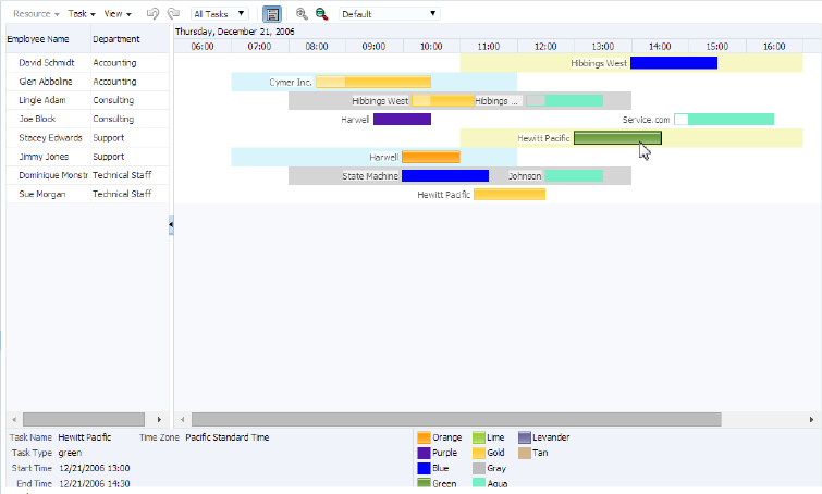
To configure the background bars details for a resource in a scheduling Gantt chart, use the setDisplayAs() method to update the TaskbarFormat object. The example below shows the managed bean that configures the background bar details for each resource.
public class SchedulingGanttBackgroundBars extends SchedulingGanttBase
{
    private TreeModel m_model;
    public TreeModel getModel()
    {
        if (m_model == null)
        m_model = SampleModelFactory.getSchedulingGanttBackgroundBarsModel();
        return m_model;
    }
        public String[] getLegendKeys()
          {return new String[]{"taskName", "taskType", "startTime",
           "endTime", "%timezone%"};
    }
    public String[] getLegendLabels()
            {return new String[]{"Task Name", "Task Type",
             "Start Time", "End Time", "Time Zone"};
    }

    public TaskbarFormatManager getTaskbarFormatManager()
    {
        TaskbarFormatManager _manager = new TaskbarFormatManager();
        //create and register new colors
        _manager.registerBackgroundBarFormat("fillColor",
            new BackgroundBarFormat("fillColor", "#f6f7c3", null));
        _manager.registerBackgroundBarFormat("fillColor2",
            new BackgroundBarFormat("fillColor2", "#d9f4fa", null));
        //register predefined colors
        _manager.registerTaskbarFormat("gold", TaskbarFormat.getInstance("Gold",
            UISchedulingGantt.GOLD_FORMAT));
        _manager.registerTaskbarFormat("green", TaskbarFormat.getInstance("Green",
            UISchedulingGantt.GREEN_FORMAT));
        _manager.registerTaskbarFormat("orange",
            TaskbarFormat.getInstance("Orange",
            UISchedulingGantt.ORANGE_FORMAT));
        _manager.registerTaskbarFormat("levander",
            TaskbarFormat.getInstance("Levander",
            UISchedulingGantt.LAVENDER_FORMAT));
        _manager.registerTaskbarFormat("lime", TaskbarFormat.getInstance("Lime",
            UISchedulingGantt.LIME_FORMAT));
        //create and register new colors
        _manager.registerTaskbarFormat("blue",
            new TaskbarFormat("Blue", "#0000FF", null, "#0000FF", 13));
        _manager.registerTaskbarFormat("purple",
            new TaskbarFormat("Purple", "#5518AB", null, "#5518AB", 13));
        _manager.registerTaskbarFormat("aqua",
            new TaskbarFormat("Aqua", "#76EEC6", null, "#76EEC6", 13));
        _manager.registerTaskbarFormat("gray",
            new TaskbarFormat("Gray", "#BEBEBE", null, "#BEBEBE", 13));
        _manager.registerTaskbarFormat("tan",
            new TaskbarFormat("Tan", "#D2B48C", null, "#D2B48C", 13));
        return _manager;
    }
}
The example below shows sample code on the JSF page for the scheduling Gantt chart shown in Figure 28-21.
<dvt:schedulingGantt id="schedulingGantBackgroundBars"
                     startTime="2006-12-21 06:00"
                     endTime="2006-12-21 18:00"
                     value="#{schedulingGanttBackgroundBars.model}"
                     var="resourceObj"
                     taskbarFormatManager="#{schedulingGanttBackgroundBars.
                         taskbarFormatManager}"
                     summary="Scheduling Gantt Background Bars Demo">
  <f:facet name="major">
    <dvt:timeAxis scale="days" id="ta1"/>
  </f:facet>
  <f:facet name="minor">
    <dvt:timeAxis scale="hours" id="ta2"/>
  </f:facet>
  <f:facet name="nodeStamp">
    <af:column headerText="Employee Name" id="c1">
      <af:outputText value="#{resourceObj.resourceName}" id="ot1"/>
    </af:column>
  </f:facet>
    <af:column headerText="Department" id="c2">
      <af:outputText value="#{resourceObj.department}" id="ot2"/>
    </af:column>
      <dvt:ganttLegend keys="#{schedulingGanttBackgroundBars.legendKeys}"
                       labels="#{schedulingGanttBackgroundBars.legendLabels}"
                       id="gl1"/>
</dvt:schedulingGantt>
28.4 Customizing Gantt Chart Display Elements
Gantt charts support a number of configurations. You can customize a Gantt chart to display nonworking days of the week, turn off user interaction features, specify the time axes, add and customize a legend, customize toolbars and context menus, and configure a custom data filter.
28.4.1 Customizing Gantt Chart Toolbars and Menus
The Gantt chart toolbar subcomponent allows users to perform operations on the Gantt chart. The left section of the toolbar is a menu bar that contains a set of default menu options for each Gantt chart type. The right section of the toolbar displays a set of default action buttons for working with each Gantt chart type.
You can customize Gantt chart menus and toolbars by supplying your own items, and adding, removing, and rearranging items within the toolbar or menu. Use the toolBarLayout and menuBarLayout attributes of the Gantt chart component to specify the contents and arrangement of buttons and menu items as a set of space-separated Strings. Submenus are designated by using brackets in the menuBarLyout attribute as in:
taskMenu [cut copy]
For example, Figure 28-22 shows a customized toolbar and menu bar for a project Gantt chart.
Figure 28-22 Project Gantt Chart Custom Toolbar and Menu Bar

The example below shows sample code for specifying the custom toolbar and menu bar in Figure 28-22:
<dvt:projectGantt id="gantt1" value="#{bindings.OrderEmployee1.projectGanttModel}"
                  dataChangeListener="#{bindings.OrderEmployee1.
                      projectGanttModel.processDataChanged}"
                  var="row" startTime="2012-07-01" endTime="2013-05-15"
                  initiallyExpandAll="true"
                  summary="Project Gantt chart for shipping orders"
                  toolBarLayout="cut copy paste link unlink"
                  menuBarLayout="editTask [cut copy]">
  ...
</dvt:projectGantt>
Table 28-5 shows the valid values for the toolBarLayout attribute.
Table 28-5 Valid Values for ToolBarLayout Attributes
| Value | Feature Disabled |
|---|---|
|
|
Show all standard toolbar items for all Gantt charts. |
|
|
Cut, Copy, and Paste tasks for all Gantt charts. |
|
|
Create Task toolbar task for project and scheduling Gantt charts. |
|
|
Copy task for all Gantt charts. |
|
|
Cut task for all Gantt charts. |
|
|
Delete task for all Gantt charts. |
|
|
Changes to the data model for all Gantt charts. |
|
|
Data filter operation for all Gantt charts. |
|
|
Indent task for project and scheduling Gantt charts. |
|
|
Indent group of tasks for project and scheduling Gantt charts. |
|
|
Indent /////. |
|
|
Hide and Show legend toolbar items for all Gantt charts. |
|
|
Link task for project and scheduling Gantt charts. |
|
|
Link group of tasks for project and scheduling Gantt charts. |
|
|
Outdent tasks for project and scheduling Gantt charts. |
|
|
Paste task for all Gantt charts. |
|
|
Print task for all Gantt charts. |
|
|
Redo task for all Gantt charts. |
|
|
Vertical line separating toolbar items for all Gantt charts. |
|
|
Undo task for all Gantt charts. |
|
|
Undo //// all Gantt charts. |
|
|
Undo /// Resource menu item for scheduling Gantt chart. |
|
|
Undo link for /// Task menu item for project and scheduling Gantt charts. |
|
|
Update Task item for project and scheduling Gantts. |
|
|
Zoom in task for all Gantt charts. |
|
|
Zoom in and out tasks ///for all Gantt charts. |
|
|
Zoom out task for all Gantt charts. |
|
|
Zoom to Fit item for all Gantt charts. |
|
|
Zoom ///. |
Table 28-6 shows the valid values for the MenuBarLayout attributes.
Table 28-6 Valid Values for MenuBarLayout Attributes
| Value | Feature Disabled |
|---|---|
|
|
Show all standard menu bar items for all Gantt charts. |
|
asList |
for all Gantt charts. |
|
|
Gantt charts. |
|
|
Gantt charts. |
|
collapseAllBelow |
Gantt charts. |
|
|
Gantt charts. |
|
|
Copy task for all Gantt charts. |
|
|
Undo //// all Gantt charts. |
|
|
Cut task for all Gantt charts. |
|
|
Delete task for all Gantt charts. |
|
|
Gantt charts. |
|
|
Changes to the data model for all Gantt charts. |
|
|
for all Gantt charts. |
|
|
Gantt charts. |
|
|
Gantt charts. |
|
|
Gantt charts. |
|
|
Filter task for project and scheduling Gantt charts. |
|
|
Indent ////task for project and scheduling Gantt charts. |
|
|
Indent /////. |
|
|
Undo //// all Gantt charts. |
|
|
Hide and Show legend toolbar items for all Gantt charts. |
|
|
Link task for project and scheduling Gantt charts. |
|
|
Link //// for project and scheduling Gantt charts. |
|
|
Undo //// all Gantt charts. |
|
|
Undo //// all Gantt charts. |
|
|
Outdent tasks for project and scheduling Gantt charts. |
|
|
Paste task for all Gantt charts. |
|
|
Print task for all Gantt charts. |
|
|
Gantt charts. |
|
|
Redo task for all Gantt charts. |
|
|
Undo //// all Gantt charts. |
|
|
Vertical line separating toolbar items for all Gantt charts. |
|
|
Undo //// all Gantt charts. |
|
|
Undo //// all Gantt charts. |
|
|
Undo //// all Gantt charts. |
|
|
Undo //// all Gantt charts. |
|
|
Undo //// all Gantt charts. |
|
|
Undo task for all Gantt charts. |
|
|
Undo /// Resource menu item for scheduling Gantt chart. |
|
|
Undo link for /// Task menu item for project and scheduling Gantt charts. |
|
|
Update Task item for project and scheduling Gantts. |
|
|
Zoom in task for all Gantt charts. |
|
|
Undo //// all Gantt charts. |
28.4.2 Creating Custom Toolbar and Menu Items
You can supply your own menu items and toolbar button by using the String menuItem to add custom items to the menu bar, and the String button to add custom items to the toolbar. The Gantt chart merges the new menu items with the standard items in the Gantt chart.
The example below shows sample code for specifying a new menu item.
<dvt:projectGantt var="task">
<f:facet name="menuBar">
  <af:menu text="My Menu">
    <af:commandMenuItem text="Add..." />
    <af:commandMenuItem text="Create.." />
  </af:menu>
</f:facet>
</dvt:projectGantt>
The example below shows sample code for specifying a new toolbar button.
<dvt:schedulingGantt var="task">
<f:facet name="toolbar">
  <af:toolbar>
    <af:button text="Custom" disabled="true"/>
  </af:toolbar>
</dvt:schedulingGantt>
Actions initiated on the menu bar and toolbar buttons are handled through a registered listener, DataChangeListener, on the Gantt chart component. For example, when a user presses the delete button in the toolbar, a DataChangeEvent with the ID of the task selected for deletion would be fired on the server. The registered listener is then responsible for performing the actual deletion of the task, and the Gantt chart data model is refreshed with the updated information.
You can register DataChangeListener by specifying a method binding using the dataChangeListener attribute on the Gantt chart tag. For example, if you put the code in a backing bean in a method called handleDataChange, then the setting for the dataChangeListener attribute becomes: "#{myBackingBean.handleDataChange}".
The example below shows sample code in a backing bean.
public void handleDataChanged(DataChangeEvent evt)
{
if (DataChangeEvent.DELETE == evt.getActionType())
            …………
}
Note:
If your application uses the Fusion technology stack, then you can use data controls to create Gantt charts. By default, a dataChangeListener is automatically provided for events. For more information, see the "What You May Need to Know About Data Change Event Handling" section in Developing Fusion Web Applications with Oracle Application Development Framework.
28.4.3 Customizing Gantt Chart Context Menus
When users right-click in the Gantt chart table or chart regions, a context menu is displayed to allow users to perform operations on the Gantt chart. A standard set of options is provided for each region.
You can customize Gantt chart context menus by supplying your own items, and adding, removing, and rearranging items within the menu. Use the chartPopupMenuLayout and tablePopupMenuLayout attributes of the Gantt chart component to specify the contents and arrangement of context menu items as a set of space-separated Strings.
For example, Figure 28-23 shows a customized table region context menu for a project Gantt chart.
Figure 28-23 Project Gantt Chart Custom Table Region Context Menu
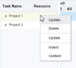
The example below shows sample code for specifying the custom table region context menu in Figure 28-23.
<dvt:projectGantt id="gantt1" value="#{bindings.OrderEmployee1.projectGanttModel}"
                  dataChangeListener="#{bindings.OrderEmployee1.
                      projectGanttModel.processDataChanged}"
                  var="row" startTime="2012-07-01" endTime="2013-05-15"
                  initiallyExpandAll="true"
                  summary="Project Gantt chart for shipping orders"
                  tablePopupMenuLayout="updateTask delete indent outdent"
  ...
</dvt:projectGantt>
Table 28-7 shows the valid values for the tablePopupMenuLayout attribute.
Table 28-7 Valid Values for TablePopupMenuLayout Attributes
| Value | Feature Disabled |
|---|---|
|
|
Show all standard table region context menu items for all Gantt charts. |
|
|
Cut, Copy, and Paste table region content menu tasks for all Gantt charts. |
|
|
Copy task for all Gantt charts. |
|
|
Cut task for all Gantt charts. |
|
|
Delete task for all Gantt charts. |
|
|
Changes to the data model for all Gantt charts. |
|
|
Indent task for project and scheduling Gantt charts. |
|
|
Indent group of tasks for project and scheduling Gantt charts. |
|
|
Outdent tasks for project and scheduling Gantt charts. |
|
|
Paste task for all Gantt charts. |
|
|
Redo task for all Gantt charts. |
|
|
Vertical line separating toolbar items for all Gantt charts. |
|
|
Update Task item for project and scheduling Gantts. |
Table 28-8 shows the valid values for the chartPopupMenuLayout attribute.
Table 28-8 Valid Values for ChartPopupMenuLayout Attributes
| Value | Feature Disabled |
|---|---|
|
|
Show all standard chart region context menu items for all Gantt charts. |
|
|
Cut, Copy, and Paste tasks for all Gantt charts. |
|
|
Copy task for all Gantt charts. |
|
|
Cut task for all Gantt charts. |
|
|
Delete task for all Gantt charts. |
|
|
Changes to the data model for all Gantt charts. |
|
|
Link task for project and scheduling Gantt charts. |
|
|
Link group of tasks for project and scheduling Gantt charts. |
|
|
Outdent tasks for project and scheduling Gantt charts. |
|
|
Paste task for all Gantt charts. |
|
|
Print task for all Gantt charts. |
|
|
Vertical line separating toolbar items for all Gantt charts. |
|
|
Undo task for all Gantt charts. |
|
|
Undo //// all Gantt charts. |
|
|
Undo link for /// Task menu item for project and scheduling Gantt charts. |
|
|
Update Task item for project and scheduling Gantts. |
You can supply your own menu items using the tablePopupMenu and chartPopupMenu facets in your Gantt chart. The Gantt chart merges the new menu items with the standard items in the Gantt chart. The example below shows sample code for specifying a custom menu item in the table region context menu.
<dvt:projectGantt startTime="#{test.startTime}" endTime="#{test.endTime}"
            value="#{test.treeModel}" var="task">

  <f:facet name="tablePopupMenu">
    <af:popup>
      <af:commandMenuItem text="Custom" disabled="true"/>
    </af:popup>
  </f:facet>
</dvt:projectGantt>
You can also dynamically change the context menu at runtime. The example below shows sample code to update a custom context menu on a task bar based on which task is selected in the chart region of a project Gantt chart.
<dvt:projectGantt var="task"
                  taskSelectionListener="#{backing.handleTaskSelected}">
  <f:facet name="chartPopupMenu">
    <af:popup id="p1" contentDelivery="lazyUncached">
      <af:menu>
      </af:menu>
    </af:popup>
  </f:facet>
</dvt:projectGantt>
The handleTaskSelected method is specified in a backing bean. The example below shows sample code for the backing bean.
public void handleTaskSelected(TaskSelectionEvent evt)
{
       JUCtrlHierNodeBinding _task = (JUCtrlHierNodeBinding)evt.getTask();
       String _type = _task.getAttribute("TaskType");

       RichPopup _popup = m_gantt.getFacet("chartPopupMenu");
       if (_popup != null)
       {
           RichMenu _menu = (RichMenu)_popup.getChildren().get(0);
           _menu.getChildren().clear();
           if ("Summary".equals(_type))
           {
               RichCommandMenuItem _item = new RichCommandMenuItem();
               _item.setId("i1");
               _item.setText("Custom Action 1");
               _menu.getChildren().add(_item);                          }
           else if ("Normal".equals(_type))
           {
               RichCommandMenuItem _item = new RichCommandMenuItem();
               _item.setId("i1");
               _item.setText("Custom Action 2");
               _menu.getChildren().add(_item);                          }
       }
}
For more information about using the af:popup components see Using Popup Dialogs, Menus, and Windows.
28.4.4 How to Customize the Time Axis of a Gantt Chart
Every Gantt chart is created with a major time axis and a minor time axis. Each time axis has a facet that identifies the level of the axis as major or minor.
The default time axis settings for all Gantt charts are:
-
Major time axis: Weeks
-
Minor time axis: Days
You can customize the settings of a time axis. However, the setting of a major axis must be a higher time level than the setting of a minor axis. The following values for setting the scale on a dvt:timeAxis component are listed from highest to lowest:
-
twoyears -
year -
halfyears -
quarters -
twomonths -
months -
twoweeks -
weeks -
days -
sixhours -
threehours -
hours -
halfhours -
quarterhours
The example below shows sample code to set the time axis of a Gantt chart to use months as a major time axis and weeks as the minor time axis.
<f:facet name="major">
  <dvt:timeAxis scale="months"/>
</f:facet>
<f:facet name="minor">
  <dvt:timeAxis scale="weeks"/>
</f:facet>
The time units you specify for the major and minor axes apply only to the initial display of the Gantt chart. At runtime, the user can zoom in or out on a time axis to display the time unit level at a different level.
You can create a custom time axis for the Gantt chart and specify that axis in the scale attribute of dvt:timeAxis. The custom time axis will be added to the Time Scale dialog at runtime.
Before you begin:
It may be helpful to have an understanding of how Gantt chart attributes and Gantt chart child components can affect functionality. For more information, see Configuring Gantt Charts.
You may also find it helpful to understand functionality that can be added using other ADF Faces features. For more information, see Additional Functionality for Gantt Chart Components.
You should already have a Gantt chart on your page. If you do not, follow the instructions in this chapter to create a Gantt chart. For information, see How to Add a Gantt Chart to a Page.
To create and use a custom time axis:
28.4.5 Creating and Customizing a Gantt Chart Legend
The optional Gantt chart legend subcomponent includes an area that displays detailed information about the selected task, or metrics about the selected time bucket, and a legend that displays the symbol and color code bar used to represent each type of task in a Gantt chart. At runtime, users can hide or show the information panel using a toolbar button.
The ganttLegend tag must be added as a child of the Gantt chart tag in order to provide the legend areas. The content of the legend areas is automatically generated based on the properties for each type of task registered with the taskbarFormatManager.
You can customize the information displayed when a task or time bucket is selected by using the keys and label attributes on the Gantt chart legend tag. The keys attribute should specify the data object keys used to retrieve the value to display and the labels attribute should contain the corresponding labels for the values retrieved with the keys. If these attributes are not specified, the legend will use the entire space of the information panel.
You can also add icons to the legend by using the iconKeys and iconLabels attributes on the Gantt chart legend tag. Icons will be automatically resized to 12 by 12 pixels if the icon size is too large.
The example below shows sample code to display information about an On Hold task in the legend of a project Gantt chart.
<dvt:projectGantt var="task">
   <dvt:ganttLegend id="gl" keys="TaskName StartTime EndTime" labels="Name Start Finish" icons="images/wait.png" iconLabels="OnHold"/>
</dvt:projectGantt>
28.4.6 How to Specify Custom Data Filters
You can change the display of data in a Gantt chart using a data filter dropdown list on the toolbar. Gantt charts manage all predefined and user-specified data filters using a FilterManager.
Filter objects contain information including:
-
A unique ID for the filter
-
The label to display for the filter in the dropdown list
-
An optional JavaScript method to invoke when the filter is selected
You can define your own filter by creating a filter object and then registering the object using the addFilter method on the FilterManager. The example below shows sample code for registering a Resource filter object with the FilterManager.
FilterManager _manager = m_gantt.getFilterManager();

// ID for filter display label   javascript callback (optional)
_manager.addFilter((new Filter(RESOURCE_FILTER, "Resource...", "showResourceDialog")));
When the user selects a filter, a FilterEvent is sent to the registered FilterListener responsible for performing the filter logic. The filterListener attribute on the Gantt chart component is used to register the listener. When implemented by the application, the data model is updated and the Gantt chart component displays the filtered result. The example below shows sample code for a FilterListener.
public void handleFilter(FilterEvent event)
    {
        String _type = event.getType();
        if (FilterEvent.ALL_TASKS.equals(_type))
        {
            // update the gantt model as appropriate
        }
    }
Before you begin:
It may be helpful to have an understanding of how Gantt chart attributes and Gantt chart child components can affect functionality. For more information, see Configuring Gantt Charts.
You may also find it helpful to understand functionality that can be added using other ADF Faces features. For more information, see Additional Functionality for Gantt Chart Components.
You should already have a Gantt chart on your page. If you do not, follow the instructions in this chapter to create a Gantt chart. For information, see How to Add a Gantt Chart to a Page.
To specify a custom data filter:
- In the Structure window, right-click the Gantt chart component and choose Go to Properties.
- In the Behavior category of the Properties window, in the
FilterListenerfield, enter a method reference to theFilterListeneryou defined. For example,"#{project.handleFilter}".
28.4.7 Specifying Nonworking Days in a Gantt Chart
You can specify nonworking days in a Gantt chart. By default, nonworking days are shaded gray, but you can select a custom color to be used for nonworking days.
28.4.7.1 How to Specify Weekdays as Nonworking Days
If certain weekdays are always nonworking days, then you can indicate the days of the week that fall in this category.
Before you begin:
It may be helpful to have an understanding of how Gantt chart attributes and Gantt chart child components can affect functionality. For more information, see Configuring Gantt Charts.
You may also find it helpful to understand functionality that can be added using other ADF Faces features. For more information, see Additional Functionality for Gantt Chart Components.
You should already have a Gantt chart on your page. If you do not, follow the instructions in this chapter to create a Gantt chart. For information, see How to Add a Gantt Chart to a Page.
To identify weekdays as nonworking days:
28.4.7.2 How to Identify Specific Dates as Nonworking Days
You can enter specific dates as nonworking days in a Gantt chart when individual weekdays are not sufficient.
Before you begin:
It may be helpful to have an understanding of how Gantt chart attributes and Gantt chart child components can affect functionality. For more information, see Configuring Gantt Charts.
You may also find it helpful to understand functionality that can be added using other ADF Faces features. For more information, see Additional Functionality for Gantt Chart Components.
You should already have a Gantt chart on your page. If you do not, follow the instructions in this chapter to create a Gantt chart. For information, see How to Add a Gantt Chart to a Page.
To identify specific dates as nonworking days:
28.4.8 How to Apply Read-Only Values to Gantt Chart Features
User interactions with a Gantt chart can be customized to disable features by setting the featuresOff property to specify read-only values.
Table 28-9 shows the valid values and the disabled feature for the Gantt chart types.
Table 28-9 Valid Values for Read-Only Attributes
| Value | Feature Disabled |
|---|---|
|
|
Show as List menu item for all Gantt charts. |
|
|
Show as Hierarchy menu item for all Gantt charts/ |
|
|
Cut, Copy, and Paste tasks for all Gantt charts. |
|
|
Cut, Copy, and Paste menu items for all Gantt charts. |
|
|
Cut, Copy, and Paste toolbar items for all Gantt charts. |
|
|
Cut, Copy, and Paste right menu items for all Gantt charts. |
|
|
Collapse All Below menu item for all Gantt charts. |
|
|
Collapse All menu item for all Gantt charts. |
|
|
Columns menu item for all Gantt charts. |
|
|
Create Resource menu item for resource utilization and scheduling Gantt charts. |
|
|
Create Resource menu and toolbar items for resource utilization and scheduling Gantt charts. |
|
|
Create Resource toolbar item for resource utilization and scheduling Gantt charts. |
|
|
Create Task menu for project and scheduling Gantt charts. |
|
|
Create Task menu and toolbar for project and scheduling Gantt charts. |
|
|
Create Task toolbar for project and scheduling Gantt charts. |
|
|
Delete menu item for project and scheduling Gantt charts. |
|
|
Delete menu, right menu, and toolbar items for project and scheduling Gantt charts. |
|
|
Delete right menu item for project and scheduling Gantt charts. |
|
|
Delete toolbar item for project and scheduling Gantt charts. |
|
|
Show and Hide dependency lines for project and scheduling Gantt charts. This includes the dependency menu option for project Gantt charts. |
|
|
Changes to the data model for all Gantt charts. |
|
|
Edit menu item for all Gantt charts. |
|
|
Expand All Below menu item for all Gantt charts. |
|
|
Expand All menu item for all Gantt charts. |
|
|
Expand menu item for all Gantt charts. |
|
|
Hide the data filter operation on the toolbar for all Gantt charts. |
|
|
Go to Date menu item for all Gantt charts. |
|
|
Indent and Outdent tasks for project and scheduling Gantt charts. |
|
|
Indent and Outdent menu items: Task for project, and Resource for scheduling and resource utilization resource Gantt charts. |
|
|
Indent and Outdent menu and toolbar and right menu items for all Gantt charts. |
|
|
Indent and Outdent right menu items for all Gantt charts. |
|
|
Indent and Outdent toolbar items for all Gantt charts. |
|
|
Hide and Show legend and task information for all Gantt charts. |
|
|
Hide and Show legend menu items for all Gantt charts. |
|
|
Hide and Show legend toolbar items for all Gantt charts. |
|
|
Link and Unlink tasks for project and scheduling Gantt charts. |
|
|
Link and Unlink menu items for project and scheduling Gantt charts. |
|
|
Link and Unlink menu, right menu, and toolbar items for project and scheduling Gantt charts. |
|
|
Link and Unlink right menu items for project and scheduling Gantt charts. |
|
|
Link and Unlink toolbar items for project and scheduling Gantt charts. |
|
|
List Pane menu item for all Gantt charts. |
|
|
Print task for all Gantt charts. |
|
|
Print menu item for all Gantt charts. |
|
|
Print toolbar item for all Gantt charts. |
|
|
Show property dialogs for all Gantt charts. |
|
|
Properties menu item for all Gantt charts. |
|
|
Properties right menu item for all Gantt charts. |
|
|
Resource menu item for resource utilization and scheduling Gantt charts. |
|
|
Snap To menu item scheduling Gantt chart. |
|
|
Snap To right menu item for scheduling Gantt chart. |
|
|
Split and Merge tasks for project Gantt chart. |
|
|
Split and Merge menu items for project Gantt chart. |
|
|
Split and Merge menu, right menu, and toolbar items for project Gantt chart. |
|
|
Split and Merge right menu items for project Gantt chart. |
|
|
Split and Merge toolbar items for project Gantt chart. |
|
|
Task menu for project and scheduling Gantt charts. |
|
|
Time Axis menu item for all Gantt charts. |
|
|
Time Bucket menu item for resource utilization Gantt chart. |
|
|
Undo and redo tasks for all Gantt charts. |
|
|
Undo and Redo menu items for all Gantt charts. |
|
|
Update Resource menu item for scheduling Gantt chart. |
|
|
Update Task menu item for project and scheduling Gantt charts. |
|
|
Update Task Edit item, Update Task toolbar item, and right menu items for project and scheduling Gantts. |
|
|
Update Task right menu item for project and scheduling Gantt charts. |
|
|
Update Task toolbar item for project and scheduling Gantt charts. |
|
|
Undo and Redo toolbar items for all Gantt charts. |
|
|
Show as list, Show as hierarchy, Columns, Expand and Collapse tasks for all Gantt charts. |
|
|
View menu items for all Gantt charts. |
|
|
Changes to the zoom level for all Gantt charts. |
|
|
Zoom menu item for all Gantt charts. |
|
|
Zoom to Fit menu toolbar item for all Gantt charts. |
Before you begin:
It may be helpful to have an understanding of how Gantt chart attributes and Gantt chart child components can affect functionality. For more information, see Configuring Gantt Charts.
You may also find it helpful to understand functionality that can be added using other ADF Faces features. For more information, see Additional Functionality for Gantt Chart Components.
You should already have a Gantt chart on your page. If you do not, follow the instructions in this chapter to create a Gantt chart. For information, see How to Add a Gantt Chart to a Page.
To set read-only values on Gantt chart features:
28.4.9 What You May Need to Know About Skinning and Customizing the Appearance of Gantt Charts
For the complete list of Gantt chart skinning keys, see the Oracle Fusion Middleware Documentation Tag Reference for Oracle Data Visualization Tools Skin Selectors. To access the list from JDeveloper, from the Help Center, choose Documentation Library, and then Fusion Middleware Reference and APIs. For additional information about customizing your application using skins, see Customizing the Appearance Using Styles and Skins.
28.5 Adding Interactive Features to Gantt Charts
Gantt charts support multiple interactive features, including adding a page control as an alternative to a scrollbar, synchronized scrolling, adding a double-click event to a task bar, and printing Gantt charts.
28.5.1 Performing an Action on Selected Tasks or Resources
A Gantt chart allows users to select one or more rows in the table region of a Gantt chart representing tasks or resources and perform some actions on those rows. When the selection state of a Gantt chart changes, the Gantt chart triggers selection events. A selectionEvent event reports which rows were just deselected and which rows were just selected.
To listen for selection events on a Gantt chart, you can register a listener on the Gantt chart either using the selectionListener attribute or by adding a listener to the Gantt chart using the addselectionListener() method. The listener can then access the selected rows and perform some actions on them.
The current selection, that is the selected row or rows, are the RowKeySet object, which you obtain by calling the getSelectedRowKeys() method for the Gantt chart. To change a selection programmatically, you can do either of the following:
-
Add
rowKeyobjects to, or removerowKeyobjects from, theRowKeySetobject. -
Make a particular row current by calling the
setRowIndex()or thesetRowKey()method on the Gantt chart. You can then either add that row to the selection, or remove it from the selection, by calling theadd()orremove()method on theRowKeySetobject.
The example below shows a portion of a Gantt chart in which a user can select some rows then click the Delete button to delete those rows. Note that the actions listener is bound to the performDelete method on the mybean managed bean.
<f:facet name="nodeStamp">
        <af:column headerText= ...>
                <af:outputText binding="#{mybean.table}" value= ... />
        </af:column>
        ...
</f:facet>
<af:button text="Delete" actionListener="#{mybean.performDelete}"/>
The example below shows an actions method, performDelete, which iterates through all the selected rows and calls the markForDeletion method on each one.
public void performDelete(ActionEvent action)
{
  UIXTable table = getTable();
  Iterator selection = table.getSelectedRowKeys().iterator();
  Object oldKey = table.getRowKey();
  try
  {
    while(selection.hasNext())
    {
      Object rowKey = selection.next();
      table.setRowKey(rowKey);
      MyRowImpl row = (MyRowImpl) table.getRowData();
      //custom method exposed on an implementation of Row interface.
      row.markForDeletion();
    }
  }
  finally
  {
    // restore the old key:
    table.setRowKey(oldKey);
  }
}
28.5.2 Using Page Controls for a Gantt Chart
For Gantt chart table regions, you can use a page control as an alternative to horizontal scrolling for both desktop applications and for mobile browsers on touch devices. This control is only available when there are more rows than the data fetch size, and the component is not being stretched by its containing layout component.
The page control displays as a footer to the table region as shown in Figure 28-24.
Figure 28-24 Gantt Chart Page Control

When you are developing an ADF Faces web application, by default Gantt chart table regions use a horizontal scroll bar for displaying columns over the size of the data being fetched. To configure a page control for desktop devices, for the schedulingGantt, projectGantt, or resourceUtilizationGantt component table region, set the scrollPolicy attribute to page.
While a standard ADF Faces web application will run in mobile device browsers, because the user interaction is different and because screen size is limited, when your application needs to run on a mobile device, you should create touch device-specific versions of the pages. For more information, see Creating Web Applications for Touch Devices Using ADF Faces.
By default, when rendered on mobile devices, Gantt chart table regions display a page control that allows the user to jump to specific pages of rows. For all Gantt charts to display on a mobile device, you should:
-
Place the Gantt chart component within a flowing container (that is, a component that does not stretch its children). For more information about flowing container components, see Geometry Management and Component Stretching.
-
Leave the
scrollPolicyattribute set toauto(default for this setting on mobile devices is paginated display of the pivot table).
If the Gantt chart is not in a flowing container, or if those attributes are not set correctly, the table region will display a scroll bar instead of pages.
28.5.3 Configuring Synchronized Scrolling Between Gantt Charts
You can configure synchronized horizontal scrolling between the chart side of two Gantt charts by using an af:clientListener component.
For example, you may wish to synchronize the scroll bars of a project Gantt chart and a resource utilization Gantt chart to view tasks and resources for the same project as illustrated in Figure 28-25.
Figure 28-25 Synchronized Scrolling Between Gantt Charts
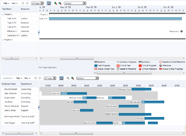
To configure synchronized scrolling between Gantt charts, use an af:clientListener component to listen for the chartHorizontalScroll event on the chart side of the Gantt chart being scrolled and set the scroll position on the other Gantt chart.
In this example, inline JavaScript is used to define the methods for synchronized scrolling within an af:resource tag. The example below shows the code for the synchronized scrolling methods. For more information, see Adding JavaScript to a Page.
<af:resource type="javascript">
  var gantt1ScrollStart = null;
  var gantt2ScrollStart = null;
  //called when the top gantt component is scrolled
  function handleTopScroll(event)
    {
      var eventScrollStart = event.getScrollStart();
      if (gantt2ScrollStart == null || gantt2ScrollStart == eventScrollStart)
        {
          // clear synced gantt scroll start
          gantt2ScrollStart = null;
          // find the corresponding gantt component
          var gantt = AdfPage.PAGE.findComponent("demo:gantt2");
          if (gantt1ScrollStart != event.getScrollStart())
            {
              // set the scrollStart position of the synced gantt to match the
                 event's value
              var scrollStart = gantt.getChartScrollStart();
              if (scrollStart != eventScrollStart)
              {
                //save the scrollStart value to stop feedback
                gantt1ScrollStart = eventScrollStart;
                gantt.setChartScrollStart(eventScrollStart);
              }
            }
          }
          event.cancel();
        }

        // called when the bottom gantt component is scrolled
        function handleBottomScroll(event)
        {
          var eventScrollStart = event.getScrollStart();
          if (gantt1ScrollStart == null || gantt1ScrollStart == eventScrollStart)
          {
            // clear synced gantt scroll start
            gantt1ScrollStart = null;
            // find the corresponding gantt component
            var gantt = AdfPage.PAGE.findComponent("demo:gantt1");
            if (gantt2ScrollStart != event.getScrollStart())
            {
              // set the scrollStart position of the synced gantt to match the
                 event's value
              var scrollStart = gantt.getChartScrollStart();
              if (scrollStart != eventScrollStart)
              {
                //save the scrollStart value to stop feedback
                gantt2ScrollStart = eventScrollStart;
                gantt.setChartScrollStart(eventScrollStart);
              }
            }
          }
          event.cancel();
        }
      </af:resource
The example below shows the code in both Gantt charts to specify a clientListener to listen for the Gantt charts' scrollEvent of type chartHorizontalScroll and invoke the handleTopScroll and handleBottomScroll methods defined in the af:resource component in the above example.
<dvt:projectGantt id="gantt1" var="task" startTime="2008-04-22"
                  endTime="2008-09-31" inlineStyle="height:400px;"
                  value="#{projectGantt.model}"
                        tooltipKeys="#{projectGantt.tooltipKeys}"
                        tooltipKeyLabels="#{projectGantt.tooltipLabels}"
                        summary="Project Gantt">
  <f:facet name="major">
    <dvt:timeAxis scale="weeks" id="ta1"/>
  </f:facet>
  <f:facet name="minor">
    <dvt:timeAxis scale="days" id="ta2"/>
  </f:facet>
  <f:facet name="nodeStamp">
    <af:column headerText="Task Name" id="c1">
      <af:outputText value="#{task.taskName}" id="ot1"/>
    </af:column>
  </f:facet>
    <af:column headerText="Resource" id="c2">
      <af:outputText value="#{task.resourceName}" id="ot2"/>
    </af:column>
    <af:column headerText="Start Date" id="c3">
      <af:outputText value="#{task.startTime}" id="ot3"/>
    </af:column>
    <af:column headerText="End Date" id="c4">
      <af:outputText value="#{task.endTime}" id="ot4"/>
    </af:column>
  <dvt:ganttLegend keys="#{projectGantt.legendKeys}"
                         labels="#{projectGantt.legendLabels}"
                         id="gl1"/>
  <af:clientListener type="chartHorizontalScroll" method="handleTopScroll"/>
</dvt:projectGantt>
<dvt:schedulingGantt id="gantt2" startTime="2006-12-21 01:00"
                     endTime="2006-12-22 23:00"
                     value="#{schedulingGantt.model}" var="resourceObj"
                     inlineStyle="height:400px;"
                     tooltipKeyLabels="#{schedulingGantt.tooltipLabels}"
                     tooltipKeys="#{schedulingGantt.tooltipKeys}"
                     summary="Scheduling Gantt Demo">
<f:facet name="major">
  <dvt:timeAxis scale="days" id="ta3"/>
</f:facet>
<f:facet name="minor">
  <dvt:timeAxis scale="hours" id="ta4"/>
</f:facet>
<f:facet name="nodeStamp">
  <af:column headerText="Employee Name" id="c5">
    <af:outputText value="#{resourceObj.resourceName}" id="ot5"/>
  </af:column>
</f:facet>
  <af:column headerText="Department" id="c6">
    <af:outputText value="#{resourceObj.department}" id="ot6"/>
  </af:column>
<dvt:ganttLegend keys="#{schedulingGantt.legendKeys}"
                 labels="#{schedulingGantt.legendLabels}"
                 id="gl2"/>
  <af:clientListener type="chartHorizontalScroll" method="handleBottomScroll"/>
</dvt:schedulingGantt>
28.5.4 Printing a Gantt Chart
The ADF Gantt chart provides a helper class (GanttPrinter) that can generate a Formatted Object (FO) for use with Apache or XML Publisher to produce PDF files.
28.5.4.1 Print Options
In general, the GanttPrinter class prints the Gantt chart content as it appears on your screen. For example, if you hide the legend in the Gantt chart, then the legend will not be printed. Similarly, if you deselect a column in the List Pane section of the View Menu, then that column will not be visible in the Gantt chart and will not appear in the printed copy unless you take advantage of the column visibility print option.
You can use the following print options in the GanttPrinter class:
-
Column visibility: The
setColumnVisiblemethod lets you control whether individual columns in the list region of the Gantt chart will appear in the printed output.For example, to hide the first column in the list region of a Gantt chart, use the following code, where the first parameter of the method is the zero-based index of the column and the second parameter indicates if the column should be visible in the printed Gantt chart:
_printer.setColumnVisible(o, false); -
Margins: The
setMarginmethod of theGanttPrinterlets you specify the top, bottom, left, and right margins in pixels as shown in the following code, where_printeris an instance of theGanttPrinterclass:_printer.setMargin(25, 16, 66, 66); -
Page size: The
setPageSizemethod of theGanttPrinterclass lets you specify the height and width of the printed page in pixels as shown in the following code, where_printeris an instance of theGanttPrinterclass:_printer.setPageSize (440, 600); -
Time period: The
setStartTimeandsetEndTimemethods of theGanttPrinterclass let you identify the time period of the Gantt chart that you want to print.The example below shows sample code for setting a specific time period in the Gantt chart for printing, where
startDateandendDateare variables that represent the desired dates and_printeris an instance of theGanttPrinterclass.
_printer.setStartTime(startDate);
_printer.setEndTime(endDate);
28.5.4.2 Action Listener to Handle the Print Event
The Gantt chart toolbar includes a print button that initiates a print action. To print a Gantt chart, you must create an ActionListener to handle the print event.
The code in the ActionListener should include the following processes:
-
Access the servlet’s output stream.
-
Generate the FO. This process includes creating an instance of the
GanttPrinterclass and entering the code for any print options that you want to use. -
Generate the PDF.
The example below shows the code for an ActionListener that handles the print event. This listener includes settings for all the print options available in the GanttPrinter helper class.
public void handleAction(GanttActionEvent evt)
{
  if (GanttActionEvent.PRINT == evt.getActionType())
  {
     FacesContext _context = FacesContext.getCurrentInstance();
     ServletResponse _response = (ServletResponse)
              _context.getExternalContext().getResponse();
     _response.setContentType("application/pdf");
     ServletOutputStream _sos = _response.getOutputStream();
     // Generate FO.
     GanttPrinter _printer = new GanttPrinter(m_gantt);
            // Set column visibility by column index.
     _printer.setColumnVisible(0, false);
            // Set start and end date.
     _printer.setStartTime(startDate);
     _printer.setEndTime(endDate);
            // Set top, bottom, left, and right margins in pixels.
     _printer.setMargin(25, 16, 66, 66);
            // Set height and width in pixels.
     _printer.setPageSize(440, 660);
     File _file = File.createTempFile("gantt", "fo");
     OutputStream _out = new FileOutputStream(_file);
     _printer.print(_out);
     _out.close();
     // generate PDF.
     FOProcessor _processor = new FOProcessor();
     _processor.setData(new FileInputStream(_file),"UTF-8"));
     _processor.setOutputFormat(FOProcessor.FORMAT_PDF);
     _processor.setOutput(_sos);
     _processor.generate();
     _context.responseComplete();
     response.setHeader("Cache-Control", "no-cache");
   }
}
28.5.5 Adding a Double-Click Event to a Task Bar
Gantt chart components support a double-click event on a task bar. For example, you may want to display detailed information about a task in a popup window.
Figure 28-26 shows a project Gantt chart with a double-click event on a task bar.
Figure 28-26 Task Bar with Double-Click Event
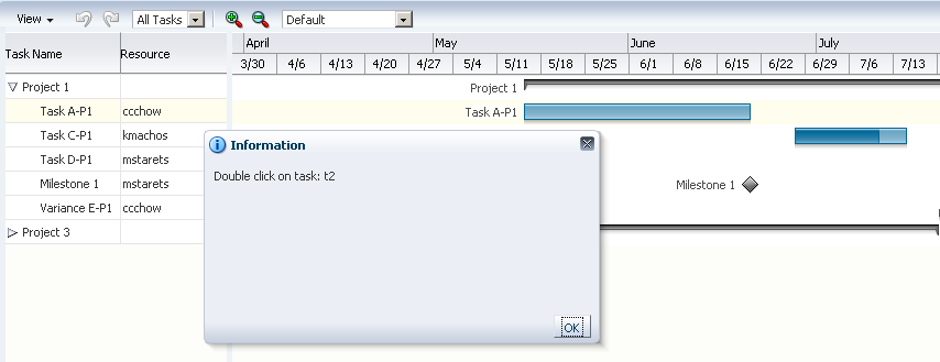
The example below show sample code for adding a double-click event to a task bar.
<dvt:projectGantt id="projectGanttDoubleClick"
    startTime="2008-04-01" endTime="2008-09-30"
    value="#{projectGanttDoubleClick.model}"
    var="task"
    doubleClickListener="#{projectGanttDoubleClick.handleDoubleClick}">
</dvt:projectGantt>
Implement the handleDoubleClick method in a backing bean, for example:
public void handleDoubleClick(DoubleClick event)
28.5.6 Using Gantt Charts as a Drop Target or Drag Source
You can add drag and drop functionality that allows users to drag an item from a collection, for example, a row from a table, and drop it into another collection component, such as a tree. Project and scheduling Gantt chart components can be enabled as drag sources as well as drop targets for ADF table or tree table components. A resource utilization Gantt chart component can be enabled only as a drop target.
The application must register the Gantt chart component as a drag source or drop target by adding the af:collectionDragSource or af:collectionDropTarget behavior tags respectively as a child to the Gantt tag. For example, you can use the af:collectionDragSource to register a drop listener that would be invoked when a project Gantt chart task is dragged from a table region onto a separate table. Figure 28-27 shows a project Gantt chart with tasks dragged from the table region onto a table of tasks.
Figure 28-27 Project Gantt Chart as Drag Source
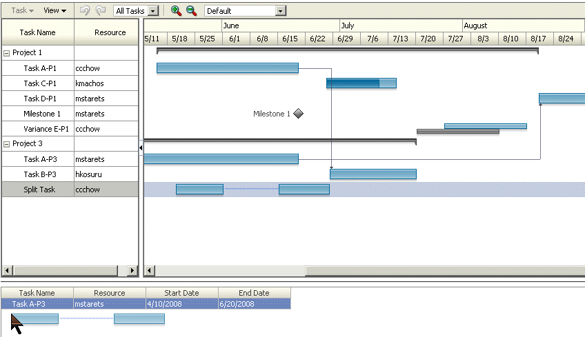
The example below shows sample code for adding drag and drop functionality to a project Gantt chart.
<dvt:projectGantt id="projectGanttDragSource"
                  startTime="2008-04-01" endTime="2008-09-30"
                  value="#{projectGanttDragSource.model}"
                  var="task"
                  summary="Project Gantt Drag Source Demo">
  <f:facet name="major">
    <dvt:timeAxis scale="months" id="ta1"/>
  </f:facet>
  <f:facet name="minor">
    <dvt:timeAxis scale="weeks" id="ta2"/>
  </f:facet>
    <af:collectionDragSource actions="COPY MOVE" modelName="treeModel"/>
  <f:facet name="nodeStamp">
    <af:column headerText="Task Name" id="c1">
      <af:outputText value="#{task.taskName}" id="ot1"/>
    </af:column>
  </f:facet>
    <af:column headerText="Resource" id="c2">
      <af:outputText value="#{task.resourceName}" id="ot2"/>
    </af:column>
    <af:column headerText="Start Date" id="c3">
      <af:outputText value="#{task.startTime}" id="ot3"/>
    </af:column>
    <af:column headerText="End Date" id="c4">
      <af:outputText value="#{task.endTime}" id="ot4"/>
    </af:column>
      </dvt:projectGantt>
The example below shows sample code for the listener method for handling the drop event.
public DnDAction onTableDrop(DropEvent evt)
{
    Transferable _transferable = evt.getTransferable();

    // Get the drag source, which is a row key, to identify which row has been dragged.
    RowKeySetImpl _rowKey = (RowKeySetImpl)_transferable.getTransferData(DataFlavor.ROW_KEY_SET_FLAVOR).getData();

    // Set the row key on the table model (source) to get the data.
    // m_tableModel is the model for the Table (the drag source).
    object _key = _rowKey.iterator().next();
    m_tableModel.setRowKey(_key);

    // See on which resource this is dropped (specific for scheduling Gantt chart).
    String _resourceId = _transferable.getData(String.class);
    Resource _resource = findResourceById(_resourceId);

    // See on what time slot did this dropped.
    Date _date = _transferable.getData(Date.class);

    // Add code to update your model here.

    // Refresh the table and the Gantt chart.
    RequestContext.getCurrentInstance().addPartialTarget(_evt.getDragComponent());
    RequestContext.getCurrentInstance().addPartialTarget(m_gantt);

    // Indicate the drop is successful.
    return DnDAction.COPY;
}
For a detailed procedure about adding drag and drop functionality for collections, see Adding Drag and Drop Functionality for Collections.