19 Displaying Tips, Messages, and Help
shortDesc attribute to display tips, and how to display messages for ADF Faces components. This chapter also describes how to provide different levels of help information for users.This chapter includes the following sections:
19.1 About Displaying Tips and Messages
ADF Faces provides many different ways for displaying informational text in an application. You can create simple tip text, validation and conversion tip text, validation and conversion failure messages, as well as elaborate help systems.
Figure 19-1 ADF Messaging Components
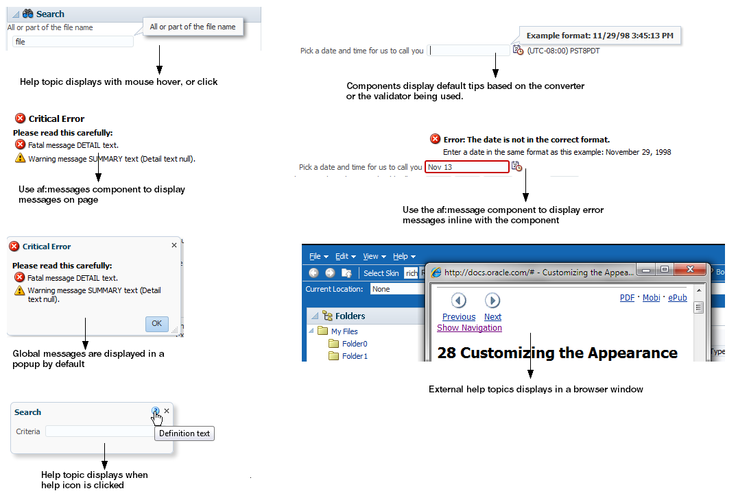
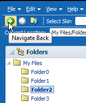
Many ADF Faces components support the shortDesc attribute, which for most components, displays tip information when a user hovers the cursor over the component. Figure 19-2 shows a tip configured for a toolbar button.
Figure 19-2 Tip Displays Information on Mouse Hover
Along with tips, some ADF Faces components (such as the inputText component, or the selection components) can display popup hint messages and failure messages used for validation and conversion. You can create two types of messages: component level messages that apply to a specific component, and global-level messages that apply to a page or group of components. Figure 19-3 shows a hint message configured for an Input Date field.
Figure 19-3 Hint Message Displays Format of Input Date

Along with configuring messages for individual component instances, you can create a separate help system that provides information that can be reused throughout the application.You create help information using different types of providers, and then reference the help text from the UI components. The following are the three types of help supported by ADF Faces:
-
Definition: Provides a help icon (question mark in a blue circle) with the help text appearing when the user mouses over the icon, as shown in Figure 19-4.
Figure 19-4 Definition Messages Display When Mousing Over the Icon

-
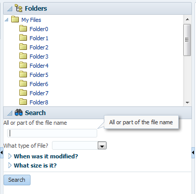
Instruction: Depending on the component, this type of help either provides instruction text within the component (as with
panelHeadercomponents), or displays text in the note window that is opened when the user clicks in the component, as shown in Figure 19-5. The text can be of any length.Figure 19-5 Instruction Messages Display in a Note Window
-
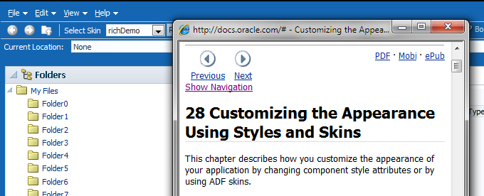
External URL: You can have a help topic that resides in an external application, which will open in a separate browser window. For example, instead of displaying instruction help, Figure 19-6 shows the Select Skin
selectOneChoicecomponent configured to open a help topic about skins. When a user clicks theselectOneChoicecomponent, the help topic opens.Figure 19-6 External URL Help Opens in a New Window
For more information about creating help systems, see Displaying Help for Components.
19.1.1 Messaging Components Use Cases and Examples
Messages can typically be divided into to types: error messages that display when an error occurs in the application, for example when a user enters incompatible information, and informational messages that provide for example, hints for using a component or for completing a task on a page.
Informational messages can range from simple tooltips to comprehensive help systems. Tooltips should be used when the component for which you want to display hints or information does not support help text. However, tooltip text must be very brief. If you have to display more detailed information, or if the text can be reused among many component instances, consider using help text instead.
You create tooltips by configuring the shortDesc attribute on a component. The value of that attribute then displays in a note window when the user hovers over the component or clicks the component (such as inputText component), as shown in Figure 19-7.
Figure 19-7 Tooltip for a Component

For more information about tooltips, see Displaying Tips for Components.
Error messages use the JSF messaging API. There are two types of error messages: component messages where the message applies to the specific component only, and global messages, where the message applies to more than one component or the whole page.
By default, the noteWindow component is used for component error messages. When you configure conversion or validation on any input component, validation and conversion hints and errors are automatically displayed in the noteWindow component. You do not need to add the component to the page.
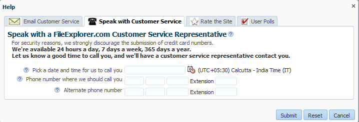
For example, when users click Help > Give Feedback in the File Explorer application, a dialog displays where they can enter a time and date for a customer service representative to call. Because the inputDate component contains a converter, when the user clicks in the field, a note window displays a hint that shows the expected pattern, as shown in Figure 19-8. If the inputDate component was also configured with a minimum or maximum value, the hint would display that information as well. These hints are provided by the converters and validators automatically.
Figure 19-8 Attached Converters and Validators Include Messages

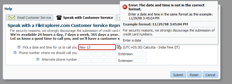
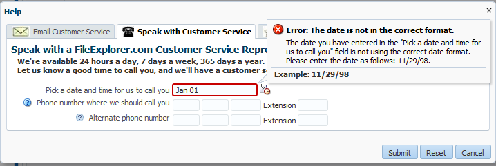
If a user enters a date incorrectly in the field shown in Figure 19-8, an error message is displayed, as shown in Figure 19-9. Note that the error message appears in the note window along with the hint.
Figure 19-9 Validation and Conversion Errors Display in Note Window

If you want to display an error message for a non-ADF Faces component, or if you want the message to be displayed inline instead of the note window, use the ADF Faces message component. When you use this component, messages are displayed next to the component, as shown in Figure 19-10.
Figure 19-10 Use the message Component to Display Messages Inline

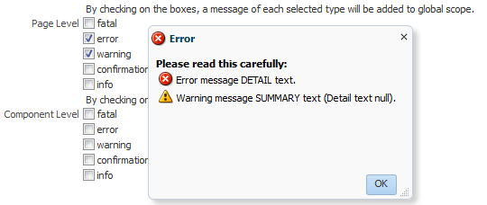
Global messages are by default displayed in a dialog, as shown in Figure 19-11. You do not need to add the popup component to the page.
Figure 19-11 Global Messages Display in a Popup Dialog
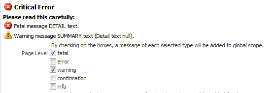
If instead you want the error messages to display directly on the page, use the messages component. When you use this component, the messages are displayed in a list at the top of the page, as shown in Figure 19-12.
Figure 19-12 Use the messages Component to Display Global Messages on the Page
For more information about error messages, see Displaying Hints and Error Messages for Validation and Conversion.
When you want to display more information that can fit in a tooltip, use definition help. When you configure definition help for most components, a help icon is displayed next to the component. The help text is displayed when the mouse hovers over the component, as shown in Figure 19-13.
Figure 19-13 Definition Help for a Column Component

For more information about definition help, see Displaying Help for Components.
When you want to display field-level help, configure an input component to use instruction text. When the user clicks in the component, the help text is displayed in a note window, as shown in Figure 19-14.
Figure 19-14 Instruction Text for a Component

When you want to display instructions for a task, configure instruction help for a container component. The text will appear in the header of the component, as shown in Figure 19-15.
Figure 19-15 Instruction Text for the panelHeader Component
Best Practice
Instruction text for input components should be used only when the typical user may fail to perform a task without assistance. Excessive use of instruction text clutters the page with directions or distracts users with note windows that may also obscure related page elements.
When you need to provide comprehensive help, you can use the help icon to link to an external help system available through a URL.
For more information about instruction and external help, see Displaying Help for Components.
19.1.2 Additional Functionality for Message Components
You may find it helpful to understand other ADF Faces features before you implement your message components and help functionality. Additionally, once you have added these components to your page, you may find that you need to add functionality such as skinning to change icons and accessibility and using resource bundles to store message text. Following are links to other functionality that message components can use.
-
Using parameters in text: You can use the ADF Faces EL format tags if you want text displayed in a component to contain parameters that will resolve at runtime. For more information, see How to Use the EL Format Tags.
-
Client events: If you want your help topic to launch using JavaScript, you use a listener for a client event. For more information about client-side events, see Using JavaScript for ADF Faces Client Events.
-
Skinning: The icons displayed for messages and help are determined by the skin used by the application. You can change the icons by creating a new skin. For more information, see Customizing the Appearance Using Styles and Skins.
-
Localization: Instead of directly entering text for messages, you can use property files. These files allow you to manage translation of these strings. For more information, see Internationalizing and Localizing Pages.
19.2 Displaying Tips for Components
ADF Faces components use the shortDesc attribute to display a tip when the user hovers the mouse over the component. Input components display the tips in their note window. Other component types display the tip in a standard tip box. This text should be kept short. If you have to display more detailed information, or if the text can be reused among many component instances, consider using help text, as described in Displaying Help for Components.
Figure 19-16 shows the effect when the cursor hovers over an inputText component.
Figure 19-16 Tip for an inputText Component

Figure 19-17 shows a tip as displayed for a showDetailItem component.
Figure 19-17 Tip for a showDetailItem Component

19.2.1 How to Display Tips for Components
You use the shortDesc attribute on a component to display a tip.
Before you begin:
It may be helpful to have an understanding of how the attributes can affect functionality. For more information, see Displaying Tips for Components.
You may also find it helpful to understand functionality that can be added using other ADF Faces features. For more information, see Additional Functionality for Message Components.
To define a tip for a component:
19.3 Displaying Hints and Error Messages for Validation and Conversion
Validators and converters have a default hint that is displayed to users when they click in the associated field. The default hint automatically displays in a note window. For converters, the hint usually tells the user the correct format to use. For validators, the hint is used to convey what values are valid.
For example, in the File Explorer application, when a user clicks in the input date field on the Speak with Customer Service page, a tip is displayed showing the correct format to use, as shown in Figure 19-18.
Note:
All the hints across the input fields can be turned off by setting the context parameteroracle.adf.view.rich.component.DEFAULT_HINT_DISPLAY to none. By default, this parameter is set to auto allowing the framework to decide the presentation mode for component hint. The default behavior is to show the hint as a note window tip on the component as soon as it receives focus.Figure 19-18 Validators and Converters Have Built-in Messages

When the value of an ADF Faces component fails validation, or cannot be converted by a converter, the component displays the resulting FacesMessage instance.
For example, entering a date that does not match the dateStyle attribute of the converter results in an error message, as shown in Figure 19-19.
Figure 19-19 Validation Error at Runtime

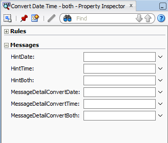
You can override the default validator and converter hint and error messages for either a component instance, or globally for all instances. To define a custom message for a component instance you set attributes to the detail messages to be displayed. The actual attributes vary according to the validator or converter. Figure 19-20 shows the attributes that you can populate to override the messages for the convertDateTime converter, as displayed in the Properties window.
Figure 19-20 Message Attributes on a Converter
To define an error message that will be used by all instances of the component, you need to create an entry in a resource bundle that will override the default message.
If you do not want messages to be displayed in the note window, you can use the message component, and messages will be displayed inline with the component. Figure 19-21 shows how messages are displayed using the message component.
Figure 19-21 Use the message Component to Display Messages Inline

JSF pages in an ADF Faces application use the document tag, which among other things, handles displaying all global messages (those not associated with a component) in a popup window. However, if you want to display global messages on the page instead, use the messages component.
Note:
To format the message using HTML tags, you must enclose the message within <html></html> tags. For example:
<html><b>error</b> message details</html>
The following HTML tags are allowed in error messages:
-
<span> -
<b> -
<a> -
<i> -
<em> -
<br> -
<hr> -
<li> -
<ol> -
<ul> -
<p> -
<tt> -
<big> -
<small> -
<pre>
19.3.1 How to Define Custom Validator and Converter Messages for a Component Instance
To override the default validator and converter messages for a single component instance, set values for the different message attributes.
Before you begin:
It may be helpful to have an understanding of how the attributes can affect functionality. For more information, see Displaying Hints and Error Messages for Validation and Conversion.
You may also find it helpful to understand functionality that can be added using other ADF Faces features. For more information, see Additional Functionality for Message Components.
To define a validator or converter message:
19.3.2 How to Define Custom Validator and Converter Messages for All Instances of a Component
Instead of changing the message string per component instance with the messageDetail[XYZ] attributes, you can override the string globally so that the custom string will be displayed for all instances. The global messages are handled by key/value pairs in a message bundle. You can override summary, detail, and hint messages.
To globally override a default validator or converter message:
19.3.3 How to Display Component Messages Inline
Instead of having a component display its messages in the note window, use the message component to display the messages inline on the page. In order for the message component to display the correct messages, associate it with a specific component.
Before you begin:
It may be helpful to have an understanding of how the attributes can affect functionality. For more information, see Displaying Hints and Error Messages for Validation and Conversion.
You may also find it helpful to understand functionality that can be added using other ADF Faces features. For more information, see Additional Functionality for Message Components.
To display component messages inline:
19.3.4 How to Display Global Messages Inline
Instead of displaying global messages in a popup window for the page, display them inline using the messages component.
Before you begin:
It may be helpful to have an understanding of how the attributes can affect functionality. For more information, see Displaying Hints and Error Messages for Validation and Conversion.
You may also find it helpful to understand functionality that can be added using other ADF Faces features. For more information, see Additional Functionality for Message Components.
To display global messages inline:
19.3.5 What Happens at Runtime: How Messages Are Displayed
ADF Faces uses the standard JSF messaging API. JSF supports a built-in framework for messaging by allowing FacesMessage instances to be added to the FacesContext object using the addMessage(java.lang.String clientId, FacesMessage message) method. Component-level messages are associated with a specific component based on any client ID that was passed to the addMessage method, and global-level messages, which are not associated with a component because no client ID was passed to the addMessage method.
When conversion or validation fails on an EditableValueHolder ADF Faces component, FacesMessages objects are automatically added to the message queue on the FacesContext instance, passing in that component's ID. These messages are then displayed in the note window for the component. ADF Faces components are able to display their own messages. You do not need to add any tags.
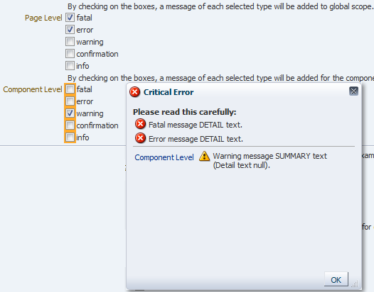
Similarly, the document tag handles and displays all global FacesMessages objects (those that do not contain an associated component ID), as well as component FacesMessages. Like component messages, you do not need to add any tags for messages to be displayed.Whenever a global message is created (or more than one component message), all messages in the queue will be displayed in a popup window, as shown in Figure 19-23.
Figure 19-23 Global and Component Messages Displayed by the Document
Tip:
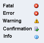
While ADF Faces provides messages for validation and conversion, you can add your own FacesMessages objects to the queue using the standard JSF messaging API. When you do so, ADF Faces will display icons with the message based on the message level, as follows:
19.4 Grouping Components with a Single Label and Message
By default, ADF Faces input and select components have built-in support for label and message display. If you want to group components and use a single label, wrap the components using the panelLabelAndMessage component.
For example, the File Explorer application collects telephone numbers using four separate inputText components; one for the area code, one for the exchange, one for the last four digits, and one for the extension. Because a single label is needed, the four inputText components are wrapped in a panelLabelAndMessage component, and the label value is set on that component. However, the input component for the extension requires an additional label, so an outputText component is used. The following example shows the JSF code for the panelLabelAndMessage component.
<af:panelLabelAndMessage labelAndAccessKey="#{explorerBundle['help.telephone']}"
                         helpTopicId="HELP_TELEPHONE_NUMBER"
                         labelStyle="vertical-align: top;
                         padding-top: 0.2em;">
  <af:inputText autoTab="true" simple="true" maximumLength="3"
                columns="3">
    <af:convertNumber type="number" integerOnly="true"/>
  </af:inputText>
  <af:inputText autoTab="true" simple="true" maximumLength="3"
                columns="3">
    <af:convertNumber type="number" integerOnly="true"/>
  </af:inputText>
  <af:inputText autoTab="true" simple="true" maximumLength="4"
                columns="4">
    <af:convertNumber type="number" integerOnly="true"/>
  </af:inputText>
  <af:outputText value="#{explorerBundle['help.extension']}"/>
  <af:inputText simple="true" columns="4">
    <af:convertNumber type="number" integerOnly="true"/>
  </af:inputText>
</af:panelLabelAndMessage>
Figure 19-24 shows how the panelLabelAndMessage and nested components are displayed in a browser.
Figure 19-24 Examples Using the panelLabelAndMessage Component
The panelLabelAndMessage component also includes an End facet that can be used to display additional components at the end of the group. Figure 19-25 shows how the telephone number fields would be displayed if the End facet was populated with an outputText component.
Figure 19-25 End Facet in a panelLabelAndMessage Component
Use a panelGroupLayout component within a panelLabelAndMessage component to group the components for the required layout. For information about using the panelGrouplayout component, see Grouping Related Items.
You set the simple attribute to true on each of the input components so that their individual labels are not displayed. However, you may want to set a value for the label attribute on each of the components for messaging purposes and for accessibility.
Tip:
If you have to use multiple panelLabelAndMessage components one after another, wrap them inside an af:panelFormLayout component, so that the labels line up properly. For information about using the panelFormLayout component, see Arranging Content in Forms.
Group and wrap components using the panelLabelAndMessage component. The panelLabelAndMessage component can be used to wrap any components, not just those that typically display messages and labels.
19.4.1 How to Group Components with a Single Label and Message
You use the panelLabelAndMessage component to group components and display a single label for that group.
Before you begin:
It may be helpful to have an understanding of how the attributes can affect functionality. For more information, see Grouping Components with a Single Label and Message.
You may also find it helpful to understand functionality that can be added using other ADF Faces features. For more information, see Additional Functionality for Message Components.
To arrange form input components with one label and message:
-
Add input or select components as needed to the page.
For each input and select component:
-
Set the
simpleattribute totrue. -
For accessibility reasons, set the
labelattribute to a label for the component.
-
-
In the Structure window, select the input or select components created in Step 1. Right-click the selection and choose Surround With > Panel Label And Message.
-
With the
panelLabelAndMessagecomponent selected, in the Properties window, set the following:-
label: Enter the label text to be displayed for the group of components.
-
for: Use the dropdown menu to choose Edit. In the Edit Property dialog, select the ID of the child input component. If there is more than one input component, select the first component.
Set the
forattribute to the firstinputComponentto meet accessibility requirements.
If one or more of the nested input components is a required component and you want a marker to be displayed indicating this, set the
showRequiredattribute totrue. -
-
To place content in the
Endfacet, drag and drop the desired component into the facet.Because facets on a JSP or JSPX accept one child component only, if you want to add more than one child component, you must wrap the child components inside a container, such as a
panelGroupLayoutorgroupcomponent. Facets on a Facelets page can accept more than one component.Tip:
If the facet is not visible in the visual editor:
-
Right-click the
panelLabelAndMessagecomponent in the Structure window. -
From the context menu, choose Facets - Panel Label And Message >facet name. Facets in use on the page are indicated by a checkmark in front of the facet name.
-
19.5 Displaying Help for Components
ADF Faces provides a framework that allows you to create and display three different types of help whose content comes from an external source, rather than as text configured on the component. Because it is not configured directly on the component, the content can be used by more than one component, saving time in creating pages and also allowing you to change the content in one place rather than everywhere the content appears.
You can display help messages in three formats; instruction help, definition help, and external URL help.
Instruction Help
Instruction help displays help text in a note window when the focus is on the component. Figure 19-26 shows the help message in a note window.
Figure 19-26 Instruction Text for a Component

Usually, you use the instruction help to show instructions about how to use the component. You can also use HTML tags to format the help message, but not all HTML tags are supported (see tag documentation of af:outputFormatted component for supported HTML tags). Figure 19-27 shows the HTML formatted help message in a note window.
Figure 19-27 HTML Formatted Instruction Help

Some components display instruction help as a description within the component. Where instruction help is displayed depends on the component with which it is associated. For example, the panelHeader and Search panel components display instruction help within the header, as shown in Figure 19-28.
Figure 19-28 Instruction Text for panelHeader

Table 19-1 shows the components that support Instruction help.
Table 19-1 Components That Support Instruction Help
| Supported Components | Help Placement | Example |
|---|---|---|
|
Input components, Choose Color, Choose Date, Quick Query |
Note window, on focus only |
 |
|
Select components |
Note window, on hover and focus |
 |
|
Panel Header, Panel Box, Query |
Text below header text |
 |
Definition Help
Definition help is like a standard tip where the content appears in a message box. However, instead of appearing when the user hovers the cursor over the component, definition help provides a help icon (a blue circle with a question mark). Or you can use a skinning attribute instead display a dotted line under the text (for more information, see What You May Need to Know About Skinning and Definition Help). When the user hovers the cursor over the icon, the content is displayed as shown in Figure 19-29.
Figure 19-29 Definition Text for a Component

Note that the tip message does not support HTML formatting and the tip message must be less than 80 characters because some older versions of browsers do not support long messages. Table 19-2 shows the components that support definition help.
Table 19-2 Components That Support Definition Help
| Supported Components | Help Icon Placement | Example |
|---|---|---|
|
All input components, Select components, Choose Color, Choose Date, Query components |
Before the label, or if no label exists, at the start of the field |
 |
|
Panel Header, PanelBox, Show Detail Header |
End of header text |
 |
|
Panel Window, Dialog |
Next to close icon in header |
 |
|
Columns in table and tree |
Below header text |
 |
External URL Help
External URL help allows you to link to an existing web page for your help content. When the help icon is clicked, the web page opens in a separate browser window, as shown in Figure 19-30. You can also use JavaScript to open the help window based on any client-based event.
Figure 19-30 External URL Help
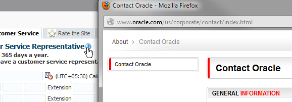
For more information about using JavaScript to open the external help, rather than the help icon, see How to Use JavaScript to Launch an External Help Window.
Help Providers
Help providers store the text of the help (or a URL, in the case of external help) for an application, and are registered in the META-INF/adf-settings.xml file. ADF Faces supports the following help providers for instruction and definition help:
-
The
ResourceBundleHelpProviderhelp provider enables you to create resource bundles that hold the help content. -
The
ELHelpProviderhelp provider enables you to create XLIFF files that get converted into maps. -
A managed bean that contains a map of help text strings.
External URL help uses a class that implements the getExternalURL method.
For more information about creating help providers, see How to Create Help Providers.
You can also use a combination of the different help providers, or create your own help provider class.
Creating Help
To create help messages, you do the following:
-
For instruction and definition help, determine which help provider type you want to use (either a resource bundle, an XLIFF file, or a managed bean), and then implement the required artifacts. These help providers will contain the actual help text. For more information, see How to Create Help Providers.
-
For external help, you need to create the an external help provider that will contain the URLs to the external content. For more information, see How to Create an External URL Help Provider.
-
Register the help providers, specifying the unique prefix that will be used to access the provider's help. For more information, see How to Register the Help Provider.
-
Have the UI components access the help contained in the providers by using the component's
helpTopicIdattribute. AhelpTopicIdattribute contains the following:-
The prefix that is used by the provider of the help
-
The topic name
For more information, see How to Access Help Content from a UI Component.
-
-
For external URL help, you can optionally have the help window launch in response to an event, instead of having the user click the help icon. For more information, see How to Use JavaScript to Launch an External Help Window.
19.5.1 How to Create Help Providers
Procedures for creating help providers differ, depending on the type of help provider you want to create. For instruction and definition help, you can use resource bundles, an XLIFF file, or a managed bean. For external URL help, you create a Java class. You can also create a custom help provider.
19.5.1.1 How to Create a Resource Bundle-Based Provider
The ResourceBundleHelpProvider class provides a basic HelpProvider instance. You can store help text within standard resource bundle property files and use the ResourceBundleHelpProvider class to deliver the content.
Before you begin:
It may be helpful to have an understanding of how the attributes can affect functionality. For more information, see Displaying Help for Components.
To create resource bundle-based help:
19.5.1.2 How to Create an XLIFF Provider
You can store the help text in XLIFF XML files and use the ELHelpProvider class to deliver the content. This class translates the XLIFF file to a map of strings that will be used as the text in the help.
Before you begin:
It may be helpful to have an understanding of how the attributes can affect functionality. For more information, see Displaying Help for Components.
To create XLIFF help:
19.5.1.3 How to Create a Managed Bean Provider
To implement a managed bean provider, create a managed bean that contains a map of strings that will be used as the text in the help. Managed bean help providers use the ELHelpProvider class to deliver the help.
Before you begin:
It may be helpful to have an understanding of how the attributes can affect functionality. For more information, see Displaying Help for Components.
To create managed bean help:
19.5.1.4 How to Create an External URL Help Provider
To use an external URL as help, you must implement the getExternalURL method.
Before you begin:
It may be helpful to have an understanding of how the attributes can affect functionality. For more information, see Displaying Help for Components.
To use External URL help:
19.5.1.5 How to Create a Custom Java Class Help Provider
Instead of using one of the ADF Faces help providers, create your own. Create the actual text in some file that your help provider will be able to access and display. To create a Java class help provider, extend the HelpProvider class. For more information about this class, refer to the Java API Reference for Oracle ADF Faces.
Before you begin:
It may be helpful to have an understanding of how the attributes can affect functionality. For more information, see Displaying Help for Components.
To create a Java class help provider:
19.5.2 How to Register the Help Provider
You register resource, XLIFF, and managed bean help providers, and an external URL help provider in the adf-settings.xml file.
Before you begin:
It may be helpful to have an understanding of how the attributes can affect functionality. For more information, see Displaying Help for Components.
To Register a Help Provider:
The following example shows a resource bundle registered in the adf-settings.xml file.
<adf-settings xmlns="http://xmlns.oracle.com/adf/settings">
<adf-faces-config xmlns="http://xmlns.oracle.com/adf/faces/settings">
  <help-provider prefix="HELP_">
    <help-provider-class>
      oracle.adf.view.rich.help.ResourceBundleHelpProvider
    </help-provider-class>
    <property>
        <property-name>baseName</property-name>
        <value>oracle.adfdemo.view.resource.fileExplorer.helpStrings</value>
    </property>
  </help-provider>
</adf-faces-config>
</adf-settings>
The following example shows an XLIFF file registered in the adf-settings.xml file.
<adf-settings xmlns="http://xmlns.oracle.com/adf/settings">
<adf-faces-config xmlns="http://xmlns.oracle.com/adf/faces/settings">
  <help-provider prefix="HELP">
    <help-provider-class>
      oracle.adf.view.rich.help.ELHelpProvider
    </help-provider-class>
    <property>
      <property-name>helpSource</property-name>
      <value>#{adfBundle['project1xliff.view.Project1XliffBundle']}</value>
      </property>
    </help-provider>
  </adf-faces-config>
</adf-settings>
The following example shows a bean registered in the adf-settings.xml file.
<adf-settings xmlns="http://xmlns.oracle.com/adf/settings">
<adf-faces-config xmlns="http://xmlns.oracle.com/adf/faces/settings">
   <help-provider prefix="HELP_">
   <help-provider-class>
     oracle.adf.view.rich.help.ELHelpProvider
   </help-provider-class>
   <property>
     <property-name>helpSource</property-name>
     <value>#{helpTranslationMap.helpMap}</value>
   </property>
 </help-provider>
 </adf-faces-config>
</adf-settings>
The following example shows the external help provider registered in the adf-settings.xml file.
<adf-settings xmlns="http://xmlns.oracle.com/adf/settings">
<adf-faces-config xmlns="http://xmlns.oracle.com/adf/faces/settings">
  <help-provider prefix="HELP_">
  <help-provider-class>
    oracle.adf.view.rich.help.ResourceBundleHelpProvider
  </help-provider-class>
  <property>
    <property-name>baseName</property-name>
    <value>oracle.adfdemo.view.resource.DemoHelp</value>
  </property>
  </help-provider>
 </adf-faces-config>
</adf-settings>
The following example shows an example of a custom help provider class registered in the adf-settings.xml file.
<adf-settings xmlns="http://xmlns.oracle.com/adf/settings">
<adf-faces-config xmlns="http://xmlns.oracle.com/adf/faces/settings">
  <help-provider prefix="MYAPP">
    <help-provider-class>
      oracle.adfdemo.view.webapp.MyHelpProvider
    </help-provider-class>
    <property>
      <property-name>myCustomProperty</property-name>
      <value>someValue</value>
    </property>
  </help-provider>
</adf-faces-config>
</adf-settings>
19.5.3 How to Access Help Content from a UI Component
Use the HelpTopicId attribute on components to access and display the help.
Before you begin:
It may be helpful to have an understanding of how the attributes can affect functionality. For more information, see Displaying Help for Components.
To access help from a component:
19.5.4 How to Use JavaScript to Launch an External Help Window
If you are using an external URL help, by default, the user clicks a help icon to launch the help window. Instead, you can use JavaScript and a client event listener for a specific component's event to launch the help window.
Before you begin:
It may be helpful to have an understanding of how the attributes can affect functionality. For more information, see Displaying Help for Components.
To use JavaScript to launch an external help window:
19.5.5 What You May Need to Know About Skinning and Definition Help
By default, when definition help is associated with a component, a question mark icon is displayed. The user clicks that icon to display the help. You can configure a custom skin to instead display a dotted line under the label of the component. This line denotes that the text is clickable. When the user clicks the text, the help is displayed.
Note:
If the component does not have label text, then only the icon can be displayed.Figure 19-31 shows an inputText component with the default question mark icon.
Figure 19-31 Definition Help Icon
Figure 19-32 shows the same inputText component, but configured to display a link instead of the question mark.
Figure 19-32 Definition Help Text Link
You use the -tr-help-def-location skin selector key to configure the display. Set it to icon to display the icon. Set it to label to display the underline. The following example shows the help configured to display the underline.
af|help {
  -tr-help-def-location: label;
}
Note:
External URL help also displays a link under the label text. If a component has both definition help and external help associated with it, then the icon will be displayed for the definition help.19.6 Combining Different Message Types
When you add help messages to input components that may already display messages for validation and conversion, ADF Faces displays the messages in the following order within the note window:
-
Validation and conversion error messages.
-
Validation and conversion hints.
-
For input and select components only, Instruction help. For
panelHeadercomponents, Instruction help is always displayed below the header. -
Value for
shortDescattribute.
Figure 19-33 shows an inputDate component that contains a converter, instruction help, and a tip message.
Figure 19-33 Different Message Types Can Be Displayed at One Time
