44 Creating Databound Diagram Components
diagram components to create diagrams that visually represent business data. It describes how to use ADF data controls to create these components with data-first development.If you are designing your page using simple UI-first development, then you can add the diagram to your page and configure the data bindings later. For information about the data requirements, tag structure, and options for customizing the look and behavior of the diagram component, see "Using Diagram Components" in Developing Web User Interfaces with Oracle ADF Faces.
This chapter includes the following sections:
44.1 About ADF Data Visualization Diagram Components
ADF Data Visualization components provide extensive graphical and tabular capabilities for visually displaying and analyzing business data. Each component needs to be bound to data before it can be rendered since the appearance of the components is dictated by the data that is displayed.
The ADF diagram component produces an interactive component that you can use to model, represent, and visualize information using a shape called a node to represent data and links to represent relationships between the nodes. Use diagrams when you want to highlight both the data objects and the relationship between them.
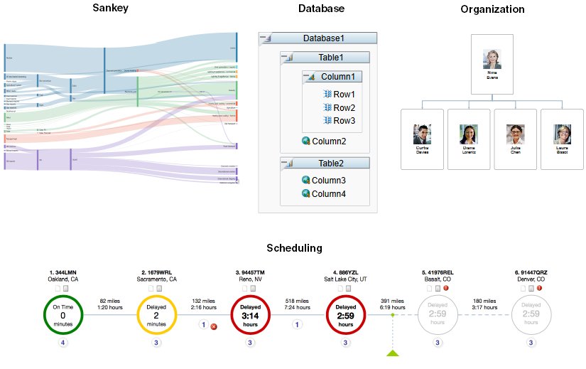
Figure 44-1 shows four runtime images of diagram components: a Sankey flow diagram, database table design, employee organization chart, and a scheduling diagram. In these examples, the nodes are the processes, database objects, employees, and scheduled stops. The links show the relationship between each process in the Sankey flow diagram, employee in the organization chart, and sequence of stops in the scheduling diagram.
Figure 44-1 Diagram Component Examples
The prefix dvt: occurs at the beginning of each data visualization component name indicating that the component belongs to the ADF Data Visualization Tools (DVT) tag library.
44.1.1 End User and Presentation Features
Visually compelling data visualization components enable end users to understand and analyze complex business data. The components are rich in features that provide out-of-the-box interactivity support. For detailed descriptions of the end user and presentation features for the DVT diagram component, see "End User and Presentation Features" in Developing Web User Interfaces with Oracle ADF Faces
44.1.2 Data Visualization Components Use Cases and Examples
For detailed descriptions of Diagram component use cases and examples, see "Diagram Use Cases and Examples" in Developing Web User Interfaces with Oracle ADF Faces.
44.1.3 Additional Functionality for Data Visualization Components
You may find it helpful to understand other Oracle ADF features before you data bind your data visualization components. Additionally, once you have added a data visualization component to your page, you may find that you need to add functionality such as validation and accessibility. Following are links to other functionality that data visualization components use:
-
Partial page rendering: You may want a data visualization component to refresh to show new data based on an action taken on another component on the page. For more information, see "Rerendering Partial Page Content" in Developing Web User Interfaces with Oracle ADF Faces.
-
Personalization: Users can change the way the data visualization components display at runtime, those values will not be retained once the user leaves the page unless you configure your application to allow user customization. For more information, see "Allowing User Customization on JSF Pages" in Developing Web User Interfaces with Oracle ADF Faces.
-
Accessibility: You can make your data visualization components accessible. For more information, see "Developing Accessible ADF Faces Pages" in Developing Web User Interfaces with Oracle ADF Faces.
-
Skins and styles: You can customize the appearance of data visualization components using an ADF skin that you apply to the application or by applying CSS style properties directly using a style-related property (
styleClassorinlineStyle). For more information, see "Customizing the Appearance Using Styles and Skins" in Developing Web User Interfaces with Oracle ADF Faces. -
Placeholder data controls: If you know the data visualization components on your page will eventually use ADF data binding, but you need to develop the pages before the data controls are ready, then you should consider using placeholder data controls, rather than manually binding the components. Using placeholder data controls will provide the same declarative development experience as using developed data controls. For more information, see Designing a Page Using Placeholder Data Controls .
44.2 Creating Databound Diagram Components
Databound diagrams require a collection of node objects to represent the data and, optionally, a collection of link objects to represent the relationships between the nodes. You can use objects that implement a List interface, such as a java.util.ArrayList object, or a collection model, such as a org.apache.myfaces.trinidad.model.CollectionModel.
Databound diagrams also require a client layout configuration defined in a JavaScript method that you add to the application as a feature. Client layouts specify how to lay out the nodes and links on a page. The diagram component includes a default layout that you can use and modify as needed. The default forceDirectedLayout positions the diagram nodes so that all the links are of more or less equal length, and there are as few crossing links as possible.
Note:
You can also provide your own client layout configuration in a JavaScript object that you add as an application feature. For additional information, see "Using the Diagram Layout Framework" in Developing Web User Interfaces with Oracle ADF Faces.
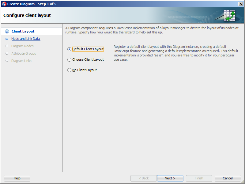
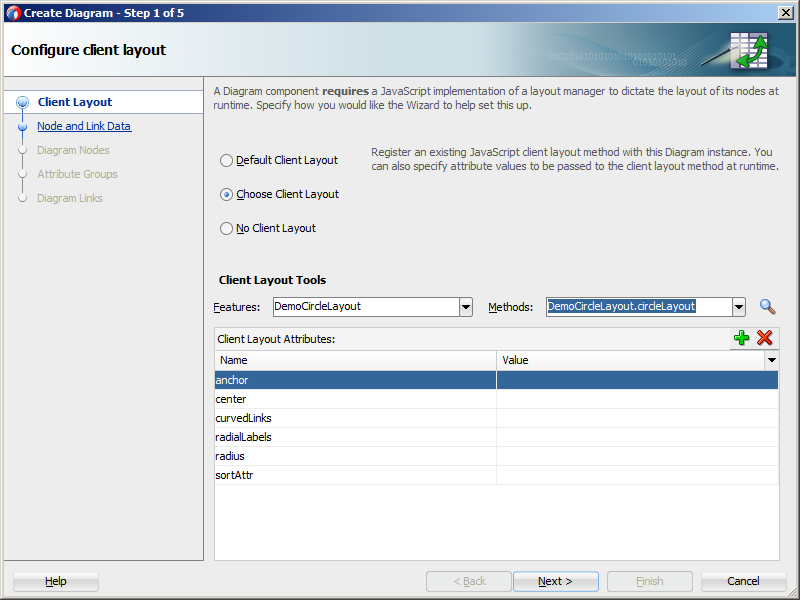
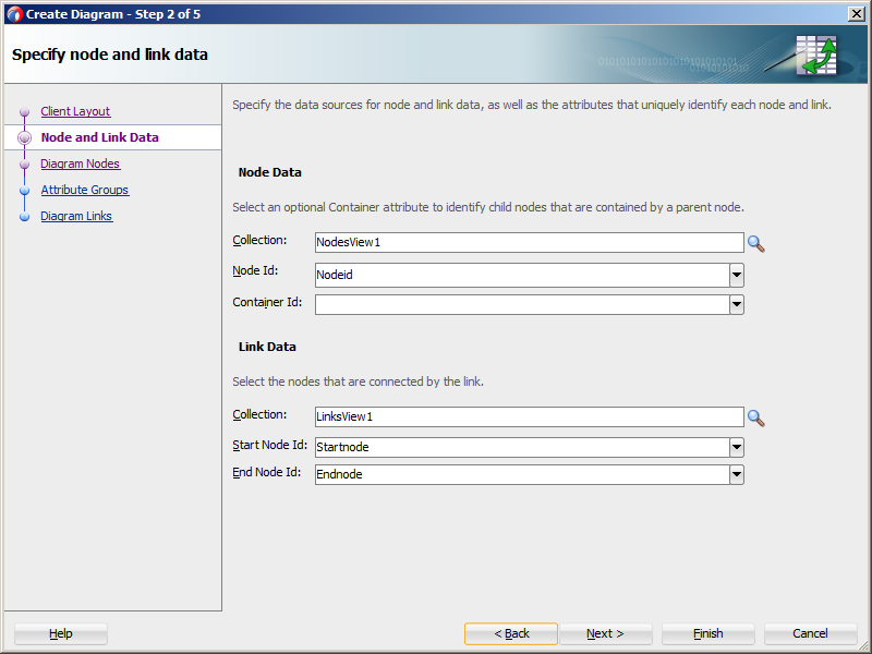
The Create Diagram wizard provides declarative support for creating the diagram and binding it to data. In the five wizard pages you can:
-
Configure the diagram's client layout.
You can choose the default client
forceDirectedLayoutfeature, specify your own layout, or choose no layout. -
Specify the node and link data, including:
-
The collections to use for the node and link data
-
The attribute that specifies the node's unique identifier (id)
-
Optionally, the attribute in the node collection that contains the container id to identify child nodes that are contained by the parent node
-
The attributes in the link collection that specify the starting and ending node ids for a link
-
-
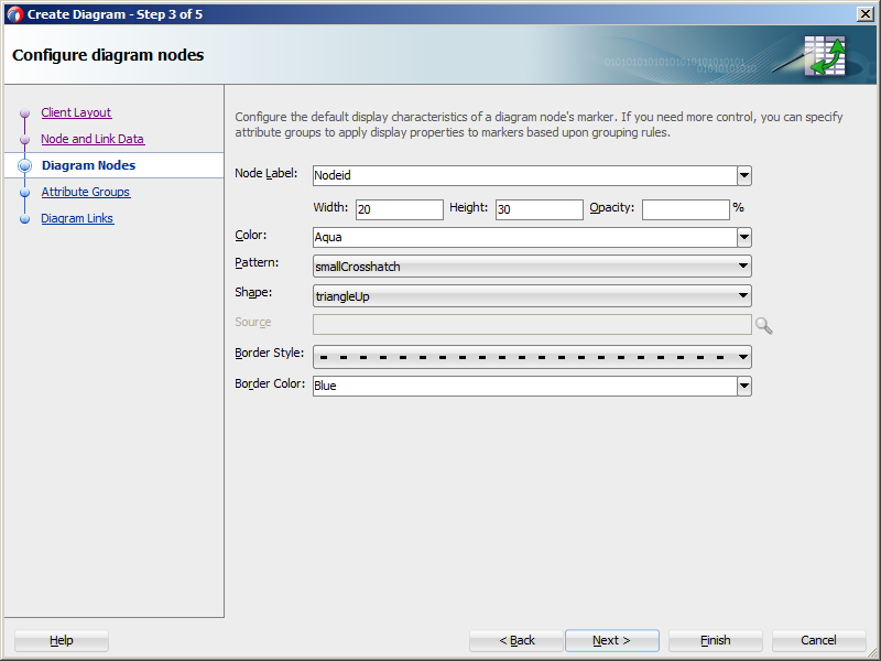
Optionally, configure the display characteristics of the node's label and marker.
Diagram nodes use the
dvt:markercomponent to configure many of the node's display characteristics, including color, pattern, shape, border style, and color. -
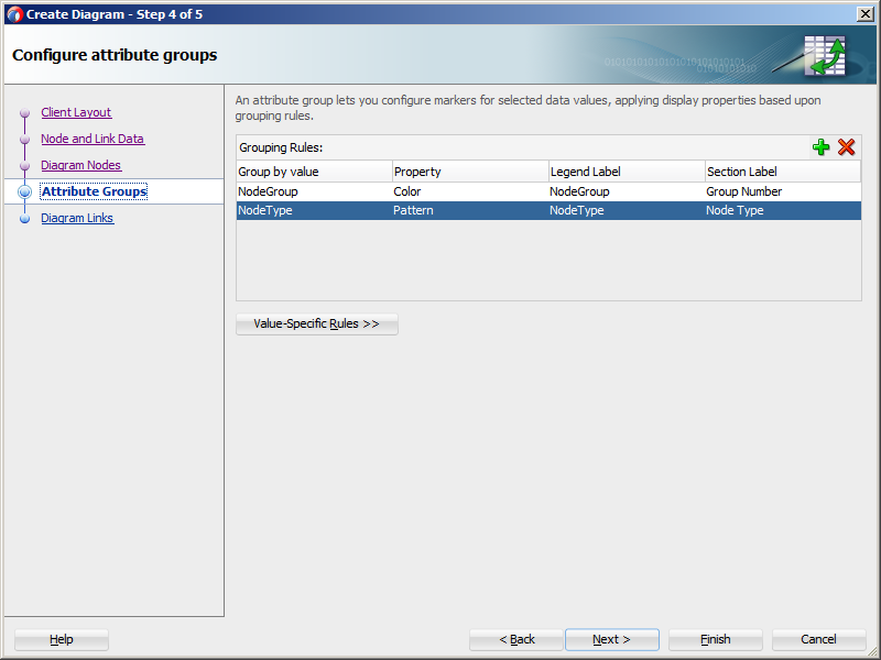
Optionally, configure attribute groups to group nodes by color, shape, pattern, opacity, scale X, or scale Y according to a specified attribute.
-
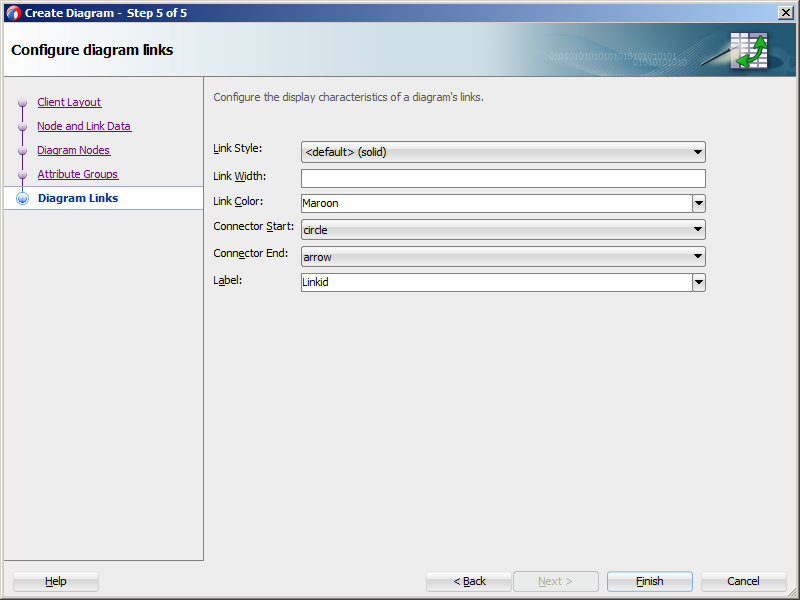
Optionally, configure the display characteristics of the link's label, style, color, width, beginning connector, and end connector.
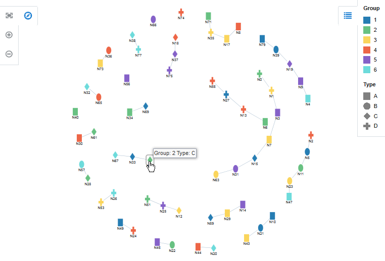
Figure 44-2 shows a diagram configured to use the default client layout. In this example, the diagram is configured to use attribute groups to group the nodes by the values in the node's NodeGroup and NodeType attributes.
Figure 44-2 Diagram Example With Attribute Groups
After you complete the Create Diagram wizard and the diagram is added to your page, you can further customize the diagram using the Properties window. For additional information, see "Using Diagram Components" in Developing Web User Interfaces with Oracle ADF Faces.
Note:
The ADF Data Visualization Tools (DVT) component collection includes other components that you can also use to model organization charts, time lines, etc.
For example, you can also use the DVT hierarchy viewer component to display an organization chart bound to employee data. Hierarchy viewers also use nodes and links to display data, but the component automatically creates the links based on the values in the node's data collection, and you do not need to supply a separate data collection for the links.
For additional information about other DVT components and typical use cases, see "Introduction to Data Visualization Components" in Developing Web User Interfaces with Oracle ADF Faces.
44.2.1 How to Create a Diagram Using ADF Data Controls
To create a DVT diagram using data controls, bind the dvt:diagram component to a collection that contains the node data and a collection that contains the links that represent the relationships between the nodes. JDeveloper allows you to do this declaratively by dragging and dropping a collection from the Data Controls panel.
Tip:
You can also create the diagram by dragging the diagram from the Components window.
Before you begin:
It may be helpful to have an understanding of databound diagrams. For more information, see About ADF Data Visualization Diagram Components.
You may also find it helpful to understand functionality that can be added using other Oracle ADF features. For more information, see Additional Functionality for Data Visualization Components.
You will need to complete these tasks:
-
Create an application module that contains instances of the view objects that you want in your data model for the diagram, as described in Creating and Modifying an Application Module.
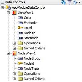
Figure 44-3 shows the data control for the diagram displayed in Figure 44-2. In this example,
NodesView1contains the data collection for the diagram nodes, andLinksView1contains the data collection for the diagram links.Figure 44-3 Diagram Node and Link Data Collections Example
The
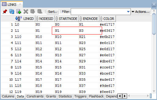
StartnodeandEndnodeattributes in theLinksView1data collection contain references to theNodeidattribute in theNodesView1data collection. Figure 44-4 shows a portion of the link collection's data in the Object Viewer.Figure 44-4 Diagram Sample Link Data
-
Create a JSF page as described in the "How to Create JSF Pages" section of Developing Web User Interfaces with Oracle ADF Faces.
To create a databound diagram:
44.2.2 What Happens When You Create a Databound Diagram
Creating a diagram from the Data Controls panel has the following effect:
-
Creates the bindings for the diagram in the page definition file (pageName
PageDef.xml) of the JSF page -
Adds the necessary tags to the JSF page for the
dvt:diagramcomponent -
If you chose the default client layout during creation, registers the layout with the ADF Faces runtime environment
44.2.2.1 Bindings for Diagram Components
The following code sample shows the bindings that JDeveloper generated for a dvt:diagram component using the data collection shown in Figure 44-3.
<executables>
  <variableIterator id="variables"/>
    <iterator Binds="NodesView1" RangeSize="-1" DataControl="AppModuleDataControl" id="NodesView1Iterator"/>
    <iterator Binds="LinksView1" RangeSize="-1" DataControl="AppModuleDataControl" id="LinksView1Iterator"/>
</executables>
<bindings>
  <tree IterBinding="NodesView1Iterator" id="NodesView1">
    <nodeDefinition DefName="model.NodesView" Name="NodesView10">
      <AttrNames>
        <Item Value="NodeGroup"/>
        <Item Value="NodeType"/>
        <Item Value="Nodeid"/>
      </AttrNames>
    </nodeDefinition>
  </tree>
  <tree IterBinding="LinksView1Iterator" id="LinksView1">
    <nodeDefinition DefName="model.LinksView" Name="LinksView10">
      <AttrNames>
        <Item Value="Endnode"/>
        <Item Value="Startnode"/>
      </AttrNames>
    </nodeDefinition>
  </tree>
</bindings>
The rules for populating the diagram are defined in a node definition. Each node definition references the node and links view objects and the attributes specified in the Create Diagram dialog. For additional information about the pageNamePageDef.xml file, see pageNamePageDef.xml.
44.2.2.2 Code on the JSF Page for a Diagram Component
The following example shows the code that is generated on the JSF page for the diagram shown in Figure 44-2.
<dvt:diagram id="dg1" layout="DiagramSampleDiagramLayout">
  <dvt:diagramNodes var="node" id="dnodes1"
                    value="#{bindings.NodesView1.collectionModel}">
    <dvt:diagramNode label="#{node.Nodeid}" id="dn1" nodeId="#{node.Nodeid}">
      <f:facet name="zoom100">
        <dvt:marker width="20" id="m1" height="30">
          <dvt:attributeGroups id="ag1" label="#{node.NodeGroup}" type="color"
                               value="#{node.NodeGroup}"/>
          <dvt:attributeGroups id="ag2" label="#{node.NodeType}" type="shape"
                               value="#{node.NodeType}"/>
        </dvt:marker>
      </f:facet>
    </dvt:diagramNode>
  </dvt:diagramNodes>
  <dvt:diagramLinks var="link" value="#{bindings.LinksView1.collectionModel}"
                    id="dl1">
    <dvt:diagramLink startNode="#{link.Startnode}" id="dl2"
                     endNode="#{link.Endnode}"/>
  </dvt:diagramLinks>
  <dvt:clientLayout method="DiagramSampleDiagramLayout.forceDirectedLayout"
                    featureName="DiagramSampleDiagramLayout"
                    name="DiagramSampleDiagramLayout">
    <f:attribute name="optimalLinkLength" value="75"/>
  </dvt:clientLayout>
  <dvt:legend id="l1">
    <dvt:legendSection label="#{viewcontrollerBundle.GROUP}" source="dnodes1:ag1"
                       id="ls1"/>
    <dvt:legendSection label="#{viewcontrollerBundle.TYPE}" source="dnodes1:ag2"
                       id="ls2"/>
  </dvt:legend>
</dvt:diagram>
44.2.2.3 Default Client Layout Files and Location
When you create a diagram using the default client layout, JDeveloper registers the force directed layout with the ADF runtime environment as a JavaScript (JS) feature. The creation process automatically adds a JS file in the ViewController/src/js/layout directory with the following naming convention:
ApplicationNameDiagramLayout.js
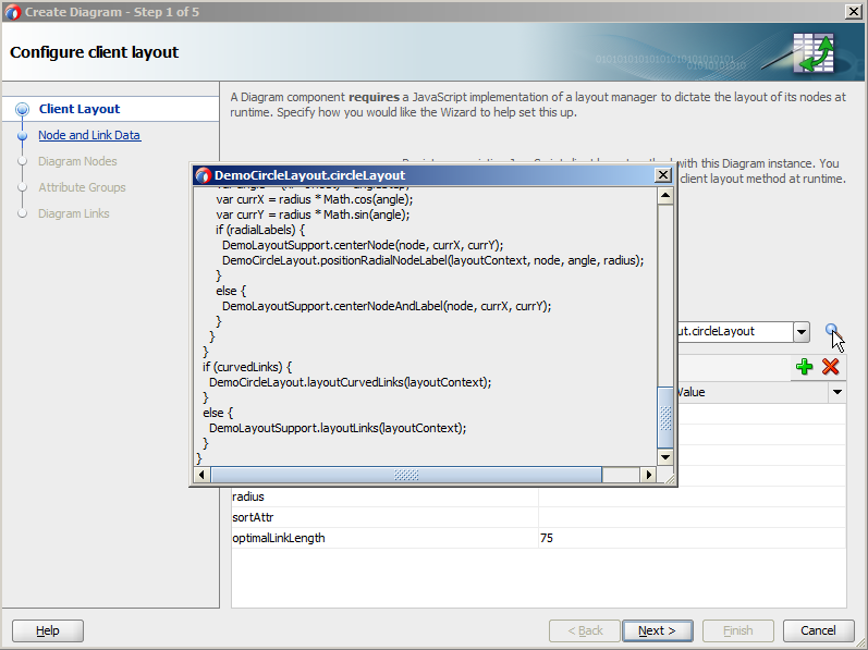
For example, if your application is named DiagramSample, the JS file is named DiagramSampleDiagramLayout.js. The content of the file contains the forceDirectedLayout method, and you can open the file in JDeveloper. You can also click Edit Component Definition in the Properties window to display the Edit Diagram - Configure Client Layout dialog and then click Search to display the method popup.
JDeveloper also creates the adf-js-features.xml file if it doesn't already exist and adds the ApplicationNameDiagramLayout as the feature-name and the path to the JS file as the feature-class. The following example shows the adf-js-features.xml file for an application named DiagramSample.
<?xml version="1.0" encoding="UTF-8" ?>
<features xmlns="http://xmlns.oracle.com/adf/faces/feature">
  <feature>
    <feature-name>DiagramSampleDiagramLayout</feature-name>
    <feature-class>js/layout/DiagramSampleDiagramLayout.js</feature-class>
  </feature>
</features>
44.2.2.4 Modifying Diagram Properties and Layout
After you create your diagram, you can specify a different client layout or add additional elements, such as a label, using the Edit Diagram dialog. To open the dialog, use the Edit icon in the Properties window for the dvt:diagram component. You can also customize the diagram properties directly in the visual editor or by setting values in the Properties window.
For example, to add the tooltip shown in Figure 44-2 to your diagram, you can enter a value for the diagram node's shortDesc attribute in the Properties window or in the code editor.
<dvt:diagramNode label="#{node.Nodeid}" id="dn1" nodeId="#{node.Nodeid}"
                 shortDesc="Group: #{node.NodeGroup} Type: #{node.NodeType}">
  <f:facet name="zoom100">
    ... contents omitted
  </f:facet>
</dvt:diagramNode>
For additional information and examples for customizing your diagram, see "Using Diagram Components" in Developing Web User Interfaces with Oracle ADF Faces.
