35 Customizing the Appearance Using Styles and Skins
This chapter includes the following sections:
35.1 About Customizing the Appearance Using Styles and Skins
ADF skin is a type of CSS (Cascading Style Sheet) file that lets you customize the appearance of the ADF application user interface in ways that are not feasible to define using CSS style properties alone. You can also override the ADF skin properties of the user interface using the style-related properties exposed by individual ADF Faces components.
You can customize the appearance of ADF Faces and ADF Data Visualization components using an ADF skin that you apply to the application or by applying CSS style properties directly to an ADF Faces or ADF Data Visualization component if the component exposes a style-related property (styleClass or inlineStyle). Choosing the latter option means that you override style properties defined in your application's ADF skin for the component. You might do this when you want to change the style for an instance of a component on a page rather than for all components throughout the application or you want to programmatically set styles conditionally. For example, you want to display text in red only under certain conditions. For more information, see Changing the Style Properties of a Component.
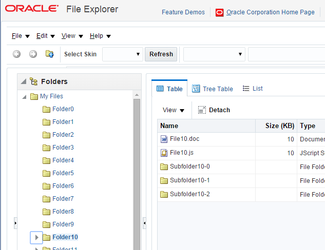
An ADF skin is a type of CSS file where you define CSS style properties based on the Cascading Style Sheet (CSS) specification for the component for which you want to customize the appearance. The ADF skin defines rules that determine how to apply CSS style properties to specific components or groups of components. The end user's browser interprets these rules and overrides the browser's default settings. Figure 35-1 and Figure 35-2 demonstrate the result that applying ADF skins can have on the appearance of the ADF Faces and ADF Data Visualization components that appear in your application. Figure 35-1 shows a page from the File Explorer application with the alta ADF skin applied.
Figure 35-1 Index Page Using the Alta Skin

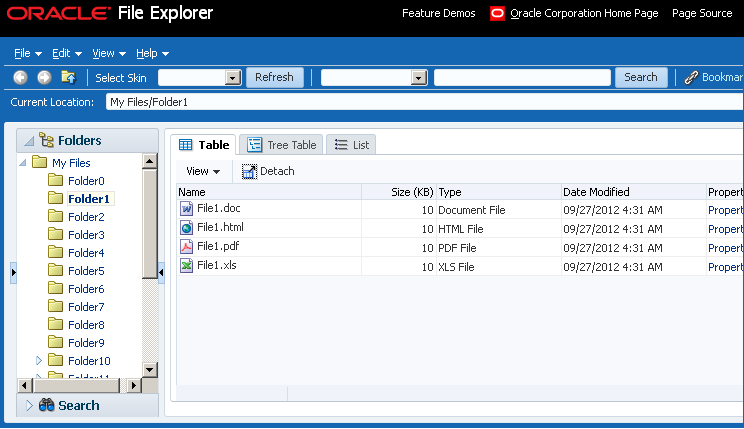
Figure 35-2 shows the same page from the same application with the skyros ADF skin applied.
Figure 35-2 Index Page Using the Skyros Skin

A new web application that you create in this release uses the alta skin by default. Migrated web applications continue to use their existing ADF skin. To get the full benefit of the Oracle Alta UI system, Oracle recommends that you go beyond simply using the alta skin and design your application around the Oracle Alta UI Design Principles. Designing your application using these principles enables you to make use of the layouts, responsive designs and components the Oracle Alta UI system incorporates to present content to your end users in a clean and uncluttered way. For more information about the Oracle Alta UI system and the Oracle Alta UI Design Principles, see http://www.oracle.com/webfolder/ux/middleware/alta/index.html and for information about Oracle Alta UI Patterns, see http://www.oracle.com/webfolder/ux/middleware/alta/patterns/index.html.
The File Explorer application provides several ADF skins to customize the appearance of the application. You can view the source files for these ADF skins and the File Explorer application. For more information, see About the ADF Faces Components Demo Application.
It is beyond the scope of this guide to explain the concept of CSS. For extensive information on style sheets, including the official specification, visit the World Wide Web Consortium's website at:
It is also beyond the scope of this guide to describe how to create, modify, or apply ADF skins to your application. Oracle ADF provides editors in JDeveloper and the Theme Editor to assist you with these tasks. See Working with ADF Skins in JDeveloper in Developing ADF Skins.
If you create multiple ADF skins, you can configure your application so that end users choose the ADF skin that they want the application to use. For more information, see Enabling End Users to Change an Application's ADF Skin.
35.1.1 Customizing the Appearance Use Cases and Examples
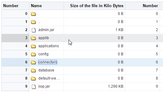
You can customize an ADF skin to serve a number of purposes. For example, you might define properties in an ADF skin so that the application highlights a data row rendered by an ADF Faces table component after an end user selects it to provide feedback, as illustrated in Figure 35-3.
Figure 35-3 ADF Skin Properties in an ADF Table Component

Use ADF skin properties to define behavior and appearance that you cannot specify using only CSS or that is dependent on component properties and, as a result, is not feasible to define using CSS. For example, ADF Faces supports animation in browsers where CSS 3 animations are not available. If you want to configure the duration of an animation, use an ADF skin property to do so. Example 35-1 shows how an ADF skin property defines the duration that an ADF Faces carousel component displays the spin animation to be 500 milliseconds long.
Example 35-1 Using an ADF Skin Property to Specify Length of Spin Animation
af|carousel {
  -tr-spin-animation-duration: 500;
}
35.1.2 Additional Functionality for Customizing the Appearance
You may find it helpful to understand other ADF Faces features and non-ADF Faces features before you decide to customize the appearance of your application. The following links provide more information that may be useful to know:
-
Using parameters in text: You can use the ADF Faces EL format tags if you want the text displayed in a component to contain parameters that will resolve at runtime. For more information, see How to Use the EL Format Tags.
-
Internationalization and localization: The ADF skin that you create to apply to your application can be customized as part of a process to internationalize and localize ADF Faces pages. For more information about this process, see Internationalizing and Localizing Pages.
-
Accessibility: The ADF skin that you create to apply to your application can be customized as part of a process to make your ADF Faces pages accessible. For more information about this process, see Developing Accessible ADF Faces Pages.
-
Touch Devices: ADF Faces components may behave and display differently on touch devices. For more information, see Creating Web Applications for Touch Devices Using ADF Faces.
-
Drag and Drop: You can configure your components so that the user can drag and drop them to another area on the page. For more information, see Adding Drag and Drop Functionality.
35.2 Changing the Style Properties of a Component
ADF Faces components expose style-related properties that you can customize to alter the ADF skin properties that determine the look and feel of the ADF application user interface.
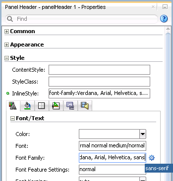
You can adjust the look and feel of any component at design time by changing the component's style-related properties, inlineStyle and styleClass, both of which render on the root DOM element. Any style-related property (inlineStyle or styleClass) you specify at design time overrides the comparable style specified in the application's ADF skin for that particular instance of the component. Any value you specify for a component's inlineStyle property overrides a value set for the styleClass attribute.
The inlineStyle attribute is a semicolon-delimited string of CSS styles that can set individual attributes, for example, background-color:red; color:blue; font-style:italic; padding:3px. The styleClass attribute is a CSS style class selector used to group a set of inline styles. The style classes can be defined using an ADF public style class, for example, .AFInstructionText, sets all properties for the text displayed in an af:outputText component.
Note:
Do not use styles to achieve stretching of components. Using styles to achieve stretching is not declarative and, in many cases, will result in inconsistent behavior across different web browsers. Instead, you can use the geometry management provided by the ADF Faces framework to achieve component stretching. For more information about layouts and stretching, see Geometry Management and Component Stretching.
35.2.1 How to Set an Inline Style
Set an inline style for a component by defining the inlineStyle attribute. You can use inline style to specify the style of a component for that instance of the component. For more information, see Arranging Contents to Stretch Across a Page.
Before you begin:
It may be helpful to have an understanding of how the inlineStyle attribute relates to other attributes. For more information, see Changing the Style Properties of a Component .
You may also find it helpful to understand functionality that can be added using other ADF Faces features. For more information, see Additional Functionality for Customizing the Appearance .
To set an inline style:
Example 35-2 InlineStyle in the Page Source
<af:outputText value="outputText1" id="ot1"
       inlineStyle="color:Red; text-decoration:overline;"/>
Example 35-3 EL Expression Used to Set an inlineStyle Attribute
<af:outputText value="#{row.assignedDate eq
    null?res['srsearch.unassignedMessage']:row.assignedDate}"
              inlineStyle="#{row.assignedDate eq null?'color:rgb(255,0,0);':''}"
      id="ot3"/>
Example 35-4 Using the contentStyle Property
<af:inputText value="outputText1"
          contentStyle="color:Red;" id="it1"/>
35.2.2 How to Set a Style Class
You can define the style for a component using a style class. You create a style class to group a set of inline styles. Use the styleClass attribute to reference the style class.
Before you begin:
It may be helpful to have an understanding of how the styleClass attribute relates to other attributes. For more information, see Changing the Style Properties of a Component .
You may also find it helpful to understand functionality that can be added using other ADF Faces features. For more information, see Additional Functionality for Customizing the Appearance .
To set a style using a style class:
Example 35-5 Page Source for Using a Style Class
<af:outputText value="Text with a style class"
               styleClass="overdue"  id="ot4"/>
35.3 Enabling End Users to Change an Application's ADF Skin
The ADF skins named in the ADF application trinidad-config.xml file can be exposed to end users so that they may change the ADF application look and feel to suit their locale.
You can configure your application to enable end users select an alternative ADF skin. You might configure this functionality when you want end users to render the application's page using an ADF skin that is more suitable for their needs. For example, you want your application to use an ADF skin with features specific to a Japanese locale when a user's browser is Japanese. An alternative example is where you want your application to use an ADF skin that is configured to make your application's pages more accessible for users with disabilities.
Figure 35-5 shows how you might implement this functionality by configuring a component (for example, af:commandMenuItem) to allow end users to change the ADF skin the application uses at runtime. Configure the component on the JSF page to set a scope value that can later be evaluated by the skin-family property in the trinidad-config file.
Figure 35-5 Changing an Application's ADF Skin

35.3.1 How to Enable End Users Change an Application's ADF Skin
You enable end users change an application's ADF skin by exposing a component that allows them to update the value of the skin-family property in the trinidad-config file.
Before you begin:
It may be helpful to have an understanding of how the changes that you make can affect functionality. For more information, see Enabling End Users to Change an Application's ADF Skin.
You may also find it helpful to understand functionality that can be added using other ADF Faces features. For more information, see Additional Functionality for Customizing the Appearance.
To enable end users change an application's ADF skin:
Example 35-6 Using a Component to Set the Skin Family
<af:menu text="Change Skin" id="skins" binding="#{backing_ChangeSkin.skins}">
        <af:commandMenuItem id="skin1" text="skyros" type="radio"
                            actionListener="#{skins.skinMenuAction}"
                            selected="#{skins.skinFamily=='skyros'}"/>
        <af:commandMenuItem id="skin3" text="fusion" type="radio"
                            actionListener="#{skins.skinMenuAction}"
                            selected="#{skins.skinFamily=='fusion'}"/>
        <af:commandMenuItem id="skin4" text="fusion-projector" type="radio"
                            actionListener="#{skins.skinMenuAction}"
                            selected="#{skins.skinFamily=='fusion-projector'}"/>
        <af:commandMenuItem id="skin5" text="simple" type="radio"
                            actionListener="#{skins.skinMenuAction}"
                            selected="#{skins.skinFamily=='simple'}"/>
        <af:commandMenuItem id="skin6" text="skin1" type="radio"
                            actionListener="#{skins.skinMenuAction}"
                            selected="#{skins.skinFamily=='skin1'}"/>
</af:menu>
Example 35-7 Managed Bean Method to Change ADF Skin
 public void skinMenuAction(ActionEvent ae)
 {
     RichCommandMenuItem menuItem = (RichCommandMenuItem)ae.getComponent();

     // Invoke another managed bean method to set the value of skinFamily
     setSkinFamily(menuItem.getText());

     // Invoke a method to reload the page. The application reloads the page
     // using the newly selected ADF skin.
     reloadThePage();
 }
35.3.2 What Happens at Runtime: How End Users Change an Application's ADF Skin
At runtime, the end user uses the component that you exposed to select another ADF skin. In Example 35-6, this is one of a number of af:commandMenuItem components. This component submits the value that the end user selected to a managed bean that, in turn, sets the value of a managed bean property (skinFamily). At runtime, the <skin-family> property in the trinidad-config file reads the value from the managed bean using an EL expression.
35.4 Using Scalar Vector Graphics Image Files
In ADF Faces applications, af:image, af:commandToolbarButton, and af:panelGroupLayout components are used to display images. Use inline SVG for these components that helps to specify the dimensions of the image instead of generating graphics at multiple resolutions and changing your application to reference different sizes of graphics.
ADF Faces supports the use of Scalar Vector Graphics (SVG) image files to render icons. ADF Faces components that reference this type of image render an HTML <img> tag in the generated page at runtime. Some components expose an additional iconDelivery attribute that you can set to inline if you want the rendered page to use an HTML <svg> tag rather than an HTML <img> tag. Rendering the HTML <svg> tag gives SVG authors more control over the rendered SVG image file, such as, for example, color changes based on an alias in a skin. Use of the inline value for the iconDelivery attribute only works for SVG images.
An example of a component that exposes the iconDelivery attribute is showDetailItem. SeeOracle Fusion Middleware Tag Reference for Oracle ADF Faces.
