Working with Buttons, Button Sets, and Toolbars
The Oracle JET framework includes the ojButton component that you can use as a standalone component or include in ojButtonset and ojToolbar container components. You can configure ojButton as a push or toggle button, depending upon your application's needs.
Topics:
Working with Buttons
Use the Oracle JET ojButton component to display a push or toggle button. Oracle JET buttons are WAI-ARIA compliant and themable, with appropriate styles for hover, active, checked, and disabled.
-
Push button: Ordinary button that does not stay pressed when clicked

You can configure push buttons as the HTML
buttonelement, anchor (<a>), orinputelement of typeinput,submit, orreset. In general, use thebuttonelement unless you need the anchor capability. Buttons using theinputelement are less frequently used since they don't support icons.<button id= "button" data-bind="click: buttonClick, ojComponent: { component: 'ojButton', label: 'A button element' }"> </button> <a id="anchor" href="#" data-bind="click: buttonClick, ojComponent: { component: 'ojButton' }">An anchor</a> -
Toggle button: Button that toggles between a selected state and an unselected state when clicked
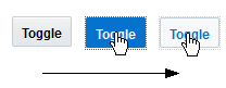
You can configure toggle buttons as the HTML
inputelement of typeradioorcheckbox. The label must be a sibling of theinputelement and immediately precede it in order to ensure compatibility with Oracle JET'sojComponentbinding. Also, the label'sforattribute must refer to the input'sidattribute.<label for="standalone">Toggle</label> <input type="checkbox" id="standalone" data-bind="ojComponent: {component: 'ojButton'}"/>
A given radio button must not be both
checkedanddisabled, unless all radio buttons in the group aredisabled, since this removes the entire radio group from the tab order in mainstream browsers. This issue applies to native radios and is not unique to Oracle JET.
The Oracle JET Cookbook at Buttons includes complete examples for all buttons. In addition, the ojButton API documentation describes support for keyboard interaction, accessibility, event handling, pseudo-selectors for jQuery expressions, setting component state, and a comparison of Oracle JET buttons with jQuery UI buttons. In particular, you should make note of the following:
-
Register click handlers directly on the button, rather than on an ancestor.
<button id= "button"
        data-bind="click: buttonClick,
                   ojComponent: { component: 'ojButton', label: 'A button element' }">
</button>
If you register the click handler on an ancestor, the click target could be removed if any of the button's DOM is swapped out. For example, if you're alternating the text and icon between Play and Pause, the bubbling will stop if the click target was part of the content that was removed in the swap.
-
If you need to set an
ojButtoncomponent's checked state programmatically, then wrap it in anojButtonsetso that you can use its checked option. It is OK for a button set to contain only one button.
Working with Button Sets
The ojButtonset component is a themable, visual and semantic grouping container for Oracle JET buttons that is also compliant with WAI-ARIA. Use ojButtonset to group related buttons, such as a group of radios or checkboxes.

Create the ojButtonset on a HTML container element, such as the div element. The Oracle JET cookbook at Button Sets contains the complete recipe to create the button set shown above.
Here are some tips for working with button sets:
-
A button set that contains radios should contain all radios in the radio group.
-
Checkboxes and radio buttons in the button set should specify the
valueattribute, since the checked option refers to that attribute. -
The application should not do anything to interfere with the focus management. For example, it should not set the
tabindexof the buttons. -
Enabled buttons should remain user visible. Otherwise, the arrow-key navigation to the button would cause the focus to seemingly disappear.
-
The button set's
focusManagementoption should be set tononewhen placing the button set in anojToolbarcomponent. -
The application is responsible for applying WAI-ARIA aria-label and aria-controls attributes to the button set, as appropriate.
aria-label="Choose only one.  Use left and right arrow keys to navigate."
aria-controls="myTextEditor"
-
If the checked option and DOM get out of synch (for example, if a set of buttons contained in a button set changes, possibly due to a Knockout binding), then the application is responsible for updating the
checkedoption. -
The application doesn't need to listen for the
optionChangeevent, since theojComponentcheckedbinding will update the bound observable whenever the checked state changes.
For additional information about the ojButtonset component's options, events, and methods, see the ojButtonset API documentation.
Working with Toolbars
The ojToolbar component is a WAI-ARIA compliant toolbar, with arrow key navigation and a single tab stop. The tab stop updates on navigation, so that tabbing back into the toolbar returns to the most recently focused button.

The ojToolbar component can contain ojButton and ojButtonset components as well as non-focusable content such as separator icons.
Here are some tips for working with toolbars:
-
A toolbar that contains radio buttons should contain all radio buttons in the radio group.
-
The application should not do anything to interfere with the focus management.
-
Enabled buttons should remain user visible. Otherwise, the arrow-key navigation to the button would cause the focus to seemingly disappear.
-
The button set's
focusManagementoption should be set tononewhen placed in a toolbar.
The Oracle JET Cookbook includes toolbar examples at Toolbars. For additional information about the ojToolbar component's options, events, and methods, see the ojToolbar API documentation.