Configuring an Editable Component's Help Option
You can configure an editable component's help option to display descriptive text, display a help icon that includes a link to a URL for additional information, or display both the help text and help icon.
The help option includes two sub-options that control the help definition text and help icon:
-
definition: Contains the help definition text that displays when the user does one of the following:-
hovers over the label or help icon
-
tabs into the help icon with the keyboard
-
presses and holds the help icon on a mobile device
-
-
source: Contains the URL to be used in the help icon's link
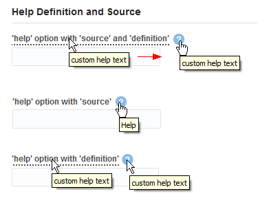
The following image shows three ojInputText components configured to use the help option. The top component is configured with both a definition and source help sub-option, and the image shows the text and clickable pointer that displays when the user hovers over the label and help icon. In the middle image, the ojInputText component includes a help icon that links to a URL when the user selects it. In the bottom image, the ojInputText displays the custom help text when the user hovers over the label or help icon. In this example, the icon is not clickable but just displays custom text.
To configure an editable component's help option:
See the Oracle JET Cookbook at Help and Title for the complete example to configure the help option on the ojInputText component.