User Interface Area of the Workbench
This chapter covers the following topics:
- Introduction to the User Interface Area of the Workbench
- Creating a New User Interface
- Editing a User Interface
- Modifying the User Interface Definition
- Copying, Moving, and Deleting User Interface Elements
- Converting a UI Template Reference
- Creating a User Interface Page
- Creating User Interface Page Content
- Creating a Region from a User Interface Content Template
- Creating a UI Template Reference
- Modifying a UI Template Reference
- Creating a Layout Region
- Creating a Table
- Creating an Item Selection Table
- Creating an Instance Management Table
- Creating a Connection Navigator Table
- Creating a Summary Table
- Displaying Invalid and Unsatisfied Items as Links in the Configuration Summary Page
- Creating a Cell Format
- Creating a Styled Text Element
- Creating a Static Styled Text Element
- Creating a Formatted Text Element
- Creating a Text Link Element
- Creating a Raw Text Element
- Creating an Image Element
- Creating an Image Button
- Creating a Standard Button
- Creating a Custom Button
- Creating a Spacer
- Creating a Separator
- Creating a Check Box
- Creating an Enhanced Check Box
- Creating an Instantiation Check Box
- Creating a Radio Button
- Creating an Enhanced Radio Button
- Creating a Drop-down List
- Creating a Text Input Element
- Creating a Status Indicator or Unsatisfied Status Indicator
- Creating a Content Container
- Creating Switcher and Case Regions
- Creating a HideShow Region
- Creating a Menu
- Creating a Menu Label
- Creating a Page Link
- Creating a Page Flow
- Creating a Page Reference
- Defining a Condition for Runtime Display and Behavior
- Refreshing a User Interface
- Formatting User Interface Elements
- Sorting Options
- Changing an Element's Associated Model Node
- Assigning Actions to User Interface Elements
- Creating a User Interface Content Template
- Creating a User Interface Content Template by Copying an Existing Template
- Creating a UI Content Template from Scratch
- User Interface Content Template Settings
- Common Steps for Creating a User Interface Content Template
- Editing a User Interface Content Template
- Editing a User Interface Master Template
- Creating a Page Include Region
Introduction to the User Interface Area of the Workbench
You use the User Interface area of the Workbench to create and maintain all of a Model’s User Interfaces. You can also unit test a UI by clicking the Test Model button at the top of the page. To navigate to the User Interface area of the Workbench, open a Model for editing and then click the User Interface link at the top of the page.
For additional information about User Interface elements and User Interface Templates, see:
Creating a New User Interface
You use a UI Master Template to create a User Interface that is based on the Model’s structure, or as the first step in building a UI from scratch.
In either case, review the predefined UI Master Templates and decide which best meets your requirements before generating a UI. See User Interface Master Templates. If one of the predefined UI Master Templates can meet your requirements with only a few modifications, create a copy of the template you want to use, and then make any necessary changes. Then, select your customized UI Master Template when generating the UI.
For details, see:
Note: A recommended best practice is to wait until the Model’s structure is complete before generating a UI. You can unit test a configuration model that does not yet have a UI using the Model Debugger. See Unit Testing Using the Model Debugger.
The following procedure assumes you have a Model open for editing and are working in the User Interface area of the Workbench.
To create a new UI:
-
In the same row as the root User Interfaces Folder, click the icon in the Create column.
-
Enter a Name and optionally a Description of the UI.
-
Select a Master Template from the list.
-
Select one of the following Options:
-
Select Generate UI for Model to generate a UI that is based on the Model’s structure.
To show all Model structure nodes in the UI, regardless of the Include in Generated UI setting, select Show Entire Model.
-
Select Create Empty UI if you want to build the UI from scratch.
Note: When creating an empty UI, you cannot use a UI Master Template that provides the Dynamic Model Tree navigation style. This is because Configurator Developer generates a dynamic navigation tree according to the Model’s structure, while empty UIs are not based on the Model’s structure.
-
Select Register Custom UI and then enter an Initial URL if you are implementing a custom User Interface using the JSP Tag Library.
When you click Apply, Configurator Developer creates a UI definition record that you publish using the same procedure as a UI generated in Configurator Developer. Publishing this UI definition record enables host applications to launch the custom UI and display the selected configuration model. For details about creating a custom UI using the JSP Tag Library, see the corresponding Oracle Configurator white paper on MetaLink.
-
-
Click Apply.
-
If you created an empty UI, add UI content.
For details, see Editing a User Interface.
If you generated a UI that is based on the Model’s structure, unit test the UI to see if any modifications are required. See Unit Testing a Generated User Interface.
Editing a User Interface
Editing a UI includes adding, deleting, or modifying UI structure or specific UI elements in the User Interface area of the Workbench. These tasks may be performed when modifying a UI that is based on the Model’s structure, or when you are building a UI from scratch (an empty UI). You edit all UIs in the User Interface area of the Workbench.
For a detailed example, see Designing and Creating a User Interface Page.
Before modifying a User Interface, be sure the Model’s structure and your configuration rules are complete.
If you created an empty UI, perform the following steps to define its content:
-
Create UI Pages and associate them with Model structure nodes.
See Creating a User Interface Page.
When you create an empty UI, Configurator Developer generates a single UI Page. By default, the Associated Model Node for this Page is set to the root Model node. Configurator Developer also generates a Page Flow, which contains a Page Reference that points to the generated UI Page.
-
Add content to UI Pages.
-
Create a Menu or any required Page Flows.
See Creating a Menu.
-
Create Page Links (if using a Menu) or Page References (if using Page Flows) to UI Pages.
If you created a UI that is based on the Model’s structure, refer to the following sections for common UI editing tasks:
-
Creating User Interface Page Content
This section describes how to create Layout Regions, UI Template References, and other basic elements such as Tables, Buttons, Check Boxes, Images, and so on.
Modifying the User Interface Definition
For general information about the UI Definition node itself, see User Interface Definition. To view recent changes to the UI Definition in a UI that is invoked from a host application, you must first republish the UI. It is not necessary to republish or refresh the UI to view changes to the UI Definition when unit testing from Configurator Developer.
The following procedure assumes you have a Model open for editing and are working in the User Interface area of the Workbench.
To modify the UI Definition:
-
In the same row as the UI Definition node, click the icon in the Edit column. (The name of this node is name you entered when generating the UI.)
The UI Definition’s details page appears.
-
Primary Navigation indicates the UI’s navigation style, which is determined by the UI Master Template used to generate the UI. Examples include Step-by-Step and Model Tree.
-
The Primary Page Flow or Main Menu setting determines the first Page an Oracle Configurator end user sees when a configuration session begins. The name of this setting varies based on the navigation style of the UI Master Template that generated the UI. For example:
-
Primary Page Flow: For UIs whose primary navigation style is Step-by-Step.
-
Main Menu: For UIs whose primary navigation style is Dynamic Model Tree, Single-Level Side Menu, Multi-level Side Menu, or Subtabs.
To specify a different Page Flow or Menu, click Choose.
Note: You cannot change the Primary Page Flow setting if the UI was generated using a UI Master Template that provides the Dynamic Model Tree navigation style. (For example, the Oracle Browser Look and Feel with Dynamic Tree Navigation UI Master Template.)
For more information about Page Flows, see Page Flows and Page References.
-
-
To change whether nested transactions are enabled or disabled in the UI, modify the Transaction Management setting.
For more information, see Pagination and Layout Section.
-
The Default Outer Page Template setting indicates which UI Content Template each UI Page uses by default. The default value is determined by the UI Master Template that was used to create the UI. Accept the default value, or click Choose to select a different Outer Page Template.
You can override this setting at the page level by editing specific UI Pages and modifying the Outer Page Template setting. For details, see Creating a User Interface Page.
For more information about Outer Page Templates, see Outer Page Templates.
-
To prevent the UI from being refreshed via the Refresh UIs button, deselect Refresh Enabled. For details, see UI Refresh Status.
This setting does not prevent you from refreshing the UI from the User Interface area of the Workbench.
For more information about this setting, see The Refresh Enabled Setting.
-
If Configurator Developer is set up to display prices and Available to Promise (ATP) information, the Price and Availability Display settings determine whether this data appears in the UI, and when selling prices and ATP dates are updated.
Setting up pricing and ATP for unit testing is described in Displaying Pricing Information and ATP Dates when Unit Testing.
Select one or more of the following settings:
-
List Price: Select this box to display the unit list prices for each item. This price does not change during a configuration session.
-
Selling Price: Select this box to display the unit selling price of all selected items. Items that are not yet selected display their unit list price. Selling prices can change during a configuration session. (See the Recalculate Prices setting below.)
-
Availability: Select this box to display ATP dates for all selected items and the entire configuration. (Note that this information can change during a configuration session.)
-
Recalculate Prices: If you selected the Selling Price and Availability settings (above), specify when to update prices and ATP dates at runtime:
-
Select On Request to update prices only when the end user chooses to do so. This is the default value. If you choose this option, you must provide a way for the user to update prices. For example, you can create a button and set its action to Update Prices.
-
Select On Page Load to recalculate prices when the end user navigates to another page, or refreshes the current page. Selecting this setting does not prevent an end user from updating prices if a UI control exists for this purpose.
-
Select On Change to update prices each time the end user makes a selection, enters a value, or navigates to another page.
-
-
-
The Message Templates settings indicate the UI Content Templates that are used to display required and optional messages at runtime.
To select a different UI Content Template, click Choose, select a Message Template, and then click Apply.
To suppress optional messages of a specific type, click Clear to remove the template.
The predefined Message Templates are described in The Predefined Message UI Content Templates.
-
The Images settings indicate the files that are used to indicate selection state, logic selector radio buttons, and logic selector check boxes at runtime. The default values are determined by the UI Master Template you used to generate the UI.
To use a different image at runtime, replace the existing file name with the new one, and then click Apply.
Images are described in Images Section.
-
The Referenced User Interfaces section lists all Model References and their associated UIs. To specify a different referenced UI, select one from the list, and then click Apply.
For more information about referenced User Interfaces, see References and User Interfaces.
-
When your changes are complete, click Apply.
Copying, Moving, and Deleting User Interface Elements
Like the Model itself, a UI appears in a hierarchical structure when viewing or editing it in the UI area of the Workbench. And, like Model structure nodes that you create in Configurator Developer, you can modify a UI by copying, moving, or deleting elements.
You copy or move UI elements by selecting them and then selecting a command from the Actions list. For details about the available actions, see Actions. You cannot copy, move, or delete any default UI Folders (that is, the Pages, Page Flows, and Menus Folders).
When copying or moving a UI element, the node you specify as the element’s new parent (its destination) must be valid for that element. Whether the new parent is a valid destination depends on its type. You can copy or move UI elements within the same UI Page or to a different Page in the same UI. You can also copy or move elements from one UI to another UI, but both UIs must belong to the same Model.
To copy or move an element:
-
Select the element.
-
Select Copy or Move from the Actions list, and then click Go.
-
If you are copying an element, select a destination for the new element.
Accept the default value of Current Parent to create a copy of the selected element at its current location. Select New Parent to create the element in a different location. In this case, click Choose, select a destination, and then click Apply.
-
If you are moving an element, select a new parent from the list, and then click Apply.
To delete a UI element:
-
In the User Interface area of the Workbench, select the element to delete.
-
Select Delete from the Actions list, and then click Go.
-
Click Yes to confirm the action.
Converting a UI Template Reference
For general information about UI Template References, see User Interface Template References. Creating a UI Template Reference is described in Creating a UI Template Reference.
Use the Convert Template Reference action when you want to convert a Template Reference into a copy of the template’s structure at its current location. This action changes a Template Reference into UI content that you can then modify. You may want to do this, for example, if you want to add or change something for a specific use of a template in the UI.
After converting the Template Reference to UI content, the root of the structure has the same Associated Model Node setting as the Template Reference; in other words, it is set to either Inherit from Parent or Specified (in the latter case, it is associated with a specific node). The Associated Model Node of the root element’s children is set to Inherit from Parent.
The following procedure assumes you have a UI open for editing in the User Interface area of the Workbench.
To convert a Template Reference into UI content:
-
Select the Template Reference(s), then select Convert Template Reference from the Actions list.
-
Click Go, and then click Yes to confirm the action.
Oracle Configurator Developer generates new content and then displays the UI structure with the selected Template Reference(s) replaced by the new inline UI content.
Creating a User Interface Page
For general information about UI Pages, see User Interface Pages.
This procedure assumes you have a UI open for editing in the User Interface area of the Workbench.
To create a UI Page:
-
In the same row as the Pages Folder, click the icon in the Create column.
-
Optionally modify the default Name and enter a Description of the Page.
-
Specify an Associated Model Node.
To do this:
-
Click Choose Node.
-
Select a Model node from the list, then click Apply.
For more information about associating structure nodes with UI elements, see User Interface Elements and Associated Model Nodes.
Note: Once you save a UI Page, you cannot modify its Associated Model Node setting. Therefore, be sure to select the correct Page before saving.
-
-
Specify a caption for the UI Page by specifying a Text Source.
For more information about UI captions, see User Interface Element Captions and Details.
-
Optionally modify the Outer Page Template setting.
Choose one of the following:
-
Select Use UI Default to use the template that is specified in the UI Definition. For details, see User Interface Definition.
-
Select Specified and then click Choose to select a different Outer Page Template for the page.
-
Select None if you do not want the selected page to use an Outer Page Template.
For more information, see Outer Page Templates.
-
-
Optionally select a different Page Status Area Template. Configurator Developer uses this template to display content of the page status area. The default value is determined by the UI Master Template that was used to create the UI.
For details about the Page Status Area Template setting, see Pagination and Layout Section.
-
Optionally define a display or enabled condition for the Page.
For details, see Defining a Condition for Runtime Display and Behavior.
-
Click Apply.
Creating User Interface Page Content
In the User Interface area of the Workbench, you can modify UI Pages by adding content such as Layout Regions, Buttons, Images, and option selection controls. For a detailed example, see Designing and Creating a User Interface Page.
When creating content, the type of element you can create depends on the parent’s type. In other words, it must be possible for the UI element you are creating to exist as a child of its parent. For example, almost any UI element can be a child of a Row Layout, but only a Case region can be a child of a Switcher region.
The types of UI content you can create and the kind of Model structure nodes that each type can be associated with are described in Introduction to User Interface Structure and Design .
In the User Interface area of the Workbench, you can create UI content:
-
Manually, by specifying the type of UI element to create, and then associating it with a Model node
-
Automatically, by using a UI Content Template
For a complete list of tasks related to creating UI content, see Introduction to the User Interface Area of the Workbench.
Creating a Region from a User Interface Content Template
For general information about this task, see Creating UI Content from a User Interface Content Template.
For information about UI Content Templates, see User Interface Content Templates.
The following procedure assumes that you have a UI open for editing in the User Interface area of the Workbench.
To create UI content using a UI Content Template:
-
In the same row as the UI element in which you want the new content to appear, click the icon in the Create column.
-
Select Region from Template, and then click Continue.
-
Select a UI Content Template, and then click Apply.
Configurator Developer copies the content of the template into the UI structure at the location you specified.
Creating a UI Template Reference
For general information about this element, see User Interface Template References.
To convert an existing Template Reference into UI content, see Converting a UI Template Reference.
Note: You cannot create a UI Template Reference to an Outer Page Template when editing a UI Page. You can create a UI Template Reference to an Outer Page Template only when editing another Outer Page Template or a Generic Content Template. For more information about Outer Page Templates, see Outer Page Templates.
To create a Template Reference:
-
In the same row as a Page Region element, click the icon in the Create column.
-
Select Other, and then select UI Template Reference.
-
Click Continue.
-
Select the UI Content Template you want to use, and then click Apply.
A UI Template Reference appears in the UI structure at the location you specified.
-
Optionally modify the following settings:
-
Associated Model Node (see Associated Model Nodes and Page Scope)
-
Refresh Enabled (see The Refresh Enabled Setting)
-
Conditional Presentation (see Runtime Conditions and User Interface Elements)
-
-
Click Apply.
Modifying a UI Template Reference
Modify a UI Template Reference when you want it to refer to a different UI Content Template.
For additional information, see User Interface Template References.
To modify a UI Template Reference:
-
In the same row as a UI Template Reference, click the icon in the Edit column.
-
In the Template Reference’s details page, click Choose Template.
The template name is a link that you can click to view or edit the template. When you do this, the template opens for editing in the User Interface area of the Workbench.
-
Select the UI Content Template you want to refer to, and then click Apply.
-
In the template reference’s details page, click Apply.
Creating a Layout Region
For general information about Layout Regions, including a description of each type, see Layout Regions.
The type of Layout Region you can create depends on its parent.
This procedure assumes you have a UI open for editing in the UI area of the Workbench.
To create a Layout Region:
-
In the same row as the UI element in which you want the Layout Region to appear, click the icon in the Create column.
-
Select Basic Layout Region, Node List Layout Region, Instance List Layout Region, or Message List Layout Region.
-
Select a Layout Region type from the list of available variations for that type of region. For details, see Layout Region Variations. For example, Stack Layout, Bulleted List, Table Layout, Row Layout, Flow Layout, Cell Format, or Header Region.
-
Click Continue.
The Layout Region’s details page appears. This page contains different settings depending on the type of element you are creating.
-
Optionally modify the default Name.
-
If you are creating a Message List Layout Region, select a Message Type.
-
Define the following settings, where applicable:
-
Associated Model Node (see User Interface Elements and Associated Model Nodes )
-
Caption Source (see User Interface Element Captions and Details)
-
Formatting (see Formatting User Interface Elements)
-
Sorting (see Sorting Options)
-
Conditional Presentation (see Defining a Condition for Runtime Display and Behavior)
-
Refresh Enabled (see The Refresh Enabled Setting)
-
-
Click Apply.
Creating a Table
To create a specific type of table, refer to one of the following sections:
Creating an Item Selection Table
For general information about this element, see Item Selection Table.
This procedure assumes you are modifying a UI in the User Interface area of the Workbench.
You can also generate this element automatically using one of the predefined BOM Item Table Control templates. For details, see Creating a Region from a User Interface Content Template.
Tip: If you want to create this element manually, review the structure of one of the predefined BOM Item Table Control templates in Configurator Developer before you begin. These templates are described in BOM Item Table Control Templates.
To create an Item Selection Table:
-
In the same row as the layout UI element in which you want the table to appear, click the icon in the Create column.
-
In the Create UI Content page, select Other, and then select Item Selection Table from the list.
-
Click Continue.
-
Optionally modify the default Name.
-
Optionally modify the Associated Model Node setting.
You can associate an Item Selection Table only with a BOM Model, BOM Option Class or Option Feature.
-
Select a Selection Style to specify the type of selection control that appears in the first column of the table at runtime.
For example, if the node associated with this element contains mutually exclusive options and you want the control to indicate selection state, select Single-select, Enhanced Radio Button. For details, see:
-
In the Formatting section, optionally modify the width of the table.
For details, see Formatting User Interface Elements.
-
Optionally specify a Sorting method for the table rows.
For details, see Sorting Options.
-
Optionally define a Display Condition, an Enabled Condition, or both for the table itself and the table rows.
For details, see Runtime Conditions and User Interface Elements.
-
Click Apply.
-
Create the table columns. This step is required before you can unit test the UI.
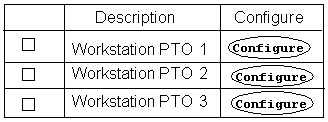
For example, to display columns with the headings "Description" and "Configure", create the following elements as children of the Item Selection Table element, and associate them with the same node as the table itself:
-
A Styled Text element: For the Text Source, select Associated Model Node System Property, and then select Description. Enter "Description" in the Table Column Header field.
-
A Button element (to enable the end user to navigate to and configure configurable items that appear in the table): For the Text Source, select Text Expression and then enter "Configure" in the field provided. Then, enter "Configure Item" in the Table Column Header Text field. Finally, define a Button Action of Drilldown to Subcomponent.
Item Selection Table shows how this table might appear at runtime.
At runtime, Oracle Configurator generates columns for each element you created, and displays a separate row for each of the associated Model node’s children.
-
See also Creating an Instance Management Table.
Tip: If you do not want to display a button for all of the items in the table, create a Flow Layout element beneath the Item Selection Table first, and then create the Button element as a child of the Flow Layout.
When you create a Button directly beneath the table element, the column containing the Button appears only if the first row in the table contains a Button. In the example above, the Configure column appears only because the row contains a Configure Button (since the first item in the table is configurable).
Creating an Instance Management Table
For general information about this element, see Instance Management Table.
The procedure below describes how to create an Instance Management Table manually. To create this element using a UI Content Template, see Creating a Region from a User Interface Content Template.
Tip: If you want to create this element manually, review the structure of the predefined Instance Management Table template in Configurator Developer before you begin. This template is described in Instance Management Control Templates.
The following procedure assumes you are modifying a UI in the User Interface area of the Workbench.
To create an Instance Management Table:
-
In the same row as the Layout Region in which you want the Instance Management Table to appear, click the icon in the Create column.
-
In the Create UI Content page, select Other, then select Instance Management Table from the list.
-
Click Continue.
-
Optionally modify the default Name.
-
Optionally modify the Associated Model Node setting.
You can associate an Instance Management Table only with an instantiable Component or instantiable Model Reference node.
-
To display a button in the table that enables an end user to add instances of the associated Model node at runtime, select Show Add Instances Button, and then define the button’s UI caption.
For details about defining a UI caption, see User Interface Element Captions and Details.
-
Optionally modify the default Formatting settings.
For details, see Formatting User Interface Elements.
-
Optionally specify a Sorting method for the table rows.
For details, see Sorting Options.
-
Optionally define a Display Condition, an Enabled Condition, or both for the table itself, and the table rows.
For details, see Runtime Conditions and User Interface Elements.
-
Click Apply.
-
Create the table columns. For examples, see Creating an Item Selection Table.
This step is required before you can unit test the UI.
Tip: If you want end users to be able to modify the name of each instance at runtime, create a Text Input element as the first child beneath the Instance Management Table element. For the Text Input element’s Display System Property setting, select InstanceName.
Creating a Connection Navigator Table
For general information about this element, see Connection Navigator Table.
The procedure below describes how to create a Connection Navigator Table manually. You can also create this element automatically using a UI Content Template. For details, see Creating a Region from a User Interface Content Template.
Tip: If you want to create this element manually, review the structure of the predefined Connection Navigator template in Configurator Developer before you begin. See Connection Navigator Template.
The following procedure assumes you are modifying a UI in the User Interface area of the Workbench.
To create a Connection Navigator Table:
-
In the same row as the layout element in which you want the Connection Navigator Table to appear, click the icon in the Create column.
-
In the Create UI Content page, select Other, then select Connection Navigator Table from the list.
-
Click Continue.
-
Optionally modify the default Name.
-
Optionally modify the default Formatting settings.
For details, see Formatting User Interface Elements.
-
Optionally specify Sorting options for the rows in the table (that is, each connected component).
For details, see Sorting Options.
-
Optionally define a Display Condition, an Enabled Condition, or both for the table itself or the rows in the table.
For details, see Runtime Conditions and User Interface Elements.
-
Click Apply.
-
Create a Styled Text element as a child of the Connection Navigator Table element. At runtime, this text is the table’s column header. See Creating a Styled Text Element.
When creating this element, specify the following:
-
Associated Model Node Property: Display Name
-
Link Action Type: Navigation (Drilldown to Subcomponent)
At runtime, the names of each connected component appear as links the user can click to navigate to the connected component.
-
-
If you want to display additional content in the table, create elements under the Connection Navigator Table element. At runtime, each additional element appears in a separate column.
For example, to indicate each connected component’s selection state, create a Selection Status Indicator element under the Styled Text element. For details, see Creating a Status Indicator or Unsatisfied Status Indicator.
Creating a Summary Table
For general information about this element, see Summary Table.
The procedure below describes how to create a Summary Table manually. You can also create this element automatically using a UI Content Template. For details, see Creating a Region from a User Interface Content Template.
Tip: If you want to create this element manually, review the structure of one of the predefined Summary Table templates in Configurator Developer before you begin. For details, see Summary Page Templates.
This procedure assumes you are modifying a UI in the User Interface area of the Workbench.
To create a Summary Table element:
-
In the same row as a layout element, click the icon in the Create column.
-
Select Other, and then select Summary Table from the list.
-
Click Continue.
-
Optionally modify the default Name.
-
In the Hierarchy Column Contents section, specify a Text Source, Style, and Table Column Header for the hierarchy column.
For details about these settings, see User Interface Element Captions and Details.
-
Specify display and formatting settings for the table. These settings include:
-
Width (percent): The width of the table as a percentage of the width of its container. Leave this field blank if you want the size of the table to be determined by its contents.
-
Expand all levels on entry: Select this setting to display all selected options and their parent nodes in the table when the end user navigates to the UI page. In other words, the hierarchy of selected options is expanded by default.
-
Dynamically update Summary data: Select this setting if you want the Summary Table to be updated automatically when the end user updates the configuration.
If you do not select this setting, Oracle Configurator updates the table only when the page is redisplayed; for example, when an end user navigates to the UI Page.
For example, you may want to select this setting to create a region that displays a "running summary" in a page that also contains controls for selecting options. Do not select this setting if you are creating a Summary page or template that does not provide option selection controls.
-
-
Optionally define a Display Condition for the table itself, or for rows within the table.
For details, see Runtime Conditions and User Interface Elements.
-
Click Apply.
-
Create the table columns.
This step is required before you can unit test the UI.
For examples, see Creating an Item Selection Table.
Displaying Invalid and Unsatisfied Items as Links in the Configuration Summary Page
For background information about this task, see:
To display all invalid and unsatisfied items as links in the Configuration Summary page:
-
Create a copy of the following predefined UI Content Templates:
Combination Status Region Template
Summary with Status Region
-
Open your copy of the Combination Status Region Template for editing.
-
Modify the Unsatisfied Item Template Reference so it refers to the Unsatisfied Items List with Links template, and then click Apply.
-
Modify the Validation Message List Template Reference so it refers to the Validation Failures List with Links template, and then click Apply.
-
Open your copy of the Summary with Status Region template for editing.
-
Modify the Combo Status Template Reference so it refers to your copy of the Combination Status Region Template, and then click Apply.
-
Open your UI Master Template for editing, and then go to the Utility Templates section.
-
Change the Configuration Summary/Preview setting so it refers to your copy of the Summary with Status Region template, and then click Apply.
-
Generate a new UI using the UI Master Template that you modified in the previous step.
-
Navigate to the Configuration Summary page and verify that all invalid and unsatisfied items appear as links.
If they do not, verify that you performed all steps above correctly and you used the correct UI Master Template to generate the UI.
Note: The steps above describe how to display unsatisfied and invalid items on the Configuration Summary page using the predefined UI templates. It is also possible to display these items as links on any UI page by creating a UI Template Reference to either the Unsatisfied Items List with Links template or the Validation Failures List with Links template.
Creating a Cell Format
Create a Cell Format to create and format cells within a Row Layout region. Row Layouts are described in Row Layout. For general information about the Cell Format element, see Cell Format.
This procedure assumes you are modifying a UI in the User Interface area of the Workbench.
To create a Cell Format:
-
In the same row as a Row Layout element, click the icon in the Create column.
-
Select Basic Layout Region, and then select Cell Format from the list.
-
Click Continue.
-
Optionally modify the default Name.
-
Optionally modify the Associated Model Node setting.
For details, see Changing an Element's Associated Model Node.
-
Optionally modify the default Formatting settings.
For details, see Formatting User Interface Elements.
-
Optionally define a Display Condition, an Enabled Condition, or both.
For details, see Defining a Condition for Runtime Display and Behavior.
-
Click Apply.
Creating a Styled Text Element
For general information about this element, see Styled Text.
This procedure assumes you are modifying a UI in the User Interface area of the Workbench.
To create a Styled Text element:
-
In the same row as any UI element, click the icon in the Create column.
-
Select Basic Element, and then select Styled Text from the list.
-
Click Continue.
-
Optionally modify the default Name.
-
Optionally modify the Associated Model Node setting.
For details, see Changing an Element's Associated Model Node.
-
Optionally modify the default Text Source setting and specify a Text Style.
For details, see User Interface Element Captions and Details.
-
Optionally define a Display Condition.
For details, see Runtime Conditions and User Interface Elements.
-
Click Apply.
Creating a Static Styled Text Element
For general information about this element, see Static Styled Text.
This procedure assumes you are modifying a UI in the User Interface area of the Workbench.
To create a Static Styled Text element:
-
In the same row as any UI element, click the icon in the Create column.
-
Select Basic Element, and then select Static Styled Text from the list.
-
Click Continue.
-
Optionally modify the default Name.
-
Optionally modify the Associated Model Node setting.
For details, see Changing an Element's Associated Model Node.
-
Enter a Prompt and then optionally specify a Text Style.
For details, see User Interface Element Captions and Details.
-
Optionally define a Display Condition.
For details, see Runtime Conditions and User Interface Elements.
-
Click Apply.
Creating a Formatted Text Element
For general information about this element, see Formatted Text.
This procedure assumes you are modifying a UI in the User Interface area of the Workbench.
To create a Formatted Text element:
-
In the same row as any UI element, click the icon in the Create column.
-
Select Other, and then select Formatted Text from the list.
-
Click Continue.
-
Optionally modify the default Name.
-
Optionally modify the Associated Model Node setting.
-
Optionally modify the default Text Source setting and specify a Text Style.
For details, see User Interface Element Captions and Details.
If you enter a text expression, note that Configurator Developer does not validate the syntax of the text you enter. Therefore, be sure to enter well-formed, valid HTML.
-
Optionally define a Display Condition.
For details, see Runtime Conditions and User Interface Elements.
-
Click Apply.
Creating a Text Link Element
For general information about this element, see Text Link.
This procedure assumes you are modifying a UI in the User Interface area of the Workbench.
To create a Text Link element:
-
In the same row as any UI element, click the icon in the Create column.
-
Select Other, and then select Text Link from the list.
-
Click Continue.
-
Optionally modify the default Name.
-
Optionally modify the Associated Model Node setting.
-
Optionally modify the default Text Source and Rollover Source settings and specify a Text Style.
For details, see User Interface Element Captions and Details.
If you enter a text expression, note that Configurator Developer does not validate the text’s syntax. Therefore, be sure to enter well-formed, valid HTML.
-
Define a Link Action.
For details, see Assigning Actions to User Interface Elements.
-
Optionally define a Display Condition.
For details, see Runtime Conditions and User Interface Elements.
-
Click Apply.
Creating a Raw Text Element
For general information about this element, see Raw Text.
This procedure assumes you are modifying a UI in the User Interface area of the Workbench.
To create a Raw Text element:
-
In the same row as any UI element, click the icon in the Create column.
-
Select Other, and then select Raw Text from the list.
-
Click Continue.
-
Optionally modify the default Name.
-
Optionally modify the Associated Model Node setting.
-
Optionally modify the default Text Source setting, specify a Text Style, and define a Link Action.
For details, see User Interface Element Captions and Details.
Configurator Developer does not validate the syntax of text that you enter in the Text Expression field. Therefore, be sure to enter well-formed, valid HTML.
-
Optionally define a Display Condition, an Enabled Condition, or both.
For details, see Runtime Conditions and User Interface Elements.
-
Click Apply.
Creating an Image Element
For general information about this element, see Image.
This procedure assumes you are modifying a UI in the User Interface area of the Workbench.
To create an Image element:
-
In the same row as any UI element, click the icon in the Create column.
-
Select Basic Element, and then select Image from the list.
-
Click Continue.
-
Optionally modify the default Name.
-
Optionally modify the Associated Model Node setting.
For details, see Changing an Element's Associated Model Node.
-
Optionally modify the default Image Source and Rollover Text Source settings.
For details, see User Interface Element Captions and Details.
-
Optionally define a Display Condition.
For details, see Runtime Conditions and User Interface Elements.
-
Click Apply.
Creating an Image Button
For general information about this element, see Image Button.
This procedure assumes you are modifying a UI in the User Interface area of the Workbench.
To create an Image Button:
-
In the same row as any UI element, click the icon in the Create column.
-
Select Basic Element, and then select Image Button from the list.
-
Click Continue.
-
Optionally modify the default Name.
-
Optionally modify the Associated Model Node setting.
For details, see Changing an Element's Associated Model Node.
-
Optionally modify the default Image Source and Rollover Text Source settings.
For details, see User Interface Element Captions and Details.
-
Optionally define a Link Action.
For details, see Assigning Actions to User Interface Elements.
-
Optionally define a Display Condition.
For details, see Runtime Conditions and User Interface Elements.
-
Click Apply.
Creating a Standard Button
For general information about this element, see Standard Button.
This procedure assumes you are modifying a UI in the User Interface area of the Workbench.
To create a Standard Button:
-
In the same row as any UI element, click the icon in the Create column.
-
Select Basic Element, and then select Standard Button from the list.
-
Click Continue.
-
Optionally modify the default Name.
-
Optionally modify the Associated Model Node setting.
For details, see Changing an Element's Associated Model Node.
-
Specify the Button’s action, UI caption, and access keys by selecting a Button Type.
For more information about access keys, see Standard Oracle Applications Shortcut Characters.
A Standard Button’s UI caption is the same as its type. For example, if the Button Type is Apply, the Button’s UI caption is "Apply".
-
Optionally define a Display Condition, an Enabled Condition, or both.
For details, see Runtime Conditions and User Interface Elements.
-
Click Apply.
Creating a Custom Button
For general information about this element, see Custom Button.
This procedure assumes you are modifying a UI in the User Interface area of the Workbench.
To create a Custom Button:
-
In the same row as any UI element, click the icon in the Create column.
-
Select Basic Element, and then select Custom Button from the list.
-
Click Continue.
-
Optionally modify the default Name.
-
Optionally modify the Associated Model Node setting.
For details, see Changing an Element's Associated Model Node.
-
Optionally modify the default Text Source and Rollover Text Source settings.
For details, see User Interface Element Captions and Details.
-
Optionally define a Button Action.
For details, see Assigning Actions to User Interface Elements.
-
Optionally define a Display Condition, an Enabled Condition, or both.
For details, see Runtime Conditions and User Interface Elements.
-
Click Apply.
Creating a Spacer
For general information about this element, see Spacer.
This procedure assumes you are modifying a UI in the User Interface area of the Workbench.
To create a Spacer element:
-
In the same row as any UI element, click the icon in the Create column.
-
Select Other, and then select Spacer from the list.
-
Click Continue.
-
Optionally modify the default Name.
-
Optionally modify the Associated Model Node setting.
For details, see Changing an Element's Associated Model Node.
-
Optionally modify the default Formatting settings.
For details, see Formatting User Interface Elements.
-
Optionally define a Display Condition.
For details, see Runtime Conditions and User Interface Elements.
-
Click Apply.
Creating a Separator
For general information about this element, see Separator.
This procedure assumes you are modifying a UI in the User Interface area of the Workbench.
To create a Separator:
-
In the same row as any UI element, click the icon in the Create column.
-
Select Basic Element, and then select Separator from the list.
-
Click Continue.
-
Optionally modify the default Name.
-
Optionally modify the Associated Model Node setting.
For details, see Changing an Element's Associated Model Node.
-
Optionally define a Display Condition.
For details, see Runtime Conditions and User Interface Elements.
-
Click Apply.
Creating a Check Box
For general information about this element, see Check Box.
This procedure assumes you are modifying a UI in the User Interface area of the Workbench.
To create a Check Box element:
-
In the same row as a UI Page or layout element (for example a Stack Layout or Row Layout), click the icon in the Create column.
-
Select Basic Element, and then select Check Box from the list.
-
Click Continue.
-
Optionally modify the default Name.
-
Optionally modify the Associated Model Node setting.
-
Optionally define a Display Condition, an Enabled Condition, or both.
For details, see Runtime Conditions and User Interface Elements.
-
Click Apply.
-
Optionally create another element to display a UI caption with the Check Box. For example, create either a Styled Text or Static Styled Text element. For details, see:
Creating an Enhanced Check Box
For general information about this element, see Enhanced Check Box.
This procedure assumes you are modifying a UI in the User Interface area of the Workbench.
To create an Enhanced Check Box element:
-
In the same row as a layout UI element (for example a Stack Layout or Row Layout), click the icon in the Create column.
-
Select Basic Element, and then select Enhanced Check Box from the list.
-
Click Continue.
-
Optionally modify the default Name.
-
Optionally modify the Associated Model Node setting.
-
Optionally define a Display Condition, an Enabled Condition, or both.
For details, see Runtime Conditions and User Interface Elements.
-
Click Apply.
-
Optionally create a Spacer element and another element to display a UI caption with the Enhanced Check Box. For example, create a Styled Text or Static Styled Text element. See:
Creating an Instantiation Check Box
For general information about this element, see Instantiation Check Box.
To create an Instantiation Check Box:
-
In the same row as a layout UI element (for example a Stack Layout or Row Layout), click the icon in the Create column.
-
Select Basic Element, and then select Instantiation Check Box from the list.
-
Click Continue.
-
Optionally modify the default Name.
-
Optionally modify the Associated Model Node setting.
-
Optionally define a Display Condition, an Enabled Condition, or both.
For details, see Runtime Conditions and User Interface Elements.
-
Click Apply.
-
Optionally create another element to display a UI caption with the Instantiation Check Box. For example, create a Styled Text or Static Styled Text element. See:
Creating a Radio Button
For general information about this element, see Radio Button.
This procedure assumes you are modifying a UI in the User Interface area of the Workbench.
To create a Radio Button:
-
In the same row as a layout UI element (for example a Stack Layout or Row Layout), click the icon in the Create column.
-
Select Basic Element, and then select Radio Button from the list.
-
Click Continue.
-
Optionally modify the default Name.
-
Optionally modify the Associated Model Node setting.
-
Optionally define a Display Condition, an Enabled Condition, or both.
For details, see Runtime Conditions and User Interface Elements.
-
Click Apply.
-
Optionally create another element to display a UI caption for the Radio Button. For example, create a Styled Text or Static Styled Text element. For details, see:
Creating an Enhanced Radio Button
For general information about this element, see Enhanced Radio Button.
This procedure assumes you are modifying a UI in the User Interface area of the Workbench.
To create an Enhanced Radio Button:
-
In the same row as a layout UI element (for example a Stack Layout or Row Layout), click the icon in the Create column.
-
Select Basic Element, and then select Enhanced Radio Button from the list.
-
Click Continue.
-
Optionally modify the default Name.
-
Optionally modify the Associated Model Node setting.
-
Optionally define a Display Condition, an Enabled Condition, or both.
For details, see Runtime Conditions and User Interface Elements.
-
Click Apply.
-
Optionally create another element to display a UI caption for the Enhanced Radio Button. For example, create a Styled Text or Static Styled Text element. See:
Creating a Drop-down List
For general information about this element, see Drop-down List.
This procedure assumes you are modifying a UI in the User Interface area of the Workbench.
To create a Drop-down List element:
-
In the same row as a layout UI element (for example a Stack Layout or Row Layout), click the icon in the Create column.
-
Select Basic Element, and then select Drop-down List from the list.
-
Click Continue.
-
Optionally modify the default Name.
-
Optionally modify the Associated Model Node setting.
-
Optionally modify the default Text Source setting.
For details, see User Interface Element Captions and Details.
-
Optionally enter an Excluded Item Prefix, an Excluded Item Prefix, or both.
Use these settings to indicate which items that appear in a drop-down list are excluded from the configuration at runtime. For example, if you enter "X -" in the Excluded Item Prefix field, each excluded item in the drop-down list appears as follows at runtime:
X - Item Display Name
Oracle Configurator inserts a space between the item’s display name and the prefix or suffix at runtime.
-
Optionally specify a Sorting method for options that will appear in the list.
For details, see Sorting Options.
-
Optionally define a Display Condition, an Enabled Condition, or both for the Drop-down List element itself. You can also click List Item Display Condition to define a display condition for items in the list.
For details, see Runtime Conditions and User Interface Elements.
-
Click Apply.
Creating a Text Input Element
For general information about this element, see Text Input.
This procedure assumes you are modifying a UI in the User Interface area of the Workbench.
To create a Text Input element:
-
In the same row as a valid parent UI element, click the icon in the Create column.
For a list of valid parent UI elements, see Text Input.
-
Select Basic Element, and then select Text Input from the list.
-
Click Continue.
-
Optionally modify the default Name.
-
Optionally modify the Associated Model Node setting.
-
Optionally modify the default Formatting settings.
For details, see Formatting User Interface Elements.
-
Optionally define a Display Condition, an Enabled Condition, or both.
For details, see Runtime Conditions and User Interface Elements.
-
Click Apply.
Creating a Status Indicator or Unsatisfied Status Indicator
For general information about these elements, see Selection Status and Unsatisfied Status Indicators.
This procedure assumes you are modifying a UI in the User Interface area of the Workbench.
To create a Selection Status Indicator or Unsatisfied Indicator element:
-
In the same row as any UI element, click the icon in the Create column.
-
Select Basic Element, and then select either Selection Status Indicator or Unsatisfied Indicator from the list.
-
Click Continue.
-
Optionally modify the default Name.
-
Optionally modify the Associated Model Node setting.
For details, see Changing an Element's Associated Model Node.
-
Optionally define a Display Condition.
For details, see Runtime Conditions and User Interface Elements.
-
Click Apply.
Creating a Content Container
For general information about this element, see Content Container.
This procedure assumes you are modifying a UI in the User Interface area of the Workbench.
To create a Content Container element:
-
In the same row as any UI element, click the icon in the Create column.
-
Select Basic Layout Region, and then select Content Container from the list.
-
Click Continue.
-
Optionally modify the default Name.
-
Optionally modify the Associated Model Node setting.
For details, see Changing an Element's Associated Model Node.
-
Optionally modify the default Formatting settings.
For details, see Formatting User Interface Elements.
-
Optionally define a Display Condition, an Enabled Condition, or both.
For details, see Runtime Conditions and User Interface Elements.
-
Click Apply.
Creating Switcher and Case Regions
For general information about Switcher and Case Regions, see Switcher and Case Regions.
This procedure assumes you have a UI open for editing in the UI area of the Workbench.
To create a Switcher Region:
-
In the same row as a UI Page, click the icon in the Create column.
-
Select Other, then select Switcher Region from the list.
-
Click Continue.
-
Optionally modify the default Name.
-
Optionally modify the Associated Model Node setting.
For details, see Changing an Element's Associated Model Node.
-
Optionally modify the Object setting. Select one of the following:
-
Select Bound to use the Switcher element’s Associated Model Node.
-
Select Other Model Node if you want to associate the Switcher with a different structure node.
-
Select Session Data to associate the Switcher with the status of the configuration.
-
-
Select a Property of the object specified in the previous step.
For details, see Switcher and Case Regions.
-
Click Apply.
-
Create a Case region (see below).
To create a Case region:
-
In the same row as a Switcher region, click the icon in the Create column.
The Case region’s details page appears. The default Switcher Object and Switcher Property are derived from the Case region’s parent (that is, the Switcher region).
-
Optionally modify the Associated Model Node setting.
For details, see Changing an Element's Associated Model Node.
-
Optionally modify the default Case Value by selecting a new value from the list, or by entering a value.
If the Switcher Property is Selection State, the Value setting is a drop-down list. If the Switcher Property is Value (that is, a Property value), then the Value setting is an input field.
-
Click Apply.
Creating a HideShow Region
For general information about HideShow Regions, see HideShow Region.
This procedure assumes you have a UI open for editing in the UI area of the Workbench.
To create a HideShow Region:
-
In the same row as a UI Page, click the icon in the Create column.
-
Select Basic Layout Region, and then select HideShow from the list.
-
Click Continue.
-
Optionally modify the default Name.
-
Optionally modify the default Associated Model Node.
For details, see User Interface Elements and Associated Model Nodes .
-
Specify a Text Source for the element’s expanded and collapsed states.
For details, see User Interface Element Captions and Details.
-
If you want the region to be collapsed the first time an end user views the page in which it appears, deselect the Initially Expanded check box.
-
Optionally enter the style sheet definition you want to use to render the caption text in the Style field.
By default, the style sheet BLAF.xss determines, the font, size, and color of the text. This style sheet is located in the oa_html/cabo/styles directory.
-
Optionally define a Display Condition, an Enabled Condition, or both.
For details, see Runtime Conditions and User Interface Elements.
-
Click Apply.
Creating a Menu
For general information about Menus, see Menus and Page Links.
This procedure assumes you have a UI open for editing in the UI area of the Workbench.
To create a Menu:
-
In the same row as the Menus Folder, click the icon in the Create column.
-
Enter a Name and optionally a Description.
-
Select a Menu Type:
-
Single Level Side Menu (see Single-Level Side Navigation UI Master Template)
-
Multi-level Side Menu (see Multiple-Level Side Navigation UI Master Template)
-
Model Tree Side Menu (see Dynamic Model Tree Navigation UI Master Template)
-
Subtab Layout (see Subtab Navigation UI Master Template)
-
-
To prevent the Menu from being updated when you refresh the UI, deselect Refresh Enabled.
For details, see Refreshing a User Interface.
-
Enter any additional information in the Notes field.
-
Click Apply.
-
Create the Menu’s Page Links.
For details, see Creating a Page Link.
Creating a Menu Label
Create a Menu Label to group a set of Page Links within a Multi-Level Menu. For general information about Menus, see Menu Labels.
This procedure assumes you have a UI open for editing in the UI area of the Workbench.
To create a Menu Label:
-
In the same row as a Multi-Level Menu, click the icon in the Create column.
-
Select Label, and then click Next.
-
Enter a Name.
-
Optionally modify the Associated Model Node setting.
For details, see User Interface Elements and Associated Model Nodes.
Define the Label Caption.
For details about each setting, see User Interface Element Captions and Details.
-
Click Finish, or click Finish and Create Another to create another Menu Label.
The Label you created appears in the UI area of the Workbench as a child of the Menu in which it will appear at runtime.
To group Page Links, create them as children of the Menu Label. See Creating a Page Link.
Creating a Page Link
For general information about Menus and Page Links, see Menus and Page Links.
You can group Page Links within a Multi-Level Menu by creating each group as children of a different Label Menu. See Creating a Menu Label.
This procedure assumes you are modifying a UI in the User Interface area of the Workbench.
To create a Page Link:
-
In the same row as a Menu or Menu Label, click the icon in the Create column.
-
If you are creating the Page Link within a Menu and the Menu’s type is Multi-Level, select Page Link, and then click Continue.
-
Select the UI Page that will be the Page Link’s target, and then click Next.
-
Enter a Name.
-
In the Contents section, specify how the runtime Oracle Configurator creates the Page Link’s UI caption (that is, the link text).
For details about each setting, see User Interface Element Captions and Details.
-
Click Apply, or Apply and Create Another.
The Page Link you created appears in the UI structure as a child of the Menu (or Menu Label) in which it will appear at runtime.
Creating a Page Flow
For general information about Page Flows, see Page Flows and Page References.
This procedure assumes you have a UI open for editing in the UI area of the Workbench.
To create a Page Flow:
-
In the same row as the Page Flows Folder, click the icon in the Create column.
-
Optionally modify the default Name.
-
To prevent the Page Flow from being updated when you refresh the UI, deselect Refresh Enabled.
For details, see The Refresh Enabled Setting.
-
Enter any additional information in the Notes field.
-
Click Apply.
-
Create Page References.
For details, see Creating a Page Reference.
Creating a Page Reference
Create Page References to incorporate UI Pages into a Page Flow. For general information about Page References and Page Flows, see Page Flows and Page References.
This procedure assumes you are modifying a UI in the User Interface area of the Workbench.
To create a Page Reference:
-
In the same row as a Page Flow, click the icon in the Create column.
-
Enter a Name, and then select a target UI Page.
-
Click Apply, or Apply and Create Another.
The Page Reference appears in the UI area of the Workbench as a child of the Page Flow.
Defining a Condition for Runtime Display and Behavior
For an overview of both display and enabled conditions, see Runtime Conditions and User Interface Elements.
The following procedure assumes you are working in the User Interface area of the Workbench.
To define a display or enabled condition for a UI element:
-
In the same row as the element for which you want to define a runtime condition, click the icon in the Edit column.
The element’s details page appears.
-
In the Conditional Presentation region, click Define next to Display Condition or Enabled Condition.
If the selected UI element is a Drop-down List, you can optionally define a display condition for individual items in the list. To do this, click Define next to List Item Display Condition.
-
In the Define Condition page, select an Object. This determines whether the condition refers to a Property of:
-
The UI element’s Bound Model Node (that is, its associated node)
-
A node that you specify (Other Model Node)
-
Configuration Session Data
If you are defining a List Item Display Condition, the default Object is List Item Model Node and you cannot change it.
-
-
Specify which Property of the Object you want Oracle Configurator to use when evaluating the condition. The options available in this list depend on the selected Object.
If the Object is a Model node, choose one of the node’s System Properties from the list. If the node can have a logic state at runtime, you can also choose Selection State, Logic State, or State.
Note: If you do not specify a System Property when creating a runtime condition, Configurator Developer assigns an implicit Property reference. For details, see Node Types and Implicit System Properties Used in Runtime Conditions and Text Expressions.
If the node is a Numeric Feature, it cannot have a logic state. In this case, select Value, and then specify a value in the Value field (see below).
If the Object is Session Data, select a configuration session property. For example, Valid, Unsatisfied, or ModelQuantity. For a complete list and a description of each, see Configuration Session Properties.
-
Indicate how the selected Property is evaluated against the value you specified by selecting a Comparison of Is or Is Not.
-
Select or enter a Value.
For example, if Property is set to Logic State, select Selected, Selectable, or Excluded. If Property is set to Value, enter a value.
-
Click Apply.
-
In the element’s detail page, click Apply to save the condition.
Refreshing a User Interface
For a general information about refreshing a UI, see Refreshing a User Interface.
The following procedure assumes you have a Model open for editing and are working in the User Interface area of the Workbench.
To refresh a User Interface:
-
In the same row as the UI you want to refresh, click the icon in the Refresh column.
-
Click Yes.
To refresh all User Interfaces that have changed since they were created or last refreshed:
-
Open the Model for editing.
-
In the General area of the Workbench, click Refresh UIs. See UI Refresh Status.
Formatting User Interface Elements
A UI element’s details page contains various formatting settings that determine the element’s appearance at runtime. The prompt for each setting indicates the unit of measure used at runtime. For example, Display Length (in lines).
The following procedure assumes you are working in the User Interface area of the Workbench.
To format a UI element:
-
In the same row as the element you want to modify, click the icon in the Edit column.
The element’s details page appears.
-
Modify the Formatting settings.
Depending on the selected element’s type, the following settings may be available:
-
Display Length: How much horizontal space to allocate for this element.
-
Display Height: How much vertical space to allocate for this element.
-
Width: The selected element’s width, as a percentage, relative the UI page or table. This value is relative to either the UI page or a table, depending on the selected element’s type.
-
Horizontal Alignment and Vertical Alignment: The location of the selected element in a UI page or within a table. Choose Left, Center, Right, Start, or End.
-
Number of rows to display at a time: The maximum number of rows to display in a table. When a table contains more than the number of rows specified here, a separate UI control is provided at runtime to view the additional rows.
-
Password-style: This setting is available only for a Text Input UI element. Select this box if you want Oracle Configurator to display any text that the end user enters as asterisks (for example, "******"). You may want to do this if the element is used to collect sensitive information, such as an end user’s credit card number.
-
-
Click Apply to save your changes.
Sorting Options
When editing some elements, such as an Item Selection Table or a Drop-down List, you can specify the order in which the element’s options appear at runtime. In an Item Selection Table, the Sorting settings determine the order in which the table rows appear. In a Drop-down List, these settings determine the order in which the options appear in the list.
When a sorting method is defined for a UI element, the runtime Oracle Configurator immediately updates the order in which the element’s options appear based on the end user’s actions. For example, the sorting method for an Item Selection List is based on the value of the DisplayName System Property, in ascending order, and List Selectable Items first is selected. At runtime, the options appear in the table alphabetically, in ascending order, based on their display name. If an end user selects an option that causes the first option in the table to be excluded from the configuration, Oracle Configurator immediately reorders the options and the excluded option appears at the bottom of the table (because it is no longer selectable). If the end user then selects the excluded option and overrides the contradiction message that appears, the option returns to its original position at the top of the table.
The following procedure assumes you are working in the User Interface of the Workbench.
To modify the order in which rows appear in a table or options appear in a list:
-
In the same row as the element, click the icon in the Edit column.
The element’s details page appears.
-
Modify the Sorting settings.
These settings include:
-
Sort Field: Select No Sorting to list options in the same order as they appear in the Model structure.
Select Item Caption to sort options alphabetically using their display name (see Sort Order, below).
Select List Item System Property or List Item User Property to sort options alphabetically using one of the associated node’s Properties. Note that these settings are labeled Row Item System Property and Row Item User Property when viewing the details page for a table element.
For details about the System Properties that appear in this list, see System Properties.
-
Sort Order: This setting controls whether Oracle Configurator sorts options in ascending or descending order, based on the Sort Field setting.
-
List selectable items first: Select this setting to display all selectable options in the list or table before any excluded options.
This setting is not available for all UI elements that provide Sorting settings, such as the Connection Navigator Table.
For more information about runtime selection states, see Logic State, Selection State, and Detailed Selection State Values.
-
-
Click Apply to save your changes.
Changing an Element's Associated Model Node
For general information about the relationship between Model structure nodes and UI elements, see User Interface Elements and Associated Model Nodes.
The following procedure assumes you are working in the User Interface area of the Workbench.
To associate a Model node with a UI element, or modify an existing association:
-
In the same row as the element, click the icon in the Edit column.
The element’s details page appears.
-
Select one of the following settings for the Associated Model Node:
-
Inherited from Parent: This associates the UI element with its parent Model node. This is the default setting.
-
Specified: Select this setting and then click Choose Node to associate the UI element with a Model node that you specify.
-
None: Select this setting if you do not want to associate the UI element with a node or any session data. If you choose this setting, be sure the element’s caption and rollover text sources are set to use a Configurator Session Property or a Text Expression. See User Interface Element Captions and Details.
The list of available settings depends on the selected UI element’s type.
-
-
Click Apply to save your changes.
Assigning Actions to User Interface Elements
For general information about actions, see User Interface Actions.
The following procedure assumes you are working in the User Interface area of the Workbench.
To assign an action to a UI element:
-
In the same row as the element, click the icon in the Edit column.
The element’s details page appears.
-
Next to the Element Type Action setting, click Define.
-
Select an Action Type and an associated action.
For a description of each action, see User Interface Actions.
-
If you selected an action of Start Page Flow, click Choose Page Flow and then select a Page Flow from the list.
-
If you selected an Action Type of either Open URL or Raise Command Event, see Action Parameters for details about the additional parameters that are required.
-
Click Apply to save your changes.
Creating a User Interface Content Template
For background information about UI Content Templates, see User Interface Content Templates.
You can create a UI Content Template either by copying one of the predefined UI Content Templates, or create the template from scratch. In each case, you begin the process in the Main area of the Repository.
You may want to create a UI Content Template from scratch if your business requires reusable UI content that cannot be created simply by modifying one of the predefined templates. When you create a template from scratch, you must then open it for editing in the User Interface area of the Workbench and define its content (for example, by creating some of the UI elements described in Introduction to User Interface Structure and Design ).
If you created a template by copying one of the predefined templates, you may want to modify some of the template’s existing elements, add new elements, or modify the template’s structure. For details, see Editing a User Interface Content Template.
For an example of how custom UI Content Templates can be used in a UI, see Designing and Creating a User Interface Page.
Related Topics
Creating a User Interface Content Template by Copying an Existing Template
Creating a UI Content Template from Scratch
Creating a User Interface Content Template by Copying an Existing Template
To create a UI Content Template by copying an existing template:
-
In the Main area of the Repository, select the UI Content Template you want to copy.
-
Select Copy from the Actions list.
-
Specify the destination for the new template, then click Finish.
-
Open the new template for editing, and create new elements or modify existing elements as required.
Creating a UI Content Template from Scratch
Before creating a UI Content Template from scratch, review the structure of a predefined template that is of the same type as the template you want to create. For example, before creating a Multi-Instance Control UI Content Template, review the structure of the predefined Instance Management Table template. This enables you to see the structure and types of UI elements that the template uses to display content at runtime, and use it as a guideline when creating your own template.
You may also want to create a test UI to review how the predefined Content Templates display content at runtime. If the Content Template you are interested in is not used by any of the predefined Master Templates by default, create a Master Template, modify it to use the Content Template you want to test, and then create a UI using the Master Template that you created. See UI Master Template Information and Settings.
To create a UI Content Template from scratch:
-
In the Main area of the Repository, in the same row as the Folder in which you want to store the new template, click the icon in the Create column.
-
Select UI Content Template, and then click Continue.
Refer to Common Steps for Creating a User Interface Content Template for the remaining steps.
User Interface Content Template Settings
This section describes the various settings that are available when you are creating or editing a UI Content Template.
The settings that appear depend on the template’s type and may include the following:
-
Root Layout Region: Select Basic Layout Region or Node List Layout Region. For details about this setting, see Layout Regions. This setting is available for the following types of UI Content Templates:
-
Selection Control
-
Utility
-
Generic
-
-
Layout Style: This setting enables Configurator Developer to group and display templates with compatible Layout Styles together. For example, when creating UI content using a template, Configurator Developer displays all available templates in a table. Templates with compatible Layout Styles appear sequentially in the table. For example, select Label/Data Row Layout or Multi-column Row Layout. Select Other if you do not want to group this template. This setting is available for the following types of UI Content Templates:
-
Selection Control
-
Generic
-
-
Title Text: The text that appears in the message header at runtime. This setting is available for all Message Templates and some Utility Templates.
-
Presentation: This setting determines whether the message appears as a Modal Message Box or a Dialog Page at runtime. This setting is available for all Message Templates.
For a description of each message type, see The Predefined Message UI Content Templates.
-
Button Bar Template: If the Presentation setting is Dialog Page, click Choose to select a Button Bar Template. This setting is available for all Message Templates and the Connection Chooser Utility template.
For details about this type of template, see The Predefined Button Bar UI Content Templates.
-
Associated Model Node: This setting is available only for Outer Page Templates, and it controls which node the template will be associated with at runtime. In other words, it determines which node the Outer Page Template uses as the source of the information that it displays at runtime.
Select one of the following:
-
Select Inherit from Page if you want the template’s associated Model node to be the node that is associated with the UI Page displayed inside the template.
-
Select Use Model Root if you want the template’s associated Model node to be the root node of the Model. If the UI Page appears in a referenced UI, the Model root refers to the Model that is the root of the configuration, not the child (referenced) Model.
For more information, see User Interface Elements and Associated Model Nodes .
Outer Page Templates are described in Outer Page Templates.
-
Common Steps for Creating a User Interface Content Template
The steps below assume you are creating a UI Content Template from scratch and are viewing the template’s details page.
To complete a UI Content Template’s definition:
-
Select a Template Type.
Configurator Developer uses this setting to determine which templates appear when you are creating or modifying a UI Master Template. For example, you are modifying a UI Master Template and want to select a different Utility Template for the Two-Page Flow Navigation setting. When you click the Choose button, Configurator Developer displays only templates whose type is Utility Template.
-
If you selected a Template Type of Control Template, Message Template, or Utility Template, select a specific Control, Message, or Utility template type from the list.
-
Click Continue.
-
Enter a Name, Description, and any Notes.
A UI template’s name must be unique within the Folder in which you are creating it.
-
Select or enter values for each additional setting.
For details about the various UI Content Templates settings, see User Interface Content Template Settings.
-
Click Apply.
-
From the Main area of the Repository, open the template for editing. The structure of the template appears in the User Interface area of the Workbench.
-
Create the elements that define the template’s content.
For example, if you created a Button Bar template, define the buttons, their labels, and a runtime action for each. For details, see Creating User Interface Page Content.
-
When the template is complete, click Apply to save it.
Editing a User Interface Content Template
The predefined UI Content Templates are read-only. The procedure below assumes you are editing a template that you created either from scratch or by copying one of the predefined templates.
Editing a UI Content Template is similar to editing a UI. For example, you open the template for editing in the User Interface area of the Workbench, and then create, move, and modify UI elements that comprise the template.
By default, you can edit a UI Content Template only if it is not locked or it is locked by you. For details, see Locking Models and UI Content Templates.
To modify a UI Content Template:
-
From the Main area of the Repository, expand the Folder in which the template is stored.
-
In the same row as the template, click the icon in the Locking column.
For details, see Locking Models and UI Content Templates.
-
In the same row as the template, click the icon in the Edit column.
The template opens for editing in the User Interface area of the Workbench.
-
Modify the template by adding, moving, or modifying UI elements.
For details, see Creating User Interface Page Content.
Editing a User Interface Master Template
The predefined UI Master Templates are read-only. The procedure below assumes you have either created a UI Master Template from scratch or by copying one of the predefined templates. See Creating a User Interface Master Template.
To edit a UI Master Template:
-
From the Main area of the Repository, expand the Folder in which the template is stored.
-
In the same row as the template, click the icon in the Edit column.
-
Modify the template by navigating to each section and changing the pagination and layout settings, specifying different UI Content Templates, and so on.
For more information, see UI Master Template Information and Settings.
Creating a Page Include Region
For general information about this element, see Page Include Region.
This procedure assumes you are modifying a UI in the User Interface area of the Workbench.
To create a Page Include Region:
-
Expand the UI Page or Layout Region in which you want the Page Include Region to appear, and then click the icon in the Create column.
You can create a Page Include Region as a child of any Layout Region except a Node List Layout Region or a Message List Layout Region. You cannot create a Page Include Region as a child of a Table-based element, such as an Item Selection Table or Instance Management Table.
-
Select Other, and then select Page Include Region from the list.
-
Click Continue.
-
Select a Target Page from the list, and then click Continue.
For details, see Target Pages.
-
In the Page Include Region’s details page, optionally modify the default Name.
Note that the Associated Model Node is specified. The element inherits this setting from the target Page.
-
Click Apply.