User Interface Structure and Design
This chapter covers the following topics:
- Introduction to User Interface Structure and Design
- User Interface Structure
- User Interface Definition
- User Interface Pages
- Menus and Page Links
- Page Flows and Page References
- Limitations when Creating UI Pages, Page Flows, and Menus
- Layout Regions
- Basic User Interface Elements
- Other User Interface Elements
- Runtime Conditions and User Interface Elements
- User Interface Element Captions and Details
- User Interface Actions
- User Interface Elements and Associated Model Nodes
- Associated Model Nodes and Page Scope
- Generating and Reusing User Interface Content
- Displaying Optionally Instantiable Component Details on a Parent UI Page
- Designing and Creating a User Interface Page
Introduction to User Interface Structure and Design
There are two ways to create a User Interface in Configurator Developer. You can generate either:
-
A UI that is based on your Model’s structure
-
An "empty" UI (that is, one that is not based on the Model’s structure and for which you define all content)
When you generate a UI that is based on your Model’s structure, Configurator Developer uses the UI Master Template you specify to generate the UI’s content, including the option selection controls for each Model node, navigation controls, UI Pages, and so on. For more information, see User Interface Master Templates.
Generate an empty UI if you want to build a UI from scratch and do not want it to be based on the Model’s structure. When you generate an empty UI, Configurator Developer creates a single empty UI Page with the primary navigation method specified by the UI Master Template, and the UI’s basic structure. This structure includes the UI Definition node and the Pages, Menus, and Page Flows Folders (see Collapsed User Interface Structure and System Folders in Configurator Developer). These Folders store all of the UI elements you create when building the UI. For example, you create Menus in the Menus Folder, UI Pages in the Pages Folder, and so on. You create individual UI elements, such as option selection controls, buttons, images, and so on, within a UI Page. These tasks are explained in Editing a User Interface.
User Interfaces that you generate in Configurator Developer use the Oracle Applications Framework and conform to Oracle’s standards for browser accessibility, look, and feel. They also assure a seamless integration with other Oracle Applications products.
Unit Testing
You do not have to generate a UI to unit test a configuration model in Configurator Developer. If you have not yet generated a UI, you can unit test it using the Model Debugger. For more information, see The Model Debugger.
You can unit test a configuration model in a generated UI at any time. For details, see Unit Testing a Generated User Interface.
User Interfaces and the Runtime Oracle Configurator
For a configuration model to be available in a host application such as Oracle Order Management, you must generate a UI in Configurator Developer and then publish both the Model and the UI. Publishing is explained inIntroduction to Publishing.
A host application launches the Generic Configurator User Interface when a user makes a request to configure an item that is based on a BOM Model that was never published from Configurator Developer, or when no UI is found that matches the provided applicability parameters. For more information about the Generic Configurator UI, see the Oracle Configurator Implementation Guide.
Custom User Interfaces
You can optionally use a different application to create a custom user interface that accesses the Configuration Interface Object (CIO). This implementation is not described directly in any Oracle Configurator documentation. For details about the CIO, see the Oracle Configurator Extensions and Interface Object Developer’s Guide.
User Interface Structure
A UI has a hierarchical structure. When you create an empty UI, or generate a UI that is based on the Model’s structure, you can view or modify its structure in the User Interface area of the Workbench. See Collapsed User Interface Structure and System Folders in Configurator Developer.
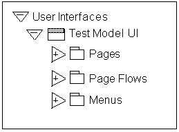
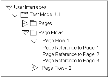
Collapsed User Interface Structure and System Folders in Configurator Developer
The root node of a UI is called the UI Definition. You can open this node for editing to modify settings and review general information about the UI. For details, see User Interface Definition.
A UI’s structure also contains the following predefined Folders, which contain automatically generated and manually created UI content:
-
Pages: This Folder contains all UI Pages.
For details, see User Interface Pages and Layout Regions.
-
Page Flows: This Folder contains one or more Page Flows.
For details, see Page Flows and Page References.
-
Menus: This Folder contains one or more Menus.
For details, see Menus and Page Links.
User Interface Definition
The UI Definition is the root node of a User Interface’s structure. In Collapsed User Interface Structure and System Folders in Configurator Developer, the UI Definition node is called Test Model UI.
The UI Definition node’s details page contains general information about the UI, including:
-
The UI Master Template used to create the UI
-
The UI’s primary navigation style
-
Whether the UI allows nested transactions
-
Whether an Outer Page Template is used
-
Whether pricing and ATP information is displayed and how it is updated and recalculated at runtime
-
Whether the UI can be refreshed
-
The initial Page Flow, Menu, or UI Page that appears at runtime
-
All Message Templates used by the UI
-
All standard or control and indicator images used in the UI (such as Enhanced Check Boxes, Enhanced Radio Buttons, and Indicator Images)
-
Any referenced UIs
The UI Master Template used to generate the UI determines the default values for all settings and information that appears in the UI Definition’s details page.
You can perform the following operations on the UI Definition node:
-
Refresh: Updates the UI with any recent changes made to the Model structure.
-
Delete: Deletes the selected UI.
-
Edit: You can change the selected UI Content Templates and images specified by the UI Master Template, select different referenced UIs, modify Pricing and ATP settings, and update the UI name or description.
For details, see Modifying the User Interface Definition.
User Interface Pages
In the User Interface area of the Workbench, UI Pages appear in the Pages Folder and represent a page that an end user can navigate to in the runtime User Interface. In the UI structure, UI Pages appear as top-level Layout Region UI elements. These elements contain substructure that represents the page’s content, which may include item selection controls, text, images, buttons, and so on. See User Interface Page Structure and Content.
Note: The Oracle Configurator Developer User’s Guide uses "UI Pages" and "Pages" when referring to the objects described in this section, which appear in the User Interface section of the Workbench in Configurator Developer. The term "pages" (lowercase p) refers to these objects at runtime.
User Interface Page Structure and Content
When you generate a UI that is based on the Model’s structure, Configurator Developer generates UI Pages based on the Pagination settings specified in your UI Master Template. These settings are described in Pagination and Layout Section. For example, when you generate a UI using one of the predefined UI Master Templates, Configurator Developer creates a UI Page for each Model, BOM Model, Component, and BOM Option Class node in your Model (assuming the Include in Generated UI setting is selected for each node).
When you create a new UI Page, you must select an Associated Model Node. See User Interface Elements and Associated Model Nodes. After selecting a Model node and saving the UI Page, you cannot change the Page’s associated Model node.
You can also modify existing UI Pages by adding UI content. The types of UI elements you can create include Buttons, Images, selection controls, and Layout Regions. All elements that appear as children of a UI Page in the UI structure appear on the same page at runtime.
See Creating a User Interface Page.
Empty User Interface Pages
When you generate a UI, it is possible for a UI Master Template to create an empty (blank) UI page for nodes that have no child nodes. It is also possible to create an empty UI Page (that is, a page that has no content).
If a UI contains any empty UI pages when a configuration session begins, the runtime Oracle Configurator ignores them. For example, a UI that uses the Step-by-Step navigation style skips any pages with no content when the end user navigates from one page to the next. This ensures that your end users do not see these pages when using the default navigation controls during a configuration session.
If an end user uses a UI control defined when customizing the UI to navigate to an empty page (for example, a UI control assigned to the Go to Page action), Oracle Configurator displays a message stating that the target page is empty. When the user clicks OK to proceed, Oracle Configurator displays the next page in the flow or sequence. For example, if the end user tries to navigate to page 3 and that page is empty, Oracle Configurator displays page 4 after the end user clicks OK in response to the message.
If the first page in a UI is blank, the Configuration Summary page appears when the configuration session begins (this is also true when all of the UI Pages in the UI are empty).
If all of a page's content is hidden dynamically during the configuration session (that is, due to display conditions), end users can navigate to the empty page. To prevent users from navigating to such pages, you may want to define a display condition on the page-level elements in your Model so the page themselves will not be available when all of their content is hidden.
Empty UI Pages appear in the UI’s structure so you can add content to them when customizing the UI. However, if the UI has a Menu, Configurator Developer does not automatically create Page Links to any empty UI Pages. If the UI contains a Page Flow instead of a Menu, Configurator Developer does not add empty UI Pages to the Page Flow. Menus and Page Links are described in Menus and Page Links.
If you add child structure to a node that previously generated an empty UI Page, or add content to an empty UI Page, you must refresh the UI. Depending on the UI’s primary navigation method, refreshing the UI either adds the previously empty UI Page to the Page Flow, or creates a new Page Link within the Menu.
For more information, see:
Menus and Page Links
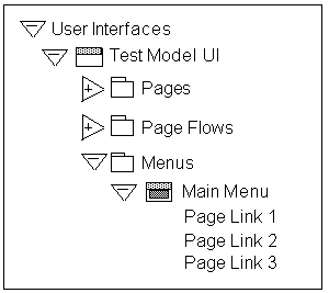
A Menu is a group of links that enable end users to navigate the runtime User Interface. These links are called Page Links, and the target of each link is always a UI Page.
When viewing the UI structure in Configurator Developer, each Page Link appears as a child of the Menu. See User Interface Structure in Configurator Developer with Menu and Page Links.
A Menu is linked to the UI Definition via the Primary Menu setting, and serves as an Oracle Configurator end user’s "point of entry" into the UI. (The UI Definition is described in User Interface Definition.)
User Interface Structure in Configurator Developer with Menu and Page Links
When you generate a UI, the UI Master Template’s Primary Navigation setting controls whether Configurator Developer generates a Menu, and if it does, the Menu’s type.
Following are the available Menu types:
-
Single Level Side Menu (see Single-Level Side Navigation UI Master Template)
-
Multi-Level Side Menu (see Multiple-Level Side Navigation UI Master Template)
-
Model Tree Side Menu (see Dynamic Model Tree Navigation UI Master Template)
-
Subtab Layout (see Subtab Navigation UI Master Template)
Additionally, when you generate:
-
A UI that is based on the Model structure, Configurator Developer generates Page Links to each UI Page.
-
An empty UI, the Menu contains a single Page Link that points to the only UI Page in the UI (this page is empty by default).
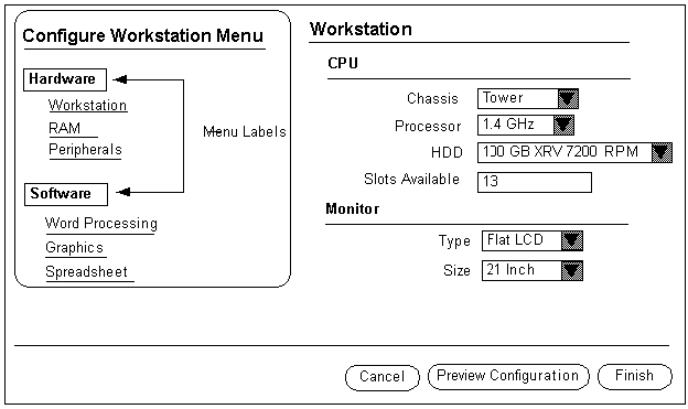
Depending on the Menu’s type, its Page Links appear in either the top left region of each page or as sub-tabs at the top and bottom of each page at runtime. Side Menu and Menu Labels at Runtime shows a UI that uses the Single-level Side Menu navigation style. This type of UI displays a Menu in the top left region of each page.
Configurator Developer does not generate a Menu if the UI Master Template’s primary navigation style is Step-by-Step or Single Page. In the Step-by-Step case, Configurator Developer generates a Page Flow instead of a Menu. For details, see Page Flows and Page References. If the navigation style is Single Page, the UI does not require any navigation controls, so none are created.
When a UI’s primary navigation style is Dynamic Tree, the UI contains a Model Tree Side Menu. This type of Menu does not contain any Page Links when viewed in Configurator Developer. This is because a Model Tree Side Menu displays links to Pages in a hierarchical arrangement that is based on the Model structure and cannot be modified in Configurator Developer.
See Creating a Menu.
Menu Labels
Create a Menu Label to group a set of Page Links within a Multi-Level Side Menu. For example, your Model contains several parts and the UI has several pages for configuring each part. You can use Menu Labels to separate the Page Links for each part of the product into groups. See Side Menu and Menu Labels at Runtime.
Side Menu and Menu Labels at Runtime
Page Flows and Page References
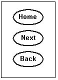
A Page Flow defines a set of pages that an Oracle Configurator end user accesses sequentially using navigation buttons, such as Back and Next. Configurator Developer automatically generates a Page Flow when your UI Master Template’s primary navigation style is Step-by-Step.
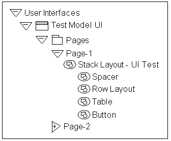
In the UI structure, Page References appear as children of a Page Flow, as shown in Page Flows and Page References in the UI Structure. Each Page Reference has a UI Page as its target. The order in which Pages are accessed at runtime is defined by the order of the Page References in the UI structure.
In other words, the Page that is the target of the first Page Reference in a Page Flow (the one at the top in the hierarchy) appears first at runtime, the Page below it appears next, and so on. Reordering Page References in the UI structure changes the order in which Pages appear in a Step-by-Step UI.
Page Flows and Page References in the UI Structure
After generating an empty UI, you can create a Page Flow in the Page Flows Folder, and then create Page References (links) to each UI Page. When creating a Page Reference, you select a UI Page as its target. When creating a Page Reference, Pages in a referenced UI are available as targets only if they are within the scope of the Page Flow’s page base. For more information about page scope and a definition of page base, see Associated Model Nodes and Page Scope.
For more information, see:
Limitations when Creating UI Pages, Page Flows, and Menus
A UI may have one or more Page Flows or Menus. When a UI contains multiple Page Flows or Menus, each one must refer to (and contain) different UI Pages. Therefore, when creating a Page Link, you cannot select a Page that already exists within another Page Flow as the link’s target. Similarly, you cannot create a Page Reference to a Page that is already linked to a Menu.
However, you can enable end users to navigate from a UI Page that is linked to a Menu, to a UI Page that is part of a Page Flow. To do this, create a Button or Image element and assign it to the "Go to Page" action. For details, see User Interface Actions.
Layout Regions
A Layout Region contains and organizes UI Page content, which includes other types of UI elements such as a Radio Button Group, Images, or an Item Selection Table. This type of element is not visible in the runtime UI.
When viewing the UI’s structure, all UI elements that appear as children of a Layout Region are arranged and displayed according to the region’s type at runtime. For example, if you create several Button UI elements under a Stack Layout Region, the buttons are "stacked" at runtime. In other words, they are displayed above one another. See Buttons Displayed within a Stack Layout.
Similarly, to display UI elements in a table, create a Table Layout element and then create the elements you want to appear in the table under the Table Layout. Table Layouts are described in Table Layout.
Tip: To understand how Layout Regions are used, generate a UI that is based on the Model structure using one of the predefined UI Master Templates. Then, review the structure of specific UI Pages carefully in the User Interface area of the Workbench, noting the relationship between Layout Regions and their child UI elements in the structure. Finally, unit test the UI to see how the elements are arranged on each page at runtime.
When viewing the UI’s structure in Configurator Developer, elements that exist at the same level (for example, within the same parent) appear one above the other. The element that appears first in the UI’s structure appears first within its parent element at runtime. The element below it in the structure appears next at runtime, and so on, from left to right. For an example, see Runtime Display of UI Elements Within a Row Layout.
A Layout Region is usually associated with a Component, BOM Model, or BOM Option Class. However, you can, for example, create a Layout Region to represent a single Option Feature with all of its Options displayed as individual controls (such as images with Select actions).
Note: For more information about the UI elements described in this chapter and examples of how they can be used, see the Oracle Application Framework Documentation Resource, Release 12, on MetaLink.
Following are the available Layout Region types:
Layout Region Variations
You can create a Basic Layout Region or a List Layout Region. A List Layout Region can be either a Node List Layout Region or a Message List Layout Region.
After indicating whether you want to create a Basic Node List or a List Layout Region, you specify its type. A Layout Region’s type controls how its associated UI content is displayed. Layout Region types include Row Layout, Flow Layout, Table Layout, Header Region, and so on. See Layout Region Variations and Types.
| Layout Region Variation | Row Layout | Flow Layout | Stack Layout | Bulleted List | Table Layout | Header Region | HideShow Region |
|---|---|---|---|---|---|---|---|
| Basic Layout Region | Y | Y | Y | Y | Y | Y | Y |
| Node List Layout Region | Y | Y | Y | Y | Y | N | N |
| Instance List Layout Region | N | Y | Y | N | Y | Y | N |
| Message List Layout Region | Y | Y | Y | Y | Y | N | N |
To create a Layout Region, see Creating a Layout Region.
Basic Layout Region
A Basic Layout Region contains only what you specify in Configurator Developer when you create it and, unlike a List Layout Region, it is not populated with additional content at runtime.
List Layout Regions
There are three types of List Layout Regions: Node List Layout Regions, Instance List Layout Regions, and Message List Layout Regions.
A Node List Layout Region repeats its contents once for each of its associated Model node’s children.
You can associate a Node List Layout Region with the following Model structure nodes:
-
BOM Model
-
BOM Option Class
-
Option Feature
For example, you want check boxes to appear next to each of a Feature’s Options at runtime. In the User Interface area of the Workbench, you create a Node List Layout Region and associate it with the Feature. In the Node List Layout Region, you then create a single Row Layout Region containing a Check Box and a Styled Text element (to display the state and label for each of the Feature’s Options). At runtime, a check box and text is generated and appears in a separate Row Layout for each of the Feature’s Options. (An example of a Row Layout is shown in Runtime Display of UI Elements Within a Row Layout.)
You cannot create a Node List Layout Region under a Message List Layout Region.
An Instance List Layout Region displays content from optional or instantiable component instances on the root Model’s UI Page, or on a Page that is the parent of those instances. For examples and information, see Displaying Optionally Instantiable Component Details on a Parent UI Page and Instance List Layout.
A Message List Layout Region repeats its contents once for each message of the specified type. For example, if the Message Type is Invalid Item List, a message similar to the following appears for each invalid item in the configuration: "Item item name is invalid."
For example, you want to add content to a Notifications Message Box. You create a Message List Layout Region using a Stack Layout, and select a Message Type of Pricing Notifications. At runtime, the contents of the Message List Layout Region are rendered once for each message, and the messages are displayed in a vertical list (that is, in a Stack Layout).
Following are the available Message Types:
-
Invalid Item List
-
Unsatisfied Item List
-
Pricing Notification List
-
ATP Notification List
-
CX (Configurator Extension) Message List
-
Reason List
-
Consequence List
-
Expert Message List
Which Message Types are available depends on the context in which you are creating the region. For example, if you are creating a Message List Layout Region within an Overridable Contradiction Message UI Content Template, you can select a Message Type of Reason List, Consequence List, or Expert Message List.
Message List Layout Regions are not associated with Model structure nodes. When creating a Message List Layout Region, you specify a Message Type, and optionally a display or enabled condition. The Message Type determines the class of message that is displayed in the region at runtime. For example, if the Message Type is Invalid Items, the Message List Layout Region lists each invalid item in the configuration. If no message of the specified type exists, then the list is empty.
Instance List Layout
Where appropriate, all of the UI customization functionality available under basic layout regions is available under an Instance List Layout Region.
The following User Interface elements specifically related to Instance Lists are available inside an Instance List Layout Region:
-
Instance List Stack Layout Region
-
Instance List Header Region
-
Instance List Flow Layout Region
-
Instance List Table Layout Region
When you create an Instance List Table Layout Region, Configurator Developer automatically creates two child Row Layout elements in the region: the Header Row Layout, which renders the table's header at runtime, and the Content Row Layout, which renders the content of each instance of the Instance List Table Layout Region's AMN. You cannot create other elements as children of an Instance List Table Layout Region. You cannot copy, delete, or move the Header Row and Content Row elements from an Instance List Table Layout Region, but you can reorder their child elements to achieve the desired arrangement.
You can use the Display Header Row setting in the Instance List Table Layout Region's details page to control whether the header region of the table appears at runtime. You can use the Style setting to specify a style class from a Cascading Style Sheet (CSS) that controls the region's formatting at runtime. You can use the Oracle CSS styles described on the Oracle Technology Network (http://www.oracle.com/technology/).
The Associated Model Node (AMN) for these Instance List elements must be either an instantiable Component or an instantiable Model Reference. At runtime, these elements display the content of their AMN once for each component instance.
You can create these UI elements on a UI Page or within any of the Instance Control UI Content Templates. For example, the BOM Item Table Control Templates, the Instance Management Control Templates, and so on.
For example, add an Instance List Layout Region to a custom Instance Control Template and then specify this template in a custom UI Master Template ("Instantiable BOM Model References" and "Instantiable Components and Non-BOM Model References" settings). You can also optionally create content in the generated UI using your custom UI Content Template, and add UI elements for displaying the details of newly-created instances under the Instance List Layout Region.
The Instance List Row Layout can have only a Cell Format as a child. All other Instance List Layout Region types can have the same UI elements as children as the existing Stack Layout region. The Instance List Row Layout is only available under the Instance List Table Layout Region.
You can nest Instance List Layout Regions, though only in a User Interface, not in a Content Template.
See Creating a Layout Region for details on how to add one of these elements to your UI.
Refreshing User Interfaces
Keep the following in mind when refreshing a UI containing Instance List Layout Regions:
-
An Instance List Layout Region changes to a basic Layout Region if its AMN is no longer optionally instantiable (for example, if the node's Minimum and Maximum Instances settings change from 1/5 to 1/1).
-
A basic Layout Region changes to an Instance List Layout Region if its AMN becomes optionally instantiable (for example, the node's Minimum and Maximum Instances settings change from 1/1 to 1/5).
These changes do not affect the appearance or behavior of the runtime UI.
Stack Layout
Create a Stack Layout when you want to arrange UI content vertically. For example, you want to display three buttons, one above the other, on the same page. You create a Stack Layout, and then create three Button elements under the Stack Layout. Buttons Displayed within a Stack Layout shows how the buttons might appear at runtime.
Buttons Displayed within a Stack Layout
You can associate a Stack Layout with any type of Model node.
To create a Stack Layout, see Creating a Layout Region.
Table Layout
A Table Layout element arranges its child elements in cells like a table at runtime, but it does not display any grid lines. This element contains a Row Layout for each row, with each cell specified by the contents of the Row Layouts.
When you create a Table Layout element, you must always create a Row Layout and then a Cell Format element to complete the structure.
For example:
Table Layout
|_ Row Layout
  |_ Cell Format
In other words, each Table Layout must have at least one child Row Layout, and each Row Layout must have at least one child Cell Format. (These elements are described in Row Layout and Cell Format.) A Table Layout arranges all of its child elements in a grid, while a Row Layout arranges its children in a row from left to right. A Cell Format contains the specific UI element you want to display in the table, such as text, a button, an image, and so on.
After creating this structure, add additional UI content as a child of the Cell Format. Do not skip any regions in the structure shown above as this can result in incorrect HTML output.
For example, you want to create a table for BOM Option Class X, which contains three BOM Standard Items. In the User Interface area of the Workbench:
-
Create a Node List Table Layout, and associate it with BOM Option Class X.
-
Create a Row Layout within (as a child of) the Table Layout.
-
Create a Cell Format within the Row Layout.
-
Create a Check Box, Text Input, and Styled Text element within the Cell Format, and enter a display name (caption) of Select, Quantity, and Name, respectively.
When viewing the UI’s structure in the User Interface area of the Workbench, these elements appear as the Row Layout’s children.
At runtime, the three BOM Standard Items appear in a table similar to the one shown in Item Selection Table.
A Table Layout is useful when other Layout Regions do not provide enough flexibility for arranging a particular set of content. For example, instead of using a standard list or a table control, you may want to present a set of Feature Options as an arrangement of images and text with associated actions. You can also nest Table Layouts for even greater control over page appearance.
A Table Layout is different from an Item Selection Table or Summary Table. In Item Selection and Summary Tables, you specify the cell contents individually and the cells can be unrelated, rather than being determined by the intersection of row and column specifications. Also, Item Selection and Summary tables display with visible borders and grid lines, whereas a Table Layout generally does not. When you generate a UI, Configurator Developer controls the alignment of similar Row Layout-based content by wrapping the content in Table Layouts.
Typically, you want a Table Layout to fill the entire space in which it is rendered. If you specify a smaller percentage, content whose horizontal alignment is specified as "center" or "end" might not appear as you expect it to (since this type of region does not automatically expand to fill the available space). However, you can specify a number of pixels (300), or a smaller percentage if necessary.
You can associate a Table Layout with any type of Model node.
To create a Table Layout, see Creating a Layout Region.
Row Layout
Use a Row Layout to arrange UI content horizontally in a row and align content both horizontally and vertically. This type of element can exist alone, but it typically appears as a child of a Table Layout and arranges its children from left to right (that is, in a row). Any type of element can be a child of a Row Layout, but most often a Row Layout is a parent of one or more Cell Formats. See Table Layout.
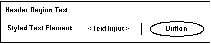
For example, you create a Row Layout under a Header Region, and then create the following elements beneath the Row Layout: Styled Text, Text Input, and Button.
Header Region
|_ Row Layout
  |_ Cell Format 1
     |_ Styled Text
  |_    Cell Format 2
     |_ Text Input
  |_ Cell Format 3
     |_ Button
At runtime, the Styled Text, Text Input, and Button elements appear in a row, from left to right, as shown in Runtime Display of UI Elements Within a Row Layout.
Runtime Display of UI Elements Within a Row Layout
Horizontal Alignment settings for a Row Layout include Start, Center, and End. Vertical Alignment settings include Top, Middle, and Bottom. Use these settings to align the content of each Cell Format. You can also specify a Row Layout’s total width in pixels or as a percentage of the page.
You can associate a Row Layout with any type of Model node.
When editing a UI, you can create a Row Layout as a child of the following UI elements:
-
Row Layout
-
Table Layout
-
Stack Layout
-
Flow Layout
-
Cell Format
-
Connection Targets Table
-
Content Container
-
Header Region
-
Instance Management Table
-
Instance Management Control
-
Item Selection Table
-
Summary Table
-
Case Region
To create a Row Layout, see Creating a Layout Region.
Note: For important information about defining a display condition for an element that is a child of a Row Layout, see Runtime Conditions and User Interface Elements.
Flow Layout
Like a Row Layout, a Flow Layout also arranges UI content horizontally. (See Row Layout.) However, a Flow Layout displays content from either left to right or right to left (depending on the Web browser’s localization settings) and automatically wraps content when necessary. You may want to use a Flow Layout instead of a Row Layout when precise vertical alignment of the element’s content is not essential.
You can associate a Flow Layout with any type of Model node.
When editing a UI, you can create a Flow Layout as a child of the following UI elements:
-
Row Layout
-
Table Layout
-
Stack Layout
-
Flow Layout
-
Cell Format
-
Connection Targets Table
-
Content Container
-
Header Region
-
Case Region
-
Instance Management Table
-
Instance Management Control
-
Item Selection Table
-
Summary Table
To create a Flow Layout, see Creating a Layout Region.
Cell Format
Use Cell Format elements to create and format cells within a Row Layout region. (See Row Layout.) A Cell Format also allows you to control the width and horizontal and vertical alignment of its content.
You can associate a Cell Format with any type of Model node.
If a display condition prevents a Cell Format element from appearing at runtime, it appears as an empty cell in the row in which it is defined. Defining a display condition is explained in Runtime Conditions and User Interface Elements.
If you need to control the alignment of the Cell Format’s content, use the Vertical Alignment and Horizontal Alignment settings. For example, if you want text that appears within the Cell Format to appear at the top of the region, set the Vertical Alignment to Top and the Horizontal Alignment to Start.
The details page of a Cell Format element (or an Instance List Table Layout Region) contains a setting called Style. Use this setting to specify a style class from a Cascading Style Sheet (CSS) to control the element's formatting at runtime. You can use the Oracle CSS styles described on the Oracle Technology Network (http://www.oracle.com/technology/).
When editing a UI, you can create a Cell Format as a child of the following UI elements:
-
Case Region
-
Cell Format
-
Content Container
-
Flow Layout
-
Header Region
-
Row Layout
-
Stack Layout
-
Table Layout
-
Instance Management Control
To create a Cell Format element, see Creating a Cell Format.
Note: For important information about defining a display condition for an element that is a child of a Row Layout, see Runtime Conditions and User Interface Elements.
Header Region
A Header Region represents a labeled subdivision of a page and displays its contents beneath a title and a horizontal rule. A Header Region’s content is stacked vertically under the title area, making it a good choice for laying out Model content.
Headers can be nested into Subheaders and Sub-subheaders, causing the label style and indentation to be automatically adjusted. Configurator Developer does not limit how many levels of sub-headers you can create.
Header Region and Two Nested Header Regions at Runtime shows how a Header Region that contains two sub-Header Regions appears at runtime. In this example, the Header Region is called Workstation, and the sub-Header Regions are called CPU and Monitor.
Header Region and Two Nested Header Regions at Runtime
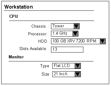
When viewing the UI’s structure in Configurator Developer, the selection controls shown in Header Region and Two Nested Header Regions at Runtime (such as Chassis) appear as Row Layout elements, and are children of a Header Region element (that is, CPU and Monitor). See Row Layout.
When generating a UI, Configurator Developer may use Header (and subheader and sub-subheader) regions to group the contents of required single-instance Components and BOM Option Classes. Additionally, if the pagination settings in your UI Master Template for nested Components and BOM Option Classes are set to Add to Parent Page, each child element displays with its own header. This setting is explained in Defining Custom Pagination and Layout.
You can associate a Header Region with any type of Model node.
When editing a UI, you can create a Header Region as a child of the following UI elements:
-
Case Region
-
Cell Format
-
Content Container
-
Flow Layout
-
Header Region
-
Row Layout
-
Stack Layout
-
Table Layout
-
Instance Management Control
To create a Header Region, see Creating a Layout Region.
HideShow Region
Use this element to enable an end user to selectively hide or display UI content. At runtime, a toggle-style UI control enables the end user to collapse or expand the region, thereby displaying or hiding the region’s contents.
When viewing the UI’s structure in Configurator Developer, all elements that are children of a HideShow Region represent content that an end user can choose to hide or display.
When editing a UI, you can create a HideShow Region as a child of the following UI elements:
-
Row Layout
-
Cell Format
-
Flow Layout
-
Stack Layout
-
Table Layout
-
Header Region
-
Case Region
-
Content Container
-
Summary Table
-
Item Selection Table
-
Flow Layout
-
Instance Management Control
-
Instance Management Table
-
Connection Targets Table
To create a HideShow Region, see Creating a HideShow Region.
Bulleted List
This element displays a bullet character before each of its children at runtime. All of a Bulleted List’s child elements must be Text elements (for example, Styled Text or Input Text). You can associate a Bulleted List with any type of Model node.
When editing a UI, you can create a Bulleted List as a child of the following UI elements:
-
Cell Format
-
Content Container
-
Connections Target Table
-
Flow Layout
-
Header Region
-
Row Layout
-
Stack Layout
-
Table Layout
-
Case Region
-
Instance Management Control
To create a Bulleted List, see Creating a Layout Region.
Basic User Interface Elements
The elements described in this section appear in the "Basic" category when you are creating a UI element in the User Interface area of the Workbench.
For a description of elements that appear in the "Other" category, see Other User Interface Elements.
Styled Text
Create this element to display text in a UI. For example, you may want to provide additional information about a specific option to help end users select the one that meets their requirements.
When defining a Styled Text element, you can either enter the text that you want to display directly, or choose to derive it from one of its associated node’s System Properties, User Properties, or a Configuration Session Property.
To display text as a hypertext link at runtime, create a Text Link. See Text Link.
When editing a UI, you can:
-
Associate a Styled Text element with any type of Model node
-
Create a Styled Text element as a child of any other UI element.
When editing a UI, you can create a Styled Text element as a child of the following UI elements:
-
Row Layout
-
Cell Format
-
Flow Layout
-
Stack Layout
-
Bulleted List
-
Table Layout
-
Header Region
-
Case Region
-
Content Container
-
Summary Table
-
Item Selection Table
-
Instance Management Table
-
Instance Management Control
-
Connection Targets Table
To create a Styled Text element, see Creating a Styled Text Element.
Static Styled Text
This UI element is similar to a Styled Text element, but its content is specified as a simple text string. That is, it cannot derive its content from node or session properties. You can use a Static Styled Text element anywhere you need to display some hard-coded text (text that is not Model or session-related). For example, this element is used in the predefined Message Templates to display boilerplate text such as "Select Yes to continue or No to return to the configuration."
To display text as a hypertext link at runtime, create a Text Link. See Text Link.
When editing a UI, you can create an Enhanced Check Box element as a child of the same UI elements as those listed in Styled Text.
To create a Static Styled Text element, see Creating a Styled Text Element .
Formatted Text
This UI element is similar to the Raw Text element, but it supports only specific HTML text formatting tags along with the text to be displayed at runtime. In other words, it accepts a limited set of HTML markup and displays formatted results in the runtime UI.
This element supports the following HTML markup:
-
<br>
-
<hr>
-
<li>
-
<pre>
-
<ol>
-
<ul>
-
<small>
-
<p>
-
<b>
-
<i>
-
<tt>
-
<span>
-
<big>
-
<a>
The Formatted Text element also supports the following HTML entities:
-
<
-
>
-
&
-
®
-
©
-
-
"
When using any of the HTML entities listed above, type the backslash character ("\") before the ampersand ("&"). For example:
\
For details, see Text Expressions and Keyboard Shortcuts.
When editing a UI, you can create a Formatted Text element as a child of the same UI elements as those listed in Styled Text.
To create a Formatted Text element, see Creating a Formatted Text Element.
Text Link
Create this element when you want to display a hypertext link in the UI. When defining a Text Link, you can either enter the text that appears at runtime directly, or choose to derive it from one of the element’s associated node’s System Properties, User Properties, or a Configuration Session Property. This is described in User Interface Element Captions and Details.
For a list of the available actions you can assign to this element, see User Interface Actions.
To create a Text Link, see Creating a Text Link Element.
Image
Use this element to display a Model node as an image at runtime. For example, you may want to display a picture of each item in BOM Option Class. To do this, you create an Image element, select the BOM Option Class as its associated Model node, and use the Image Source setting to indicate the image file to use.
To enable end users to execute an action by clicking an image, create an Image Button. See, Image Button.
For details about where an image file must be located to appear at runtime, see Images Section.
When editing a UI, you can:
-
Associate an Image with any type of Model node
-
Create an Image element as a child of any other UI element.
When editing a UI, you can create an Image element as a child of the following UI elements:
-
Row Layout
-
Cell Format
-
Flow Layout
-
Stack Layout
-
Bulleted List
-
Table Layout
-
Header Region
-
Case Region
-
Content Container
-
Summary Table
-
Item Selection Table
-
Instance Management Table
-
Instance Management Control
-
Connection Targets Table
To create an Image element, see Creating an Image Element.
Note: To display an Image or Image Button element within a table (for example, in a column within a BOM Instance Management Table), create the element as a child of a Layout Region and then enter text in the Table Column Header for the Layout Region element. If you add an Image or Image Button element to a table, but not as a child of a Layout Region, the column in which the element appears will not contain any header text at runtime (in other words, the Image or Image Button’s Table Column Header Text does not appear).
Image Button
Create this element to display an image with an associated action, such as Go to Page, Add Instance, or Open URL. In other words, an Oracle Configurator end user can click the image you specify to navigate to another page in the UI or to an external Web page, for example.
For a list of the available actions you can assign to this element, see User Interface Actions.
To create an Image Button, see Creating an Image Button.
For important information about displaying an Image Button within a table, see the note in Image.
Using an Image Button at Runtime
You want to represent selectable items as images at runtime. Doing this provides the following runtime behavior:
-
Clicking on the image selects the option if it is not selected, or deselects it if it is selected
-
The image is different depending on whether the option is selected, not selected, or excluded
To do this, perform the following:
-
Create a Switcher element and specify a Switcher condition of Selection State.
For details, see Creating Switcher and Case Regions.
-
Create three Case elements within the Switcher element and specify the possible states of the option (selected, not selected, excluded) as the Case Value for the Switcher to display one of the images.
-
Create three separate Image Button elements inside each Case element, each with a different image URL.
-
Assign a Select action to the Images for the "not selected" and "excluded" cases. (The option in this case is the Image’s associated Model node.)
For details about UI actions, see User Interface Actions.
-
Assign a Deselect action to the Image Button for the "selected" case.
When editing a UI, you can create an Image Button element as a child of the same UI elements as any Layout Region. See Layout Regions.
Standard Button
Create this element to define commonly used buttons, like those used by the predefined Button Bar UI Content Templates. (For example, Apply, Finish, Yes, No, Back, and Next.)
When you create a Standard Button, the Button Type you select determines the Button’s runtime action, UI caption, and access keys. For more information, see Standard Oracle Applications Shortcut Characters.
When editing a UI, you can create a Standard Button element as a child of the following UI elements:
-
Row Layout
-
Cell Format
-
Flow Layout
-
Stack Layout
-
Bulleted List
-
Table Layout
-
Header Region
-
Case Region
-
Content Container
-
Summary Table
-
Item Selection Table
-
Instance Management Table
-
Instance Management Control
-
Connection Targets Table
When editing a UI, you can create a Standard Button element as a child of any type of Layout Region. See Layout Regions.
To create a Standard Button, see Creating a Standard Button.
Custom Button
Create a Custom Button when you want to:
-
Assign an action that a Standard Button does not provide (see Standard Button)
For example, you can create a button to add a Component to the configuration, navigate to a specific page, or update the list prices for all selected items. You can also perform custom actions by associating a button with a Command Event to trigger a Configurator Extension. For more information, see User Interface Actions.
-
Specify how the button’s UI caption is created at runtime
-
Define the button’s rollover text (that is, the text that appears when the end user places the mouse over the Button, or navigates to the Button by pressing the Tab key)
When editing a UI, you can create a Custom Button element as a child of any type of Layout Region. See Layout Regions.
To create a Custom Button, see Creating a Custom Button.
Spacer
Use this element to fine-tune the layout of a page by adding space between other UI elements. For example, create a Spacer element to insert a fixed amount of space within a Layout Region.
When editing a UI, you can:
-
Associate a Spacer with any type of Model node
-
Create a Spacer as a child of any other UI element.
When editing a UI, you can create a Spacer element as a child of the following UI elements:
-
Row Layout
-
Cell Format
-
Flow Layout
-
Stack Layout
-
Bulleted List
-
Table Layout
-
Header Region
-
Case Region
-
Content Container
-
Item Selection Table
-
Instance Management Control
To create a Spacer element, see Creating a Spacer.
Separator
This element is useful when you need to visually separate UI content on a page, such as header text that precedes a group of selection controls. At runtime, a Separator element appears as a thin line below it’s parent element. For example, in Header Region and Two Nested Header Regions at Runtime, the lines that appear beneath the text Workstation, CPU, and Monitor is a Separator element.
To create a Separator, see Creating a Separator.
Check Box
Use this element to display a Model node as a standard HTML check box. At runtime, an end user uses the check box to add an option to or remove it from the configuration (in other words, the element’s associated Model node).
You can associate a check box with the following Model structure nodes:
-
BOM Model (instantiable or non-instantiable)
-
BOM Option Class
-
BOM Standard Item
-
Option Feature
-
Option
-
Boolean Feature
-
BOM Model Reference
When editing a UI, you can create a Check Box element as a child of the following UI elements:
-
Row Layout
-
Cell Format
-
Flow Layout
-
Stack Layout
-
Table Layout
-
Header Region
-
Case Region
-
Content Container
-
Summary Table
-
Item Selection Table
-
Instance Management Table
-
Instance Management Control
-
Connection Targets Table
To create a Check Box element, see Creating a Check Box.
Enhanced Check Box
This element is a graphical check box that displays the selection state of its associated structure node using the image specified in your UI Master Template. (A node’s selection state determines which image appears at runtime.)
For more information, see:
When editing a UI, you can create an Enhanced Check Box element as a child of the same UI elements as those listed in Check Box.
To create an Enhanced Check Box element, see Creating an Enhanced Check Box.
Instantiation Check Box
Use this element to control the instantiation of a Model Reference or a Component that is defined as an Optional Single Instance.
For example, you create this element and, for its Associated Model Node setting, specify a Component whose Instances setting is set to Optional Single Instance. At runtime, an end user selects this check box to create an instance of the Component and add it to the configuration.
This element is part of the predefined Instance Management Control content template. For details about this template, see Instance Management Control Templates.
When editing a UI, you can create an Instantiation Check Box element as a child of an Instance Management Control or any type of Layout Region. See Layout Regions.
To create an Instantiation Check Box, see Creating an Instantiation Check Box.
Radio Button
Use this element to display a single Feature Option or BOM item. At runtime, an end user uses the radio button to add an item to, or remove it from, the configuration. (The item referred to here is the element’s associated Model node.)
You can associate a Radio Button element with the following Model structure nodes:
-
BOM Model
-
BOM Option Class
-
BOM Standard Item
-
Option
When editing a UI, you can create a Radio Button element as a child of the following UI elements:
-
Row Layout
-
Cell Format
-
Flow Layout
-
Stack Layout
-
Table Layout
-
Header Region
-
Case Region
-
Content Container
-
Instance Management Control
To create a Radio Button element, see Creating a Radio Button.
Enhanced Radio Button
This element is a graphical radio button that displays the selection state of its associated structure node using the image specified in your UI Master Template.
For more information, see:
When editing a UI, you can create an Enhanced Radio Button element as a child of the same UI elements as those listed in Radio Button.
To create an Enhanced Radio Button element, see Creating an Enhanced Radio Button.
Drop-down List
Use this element to display a List of Options Feature with a Maximum Selections of 1, or a BOM Option Class containing mutually exclusive Items when displaying the item’s quantity is not required.
You can associate a Drop-down List element with the following Model structure nodes:
-
BOM Model
-
BOM Option Class
-
Option Feature
When editing a UI, you can create a Drop-down List element as a child of the following UI elements:
-
Row Layout
-
Cell Format
-
Flow Layout
-
Stack Layout
-
Table Layout
-
Header Region
-
Case Region
-
Content Container
-
Summary Table
-
Instance Management Control
-
Instance Management Table
-
Item Selection Table
-
Connection Targets Table
To create a Drop-down List element, see Creating a Drop-down List.
Text Input
Use this element to display and set the value of the following Feature types: Text, Integer, Count, Decimal. You can also use it to display the quantity of a BOM item or Counted Option, or the name of a Component or Model instance.
You can associate a Text Input element with the following Model structure nodes:
-
BOM Model
-
BOM Option Class
-
BOM Standard Item
-
Text Feature
-
Integer Feature
-
Decimal Feature
-
Instantiable Component
When editing a UI, you can create a Text Input element as a child of the following UI elements:
-
Row Layout
-
Cell Format
-
Flow Layout
-
Stack Layout
-
Table Layout
-
Header Region
-
Case Region
-
Content Container
-
Summary Table
-
Item Selection Table
-
Instance Management Table
-
Instance Management Control
-
Connection Targets Table
When creating a Text Input UI element within an Instance List Layout Region, the Display System Property setting appears in the element's details page when the UI element's Associated Model Node (AMN) is a BOM Model. In this case, you can choose to display either the AMN's InstanceName or Quantity System Property as the element's UI caption at runtime.
If the AMN is not a BOM Model, then the Display System Property setting does not appear in the Text Input details page. In this case, the element's UI caption is set to InstanceName and you cannot change it.
To create a Text Input element, see Creating a Text Input Element.
Selection Status and Unsatisfied Status Indicators
Use the Status Indicator and Unsatisfied Status Indicator elements to display an image that indicates the status of a specific node at runtime. The settings in the Images section of your UI Master Template control which images appear at runtime.
When you create this element, you specify an associated Model node. At runtime, Oracle Configurator checks the node’s selection state and displays the corresponding image specified in your UI Master Template.
For example, you associate the Status Indicator with Feature X and set the Indicator Type to Selection State. When an Oracle Configurator end user selects Feature X, the image that is specified for the User Selected setting in your UI Master Template appears next to Feature X.
For more information, see:
You can associate a Status Indicator element with the following Model structure nodes:
-
BOM Model
-
BOM Option Class
-
BOM Standard Item
-
Option Feature
-
Option
You can associate an Unsatisfied Indicator element with all of the above except Options. You can also associate this element with Connectors and Text Features. The following nodes can be unsatisfied at runtime: Option Features, BOM Option Classes, Connectors, and Text Features.
When editing a UI, you can create a Status Indicator or Unsatisfied Indicator as a child the following UI elements:
-
Row Layout
-
Cell Format
-
Flow Layout
-
Stack Layout
-
Bulleted List
-
Table Layout
-
Header Region
-
Case Region
-
Content Container
-
Summary Table
-
Item Selection Table
-
Instance Management Table
-
Instance Management Control
-
Connection Targets Table
To create a Status Indicator or Unsatisfied Indicator element, see Creating a Status Indicator or Unsatisfied Status Indicator.
Other User Interface Elements
The elements described in this section appear in the "Other" category when you are creating a UI element in the User Interface area of the workbench.
For a description of elements that appear in the "Basic" category, see Basic User Interface Elements.
UI Template Reference
For details about this element, see:
Switcher and Case Regions
The Switcher and Case regions are elements you can create in the User Interface area of the Workbench and appear in a UI’s structure. However, they do not appear in the runtime UI. You use these regions to define a conditional expression that controls which of the Case region’s child UI elements appear at runtime.
You specify the condition to evaluate as a runtime property of the Switcher region’s associated node (for example, logic state), or the status of the configuration itself (in other words, a configuration session property). You then specify each of the possible results in one or more Case regions. At runtime, Oracle Configurator tests the condition and displays the content defined for the Case region that matches the condition.
For example, the predefined Basic Transaction Button Bar UI Content Template contains a Switcher and two Case regions. These regions check whether the end user is currently in a nested transaction and display either an Apply or a Finish button based on the answer. Following is the Case Condition defined for the Case Region called "True":
Switcher Object: Configuration Session
Switcher Property: InNestedTransaction
Case Value: Value = True
Following is the Case Condition defined for the Case Region called "Default Case":
Switcher Object: Configuration Session
Switcher Property: InNestedTransaction
Case Value: Value = False
If the configuration session is currently in a nested transaction, then the UI page contains an Apply button. Otherwise, it contains a Finish button.
Whether an item appears may be based on the status of a Model node or the status of the configuration itself. You can associate a Switcher or Case region with any type of Model node.
For example, if the object of the Switcher region (condition) is a structure node, select one of the following System Properties:
-
LogicState
-
MinSelected
-
MaxSelected
-
Satisfied
-
SelectableChildren
-
HasChildren
For more information, see System Properties.
If the object of the Switcher condition is Session Data, select one of the following:
-
ModelQuantity
-
TotalListPrice
-
TotalSellingPrice
-
ListPriceEnabled
-
SellingPriceEnabled
-
PricingEnabled
-
ATPEnabled
-
PriceAndATPDisabled
-
Currency
-
Valid
-
Unsatisfied
-
ConfigHeaderID
-
ConfigRevisionNumber
-
InNestedTransaction
-
IsContainerModel
The Session Data system properties refer to the status of the configuration itself. For example, if you select Valid as the Session Data property and the configuration is valid, then the contents of the Case region are displayed.
For more information, see Configuration Session Properties.
When editing a UI, you can create a Switcher Region as a child the following UI elements:
-
Row Layout
-
Cell Format
-
Flow Layout
-
Stack Layout
-
Table Layout
-
Header Region
-
Case Region
-
Content Container
-
Summary Table
-
Item Selection Table
-
Instance Management Table
-
Instance Management Control
-
Connection Targets Table
You can create a Case Region only under a Switcher Region.
To create a Switcher or Case Region, see Creating Switcher and Case Regions.
Content Container
A Content Container is a separate region in a page that is offset by a different color. You may want to create this UI element to highlight specific information in a UI page.
For example, you want to display additional information about the item being configured to guide an end user’s selections. You create a Content Container containing the word "Tip" as header text and create a Text element to display the text that the end user sees (that is, the container’s content).
When editing a UI, you can create a Content Container element as a child the following UI elements:
-
Row Layout
-
Cell Format
-
Flow Layout
-
Stack Layout
-
Table Layout
-
Header Region
-
Case Region
-
Content Container
-
Instance Management Control
To create a Content Container, see Creating a Content Container.
Summary Table
This UI element displays all orderable options that are selected during a configuration session in a table. (For details about what makes an option orderable, see Orderable Items). You may want to add this element to specific UI pages, for example, so end users can view all of the items they have selected without navigating to the Configuration Summary page. For more information, see The Configuration Summary Page.
You can create a Summary Table on any UI Page, but the Summary Table element’s Associated Model Node is always the root node of the Model.
When editing a UI, you can create a Summary Table element as a child of the following UI elements:
-
Row Layout
-
Cell Format
-
Flow Layout
-
Stack Layout
-
Table Layout
-
Header Region
-
Case Region
-
Content Container
Item Selection Table
An Item Selection Table enables Oracle Configurator end users to select, deselect, and set the quantity of Feature Options or BOM items. Configurator Developer uses these tables when you generate a UI that is based on the Model structure and your UI Master Template uses the Content Templates described in the following sections:
You can create this type of table manually, or by using one of the templates listed above. Refer to the following sections for more information:
You can associate an Item Selection Table with the following Model structure nodes:
-
BOM Model
-
BOM Option Class
-
Option Feature
When editing a UI, you can create an Item Selection Table as a child of the following UI elements:
-
Cell Format
-
Flow Layout
-
Stack Layout
-
Table Layout
-
Header Region
-
Case Region
-
Content Container
To create an Item Selection Table, see Creating an Item Selection Table.
Instance Management Table
Create this element to enable an end user to configure and add instances of a Component or Reference to a non-imported Model that can have multiple instances. For background information, see Introduction to Instantiation.
An example of this table is shown in An Instance Management Table at Runtime.
You can associate an Instance Management Table with the following Model structure nodes:
-
Instantiable Component
-
Instantiable Model Reference
When editing a UI, you can create an Instance Management Table as a child of the following UI elements:
-
Cell Format
-
Flow Layout or Instance List Flow Layout Region
-
Stack Layout or Instance List Flow Layout Region
-
Table Layout or Instance List Flow Layout Region
-
Header Region or Instance List Flow Layout Region
-
Case Region
-
Content Container
You can create this table manually, or use the predefined Instance Management Table UI Content Template to generate it. For details, see:
Note: If your UI uses a Dynamic Model Tree navigation style and you specify Sorting settings for an Item Selection Table, the order in which instances appear in the Tree might not reflect the order of instances in the table. The Sorting settings are described in Sorting Options.
Connection Navigator Table
Create this element to list all components that are currently connected to the selected instance in a table at runtime. (In other words, all components that are connected to the component the Oracle Configurator end user is viewing.) This element is useful in Models that support connectivity. For details, see Introduction to Connectivity.
When you create this element using the Connection Navigator Template, each component name appears as a link that the end user can use to navigate to that component. When you create a Connection Navigator Table manually, you must create each link separately. For details about the Connection Navigator Template, see Connection Navigator Template.
A Connection Navigator Table is associated with the root Model node by default, and you cannot change this association. For details about associated Model nodes, see User Interface Elements and Associated Model Nodes.
A Connection Navigator Table does not contain information at runtime if no connections exist in the configuration.
The Go to Node action may be disabled at runtime in certain circumstances. For details, see Go to Node Action and Nested Transactions.
When editing a UI, you can create a Connection Navigator Table as a child of the following UI elements:
-
Cell Format
-
Flow Layout
-
Stack Layout
-
Table Layout
-
Header Region
-
Case Region
-
Content Container
For more information, see:
Navigation Bar
Use this element to indicate which page in a sequence the end user is viewing. For example, you add this element to each UI Page in a Page Flow containing five Pages. At runtime, this element displays "Page 1 of 5" on the first page, "Page 2 of 5" on the second, and so on.
This element is part of the following predefined UI Content Templates:
Raw Text
Use this element to add an HTML directive to a UI. This element displays unescaped HTML, which means the runtime Oracle Configurator does not scan the text for "special characters" and substitute them so they show up as entered in an HTML page.
For example, to display the text "Go to our Web site" at runtime as a link to www.ourwebsite.com, enter the following in the Raw Text element's Text Expression field:
<A href='www.ourwebsite.com'>Go to our Web site</A>
You can also use a Raw Text element to embed Flash content on a UI page. To do this, enter text similar to the following in the Text Expression field:
<iframe name="Test" width="400" height="400" MARGINWIDTH="0" MARGINHEIGHT="0" FRAMEBORDER="0" SCROLLING="no" src="http://www.MyWebSite.com/content.html"></iframe>
Note: For a white paper about how you can create a specific look and feel by embedding HTML in a UI page using the Raw Text element, see the list of Oracle Configurator documentation in the Oracle Configurator Release Notes for this release.
When editing a UI, you can:
-
Associate a Raw Text element with any type of Model node
-
Create a Raw Text element as a child of any other UI element.
When editing a UI, you can create an Raw Text element as a child of the following UI elements:
-
Flow Layout
-
Stack Layout
-
Bulleted List
-
Table Layout
-
Header Region
-
Case Region
-
Content Container
-
Summary Table
-
Item Selection Table
-
Instance Management Table
-
Instance Management Control
-
Connection Targets Table
To create a Raw Text element, see Creating a Raw Text Element.
Page Include Region
Use this element to display a page from a referenced Model within a Page in the parent Model’s User Interface. A Page Include Region enables end users to view content from a referenced Model while maintaining the parent UI’s navigation context. In other words, a Page Include Region enables an end user to configure a referenced Model without the additional navigation steps that are typically required (for example, drilling down into the referenced UI, applying the changes, and then returning to the parent UI).
For example, you create a Page Include Region within UI Page 2 in Model A. You select Page 10 from referenced Model B as the Page Include Region’s target Page. At runtime, the content of Page 10 appears on Page 2 within the parent Model’s UI.
By default, it is not apparent at runtime which content belongs to the parent page and which content is displayed by a Page Include Region. In other words, Oracle Configurator does not provide a separator line, header text, or other UI elements to distinguish one page’s content from another. To visually separate content that belongs to the parent page and the included page, editing the parent UI in Configurator Developer and (in the UI structure) add one or more elements between the parent page’s content and the Page Include Region.
To create a Page Include Region, see Creating a Page Include Region.
Target Pages
A target Page is the UI Page you want to display within a Page Include Region at runtime. You select a target Page when creating or modifying a Page Include Region.
A target Page must belong to a referenced Model whose Instantiability is set to Required Single Instance. (For details about this setting, see Instances.) The target of a Page Include Region cannot belong to the Model you are editing.
Additionally, the referenced Model to which the target Page belongs must be a child of the parent Model. In other words, it cannot be a nested Reference (a Reference within a Reference).
When you are selecting a target Page, Configurator Developer displays only UI Pages that meet the criteria described above. However, Configurator Developer does not check whether the target Page’s Associated Model Node is reachable from the parent Page’s Associated Model Node until you select a target Page, and then click Apply.
If the target Page you selected is not reachable from the Page Include Region’s associated Model node, Configurator Developer displays an error message. In this case, you must either cancel the operation, or select another target Page. For more information, see Associated Model Nodes and Page Scope.
Multiple Page Include Regions
A UI Page may contain one or more Page Include Regions, and each Page Include Region may specify a target Page from the same or different referenced UIs. There is no limit to how many Page Include Regions can appear on the same UI Page.
When multiple Page Include Regions on the same Page, the end user may be required to scroll down to view all of the Page’s content.
The target Page of a Page Include Region may itself contain one or more Page Include Regions. In other words, the content from several referenced UI Pages may appear on the same parent UI Page.
Empty Page Include Regions
A Page Include Region’s target Page will not appear at runtime under the following circumstances:
-
The Page Include Region’s Target Page setting is null.
This can occur when the target Page is deleted or a change to the Model structure makes it unreachable from the parent UI Page’s associated Model node, and then the parent Model’s UI is refreshed.
-
A UI Page that is the target of a Page Include Region is dynamically hidden at runtime.
This can occur when there is a display condition defined for the target Page.
When a target Page is not displayed, Oracle Configurator reformats the parent Page so there is no extraneous white space or gaps between the elements that precede and follow the Page Include Region in the UI structure.
Page Include Regions and Outer Page Templates
For general information about Outer Page Templates, see Outer Page Templates.
If a UI Page that is the target of a Page Include Region uses an Outer Page Template, the content of the template wraps the content of the Page Include Region.
Validation and Warnings
Configurator Developer validates a Page Include Region’s definition to prevent most errors from occurring at runtime. However, some errors can only be discovered by thoroughly unit testing the UI.
Disabling refresh on a UI or a UI Page that contains a Page Include Region can prevent Configurator Developer from detecting potential problems. For example, a Page that is the target of a Page Include Region may no longer exist in the referenced UI. If this type of issue is not resolved in Configurator Developer, errors or unexpected behavior can occur at runtime. For details, see The Refresh Enabled Setting.
Configurator Developer displays a warning message in the following situations:
-
You attempt to delete a UI Page that is the target of a Page Include Region within another (referencing) UI
-
You are modifying the UI Definition and select a different UI for a referenced Model, but a Page Include Region in the UI you are modifying refers to a Page in the previously selected UI
For example, you are working in a UI called "Model A Test." This UI references a UI called "Model B Test." In the UI Definition for Model A Test, you select a different UI for Model B, and then click Apply. When you do this, Configurator Developer displays a warning that Model B Test contains a Page that is the target of a Page Include Region in Model A Test. You can either cancel the operation, or continue and apply the change.
If you apply the change, the Page Include Region’s Target Page setting is set to null. If you do not select a new target Page, the Page Include Region appears empty at runtime.
For more information, see Modifying the User Interface Definition.
-
You refresh a UI and Configurator Developer:
-
Discovers that the target Page is unreachable from the Page containing the Page Include Region.
This can occur, for example, when a Component or Model Reference node is moved or its Instantiability setting changes.
For details, see Associated Model Nodes and Page Scope.
-
Deletes a UI Page that was the target of a Page Include Region. This sets the Page Include Region’s Target Page setting to null.
-
-
You open the details page of a Page Include Region, and the target Page is not specified (that is, its value is null). This can occur when the target Page:
-
Is deleted
This can occur, for example, when the target Page’s associated Model node is deleted from the referenced Model and then you refresh the parent Model’s UI. In this case, refreshing the UI deletes the target Page. It is also possible that the target Page was deleted manually.
For details, see Refreshing a User Interface.
-
Is in a UI that is no longer referenced by the parent UI
Refer to the example above that describes modifying the UI Definition and selecting a different referenced UI.
When you are viewing a Page Include Region’s details page and the target Page is unreachable, Configurator Developer displays a warning message only when you click Apply. If you click Cancel, Configurator Developer does not check whether the target Page is reachable, and therefore does not display a message when it is not.
-
Runtime Conditions and User Interface Elements
You can define one or both of the following types of runtime conditions for any UI element:
-
Enabled Condition: When the condition you define is false at runtime, the UI element is disabled.
-
Display Condition: When the condition you define is false at runtime, the UI element and its child content (if any) no longer appear.
The condition you define affects both the selected UI element and all of its children. For example, when a condition causes a UI page to be disabled, all of the page’s content and controls are visible, but are read-only (this does not include navigation controls such as a Menu or Step-by-Step navigation buttons).
An element may be hidden or disabled at runtime based on a Model node’s System Property or a property of the configuration session itself (for example, Valid or Unsatisfied). For example, you may want a button to be disabled when the logic state of a specific node is Logic False, or hide a Configure button when its associated component is not instantiable. For more information about each type of Property, see Introduction to Properties.
Note: In a customized UI, or a UI page or region that you created, it is possible for UI elements to be hidden at runtime if their associated Model nodes are not effective. (Effectivity is explained in Introduction to Effectivity.) In this situation, a UI control's caption (text) is displayed, but the UI control itself is not. To avoid this situation, a recommended best practice is to associate the element's parent element (such as the Header or Layout Region) with the Model node, so when the associated node is not effective the entire region is hidden at runtime. This situation only occurs in a customized UI , as UI Content Templates hide the entire region when an element's associated Model node is not effective.
When creating or modifying a Drop-down List, Node List Layout Region, or any Table element (Summary Table, Item Selection table, and so on), you can define a row or item display condition to dynamically hide specific rows or items in a list. The display condition can be based on either a Property or the state of the row or item’s associated Model node. For example, you may want to hide a row when the option it contains is logically excluded from the configuration.
Display Condition for an Update Prices Button shows a display condition defined for a user-created button whose action is Update Prices.
Display Condition for an Update Prices Button
Object: Configuration Session
Property: PricingEnabled
Comparison: Is Condition: True
In this example, the Update Prices button does not appear if pricing is not enabled at runtime.
To define a condition for hiding or disabling a UI element, see Defining a Condition for Runtime Display and Behavior.
You can also define display conditions for UI elements by creating Switcher and Case Regions. For more information, see Switcher and Case Regions.
Note: Defining a display condition for an element that is a child of a Cell Format or a Row Layout is not recommended, as this can produce unexpected results at runtime. Instead, make the element a child of a Flow Layout, and then define a display condition for it.
Runtime Conditions and Table Elements
It is important to understand how Oracle Configurator evaluates a runtime condition that involves an element's Associated Model Node (AMN) when the condition is defined within a Table element. An example of a condition that involves the AMN is "Associated Model Node Property 'DisplayName' is Hard Drive." Examples of Table elements include the Summary Table, Item Selection Table, and Instance Management Table. Components, Option Features, and BOM Option Classes are often displayed in a table at runtime, so one of these node types is specified as the AMN for the parent element within the table in Configurator Developer.
When evaluating a runtime condition that is defined on an element that is a child of a Table element (and the AMN of the child is different from its parent), Oracle Configurator refers to the Table element's AMN, not the child element's AMN. For example, you create the structure shown in Table Element Structure and then define a condition on Cell Format 1. At runtime, Oracle Configurator refers to the Table Element's AMN when evaluating the condition, not Cell Format 1's AMN. Define a condition like this to, for example, hide an entire column within a table based on a Component's Property value.
When evaluating a condition that is defined on a grandchild of a Table element, Oracle Configurator refers to the child of the Table element's AMN. For example, in the structure shown in Table Element Structure, you define a condition on Button 1. At runtime, Oracle Configurator refers to Button 1's AMN when evaluating the condition. Define a condition like this to, for example, hide the content of a cell based on a child of the Table element's AMN (such as a Feature Option or a BOM Standard Item).
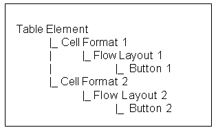
Note: If you define a display condition on a grandchild of a Table element (to hide the content of one or more cells), and you want the cell's content to be hidden or displayed when the end user performs an action on the current page, you must define the element under a Flow Layout (as shown in Table Element Structure). If the element is not defined under a Flow Layout, the visibility of the cell's content changes only when the end user navigates to another page and then returns to the page on which the table appears.
Note that this information applies only to display conditions, not enabled conditions. In other words, grandchildren of a Table element for which an enabled condition exists do not have to be defined under a Flow Layout for the condition to be reevaluated when the end user performs an action.
Hidden User Interface Pages
At runtime, and end user cannot navigate to a page that is hidden because of a display condition. For example, if the UI provides Previous and Next navigation buttons and some pages in the sequence are hidden, Oracle Configurator automatically skips them and displays the next available page in the sequence.
For more information, see Controlling the Content of a User Interface.
Conditions and Effectivity
A UI element’s effectivity at runtime takes precedence over any display conditions that you define. For example, when an element is not effective on the day an end user is configuring the product, the element does not appear in the UI, regardless of any display conditions that may defined for that element.
For more information, see Introduction to Effectivity.
Selecting a Valid Object
By default, a display or enabled condition is based on the UI element’s associated Model node. However, you can select a different node (the Object in the expression) when defining a condition. When you do this, Configurator Developer ensures that the node you specify is a valid selection. The node you select must be within the mandatory structure of the UI Page’s associated Model node, or the mandatory structure of any of its ancestors. In other words, the node cannot be an optional or instantiable descendant of the associated node of the UI Page in which the element appears.
For more information about optional and instantiable components, see Rules that Relate Components and Models.
Problems When Evaluating Runtime Conditions
At runtime, if certain problems occur in evaluating a display or enabled condition, then Oracle Configurator ignores the condition, displays or enables the affected UI element, and presents a notification to the end user.
Evaluation problems include the following:
-
The CIO method or other API required to evaluate the runtime condition is not available.
-
The node specified by the runtime condition has been deleted from the configuration.
-
The value of the Property specified by the runtime condition could not be determined by Oracle Configurator.
-
The User Property specified by the runtime condition does not exist.
User Interface Element Captions and Details
The settings in a UI element’s details page determine how the element appears and functions at runtime. The settings that are available depend on the element’s type, and may include the following:
-
Text Source: This setting controls how the runtime Oracle Configurator creates an element’s UI caption at runtime. Depending on the type of element, the UI caption can be one of the following:
-
One of the associated Model node’s System Properties
For example, if you select the Description System Property, the element’s UI caption is the description of its associated Model node. System Properties are described in System Properties.
-
One of the associated Model node’s User Properties
See User Properties.
-
A configuration session property
For example, if you select the Unsatisfied configuration session property, the element’s UI caption is False when the configuration is complete and True when it is not.
-
A Text Expression (that is, any text that you enter)
For example, "Select this box if you are an experienced user." See Defining a Text Expression.
The default value for an element’s UI caption the associated Model node’s DisplayName System Property. The value of this Property is derived from a Model-level setting that you specify in the General area of the Workbench. For details, see Runtime Display Names.
If you select a User Property as the Text Source for a UI element that displays its associated Model node’s children, the Property you select must be common to all of the child nodes. For example, if the UI element is a Drop-down List and the associated Model node is an Option Feature, then the User Property that you specify must be shared by all of the Feature’s Options; otherwise, Configurator Developer displays an error when you save the UI element. For more information about Properties, see Introduction to Properties .
Tip: If a UI element does not have the Text Source setting, you can create a UI caption for it by defining a Styled Text or Static Styled Text element. See Creating a Styled Text Element or Creating a Static Styled Text Element.
-
-
Image Source: This setting indicates the location of the image file to display at runtime and is available only for Image and Image Button elements. Select one of the associated node’s Properties that is an image file, or select Text Expression and then enter a complete path to the image you want to use.
For example:
http://www.MyWebSite.com/image1.gif
For more information, see Images Section.
-
Caption Style or Style: Use this setting to specify the style that you want to use to render the element's UI caption at runtime. Enter the name of a style that is defined in the standard Oracle style sheet. For example, OraDataText, OraPromptText, or OraInstructionText.
For more information about Oracle's Cascading Style Sheet (CSS) standards, go to the Oracle Technology Network Web site, at
http://www.oracle.com/technology/index.html
Alternatively, you can display customized text using basic HTML tags. For details, see Formatted Text.
-
Indicator Type: This setting controls when a Status Indicator UI element is displayed at runtime. This setting is available only when creating or modifying a Status Indicator element. Choose Selection State, Logic State, or Unsatisfied Item.
For details about Status Indicators, see Selection Status and Unsatisfied Status Indicators.
-
Choose a Rollover Text Source to specify the node Property, Configuration session property, or text to use as the element’s rollover text at runtime. Rollover text indicates a UI element’s purpose or action, and appears when an end user places the cursor over the element at runtime, or navigates to an element by pressing the Tab key. For example, rollover text for a Save button might be "Click to Save Your Work". For details about defining a text expression, see Defining a Text Expression.
-
Link Action: Use this setting to assign a runtime action to the selected UI element. For more information, see User Interface Actions.
Defining a Text Expression
Select Text Expression as a UI element’s Caption Source if you want to define the caption or rollover text. This setting enables you to directly enter the text that appears at runtime for a UI element.
You can also use any System or User Properties that belong to a UI element’s associated node when building an expression. When used in a text expression, all Properties must be preceded with an ampersand (&) so the runtime Oracle Configurator will derive the text from the specified Property, rather than displaying the name of the Property itself.
When using a User Property in a text expression, use the following syntax (not case-sensitive):
&PROPERTY["UserPropertyName"]
To use the name of a System Property in a text expression, enter the name of the Property and precede it with an ampersand. For example: &DISPLAYNAME, &DESCRIPTION, or &QUANTITY (also not case-sensitive). For a complete list of the System Properties you can use, see System Properties. If you do not specify which System Property to use in a text expression, Configurator Developer assigns an implicit node.property() reference, depending on the node type and the context established by the expression operator. For details, see Node Types and Implicit System Properties Used in Runtime Conditions and Text Expressions.
For example, you associate a UI element with Feature A and then enter the following expression:
You have selected &QUANTITY of this item. Each item adds &PROPERTY["Weight"] to the configuration.
At runtime, Oracle Configurator checks the current value of the associated node’s QUANTITY System Property and the User Property called "Weight" and displays the following message with Feature A:
You have selected 12 of this item. Each item adds 10 ounces to the configuration.
Note: To define an expression that includes the ampersand character at runtime, precede the ampersand with the backslash character. For example, to display "A & B" at runtime, define the following text expression:
A \& B
The left and right brackets ([ and ]) are also special characters. If a User Property name contains one of these characters and you want to use the Property name in a text expression, you must precede the bracket with the backslash character. For example:
\[DVD RW Player\]
Text Expressions and Keyboard Shortcuts
Keyboard shortcuts, which are also known as accelerator keys or hot keys, bypass menu and page navigation and perform an action directly, as if the user has pressed a navigation button or clicked a text link using the mouse. When editing a UI, you can define a text expression for an element that includes the keyboard shortcut that an end user can use to execute an action.
For example, you create a Custom Button element, define the element’s action as Go to Home Page, and enter the following text expression as its UI caption:
\&Home
At runtime, the button appears as shown in Home Button indicating a Keyboard Shortcut and the end user can execute the button’s action by pressing Alt+h.
Home Button indicating a Keyboard Shortcut
To display a text string at runtime that includes an ampersand, you must indicate that you do not want the character to denote a keyboard shortcut. To do this, "escape" the character by preceding it with another ampersand. For example, to display the string "A & B" at runtime, enter the following in the Text Expression field:
A \&\& B
Standard Oracle Applications Shortcut Characters
Several standard actions and keyboard shortcut characters are frequently used by Oracle Applications (OA) products. The most up to date list of standard OA shortcut characters is available on the Oracle Technology Network Web site at:
http://www.oracle.com/technology/tech/blaf/specs/keyboard.html
To avoid potential conflicts when using other Oracle Applications products, do not use the standard OA shortcut characters when defining keyboard shortcuts for UI elements in Configurator Developer.
Additionally, when defining keyboard shortcuts, be sure that you:
-
Use them consistently in the UI. That is, a shortcut must perform the same function on each page in which it is used.
-
Do not use the same character as a shortcut for multiple elements on the same page.
User Interface Actions
You can assign a runtime action to a Custom Button, Image Button, or a Text Link element. If you want text that has an associated action to be underlined at runtime (so it is apparent that it is a hypertext link), use a Static Styled Text element and enter either OraLink or OraVLinkText for the element’s Style setting. For more information about the Style setting, see User Interface Element Captions and Details.
Assigning an action to a UI element is described in Assigning Actions to User Interface Elements.
Refer to the following sections for details about the available actions:
| Action | Description |
|---|---|
| Start Page Flow | Goes to the first UI Page in the Page Flow that you specify. For details, see Page Flows and Page References. |
| Go to Previous Page | Navigates to the previous UI Page in a Page Flow. For more information, see UI Page Scope and Runtime Navigation. |
| Go to Next Page | Navigates to the next UI Page in a Page Flow. The order of UI Pages can change at runtime as components become instantiated or when effectivity and display conditions cause some UI Pages to be hidden. For more information, see UI Page Scope and Runtime Navigation. |
| Go Back | Returns to the page from which the current page was invoked. |
| Go to Preview Page | Navigates to the Configuration Summary page. For details, see The Configuration Summary Page. |
| Go to Page | Navigates to the UI Page that you specify. The UI Page you specify as the target of this action must have an associated Model node within the current component’s mandatory structure, or the mandatory structure of one of its ancestors. In other words, you cannot select a UI Page whose associated Model node is an optional or instantiable descendant of the current UI Page’s associated Model node. For these cases, use the Drilldown to Subcomponent action. For more information, see UI Page Scope and Instance Navigation. |
| Go to Home Page | Navigates to the first page in the UI. The first page depends on the structure of the Model at runtime, which may be affected by effectivity, display conditions, and so on. |
| Go to Node | Navigates to the page containing the node that you specify. For more information, see Go to Node User Interface Action. |
| Go to Full Summary | Navigates to a Configuration Summary page that shows all items in the configuration and displays an icon next to items that have been added, removed, or have changed relative to Oracle Install Base. This action applies only to Models that support updates to installed configurations. For details, see Summary Page Templates. |
| Go to Filtered Summary (Configuration Upgrades Only) | Navigates to a Configuration Summary page that shows only items (and their parents) that have changed relative to Oracle Install Base. This action applies only to Models that support updates to installed configurations. For details, see Summary Page Templates. |
| Go to First Instance | Navigates to the first page that exists for the first instance of the specified Component or Model in the current context. For more information, see UI Page Scope and Instance Navigation. |
| Go to Next Instance | Navigates to the first page that exists for the next instance of the Component or Model that constitutes the current context. For more information, see UI Page Scope and Instance Navigation. |
| Go to Previous Instance | Navigates to the first page that exists for the previous instance of the Component or Model that constitutes the current context. For more information, see UI Page Scope and Instance Navigation. |
| Go to Target Instance | Navigates to the first page that exists for a particular instance of the specified Component or Model. |
| Drilldown to Subcomponent | Navigates to the page for the element’s associated Model node. If the associated Model node belongs to a referenced Model, BOM Option Class, or a single-instance Component, and a page for the node exists in the referenced UI, then this action displays that page. To enable the end user to navigate to a different page, use the Go to Page action. For more information about "drilling down" and subcomponents, refer to the description of the Transaction Management setting in Pagination and Layout Section. |
| Return from Drilldown | Saves any pending changes and returns to the parent page after an end user drills down to configure a Component, referenced Model, or BOM Option Class. This action performs the same function regardless of how the Transaction Management setting is defined in the UI Master Template that was used to create the UI. This setting is described in Pagination and Layout Section. |
| Open URL | Navigates to the URL that you specify using the current browser window, or by opening a new window. For details, see Open URL Action. |
| Open Connection Chooser | Opens the Connection Chooser page, which displays a list of Model instances to which a component can be connected at runtime. The list appears when an end user clicks a button to create a connection. For more information see Connection Control Template. |
| Action | Description |
|---|---|
| Select Node | Selects the node that you specify. |
| Deselect Node | Deselects the node that you specify. |
| Add Instance | Adds an instance of the component that you specify to the configuration. |
| Add and Go to Instance | Adds an instance of the component that you specify to the configuration, and navigates the end user to the new instance. |
| Delete Instance | Deletes the selected instance from the configuration. This action derives the instance set from the current context of the page on which it is displayed. For more information about page context and runtime navigation, see Associated Model Nodes and Page Scope. |
| Activate Instance | Makes all of the UI controls on the selected, read-only UI page editable. This action applies only to Models that support reconfiguration of installed instances. For more information, refer to the Oracle Telecommunications Service Ordering Process Guide. |
| Set Connection | Creates a connection between the current component and the selected instance (for example, in a Connection Navigator Table). |
| Clear Connection | Clears the connection between the current component and the selected instance (for example, in a Connection Navigator Table). |
Warning: Do not assign the Save action to a UI control unless you know that the host application supports it. In other words, be sure that the host application can save the configuration without displaying an error. Additionally, creating a control that saves the configuration on a UI Page that exists within a nested transaction can cause an error at runtime. For details about nested transactions, see Pagination and Layout Section.
For an important suggestion about the Display Update actions, see Displaying Pricing and ATP Using a UI Content Template.
Action Parameters
When you select an Action Type of either Open URL or Raise Command Event, the Choose Action page displays additional settings in the Action Parameters section.
Open URL Action
Use these settings to specify the destination URL, the target browser window, and the Javascript window options (if creating a new window). If you do not specify window options, Oracle Configurator creates the new window at runtime using the browser’s default settings.
You may want to use this option, for example, to enable an end user to view additional information about an option before adding it to the configuration.
-
Target URL Source: Select Text Expression if you want to specify a URL. If you select this option, enter a complete URL. For example:
http://www.MyWebPage.com
Select Associated Model Node User Property if you want to specify a User Property that has a URL as its Property. For more information, see User Properties.
-
Target Window: Select Main Window to navigate to the URL in the current browser window. For an important consideration when using this setting, Forms-Based Host Applications and Target Window.
Select Child Window to open a separate browser window when the end user invokes the specified action (such as by clicking a button).
If you select this option:
-
Optionally enter a text string which acts as an internal identifier for the child window. If you leave this field empty, Oracle Configurator creates a string at runtime to identify the window.
If you enter text, it must not contain any spaces. For example:
Window1
You may want to specify a Window Name when a UI Page contains more than one control that opens a separate window, and you want the end user to be able to display multiple child windows at the same time.
For example, Button1 and Button 2 appear in the same UI Page. Each button specifies a different URL, and the Window Name setting is set to Window1 and Window2, respectively. At runtime, when the end user clicks Button1, a separate window appears and displays the specified Web page. If the end user then clicks Button2 (without closing the child window), the specified Web page appears in a second child window.
If, however, a Window Name for Button2 is not specified, Oracle Configurator replaces the content of the first child window when Button2 is clicked.
-
Specify options for opening the window at runtime in the Window Options field. Use valid syntax for the JavaScript method window.open(). For example:
{toolbar:0,location:0,directories:0,status:0,menubar:0,scrollbars:0,resizable:1,width:200,height:300}
Enter a "0" (zero) to disable an option and a "1" to enable it. In the example above, the window does not display a toolbar, but can be resized.
Not all of the options listed in this example are required, but including them all is recommended. The text you enter must not contain any spaces.
-
-
Lock Main Window while Displaying Child: Select this option to prevent the end user from making changes in Oracle Configurator until the child window is closed.
Raise Command Event Action
Select the Raise Command Event action to trigger the Configurator Extension(s) bound to the command string that you enter. For example, assign this action if you want to execute a Configurator Extension when an Oracle Configurator end user clicks a button.
For details about the Output Window Name, Output Window Options, and Lock Main Window while Displaying Child settings, see Open URL Action.
For more information about Configurator Extensions, see Introduction to Configurator Extensions.
Forms-Based Host Applications and Target Window
If the runtime Oracle Configurator will be launched from a forms-based Oracle Applications product such as Order Management, and you set the Target Window setting to Main Window, you must add the following HTML markup at the bottom of the target page:
<IFRAME HEIGHT="0" WIDTH="0" SRC="/OA_HTML/czJradHeartBeat.jsp" NAME="HeartBeatFrame" Id="HeartBeatFrame" title=""></IFRAME>
If this markup does not exist in the target page, the configuration session may end prematurely.
The Target Window setting is described in Open URL Action.
For more information, see the section on the heartbeat mechanism in the Oracle Configurator Installation Guide.
Go to Node User Interface Action
The Go to Node UI action enables an Oracle Configurator end user to navigate to the page on which a specific Model node appears at runtime. You can assign this action to a Text Link, Image Button, or Custom Button when creating these elements on a UI Page, or within the following UI elements:
-
Summary Table
-
Connection Navigator Table
-
Message List Layout Region (the element’s Message Type can be either Invalid Item List or Unsatisfied Item List)
You can also use the Go to Node action when creating a Text Link, Image Button, or Custom Button within the following UI Content Templates:
-
Configuration Summary and Session Status templates
These include the Standard Summary Table template, Summary with Status Region template, Combination Status Region templates, and all Upgrade Summary templates.
-
Connection Navigator
-
Generic
These templates are described in User Interface Content Templates.
The Go to Node action may be disabled at runtime in certain circumstances. For details, see Go to Node Action and Nested Transactions.
Go to Node Action and Target UI Pages
When you create a Text Link, Image Button, or Custom Button on a UI Page and assign the Go to Node action, the target of navigation at runtime is the element’s associated Model node.
When you create the UI element within a Summary Table, Connection Navigator Table, or a Message List Layout Region, Oracle Configurator determines the target of the Go to Node action at runtime. For example, you create a Text Link with the Go to Node action within an Unsatisfied Item List. At runtime, Oracle Configurator displays each unsatisfied item or message as a link the end user can use to navigate to the page containing that item. (When you use the predefined UI Content Templates that display invalid and unsatisfied items, the message text itself appears as a link.)
A UI element and its associated node can appear on multiple pages at runtime. Therefore, Oracle Configurator may find multiple target pages when the end user clicks a link or button that has the Go to Node action. At runtime, if multiple target pages exist for an item, then Oracle Configurator evaluates any display conditions and displays the first page that is not hidden. If none of the pages are visible, then Oracle Configurator displays a message similar to the following: "The specified item is not available for display." If the item is hidden due to a display condition but its host page is visible, Oracle Configurator displays the host page. However, Oracle Configurator does not notify the end user that the item is not visible.
There may also be times when the target node is displayed on the same page as the element that is assigned to the Go to Page action. For example, each page in a UI contains a reference to the Combination Status Region with Links template. Item A is unsatisfied and appears on the current page. When the end user clicks Item A in the unsatisfied items list, Oracle Configurator displays a message similar to the following: "The specified item is displayed on the current page."
Oracle recommends that you create a UI such that for each potential target node, there is only one target page that can be displayed at a time, and the relevant UI element is visible and editable on that page.
When an end user clicks a link or button that has an action of Go to Node, Oracle Configurator navigates to the top of the page on which the node appears. The end user may be required to scroll down to find the item that is the target of the action.
Page Include Regions
For background information about Page Include Regions, see Page Include Region.
The runtime Oracle Configurator considers whether the page containing an item that is the target of a Go to Page action is also the target of a Page Include Region. (When this occurs, the item may appear in multiple pages.) In this case, Oracle Configurator checks pages in the following order, and displays the first page on which the item appears:
-
The current page (that is, the page on which the message, Text Link, Image Button, or Custom Button appears)
-
Another page in the current UI
-
The highest level host page that contains the item
-
Any other page in another UI (the UI at the deepest level takes precedence)
An item that is the target of the Go to Node action may also appear on multiple pages because of nested Page Include Regions. For example, Page A belongs to the parent UI and has a Page Include Region with a target of Page B. Page B also has a Page Include Region with a target of Page C, and Page C contains Item 1.
When this occurs, Oracle Configurator tries to display the page that belongs to the parent UI, since this is considered preferable to viewing a page from a referenced UI. After considering any display conditions on each page, Oracle Configurator displays the highest-level host page that contains the target page or, if all of the host pages are hidden, it displays the target page itself.
Using the example described above, when an end user executes the Go to Node action to go to the page containing Item 1, Oracle Configurator displays:
-
Page A, if it is visible
-
Page B, if Page A is hidden
-
Page C, if Pages A and B are hidden
In a UI that contains Page Include Regions, the Configure icon in a BOM Item Selection Table has an action of Drilldown to Subcomponent. Clicking this icon navigates the end user to a page in a child (referenced) UI. If you want end users to be able to stay in the parent (root) UI and access all available options using page flow navigation, perform one of the following:
-
Create a custom UI Content Template and change the UI action for the Configure icon in the BOM Selection Table from Drilldown to Subcomponent to Go to Node.
-
Remove the column containing the Configure icon from the BOM Selection Table.
This forces end users to navigate using page-level navigation and configure the item when it is displayed on a page by a Page Include Region.
Go to Node Action and Nested Transactions
If nested transactions are enabled and a UI element assigned to the Go to Node action appears in a nested transaction, Oracle Configurator disables the Go to Node action for the element.
For example, nested transactions are enabled in a UI and the Configuration Summary page lists several items that are incomplete in the configuration. Each item that appears within a nested transaction does not appear as a link. In this case, the end user must return to the configuration and navigate to the item using another method.
Oracle recommends that you use the Go to Node action only when nested transactions are disabled in the root UI. In other words, when the Transaction Management setting in the UI Definition is set to Drilldown Maintains Single Transaction. For details about this setting, see Pagination and Layout Section.
User Interface Elements and Associated Model Nodes
A UI element is always associated with a Model node. A UI element may be directly associated with a Model node, or it may inherit the node from its parent UI element in the UI structure. This relationship indicates that the UI element represents the structure node in the runtime UI, or is otherwise bound to it in some way. For example, when a UI element is associated with a Model node, the element can use any of the node’s System or User Properties as the source of its UI caption. A node’s selection state or logic state can also control whether the associated UI element is enabled or visible in the UI. This is described in Runtime Conditions and User Interface Elements.
This relationship can be created automatically, such as when you generate a UI, or manually, when you create a UI element. When you generate a UI using a Master Template, Configurator Developer creates a UI element for each Model node. This creates the default Model node association for each UI element (in other words, the default value of the element’s Associated Model Node setting). A UI element that you create is associated with its parent element’s node by default. For example, a Layout Region is associated with a Feature node called Primary Color. When you create a Check Box UI element as a child of the Layout Region, the Check Box’s Associated Model Node is set to Inherited from Parent by default. In other words, the Check Box is associated with the Primary Color Feature node.
When creating or modifying a UI element, you can change the default Associated Model Node setting and specify a different node. If you change an element’s default Associated Model Node setting, Configurator Developer displays only Model nodes that are reachable from the Page on which the element appears.
Configurator Developer also allows you to create only valid associations between Model structure nodes and UI elements. For example, when modifying an Drop-down List element, you click Choose Node. When you do this, the Model structure appears, but only nodes that can be associated with a Drop-down List can be selected (the Select column is read-only for all invalid nodes). Changing an element’s associated Model node is described in Changing an Element's Associated Model Node.
You can also associate a UI element with a node that belongs to a referenced Model. You may want to do this, for example, to display a node from the referenced Model on one of the parent Model’s pages.
Because all UI elements appear on a page at runtime, each element’s associated node must be within the scope of the UI Page’s associated Model node. For more information, see Associated Model Nodes and Page Scope.
Associated Model Nodes and Page Scope
When you are creating or editing a UI element, you can refer to a node if it is within the scope of a UI Page; otherwise, Configurator Developer displays an error when you save your changes. The scope of a UI Page refers to the set of all nodes that are reachable within the "current context" when the UI Page is displayed at runtime. The node specified as the Associated Model Node for a Page serves as the "page base" and establishes the current context when that Page is displayed at runtime. A node is considered to be "in the scope" of a Page if it is guaranteed to exist and cannot have multiple instances relative to the page base at runtime.
Every node referred to in a Page must be reachable from the page base. This includes the associated Model node for any element on the Page, nodes that participate in a display or enabled condition, or any node that is used as the target of navigation from the UI Page. There are the following exceptions, however:
-
A node that is used as the target of the Go to First Instance action may be instantiable relative to the page base.
-
A UI element that represents an "instance set" can be bound to an instantiable child of the page base (for example, an Instance Management Table).
In other words, Configurator Developer ensures that a node is reachable by checking the path through the Model structure from the page base to the node referred to on the Page (for example, in a display condition). This path can go up or down through the structure of the Model. However, if the path from the page base to the node in question descends into an optional or instantiable component, then the node is not reachable at runtime, and is therefore out of the Page’s scope. In other words, the node might not exist at runtime (because it is optional) or it may be ambiguous because it has multiple instances.
Ascending out of an optional or instantiable component is acceptable, because whenever the descendant structure exists, everything between it and the Model root is guaranteed to exist.
UI Page Scope and Displaying Model Node Content
As explained in the preceding section, all nodes referred to in a UI Page must be within the Page’s scope.
Consider the Model structure shown in Model Structure.
Current Context and Displaying Model Node Content shows this Model in its fully-instantiated state at runtime.
Current Context and Displaying Model Node Content
In this example, a single page has been generated for each Component. The page the end user is viewing (C3.2, in bold) is displaying content from the second instance of C3 under the first instance of C2. The Associated Model Node for the current page is C3, and the shaded area is the scope of the page. In this context, C3.2 can display content from any of the Component instances within the shaded area, including the Model root.
UI Page Scope and Runtime Navigation
As explained in section Associated Model Nodes and Page Scope, every node referred to in a UI Page must be reachable from the page base. This includes any node that is used as the target of navigation from the UI Page.
For example, a UI Page must be reachable to be a valid target when you create a button and an assign it to the Go to Page action. That is, the page base of the target Page must be reachable by an unambiguous relative path from the page base of the current page.
In the illustration shown in Current Context and Displaying Model Node Content, the component instances that an end user can explicitly navigate to (such as by clicking a button assigned to the Go to Next Page action) include C1 (the root) and C2.1. These nodes both appear in the shaded area, which represents the path mentioned in the preceding paragraphs and in Associated Model Nodes and Page Scope.
UI Page Scope and Instance Navigation
You can refer to an instantiable Model node as a navigation target using the Go to First Instance action. The Go to First Instance action disambiguates the reference by explicitly referring to the first instance of the specified node. (This means the first instance within a particular component set, not the first instance across multiple sets of the same component.) For example, in Current Context and Displaying Model Node Content, an end user can use a UI control assigned to this action to navigate to navigate to C4.1. Therefore, the targeted Model node may be the base component itself (if it is instantiable), the closest instantiable descendant of the base component (C4 in ), or any of the base component’s instantiable ancestors (C2 in ).
Navigation by instance always goes to the first page that is associated with the instantiable component. This is true even if the navigation is invoked from a page other than the first in another instance.
Go to First Instance below assumes the same current context as Current Context and Displaying Model Node Content, but the base component instances that can be reached by the Go to First Instance action are in bold. In this example these components include the root node, C1, C2.1, C3.1, and C4.1.
The target of the Go to Next Instance and Go to Previous Instance actions must also be an instantiable Model node, but unlike the Go to First Instance Action, it must be a Model node that is in the path that constitutes the current context. That is, it must be either the current base component or an instantiable ancestor of the base component. This is because the notion of "next" and "previous" instances implies that the current context defines the "current" instance.
The following illustrations assume the same current context as the previous examples. In Go to Next Instance Action, the components in bold are the base component instances that can be reached by the Go to Next Instance action from the current page (C3.2). In other words, the root node (C1), C2.2, and C3.3.
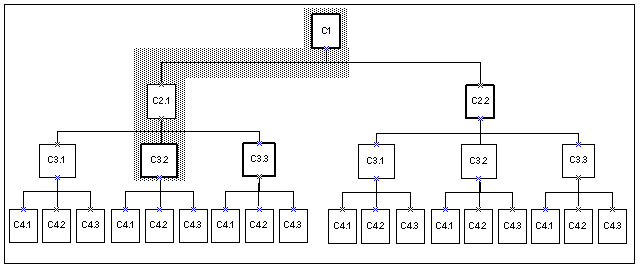
In the Go to Previous Instance Action, the component in bold is the base component instance that can be reached from the current page (C3.2) by the Go to Previous Instance action.
Go to Previous Instance Action
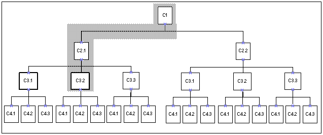
For more information, see:
Generating and Reusing User Interface Content
When creating or modifying a UI, you can perform the following actions:
-
Create a Template Reference: See User Interface Template References.
-
Create a Region from a Template: See Creating UI Content from a User Interface Content Template.
-
Convert a Template Reference into UI content: See Converting a UI Template Reference.
User Interface Template References
If you are unfamiliar with UI templates, reviewIntroduction to User Interface Templates before reading this section.
A User Interface Template Reference is a UI element that enables a UI to refer to a UI Content Template and display its content dynamically at runtime. In other words, any changes to a UI Content Template appear automatically the next time you unit test the UI.
User Interface Template References can be created manually or automatically. You create a UI Template Reference manually when editing a UI. You may want to do this to associate a Model node with a specific UI Content Template. For example, you want all Option Features in your Model to appear the same way at runtime, so you create an Option Feature UI Content Template. When editing the UI, you create a UI Template Reference for each Option Feature in your Model, and specify your Option Feature template. Since the Option Features reference your template, Oracle Configurator displays the Option Features correctly, even if the template has recently changed.
By default, Template References that you create appear in the UI structure as "UI Template Reference - Number." For example: UI Template Reference - 3. See UI Template References.
Creating a Template Reference is described in Creating a UI Template Reference.
When you create a UI that is based on the Model structure, Configurator Developer automatically creates Template References wherever the Template Usage setting in the UI Master Template is set to Incorporate by Reference. This setting is described in Specifying How a User Interface Uses Content Templates.
For example, in the BOM Content Custom Settings page, the Multi-Instance setting for Instantiable BOM Model References is set to BOM Instance Management Table, and the Template Usage is set to Incorporate by Reference. After you generate the UI, the UI structure contains a Template Reference for each BOM Model Reference that can have multiple instances at runtime. For an example of manually creating and using Template References, see Designing and Creating a User Interface Page.
If necessary, you can convert a Template Reference into UI content. This is described in Converting a UI Template Reference.
When editing a UI, you can create a Template Reference as a child the following UI elements:
-
Row Layout
-
Flow Layout
-
Stack Layout
-
Table Layout
-
Header Region
-
Case Region
-
Content Container
-
Instance Management Control
Viewing UI Template References
A row in the UI structure that is a reference to a UI Content Template does not have any child elements and contains the name of the template, followed by a sequence number. For example: "BOM Instance Management Table - 7". When viewing the reference’s details page, you can see which UI Content Template to which it refers and if necessary, specify a different template. See Modifying a UI Template Reference.
UI Template References shows UI structure containing several UI Template References.
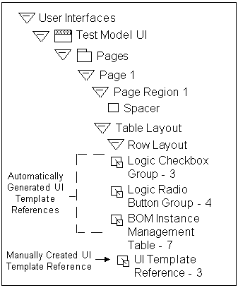
Modifying a UI Template Reference
You may want to modify an existing Template reference so it points to another template. When you do this, you may need to make some changes to the enclosing region if the Layout Styles of the old and new templates are different. This is because some UI elements may not appear as expected at runtime when using a different template.
For details, see Modifying a UI Template Reference.
For example, you may need to move the template out of its old region, or create a new Layout Region to wrap it. You can view a template’s Layout Style by editing the template’s Definition page. For details, see User Interface Content Template Settings.
Creating UI Content from a User Interface Content Template
When creating a UI from scratch or editing a generated UI, you can generate UI elements using a UI Content Template. Creating UI content using a template is an efficient way of creating frequently used or more complex UI elements, such as tables.
When you create an element using a template, Configurator Developer copies the content of the selected template into the UI at the location you specify. You can then modify the UI element’s default settings, such as its UI caption, runtime conditions, and so on.
You manually create UI content from a UI Content Template by selecting "Create Region from Template" when creating UI Page content. For details, see Creating a Region from a User Interface Content Template.
Configurator Developer automatically creates UI content from a UI Content Template when the Template Usage setting in the UI Master Template is set to Copy to UI as Page Content. For details, see Specifying How a User Interface Uses Content Templates.
Displaying Optionally Instantiable Component Details on a Parent UI Page
By using Instance List Layout Regions, you can design a UI that displays the content of an optional or instantiable component instance on one of the root Model's UI pages.
For example, assume that Model Server_System has the following structure:
Model Server_System
 |_ Component Server (0/3)
 |_ Model Storage (0/4) < - Model Reference
 |_ Model Network (1/5) < - Model Reference
Without Instance List Layout Regions, the content of any new instances of Component Server, Model Storage, and Model Network that are created at runtime appear on separate UI pages. As a result, end users are required to either navigate to each page separately or drill down to configure each newly created instance.
In the figure An Instance List Table Layout Region at Runtime, instances of the Component named Server in the Model named Server_System appear in an Instance List Table Layout Region. This table can be displayed on the Server_System Model's main UI page. End users can add and delete instances of Server from the table, and configure each Server by specifying RAM, CPU speed, number of CPUs, hard drive size, and so on. Contrast this figure to An Instance Management Table at Runtime
An Instance List Table Layout Region at Runtime
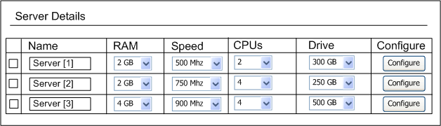
You can use Configurator Developer to create the UI elements listed in Instance List Layout. All of these elements support Display and Enabled conditions, and they enable you to do the following in a runtime UI:
-
Display the details of a new component instance on its parent node's UI page.
To do this, create one of the new UI elements listed in Instance List Layout and select an optional or instantiable component as its Associated Model Node (AMN).
-
Display the content of a new component instance in the parent Model's primary navigation flow. If multiple instances of the same component are created at runtime, all of those instances appear on the same UI page in the UI's primary navigation flow.
To do this, create a new UI page and then create an Instance List Layout Region on the page. Associate the region to the instantiable component to display each new instance on the same page at runtime.
This reduces the amount of runtime navigation required to configure optional instances because the content is available via the UI's primary navigation controls (such as the Next and Previous buttons in a Step-by-Step UI).
-
Add a new component instance to its parent's UI page.
To do this, create a Custom Button UI element on the UI page for the component's parent node, and select the component as the button's AMN. Then select Add Instance as the button's UI action. After creating the button, add the required UI structure within the Instance List Layout Region to display the details of the new instance. See Example: Adding an Instance of a Component to its Parent UI Page.
Example: Adding an Instance of a Component to its Parent UI Page
Create the following structure in your User Interface to enable an end user to add a new component instance to a parent UI page:
Stack Layout (AMN = Instantiable Component) |_ Button (Action = Add Instance) |_ Instance List Stack Layout Region |_ Text Input (Display System Property = InstanceName) -
Navigate to a new component instance's UI page from its parent's UI page.
To do this, create a Custom Button UI element within an Instance List Layout Region, and select the instantiable component as the button's AMN. Then select Drilldown to Subcomponent as the button's UI action.
For example, you may want to display only a subset of specific Model nodes on a parent UI page, but provide a button that end users can use to navigate to a specific instance for additional information.
-
Display optional instances in a table at runtime.
To do this, create an Instance List Table Layout Region and select an instantiable component as its AMN. See Instance List Table Layout Region for details about this region. Then create UI structure under the Header Row Layout and the Content Row Layout so that each instance appears as a row in the table at runtime. No instance rows will appear at runtime unless you add structure under the Content Row Layout.
For an example of structure using an Instance List Table Layout Region, see Structure under Instance List Table Layout Region. At runtime, this table displays a row for each instance of the AMN that is instantiated. Each row includes a cell displaying the instance's name and a cell displaying an image button whose action deletes the instance.
Example: Structure under Instance List Table Layout Region
Instance List Table Layout 1
    |_Header Row Layout
    |    |_Cell Format 1
    |    |     |_Static Styled Text 1 (text = DisplayName)
    |    |_Cell Format 2
    |          |_Static Styled Text 1 (text = Delete)
    |_Content Row Layout
         |_Cell Format 1
         |     |_Text Input 1 (Display System Property = InstanceName)
         |_Cell Format 2
               |_Image Button 1 (Action = Delete Instance)
You can optionally display additional nodes from the component's substructure as columns in the table, and display icons to indicate which selections from the component's substructure are required to complete the configuration.
See Instance List Layout.
-
Delete a component instance from its parent's UI page.
To do this, create an Instance List Layout Region and select an instantiable component as its AMN. Then create a Custom Button UI element under the Instance List Layout Region and select Delete Instance as the button's UI action. See Instance List Layout.
Caution: After deleting an instance at runtime, any UI content associated with that instance dynamically disappears from the parent UI page.
Designing and Creating a User Interface Page
This section provides an introduction to UI editing and explains how you can use the UI elements that Configurator Developer provides to edit a UI and create a UI Page from scratch.
Before reading this section, you should be familiar with the UI elements described in this chapter and understand how of User Interface templates are used when creating, editing, and refreshing a UI. UI templates are described in Introduction to User Interface Templates.
Creating a custom UI Page typically consists of the following tasks:
-
Step 2: Plan for Using Layout Regions to Arrange the Page’s Content
-
Step 3: Plan for Using UI Elements and Custom UI Content Templates
Introduction to the Example Model
The example Model is called the Windows Model and it was created by a windows manufacturer to enable end users (its customers) to configure and order windows on an external Web site. The Windows Model is based on an imported BOM Model, and the available types of windows are Composite, Vented, Fixed, and CircleHead.
Following are the basic requirements for the UI:
-
End users (customers) must be able to specify requirements for each window.
In the Windows Model, customer requirements include the project type, window material, interior and exterior colors, a glazing type, and a unit of measure.
-
End users must be able to create and configure multiple instances of each type of window, specify a quantity for each window, and delete instances.
-
End users must be able to create instances of a window by clicking on a picture of the window.
-
The page must provide a link to additional details about each type of window.
-
UI elements should be referenced by the UI wherever possible.
This is required because the windows manufacturer wants to display text and selection controls in a specific way and reuse these UI elements within other Models and UIs.
In the Windows Model, customer requirements questions are defined using Option Features, while each type of window is a referenced BOM Model that can have multiple instances at runtime.
Windows Model Structure shows the structure of the Windows Model as it appears in Configurator Developer.
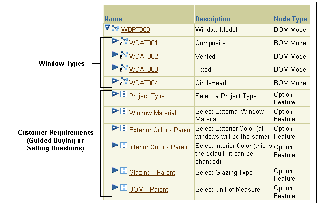
Step 1: Create an Initial Design of the New UI Page
The first step when creating a custom UI Page or editing a UI is to determine what you want to display and how you want the content to be arranged. In other words, decide how you want the completed UI Page to appear to your end users at runtime.
In this step, carefully consider the features and options of your Model and determine whether you want any guided buying or selling questions (to capture the customer’s requirements). Also, identify which product images you want to display. Finally, decide upon the most effective way to present required information to your end users in a format that is easy to understand and use.
Creating a rough sketch of the page and its content is recommended during this step. For example, you may want to create initial designs using a whiteboard and then refine the layout and content using graphics software.
UI Page Design - Initial Design shows the initial design of the new page for the Windows Model. It includes the page header, the text of each customer requirements question, and the controls required to respond to these questions. It also shows where the window images and the controls for configuring each window instance appear on the page.
UI Page Design - Initial Design
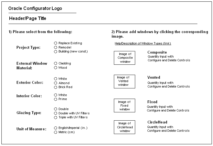
After completing the initial design of the page, the next step is to decide which UI elements will be required to arrange the page’s content.
Step 2: Plan for Using Layout Regions to Arrange the Page’s Content
The initial design of the UI Page, shown in UI Page Design - Initial Design, has two main regions. The region on the left consists of several customer requirements questions and responses for each. The region on the right consists of:
-
Text that prompts the end user to add window instances
-
An image and text link to more information about window types
-
Pictures of each window type
-
The controls required to configure, delete, and enter a quantity for each window instance
Identifying the page’s main regions is useful when determining which UI elements will be required to arrange the text, selection controls, and images on the page. UI elements that arrange other elements on a page are called Layout Regions. Layout Regions are described in Layout Regions.
In this step, you may want to create another drawing to visualize the page’s main areas and the Layout Regions required to create them. UI Page Design - Required Layout Regions and Other UI Elements shows the Layout Regions and other UI elements that will be required to create the new page based on the initial design.
UI Page Design - Required Layout Regions and Other UI Elements
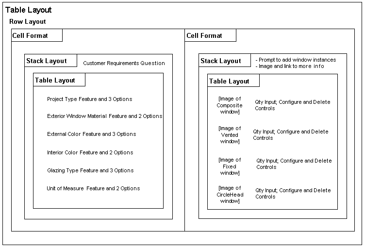
UI Page Design - Required Layout Regions and Other UI Elements shows the following:
-
The two main regions of the page are represented by two Cell Formats. Since they must appear side-by-side at runtime, they must be created under a Row Layout in the UI structure.
-
The customer requirements questions, the images of each window, and the option selection controls must be arranged vertically within the two main regions. Therefore, these UI elements must be created beneath a Stack Layout.
-
The two Table Layouts within the Stack Layouts provide additional control over formatting and ensure that the text, images, and selection controls are properly aligned within the two main regions.
Step 3: Plan for Using UI Elements and Custom UI Content Templates
In this step, decide how you want to display Model nodes at runtime and define any custom UI Content Templates that the UI requires to do this. Also, consider what other kinds of UI elements will be required to create the page according to the initial design.
The UI requirements listed in Introduction to the Example Model state that UI elements must be reusable. This is because the windows manufacturer wants to use the UI controls that provide customer requirements questions and the controls provided to manage instances of each window in multiple Models and UIs. This can be accomplished by defining custom UI Content Templates.
Custom UI Content Templates and Template References
The windows manufacturer created two custom UI Content Templates. The ADS - Radio Button Group template displays the customer requirements controls, and the ADS - BOM Instance Management Table template displays controls for configuring each window instance. These templates were created by copying and then modifying the predefined Enhanced Radio Button Group and BOM Instance Management Table templates.
The ADS - Radio Button Group template creates a UI caption using its associated Model node’s description and displays the node’s selectable child options using radio buttons. In the page for the Windows Model, this template displays the following Features and their Options: Project Type, Window Material, Exterior Color, Interior Color, Glazing, and UOM. References to this template appear in the UI structure shown in Partial UI Structure - Left Hand Region of UI Page.
The ADS - BOM Instance Management Table template also creates UI captions (the table headers) using its associated Model node’s description, and it enables end users to enter a quantity, configure, and optionally delete instances of each window. References to this template appear in the UI structure shown in Partial UI Structure - Right Hand Region of UI Page.
The Template References that refer to the custom UI Content Templates are shown in Partial UI Structure - Right Hand Region of UI Page.
Note: When editing a UI, you reference a UI Content Template by creating a Template Reference and then specifying the node you want the template to represent in the UI as its Associated Model Node (for example, the Project Type Option Feature). For more information, see User Interface Template References.
Required UI Elements
The requirements for the page also state that end users must be able to create instances by clicking on a picture of each window. The Image Button UI element provides this functionality. This element is described in Image Button.
In the page for the Windows Model, each Image Button:
-
Displays a picture of a different window
The UI element’s Image Source setting identifies the image to display.
-
Is associated with a different BOM Model Reference
These nodes represent the available window types (see Windows Model Structure).
-
Has an action of Add Instance
This enables the end user to create an instance of each window by clicking on the corresponding image.
The page also requires an Image Button to display the image of a question mark that the end user can click on for more information about the available window types. This image will appear next to, and have the same action as, the "details about window types" text link.
Step 4: Create the UI Page and Page Content
In this step you create all of the UI elements that the page requires in the User Interface area of the Workbench. This section assumes that you have already generated a UI that is based on the Model structure, or have created an empty UI. These tasks are described in Introduction to the User Interface Area of the Workbench.
Refer to the following sections for details about UI elements that are commonly used when editing a UI or building a custom page:
Creating the UI Page and Required Elements
This section explains how to create the left hand region of the page in the User Interface area of the Workbench. The completed structure that represents this part of the UI is shown in Partial UI Structure - Left Hand Region of UI Page.
Following are the basic steps to create this part of the UI:
-
In the Pages Folder of the Windows Model UI, create a UI Page. See Creating a User Interface Page for details.
All of the elements in the following steps will be created under this Page, so they will appear on the same page at runtime.
-
To create a region that includes two side-by-side regions in the page, create a Table Layout element. This new element is named Table Layout 1 in Partial UI Structure - Left Hand Region of UI Page because it is the first Table Layout element within the UI Page.
See Creating a Layout Region for details.
-
Create a Row Layout under the Table Layout. This region will arrange the two main regions of the page side-by-side at runtime.
See Creating a Layout Region for details.
-
Under Row Layout 1, create a Cell Format. This is the left region of the page which will contain the customer requirements selection controls.
-
Under the Cell Format you just created, create a Stack Layout element.
This element will display the customer requirement selection controls vertically at runtime.
-
Create the following elements under the Stack Layout:
-
A Formatted Text element, which is the text of the prompt for responding to the customer requirements question. The element’s Text Source is set to Text Expression and it contains the following text: "Please select from the following:"
-
A Spacer element, which adds space between the customer requirements question "Please select from the following:" and the Radio Button groups that appear below it on the page (see UI Page Design - Initial Design). In this example, the value of the Height setting is 25 (pixels).
-
A Table Layout element, which arranges the customer requirements selection controls (Radio Buttons) that you create in the next step.
-
-
Under the Table Layout, create six Template References.
All of these Template References refer to the ADS - Radio Button Group template, but each has a different associated Model node. For example, the first is associated with the Project Type Feature, the next is associated with the Window Material Feature, and so on.
-
Following the same procedure, create another Cell Format (Cell Format 2) under Row Layout 1, and then create the elements shown in Partial UI Structure - Right Hand Region of UI Page.
Partial UI Structure - Left Hand Region of UI Page
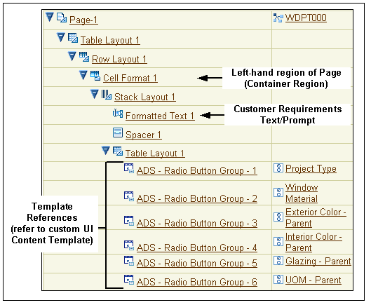
Partial UI Structure - Right Hand Region of UI Page
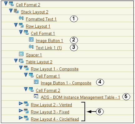
Following is a description of the numbered UI elements shown in Partial UI Structure - Right Hand Region of UI Page.
-
Element 1, Formatted Text with the text "Please add windows by clicking on the corresponding image."
-
Element 2, Image Button that appears as a question mark at runtime. (See Completed UI Page at Runtime).
-
Element 3, Text Link that displays the following text at runtime: "More information about window types."
-
Element 4, Image Button that enables end user to add instances of the Composite window.
-
Element 5, Template Reference that displays a UI control for each instance of the Composite window.
This Template Reference refers to the ADS - BOM instance Management Table template, and is associated with the Composite BOM Model Reference node.
-
Elements 6, Row Layouts 2, 3, and 4 with the same structure as Row Layout 1. The only difference is that the Template References are associated with the Vented, Fixed, and CircleHead BOM nodes (that is, the other window types), and the Image Buttons display images of the Vented, Fixed, and CircleHead windows.
To see how the completed page appears at runtime, see Completed UI Page at Runtime.
Note: Row Layouts 1-4 could also be defined as UI Content Templates and then incorporated into the UI as Template References.
Step 5: Review and Modify the Page
When creating a UI Page or simply editing a UI to make minor changes, it is a good idea to periodically review its appearance at runtime to see the effect of any recent changes. Then, return to Configurator Developer and modify the UI structure as required. For details, see Unit Testing a Generated User Interface.
For example, you may want to change the order in which selection controls appear on the page, modify existing Layout Regions to enhance alignment of specific elements, or modify a Template Reference to point to a different UI Content Template.
Completed UI Page at Runtime shows the completed page for the Windows Model.
In Completed UI Page at Runtime, the end user has responded to the customer requirements questions that appear in the left-hand region of the page, and an instance of each type of window has been created. The icon in the Unsatisfied column indicates that all of the window instances contain at least one required selection.