12 Creating and Editing a Portal Page
This chapter provides describes how to create and edit portal pages, subpages, and page variants.
For conceptual information about the different types of pages in WebCenter Portal, see Section 1.3.7, "What Are Pages?"
This chapter includes the following topics:
Permissions:
To perform the tasks in this chapter, you must be a portal moderator or a portal member with the permission Basic Services: Edit Page Access, Structure, and Content (standard permissions) or Pages: Create, Edit, and Delete Pages (advanced permissions). Users with this permission can edit pages, revise page properties, add page content, and delete pages from a portal. This includes delegated administration to override the page security and grant other users permissions to create subpages, edit the page, and so on, overriding any permission limits of user roles.
To create and manage new pages, you also need the portal-level permission Assets: Edit Assets (standard permissions) or Navigations: Edit Navigations (advanced permissions) to automatically add the page to the portal navigation.
For more information about permissions, see Section 29.1, "About Roles and Permissions for a Portal."
12.1 Viewing the Pages and Page Variants in a Portal
You can view all pages in a portal, preview what a page will look like on a device (such as a smart phone, tablet, or desktop browser) in a selected device group, or filter the listing by device group:
12.1.1 Accessing the Pages in a Portal
You can access the pages in a portal in the following ways:
-
In the portal editor. If you have permissions to edit the portal, see Section 6.2.1, "Accessing Pages in the Portal Editor."
-
In portal administration. If you have permissions to administer the portal, see Section 7.4.1, "Accessing Pages Administration for a Portal."
-
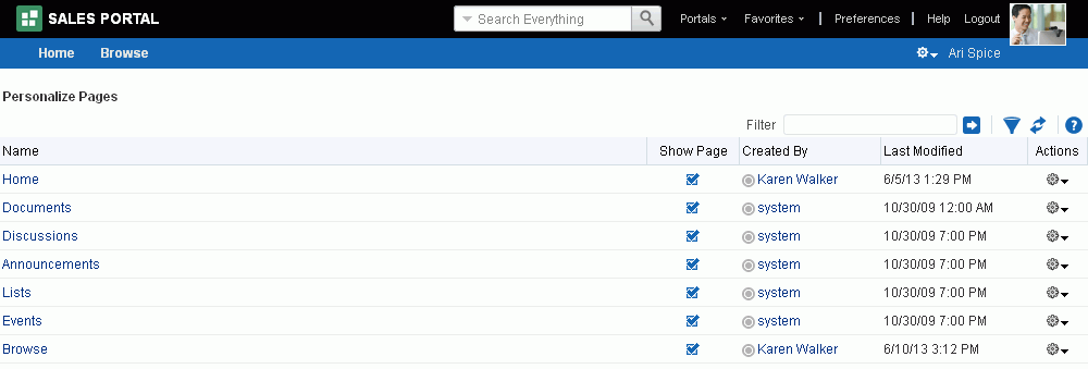
On the Personalize Pages page (Figure 12-1). This page lists all the pages in the portal as a flat listing. To view the page hierarchy (pages and their subpages), view the Pages page in the portal editor or the portal administration.
Tip:
The way you access the Personalize Pages page depends on the page template in use. For example, you may access it through an Actions
 menu when viewing the portal.
Figure 12-1 Personalize Pages for a Portal
Description of "Figure 12-1 Personalize Pages for a Portal"
12.1.2 Previewing a Page Variant for a Device
To preview what a page will look like on a device (such as a smart phone, tablet, or desktop browser) before and after creating a page variant, you can do so on the Pages page in the portal editor. Even if you are building a portal for a desktop browser, this gives you an idea of what the pages might look like on other devices. This preview is useful for determining the edits required to optimize a page variant for a particular device.
See Also:
-
Section 7.3.6, "Setting Page Behavior for a Portal When No Page Variant Exists"
-
Section 12.1.3, "Filtering a Portal Page Listing by Device Group"
-
Section 13.10, "Setting Page Behavior for a Specific Page When No Page Variant Exists"
At the application-level, your system administrator performs the following tasks described in Oracle Fusion Middleware Administering Oracle WebCenter Portal:
-
Configures device group settings, as described in the "Administering Device Settings" chapter
-
Creates page variants for system pages, as described in the "Creating a Page Variant of a System Page for Device Groups" section
To preview how a page will look on a selected device:
-
In the portal editor or portal administration, open the Pages page.
-
Select the page that you want to preview.
-
In the page selection pane, from the Preview (
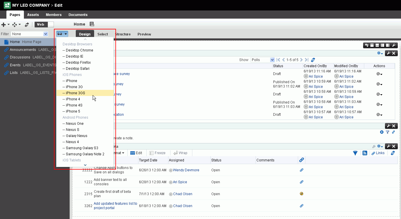
 ) list, select a device for which to preview the selected page (Figure 12-2).
Figure 12-2 Selecting Device for Page Preview
Description of "Figure 12-2 Selecting Device for Page Preview"
-
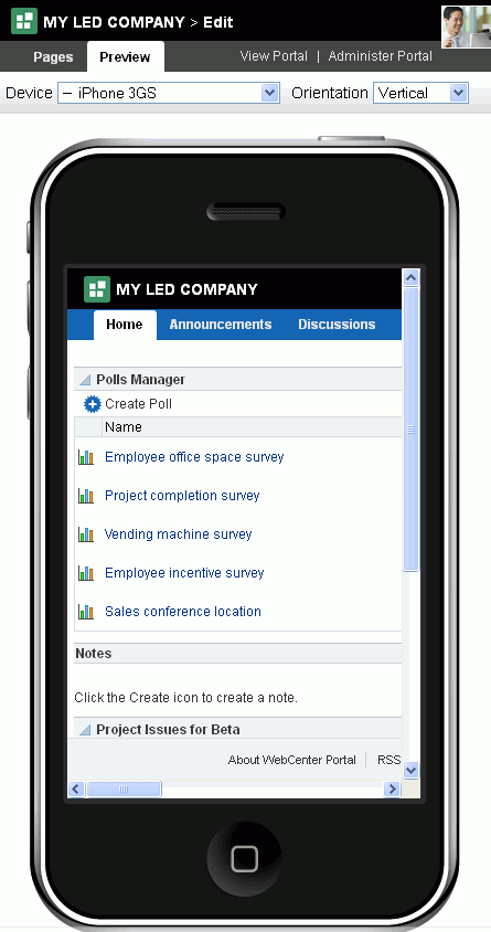
In the Preview view (Figure 12-3), select from the Device and Orientation dropdown lists to preview the page on other devices.
12.1.3 Filtering a Portal Page Listing by Device Group
To view or work with only the pages for a particular device group, you can filter the listing on the Pages page.
See Also:
-
Section 7.3.6, "Setting Page Behavior for a Portal When No Page Variant Exists"
-
Section 13.10, "Setting Page Behavior for a Specific Page When No Page Variant Exists"
At the application-level, your system administrator performs the following tasks described in Oracle Fusion Middleware Administering Oracle WebCenter Portal:
-
Configures device group settings, as described in the "Administering Device Settings" chapter
-
Creates page variants for system pages, as described in the "Creating a Page Variant of a System Page for Device Groups" section
To view pages for a particular device group:
-
In the portal editor or portal administration, open the Pages page.
-
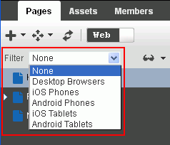
In the page selection pane, from the Filter list, select the device group for which you want to view associated pages (Figure 12-4).
Figure 12-4 Filtering Page List By Device Group
Description of "Figure 12-4 Filtering Page List By Device Group"
The selection pane displays pages associated with the selected device group.
Any pages that are configured to have no fallback if an associated page variant does not exist, either at the application level (see Section 7.3.6, "Setting Page Behavior for a Portal When No Page Variant Exists") or the portal level (Section 13.10, "Setting Page Behavior for a Specific Page When No Page Variant Exists"), it will not be shown in the navigation when you filter by that device group.
12.2 Creating Pages or Subpages in a Portal
You can create new pages or subpages in a portal either when creating a new portal, or by editing an existing portal, as described in the following sections:
-
Section 12.2.1, "Creating Pages or Subpages When Creating a New Portal"
-
Section 12.2.2, "Creating a Page or Subpage in an Existing Portal"
Permissions:
To create a new page in a portal, you must be a portal moderator or a portal member with the portal-level permission Basic Services: Edit Page Access, Structure, and Content permission. Additionally, you need the Assets: Edit Assets (standard permissions) or Navigations: Edit Navigations (advanced permissions) to automatically add the page to the portal navigation.
Portal moderators or other members with Manage All or Manage Configuration permission in the portal can also create new pages from the Pages page in portal administration, as described in Section 7.4.2, "Working with Portal Pages (from Portal Administration)."
For more information about permissions, see Section 29.1, "About Roles and Permissions for a Portal."
12.2.1 Creating Pages or Subpages When Creating a New Portal
You can quickly create pages and subpages for a new portal during the process of creating the portal, using a special syntax in the Create Portal wizard. For information about this method of creating pages, see Section 2.3, "Creating Pages When Creating a New Portal."
12.2.2 Creating a Page or Subpage in an Existing Portal
To create a new page or subpage in an existing portal:
-
Open the Create Page wizard in any of the following ways:
-
On the Home page of the portal, click Create Page.
Tip:
The location of the Create Page link depends on the page template in use. For example, in a side navigation template, you may access it through an Actions menu. You can also find it on the Personalize Pages page.
-
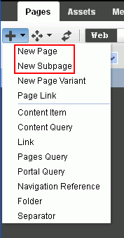
In the portal editor or portal administration, on the Pages page, click the Add icon, and select New Page or New Subpage (Figure 12-5).
See Also:
Section 6.2.1, "Accessing Pages in the Portal Editor" or Section 7.4.1, "Accessing Pages Administration for a Portal."
Figure 12-5 Creating a Page or Subpage in the Portal Editor
Description of "Figure 12-5 Creating a Page or Subpage in the Portal Editor"
-
-
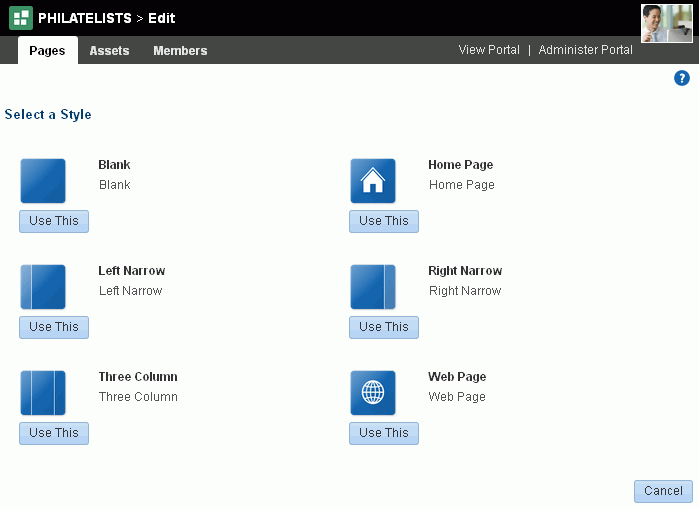
On the Select a Style page (Figure 12-6), explore the page styles available to you to use as the basis for your new page, then click Use This beneath the style you want to use
See Also:
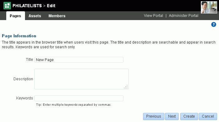
The Page Information page (Figure 12-7) opens.
Figure 12-7 Create Page Wizard: Page Information
Description of "Figure 12-7 Create Page Wizard: Page Information"
-
Enter a page title and, optionally, a description and keywords for the page. Enter any keywords related to the content of the page to make it more easily discoverable in search results. Separate keywords with a space or comma.
The title that you enter here displays at the top of the page and other places where pages are available for selection, such as in the page navigation for the portal.
Note:
-
If you enter a name that duplicates an existing page name, WebCenter Portal automatically adds a numeric suffix to the page name and creates the new page with the modified name. For example, if
MyPageexists, and you try to create a new page namedMyPage, WebCenter Portal renames the new pageMyPage1. -
For wiki pages, the following characters may not be used in the page name:
? \ / : [ ] * ' " |
For wiki page names, you can use letters, numbers, character spaces, and periods (.).
-
-
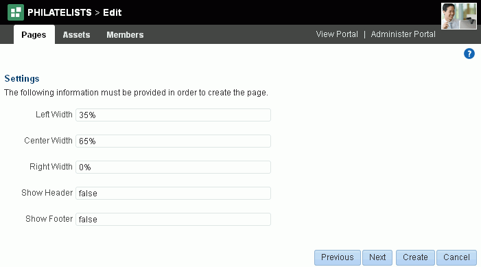
Click Create to create the page with existing default parameter and security settings, or click Next to open the Settings page (Figure 12-8).
Note:
This page appears only if the selected page style includes page parameters. Such parameters are useful for establishing page settings during page creation, rather than editing the page later. Parameters may be used to show or hide areas of a page, set styles or settings for the page, set a product ID, and so on.
-
Optionally. modify the default values of the out-of-the-box page parameters.
If you selected the
Blank,Home Page,Left Narrow,Right Narrow, orThree Columnpage style, you will see the following out-of-the-box parameters with default values:Note:
In non-English versions of WebCenter Portal, these parameters will always display in English due to underlying source code requirements.
Element Description Use to adjust the width of page columns. Depending on the layout you choose, each page column is assigned a default width (
0%in some cases). You can modify the percentage of width allotted to each column. Note that the width values that you enter are fixed values. That is, they do not expand should you add content that exceeds the stated width. See Section 13.12, "Adjusting the Widths of Page Columns."Use to display (
true) or hide (false) a page footer and header. Both of these content areas are immune to user customizations, preventing them from being dragged to a new position or otherwise altered in page view mode.You can edit the page to add content as desired to the page header and footer. See Section 13.13, "Adding a Page Header and Footer." -
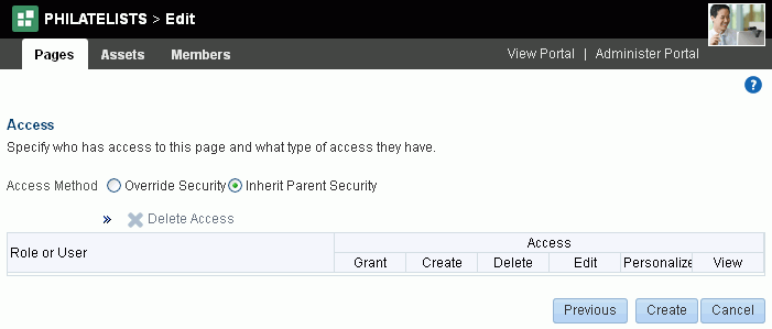
Click Create to create the page with existing default security settings, or click Next to open the Access page (Figure 12-9).
-
Modify the access to the page. For more information, see Section 13.15, "Setting Page Security."
Note:
You can override the page security to create a page that does not take the permissions from the portal roles, but instead allows custom scenarios to be set up where you can control who can see the page, who can edit it, who can create subpages, and so on. If you do not set security in the Create Page wizard at this time, you can set it later on the Security tab of the Pages page, as described Section 13.15, "Setting Page Security."
-
Click Create.
The new page is created and automatically added to the portal navigation. You can edit (see Section 12.4, "Editing a Page") or manage (see Chapter 13, "Managing a Portal Page") it as required.
Note:
If you do not see the new page in the portal navigation, verify with the portal moderator that you are granted the
Assets: Edit Assets(standard permissions) orNavigations: Edit Navigations(advanced permissions) permission to ensure that pages you create are added to the portal navigation.For more information about permissions, see Section 29.1, "About Roles and Permissions for a Portal."
12.3 Creating a Page Variant for a Device Group
Page variants are alternative views of an existing page for specific device groups to target specific device size and characteristics. The base page and the page variant have the same URL, security, parameters, and so on.
Page variants can be created for the Home page and user-created pages in a portal. When a page variant is created for a specific device group, portal users will see that variant when they view the page on a device (such as a smart phone, tablet, or desktop browser) in the device group. When viewing the page on a device in a device group that does not have a page variant defined, the device displays the page as specified in Section 7.3.6, "Setting Page Behavior for a Portal When No Page Variant Exists."
Any changes you make to the page information, security, or parameters of base page are reflected in the page variant. The page variant does not include the Summary, Security, Parameters, and Advanced tabs that allow you to edit this information. However, any subsequent changes to the content of the base page are not reflected in the variant page(s), and vice versa.
See Also:
-
Section 7.3.6, "Setting Page Behavior for a Portal When No Page Variant Exists"
-
Section 12.1.3, "Filtering a Portal Page Listing by Device Group"
-
Section 13.10, "Setting Page Behavior for a Specific Page When No Page Variant Exists"
At the application-level, your system administrator performs the following tasks described in Oracle Fusion Middleware Administering Oracle WebCenter Portal:
-
Configures device group settings, as described in the "Administering Devices and Device Groups" chapter
-
Creates page variants for system pages, as described in the "Creating a Page Variant for System Pages" section
To create a page variant for a device group:
-
In the portal editor or portal administration, open the Pages page.
-
To preview what page looks like for a particular device group before creating the page variant, see Section 12.1.2, "Previewing a Page Variant for a Device."
-
In the selection pane, select the page for which you want to create a page variant.
-
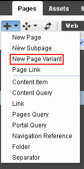
Click the Add icon, and select New Page Variant (Figure 12-10).
-
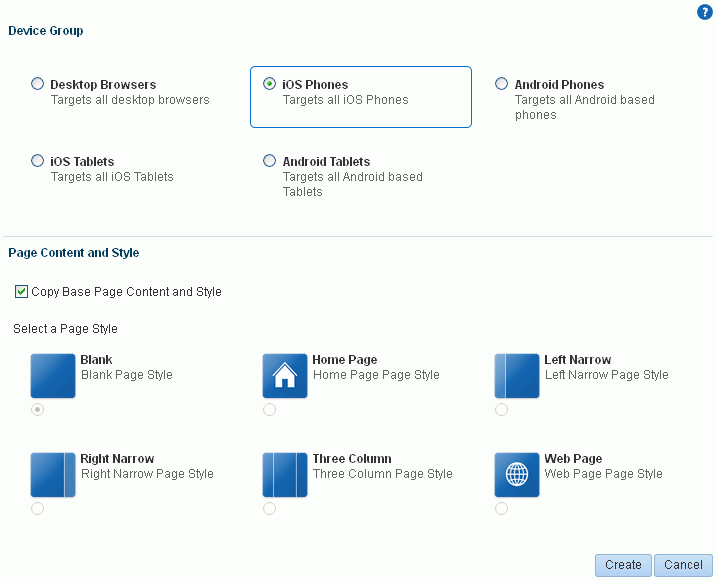
Select the Device Group and Page Content and Style (Figure 12-11):
-
To copy the content and style from the base page, select the Copy Base Page Content and Style check box.
-
To create a page variant with different content and style than the base page, deselect the check box, and select the required page style.
Figure 12-11 Selecting Device Group, Content, and Style
Description of "Figure 12-11 Selecting Device Group, Content, and Style"
-
-
Click Create.
The new page variant is created and the base page exposes it in the portal navigation (Figure 12-12).
Any changes you make to the page information, security, or parameters of base page are reflected in the page variant. The page variant does not include the Summary, Security, Parameters, and Advanced tabs that allow you to edit this information. However, any subsequent changes to the content of the base page are not reflected in the variant page(s), and vice versa.
Figure 12-12 Page Variant in Portal Navigation
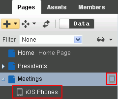
Description of "Figure 12-12 Page Variant in Portal Navigation"
-
To list only those pages for a particular device group, see Section 12.1.3, "Filtering a Portal Page Listing by Device Group."
-
Select and editing page variants as you would any other page (see Section 12.4, "Editing a Page").
12.4 Editing a Page
One of the most powerful offerings in a portal is the ability to add and edit page content at application runtime. This capability is delivered through Composer, a fully-integrated page editor for revising the properties, layout, and content of portal pages, and wiring pages, task flows, and portlets to each other.
Note:
If your portal is based on a portal (space) template from a prior release of WebCenter Portal (for example, if you simply imported a space from a prior release), you will see a view similar to Figure 6-7. Note that there is no support for hierarchical pages (subpages), page variants, or device preview, and the portal administration does not include a Device Settings page. Refer to the WebCenter Portal Documentation on OTN for working with a page in a space for the prior release at http://www.oracle.com/technetwork/middleware/webcenter/portal/documentation/index.html.
If your portal is based on a portal template for this release of WebCenter Portal, either an out-of-the-box template (see Table 3-1, "Out-of-the-Box Portal Templates and Categories") or a custom template, continue with the steps in this section.
This section provides an overview of Composer and describes how to perform editorial tasks:
-
Section 12.4.3, "Opening a Page in the Page Editor (Composer)"
-
Section 12.4.4, "Providing Page Background Color, Image, and CSS Encoding"
-
Section 12.4.6, "Creating Layered Content Regions Using Tabs"
12.4.1 About the Page Editor (Composer)
With the view switcher set to ![]() , the portal editor displays the page editor, Composer. In Composer, you can edit the Home page and any user-created pages in a portal. Other resources added to the portal navigation (see Section 22.2.3, "Adding Resources to a Navigation Model") are not editable in Composer (Figure 12-13).
, the portal editor displays the page editor, Composer. In Composer, you can edit the Home page and any user-created pages in a portal. Other resources added to the portal navigation (see Section 22.2.3, "Adding Resources to a Navigation Model") are not editable in Composer (Figure 12-13).
Note:
The left pane listing all pages in the portal displays only if you have the portal-level permission Assets: Edit Assets (standard permissions) or Navigations: Edit Navigations (advanced permissions).
Figure 12-13 Editable Pages in Portal Navigation
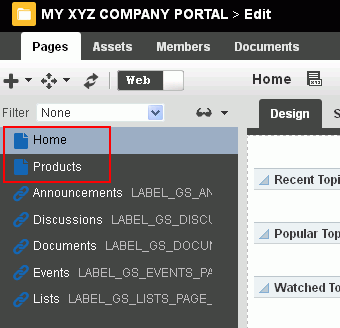
Description of "Figure 12-13 Editable Pages in Portal Navigation"
Note:
With the view switcher set to ![]() , you can manage pages and other navigation items, including viewing and modifying page information, defining parameters, establishing page security, and specifying additional navigation options. For more information, see Chapter 13, "Managing a Portal Page."
, you can manage pages and other navigation items, including viewing and modifying page information, defining parameters, establishing page security, and specifying additional navigation options. For more information, see Chapter 13, "Managing a Portal Page."
The following sections describe the tabbed views where you will edit your pages in Composer:
12.4.1.1 About Design View in Composer
Design view is the default view when you open a page in the page editor (Composer). It provides a WYSIWYG rendering of the page and its content, where controls are directly selectable on each component to move, delete, or view the properties of the component. For more information, see:
-
Section 14.2.1, "Adding a Component to a Page in Design View"
-
Section 14.3.2.1, "Setting Component Properties in Design View"
You cannot select a component in Design view to target the location of new components; this action is available in Select view.
The resource catalog displays inline on the right side of the page, where you can select components to add to the page (Figure 12-14) using drag-and-drop or by clicking the Add link next to a component. You can choose to hide the inline resource catalog in Design view, and instead show each area of the page with an Add Content button to identify the layout containers (such as a Box or Movable Box components) to target the location of new components. If you hide the inline resource catalog, clicking Add Content displays a standalone resource catalog, which does not support drag-and-drop.
Figure 12-14 Design View of Composer (showing page hierarchy and page variant)
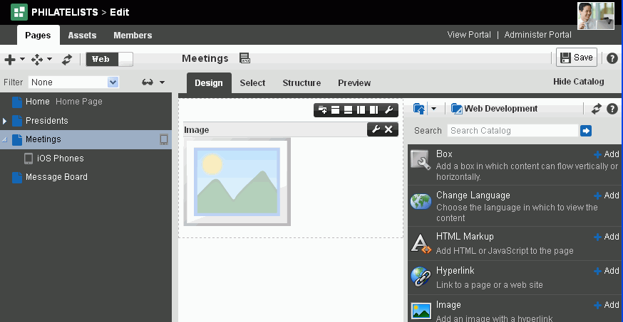
Description of "Figure 12-14 Design View of Composer (showing page hierarchy and page variant)"
12.4.1.2 About Select View in Composer
Select view provides a WYSIWYG rendering of a page and its content, where you can select a component for quick access to its properties or the properties of its parent component, and target the location of new components added to a page. For more information, see:
-
Section 14.2.2, "Adding a Component to a Page in Select View"
-
Section 14.3.2.2, "Setting Component Properties in Select View"
You cannot delete or move a component in Select view; these actions are available in Design view.
Just like Design view, the resource catalog displays inline on the right side of the page, where you can select components to add to the page (Figure 12-15). You can also choose to hide the inline resource catalog, but unlike Design view, Select view does not display Add Content buttons when you hide the inline resource catalog.
Tip:
To target the location of new components in Select view, as Add Content buttons do in Design view, you can select an existing layout container (such as a Box or Movable Box component) in Select view, then click Add next to a component in the resource catalog to add the component inside the selected layout container.
Figure 12-15 Select View of Page Edit Mode
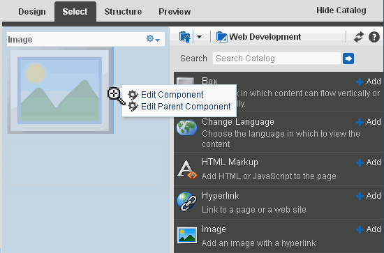
Description of "Figure 12-15 Select View of Page Edit Mode"
12.4.1.3 About Structure View in Composer
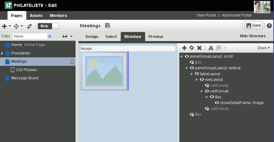
Structure view provides a combined WYSIWYG and hierarchical rendering of page components, where controls are available in the toolbar of the page structure pane (Figure 12-16) to add, edit properties of, delete, cut, and paste page components. Additionally, you can collapse and expand the component hierarchy in the structure pane. For more information, see:
-
Section 14.2.3, "Adding a Component to a Page in Structure View"
-
Section 14.3.2.3, "Setting Component Properties in Structure View"
Figure 12-16 Structure View of Page Edit Mode
Description of "Figure 12-16 Structure View of Page Edit Mode"
The component navigator provides access to page layout components in a tree structure and enables you to select and modify components that are otherwise not exposed on the page. For examples, see Chapter 16, "Working with Layout Components on a Page."
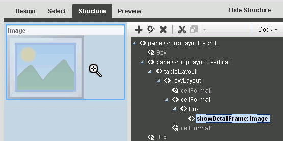
Component selection is indicated by a dark blue outline. A light blue outline is drawn when the mouse hovers around a component that can be selected for editing, and your mouse cursor changes to a magnifying glass (Figure 12-17). When you select a component in the structure pane, it is automatically selected on the page. Similarly, if you select a component on the page, it is automatically selected in the structure pane.
Figure 12-17 Mouse Cursor as Magnifying Glass
Description of "Figure 12-17 Mouse Cursor as Magnifying Glass"
Note:
You can edit core ADF Faces components, task flows, and declarative components only in Structure view of the page.
When your page structure includes a task flow, you will see an Edit Task Flow link next to the task flow in the structure pane, which allows you to zoom into the task flow and edit it like you would edit any customizable page. You can add components, edit component properties, delete components, and resequence table columns on the task flow's page. A Close link zooms back out to the full page hierarchy view. For more information, see Chapter 10, "Customizing Task Flows for a Portal."
Similarly, an Edit link or a Close link next to a declarative component enables you to zoom in and out of the declarative component's page and edit components inside it.
12.4.1.4 About Preview View in Composer
Preview view displays a preview of the published page, as it will appear in your portal.
12.4.2 About Concurrent Users in Composer
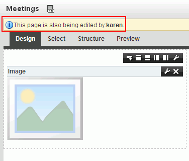
Because users access a portal from the Web, multiple users may attempt to edit the same page at the same time. In such cases, a concurrency warning displays in Composer that alerts each user to the others (Figure 12-18).
Figure 12-18 A Concurrency Warning in Composer
Description of "Figure 12-18 A Concurrency Warning in Composer"
The final state of the page is determined by the last user to save. That is, the last changes saved overwrite the changes made by other concurrent users.
Tip:
Time duration is added to the concurrency message only when the first or a subsequent concurrent user has made (but not yet saved) a page customization.
WebCenter Portal does not support single-user concurrency. That is, one user cannot create multiple, simultaneous sessions.
Because concurrent page editing by multiple users is supported, there may be occasions when one user deletes a page that another user is editing. In such cases, the user performing the edits sees an error message with each action. For example, a message saying the user does not have permission to edit the page may appear. When the user tries to save changes, a Page Not Found error appears with a link redirecting the user to the Home page. The error message may differ, depending on whether the user is editing a page in a portal or the Home portal.
If you view a page while another user is editing it, you may not immediately see the results of those edits in your session. To reliably see any changes, view the page after the other user has saved.
If you revise a component in page view mode while another user deletes the same component in the page editor, an error page opens. Simply navigate back to the original page. The deleted component does not appear, and you can continue working on other components.
12.4.3 Opening a Page in the Page Editor (Composer)
If you own or have permissions to edit a page, you can modify it in the page editor (Composer).
To open a page you own or have permissions to edit in Composer:
-
In the portal editor (see Section 6.1, "Opening the Portal Editor"), click the Pages tab.
-
In the left pane, select the page you want to edit (Figure 12-19).
Note:
The left pane listing all pages in the portal displays only if you have the portal-level permission
Assets: Edit Assets(standard permissions) orNavigations: Edit Navigations(advanced permissions).You can also use the left pane to create and add pages, subpages, page variants, and other navigation items in the current portal, adding them to the portal navigation. For more information, see:
-
Section 13.2, "Adding an Existing Page to the Portal Navigation"
-
Section 13.3, "Adjusting Page Order and Hierarchy in the Portal Navigation"
Figure 12-19 Design View of Page Editor (Web view)

Description of "Figure 12-19 Design View of Page Editor (Web view)"
With the view switcher set to ![]() , you can edit a page in Composer, as described in the sections that follow:
, you can edit a page in Composer, as described in the sections that follow:
-
Section 12.4.4, "Providing Page Background Color, Image, and CSS Encoding"
-
Section 12.4.6, "Creating Layered Content Regions Using Tabs"
With the view switcher set to ![]() , you can manage pages and other navigation items, including viewing and modifying page information, defining parameters, establishing page security, and specifying additional navigation options. For more information, see Chapter 13, "Managing a Portal Page."
, you can manage pages and other navigation items, including viewing and modifying page information, defining parameters, establishing page security, and specifying additional navigation options. For more information, see Chapter 13, "Managing a Portal Page."
12.4.4 Providing Page Background Color, Image, and CSS Encoding
Page properties provide a means of specifying a page background color and image, and applying additional CSS encoding to the page.
Note:
To access other page parameters, which you can use in wiring pages to page components, see Section 13.11, "Adding or Modifying Page Parameters." To set properties that control page security settings, see Section 13.15, "Setting Page Security."
To edit a page's properties:
-
Open the page in edit mode (see Section 12.4.3, "Opening a Page in the Page Editor (Composer)").
-
Click the view switcher to
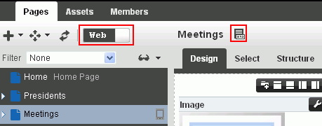
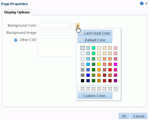
 , then click the Page Properties icon (Figure 12-20) to open the Page Properties dialog (Figure 12-21).
Figure 12-20 the Page Editor (Web): Page Properties Icon
Description of "Figure 12-20 the Page Editor (Web): Page Properties Icon"
Figure 12-21 Page Properties: Display Options
Description of "Figure 12-21 Page Properties: Display Options"
-
To set the page background color, open the color picker next to Background Color, and select a background color for the page in one of the following ways:
-
Select a color by clicking it.
-
Enter the color's RGB equivalent in the Background Color field.
Tip:
Enter RGB values in the format
RRGGBBor#RRGGBBorr,g,b -
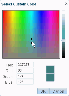
Create a custom color by clicking Custom Color in the picker and selecting a color and a saturation level using the selector and the slider provided (Figure 12-22).
Click OK to enter the color value in the Background Color field.
-
-
To set a background image for the page, enter in the Background Image field a full URL or a URL relative to the application root. For example:
http://www.abc.com/image.jpg
-
In the Other CSS field, add any other CSS encoding you care to that is not covered by the other page properties. For example:
background-position:center;
You must use standard CSS syntax for this value to be valid (for more information about Other CSS, see Section 14.3.6.2, "Using the Other CSS Property").
-
Click OK to save your changes and apply them to the page.
12.4.5 Adding New Content Regions
You can create additional content regions by splitting a Box component into multiple Boxes.
See Also:
You can also create additional content regions by adding more Boxes to a page. For more information, see Section 15.2, "Adding a Web Development Component to a Page."
To split a layout Box on a page:
-
Open the page in edit mode (see Section 12.4.3, "Opening a Page in the Page Editor (Composer)").
-
Click the view switcher to
 and click the Design tab to display the page in Design view.
 -
Go to the Box you want to split, and click the desired Add Box icon (Figure 12-23).
-
Click Save in Composer to save your changes.
See Also:
For information about setting properties on a Box component, see Section 15.3, "Working with the Box Component."
12.4.6 Creating Layered Content Regions Using Tabs
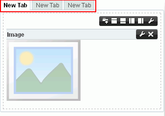
When page real estate is tight, you can add layered content regions using tabs. Tabs are content regions that each have a tab and sit on top of other tabbed content regions (Figure 12-24).
Most of the actions you can perform on a tab, such as renaming, reordering, and so on, are available through tab properties. This section describes how to add tabbed content regions and how to perform various actions on tabs through tab properties:
See Also:
For information about working with tab properties, see Section 16.8, "Setting panelTabbed Properties" and Section 16.10, "Setting sidebarItem Properties."
12.4.6.1 Adding Tabbed Content Regions
Each tab you add to a page provides its own region to which you can add content.
To add tabbed content regions to a page:
-
Open the page in edit mode (see Section 12.4.3, "Opening a Page in the Page Editor (Composer)").
-
Click the view switcher to
 and click the Design tab to display the page in Design view.
 -
In the region (Box component) where you want to add tabs, click the Add a Tab Set or a Tab icon (Figure 12-25) one or more times.
The first tabbed region contains the content present in the layout region on which the tab was created (Figure 12-26), additional tabbed regions initially have no content.
-
Click Save in Composer to save your changes.
12.4.6.2 Reordering and Renaming Tabs
Once you create a tab, you can use tab properties to change its default name (New Tab) or position.
To rename and reorder tabs on a page:
-
Open the page in edit mode (see Section 12.4.3, "Opening a Page in the Page Editor (Composer)").
-
Click the view switcher to
 and click the Design tab to display the page in Design view.
 -
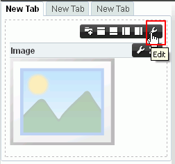
Click the Edit icon on the tab you want to rename or reorder (Figure 12-27).
-
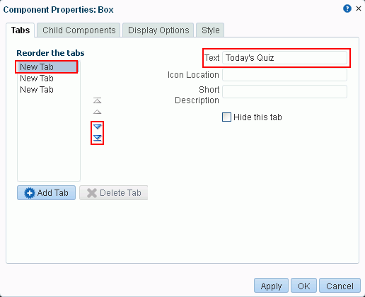
In the Component Properties dialog, on the Tabs tab, select the tab you want to rename or reorder in the Reorder the tabs list (Figure 12-28):
-
To rename the tab, enter the new name in the Text field.
-
To reorder the tab, click a Move icon to the right of the Reorder the tabs list.
Figure 12-28 Renaming or Reordering a Tab
Description of "Figure 12-28 Renaming or Reordering a Tab"
-
-
Click OK to save your changes and exit the dialog.
-
Click Save in Composer to save your changes.
12.4.6.3 Adding an Icon to a Tab
You may want to add a meaningful icon to a tab to make its purpose obvious to knowledgeable users. Added icons are rendered to the left of the tab display name (Figure 12-29).
To add an icon to a tab on a page:
-
Open the page in edit mode (see Section 12.4.3, "Opening a Page in the Page Editor (Composer)").
-
Click the view switcher to
 and click the Design tab to display the page in Design view.
 -
Click the Edit icon on the tab to which you want to add an icon.
-
In the Component Properties dialog, on the Tabs tab, select the tab in the Reorder the tabs list, and set Icon Location to the URI of an image (Figure 12-30).
This property supports the following types of URIs:
-
An absolute path to the image, such as:
http://oracleimg.com/admin/images/ocom/hp/oralogo_small.gif
-
A path located relative to the source page, such as:
bullet.jpg
-
A path relative to the application's context root, such as:
/images/error.png
-
A path relative to the application server, such as:
//adf-richclient-demo-context-root/images/error.png
-
-
Click OK to save your changes and exit the dialog.
-
Click Save in Composer to save your changes.
12.4.6.4 Hiding and Showing Tabs
You can take a tab out of action by hiding it. Hiding a tab might be preferable to deleting because it leaves you the option of returning it to view. Hidden tabs are listed in tab properties, so you always have access to them.
Tip:
If you hide all tabs in a tab set, you can access their properties in Composer Structure view (see Section 12.4.1.3, "About Structure View in Composer"). In Structure view, select the tabs parent element, panelTabbed, and edit its properties.
To hide or show a tab on a page:
-
Open the page in edit mode (see Section 12.4.3, "Opening a Page in the Page Editor (Composer)").
-
Click the view switcher to
 and click the Design tab to display the page in Design view.
 -
Click the Edit icon on a tab you want to change.
-
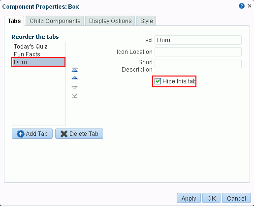
In the Component Properties dialog, on the Tabs tab, select the tab under Reorder the tabs, and do one of the following (Figure 12-31):
-
Select the Hide this tab check box to hide the tab.
-
Deselect the check box to show a hidden tab.
-
-
Click OK to save your changes and exit the dialog.
-
Click Save in Composer to save your changes.
12.4.6.5 Deleting Tabs
You have a few options for deleting a tab or a tab set. You can do so through Structure or Design view in Composer, through tab properties, or on the tab itself. When you delete a tab, the contents of the tab are also deleted.
Note:
Whether you can delete tabs and how many tabs you can delete may be controlled by the panelTabbed property Tab Removal (see Section 16.8, "Setting panelTabbed Properties").
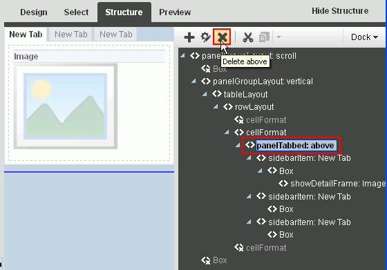
You can delete an entire tab set by deleting panelTabbed in Structure view.
When you remove tabs individually through Box properties (in Design view), you can remove all but the current tab.
To delete a tab or a tab set on a page:
-
Open the page in edit mode (see Section 12.4.3, "Opening a Page in the Page Editor (Composer)").
-
Click the view switcher to
 and click the Design tab to display the page in Design view.
 -
Delete the relevant tab or tab set by doing one of the following:
-
To delete a tab set, go to Structure view of Composer, select the relevant
panelTabbedelement, and click Delete (Figure 12-32).Figure 12-32 Deleting a panelTabbed Element in Structure View of Page Editor
Description of "Figure 12-32 Deleting a panelTabbed Element in Structure View of Page Editor"
Click Delete in the confirmation dialog.
See Also:
For more information about Structure view, see Section 12.4.1.3, "About Structure View in Composer."
-
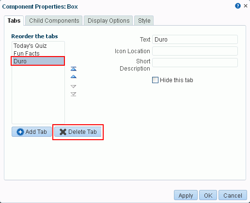
To delete one or more tabs, go to Design view of Composer, click the Edit icon on a tab in the tab set, then in the Component Properties dialog, on the Tabs tab, select the tab to delete under Reorder the tabs, and click Delete Tab (Figure 12-33).
Click Delete in the confirmation dialog.
Tip:
You can also access tab set properties by selecting the
panelTabbedin Composer Structure view (see Section 12.4.1.3, "About Structure View in Composer") and clicking the Edit button.
-
-
Click Save in Composer to save your changes.
12.4.7 Adding Components to a Page
You develop the content of a page by adding components to it in Composer. In Design view and Select view (see Section 12.4.1, "About the Page Editor (Composer)"), the resource catalog provides a gateway to a wide range of task flows, portlets, components, and other types of resources. In Structure view, you can add layout components. For information about adding components to a page, see:
12.5 Personalizing Pages
Using Expression Language (EL) expressions, you can present targeted content or shape the way content is presented by selecting and applying a page template based on whoever is the current user. For example, one user role sees a page through template A, while another user role sees the same page through template B. If you need assistance, an application developer can help provide an EL expression (see the "Expression Language Expressions" appendix in Oracle Fusion Middleware Developing Portals with Oracle WebCenter Portal and Oracle JDeveloper to add to your page.
There is a wide variety of user and application context that can determine the content a user sees. For example, content can be restricted by role through a security mechanism, such as page hierarchy security. Or, content can be targeted based on more dynamic user and application context, such as user profile values and session information.
Information about personalization in Oracle WebCenter Portal is available in the "Managing Personalization" chapter in Oracle Fusion Middleware Administering Oracle WebCenter Portal, and the "Personalizing Oracle WebCenter Portal Applications" chapter in Oracle Fusion Middleware Developing Portals with Oracle WebCenter Portal and Oracle JDeveloper.
