Getting Started with JavaFX
2 Creating a Form in JavaFX
Creating a form is a common activity when developing an application. This tutorial teaches you the basics of screen layout, how to add controls to a layout pane, and how to create input events.
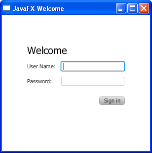
In this tutorial, you will use JavaFX to build the login form shown in Figure 2-1.
The tool used in this Getting Started tutorial is NetBeans IDE. Before you begin, ensure that the version of NetBeans IDE that you are using supports JavaFX 2. See the System Requirements for details.
Create the Project
Your first task is to create a JavaFX project in NetBeans IDE and name it Login:
-
From the File menu, choose New Project.
-
In the JavaFX application category, choose JavaFX Application. Click Next.
-
Name the project Login and click Finish.
When you create a JavaFX project, NetBeans IDE provides a Hello World application as a starting point, which you have already seen if you followed the Hello World tutorial.
-
Remove the
start()method that NetBeans IDE generated and replace it with the code in Example 2-1.
Tip: After you add sample code into a NetBeans project, press Ctrl (or Cmd) + Shift + I to import the required packages. When there is a choice of import statements, choose the one that starts with javafx.
Create a GridPane Layout
For the login form, use a GridPane layout because it enables you to create a flexible grid of rows and columns in which to lay out controls. You can place controls in any cell in the grid, and you can make controls span cells as needed.
The code to create the GridPane layout is in Example 2-2. Add the code before the line primaryStage.show();
Example 2-2 GridPane with Gap and Padding Properties
GridPane grid = new GridPane();
grid.setAlignment(Pos.CENTER);
grid.setHgap(10);
grid.setVgap(10);
grid.setPadding(new Insets(25, 25, 25, 25));

Scene scene = new Scene(grid, 300, 275);
primaryStage.setScene(scene);
Example 2-2 creates a GridPane object and assigns it to the variable named grid. The alignment property changes the default position of the grid from the top left of the scene to the center. The gap properties manage the spacing between the rows and columns, while the padding property manages the space around the edges of the grid pane. The insets are in the order of top, right, bottom, and left. In this example, there are 25 pixels of padding on each side.
The scene is created with the grid pane as the root node, which is a common practice when working with layout containers. Thus, as the window is resized, the nodes within the grid pane are resized according to their layout constraints. In this example, the grid pane remains in the center when you grow or shrink the window. The padding properties ensure there is a padding around the grid pane when you make the window smaller.
This code sets the scene width and height to 300 by 275. If you do not set the scene dimensions, the scene defaults to the minimum size needed to display its contents.
Add Text, Labels, and Text Fields
Looking at Figure 2-1, you can see that the form requires the title “Welcome “and text and password fields for gathering information from the user. The code for creating these controls is in Example 2-3. Add this code after the line that sets the grid padding property.
Example 2-3 Controls
Text scenetitle = new Text("Welcome");
scenetitle.setFont(Font.font("Tahoma", FontWeight.NORMAL, 20));
grid.add(scenetitle, 0, 0, 2, 1);

Label userName = new Label("User Name:");
grid.add(userName, 0, 1);

TextField userTextField = new TextField();
grid.add(userTextField, 1, 1);

Label pw = new Label("Password:");
grid.add(pw, 0, 2);

PasswordField pwBox = new PasswordField();
grid.add(pwBox, 1, 2);
The first line creates a Text object that cannot be edited, sets the text to Welcome, and assigns it to a variable named scenetitle. The next line uses the setFont() method to set the font family, weight, and size of the scenetitle variable. Using an inline style is appropriate where the style is bound to a variable, but a better technique for styling the elements of your user interface is by using a style sheet. In the next tutorial, Fancy Forms with JavaFX CSS, you will replace the inline style with a style sheet.
The grid.add() method adds the scenetitle variable to the layout grid. The numbering for columns and rows in the grid starts at zero, and scenetitle is added in column 0, row 0. The last two arguments of the grid.add() method set the column span to 2 and the row span to 1.
The next lines create a Label object with text User Name at column 0, row 1 and a Text Field object that can be edited. The text field is added to the grid pane at column 1, row 1. A password field and label are created and added to the grid pane in a similar fashion.
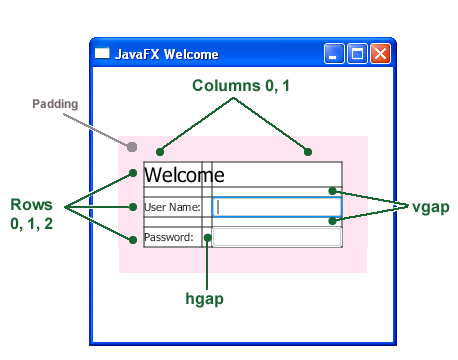
When working with a grid pane, you can display the grid lines, which is useful for debugging purposes. In this case, you can add grid.setGridLinesVisible(true) after the line that adds the password field. Then, when you run the application, you see the lines for the grid columns and rows as well as the gap properties, as shown in Figure 2-2.
Add a Button and Text
The final two controls required for the application are a Button control for submitting the data and a Text control for displaying a message when the user presses the button.
First, create the button and position it on the bottom right, which is a common placement for buttons that perform an action affecting the entire form. The code is in Example 2-4. Add this code before the code for the scene.
Example 2-4 Button
Button btn = new Button("Sign in");
HBox hbBtn = new HBox(10);
hbBtn.setAlignment(Pos.BOTTOM_RIGHT);
hbBtn.getChildren().add(btn);
grid.add(hbBtn, 1, 4);
The first line creates a button named btn with the label Sign in, and the second line creates an HBox layout pane named hbBtn with spacing of 10 pixels. The HBox pane sets an alignment for the button that is different from the alignment applied to the other controls in the grid pane. The alignment property has a value of Pos.BOTTOM_RIGHT, which positions a node at the bottom of the space vertically and at the right edge of the space horizontally. The button is added as a child of the HBox pane, and the HBox pane is added to the grid in column 1, row 4.
Now, add a Text control for displaying the message, as shown in Example 2-5. Add this code before the code for the scene.
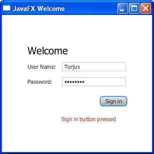
Figure 2-3 shows the form now. You will not see the text message until you work through the next section of the tutorial, Add Code to Handle an Event.
Add Code to Handle an Event
Finally, make the button display the text message when the user presses it. Add the code in Example 2-6 before the code for the scene.
Example 2-6 Button Event
btn.setOnAction(new EventHandler<ActionEvent>() {

    @Override
    public void handle(ActionEvent e) {
        actiontarget.setFill(Color.FIREBRICK);
        actiontarget.setText("Sign in button pressed");
    }
});
The setOnAction() method is used to register an event handler that sets the actiontarget object to Sign in button pressed when the user presses the button. The color of the actiontarget object is set to firebrick red.
Run the Application
Right-click the Login project node in the Projects window, choose Run, and then click the Sign in button. Figure 2-4 shows the results. If you run into problems, then take a look at the code in the Login.java file.
Where to Go from Here
This concludes the basic form tutorial, but you can continue reading the following tutorials on developing JavaFX applications.
-
Fancy Forms with JavaFX CSS provides tips on how to add a background image and radically change the style of the text, label, and button in the login form.
-
Using FXML to Create a User Interface shows an alternate method for creating the login user interface. FXML is an XML-based language that provides the structure for building a user interface separate from the application logic of your code.
-
Working With Layouts in JavaFX explains the built-in JavaFX layout panes, and tips and tricks for using them.
-
Deploying Your First JavaFX Application provides information on how to run your application outside NetBeans IDE.
Also try out the JavaFX samples, which you can download from the JDK Demos and Samples section of the Java SE Downloads page at http://www.oracle.com/technetwork/java/javase/downloads/. The Ensemble sample contains examples of layouts and their source code.
 Gail is part of the JavaFX documentation team and enjoys working on cutting-edge, innovative documentation.
 Nancy is a technical writer
in the JavaFX group. She has a background in content management systems, enterprise server-client software, and XML.
She lives on 480 acres in the middle of nowhere with horses, a donkey, dogs, cats, and chickens, and stays
connected by satellite.


