 Gail is part of the JavaFX documentation team and enjoys working on cutting-edge, innovative documentation.
 Nancy is a technical writer
in the JavaFX group. She has a background in content management systems, enterprise server-client software, and XML.
She lives on 480 acres in the middle of nowhere with horses, a donkey, dogs, cats, and chickens, and stays
connected by satellite.
Nancy is a technical writer
in the JavaFX group. She has a background in content management systems, enterprise server-client software, and XML.
She lives on 480 acres in the middle of nowhere with horses, a donkey, dogs, cats, and chickens, and stays
connected by satellite. Getting Started with JavaFX
 |
 |
3 Fancy Forms with JavaFX CSS
This tutorial is about making your JavaFX application look attractive by adding a Cascading Style Sheet (CSS). You develop a design, create a .css file, and apply the new styles.
In this tutorial, you will take a Login form that uses default styles for labels, buttons, and background color, and, with a few simple CSS modifications, turn it into a stylized application, as shown in Figure 3-1.
Figure 3-1 Login Form With and Without CSS

Description of "Figure 3-1 Login Form With and Without CSS"
The tool used in this Getting Started tutorial is NetBeans IDE. Before you begin, ensure that the version of NetBeans IDE that you are using supports JavaFX 2. See the System Requirements for details.
Create the Project
If you followed the Getting Started guide from the start, then you already created the Login project required for this tutorial. If not, download the Login project by right-clicking Login.zip and saving it to your file system. Extract the files from the zip file, and then open the project in NetBeans IDE.
Create the CSS File
Your first task is to create a new CSS file and save it in the same directory as the main class of your application. After that, you must make the JavaFX application aware of the newly added Cascading Style Sheet.
-
In the NetBeans IDE Projects window, expand the Login project node and then the Source Packages directory node.
-
Right-click the login folder under the Source Packages directory and choose New, then Other.
-
In the New File dialog box, choose Other, then Cascading Style Sheet, and click Next.
-
Enter Login for the File Name text field and ensure the Folder text field value is
src\login. -
Click Finish.
-
In the
Login.javafile, initialize thestyle sheetsvariable of theSceneclass to point to the Cascading Style Sheet by including the line of code shown in bold below so that it appears as shown in Example 3-1.Example 3-1 Initialize the stylesheets Variable
Scene scene = new Scene(grid, 300, 275); primaryStage.setScene(scene);
scene.getStylesheets().add(Login.class.getResource("Login.css").toExternalForm());primaryStage.show();This code looks for the style sheet in the
src\logindirectory in the NetBeans project.
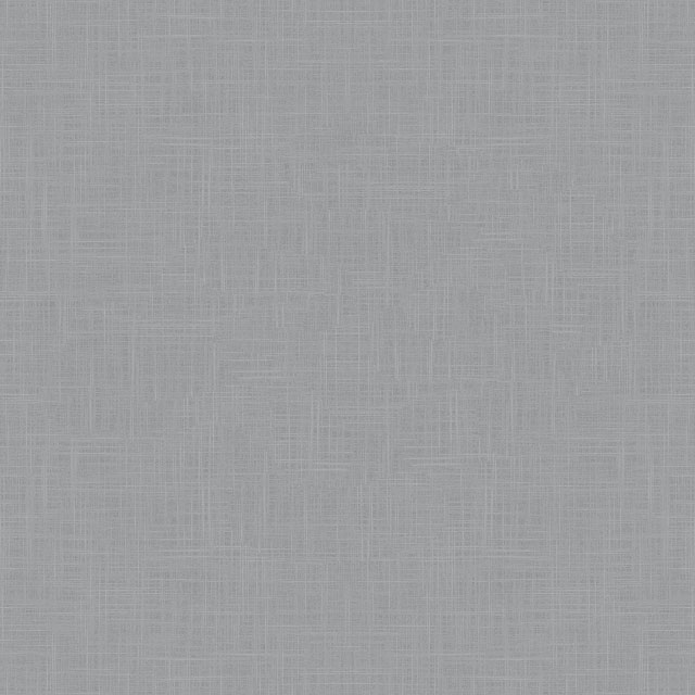
Add a Background Image
A background image helps make your form more attractive. For this tutorial, you add a gray background with a linen-like texture.
First, download the background image by right-clicking background.jpg and saving it to your file system. Then, copy the file into the src\login folder in the Login NetBeans project.
Now, add the code for the background-image property to the CSS file. Remember that the path is relative to the style sheet. So, in the code in Example 3-2, the background.jpg image is in the same directory as the Login.css file.
The background image is applied to the .root style, which means it is applied to the root node of the Scene instance. The style definition consists of the name of the property (-fx-background-image) and the value for the property (url(“background.jpg”)).
Figure 3-2 shows the login form with the new gray background.

Style the Labels
The next controls to enhance are the labels. You will use the .label style class, which means the styles will affect all labels in the form. The code is in Example 3-3.
Example 3-3 Font Size, Fill, Weight, and Effect on Labels
.label {
    -fx-font-size: 12px;
    -fx-font-weight: bold;
    -fx-text-fill: #333333;
    -fx-effect: dropshadow( gaussian , rgba(255,255,255,0.5) , 0,0,0,1 );
}
This example increases the font size and weight and applies a drop shadow of a gray color (#333333). The purpose of the drop shadow is to add contrast between the dark gray text and the light gray background. See the section on effects in the JavaFX CSS Reference Guide for details on the parameters of the drop shadow property.
The enhanced User Name and Password labels are shown in Figure 3-3.
Figure 3-3 Bigger, Bolder Labels with Drop Shadow

Description of "Figure 3-3 Bigger, Bolder Labels with Drop Shadow"
Style Text
Now, create some special effects on the two Text objects in the form: scenetitle, which includes the text Welcome, and actiontarget, which is the text that is returned when the user presses the Sign in button. You can apply different styles to Text objects used in such diverse ways.
-
In the
Login.javafile, remove the following lines of code that define the inline styles currently set for the text objects:scenetitle.setFont(Font.font(“Tahoma”, FontWeight.NORMAL, 20));actiontarget.setFill(Color.FIREBRICK);By switching to CSS over inline styles, you separate the design from the content. This approach makes it easier for a designer to have control over the style without having to modify content.
-
Create an ID for each text node by using the
setID()method of the Node class:scenetitle.setId("welcome-text");actiontarget.setId("actiontarget"); -
In the
Login.cssfile, define the style properties for thewelcome-textandactiontargetIDs. For the style name, use the ID preceded by a number sign (#), as shown in Example 3-4.Example 3-4 Text Effect
#welcome-text {
   -fx-font-size: 32px;
   -fx-font-family: "Arial Black";
   -fx-fill: #818181;
   -fx-effect: innershadow( three-pass-box , rgba(0,0,0,0.7) , 6, 0.0 , 0 , 2 );
}
#actiontarget {
  -fx-fill: FIREBRICK;
  -fx-font-weight: bold;
  -fx-effect: dropshadow( gaussian , rgba(255,255,255,0.5) , 0,0,0,1 );
}
The size of the Welcome text is increased to 32 points and the font is changed to Arial Black. The text fill color is set to a dark gray color (#818181) and an inner shadow effect is applied, creating an embossing effect. You can apply an inner shadow to any color by changing the text fill color to be a darker version of the background. See the section on effects in the JavaFX CSS Reference Guide for details about the parameters of inner shadow property.
The style definition for actiontarget is similar to what you have seen before.
Figure 3-4 shows the font changes and shadow effects on the two Text objects.

Style the Button
The next step is to style the button, making it change style when the user hovers the mouse over it. This change will give users an indication that the button is interactive, a standard design practice.
First, create the style for the initial state of the button by adding the code in Example 3-5. This code uses the .button style class selector, such that if you add a button to the form at a later date, then the new button will also use this style.
Example 3-5 Drop Shadow for Button
.button {
    -fx-text-fill: white;
    -fx-font-family: "Arial Narrow";
    -fx-font-weight: bold;
    -fx-background-color: linear-gradient(#61a2b1, #2A5058);
    -fx-effect: dropshadow( three-pass-box , rgba(0,0,0,0.6) , 5, 0.0 , 0 , 1 );
}
Now, create a slightly different look for when the user hovers the mouse over the button. You do this with the hover pseudo-class. A pseudo-class includes the selector for the class and the name for the state separated by a colon (:), as shown in Example 3-6.
Example 3-6 Button Hover Style
.button:hover {
    -fx-background-color: linear-gradient(#2A5058, #61a2b1);
}
Figure 3-5 shows the initial and hover states of the button with its new blue-gray background and white bold text.
Figure 3-5 Initial and Hover Button States

Description of "Figure 3-5 Initial and Hover Button States"
Figure 3-6 shows the final application.

Where to Go from Here
Here are some things for you to try next:
-
See what you can create using CSS. Some documents that can help you are Skinning JavaFX Applications with CSS, Styling Charts with CSS, and the JavaFX CSS Reference Guide. Skinning with CSS and CSS Analyzer also provides information on how you can use the JavaFX Scene Builder tool to skin your JavaFX FXML layout.
-
See Styling FX Buttons with CSS for examples of how to create common button styles using CSS.
-
Try deploying your application outside NetBeans IDE. See Deploying Your First JavaFX Application.
|
|