| Bookshelf Home | Contents | Index | Search | PDF | |
Siebel Tools Reference > Physical UI Navigation and Templates > Applet Templates >
Tree Applets
The explorer-style (or tree) applet presents hierarchically structured information in an expandable tree control. The tree control is displayed in a frame on the left side of the applet content area. Detailed information for a selected tree node is displayed in the details applet in a frame to the right. The separate vertical frames allow the contents of the tree applet to be scrolled independently from the details applet. This is important because trees' structures can typically grow very large in length and width.
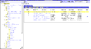
A tree applet in an explorer view is similar in operation to the Object Explorer and Object List Editor in Siebel Tools. The user may expand and collapse folders in the tree applet, and view the records in that folder in the list applet. The hierarchy displayed in the tree applet represents master-detail relationships between records of different business components. A tree applet in an explorer view uses the set of master-detail relationships implemented in the business object assigned to the view. The Opportunities Explorer View is illustrated in Figure 227.
For example, when the user expands an opportunity by double-clicking, a set of folders appears hierarchically beneath it including Opportunities, Contacts, Partners, Quotes, Activities, Notes, and so on. When the user expands one of these child folders, a list of records appears of the corresponding business component. If the user expands the opportunity and then expands the Activities folder beneath it, the list of records displayed is the set of activity records for that opportunity. In the master-detail relationship between opportunities and activities, these activity records are detail records of the master opportunity record that was expanded. The user can also add or associate detail records of various kinds to particular master records.
NOTE: The architectural aspects of tree applets are described in the Tree Applets section of the Special-Purpose Applets and Controls.
This section describes the configuration of the templates for the explorer applet.
Here is a sample view template for a view containing an explorer applet:
<!--View with tree applet on the left and list applet on the right-->
<table border="0" cellspacing="0" cellpadding="1" width="100%">
<swe:applet id="1" hintText="Tree Applet"/>
The
<swe:applet-tree-list>tag that appears in this template provides a placeholder for a list applet that is displayed as a result of selecting or expanding a tree item (node). The applet that is rendered depends on the node that is currently selected.Here is a sample applet template for an explorer applet. It displays the tree in a single-column table:
<TABLE BORDER=0 CELLPADDING=0 CELLSPACING=0>
<swe:this property="FormattedHtml"/>
<swe:this property="FormattedHtml"/>
A tree control can have repository tree nodes and field values as elements in the tree. The term tree item is used for a tree element regardless of whether it is a "root," "branch," or a "leaf" in the tree. A repository tree node is called a tree node. The
<swe:node>tag specifies the placeholder for a tree item. For a tree node, the display name is shown, whereas for tree items, the field values are shown. In the example above, the<swe:node>tag with type DisplayName is ignored for tree items, and the<swe:node>with type FieldValue is ignored for tree nodes.In order to display a tree, the logic iterates over each item of the tree in a top-down, depth-first fashion, and displays one item at a time. This is specified in the template using the
<swe:for-each-node>tag.Each tree item is indented to place the text in the correct indent level relative to the root using the
<swe:for-each-indent>tag, and to display the expand/collapse mark, the text of the item, and the hyperlinks. The indentation is accomplished using a series of GIF images, or just white spaces (when in text-only mode). The expand/collapse mark and the item are displayed using images (or just text, in text-only mode), specified in the template using the<swe:indent-img>tag. The list applet associated with the currently selected tree node is displayed as part of the view.Details about the various tags used in Tree Applet Templates are described below:
<swe:for-each-node>Iterates over each visible item in the tree control in a top-down, "depth-first" fashion. This tag is used to display tree nodes and field values. The attributes are optional. If Count is not specified, the tag iterates over all nodes in the tree.
- Count. Specifies the number of times the tag should iterate its contents. This attribute is provided for situations where specific tree formatting is required.
- StartValue. The value at which the iteration starts. The tag starts the iteration by assigning this value to an internal iterator, and increments it by one for each iteration.
<swe:for-each-indent>Iterates over each level of a tree item. Used for creating indentation when displaying tree items.
<swe:indent-img>Provides a placeholder for a GIF image corresponding to a tree item's current indentation level. At each level, SWE determines which GIF file to use in the
<img>tag to output. The GIF images can be either a blank space or a vertical bar.
<swe:node>Provides a placeholder for an item in the tree. A tree item can be a repository tree node or a field value. The display name is printed if the tree item is a tree node. Otherwise, the field value is generated. The expand/collapse mark, the item's icon, and the links are also parts of a tree item. Depending on the configuration file settings, the expand/collapse mark is shown as either a GIF image or text. The expand/collapse mark is only shown for tree items with child items. There are two links associated with each item. There is a link for the
+/— mark to expand or collapse the item and a link for the item image for selecting the item (or for going to next or previous workset). The item selection allows the user to access the list applet associated with the tree node. This tag should use<swe:this>as a child tag.Configuration File Parameters
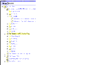
A tree control consists of reusable graphic elements and text obtained from business component records, as shown in Figure 228.
The text is obtained from business components, as defined in the Tree and Tree Node object types in the repository. The graphic elements (expansion and contraction boxes, elbows, folder symbols and so on) are defined in the configuration file in the [SWE] section. Configuration file parameters are specified to customize the appearance of the folder and document symbols, expand and collapse marks, elbows, spacers, and so on. The syntax of a configuration file parameter line for defining a graphic is as follows:
parameter_name = <img param1 param2 etc.>
TreeNodeCollapseCaption = "<img src='images/tree_collapse.gif' alt='-' border=0 align=left vspace=0 hspace=0>"
A text replacement for an image, for use by text-only browsers, is specified using the
alt=parameter in the<img>tag.Four parameters are also available for configuring the display of text obtained from field values. These are the TreeNodeFontStyle, TreeNodeFontSize, TreeNodeSelectBgColor, and TreeNodeSelectFgColor parameters. The syntax for these is:
The term caption as used in the parameter names is a bit misleading. By caption, what is actually meant is icon or graphic. The so-called caption precedes the text that is generated from field values, or precedes another so-called caption. The supported caption graphic and text style parameters are listed below by category.
Elbows and Trees
- TreeNodeCollapseElbowCaption
- TreeNodeCollapseTeeCaption
- TreeNodeElbowCaption
- TreeNodeExpandElbowCaption
- TreeNodeExpandTeeCaption
- TreeNodeTeeCaption
Root, Leaf, and Open/Closed Folder Icons
- TreeNodeCloseFolderCaption.
- TreeNodeLeafCaption.
- TreeNodeOpenFolderCaption—Open folder with the dangling line.
- TreeNodeOpenFolder2Caption—Open folder without the dangling line.
- TreeNodeRootCaption.
- TreeNodeArrowDownCaption—This icon indicates that there are additional records not shown below, and when clicked, displays the next group.
- TreeNodeArrowUpCaption—This indicates that there are additional records not shown above.
Indentation Graphics
Text Style Parameters
| Bookshelf Home | Contents | Index | Search | PDF | |
Siebel Tools Reference Published: 20 October 2003 |