This section describes the main sections that make up the PMDT file from which the template user interface is created.
Template Header
The first part of the template PMDT file is the header, which provides basic information about the template. The header includes the following attributes:
The template header attributes are:
item-type—Required. Type of repository item the template represents. The default options are item-discount, order-discount, and shipping-discount.author—Optional. Name of the template author.last-modified-by—Optional. Name of the person who last modified the template. Must be manually updated if used.creation-date—Optional. Creation date of the template.deprecated-by—Optional. Name of the person who deprecated the template. Must be manually updated if used.
For example:
<template   item-type="Item Discount"
            repository="some/repository/path"
            author="Template Author"
            last-modified-by="Template Author"
            creation-date="28/09/2009">
UI Description Element
If you want your template to appear in the Oracle ATG Web Commerce Merchandising user interface, you must include a ui-description element as part of the template.
If the template has no ui-description section, it is not displayed in Merchandising’s template list. If the template does have a ui-description section then it will appear in the template list unless the available-in-ui attribute is explicitly set to false.
Note: You may not want the template to appear in the UI if the template is intended for importing or exporting promotions (see Importing and Exporting Promotions), or if you want to remove the template from the list from which users can select.
The ui-description tag includes the following attributes, all of which are optional:
display-name—String used to label the template in the template list and in the template screen title bar.resource-bundle—Optional. The location of the resource bundle used to represent this template in the UI.display-name-resource—Optional. If theresource-bundleattribute is present, thedisplay-name-resourceis used as a key to retrieve the localized value from the indicated resource bundle. Ifresource-bundleis not present or the specified resource bundle cannot be found, thedisplay-name-resourceattribute value is used for display. This attribute overrides thedisplay-nameattribute.available-in-ui—Optional. If this attribute is not included in the XML, it defaults totrue. If explicitly set tofalse, the template is not displayed on the template selection screen, even if it has aui-descriptionsection.
UI Description Child Elements
The ui-description can include a number of sub-elements.
The multi-element-translators element is used to combine, translate, or insert values into the item properties. See Translating User Input Values in Templates.
The optional group-info element is used to create the template selection menu. The group-info element has two optional attributes:
groupId—IfgroupIdis specified, that template appears grouped with other templates that have the samegroupId. If nogroupIdis specified, the templates are grouped into a default group. Templates within a group appear in ascending alphabetical order unless atemplatePriorityIdis specified.templatePriorityId—If specified for a template, templates are displayed in ascending priority order rather than ascending alphabetical (the default). Zero designates the highest priority.
Additional elements are structural, and provide layout information for the template page:
The
screen-segmentelement provides a means of grouping elements within the template. Ascreen-segmenthas anameand however manylineelements you want to include.The
lineelement contains user interface items you want to appear as one line to the user, for example a label and its corresponding input area.
A line element is the smallest structural unit of a template.
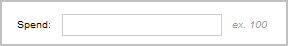
This example shows a screen segment with a single line of input:
<screen-segment display-name="Condition"
  <line>
    <label id="spendLabel"
           display-name="Spend:"
    <textInput id="spend_textInput"
               placeholder-name="spend_value"/>
    <label id="spend_example_label"
           display-name="ex. 100" styleName="infoText"/>
  </line>
</screen-segment>
The resulting user interface resembles the following:
Line Child Elements
The line element can include any of the following sub-elements
textInputcomboBoxradioButtonGroupcheckBoxtextAreadatelabelspacerhorizontalRule
Most of these elements represent standard user interface components. Each can include a number of attributes such as height, label, and a resource bundle reference; see the PMDT.DTD for detailed information.
The following elements are unique to promotions templates, and are described in the sections that follow:
expression—Used by the advanced screen to display a condition or offer sequence See the Expression Elements section for more information.grid—Used for table layouts; see the Grid Elements section for details.includesProductSetCriteriaandexcludesProductSetCriteria—Used to construct rules that identify which products are eligible for the promotion. See the Product Set Criteria Elements section for more information.switchableDiscount—This element allows a user to toggle between discount amount and a discount structure grid view. See the SwitchableDiscount Element section.assetCollector—When clicked, pops up an asset picker dialog from which assets can be selected. (See the ATG Business Control Center Administration and Development Guide).gwpSelector—An asset selector with restrictions specific to gift with purchase promotions. The selector supports both drag and drop and asset picker selection, and allows selection of categories, products, SKUs, or content groups as a gift. See the following screen shot for an illustration.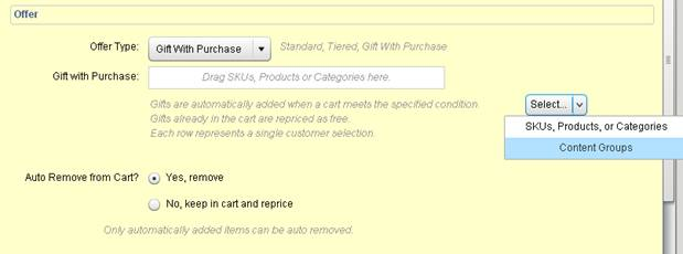
Each element in the user interface has an id attribute, which can be used to identify the user input for that element elsewhere in the template. Elements can also have a place-holder-name attribute. The place-holder-name attribute is used to insert user input into the PMDL statement the template constructs.
Expression Elements
The expression element allows you to support complex, freeform conditional statements such as those used in the Advanced Condition & Offer template. It does this using an independent grammar file, and appears in the user interface as an expression editor.
The expression element functionality is available through the Advanced Condition & Offer page, and has the following attributes:
id—Id to use when referencing the expression.model-path—Path to a Nucleus component that provides the information necessary to configure the expression with the correct sequence information.enabled—True by default; if false, the expression section appears grayed out and uneditable in the template.required—True by default; if false, the expression section is included but is not required by the template.
SwitchableDiscount Element
If the offer type is not Gift with Purchase, the switchableDiscount element allows a user to toggle between the views defined by the beneath it; for example, between the discount amount and a discount structure grid view.
The examples shown are from the Advanced Condition & Offer:
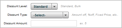
Discount Amount
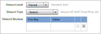
Discount Structure
The following code sample illustrates the use in the template:
<line>
  <switchableDiscount id="switchable_discount">
    <view>
      <label id="discount_structure_label" display-name-
resource="template.common.discountStructureLabel" container-width="100" container-
h-align="right"/>
      <grid id="discountStructureData"
validator="/atg/remote/promotion/template/validators/TieredItemDiscountValidator">
        <content-source
path="/atg/remote/promotion/template/contentSource/BandedDiscountStructureContents
">
          <attribute-value-reference name="calculatorType" element-
id="calculatorType"/>
        </content-source>
      </grid>
    </view>
    <view>
      <label id="discount_amount_label" display-name-
resource="template.common.discountAmountLabel" container-width="100" container-h-
align="right"/>
      <textInput id="discountAmount" required="true" restrict="0-9\."
validator="/atg/remote/promotion/template/validators/NumberValidator"/>
      <label id="discount_amount_example_label" display-name-
resource="template.common.discountInfoLabel" styleName="infoText"/>
    </view>
  </switchableDiscount>
</line>
If the offer type is Gift with Purchase, the SwitchableDiscount element displays the UI for that offer type.
Grid Elements
The grid element allows you to include a DataGrid component as part of your template’s user interface. The main use for grids is to provide users with an easy means to enter data when creating banded promotions. For example:
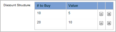
Users can add or subtract rows in the grid using the – and + buttons.
The grid element supports two approaches to defining the DataGrid component; these approaches are described in the sections that follow.
When the template is validated on startup, if a grid element has both a content-source and one or more grid columns, or if it has neither a content-source nor a grid-column, an error is logged, and the template is not included in the template list in the user interface.
Dynamically Determining Grid Structure at Runtime
The first method for creating a grid in a template dynamically generates the grid contents at runtime. The XML used for the user interface would resemble this example:
<line>
  <label display-name="Discount Structure:"/>
  <grid id="tieredPromo" placeholder-name="tiered_promo_value">
      <content-source path="/atg/xxx/yyy">
          <attribute name="calculator-type" value="bulk"/>
      </content-source>
  </grid>
</line>
If you use this approach, the grid element must include a content-source element. The content-source points to a Nucleus that provides the grid with the necessary data structure. The provided /atg/remote/promotion/template/contentSource/BandedDiscountStructureContents component is specific to discount structures; if you want the grid for some other purpose, you can write your own component.
The component should obtain a CalculatorInfo object for the appropriate calculator type (defined in the child attribute element of the content-source) and the promotion type (Item, Order, Shipping or Tax), both of which are passed to the component as the page is generated.
Explicitly Defining Table Structure
As an alternative to dynamic grid generation, you can also explicitly define the DataGrid. In this case, the XML used would resemble the following example:
<line>
  <label display-name="Discount Structure:"/>
  <grid id="tieredPromo"
      placeholder-name="tiered_promo_value">
    <grid-column display-name="band">
      <textInput />
    </grid-column>
    <grid-column display-name="adjuster">
      <textInput />
    </grid-column>
  </grid>
</line>
The grid element in this case explicitly lists the components needed to let the user interface render and build the grid. The child grid-column elements control the display and data-input characteristics of each column in the table. The display-name attribute of the grid-column contains the column header (in this example, it uses a resource bundle). The child elements of the grid-column specify the editor type to be presented in the user interface, which can be either textInput or comboBox.
AssetTable Elements
The assetTable element provides a way for merchandisers to add assets to a promotion condition or offer, either by selecting from an asset picker or using drag and drop.
To override the default set of draggable assets, you can define a content-source element, as shown in the example below. This element limits the draggable assets to products and product subtypes:
<assetTable id="gwpAssetTable" container-width="100" container-h-align="right">
   <content-source
path="/atg/remote/promotion/template/contentSource/AssetParentChildInfo">
   <attribute name="assetBaseTypes"
        value="atg/commerce/catalog/ProductCatalog:product/>
   </content-source>
</assetTable>
Product Set Criteria Elements
The includesProductSetCriteria and excludesProductSetCriteria elements can be used within a line element. They allow users to construct statements for determining products to include in or exclude from the promotion. Each element consists of multiple combo boxes that allow users to specify a sequence of comparative values for properties. The output is a placeholder value that can be used in a PMDL rule.
The includesProductSetCriteria and excludesProductSetCriteria elements have the following attributes:
id—Identifier for the PSC elementrequired—Whether or not the PSC is required; the default is truemodel-path—The model for a PSC is a Nucleus component that controls how the combination boxes are populated and displayed. For product set criteria elements, the model-path should be:model-path="/atg/remote/promotion/expreditor/psc/PSCExpressionModel
Four additional attributes control basic display options:
container-widthcontainer-heightcontainer-h-aligncontainer-v-align
This example shows an includesProductSetCriteria element in a ui-description:
<includesProductSetCriteria id="PSC" required="true" model
-path="/atg/remote/promotion/expreditor/psc/PSCExpressionModel" />
The user interface representation of an expression element consists of three parts:
A fully qualified property of an item such as a product or SKU
A comparator such as equals or is one of
The editor to use for the property
The resulting combination box looks like the following example:
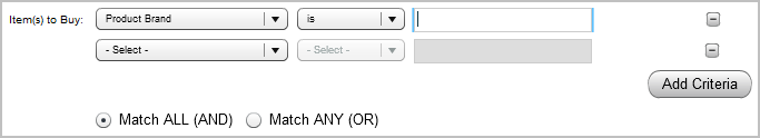
The user can add can add criteria by clicking the Add Criteria button in the UI (button inclusion and placement is automatic), and join these criteria as AND or OR combinations.
When the user makes selections and saves the template-based promotion, the information is translated into a PMDL statement by the PSCExpressionModel.
Using Optional Fields
It may be necessary to mark fields as optional in your template. You can do this by including an required="false" attribute in any user interface element tag. When this attribute is not present, the element is marked with an asterisk as usual for template fields.
If you make a field optional and the user submits no content for that field, a blank area is substituted for the placeholder associated with the field in the associated item property (as linked by the placeholder-name), which could render the PMDL invalid. If you do make fields optional, make sure that your PMDL blueprint permits an empty string.
For example, if the user interface element for a particular placeholder value is optional and might be left empty, the placeholder should include both the start and end tags of the PMDL, or should be positioned so that an empty string does not break the PMDL.
