Administrative-Level Personalizations: Classic User Interface
This chapter covers the following topics:
- Overview
- Focused Page Hierarchy Personalization Page
- Choose Personalization Context Page
- Personalize Page
- Create Query Page
- Page Hierarchy Personalization Page: Expanded Search Region
- Reorder Contents Page
- Add Content Page
- Create Content Page
- Model Personalization Page
- Dynamic View Object Page
- Create Item Page
- Update Item Page
- Manage Personalization Levels Page
- Copy Personalization Page
- Extract Translation Files Page
- Upload Translations Page
- Translate Page
- Choose Languages Page
- Personalize Saved Searches Page
- Create Saved Search, Update Saved Search, and Duplicate Saved Search Pages
- Rename Columns / Totaling Page
- Setting the Record Set Size for nodeDefinition under a HGrid
- Hiding the Save Search and Personalize Buttons
- Change Display Size for Various TextInput fields
- Adding Search Mappings
- Personalizing Color-Coded Tiles
Overview
This chapter provides detailed descriptions of all the individual pages in the user interface for Admin-level personalizations.
Focused Page Hierarchy Personalization Page
You may launch the "focused" version of the Page Hierarchy Personalization page by selecting the Personalize (pen) icon for a boxed region from the Page Layout Personalization page. The Personalization Structure on the focused page initially focuses on the structure of the selected region, from which you launch this page.
"Focused" version of the Page Hierarchy Personalization page for the Configurable Home page.
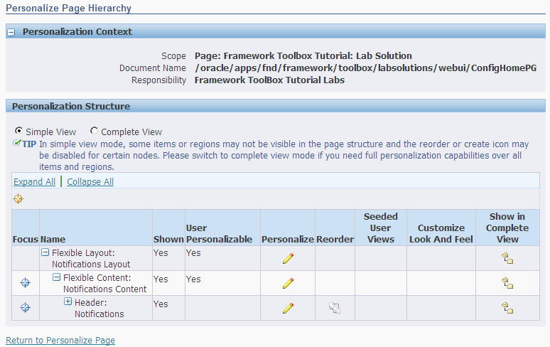
The Personalization Context region at the top of the page lists the context for the top-level object, which in the case of the Oracle E-Business Suite, is the page layout. It identifies the scope of the personalizations you are about to make, as well as to what personalization level(s) and value(s) these personalizations apply.
The Simple View and Complete View radio buttons above the HGrid allow you to toggle between a Simple or Complete view of the page hierarchy in the HGrid.
The Shown column indicates whether the page element is rendered after applying all existing personalizations for the current context. The User Personalizable column indicates whether the page element is user personalizable.
You can launch a few tasks from this page, as described in the following table.
| Task | Launch Point from Focused Page Hierarchy Personalization page | Flow Description |
|---|---|---|
| Personalize the properties (such as Prompt name, default value, and so on) of a specific page element |
|
Note: Although a region may be personalizable, not all region items in a region are personalizable. Each region item in a region has an ADMIN_CUSTOMIZABLE property associated with it. If the property is set to false by the developer of the region, the region item is not personalizable at the personalization level. For example, a developer would very likely set ADMIN_CUSTOMIZABLE to false for the vertical spacer item in a table layout region to prevent disruption of the spacing in a table. |
| Reorder the children of a boxed region |
|
Launches the Reorder Contents page, where you can reorder the children of the boxed region. Select "Apply" to save your changes when you are done. |
| Create a new item in a boxed region |
|
Launches the Create Item page, where you can create a new item for the content region. Select "Apply" to save your changes when you are done. The new item appears as the last item in the region. Use the Reorder Content icon to reorder the layout sequence of the new item. You can only create new items in boxed content regions or in the top page layout region. |
| Create, Duplicate, Update or Delete an "admin-seeded user-level" personalization |
|
|
| Customize Look-and-Feel |
|
Launches the Customizing Look-and-Feel user interface. |
| Update an item created with the Create Item page |
|
Launches the Update Item page where you can update an item for the region. Note that you may only update an item that was previously created with the Create Item page. |
| Delete an item from a region |
|
Directs you to warning page that asks you to confirm whether you really want to delete the current item. Deleted items are non-recoverable.
Note: Delete Item is available only if the page element is an item that was created at the Site level using the Create Item page. |
If you wish to exit from the focused Page Hierarchy Personalization page, select the "Return to Personalize Page" link at the bottom of the page to return to the Page Layout Personalization page.
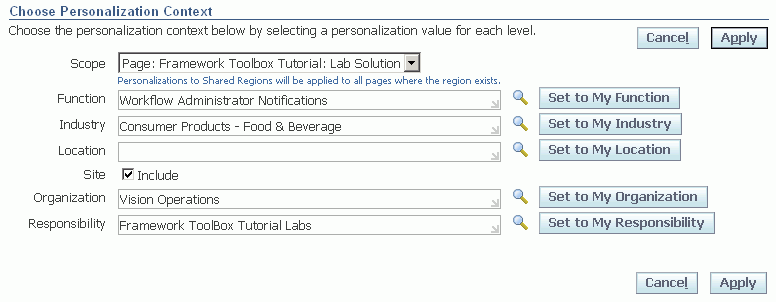
Choose Personalization Context Page
The Choose Personalization Context page is launched when you select the Choose Context button from any of the personalization launch pages.
Choose Personalization Context page, with the Scope set to Page, and the personalization level set to "Site".
-
In the Choose Personalization Context page, use the Scope poplist to specify whether you want to personalize the current page, or personalize a shared region, if any, that is extended by the current page. If there are no shared regions on the page, a single non-updateable radio button for the page itself is displayed for the scope.
When you select the Page as the scope, the personalization you create applies only to the current instance of the page (saved as a per instance personalization). If there are shared regions on the page and you select a shared region as the scope, the personalization you create on that shared region is also saved as a per instance personalization of that shared region but will appear in all occurrences of that shared region in any page that extends it. Refer to Per Instance versus Global Personalization for further explanation.
Additional Information: If you wish to personalize the Standard Footer that appears in OA Framework-based pages, you can use the Standard Footer Personalization Shortcut that appears in the Application Catalog page under the Personalization tab of the Functional Administrator responsibility.
-
Specify the personalization level at which you want to make your changes and specify a value for that level. The Site level does not require any value as the personalization applies to all users of the current site. To create a Site level personalization, check the Include checkbox. To create personalizations at any other level, enter a value for that specific level. Responsibility or Function levels, for example, require a specific responsibility or function name, respectively.
You may specify more than one personalization level when you define a personalization. Simply specify values for each of the levels that you want this personalization to apply.
You can specify a personalization value in one of the following ways:
-
Select a value from a specific level LOV (that is, from Function, Industry, Location, Organization, or Responsibility).
-
Choose the Set to My level button. The Set to My level button resets the personalization value to the default value for that personalization level. The default value, in turn, is derived from your current apps context. For example, if you are logged in as the System Administrator responsibility, then choosing Set to My Responsibility would set the Responsibility level to
System Administrator. For the Localization level, the default value is determined by the profile option ICX: Territory (ICX_TERRITORY). For the Organization level, the default value is determined by the profile MO: Operating Unit, which can be set at the Site or Responsibility level.For more information about the ICX: Territory profile option, refer to the Internationalization section in the OA Framework Profile Options appendix of the Oracle Application Framework Developer's Guide.
-
-
Once you finish setting your personalization context, choose Apply. Choosing Cancel returns you to the previous page.
Per Instance versus Global Personalizations
You can personalize a region that extends a shared region (that is, it contains a region that is defined elsewhere and the current region simply references or extends that base region). If you set the scope of your personalization context to the Page, the personalization is saved on the current instance of that page, as a per instance personalization, for the context specified. As a result, if another page extends the same shared region, you will not see your personalization in that other page.
If you want to save the personalization of a shared region so that it applies to all pages or regions that extend that shared region, set the scope of your personalization context to the Shared region. Note however, that the personalization you save on that Shared region is also technically saved as a per instance personalization, even though the personalization applies to all pages or regions that extend this Shared region.
This is because a shared region can itself extend another shared region. Suppose you have Page A that extends Shared region B and Shared region B extends Shared region C. Say you set your personalization context scope to Shared region B and create a personalization that alters Shared region C. The personalization that you save, although it appears to be saved as a global personalization because it now applies to all pages that extend Shared region B, is actually saved as a per instance personalization of Shared region B. The reason is because the change that was made in Shared region C was only saved to the instance where it was extended by Shared region B. In other words, the personalization you saved on Shared region B was not saved to the base of Shared region C, but only to that instance of Shared region C as it appeared in Shared region B.
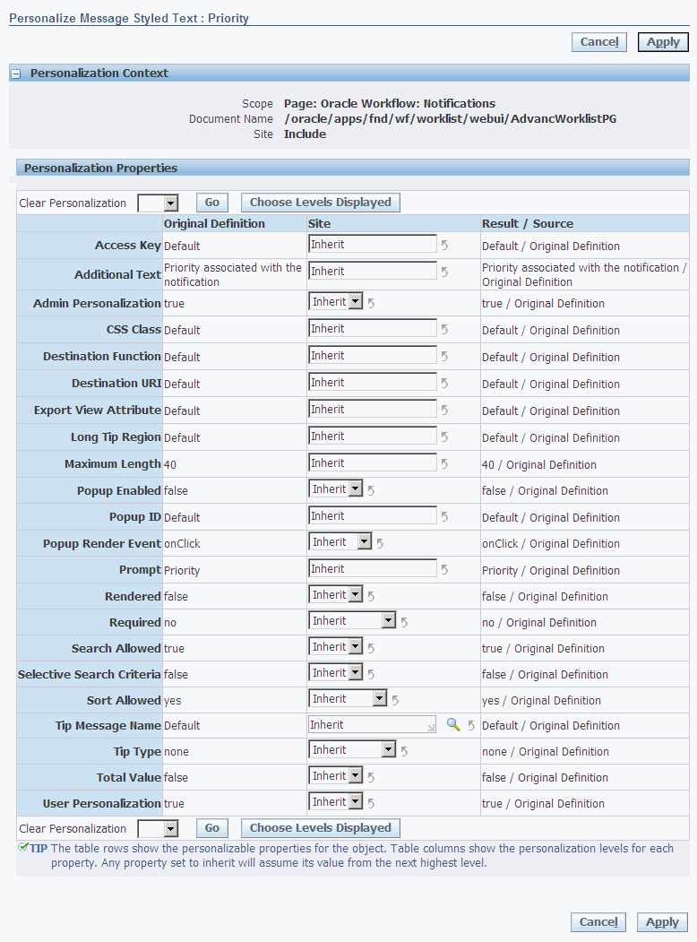
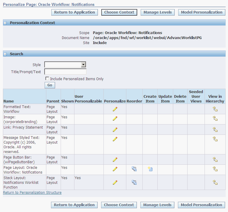
Personalize Page
Use the Personalize page to personalize the properties of a selected page element.
When you select the Personalize (pen) icon for a page element listed in the "complete" version or "focused" version of the Page Hierarchy Personalization page, the Personalize page appears. The Personalize page varies in appearance depending on the page element you are personalizing, for example, a non-table region versus a table region.
Personalize page for the "Priority" Message Styled Text item in the Notifications table of the Workflow Notifications page.
Personalize page for a classic table region.
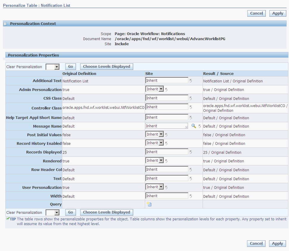
The personalization context is displayed at the top of the page. All the properties that you can personalize for the current page element are listed in the Personalization Properties table. This list of properties is dynamically determined by the page element you select. For example, the properties listed when you personalize a classic table region are different from the properties listed when you personalize a messageStyledText item. In addition, a special Query row appears in the Personalization Properties table when you personalize a table region.
For information on the properties that you can personalize for a particular page element, refer to the Personalization Considerations appendix. You may also refer to the OA Component Reference for a complete list and description of personalizable properties relevant for each region or item style.
Personalization Properties Table
Following is a description of the Personalization Properties table and how you can use the table to personalize your page element.
Global Table Actions
The Personalization Properties table provides the following controls for global table action, which you can select at any time:
-
Clear Personalization - clears for a selected personalization level, all personalizations for all properties of the current page element. The poplist displays a list of the personalization levels for the current personalization context. Select a personalization level from the poplist and choose Go to perform this table action.
-
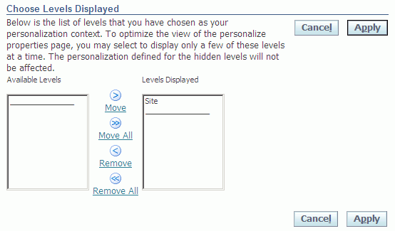
Choose Levels Displayed - navigates to the Choose Levels Displayed page, where you can choose to hide or show specific personalization level columns in the Personalization Properties table using the shuttle region provided. Only the personalization levels for the current personalization context are displayed in this page. Use the arrows to move the desired personalization level between the Available Levels and Levels Displayed lists. Choose Apply to save your changes and return to the previous page. Note that personalization levels that are not displayed still affect the final cumulative results of your personalizations.
Choose Levels Displayed page
Original Definition column
The first column in the Personalization Properties table lists the name of each property that you can personalize for the current page element. The next column, Original Definition, lists the read-only base value of that property, as defined in the AK or current MDS repository.
The list of properties varies according to the page element you are personalizing. Refer to the OA Component Reference for a description of the personalizable properties for each region and item style.
Additional Information: If you are personalizing an item that has a CSS Class property, you can use the CSS Styles Lookup page to first preview your item with different CSS styles before setting the CSS Class name for the item. See the section on Style Sheets for additional information.
Step 1: Update the personalization level columns
Following the Original Definition column, are columns for each of the personalization levels, shown in order of lowest to highest precedence, as defined by your personalization context. These columns are collectively referred to as the personalization level columns. For example, if you select the Site, Organization, and Responsibility levels as your personalization context in the Choose Personalization Context page, the table displays Site, Organization: <Organization Value>, and Responsibility: <Responsibility Value> personalization level columns, so that you can personalize the page element properties at each of these personalization levels.
The fields in these personalization level columns are updateable, so you can enter a personalized value for each property at each personalization level.
The fields in the personalization level columns are used as follows:
-
If a field is not personalized, it displays a special value of
Inherit, by default. This special value indicates that at that personalization level, the property inherits its value from the personalization level above it (the preceding column). -
You can update a value displayed in a field and if partial page rendering is enabled, the field refreshes to display the new result value. If partial page rendering is disabled, you must select the Go button that renders to refresh the field with this new value.
Additional Information: The personalized value at that personalization level is not actually applied to the page element itself until you choose the Apply button on the Personalize page.
-
If a field contains a personalized value, a Clear Personalization icon is enabled next to the updateable field. Selecting this icon sets the value back to
Inherit, so that the property inherits its value from the level above it. -
Note that a blank value is not equivalent to a value of
Inherit.
Personalizing EL-supporting Properties
OA Framework supports EL (Expression Language) personalizations on the following properties:
| Property | Attribute Data Type | Valid Values |
|---|---|---|
| Required | String |
|
| Read Only | Boolean |
|
| Rendered | Boolean |
|
| Prompt | String | Any string value |
| Sort Allowed | Boolean |
Note: EL support for Sort Allowed is available only for items and not regions. |
| Maximum Length | Number | Integer.inValue() |
For the Prompt and Maximum Length properties, enter a valid value or EL expression directly into the personalization level column field. For all other EL-supporting properties, select one of the following values from the poplist in the personalization level column:
-
Inherit -
Any of the valid values as listed in the table above.
-
SPEL(Simplest Possible Expression Language)
If you select SPEL for any of these properties, an additional text box renders for you to enter an EL expression (string), such as ${oa.<viewObject>.<viewAttr>} or ${oa.function.<functionName>}.
If the value for any of the above properties is already an EL expression, the property displays the value SPEL in its poplist and a text box shows the EL expression.
If you select any value other than SPEL in the poplist, the text box is not rendered.
Note the caveats for the following EL-supporting properties:
-
If the base value of Rendered is
SPEL, the poplist choices for Rendered arefalseorSPEL. -
If the base value of Required is
SPEL, the poplist choices for Required aretrueorSPEL. -
If the base value of Read Only is
SPEL, the poplist choices for Read Only aretrueorSPEL.
These caveats maintain the integrity of the business logic and security criteria of the page.
When you personalize the value for an EL-supporting property, you may also see one of the following warnings:
-
If the base value of Rendered is
trueorSPEL, and you personalize the value tofalseorSPELwith a different EL expression, the following warning appears:"Setting <property name> to <property value> may hide this item and its children. The application may be inoperable if this item or any of its children is required."
-
If you personalize Required to a EL expression other than its original EL expression, the following warning appears:
"Setting <property name> to <property value> may affect the components that depend on the original SPEL expression or value of this property."
-
If you personalize Read Only to
trueorSPEL, the following warning appears:"Setting <property name> to <property value> may make this item read-only. A read-only item is not validated on the browser and is not included in the form submitted to the server."
For more information about EL support and syntax, refer to the EL (Expression Language) Support topic in the Implementing Specific UI Features chapter of the Oracle Application Framework Developer's Guide.
Setting Default Values
You may set a default value for a page element in the Personalization Properties table only if the page element is of one of the following region item styles:
-
MessageTextInput (for Datatypes - VarChar, Date, Number)
-
MessageLOVInput
-
MessageCheckBox
-
MessageChoice
-
MessageRadioButton
-
MessageRadioGroup
The above item styles all have a property called Initial Value that you may personalize. The value you specify for this property determines what an end-user sees as a default value in the page element when the page initially displays. When you set the Initial Value property, be sure the value matches the data type and field-level restrictions of that item page element, otherwise you get an exception. For example, you cannot specify a value of "True" on a date field or set the value to a length of 20 bytes if the field length is 10 bytes.
The default value is effective for both non-view object-mapped and view object-mapped page elements. If a page element is not mapped to a view object, the default value is applied immediately and reflected on the page. If a page element is mapped to a view object, the default value is set on the row and will appear when a user creates a new row. The default value also overrides any default value set in the page element's underlying business object.
In cases where the page element exists beneath a container page element in the Page Hierarchy, the following applies:
-
If the item page element is contained beneath a table or Table-In-Table page element, the Initial Value property you set for the item page element becomes effective immediately.
-
If the item page element is beneath an advanced table container page element, the Initial Value property you set for the item page element will not be effective.
-
The Initial Value property is not supported for an item page element contained beneath an HGrid page element.
Additional Information: If a developer sets a default value on an item page element in their controller code, the developer-set default will override the default value you personalize in the Initial Value property.
Important: The profile option FND: OA:Enable Defaults, determines whether default values specified in personalizations and base page meta data are applied to your pages. Valid values are Y (enable defaulting) and N (disable defaulting). Refer to the OA Framework Profile Options appendix in the Oracle Application Framework Developer's Guide, My Oracle Support Knowledge Document 1315485.1, for more information about this profile. The tables below describe the default value behavior as it relates to this profile in various scenarios:
| Is a Default Value Set in Base Page? | Is the Default Value Personalized? | Value of "FND: OA:Enbabled Defaults" Profile | Default Value Displayed |
|---|---|---|---|
| Yes | Yes | N | from base page |
| Yes | Yes | Y | from personalization |
| No | Yes | N | null |
| No | Yes | Y | from personalization |
| Yes | No | Ignored | from base page |
| No | No | Ignored | null |
| Is a Default Value Set in Base Page? | Is the Default Value Personalized? | Value of "FND: OA:Enbabled Defaults" Profile | Default Value Displayed |
|---|---|---|---|
| Page element does not exist in base page | Yes | Y | from personalization |
| Page element does not exist in base page | Yes | N | from personalizaton |
| Page element does not exist in base page | No | Ignored | null |
Step 2: Verify the Value Displayed in the Result/Source column
The last column in the Personalization Properties table is Result/Source. Although you cannot update a value in this column directly, a value in this column is refreshed whenever you update a value for a property at a specific personalization level. This column displays the resulting value of a property if all the personalized values for the current context of personalization levels are applied, as well as the source of that resulting value, which can either be from the personalization level that takes the highest precedence or the Original Definition, if the property has not been updated.
Verify that the value shown in this column is what you want to accomplish when you apply all the personalizations in the current context to the property. Otherwise, update the property value again for the appropriate personalization level, until you get the desired result.
Step 3: Personalize the Data Displayed in a Table Region using the Query Row
If the page element you personalize is a table region, a special row called Query appears at the end of the Personalization Properties table. The Query row displays a Query icon in each personalization level column. When you select the Query icon, you navigate to the Create Query page. You can specify sort information and search criteria on this page to sort and filter the data that displays in the rendered table region when your personalizations are applied. After you create a query and return to the Personalization page, the Query icon in the Query row for that personalization level, changes to a Personalize icon (a pen) to indicate that you can view or author personalize that existing query.
Step 4: Apply Personalizations
Once you finish making changes to the Personalize page, you can choose one of the following buttons:
-
Apply - to save your personalizations and return to the Page Layout Personalization page.
-
Apply and Personalize Another - to save your personalizations and return to the "focused" Page Hierarchy Personalization page.
-
Cancel - to cancel any changes and return to the previous page.
Additional Information: If you navigate to the Personalize page by launching a flow from the "complete" Page Hierarchy Personalization page, the Apply and Personalize Another button does not render. The Apply button also has slightly different behavior in this case; it saves your personalizations and returns to the Page Hierarchy Personalization page.
Create Query Page
You can navigate to the Create Query page by selecting the Query row icon from the Personalization Properties table in the Personalize page when you personalize a table region. This page allows you to specify sort information and search criteria for a table region to filter the data that displays in that table.
Note: Any search criteria that a user enters for a field from the table's Search panel overrides any search filter on that field that you create from the Create Query page. For example, suppose you specify the following data filter for a table using the Create Query page:
-
Name contains Jason
-
Email contains Oracle
If a user then displays the page containing the table and enters the value 'Peter%' for the Name field in the Search panel, the table returns query results for:
-
Name like 'Peter%'
-
Email like 'Oracle%'
Create Query page for a table region.
-
In the Data Filter region, indicate how you want the filter to match your search conditions by selecting one of the following radio buttons: Show table data when all conditions are met = Match All or Show table data when any condition is met = Match Any.
-
first four columns of the table are listed for you to specify search criteria. Using the poplist following the column name, choose a search condition and enter a value to search for in that column.
-
You can also select a column from the Add Another poplist and choose Add to add more search criteria to your filter.
Additional Information: Only columns whose Search Allowed property is set to True are displayed in the Add Another poplist. If this property is initially set to false and you want to be able to search on this column, you must first create an admin-level personalization of the table region that updates the Search Allowed property for the column (item) to True.
If you leave the search criteria blank for a column, the filter does not search on that column.
-
In the Sorting region, you can specify up to three levels of sorting for your data. Select a column from the Column Name poplist for each level of sorting you wish to perform.
Additional Information: Only columns whose Sort Allowed property is set to Yes (in the original definition of the page) are displayed in the Column Name poplist.
-
For each sort column, you must specify whether to sort in ascending or descending direction.
-
When you are done creating the data filter and specifying your sort settings, choose Apply to apply your changes and return to the Personalize page. The Query row of the Personalization Properties table should now display a Personalize icon (pen). The change in icon indicates that a data filter now exists at that personalization level and you can select the icon to view or update the existing data filter again.
Additional Information: When you personalize a table region at various personalization levels and for each of those levels, specify search criteria for different columns in the table region, the search criteria are combined with a logical AND for the cumulative personalizations. The same is true if you personalize a table region at various personalizations levels, with search criteria for the same columns in the table region. The search criteria defined in all levels are AND-ed together.
Additional Information: If the page metadata is shipped with the table containing first, second and third sort sequence columns already set, administrators may have to perform an additional step before changing the sort sequence of the table.
If any of the seeded first, second and third sort columns are not going to be used again as in personalized sort columns (either as first, second or third sort) each of these columns should be made non-sortable columns. This can be done by personalizing individual items and setting the "Sort Allowed" property to "no".
For Example, if the table is shipped with columns as described in the following table:
| Column / Attribute | Sort Sequence | Sort Order |
|---|---|---|
| EmpNo | First | Ascending |
| Ename | Second | Ascending |
| Sal | Third | Descending |
And an Administrator would like to personalize to the following table:
| Column / Attribute | Sort Sequence | Sort Order |
|---|---|---|
| Mgr | First | Ascending |
| Sal | Second | Ascending |
| Desg | Third | Descending |
Then the EmpNo and Ename columns should be personalized to "Sort Allowed - no".
Page Hierarchy Personalization Page: Expanded Search Region
When you choose the expand icon (+) for Search in the Page Hierarchy Personalize page, the Search region expands as shown in the following illustration. You can use this region to specify criteria that searches for a specific subset of page elements.
Additional Information: You can perform a search only on pages, regions and their personalizations that reside in the database repository. Search is not able to locate elements on pages that reside on the local file system.
-
Specify in the Style field whether to search for elements of a specific item style. If Style is set to null, then elements of all styles are searched. Note that the Style field displays only the styles used on the page elements of the current page.
-
Specify in the Title/Prompt/Text field whether to search for elements that contain a specific title, prompt, or text. You may specify a wild card character (
%) in the search string. -
Check Include Personalized Items Only if you want the search to return only matching results that have been personalized.
Search region for the Page Hierarchy Personalize page.
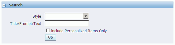
-
Select Go to perform the search.
The results are returned in a flat table, where the names of the matching page elements are sorted by style. This flat table has the same columns as the prior Page Hierarchy HGrid, so that you can launch the same personalization tasks from this presentation. However, it also includes a column called View in Hierarchy, from which you can select the Hierarchy icon for a page element to focus on the page element as displayed within the page hierarchy.
Search Results in the Page Hierarchy Personalization page, showing all personalized page objects.
-
Select the Return to Personalization Structure link below the Search Results table if you want to return to the original Page Hierarchy Personalization page regardless of the focus you had before you selected Go to search for specific page elements.
Reorder Contents Page
When you choose the Reorder Contents icon from the Page Layout Personalization page, the complete Page Hierarchy Personalization page, or the focused Page Hierarchy Personalization page, you navigate to the Reorder Contents page. You can reorder the contents of a page layout only if the page is configurable, otherwise you can reorder the contents of a region.
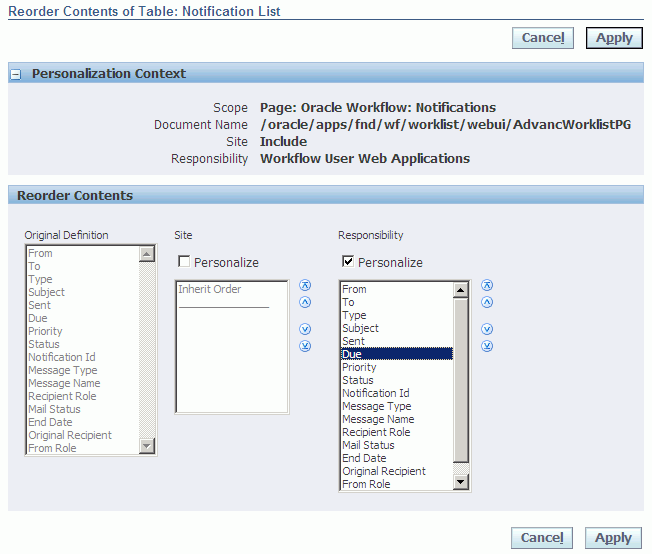
The Reorder Contents page displays a reorder region for each personalization level set in the current personalization context and also displays a read-only region that shows the order of the content in the base definition.
-
Use a reorder region to reorder the contents of a region by personalization level. The usage of a reorder region is as follows:
-
If the contents of a region have not been reordered at a given personalization level, the reorder region displays Inherit Order, by default. This indicates that at that personalization level, the boxed region inherits its order from the personalization level above it (lower levels take precedence ).
-
If you want to reorder the contents for a given personalization level, check the Personalize checkbox for that personalization level. If partial page rendering is enabled, the region refreshes to display the content that can be reordered. If partial page rendering is disabled, you must select the Go button to refresh the region so it displays the content to reorder.
Additional Information: The personalized order for any given personalization level is not actually applied until you choose Apply on the page.
-
The Personalize checkbox may also be checked for a personalization level if the region has previously been reordered (personalized).
-
Use the arrows on the side of the reorder region to reorder its contents.
-
-
Choose Apply to apply the new order for each personalization-level that was personalized and return to your previous page.
Additional Information: For configurable pages, you can reorder content only within the content's assigned layout region. You cannot reorder content across different layout regions.
Add Content Page
When you choose the Add Content icon from the Page Layout Personalization page or the complete Page Hierarchy Personalization page, you navigate to the Add Content page. You can add content to a page only if the page is configurable and if the region you are adding content to is a boxed layout region that contains only content regions and not other layout regions.
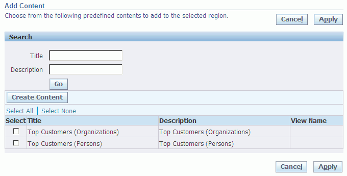
The Add Content page displays a catalog of predefined content regions that you can add to the selected region. The Content catalog lists the title of the predefined content and its description.
Note: This page initially displays only the predefined content regions that were delivered with your Oracle application. If you have defined additional independent content regions that you want to include on this list, select the Create Content button to access the Create Content page.
Note: The Create Content button is available only at the Site, Function, and Localization levels.
If a content contains a user-personalizable region and one or more personalized saved searches of that region exists, the Content catalog will list each defined saved search by its saved search name and the content with which it is associated. Once you add a content (or a personalized saved search of a content) to a boxed layout region, the next time you display the Add Content page, the content or other personalized saved searches of the content will no longer be available for selection from the Content catalog. You must remove the content from the current layout region, using the Remove Boxed Region icon , before you can choose a different personalized saved search of that content to add.
-
Enter a title or description in the Search region and choose Go to search for the content you wish to add.
-
Check Select for the content you wish to add.
-
Choose Apply to save your personalization and return to your previous page.
The new content is added as the last content region of the selected boxed layout region.
Important: Since you can personalize a configurable page at only one level at any given time, any personalizations you make to the page, such as adding new content, are not available at any other level. For example, if you create and add content to a flexibleContent region on a configurable page at the Site personalization level, that content will not be available to users at the Responsibility level. You can work around this restriction as follows:
-
Use the Functional Administrator responsibility to launch OA Personalization Framework.
-
In the Application Catalog, search for the specific region that you want to personalize, then select the Personalize icon to navigate to the Page Hierarchy Personalization page.
-
Select Choose Context to specify the level(s) at which you want your personalization to apply.
-
Personalize the region. Note that the personalization you create from the Functional Administrator tool is applied to all instances of the region.
-
Navigate back to the configurable page and launch OA Personalization Framework. Set the personalization level to the level specified in step 3. In the Content mode of the Page Layout Personalization page, use the Add Content page and Create Content button to add the region personalized in the previous step to a desired flexibleContent region.
-
If you specify more than one personalization level in step 3, repeat step 5 for each of the other personalization levels.
Create Content Page
When you click the Create Content button on the Add Content page, you navigate to the Create Content page.
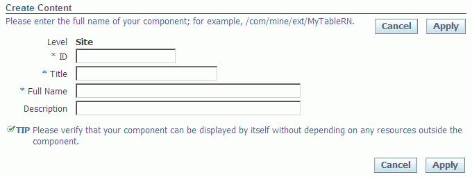
Use the Create Content page to select a custom content region that you have already defined in JDeveloper, and want to include on the list of predefined content regions on the Add Content page. Be sure to enter the region's ID and title, and the full name (for example, /com/mine/ext/MyTableRN). It is a good idea to add a description, which will provide useful selection information. When you select Apply, the Add Content page will appear, with this region added to the list of available content regions.
Important: The region you specify must be displayable without the use of any other resources.
Model Personalization Page
Launch the Model Personalization page by selecting the Model Personalization button from the complete Page Hierarchy Personalization page. As of Release 12.2, you can bind web beans that you create from the Create Item page to new view instances that you create in the Model Personalization page. For example, you can create a new dynamic view instance in the Model Personalization page and bind it as a pick list view instance to a new shuttle or message choice list, that you create from the Create Item page. Prior to Release 12.2, you can only bind existing view objects present in the root application module to web beans created from the Create Item page.
The Model Personalization page allows you to create and add a new dynamic read-only view instance that encapsulates a database query, to the root application module of the current OA Framework-based page. The dynamic view instances you add to the root application module are collectively known as a model personalization. Once you create a new dynamic view instance, you can also enable, disable, or delete the view instance, or delete the model personalization from the root application module.
Note: You can not manage model personalizations from the Functional Administrator responsibility.
Note: Model personalizations are not supported for configurable pages.
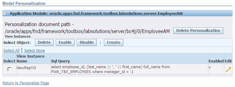
The Model Personalization page displays the root application module to which new dynamic view objects are to be added, along with the personalization document path.
-
Select the Create button to navigate to the Dynamic View Object page where you can create a new dynamic view instance.
-
The dynamic view instances you create are displayed in the View Instances table.
-
To edit a view instance, select its Edit icon to edit the view instance in the Dynamic View Object page.
-
To delete a view instance, select the view instance and choose Delete. Deleted view instances are not recoverable.
-
To control whether a view instance should be created, select the view instance and choose Enable or Disable. If a view instance's creation causes a runtime error, you may wish to disable the view instance so you can debug the error.
-
To delete the model personalization for the root application module, select Delete Personalization. A deleted model personalization is not recoverable.
-
Once you create a new view instance, you can create a new item or region using the Create Item page and bind that new item or region to your new view instance via its View Instance and View Attribute properties.
Additional Information: Refer to the Examples: Creating New Items Using the Personalization UI section for an example of how to create a new model personalization-based table region using the Create Item page..
Dynamic View Object Page
Launch the Dynamic View Object page by selecting the Create button from the Model Personalization page.
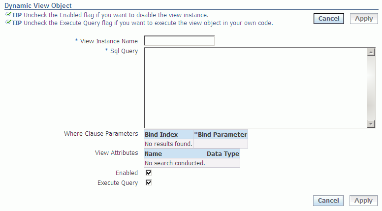
Use the Dynamic View Object page to create a new or edit an existing dynamic view instance.
Note: This page only allows you to create read-only view objects.
-
Specify a name for the view instance.
-
Enter the SQL query for the view instance. Any error in the SQL query will display once you tab out of the field. Correct the error before proceeding.
Important: The maximum length for a dynamic view object SQL query is 4000 characters.
-
The Where Clause Parameters table populates with bind indices if the SQL query contains bind parameters. You may specify the bind parameters using any of the supported Expression Language (EL) syntax described in the Personalizing EL-supporting Properties section of the Personalize Page. For example, to specify a simple bind parameter to a view attribute in a view instance, use the EL syntax:
${oa.<viewInstanceName>.<viewAttributeName>}
as in
${oa.EMPVO1.Empno}
-
The View Attributes table displays each attribute's name and data type.
-
Check Enabled to allow the creation of the view instance. If the creation of the view instance causes a runtime error, you should uncheck Enabled so you can debug the error.
-
Check Execute Query to allow the framework to run the view object query. If you want the view object query to be run from custom code, you should uncheck Execute Query.
-
Select Apply to save the dynamic view instance and display the view instance information in the Model Personalization page.
Create Item Page
When you choose the Create Item icon from the Page Layout Personalization page, the complete Page Hierarchy Personalization page, or the focused Page Hierarchy Personalization page, you navigate to the Create Item page. Use the Create Item page to declaratively add a new element, such as an item or region, to an existing region using the OA Personalization Framework.
Important: You can add a new element to a region using OA Personalization Framework only if:
-
In Oracle JDeveloper OA Extension, the Add Indexed Children property of the region you are adding the element to has been set to True.
-
You are personalizing a region at the Site, Function, or Localization level.
Any new element that you create while personalizing a region at the Function or Localization level may only be further personalized at the same Function or Localization level at which it was created. New elements that you create while personalizing a region at the Site level may later be personalized at any level. For example, you may personalize at the Responsibility level, an element that you create at the Site level.
Important: You may add a new item to a table or HGrid; however, all items in the table or HGrid must be set to the same BC4J view usage name.
Create Item page listing the properties you can specify for a Tip item.
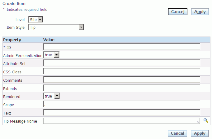
-
Use the Level poplist to specify whether to create the new element at the Site or Function level. Use the Item Style poplist to select the item or region style to create. Currently, you can create an item or region of any of the following styles:
Item (or Region) Styles Item (or Region) Style Description Usage Notes Advanced Table As of Release 12.2, you can create an advanced table region where each column can be a simple web bean (such as a text input field, a link, a poplist, and so on), or a composite container that groups these simple beans. A common example of a composite container is a flow layout region that contains a pop-up. Note: You can not add Named Child elements, such as table actions, select column, control bar, and so on, to an advanced table using the OA Personalization Framework.
You must enter a View Instance name for the advanced table.
To create the columns for the advanced table:-
In the HGrid of the Page Hierarchy Personalization page , select the Create Item icon for the advanced table.
-
The only style of item you can create under the advanced table region is a Column.
-
Every new column you create is accompanied by a Create Item icon, as well as a Column Header child item with its own Create Item icon.
-
Select the Create Item icon for the Column Header. The only style of item you can create under the Column Header is a Sortable Header.
-
Enter an ID and a value for the Prompt property of the Sortable Header to provide a heading for the column.
-
Select the Create Item icon for the Column to create a child item or region that constitutes the column's content. If you decide to add a region to a column, you may only select one of two region styles: Flow Layout or Stack Layout. The sole purpose of the Flow Layout region style in an advanced table column is to provide support for adding a pop-up.
Note: You may only add items as children of a Flow Layout or Stack Layout region within a column of an advanced table. Although the Item Style poplist in the Create Item page currently does not restrict you from adding other region styles as children, OA Personalization Framework does not expect or support this.
Caution: If you do not create another child item/region for the column, in addition to the Column Header's Sortable Header, a runtime exception will occur when you choose Return to Application.
Additional Information: For an example of how to create an advanced table using the Create Item page, refer to Example 3: Adding a New Table to a Page.
Attachment Image An Attachment column in a table region that renders the following icons: -
Attachment icon - navigates to the Attachment page, where users may view the attachments for a current record.
-
Add icon - navigates to the Add Attachment page, where users can add an attachment to a record
Note: This item style is only available for creation under a table or advanced table region.
-
You must enter the name of the View Instance for the entity you are attachment-enabling.
-
After creating Attachment Table item, select the Create Item icon again for categoryMappings in the Page Hierarchy Personalization page to create a Category Map.
-
Select the Create Item icon for entityMappings under the Attachment Table item in the Page Hierarchy Personalization page to create an Entity Map.
-
Finally, select the Create Item icon for primaryKeys under the Attachment Table item in the Page Hierarchy Personalization page to create a Primary Key if none has yet been defined for the entity map.
Attachment Link A View link that navigates to the Attachments page where users can view existing attachments for the entity record. This item style also renders an Add button that users can select to add new attachments to the current entity record. -
You must enter the name of the View Instance for the entity you are attachment-enabling.
-
After creating Attachment Link item, select the Create Item icon again for categoryMappings in the Page Hierarchy Personalization page to create a Category Map.
-
Select the Create Item icon for entityMappings under the Attachment Link item in the Page Hierarchy Personalization page to create an Entity Map.
-
Finally, select the Create Item icon for primaryKeys under the Attachment Link item in the Page Hierarchy Personalization page to create a Primary Key if none has yet been defined for the entity map.
Attachment Table An Attachments table that users can use to view existing attachments for the entity record. -
You must enter the name of the View Instance for the entity you are attachment-enabling.
-
After creating Attachment Table item, select the Create Item icon again for categoryMappings in the Page Hierarchy Personalization page to create a Category Map.
-
Select the Create Item icon for entityMappings under the Attachment Table item in the Page Hierarchy Personalization page to create an Entity Map.
-
Finally, select the Create Item icon for primaryKeys under the Attachment Table item in the Page Hierarchy Personalization page to create a Primary Key if none has yet been defined for the entity map.
Create Item page
ButtonA button that represents an action that you can perform on a region. OA Framework generates buttons as images that represent the underlying function. You must enter a value for Prompt with this item style.
If you want your Button to navigate to another page, you can specify a Destination URI value that navigates to that page.Category Map A custom category to associate with an Attachment item. Note: This item style appears in the Item Style poplist only when you choose the Create Item icon for categoryMappings under an Attachment entity hierarchy in the Page Hierarchy Personalization page.
You must enter a value for the Category property. This value should be identical to the predefined internal name of the category in the FND_DOCUMENT_CATEGORIES table.
You may specify whether to secure the categoryMap with Application Security rules. The default value for the Secure property is False.Column A new column in an advanced table or a column group. Note: This item style appears in the Item Style poplist only when you choose the Create Item icon for an advanced table or a column group in the Page Hierarchy Personalization page.
Every new column is accompanied by a Create Item icon, as well as a Column Header child item with its own Create Item icon, on the HGrid of the Page Hierarchy Personalization page.
The only style of item you can insert under the Column Header is a Sortable Header.Caution: In addition to the Sortable Header item under the Column Header, you must also create at least one more child item for the column (by selecting the column's Create Item icon), otherwise a runtime exception occurs when you choose Return to Application. The Prompt property of the Sortable Header provides the column's "header," and the immediate children of the column constitute its "body."
Entity Map An entity to associate with an Attachment item. Note: This item style appears in the Item Style poplist only when you choose the Create Item icon for entityMappings under an Attachment entity hierarchy in the Page Hierarchy Personalization page.
You must enter a value for the Entity property: -
If you defined an entity in the AK Entity form to share between the Oracle Forms and OA Framework interfaces, specify the Entity ID you defined in the AK Entity form.
-
If you are enabling attachments only to be viewed from the OA Framework interface, enter a unique arbitrary value for Entity and be sure to create a primaryKeyMap for the entity map.
Export Button An Export button that when selected, exports the data displayed in a region. Create this item at the desired position within the region whose data you want to export.
You must set the View Instance name to the same view object associated with the region for which you want to enable export.Flex A key or descriptive flexfield. A key flexfield represents an object defined by the values a user enters in each of its segments. A descriptive flexfield is customizable "expansion space" on a page. You must specify values for the following properties of this item style: -
Appl Short Name
-
Name - set to the name of the flexfield as it was registered
-
View Instance
-
Type - key or descriptive
If you want only specific segments of the flexfield to render, specify a value for the Segment List property. If this property is left blank, then all segments are rendered. Segments within a certain context are listed, separated by "|", a single pipe, while data from different context is separated by "||", a double pipe.
Additionally you can click on the Create Item icon to create a flexMap under the flex item. When the user clicks on the icon, the Create Item page will be displayed with the Item Style as Flex Map. A user can enter the required parameters for the item and click on Apply. The flex map item created will be added under the flex item .Flex Map A mapping of a flexfield reference web bean to a named parameter. A reference web bean participates in evaluating one or more properties of a flexfield, such as a default segment value, a value set or a context reference field for a descriptive flexfield. You map the web bean to a :$PROFILES$.*<NAME>reference that is used in a flexfield's property.<NAME>may be any alphanumeric value and thus provides a potentially infinite namespace of named parameters that you can pass from the OA Framework UI to the flexfield definition. Whenever the value in the reference web bean changes, the page refreshes with changes to the corresponding flexfield property.-
Specify the parameter name in the Name property. For example, if your Flexfield definition uses the named parameter,
$PROFILE$.*paramName, then set the Name property to*paramName. -
Specify the value or value binding for the parameter in the Reference Value property. The value can be one of the following:
-
A constant value
-
A view attribute represented by SPEL (Simplest Possible Expression Language) as
${oa.<viewUsage>.<viewAttribute>} -
The name of the web bean on the current OA Framework page that acts as the reference field, represented by SPEL as
${oa.page.<referenceID>}
-
-
For a descriptive flexfield, set the Refer Context property to true if this flex map acts as a reference field.
As an example, suppose your descriptive flexfield has the context segment with Reference field set and you change the reference field value to use a dummy profile option such as $PROFILES$.*ASSET_CATEGORY. Perform the following steps to create a flex map in the OA Framework page that maps the value of this segment to a web bean whose ID is ReferenceField to drive the context field value:
-
Set Level to Site and Item Style to Flex Map.
-
Enter a value such as sampleMap for ID.
-
Enter *ASSET_CATEGORY for Name.
-
Enter ${oa.page.ReferenceField} for Reference Value.
-
Set Refer Context to true since this flex map acts as a Reference field for the context of this descriptive flexfield.
Flexible Layout A flexible layout region. Important: This item type can only be created at the Site level and is intended to be used for inserting another region into a page by adding one flexible content that extends that region. It does not allow the construction of complex flexible layout regions. To construct a fully configurable page, use OA Extension, as described in the Oracle Application Framework Developer's Guide.
Additional Information: If a page contains flexible layout and flexible content created from the personalization Create Item page, you get the Page Hierarchy Personalization page UI when you personalize the page. If a page's base definition contains flexible layouts and flexible contents, you get the Page Layout Personalization page UI.
-
Specify whether the Rendered property is true or false.
-
Specify an optional Comment.
-
Select the Create Item icon for the newly created flexible layout region in the Page Hierarchy Personalization page to create a flexible content element.
Flexible Content Flexible content that extends another region and renders within a flexible layout region. Note: This item style appears in the Item Style poplist only when you choose the Create Item icon in the Page Hierarchy Personalization page for a newly created Flexible Layout region defined in the Create Item page.
Specify the full package name of the region that the flexible content extends. Important: Flexible content can only be inserted into a flexible layout at the site level and the current personalization scope must be a page.
Flexible contents can be deleted, but not updated.
Tip: Creating only one flexible content per flexible layout is recommended. If you create more than one flexible content for a single flexible layout, the flexible contents will be vertically aligned and you will not have the option of changing their order or alignment.
Flow Layout As of Release 12.2, you can create a flow layout region that displays regions and items that you add, in a horizontal flow. The flow layout does not indent the items and does not add horizontal space between items. You may add a pop-up region as a child, to a flow layout. Form Value A value submitted with a form but that is not displayed on the page. Specify a View Instance and View Attribute from which this item derives its value. Formatted Text Formatted text using generic HTML formatting tags. You must enter Text for this item style. Header As of Release 12.2, you can create a header to display a title and to separate page content. You may optionally enter a Text value that becomes the title of the header. Image An image can be a plain image that simply appears on the page, or can have a URL associated with it so that the user can click on it to navigate elsewhere. Although icon images are generally used as global buttons in the Oracle E-Business Suite, an icon image may also be used next to text to visually quantify its content, as in the case of tips, or in line messages. You must specify a value for Image URI with this item style.
If you want to optionally associate a URL with the image, specify a value for the Destination URI property.Link A link represents an action that you can perform on a region. A link can be used to navigate to another page or region. You must enter a value for Text with this item style. For navigation, the Destination URI value must be a valid destination. Menu As of Release 12.2.4, you can enable a menu region on an image, link or button item. This menu component provides a way for you to design an intuitive and space-saving user interface that allows end-users to choose one or more actions to perform on a page. The menu may operate in "Selection Enabled" or "Selection Disabled" mode, to allow a user to select multiple menu items or select only a single menu item, respectively. Each menu item may be associated with a client-side action. Additionally, you can define the items on the menu to be user-reorderable and associate a function to each reorder action. Specify values for the following properties of this region: -
ID
-
Enable Selection - set this to True for "Selection Enabled" mode and False for "Selection Disabled" mode.
-
Enable Reorder - set this to True if you want the items in this menu to be reordered by the user.
Menu Item As of Release 12.2.4, you can define a menu item for your menu region. To create a submenu, you can create another menu region under a menu item. Specify values for the following properties of this item: -
ID
-
Text - specify the text label to display for the menu item.
If Enable Selection is set to True for the parent menu, you should also set these properties:-
Selected State - specify enabled or disabled to indicate the selection state of the menu item.
-
Enable Selection - indicate whether to enable or disable selection only on this menu item.
-
OnSelect - specify the function to run when the user selects this menu item.
-
Icon URI - (optional) specify the image source to display before the menu item text.
-
disabled - specify True to disable the entire menu item.
-
onReorderDown - specify the function to run when the user selects the Reorder Down icon.
-
onReorderUp - specify the function to run when the user selects the Reorder Up icon.
If Enable Selection is set to False for the parent menu, you should set these properties:-
Destination URI - specify the target URI for the menu item.
-
Icon URI - (optional) specify the image source to display before the menu item text.
Message Check Box A checkbox, that when checked, specifies a value. You must enter a value for Prompt with this item style. Message Choice A poplist where users can select any value displayed in the poplist. You must specify values for the following properties of this item style: -
Prompt
-
Picklist View Instance
-
Picklist View Definition
-
Picklist Display Attribute
-
Picklist Value Attribute
Message Component Layout As of Release 12.2, you can create a message component layout to correctly position components into an N-column grid. Both the component spacing and tab sequence (down and then across for multiple columns) fully comply with the BLAF UI guidelines. To obtain a multi-column layout, you may optionally specify values for the Columns and Rows properties based on these rules: -
The Columns property controls the maximum number of columns you want to render.
-
The Rows property controls how many items should render in any given column before populating the next column. However, this property is ultimately governed by the Columns property. If, for example, you set the Rows property to 2 and the Columns property to 2, and you add 6 items to the message component layout region, your layout will appear as two columns with the first containing objects 1 - 3 while the second contains objects 4 - 6.
Note: To create an item under a message component layout, select the Create Item icon for the message component layout in the HGrid of the Page Hierarchy Personalization page. If the new item you create is a "non-message-type" item style (such as a submit button or a tip), it will automatically be created as a child of a message layout item under the message component layout. All "message-type" item styles (for example, message choice or message checkbox, etc.) you create are added as direct children of the message component layout.
Message Download A file download link, which when selected opens a small Browser window that allows the user to either open the file and display its content or save the file to a client machine. You must specify values for the following properties: -
View Instance - view object instance of the underlying data source.
-
View Attribute - view attribute that maps to a column in the underlying data source.
-
File View Attribute - view attribute that maps to the column that stores the file content.
Message File Upload An Upload File prompt, input field and Browse button that allows users to upload a file from a client machine to the application tier. Note: If this item is associated with a view object instance and view attribute that returns a non-null value, that is, a file is already uploaded, OA Framework renders a Upload File prompt, View link and Clear button, so the user can view the already uploaded file, or clear it to upload another file.
You must specify values for the following properties: -
View Instance - view object instance of the underlying data source.
-
View Attribute - view attribute in the specified view object instance that maps to the column for storing the file content.
Message Inline Attachment A list of inline attachment links that users can select to view a specific attachment. Also renders the “More…” link, which allows users to navigate to the Attachments user interface to perform further operations on attachments. -
You must enter the name of the View Instance for the entity you are attachment-enabling.
-
After creating Message Inline Attachment item, select the Create Item icon again for categoryMappings in the Page Hierarchy Personalization page to create a Category Map.
-
Select the Create Item icon for entityMappings under the Message Inline Attachment item in the Page Hierarchy Personalization page to create an Entity Map.
-
Finally, select the Create Item icon for primaryKeys under the Message Inline Attachment item in the Page Hierarchy Personalization page to create a Primary Key if none has yet been defined for the entity map.
Message LOV Input A LOV that allows users to select a value from a Search and Select List of Values window. Follow the instructions outlined in Creating a Message LOV Input Item. Message Radio Group A radio group that allows a user to select one of several distinct values. You must specify values for the following properties of this item style: -
Prompt
-
Picklist View Instance
-
Picklist View Definition
-
Picklist Display Attribute
-
Picklist Value Attribute
Message Rating Bar As of Release 12.2.2, you can create a rating bar component under any region to allow users to rate a product, service or entity in an OA Framework-based page. Create a Message Rating Bar component under a region by specifying an ID for the component. Then in the Personalize Page, select the Update Item icon for the new Message Rating Bar component and specify the following properties: -
Attribute Set - specify an attribute set if you want to maintain a standard look and feel for your item.
-
Initial Value - specify a default value if you want the rating bar to render a default selected value.
-
Picklist View Definition - specify the fully-qualified view object name for the picklist. The picklist view object must have two attributes, a display attribute and a value attribute.
-
Picklist View Instance - specify the view instance name for the picklist.
-
Picklist Display Attribute - specify the view attribute that serves as the displayed value of choices. When a user hovers the mouse over a rating image, the value of this view attribute displays.
-
Picklist Value Attribute - specify the view attribute that serves as the internal value of choices. This attribute determines the value of the rendered rating image.
-
Prompt - specify the text label for the rating bar.
-
View Attribute - specify the name of the view attribute. The View Attribute value for this web bean must correspond to the Picklist Value Attribute.
Message Rich Text Editor As of Release 12.2, you can create a rich text editor to a region. A rich text editor allows users to author, edit and view rich text content in a browser that supports IFRAMEs. Note: The Rich Text Editor is rendered in Text Mode when the Self Service Accessibility Features (ICX_ACCESSIBILITY_FEATURES) profile is set to "Standard Accessibility" or "Screen Reader Optimized". When the profile is set to “None” then the Rich Text Editor is rendered in Rich Text Mode, along with a Switch Mode link.
Message Spin Box As of Release 12.2.4, you can create a spin box that allows a user to select a numeric value from a predefined range. You can specify a minimum and maximum value to define the numeric range of the spin box and you may specify the step size by which users can increase or decreases its value. You must specify values for the following properties of this item style: -
Prompt
-
Rendered - set this to True.
-
Read-only - set this to False.
-
Disabled - set this to False.
-
MinValue
-
MaxValue
-
Stepsize
-
Action Type
Message Styled Text A text field that can be updated and have a default value. You can optionally enter a value for the Prompt, or View Instance and View Attribute properties.
If you wish to change the style of the text or associate a URL with the text, you can specify values for the CSS Class or Destination URI properties, respectively.Message Text Input A text input field. You must enter a value in the Prompt field for this item style.
You may also optionally enter a value for the View Instance and View Attribute properties.Pop-up As of Release 12.2, you can create a pop-up for a table, advanced table or HGrid column, by adding the pop-up to a flow layout region. To create a pop-up: -
Create a flow layout region under a table, advanced table or HGrid column, then select the Create Item icon for the flow layout.
-
Select the item style, Message Styled Text, Image, Link, or Button, as these are the only types of base items within a table column from which you can enable a pop-up. Specify values for the properties necessary to define the item. You may leave the "Popup"-specific properties blank at this point.
-
Select the Create Item icon for the flow layout region again.
-
Select the item style Pop-Up for this new flow layout child.
-
Specify values for the following properties in the Pop-Up item:
-
Title - the title for the pop-up window.
-
Region - the fully-qualified path of the standalone region to be rendered as a pop-up.
-
Type - either embedded or parameterized.
-
Read Only - whether the pop-up is read only.
-
Parameters - any base page parameters to pass to the pop-up region, if the pop-up type is parameterized.
-
Width - in pixels.
-
Height - in pixels, set to a minimum value of 50 to ensure the pop-up window accommodates its pop-up content.
-
-
Select the Update Item icon for the message styled text, image, link, or button item you created earlier under the flow layout. In this item, specify values for the following "Popup-specific" properties:
-
Popup Enabled - enable or disable the pop-up.
-
Popup ID - the ID of the pop-up item you created as a child of the flow layout.
-
Popup Render Event - type of event (onClick or onHover) that will launch the pop-up.
-
Primary Key A primary key associated with the Entity Map of an attachment entity. Note: This item style appears in the Item Style poplist only when no other primary key has been defined yet for the entity map and you choose the Create Item icon for primaryKeys under an Attachment entity hierarchy in the Page Hierarchy Personalization page.
You must enter a View Attribute name for the primary key. Raw Text Any type of text. For example, the raw text style allows you to enter HTML tags to display text in bold. You can optionally enter a value for the following properties: Additional Text, or View Instance and View Attribute. Caution: In general, you should avoid using custom HTML as it does not meet the NLS, accessibility, security, and Oracle Browser Look-and-Feel (BLAF) UI guidelines and standards.
Reset Button As of Release 12.2, you can create a reset button that when selected, resets the content of a form. Refer to the OA Component Reference for information about properties to set. Separator A line to separate portions of a region. By default, the separator is rendered as a blue dotted line. Note: The Separator is obsolete as of Release 12.
Refer to the OA Component Reference for information about properties to set. Servlet Include Includes HTML content loaded from a local Servlet or JSP under the parent region. You must enter a value for Source URI to indicate the Servlet or JSP source. Spacer A space that you can include in a region to improve the appearance of its layout. You must specify values for spacer Width and spacer Height with this item style. Stack Layout A stack layout region that renders its children regions and items in a vertical stack without any indentation. Stack layouts may be created in any region, but only at the Site level. Static Styled Text Text that is for display only and not for editing purposes. For example, if you wish to create a URL link, you would define its item style as static text. You must enter a value for Prompt with this item style.
If you wish to change the style of the text, you can specify the CSS Class whose style you want the text to inherit.Additional Information: For an example of how to create a URL link using the Create Item page, refer to Example 1: Adding a URL Link to the Advanced Worklist Page.
Submit Button As of Release 12.2, you can create a submit button that when selected, submits the form. You can optionally set a value for Prompt (if no attribute set has been specified) to set a label for the button. Tip Text that provides a tip about the contents of the region. You must specify an ID and a Tip Message Name for this item style. Additional Information: For an example of how to create a tip using the Create Item page, refer to Example 2: Adding New Instruction Text to a Page.
Table As of Release 12.2, you can create a table region where each column can be a simple web bean (such as a text input field, a link, a poplist, and so on), or a composite container. A common example of a composite container is a flow layout region that contains a pop-up. Note: You can not add Named Child elements, such as table actions, select column, control bar, and so on, to a table using the OA Personalization Framework.
To create the columns for a table: -
Define a region and/or item directly to your table region, as a child of the table. In the HGrid of the Page Hierarchy Personalization page , select the Create Item icon for the table.
-
If you define a region as a child of the table, the only region style you can specify is a Flow Layout. The sole purpose of the Flow Layout region style in a table is to provide support for adding a pop-up to a table column.
Note: You may only add items as children of a Flow Layout region within a table. Although the Item Style poplist in the Create Item page currently does not restrict you from adding other region styles as children, OA Personalization Framework does not expect or support this.
URL Include Includes HTML content loaded from an external source under the parent region. You must enter a value for Source URI to indicate the source of this HTML content. No post processing on the HTML is performed, so the included HTML should not include HTML tags like <html> or <body>. Additional Information: Refer to the Oracle Application Framework Developer's Guide, My Oracle Support Knowledge Document 1315485.1 and the OA Component Reference, My Oracle Support Knowledge Document 1315505.1, for information about other properties to set for the item and region layout styles listed in the table above.
-
-
Enter a required ID for the new region item. Region item IDs should not exceed 30 characters, and they should be as short as possible. Abbreviations (which would be understood by consultants and customers) are encouraged. Item IDs must be unique within a single page regardless of its placement within the page hierarchy.
-
The properties that you can set for your new item are dynamically determined based on the item style that you select in Step 1. Check the Usage Notes column in the table shown in Step 1 for information about the specific properties you need to set for a specific item style. Note that the properties that you can set when you create an item in the Create Item page may not be personalizable. Thus, for a specific item style, you may see more properties listed in the Create Item page, than what is shown for the same item style in the Personalize page.
If you must update some non-personalizable property of an item you created in the Create Item page, use the Update Item page.
Tip: If an item style allows you to specify a value for its CSS Class, you can use the CSS Styles Lookup element to first preview your item with different CSS styles before setting the CSS Class name for the item. See the section on Style Sheets for additional information.
Additional Information: If you want to create an item that allows you to specify a Destination URI, you should specify the URI syntax as:
<protocol>://<machine>:<port>/...For example,http://www.example.com/home/page1.htm. If you want to call an Oracle E-Business Suite function, specify the function name for the Destination Function property. For example, to call the PL/SQL General Preferences page from an item, you would enter the following value for the Destination Function property:ICX_USER_PREFERENCES. Make sure that the page specified as the Destination URI has a link that navigates you back to the original page. See Examples: Creating New Items Using the Personalization UI for additional information. -
Choose Apply to create the new item and return to the previous page. The new item is created as the last item in the region. You can use the Reorder Content control from the complete Page Hierarchy Personalization page or the Page Layout Personalization page to reorder the position of the new item.
Additional Information: For configurable pages, you can only create a new item in a boxed content region or to the top pageLayout region. You cannot create a new item in a boxed layout region that contains only boxed layout regions as children.
Tip: If you make a mistake when you create a new item, such that it causes the base page to display an error, you can sign on to the Oracle E-Business Suite as the Functional Administrator responsibility and remove the personalization using the Manage Personalization Levels page.
Creating a Message LOV Input Item
Follow these steps if you wish to create a Message LOV Input item using the Create Item page:
-
Use the Item Style poplist to select Message LOV Input.
-
Enter a required ID for the new region item. Region item IDs should not exceed 30 characters, and they should be as short as possible. Abbreviations (which would be understood by consultants and customers) are encouraged. Item IDs must be unique within a single page regardless of its placement within the page hierarchy.
-
Enter values for the External LOV and Prompt properties.
-
Set the Data Type property to match the data type of the attribute returned from the LOV.
-
Choose Apply to create the new item and return to the Page Hierarchy. You should see a new grouping called lovMappings created under this new item. LOV Mappings define the data communication between the base page and the and LOV window.
-
Select the Create Item icon for lovMappings in the Page Hierarchy. In the Create Item page, create a related LOV Map for the Message LOV Input item. Specify a value for the required ID property and these other required properties:
-
Criteria Item - the base page item whose value is to be used as LOV search criteria
-
LOV Region Item - the item in the LOV for which the mapping is defined.
-
Return Item - the base page item whose value is to be populated by the LOV selection
-
-
Choose Apply to create the new item and return to the previous page. Repeat Step 6 to create additional LOV Maps.
-
When you finish creating your related LOV Maps, select Return to Application from the Page Hierarchy to view the new Message LOV Input item on your application page.
Update Item Page
When you choose the Update Item icon from the Page Layout Personalization page or the complete Page Hierarchy Personalization page, you navigate to the Update Item page. Use the Update Item page to update the properties of an item that you created declaratively in the Create Item page of OA Personalization Framework.
Important: You can only add a new item to a region if you are personalizing a region at the Site, Function, or Localization level. Any new item that you create while personalizing a region at the Function or Localization level may only be further personalized or updated at the same Function or Localization level at which it was created. New items that you create while personalizing a region at the Site level may later be personalized at any level. For example, you may personalize at the Responsibility level, an item that you create at the Site level.
Update Item page for a Tip item that was created.
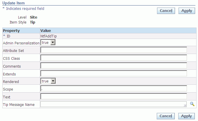
The Update Item page displays the current personalization level, which can only be Site.
-
The properties that you can update for your item are dynamically determined by the item's style. Check the Usage Notes column in the table shown in Step 1 of the Create Item page for information about the specific properties that you can update for a specific item style. Note that the properties that you can set in the Update Item page may not be personalizable. Thus, for a specific item style, you may see more properties listed in the Update Item page, than what is shown for the same item style in the Personalize page.
Additional Information: If an item style allows you to specify a value for its CSS Class, you can use the CSS Styles Lookup page to first preview your item with different CSS styles before setting the CSS Class name for the item. See the section on Style Sheets for additional information.
Additional Information: If you want to update an item that allows you to specify a Destination URI, you should specify the URI syntax as:
<protocol>://<machine>:<port>/...
For example:
http://www.example.com/home/page1.htm
If you want to call an Oracle E-Business Suite function, omit the
protocol://machine:portspecification in the URI, and only enterOA.jsp?with the following syntax:OA.jsp?OAFunc=<Apps function you want to call>. OA Framework automatically prepends the correct syntax for the OA_HTML directory path so that your function runs properly. For example, to call the PL/SQL General Preferences page from an item, you would enter the following value for the Destination URI property:OA.jsp?OAFunc=ICX_USER_PREFERENCES
Make sure that the page specified as the Destination URI has a link that navigates you back to the original page.
-
Choose Apply to update the new item and return to the previous page.
Tip: If you make a mistake when you update a new item, such that it causes the base page to display an error, you can sign on to Oracle E-Business Suite as the Functional Administrator responsibility and remove the personalization using the Manage Personalization Levels page.
Manage Personalization Levels Page
The Manage Personalization Levels page is launched when you choose the Manage Levels button from the complete Page Hierarchy Personalization page or the Page Layout Personalization page. You can use the Manage Personalization Levels page to select existing personalizations to activate, inactive, copy, undo or delete. You can also launch from this page, tasks to manage the translation of your personalizations.
Manage Personalization Levels page
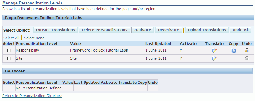
The Manage Personalization Levels page displays a table for each scope of the original page. For example, an original page might have three possible scopes: the Page itself, the OA Footer shared region, and the Notifications Worklist Function shared region. Shared regions are regions that can be shared among different pages. If you select a shared region as your scope when you set your personalization context, any personalizations you create get propagated to all occurrences of that shared region for the personalization level specified. If you select the page as your scope, then any personalizations you make are applied to just that local page. Refer to Per Instance versus Global Personalization for more details.
-
Each table lists all existing personalizations (also known as personalization documents), and identifies each by the level (function, localization, site, organization, responsibility, "Oracle-seeded user-level" or "admin-seeded user-level") and the layer (that is, the value at that level) for which the personalization was created. The following is an example of two distinct personalization documents:
Personalization Document A
-
Level: Responsibility
-
Layer (or Level Value): Framework ToolBox Tutorial Labs
Personalization Document B
-
Level: Responsibility
-
Layer (or Level Value): System Administrator
The table also identifies when a personalization was last updated and whether the personalization is active. You may select a personalization and use the Activate or Deactivate buttons to activate or deactivate the personalization.
-
-
If you wish to delete one or more personalizations, select the personalization(s) and choose Delete Personalization. Deleted personalizations are not recoverable.
Additional Information: "Oracle-seeded" and "admin-seeded" user-level personalizations cannot be deleted from this page. If you wish to delete seeded user-level personalizations, you can do so from the Personal Saved Searches page.
As of Release 12.2, you can copy a personalization document to multiple layers within the same personalization level by selecting the Copy icon for that personalization document. Prior to Release 12.2, to replicate a personalization document to different layers within the current personalization level, you have to manually recreate the personalization for each desired layer within that level.
The Copy icon launches the Copy Personalization page where you can copy the current personalization document to one or more layers within the current personalization level.
Warning: If you copy a personalization document to a layer that already contains an existing personalization document, that existing personalization document gets overwritten.
Note: You can not copy a Site level personalization document.
Note: You can only copy a personalization document from one layer to another within the same personalization level. For example, you can copy a responsibility-level personalization document to different responsibilities, but not to a different function or organization.
As of Release 12.2, to undo the personalization changes made within the current browser session for a specific personalization level and layer, you can select the Undo icon for that personalization document. Once the personalization changes are cleared, the Undo icon is disabled for that personalization document.
-
As of Release 12.2, to undo all personalization changes made within the current browser session, select the Undo All button.
Note: Only Administrator-Level personalizations, excluding "admin-seeded" user-level personalizations, can be undone.
Note: It is not possible to undo personalizations "up to a certain point" from the current browser session. Once you select Undo or Undo All, then all changes from the current browser session are reverted.
Note: If you make a personalization that causes an error in a page, use Undo or Undo All to revert back to the original state of the page prior to the current browser session. In previous releases, if you get a page error due to a personalization, you have to manually undo/delete each and every personalization or delete the personalization document.
In addition, as of Release 12.2, an Error page now displays a Personalize Previous Page link if the page in question has been personalized within the current browser session and the personalizations made in the current browser session have not been undone completely. Simply select the Personalize Previous Page link to navigate directly to the Manage Personalization Levels page where you can undo the personalization(s).
-
Select the Translate icon for a personalization if you want to translate the personalization to another language. The Translate icon launches the Translate page where you can translation your personalization inline. The Translate Column appears only if you have a language other than the base language installed on your system.
Additional Information: "Oracle-seeded" and "admin-seeded" user-level personalizations cannot be translated. The Translate icon is disabled for these personalizations.
-
If you wish to extract translation files for one or more personalizations, select the personalization(s) and choose Extract Translation File. This button navigates to the Extract Translation Files page, where you can specify the languages to extract.
-
Select a personalization and choose Upload Translations if you want to upload the translations of a personalization from XLIFF files. This button launches the Upload Translations page.
-
Once you are done making changes to the Manage Personalization Levels page, select Return to Personalization Structure.
Copy Personalization Page
The Copy Personalization page is launched from the Copy icon in the Manage Personalization Levels page. Use this page to copy a personalization document from a specific personalization level to one or more layers within that level.
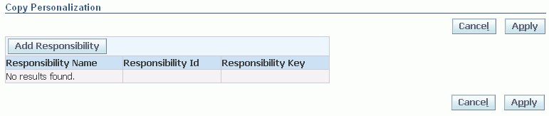
-
In the Copy Personalization page, select the Add <Level> button, where <Level> corresponds to the personalization level of the selected personalization. For example, if you choose to copy a Responsibility level personalization document, an Add Responsibility button appears.
-
The Add <Level> button launches a multi-select LOV window. Use this window to search for and select the layer(s) within the current personalization level to which you want to copy the selected personalization.
Multi-select Add Responsibility LOV window
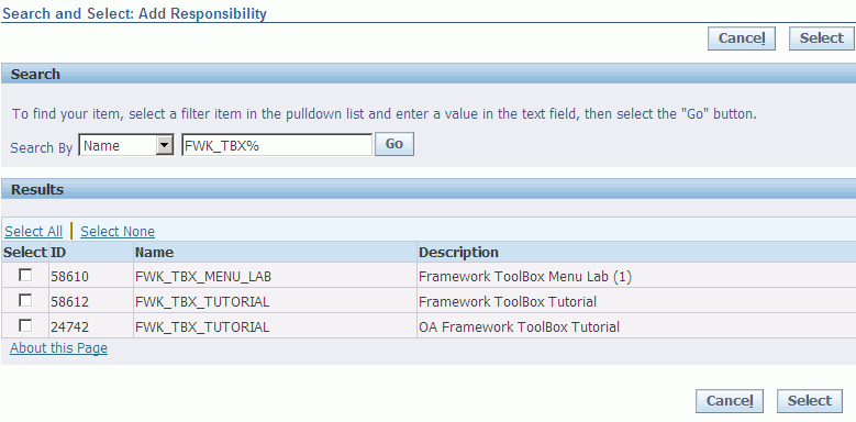
-
Upon returning to the Copy Personalization page, choose Apply to copy the personalization to the selected layer(s) and display the new personalization document(s) in the Manage Personalization Levels page.
Warning: If you copy a personalization document to a layer that already contains an existing personalization document, that existing personalization document gets overwritten.
Note: You can only copy a personalization document from one layer to another within the same personalization level. For example, you can copy a responsibility-level personalization document to different responsibilities, but not to a different function or organization.
Note: To see the effect of the copied personalization(s), use the Caching Framework in the Functional Administrator responsibility to clear the cache if necessary.
Extract Translation Files Page
The Extract Translation Files page is launched from the Extract Translation File button on the Manage Personalization Levels page. Use this page to select the languages for which you want to extract translation files.
Additional Information: You must set the Fnd Xliff Export Root Path (FND_XLIFF_EXPORT_ROOT_PATH) profile option before you can extract translation files. The directory that you specify for this profile option should have the proper permissions; refer to Oracle Application Framework Profile Options, My Oracle Support Knowledge Document 1315510.1, for more information.
Extract Translation Files page
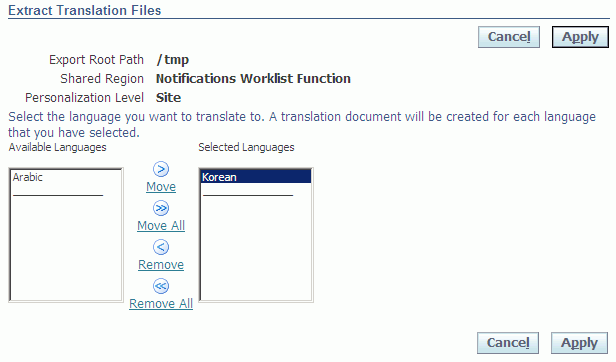
-
Use the arrow buttons between the Available Languages and Selected Languages lists to shuttle selected languages between the two lists.
-
Choose Apply to extract the personalization translations for these languages to an oraXLIFF file and return to the Manage Personalization Levels page. Language-specific subdirectories are created for each selected language in the package structure generated from the setting of the Fnd Xliff Export Root Path profile option.
For more information about the Fnd Xliff Export Root Path profile option, refer to the Personalization section in the OA Framework Profile Options appendix of the Oracle Application Framework Developer's Guide.
Upload Translations Page
The Upload Translations page is launched from the Upload Translations button on the Manage Personalization Levels page. Use this page to upload available personalization translations from oraXLIFF files located in the language subdirectory of the package structure generated from the setting of the Xliff Import Root Path (FND_XLIFF_IMPORT_ROOT_PATH) profile option.
For more information about the Xliff Import Root Path profile option, refer to the Personalization section in the OA Framework Profile Options appendix of the Oracle Application Framework Developer's Guide.
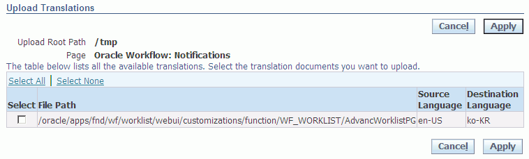
The table lists the personalization translations that are available for upload. The table also identifies source language of the file and the language of the translation.
-
Select one or more personalization translation(s).
-
Choose Apply to upload the translations to the MDS repository and return to the Manage Personalization Levels page. The uploaded translations now also appear in the Translate page.
Translate Page
The Translate page is launched from the Translate icon on the Manage Personalization Levels page. Use this page to perform inline translations of your personalizations.
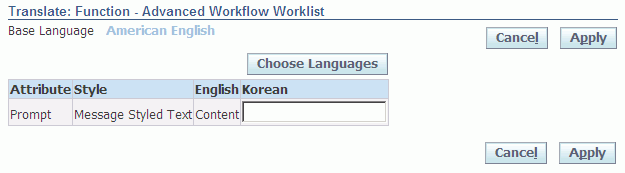
The Translate page displays a table that lists all the page elements (Style column) and their translatable properties (Attribute column) that were modified in the selected personalization. It provides a read-only column that lists the personalized value for each property in the base language.
The table also shows columns for up to four languages. Any existing translations that have been previously uploaded are displayed in these language columns. If a field in a language column is empty, the translation for that field is defaulted from the base language.
-
Select Choose Languages to navigate to the Choose Languages page, where you can select the languages (up to four) that display in the Translate page. When you are done choosing translation languages, return to the Translate page.
-
In the column for the language to which you want to translate the personalization, enter a translation value for the translatable property.
-
Repeat Step 2 for the other languages to which you want to translate the personalization.
-
Choose Apply to save your translations to the MDS repository and return to the Manage Personalization Levels page.
Choose Languages Page
The Choose Languages page is displayed when you select the Choose Languages button from the Translate page.
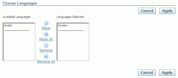
The languages that are currently installed are displayed in the Available Columns list.
-
Use the shuttle controls to select up to four languages to display in the Columns Displayed list.
-
Choose Apply to display the selected languages in the Translate page.
Personalize Saved Searches Page
The Personalize Saved Searches page is displayed when you select the Seeded User Saved Searches icon from the complete Page Hierarchy Personalization page or the focused Page Hierarchy Personalization page. From this page, you can seed new end user saved searches or duplicate, update, or delete pre-seeded end-user saved searches.
Note: You can find more information about using this page in the User-Level Personalization User Interface chapter.
Important: "Oracle-seeded" or "Admin-seeded" end user saved searches can be created only for tables (including HGrids) in a query region.
Personalize Saved Searches page
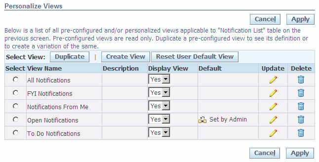
If you are an Oracle in-house E-Business Suite developer, only "Oracle-seeded" end user saved searches are displayed in the Personalize Saved Searches table. If you are an Administrator, "Oracle-seeded" and "Admin-seeded" end user saved searches are displayed and the only action you can perform on an "Oracle-seeded" saved search is to duplicate it.
Note: As an Administrator, you cannot update or delete an "Oracle-seeded" end user saved search. Instead, if you want to personalize the saved search, you should duplicate the saved search and personalize the duplicate. This ensures that if Oracle ever ships changes to an "Oracle-seeded" end user saved search, it will never override your personalizations, because you will have personalized not the "Oracle-seeded" saved search, but a duplicate of the "Oracle-seeded" saved search.
Note: When end-users choose to personalize a table in a Query region, the users see all "Oracle-seeded" and "Admin-seeded" end-user saved searches, in addition to the personalized saved searches the users create themselves, in the Personalize Saved Searces page. Although users can select any "Oracle-seeded" or "Admin-seeded" user saved search as their default saved search, they cannot update or delete the seeded saved search. Instead they can duplicate the seeded saved search and personalize the duplicate to ensure that their personalizations are preserved when there is an upgrade. See Default Saved Search for additional information.
The Personalize Saved Searches page displays the name of each saved search, along with a description.
-
If you want to make a copy of a saved search, select the saved search you wish to copy and choose Duplicate. This makes a duplicate of the saved search and takes you to the Duplicate Saved Search page where you can personalize the duplicate.
-
If you want to modify an existing saved search, select Update to navigate to the Update Saved Search page where you can personalize the saved search. Note that as an Administrator, you cannot update "Oracle-seeded" saved searches.
-
If you want to delete an existing saved search, select Delete. Note that as an Administrator, you cannot delete "Oracle-seeded" saved searches.
-
To create a new saved search, select Create Saved Search to navigate to the Create Saved Searches page where you can create a new personalization for the Query table (or HGrid) region.
If a saved search that was personalized and specified as the default saved search by an end-user gets corrupted (for example, if Oracle ships a change to the base page that may render the personalized saved search invalid), an Error Page will result when the user runs that page. To correct the problem, you need to reset the page so the default saved search that you originally set as the system administrator renders. Click Reset User Default Saved Search to reset the page to display the default saved search that you originally set. If you didn't set a default saved search, the base page renders.This allows you to run the page again so you can then return to the Personalize Saved Searches page to either delete or correct the offending saved search.
Note: You can also reset the default saved search of a page by clicking Reset Default Saved Search on the Personalization subtab of the About Page.
Use the Display Saved Search poplist to control whether the saved search displays in the Saved Search poplist of the Saved Search panel for end users and in the Personalize Saved Searches page for end user personalizations.
Create Saved Search, Update Saved Search, and Duplicate Saved Search Pages
The Create Saved Search page is identical to the Duplicate Saved Search and Update Saved Search pages, except that the fields in the latter pages are pre-populated with settings from the selected personalization.
Note: You can find more information about using these pages in the User-Level Personalization User Interface chapter.
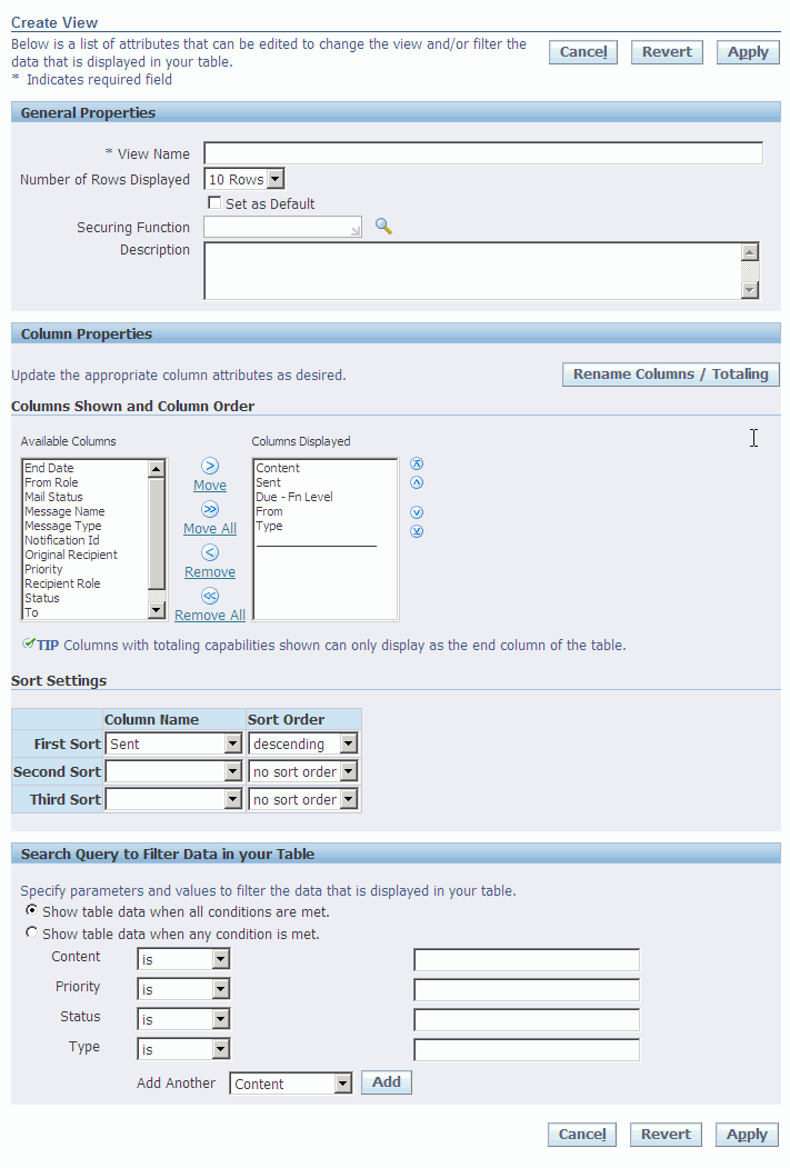
Important: Although a region may be personalizable, not all region items in a region are personalizable. Each region item in a region has an ADMIN_CUSTOMIZABLE property associated with it. If the property is set to false by the developer of the region, the region item is not personalizable at the Admin level. For example, a developer would very likely set ADMIN_CUSTOMIZABLE to false for the vertical spacer item in a table layout region to prevent disruption of the spacing in a table.
-
Edit the following General Properties for your table or HGrid region:
-
Saved Search Name - the name of the personalized end user saved search as it appears in the Personalize Saved Searches page or the Personal Table Saved Searches page for end-users.
-
Number of Rows Displayed - the number of rows of data you wish to display in the table.
-
Set Saved Search as Default - check if you want to make this personalized saved search the default saved search. As an Administrator, you can only set an "Admin-seeded" end user saved search as a default.
Note: If an "Oracle-seeded" end user saved search and an "Admin-seeded" end user saved search of the same region are both marked as defaults, the "Admin-seeded" end user saved search takes precedence and is displayed as the default for the end user. However, if an end user also has a personalized saved search of the same region that they mark as the default, then the end user's personalized saved search takes precedence over both seeded saved searches and is the default for that end user. See Default Sved Searches for additional information.
-
Securing Function - the function for which this saved search is available. Specifying a securing function allows you to restrict the use of this saved search to only users who have been granted access to that function. Refer to the section on Securing Saved Searches for complete information.
-
Description - an optional description for this personalized saved search.
-
-
Use the Columns Shown and Column Order shuttle to specify the columns to display in the table or HGrid region. Select an item from the Available Columns or Columns Displayed list and use the arrows between these lists to either move the selected item to or remove the selected item from the Columns Displayed list.
Note: Columns that are required fields table appear with an asterisk (*) and cannot be removed from the Columns/Attributes Displayed list.
Example of an Advanced Table with Two Levels of Column Spans
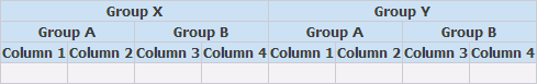
Each of the columns in the top row (labeled "Group X" and "Group Y") spans two columns in the second row (labeled "Group A" and "Group B" in both cases). Each "Group A" column in turn spans "Column 1" and "Column 2" below it, while each "Group B" column spans "Column 3" and "Column 4."
If the region you are personalizing is an Advanced Table that displays column spans, as shown in the example, the columns listed in the Available Columns and Columns Displayed shuttle will have the entire hierarchy of column group names appended to each column name. This ensures that you hide/show the correct column, especially in the case where multiple columns of the same name may exist within different column groups. For the example shown, the columns shown in the Available Columns and Columns Displayed lists would be:
Group X: Group A: Column 1
Group X: Group A: Column 2
Group X: Group B: Column 3
Group X: Group B: Column 4
Group Y: Group A: Column 1
Group Y: Group A: Column 2
Group Y: Group C: Column 3
Group Y: Group C: Column 4
-
Once you are satisfied with the columns to display, use the arrows to the right of the Columns Displayed list to reorder their sequence.
-
Choose Rename Columns / Totaling to rename or show a total for a column.
-
You can specify up to three levels of sorting for your data in the Sort Settings region. Select a column from the Column Name poplist for each level of sorting you wish to perform.
Note: Only columns whose Sort Allowed property is set to Yes are displayed in the Column Name poplist. If this property is initially set to no and you want to be able to sort on this column, you must first create an admin-level personalization of the table region that updates the Sort Allowed property for the column to yes.
-
For each sort column, specify whether to sort in ascending or descending order.
-
You can filter the data that is displayed in the table based on criteria that you specify in the Search Query to Filter Data in Table region:
-
Indicate how you want the filter to match your search conditions by selecting one of the following radio buttons: Show table data when all conditions are met = Match All or Show table data when any condition is met = Match Any.
-
The first four columns of the table are listed for you to specify search criteria. Using the poplist following the column name, choose a search condition and enter a value to search for in that column.
-
Select a column from the Add Another poplist and choose Add to add more search criteria to your filter.
Note: Only columns whose Search Allowed property is set to True are displayed in the Add Another poplist. If this property is initially set to False and you want to be able to search on this column, you must first create an admin-level personalization of the table region that updates the Search Allowed property for the column to True.
Tip: If you leave the search criteria blank for a column, the filter will not search on that column.
-
When you are done personalizing your saved search of the table or HGrid region, you can choose Apply to save the personalized saved search and return to the Personalize Saved Searches page. If you choose Revert to revert to default settings, the following occurs depending on the page you are using:
-
Create Saved Search page - the page defaults to the pre-seeded display settings, where no query options are set.
-
Duplicate Saved Search or Update Saved Search page - the page defaults to the display settings and query options of the saved existing saved search.
Note: How you set the Scope of your personalization context in the Choose Personalization Context page affects how your personalized saved search is saved. The saved search may be saved to the current instance of the page as a per instance personalization if you set the Scope to Page. If there is a shared region on the page and you select the Shared region as the Scope, the personalization you create on that shared region is also saved as a per instance personalization of that shared region but will appear in all occurrences of that shared region in any page that extends it. Refer to Per Instance versus Global Personalization for further details.
-
Securing Saved Searches
OA Personalization Framework secures saved searches through the Securing Function property in the Create/Update/Duplicate Saved Search pages.
If an "Oracle-seeded" or "Admin-seeded" end user saved search has a securing function associated with it, only end users who are granted access to that securing function are able to see that saved search in the Saved Searches poplist of the Saved Searchs panel of their Search page. The securing function, in addition to restricting visibility of a secured Saved Searches in the Saved Searches poplist of the Saved Searches panel, also restricts visibility of a secured saved search in the Personalize Saved Searches page.
As an administrator, you are not able to update or delete "Oracle-seeded" end user saved searches. As a result, seeded saved searches are always visible to all end users. For example, you cannot update "Oracle-seeded" saved searches to restrict them to a specific set of end users or delete some of these saved searches for all end users. However, if you want to turn off an "Oracle-seeded" saved search, you can duplicate the seeded saved search and set the securing function on the duplicated saved search to a function to which a user or group of users does not have access.
If you want to simply control the visibility of a saved search for an end user in the Saved Searches poplist of the Saved Searches panel, first duplicate the saved search and set a securing function on the duplicate, granting the user access to that function. Then in the Personalize Saved Search page, set Display Saved Search to Yes or No for that duplicated saved search.
The following table identifies the accessibility of saved searches to administrators as well as end users, when a securing function is specified for "Oracle -seeded" and "Admin-seeded" end user saved searches.
| Created By | Active | Effect on an Administrator's Personalize Saved Searches Page | Effect on an End User's Personalize Saved Searches Page | Effect on the Saved Searches Poplist in the Saved Searches Panel |
|---|---|---|---|---|
| Oracle | Yes | Securing function: Yes Shown: Yes Can be deleted: No Can be modified: No Can be duplicated: Yes |
Shown: Only if user has access to the securing function. Can be deleted: No Can be modified: No Can be duplicated: Yes |
Shown only if user has access to the securing function. |
| Oracle | No | Securing function: Yes Shown: Yes Can be deleted: No Can be modified: No Can be duplicated: Yes |
Shown: Only if user has access to the securing function. Can be deleted: No Can be modified: No Can be duplicated: Yes |
Not shown, since the Active property is set to No. |
| Administrator | Yes | Securing Function: Yes Shown: Yes Can be deleted: Yes Can be modified: Yes Can be duplicated: Yes |
Shown: Only if user has access to the securing function. Can be deleted: No Can be modified: No Can be duplicated: Yes |
Shown only if user has access to the securing function. |
| Administrator | No | Securing Function: Yes Shown: Yes Can be deleted: Yes Can be modified: Yes Can be duplicated: Yes |
Shown: Only if user has access to the securing function. Can be deleted: No Can be modified: No Can be duplicated: Yes |
Not shown, since the Active property is set to No. |
| End User | Yes | Not applicable | Shown: Yes Can be deleted: Yes Can be modified: Yes Can be duplicated: Yes |
Shown: Yes |
| End User | No | Not applicable | Shown: Yes Can be deleted: Yes Can be modified: Yes Can be duplicated: Yes |
Not shown |
Rename Columns / Totaling Page
Use the Rename Columns / Totaling page to rename the table or HGrid columns that are displayed in your personalized saved search, to display a total for a column.
Note: You can find more information about using this page in the User-Level Personalization User Interface chapter.
Rename Columns / Totaling page
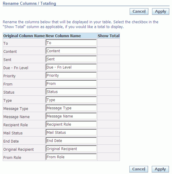
-
You can change the Column Names for the columns you chose to display.
-
You may check Show Total to turn on totaling for a specific column in your table, if it is applicable to the underlying data.
Tip: If you choose to display a column with totaling capabilities, you may want to display this column as the last column of the table. You can reorder the columns in the Columns Displayed list located on the previous page.
-
If after you make changes to your columns, you decide you want to revert back to the default values, choose Reset to Defaults.
-
Choose Apply when you are done to save your changes and return to the previous page.
Setting the Record Set Size for nodeDefinition under a HGrid
Setting the Record Set Size property for each nodeDefinition item defined under an HGrid.
An administrator can set the value for the Record Set Size property of each nodeDefinition to control the Record Set Size at each level.
To set the Record Set Size value:
-
Navigate to the Personalize Page Hierarchy - Administrator Personalization page for the HGrid page to be personalized
-
In the Personalization Structure HGrid, locate the HGrid to be personalized in the Name column
-
For the HGrid, click on the Personalize icon for the nodeDefinition item for which the Record Set Size value needs to be set.
-
In the Personalize Node Definition - Administrator Personalization page set the desired value for the Record Set Size property
-
Select Apply.
Note the following:
-
After making this change, the administrator must navigate back to the home page and then return to the application to see the record set size change take effect
-
The Record Set Size Property value of the HGrid should be set to a value greater than zero for the Record Set Size property value set at the nodeDefinition level to take effect.
Hiding the Save Search and Personalize Buttons
The Save Search button on the Search panel and the Personalize button can be shown/hidden through personalization.
-
Click on the personalize search link in the search panel on the page.
-
Click on the personalize icon next to the search header in the personalization structure HGrid.
-
In the personalize page new attributes "Hide Save Search" and "Hide Personalize" are displayed in the Personalization Properties table.
-
Change the value.
-
Click the Apply button.
-
Navigate back to the Application Page.
-
The end user is shown / hidden the Save Search and the Personalize buttons on the page, depending on the value selected.
Change Display Size for Various TextInput fields
The Administrator is able to change the display size of the following TextInput fields;
-
messageTextInput
-
messageLovField
-
messageFileUpload
Personalization is done by setting the value for the Length property.
-
Click on the personalize page link on a page containing the TextInput.
-
Click on the personalize icon next to the TextInput in the Personalization structure HGrid.
-
In the Personalize page set a new value for the Length property in the Personalization Properties table and click on the Apply button.
-
Navigate back to the Application Page.
-
The display length of the personalized TextInput should reflect the new value set through personalization
Adding Search Mappings
Search Mappings can be added through personalizations. A user can add a search mapping using personalization to a query region defined in the Auto Customization Criteria (ACC). The search mapping can be defined between fields already present in the simple search panel of the query region or added using personalization with fields present in the result table for the query region. The following two corollary requirements have also been added to enhance the user experience while adding a search mapping using personalization.
While defining the search mapping, the IDs of the columns in the result table of the query region are displayed in a poplist.
If using an ID of the column to be used in the mapping and entering the same in a text input field, a search mapping can be created between fields (one from the search panel and one from the result table); however, a validation message will be displayed if there are incompatible datatypes.
Add a field to the simple search panel using personalization using the following steps:
-
Click on the Personalize Page link.
-
Click on the Create item icon in the Message Component Layout present in the Simple Search panel.
-
In the Create Item page, select the Item and set the IDand prompt.
-
Click on Apply.
Create the search mapping using the Admin Personalization UI:
-
Click the Create Item icon for Simple Search mappings.
-
Enter the ID, Result Item ID, and Search Item ID.
-
Click on Apply.
-
Click on the Return to Application link.
-
Perform the search.
Personalizing Color-Coded Tiles
An infotile, also simply known as a tile, consists of a header box and an associated content region. Each infotile provides a description of its detailed region. When a user selects a given infotile, the details related to that tile are shown in the region. Beginning with Release 12.2.11, administrators can personalize the color coding of infotiles.
System administrators who wish to change the default color coding colors or the logic for color coding conditions can download the seeded document using jdr_utils.printDocument('Seeded Doc Path') and save the content in an XML file. For example:
jdr_utils.printDocument('/oracle/apps/fnd/framework/toolbox/tutorial/webui/customizations/user/seededcustomer/PoListSearchPG')
Once the document has been saved as XML, the values can be customized as needed.
An example of customization is:
<view id="custSeed2" element="ResultsTable" MDSActiveView="true" name="Seed1">
<modifications>
<modify element="ResultsTable" blockSize="10" colorRule="1" codingCondition="BT-0-40-3|BT-41-60-2|GE-61-0">
<queryCriteria>
<criterion element="Supplier" operator="start" operand="Micro" joinCondition="and"/>
</queryCriteria>
</modify>
<modify element="OrderNumHdr1" initSortSeq="second"/>
</modifications>
</view>
For more information on infotiles, refer to the Oracle Application Framework Developer's Guide, My Oracle Support Knowledge Document 1315485.1.
Modifying XML Documents Using the Diagnostic Console
Beginning with Release 12.2.11, the Diagnostic Console allows you to modify XML documents from the UI and then upload them to the MDS repository from the UI.
To modify the infotile color coding logic using this method, go to the page where you want to modify the logic and then perform the following steps.
-
Open the Diagnostic Console by clicking the button. (You may first need to set the FND_DIAGNOSTICS profile option to be able to see this button).
-
Go to the MDS tab.
-
Locate the seeded view document in the list. For example:
/oracle/apps/fnd/framework/toolbox/tutorial/webui/customizations/user/seededcustomer/PoListSearchPG
-
Click the pencil icon to edit the MDS document.
-
In the new tab that is created, the MDS document will be opened in edit mode.
-
Make your required changes to the MDS document.
-
Click the Upload to MDS Repository button.
-
Log out and log in again to see your changes.
Additional Features
-
Infotiles created as part of list search will render with Chroming = Half Chrome. That is, the blue bottom pointer will not appear in the infotile.
-
For infotiles under query beans, the collapse of infotiles feature is enabled. Just like page tabs, the infotiles can be collapsed.