Personalizing OA Framework Applications
This chapter covers the following topics:
- Branding
- Themes
- Customizing Look-and-Feel (CLAF)
- Icons
- Responsibilities and Menus
- Messages
- Lookup Codes
- Style Sheets
Branding
As described in the Browser Look-And-Feel (BLAF) guidelines for branding on the Oracle Technology Network (OTN), every OA Framework page reserves the upper left-hand corner for one of the following:
-
Basic (Non-Contextual) Branding - includes corporate (for example, "Oracle") and product brand names
-
In-Context Branding - includes user-selected contextual information in addition to the corporate and product brand names
All OA Framework pages must provide basic branding support. In-context branding may be used in cases where there is a specific need.
Basic (Non-Contextual) Branding
Basic branding includes the display of corporate (for example, "Oracle") and product brand names. It displays the product branding as text drawn from one of several possible sources. The global buttons are displayed as text links only. It supports a regular layout style, as in the following example.
Basic branding (corresponds to BLAF "Regular" layout)
Personalizing the Corporate Branding Image
Every page contains a corporateBranding page element that has an Oracle corporate image file assigned to it. That image file is /OA_MEDIA/FNDSSCORP.gif, which contains the Oracle corporate image. You can change the corporate branding image that appears on your pages in one of two ways:
-
To globally override the Oracle corporate branding image with your own corporate branding image, set the profile option Corporate Branding Image for Oracle Applications (FND_CORPORATE_BRANDING_IMAGE) to the name of an image file (GIF) that contains your corporate image. For example,
MyCompanyImage.gif. The image file MyCompanyImage.gif should be placed under the $OA_MEDIA directory. This profile option should be set at the Site level and does not have a default value.Note that the Corporate Branding Image for Oracle Applications profile option also controls the corporate branding image for JTF-based applications. Refer to the "Implementing the Oracle CRM Technology Foundation" chapter of the Oracle E-Business Suite CRM System Administrator's Guide for more information.
Note: Beginning with Release 12.2.5, if you set a new corporate branding image with the profile Corporate Branding Image for Oracle Applications, you can specify alternative text (alt-text) to describe your image file by updating the Description field of the Corporate Branding Image for Oracle Applications profile itself.
-
To create an administrative-level personalization for a specific page, set the Image URI property on the corporateBranding page element to a different image file. This updates the image only for the specific usage on that page.
-
If you are using the Export to PDF feature for tables (introduced in Release 12.2.10), then every exported PDF document carries the same corporate branding image as the base page by default. If you want to apply a different corporate branding image, then place the image file under the
$OA_MEDIAdirectory, and set the profile option "FND: Export to PDF Corporate branding image location" (code FND_EXPORT_TO_PDF_CORP_BRANDING_IMG_LOC) to point to the file name of the image in the$OA_MEDIAdirectory.
Warning: Do not attempt to globally override the corporate branding image by renaming your custom corporate branding image file as /OA_MEDIA/FNDSSCORP.gif. This would result in distortion of your corporate image. When a page is rendered, OA Framework checks whether a value is set for the profile option Corporate Branding Image for Oracle Applications. If no value is set, it renders /OA_MEDIA/FNDSSCORP.gif as the corporate branding image and sets the image area size to 134 x 23 (which is the actual size of the image in FNDSSCORP.gif). If this profile option has a value set, it renders the content of the specified image file without specifying an image area size since the image size is as yet, unknown.
Personalizing Product Branding
The product branding is derived in one of three possible ways:
-
Default behavior - If your OA Framework page is launched from the Navigator in the E-Business Suite Personal Home Page, OA Framework automatically sets the branding text for you based on the current selected responsibility and page link. This ensures consistency between the options presented in the Navigator and the branding text displayed on the application page.
Note: The default branding is set only if the FND:Framework Compatability Mode profile option value is set to
11.5.10. -
Declarative branding behavior - A developer may set the product branding declaratively on the page itself and override the default branding behavior. If this is the case, you can personalize the product branding text by creating an administrative-level personalization for the page which sets the Text property on the productBranding: formattedText page element to the product name you want to display.
-
OAPB override behavior - A developer may also define a form function and call it using the OAPB URL parameter with the page to specify the product branding text. When a developer specifies an OAPB parameter programmatically, it overrides both the default and the declarative branding behavior, if any. The only way to personalize the product branding text in this case is by logging into the Oracle E-Business Suite and updating the User Function Name value for that branding function, using the Form Functions screen.
In-Context Branding
The in-context brand includes the corporate and product brand images. Additionally, contextual information renders below the corporate and product information, as shown in the following example.
Example of In-Context Branding

Note: This style of branding is intended to be used only for cases where the user makes a contextual selection when starting work that remains unchanged for the life of the application or task.
To personalize in-context branding, create an administrative-level personalization for the page that sets the Text property on the productBranding: formattedText page element to the product name you want to display. Then set the Text property on the inContextBranding: formattedText page element to the context you wish to display. For example, the Text property of the inContextBranding: formattedText page element displayed in the preceding example is "Customer <b>Company A - North America</b>".
Themes
A theme determines how Oracle Application Framework pages will look. You can choose a shipped theme or create your own using the Theme Editor feature.
Introduced in Release 12.2.7, the Theme Editor for Oracle E-Business Suite is a lightweight UI-driven tool that enables easy customization of OAF applications' look and feel.
Important: Beginning with Release 12.2.15, the default LAF for Oracle E-Business Suite is Redwood. There are two LAF settings, Redwood and Alta. You can specify which LAF to use by setting the profile option 'Oracle Applications Look and Feel' (internal code APPS_LOOK_AND_FEEL). If this profile is not set (null), then the Redwood LAF is implemented and themes cannot be used.
If you want to use a theme as described in this section, you must set the profile option 'Oracle Applications Look and Feel' to 'Alta'.
The Theme Editor reduces the personalization skills and efforts needed to customize the look and feel of Oracle E-Business Suite. For example, users with little or no knowledge of cascading style sheets (CSS) will still be able to create and edit themes that suit the needs of their specific installations. A further benefit of the Theme Editor is that customized themes created using it can be applied on-the-fly, without requiring a restart of the application services.
To use the Theme Editor, you must have the Functional Administrator responsibility.
Themes are reflected in pages built with Oracle Application Framework and also in pages built with other underlying technologies in the following products:
-
Oracle CRM Technology Foundation (JTT)
-
Oracle Applications Manager
-
Oracle Web Applications Desktop Integrator
In the following products, pages use an underlying technology for which themes are not supported. Therefore, themes are not reflected in the following:
-
The eKanban application in the Discrete Manufacturing product family
-
Oracle iStore
-
The Oracle E-Business Suite online help pages
Customizable Properties
Themes in Oracle E-Business Suite can be used to specify the following properties for a page, to provide a distinctive theme:
-
Page border color
-
Button background color
-
Text color (for tip text, for example)
-
Link text color
-
Button text color
-
Prompt text color (that is, for text labeling input fields)
-
Global Header and Footer text color
-
Header and subheader text color
-
Global Header icon color
The following figure illustrates examples of where the properties can be applied:
Examples of Elements Using Customizable Theme Properties
-
Page border color
-
Global Header and Footer text color
-
Link text color
-
Global Header icon color
-
Text color
-
Button background color and button text color
Note that themes you create in this way do not affect the following page elements:
-
Table headers
-
Dropdown menus
-
Most modal and inline pop-up windows (for example, Attachment pop-up windows, Navigator, Favorites, Settings, Worklist, and Preferences)
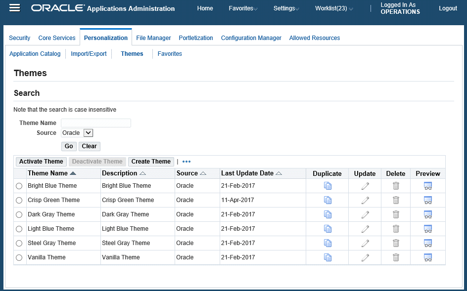
Accessing the Themes Pages
-
Log in as a user with the Functional Administrator responsibility.
-
Navigate to Functional Administrator > Home.
-
Navigate to Personalization > Themes.
Searching for Themes
You can search by Theme Name or Source. For Source, the options are Oracle (shipped with Oracle E-Business Suite), Custom (customer-created), or All (leave the field blank).
Themes Search with Oracle Source
Previewing a Custom or Oracle Theme
To preview an existing theme, click the Preview icon for the theme.
Creating and Editing a Custom Theme
Create Theme Page
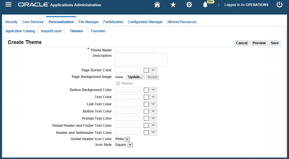
To create a new theme:
-
Select the Create Theme button.
-
Enter a Theme Name and optional description for your theme.
-
Choose colors for page properties using the color picker. If you have the profile FND: Enable JET ColorPicker set to
Yes(the default), the advanced color picker is shown. If it is set toNo, then the classic color palette is used.With the advanced JET color picker, you can:
-
Choose from a predefined palette of colors
-
Use the Custom Colors... to retrieve a color value from a saturation spectrum with hue and opacity sliders.
-
Select your last-used color or another recently-used color
You can also enter a color hex code directly into a field.
Choose colors for the following properties:
-
Page border color
-
Button background color
-
Text color (for tip text, for example)
-
Link text color
-
Button text color
-
Prompt text color (that is, for text that precedes input fields)
-
Global Header and Footer text color
-
Header and subheader text color
-
-
Select a Global Header icon color.
Note: For branding: With seeded themes, the color of Oracle logo is based on this property. However, for custom themes, you need to set the profile option Corporate Branding Image for Oracle Applications (FND_CORPORATE_BRANDING_IMAGE) to set the appropriate logo.
-
Select an Icon style (Square or Circular).
-
You can preview your theme using the Preview button. This button opens a page displaying components in your selected colors. To exit the Preview window, click the 'X' icon at the top right. You will be taken back to the Create Theme page where you can change your color choices if you want.
-
When you are finished creating your theme, click Save.
Note that if you leave a field blank, the Alta color scheme is used for that field.
To implement your new theme, activate it as described below.
Updating a Custom Theme
From the results table on the Themes page, click the Update icon for the theme you wish to update. You can then make your updates in the Edit Theme page.
Duplicating a Custom or Oracle Theme
From the results table on the Themes page, click the Duplicate icon for the theme you wish to copy. The Create Theme page will display from which you can edit the copy of the original theme.
Deleting an Existing Custom Theme
Click the Delete icon for the theme you wish to delete. Deleting an active theme restores the default Alta Look-and-Feel.
Note: You cannot delete the Oracle seeded themes.
Activating a Custom or Oracle Theme
To activate a theme for your instance, select the theme name and click the Activate Theme button. A flag icon will appear next to the theme name.
Activated Dark Gray Theme with Flag Indicator
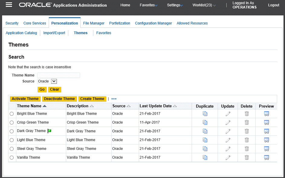
Oracle Application Framework application pages will then apply this theme's styles.
Note: Refer to the overview of this section for a list of exceptions.
The theme name will be saved in profile FND: User Theme (FND_USER_THEME). This profile value can also be set at the site, application, responsibility, or user level, as described below.
Deactivating a Custom or Oracle Theme
To deactivate a theme, use the Deactivate Theme button. The default Alta Look-and-Feel is restored.
Setting a Theme at the Site, Application, Responsibility, or User Level
While you can activate a theme to be the default for Oracle Application Framework pages using the Themes page, you can also choose to override this choice on the site, application, responsibility, or user level using the FND: User Theme (FND_USER_THEME) profile.
Also, users can view and update this profile, so they can select which pre-defined themes to use.
For example, a user can:
-
Navigate to the Personal Profiles window.
-
Query the profile name 'FND: User Theme'.
-
Set the user value to 'Bright Blue Theme'.
-
Save the changes.
Note that for the user to see the updated theme, the profile option cache must be cleared by a system administrator. To do this, navigate to the Functional Administrator (seeded responsibility) > Core Services > Caching Framework, select the cache object 'PROFILE_OPTION_VALUE_CACHE' , and click the Clear Cache button.
After the profile option cache is cleared, the user can log in and see the new theme.
Ready-to-Use Themes
Oracle E-Business Suite includes the following ready-to-use themes:
-
Bright Blue
-
Crisp Green
-
Dark Gray
-
Light Blue
-
Redwood
-
Steel Gray
-
Vanilla
If the capabilities offered by the Theme Editor are insufficient for all your needs, you can customize more extensively using the Customizing Look-and-Feel (CLAF) feature, as described in the next section.
Customizing Look-and-Feel (CLAF)
Oracle E-Business Suite applications are currently shipped with Oracle's corporate Browser Look-and-Feel (BLAF), which supplies a rich set of components for web-based applications. Although OA Personalization Framework provides you with the ability to change the look of a page by changing user interface (UI) component properties, adding UI components, and so on, it does not allow you to create and apply an entirely new Look-and-Feel to an application.
The Customizing Look-and-Feel (CLAF) feature addresses this issue by providing a self-service based UI to modify the Look-and-Feel of an application. The feature enhances OA Personalization Framework by allowing personalization administrators to:
-
Create a new Look-and-Feel (LAF).
-
Register the new LAF.
-
Apply the LAF at the Application, Responsibility, Site, Organization or User levels.
-
Update a custom LAF.
UIX currently provides OA Framework with the following LAFs, which can be used directly in web applications:
-
Base Look-and-Feel - the root of all LAF implementations.
-
Simple Look-and-Feel (SLAF) - a LAF built on top of Base Look-and-Feel to offer more customization features, and to serve as an illustration of how to create LAF extensions on top of a base LAF.
-
Browser Look-and-Feel (BLAF) - the default LAF, which conforms to Oracle's corporate UI guidelines.
-
Minimal Look-and-Feel (MLAF) - a simplified version of BLAF with a lightweight UI.
You can build custom LAFs by extending Base LAF, Simple LAF, or another custom LAF.
Note: You cannot extend BLAF or MLAF.
Infrastructure of a Look-and-Feel
A Look-and-Feel is defined by three major components: style sheets (XSS), icons, and renderers.
Style Sheets
A style sheet document (.xss extension) lists the styles for the Look-and-Feel. Styles control the color and font of HTML components. For a complete discussion of style sheets and styles, please refer to the Style Sheets topic in this chapter. Style sheets are located in /OA_HTML/cabo/styles.
See also the list of global styles provided by UIX later in this chapter.
Icons
Some web beans are composed of one or more icons that control the web bean's Look-and-Feel. Icons are identified by a name. For example, the Hide/Show web bean consists of the "disclosed" icon. Icons are present in the LAF configuration file. For additional information, refer to the Icons topic in this chapter.
Renderers
A renderer controls how a web bean lays out its children and generates HTML. If the layout of the LAF you wish to create is different from the standard layout provided by Oracle, you will have to write new renderers for those components that differ in their layout. You define renderers declaratively as templates (.uit extension). Following is an example template definition for a sidebar component:
<!-- Template used by sample LAF for side bar. -->
<templateDefinition
      xmlns="https://xmlns.example.com/uix/ui"
      xmlns:ui="https://xmlns.example.com/uix/ui"
      xmlns:html="https://www.w3.org/TR/html40/"
      targetNamespace="https://www.example.org/demo/templates"
      localName="sidebar">
  <content>
  ...
  </content>
</templateDefinition>
You should have one template renderer for each component that has a custom layout. The section between the <content> and </content> tags contains the desired UI layout and any references to other UI components. The UI layout is represented in uiXML and HTML.
Important: You can use a template renderer to customize the layout of some - but not all - components. Following is a list of the components with customizable layouts:
-
borderLayout
-
breadCrumbs
-
bulletedList
-
button
-
contentContainer
-
flowLayout
-
footer
-
globalButtonBar
-
globalHeader
-
header
-
hideShow
-
link
-
messageComponentLayout
-
pageButtonBar
-
pageLayout
-
printablePageLayout
-
rowLayout
-
sideBar
-
sideNav
-
stackLayout
-
subTabBar
-
subTabLayout
-
tabBar
-
tableLayout
-
tip
-
train
Look-and-Feel Extension
When you define a new Look-and-Feel (LAF), you can also alter the layout of its inherited Look-and-Feel, thereby creating a custom LAF. A LAF is sometimes also called a "skin." To complete the creation of a custom LAF, you must register any custom renderers, custom facet renders, and custom icons for that LAF, on your custom Look-and-Feel using the Customizing Look-and-Feel UI.
Note: A facet is an optimized variation of a LAF, usually created for a specific output medium. For example, a printable version of a page can be implemented as a facet by excluding superfluous navigation and personalization controls that are not necessary for printed output.
For more information, see Custom Renderer and Custom Icon Standards.
Example
The following code is an example of content in a LAF extension XML that defines a new LAF. This example represents a LAF identified by a family called customlaf. Since it extends the simple.desktop LAF, it inherits all the styles from the UIX Simple Look-and-Feel (SLAF). This custom LAF overrides the renderer for page layout by providing its own template-based renderer for page layout. It also provides a custom printable facet page layout renderer (which is initiated to render the page when you run the page in printable page mode) and some custom icons.
<lookAndFeel xmlns="http://xmlns.example.com/uix/ui/laf"
             xmlns:ui="http://xmlns.example.com/uix/ui"
             id="customlaf.desktop"
             family="customlaf"
             extends="simple.desktop"
             styleSheetName="customlaf-desktop.xss">

  <!-- Custom Renderers -->
  <renderers>
    <!-- Register a custom pageLayout Renderer -->
    <renderer name="ui:pageLayout">
      <template name="pageLayout.uit"/>
    </renderer>
  </renderers>

  <!-- Facet custom Renderers -->
  <renderers facets="printable">
    <!-- Register a custom pageLayout Renderer -->
    <renderer name="ui:pageLayout">
      <template name="printablePageLayout.uit"/>
    </renderer>
  </renderers>

  <!-- Custom Icons -->
  <icons>
    <!-- Provide some icon -->
    <icon name="ui:tabBarStart">
    <contextImage uri="images/laf/customlaf/tbs.gif"
      width="8" height="26"/>
    </icon>
  </icons>
Customizing Look-and-Feel (CLAF) User Interface
The Customizing Look-and-Feel feature provides a self-service user interface that allows you to create a new Look-and-Feel, as well as update an existing Look-and-Feel. It does not, however, provide a user interface to create custom template renderers. You must first create/write any custom template renderers that you require before you can create the look and feel.
-
You should have a good knowledge of UIX web beans and be able to identify which specific UIX component maps to a given component in your web site.
-
You should have a good understanding of UIX XSS infrastructure and be able to identify what color and font styles are associated with each component. Refer to the Style Sheets topic and the Global Styles table for additional information.
You must ensure that you have write permission on the file system where OA Personalization Framework is running. If write permission is not granted before you attempt to create or update a Look-and-Feel, the UI will throw an exception.
-
You need to write a template renderer only if a component has a layout and children that are different from that of the Browser Look-and-Feel (BLAF). If you need to register a new template renderer, follow these steps before proceeding to the Accessing the CLAF UI section following:
-
Name your custom template renderer file as <webBeanType>.uit. For example:
sideBar.uit,tabBar.uit, orpageLayout.uit. -
Create a folder named <lookandFeelId> under $HTML_TOP/cabo/templates, where <lookandFeelId> would be a LAF name, such as
custom-desktop. -
Place the <webBeanType>.uit file in the folder $HTML_TOP/cabo/templates/<lookandFeelId>. For example to register a new template renderer for tabBar, move tabBar.uit so that resides as
$HTML_TOP/cabo/templates/custom-desktop/tabBar.uit, wherecustom-desktopis the <lookandFeelId> folder. -
Continue with the Accessing the CLAF UI and Creating a New LAF sections to create new LAF.
Important: To ensure that your template renderer registers properly, make sure the new LAF you create has the same LAF name as the <lookandFeelId> folder you created in the second step.
To update an already registered template renderer, first replace the old <webBeanType>.uit file with your new modified version of the <webBeanType>.uit file. Next, proceed to the Accessing the CLAF UI and Updating a LAF sections. Make sure you replace <webBeanType>.uit in the appropriate <lookandFeelId> folder.
-
Accessing the CLAF UI
The Customizing Look-and-Feel user interface can be accessed in one of two ways:
-
Using the Oracle E-Business Suite Users window, add the responsibility FND_CLAF_ADMINISTRATOR to the user who should be given permission to create new LAFs. Make sure you bounce your web server after saving the change so that the setting takes effect. A Customizing Look and Feel Administrator responsibility should now be available for the user. After selecting that responsibility, the user should then select Customizing Look and Feel Administrator to navigate to the first page of the CLAF UI.
-
In the Page Hierarchy Personalization page of the Admin Personalization UI, the Page Hierarchy HGrid displays a column called Customize Look and Feel. A Customize Look and Feel (pen) icon appears in the column if the following two conditions are met:
-
The application page's current Look-and-Feel is customizable. For example if the current Look-and-Feel is BLAF, an icon will never appear because BLAF is not customizable.
-
The component is LAF customizable. This means that only a component associated with a style or icon can have the Customize Look and Feel icon enabled. If a personalization administrator does not have access to the Customizing Look and Feel Administrator responsibility when the administrator selects the icon, OA Framework returns an error.
-
When you select the Customize Look and Feel icon in the HGrid for a specific page element, you navigate to the second page of the CLAF UI (Customize Styles and Icons ) for that page element.
Creating a New LAF
Aside from creating custom template renderers yourself, the CLAF UI provides all the other features needed to create a new look and feel. The UI allows you to:
-
Specify the new Look-and-Feel identifier or name. The identifier must be unique, all lower case, and must follow the standard <lookAndFeelFamilyName>-<device> naming convention, where <device> is either
desktoporpda. -
Specify the family under which the Look-and-Feel belongs (in all lower case). Multiple LAFs for different devices can exist under the same family. For example, myclaf-desktop and myclaf-pda both exist under the myclaf family. The family name should be unique for a particular Look-and-Feel.
-
Specify the base Look-and-Feel that your new custom Look-and-Feel shall extend. All styles, icons, and renderers are inherited from this base look and feel, and can be overridden.
-
Modify the styles inherited from the base Look-and-Feel to suit the colors and fonts of the new Look-and-Feel you want to create.
-
Modify the icons inherited from the base Look-and-Feel to suit the new look and feel you want to create.
-
Get immediate feedback on the changes being made to styles and icons using the preview page.
-
Register any custom template renderers you define for any web beans.
The following steps outline how to create a new custom LAF using the CLAF user interface:
-
Evaluate a good sampling of pages in the web site for which you want to create a new Look-and-Feel. Determine whether the overall layout and component order as specified in BLAF is sufficient for the new LAF. If it is, then you do not need to create a new LAF, but simply need to modify certain styles or icons. If it is not, that is, the layout and component order differs from that of BLAF, you will need to define renderers for each of those components.
-
Log in as a user with access to the Customizing Look and Feel Administrator responsibility. Select the menu option Customizing Look and Feel Administrator to initiate the CLAF UI.
-
In the Look and Feel Configuration page, select the Create Look and Feel radio button.
Creating a LAF in the Look and Feel Configuration page
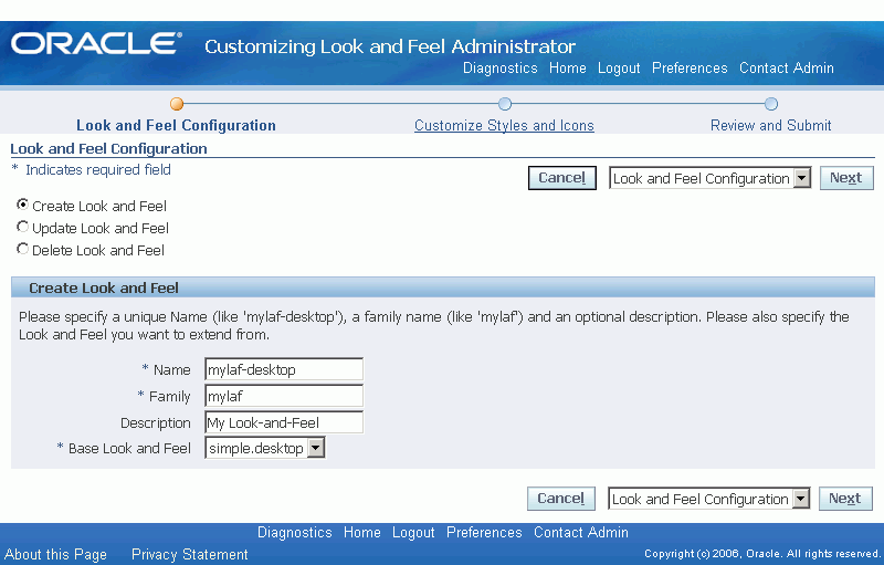
Specify values for the following parameters, then select Next:
-
Name - (Required) A unique name for the LAF, in all lower case, following the naming standard <lookAndFeelFamilyName>-<device>.
Caution: The name of your new LAF must not contain upper case letters. Although you can enter a name with upper case letters, the OA Personalization Framework converts them to lower case in the filename when saving the LAF. If you try to update this LAF later, the system will not be able to find it, and will generate an error.
OA Framework automatically generates an internal .xml file and an .xss file using this name. For example, if you name your LAF
custom-desktop, OA Framework automatically generates the Look-and-Feel configuration file $HTML_TOP/cabo/lafs/custom-desktop.xml, and the stylesheet file $HTML_TOP/cabo/styles/custom-desktop.xss. -
Family - (Required) The family under which this LAF is being created. Specify the family as all lower case. For example, the
customLAF family can have two LAFs namedcustom-desktopandcustom-pda. -
Description - (Optional) Enter text to describe the LAF that you are creating.
-
Base Look and Feel - (Required) The base LAF that the LAF you are creating will extend. The set of existing LAFs in your environment is displayed in the poplist.
Note: You cannot extend the Oracle corporate BLAF (Browser Look-and-Feel) or the MLAF (Minimal Look-and-Feel).
-
-
In the Customize Styles and Icons page that appears, the set of global named styles is displayed by default. The Component poplist also displays
globalby default to indicate that the page is currently displaying the global named styles that affect more than one component. You can also choose the Selectors or Icons sub tabs to display any global selectors or global icons.Customize Styles and Icons page.
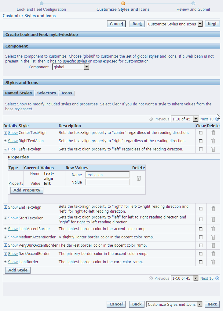
-
Modify named styles or selectors - In the Named Styles or Selectors sub tabs, identify the style you want to change. Styles control color or font properties. You can add a new custom style by selecting Add Style or delete a custom style by selecting the Delete icon.
Select Show to expand the detail region for a style or selector to make any of the following modifications:
-
Add a new property or included style to a style or selector by choosing Add Property and using the Type poplist to specify the type of property to add.
-
Change the value of any existing property.
-
Delete any property or included style from a style or selector .
Note: You cannot directly update an included style. To replace an included style, delete the existing one, then add a new one using the Add Property button.
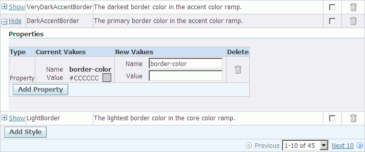
Expanded detail region of the DarkAccentBorder global named style.
-
-
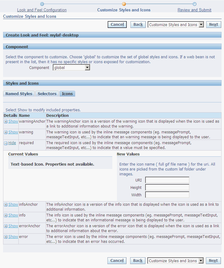
Modify icons (icons may either be text-based or GIF image-based). Select the Icons sub-tab and identify the icon you want to modify. Select Show to expand the detail region for the icon to make any of the following modifications:
-
Alter the icon's properties, such as height or width.
-
Replace the existing icon with a different icon (such as replacing a text icon with an image icon).
Expanded detail region of the global required icon.
-
-
If you wish to add or modify named styles, selectors or icons that are specific to a component, use the Component poplist to select the component you wish to customize. Once you select a component, the page refreshes with a preview of the component beneath the Component poplist.
Customize Styles and Icons page with a preview of the contentContainer component
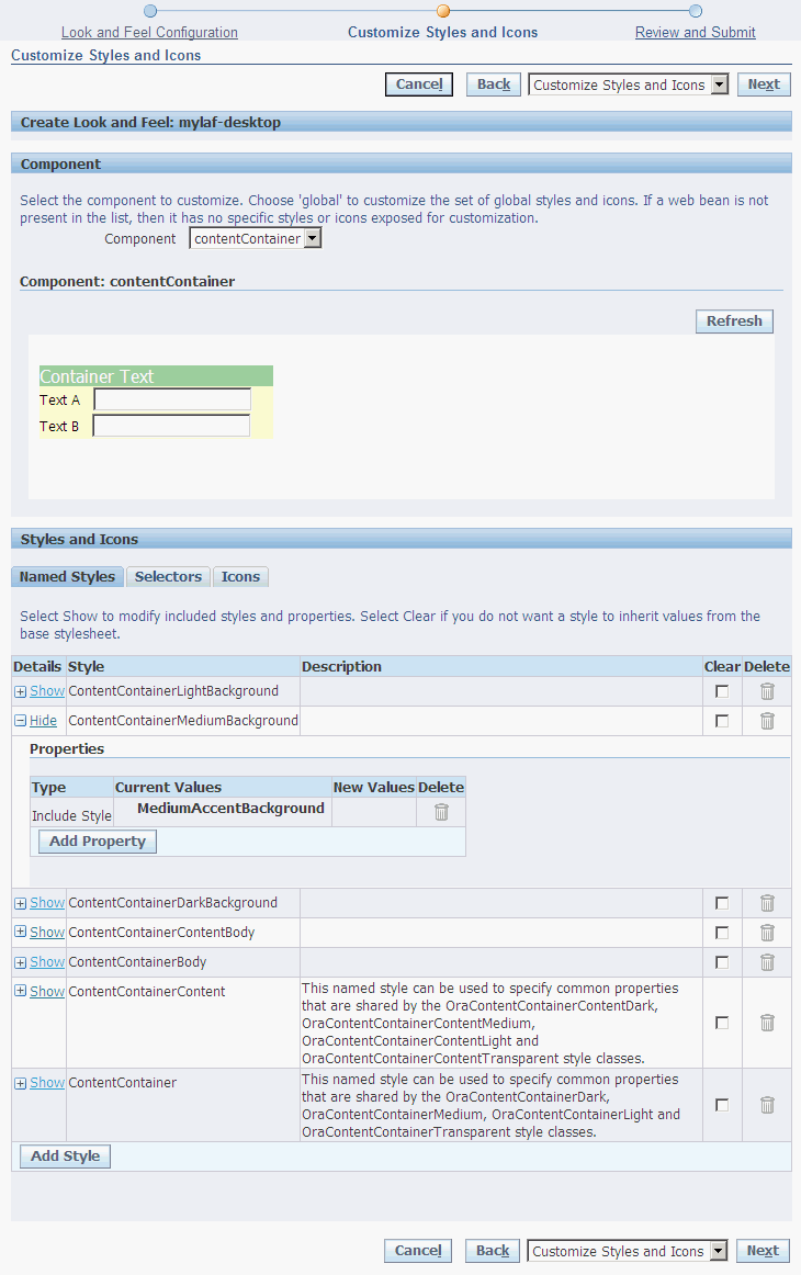
Repeat Step 6 if you wish to modify the component's named styles/selectors or Step 7 to modify the components named icons. Repeat this step for all the components you want to customize. Select Next when you are done.
Note: Any custom template renderers you defined are registered here.
-
In the Review and Submit page, select Go if you wish to preview your new custom LAF against the Toolbox Tutorial Home Page that is shipped with OA Framework.
Alternatively, you may specify your own page to preview, using the format
OA.jsp?param1=value1¶m2=value2&...in the Page Preview URL field and selecting Go.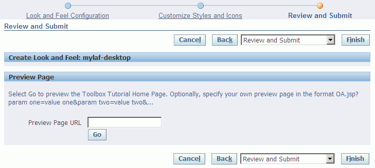
-
If you are satisfied with the previewed changes, select Finish to save your changes and create/register your new custom LAF, otherwise select Back to return to the previous pages in the CLAF flow to make additional modifications.
-
To run your Oracle E-Business Suite applications pages with your custom LAF, log in to the Oracle E-Business Suite and set the profile option Oracle Applications Look and Feel (APPS_LOOK_AND_FEEL) to the custom LAF that you created, as it appears in the poplist.
-
Bounce your web server, then run your application pages to see the new LAF take effect.
Updating a LAF
You can also use the CLAF UI to update an existing Look-and-Feel. The UI allows you to:
-
Modify any styles or icons defined in the Look-and-Feel.
-
Change any renderers registered with the Look-and-Feel.
The following steps outline how to update a LAF using the CLAF user interface:
-
Access the CLAF UI using one of these two methods:
-
Log in as a user with access to the Customizing Look and Feel Administrator responsibility, and select the menu option Customizing Look and Feel Administrator to initiate the CLAF UI.
-
In the Page Hierarchy Personalization page of the Admin Personalization UI, select the Customize Look and Feel (pen) icon in the Customize Look and Feel column of the Page Hierarchy HGrid. You can access the CLAF UI using this method if the appropriate conditions are met.
-
-
In the Look and Feel Configuration page, select the Update Look and Feel radio button.
Updating a LAF in the Look and Feel Configuration page
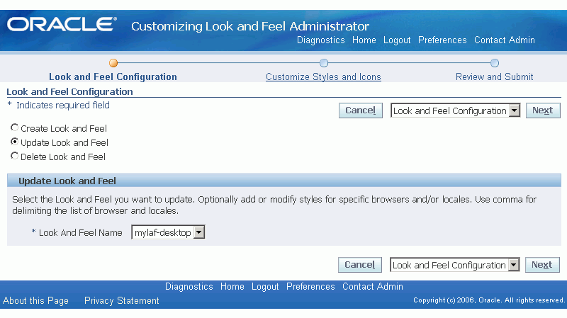
-
Specify the name of the Look-and-Feel that you want to update, then click Next.
-
Refer to Steps 5 and on in the Creating a New LAF section for the remaining steps that are also common to updating a LAF.
Deleting a LAF
You can use the CLAF UI to delete an existing custom Look-and-Feel.
To delete a custom Look-and-Feel:
-
Access the CLAF UI using one of the following methods:
-
Log in as a user with access to the Customizing Look and Feel Administrator responsibility, and select the menu option Customizing Look and Feel Administrator to initiate the CLAF UI.
-
In the Page Hierarchy Personalization page of the Admin Personalization UI, select the Customize Look and Feel (pen) icon in the Customize Look and Feel column of the Page Hierarchy HGrid. You can access the CLAF UI using this method if the appropriate conditions are met.
-
-
On the Look and Feel Configuration page, select the Delete Look and Feel radio button.
Deleting a LAF on the Look and Feel Configuration page
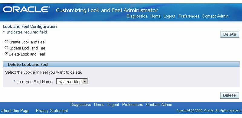
-
Select the name of the custom Look-and-Feel that you want to delete, then click Delete.
-
On the Confirmation page that appears, click OK.
Custom Renderer and Custom Icon Standards
The following naming and directory standards must be followed:
-
All custom template renderer files should be named as <webBeanType>.uit. For example:
sideBar.uit,tabBar.uit, orpageLayout.uit. -
All template renderer files should reside under $HTML_TOP/cabo/templates/<lookandFeelId>/ where <lookandFeelId> would be a LAF name, such as
custom-desktop. -
All custom icon files should reside under $HTML_TOP/cabo/images/<lookandFeelId>/ where <lookandFeelId> would be a LAF name, such as
custom-desktop.
Global Styles
The following tables list description of the global styles that are provided by UIX.
| Alignment Styles | Description |
|---|---|
| CenterTextAlign | Sets the text-align property to "center" regardless of the reading direction. |
| RightTextAlign | Sets the text-align property to "right" regardless of the reading direction. |
| LeftTextAlign | Sets the text-align property to "left" regardless of the reading direction. |
| EndTextAlign | Sets the text-align property to "right" for left-to-right reading direction and "left" for right-to-left reading direction. |
| StartTextAlign | Sets the text-align property to "left" for left-to-right reading direction and "right" for right-to-left reading direction. |
| Color Style | Description |
|---|---|
| LightAccentBorder | The lightest border color in the accent color ramp. |
| MediumAccentBorder | A slightly lighter border color in the accent color ramp. |
| VeryDarkAccentBorder | The darkest border color in the accent color ramp. |
| DarkAccentBorder | The primary border color in the accent color ramp. |
| LightBorder | The lightest border color in the core color ramp. |
| MediumBorder | A slightly lighter border color in the core color ramp. |
| VeryDarkBorder | The darkest border color in the core color ramp. |
| DarkBorder | The primary border color in the core color ramp. |
| DisabledLinkForeground | The default foreground color for disabled links. |
| VisitedLinkForeground | The default foreground color for visited links. |
| ActiveLinkForeground | The default foreground color for active links. |
| LinkForeground | The default foreground color for inactive, unvisited links. |
| ErrorTextForeground | The foreground color for error text (red). |
| SelectedTextForeground | The foreground color for selected/highlighted text, or text which is drawn on a dark background. |
| TextForeground | The default text foreground color (black). See the Color Styles section in the Style Sheets topic for more information. |
| LightAccentForeground | The lightest foreground color in the accent color ramp. This value is computed relative to the DarkAccentForeground color. |
| MediumAccentForeground | A slightly lighter foreground color in the accent color ramp. This value is computed relative to the DarkAccentForeground color. |
| VeryDarkAccentForeground | The darkest foreground color in the accent color ramp. This value is computed relative to the DarkAccentForeground color. |
| DarkAccentForeground | The primary foreground color in the accent color ramp. |
| LightForeground | The lightest foreground color in the core color ramp. This value is computed relative to the DarkForeground color. |
| MediumForeground | A slightly lighter foreground color in the core color ramp. This value is computed relative to the DarkForeground color. |
| VeryDarkForeground | The darkest foreground color in the core color ramp. This value is computed relative to the DarkForeground color. |
| DarkForeground | The primary foreground color in the core color ramp. |
| TextBackground | The default text background color (white). See the Color Styles section in the Style Sheets topic for more information. |
| LightAccentBackground | The lightest background color in the accent color ramp. This value is computed relative to the DarkAccentBackground color. |
| MediumAccentBackground | A slightly lighter background color in the accent color ramp. This value is computed relative to the DarkAccentBackground color. |
| VeryDarkAccentBackground | The darkest background color in the accent color ramp. This value is computed relative to the DarkAccentBackground color. |
| DarkAccentBackground | The primary background color in the accent color ramp. Also known as the Accent background color. See the Color Styles section in the Style Sheets topic for more information. |
| LightBackground | The lightest background color in the core color ramp. This value is computed relative to the DarkBackground color. |
| MediumBackground | A slightly lighter background color in the core color ramp. This value is computed relative to the DarkBackground color. |
| VeryDarkBackground | The darkest background color in the core color ramp. This value is computed relative to the DarkBackground color. |
| DarkBackground | The primary background color in the core color ramp. Also known as the Core background color. See the Color Styles section in the Style Sheets topic for more information. |
| Font Style | Description |
|---|---|
| VeryLargeFont | A very large version of the default font. See the Font Size Styles section and the Font Size Styles for Microsoft Internet Explorer section in the Style Sheets topic for more information. |
| LargeFont | A large version of the default font. See the Font Size Styles section and the Font Size Styles for Microsoft Internet Explorer section in the Style Sheets topic for more information. |
| MediumFont | A version of the default font which is slightly larger than the default size. This is used for medium sized text, such as level 2 headers. See the Font Size Styles section and the Font Size Styles for Microsoft Internet Explorer section in the Style Sheets topic for more information. |
| SmallFont | A small version of the default font. This style is used for text which is slightly smaller than the default, such as breadCrumb links. See the Font Size Styles section and the Font Size Styles for Microsoft Internet Explorer section in the Style Sheets topic for more information. |
| VerySmallFont | A very small version of the default font. This style is used for very small text such as inline messages, and copyright and privacy messages. See the Font Size Styles section and the Font Size Styles for Microsoft Internet Explorer section in the Style Sheets topic for more information. |
| DefaultBoldFont | A bold version of the default font. |
| DefaultFont | Specifies the default font for the Look-and-Feel. This style defines both the default font family (as specified by the DefaultFontFamily named style) and the default font size. See the Font Size Styles section and the Font Size Styles for Microsoft Internet Explorer section in the Style Sheets topic for more information. |
| DefaultFontFamily | Specifies the default font family list ("font-family" property) for the Look-and-Feel. See the Font Styles section in the Style Sheets topic for more information. |
Customizable Components
The following is a list of components whose Look-and-Feel may be customized using the CLAF UI:
-
applicationSwitcher
-
breadCrumbs x train
-
button
-
colorField
-
contentContainer
-
dateField
-
footer
-
globalButton
-
globalHeader
-
hGrid
-
header
-
hideShow
-
lovInput
-
messageBox
-
sidebar
-
sortableHeader
-
tabBar
-
table
-
train
Note: If a side navigation menu is created by adding functions with prompts to an HTML Sub Tab menu instead of an HTML sideBar menu, any look-and-feel changes using the CLAF tool on the sideBar component will not be supported on the menu.
Known Issues
See a summary of key CLAF issues with suggested workarounds if available.
Personalization FAQ
The Personalization FAQ includes a number of entries that cover Customizing Look-and-Feel issues.
Icons
For a detailed discussion of icons, refer to the BLAF Icon Specifications on the Oracle Technology Network (OTN).
If you need to develop new icons to support your customizations, refer to Icons in BLAF Applications and the BLAF Icon Naming Strategy on OTN.
You may also want to look at the Icon Repository for BLAF on OTN to find the base templates that were used to create icons.
Icons are stored as gif image files in the OA_MEDIA directory. You can change the image of an icon in one of two ways:
-
You can replace the appropriate image file with a file of the same name that contains an updated icon. This updates all instances of that icon globally.
-
You can create an administrative-level personalization for the page by setting the Image URI property on the image page element to a different image file. This updates the image for that specific usage of the icon.
Responsibilities and Menus
For a detailed discussion of menus, responsibilities and other Oracle E-Business Suite security issues, refer to the "Oracle Application Object Library Security" chapter of the Oracle E-Business Suite Security Guide.
For a detailed discussion of menus in OA Framework pages, refer to "Menus" in the "Implementing the View" section of the OA Framework Developer's Guide.
Using the Oracle E-Business Suite Responsibilities screen, you can modify seeded responsibilities or define new ones to create the menu structure and business flows that match your business roles and requirements.
Menus serve two major purposes in the Oracle E-Business Suite:
-
Oracle E-Business Suite menus are a navigation tool for the user.
The menus are fully independent of the underlying code, whether it is OA Framework-based or Forms-based. In fact, the same page can be available from multiple menus, where the navigation paths can all vary substantially. You can use the Oracle E-Business Suite Menus screen to modify or define new menus.
-
Oracle E-Business Suite menus are part of the Oracle E-Business Suite security model.
A menu must be assigned to a responsibility using the Oracle E-Business Suite Responsibilities screen, and a responsibility must be assigned to a valid user using the Oracle E-Business Suite Users screen. To see a given menu, you must be logged into the Oracle E-Business Suite as the appropriate user.
Messages
For a detailed discussion of the Message Dictionary, refer to the Oracle E-Business Suite Developer's Guide. Also, the Oracle E-Business Suite User Interface Standards for Forms-Based Products guide has a nice summary of using messages, and contains useful general rules.
You can change messages for OA Framework-based applications in the same way that you change messages for Forms-based applications. If you wish to personalize an error message or other long text, such as a long tip message, you can edit the message in which the error message or long text is stored. To identify the name of the message used for a long tip on a given page, navigate to the Personalize page in the Admin-level Personalization UI to identify the values set for the Tip Message Name and Tip Message Appl Short Name properties.
Lookup Codes
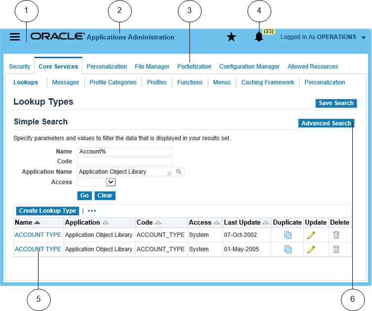
Lookup codes which define the display values primarily seen in poplists are handled in OA Framework-based applications the same way that they are handled in Forms-based applications. You can use the Oracle E-Business Suite Lookups page to update or define new lookups and lookup codes. For further information, refer to the online help for the Lookups page. The lookups data is stored in the FND_LOOKUPS table, and you may extract the lookups from there.
Style Sheets
OA Personalization Framework uses custom style sheets (.xss files) to specify and manage the visual styles of the Look-and-Feel of applications built with OA Framework. One of the goals of custom style sheets is to allow presentation styles, such as fonts and colors, to be separated from the HTML content to which the styles are applied. This enables you to maintain a consistent Look-and-Feel for the application, yet manage the customizations of styles for different target audiences.
The custom style sheets employ XML Style Sheets (XSS) language, a language that is based on Cascading Style Sheets (CSS), but is designed for easy extraction of style information.
Style sheets are associated with a specific Look-and-Feel that you can create or update using the Customizing Look-and-Feel (CLAF) user interface. With the CLAF UI, you do not need to create or modify custom style sheets directly to alter the styles in your Look-and-Feel. Instead, you use the CLAF UI to create or modify a custom Look-and-Feel (LAF) and modify the styles for that custom LAF.
Some of the benefits of the CLAF UI include:
-
Applicable over any LAF (other than BLAF and minimal).
-
Allows stylesheet, icon and layout (renderer) customization.
-
Can define a new Look-and-Feel.
-
One Look-and-Feel can extend another Look-and-Feel.
-
Supported by UIX.
Although you do not have to work with XSS style sheets directly, the content of this document provides important information about the concepts of XSS that you should know before you start modifying styles in the CLAF UI.
The BLAF (Browser Look-and-Feel) style sheet (blaf.xss) defines Oracle's corporate Look-and-Feel for HTML applications.
Note: You cannot extend BLAF or MLAF.
Introduction to XSS
An XSS (stylesheet) document consists of a set of style sheets, each of which defines a set of visual styles to be applied to the Look-and-Feel of a web page. Styles control two key aspects of HTML components - color and font. Following is an example of a base style sheet document:
<styleSheetDocument xmlns="http://xmlns.example.com/uix/style"
 version="2.0">
<!-- Style sheet for our Custom UI -->
<styleSheet>
   <!-- Change the dark color ramp to blue -->
   <style name="DarkBackground">
      <property name="background-color">#00619C</property>
   </style>

   <!-- Override global button text color/font -->
   <style selector=".OraGlobalButtonText">
      <property name="color">black</property>
      <property name="font-weight">bold</property>
      <property name="font-size">80%</property>
      <property name="text-decoration">none</property>
   </style>
</styleSheet>
</styleSheetDocument>
Style Sheets
Each style sheet is defined with a <styleSheet> element. You can designate which end-user environment to apply a style sheet to by assigning attributes, also called "variants", to the <styleSheet> element. XSS supports the following five variants:
-
Locale (e.g. locales="ja" or "en_US")
-
Reading direction (e.g. direction="rtl" or "ltr")
-
Browser (e.g. browsers="Firefox" or "Internet Explorer")
-
Browser major version (e.g. versions="4" or "5")
-
Operating system (e.g. platforms="Windows" or "Linux")
A style sheet that contains no variant attributes is known as a base style sheet. The following example shows a style sheet that defines styles for Internet Explorer users in the Japanese locale:
<stylesheet locales="JA" browsers="ie">...
</styleSheet>
Styles
Each <styleSheet> element contains one or more <style> elements. In general, a style element is identified by a name and a set of one or more properties as shown below:
<style name="styleA">
   <property name="prop1" value="value1" />
   <property name="prop2" />
</style>
A property is identified by a name and a value. It defines a facet for the style (for example, font size for a particular font style) and is a CSS property. Generally, an XSS document would have about 100-250 style definitions. Each XSS style definition can use from 1 to 5 CSS properties. There are about 100 valid CSS properties available in all. These properties are listed in the W3C CSS Reference.
Styles are classified into two types:
-
Named styles - which are named bundles of properties that may also include other named styles and is used to define some of the basic units of reusability for the Look-and-Feel.
-
Selectors - which include properties, and/or named styles and is used by a specific web bean to control its Look-and-Feel.
Named Styles
Often, many style definitions share common properties, such as a base font or standard background color. In XSS, you can define a named style for such common properties, which can then be referenced by other named styles or selectors in the XSS document. This ability to include a named style allows you to make and maintain simple and concise customizations to the style sheets.
For example, the "DefaultFont" named style below defines the font and font size for two other styles, each of which reference the "DefaultFont" using the <includeStyle> element.
<stylesheet>
   <style name="DefaultFont">
      <property name="font-family">Arial</property>
      <property name="font-size">10pt</property>
   </style>
   <style selector=".OraFieldText">
      <includeStyle name="DefaultFont">
      <property name="color">#000000</property>
   </style>
   <style name="LinkFont">
      <includeStyle name="DefaultFont">
      <property name="color">#663300</property>
   </style>
</styleSheet>
Selectors
A <style> element can also be identified by a selector, which associates the style with a particular web bean or set of web beans in a HTML document. Selectors are defined by a list of properties and can also reference other named styles using the <includeStyle> element. The following example shows the style definition for the HTML OraFieldText element:
<stylesheet>
   <style selector=".OraFieldText">
      <includeStyle name="DefaultFont">
      <property name="color">#000000</property>
   </style>
</styleSheet>
In this example, the selector ".OraFieldText" indicates that the properties defined by this style should be applied to any HTML element with a class attribute value of OraFieldText. The style itself is a black Default Font (Arial 10pt) text.
Reusing Styles and Properties
As mentioned above, you can use the <includeStyle> element in your style definition to include all the properties from another style in your style definition. You can also use the <includeProperty> element to include only a specific property of another style in your style definition. For example, the following styleA is defined by a property called prop1, all the properties from styleB, and a property called prop3, which is derived from property prop2 of styleC.
<style name="styleA">
  <property name="prop1" value="value1" />
  <includeStyle name="styleB" />
  <includeProperty name ="styleC" propertyName="prop2"
   localPropertyName?="prop3 />
</style>
Global Versus Component-Specific Styles
All styles and selectors can be further grouped as global styles or component-specific styles:
-
Global styles - affect more than one component. Examples of global styles include DefaultFont and LightBackground.
-
Component-specific styles - affect only one component. An example of a component-specific style is OraContentContainerHeaderText which controls the font properties of the header text of the content container web bean. A set of twenty-one web beans in OA Framework have custom styles defined for them that can be further customized.
Most customizations that you make to a style sheet involve the set of forty-five Global named styles that control about ninety percent of the Look-and-Feel of the application.
Font Styles
One of the most common customizations you may wish to make to the look and feel of the Oracle E-Business Suite user interface is to modify the default font. Although a stylesheet may define many different styles that affect font properties, all these styles refer to a single named style that defines the default font family. As a result, if you wish to change the font family properties for all the styles defined in a style sheet, you need to make only a single style override to the DefaultFontFamily style.
| Style | Properties | Description |
|---|---|---|
| DefaultFontFamily | font-family = Arial, Helvetica, Geneva, and sans-serif | Specifies the default font family list for the Look-and-Feel. |
For example, suppose you want to change the default font family for all styles to include only the CSS "serif" font family. In the Customizing Look and Feel UI, you would update your Look-and-Feel by modifying the global DefaultFontFamily style such that the value of its font-family property is changed to serif.
Font Size Styles
Another common customization you may wish to make to the Look-and-Feel of the user interface is to alter the default font size. Almost all the font size styles defined in a style sheet reference a common named style that defines the default font size:
| Style | Properties | Description |
|---|---|---|
| DefaultFont | includeStyle = DefaultFontFamily font-size = 10pt |
Specifies the default font and default font size for the Look-and-Feel. |
To change the default font size, in the Customizing Look-and-Feel UI , you would modifying the DefaultFont style such that the value of its font-size property is changed to something like 12pt.
Style sheets may also make use of several other font sizes. A smaller font size may be used for in line messages, while a larger font size is used for headers, and so on. Each of the different font sizes may be defined in style sheet, as shown:
| Style | Properties | Description |
|---|---|---|
| VerySmallFont | includeStyle = DefaultFont font-size = -2pt |
A very small version of the default font. This style is used for very small text such as inline messages, and copyright and privacy messages. |
| SmallFont | includeStyle = DefaultFont font-size = -1pt |
A small version of the default font. This style is used for text which is slightly smaller than the default, such as breadCrumb links. |
| MediumFont | includeStyle = DefaultFont font-size = +1pt |
A version of the default font which is slightly larger than the default size. This is used for medium sized text, such as level 2 headers. |
| LargeFont | includeStyle = DefaultFont font-size = +3pt |
A large version of the default font. This is used for large text, such as level 1 headers. |
| VeryLargeFont | includeStyle = DefaultFont font-size = +6pt |
A very large version of the default font. |
Each of these font size definitions includes the DefaultFont, using the <includeStyle> element, and then specifies a point size increment or decrement relative to the default font size. By using this XML Style Sheet Language technique, it is possible for you to change all font sizes defined in blaf.xss with a single override of the DefaultFont style.
Font Size Styles for Microsoft Internet Explorer
The DefaultFont style may be defined twice, once in a generic style sheet as described previously, and once in an environment-specific style sheet. The latter style sheet overrides the default font size specifically for the Microsoft Internet Explorer (IE) browser, to take advantage of some IE-specific functionality.
In particular, IE provides a text zooming feature that allows you to scale text to a larger or smaller size, via the View > Text Size menu. This functionality does not work with sizes specified in point units, but does work with sizes specified using the CSS "absolute size" keywords. Hence, the IE-specific style sheet uses the "x-small" keyword for its default font size, which is rendered as 10 point text by default. The size is scalable, so the other font sizes defined for IE are specified as a percentage of the default font size.
| Style | Properties | Description |
|---|---|---|
| DefaultFont | font-size = x-small | Overrides the default font size specifically for the Microsoft Internet Explorer (IE) browser. |
| VerySmallFont | font-size = 67% | A very small version of the default font specifically for IE. |
To change the default font size for IE, use the Customize Look-and-Feel UI to update the Look-and-Feel for the IE browser. Modify the DefaultFont style such that the value of its font-size property is changed to something like small.
Color Styles
The Browser Look-and-Feel makes use of four colors that you may potentially want to change:
-
Text foreground color - Color used for almost all text. The default is black.
-
Text background color - Color used for almost all content. The default is white.
-
Core background color - This is the default blue color that appears throughout the user interface. For example, the color is used as the background color for the selected link in the level one tab bar, as well as the background color of the global header and footer. A style sheet may derive a color ramp that includes lighter and darker shades based on the core background color. For example, a Look-and-Feel may have a light blue foreground color for a selected link in a level one tab bar.
-
Accent background color - This is the default tan color that appears through the user interface. For example, the color is used as the background color for the unselected links in the level one tab bar. As with the core background color, style sheets may derive a color ramp based on the accent background color. For example, the dark brown foreground color used for hypertext links, as well as the lighter yellow colors used for action button backgrounds may be variations of the accent background color.
As is the case with fonts, style sheets may use the <includeStyle> element to share the set of color-related named styles with other defined styles. So if you wish to change the colors in the user interface, you need only override these four named styles using the Customize Look-and-Feel UI (CLAF). These four color styles are defined as follows:
| Style | Properties | Description |
|---|---|---|
| TextForeground | color = #000000 | The default text foreground color (black). |
| TextBackground | background-color = #ffffff | The default text background color (white). |
| DarkBackground | background-color = #336699 | The primary background color in the core color ramp. Also known as the Core background color. |
| DarkAccentBackground | background-color = #cccc99 | The primary background color in the accent color ramp. Also known as the Accent background color. |
The "DarkBackground" and "DarkAccentBackground" styles define the primary colors in the core and accent background color ramps respectively.
If you decide to customize the colors for the user interface, you should try to maintain the contrasts between the text foreground and background colors, as well as between the core and accent colors.
In general, try to select colors from the web safe color palette, as these colors have the most consistent results across the widest range of browsers and platforms. The web safe color palette is a set of 216 colors, where each red, green, or blue component of that color is a multiple of 51 in decimal (0, 51, 102, 153, 204, or 255) or #33 for hexadecimal values (#00, #33, #66, #99, #cc, or #ff).
Also consider, that when you select a new core or accent background color, blaf.xss derives a ramp of lighter and darker shades from that color. As a result, selecting very dark or very light color values may result in less distinction between various darker or lighter shades in the color ramp.
CSS Style Lookup
You can use an interactive user interface called the Item Style and Style Type Selection page to preview a specific item style with a selected CSS Style applied to it. You should use this feature to simulate the Look-and-Feel of an item style before making the actual CSS style change to your pages with OA Personalization Framework.
Item Style and Style Type Selection page
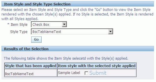
To access the Item Style and Style Type Selection page:
-
Sign on to the Oracle E-Business Suite and select the System Administration responsibility.
-
Use the Oracle E-Business Suite Menus form to add the function FWK_CSS_LOOKUP to your System Administration menu.
To preview an Item Style with different CSS styles applied to it:
-
Sign on to Oracle E-Business Suite and select the System Administration responsibility.
-
Select FWK CSS Style Lookup from the menu.
-
In the Item Style and Style Type Selection page, there is a required Item Style poplist and a Style Type poplist. Use the Item Style poplist to select an item style for which a CSS Style may be applied. Use the Style Type poplist to select a CSS Style to apply. The Style Type poplist lets you select from all the CSS styles that have a selector defined in custom.xss. If you select
All Styles, the selected item renders with all the available CSS styles applied. -
Choose Go to apply the CSS style(s). The results are displayed in a table with two columns. The first column lists the name of the CSS style that has been applied and the second column renders the item style with the CSS style applied to it.
Note: If the selected Item Style is Text Input or Static Styled Text, the results table displays three columns. The first column always lists the name of the CSS style that has been applied. For Text Input, the second column renders the Text Input with the applied CSS style, and the third column renders the Text Input as a multi-line Text Area with the applied CSS style. For Static Styled Text, the second column renders the Static Styled Text with the applied CSS style, and the third column renders the Static Styled Text as a URL with the applied CSS style.