 Understanding PeopleSoft Quality Application
Client Charts and Analysis Tools
Understanding PeopleSoft Quality Application
Client Charts and Analysis Tools
This chapter provides an overview of Quality application client charts and analysis tools, lists prerequisites, and discusses how to:
Use the Quality application client toolbar.
Create and manage datasets.
Use control charts.
Use histograms.
Use bar graphs.
Use line graphs.
Use Pareto charts.
Use box plots.
Use spreadsheets.
Use the statistical matrix.
Create graph-display templates.
Save configuration settings.
Print displays.
Understanding PeopleSoft Quality Application
Client Charts and Analysis Tools
Quality provides industry-standard charts and graphs for you to assess process performance and optimize control to achieve continuous process improvement. Each chart possesses unique display and analysis traits that you can alter to enhance the interpretation of the data. Using the Quality application client, you can display individual graphs, multiple graphs, or overlay graphs simultaneously for ease of comparison or reporting.
The Quality application client displays are also referred to as graphing tools. Each tool is activated by clicking a button on the Quality application client main window toolbar. The system renders the requested chart in a separate window based upon the selections made from the Selector panel.
Note. Each graph is displayed, one at a time, in a separate window.
See Also
Creating and Managing Datasets
Prerequisites
Before you use the Quality application client, you must:
Install the Quality application client.
See PeopleSoft Supplemental Instructions for PeopleSoft 9.1 Supply Chain Management Installation
Create a dataset by extracting quality control information from the Quality database, if you want to use data that you have previously collected in the quality control environment.
Using the PeopleSoft Quality Application
Client Toolbar
The Quality application client toolbar is located at the top of the program's main window beneath the menu bar. The number of menus varies depending on if you have opened a dataset.
Except for standard Microsoft Windows buttons, such as Cut and Paste, buttons are unique to the Quality application client application and become active depending on the subset that you select and the graphic windows that are open. Because only one graphic window at a time is active, these options might become active or inactive dynamically as you display each graph.
You can also select each toolbar function from the View menu.
|
|
Click the New button to create a new dataset. |
|
|
Click the Open button to open an existing dataset. |
|
|
Click the Print button to print the active window. |
|
|
Click the Copy button to copy selected text to the Clipboard. |
|
|
Click the Selector Panel button to display the subset and column role selector window. |
|
|
Click the Control Chart button to display a control chart based upon the currently selected subsets. |
|
|
Click the Histogram button to display a histogram based upon the currently selected subsets. |
|
|
Click the Bar Graph button to display a bar graph based upon the currently selected subsets. |
|
|
Click the Line Graph button to display a line graph based upon the currently selected subsets. |
|
|
Click the Pareto Chart button to display a Pareto chart based upon the currently selected subsets and attribute column. |
|
|
Click the Box Plots button to display a box plot based upon the currently selected subsets. |
|
|
Click the Spreadsheet button to display a spreadsheet of the open dataset. |
|
|
Click the Statistical Matrix button to display a statistical matrix chart based upon the currently selected subsets. |
|
|
Click the Previous Characteristic button to display the previous characteristic in the format of the active graphic window. Available if multiple subsets have been selected for analysis. |
|
|
Click the Next Characteristic button to display the next characteristic in the format of the active graphic window. Available if multiple subsets have been selected for analysis. |
|
|
Click the Redraw button to redraw the active window and apply any point or cell selections. |
|
|
Click the Restore Dataset button to reload the original data for the active window. |
|
|
Click the About button to display release and help information for the Quality application client. |
Creating and Managing Datasets
Use Quality application client panels to create and modify dataset configurations and content. From these panels, you access additional detail panels for maintaining specific dataset elements.
This section discusses how to:
Create and manage datasets.
Configure datasets.
Add columns.
Add subsets.
Define subset and column formulas.
 Pages Used to Create and Manage Datasets
|
Page Name |
Definition Name |
Navigation |
Usage |
|
None |
|
Add or change columns and subsets for an existing dataset or for configuring a new dataset. |
|
|
None |
|
Add or change cell values for a dataset. |
|
|
None |
Click the Configure button on the Selector panel. |
Configure dataset columns and subsets. |
|
|
None |
Click the Add button under Common Columns or Data Columns on the Dataset Configuration panel. |
Add common columns or data columns to a dataset. |
|
|
None |
Click the Add button under Subsets on the Dataset Configuration panel. |
Add subsets to a dataset. |
|
|
None |
Click the Formula button on the Dataset Configuration panel. |
Enter formulas to derive cell values for an entire column. |
Creating and Managing Datasets
Access the Spreadsheet and Selector panels (Select File, Open).
The Selector and Spreadsheet panels appear together when you initially launch the Quality application client from an extraction or when you open an existing dataset.
Use the Selector panel to manage dataset configurations, specify columns used for generating graphs, and to create or manipulate a dataset for analysis. You can:
Define columns and subsets.
Select the graph preference to use when performing analysis.
After you configure the dataset layout, enter the cell values that make up the dataset content in the columns and rows in the spreadsheet. The number of rows allowed is only limited by the available memory of a workstation.
After populating the dataset, you can select and manipulate information for analysis. For example, you can analyze one subset of data at a time or multiple subsets together and assign columns to roles for analysis. You can:
Select different subsets of data to analyze and graph.
Assign roles to columns for graphing and data-grouping purposes.
Change the graph preferences.
Add new common columns, data columns, and subsets to the dataset.
After configuring the dataset and entering data, you can access graphs using the Quality application client toolbar.
|
Measure, Attribute, and Group By |
Select the columns used for producing graphs. If you are creating a new dataset, the system displays N/A (not applicable). |
|
Graph Pref (graph preference) |
Select the graph preference applied to this dataset. |
|
Subset Selections |
Select subsets to analyze and graph. |
|
Configure |
Click to access the Dataset Configuration panel. |
|
Apply |
Click to save changes you make to the settings. |
|
Done |
Click to exit the panel. |
Use the Spreadsheet panel to:
Enter cell values for a new dataset.
View, add, change, or delete cell data associated with an existing dataset.
The Spreadsheet panel operates basically the same, whether you are adding data for the first time or modifying existing data. The program displays the data associated with an existing dataset on the spreadsheet. The spreadsheet is empty when you add data for the first time.
To enter data into a cell, either click the cell or use the arrow keys to navigate to the cell. To enter multiple lines into a tall cell, press the F2 button twice. You can also cut and paste the different cells within the spreadsheet, similar to using Microsoft Windows Excel.
To perform data analysis using graphs:
Access the Selector and Spreadsheet panels.
All graphs use the Measure field, except the Pareto chart, which displays attributes information.
Select the column values to plot on the different graph displays using the Measure field.
This is also the data column used for calculating any statistics and tests. Only numeric columns are available for selection.
Select the Attribute column for the Pareto chart.
Only character columns are available for selection.
(Optional) Select the column to group by.
You specify an alternate data grouping using another column.
As an example, you can create subgroups based upon a traceability field (lot number), as an alternative to viewing the natural subgroup size defined for the subset. All readings corresponding to a unique value are grouped together.
Select the graph preference to apply for analysis and graphing.
Select one or more subsets under Subset Selections to analyze or view using the graphing tools.
Depending on the graphing tool, multiple subsets either overlay or are segmented when displayed. Available subsets are based on the dataset.
Note. You must select at least one subset to view any of the Quality application client displays, except for the spreadsheet.
As you make selections using the Selector panel, tool buttons become active on the Quality application client toolbar, indicating which graphs you can select.
See Also
Defining Graph and Display Preferences
Configuring Datasets
Access the Dataset Configuration dialog box (Click the Configure button on the Selector panel).
The panel operates similarly for entering new data or changing data.
|
Common Columns, Data Columns, and Subsets |
Define the structure of the dataset. Click the Add button under each field to access panels for defining columns or subsets. Note. Always add the different columns in the order in which they appear on the panel. Create common columns, then create data columns, and finally create subsets. You can't add common columns after adding data columns to a dataset. |
|
Add |
Click the buttons to access data-entry panels. Note. The button under Common Columns won't be accessible if you created the dataset using the extraction process or if you defined data columns. |
|
Formula |
Click this button to access the Subset/Column Detail panel and enter the formula for a measurement data column. Note. The Formula button becomes available when you select a measurement data column and a subset at the same time. |
See Also
Defining Subset/Column Formulas
Adding Columns
Access the Column Detail panel (Click the Add button under Common Columns or Data Columns on the Dataset Configuration panel).
|
Name |
Identifies a dataset column. This name must be unique within the dataset. |
|
Column |
When you create columns in the dataset, they inherit properties from the selected column type, enabling the program to make assumptions about the new column and how to use it for analysis. The column type contains properties such as data type (character or numeric) and row type (single or multiple). This method minimizes the number of parameters required for defining columns in the dataset. Column type options include the following: 1) APPLICATION FIELD 2) STREAM COMPONENT 7) DATE AND TIME 8) VALUE 9) SUBGROUP SIZE 11) SEQUENCE 31) SUBGROUP STATUS 12) HCLIM 14) TEST VIOLATION 15) DEFECT 16) CAUSE 17) ACTION 20) COMMENT 28) SUBGROUP SEQUENCE 29) SAMPLE NO 30) SGRP STATUS 35) ATTRIBUTE TALLY |
Adding Subsets
Access the Subset Detail panel (Click the Add button under Subsets on the Dataset Configuration panel).
|
Data Type |
Select from: Variables Defects Defectives |
|
Subgroup Size |
Enter the statistical process control subgroup size used for producing control charts and calculating subgroup statistics. |
|
Control Chart |
Select the control chart used for graphing the subset and evaluating process control. |
|
Control Proc (control procedure) |
Indicate the procedure used to evaluate process control. Note. The actual charts and control procedures listed depend on the configuration of the database. Available combinations include the following types. |
|
Data Type |
Available Control Charts |
|
Variables |
X and moving range Xbar and range Xbar and sigma |
|
Defects |
c chart u chart |
|
Defectives |
p chart np chart |
The current process control limits appear from the database if the dataset you are using was created using an extraction or inquiry.
Defining Subset/Column Formulas
Access the Subset/Column Detail panel (Click the Formula button on the Dataset Configuration panel).
The upper portion of the panel displays the subset and data column that you selected.
|
Formula |
Enter a formula that applies to the measurement column and subset combination. The formula behaves similarly to the formula used to derive characteristics in measurement plans. For example, you use a formula when prototyping or characterizing a process that in actual use derives characteristics, or to derive costs from live data by appending a subset (characteristic) to a dataset that has been extracted from the database. |
See Also
Using Control Charts
This section discusses how to:
View and manipulate control chart data.
Modify control chart graph options.
Run tests from control charts.
Pages Used to Use Control Charts|
Page Name |
Definition Name |
Navigation |
Usage |
|
None |
|
View process performance trends over a specific time period or number of subgroups sampled. Control charts help you distinguish between natural and unnatural process variation and the effectiveness of corrective actions taken. |
|
|
None |
Display a control chart. Select Modify Graph, Settings. |
Change graph settings and display characteristics. |
|
|
None |
Display a control chart. Select a different control procedure to run against current datasets. Select Tests, Apply Control Procedure. |
Select a control procedure and apply it to the current control chart. |
Viewing and Manipulating Control Chart Data
Access the Control Chart panel (Select View, Control Chart).
Control charts are comprised of multiple graph panes (sections) that display information about a subset. To resize the sections:
Place the cursor on the thick bar between the sections.
Drag the edge of the section to the new size.
You can also select an individual point and view the details, including subgroup calculations, trace data, and cause and corrective action information. When you click points in the chart section, a yellow vertical bar highlights the points, while corresponding values for the points appear in the detail section. To move this bar:
Drag it.
Use the Left Arrow and Right Arrow keys on the keyboard.
To remove the yellow highlight bar, drag it to the far left or far right of the chart.
To select multiple subgroup points:
Hold the Shift key down.
Drag the mouse over the points to remove or restore.
The points that you select are enclosed in red boxes in the chart section, and the summary list appears in the detail section.
To deselect the points, repeat steps 1 and 2, or use the Restore button. These subgroups are discounted from any local control limit recalculations or test violations when you click the Redraw button.
Note. When you use the control chart to apply tests, deselect points, or change control limits, the results are local to the active window; the dataset is not altered.
This section displays the label of the chart being applied; for example, X-bar and Range charts. The title section also displays the subset for which the data is being displayed; for example, Temp A.
|
N |
Displays the subgroup size used for this control chart. |
|
Sgrps (subgroups) |
Displays the number of subgroups or plotted points displayed in this chart. |
|
OCL (operating control limit) |
Displays the status of control limit promotion or calculation. Note. The status values correspond to the standard None, Preliminary, Monitoring, and Ongoing limit status values. Modified status indicates that the control limits were calculated dynamically for this graph window and not extracted from the database. |
|
Proc (control procedure) |
Displays the control procedure in effect. It also indicates whether the alarms indicated on the chart were: (Tested): Tests and alarms were performed locally to this graph and not necessarily present in the database. (Actual): Alarms associated with the subgroups were extracted from the database. |
This section displays the main body of the graph. For example, if you selected the X-bar and range charts, you would see two graphs displayed on the control chart, one for the X-bar and one for the range chart. Each point on the graph represents an individual subgroup.
Alarms or out-of-control points are indicated by red triangles. Green circles represent all others. A blue square indicates that the subgroup readings were edited in the database using data-entry panels.
Note. Points with cause and action information associated with them are indicated by an over-bar.
You can see the subgroup values for each point on the chart by finding its number in the detail section of the control chart.
Control Limit Description Section
This section displays the values and appropriate labels for the upper control limit (UCL), mean (CL), and lower control limit (LCL) for each graph. These limits may be have been extracted from the database, calculated, or set local to the graph.
This section is blank, unless you select a point in the graph section; then it displays detailed information about the point.
This section displays a list of subgroup summary information if a point has not been selected on the graph. This list includes the subgroup plot point values and alarm descriptions.
If you select an individual point on the graph, use this area to see detail information, such as traceability fields, probable causes, and corrective actions for that subgroup. If the dataset has been extracted from the Quality database, the Subgroup Status field also appears. The field indicates if a subgroup has been edited or changed in the database. A status of 800 indicates that one or more sample values have been changed for the subgroup, and this point is designated as a blue square on the chart. A status of 200 indicates that the subgroup has not been edited.
See Also
Defining Quality Methods and Procedures
Modifying Control Chart Graph Options
Modifying Control Chart Graph Options
Access the Modify Control Chart dialog box (Select Modify Graph, Settings).
You can change a chart by resizing the sections to adjust the amount of display information, by changing the control limits, and by choosing whether to display the control limit labels, alarm indicators, varying control limits, and test zones. Changes you make to the control chart affect only the active chart. If you open a second chart window, the changes are not in effect.
|
Fit Points to Window |
Select to size the graph to fit inside the chart section of the window. Eliminates the horizontal scroll bar. |
|
Display Ctl Limit Labels (display control limit labels) |
Select to display labels in the description section of the control chart. This is useful if you have limited space and it is more important to display the graph than the labels. |
|
Display Alarm Indicators |
Select to display red triangle alarm indicators, representing subgroup points that are out of limits. |
|
Display varying limits |
Select to display historical control limits associated with a dataset in a step-wise fashion on the control chart. The system evaluates the chart based on the most current control limits. If the chart's time period includes prior limit calculations and you select this option, the system displays the limits as expanding or contracting segments against a fixed scale. Note. This option applies only to datasets extracted from the Quality database. |
|
Display test zones |
Select to display positive and negative sigma lines in the main body of the control chart. |
|
Control Limits |
Select to reset limits for the UCL, CL, or LCL. There is a column to set limits for each graph in the active section of the control chart. |
|
Maintain Current Limits |
Select if you don't want the current control limits to be recalculated while you are working with this control chart. Note. The limits are recalculated when you click the Redraw button. |
Running Tests Against Control Charts
Access the Control Procedures dialog box (Select Modify Graph, Settings. Select a different control procedure to run against current datasets. Select Tests, Apply Control Procedure).
You can select a control procedure from the list and apply it to the current chart. Each procedure contains one or more control tests that are executed against the chart to test alarm conditions. The procedures and tests were set up when you defined quality methods.
To run tests, select a control procedure. The tests run immediately, and the results appear in the lower portion of the panel. The first number represents the number of chart-based alarms, or alarms not generated from specification violations. The number in parentheses is the number of alarms generated from specification violations.
For example:
3 (3) Subgroups Alarmed on X Chart
6 (3) Subgroups Alarmed on MRange Chart
The example indicates that three alarms were generated from non-specification violations, and three alarms were generated from specification violations on the X-Bar graph of the control chart.
Because each subgroup on the chart can have more than one alarm condition, the total number of alarms can exceed the number of points on the chart. The number of specification-related alarms is the same for the second MRange chart.
Use the configuration panels associated with the Selector panel in the Quality application client to change elements related to a subset, such as the subgroup size and default control procedure.
See Also
Defining Quality Methods and Procedures
Viewing and Manipulating Control Chart Data
Creating and Managing Datasets
Using Histograms
This section discusses how to:
View and manipulate histograms.
Modify histogram graph options.
Run mean tests from histograms.
Run standard deviation tests from histograms.
Pages Used to Use Histograms|
Page Name |
Definition Name |
Navigation |
Usage |
|
None |
|
Display the distribution analysis. |
|
|
None |
Open a histogram. Select Modify Graph, Settings. |
Select options to modify the settings and display characteristics for histograms. |
|
|
None |
Open a histogram. Select Tests, Mean Test. |
Run a means test against the histogram. |
|
|
None |
Open a histogram. Select Tests, Stdev Test. |
Run a standard deviation test against the histogram. |
Viewing and Manipulating Histograms
Access the Histogram panel (Select View, Histogram).
The histogram display comprises multiple panes (sections) that display information about a subset. To resize a section:
Place the cursor on the thick bar between the sections.
Drag the edge of the section to the new size.
Click a cell and it becomes crosshatched to highlight it. When you click the Redraw button, the histogram is redrawn with the crosshatched cells removed. This is useful to examine a smaller portion of the data. By deleting cells, you can temporarily exclude the data values associated with that cell and recalculate the histogram and statistics.
To select a cell, drag the cursor across the vertical bar. The cell is highlighted in yellow. You can see the details of the selected cell in the detail section of the histogram.
Note. Cell values excluded from the graph are local to the active window; the dataset is not altered.
This section displays the subset being analyzed for example, TEMP A.
|
Observations |
Displays the number of points used for the analysis. |
|
Pearson Best-Fit, Tested for Normality, and Normality Assumed |
Displays how the data distribution was assessed. |
The section of the histogram displays the main body of the graph, with the following conditions:
(Optional) Specifications and +/- 3 sigma regions appear as dashed lines.
A thin, red, vertical line indicates the mean point.
The histogram is scaled by frequency on the left and by percent on the right.
(Optional) The distribution curve (indicated by a thick, red, curved line) overlays the chart.
This section displays summary statistics. You can change the statistics by changing graph preference settings. The statistics are calculated based upon the active data values for this subset.
This section is blank, unless you select a vertical bar (cell), in which case it displays detailed cell information. To select a cell, drag the cursor over the vertical bar, and it is highlighted in yellow.
|
Cell # (cell number) |
Displays the order of the individual cell in the histogram. For example, Cell #6 is the sixth cell in the sequence of cells displayed. |
|
Width |
Displays the dimension of the cell in the display. |
|
Tally |
Displays the total number of individual values in a cell. |
|
% (percent) |
Displays the percent of individual values in a cell. |
See Also
Using Pearson Best-Fit Criteria
Defining Graph and Display Preferences
Modifying Histogram Graph Options
Access the Histogram Options dialog box (Select Modify Graph, Settings).
You can modify the histogram by resizing the sections to adjust the amount of display information in each section of the graph. You can choose whether to display the overlay curve, the overlay specifications, or to overlay a box plot. You can change the number of cells displayed and the upper and lower specification limits.
Note. Any changes you make to the histogram are in effect only for the active chart. If you open a second histogram window, the changes are not in effect.
|
Overlay Distribution Curve |
Select to display a red bell curve line to overlay histogram cells. |
|
Overlay Specs (overlay specifications) |
Select to display blue, dashed, vertical lines for the upper specification limit (USL) and the lower specification limit (LSL). |
|
Overlay Box and Whisker Plot |
Select to display a box plot with the curve graph on the histogram. |
|
Number of Cells |
Indicate the number of cells displayed by the histogram. Move the slider or enter the number of cells in the settings box to the right to indicate how many cells you want between 4 and 30. Note. The sample values are reordered to fit within the number of cells specified. |
|
Spec Limits (specification limits) |
Enter the limits in the Upper and Lower fields. |
Running Mean Tests from Histograms
Access the Mean Test dialog box (Select Tests, Mean Test).
Use mean tests to test the mean of the current sample versus a target mean and a confidence level.
To test for a mean:
Enter the target mean and confidence level, or use the defaults.
Click the Calculate button to see the results of the t Test calculation.
Click the Done button to update the graph on the histogram.
Running Standard Deviation Tests from Histograms
Access the Stdev Test dialog box (Select Tests, Stdev Test).
Use standard deviation tests to test the standard deviation of the current sample versus a target standard deviation and a confidence level.
To test for standard deviation:
Enter the target standard deviation, or use the default.
The standard deviation test has a limitation of df = 100. The sample size is display-only.
Select a confidence level.
Valid levels include:
0.995
0.990
0.975
0.950
0.050
0.025
0.010
0.005
Click the Calculate button to see the results of the chi-squared test calculation.
Click the Done button to update the graph on the histogram.
See Also
Using Bar Graphs
This section discusses how to:
View and manipulate bar graphs.
Modify bar graph options.
Pages Used to Use Bar Graphs|
Page Name |
Definition Name |
Navigation |
Usage |
|
None |
|
Compare a selected statistic among subsets. |
|
|
None |
Open a bar graph. Select Modify Graph, Settings. |
Modify settings and display characteristics for the active bar graph window. |
Viewing and Manipulating Bar Graphs
Access the Bar Graph panel (Select View, Bar Graph).
The bar graph is comprised of multiple panes (sections) that display information about the subset that you are examining. You resize sections the same as you do for a histogram. There is a bar on the graph for each subset you selected in the Selector panel.
This section of the bar graph displays the statistics that you are comparing.
|
Pearson Best-Fit, Tested for Normality, and Normality Assumed |
Displays how the data distribution was assessed. |
This section displays the name of the statistical item you are comparing
|
Name and Scale |
Displays upper and lower scale limits (based on the minimum and maximum statistical values). To select a different statistic, select Modify Graph, Settings. |
This section displays a bar for each subset chosen from the Selector panel.
Modifying Bar Graph Options
Access the Modify Bar Graph dialog box (Select Modify Graph, Settings).
You can modify the size of the bar display, the bar values, reorder, and change the statistic on the bar graph. Any changes you make to the bar graph are in effect only for the active chart. If you open a second bar graph window, the changes are not in effect.
|
Fit Bars to Window |
Select to expand the graph to fit the full size of the Bar Graph panel, eliminating the vertical scroll bar. |
|
Display Bar Values |
Select to display numeric values for each bar on the graph. |
|
Indicate Min/Max (<>) Bars (indicate minimum/maximum bars) |
Select to indicate which bars represent the minimum and maximum values. The bar that contains the lowest value displays <. The bar with the highest value displays >. This option is useful for distinguishing the highest and lowest value bars among bars of similar lengths. |
|
Bar Display Limit (# bars) (number of bars) |
Enter the number of bars to display on the graph. The limits for constraining the number of bars are from 2 to 1000. By default (or by entering 0 or 1), all the subsets that you selected in the Selector panel appear. |
|
Graphing Order (Bars) |
Select the order in which the bars (subsets) appear on the bar graph. Options are: Selection: Displays subsets in the order that they were selected on the Selector panel. Ascending: Displays bars in ascending order by statistical value. Descending: Displays bars in descending order by statistical value. |
|
Statistic |
Select an item from the list to compare. For example, you can compare machines to machines or compare multiple readings for cylinders of different diameters. Values include: MEAN MINIMUM STDDEV VARIANCE COEFVAR KURTOSIS ZUPPER UPPER3S SUMX SUMZ Q1 Q3 AVEVARS CPK CPU PCSPEC PCUPPER SUMDEF DEFPT DEFPU USL FACT2 OBSRV MAXIMUM RANGE STDERR SKEWNESS ZLOWER LOWER3S DISTYPE SUMX2 SIZEN MEDIAN AVEMEANS CP CPL CPK90 PCLOWER PCTOTAL DEFPH DEFPM LSL FACT1 TRANS |
|
Scale Limits |
Enter values for the lower and upper display limits. |
See Also
Using Quality Statistical Equations and Methods
Using Line Graphs
This section discusses how to:
View line graphs.
Modify line graph options.
Pages Used to Use Line Graphs|
Page Name |
Definition Name |
Navigation |
Usage |
|
None |
|
Display trends of individual measurement values. |
|
|
None |
Open a line graph. Select Modify Graph, Settings. |
Modify settings and display characteristics for the active line graph window. |
Viewing Line Graphs
Access the Line Graph panel (Select View, Line Graph).
The line graph comprises multiple graph panes (sections) displaying information about the subset that you are examining. All subsets that you are comparing are overlaid on the same graph. You can select individual points on the line graph display to examine details.
When you click points on the graph section, a yellow vertical bar highlights the points. The corresponding values for the points are displayed in the detail section of the chart, with a single point for each subset. To move the yellow vertical bar:
Drag it.
Use the Left Arrow and Right Arrow keys on the keyboard.
To remove the yellow highlight bar, drag it to the far left or the far right of the chart.
Resize the sections the same as you resize histogram sections. All subsets are overlaid in the line graph, so you can view them at the same time. You can examine the graph with or without connecting lines or points.
This section displays the label of the graph being displayed for a specific column, such as READING. The title section also displays the maximum number of points drawn on the graph.
This section indicates the numeric values for the scale used for the graph. Scales are usually calculated based upon the minimum/maximum observations for the subsets selected, but you can change the scale limits using the Modify Line Graph dialog box.
This section displays a line for each subset that you selected in the Selector panel. For example, if you selected three subsets, the system displays three lines on the line graph. Each line has a different geometric shape for its point indicator, and a different color.
This section displays the geometric shape and color that represent each subset on the line graph.
This section displays the individual data values for the points in each subset.
See Also
Defining Graph and Display Preferences
Modifying Line Graph Options
Access the Modify Line Graph dialog box (Select Modify Graph, Settings).
You can modify the line graph by resizing the sections to adjust the amount of display information, changing the display lines and points, and changing the graph scale.
Any changes you make to the line graph are in effect only for the active chart. If you open a second line graph window, the changes are not in effect.
|
Fit Points to Window |
Select to expand the graph to fit the full size of the Line Graph panel, eliminating the horizontal scroll bar. |
|
Draw Connecting Lines |
Select to display the lines that connect each point on the graph. |
|
Draw Points |
Select to display the points on each line in the graph. |
|
Scale Limits |
Enter values for the lower and upper scale limits. |
Using Pareto Charts
This section discusses how to:
View Pareto charts.
Modify Pareto chart options.
Pages Used to Use Pareto Charts|
Page Name |
Definition Name |
Navigation |
Usage |
|
None |
|
View attribute data in descending order of frequency of occurrence. |
|
|
None |
Open a Pareto chart. Select Modify Graph, Settings. |
Modify settings or display characteristics for a Pareto chart. |
Viewing Pareto Charts
Access the Pareto Chart panel (Select View, Pareto).
A Pareto chart is comprised of multiple graph panes (sections) and includes information about the subset that you are examining. You can resize the sections the same way that you resize histogram sections.
When you click a cell, it becomes crosshatched to highlight it. When you click the Redraw button, the Pareto chart is redrawn with the crosshatched cells removed. This is useful to examine a smaller portion of the data or compare certain attributes only. When you click the Restore button, the Pareto chart is redrawn in its original state. The redraw and restore functions only apply to the Pareto chart that you are currently manipulating and do not affect other Pareto charts.
When you select multiple subsets on the Selector panel and click the Pareto button, the chart that is initially displayed is a composite of all the subsets selected. From there, you can cycle and view the individual Pareto charts (layers) corresponding to each subset. For example, if you selected three subsets on the Selector panel, the system generates four Pareto charts. The first Pareto chart displays a composite of all the subsets, and there is also a Pareto chart for each individual subset.
Note. Each chart is displayed, one at a time, within the existing tool window.
Note. The Attribute column role assignment on the Selector panel determines which attribute appears on the Pareto chart.
This section includes a heading that indicates which subset of data and attribute you are currently analyzing. In the previous illustration, the attribute being analyzed is Defects, and the Pareto chart being displayed is for all the subsets that you selected on the Selector panel.
If you filter the attributes, either by clicking a cell or by using the Modify Pareto Chart dialog box, you'll see (Filtered) in the title section.
This section displays the name of the data column that you are analyzing and a scale that exhibits the display limits for the Pareto chart. In the illustrated panel, the data column is Defects and the scale is Frequency.
This section contains the main body of the Pareto chart, including a description of each attribute, the attribute count, and the percentage of the number of defects for which that attribute accounts. The red line represents the cumulative percent line, also known as the Lorenz curve.
Note. Cell values excluded from the graph are local to the active window; the dataset is not altered.
See Also
Creating and Managing Datasets
Modifying Pareto Chart Options
Modifying Pareto Chart Options
Access the Modify Pareto Chart dialog box (Select Modify Graph, Settings).
You can modify Pareto charts to display:
Cells in one window.
Cumulative lines.
Graphing order of the cells.
Specific numbers of cells.
You can also filtering the attribute components that are displayed. Any changes you make to the Pareto chart are in effect only for the active chart. If you open a second Pareto chart window, the changes are not in effect.
|
Fit Cells to Window |
Select to expand the chart to fit the full size of the Pareto chart display panel, eliminating the vertical scroll bar. |
|
Display Cumulative (%) Lines |
Select to display a cumulative percent line across the graph. |
|
Graphing Order (cells) |
Select the order of display. Options are: Ascending:Cells appear in ascending order by attribute count. Descending: Cells appear in descending order by attribute count. |
|
Top N Cells |
Enter the number of cells you want in the Pareto chart. For example, if you enter 10, 10 cells appear in the Pareto chart, if they are available. Leaving this field set to 0 or 1 displays all attribute cells. |
|
Filter by Attribute Components |
Specifies whether to display data based on components of the defect phrase or the cause/action phrase. The defect phrase includes Location, Fault, and With. The cause/action phrase includes Problem, Affecting, and Action. Note. The Filter by Attribute Components section applies mainly to datasets extracted from the PeopleSoft database. The actual component meanings may vary, depending on how they were defined in the Attribute Categories pages. Filter buttons refer to the first, second, and third phrase components, as follows: The first component (Location or Problem). The second component (Fault or Affecting). The third component (With or Action). For the first, second, and third components, select the filtering criteria and then the component attribute by which to filter. Filtering criteria includes: Expand: Includes all attributes for the component. This is the default setting for all three components. Ignore: Excludes all attributes with the component. Select: Displays a single component (by value). Exclude: Displays everything, except for the selected component, by value. |
You define component attributes in the Attribute Groups component.
When you are finished with selections, click the OK button. The Pareto chart is redrawn with the options you selected. The title section displays Filtered.
See Also
Using Box Plots
This section discusses how to:
View box plots.
Modify box plot graph options.
Pages Used to Use Box Plots|
Page Name |
Definition Name |
Navigation |
Usage |
|
None |
|
Display and compare process performance of multiple subsets. |
|
|
None |
Open a box plot. Select Modify Graph, Settings. |
Modify settings or display characteristics for active box plots window. |
Viewing Box Plots
Access the Box Plots panel (Select View, Box Plots).
The box plots display is comprised of multiple graph panes (sections), with each section displaying information about the subset that you are examining. Box plots are also referred to as Box and Whisker plots, because of the vertical whisker lines at each end of the horizontal scale.
Box plots supports three styles of plots, including:
Box and Whisker
Capability
Min/Max (minimum/maximum)
When you select multiple subsets on the Selector panel and click the Box Plots button, the displays represent the subsets you select. All selected subsets are overlaid together in the same box plots window.
You can select individual box plots by clicking the subset name. A red box appears around the subset that you selected. The detail section of the display changes from the collective summary of statistics for all box plots to individual summary statistics for the selected subset.
Deselect an individual box plot by clicking above the first box or below the last box in the label area. Click to the left of the boxes.
This section includes a heading that indicates the plot type, the data column used as the basis for generating the box plots, and normality criteria for the calculations used to generate the box plots. In the previous illustration, the plot type is Box and Whisker, the data column is Reading, and the normality criteria is Pearson Best Fit.
The graph preference that you select on the Selector panel determines the normality criteria.
This section displays the name of the data column that you are analyzing and a scale, which exhibits the box plot's limits. In the previous illustration, the data column is Reading and the graph type is Box and Whisker.
Note. By default, the system calculates the scale based on the minimum/maximum values of the data to be graphed.
Section contents vary depending on the graph style.
The Box and Whisker chart section contains Box and Whisker displays. The ends of the whisker lines represent the minimum and maximum values, the left and right edges of the boxes represent the first quartile and third quartile values, and the centerlines represent the median value.
The individual boxes correspond to either the subsets that you selected or the data groupings established with the group by column role assignment on the Selector panel.
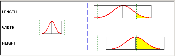
A capability graph appears in this section:
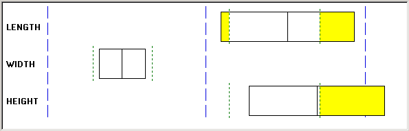
Chart section - capability graph
The left and right edges of the capability graph box represent the plus and minus 3 sigma values, and the centerline represents the mean value. In addition, green dashed lines represent the lower-and upper-specification limits, while yellow parts represent the areas out of specification based upon the distribution fitting (Normality, Pearson Best Fit) criteria in effect.
Individual boxes correspond to either the subsets that you selected or the data groupings established with the group by column role assignment on the Selector panel.
A min/max graph appears in the following section:
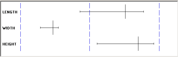
Chart section - min/max graph
The left and right endpoints represent minimum and maximum values, and the centerline represents the mean.
The individual boxes correspond to either the subsets that you selected or the data groupings established with the group by column role assignment on the Selector panel.
This section of box plots includes the collective summary statistics for all box plots on the display. If you select an individual box plot, then the summary statistics for that individual box plot appear.
See Also
Defining Graph and Display Preferences
Modifying Box Plot Graph Options
Creating and Managing Datasets
Modifying Box Plot Graph Options
Access the Modify Box Plot dialog box (Select Modify Graph, Settings).
You can modify the box plots using the following:
|
Graph Style |
Select a graph style for the chart section of the box plots display. Options are:
|
|
Fit Plots to Window |
Select to expand the chart to fit the full size of the box plot chart display, eliminating the vertical scroll bar. |
|
Overlay + / - 3 Sigma Region |
Select to overlay each capability box in the box plots window with a distribution curve. This option is only applicable when the graph style is set to Capability. |
|
Graph Scale Limits |
The system calculates and displays scales by adding and subtracting a percentage of the upper- and lower-plot values that are based on option and graph type selections. You can change the lower and upper graph scale limits, which change how the box plots appear in the window. The scale section of the display changes to reflect the new graph scale limits. The scale that you enter stays in effect until you select another graph style or (sometimes) when you change the overlay 3 + / - Sigma Region check box. If you change any setting that could potentially alter the assessment of minimum/maximum plot values, the system recalculates the scales. |
An example of a box plot with distribution curves overlaid appears in the following section:
Overlaying distribution curves on box plots
Note. The system calculates the distribution curve according to the normality/curve fitting criteria in effect by the graph preference ID that you selected.
See Also
Using Spreadsheets
This section discusses how to view and manipulate spreadsheet data.
Page Used to Use Spreadsheets|
Page Name |
Definition Name |
Navigation |
Usage |
|
None |
|
View and manipulate data cell values and modify or add additional data. |
Viewing and Manipulating Spreadsheet Data
Access the Spreadsheet panel (Select View, Spreadsheet).
A spreadsheet displays the current dataset information in a grid format. Subsets within the dataset appear across the bottom of the spreadsheet. The spreadsheet functions much like a Microsoft Excel spreadsheet.
You can enter additional data in the cells or change existing data. You can copy, cut, and paste data within cells. Use the horizontal scroll bar at the bottom of the display to view additional data columns.
Click each subset at the bottom of the spreadsheet to see the data associated with that subset.
You can also export the data on the spreadsheet to a Microsoft Excel spreadsheet and other application types. To export the data, select File, Export, and the appropriate options.
See Also
Creating and Managing Datasets
Using the Statistical Matrix
This section discusses how to view statistical matrix data.
Page Used to Use the Statistical Matrix|
Page Name |
Definition Name |
Navigation |
Usage |
|
None |
|
Display statistics as columns or rows determined by settings in the graph preferences. |
Viewing Statistical Matrix Data
Access the Statistical Matrix panel (Select View, Statistical Matrix).
The statistical matrix format is similar to a spreadsheet. You can view tabular formatted statistics related to one or more subsets of the dataset in the following categories:
General statistics
Includes mean, observations, standard deviation, variance, covariance, range, minimum, maximum, skewness, kurtosis, Z scores, sum, upper and lower sigma, quartile, and median.
Capability indices
Includes Cp, Cpk, Cpl, Cpu, Cr, Cpk at 90 percent, percent below specification, percent above specification, percent of total specification, and other associated statistics.
Defect statistics
Includes defect sum, defects per unit, defects per hundred, defects per thousand, and defects per million.
The statistical matrix display uses the Measure column row assignments and the selected graph preferences from the Selector panel.
See Also
Creating and Managing Datasets
Creating Graph-Display Templates
This section provides an overview of graph-display templates and discusses how to:
Create graph-display layouts.
Apply graphic layouts.
Understanding Graph-Display Templates
Templates are custom graphic layouts that you create, store, and reuse. Using the templates, you can simultaneously display one or more data-analysis tools in the Quality application client, making it possible to compare different graphs and charts for the same sets of data. For example, suppose you use a line graph, a bar graph, and a box plot to display a dataset. You can set up the Quality application client to display the three charts in the identical format for each dataset you examine.
You can also compare two datasets that are not identical, just similar. For example, if you create a layout using certain attributes or measurement columns, you can apply that layout to all similar datasets that have those columns defined. You can access data-analysis tools individually, using the Quality application client toolbar, or use the View menu.
Creating Graph-Display Layouts
To create graph-display layouts:
Open a dataset.
Select the dataset configuration using the Selector panel.
Select graphs using the buttons on the toolbar.
Size and position the graphs in the panel.
Select File, Save Layout.
Name the layout and select a place to save it.
The extension .tpl is automatically appended to the files.
The system saves the file to the same directory as dataset files on a workstation. Templates, like datasets, don't reside in the PeopleSoft database and should be considered workstation-specific.
See Also
Defining Data Extractions and Loading Datasets
Applying Graphic Layouts
Access the Quality application client.
To apply a layout, select File, Apply Layout. Each time you apply a different layout to the same data, the new layout replaces the previous one. The panels on the layout display the data from the currently selected dataset. If you open a different dataset and apply the same layout, you see the new data displayed in the same arrangement of panels.
You can change any of the charts in the layout the same as when you display the chart individually. To display the original layout, apply it again.
Saving Configuration Settings
This section provides an overview of configuration settings and discusses how to save control definitions.
Understanding Configuration Settings
The control settings for each dataset are embedded in a .cld file. For data extractions or inquiries, where the output is written to a dataset file for downloading, current database configurations for control charts, control procedures, control tests, and graph and display preferences are appended to the file along with the actual data. This ensures a concise snapshot of the configuration, no matter when you view the dataset.
Page Used to Save Configuration Settings|
Page Name |
Definition Name |
Navigation |
Usage |
|
None |
Select File, Save Control Definitions |
Refresh local configuration file with the settings from any .cld file. Apply the latest database configurations (control tests, charts, and procedures) to new datasets created offline. |
Saving Control Definitions
The save control definitions program updates the local QS_QSRV.CFG file with control definitions set in the database and embedded in an extraction or inquiry dataset file. With this selection, changes made using the Quality menu in PeopleSoft are copied to a client machine for offline analysis.
Using the option, you create and save a new control test using Quality. If you want the new test available for offline analysis in the Quality application client, the local configuration must be updated to include the test.
To update the configuration:
Perform an extraction or inquiry.
Download the associated dataset file.
Open the file in the Quality application client.
Select File, Save Control Definitions to update the local cache (configuration) file with the new test.
Printing Displays
Any of the Quality application client displays can be printed.
To print a Quality application client display:
Open the control chart, histogram, or Pareto chart to print.
Select File, Print.
Select Print Preview to view how the file will look before you print it.