You can customize overlay charts in a variety of ways:
Select the View menu in the overlay chart window to switch among several graphic and numeric views.
Select the Overlay menu to add additional forecasts to the chart or remove them all and toggle between the default view and Goodness Of Fit view.
Select Preferences, and then Overlay to select a view, determine when the overlay chart window should be displayed, and specify whether to fit distributions to all forecasts (described in Using Distribution Fitting with Overlay Charts).
Select Preferences, and then Chart Preferences to further customize the chart’s appearance as described in Setting Chart Preferences.
Note: | You can also use shortcut keys (keyboard equivalents) for commands to quickly change the chart preferences. For a list of these, see Table 6, Shortcut Keys for Chart Preferences . |
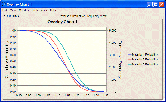
Customizing overlay charts helps you compare forecasts by viewing their differences in several ways. For example, the area and column chart types may obscure parts of some distributions behind other distributions, but the outline or line chart type shows virtually all of each distribution. Figure 30, Overlay Chart with Three Distributions shows what happens if you press Ctrl+d several times to display the reverse cumulative chart view, and then press Ctrl+t to display the outline chart type. This chart in outline view most clearly suggests that Material 3 has superior reliability and is dominant since a greater proportion of its distribution is to the right of 1.00 and its values for all probability levels are higher than the others.
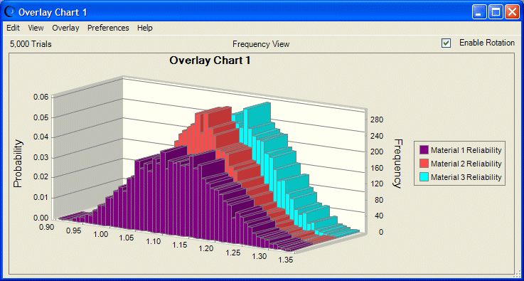
For best display of many types of data, you can select 3D view and then rotate the chart as shown in Figure 32, A Rotated and Stretched Overlay Chart. To display this chart with shortcut keys, press Ctrl+d until the frequency distribution is displayed. Press Ctrl+t to display the column chart. Try pressing Ctrl+b to change the number of frequency bins (columns, in this view). Then, press Ctrl+w to make the chart three-dimensional (Figure 31, Overlay Chart, 3D View).
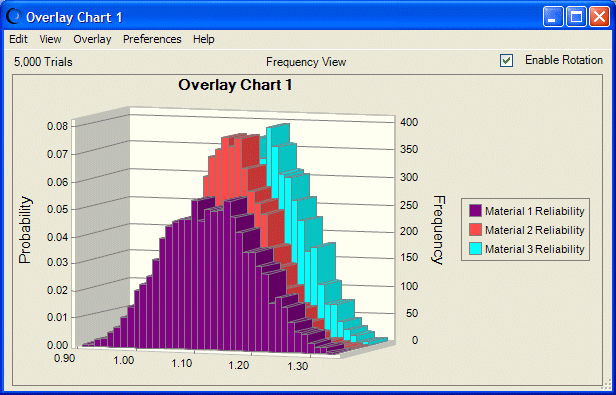
If you want, you can drag either side of the chart to give it a taller, narrower look (Figure 31, Overlay Chart, 3D View) or a stretched look (Figure 32, A Rotated and Stretched Overlay Chart).
In 3D view, the Enable Rotation checkbox is displayed at the top of the chart, accessible with the Tab key. When it is selected, you can click inside the chart and drag to rotate it. This can enhance the data display for both analysis and presentation. Figure 32, A Rotated and Stretched Overlay Chart shows a rotated overlay chart, stretched to emphasize x-axis differences.
Note: | Rotation settings are for the current session only and are not saved with the chart. |