Each trial of a simulation generates a value for every assumption cell and these feed into associated forecast cells. The generated values are saved, divided into value-range intervals (bins), and counted. Forecast charts show the number (frequency) of values occurring in each plotted interval. As Crystal Ball generates the forecast values, the number of values in each interval increases.
To display a forecast chart, follow the instructions in Opening Charts. Other topics listed at the beginning of this section describe how to change the contents and appearance of forecast charts.
Figure 15, Forecast Chart shows the elements of forecast charts.
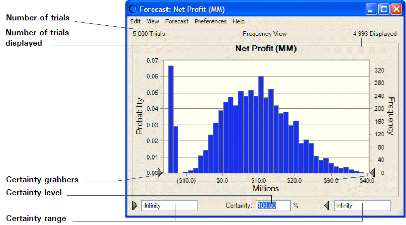
The frequency scale shows the number of values in each charted interval. The probability scale shows the probability of values falling in each interval (the percentage of the total)
The certainty level (Certainty) is displayed below the forecast chart. The certainty minimum is displayed in the first box, to the left of the certainty level. The certainty maximum is displayed in the third box, to the right of the certainty level. The certainty range is the difference between the minimum and maximum values. The certainty level is calculated by comparing the number of forecasted values in the certainty range with the number of values in the entire range.
Crystal Ball forecasts the entire range of results. By default, forecast charts show only a display range including about 99% of the forecast values and excluding extremely high and low values. The number of trials run for a forecast is displayed at the top of the forecast chart, near the Probability scale. The number of trials in the display range is displayed at the top of the chart near the Frequency scale (right vertical axis).
To display all trials, change the chart axis preferences to display fixed endpoints between –Infinity and +Infinity (Focusing on the Display Range). |
In Figure 15, Forecast Chart, the mode (the x-axis value that occurred the most frequently) has a frequency of about 300, meaning that the interval expressed by that column contains 300 values. The mode has a probability of about 0.06 (or 6%), meaning that there is a 6% chance of a value falling within this interval. The certainty range includes all values between –Infinity and +Infinity. The certainty level is 100%. The display range excludes only one trial out of the total 5000.