Designing Accessible PDF Documents
With proper design settings, Oracle Documaker can produce accessible PDF documents.
Alternative Text
Screen readers may read alternative text, if present, to provide information about non-text content such as graphics. Documaker Studio enables users to specify alternate text on objects such as graphics, charts and hyperlinks.This alternate text is then embedded in the PDF output when the accessibility option is enabled.
To include text equivalent on objects, you may also use the Alternate Text field on the individual object. In Figure 1, alternate text has been supplied for the graphic object.

Figure 1: Option Showing Alternative Text for Images in Documaker Studio.
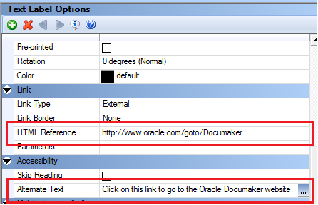
Figure 2: Option Showing Alternative Text for Text Label in Documaker Studio.
Tips:
- Good alternate descriptions are concise yet descriptive.
- The alternate description “Download the WipEdit Plugin” is more descriptive than “Download Plugin”. Additionally, since voice synthesizers take into account punctuation, it is a good idea to end the alternate text with a punctuation mark. This will allow the screen reader to pause at the end of the alternate text aiding in comprehension of the content.
For mobile output, the alternate text for an object can be accessed with the keyword: documaker.alttext. Using this keyword in your snippet files will allow the mobile author to set the alternate text in the mobile output so that it is available when listening to the content.
Skip Reading
The Skip Reading attribute indicates whether the object should be included or excluded from being read by assistive technology. This setting could also be used on items that only need to be read once such as page numbers, headers and footers which are repeated on each page of a document. Enabling Skip Reading allows the assistive technology to by-pass the content within the PDF document.
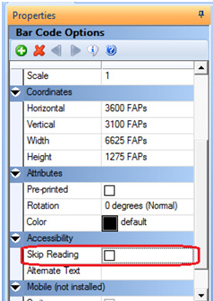
Figure 3: The Skip Reading Option in Documaker Studio.
Applying this attribute on content will cause the Skip Reading element to be enabled in the mobile output when using the default snippets or the keyword “documaker.skipread” within your implementation specific snippet files.
Ultimately, how the mobile output uses this information is up to the Mobile Author and your company’s requirements.
Tab Order
Maintain a logical tab order for visually impaired users as they cannot see the field groupings. For instance, field tab order should generally be from left to right and top to bottom.
Use the column feature included in Oracle Documaker Studio. Columns are defined in text area where you can add more columns, rather than adding text labels or areas arranged in columnar format. Columns can also be defined in a multi-line text field or a text area marked for interactive editing in data entry. This allows the assistive technology to recognize the columns and mark the proper reading order.
Use a table rather than text labels or areas. Assistive technology typically traverse any table from left to right and from top to bottom in an accessible PDF file.
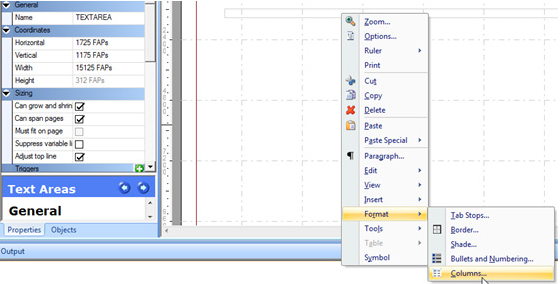
Figure 4: Using the column feature in Documaker Studio.
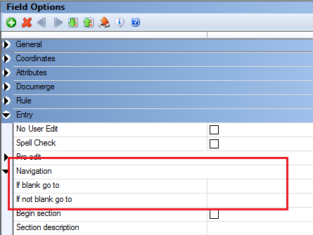
Figure 5: Using Tab Order via Navigation settings for Fields in Documaker Studio.
Tip:
Use text areas for bulleted or enumerated lists instead of individual static labels.
Hyphenation
When hyphenation causes a word to be split across two lines of a paragraph, screen readers split up hyphenated words instead of speaking them properly as single words. Hyphenation can make reading very confusing for screen reader users.
To eliminate potential hyphenation issues, set hyphenation to None.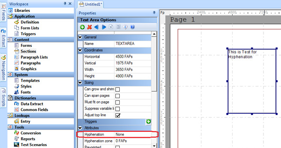
Figure 6: Using the Hyphenation setting in Text Area Options for a text area object in the Section Manager in Documaker Studio.
Tip:
You can set hyphenation to 'None' at the text area and Multiline Text field level.
Tables
The content of an individual paragraph should be restricted to the same cell rather than splitting it to the next row as shown below.
| Table | Description |
|---|---|
| valid | Customer Communications Management means leveraging a company's transaction documents such as, Marketing Campaigns, Personalized Correspondence, and Billing to improve customer relationships. |
| Table | Description |
|---|---|
| invalid | Customer Communications Management means leveraging a company's transaction documents such as, ---------------------------------------------------------------------------------------------------------- Marketing Campaigns, Personalized Correspondence, and Billing to improve customer relationships. |
Tips:
- Use tables only when really needed.
- Table Headings are required in a table.
- Include a description of the table object.
- Avoid using tables for columnar or listed data.
- Avoid using tables for page-layout purposes.
- Avoid using nested tables.
Note: Documaker has the option to define Alternative Text in a table object to improve readability.
Accessible PDF
When people talk about “accessible” PDF files, they usually are referring to “tagged” PDF files, even though there is more to an accessible PDF than tags.
Tagged PDF contains meta-information of certain groups of PDF instructions inside the page content. With the correct tags, a screen reader can understand where headings fall, what is a table, image, footnote etc. in a PDF document.
In order to produce accessible (tagged) PDF output, you must set Accessibility to Yes as shown below:
< PrtType:PDF >
Accessibility = Yes
Embedded Fonts
Consider the fonts used to generate the output. Select clear, readable fonts in an appropriate size for readability.
When a font has high readability, embedding fonts ensures that all recipients will be able to display the PDF as intended. Avoid embedding fonts with poor readability.
When embedding fonts, you must have either PostScript Type 1 or TrueType fonts. In addition, you must set the DownloadFonts to Yes as shown below:
< PrtType:PDF >
DownloadFonts = Yes, Enabled
The Font Name field under the PostScript Properties contains the file name of the PostScript or TrueType font you want to embed. This file should exist in the directory specified by the FontLib setting in your master resource library.
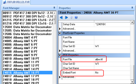
Figure 7: Embeded Font.
Language Setup
To produce accessible documents in non-English languages, make sure to define the language being used in the PDF print type settings.
ISO 639 is the International Standard for language codes used in accessible PDF files. The Lang INI setting specifies the default language for the PDF document. For instance, for Dutch, the setting should be:
< PrtType:PDF >
Lang = nl
If the default language is not set, accessibility checker will fail with the following error:
“The test on this page lacks a language specification.”
Bookmarks
Bookmarks helps in easy navigation of voluminous documents. To enable the bookmark at Form/Page level or both at Form and Page levels, use the following INI settings:
< PrtType:PDF >
Accessibility = Yes
Bookmark = Yes,Page,Yes,Page
Color Contrast
Color should not be used as the only way to convey meaning. For example users with color vision deficiencies may not able to distinguish warning text that is in red from non warning text that is not red. The best option is to use meaningful text along with color. In a warning text, for example, the word Warning could be included to identify warning text from non-warning text. Also, there must be contrast between foreground and background colors to display the text correctly when rendered on a background with a different color.
When printing in color, there are two settings to consider:
- SendColor is a print driver setting that must be enabled in order to print objects in color. For any individual object (text label, variable field, lines, boxes, etc.), the object’s color setting must also be marked as “Print in Color” in order for the object to print in color. When printing in color, make sure that the objects to be printed have appropriate contrast ratios.
- When “Print in Color” is not enabled for an object, the print driver will print the object using Black. The other option is to enforce minimum color contrast for text.
In Documaker’s PDF output, use the following INI Settings:
< PrtType:PDF >
SendColor = N
When sendcolor is set to No, all content in the PDF is output in Black and White. Black and white creates the highest contrast possible.
Tips:
- Do not attempt to convey information solely by color or textual styles. Assistive technology is unable to interpret the visual cues that sighted persons take for granted, such as automatically adding emphasis to bold text.
- Consider fonts used to display the output. Select clear, readable fonts in an appropriate size for readability.
- Text and images of text should have a luminosity contrast ratio of at least 4.5 to 1. Large scale text (point sizes 18 and higher) should have a minimum ratio of at least 3 to 1.
For more information on color contrast, refer to the following link:
https://www.w3.org/TR/UNDERSTANDING-WCAG20/visual-audio-contrast-contrast.html
Additional Design Tips for Accessibility
In addition to the configuration settings presented herein there are also various layout and design considerations that can impact the accessibility of documents produced by Oracle Documaker.
Tips:
- While producing charts, it is recommended to provide meaningful legends for easy interpretation of the data points represented.
- Do not use ASCII characters to render drawings or figures such as “:-)” or “-->” or a series of characters such as “---------------”. Screen Readers may read these without interpretation. So the user may hear “dash dash greater than” rather than the arrow(-->) that was intended.
- Ensure hyperlinks are underlined so that a user who can’t distinguish the color knows they are links.
- Avoid abbreviations and acronyms unless so common, they’re considered as part of the language. Define or explain an abbreviation on the first time you use it.
- Avoid making explicit reference to mnemonics.
- Descriptions for alternate text should be concise. The World Wide Web Consortium (W3C) recommends 100 or fewer characters for alternate text.
- It is a good idea to end the alternate text with a punctuation mark so that voice synthesizers pause for short time and therefore help comprehension.
Home Page | Previous Page | Next Page
© Copyright 2017, Oracle and/or its affiliates. All rights reserved. Legal notices.