Explore the Dashboard
Use the Dashboard to view high-level information about your library system.
The Dashboard contains multiple panes, each showing a different aspect of your library environment. You can hover your mouse over areas of graphical panes to display detailed information. You can click links within some panes to navigate to other screens to view corresponding data.
-
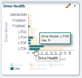
Choose any bar chart on the Dashboard and move your mouse over the graph to display detailed values for the bar chart segments.
In the example below, hovering over the LTO6 bar of the Drive Health pane reveals there are nine LTO6 drives in the Use state.
-
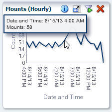
Move your mouse over any line graph, such as the Mounts (Hourly) pane, to display detail for each of the data points on the line.
-
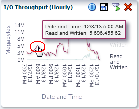
The units of measure and scaling of the graphs vary from pane to pane. Check the labels on each axis. STA adjusts the scaling according to the actual data displayed to show as much detail as possible.
For example, in the following I/O Throughput (Hourly) pane, the vertical axis is labeled "Megabytes," with markers every 3M (three million), from 0M to 14M. Each data point on the line graph, therefore, represents millions of megabytes, which converts to terabytes (TB). The hover text for the selected data point indicates 5,696,455.62 MB Read and Written, which converts to roughly 5.69 TB.
-
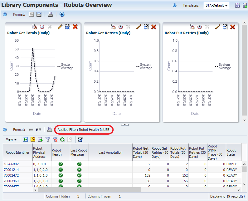
Bar chart, pie chart, and area chart segments are also active links.
In the Robot Health pane, click a bar chart segment.
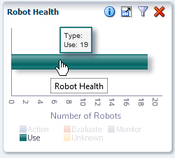
The link displays the Library Components – Robots Overview screen. It shows detailed information about the robots included in the bar segment that you clicked. In this example, the filter shows all robots with a "Use" health.