Defining Push Button Page Elements
This topic discusses how to define push button page elements.
This topic discusses how to define push button page elements. When you are done defining a push button page element, you can define additional properties using the Button Properties page.
Push Button Types
The Mobile Application Platform supports two push button types:
|
Field or Control |
Definition |
|---|---|
| Save |
When you define a Save type push button you define a PeopleCode Save event to execute when the user selects a push button. |
| URL |
When you define a URL type push button you define one a URL to invoke when the user selects a push button. You can define push button elements to invoke:
The process for defining URLs for push button page elements is very similar to the process for defining URLs for URL page elements. |
Grouping Push Button Elements
You can define groups of push button elements in the Mobile Application Platform.
When defining push buttons you are presented with the “Do you want to create a group?” page, which enables you to define an element group and also define the number of push buttons in the group.
Save Type Push Buttons in Pop-Up Container Elements
With one exception, PeopleCode Save event processing via Save type push buttons does not return input data to the application server when defined in pop-up containers. (Pop-up containers are those container elements where the Enable Popup option is enabled in the container’s properties.) In these cases use an Ajax event for save processing.
The exception is when pop-up containers are defined in header or footer elements. When pop-up containers are defined in header or footer page elements, PeopleCode Save event processing via Save type push buttons returns data to the application server.
To add a push button page element to a page:
Access the Layout grid on the Layout Designer – Layout page.
Select to access the page.
Determine the position in the grid to add the page element.
Click the row directly above where you want to add the page element to make it the current row.
The Current Row icon (blue arrow) displays in the first column of the row to indicate that it’s the current row.
Field or Control
Definition

The Current Row button.
Click the Add Pushbutton button on the Layout grid toolbar.
Field or Control
Definition

The Add Pushbutton button.
After you click the Add Pushbutton button the “Do you want to create a group?” page appears.
After you click the Add Pushbutton control on the Layout grid toolbar on the Layout Designer – Layout page, the “Do you want to create a group?” page appears, giving you the option to create a group push buttons
Image: “Do you want to create a group?” page
This example illustrates the fields and controls on the “Do you want to create a group?” page. You can find definitions for the fields and controls later on this page.
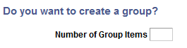
If you want to create a group of push buttons, enter the number of group items to create in the Number of Group Items field and click the Yes button. If you do not want to create a group of radio button elements click the No button.
After you click Yes to create a group or push button or click No to not create a group of push buttons, the Select Button Type page appears. See the next section for information about how to use the page.
Use the Select Button Type page to select the button type.
To access the page select and add a push button element to the Layout grid.
Image: Select Button Type page (Default view)
This example illustrates the fields and controls in the default view of the Select Button Type page. You can find definitions for the fields and controls later on this page.
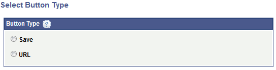
|
Field or Control |
Definition |
|---|---|
| Save |
Select the radio button to define a Save button. When you select this button type, additional parameters appear on the page to define the PeopleCode Save event to invoke when the user selects the button. |
| URL |
Select the radio button to define a button that invokes a URL. When you select this button type, the Select Button URL page appears for you to select the type of URL type invoke when the users selects the button. |
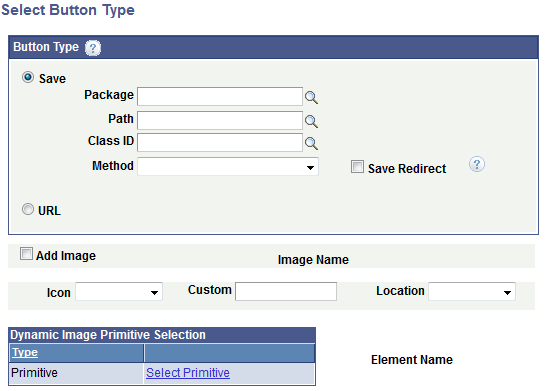
When you click the Save radio button on the Select Button Type page additional fields and controls appear to define the PeopleCode Save event to invoke when the user selects the button. Additional fields and controls also appear to define the push button control.
Image: Select Button Type page (Save type)
This example illustrates the fields and controls on the Select Button Type page after you select Save as the button type. You can find definitions for the fields and controls later on this page.
|
Field or Control |
Definition |
|---|---|
| Package |
Enter the name of the application package that contains the method to invoke. |
| Path |
Enter the names of each sub-package in the application class hierarchy that define the location of the application class. Separate sub-package names by a colon. If the class is defined in the top-level application package, enter or select the colon. |
| Class ID |
Enter the name of the application class that contains the method to invoke. |
| Method |
From the drop-down list select the method to invoke. |
| Save Redirect |
By default, save messages appear in a pop-up message. Select this control to display the save message on another page or update the same page, instead of appearing as a pop-up message. |
The remaining controls on the page are used to define the push button control. These fields are described later in this topic.
Use the Select Button URL page to select the URL type to invoke when the user selects a push button.
To access the page click the URL radio button on the Select Button Type page.
Image: Select Button URL page (Default view)
This example illustrates the fields and controls on the default view of the Select Button URL page.
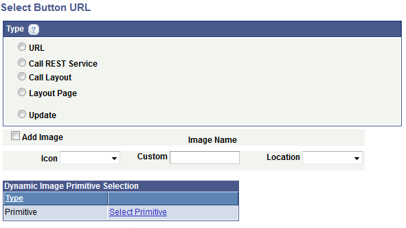
The fields and controls that you use to define a URL depend on the URL type that you choose in the default view of the page.
|
Field or Control |
Definition |
|---|---|
| URL |
Click the radio button to define a standard URL to invoke when a user click the push button, for example: |
| Call REST Service |
Click the radio button to define a URL to invoke a REST service when a user clicks the push button. |
| Call Layout |
Click the radio button to define a URL to invoke another Mobile Application Platform layout when a user clicks the push button. |
| Layout Page |
Click the radio button to define a URL to invoke a another page in the current layout when a user clicks the push button. |
| Update |
Click the radio button to define a URL that executes a PeopleCode Update event when a user clicks the push button. |
The remaining controls on the page are used to define the push button control. These fields are described later in this topic.
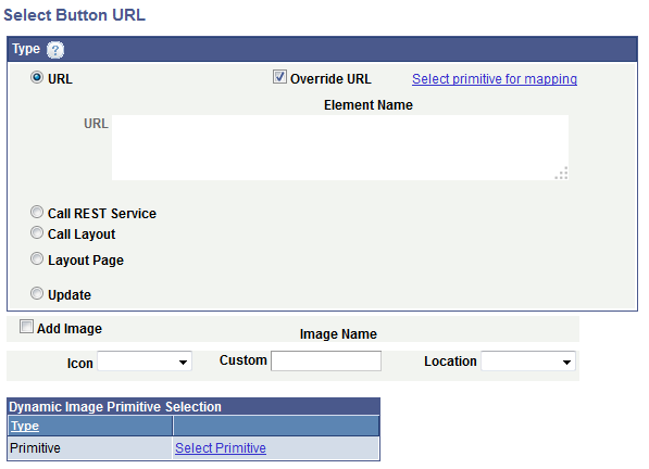
When defining a push button to invoke a standard URL, you can specify a fully-qualified URL or an anchor using an id attribute (#<id>).
To define a standard URL click the URL radio button on the Select Button URL page.
Image: Select Button URL page (Call standard URL)
This example illustrates the fields and controls on the Select Button URL page when you are defining a push button that invokes a standard URL. You can find definitions for the fields and controls later on this page.
|
Field or Control |
Definition |
|---|---|
| URL |
Enter the fully-qualified URL or anchor in the long edit box. |
| Override URL |
Select the box to define a dynamic URL using a primitive element defined in the PeopleSoft document associated with the layout. |
| Select primitive for mapping |
This link appears if you select the Override URL box. Click the link to access the Select Primitive page to select a primitive. |
| Element Name |
If you define a primitive for the URL, the primitive element name appears in this field. |
The remaining controls on the page are used to define the push button control. These fields are described later in this topic.
You can define a push button to call provider or consumer REST services. When defining this URL type, you select the REST service operation, select the appropriate URI template, and then identify the variables to pass.
To define a push button that calls a REST service click the Call REST Service radio button on the Select Button URL page.
Image: Select Button URL page (Call REST service)
This example illustrates the fields and controls on the Select Button URL page when you are defining a push button that calls a REST service.
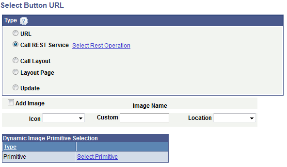
Click the Select Rest Operation link to access the URI Selection page to build the REST URI.
After you build the URI an Operation field appears on the page that displays the name of the REST service operation.
The remaining controls on the page are used to define the push button control. These fields are described later in this topic.
When you define a push button to call another layout you must select the name of the layout to call, define the appropriate layout initialization to use, and identify the variables to pass.
To define a push button to call another layout click the Call Layout radio button on the Select Button URL page.
Image: Select Button URL page (Call Layout)
This example illustrates the fields and controls on the Select Button URL page when you are defining a push button to call another Mobile Application Platform layout. You can find definitions for the fields and controls later on this page.
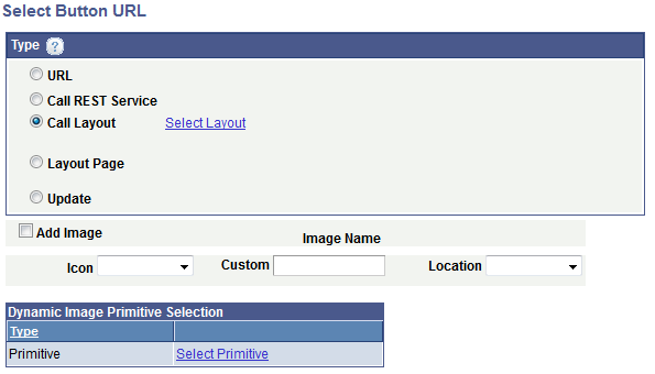
When you click the Call Layout radio button a Select Layout link appears. Click the link to access the Layout Selection page to select the layout to call.
The remaining controls on the page are used to define the push button control. These fields are described later in this topic.
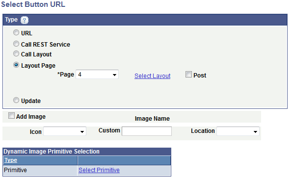
Click the Layout Page radio button on the Select Button URL page to define a push button to call a page within the same layout.
The fields and controls that appear on the page depend on if you are defining a URL to a page defined as an Internal type page or an External type page.
Image: Select Button URL page (Call Internal type page in layout)
This example illustrates the fields and controls on the Select Button URL page when are defining a push button to call an Internal type page in the current layout. You can find definitions for the fields and controls later on this page.
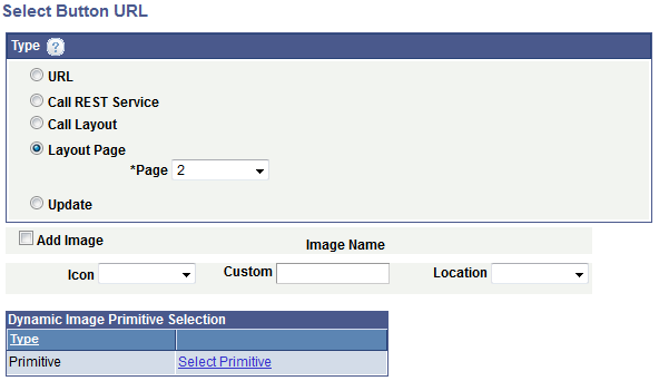
Image: Select Button URL page (Call External type page in same layout)
This example illustrates the fields and controls on the Select Button URL page when are defining a push button to call an External type page in the current layout. You can find definitions for the fields and controls later on this page.
|
Field or Control |
Definition |
|---|---|
| Page |
From the drop-down list select the number of the layout page to call. |
| Select Layout |
This link appears when you select an External type page from the Page drop-down list. Click the link to access the Layout Selection page to select the layout to call. |
| Post |
This control appears when you select an External type page from the Page drop-down list. By default the external page is called via an HTTP GET. If data to be passed as arguments needs to be more secure, select the box to make the request via an HTTP POST. |
The remaining controls on the page are used to define the push button control. These fields are described later in this topic.
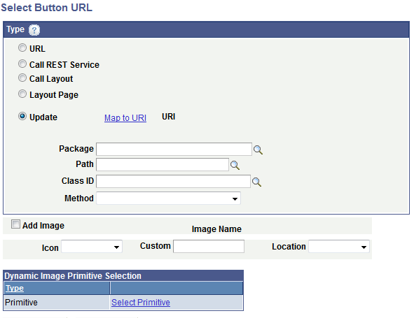
Click the Update radio button on the Select Button URL page to define a PeopleCode Update event to call when a user clicks a push button.
Image: Select Button URL page (Call PeopleCode Update event)
This example illustrates the fields and controls on the Select Button URL page when you are defining a push button to call a PeopleCode update event. You can find definitions for the fields and controls later on this page.
|
Field or Control |
Definition |
|---|---|
| Map to URI |
Click the link to access the Select URI page to select the URI parameters to pass to the Update event. The Select URI page displays the URIs defined for the current layout, as defined in the initialization parameters for the layout. |
| URI |
After you define the URI parameters to pass using the Select URI page, the URI string displays in this field. |
| Root Package ID |
Enter the name of the application package that contains the method to invoke. |
| Path |
Enter the names of each sub-package in the application class hierarchy that define the location of the application class. Separate sub-package names by a colon. If the class is defined in the top-level application package, enter or select the colon. |
| Class ID |
Enter the name of the application class that contains the method to invoke. |
| Method |
From the drop-down list select the method to invoke. |
The remaining controls on the page are used to define the push button control. These fields are described later in this topic.
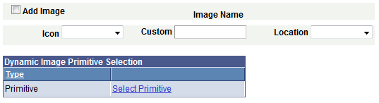
At the bottom of the Select Button URL page are fields and controls to define push button control that the user selects on the user interface.
To define the control you can upload an image from the database, use one of the delivered icons, or define a control using CSS3 style or class. You also have the option of defining a dynamic image by defining a primitive value for image.
Image: Select Button URL page (Button and image fields and controls)
This example illustrates the fields and controls on the Select Button URL page for defining push button controls. You can find definitions for the fields and controls later on this page.
|
Field or Control |
Definition |
|---|---|
| Add Image |
Select the control to add image that becomes the hot spot for the push button control. |
| Image Selector |
This link appears if you select the Add Image control. Click the link to access the Image Selector page to select an image. |
| Image Name |
After you select an image using the Image Selector page, the image name appears in this field. |
| Icon |
From the drop-down list select an icon for the push button. The values are:
|
| Custom |
Enter the class or style name of a custom icon defined on the Layout Designer – CSS page, or in the Template Designer – CSS page if a layout template is applied to the layout. |
| Location |
From the drop-down list select the location for the icon relative to any icon label text defined. The values are:
|
| Select Primitive |
Click the link to access the Select Primitive page to select an image defined as a primitive element to display dynamically. In PeopleCode you must populate the primitive element with the fully qualified URL of the image to display. |
After you define a push button element using the Select Button URL page the Layout Designer – Layout page appears and the element appears in the Layout grid.
The default element ID for push button page elements is mapbutton.
Image: Push button element defined in the Layout grid
This example illustrates a partial view of the Layout grid showing a push button defined.

The value that you enter in the Label Text field becomes the button label in the generated HTML. In this example Expense Report is the label that appears on the button at runtime.
Click the Properties link to access the Button Properties page to define properties for the element.
Use the other fields to apply CSS3 classes and styles to the button label, as well as apply jQuery themes.