Working with Other Page Controls
This section contains an overview and discusses aspects specific to fluid page development with regard to adding page controls.
In general, adding page controls to fluid pages is comparable to adding page controls to a classic page, except for using CSS styles to position the control and the obvious look and feel differences at runtime. The content in the this topic call out key differences with regard to fluid development. You should be well versed in development of classic PeopleSoft applications and all of the various page control options provided by Application Designer prior to beginning a fluid development or customization project.
Setting Grid Label Properties
Fluid grids support these property settings:
Row count (n rows).
Previous, Next, and View All.
Combined, these properties enable lazy scrolling on fluid grids; see Enabling Lazy Scrolling for Scrollable Grids for more information. However, unlike classic grids, no separate page controls are displayed for these features.
Find.
Download to Excel.
Personalize, which displays two options for fluid grids:
Personalize Columns – Select to display the Personalize button in the grid header. The Personalize button allows users to change the order of grid columns, hide columns, and specify the sort order on up to three columns.
• Save Sort – Select to display the Sort button in the grid header. The Sort button allows users to specify a sort on one column and save this sort personalization.
Note: Save Sort is selected by default on fluid grids.
However, do not enable the Personalize property on a fluid grid if:
Grid columns are hidden or shown programmatically.
The Show Column When Cells Hidden check box is selected on the grid’s Use tab.
In addition, do not enable the Personalize property on a fluid grid if the page or component includes multiple grids based on the same record except when you implement a common list of grid columns across all grids using this record and you restrict the sort to only those common columns.
Personalization of a "stacked" grid is disabled because it could cause unintended display issues in the grid. The styling that achieves the stacking is imposed by group box columns in the grid. The styling may be different from one collection of grouped columns to the next. If an end user moves a column from one collection of grouped columns to another, it can cause unintended display issues in the grid. Therefore, the Personalize button does not appear on a "stacked" grid.
These features are not supported and are ignored (if enabled) on fluid grids:
Top and Bottom (First and Last links).
Row count (x–y of n).
Footer.
For more information on setting grid label properties, see Setting Grid Label Properties
Selecting Grid Layout
Fluid grids support these layout options:
Data Grid Layout.
Div Grid Layout.
Flex Grid Layout.
List Grid Layout (Ordered).
List Grid Layout (Unordered).
Menu Grid Layout.
Tab Set Grid Layout.
For more information on selecting a grid layout and setting other grid use properties, see Setting Grid Use Properties.
Setting Fluid Properties for Grids
When working with grids, the relevant, common fluid properties apply, but also you can set these properties on the Fluid tab:
Term |
Definition |
|---|---|
Scroll Sizing by Style |
Select to override the system default, automatic scroll container sizing. If you use this option, you must control the scroll container sizing through a custom style. If you select this option, be aware of these items:
|
Custom Grid Header |
Select a group box of type Custom Grid Header to specify a custom grid header. See Setting Group Box Properties for more information on the Custom Grid Header group box type. |
Note: In some situations, such as when displaying a page on a smart phone, you may want grid scrolling disabled. Add the psc_noscroll style to Small in the Form Factor Style Class Override group box to disable scrolling for that grid on small form factor devices. Do not disable scrolling for lazy scroll grids.
Other Unsupported Grid Features
These grid features are not supported in addition to the grid label features that aren’t supported:
Odd/even row styles.
Persist in menu.
-
Collapsible data areas.
Lazy scrolling provides the ability for the PeopleSoft application to dynamically load grid content as the end user scrolls downward. Rather than loading all content up front, which would degrade performance, the fluid application loads the content as needed. The fluid application loads the next set of scrollable content automatically as the user reaches the end of the currently displayed content. The fluid application displays the total row count for the grid on the same line as the grid title.
To enable lazy scrolling:
On the Grid Properties > General tab, set the Occurs Count to the number rows to be sent to the browser when the grid appears initially.
Note: Make sure Unlimited Occurs Count (rows) is not selected.
On the Label tab, in the Header Navigation Bar Properties for that grid, make sure the Invisible option is clear for these property tabs:
Previous
Next
View All
On the Use tab, in the Grid Style group box, select the Vertical check box.
You can add container group boxes to organize grid columns into "hotspots," or clickable areas. Then, you add a hidden trigger field (a hyperlink or push button) to each group box to define the hotspot's action.
To create multiple clickable hotspots in grid rows:
Within the grid, insert a group box before the grid columns to be included within that hotspot.
On the Fluid tab of the group box's properties, set the type to Container or Default.
Also, select the Capture Trigger check box.
Within that group box, insert a push button/hyperlink control:
Note: The order of this trigger control within the group box does not matter.
On the Type tab, ensure that the destination is PeopleCode Command.
On the Use tab, select the Execute PC on Row/Group Click check box.
On the Fluid tab, stylistically hide the control using psc_hidden.
Ensure that all visible columns within the hotspot are set to display only and are not interactive.
Repeat steps 1 through 3 for each hotspot within the grid.
Additional Considerations
When implementing multiple hotspots for grid rows, consider this additional information:
Multiple hotspots and the row click action are mutually exclusive features. You cannot implement both on the same grid.
The hotspot is rendered in HTML with the ARIA role="button". If link is a more appropriate term for screen reader users, or if further explication is required, use the AriaAttributes property of the Field class to describe the ARIA role. For example, either of the following will more accurately describe the control to screen reader users:
&fld.AriaAttributes = "aria-roledescription='information button'";
&fld.AriaAttributes = "aria-roledescription='link'";
When working with scroll areas, the relevant, common fluid properties apply, but you can also set these properties:
Term |
Definition |
|---|---|
Layout |
Select one of these layout options:
|
Note: Collapsible data areas are not supported for fluid scroll areas.
When working with edit boxes and long edit boxes, the relevant, common fluid properties apply, but also you can set these properties:
Term |
Definition |
|---|---|
Application-Specific Styles: Style Classes |
Similar to classic pages, when the character counter is enabled, it is displayed beneath the bottom right corner of the long edit box. If you want the character counter to be displayed beneath the bottom left corner, use the psc_counter-left style. Oracle recommends that you do not use a psc_control-width*pct style to control the width of the long edit box itself because you will then need to develop and apply custom styling to get the character counter aligned with the long edit box. |
Place Holder Text |
Display default, place holder, text in the edit box as follows:
For example, you can add a default value or sample format of the field data to assist users. HTML example:
|
Input Properties |
Select the expected data type for users to input. This sets the HTML input type parameter. Setting input types for forms allow for better input control and validation for various data types, including:
Note: The Input Properties setting does not apply to long edit boxes. |
Note: The Show Label option is not supported for edit boxes on fluid pages.
Note: The Display in Modal Window option is not supported for long edit boxes on fluid pages. Therefore, the character limit counter cannot be displayed for long edit boxes in fluid grids.
Working with Number Fields
When you select number as the Input Type, the system uses an HTML 5 number input which renders in a fashion specific to the browser/device accessing the page. For example, on a touch device the system displays the numeric keyboard when the number field is in focus, and a browser may display a spinner (spin-button) for a number field.
Note: Browser rendering and HTML 5 rendering may change after the publication of this document.
When setting Input Type to number, consider that HTML 5 restricts the data that can be used as input or displayed for number fields to the following set of characters:
0 through 9.
- for negative numbers.
. for a decimal point.
Adding additional characters (such as a currency symbol, a thousand’s separator, and so on) or additional field formatting is not supported for a field with the Input Type set to number. For example, if you set Input Type to number, the numeric keyboard will be displayed by default for that field on touch devices, however you also introduce the HTML 5 number field character restrictions. In this case, any special characters or formatting applied in Edit Box Properties, field definition formatting, or PeopleCode (such as currency symbols, thousands separators, and so on) will not be displayed or accepted as input for that field.
On the other hand, if you want to allow additional formatting or characters for numerical values, then set the Input Type to text, keeping in mind that with the Input Type set to text you lose the device/browser-specific representation (such as the numeric keyboard for example).
A general recommendation would be that you should only set a field's Input Type to number if the underlying field definition Field Type is set to Number in Application Designer, or if the Field Type is set to Character, you have also set the Format Type to Numbers Only.
Using subpages can help to reduce clutter on the main or primary fluid page, and they clearly separate related fields into separate entities. In addition, they enable you to segregate business logic into separate, reusable modules.
When using subpages, you will notice that the footprint is small in terms of the space they consume on the page that includes the subpage. Every subpage control must be enclosed by a group box on the primary page where the subpage has been included.
Finally, subpages can be nested—that is, one subpage can include a subpage control for another subpage, and so on.
Similar to classic secondary pages, use secondary pages in fluid applications to:
Reduce clutter of the main or primary fluid page.
Display ancillary information in a separate modal window.
Provide a data entry area for secondary or supplemental information.
Unlike classic secondary pages, fluid secondary pages must always be displayed in a modal window. When creating a fluid secondary page:
Select Page (Fluid) as the definition type in Application Designer.
Select PSL_APPS_CONTENT as the layout page.
Note: Creating your page in this manner applies the ps_apps_content style to the outermost group box container on the page.
On the Use tab of the Page Properties dialog box, set the Page Type to Secondary Page.
On the Use tab, determine whether to retain settings for PeopleTools-produced buttons:
Important! Do not select the Disable Display in Modal Window When Not Launched by DoModal Peoplecode check box for fluid secondary pages. Fluid secondary pages must always be displayed in a modal window.
Deselect the OK & Cancel buttons check box if you plan to add custom button definitions directly to the secondary page definition.
Note: On fluid modal secondary windows, the OK button is actually rendered with the label Done.
Deselect the Close Box check box when the OK & Cancel buttons check box is selected or when you plan to add a custom Cancel button directly to the secondary page definition.
This item renders an X in the upper left corner of the modal window that can be used to cancel and close the window.
Set an appropriate minimum size for the modal window for each form factor, which is inclusive of its title bar. Specify a size that is neither too small nor too large for the content you are displaying in the modal window. Otherwise, the modal window will be rendered incorrectly, sometimes with scroll bars and sometimes not.
Oracle recommends that you use styles to set the minimum size for the modal window. Specify styles on the Fluid tab of the Page Properties dialog box.
For example, page-secmin30x25em sets the minimum size to 30 ems wide by 25 ems tall:
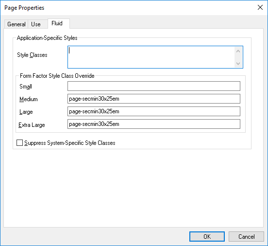
Typically, modal windows on small form factor devices should occupy the full screen. Therefore, no style override was specified in the preceding example.
Note: You will encounter some Oracle-delivered fluid applications that set width and height in PeopleCode using modal options. Nevertheless, the recommended approach is to use styles as stated here.
Add page Activate PeopleCode to set the viewport for this secondary page.
Setting the viewport for each fluid component and secondary page ensures that your fluid applications operate properly across all device types, particularly on small form factor devices such as smartphones. The recommended methodology is to use the SetDefaultViewport method:
import PT_PAGE_UTILS:*;
(create PT_PAGE_UTILS:Utils()).SetDefaultViewport();
When ps_apps_content Is Not Applied to the Outermost Container
When you create your secondary page definition using the PSL_APPS_CONTENT layout page as described in preceding section, ps_apps_content is applied to the outermost group box container. However, in certain cases, ps_apps_content may not be appropriate for the outermost container—for example, if your modal page design includes fixed areas (group boxes) at the top, bottom, or sides of the page. If your secondary page does not have ps_apps_content applied to the outermost group box container, you might have to apply additional styles to ensure that the modal window is sized correctly:
If ps_apps_content is applied to another group box within the page, for each fixed group box, apply one of these styles:
For a fixed horizontal area (for example, at the top or bottom), add the psc_modal-addheight style to the container group box to add the height of the group box to the computed modal size.
For a fixed vertical area (for example, at either side), add the psc_modal-addwidth style to the container group box to add the width of the group box to the computed modal size.
Add the psc_modal-addall style to the container group box to add both the height and the width of the group box to the computed modal size.
If you have a scrollable area but are not using the ps_apps_content style, then apply the ps_scroll-target to this group box. Then, if you have other fixed areas on the page, see the usage notes above for psc_modal-addheight, psc_modal-addwidth, and psc_modal-addall.
In general, HTML areas should be used sparingly, if at all, with fluid applications. If used, keep these guidelines in mind:
Select the HTML Tags Only option on the HTML tab of the HTML Area Properties dialog box for performance reasons. This limits the processing and parsing tasks that the system needs to perform, especially in the case of large grids containing numerous input fields.
Do not reference external JavaScript or external style sheets in the HTML area.
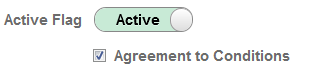
With check boxes on a fluid page, there are differences based on the Control Structure settings on the Check Box Properties > Fluid tab.
The default (Advanced) shows the actual translate values (On/Off, Active/Inactive, whatever they happen to be). With Basic selected, the system shows just a check box, similar to classic rendering.
Label positioning can be important with these options, as you typically want labels to appear after a standard check box but before the control with the Advanced option selected.
This example illustrates the differences in rendering and label placement of the Advanced and Basic Control Structure settings for check boxes. The Advanced selection shows the toggle switch, while the Basic selection displays a more standard check box.
In addition to the existing push buttons types used in classic applications, these toolbar action types are available for use in fluid applications only: Back, Clear Prompt, Help Link, Home, IN Prompt, Logout, Nav Bar, New Window, Search, Search Cancel, and SUOW Save.
You can create tool bars containing push buttons that appear in custom locations, such as sidebars for example, using your own actions, if needed. Push buttons are not required to appear only in the toolbar at the top of the page. Options that can be found on the Use tab that may also be of interest for fluid pages include:
Execute PC on Row\Group click: Runs PeopleCode as soon as user clicks on row\group).
Execute SearchSave Event: When a user runs a search, the system saves the page data prior to running the search so it is not lost. This option applies only to the search button, not every button on the page.
Note: For a button to display an image and text (a combination button), on the Label tab, select Both for the Label Type, then specify the Alt tag for image and Label Image.
Note: The Open in New Window and Replace Current Window options on the Push Button/Hyperlink Properties dialog box Use tab are not supported for fluid pages. To open a page in a new window for a fluid page, use PeopleCode, such as ViewURL or ViewContentURL.
Toggle Buttons
A toggle button is a two-state button indicating whether the button is pressed or not pressed (for example, on or off). Pressed (or on) means that the functionality implemented by the button is enabled. Not pressed (or off) means that the functionality implemented by the button is not enabled (or the default functionality is applied).
Toggle buttons can be created from simple text buttons (that is, a text button with the psc_button-simple style) or from image-only buttons. The toggle button states are manipulated by these toggle button methods of the PT_PAGE_UTILS:Utils class: GetButtonState, SetButtonState, and ToggleButtonState.
For example, use the following code excerpt in a FieldChange PeopleCode program to toggle the button state each time the button is tapped:
import PT_PAGE_UTILS:*;

Local boolean &bState = (create PT_PAGE_UTILS:Utils()).ToggleButtonState(GetField());
/* Do additional processing associated with the toggle button. */
Transparent, Borderless Buttons
You can style push buttons to be transparent and borderless using the psc_button-transparent style. This style can be used on standard text buttons, text and image buttons, and image-only buttons. While this style can be used on simple buttons (that is, a button styled with psc_button-simple), it is not recommended. Do not use this style on primary buttons or on toggle buttons.
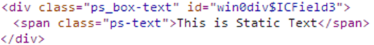
Static controls can be used for fluid pages. They have a different structure than what you see on classic pages, and you can apply style classes to these page elements (to the outer wrapper as with all other controls).
This example illustrates the static text control represented in the generated HTML for a fluid page.
This example illustrates the static image control represented in the generated HTML for a fluid page.

The horizontal rule control can be used and you can apply a style on the Horizontal Rule Properties > Fluid tab to be applied to the horizontal rule. Styles are applied at the ps_box-hr level (as with all controls, styles applied in Application Designer are found in the outer wrapper of the control).
When inserting charts onto a fluid page, note that there is no Fluid tab on the Chart Properties dialog box. The properties applied to a chart on a fluid page are applied using the Fluid tab of the chart container (the group box surrounding the chart.)
For more information, see Fluid Mode Considerations for Charts and Gauges.
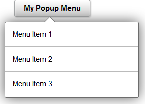
You can create a pop-up menu on a fluid page with menu items performing any action or navigation. Fluid pop-up menus can contain only a single level of menu items. Using the page controls and techniques described in this section will create pop-up menus that are rendered, styled, and tagged to standards that work with assistive technology.
The following example illustrates a fluid pop-up menu:
A fluid pop-up menu is not a separate, distinct page control found in Application Designer. Instead, you can use several methodologies to create fluid pop-up menus, including a parent group box (described here), a hyperlink or button, and others. The procedure described here relies on a parent group box of type Popup to serve as the button to activate the pop-up menu. This procedure requires no further coding by you to create a control and menu that is generated to standards that work with assistive technology. In addition to the parent Popup group box, you can use one of three methods to create the pop-up menu:
A group box of type Menu. Each menu item is a hyperlink contained within a group box of type Menu Item.
A grid with a layout of Menu Grid Layout. Each row in the grid is a menu item.
A scroll area with a layout of Menu. Each row in the scroll is a menu item.
To create a fluid pop-up menu:
Create a parent group box of type Popup to serve as the button to activate the pop-up menu:
On the Label tab, specify a text label for this button.
On the Use tab, specify an image for this button if applicable.
On the Fluid tab: Specify any additional styles for this button—for example, psc_image_only.
On the Fluid tab: Oracle recommends that you enable a vertical scroll bar for this menu; whether a vertical scroll bar is displayed depends on how the page is displayed (in a modal window, for example) and form factor usage (smart phone, for example).
Using the SetGroupletMOptions PeopleCode built-in function, set modal popup options enabling bPopupMenu on the record field. For example:
MY_RECORD.POPUP_MENU_GBX.SetGroupletMOptions("bPopupMenu@1;");Note: When bPopupMenu is enabled (set to 1), the system will automatically set bHeader to 0 (disabled), bAutoClose to 1 (enabled), bMask to 1 (enabled), and sMaskStyle to ps_masktrans; these options cannot be overridden. In addition, bVertical will be set to 1 (which is recommended), but it can be overridden.
Within the popup group box, create the menu container using one of three options:
To create a static menu, use a group box of type Menu.
To create a dynamic menu, use a grid with a layout of Menu Grid Layout.
Alternatively, use a scroll area with a layout of Menu to create a dynamic menu.
Define menu items within the menu container depending on the option selected in step 2:
If the menu container is a group box, create a group box of type Menu Item for each static menu item. Within each menu item group box, insert a single control, a hyperlink that executes the PeopleCode for this menu item. If you require a complex grouping of controls, use a grid or scroll as the menu container.
If the menu container is a grid or a scroll area, you can create a simple grid or scroll with one column: a hyperlink that executes the PeopleCode for this menu item.
Alternatively, if the menu container is a grid or a scroll area, you can also create a grouping of columns to be acted upon as a single menu item: a layout group box as the first column in the grid (in a scroll, this layout group box contains the other columns), one hyperlink that executes the PeopleCode for this menu item, and any additional controls such as images or counters (badges) to adorn the menu item.
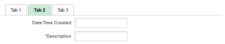
You can create sectional tabs embedded on a fluid page to control which portions of the page data are displayed depending on the tab selected. Using the page controls and techniques described in this section will create sectional tabs that are rendered, styled, and tagged to standards that work with assistive technology.
The following example illustrates sectional tabs:
Sectional tabs are not a separate, distinct page control found in Application Designer. Instead, you can use one of three methods to create sectional tabs:
A group box of type TabSet. Each tab item is a hyperlink contained within a group box of type TabItem.
A grid with a layout of Tab Set Grid Layout. Each row in the grid is a tab item.
A scroll area with a layout of Tab Set. Each row in the scroll is a tab item.
To create sectional tabs:
Create the tab set container using one of three options:
To create a static set of tabs, use a group box of type TabSet.
To create a dynamic set of tabs, use a grid with a layout of Tab Set Grid Layout.
Alternatively, use a scroll area with a layout of Tab Set to create a dynamic set of tabs.
Define tabs within the tab set container depending on the option selected in step 1:
If the tab set container is a group box, create a group box of type TabItem for each static tab. Within each tab item group box, insert a single control, a hyperlink that executes the PeopleCode for this tab. If you require a complex grouping of controls, use a grid or scroll as the tab set container.
If the tab set container is a grid or a scroll area, you can create a simple grid or scroll with one column: a hyperlink that executes the PeopleCode for this tab.
Alternatively, if the tab set container is a grid or a scroll area, you can also create a grouping of columns to be acted upon as a single tab: a layout group box as the first column in the grid (in a scroll, this layout group box contains the other columns), one hyperlink that executes the PeopleCode for this tab, and any additional controls such as images or counters (badges) to adorn the tab.
The following page controls are not supported in fluid applications:
Embedded help in grids, scroll areas, and group boxes.
Frames – Use a group box of type Layout instead.
-
Pop-up menus – The use of the classic pop-up menu page control can produce unpredictable results with other aspects of fluid applications. Pop-up menus on fluid pages are created in a different manner.
Pop-up pages – Mouse-over pop-up pages are not supported in fluid applications.
Scroll bars.
Trees.