Customizing Design Editor emails and landing pages with CSS
CSS can be used to heavily customize the layout of emails and landing pages. Standalone CSS classes allow for more flexibility with email and landing page designs, and custom styles in the Design Editor. Custom CSS will be reflected immediately in the editing canvas. It's best practice to confirm your styling in preview mode as well as testing live.
In this topic, you'll learn about:
Learn more by watching this video!
Learn more by watching this video!
Class names
Use these classes to identify the parts of your email or landing page that you would like to customize.
| Design Editor Element | Class Name | Description |
|---|---|---|
|
|
.elq-text-cell | This class targets the text in text cells. |
|
|
.elq-image-cell | This class targets image cells. |
|
|
.elq-button-cell | This class targets button cells. |
| Shared rules/ |
.elq-external-cell | This class targets both shared content and signature rules. |
|
|
.elq-divider-cell | This class targets divider cells. |
|
|
.elq-dynamic-content-cell | This class targets dynamic content cells. |
|
|
.elq-cloud-cell | This class targets cloud content cells. |
|
|
.elq-space-cell | This class targets spacer cells. |
|
|
.elq-code-cell | This class targets custom code cells. |
| Cells by location | .row .col .cell |
Target specific rows, columns, and cells. |
Sample code
See the following design goals and the corresponding example code samples to achieve these goals:
| Goal | Code Sample |
|---|---|
| Adding a webfont |
@font-face {font-family: 'Roboto Slab';font-style: normal;font-weight: 400;src: local('Roboto Slab Regular'),local('RobotoSlab-Regular'),url(https://fonts.gstatic.com/s/robotoslab/v8/BngMUXZYTXPIvIBgJJSb6ufA5qWr4xCCQ_k.woff2)format('woff2');unicode-range: U+0460-052F, U+1C80-1C88, U+20B4, U+2DE0-2DFF,U+A640-A69F, U+FE2E-FE2F;}@import url('https://fonts.googleapis.com/css?family=Roboto+Slab');
|
| Style Headers 1-6 |
.elq-text-cell h1 {color: red;text-decoration: underline;}
|
| Style bullets and numbered lists in text cells |
Unordered list: .elq-text-cell ul {color: #666666;font-weight: bold;}Ordered list: .elq-text-cell ol {color: #444444;font-weight: normal;} |
| Linking to external style sheets |
</style>
<link href="http://exampledomain.com/mystyles.css" rel="stylesheet"><!-- here we are in html, so re-open the style to get back to CSS --><style>
|
| Style specific cells using their location |
.row-0 .col-0 .cell-1 {color: blue;}
The editor counts left-to-right, top-to-bottom. |
| Style body text in every text cell |
.elq-text-cell > div > div {font-family: 'Roboto Slab';font-size: 1.3em;}
Use both <div> elements, otherwise you will style all text in all cells. |
Things to consider
- Old Shared Content, Dynamic Content, Header, and Footer content components use the
<font>tag rather than<span>. Newly created component library assets will use the<span>tag. - If you use the "em" unit inside the CSS block, it may be scaled up or down to the "px" fonts that the
<div>defaults have been overridden with by styles within the text cell itself. - Font size for Spacer and Divider cells is default coded to 0.
- The default styles from the Styles tab, as well as other styles needed for consistent rendering, are inserted into the document at the column level, via a
styleattribute. - Oracle Eloqua prioritizes CSS styling in the Design Editor as such:
- Styles defined at the local cell level (when you click on a content component and configure it).

- Custom CSS (as defined in the Advanced Styles section in the Style
 panel).
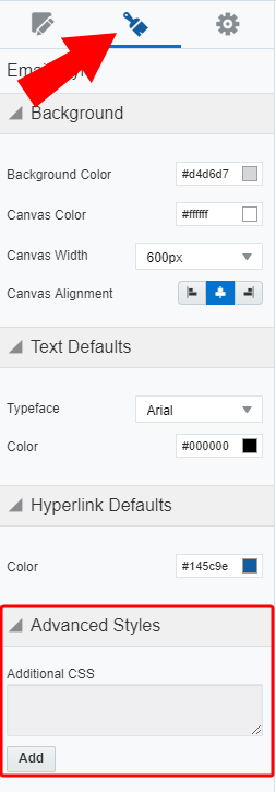
- Global defaults (as defined in the Style panel).
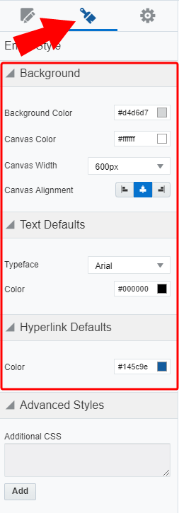
- Styles defined at the local cell level (when you click on a content component and configure it).