Setting Label Properties
The Label tab enables you to set the label that appears on a control. This label can be the long or short name that is specified in the record definition or in other text. Use this tab to verify the label ID that is used as the internal reference.
Access the page field properties for the control and select the Label tab.
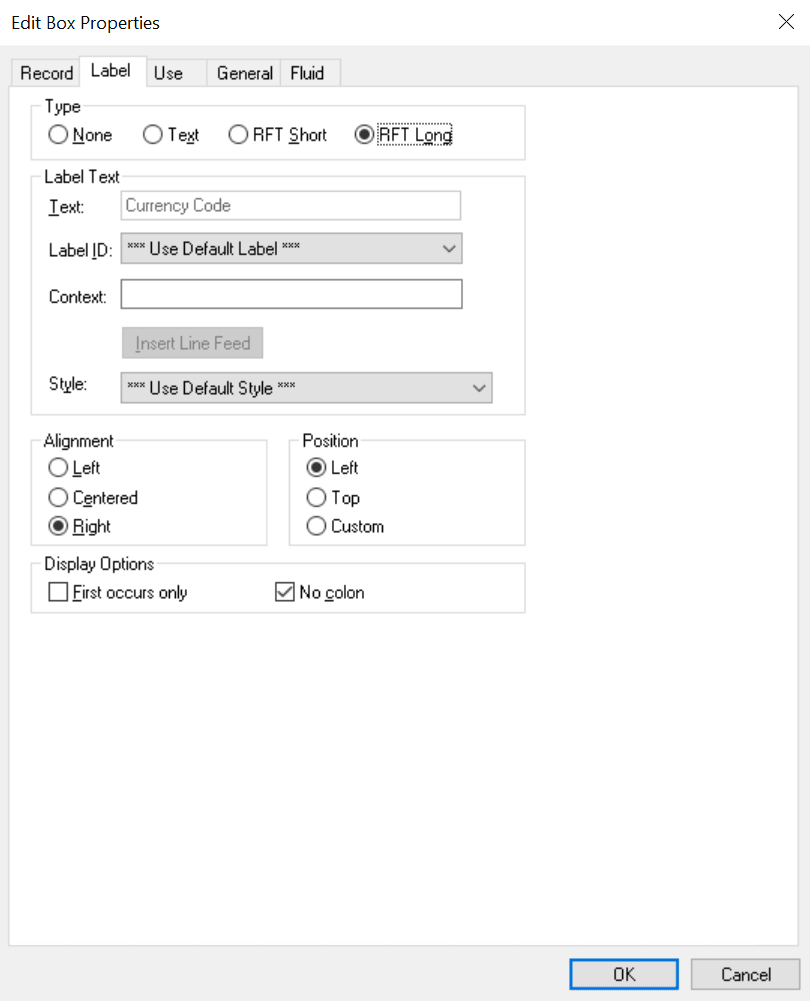
This example illustrates the fields and controls on the Edit Box Properties dialog box: Label tab. You can find definitions for the fields and controls later on this page.
Note:
This section applies to the following controls: edit boxes, long edit boxes, check boxes, drop-down list boxes, group boxes, radio buttons, and static text.
Type
Select the type of label. If you want the label to remain blank, you must first set up a blank label in the field definition that you are using. The blank label then appears as an option in the Label ID drop-down list box.
| Field or Control | Description |
|---|---|
|
None |
Select to display no control label on the page. Use this option for controls such as related displays. |
|
Text |
Select to display text that you enter in the Text field. The default text is the long name for the field from the associated record definition. For translation purposes, avoid using this option if possible. |
|
RFT Short (record field table short) |
Select to display the RFT short name for the field from the associated record definition. |
|
RFT Long (record field table long) |
Select to display the RFT long name for the field from the associated record definition. This value is the default. |
Label Text
| Field or Control | Description |
|---|---|
|
Text |
Enter the text exactly as it should appear on the page. The default is Dummy Name until you assign a record and field to the control. This field is only enabled if you selected Text as the type. Otherwise, the system displays the label text assigned to the field for the Label ID you select. |
|
Label ID |
Select from the drop-down list box the label you want to appear for the page field. The available choices are based on the Label ID column and the Long Name column for the selected field definition. The default setting for this option is Use Default Label. This default is determined by the label you select as the default for the field definition. |
|
Context |
Displays text to assist the translation team determine the context of the field label to be translated. The context is determined by the field name and label ID combination. If no contextual information exists in the database, then no text appears in this field. This property appears on edit box, long edit box, drop-down list box, push button, image, chart, tree, group box, and check box page controls. Application users define the contextual information on the Context Information page. See Global Technology: Providing Context Information. |
|
Insert Line Feed |
Click to split your control label into multiple lines at the position of the cursor in the Text field. A thick vertical bar character appears in the Text field. When you close the properties dialog box, the label is split into multiple lines. This option is only active when you select Text for the type. |
|
Style |
Select an option to control the color, font, and other characteristics of a label. If you do not select a label style that is different than the default, Use Default Style, then the system uses the label style specified on the style sheet on the PeopleTools Options page. |
Alignment
The label alignment in the page field properties controls the alignment for both page fields placed on a page and page fields as grid columns. For a grid column, the label becomes the column heading and is aligned within the column boundaries as specified by this attribute, either left, centered, or right.
| Field or Control | Description |
|---|---|
|
Left |
Select to align the label to the left-of-center horizontally. This value is the default. |
|
Centered |
Select to center the label horizontally. |
|
Right |
Select to align the label to the right-of-center horizontally. |
Note:
By default, the system uses left label alignment. To make all new page field labels use right label alignment (design time), set the Right Align Field Labels check box on the PeopleTools Options page.
Note:
Push buttons with images or text are automatically center aligned when in a grid. Push buttons with images or text are automatically left aligned when not in a grid.
Position
These position options are available for edit boxes, long edit boxes, and drop-down list boxes only.
| Field or Control | Description |
|---|---|
|
Left |
Positions label immediately adjacent to the left side of the field. Left is the default position of the label for fields newly added to the page. If you move the label on the page from the left position, PeopleSoft Application Designer changes the selection to Custom. |
|
Top |
Positions label above the field. Selecting this option automatically moves the label to the top of the field. If you later move the label on the page from the top position, PeopleSoft Application Designer changes the selection to Custom. |
|
Custom |
Indicates that the label was manually moved on the page. Labels can be adjusted using the keyboard arrows. Selecting this option does not automatically move the label on the page. |
To set labels to the left position for individual page fields:
-
Select the control that you want to affect.
-
Select
The Left Label Position option is only enabled if the label is set to the custom position. The system moves the label for the selected control to the left position. The position indicator in the page field properties does not change from Custom. Note that you may need to readjust the positioning of other fields and labels to accommodate this change.
Note:
If you move a page field label manually on the page, the label position in the page field properties dialog box automatically updates to Custom.
Display Options
| Field or Control | Description |
|---|---|
|
First occurs only |
Select to display the label only with the first occurrence of a child page field in a scroll area. |
|
No colon |
Select this option if you do not want a colon to appear at the end of the label text. This option is selected by default for edit boxes and long edit boxes. |
Special Label Considerations
If you add a related display page control with a label type of None, enter an information-only label that identifies the related field but that is not identical to the label on the control field. A little documentation now can save you time in the future if you modify this page again. For example:
| Control Label | Related Field Label (Information-Only) |
|---|---|
|
Department |
Department Description |
|
Jobcode |
Jobcode Description |
|
Regular/Temporary |
Regular/Temporary XLAT (XLAT is from the Translate Table) |
When defining labels for columnar controls in a multi-occurrence scroll, you can apply several techniques. The first technique is to select First occurs only. This selection limits the appearance of the label to the first scroll occurrence on the control, allowing the label to be used as a column heading. The second technique is to select No colon to omit the colon from the label (column headings typically do not need a colon).