Setting Record Properties
For most controls, you must set record properties to assign the control to a specific field in a record definition. No distinct correlation exists between the field types in a record definition and the controls in a page definition.
Use this table to select the appropriate page control type to associate with the corresponding field in your record definition:
| Record Definition Field Type | Page Definition Control Type |
|---|---|
|
Character |
Edit box |
|
Character (Yes or No Table Edit) |
Check box Edit box |
|
Character (Translate Table Edit) |
Radio button Edit box Drop-down list box |
|
Long Character |
Long edit box, HTML area Note: Do not associate Long Character fields to edit box controls; use a long edit box control. Associating a Long Character field to an edit box control can produce unexpected behavior on the page. |
|
Number |
Edit box |
|
Signed Number |
Edit box |
|
Date |
Edit box |
|
Time |
Edit box |
|
Datetime |
Edit box |
|
Subrecord |
Not applicable Note: A direct association to subrecords is not available. |
|
Image |
Image |
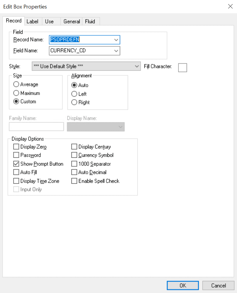
To set the record properties for a page control, access the page field properties for the control and select the Record tab:
This example illustrates the fields and controls on the Edit Box Properties dialog box: Record tab. You can find definitions for the fields and controls later on this page.
Note:
This section applies to both edit boxes and long edit boxes. Other controls may contain only a few, if any, of the properties listed in the following tables. Refer to the discussion of the specific control for more information.
| Field or Control | Description |
|---|---|
|
Record Name |
Select the record name of the record definition where the field is located. If you already added a field to your page and associated it with a record definition, the system uses the last record definition name that you entered. |
|
Field Name |
Select the field name. If the field is a related display field that contains a long name or short name from the Translate Table, use PSXLATDEFN as the record definition name. The field name is either a long name (30 characters) or a short name (10 characters). |
|
Style |
Set the font and color attributes of your control data. The default style class for an edit box is PSEDITBOX, which controls how the data portion of the edit box appears. Control the color, font, and other characteristics of an edit box by specifying a different style class. Note: Certain browsers always display the background of an edit box as white. See "Troubleshooting Browser Limitations" on Customer Connection. |
Size
After you link a control with a record name and field, the system automatically calculates the page control size. The size is based on the length of the field that is defined in your record definition, the font metrics of the field style, and any formatting options (currency symbol, 1000 separators, and so on) that apply. Because many fonts have variable width characters (for example, a W character is wider than a l character) three size options are available.
Note:
Some browsers do not support custom sizing for edit boxes, long edit boxes, drop-down list boxes, and push buttons.
See Troubleshooting Browser Limitations available on the My Oracle Support website.
| Field or Control | Description |
|---|---|
|
Average |
Select to provide sufficient space to display the field control length in average-width characters. |
|
Maximum |
Select to provide enough space to display the field control length in maximum-width characters. |
|
Custom |
Select to define a custom size for edit boxes that are not display-only. If you set a display-only edit box to Custom, it appears as its defined length. If your edit box is in a grid, this field wraps. |
Alignment
Alignment indicates the runtime alignment of data within a page field. These settings have no affect on the relative alignment of page fields.
| Field or Control | Description |
|---|---|
|
Auto |
Select to left-justify the content of character fields and right-justify the content of number and signed number fields. This value is the default. |
|
Left |
Select to left-justify the content of a field. Note: If the field is not display-only, the alignment is always left-justified. If the field is display-only, the system uses the alignment that you specify. |
|
Right |
Select to right-justify the content of the field. Do not use this option in the PeopleSoft Pure Internet Architecture for fields that are not display-only. |
|
Family Name |
Displays the current family name, which was set when the field was created, if it is applicable to your control. |
|
Display Name |
Select an option to override the display format that is associated with a field. |
Display Options
| Field or Control | Description |
|---|---|
|
Display Zero |
Select if the content of the page control are numeric and you want to display a zero value instead of a blank field. Sometimes, seeing a zero helps users remember that a page control is not blank. For example, in a tax table you might show the lowest tax bracket as starting at zero instead of leaving it blank. |
|
Display Century |
Select for date fields to enable users to enter a date with a four-digit century, as in 1999. Dates are always stored with the four-digit century in the database, but only the last two digits appear unless you select Display Century. If this option is not selected, the century is automatically set to the century of your system date. |
|
Password |
Select to hide the value that is entered or displayed in a page control. When selected, characters in this control appear online as black dots. The component processor stores the actual value, making it available for normal processing, such as PeopleCode. Use this option for pages that capture sensitive information, such as personal identification numbers (PINs), passwords, and so on. For more information on options for displaying sensitive field data, see Protecting Sensitive Field Data Online. |
|
Currency Symbol |
Select to display a currency symbol in the field. This selection expands the display length of the field by the length of the currency symbol. |
|
Show Prompt Button |
Select to display a prompt button next to the edit box, which enables the user to look up valid values for that field. |
|
1000 Separator |
Select if the content of the page control is numeric and you want to insert thousand separators to make the numbers easier to read. The system automatically calculates the number of thousand separators to insert and determines where they should be positioned. This selection expands the display length of the edit box by one character for each separator. |
|
Auto Fill |
Select to have the system automatically populate the page control with the character specified in the Fill Character field. The direction in which it populates depends on the alignment that you select. If a field is left-aligned, then it populates from left to right. If a field is right-aligned, it populates from right to left. For example, suppose that you define a six-character control as left-aligned, specify a fill character of 0, and activate Auto Fill. When you type 123 in the control online, the system displays 123000. Similarly, if you changed the alignment to right, the system would display 000123. Note: Auto Fill can affect the actual value of the control, not just its visual representation. |
|
Auto Decimal |
Select to insert a decimal point automatically if none is provided in the data that is entered into the control. Where the system inserts the decimal point depends on how you define the control. For example, in a record definition if you define a numeric field with a length of 4.2 (allowing four characters to the left of the decimal and two to the right) and activate Auto Decimal, the system inserts a decimal at the second digit from the right. This option applies only to numeric field controls and affects the actual value of the field control, not just its visual representation. |
|
Display Time Zone |
Select if you are setting the properties for a Time or a Datetime field and you want to display the related time zone. This setting helps users understand whether the time reflects the base time zone of the database or of some other time zone. This setting does not determine which time zone is actually used, only whether the time zone appears. The record field properties determine which time zone is used. |
|
Input Only |
Select for edit boxes containing sensitive information that you want to protect by:
The component processor stores the actual value, making it available for normal processing, such as PeopleCode. Use this option for pages that capture sensitive information, such as personal identification numbers (PINs), passwords, and so on. For more information on options for displaying sensitive field data, see Protecting Sensitive Field Data Online. |
|
Enable Spell Check |
For edit boxes and long edit boxes only, this option enables the user to check spelling on field content. This feature supports 17 languages using 36 dictionaries. Users have the option of selecting the appropriate dictionary to meet the language needs. To see the list of supported dictionaries, refer to Global Technology: Managing Languages in the PSLANGUAGES Table. You can also navigate to the Manage Installed Languages page and view the values for the Spell Check Language drop-down list box. The behavior of this feature is as follows:
|
|
Fill Character |
Enter a character to replace blank spaces in an edit box when the system displays the content of the field. For instance, if the length of a Net Pay field is 8.3 and you specify a fill character of *, then a value of $1,250 appears as: *****$1,250.000 You can use any character as a fill character. |
Example: Auto Decimal
This table shows how the Auto Decimal option affects a numeric field control with a length of 4.2, depending on what you enter online:
| Entered | Displayed |
|---|---|
|
100 |
1.00 |
|
100. |
100.00 |
|
1 |
0.01 |