Setting Use Properties
The Use tab defines how a field functions on a page. Use this tab to disable or hide fields; to define the display and related control fields and the processing of the control; and to define a field as a mouse over pop-up field.
Access the page field properties for the page control and select the Use tab.
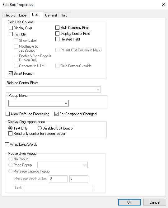
This example illustrates the fields and controls on the Edit Box Properties dialog box: Use tab. You can find definitions for the fields and controls later on this page.
Note:
These controls contain the same or similar use properties: edit boxes, drop-down list boxes, check boxes, images, long edit boxes, push button/hyperlinks, and radio buttons.
Field Use and Other Options
Note that long edit boxes have slightly different field use options.
| Field or Control | Description |
|---|---|
|
Display Only |
Select to prevent users from modifying the content of the control during application data entry. The system automatically selects Display Only when you select Related Field. |
|
Invisible |
Select to make the control physically present on a page but invisible to users. Typically, you add an invisible control because it is required for a PeopleCode program that is associated with the page. An invisible control can also be used as a display control field. When you select the Invisible check box, the Show Label, Modifiable by JavaScript, and Enable When Page is Display Only fields are enabled. |
|
Show Label |
Select to make the control label visible while the control itself is invisible. This option is useful if you add an invisible display control field to a page to show its related description. Show Label is enabled only if Invisible is selected. Important: The Show Label option is not supported for page controls on fluid pages. |
|
Modifiable by JavaScript |
This feature is security related and should always be deselected unless you are familiar with modifying an invisible field using JavaScript in an HTML area. If the Invisible check box is deselected, then Modifiable by JavaScript is deselected and unavailable for entry. If the Invisible check box is selected, then the Modifiable by JavaScript check box is deselected by default. |
|
Enable When Page is Display Only |
Select to enable hyperlink actions on read-only pages. This check box is active when the Invisible check box is selected. This check box is deselected by default. Note: This property appears on Edit box, Long Edit box, and Image controls. |
|
Generate in HTML |
Select to generate an invisible field (hidden field) on the HTML page sent to the browser where it can be manipulated by JavaScript in the browser. Only use this option if you are familiar with modifying an invisible field using JavaScript due to potential security concerns. This check box is active only when the Invisible check box is selected. This check box is deselected by default. If you want the application server to update the invisible field with data sent back from the browser, in addition to having the Generate in HTML check box selected, also make sure to select the Modifiable by JavaScript check box. This option is available for edit boxes, long edit boxes, check boxes, radio buttons, and drop-down list boxes (only list boxes with a single value for selection). |
|
Expand Field when Page is Display Only |
Select to automatically resize a disabled (display-only) long edit box so that all text within the field is visible at runtime. The field automatically enlarges to accommodate text. This check box is deselected by default. When selected, this option enables the Wrap Long Words option. |
|
Multi-Currency Field |
Select to identify the control as associated with multi-currency processing. This selection causes the field to appear at runtime only if Multi-Currency is selected on the PeopleTools Options page. |
|
Display Control Field |
Select to indicate that the field controls another field at the same page level. The controlled field is a related field. For example, on many pages Department ID is the display control field and Department Name is the related field. The system uses Department ID to retrieve Department Name from the Department table to display on the page. |
|
Related Field |
Select to specify that the content of this control is controlled by another field on the same page level, one that you selected as a display control field. When you select this check box, the system automatically selects the Display Only option. It also makes the Related Control Field drop-down list box available for you to select the related control field. When you select Related Field, Display Only is automatically selected. If the related field is located on a record definition with multiple keys, relate the display field to the lowest order key field that both record definitions have in common, with the exception of EFFDT and EFFSEQ, in the control record definition. The system searches for the higher order keys by matching field control names on the current level and all higher levels for the other keys. If the related display field contains a long name or short name from the Translate Table, use PSXLATDEFN as the record definition name. |
|
Enable When Page is Display Only |
Select this check box to enable the user to select radio buttons and check boxes on runtime pages to perform certain tasks and processes despite the entire page being in display-only mode. Note: This property appears on Check Box and Radio Button controls only. |
|
Paragraph |
The Paragraph property applies only to these page field controls:
If Paragraph is selected, PeopleTools generates a text
field for the supported controls and inserts the page field content within a paragraph tag
( The Paragraph property applies to classic and fluid applications. For classic pages, PeopleTools generates a paragraph tag if the Paragraph property is selected or the controls have one of the following styles applied:
PeopleTools suppresses any label generation for the paragraph fields; field values are generated, but field labels are omitted. PeopleTools ignores the Paragraph property in these conditions:
|
|
Wrap Long Words |
Select to wrap long words that do not contain spaces, such as long URLs, in a page field at runtime for Microsoft Internet Explorer only. The word wraps to the length of the field set at design time. Other browsers automatically stretch the width of the page to accommodate the longer text. This option has no effect at runtime to applications running on browsers other than Microsoft Internet Explorer. This setting is deselected by default. The Wrap Long Words option is available for edit boxes, long edit boxes, and drop-down list boxes only. You can apply it to standalone page fields and grid columns. For edit boxes and drop-down list boxes, this option is disabled if Disabled Edit Control is selected. For long edit boxes, this option is available only if the Expand Field When Display Only option under Field Use Options is selected. Note: The system does not restrict an edit box or drop-down list box that is configured as Display Only and Text Only to one line of height. The text is wrapped to the next line as necessary. Also, the Wrap Long Words property does not affect the word wrapping behavior of shorter words that can be accommodated by the page field size at runtime. This text automatically wraps at word boundaries in accordance with the page field size, regardless of whether this option is set. |
|
Persist Grid Column in Menu |
Important: Persistent search, the drop-down menu, and other forms of classic navigation are no longer supported. The default navigational interface for PeopleSoft applications in the current release is based on the fluid banner, which can be used for both classic and fluid applications. Select to include the field as a list box item in the persistent search results grid. You must also select the Persist in Menu grid property for the grid that contains the field. Note: This property applies only to fields that appear in grids on pages that are used as custom, application-specific search pages. This property is disabled on check boxes and radio buttons. You must enable recent search results caching at the system level in the web profile for this property to take effect. |
|
Field Format Override |
Select to override the Suppress Trailing Zeros and the Extend Decimal Precision properties that are set at the record field level. The Field Format Override option is enabled only if the record field has either the Suppress Trailing Zeros property or the Extend Decimal Precision property set. For more information, see Setting Record Field Properties. |
|
Smart Prompt or Smart Drop-Down |
Use the Smart Prompt or Smart Drop-Down check box to either disable or enable the display of smart prompt values or smart drop-down list. Note: The Smart Prompt option is only available for fields with a prompt table and for fields that have translate values. Smart prompt and smart drop-down are enabled by default. Deselect this option to disable this feature. If disabled, the feature is disabled for that page field only and is applicable for all users. It does not impact any other fields on the page and it does not impact any other pages. For more information, see Applications User’s Guide: Using Smart Prompts, Applications User’s Guide: Using Drop-Down List Boxes, and System and Server Administration: PeopleTools Options. |
|
Related Control Field |
When you select Related Field, a list of all controls on the page that are marked as display control fields appears in this drop-down list box. Select the field to which this control is related. You must define the use of the initial control field before it appears as an option in the Related Control Field drop-down list box. For example, after the Pay Group field is designated as a display control field, it appears in the Related Control Field drop-down list box for the control that you set as the related field. Note: The number that appears before each entry in the Related Control Field drop-down list box is the page field order number associated with that entry. |
|
Set Component Changed |
Enables the system to issue a save warning for the field if the user changes the value and attempts to exit the page before saving. This setting reinforces current save warning behavior. This option is set by default for edit boxes, long edit boxes, radio buttons, check boxes, and drop-down list boxes. Deselecting this option overrides the save warning that normally appears to users. The user will not see a save warning after changing the value of the field and attempting to exit the page. An example of when this might be necessary is for a drop-down list box that includes links to another page. If the user selects a link from this field to transfer to another page but has not made any other changes to the page, then the system should not issue a save warning. By deselecting the Set Component Changed flag, you indicate that no save warning message is issued for this field. This option works for fields associated with a derived work field or database record field. For the push button/hyperlink control, the default setting is deselected instead of selected, unlike most other page controls. |
|
Allow Deferred Processing |
Deselect this option to allow this field to operate in interactive mode. Typically, set a field to interactive only if you want to perform a server trip for an action that can be deferred otherwise—for example, to execute FieldEdit or FieldChange PeopleCode, when data is entered in a field with a prompt table edit, or in a field with a related display. The setting of this field is ignored if either the page or the component is set to run in interactive mode. See Understanding Processing Modes for more information. Note: The default setting is selected. |
Display-Only Appearance Option
| Field or Control | Description |
|---|---|
|
Text Only |
On classic pages, applies only to edit boxes and drop-down list boxes. On fluid pages, applies only to edit boxes, drop-down list boxes, and check boxes. |
|
Disabled Edit Control |
On classic pages, applies only to edit boxes and drop-down list boxes. On fluid pages, applies only to edit boxes, drop-down list boxes, and check boxes. |
|
Read only control for screen reader |
Application developers can use the Read only control for screen reader attribute to mark fields as read only in screen reader mode, which enables screen readers to set focus into the fields but does not allow the user to modify the value. Unlike read-only fields, you cannot set focus into the disabled fields, and disabled fields are grayed out. When you use the Read only control for screen reader attribute, consider the following:
Note: The Read only control for screen reader attribute is used in conjunction with the Display Only attribute on the Use tab or the DisplayOnly property in PeopleCode. |
The Text Only and Disabled Edit Control properties, in conjunction with other attributes you apply to the field, such as Display Only on the Use tab, or the Gray function or the Enabled property in PeopleCode to disable the field, and whether or not the field is in a grid control the base style that the system uses to render these controls at runtime.
The default base style for a normal edit box, meaning editable and enabled (as opposed to display-only or disabled), is PSEDITBOX. The default base style for drop-down list boxes is PSDROPDOWNLIST. The base style then changes depending on the attributes that you select and where you place your field, as shown by the default base style examples in the following table.
If you choose a custom base style for the field on the Record tab of the control properties, then the system uses the associated display-only and disabled variants of the style as appropriate to create the additional looks. For example, if you select XYZ base style and set the field as display-only, then the related XYZ_DISPONLY style is used if it exists; otherwise, the base XYZ style is used.
| Display-Only Appearance Option | Normal Edit Field | Display-Only Edit Field | Disabled Edit Field |
|---|---|---|---|
|
Text Only |
Non-Grid: PSEDITBOX Grid: PSEDITBOX |
Non-Grid: PSEDITBOX_DISPONLY Grid: PSEDITBOX_DISPONLY |
Non-Grid: PSDISABLED Grid: PSEDITBOX_DISPONLY |
|
Disabled Edit Control |
Non-Grid: PSEDITBOX Grid: PSEDITBOX |
Non-Grid: PSDISABLED Grid: PSDISABLED |
Non-Grid: PSDISABLED Grid: PSDISABLED |
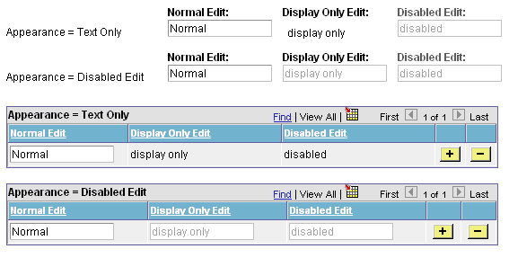
Note that for Text Only disabled edit boxes using the default PSEDITBOX base style, the system applies PSDISABLED to non-grid fields and PSEDITBOX_DISPONLY to fields in a grid. As a result, these fields render differently at runtime, as shown in the following example. If the field is outside of a grid, for example, selecting the Display Only field use option with the Text Only appearance option displays the field value as disabled text within a grayed border, whereas if the field is located in a grid with the same attributes, the field value renders as display only text without a border.
This example illustrates the fields and controls on the Example of Display-Only Appearance settings at runtime using the base PSEDITBOX style.
Note:
Depending on the style sheet that your application uses, the appearance of your pages and fields might deviate slightly from the appearance of the page and fields in the previous example.
Mouse Over Popup Options
Select the Display Only check box to enable the Mouse Over Popup options. Select from these mouse over pop-up options:
| Field or Control | Description |
|---|---|
|
No Popup |
Select to have no pop-up page. This value is the default. |
|
Page Popup |
Select to associate the edit box with a pop-up page that you choose from the drop-down list box. Only pop-up pages appear in the Page Popup drop-down list box. |
|
Message Catalog Popup |
Select to associate this edit box with a pop-up page that displays a message from the message catalog. You can design and implement message catalog pop-up pages to be context sensitive. |
|
Message Set/Number |
Enter the message set number and the message number of the message whose text you want to appear in the pop-up window. |
|
Text |
This field displays the message of the message catalog entry that you enter in the message set/number fields. |
Note:
If you associate a mouse-over pop-up page to an edit box, then do not attempt to make the edit box editable at runtime, for example by using PeopleCode; the operation will fail.