Working with Fluid Grids
This example illustrates the appearance of a grid on a fluid page.
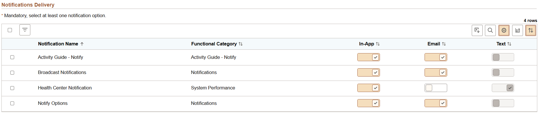
| Term | Definition |
|---|---|
|
|
Select All button Click to select all or deselect all rows in the grid. Note: The state displayed by the Select All button reflects the last user interaction with the button, and not interactions with individual grid rows. A server trip will clear the Select All button, but not the settings for individual rows. |
|
|
Filter button Click to open the Filter dialog box to allow you to select one or more filter criteria to limit the grid rows displayed. |
|
|
Download to Excel button. Click to download the grid contents to an Excel spreadsheet. Note:
The downloaded file
is named |
|
|
Find button. The find feature looks for matches in edit boxes, display-only fields, disabled or shaded fields, dynamic links, and text in long edit boxes. It does not find column headings, field labels, text values on icons, static links, and hidden fields. It also does not search HTML areas that are on the grid or scroll area. See Finding Data for more information. |
|
|
Personalize button. Click to display the Grid Settings page in a modal window. See the following section, “Personalizing a Grid,” for more information. When no grid personalization is in effect, the button background color is white; when grid personalization is in effect, including a simple user sort, the button background color is brown. Note: The Personalize button does not appear on a "stacked" grid because personalization is disabled on a “stacked” grid. |
|
|
View Chart button. Click to generate a chart using the grid data. |
|
|
Sort button. Click to display the Sort pop-up menu. See the following section, “Sorting a Grid,” for more information. When the default sort is in effect, the button background color is white; when a user sort is in effect, the button background color is brown. |
|
Grid Column Heading |
Click a grid column heading to sort or resort the grid data. An up or down arrow indicates the direction of the active sort. Note: Sorting is disabled on columns consisting of radio button fields. |


Personalizing a Grid
This example illustrates the fields and controls on the Grid Settings page. You can find definitions for the fields and controls later on this page.
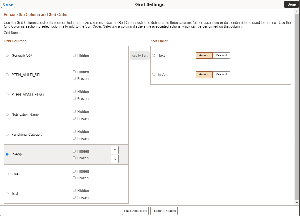
In both sections, selecting a column displays the associated actions which can be performed on that column. Use the Grid Columns section to reorder columns, hide or show columns, freeze or unfreeze columns, and to add columns to the Sort Order section. Use the Sort Order section to define up to three columns (either ascending or descending) to be used for sorting the grid.
| Term | Definition |
|---|---|
|
Hidden |
Select this option to hide a grid column. Note: It is recommended not to hide the columns in a grid that are used for sorting. |
|
Frozen |
Select this option to freeze a grid column so that it appears on all tabs of a tabbed grid. Note: This option appears only on tabbed grids. |
|
Add to Sort |
When a column is selected in the Grid Columns section, use the Add to Sort button to add the column to the Sort Order section. |
|
Clear Selections |
Click the Clear Selections button to deselect all selected items in both the Grid Columns section and the Sort Order section. |
|
Restore Defaults |
Click the Restore Defaults button to restore the default column order, default sort order, and whether columns are visible. |
After you've personalized the columns in a grid and saved your settings, if your system administrator inserts a new column in that grid, the system preserves the column personalization in the grid and displays the newly inserted column as the last column in the grid.
Sorting a Grid
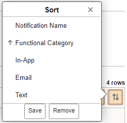
This example illustrates the fields and controls on the Sort pop-up menu when save sort has been enabled. You can find definitions for the fields and controls later on this page.
| Term | Definition |
|---|---|
|
Grid Column Heading |
Click a grid column heading to sort or resort the grid data. An up or down arrow indicates the direction of the active sort. On a stacked grid, personalization is disabled, but you can use the sort button to sort multiple columns. The sort indicator arrow only appears on the primary sort column, but users can sort up to three columns. For example, if you want to sort two columns, you should first perform a sort on the secondary sort column and then on the primary sort column. You can then save the sort and the sorting on both columns will be saved. Any time a column is sorted on, it becomes the primary sort. Any previously sorted columns (in the same session) become secondary and tertiary sorted columns. In this way, you can sort multiple columns. Note: Sorting is disabled on columns consisting of radio button fields. |
|
Save |
Note: The Save button is available only when personalization has been enabled for the grid. The Save button is displayed only after a user sort is in effect. Click the Save button to save a user sort. |
|
Remove |
Note: The Remove button is available only when personalization has been enabled for the grid. The Remove button is displayed only after a user sort has been saved. Click the Remove button to remove a saved user sort. |