Analytics: Summary View
In the Analytics main page, you get a summary view of analytics data for all process applications present in the Process Automation instance.
Note:
The terms status and states have been used interchangeably to describe instance status in the visualization area.Instances by Status
The Instances by Status section is on the left of the visualization area and shows a bar graph representation of a summary of process applications. Each application lists total process instances by status. The X-axis lists the applications. The Y-axis represents the number of instances.
The colored bars represent the total number of instances by status: Completed, Faulted, In progress, New, Suspended, and Terminated. For more information on instance status, see About Instance Status.
In the following example, the Onboarding application has 200 Completed, 140 Faulted, 150 In progress, 10 New, 80 Suspended, and 50 Terminated instances in the past week.
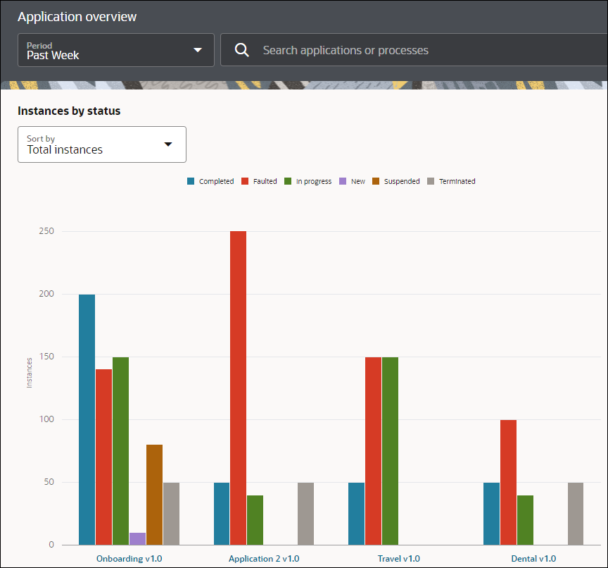
Description of the illustration analytics-apps-bargraph.png
Note that if an application has multiple versions, all the different versions will be represented as separate applications in the X-axis of the bar graph.
Various options are available to further refine the view of the bar graph and get more details:
-
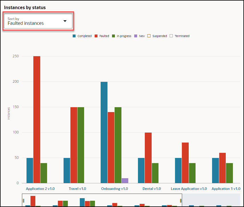
Sort by: The Sort by drop-down field allows you to sort application data represented in the bar graph in descending order based on the state that you select. For example, if you select Faulted instances, the bar graph changes with data represented in the descending order of the state (Faulted) selected. The application with the maximum number of instances in Faulted state will be represented first in the bar graph, the application with the second highest instances in Faulted state will be represented second, and so on.
-
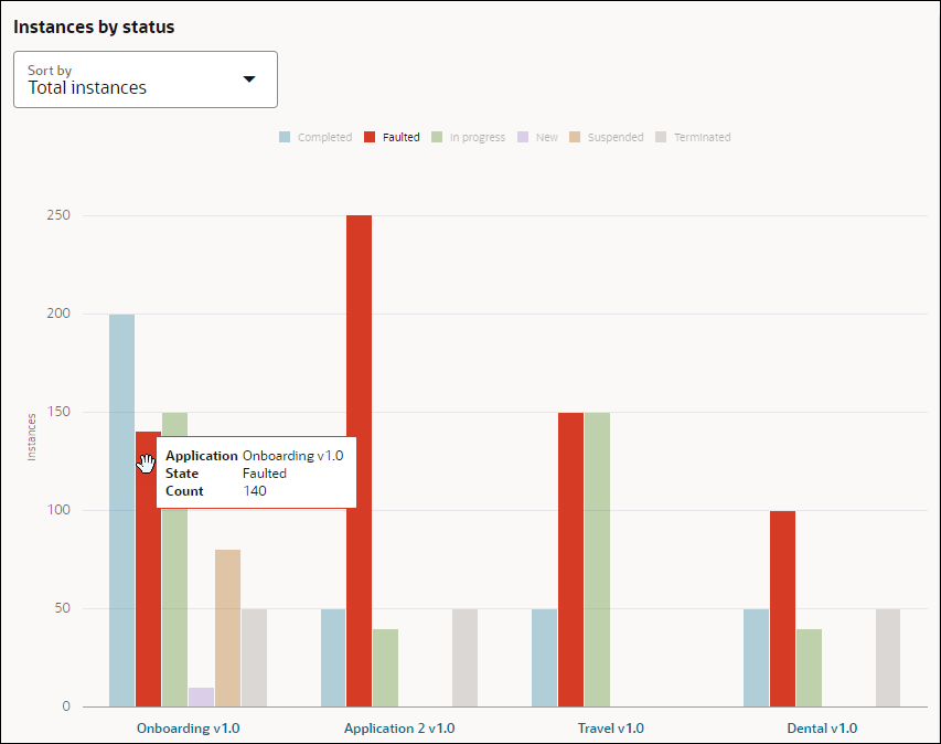
Interactive legends and bars: When you hover over a legend on top or hover over a state bar in the bar graph, the other states dim, and the selected state gets highlighted in the bar graph.
In the example below, hovering over the Faulted state bar in the Onboarding application, dims the other state bars in the applications. Also a tool tip on the selected bar is shown with the application name, the state, and the total count of instances in the Faulted state in the Onboarding application.
-
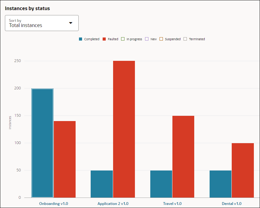
Filter by State: Suppose you want to view process instances that are in Completed and Faulted state only, click the other state legends on top to hide the states represented by them. The bar graph will only show the total number of Completed and Faulted process instances for the applications.
-
Horizontal scroller: By default, four applications are displayed on the X-axis of the bar graph. If you want to view more applications, use the horizontal scroller to scroll to your right and see all the applications present. Click the end of the scroller and expand it to see more applications in the bar graph.
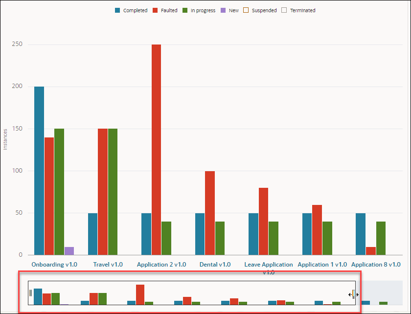
Description of the illustration analytics-horizontal-scroller.png
Average Time
The Average Time section is present on the right of the visualization area and shows a Treemap view of the average time that the applications have taken to complete. Based on the average time taken by each application, the relative rectangular box for the application is created. The application that takes the maximum time appears in the biggest rectangle and so on. Hover over a rectangular box to get a tool tip with the application name and average duration that instances took to complete.
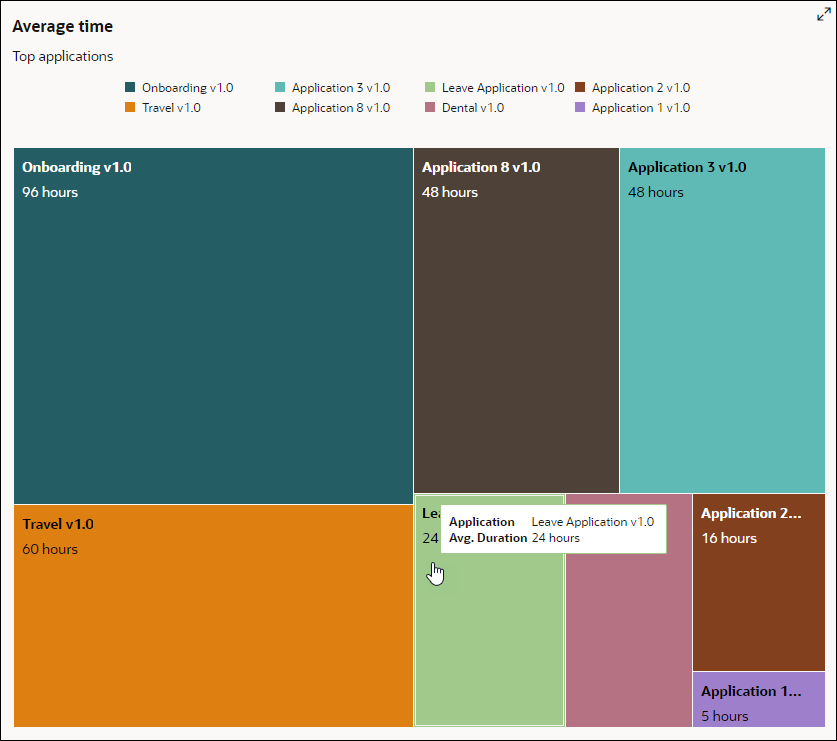
Description of the illustration analytics-treemap.png
You can use the maximize icon on the top right to get a clearer view of the analytics visualization area.
