View Analytics for an Application
You can view analytics report for a particular application to check how processes within that application are performing.
- Click the application name from the X-axis of the bar graph.
- Click an application node in the treemap view.
- Search and select the application from the search field.
Tip: A quick way to switch to a different application is to use the filter chip displayed for the application below the search field.
Status by process
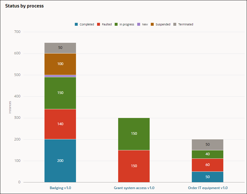
The Status by process section is on the left where each process within the selected application is represented by a stacked bar chart. The stacked bar shows the cumulative count of a process in different instance states.
Description of the illustration analytics-status-process.png
The following options are available to further refine the view of the stacked bar chart and get more details:
-
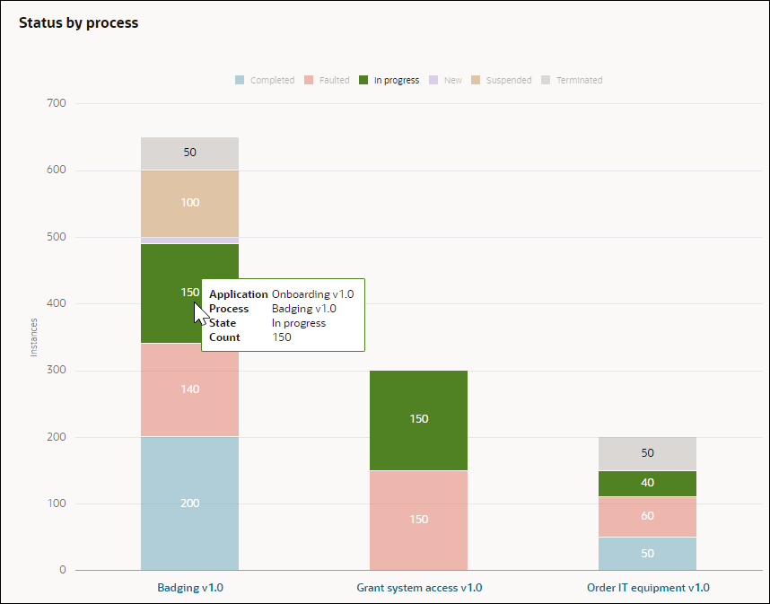
Interactive legends and stacked bars: When you hover over a state legend or a state in the stacked bar chart, then the other states dim, and the selected state gets highlighted in the stacked bar chart.
Description of the illustration analytics-process-interactive.png -
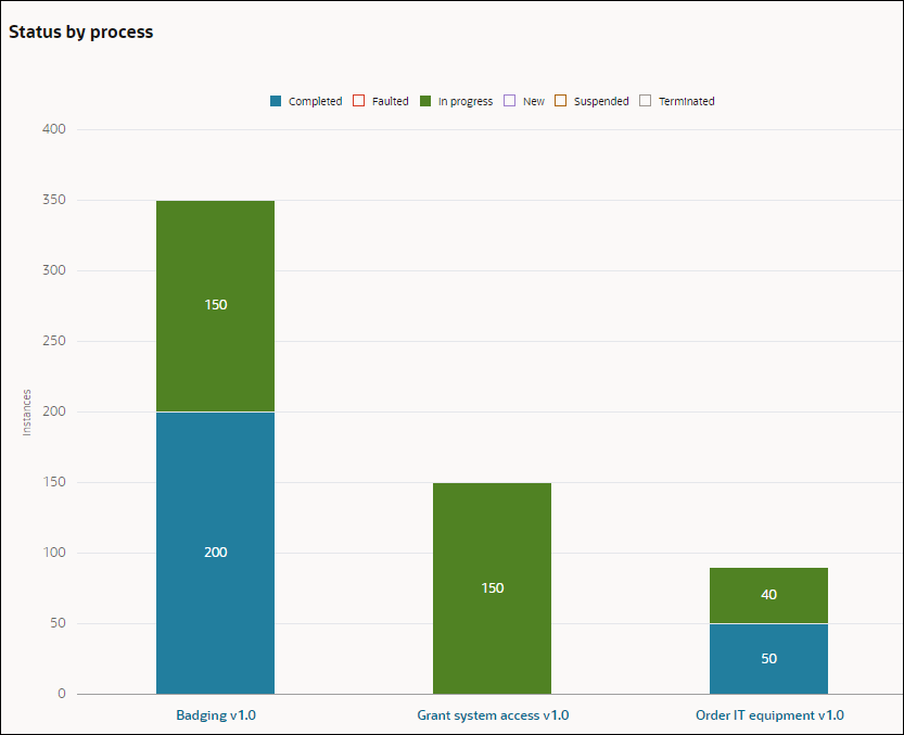
Filter by State: Suppose you want to view process instances that are in Completed and In progress state only, click the other state legends on top to hide the states represented by them. The stacked bar chart will only show the total number of In progress and Completed process instances for the processes.
Description of the illustration analytics-filter-processstate.png
Total instances by process
This is the first chart that is displayed on the right section. The report for the chart is based on the duration that the user has selected. For example, if you’ve selected Past Week in the Period field, then daily data for each day of the past week is shown. The X-axis of the chart will be represented by the days of the past week. The Y-axis represents instance counts. The different colored lines represent the processes present. Hovering over one of the plot points in a line shows the total number of instances of the process that were present on that given date (X-axis).
For example, hovering over the Badging process on Jan 3, shows that 180 process instances were present on that date.
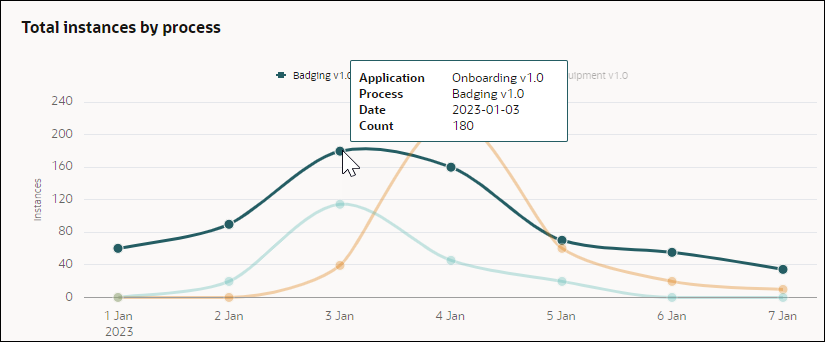
Description of the illustration analytics-totalinstance-process.png
Average time to complete
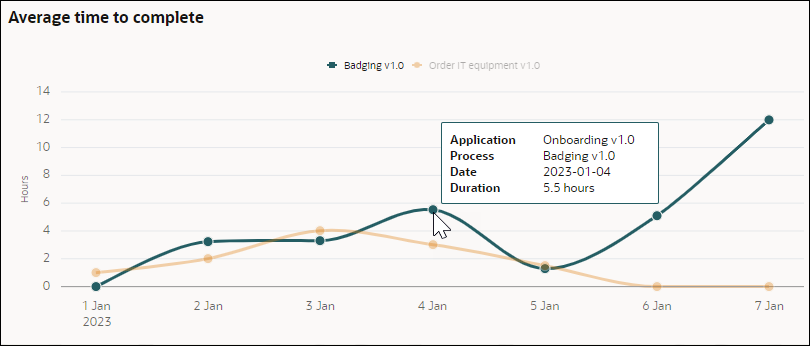
This is the second chart that is displayed on the right section. The report for the chart is based on the duration that the user has selected. For example, if you’ve selected Past Week in the Period field, then daily data for each day of the past week is shown. The X-axis of the charts is represented by the days of the past week. The Y-axis represents duration in hours. The different colored lines represent the processes present. Hovering over one of the plot points in a line shows the average time taken by the process to complete on that date (X-axis).
For example, hovering over the Badging process on Jan 4, shows that the average time taken by the process to complete on that date is 5.5 hours.
